A new logo for Carrefour
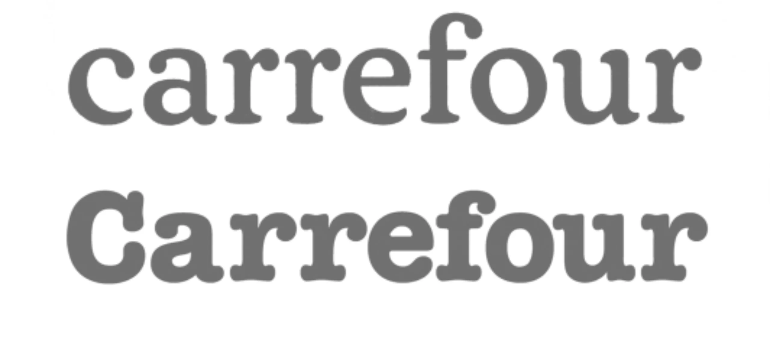
Today I didn’t throw away all the advertising leaflets cluttering up my letterbox. No, there was one that caught my eye and it was a “Carrefour DIY and decoration” advertising brochure. What’s so special about it? Well, it seems to have the latest facelift of the Carrefour logo.
That’s quite an event, isn’t it? As you can see, the original work has been partly respected and the changes are mainly to the colour range and the greasing up of the typefaces, which were originally intended to be American Typewriter or Courrier… Note, however, the loss of the capital…
On that note, good night 🙂
On the subject
-

Groupama’s new visual identity, a logo in the open countryside
Groupama has just unveiled a new logo that updates its graphic design by abandoning its campaign in favor of a “startup” aesthetic.
-
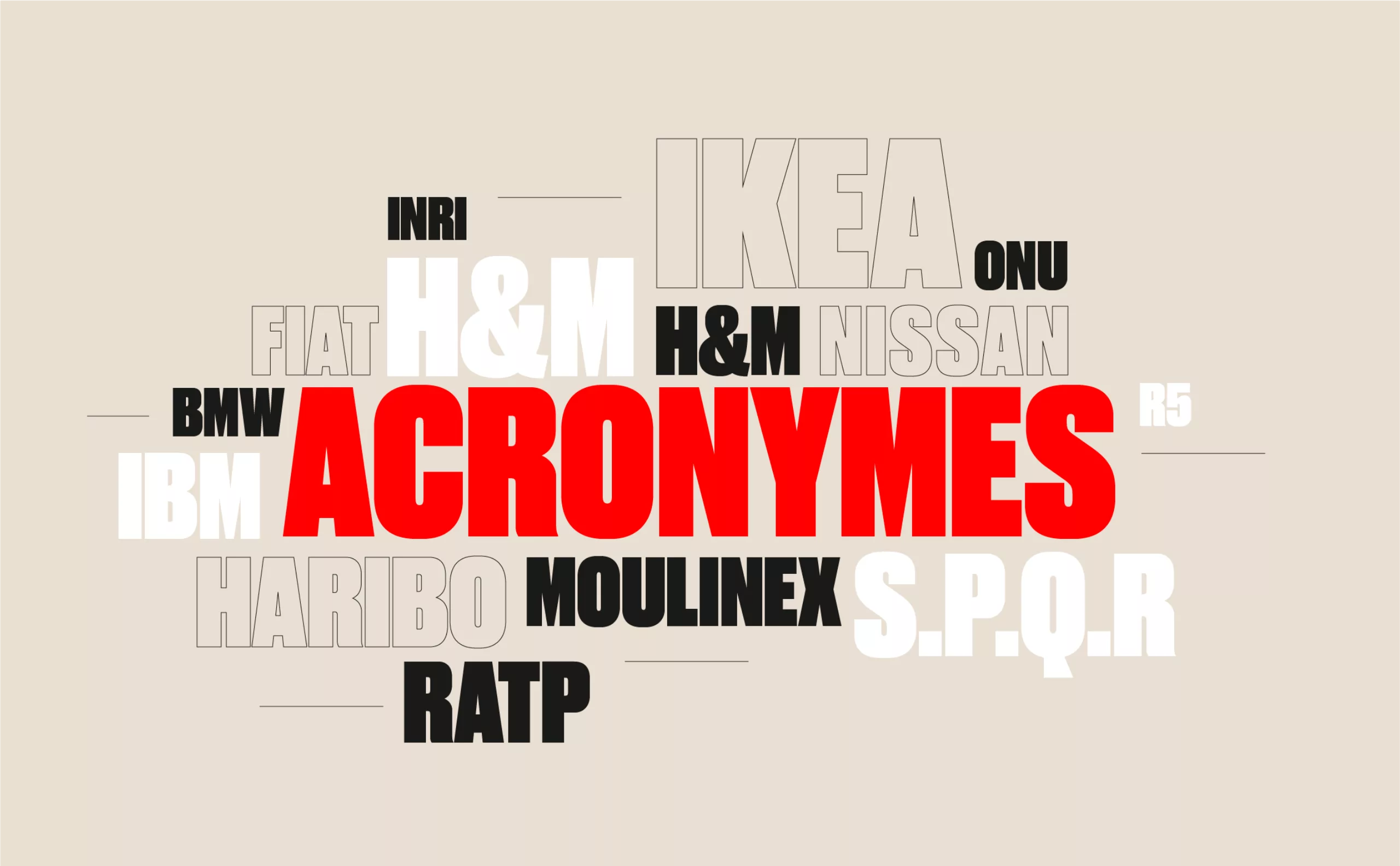
From surnames to acronyms: creating a brand name from letters
From founders’ surnames to initials and acronyms, brand names have always oscillated between abstraction and familiarity.
-

The UN logo takes on water during COP28
For COP28, two designers have come up with a new UN logo showing the rising sea levels and the future disappearance of much land and coastline.