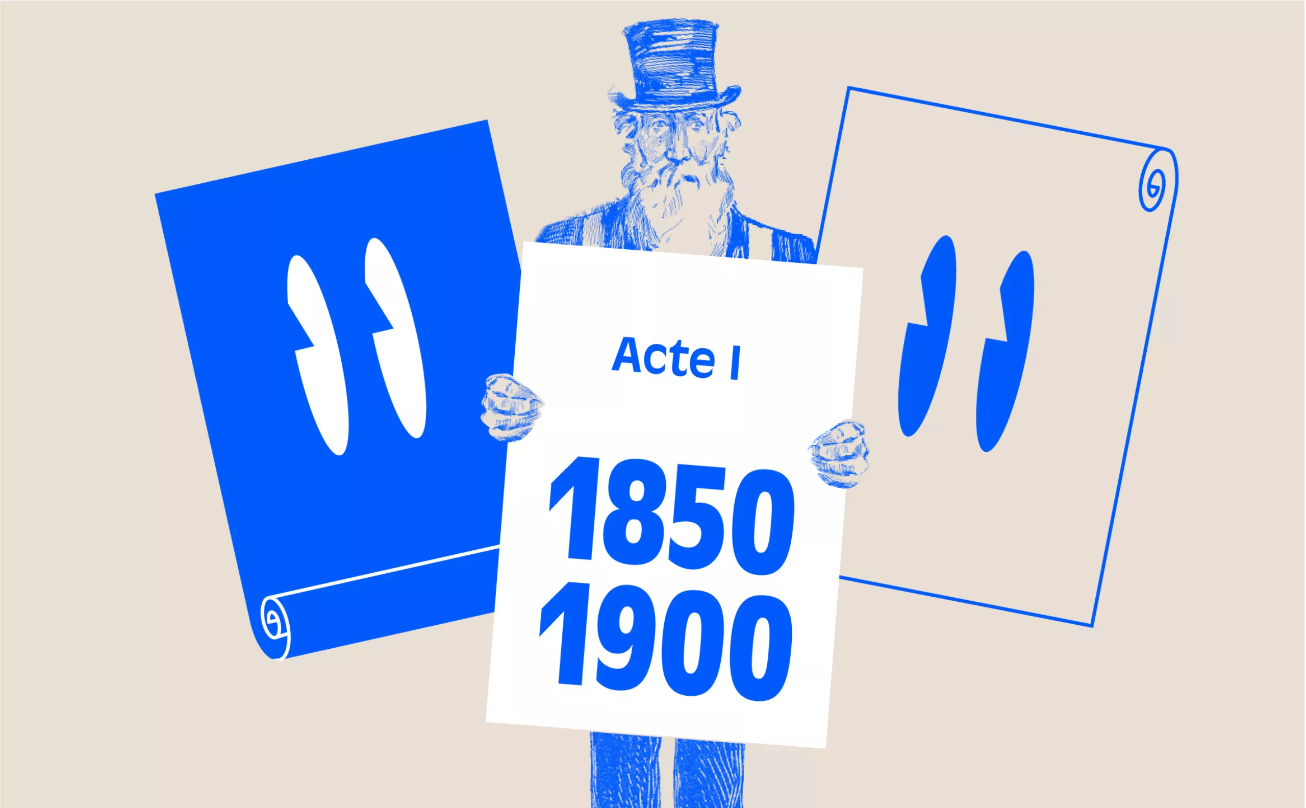
ACT I – The golden age of 19th-century theater posters
This article is the second in a VI-act series on the history of theater posters in France. It traces the origins of theater posters and their specific characteristics, mirroring our society’s evolution from text to image, via typographic creation and digital media.
Complete series
Preamble : The history of theater posters in 6 acts
ACT I – The golden age of the poster in the 19th century
ACT II – The Glorious Thirty of theater posters 1950/60
ACT III – The legacy of the Polish school and the 70/80s
ACT IV – The Posters of the Théâtre de la Colline, from Batory to the ter Bekke & Behage Studio
ACT V – The intrusion of Contemporary Art
ACT VI – The decade of social networks + the typographic reign
Advertising placard, administrative or legal notice, event announcement… the theater poster found its modern form with lithography, and took on the multiple functions we still know today.
In the 17th and 18th centuries, the poster was the theater’s sole means of communication. Placarded outside, it relayed the “orator”, charged by the troupe with announcing upcoming performances to the public, which usually consisted of two or even three plays. Theatrical posters evolved over time: typographed and decorated with decorative woodcuts in the 18th century, they became almost purely typographic in the 19th century.
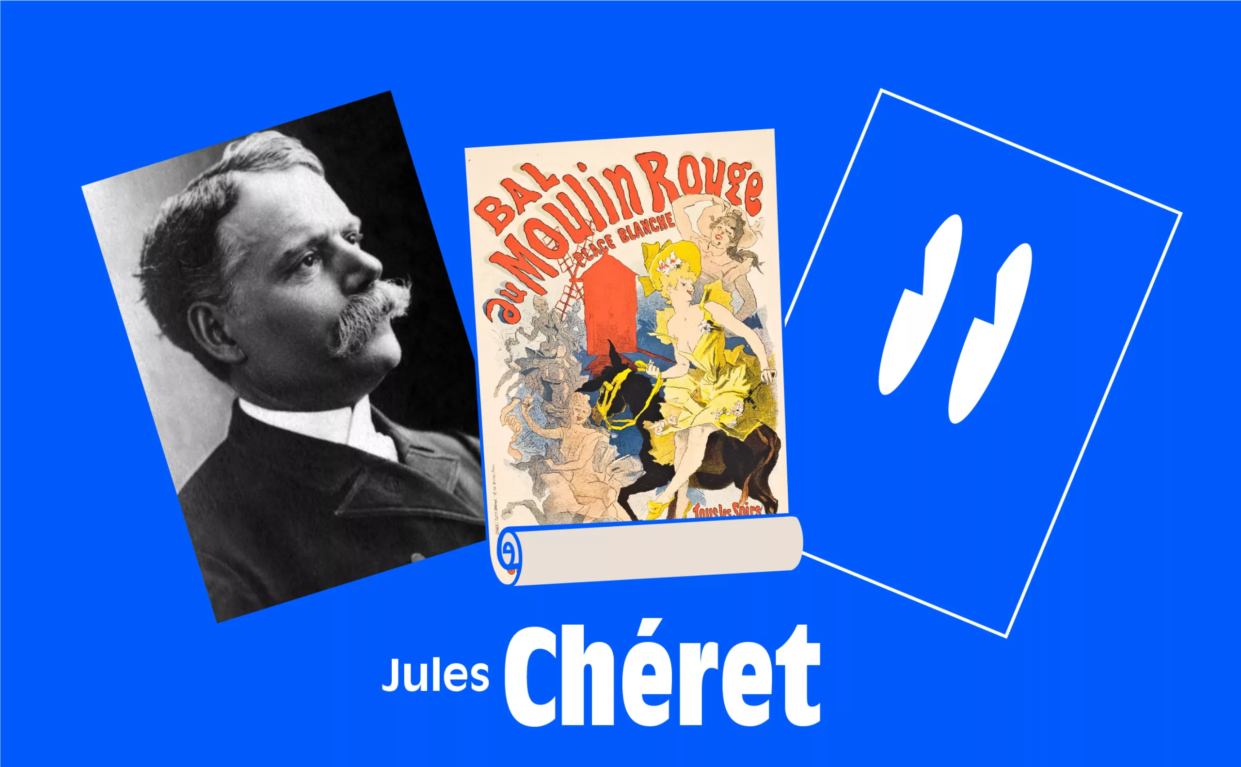
Jules Chéret enters the scene
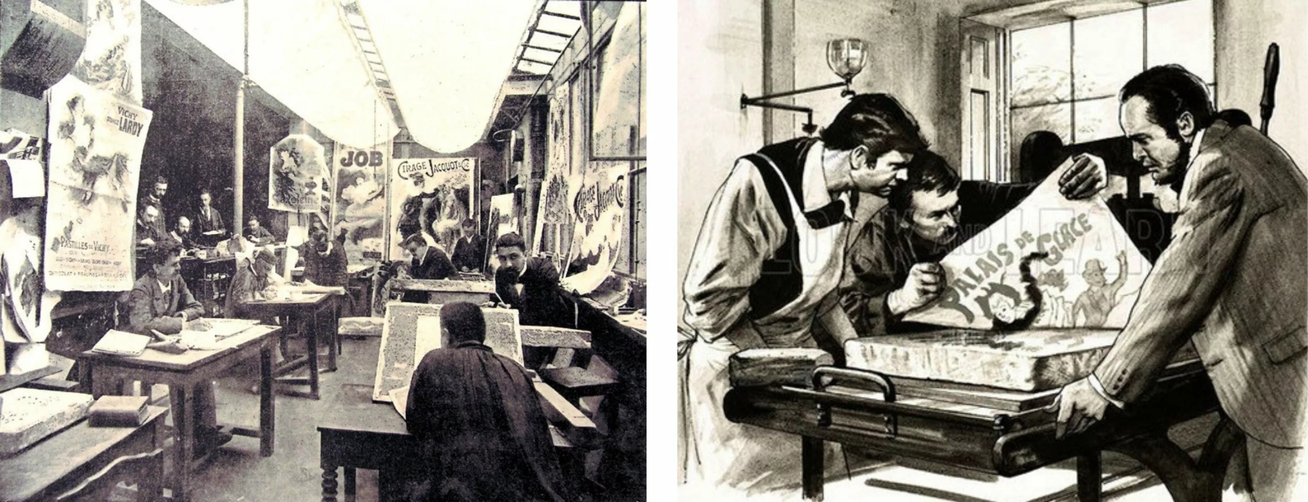
The second half of the 19th century marked the golden age of the poster. The key figure, the first real character, was undoubtedly Jules Cheret, who established himself on the national scene as the father of the modern poster that everyone was clamoring to get their hands on. Born in 1836, the son of a typographer and apprentice to a Parisian lithographer, Chéret spent several years in London studying the very latest industrial color lithography processes.
Returning to Paris in the 1860s, he developed a three- or four-color printing system, working directly on the stone. The technical constraints of lithography drove him to develop extremely efficient graphic solutions. Large solid colors, fewer colors, neutral backgrounds. The result was lower costs and larger print runs.
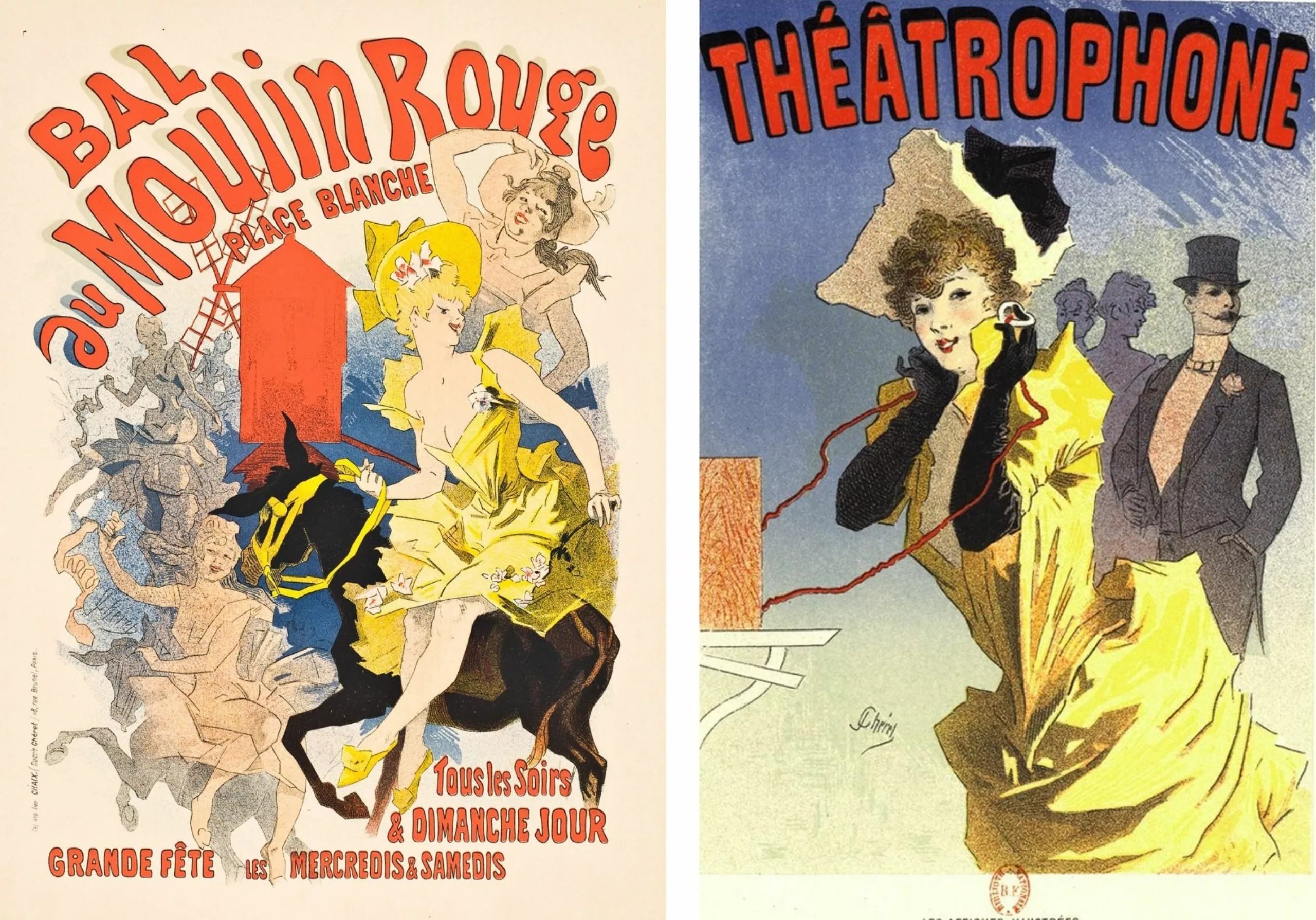
He invents everything with an easily recognizable style. At the center of the poster is the main character, often a woman – the “chérette”, cheerful, elegant and always on the move – identified by the brightest color, yellow or red. This eye-catching feminine motif is the ancestor of the American pin-up who can sell anything… a light bulb and a theater show, a bicycle or a newspaper. A single form and minimal text. No light source, no shadow, no depth on the poster. The silhouette is detached from any perspective.
Cheret developed a graphic vocabulary that, within a few years, would become the standard for poster production in Europe. His style reached maturity towards the end of the century, and was adopted by artists such as Bonnard and Toulouse-Lautrec. His studio, for he was not alone, created over 1,200 advertising and theater posters.
At a time when the literacy rate in France was low (20% in 1900), Cheret found a graphic style suited to the general public. He was one step ahead of the new commercial and advertising requirements. The “industrialization” of entertainment, and the expansion and restructuring of urban spaces, encouraged and encouraged this development. Edmond de Goncourt referred to him as “the inventor of the street gallery”.
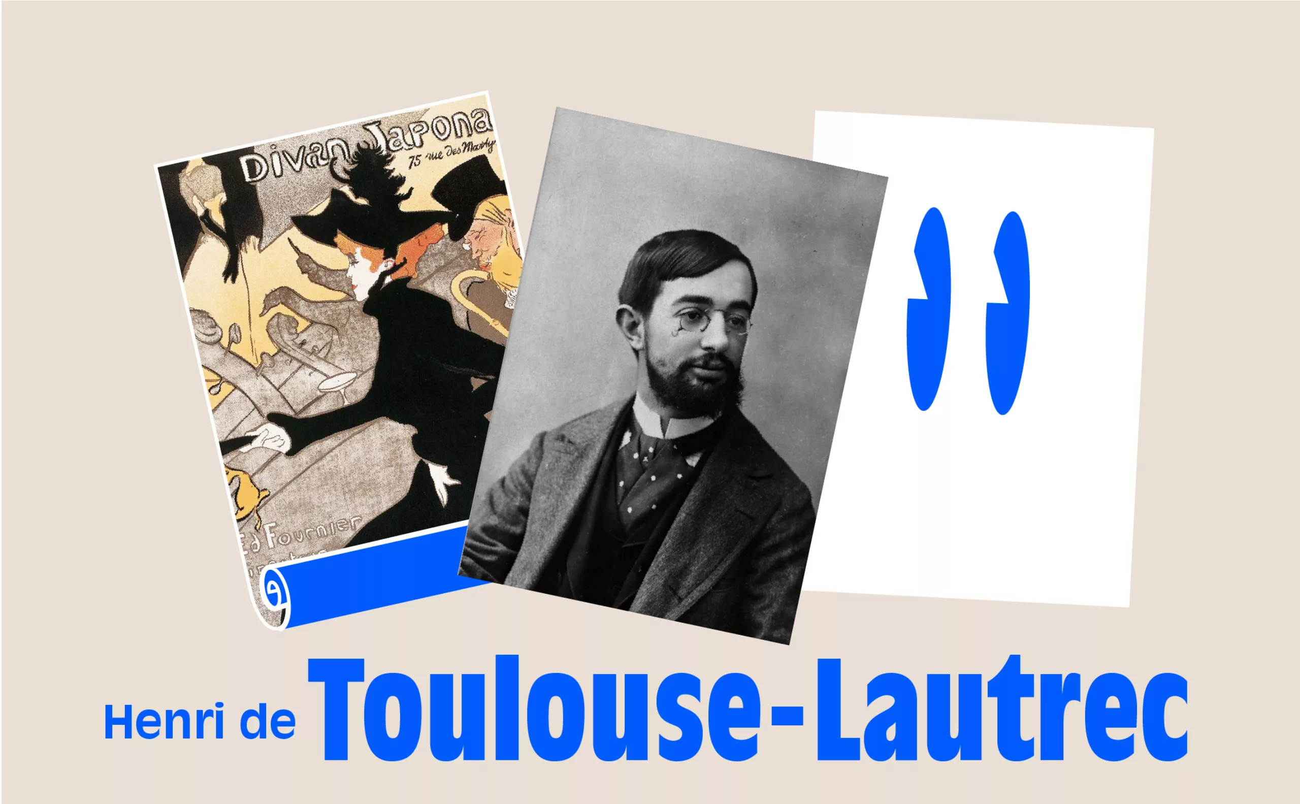
The poster as a work of art with Henri de Toulouse-Lautrec
Toulouse-Lautrec elevated the poster to a work of art in its own right. His status as a poster painter became the French archetype for many twentieth-century graphic artists. Lautrec revolutionized the poster technique, bringing freshness and inventiveness to it, and prefiguring the contemporary advertising art of a Capiello at the beginning of the twentieth century.
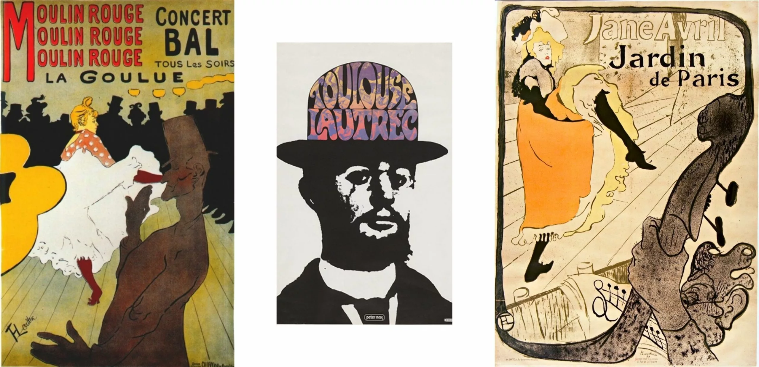
It all began with a revelation: he fell under the spell of a poster designed by Pierre Bonnard in 1891, “France-Champagne”. That same year, Zidler, the director of the famous Parisian cabaret, commissioned “Moulin-Rouge, la Goulue”, and everything became concrete. He embarked on an adventure that would last 10 years, allowing him to experiment with the lithographic medium by working on the stone himself. Between 1891 and 1900, Toulouse-Lautrec created 31 posters and nearly 325 lithographs. More than theater, it was a cabaret show. This was his consecration to a wider public than his painting. Most of Toulouse-Lautrec’s lithographs were printed in small numbers: 12 to 100 proofs.
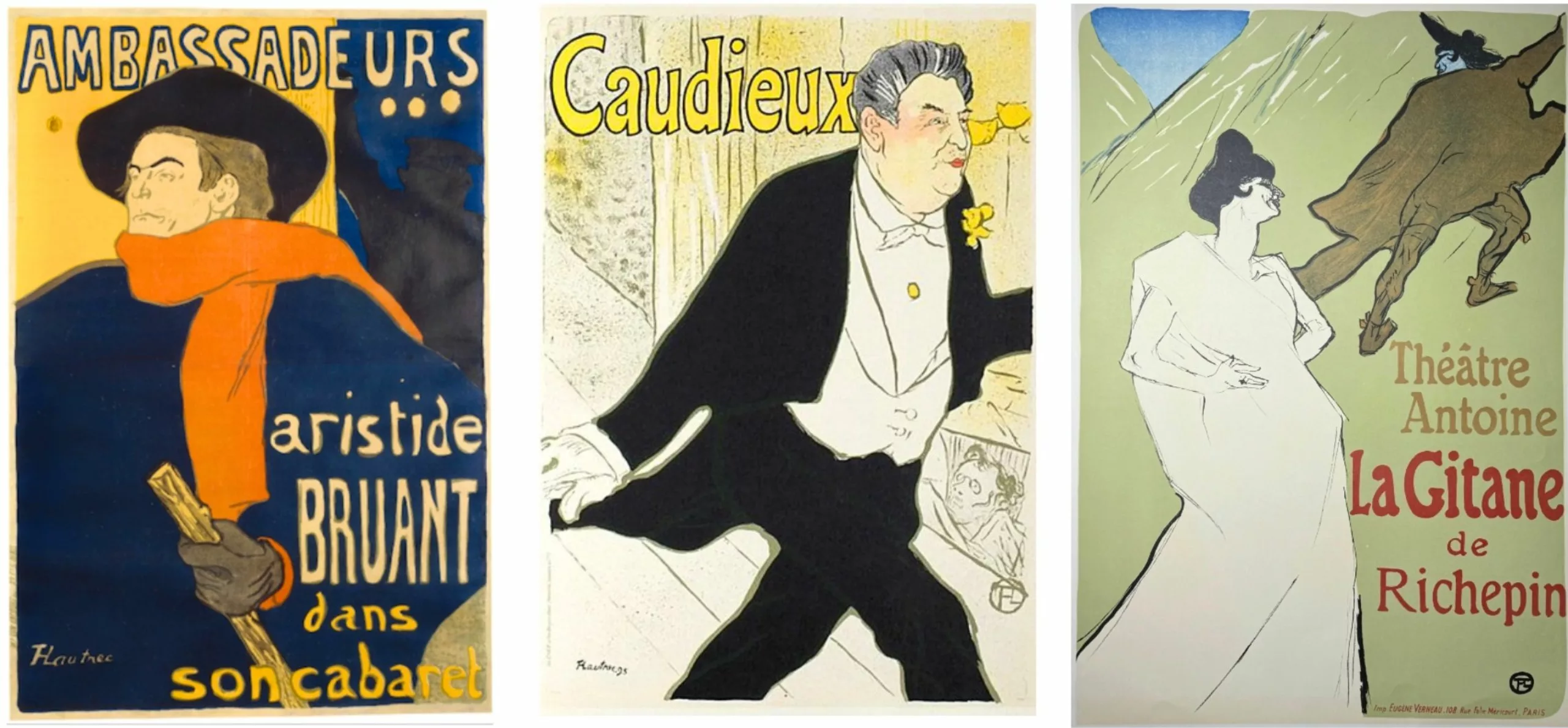
Each composition reflects a genuine concern for legibility. He adopts the principles of Japanese prints, which were very fashionable at the time. Drawing always takes precedence. Undulating lines or nervous tracings, foregrounds occupied by arbitrarily cut silhouettes surrounded by thick lines, flat, stylized figures. The quasi-photographic framing lends a closeness not found in Cheret’s posters. The chromatic treatment transforms the image into a poster, with large flat areas of pure, contrasting colors designed to catch the viewer’s eye. With Toulouse-Lautrec, there’s a real desire to conceive the poster as a communication tool. The messages are brief and effective, sometimes repeated to catch the eye.
Legend has it that Picasso and Braque, avid poster collectors, would pick up Toulouse-Lautrec’s posters from the walls of the capital after dark. The term “affichomanie” was even coined at the time!
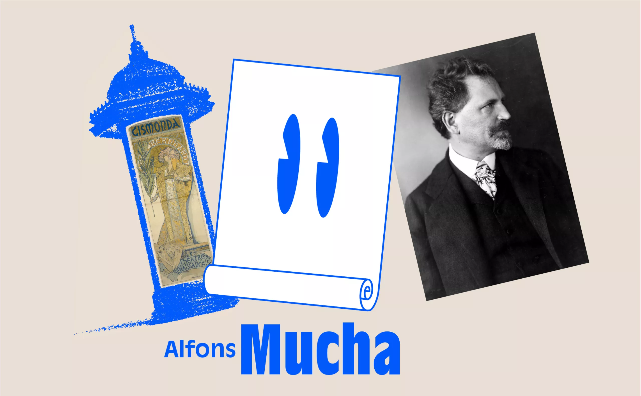
Alfons Mucha and the art nouveau of theater posters
1900, a new century dawns with Art Nouveau, plant and floral motifs, decorative arabesques and the electricity fairy illuminating the urban night. And the theatrical stage was adorned with a hitherto unknown light.
Mucha’s theater and advertising posters, the female figures introduced by Cheret are still there, but in a very different form. For Alfons Mucha, a Czech-born artist, is Art Nouveau. And for him, the turning point in his career came at the end of 1894. He was 27 when Sarah Bernhardt commissioned him to design a promotional theater poster for Gismonda, at the Théâtre de la Renaissance. At the time, Sarah Bernhardt was at the height of her fame.
With this “Gismonda”, the Mucha style was truly born before the eyes of admiring Parisians. What he came up with was incredibly original. A narrow, full-height format enabled him to depict the model’s feet almost life-size. Byzantine ornaments, pastel hues with bronze and silver highlights, a semicircle haloing the face, a sumptuous costume and letters taken from the motif. This clearly sets him apart from Cheret and Toulouse-Lautrec, who used very bright colors.
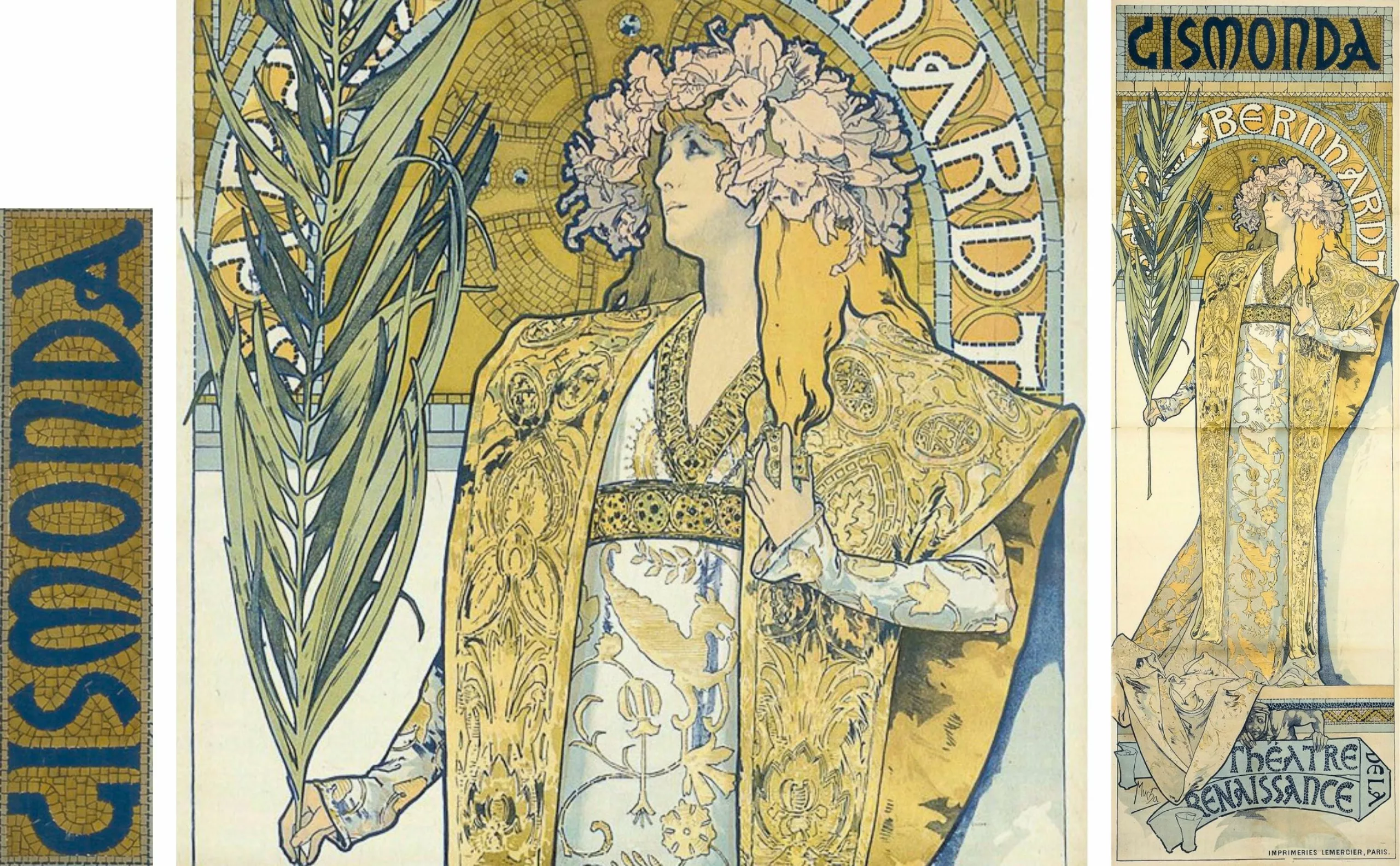
There’s a real encounter between the magnified, sublimated image Sarah Bernhardt wishes to portray of herself and Mucha’s style. It’s no longer just a play that the artist announces with his poster, but a mysterious woman with an eloquent, solemn gesture that captures the viewer’s attention. Mucha was the first to move the poster from the descriptive to the seductive. This poster was printed in 4,000 copies and covered every wall in the capital. By associating his name with that of “La Divine”, Mucha achieved true public recognition.
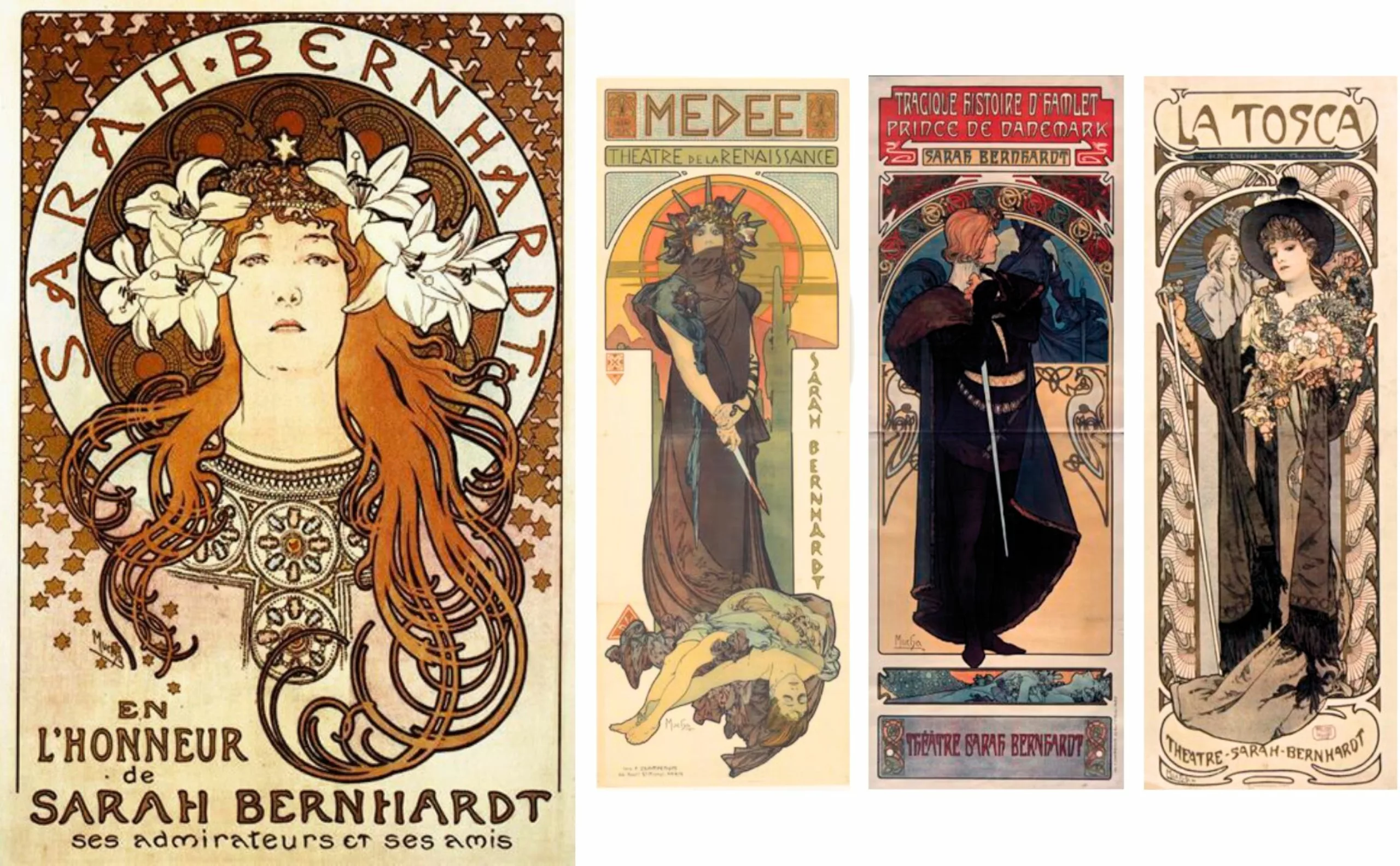
He went on to produce seven posters for plays starring the tragedienne and world superstar.
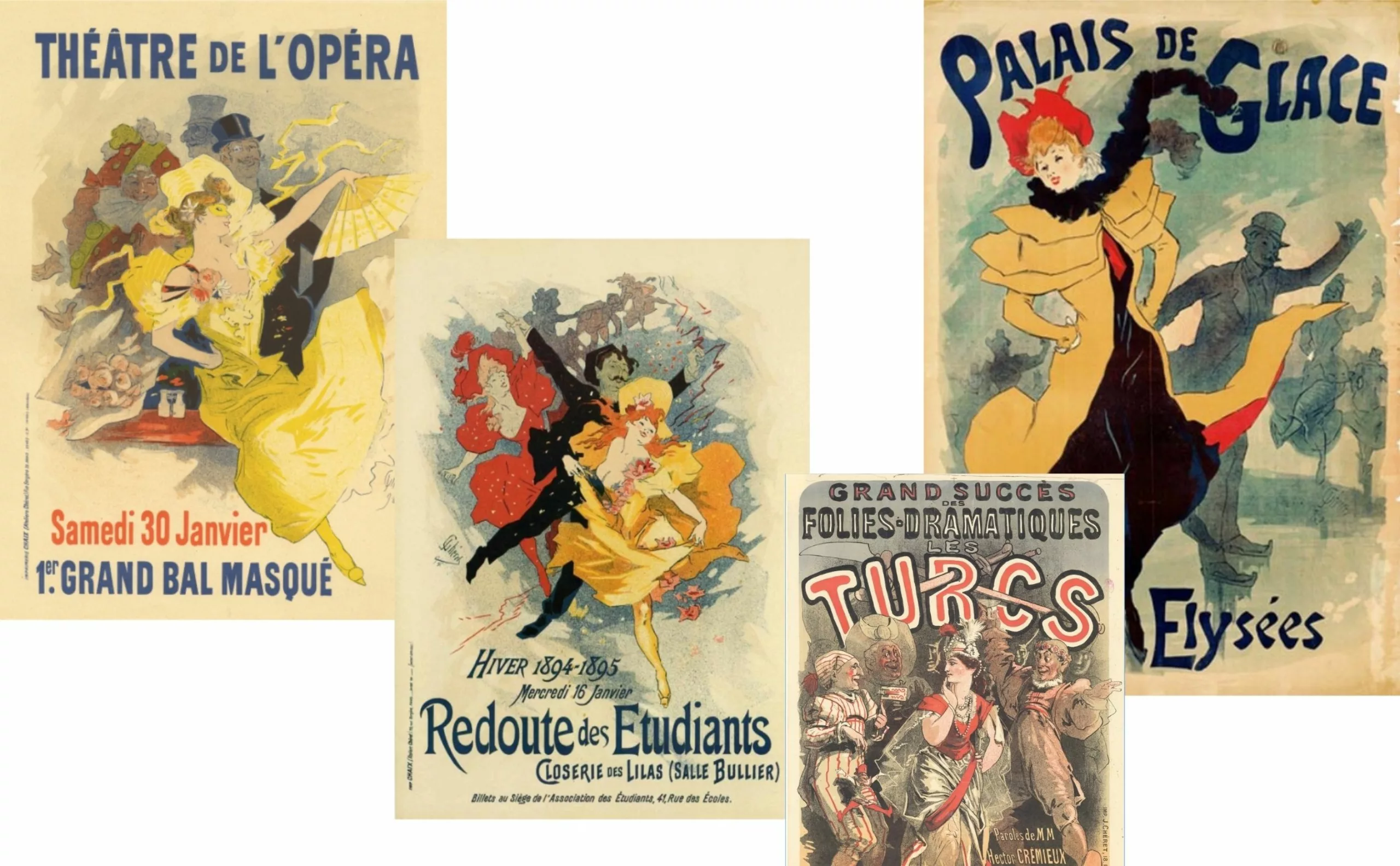
The great poster designers in Paris and Europe
At this time, theater was the favorite pastime of Parisians, and the French stage enjoyed great prestige. Between 1860 and 1913, the number of theaters increased from 34 to 121. This multiplication contributed to the rise of the poster, which became the essential means of announcing and promoting shows.
In spring 2025 (from March 18 to July 6), the Musée d’Orsay invites visitors to discover the high quality of these historic posters (230 original works on display) from the 2nd half of the 19th century, in an exhibition entitled “L’art est dans la rue” (“Art is in the street”). It’s an opportunity to measure the spectacular rise of these very large-format color posters, which transformed a Paris in the throes of social and urban change. How posters played a major role in the development of the consumer society.
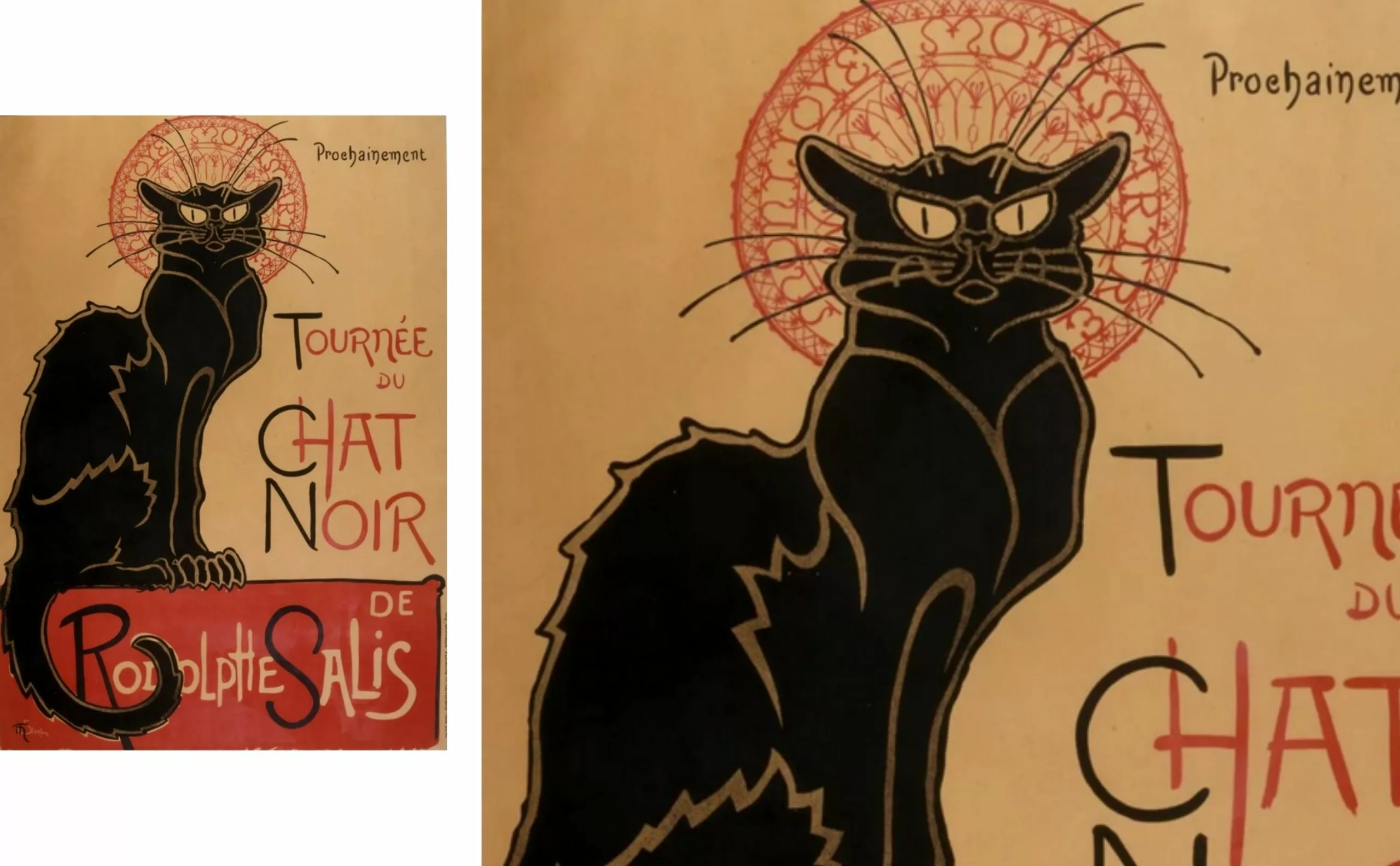
Then came Grasset, who adopted Mucha’s graphic style in part, with more personal borrowings from medieval art and Japanese woodcuts. In 1896, Steinlein’s Japanese-style “Tournée du Chat Noir” poster became a symbol of fin-de-siècle Montmartre.
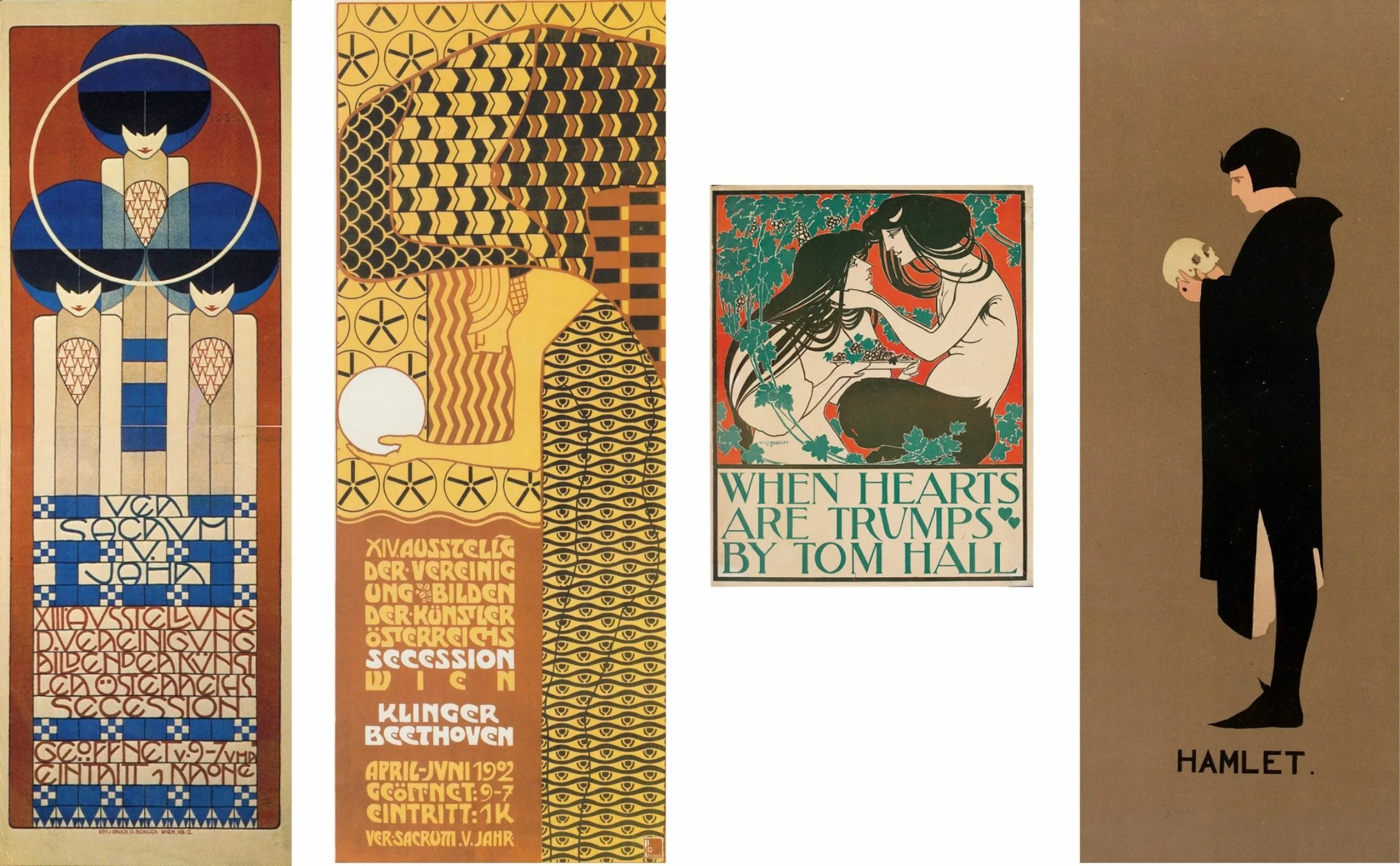
In just a few years, these poster artists, or poster painters, would give poster art a decisive and liberating boost throughout Europe and the United States. These included the Beggarstaff brothers in England, the Vienna Secession in Austria and Will Bradley in the United States. In Italy, Capiello became the undisputed master of the commercial poster.
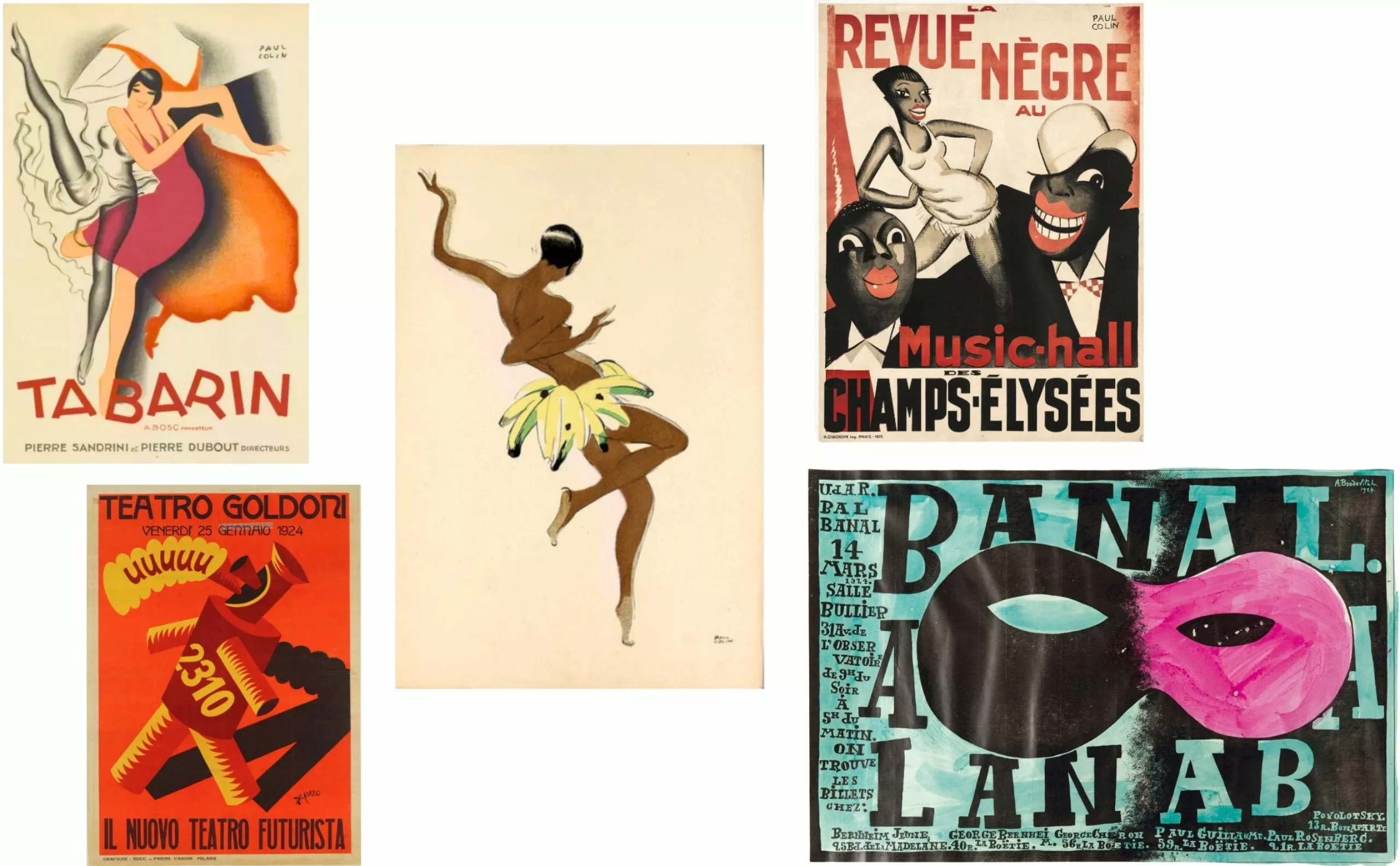
Then the interwar period, the Belle Époque, Art Deco with Cassandre and Loupot, Carlu, Colin.
After the 1st World War, a number of artists took to the stage, often for art exhibitions, but few for theater. These included Picasso, Braques, Léger, Miro and Arp.
In Act II, we’ll look at post-World War II international-style posters.