ACT II – The Glorious Thirty of theater posters 1950/60
This article is the third in a series on the history of theater posters in France. It traces the origin of theater posters and their specific characteristics, reflecting our society’s evolution from pure text to image, through typographic creation and digital media.
Complete series
Preamble : The history of theater posters in 6 acts
ACT I – The golden age of the poster in the 19th century
ACT II – The Glorious Thirty of theater posters 1950/60
ACT III – The legacy of the Polish school and the 70/80s
ACT IV – The Posters of the Théâtre de la Colline, from Batory to the ter Bekke & Behage Studio
ACT V – The intrusion of Contemporary Art
ACT VI – The decade of social networks + the typographic reign
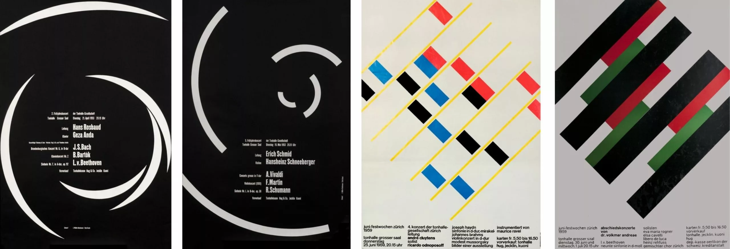
International style after the war
In the post-war decade, the International and Modernist Style, heir to the Bauhaus, took hold throughout the Western world. The need for more neutral, less plastic commercial communication justified photography and linear typography. Theatrical posters were not Helvetica‘s preferred medium.
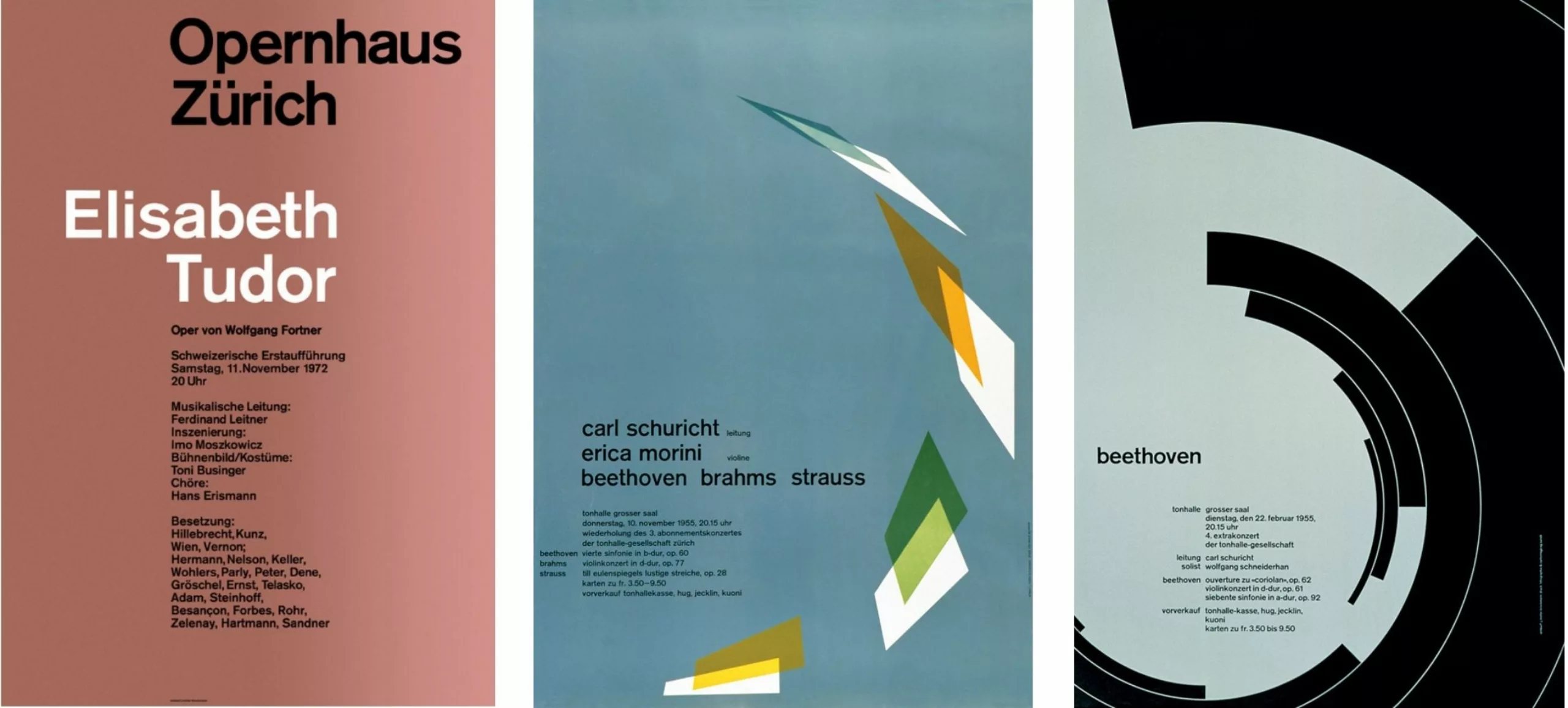
Two posters by Armin Hofmann, one of the leading figures of the so-called Basel School, stand out. The first, for the Stadttheater Basel, was awarded the Prix de l’Affiche Suisse in 1960. A black-and-white poster, in the image of Hofmann’s rigor. A very present, graphic typography overhangs an unstably balanced figure.
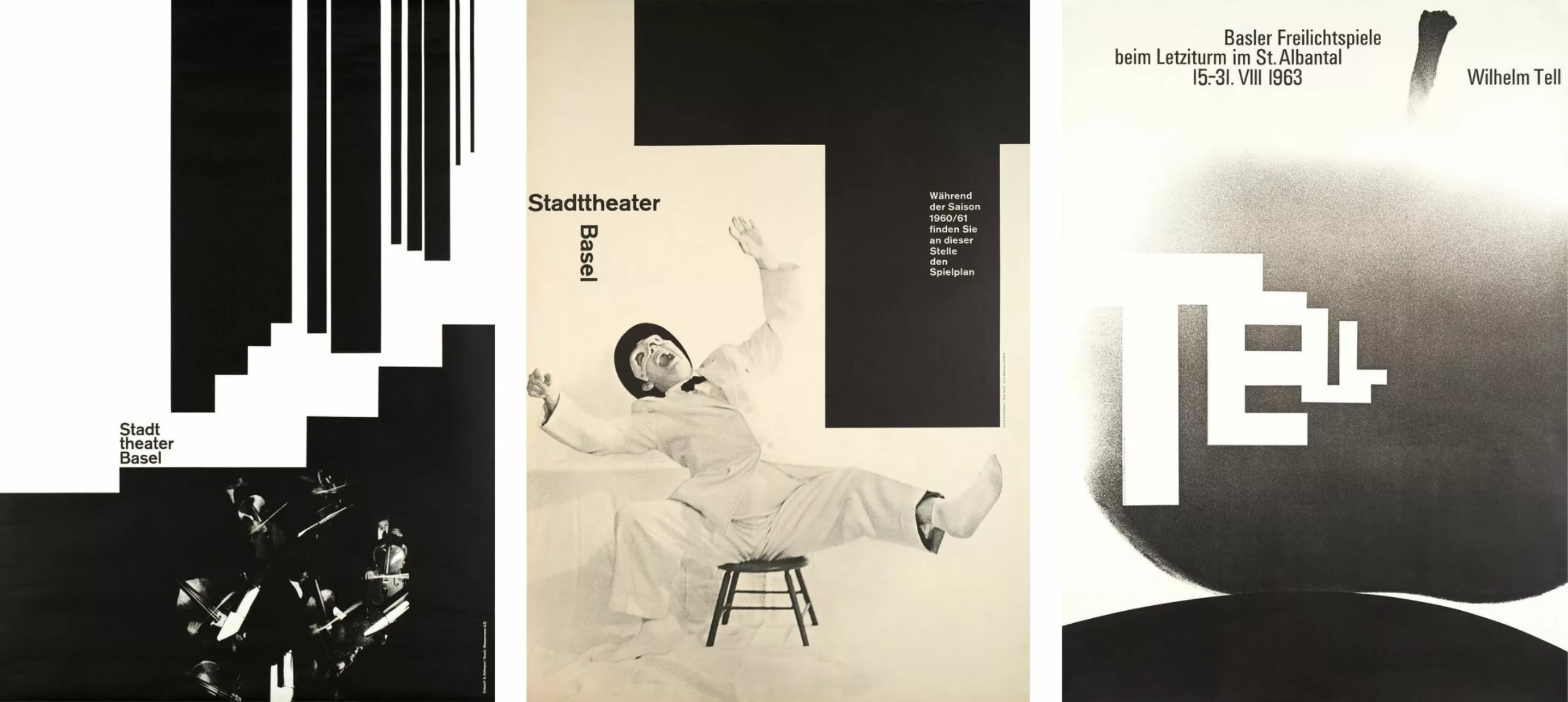
The second, TELL, also in black and white and featured in all the anthologies, dates from 1963. A minimalist, typographic transcription of the legend of William Tell. The 4 letters of the word TELL, by their reduction, suggest the perspective up to the almost abstract apple, identifiable by its tail.
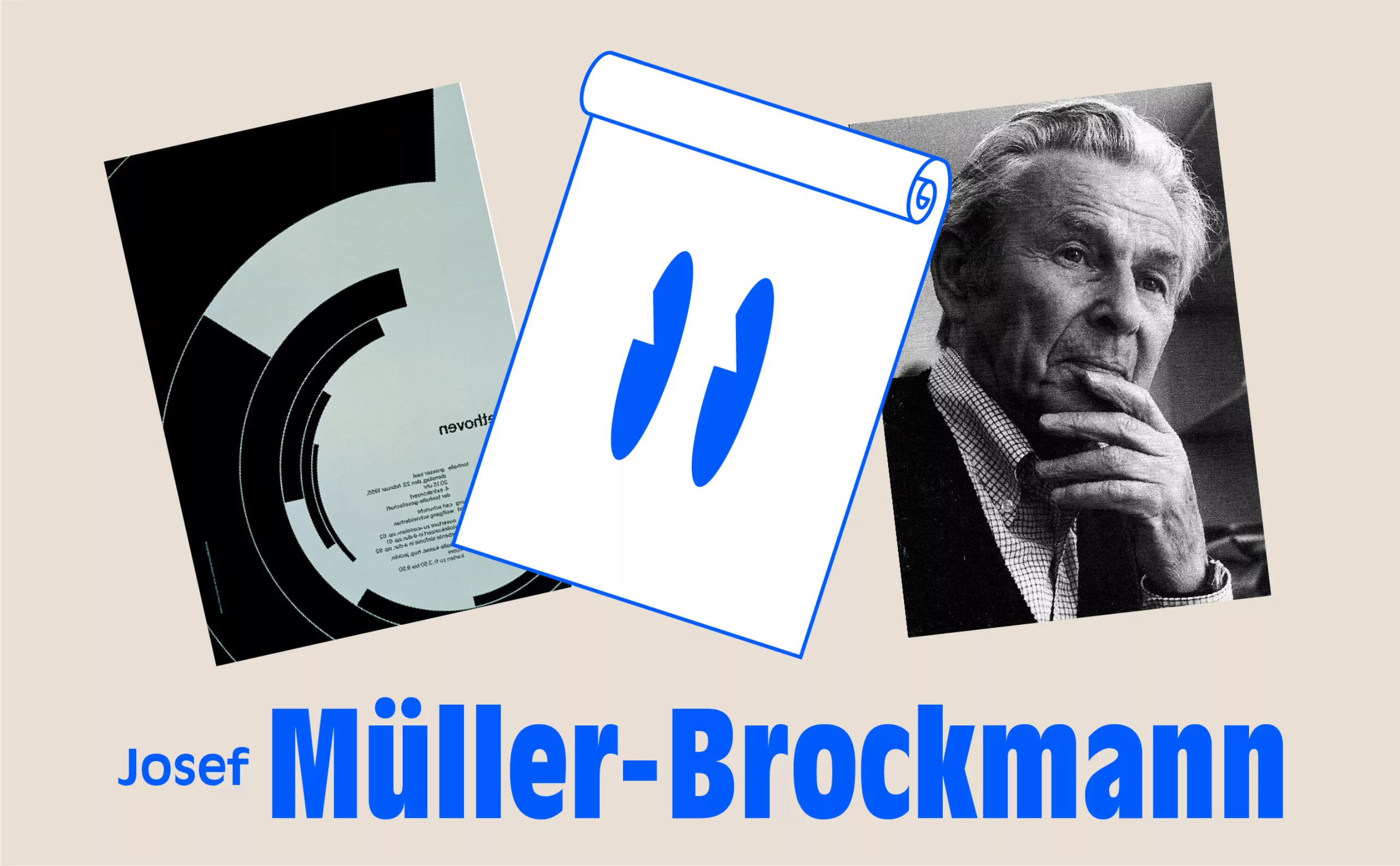
Another key figure, Josef Müller-Brockmann, created a series of theater posters for the Opernhaus Zürich that anticipated by half a century the contemporary approach of certain public theaters in Paris (one thinks of the work of ter Beckke & Behage for La Colline and the Odéon).
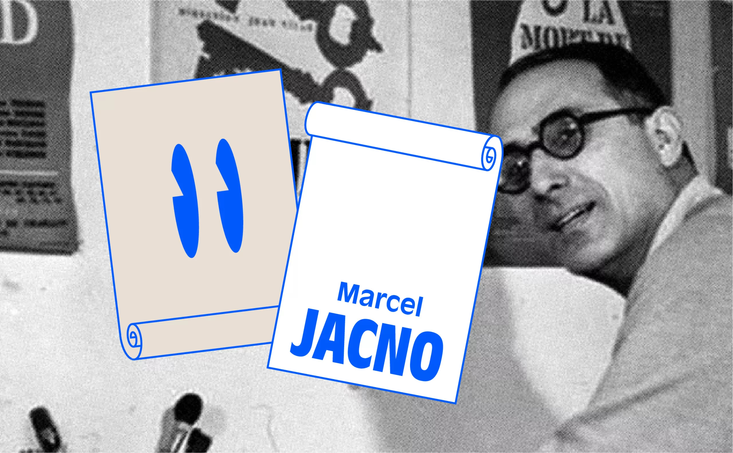
Marcel Jacno and the National Popular Theater
In France, three letters, TNP, would profoundly shape the theater landscape during the Trente Glorieuses. In 1950, Marcel Jacno (see our article on the magazine) met Jean Vilar, the director of the TNP, the National Popular Theater, who was also the founder of the Avignon Festival. A relationship of mutual trust and understanding quickly developed, leading to a 20-year collaboration.
From 1951 to 1972, Jacno would create no fewer than a hundred posters for the man of the theater. “Our understanding was perfect,” Jacno recounts in his memoir *Un bel avenir*. “The choice of poster projects was decided face to face. Without outside interference, without a referendum. \[…] I laid my drawings on the floor, on the parquet. Vilar, standing beside me in his dressing gown, would examine them, form his opinion. ‘It has to bleed!’ he would say.”
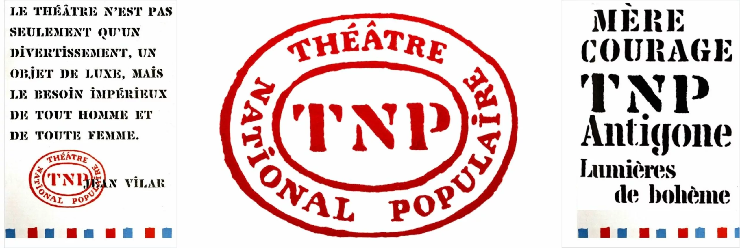
In 1950, the generic poster of the TNP set the tone.
A sober, typographic poster, using the limited colors of the national flag, blue, white, and red, for the Théâtre National Populaire. And what would become one of the first visual identity systems in France was quickly put into place. A graphic charter that could be adapted across all media. With particular attention paid to typography, as Jacno created, for the occasion, the “Chaillot,” a stencil typeface inspired by the stamps printed on the wooden crates used by touring theater troupes. For the TNP, he aimed to find a graphic script based on a concept that was dear to him: “The homogeneity of forms is much more important than the purity of the letter outlines.”
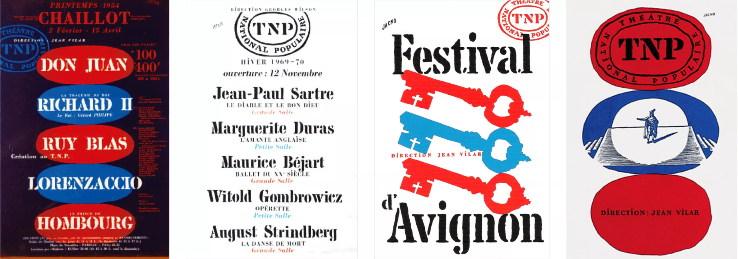
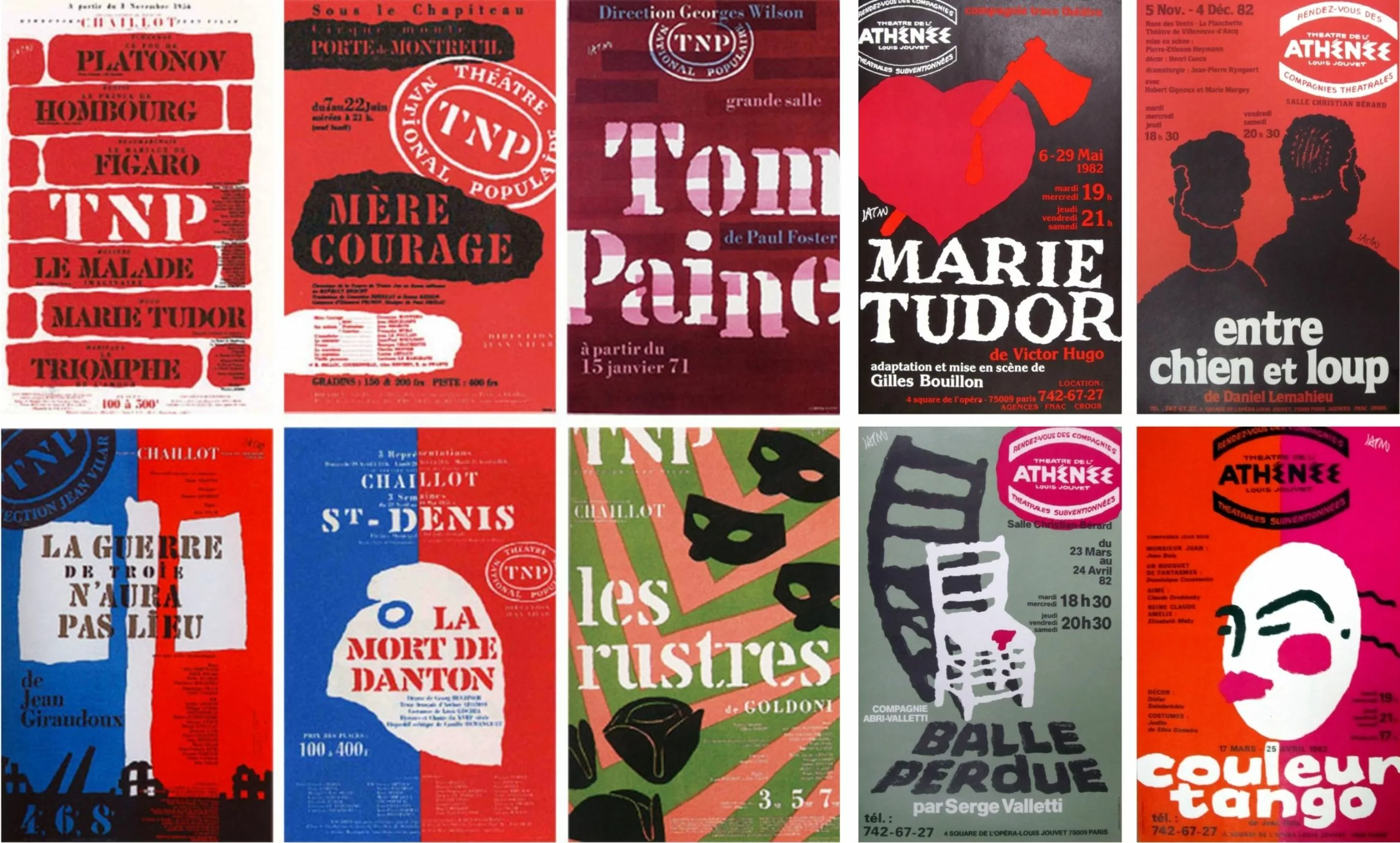
The visual identity of the TNP would be developed using the Chaillot typeface within an irregular oval—an emblem Jacno used as a marker across the poster variations. “With this alphabet of unexpected shapes, I wanted the titles to take center stage and become images within the printed matter.” The Deberny and Peignot foundry began publishing the Chaillot typeface in 1953.
“As with all effective graphic design,” he argued, “there are, in the posters of a theatrical enterprise, two elements that, when consistently repeated, must be easily perceived by the eye and grasped by the mind. First, the color; then, the typography of the main titles, which, while remaining highly legible, must also be strikingly distinctive. In blue, white, and red, the posters of the TNP and the Avignon Festival bore, along with that torch, the hallmark of a culture belonging to the people, in the ‘French Revolution style.’”
And here again, a foreshadowing of what would become today’s trend: the “theater as enterprise,” as Jacno put it, taking precedence over the performance in the name of brand recognition.
The close collaboration between Jacno and Vilar, through the creation of TNP posters, secured the designer’s essential place in the field. All of France’s major theaters entrusted him with their posters, programs, and visual identities. In 1970, the Comédie-Française called on him for its communication. For 30 years, up until 1980, Jacno was omnipresent, producing posters that presented a vision of theater that was open and popular.
In Act III, we will explore the influence of the Polish school on French theater posters.
On the subject
-

The hidden secret of CHANCE by CHANEL is Goude
Advertising sometimes offers us UFOs that seem to escape simple marketing specifications to project us towards an unexpected elsewhere. Here’s an analysis of the symbolic mystery of Chanel’s latest Chance perfume ad, directed by Jean-Paul Goude in 2016.