ACT IV – The Posters of the Théâtre de la Colline, from Batory to the ter Bekke & Behage Studio
This article is the third in a series on the history of theater posters in France. It traces the origin of theater posters and their specific characteristics, reflecting our society’s evolution from pure text to image, through typographic creation and digital media.
Complete series
Preamble : The history of theater posters in 6 acts
ACT I – The golden age of the poster in the 19th century
ACT II – The Glorious Thirty of theater posters 1950/60
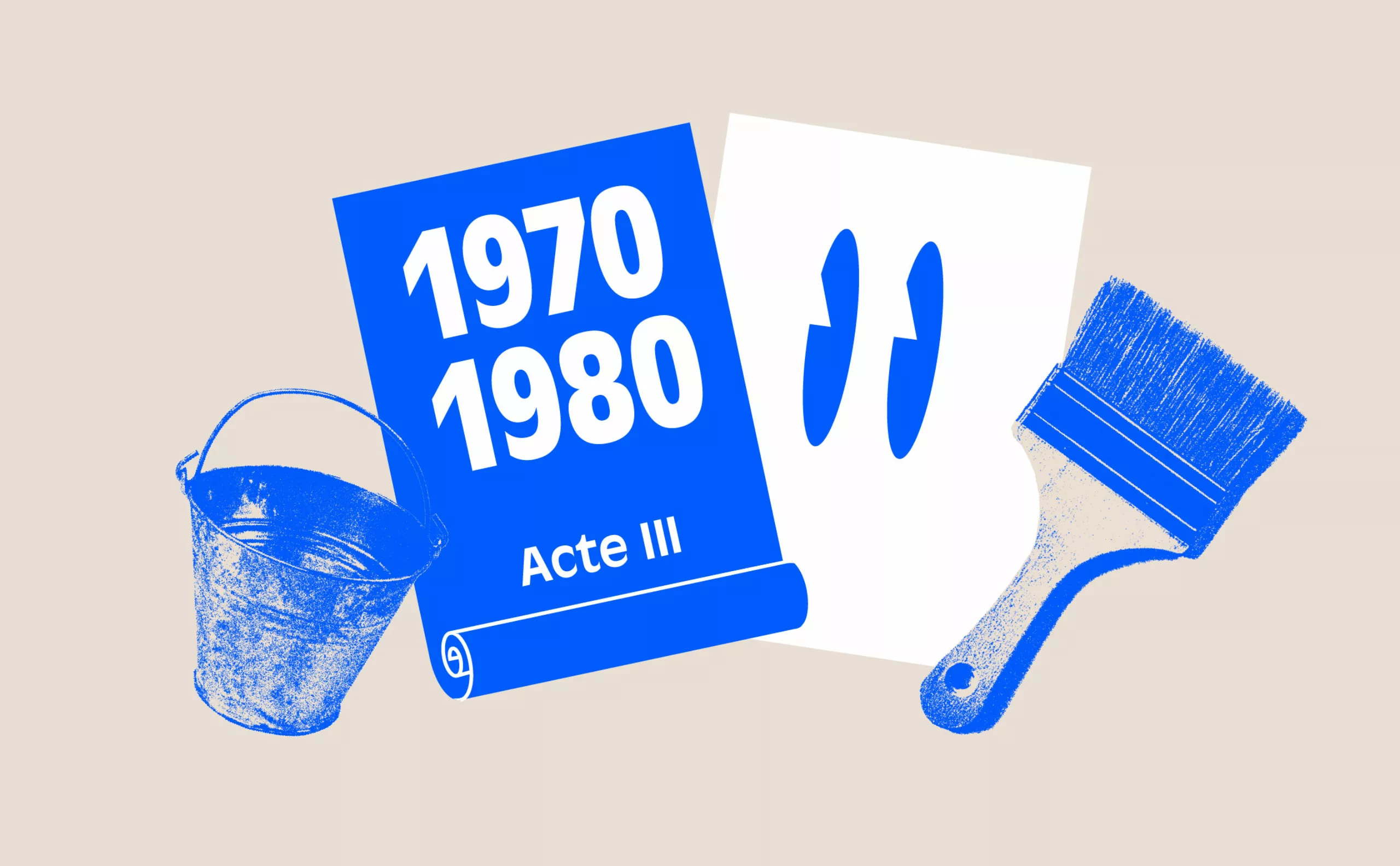
ACT III – The legacy of the Polish school and the 70/80s
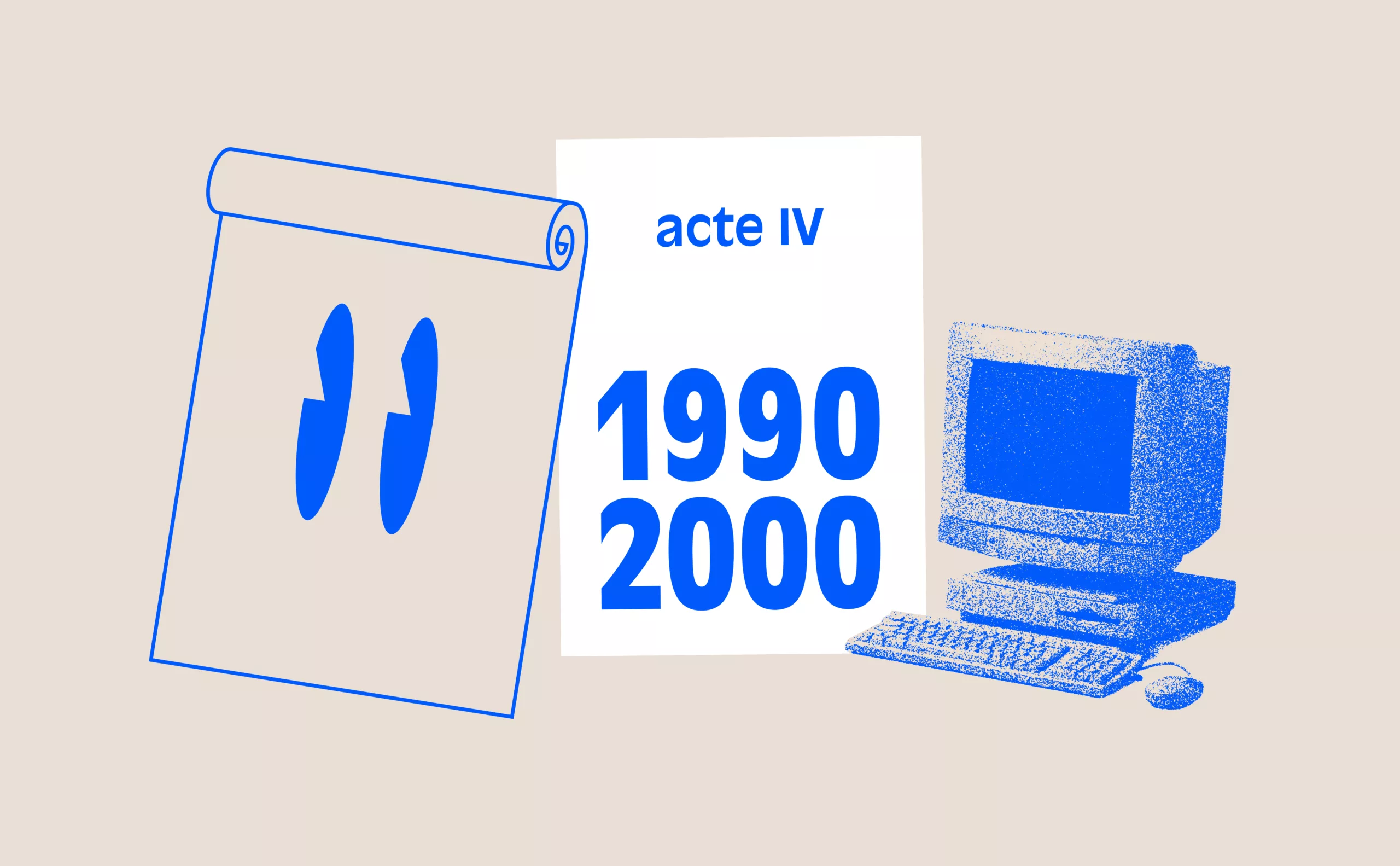
ACT IV – The Posters of the Théâtre de la Colline, from Batory to the ter Bekke & Behage Studio
ACT V – The intrusion of Contemporary Art
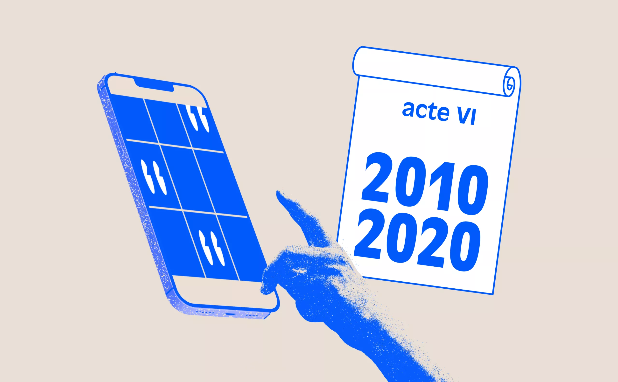
ACT VI – The decade of social networks + the typographic reign
Until the mid-1990s, theater posters in France largely remained faithful to what had been created in Poland half a century earlier. With few exceptions, the focus was on the quality and creativity of a graphic designer to translate the theme of a play into an image. In the meantime, the digital revolution was profoundly transforming the fields of graphic design and communication.

Michal Batory, the Master of Metaphorical Theater Posters
In 1994, Parisians discovered a graphic explosion on the city’s walls and in the metro. Jorge Lavelli, director of the Théâtre de la Colline, entrusted the visual communication for the new season to Michal Batory, a young Polish graphic designer who had been living in Paris since 1987 and who would leave a strong mark with his talent on the image of this new theatrical creation venue inaugurated in 1988.

Trained at the National School of Fine Arts in Łódź, Michal Batory’s graphic style is directly derived from the Polish School. His poster-making practice has been enriched by the arrival of digital technology. “Poland invented the poster of the 20th century. Artists of the 1960s and 1970s used a lot of painting. I preferred photography, but the idea remains the same : metaphor, coding, decoding.” With metaphorical imagery and an allegorical shorthand of the text, his style is immediately recognizable and impressively effective.
“To find the idea for a poster, I first need to gather as much information as possible about the subject I’m working on,” explains Michal Batory. “I read, I meet with directors, choreographers. After this research work, I make ten to fifteen sketches, which allows me to eliminate bad ideas. In the sketch, you can imagine everything. After choosing one or two good directions, a new question arises: how to realize the chosen idea? Is it painting, photography, or both?”


For three years (1994–1996), Michal Batory created numerous theater posters mixing photography, drawing, and typography. Initially collaborating with photographer Myr Muratet, he soon decided to work alone on his upcoming projects to avoid any artistic conflicts.
His posters were simple, accessible, and almost instantly legible, following the construction theorized by Jean-Luc Godard regarding editing: 1 + 1 = 3. One image combined with a second creates a third. This results in a moment of cognitive dissonance for the viewer. Set against a neutral background, the goal was to impose a strong, decontextualized motif. These visual bricolages led Michal Batory to describe himself as a “graphic artisan.” “In every image, there is a metaphor. Every image has meaning. It is when there is substance that an image can become just a little more eternal than a purely formal image.”
At the same time, Batory worked for IRCAM and the Cité des Sciences et de l’Industrie de la Villette. Some considered that during this prolific period, the graphic style—very strong and distinctive—of the talented designer “vampirized” his clients to the point that it was sometimes hard to know who the real commissioner was.

Another point of contention was that some posters created for the Colline became the site of fierce debates between the director, actors, graphic designer, and institution.
Jorge Lavelli’s tenure ended in 1996, which, for Michal Batory, marked the end of his collaboration with the Colline. And this brought to light the whole question of the role of image in theater posters.
The New Codes of the Théâtre de la Colline: The Image-Free Poster
November 1996. Alain Françon is appointed director of the Théâtre de la Colline. His aim is to radically change the theater’s public image. He wishes to break with Michal Batory’s Polish tradition of metaphorical visuals. A consultation is organized, resulting in the selection of seven graphic designers. Each participant receives a very precise brief, including Malte Martin, Pierre Bernard, Atalante, Gérard Ségard, Corinne Tassel, Bernard Baissait, and Claude Jaubert.
Excerpt from the brief for the new communication of the Théâtre de la Colline, 1996.
“The new team at the Théâtre lives its projects, both aesthetically and in its approach to communication, in a spirit of total rupture. \[…] The new director of the Théâtre de la Colline feels saturated with images and does not want the theater’s communication to follow the same logic as that of many theaters that rely on visuals based on the use of color. Alain Françon proposes a theater different from Jorge Lavelli’s, open to a political and aesthetic understanding of the texts and the relationships they maintain among themselves. \[…] Why should the search for meaning be sad, painful, or distressing? It can be tender, funny, jubilant. The development of the graphic charter and the creation of materials should be inspired by a general idea of softness.” So be it…
And always, as with all theaters, the desire to retain subscribers while seeking to attract a new audience in eastern Paris. Everyone clearly perceives this as a turning point in the theater’s communication. A “total rupture.”
The question of differing perspectives, which is common in theater, comes back into focus: the viewpoint of the author who wrote the text, that of the director, and that of the graphic designer who creates the poster. This is the question posed by philosopher Jean-François Lyotard regarding Michel Bouvet’s posters : “Is it really necessary for a poster artist to have their own style? Should the way of announcing an event, of notifying the public, be unique to the announcer to the point that it is recognized above all others as a signature ? Or should the poster rather allow itself to be appropriated by the event it announces so that the event itself rather than the poster or its creator reaches the public?” From the book Carnet d’affiches Carnets de voyages, Michel Bouvet, Éditions De visu l’image, Paris, 1995.

What becomes apparent with the appointment and intention of Alain Françon is the emergence of a fourth perspective—the theater and institution itself, which wishes to take a greater role. Ultimately, Alain Françon chose the agency Atalante and Xavier Barral. Atalante’s first poster announced *Les petites heures* in September 1997, marking the opening of the season.

For Xavier Barral, Atalante’s working principle revolves around the idea of seeing what a word evokes and adding an echo to it—using wordplay, letter play, and variations in weight.

It is the “color of words” that creates an atmosphere. “Alain Françon was surprised that we took him literally. I think he found it amusing,” Xavier Barral would later say. “The posters we created are a bit like traces with fragments of sentences.”

At the end of this change in leadership and communication, a survey was conducted among the subscribers of the Colline. Contrary to all expectations, about one in two people said they had noticed nothing at all about the new graphic style—saying a lot about how graphic design is received by the general public. In 2002, continuing from Atalante’s work, the communication of the Théâtre de la Colline was entrusted to IDSLAND, adopting a clear choice of text over an abstract background of raw materials. This initial phase of Alain Françon’s tenure was only a trial run that would be confirmed a decade later with the appointment of Stéphane Braunschweig at the Colline.

The Typographic Poster by ter Bekke & Behage
October 2008. Stéphane Braunschweig, the new director, and Didier Juillard launched a limited call for tenders to renew the visual identity of the Colline. Four studios were consulted: Philippe Apeloig, Malte Martin, Philippe Bretelle, and Atalante.
The brief was simple and precise. It was preceded by individual interviews with the graphic designers, who were asked to work on the following elements :
– New logo and its application on the season brochure, season poster, show poster, two inside pages of the brochure, an advertising block, and a cover for the playbill.
The brief reinforces what was still implicit in Alain Françon’s request ten years earlier: a logic of identity prioritizing legibility and immediate recognition. “We are dealing with language and writing: the absence of images means playing more with typography, shapes, colors, and papers.” The message is clear, there must be continuous simplification, with no distinctive sign repeated on every poster.
The logo created in 1988 by Jean Widemer at the theater’s opening also needed to be reworked. “The goal was to give new momentum to the logo. To work on the word ‘Colline’ with the idea of a more immediate sense of closeness (people now say ‘I’m going to La Colline’). And a name change therefore means a new logo for the Théâtre de la Colline.”
However, after the first unsatisfying drafts, disappointment led the theater to question its request. Doubt set in, and the Colline team then decided to contact the studio of Evelyn ter Bekke & Dirk Behage (who had created the communication for the Maison Européenne de la Photographie). Within three weeks, the two Dutch graphic designers sketched a project that was approved by the management. It was their first communication project for a theater, and it was a success praised by all the professionals in the field.

Their proposal for the new posters of the Théâtre de la Colline, simple and dynamic, is built around a 1920s typography found in a German catalog. A modular typeface—square, quarter circle, and rectangle. This construction play gives typography a place of prominence.
But perhaps it is with their typographic visual identity proposal that they give form to the change that has been taking place in the world of theater for several years.

La Colline, as an identity, is placed at the center of the poster, at the center of the program. The signature clearly states that this point of view is important, indeed the primary one. Of course, the theater is the place, the institution, but by associating the venue with the title of the play, the theater truly becomes this fourth actor with whom one must now reckon.
Their typographic creation is paired with Courier Sans for the body text. Once again, this marks a distance, with a sobriety that leans toward neutrality. The chromatic choice for the first season reflects the change: a signature in red, the year in yellow, with variations for the titles of the plays. All of this is printed in spot colors on the white of offset paper.
Of course, in the metro corridors, it stands out and gets noticed. The contrast with other cultural or commercial posters is at its maximum. But the recurring question throughout the different seasons is: who are we speaking to? To the knowledgeable, elitist audience that is already subscribed, or to the public that never comes to the theater? Or to the small, exclusive world of graphic design?
What bursts forth forcefully into the open, and will become widespread, is the omnipresence of typography, which will become the graphic hallmark of the cultural world at the expense of the image.
In Act V, we will see how contemporary art has made its place on French theater posters.
On the subject
-

Jacno, “Five capital letters!”
Marcel Jacno (1904- 1989), known as Jacno, is a french graphic designer, famous notably for having designed the NPT logo, as well as the Gauloises cigarette pack.