Act V – The Intrusion of Contemporary Art
This article is the third in a series on the history of theater posters in France. It traces the origin of theater posters and their specific characteristics, reflecting our society’s evolution from pure text to image, through typographic creation and digital media.
Complete series
Preamble : The history of theater posters in 6 acts
ACT I – The golden age of the poster in the 19th century
ACT II – The Glorious Thirty of theater posters 1950/60
ACT III – The legacy of the Polish school and the 70/80s
ACT IV – The Posters of the Théâtre de la Colline, from Batory to the ter Bekke & Behage Studio
ACT V – The intrusion of Contemporary Art
ACT VI – The decade of social networks + the typographic reign
Two years after Michal Batory’s “coup de force” at the Théâtre de la Colline, a new graphic explosion throws audiences in Brittany into endless questioning. Contemporary art makes a dramatic entrance into the world of theater posters.
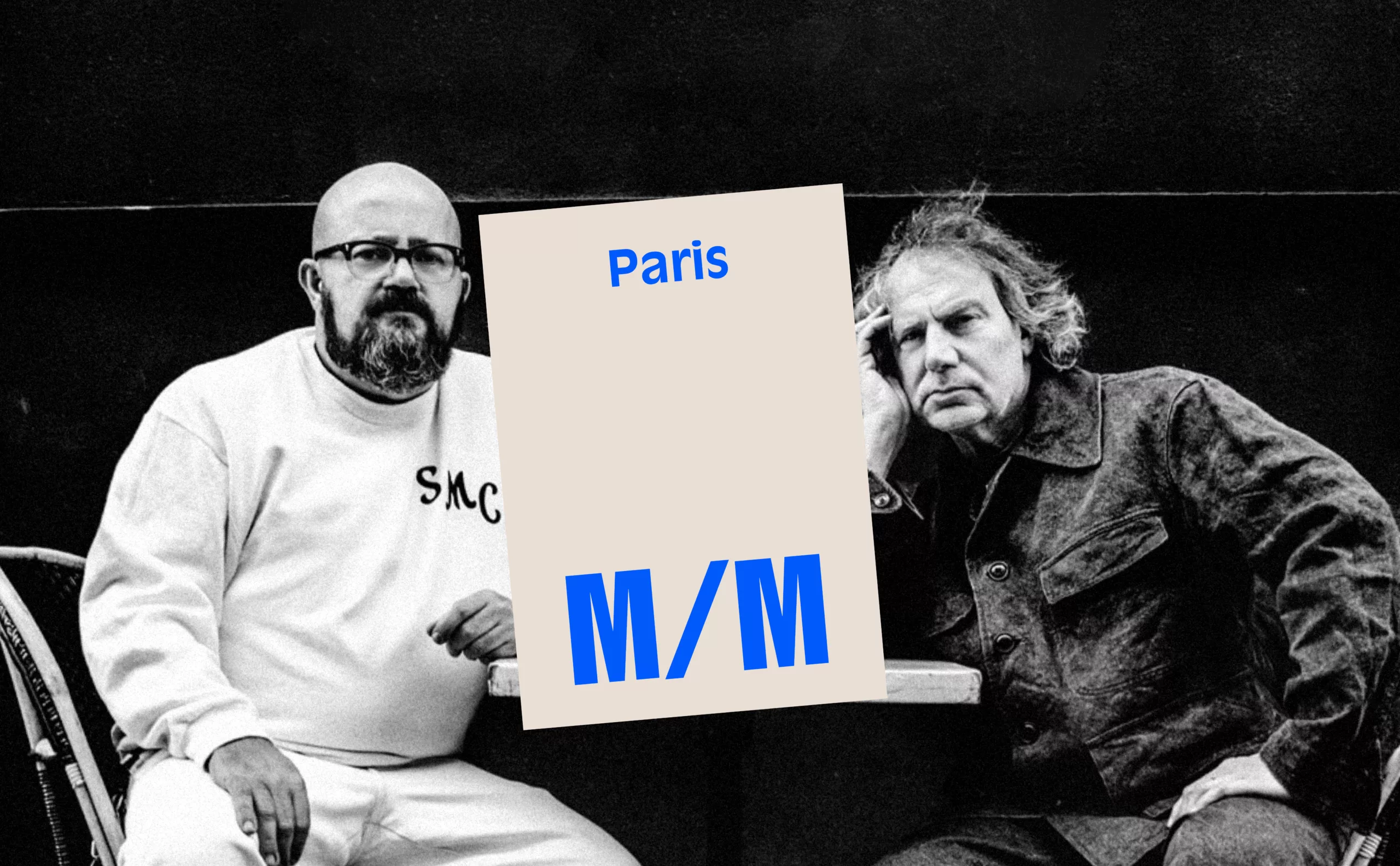
M/M (Paris), Poster Design for the Théâtre de Lorient
In 1996, author and director Éric Vigner, newly appointed head of the CCDB–Théâtre de Lorient, entrusted the theater’s communication to the duo M/M (Paris). This marked the beginning of a 20-year collaboration and the establishment of what would become a true laboratory of graphic experimentation.
Michaël Amzalag and Mathias Augustyniak, the two M’s of M/M, met in 1989 at the École Nationale Supérieure des Arts Décoratifs in Paris—a time when teaching at ENSAD was defined by a sharp divide between two major graphic design currents. On one side was the Grapus movement, which promoted a politically engaged “public service graphic design.” On the other, the International Style, a Swiss-born functionalism stemming from the Bauhaus tradition, embodied in France by Jean Widmer. While these graphic factions debated over how to break from the past, the two future founders of M/M (Paris) looked elsewhere, “beyond the traditional boundaries of graphic design”. They turned their attention to fashion, music, contemporary art, and critical theory, all fields then still considered marginal in design schools, but which would soon gain cultural legitimacy.
En 1992, ils se retrouvent et fondent M/M (Paris). C’est une période charnière : Jack Lang, alors ministre de la Culture, accorde une légitimité nouvelle à des domaines artistiques jusqu’alors considérés comme mineurs ou marginaux. La mode, le graphisme, la bande dessinée accèdent au rang de patrimoine culturel français. Ce basculement, M/M (Paris) saura en tirer pleinement parti. « Pour survivre et être compétitif avec les machines, affirme Mathias Augustyniak, un graphiste contemporain doit être auteur, penseur, poète, journaliste, philosophe… »
At first, the posters for the Théâtre de Lorient largely unsettled the public because they broke the usual codes. “The posters were harshly criticized for being hard to read and difficult to understand,” explains Éric Vigner. “Today, spectators know how to decipher the information… Beyond referring to the play, the images or the text, it is a work in itself that carries an idea.”
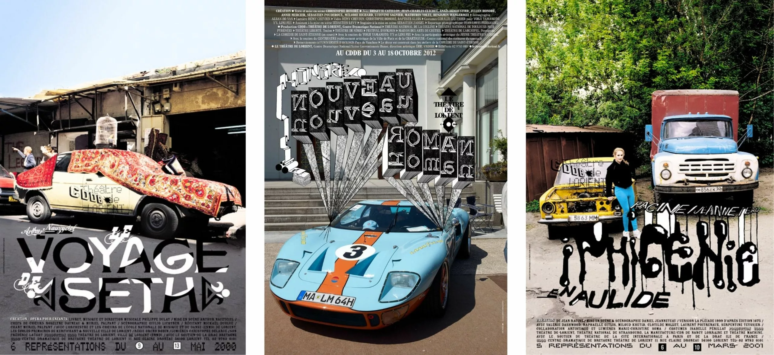
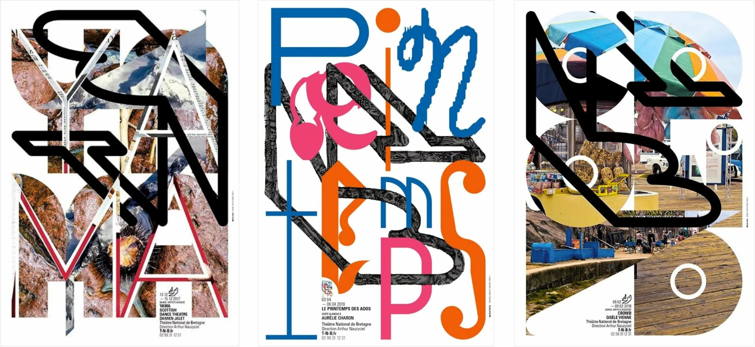
Because these posters bear no resemblance to the traditional posters seen on walls. They have no obvious reading order, no hierarchy like advertising posters that deliver a commercial message. M/M (Paris) posters demand time; nothing is perceptible at first glance. “For these posters, we adopt the rules of classical tragedy: unity of place, time, and action. Each poster is built around a color photograph referencing documentary photography and a title in black and white, generally in handwritten typography,” explains Mathias Augustyniak.
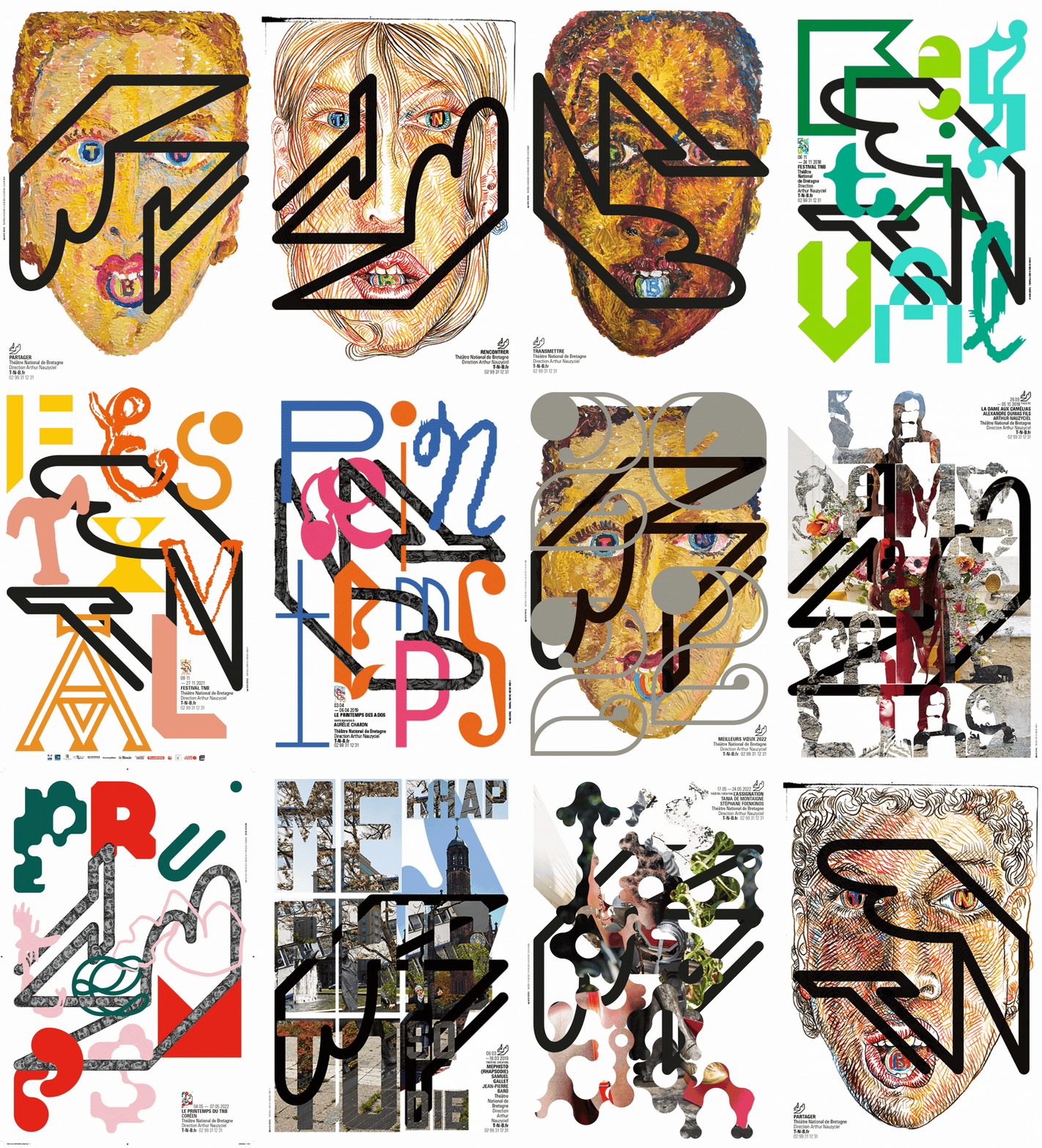
They radically shift the expected role of the cultural author—the graphic designer—by expanding the possibilities. They do not position themselves simply as service providers for a client but become part of the work itself, engaging in exchanges between experts and creators, often circumventing the original request. This approach became their critical laboratory. In doing so, they created their “signature,” their brand. The cross-disciplinary nature of their work can be disconcerting, as it blends everything to the point where their work can be seen as a carte blanche taking the form of a working journal. Each poster tells a story, halfway between a professional and personal journey. One can even find traces of other parallel collaborations—for example, in the poster for Savannah Bay by Marguerite Duras. There, you might discover a photo from the making-of of the album cover for “Vespertine” by Björk, photographed by Inez van Lamsweerde. A true patchwork of threads and bits of string…
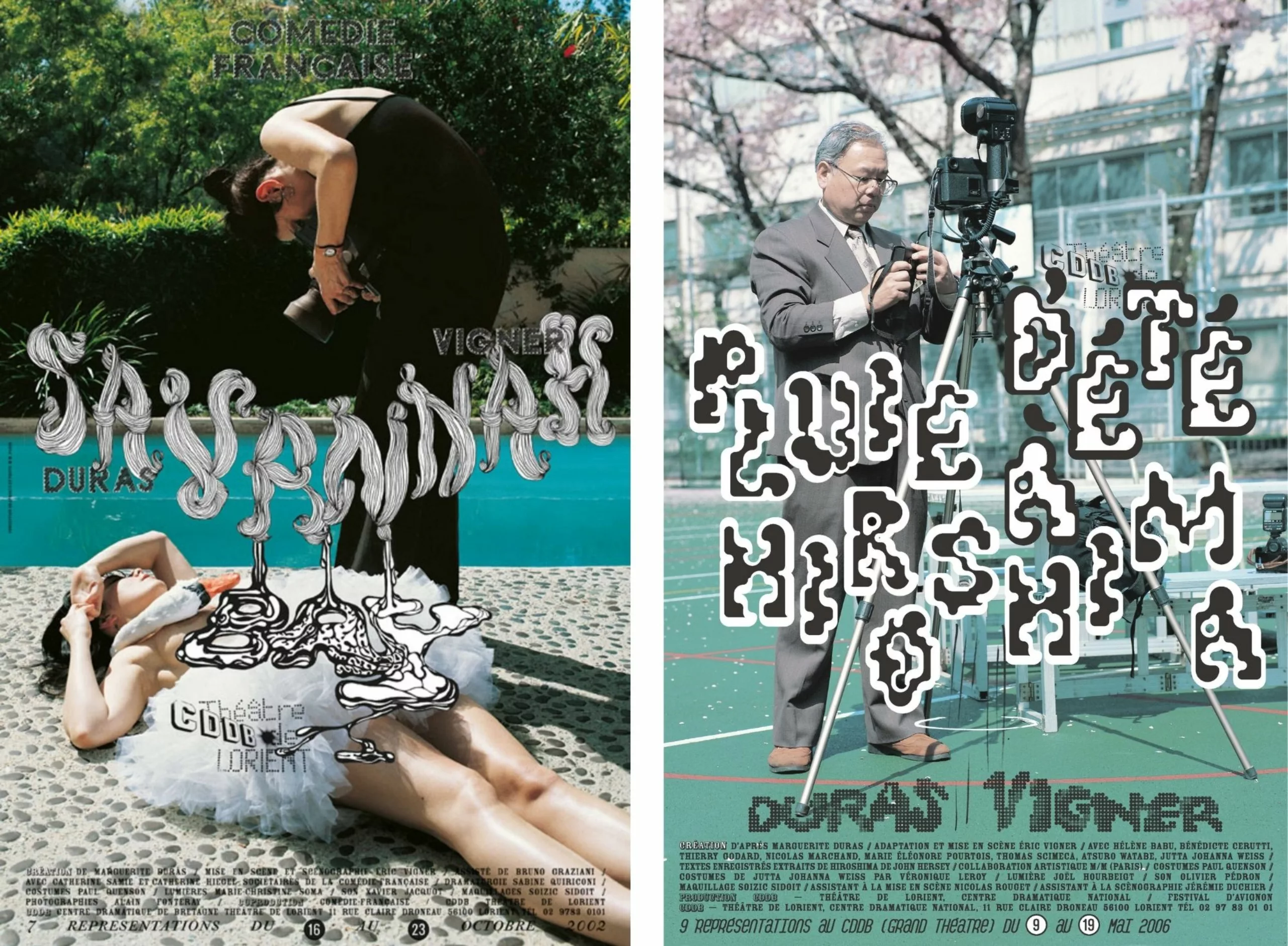
This collaboration between M/M (Paris) and the Théâtre de Lorient gave rise to a new image that rejects any inheritance from the Polish school and its “sacred” visual metaphor. A century later, paradoxically, the figure of the painter-poster artist Toulouse-Lautrec makes a strong comeback on the theatrical scene. The visual artist takes precedence over the graphic designer. What M/M (Paris) brilliantly initiated would continue at Nanterre, at the Théâtre Nanterre-Amandiers.
Théâtre de Nanterre-Amandiers, Labomatic
In 2003/2004, the first campaign created by the Labomatic collective for the Théâtre Nanterre-Amandiers was immediately experienced as a clearly expressed desire to break the theater free from the visual universe in which it had been confined for nearly 50 years. Just like M/M (Paris), this new generation was determined to distance itself from the graphic codes of post-war theater.
The various members of the collective (Pascal Béjean, Frédéric Bertolotti, and Nicolas Ledoux; and later, from 2009 onward, Pascal Béjean and Frédéric Bertolotti) had no prior experience in theater. It is through the lens of contemporary art that they shifted the theater poster.
It is through this new yellow and black prism that audiences would discover the posters of the Théâtre des Amandiers.
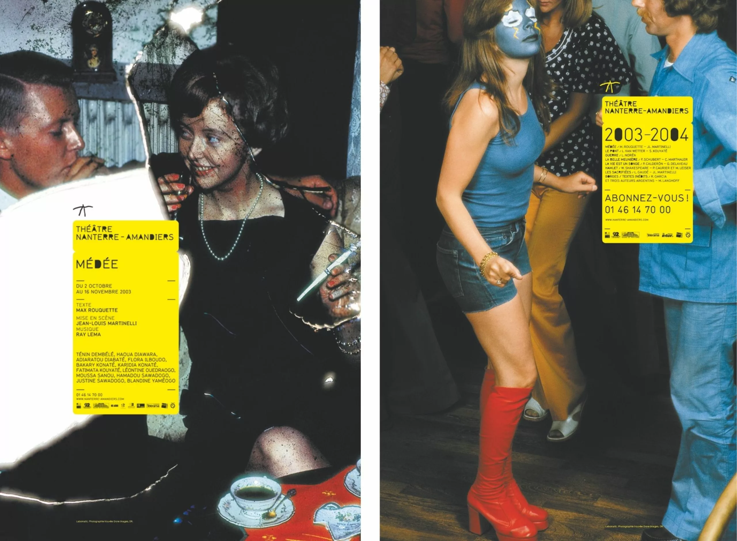
For this first season, Jean-Louis Martinelli, the director, chose the most radical proposal presented by Labomatic. This concept was created from an iconographic archive of amateur images (Grore images), assembled by an artist (Philippe Maitresse)—images without artistic pretension, what we would today call raw photography. These were found images. A normographic typeface and a color combination that, for ten years, would “brand” the Amandiers: yellow and black.
The design was extremely basic and neutral—a simple image with a yellow post-it note stuck on it containing practical information. Neutrality of the images, which served only as a support; neutrality of the typography. A conceptual point of view that once again completely broke with the usual codes of theater posters. And as often in contemporary art, the most anachronistic, the most offbeat, arouses curiosity.
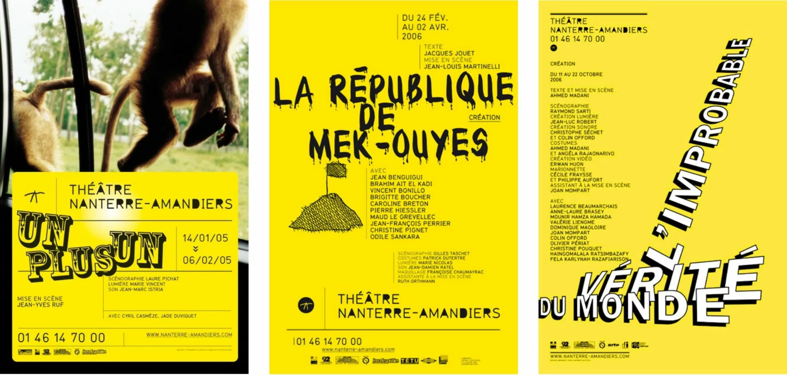
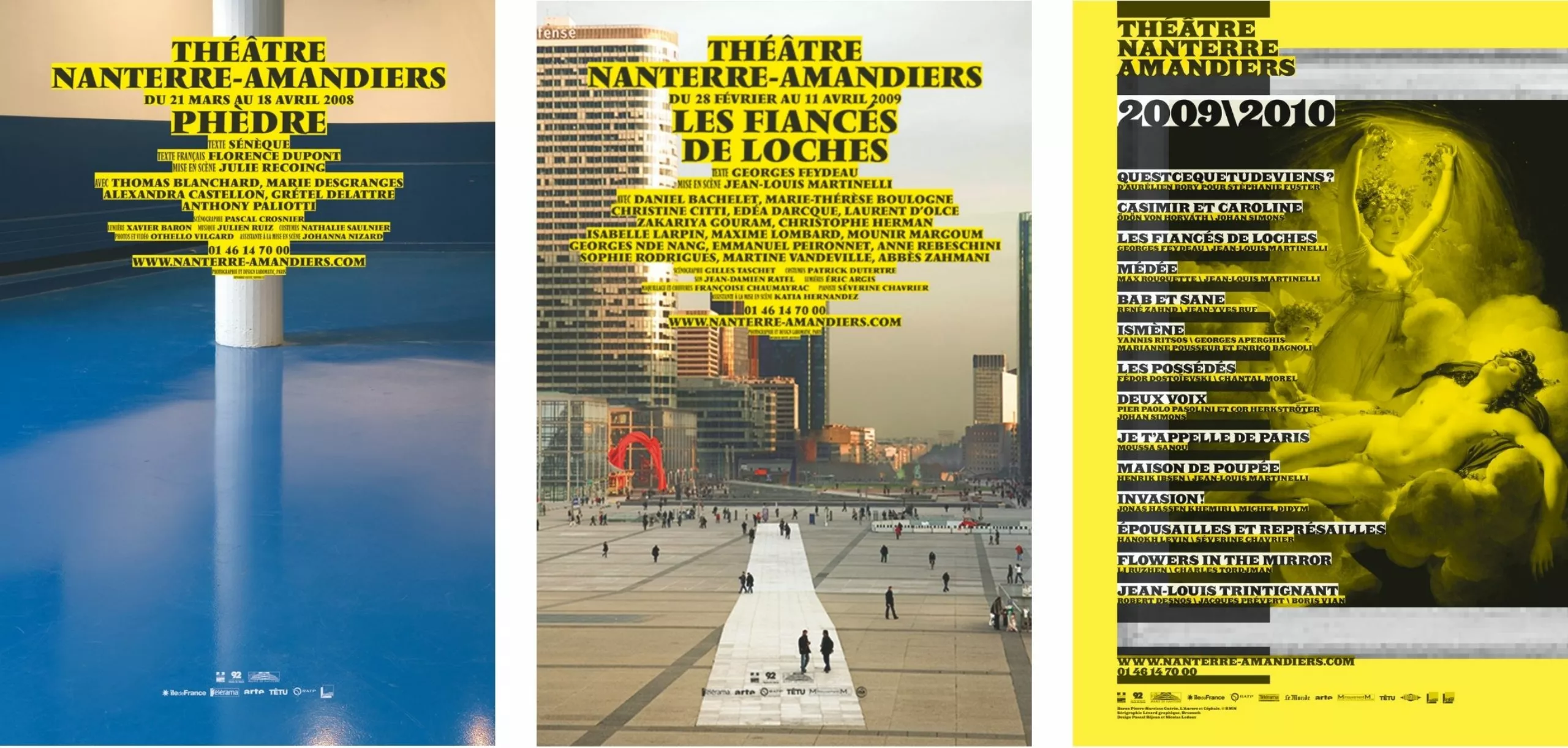
Over the years, the poster evolved and the photographic image gradually disappeared. Then it became more radical with a yellow solid background and black typography, as if Labomatic wanted to “cleanse” the viewer’s gaze to rediscover photography in the following seasons. In 2007/2008 came images of the theatrical space—the stage, the auditorium, the backstage—always marked with black typography on a yellow background. Using Vendôme, an extremely classic typeface created under the direction of Roger Excoffon in 1952. Next came the theater’s environment: Nanterre, the city. Then, in 2009/2010, came paintings from the Louvre—archetypes of 18th and 19th-century classical painting—not aiming to illustrate a specific play. Close-up black-and-white photographs of actors, directors, and authors, all on a yellow circle.
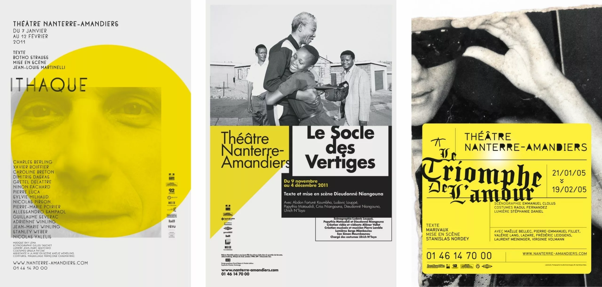
Over the seasons, and beyond the initial surprise effect, the question nevertheless arose about the visual choices emptied of their meaning and the reference to contemporary art used to justify everything.
In 2011/2012, Labomatic opted for decontextualized journalistic photographs. For example, the poster for *Uncle Vanya* features a black-and-white portrait of Thomas Sankara, who was president of Burkina Faso and was assassinated on October 15, 1987. The photo is an agency image distributed by AFP. *Uncle Vanya* is a play by Chekhov that mixes drama and comedy. Yet, the intended and claimed dissonance becomes difficult to grasp. One senses that the random anachronism of these juxtapositions is a logic that wears out over time.
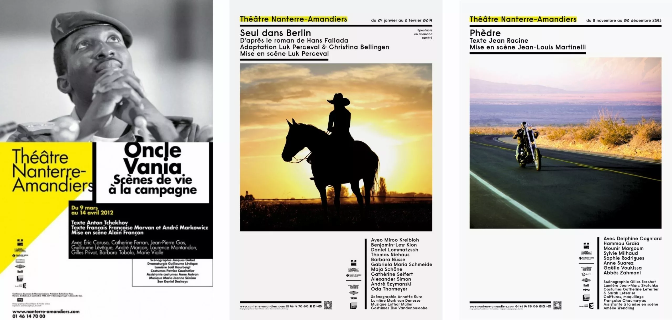
Moreover, by drawing closer to contemporary art, another pressing issue emerges: the elitist and Paris-centric nature of public theater—a theater that seems to drift away from its fundamental goal of making the world of live performance accessible to the widest possible audience.
Théâtre de l’Athénée Louis-Jouvet and Malte Martin
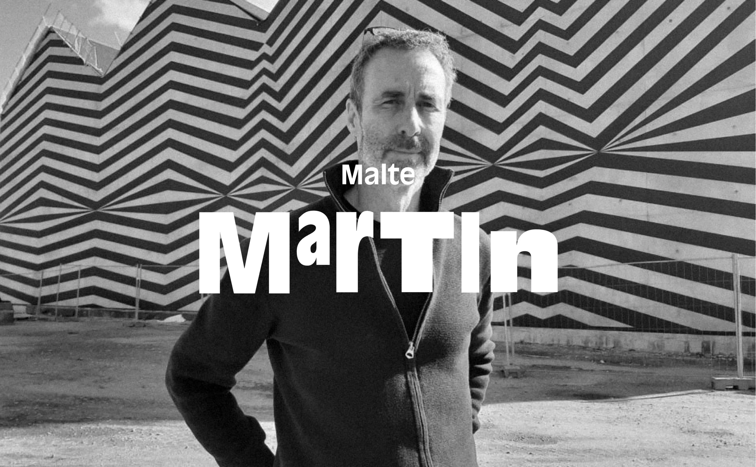
“Our public mission began in a metro corridor, even before entering the theater,” 2005. Around the same time, the question of the public theater’s mission was approached from another angle at the Théâtre de l’Athénée. It was through the Agrafmobile project (an experimental creative laboratory) that the Athénée contacted Malte Martin and his workshop “Écouter pour voir” in 2005.
“We are a theater that works on the text ; we often choose authors before directors. And the relationship to the text that you develop might suit us,” explained Dorothée Burillon, the general secretary at the time, to Malte Martin. “We are a public theater located in the upscale neighborhood near the Opera, and we face two problems… We are located in a geographic area where only private structures exist, and people imagine us as a private theater when we want to assert our public status. Secondly, we have an established audience, which corresponds, to simplify, to the circle of ‘Télérama subscribers,’ and we need to renew this audience by reaching out to a younger public. Lastly, our budget is limited because we are a theater outside the official public status.”
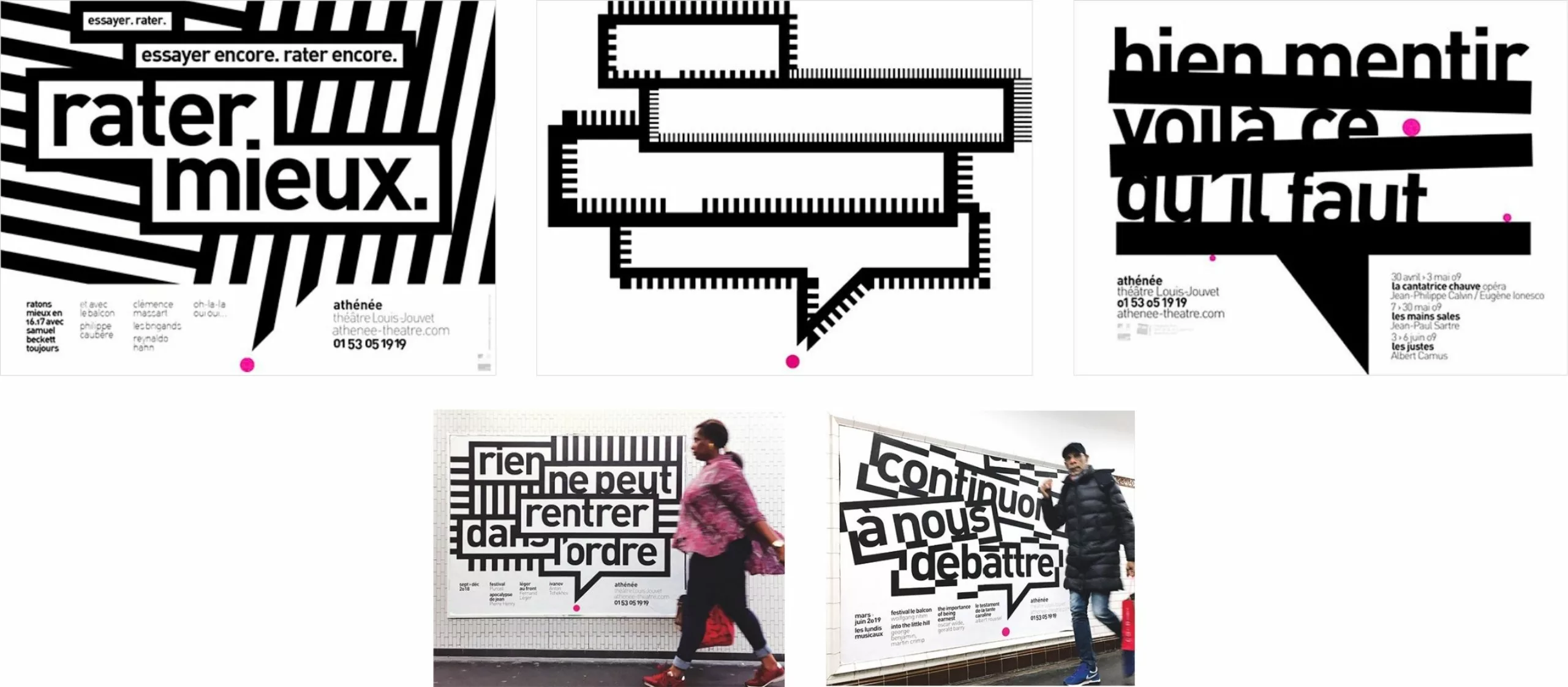
Quickly, Malte Martin chose a proposal that reversed the usual hierarchy of theater posters—title/author/quote… Step by step, the Athénée’s brand image took shape. “Something strong is said through the quote, which becomes the ‘star,’ and then, in smaller text, the programming details of the plays are indicated.”
Malte Martin’s graphic proposals arrived at a time when theater websites were gaining visibility, meaning communication no longer necessarily passed through the poster, which could take on a certain autonomy.
The second point concerned the audience. It was about speaking to a new, younger public for whom the sacralization of theater is a barrier. Malte Martin aimed for the graphic form to be direct, popular, and accessible. Hence the idea of borrowing the speech bubble from pop culture and comic books. This was treated within a fairly constructivist graphic environment—a punchy style designed to catch the eye of a passing commuter in the metro. The theater speaks out in public space. Priority is given to the institution, the very place of the theater itself, while the show becomes more discreet. As if the theater’s visual identity was no longer the small logo at the top of the poster, but the graphic writing covering the entire medium.
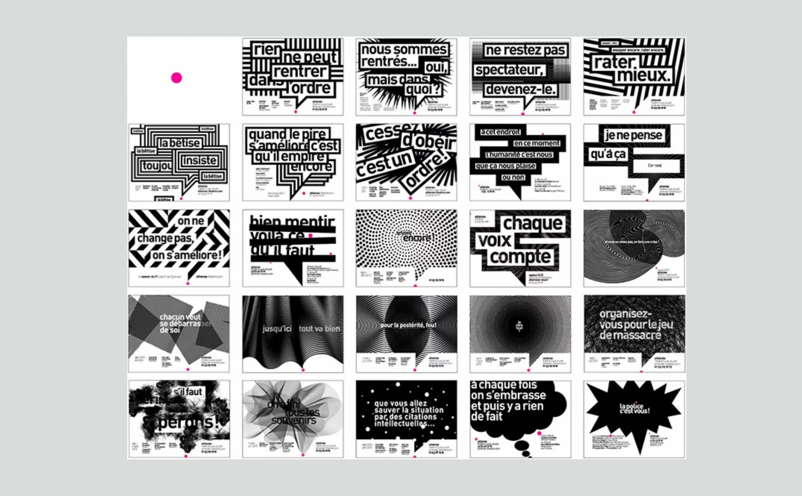
Beyond the traditional audience of theater connoisseurs and subscribers, the bet made at the Athénée—and what set it apart from others—was to say, “We want our posters to show that theater is not a place that talks about academic subjects for PhD holders or tells stories about ancient kings and Greek allegories for a scholarly audience. Rather, theater has a point of view on today’s world !” The idea of using literary quotes and slogans allowed the theater to engage with public debate—even in a metro corridor. “This showed that a theater can involve itself in current events and what surrounds people. Beyond affirming the theater’s identity, it spoke to the public mission of a public theater that could offer texts to read and hear. Our mission began in a metro corridor, even before entering the theater.”
Malte Martin’s adventure at the Athénée lasted 15 years, from 2006 to 2021.
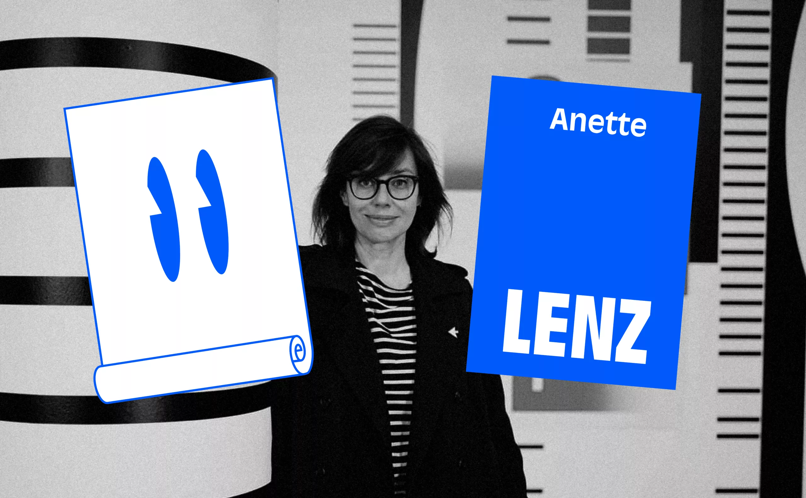
The Anette Lenz and Vincent Perrottet Interlude
Another unique approach that also raises questions about the mission of public theater at the beginning of the 21st century is that of Anette Lenz and Vincent Perrottet. Their close collaboration with Joël Gunzburger, former director of the theaters in Angoulême, the Filature de Mulhouse, and currently L’Onde, is an example of the richness and diversity that the theater world can maintain in dialogue with graphic design and its environment.
Apart from the major trends that have been established over the past twenty years, Anette Lenz and Vincent Perrottet seek what they call a “functional writing”, that is, a graphic language adapted and personalized to a client, a venue, an audience, or a specific city. What about the theater’s cultural project and its relationship to the image, a subject that is more sensitive than ever today? “With clients, we have to share the subject in order to share the images,” explains Vincent Perrottet. “They educate us about their field, and we educate them about ours. When the relationship with a client is good, the result is good. When the relationship is not good, with us there is no result—it stops beforehand. No one will make us create bad images.”
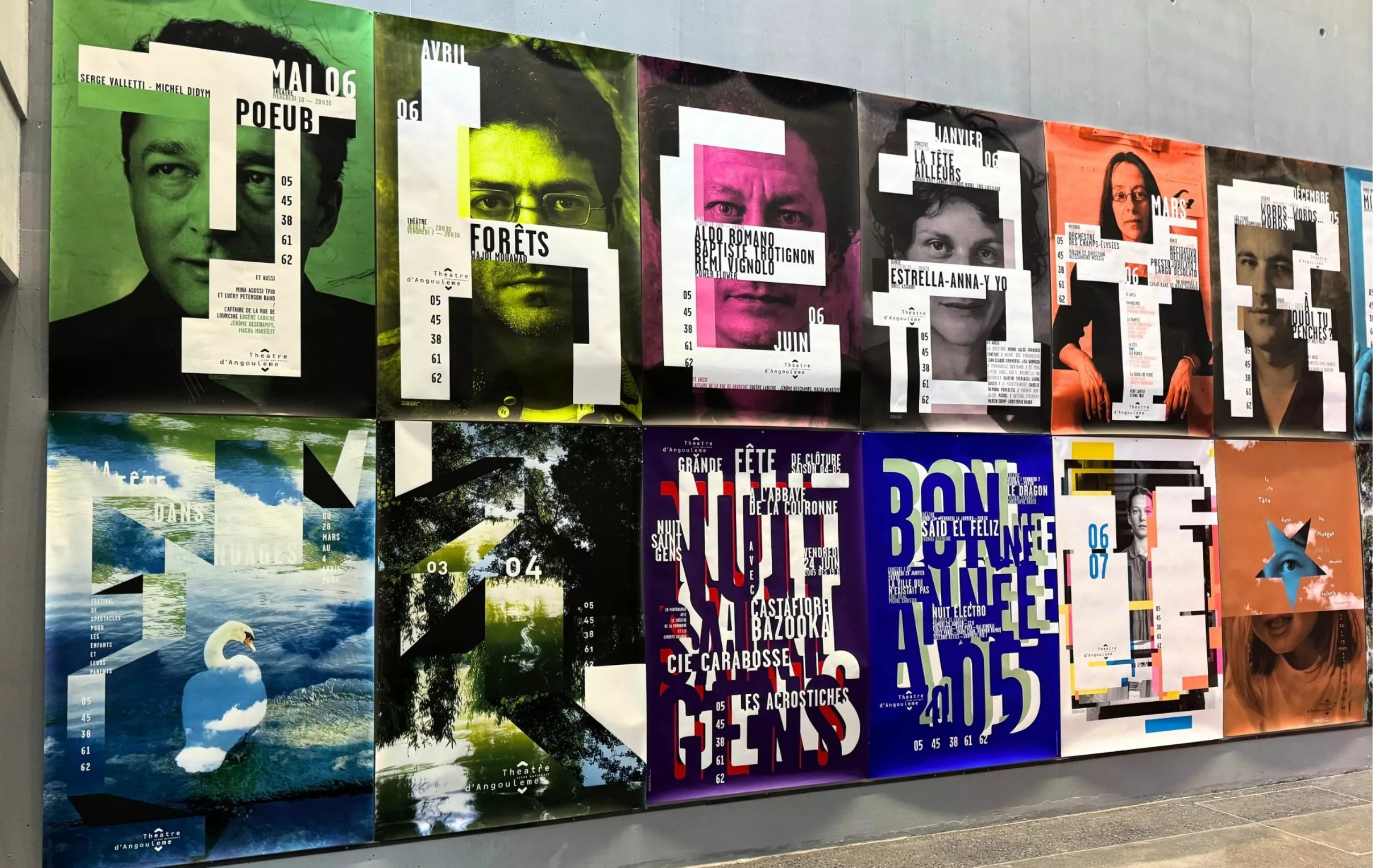
After an initial collaboration in 1992 with Vincent Perrottet for the municipal theater of Rungis, Joël Gunzburger called on Anette Lenz, who presented a singular work opening the door to abstraction, a direction unprecedented in France. Then came the theater of Angoulême in 2001, where the graphic duo reunited and developed a graphic language that powerfully questioned the role of theater in the urban context. In 2003/2004, they worked on images of the city and its inhabitants as well as the theater itself.
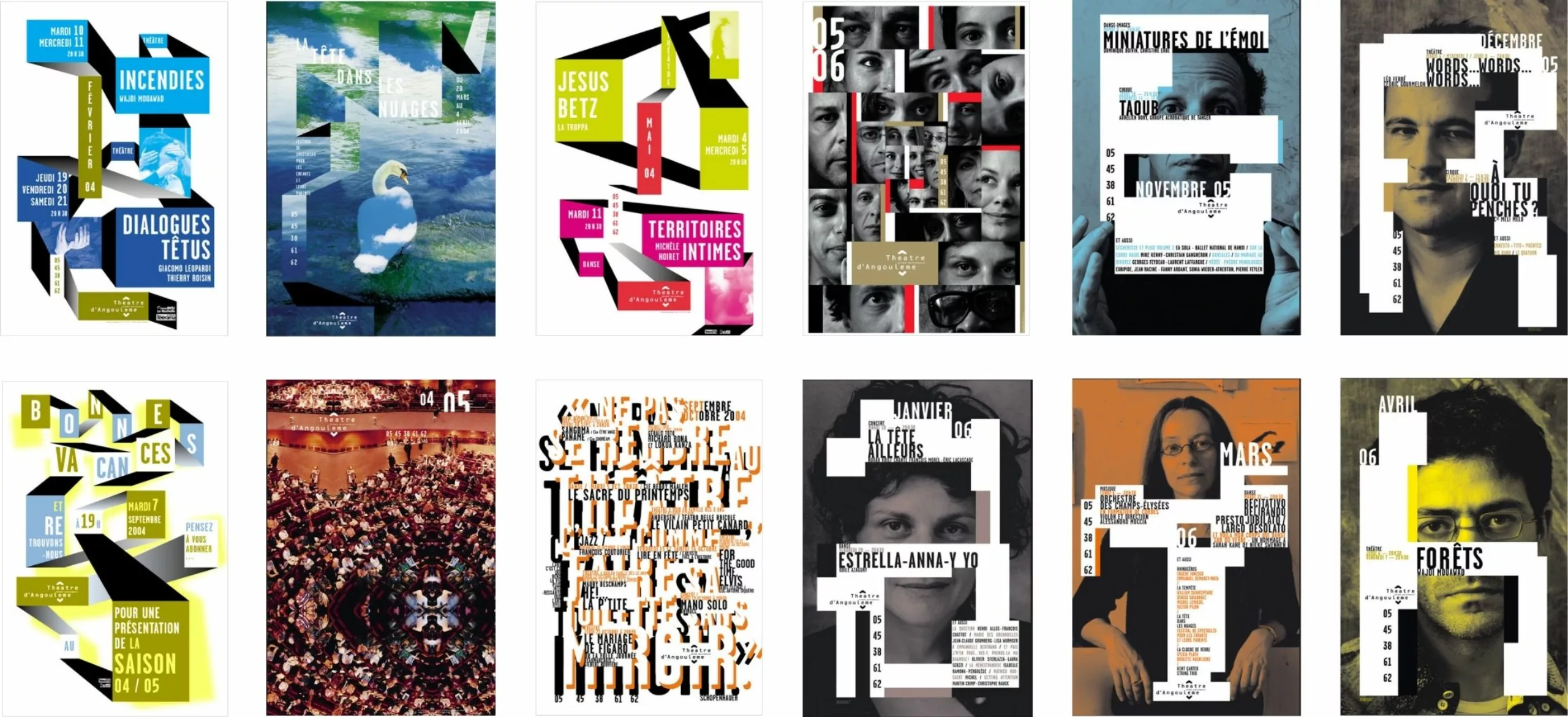
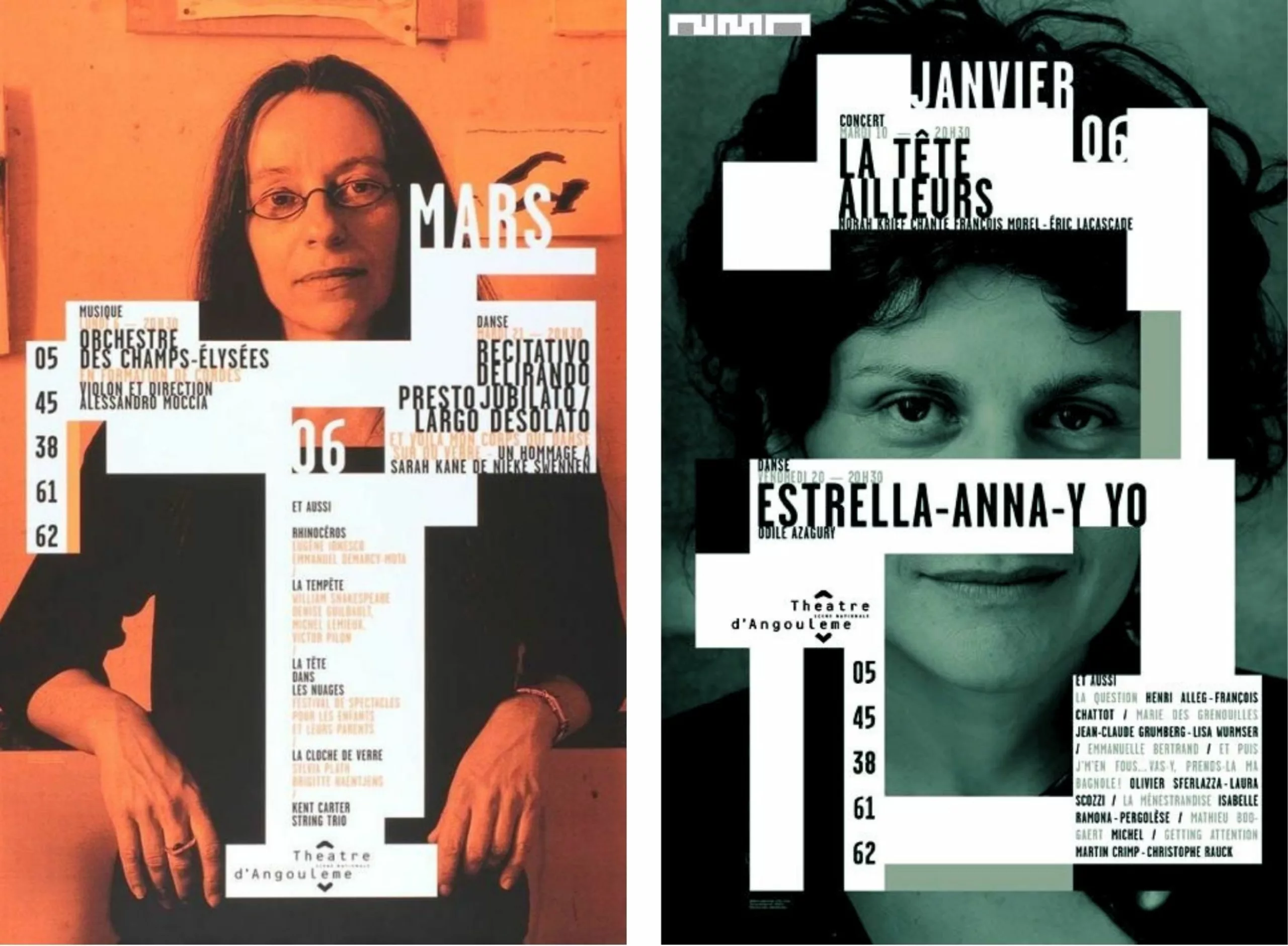
“It’s important to work within a real context, with people in the city,” explains Anette Lenz. “Often, it’s about going beyond the commission—that is, using this public commission to be present in the streets… With our posters, the approach is different from those exhibited in museums; here, it’s our work that comes to the people. This raises the question of the theater’s place within the urban space. Where is it located, and how will people be integrated into that space?
Often, it’s about finding an identity for the theater itself much more than finding an identity for the individual plays.”
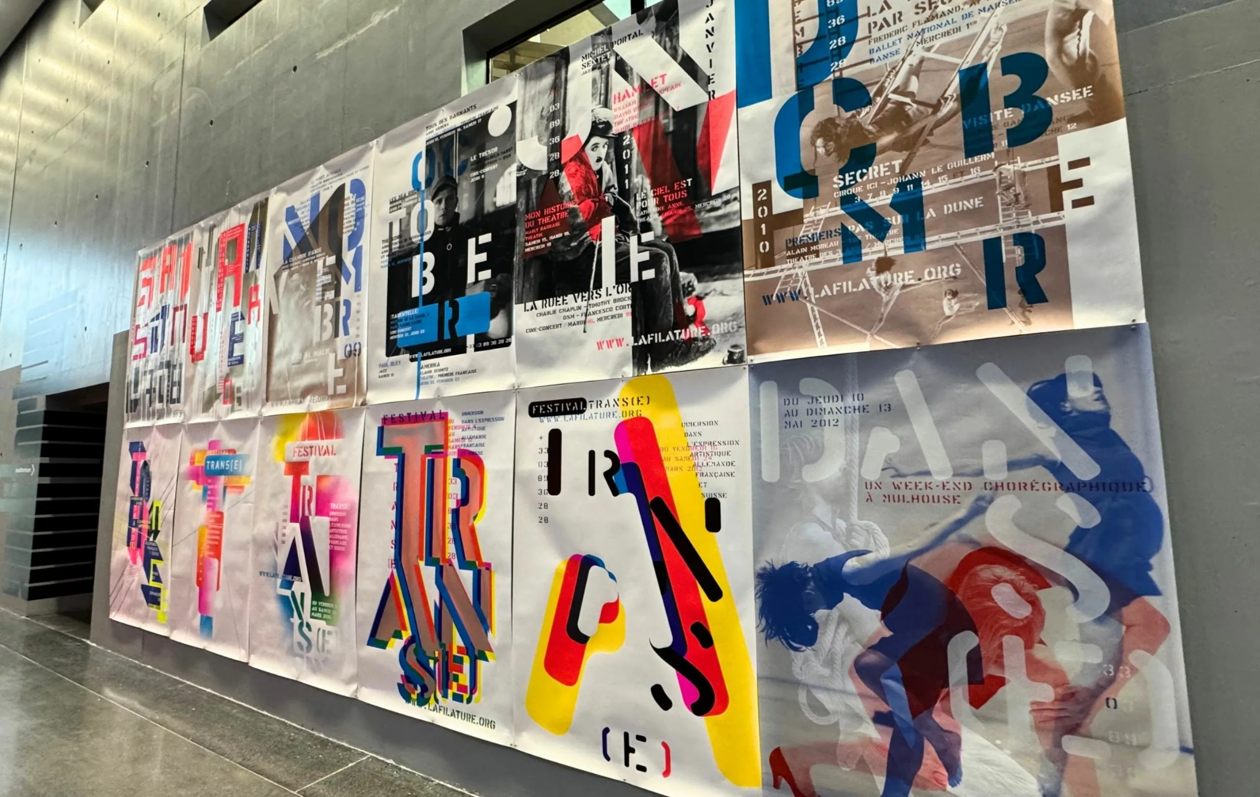
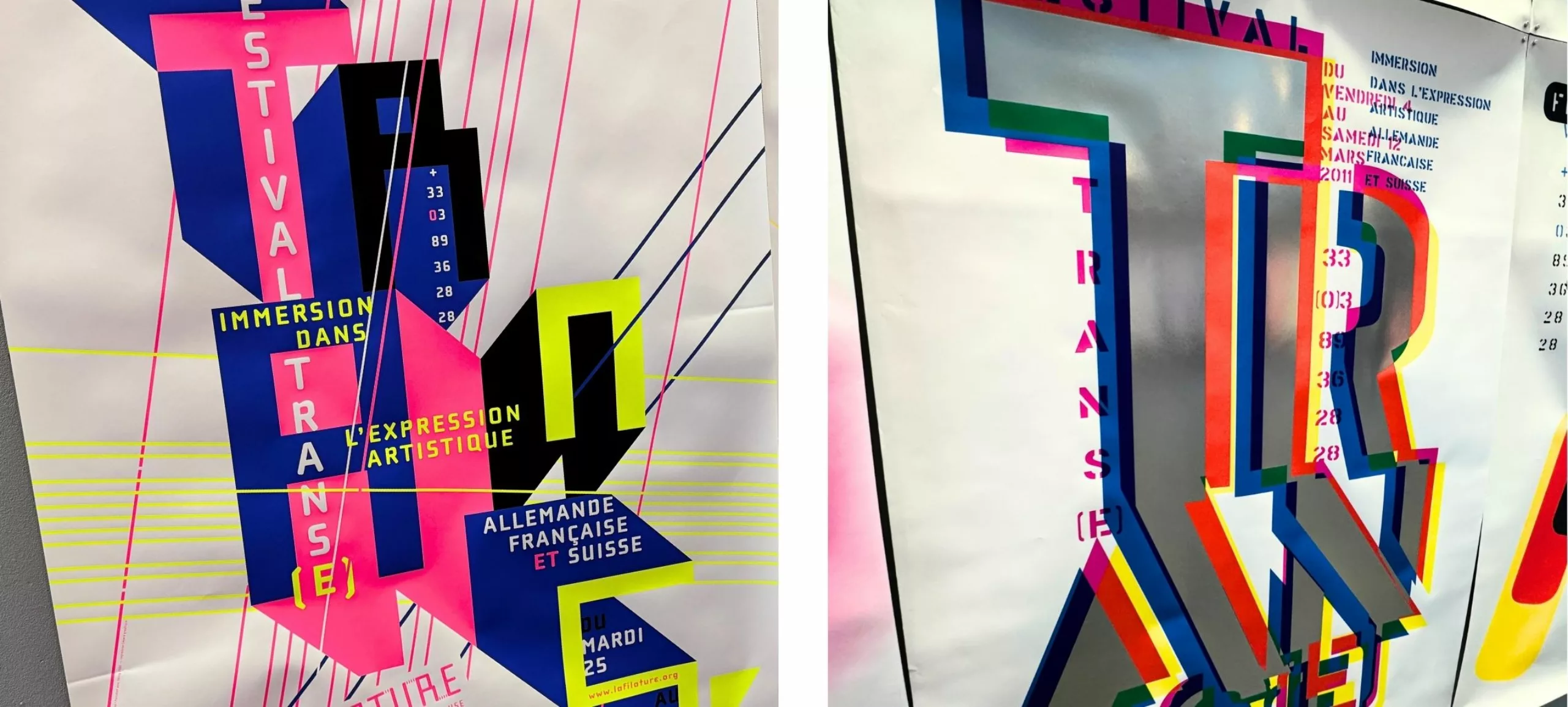
Then came La Filature, Scène nationale de Mulhouse. The theater is housed in a former spinning mill building… An idea of weaving, mixing, and networking the territory found a graphic echo in the posters.
At the same time, in Chaumont at Nouveau Reflex, Anette Lenz and Vincent Perrottet surprised once again by developing a project in a different realm. Far from abstraction and conceptual writing, they worked immersed in the city, in contact with residents and sports and cultural associations. For example, they staged scenes of people grimacing for the occasion—thus reconnecting with the origins of street theater where spectators and actors shared close proximity. A direct and popular approach seeking to create bonds.
In our final article, Act VI, we will discuss the decade of social networks and the reign of typography.