Act VI – The Decade of Social Media and the Reign of Typography
This article is the third in a series on the history of theater posters in France. It traces the origin of theater posters and their specific characteristics, reflecting our society’s evolution from pure text to image, through typographic creation and digital media.
Complete series
Preamble : The history of theater posters in 6 acts
ACT I – The golden age of the poster in the 19th century
ACT II – The Glorious Thirty of theater posters 1950/60
ACT III – The legacy of the Polish school and the 70/80s
ACT IV – The Posters of the Théâtre de la Colline, from Batory to the ter Bekke & Behage Studio
ACT V – The intrusion of Contemporary Art
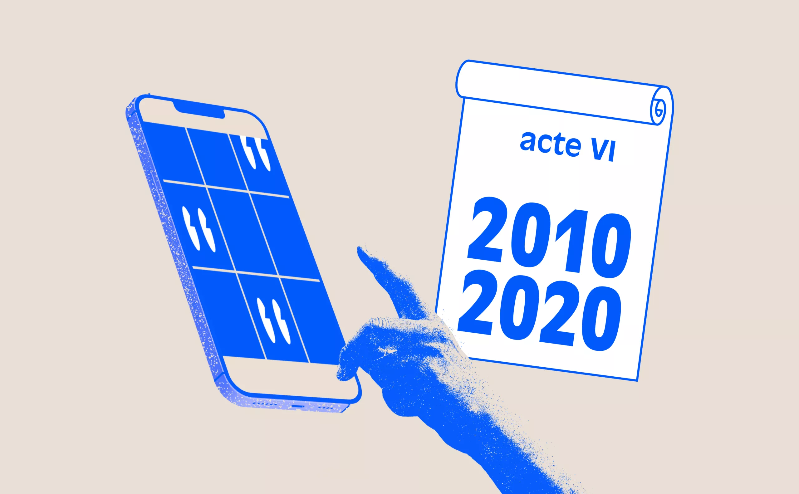
ACT VI – The decade of social networks + the typographic reign
Over the past 15 years, theater posters have drawn from all these major trends and questions : Polish influences, dominant typography, references to contemporary art, and the status of the painter-poster artist. Theater has become a full-fledged actor on the same level as the playwright, director, or graphic designer.
From around 2010–2015 onward, social media took on an essential role in communication, which today passes mainly through smartphone screens… and much less through posters.
Poetry, Color, Typography, and Identity in Theater Posters
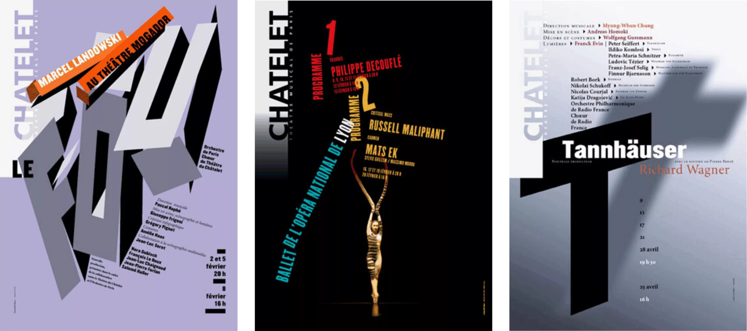
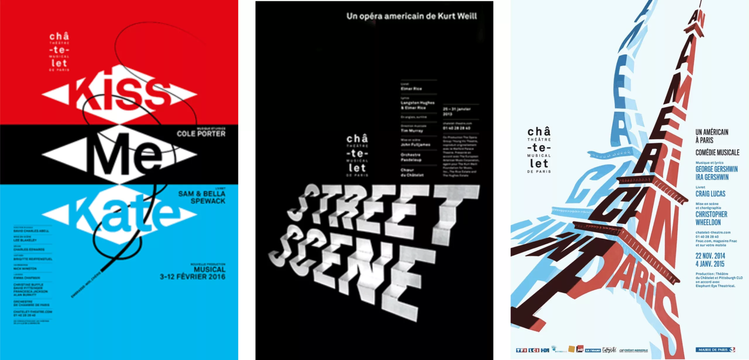
An example can be seen with Rudi Meyer or Philippe Apeloig for the Théâtre du Châtelet. Each poster is treated as a unique creation and does not follow a predefined graphic charter established at the start of the season.
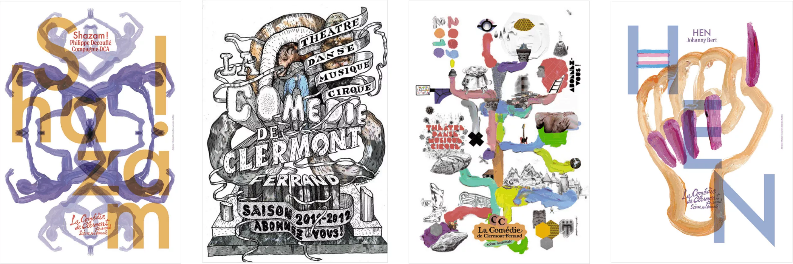
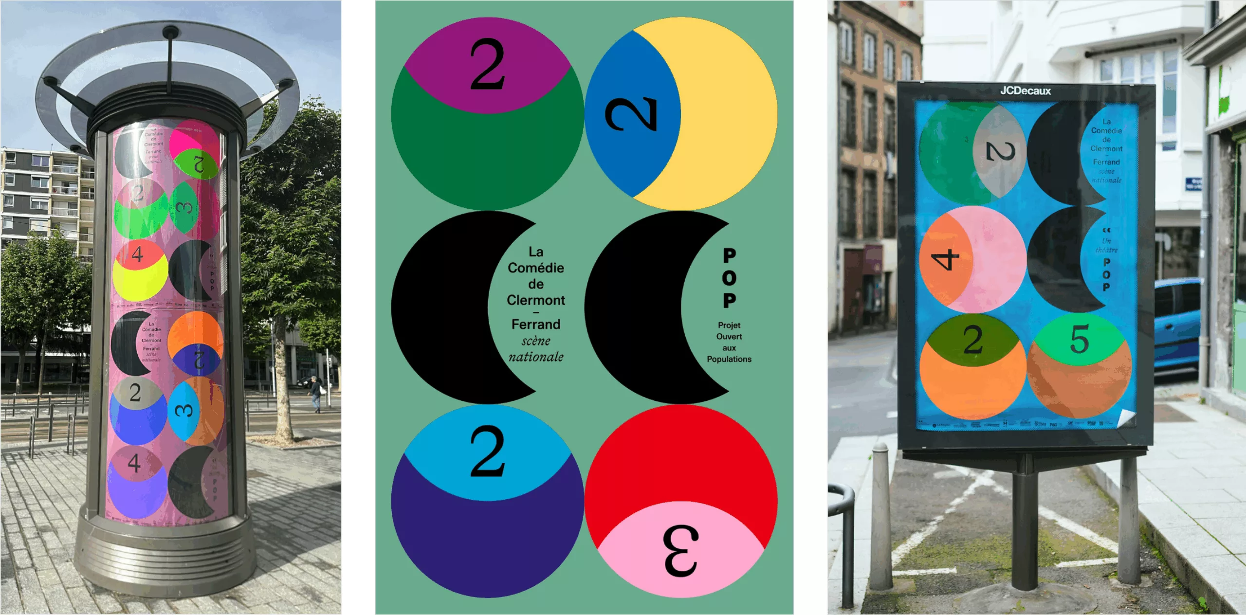
At the Théâtre de la Comédie de Clermont-Ferrand, Fanette Mellier brought her expertise in color and signage within the urban environment. Previously, the creations of the duo Antoine and Manuel energized the theater’s communications.
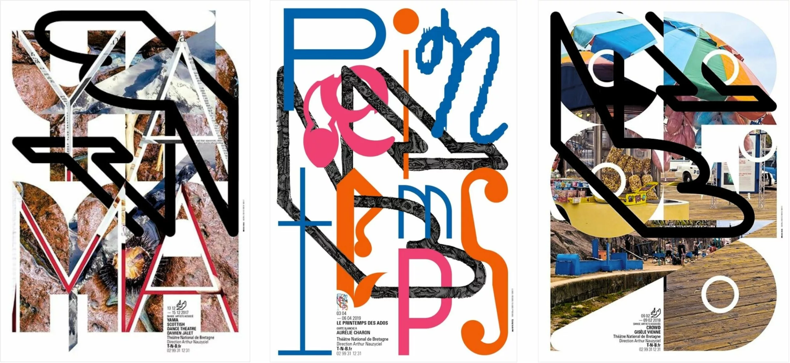
M/M (Paris) continue their work as full-fledged author-designers at the Théâtre de Bretagne in Rennes.
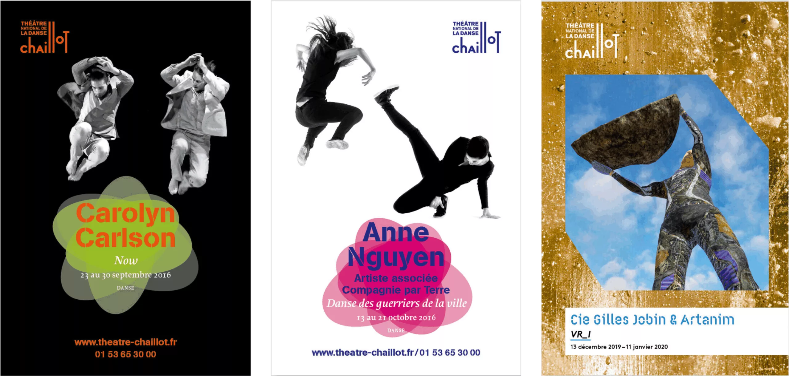
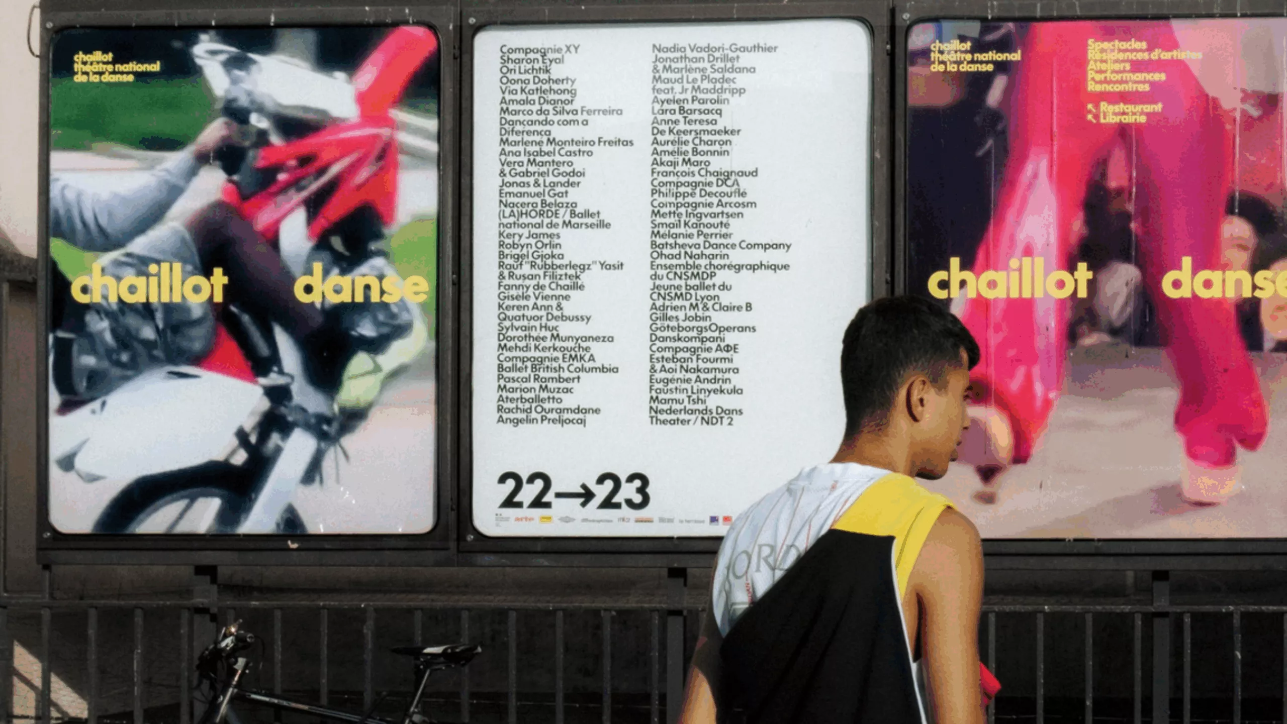
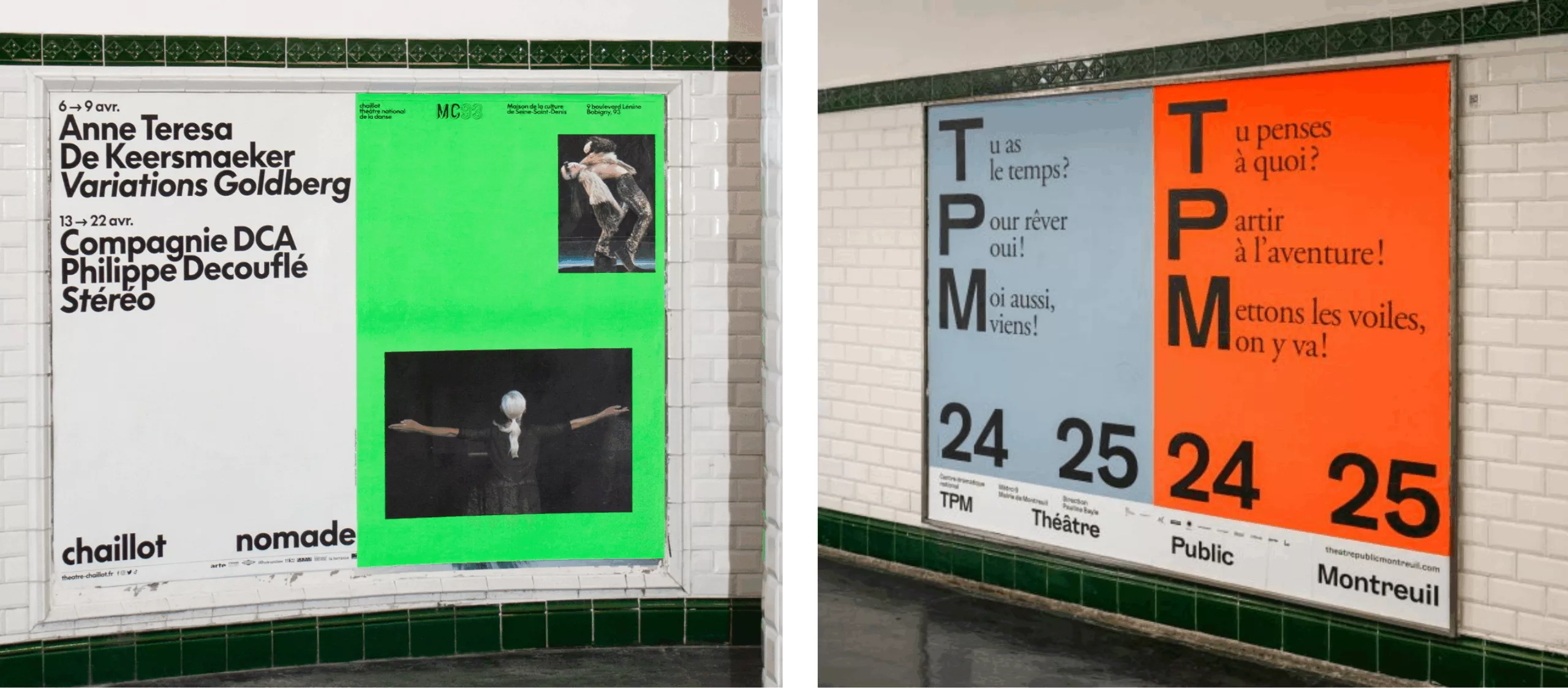
For the Chaillot National Dance Theater, Amélie Doistau found a compromise between image and typography by using visuals from the performances.
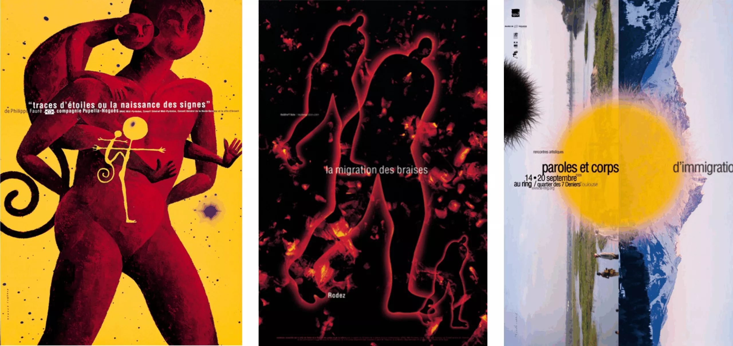
For Le Ring, the Théâtre Garonne, and other cultural venues in the Toulouse region, Ronald Curchod approaches the poster as a painter-poster artist. He works with a very specific technique : egg tempera.
In the realm of private theater, Pierre Jeanneau will bring a very personal touch with posters that combine typography—a skillful balance to create posters accessible to the widest possible audience.
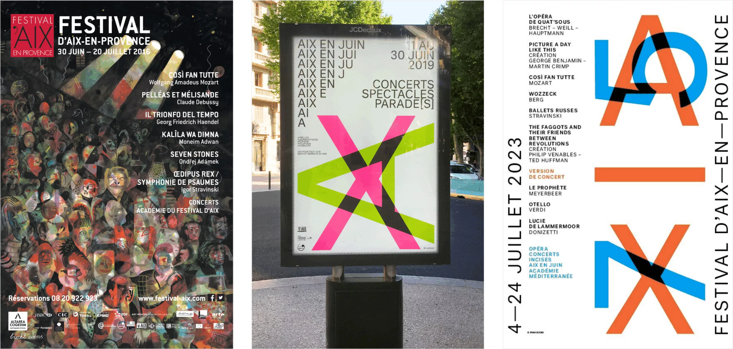
With an even more pared-down approach, Irma Boom, for the Festival d’Aix-en-Provence, developed the festival’s identity without using any additional visuals. Previously, it was Brecht Evens who “illustrated” the posters.Across all these theaters, we’ve shifted from personalized posters for individual plays to signage-style visuals—perfectly legible and efficient, but also terribly sanitized. It’s become brand communication.
Les années passées, c’est le Suisse Werner Jeker qui œuvrait à la communication du théâtre de l’Europe, Odéon.
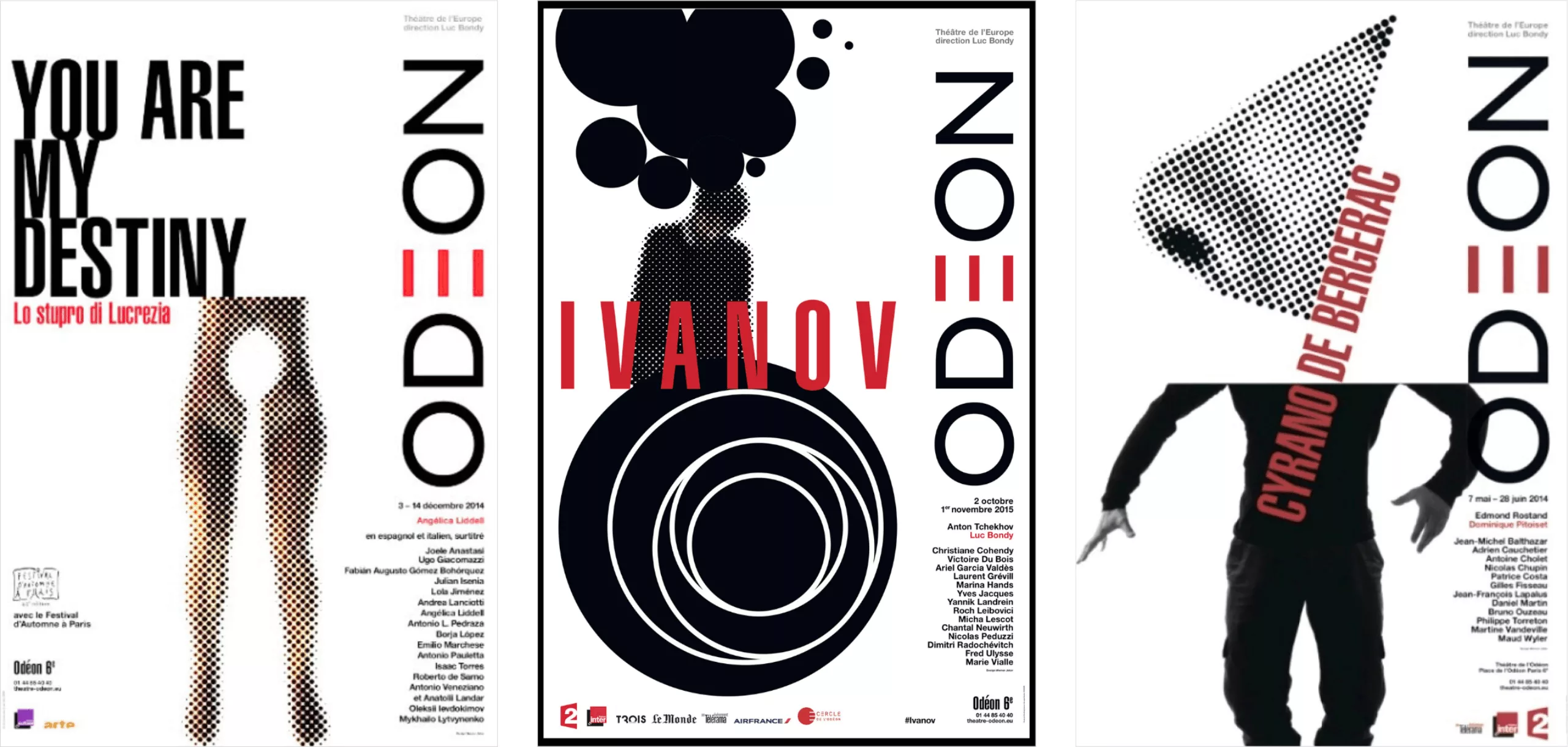
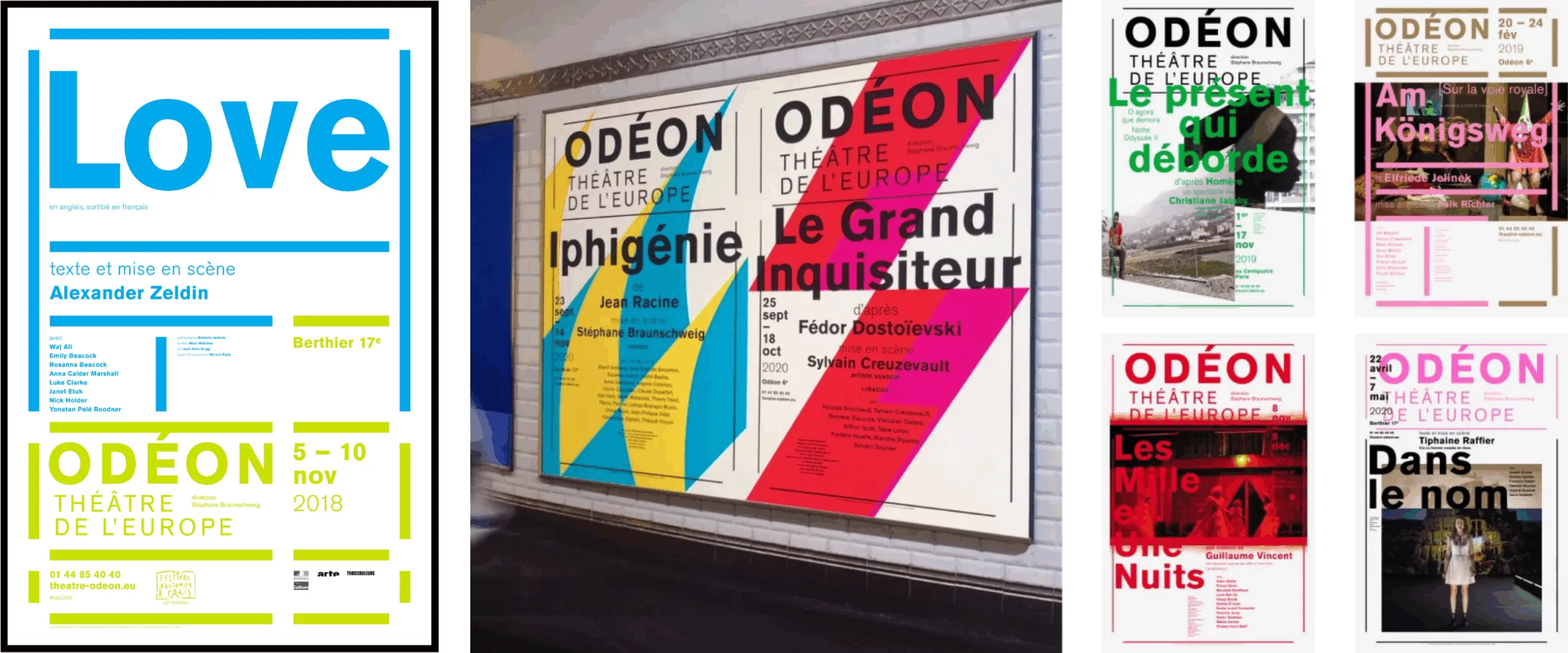
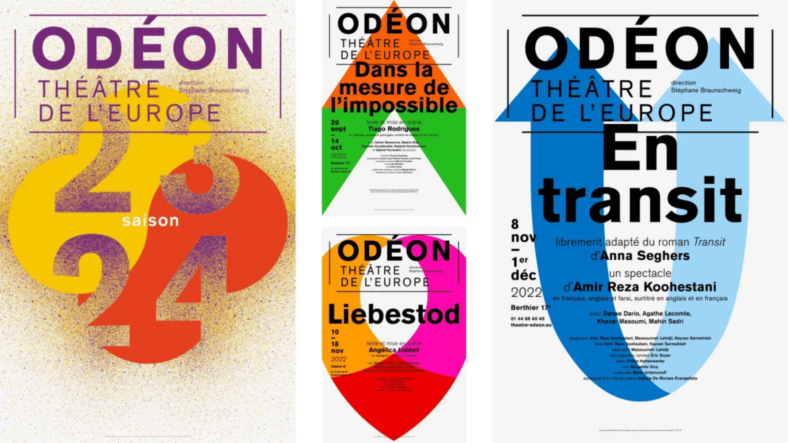
Puis le duo ter Bekke & Behage qui suit Stéphane Braunschweig au théâtre de l’Europe, Odéon, où ils poursuivent avec méthode ce qu’ils avaient mis en place à la Colline.
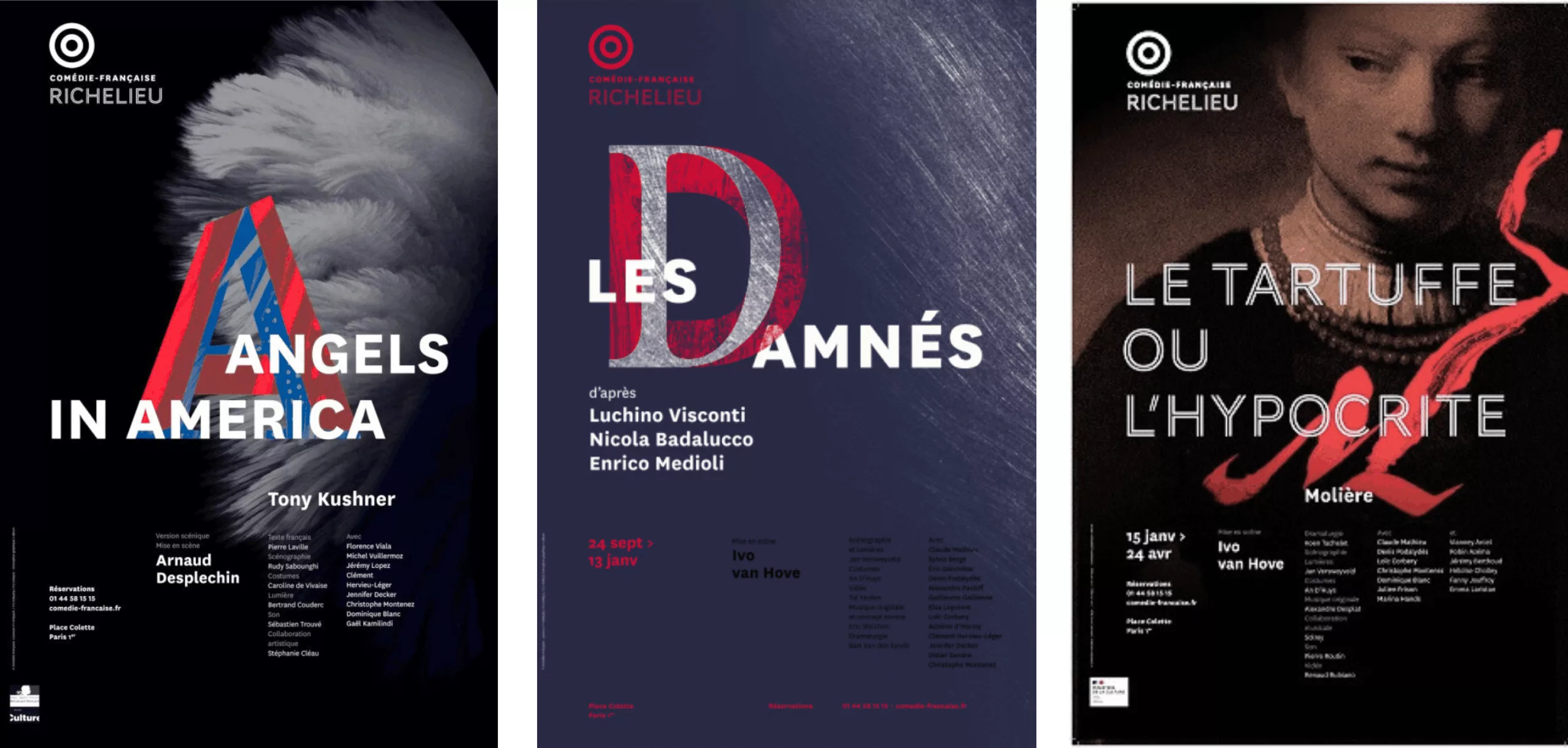
In 2015, the Comédie-Française, like many public theaters, pushed its programming into the background to highlight a bold, easily identifiable red rosette. The new visual identity, as well as the posters, were designed by C-Album. Once again, and increasingly, it is the theater as institution that takes center stage.
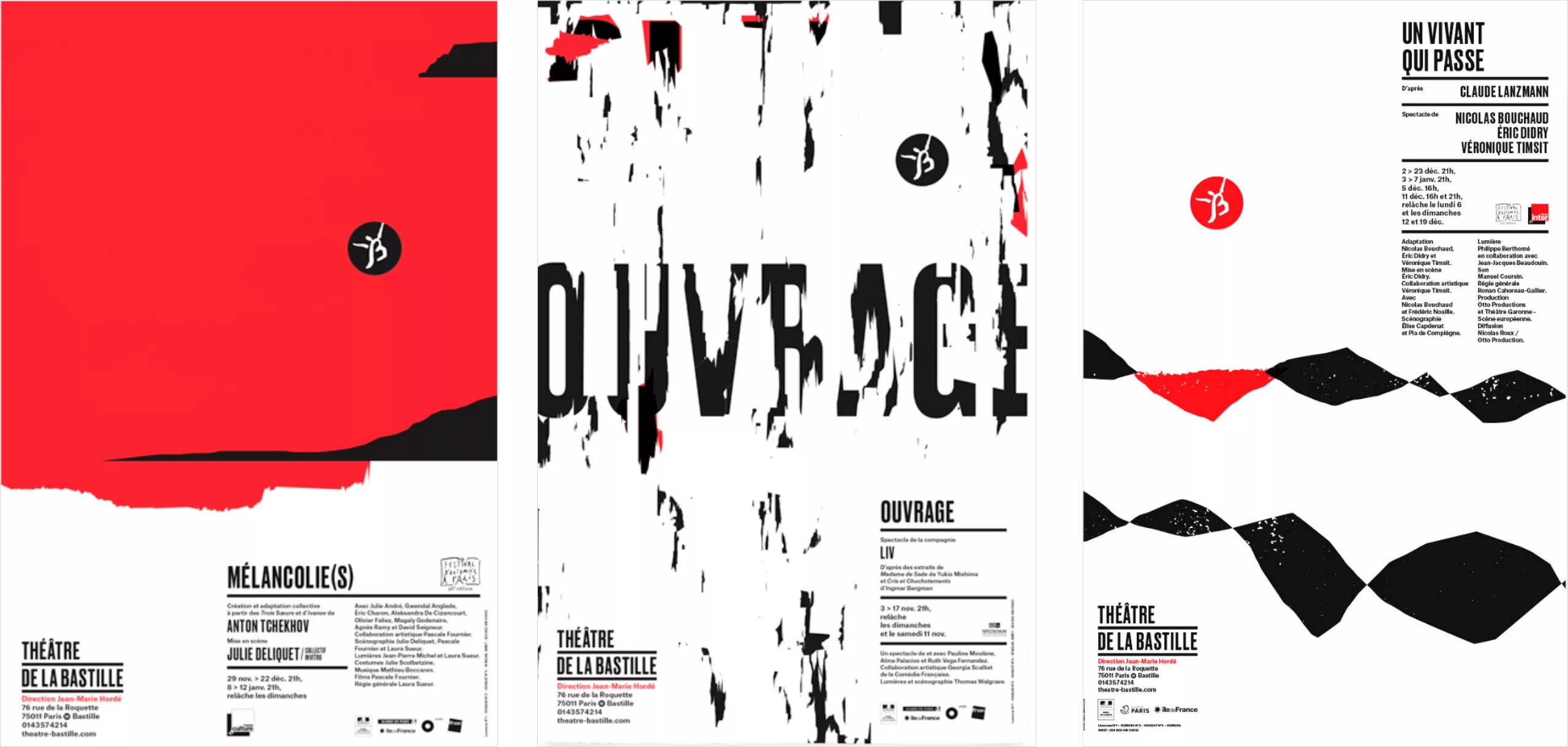
The Théâtre de la Bastille chose to embrace typography and graphic abstraction through the work of Marge Design.
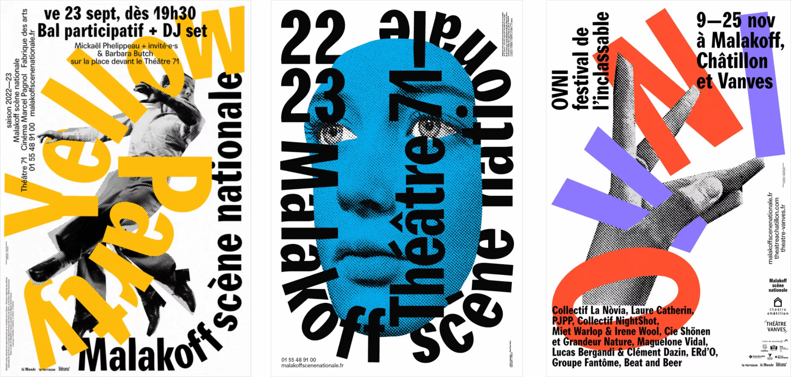
At Théâtre 71 in Malakoff, the design collective Brest, Brest, Brest brought a typographic boldness that renewed the visual communication of previous years.
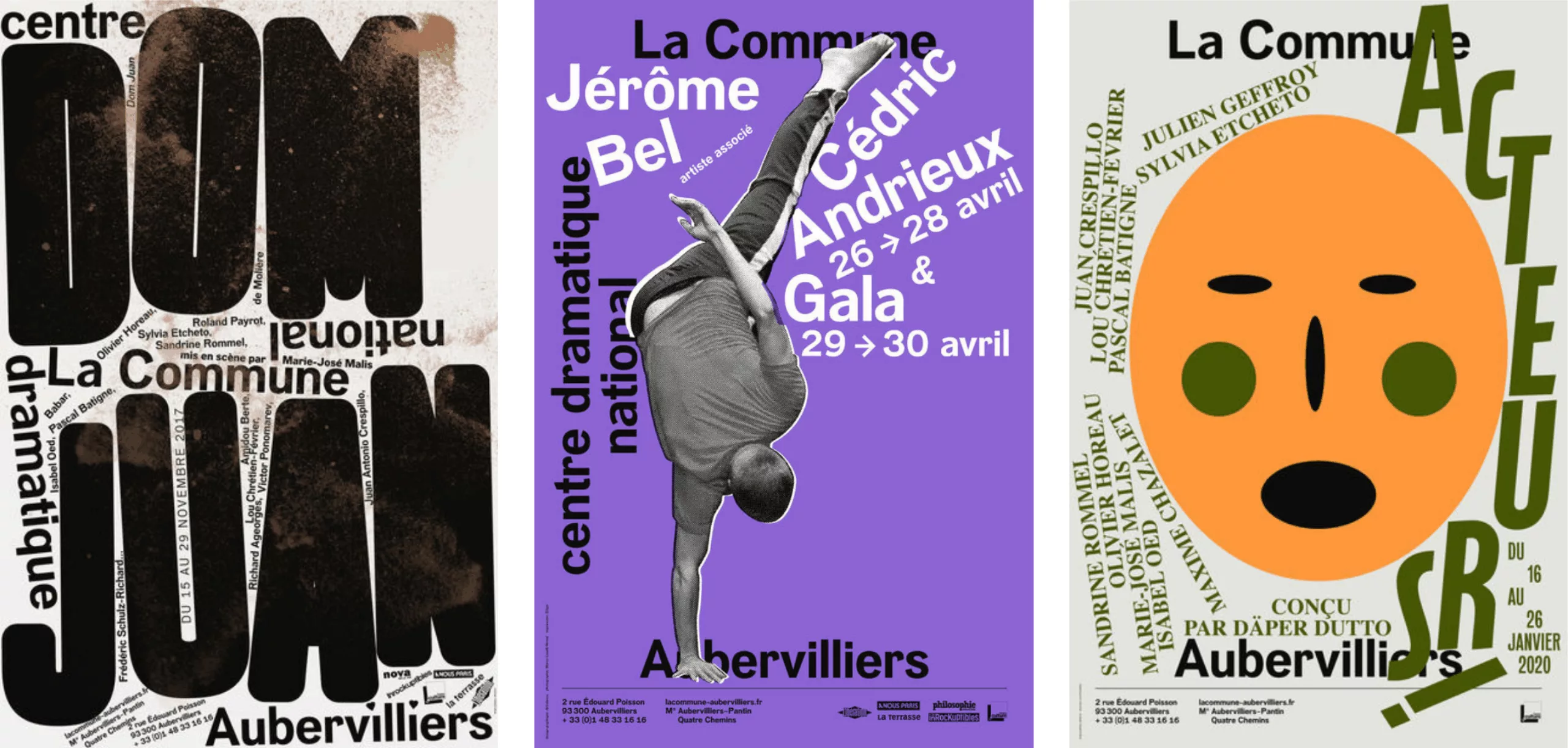
In Aubervilliers, the Théâtre de la Commune collaborated with the studio deValence, producing posters that revived the Dadaist spirit of the early 20th century. A resolutely typographic approach…
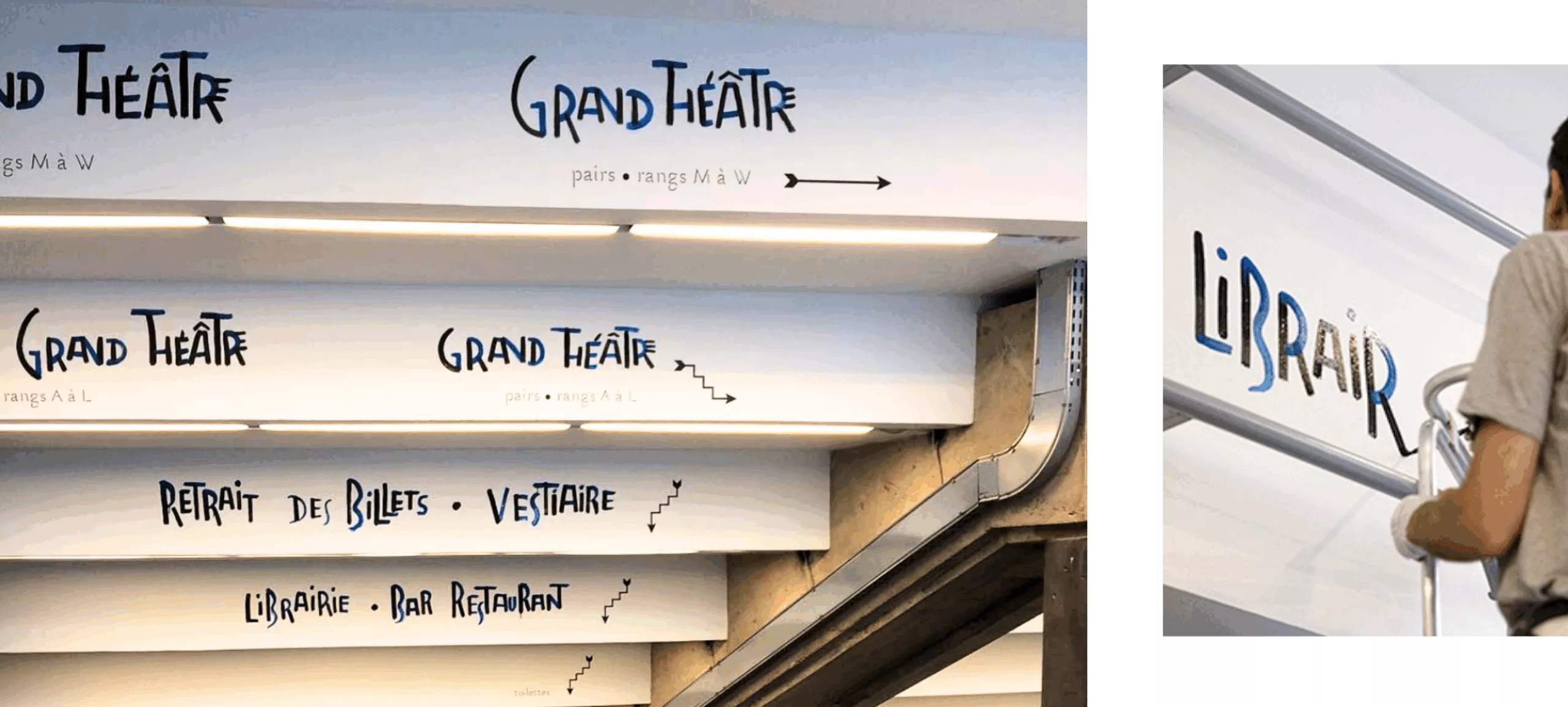
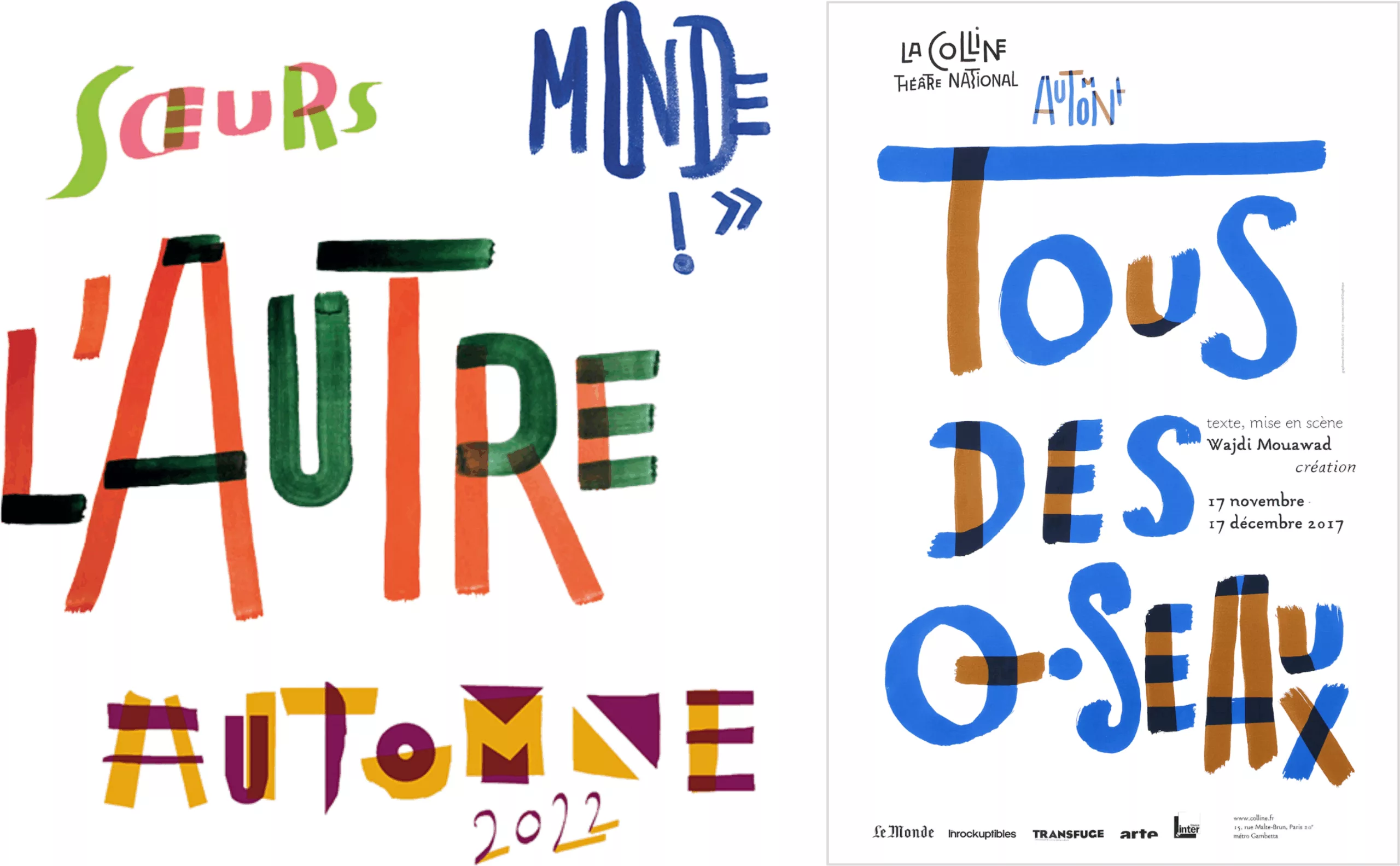
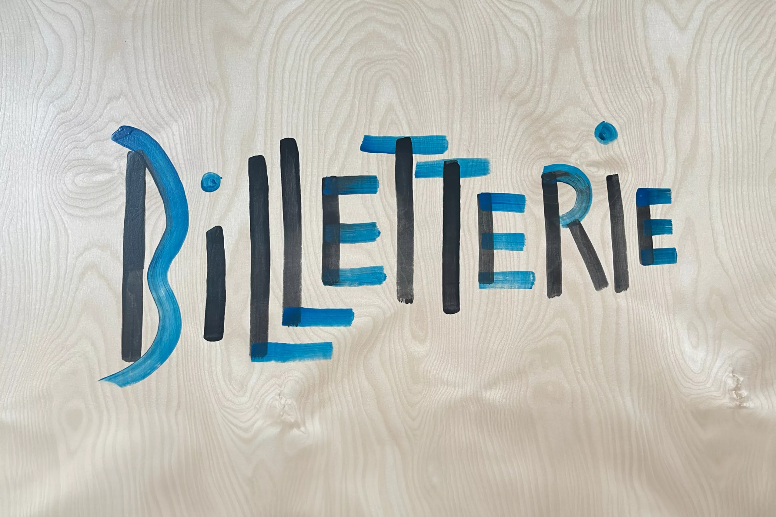
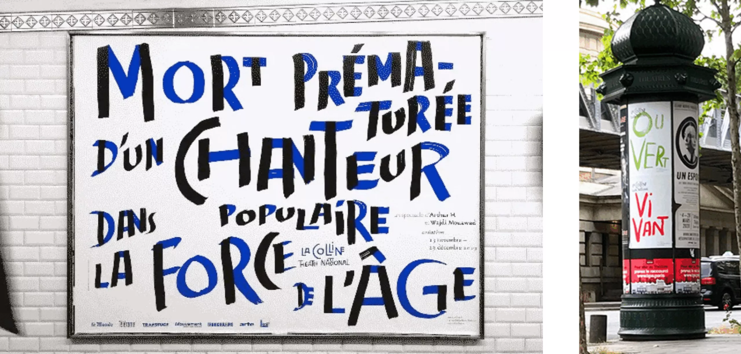
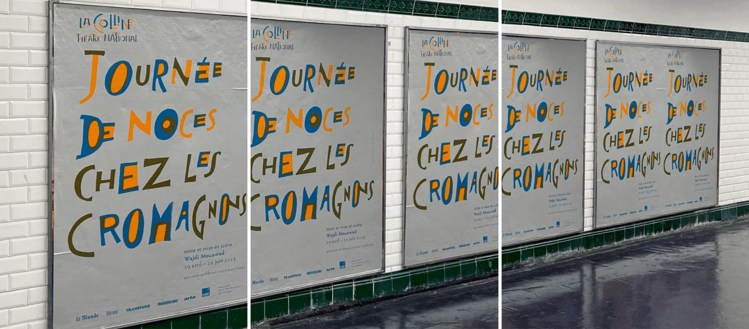
At La Colline, Pierre di Sciullo brought a more poetic and free-spirited touch through his writing systems, expressing his desire to question language itself. He had never previously worked for a theater as prominent as La Colline.
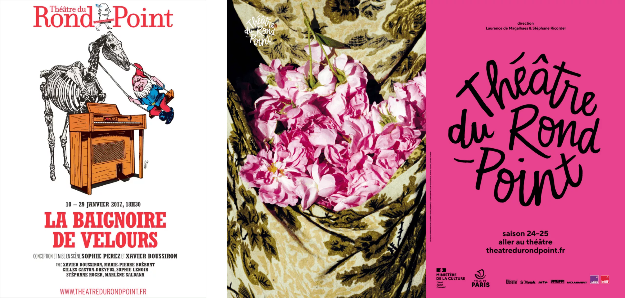
The Théâtre du Rond-Point has moved away from Atalante and the illustrations by Stéphane Trapier that once set it apart from other cultural posters, favoring more standardized visuals instead. Gérard Garouste’s logo, which was somewhat at odds with the theatrical visual identity, has also disappeared.
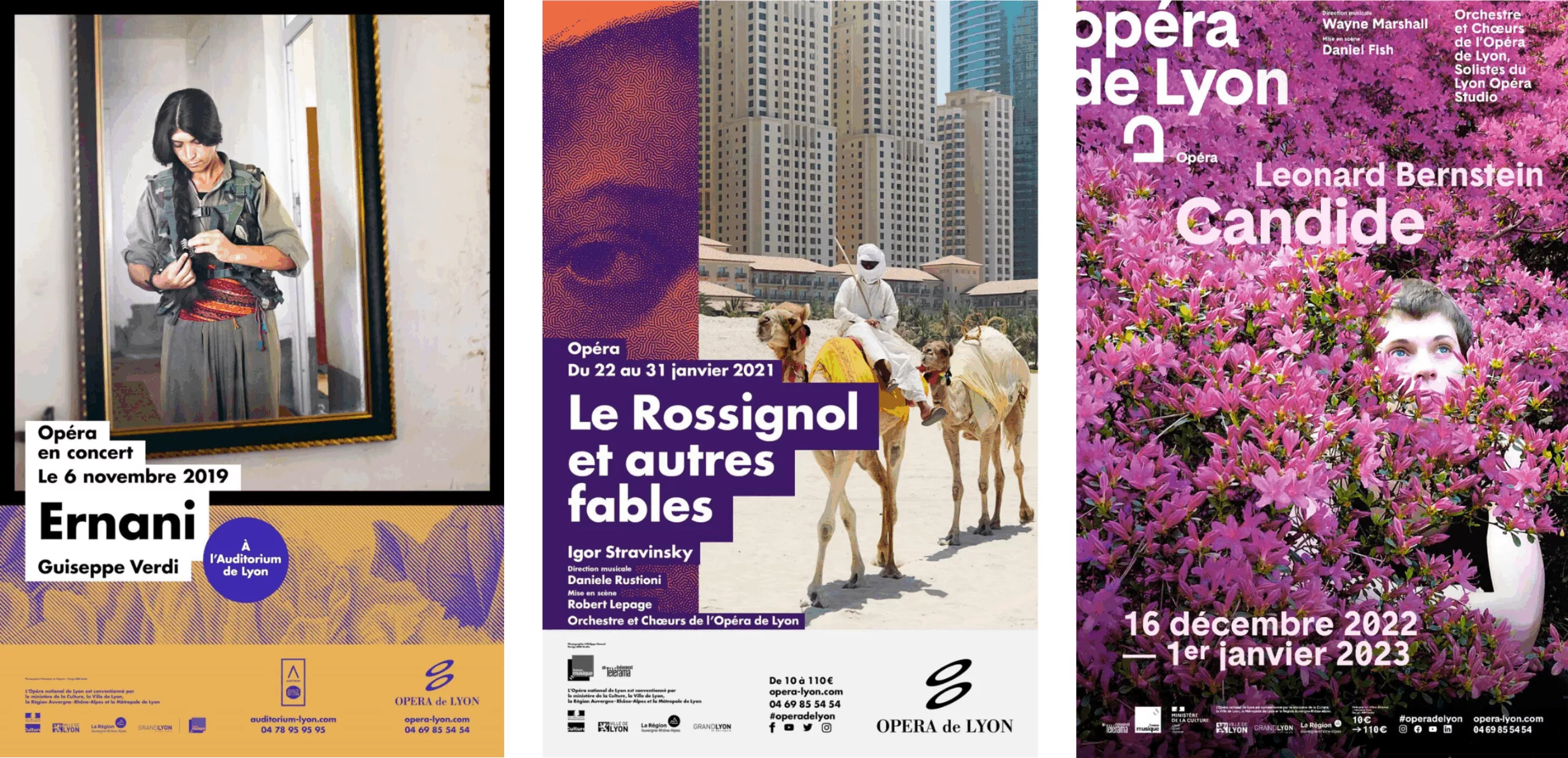
ABM Studio (formerly Labomatic) will return to more classical, more accessible forms for the Opéra de Lyon and the Théâtre de Lorient—designs that are clearer and more legible for a broad audience.
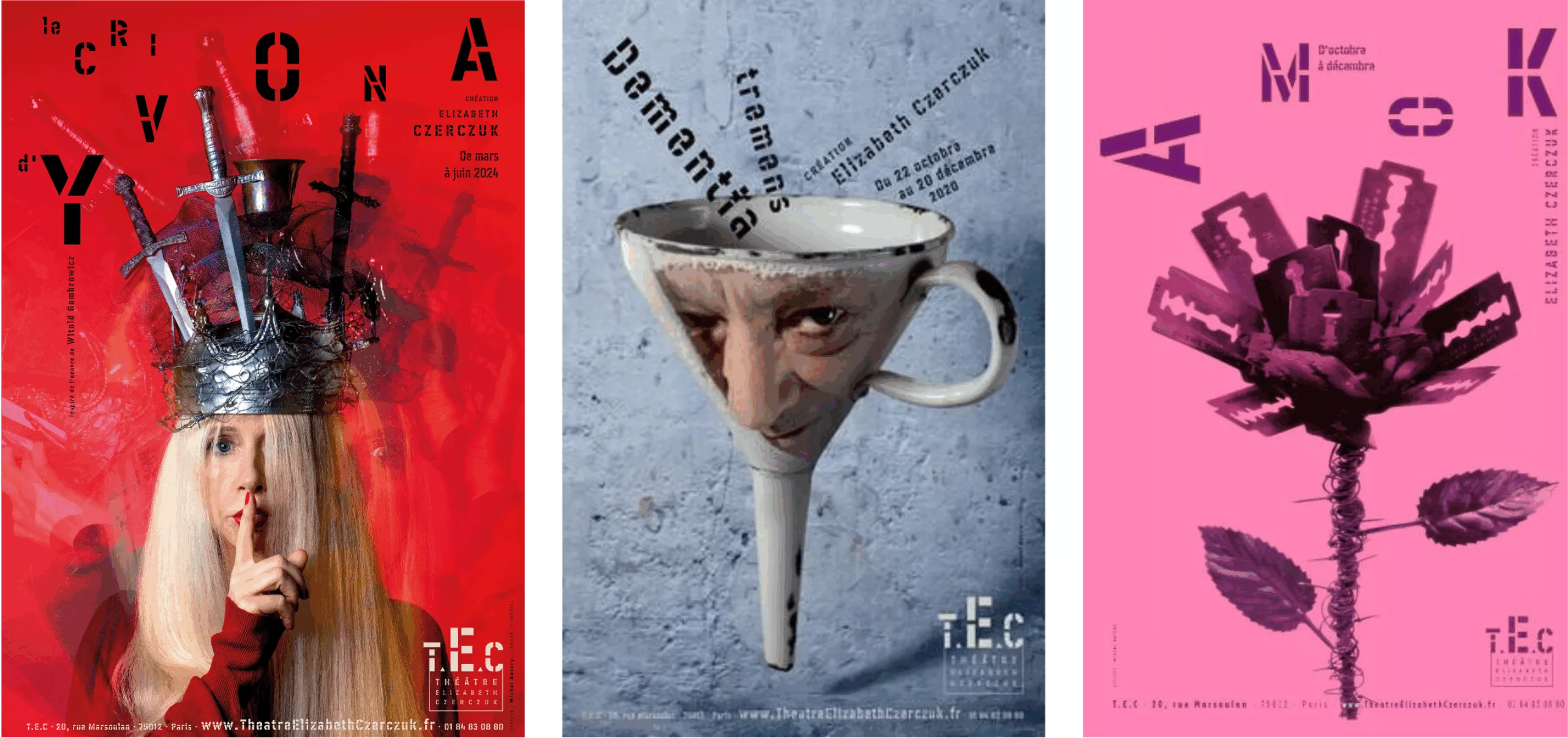
Twenty years after his work for La Colline, Michal Batory will return to the spotlight with the private Elisabeth Czerczuk Theater, delivering posters that remain striking and feature his distinctive graphic style.
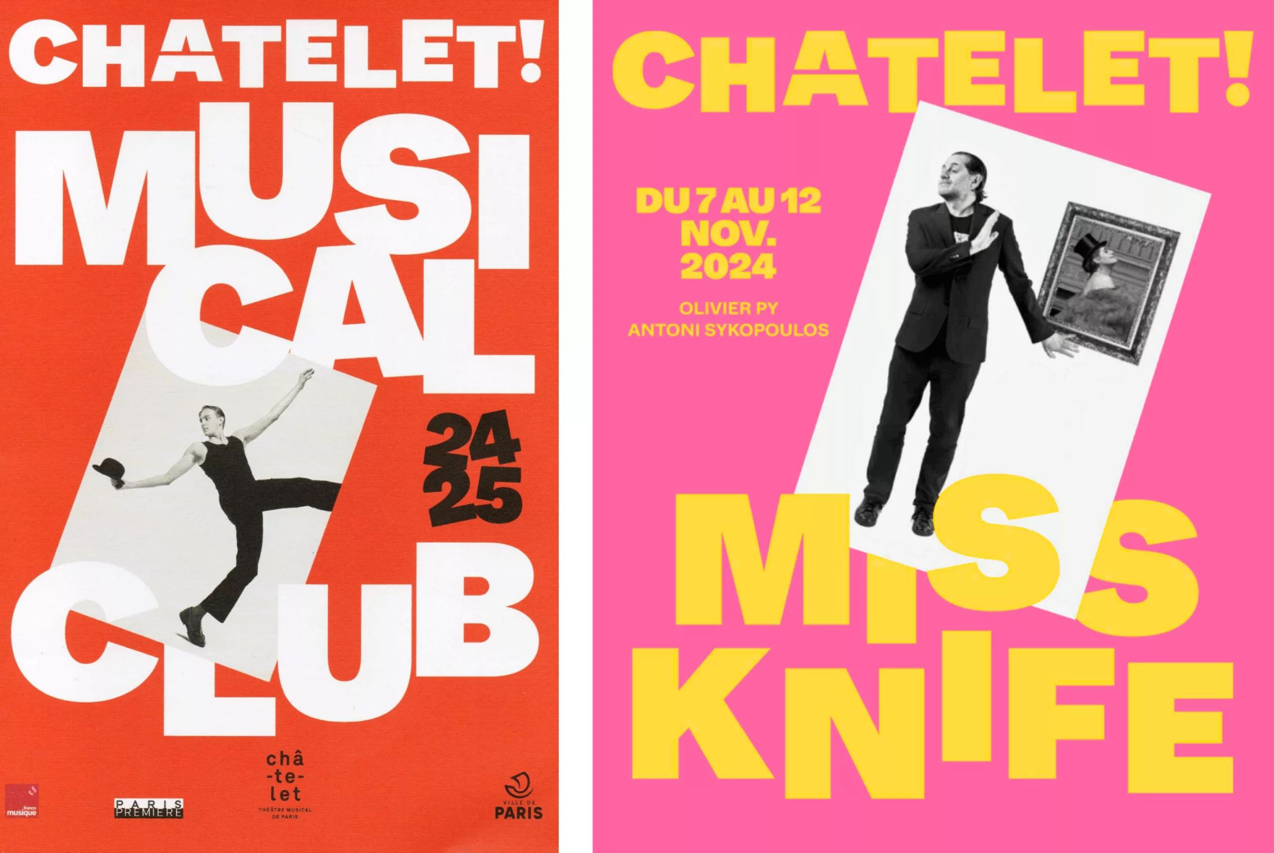
The Théâtre du Châtelet is reinventing its brand identity alongside the Brussels-based agency Base Design, following a logo redesign carried out by our team. After more than two years of renovation and closure, audiences are now discovering a new logo and a “new graphic world.”
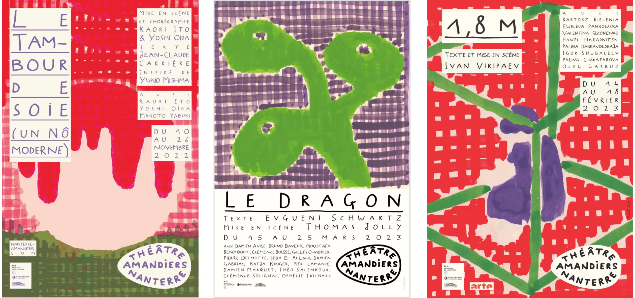
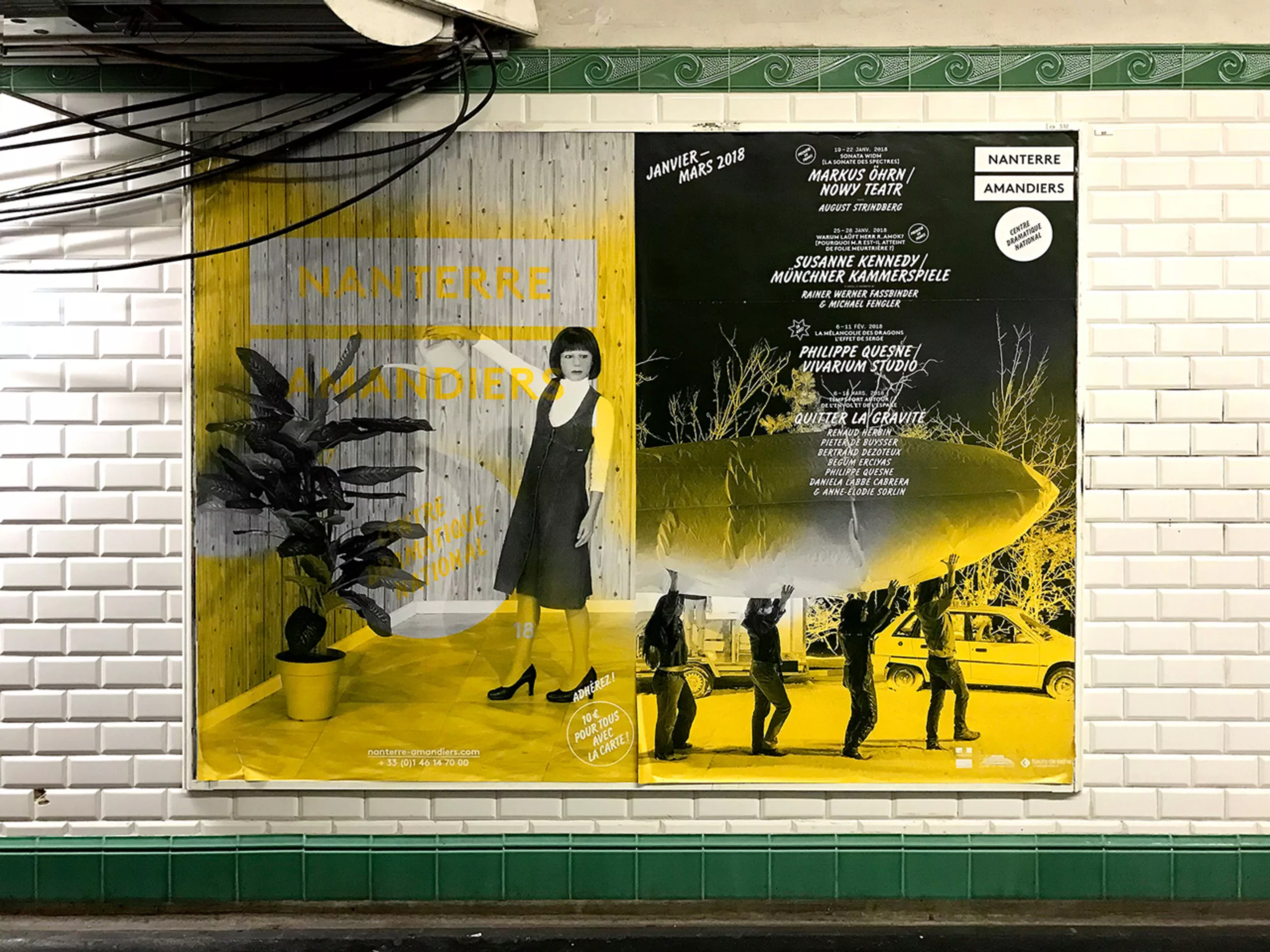
Following the sudden death of Frédéric Teschner, who collaborated with Lisa Sturacci, the Théâtre de Nanterre turned to Paul Cox and his painting work. Perhaps this was a way to reconnect with the distinctly French tradition of the painter-poster artist ?
And many others who bring diversity to the world of theater…
ÉPILOGUE – And What If the Reign of Typography Had Arrived?
The story is coming to an end, it’s time to conclude with this epilogue!
“In our professions, there are three people involved : the designer, the client, and the public, Milton Glaser used to say. “None of the three should come first, and certainly not the designer. On the contrary, it’s the interrelationship that matters; narcissism has no place. The ego should never be misplaced.” That was 50 years ago, half a century, and since then, everything has moved very fast in the world of theater posters.
Until the 1990s, the poster generally served to illustrate a production. This personalization was largely rooted in the graphic language of the postwar Polish school. The rupture came with Michel Batory at La Colline. Theater institutions began seeking distance from overly recognizable imagery that had become the signature of a handful of author-designers.
In the meantime, the digital revolution has profoundly transformed communication. It took time to realize that this shift hadn’t only impacted the creation of visuals. More subtly, it changed the interactions between key players, most notably, the relationship between client and graphic designer. In an issue of Étapes (179), Evelyne ter Bekke & Dirk Behage reflect on this shift:
“Since the introduction of computers in the 1980s, this new technology has made the relationship between designers and clients more ambiguous. The “myth” of creation has faded into a more ordinary and democratic relationship. The professional authority of the graphic designer is often called into question. The designer is now expected to “provide a service.” Today, the challenge is no longer to imagine projects, but rather to be able to make them exist “well”, exactly as they were imagined.”
What emerged at the dawn of the twenty-first century was a fourth figure who took on an increasingly important role… THE theater itself. The assertion of the institution as a creative actor became visually more prominent on posters. The institution, the theater, and the season’s programming asserted themselves strongly. Theater as a literary work has nearly disappeared in favor of theater as a live performance venue.
Typographic Graphic Designers and Text-Based Posters
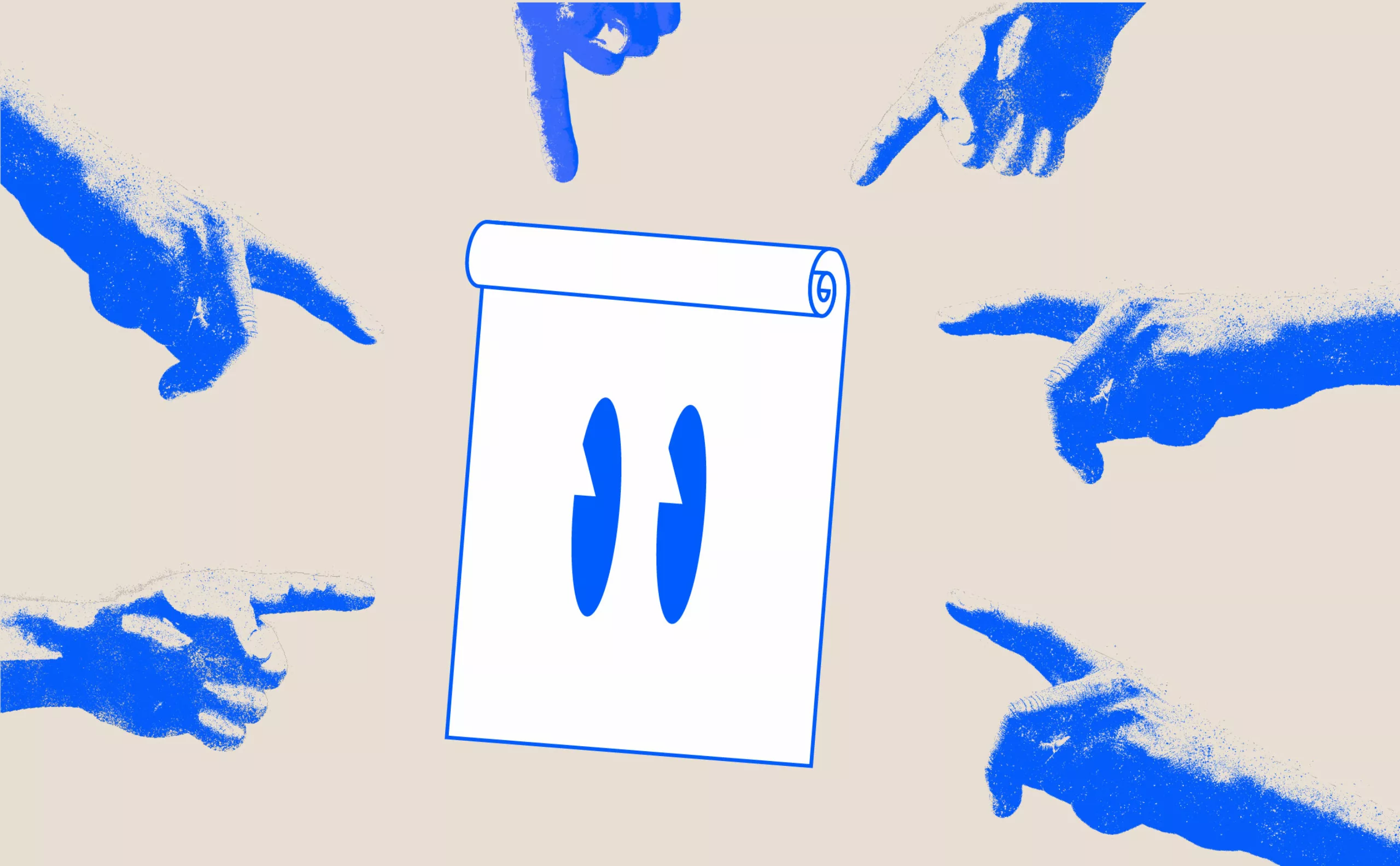
There remains the question of the text/image pairing which, in this case, also tells the story of our society. Theater posters have evolved towards designs where the image has been reduced to its simplest form. Instead, typography has taken on a hegemonic role. And paradoxically, more than two centuries later, we find ourselves returning to the typographic posters of the early nineteenth century.
“Graphic designers have become typographers !” Peter Knapp already declared this some years ago at the Rencontres de Lure.
To the point that some posters can be seen as typographic specimen sheets, like those that type foundries used to produce to showcase their new creations. Promotional materials aimed… at graphic designers themselves! Does this mean that today’s typographic posters are primarily addressed to graphic designers rather than the general public ? “I’m interested in speaking to people, not to other graphic designers in my field,” responds Alain Le Quernec when asked about the current production.
So yes, the image raises questions. But what about the image itself, and why does this typographic leveling seem so firmly established?
The Culture of Text and the Typographic Risk-Taking
The explosion of social media starting in 2010, and more specifically the emergence of Instagram, has changed our perception and relationship with images. Regardless of their nature, images are now massively circulated but also heavily criticized and called out. Controversies have become very frequent.
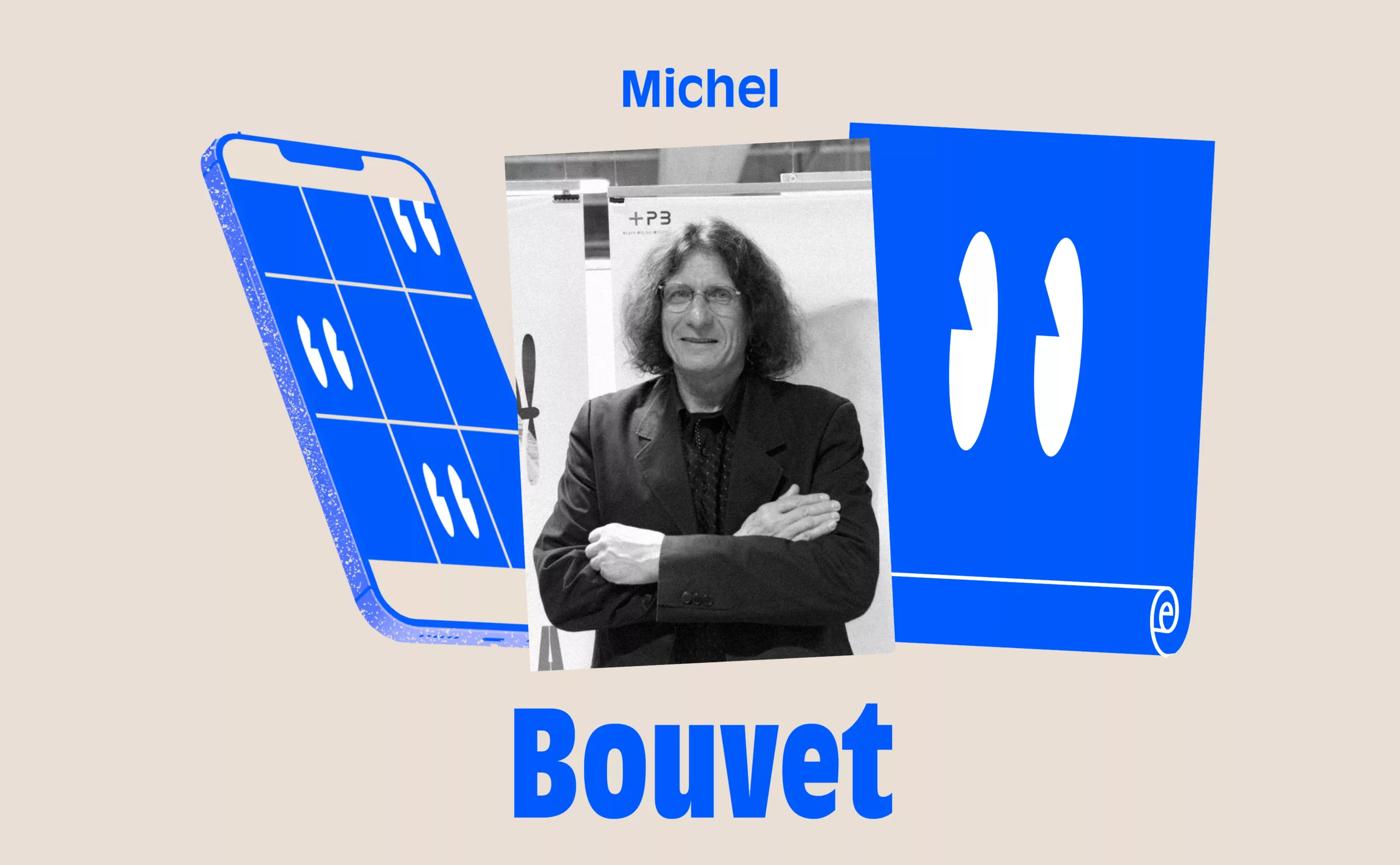
Michel Bouvet expresses this based on his experience: “In a broad sense, because it’s not only theaters that are concerned but cultural institutions in general, since the 2000s everything has evolved tremendously, and the image is truly experienced as a risk. I lived through the golden age of posters in the 80s and 90s, when clients wanted to create posters with beautiful images. Then there was a generational shift, and we saw the emergence of people who were probably less interested in the image.”
And what began to spread across all creative fields is a constant fear of facing critical viewpoints on posters. The need to justify oneself… “What does this represent and why ?” I think I have always sensed the boundaries not to cross. I created images that sparked many discussions, but they passed, I knew how far not to go too far. But today, the image has become much more contested than it ever was. The logical consequence, to prevent these potential excesses, is a gradual shift toward typography.
I continue to propose them, risking having my poster rejected, perhaps less by the client than by the poster distributors. Posters with images strongly appeal to the public they spark desire and inspire people to go to the theater. They offer an opportunity to talk about images to remember and memorize them. Typographic posters can have real graphic qualities and they do but they are often less noticeable to the general public.
In 2020, I was invited to Berlin to serve on a jury selecting the 100 best German, Austrian, and Swiss posters, and even then, I made this observation… Many of the posters were typographic, with very few images. This is striking considering that German poster art has historically been shaped by several remarkable generations of poster artists. For several years now, there has been a real trend toward creating virtuoso posters. My question remains the same: “Do these posters speak to the general public???”
The Generational Battle of the Poster

From another perspective, it is also a generational story. Even today, the image in cultural posters is strongly linked to the post-May 68 era and the Grapus years. Designers for whom posters had to carry meaning. A generation that intellectually and politically shared the mindset of institutional leaders.
Malte Martin experiences this daily. “Whether we like it or not, I am part of the graphic designers likely linked to the image production created for the previous generation of theater leaders. The new generation, and rightly so, desires a break from that. A break in graphic writing, a need to visually mark the generational change. A director or artistic director aged 35 to 40, newly appointed, often approaches collaboration with an older graphic designer who knew the venues before them, the theater world, and its communication codes. Paradoxically, experience works against us, unlike in other creative fields. These new leaders turn to younger graphic designers with a belief that this will necessarily produce an image representing them, distinct from the previous generation. But perhaps also with the idea of having more experience and legitimacy to remain the artistic directors of the visual production.
When I work with urban planners or architects, I am often the oldest and in some ways more experienced than them, and this causes no problem, quite the opposite. They seek someone who can understand the complexity of an urban issue. A very different approach from that of some theater directors who hope for visibility through an original image.”
Typography perfectly responds to this “power dynamic.” Previously, a theater director sought a graphic designer capable of visually conveying the meaning and spirit of a play. This often led to friction and debates around each poster. Today, typography gives the illusion that one can bypass these subjectivities by adopting a neutral point of view.
Stéphane Braunschweig for the Théâtre de la Colline expressed a similar idea by choosing to exclude the image. He emphasized that the poster must remain neutral through typography. “The spectator must come into the theater with a clean slate (!)” Once the graphic system is established, variations are produced quickly and without discussion because there are no surprises. This results in graphic lines that are easily predictable and risk-free.
Theater as a mark that stands out
The choice of typography also responds to real economic reasons. Images are subject to copyright fees, whereas words remain free to use. Moreover, creating an image takes time, much more time than typographic design. This reflects an economic model that has evolved over the past 40 years. Cultural budgets have tightened.
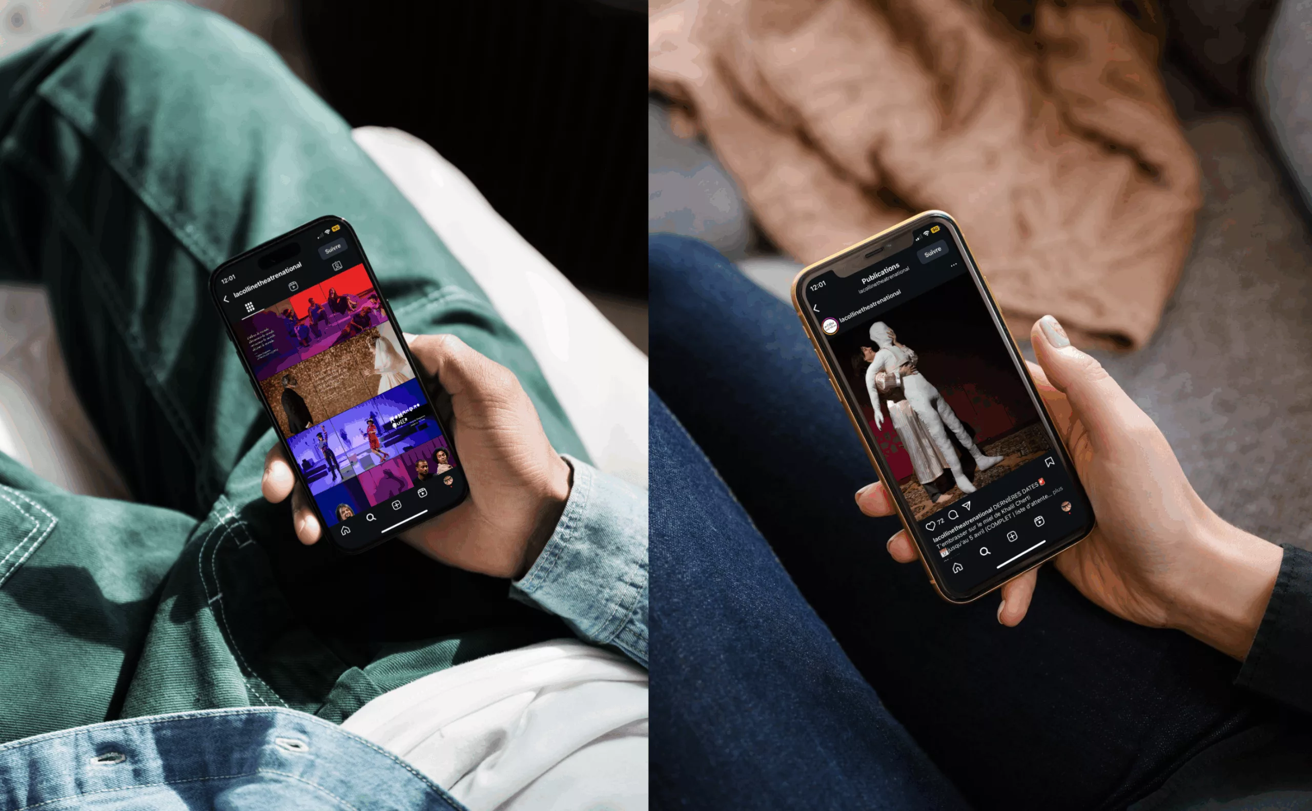
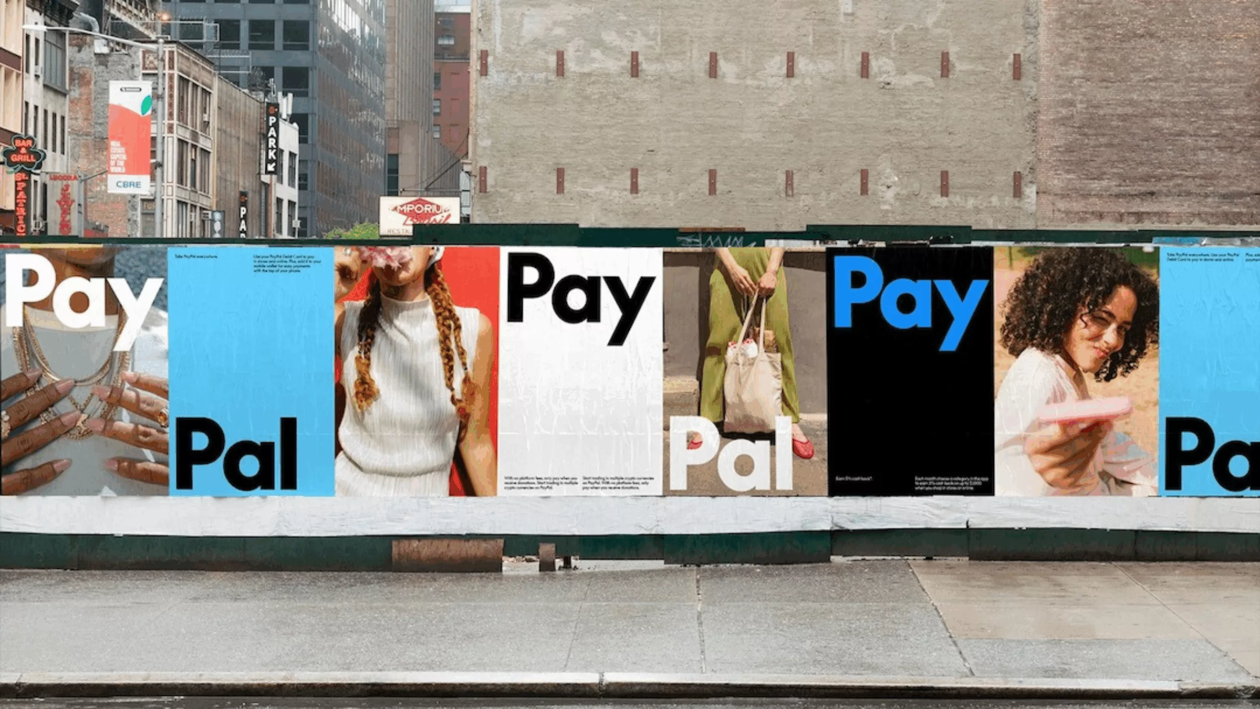
The new communication of the Théâtre de Chaillot by Zoo graphic designers offers us other avenues for reflection. For the past ten years, the smartphone screen has smoothed out graphic production. The very size of the screen encourages a bolder and thicker use of typography. Everything must be immediately readable. It is the codes of commercial communication that gradually impose themselves. That Chaillot now communicates like PayPal (in its latest campaign created by Pentagram) says a lot about this leveling.
Everything looks alike and everything blends together, everything is equal and the hierarchies between fields fade away. The omnipresence of the smartphone has come to standardize the message. How can we not think of McLuhan’s prediction, “The medium is the message”… here we are.
In Paris, the theater sector is vast and highly competitive, which creates a need to stand out and have strong visibility. There is a temptation to use aggressive and impactful graphic typography. The approach is more about brand communication than product promotion. The message is loud and clear: “Something is happening at the Odéon, at La Colline, at Chaillot.” The time is no longer for promoting “The Seagull” by Chekhov or “The Satin Slipper” by Claudel…
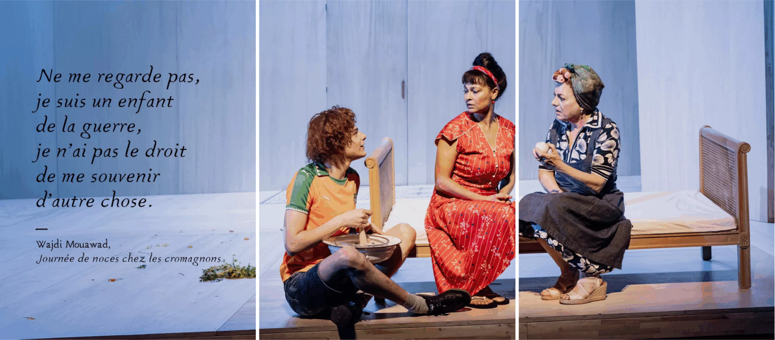
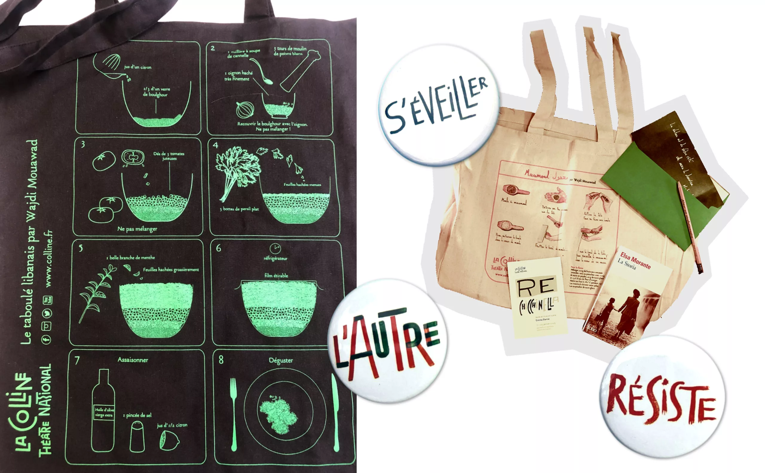
The theater as an institutional venue has truly become a brand. It no longer signs discreetly in a corner of the poster; it takes up the entire space. The entire space. And like all brands, public theater applies marketing and advertising logic. Here, we can see tote bags from La Colline featuring Wajdi Mouawad’s Lebanese tabbouleh recipe. What does this have to do with theater? Nothing, except that it creates an emotional connection between the spectator or client who takes ownership of these goodies and can prepare a delicious tabbouleh at home after a night at the theater. In the nineteenth century, there were sandwich men ; today, we have men and women tote bags.
The shift took place gradually over twenty years, almost imperceptibly. The Théâtre de la Colline became simply La Colline. The Colline brand began to overshadow the plays being performed which, if we push the logic further, can be seen as derivative products (yes, it’s an exaggeration to say it like that!!!).
The theater, for whom, and why?

All theaters “compete” for the same subscribers of Télérama and, to a lesser extent, Les Inrockuptibles. Beyond the appeal of a particular play, it is essential to be highly visible as a venue attractive enough to inspire subscriptions. Because subscriptions are now the top priority. This drives communication that emphasizes the identity of the venue at the expense of the programming. Typography alone or typography combined with a photo of the play quickly establishes itself as the best graphic response, or at least the most effective way to promote the venue.
The central question that has been present since the beginning of this story remains: who are we communicating for ? To whom are we speaking, and what are we trying to say ? What audience do we want to bring into a performance venue ? This summer, in an opinion piece in Libération, Ariane Mnouchkine, founder of the Théâtre du Soleil, took a stand during the early legislative elections.
“What have we not done? Or done what we should not have? I believe we are partly responsible, we, people of the left, we, people of culture. We let go of the people; we did not want to listen to their fears and anxieties. When people said what they saw, we told them they were wrong, that they did not see what they saw. We told them it was only a deceptive feeling. Then, as they insisted, we called them fools; and as they insisted even more, we called them scoundrels. We insulted a large third of France out of a lack of imagination. Imagination is what allows you to put yourself in the Other’s place. Without imagination, no compassion. Today, I am not sure that a collective statement by artists is useful or productive. A portion of our fellow citizens are fed up with us: fed up with our helplessness, our fears, our narcissism, our sectarianism, our denial. That’s where I stand. A very dark, uncertain, and shifting reflection.”
Wajdi Mouawad, the director of Théâtre de la Colline, features this direct question in the season program : Theater for whom, for what ? And always this question of the role of public theater, of its mission. Of the importance of theater posters in public spaces.
The Importance of Theater Posters
A theater poster today is still an image that will be seen thousands of times, hundreds of thousands of people will pass by it, among other commercial posters. For a long time, it was a medium of struggle, resistance, and fight against the hegemony of advertising messages and commercial signs in the city. A theater poster can catch our eye, whether we go to the show or not. A theater poster can make us reflect.
One can even consider that theater posters contribute to visual education, to the visual quality of our environment. We often talk about urban noise pollution, but very little about visual pollution. Just look at what the entrances of certain cities look like to be convinced of this.
This summer, Paris and indeed much of the world lived to the rhythm of the Olympic Games and the fervor they sparked. Thomas Jolly, the artistic director of Paris 2024, reflected in an interview with *Le Monde* on the widespread enthusiasm that everyone discovered. On this occasion, he raised genuine questions regarding theater and its audience.
“Universalism emerges stronger from this dialogue between the common and the singular. Likewise, the fortunate association of culture and sport, two pillars for building society. Politicians should take this lesson to heart. Why couldn’t there be a World Cup of theater? It existed once, long ago, with the Dionysia. Theater was performed in stadiums seating 20,000 people, ten times the audience of the largest theaters in France. I’m not saying sport and culture should always be combined. But if these ceremonies have proven anything, it’s that live performance carries tools for better togetherness.”
“Better living together” and “Culture for the greatest number”… the debate remains as urgent as ever. For the first time in many years, cultural budgets seem genuinely threatened. It is the place of theater, the missions of public theater, and the economics of theater that are now coming to the forefront. Without a doubt, all of this will feed into the reflection of leaders and graphic designers about what a theater poster should be today.
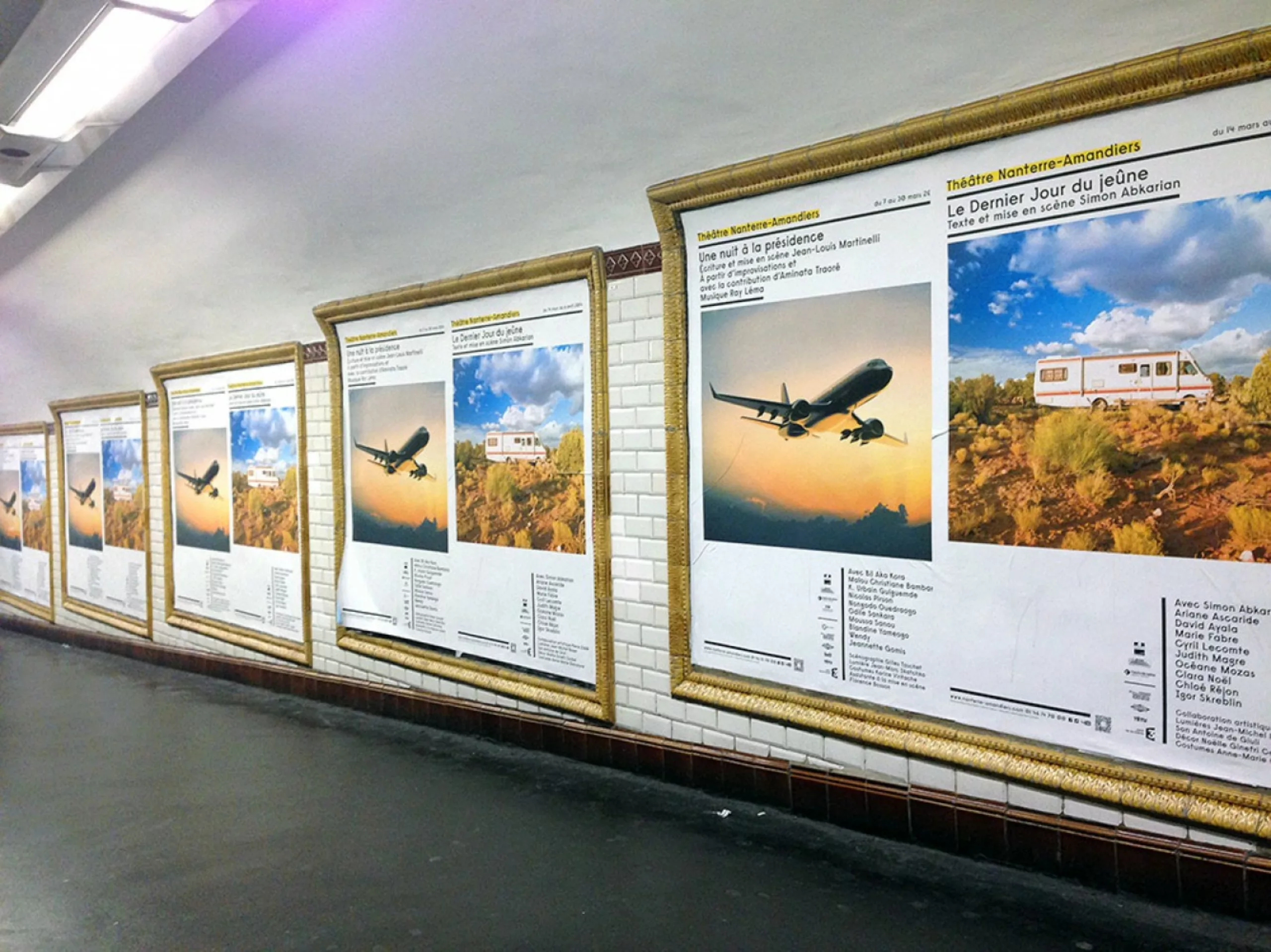
Before the curtain falls, a remark from Paul Cox about his creations for the Amandiers: “My wish is to achieve the following equation : a strong and recognizable image year after year, yet a surprise of novelty each season – each one being, in turn, considered as a story, or at least united by a theme.”
In 2025, more than ever, we need narrative imaginations and “posters that sing out loud,” as described by Apollinaire in Alcools !
Sources for further reading :
Yellow and Black, 8 Seasons. Théâtre Nanterre-Amandiers — Pyramid Éditions, 2010, Théâtre de la Colline
Interview Pierre Bernard — Formes Vives
Interview Gérard Paris-Clavel — Formes Vives
Étapes no. 35 December 1997 — no. 167 April 2009 — no. 179 April 2010, Claude Baillargeon on posters, November 2022
History of Graphic Design in France, Michel Wlassikoff, Éditions les Arts décoratifs, Paris 2008
Posters That Changed the World, Michel Wlassikoff, Éditions Larousse, Paris 2019
Poland, A Graphic Revolution, Mois du graphisme d’Échirolles 2018, Éditions du Limonaire, 2018
Poster Notebooks, Michel Bouvet, Éditions De visu l’image, Paris 1995
A Graphic Designer’s Manual, Michel Bouver / Fanny Laffitte, Éditions Eyrolles, Paris 2022
Forms as Stories, Paul Cox at Théâtre Nanterre-Amandiers
Jules Chéret — Galerie 123
Michal Batory — Paris Art
Michal Batory, Poster Artisan — Artefake
Le Chaillot by Jacno
Political and Cultural Posters, BDIC Exhibition
Pierre Di Sciullo: “A Good Poster Exists Without Noise” — France Culture
The Afternoon of a Phoneme – Pierre Di Sciullo – ZEUG
In Montmartre with Pierre di Sciullo — La Survivance
Pierre Di Sciullo, Poster for La Colline, Théâtre National. Mad Paris, 2018
Théâtre de l’Athénée – Malte Martin, La Survivance
The Theater with a Beauty Mark, Malte Martin – les Éditions de l’œil, Paris
Guided Visit: In the Studio of Graphic Designers Evelyn ter Bekke and Dirk Behage — Télérama
Alain Le Quernec, DDABretagne
Jacno, Five Capital Letters ! — Grapheine
Pierre Bernard & Grapus, “Graphic Design of Public Utility” — Grapheine
How Do You Not Know Grapus, Léo Favier — Éditions Spector Book, 2014
Amélie Doisteau for Chaillot
The Poster, From Wall Print to Popular Museum of the Street — Gallica BNF
Vincent Perrottet
Thanks to François Chevret for the texts
On the subject
-

Who controls the memes, controls the universe
Who controls the memes controls the universe! Analysis of the meme phenomenon,
comparison with the stakes of brands and analysis of the impacts on political communication. -
New identity for the Gaîté Lyrique, a nice logo to start 2017
New visual identity for the Gaîté Lyrique, a nice logo to start 2017.
Yorgo Tloupas, our hexagonal madmen has struck again!