Brand mascots, from Bibendum to Benny the Bull
This article is the second in a series on mascots, from their historical origins to their digital transformation. Find all the articles here:
- A history of mascots
- Brand mascots, from Bibendum to Benny the Bull
- What strategies are hidden behind the mascots’ smile?
- Mascots and virtual avatars in the digital age
In the previous article, we talked about the origins of mascots, from Antiquity to Japan, explaining their history and why they have a place in our societies. Now here is an overview of the most well-known brand mascots and those that stir the world of sports.
We begin with mascots that directly embody brand products, before turning to those, more abstract, that reflect their values, as seen in the world of sports. At the very end of the article, we will look at the key ingredients for creating a successful brand mascot.
When mascots resemble the brands
Most of the time, mascots come to life as animals, humans, directly represent the product (metonymies), or embody “in real life” our favorite heroes and heroines, like in Disneyland parks. In principle, a mascot resembles what it embodies, in a more or less obvious way.
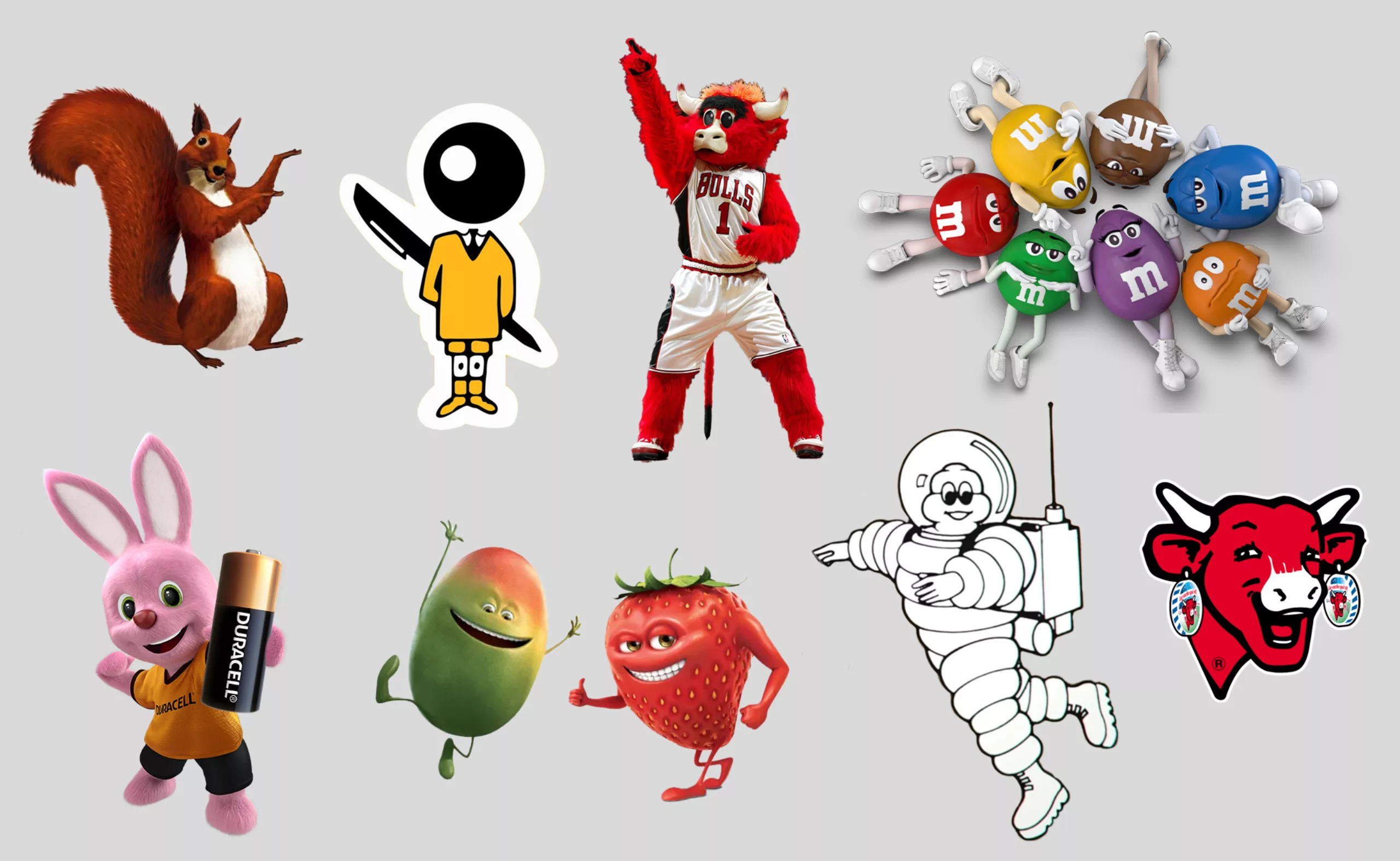
For example, think of Michelin’s tire man Bibendum, Bic’s schoolboy, the squirrel of Caisse d’Épargne who gathers reserves, the strong and flexible blond figure of Malabar, the Laughing Cow as its name suggests, the hyperactive pink rabbit of Duracell batteries (and all his friends), Benny the Bull, the Chicago Bulls’ mascot, M\&M’s, or the fruits from Oasis drinks. And what about Ramses, the white cat of Feu Vert, who seems to have no connection to the brand? A mystery, except for his green eyes that recall the company’s colors… or could it be a charm to ward off the bad omen of the black cat?
Let’s take a look at the history of a few French brand mascots: Bibendum, Bic, and Cetelem, followed by the story of pink rabbits.
Bibendum, the very first French mascot
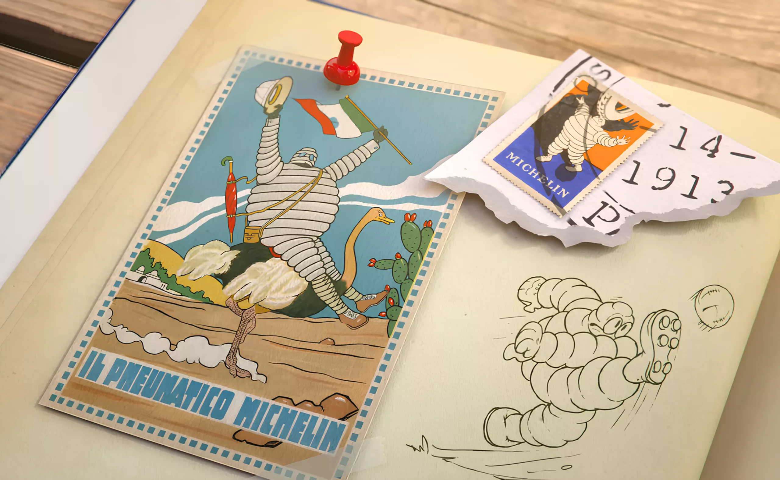
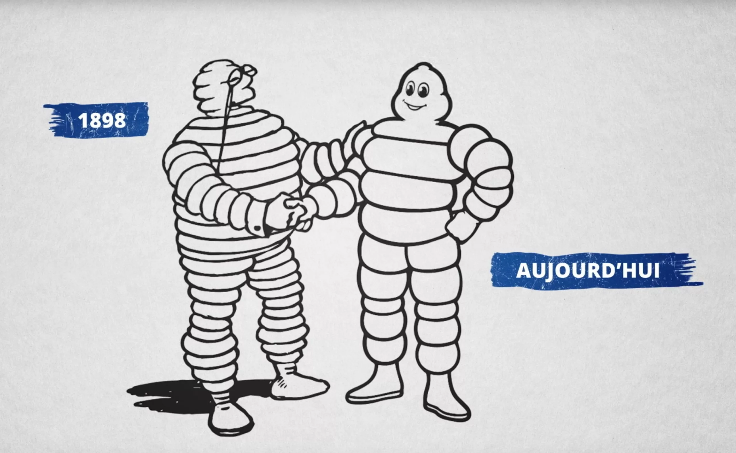
In France, the first brand mascot is the tire man Bibendum, who made his debut in 1898 when the founders of Michelin noticed at the Lyon fair a pile of tires stacked in a way that resembled a little man.
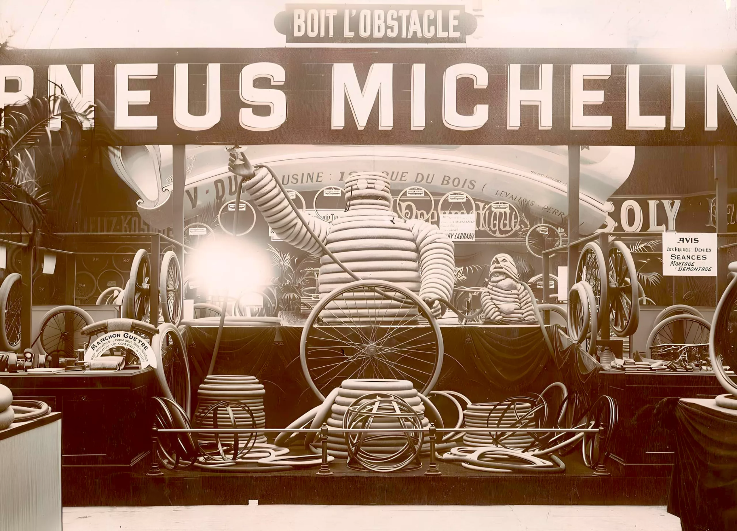
It was the illustrator Marius Rossillon who brought him to life: his name is borrowed from the Odes of the poet Horace, “Nunc est bibendum” (“now is the time to drink”), as the poster explains, meaning that “the Michelin tire drinks up the obstacle,” that is to say, it adapts to bumps and hollows, so much so that Bibendum is capable of swallowing broken glass. Beside him, you can see withered and dejected “bad tires” that clearly cannot hold the road. A bon vivant, reliable, enduring, and robust, this overinflated genius is protective and helpful, while also being funny and jovial. He embodies both the company’s values and the technical quality of the tires.
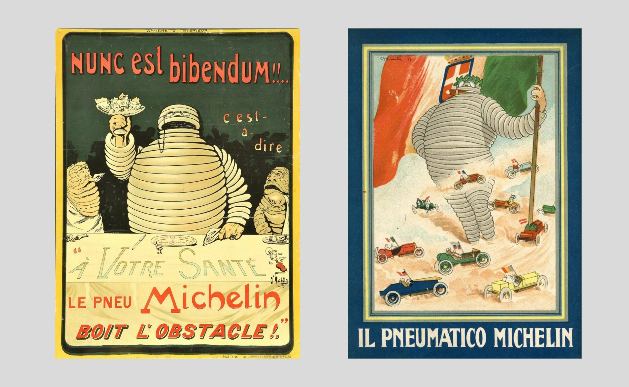
At its origin, Bibendum was close to its affluent target audience and bore the features of a bourgeois with a cigar in his mouth, cufflinks, and pince-nez glasses. His tires were thin, reflecting the style of the time. Gradually, as he became popular, he took on the appearance of a large, reassuring figure with big round eyes, living all sorts of adventures, and his tires grew thicker and thicker.
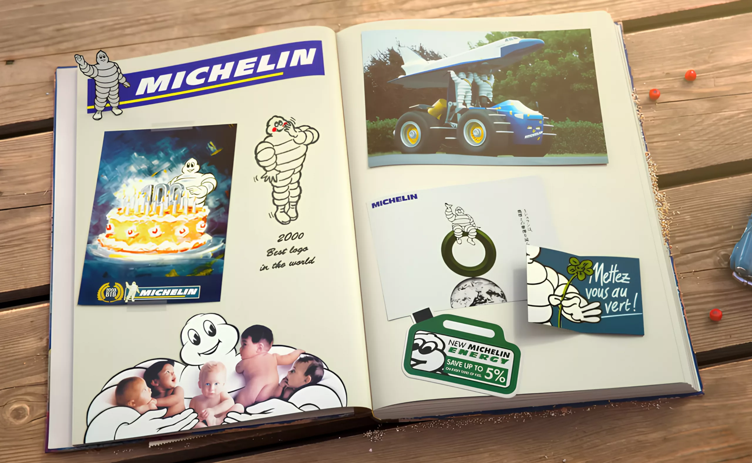
Bibendum distinguishes itself from Michelin by becoming an autonomous intentional being, defender of the user, a kind of mythical and benevolent hero. Stories about the mascot are told in cartoons, and he even gets married. The tire giant, recognized worldwide, was voted best logo of the century and icon of the millennium. Proof of its effectiveness, in recent advertisements, simply drawing a white tire with black outlines is enough to instantly recognize the brand.
PS: For the curious or the passionate, a museum dedicated to the “Michelin adventure” in Clermont-Ferrand covers the history of the brand, from its beginnings in cycling to signage and travel guides, including innovations and the mascot Bibendum.
The big-headed schoolboy, mascot of the BiC brand
In a different vein, but still rolling, the BiC mascot was created by the illustrator Raymond Savignac, who produced advertisements for the ballpoint pen for over 20 years. Funny and lighthearted, they are instantly understandable and reflect this light, simple, and efficient tool that revolutionized writing by replacing the pen and ink.
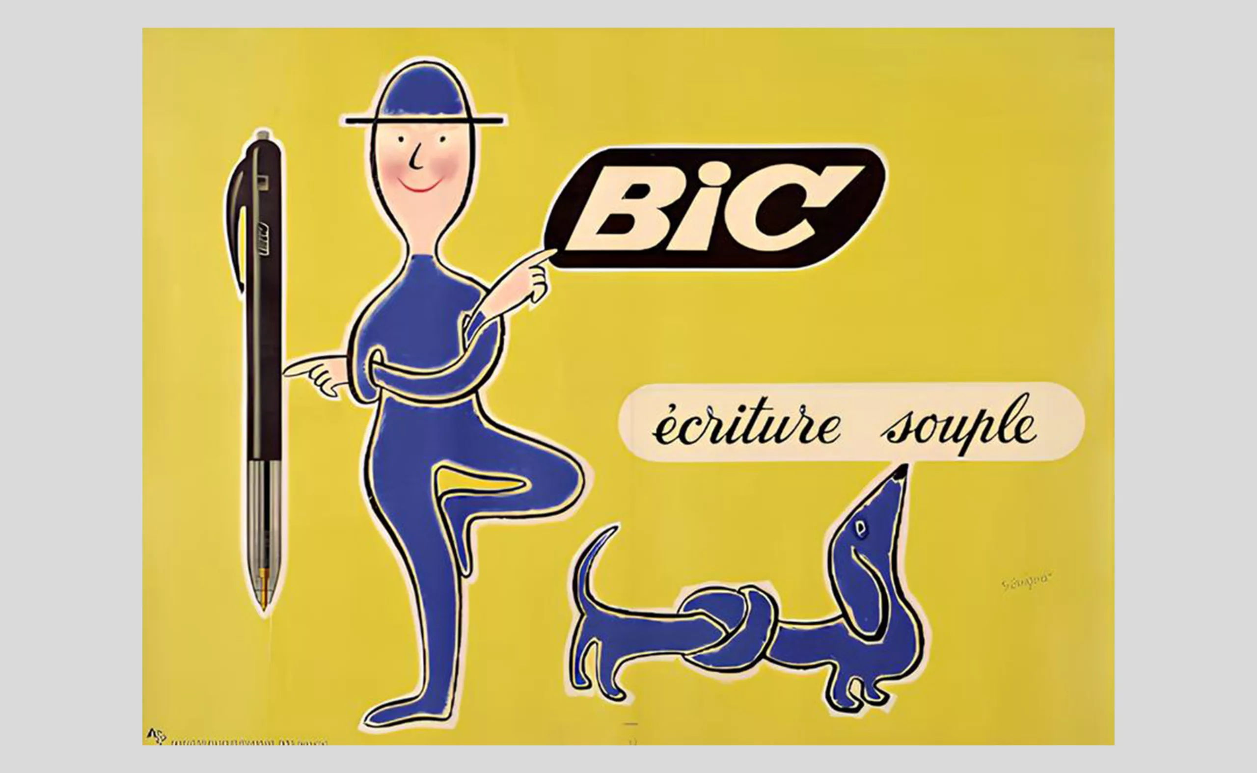
In 1961, the founder Bich launched a new pen with an innovative new ball, and Savignac had the idea to draw a little figure (a schoolboy) with a ball-shaped, round, and disproportionate head. Although the pen would not replace the fountain pen on school benches until four years later, the big-headed schoolboy was not meant to anticipate this success but was rather chosen for its symbolism: the ball had always been a popular playground game, as well as a synonym for “head.”
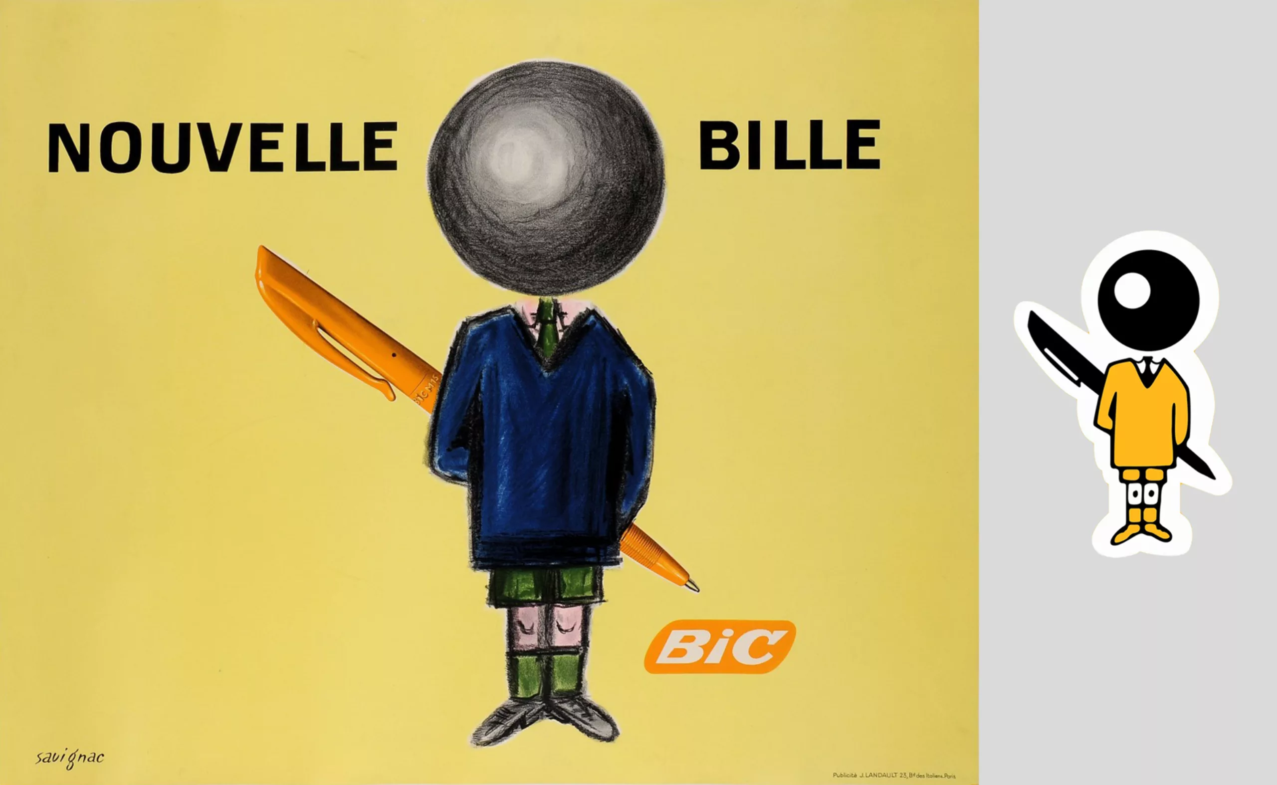
Through this drawing, “the product becomes an actor and delivers the lines,” as Savignac explains. The mascot was born: it is placed next to the logo. In 1973, the schoolboy appeared on lighters, and two years later on the brand’s razors, which had diversified into products for adults while keeping its mascot… but no one minded, because BiC is above all synonymous with practicality, efficiency, and quality at a low price.
The Cetelem figure, or the allegorical mascot
But how do you design a brand mascot for an intangible product, such as insurance, a loan, or a sporting event? In the service world, a mascot helps to materialize the intangible, bringing it to life to reassure users. Brands then play with shapes and their symbolism or create a mascot as an allegory, illustrating values through recognizable signs. This is the case, for example, with Cetelem credit.
The word credit comes from the Latin “credere“, meaning to believe: everything here is a question of trust. But how do you give form to trust? In 2004, the agency TBWA was chosen to create a mascot for Cetelem. After several studies and tests to validate the form that would work best with clients, the mascot took the shape of a large humanoid plush toy: it would be green, round, and endearing, with a soft texture, benevolent and smiling, gender-neutral, without ears, hair, or a fifth finger, bearing a red C on its chest, and without a name (Crédito is just a rumor, not its official name, as it deliberately has none). At first glance, this mascot seems to have nothing to do with what it represents, a “responsible credit.” But its appearance is more symbolic than representative. So why were these shapes and this color chosen?
If we look at color theory (Fernandez, 2005), green symbolizes passivity but also harmony, balance, calmness, as well as sociability and sensitivity. Meanwhile, shape theory (Chevalier and Gheerbrant, 2005) highlights that curves evoke femininity, fullness, roundness, and create a feeling of calm. Cetelem, which makes you want to give it a big hug, could not have been red and prickly, or even moved quickly, otherwise it would have inspired distrust rather than reassuring stability.
In September 2004, for its first appearance on screen, the green figure is seen accompanying a man in his life choices, granting him credit, and knowing how to say no when necessary and right. The mascot then becomes the embodiment of kindness and responsibility. In 2011, although it has not changed physically and hardly appears in TV commercials anymore, a new wave of creative and resourceful imitators tries to pass themselves off as the green mascot by adopting its distinctive features: the green color, the round shape, and the texture.
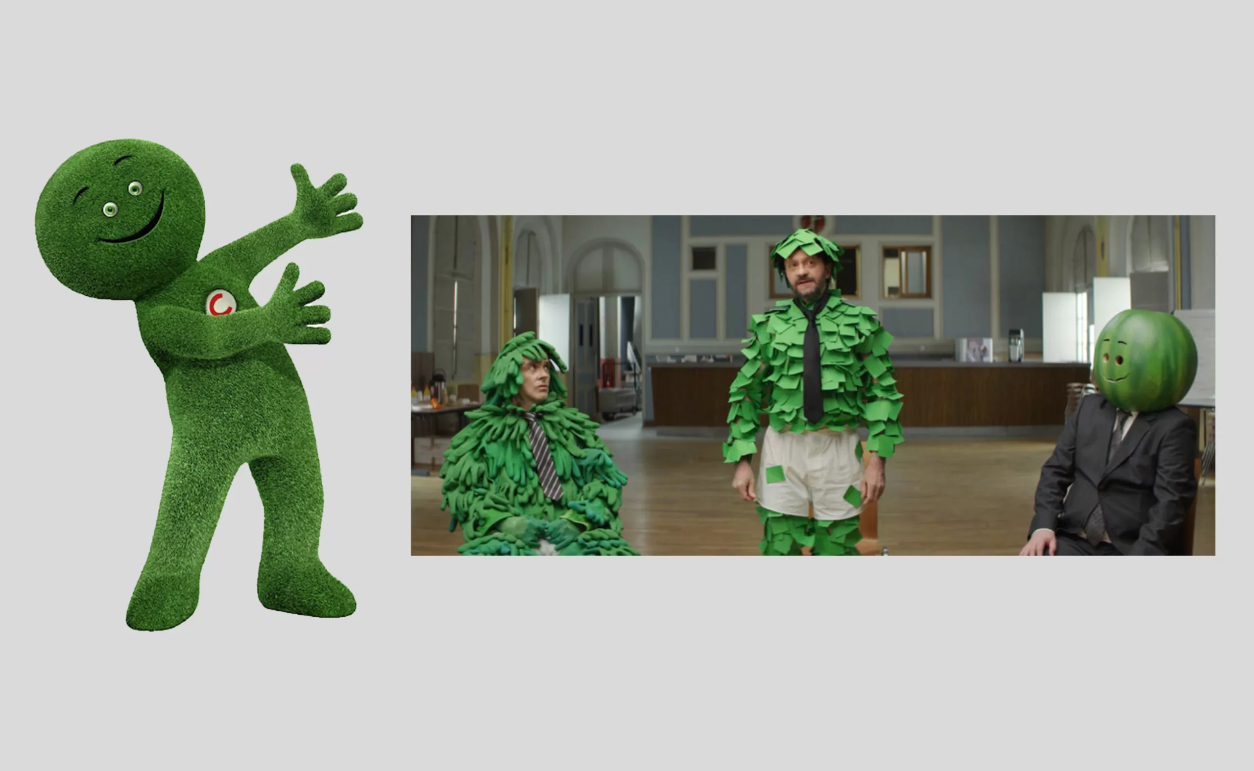
Despite the efforts of the post-it man, the lawn, or the watermelon… the brand rightly reminds us that “looking like Cetelem is not enough to be Cetelem.” It’s a very clever PR move; by making an impression with humor and playing with the distinctive features of its mascot, the Cetelem figure becomes an icon because it is unique, memorable, and recognizable by everyone. Thanks to offbeat advertisements and the mascot’s distinct character, people still perfectly identify it with its brand, as 90% of French men and women said they recognized it (in 2014).
A story of pink rabbits…
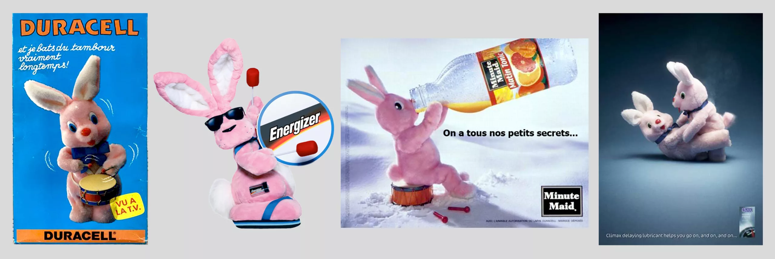
And before closing this nostalgic segment, we wanted to revisit the story of one last historic mascot, a pink rabbit that has had many little ones… the Duracell rabbit. It appeared in 1973 in a TV commercial showing plush rabbits beating their drums. The other rabbits, powered by regular batteries, didn’t last as long as the Duracell one, which is the only “survivor” still drumming at the end of the ad. The success was so great internationally that Duracell made the rabbit its mascot and developed more commercials.
But at the end of the 1980s, Duracell forgot to renew its trademark rights… the pink rabbit was no longer legally protected: its competitor Energizer seized the opportunity and made a big hit in the United States. Energizer’s rabbit has a bigger drum, sunglasses, and flip-flops, giving it a cooler and more powerful vibe, less like a toy. For a few years, however, Duracell benefited from this ad hijacking, which created confusion in consumers’ minds: they mixed up the two mascots! Energizer quickly regained market share with other bold and offbeat commercials featuring a more imposing rabbit in ads that looked a lot like a dick contest, by the way. “Energizer lasts longer,” Energizer drums harder, Energizer has a bigger drum… you get the idea.
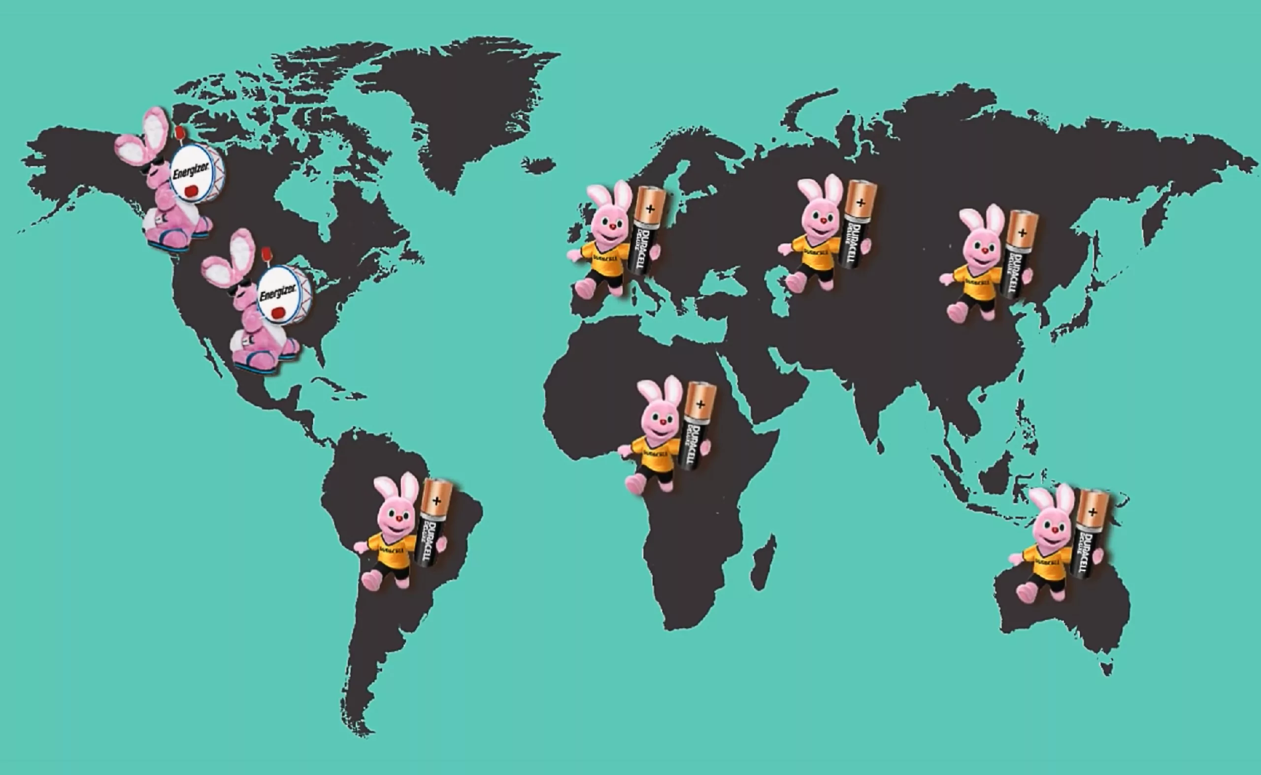
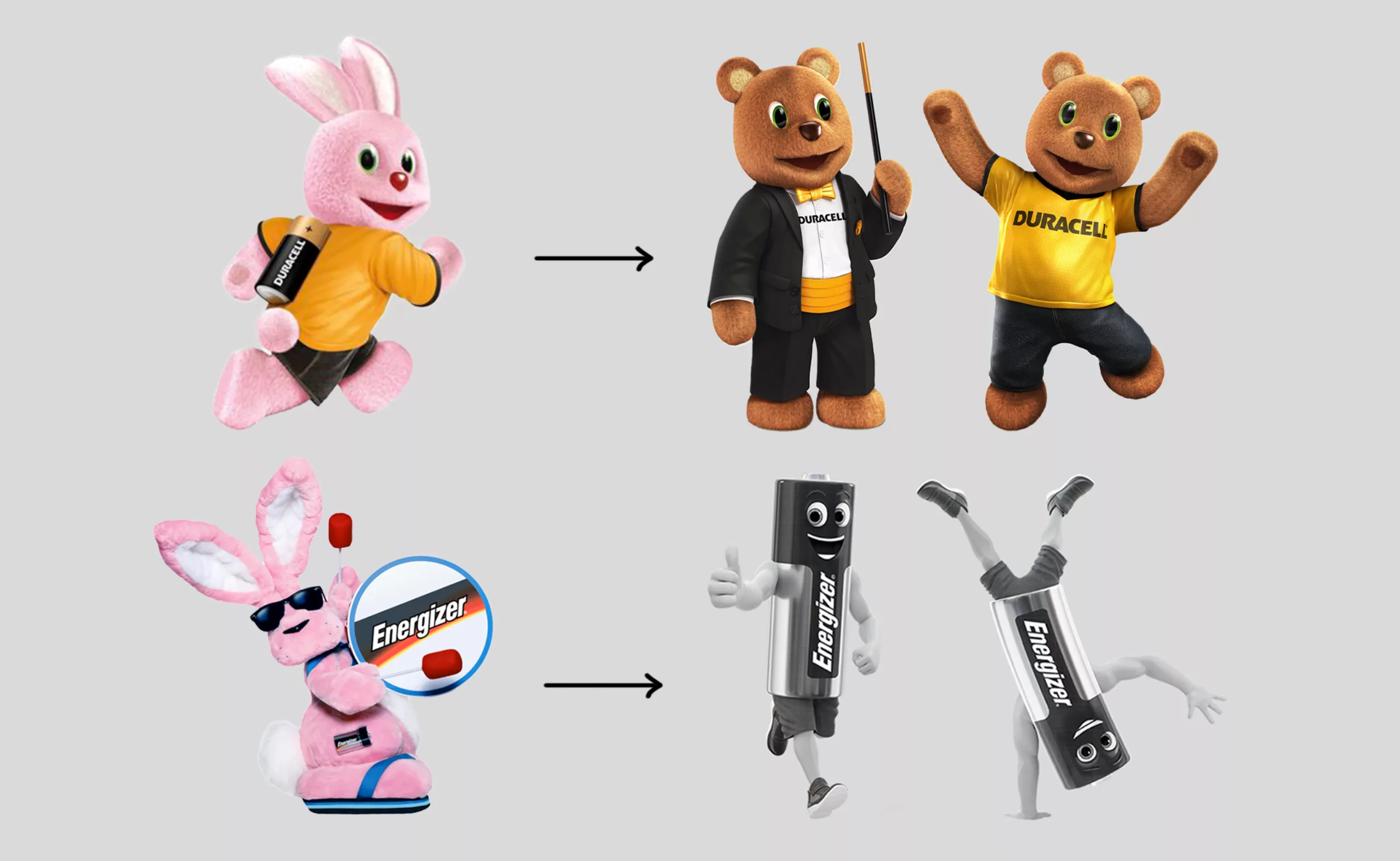
After a legal agreement, it was established that Duracell can sell its batteries everywhere except in America, Energizer’s territory. Today, however, Energizer batteries can be found in Europe, but the mascot is a muscular battery, not a pink rabbit. Among rabbits, you don’t mess with others’ turf… especially when you’re wearing flip-flops! It’s a matter of principle. Another detail: in Turkey, it’s no longer a pink rabbit but a brown bear. Globalization is becoming complicated.
In the 2000s, Minute Maid used the pink rabbit’s fame to its advantage by revealing that the secret of its legendary energy did not come from batteries, but from secretly drinking fruit juice…! Later, Durex launched a lubricant that delays climaxing, to “last longer,”with the Duracell rabbits in adult films stars. Definitely…
It goes to show that a good mascot can also serve other brands.
Mascots of discontinued or rebranded brands
It should also be noted that the 2010s marked the golden age of mascots. Since then, few brands have launched new ones, and many have disappeared or changed. Yet, the mascot is, in a way, the symbolic double of the brand, its effigy, telling its story over the years. By repeatedly seeing this social face and feeling familiar with this figure, people grow attached to it. Changing or abandoning a mascot is a significant risk because the brand thereby breaks this intermediary link between itself and the customer, severing the trust that had been built.
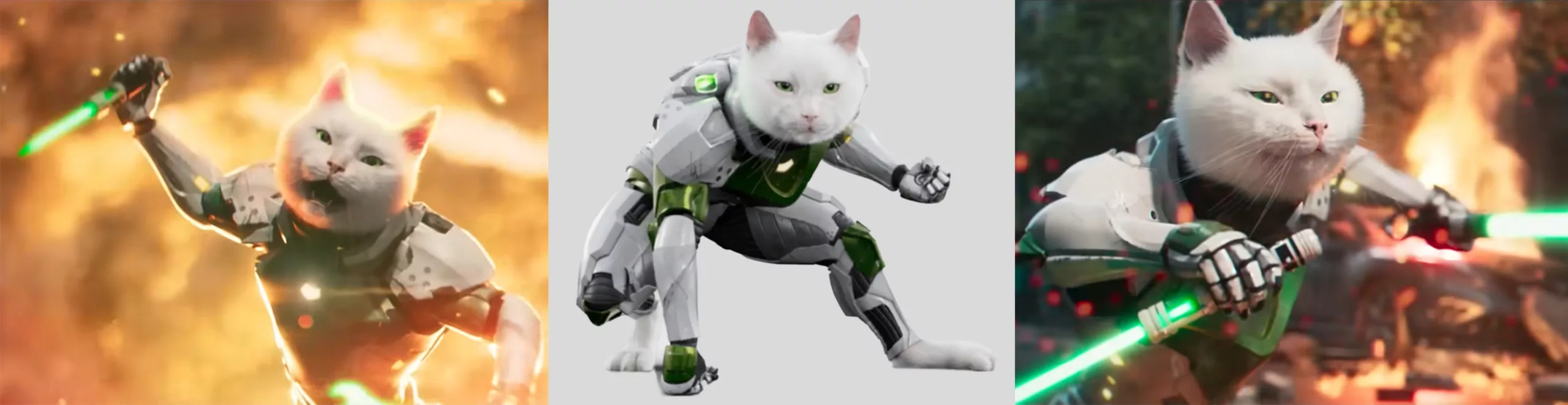
We have seen, however, the disappearance of the Caisse d’Épargne squirrel since 2011, and Malabar transformed into Mabulle the black cat, causing a huge uproar among customers the same year. Groquik, deemed too big, was replaced by a fast rabbit (yet another rabbit), and Quickos, the strange puppet mascot of Quick burgers, did not survive the transition to 3D. The Cetelem figure and Bibendum now only appear anecdotally at the end of commercials. As for Ramses, the Feu Vert cat—digitized in 2007 to cut costs, then back to a real cat ten years later before returning to 3D—it announced its departure after 15 years of loyal service for a “sabbatical leave” in 2021, an opportunity to create a PR buzz around the redesign of the Feu Vert logo.
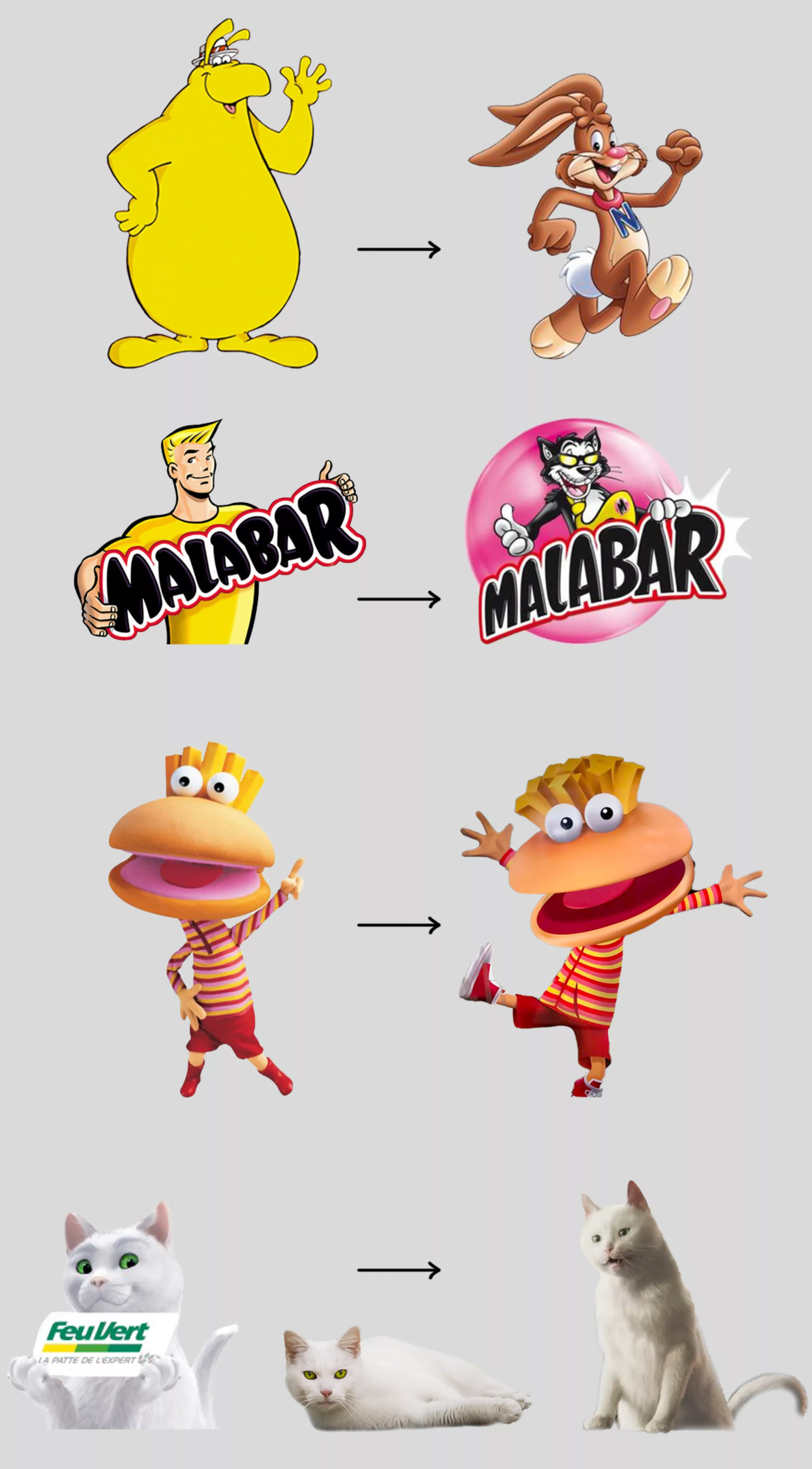
By announcing its departure and holding fake castings for other mascots accompanied by online votes for consumers, the company was able to measure the level of engagement and attachment to its mascot, which it did not truly want to see disappear, while reinforcing its “indispensable” presence alongside the brand. Formerly a real cat, Ramses’ digital version allows him to live all kinds of adventures (recently featuring a pun campaign on “cat power / purchasing power,” in which he dons a superhero costume) but gives him a strange appearance because it is too realistic without being entirely convincing. Maybe too strange? We will discuss this phenomenon, called the “uncanny valley,” in the next article.
Sports mascots
In the world of sports, it’s obviously not enough to just showcase sports accessories or look cool to create good mascots. The best approach is to make them allegories of values, like the Cetelem figure. The advantage is that they can then take almost any form, drawing inspiration from architecture, the history of the location, the club’s logo… but sometimes this great freedom creates hybrids with strange or even creepy appearances, as seen at the Atlanta, Athens, or London Olympics. As a result, they often fail to win unanimous approval or recognition.
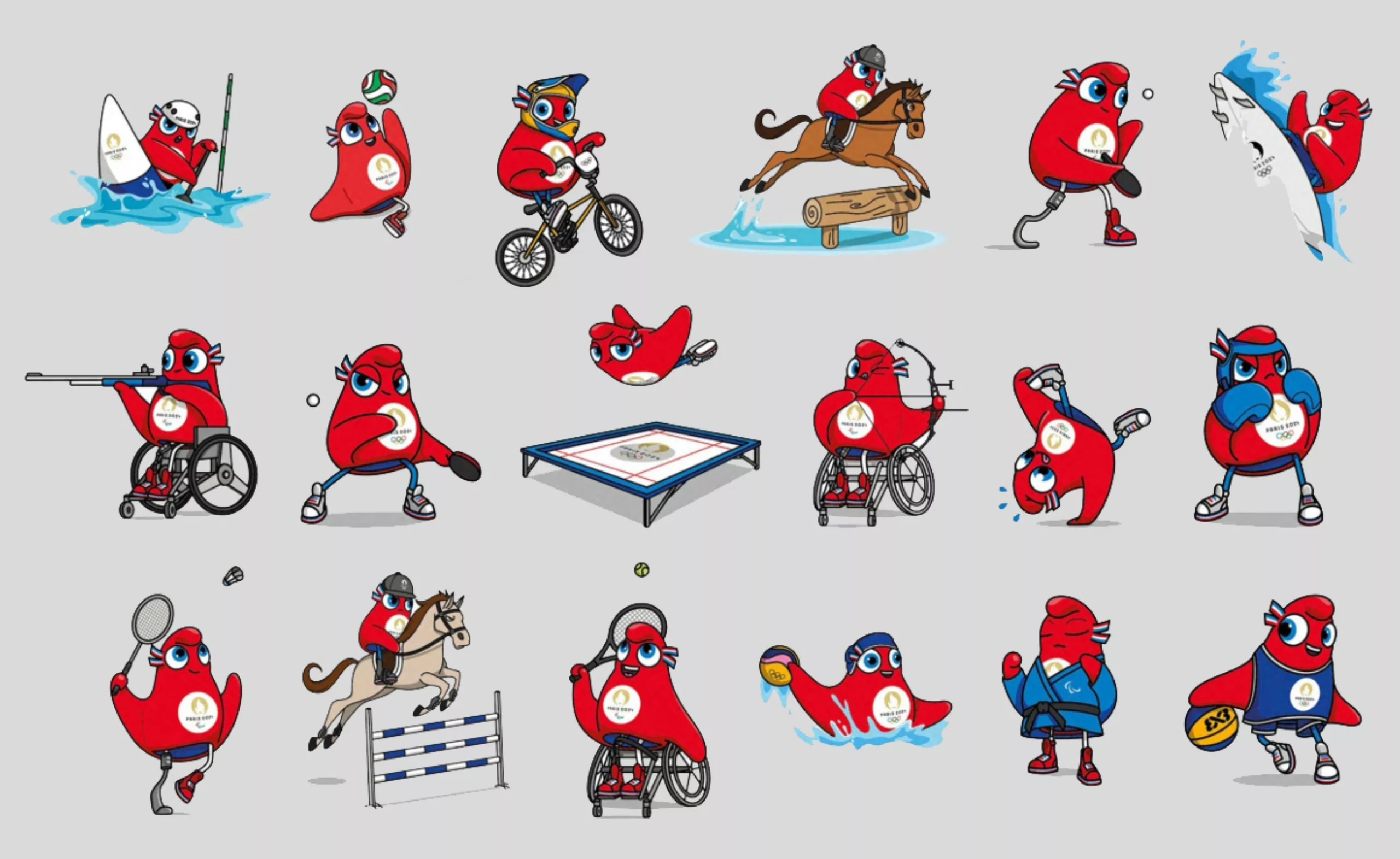
Recently, the mascots for the Paris 2024 Olympics, the Phryges, appeared—allegorical mascots that sparked controversy. In “Le Dessous des Images,” aired on Arte, they are referred to as “decapitated caps” and clitorises. Julie Matikine, brand director for Paris 2024, explains that “the Phryges are not animals but ideals, meant to help us lead the revolution through sport.” The friendly, gender-neutral Phrygian cap mascots with cockade-like blue, white, and red eyes primarily evoke the French Revolution, the abolition of privileges, and recall Liberty Leading the People; in short, they embody values more Parisian and historical than sporting, even if they illustrate a certain form of combativeness (but are the Olympic Games a battle or the embodiment of peaceful fraternity through sport?).
The Phryges follow in the tradition of somewhat quirky and cute mascots chosen to represent the Games, after a few sometimes indefinable anthropomorphic shapes (see enlarged in the image below) such as Grenoble’s “Schuss” in 1968, Albertville’s star in ’92, Atlanta’s flame Izzy in ’96, or Wenlock, a piece of the London stadium in 2012. The majority of other mascots are inspired by animals. At the previous edition in China, the frosty panda was immensely popular with young audiences, who loved merchandise and plush toys bearing its likeness.
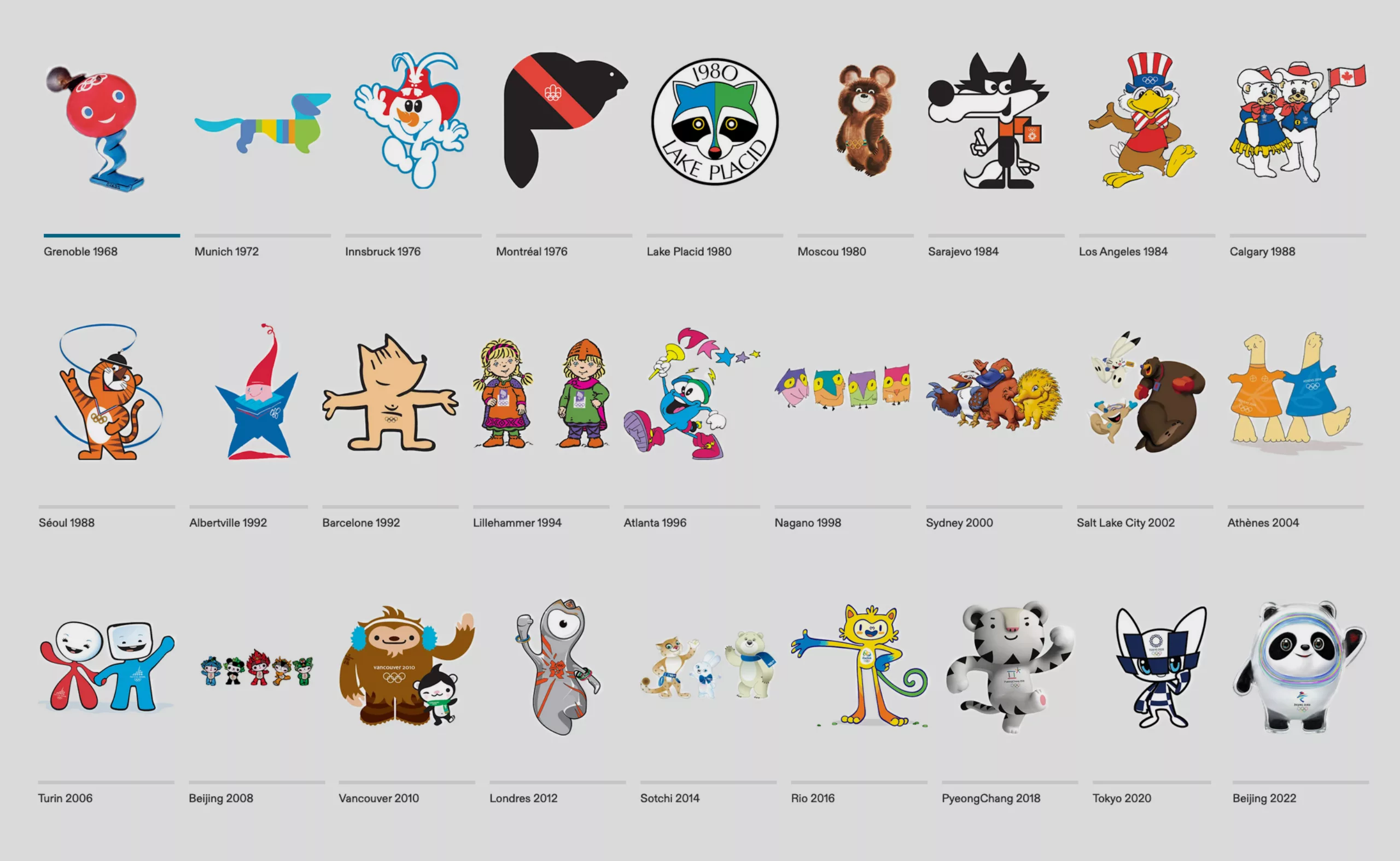
Overall, we tend to remember Olympic mascots less than brand mascots. Obviously, they appear less frequently, only every four years, and are even harder to remember when the event isn’t held in our country. Beyond seeing them regularly as plush toys, 2D prints, or on TV, it seems that visual repetition alone isn’t enough to make us attach to them. We can imagine this is mainly because they don’t dare to have a truly distinct personality, trying to please everyone and ending up fading into the consensus. By comparison, Bibendum is almost a superhero, the BiC figure was funny and offbeat, Cetelem inspires creativity, Ramses wields a saber and laser eyes, and the rabbits have a sporty and enduring side that can inspire some. This is far from the big plush toys that greet you with a smile.
Football club and World Cup mascots don’t leave much of an impression either, perhaps because they’re overshadowed by the stars themselves, target mainly children, or simply lack a strong personality. Another theory is that football stadiums are much larger than hockey or basketball arenas, so the mascot becomes just a colorful dot, losing some of its appeal at that distance. There was Footix during the 1998 World Cup in France, but people remember more the “1 and 2 and 3 – 0” chant and the victory itself than the mascot. Not to mention the 2018 mascot, the Russian wolf Zabivaka, forgotten despite France’s win, as well as Ettie (yes, lowercase), the chick and “daughter” of Footix chosen to represent the 2019 Women’s World Cup. Tennis, though one of the most popular sports, is hardly into mascots, even if the Federation has one (a tricolor rooster playing tennis), probably because it is mostly an individual sport and there’s no need to invent intermediaries to embody the qualities of a player who doesn’t need a stand-in to convey their image.
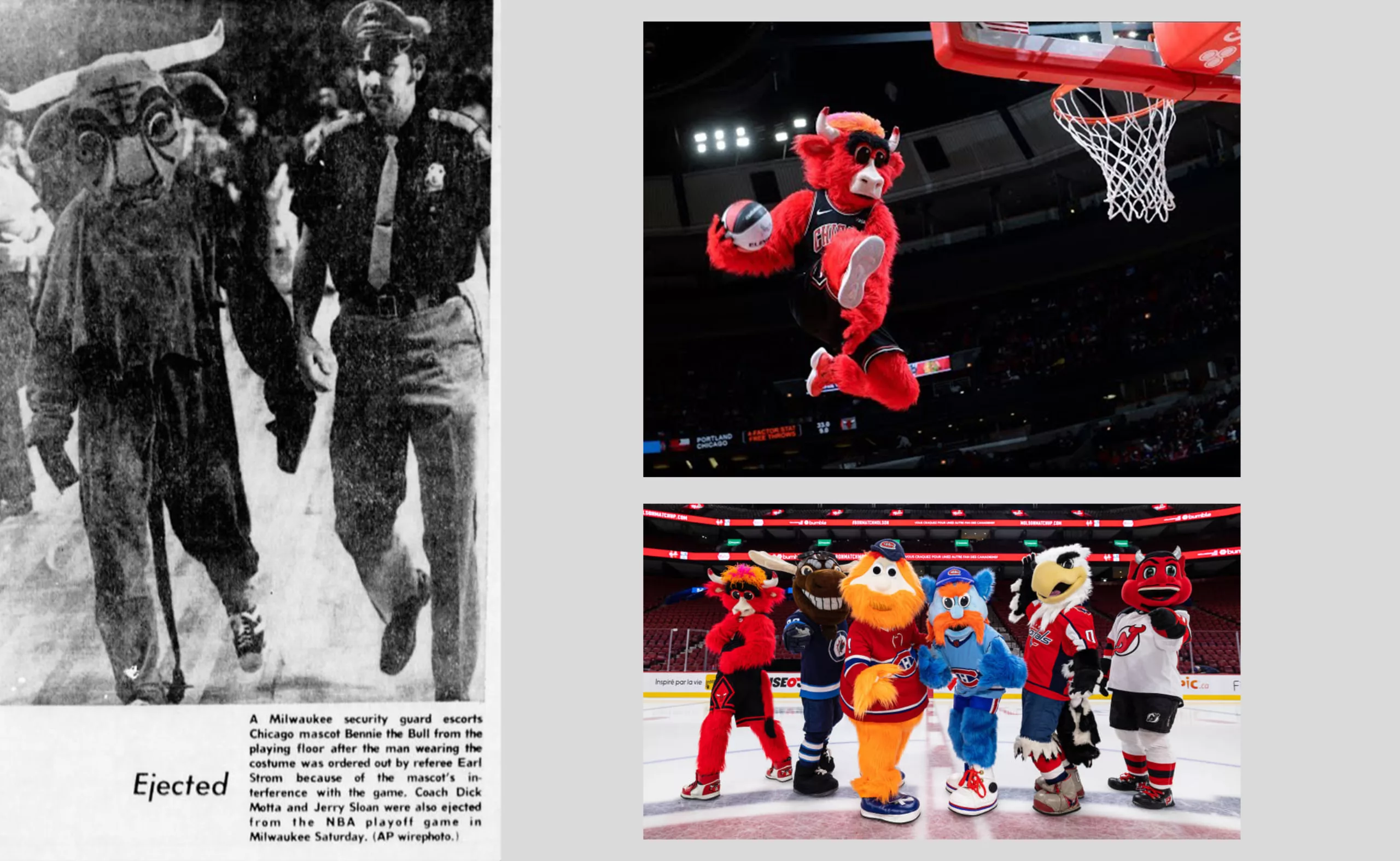
Benny the Bull, THE sports mascot causing a sensation
On the team sports side, the most famous mascots are mainly found across the Atlantic in the Hockey Federation and the NBA. In the United States and Canada, mascots embody the team spirit and provoke opponents or engage with the crowd. Some are true icons whose identities remain secret, like the performer behind Benny the Bull of the Chicago Bulls, a genuine acrobat paid \$200,000 a year, excluding bonuses, to energize arenas and make over 250 public appearances. A bit like a Miss France, but furrier.
Invented in the 60s and 70s, sports mascots were originally meant to scare opponents. They then became the humanoid interlude between players and fans, to entertain and help fans better identify with their team. “The slogan is the promise. The logo makes it concrete. And the mascot is the embodiment of the values that make up a team,” explains Magali Tézenas du Montcel, general delegate at Sponsora.
The first and thus oldest NBA mascot, Benny appeared during the 1969-70 season and has never stopped leaving an impression. He was ejected from the court in 1974 after insulting referees (which is absolutely taboo in basketball), and he’s regularly seen dumping bags of popcorn into the stands, twerking on the court, or bothering stars, on top of standing out as an athlete himself. Beyond his appearance, it’s mainly his personality that the audience loves, his dance moves, facial expressions, and memorable dunks. He’s not just there to look cute and wave at the kids.
The ingredients for creating a good brand mascot
In summary: far from being just plush toys, good mascots are made with a few essential ingredients:
- longevity, the ability to exist over time (e.g., Bibendum, Benny the Bull)
- weaving a metaphor linked to the product or brand, embodied by the mascot (e.g., the Energizer rabbit and the sexual metaphor symbolizing lasting performance, Malabar strong and flexible)
- playful subversion to make people laugh and turn the mascot into an irreplaceable icon (e.g., the Cetelem figure or Feu Vert’s Ramsès)
- a unique and disruptive character (e.g., Benny the Bull, Bibendum, or the M\&M’s)
- preferring a drawn or non-realistic version over a 3D one to avoid a strange look (Quickos and Ramsès are counterexamples)
- making it visible regularly across various media (e.g., Ramsès, Bibendum, Benny, the rabbits)
- giving it a smile and distinctive shapes to create attachment (e.g., the Cetelem figure, Groquik, Bibendum, La Vache qui rit)
The public embraces a mascot because it is memorable, wrapped in a specific marketing strategy that seems to give it full freedom to express itself as an “individual.”
But what other mechanism hides behind their furry, smiling faces? Why do mascots affect us so deeply? We will explore the impact mascots have on our brains in a third article: What strategies lie behind the mascots’ smiles?
On the subject
-
New logo for OM: analyzing a sports crest
OM will soon be changing its logo. This is an opportunity to delve into 125 years of heritage to understand the challenges of the future.
-

Ski trail map designer: such a cool job!
A rare profession just as the yeti: ski trail designer. Without knowing it, you’ve most probably already seen Novat’s or Nieuhe’s works.
-
Manchester City Football Club restores its heraldic coat of arms
Manchester City FC has signed Noel Gallagher to promote its new logo!
Classic branding, but well done.