ENSAD’s new visual identity
ENSAD’s new visual identity
ENSAD (École Nationale Supérieure des Arts Décoratifs) has unveiled its new visual identity, designed by the Atelier Trois collective.
Turn down the brightness on your screen, alert your office colleagues that all is well, that your screen isn’t going to explode and that all your pixels are intact, just move back in your seat a little. This is the new visual identity of ENSAD, designed by Atelier Trois, a collective of former students from the school.


I’m not in the habit of criticising (who? me?) but as they say: ‘It stings the eyes’.
Formerly known as the ‘École Royale Gratuite de Dessin’…
The École Nationale Supérieure des Arts Décoratifs, or ‘Arts Déco’ to its friends, formerly the École Royale Gratuite de Dessin, opened in 1767 by Louis XV under the impetus of the painter Jean-Jacques Bachelier, is one of Paris’s leading art schools.
With former students as famous as Hector Guimard, Jean-Paul Goude, Fernand Léger and Jacques Tardi among its best-known names, this year ENSAD obtained state accreditation of its diploma at Master’s level from 2012. This is a major step forward for this public higher education establishment, which will now be aligned with European diplomas.
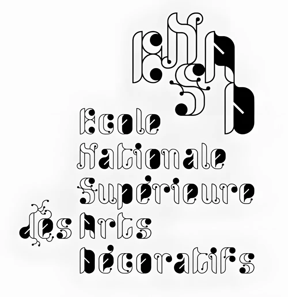
A year ago, new director Geneviève Gallot decided to boost the school’s communications, in particular by issuing a call for tenders for a new visual identity. Among the big-name agencies were Camille Gallet, Emmanuel Pevny and Cécile Boyer, three former ENSAD students grouped together in the Atelier Trois collective, whom the school decided to give a chance to design the successor to the controversial work created 5 years ago by M/M .
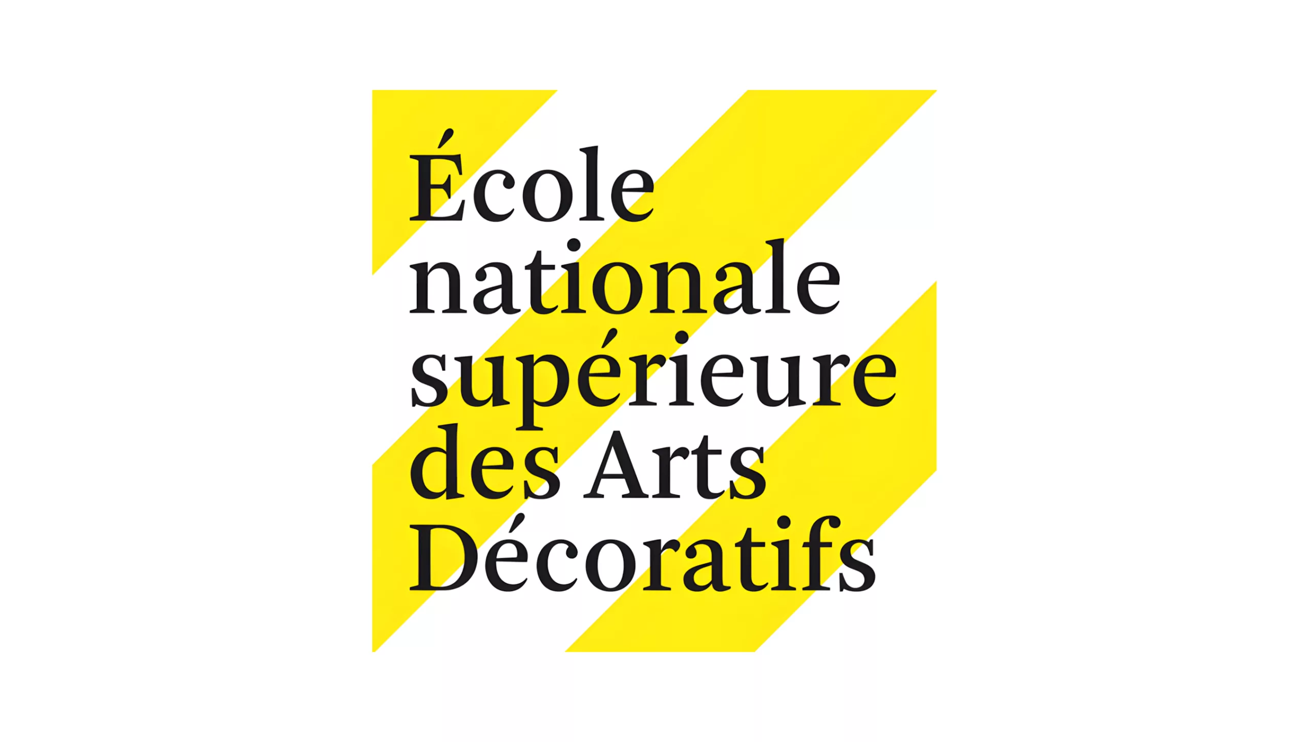
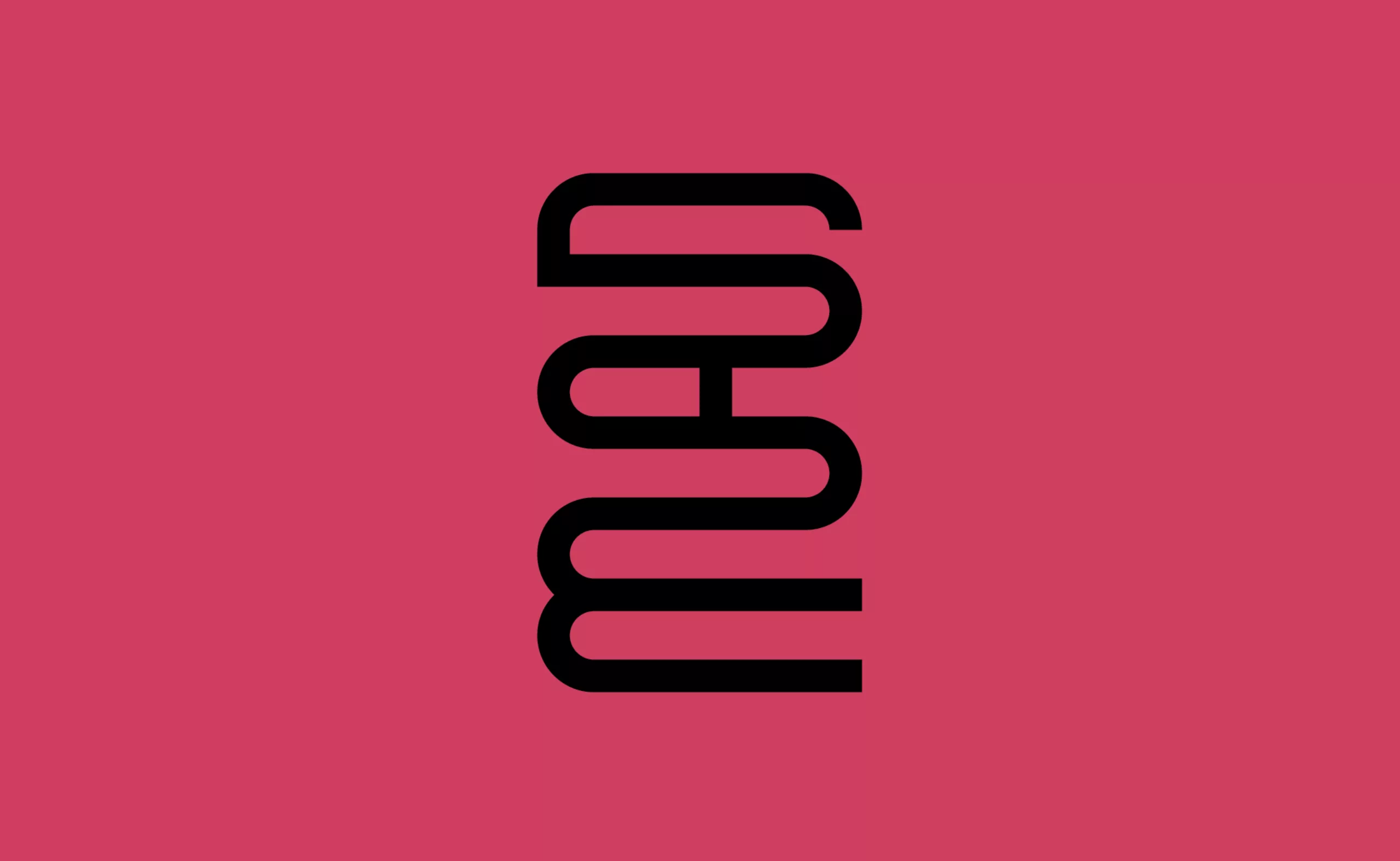
“This graphic charter, closely linked to the specific nature of the School’s activities, is characterised by: serif typography, embodying study and thought, and a mechanical grid recalling the serial nature of decorative arts production.
The identity is based on the complementary nature of these elements, reflecting a school that moves between tradition and creation, but is always on the move. The typeface chosen is Arnhem. Designed in 1999 by Fred Smeijers, it is a contemporary typeface inspired by the French models of the eighteenth century, the period in which the School was founded. Its design combines rational construction with the trace of a calligraphic gesture. The screen acts as a background motif. It consists of a diagonal stripe inclined at 45°, with a 1:1 ratio of white to colour. The 2010-2011 colour is yellow. The logotype consists of the name of the School in left-iron on a screened background.”
Extrait du communiqué de l’ENSAD.
According to Geoffrey Dorne, a researcher at ENSADLab in Digital Identity and Mobility, a graduate of the aforementioned school and a blogger on the famous Graphism.fr website, “Atelier Trois, who otherwise do a very good job, were apparently somewhat forced to follow certain directions that were not their own in drawing up the graphic charter. I’ve also heard that they would have preferred to formalise something else (to be verified).”
A controversial project…
Geoffrey Dorne, who at first thought it was a joke, also explained that ‘it looks like Atelier Trois didn’t have a completely free hand with this work’.
The “work in progress” aspect of the yellow screen, whose colour is only annual and will change at the start of each new student year, makes it difficult to read the name, even though it is written in a rather nice font.
Jean-François Porchez, a renowned typographer, creator of the Le Typographe website and professor of typography at ENSAD, thinks that this work is ‘rather well received’:
‘The simplicity of the stripes, the ’under construction” aspect is a good nod, and the choice of the Arnhem typeface is a good one, although of course I would have preferred a French typeface. It’s a good choice because it refers to the creation of the school and the beginnings of modernism. The result is a good synthesis of the different currents. (…) It’s a good job, nothing like the pretentious horror that preceded it’.
The fact remains that once they have been laid out in compositions, the result is much more pleasant (or should I say “much less unpleasant”?), as shown by these examples of print use in the ENSAD press release.
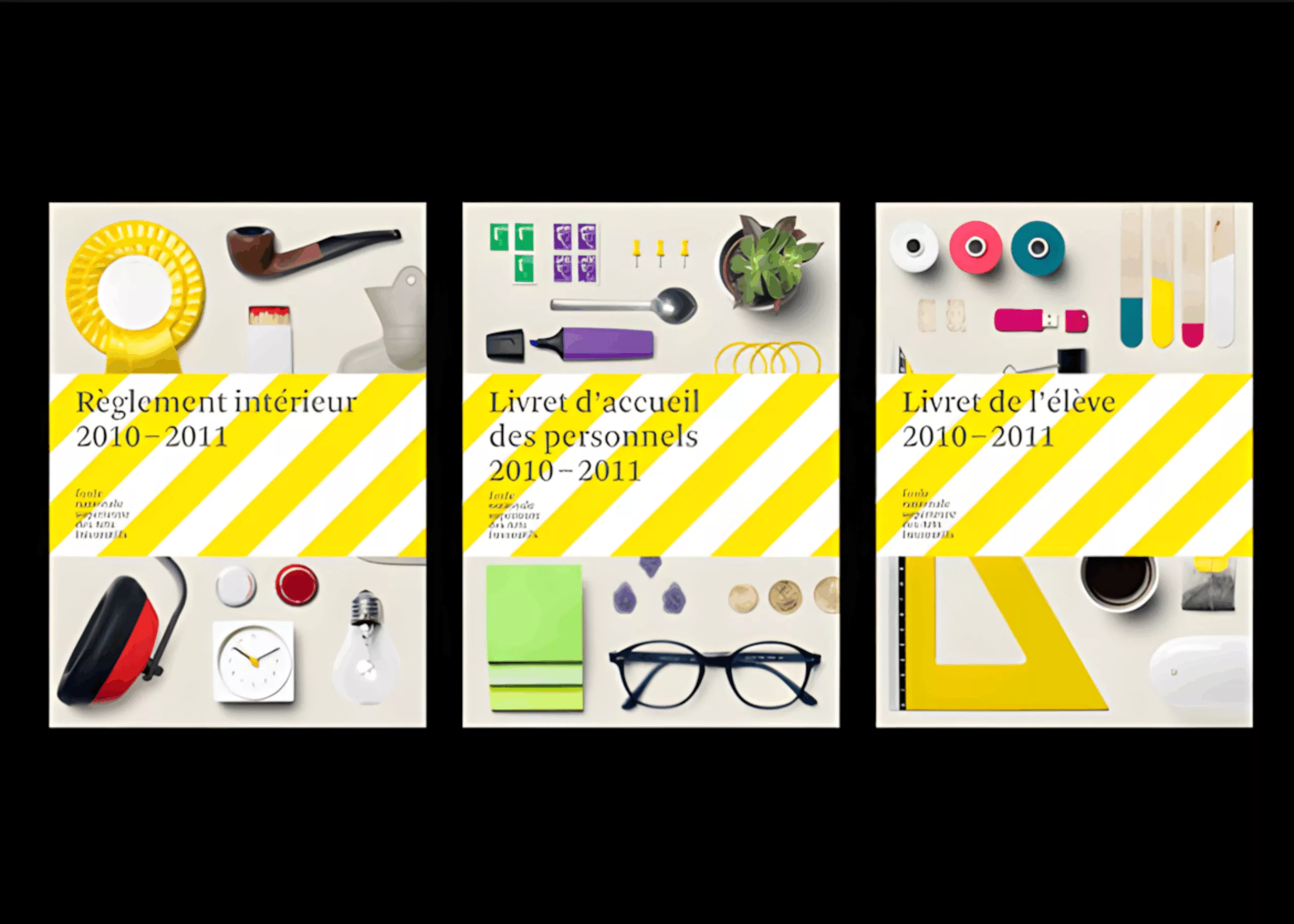
The new visual identity has therefore been incorporated firstly on student cards, then on welcome booklets, and finally on all the School’s communication tools, including future press releases, which will apparently be issued much more frequently. Add to all this an overhaul of the website which is currently underway (the temporary SPIP version is even more eye-watering).
Over and above the result and the new logo, a whole debate has been launched in the graphics community about the difficulty of representing such artistic institutions. Perhaps too contemporary for a school that is more than 240 years old, the design’s very flashy yellow colour is currently causing a stir, since the greyscale version is much more palatable. But as the colour will be changed every year, perhaps the neon green of 2011/2012 will be less aggressive for our eyes! (sarcasm inside)
On the subject
-
A mad logo for the “Musée des Arts Déco”
A new visual identity for the Musée des Arts Décoratifs that becomes “MAD”… Fashion, Arts, Design!