Gaumont modernises the daisy in its logo
Founded in 1895 by Léon Gaumont, a few months before the first official presentation of the Lumière brothers’ cinematograph, Gaumont is certainly one of the oldest film companies in the world, and one of the biggest successful producers of French films (Georges Lautner’s Les Tontons Flingueurs, Louis Feuillade’s Fantômas, Jean Vigo’s Atalante, Luc Besson’s Le Grand Bleu, Jean-Marie Poiré’s Les Visiteurs and Claude Pinoteau’s La Boum, to name but a few).
From rose to daisy
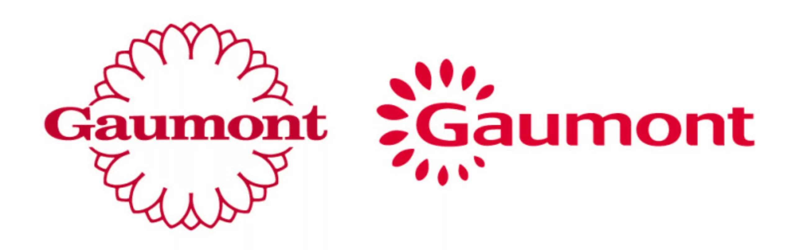
115 years after its birth, the Gaumont group has decided to give its 1993 logo – the famous daisy so dear to its founder, which he chose in reference to his mother’s first name – a major facelift.
Created by the agency Les 4 Lunes, which had already designed the old logo in 1993, and which has recently been responsible for the new logo of the Association des Maires de France and the visual identity of the video game Prince of Persia, the Two Kingdoms, this new logo is intended to be more sparkling, more human. Lorène Bruant, the designer of the new logo (who also designed the new logo for the Comité Départemental de Tourisme de la Marne for Leon Travel & Tourisme) explained her creative approach to ActuLogo:
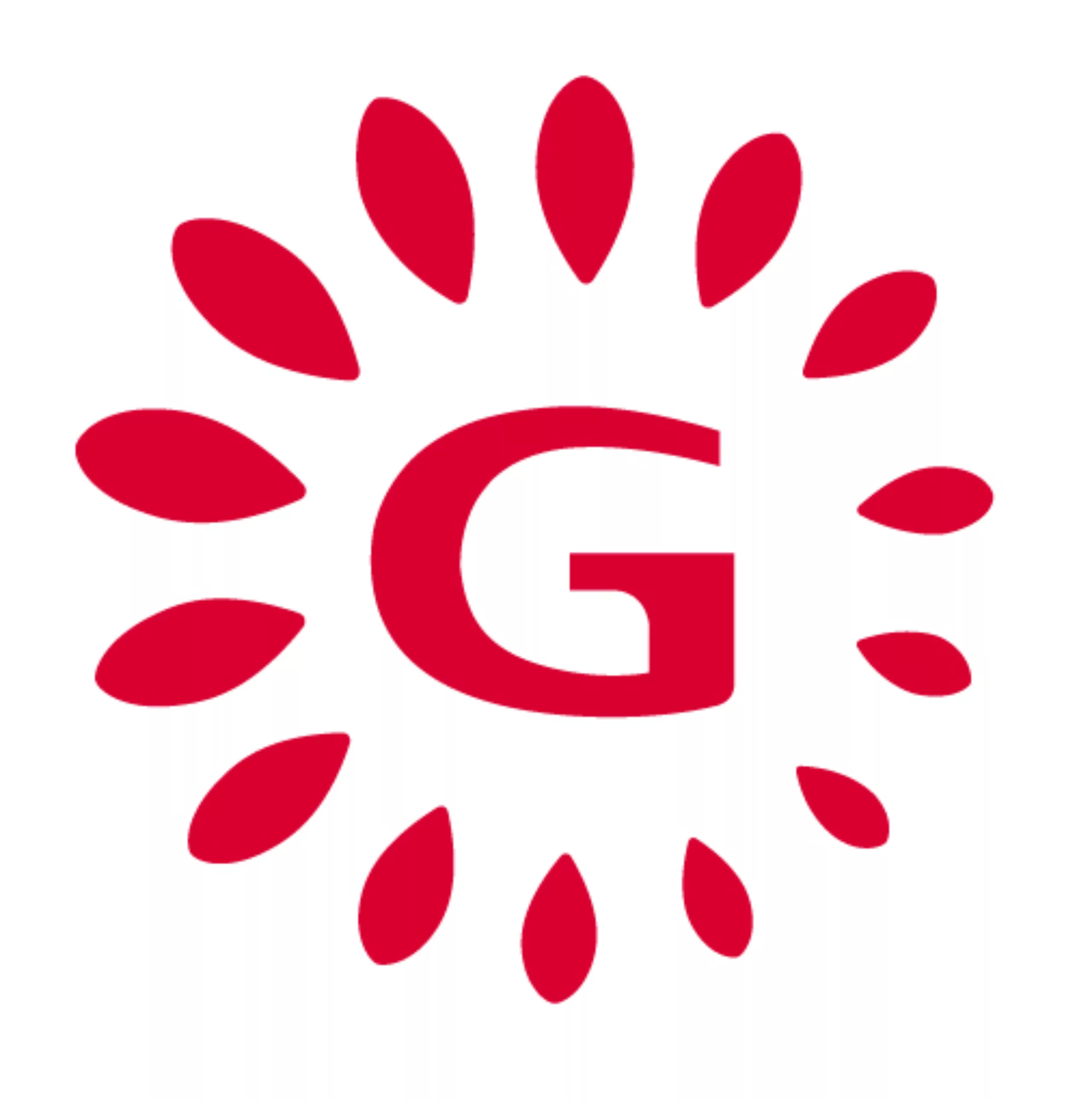
‘Gaumont had wanted to modernise its rose window for several years, but the trials proposed by agencies had so far proved unsuccessful. We started with the idea of the praxinoscope (the predecessor of the cinema, invented by Emile Reynaud in 1876), to come up with a logo that was positive, instinctive, emotional and, above all, spontaneous. The old logo was rather rigid and too regular to inspire dynamism. The rosette design was also too complex to suggest the idea of movement. Gaumont wanted a less authoritarian sign to give a new impetus to the general public. We therefore worked from this rosette, retaining the root of the daisy but treating it as if it were a light that illuminated around the G, with irregular petals that were positively exposed.’
These irregular petals, which give an idea of movement, bring a dynamism to the logo, a sort of exclamation and spontaneity, all in a Pantone 186C to replace the 187C of the old version.
A more modern typography
As for the lettering, Lorène Bruant has created a unique typography, based on multiple origins, and much airier than that of the old logo.
‘The old logo’s slightly old-fashioned serif typeface had a very tight feel to it, and was enclosed in its rosette. Starting from a number of typographic bases, the new lettering offers a stable, generous typeface and a name that breathes. What’s more, there was no harmony between the typography and the rosette as it evolved. With fewer serifs and more spacing, the name is now consistent with the petals.’
In addition to the logo, the visual identity also includes a monogram, which will take over from the brand when required, for example for mobile applications or social networks.
‘The fact that the sign becomes more emotional, more human, gives it a dynamic, and it’s a spontaneous sign,” continues Lorène Bruant. We’re not trying to tell a story with this logo, it just sparkles and leaves it up to everyone to imagine what’s behind it.’
Gaumont’s subsidiaries will also be using Lucida for the accompanying text.
The new logo is already on display on the group’s website, and its first animated appearances should be seen in the credits of films due for release next spring. While the logo animation has been completed, the musical accompaniment is still being developed at the time of publication of this article. As for the deployment of the logo on Gaumont’s signage and in its cinemas, this will depend solely on Europalace, which directly manages the Gaumont and Pathé cinemas.
You can find all the old Gaumont logos since its creation on the Gaumont Museum website.
On the subject
-
Typorama #06 : Futura by Paul Renner
From the Nazis to the moon, Futura is probably the most used typeface in the world, and yet it’s not new!
-
Brands and movies: a history of product placement
Product placement in movies is sometimes irritating, funny or totally fictitious. Brands from movies sometimes even come to life.
-
The story of the big bad Jurassic Park logosaurus
It took 68 million years to resurrect a T-rex, and almost as long to create the Jurassic Park logo. Here is his wicked adventure.