Groupama’s new visual identity, a logo in the open countryside
Groupama, a logo reflecting France
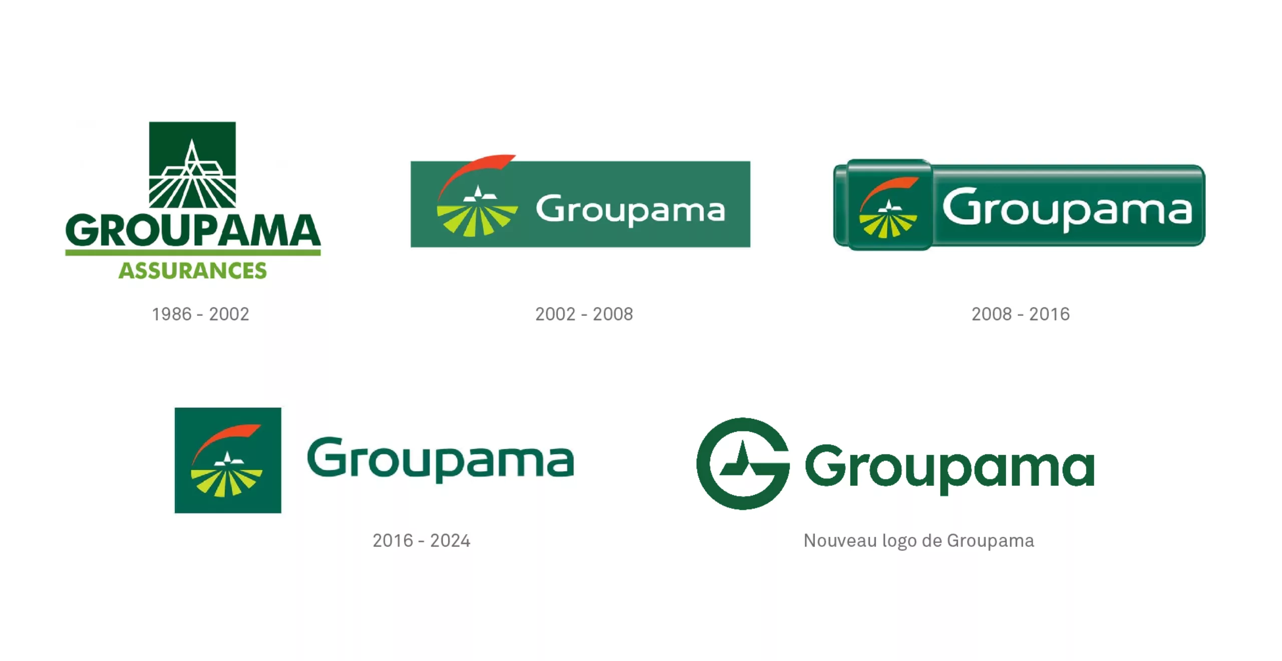
A few weeks ago, we saw a new Groupama logo online. There has been no grand announcement (yet?) or official unveiling, but the new logo is there. It has quietly taken its place, replacing a logo that had been in use and recognized for over 20 years.
First observation: the furrows of plowed fields that made the small French village shine have disappeared. That’s it, we no longer have farmers, but rest assured, the bell tower still stands in the center. Imagine if they had torn down our Christian civilizational foundation!
This is yet another rebranding in keeping with the times, in line with the codes of digital applications. In any case, change has become a necessarily positive value synonymous with innovation, so it’s given the green light. Will this article once again be an opportunity to fire broadsides at a new logo? Yes and no. Let’s hope that the most important thing will be to examine the context in which it appears, and above all the questions it may raise in the always perilous exercise of rebranding and brand identity evolution.
Is France searching for its identity, still torn between decentralization and modernity?
It has become “modern” and cold. All the perspective, depth, dynamism, and subtlety of the old logo has disappeared, replaced by a flat design that wouldn’t be ugly in itself if it weren’t for the old logo to compare it to. Let’s go back two seconds to the origins of Groupama: “The starting point was the law of July 4, 1900, which enabled the true birth and then the organization of the agricultural mutualist movement in France.”
By removing the fields from the logo, does this imply that Groupama is cutting ties with the agricultural world to turn to another clientele? In other words, is Groupama abandoning the country folk to court city dwellers? It’s difficult to know without seeing the client’s specifications. With its sleek geometric typography and universal pictorial language, Groupama may be aiming to reach a global audience without confusion. Groupama would therefore no longer be an exclusively French brand, but probably a European or even global brand.
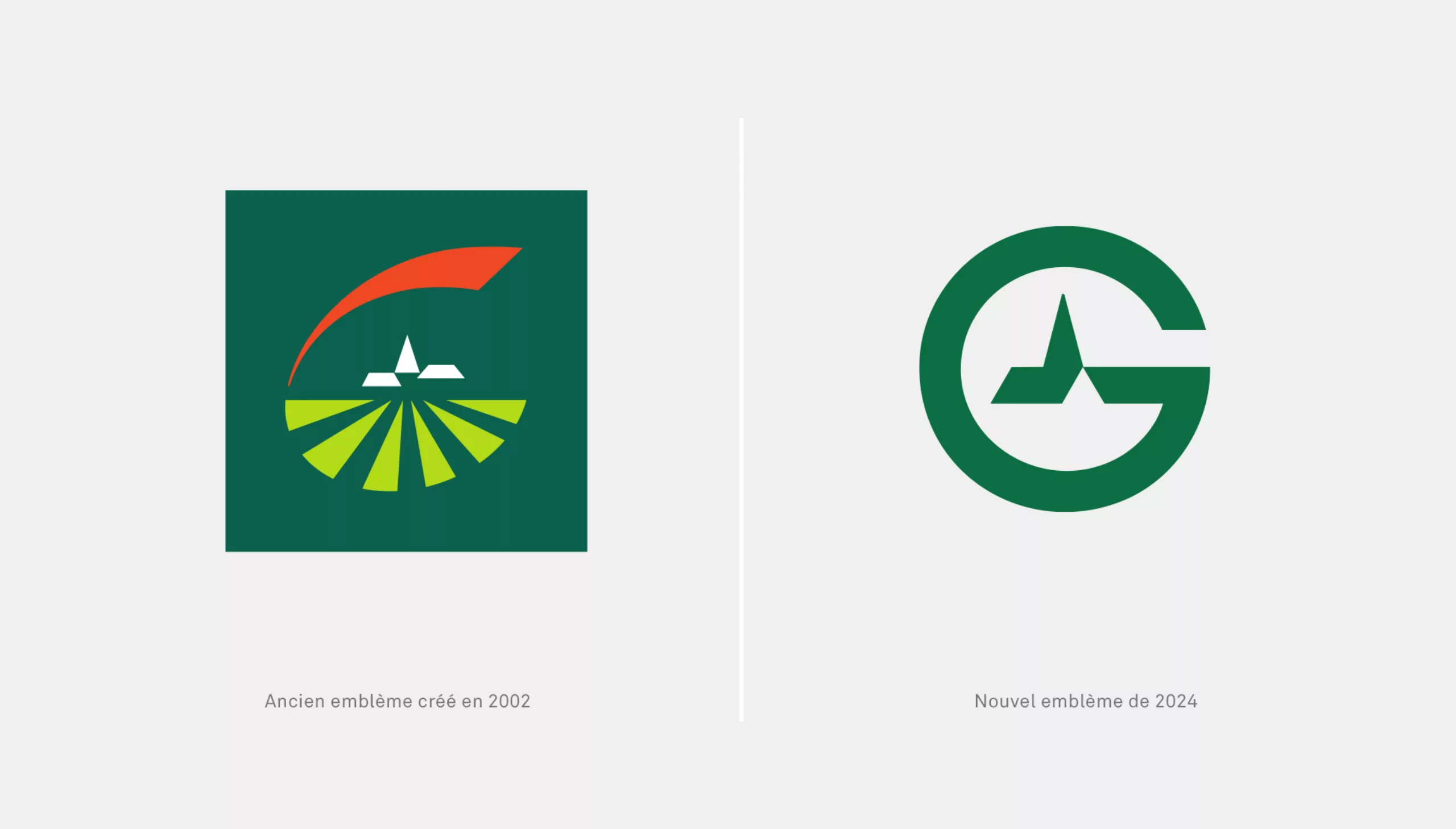
From a purely formal point of view, the emblem is fairly balanced and its dual interpretation as a letter and symbol is clear. However, it becomes more of a ‘pictogram’ than a distinctive brand emblem. We can applaud the work on the counterform, which gives a more ‘3D’ look to the house compared to before. At first glance, we can also see a pictogram representing ‘electricity’.
We also see a resemblance to a heart rate line in a magnifying glass, as if to ask: is there still any life left in this French village? One last pulse before the flatline. It’s becoming corporate-lambda like so many others… Without the iconic name and green color, it could almost be any digital start-up. Let’s wait for the next stage of the striptease where they’ll remove the bell tower… There’s reason to be green, they’ve even removed the little orange dome that gave a warm and sunny touch to the previous emblem.
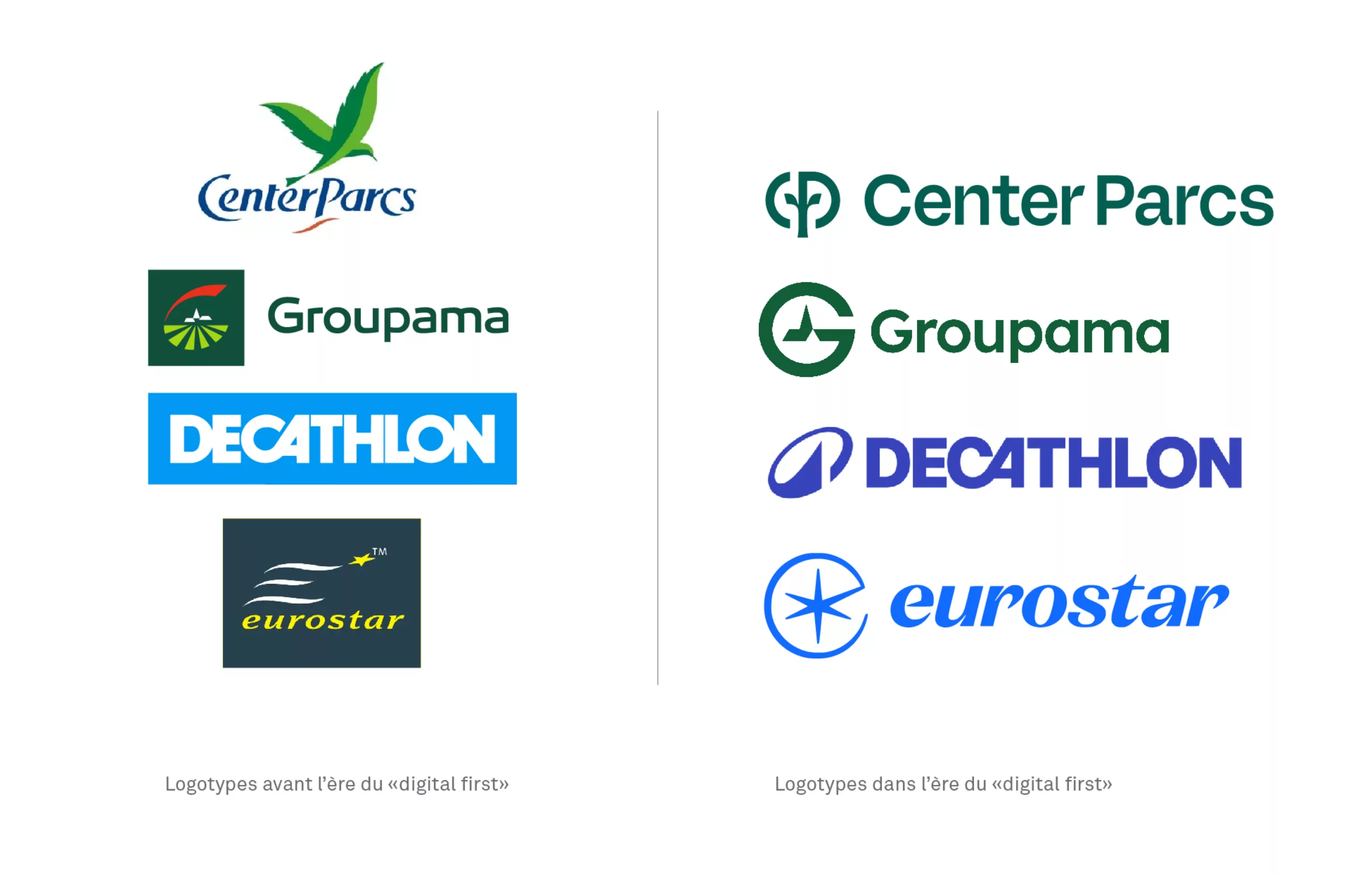
Digital is killing the logotype stars
In hindsight, we will surely have to face the facts (let’s take a chance on this bet): we will have been the generation of designers responsible for the great rationalization of graphic identities. Our main justification/excuse? Studying everything through the prism of the digital transformation of brands, as well as the concomitant decline in our attention span as an imperative for simplification (some would say our “available brain time”).
Meta, LinkedIn, and all the other social networks have preempted our attention with their addictive algorithms… but they have also captured the brands (and their codes of expression) that they have brought under their control. Until then, the advertiser was king, and advertising in the 2000s consisted of dressing up a media site from head to toe for the duration of a campaign. The brand expressed itself 200%. With social media, the brand is confined to a 96px wide icon, and rebranding has supplanted the visual and economic impact of an advertising campaign.
The new logo, by flattening, pruning, and removing signs and colors, makes things obvious. The letter G jumps out at you, and the challenge of unveiling it no longer even arises. What’s the point anyway? Who would have the time and pleasure of this ambiguity and discovery since we all live in the frenzy of the present moment with our eyes glued to our smartphones? So let’s be efficient and save time.
The designer as guardian of a certain heritage of graphic symbols and the responsibility of the client
The attachment we may feel for certain logos defies all rational logic. We like some simply because they are part of our landscape and have been with us silently since childhood. Others transcend eras and generations and become unshakeable. We tend to describe them as “iconic.”
Groupama is not the Centre Pompidou. The G that encapsulates the idealized image of the French countryside village is not the famous symbol created for the Centre by Jean Widmer. And yet they both embody a facet of France. Tradition on the one hand. Iconoclastic architectural audacity on the other. One was saved thanks to a petition signed by the entire profession, the other… well, we don’t really care. It’s just the logo of an insurance company.
Couldn’t this inevitably “retro” Groupama emblem have been kept? Isn’t it as graphically clever as the Carrefour logo with its ‘C’ in reserve? How many of you noticed that the Groupama landscape emblem was also a “G”?
The Groupama logo embodied, as certain politicians or simply “people from the capital” condescendingly put it, “regional France.” What used to be called regional France, and before that, the provinces, rural areas. This evolution of the logo conveys a vision of France that is not neutral, and the void is palpable. Sometimes simplification impoverishes symbolic meaning. The sun and fields have disappeared from the logo, so we can legitimately ask ourselves whether there is any life left in it.
What if there were a role for graphic designers whose mission was to question the sustainability of symbols—those that, thanks to their visual qualities and longevity, end up becoming an integral part of our culture? Those that tell our story and create a sense of community. Would that be reactionary or eco-friendly?
On the subject
-
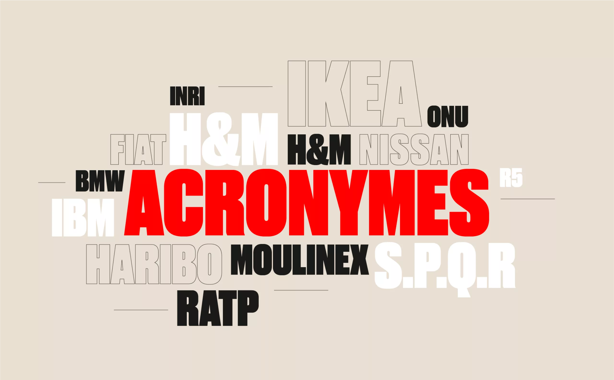
From surnames to acronyms: creating a brand name from letters
From founders’ surnames to initials and acronyms, brand names have always oscillated between abstraction and familiarity.
-

The UN logo takes on water during COP28
For COP28, two designers have come up with a new UN logo showing the rising sea levels and the future disappearance of much land and coastline.
-
The graphic codes of post-modernism in brand logos
We are entering the “time of the tribes”. Let’s discover the impact of this post-modernity for the logos and visual identities of brands and companies.