The story of Harald with blue teeth!
The little story of the Bluetooth logo
Everyone knows the “Bluetooth” logo, but do you know the origin of this name and its logo?
It is a unique story, much deeper than it seems. Personally, I’ve always taken that name for a kind of funny and offbeat joke.
In an article published in the Reddit thread, a user shares the roots of the emblem of this technology. The Bluetooth logo would be the combination of the letters “H” and “B”, the initials of King Harald Bluetooth (in Danish “Harald Blåtand”) written in the runic script used by the Vikings.
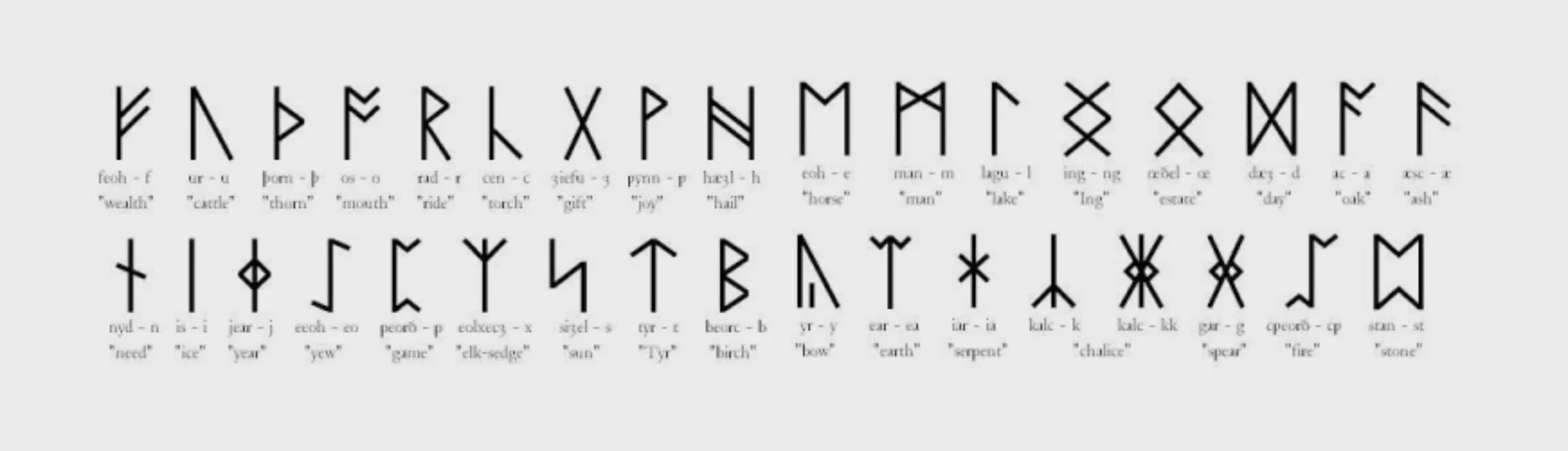
Below: The runic alphabet or futhark – a term formed from the name of its first six letters – is an alphabet that was used for the writing of Germanic languages by peoples speaking these languages, such as the Scandinavians, Friesians, Anglo-Saxons, etc. There are also Hungarian and Turkish runes, two independent systems (Source: Wikipedia).
Then why did Intel engineers dig up a Danish king to name their technology?
In 1996, Jim Kardach, an Intel engineer, worked on the development of a system that would unify phones with computers using wireless communication technology. At this point the proposed names look like Biz-RF, MC-Link or Low Power RF! In other words, names as unoriginal as “Microsoft” compared to “Apple”. All these names will be rejected by the legal department because of their too generic names. This is where a Danish collaborator from Kardach talks to him about “Harald with blue teeth”, the king who unified Denmark and Norway between 958 and 987.
The name was there, with the promise of unification of electronic devices at the same time.
A great example of successful naming!
From then on, the logo appeared very quickly by combining Harald Blåtand‘s initials: (Hagall) (ᚼ) and (Bjarkan) (ᛒ).
Source: The cover illustration is from a creation for a t-shirt for sale on www.threadless.com/designs/king-harald-bluetooth.
On the subject
-

Groupama’s new visual identity, a logo in the open countryside
Groupama has just unveiled a new logo that updates its graphic design by abandoning its campaign in favor of a “startup” aesthetic.
-
From surnames to acronyms: creating a brand name from letters
From founders’ surnames to initials and acronyms, brand names have always oscillated between abstraction and familiarity.
-

The UN logo takes on water during COP28
For COP28, two designers have come up with a new UN logo showing the rising sea levels and the future disappearance of much land and coastline.