Le Corbusier and the Tourette convent
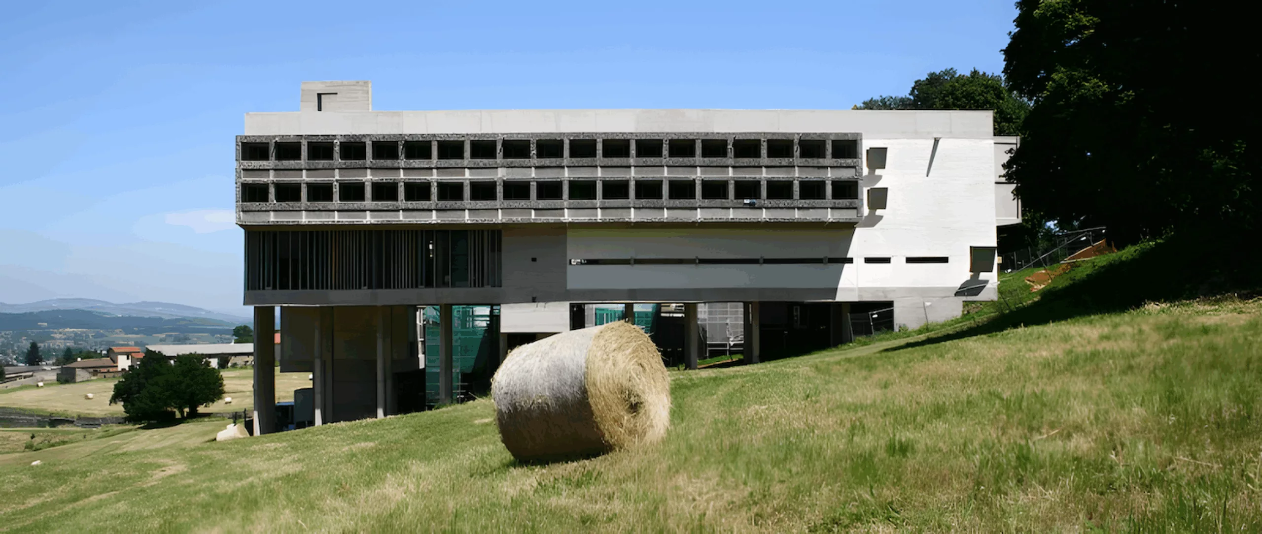
While taking a briefing near l’Arbresle (69), I took the opportunity to visit the Couvent de la Tourette, designed by Le Corbusier between 1953 and 1960. Built according to the precepts of the Dominican order, Le Corbusier used his favourite materials: sun, space, trees, steel and reinforced cement, all under the sign of the Modulor.
The convent has been listed as a historic monument since 11 December 1979. It has also been awarded the ‘20th Century Heritage’ label… in other words… it’s well worth the diversions! I’d even go so far as to say it’s a real architectural slap in the face!
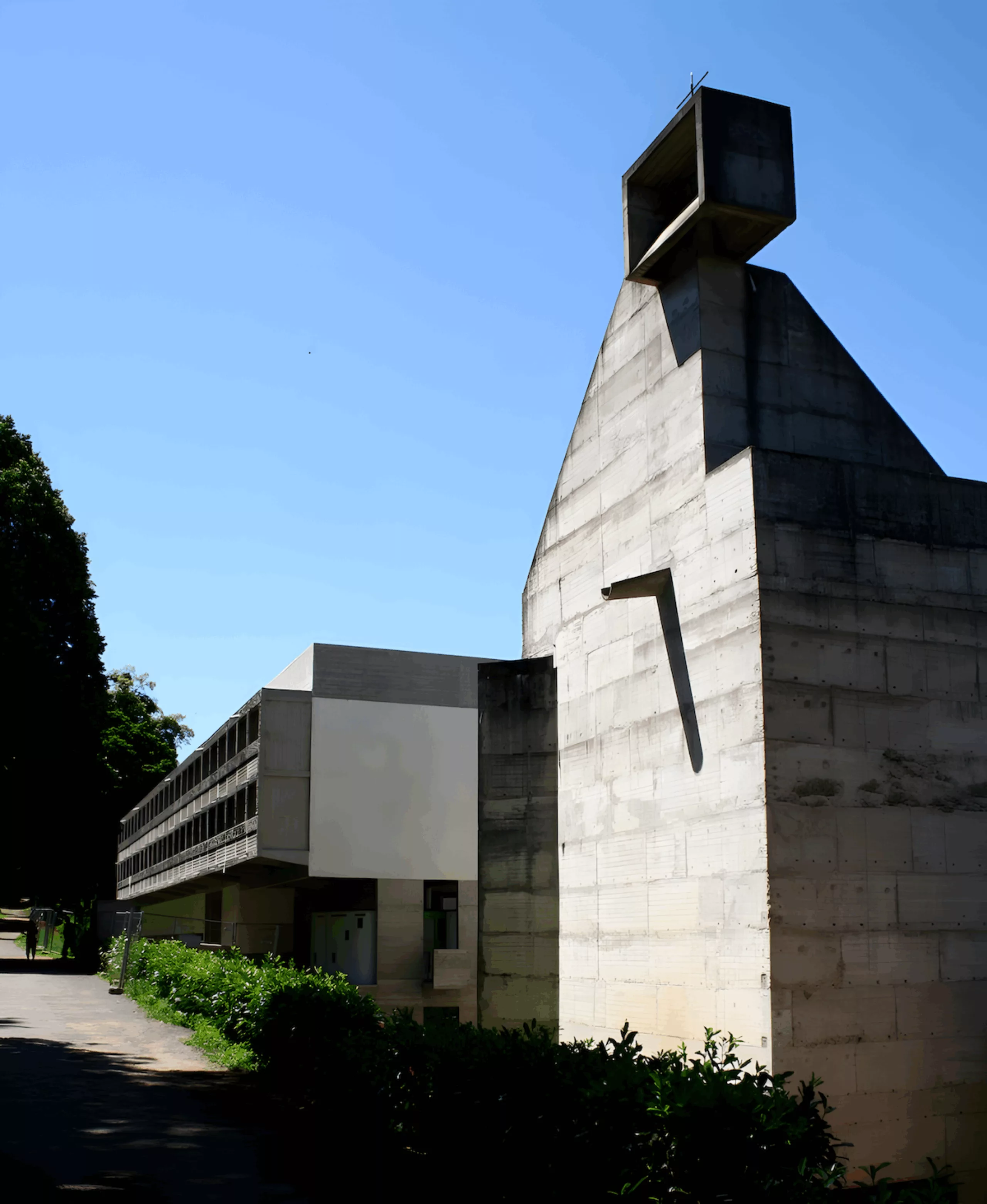
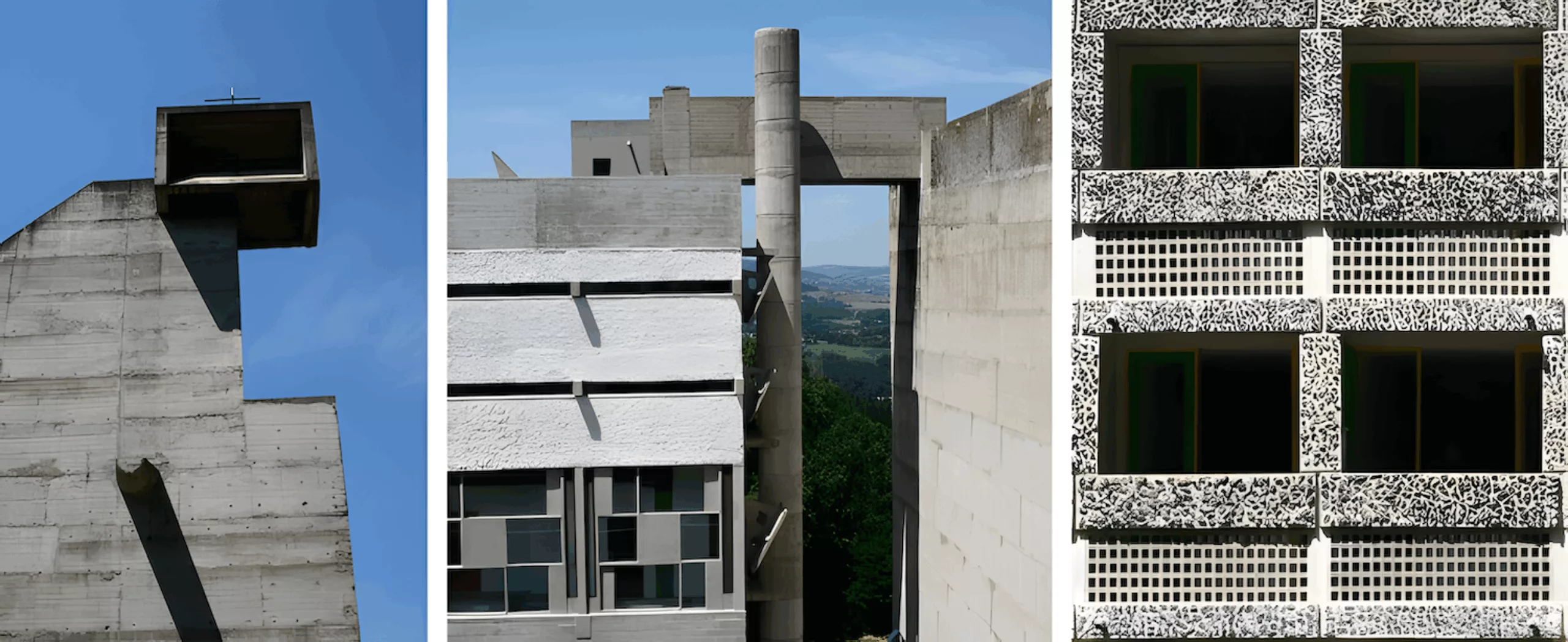
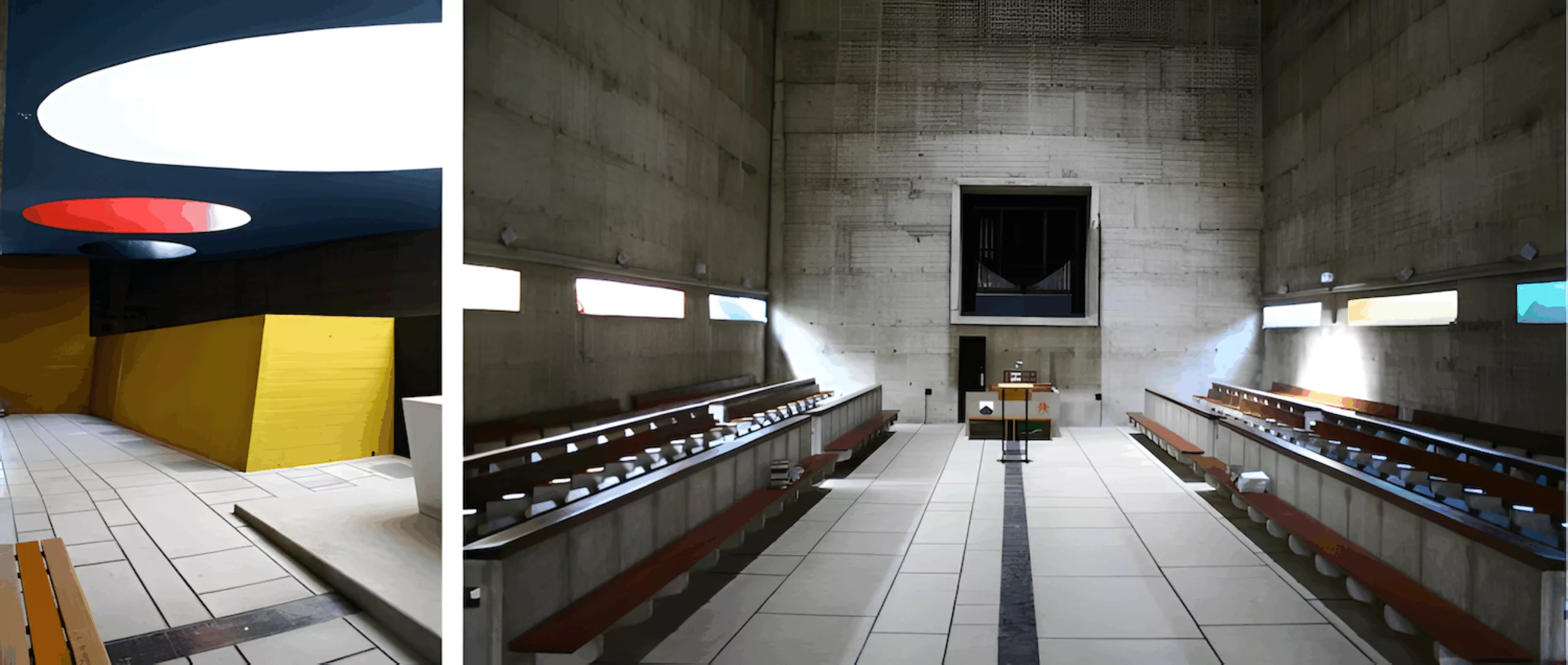
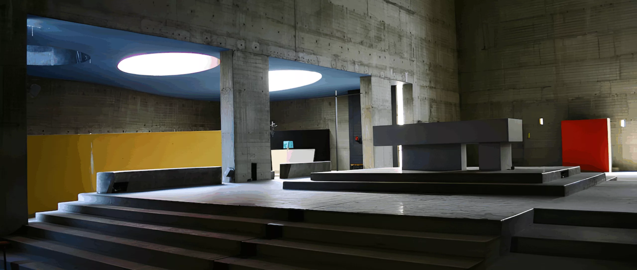
Le Corbusier declared: ‘This convent of rough concrete is a work of love. It does not speak. It is lived from the inside. It’s inside that the essential takes place‘… and I can confirm this… particularly its church… the lighting is created by a system of multiple skylights designed like chimneys, metaphorically called ’light cannons” because they produce the effect of concentrated patches of light projected onto the floor.
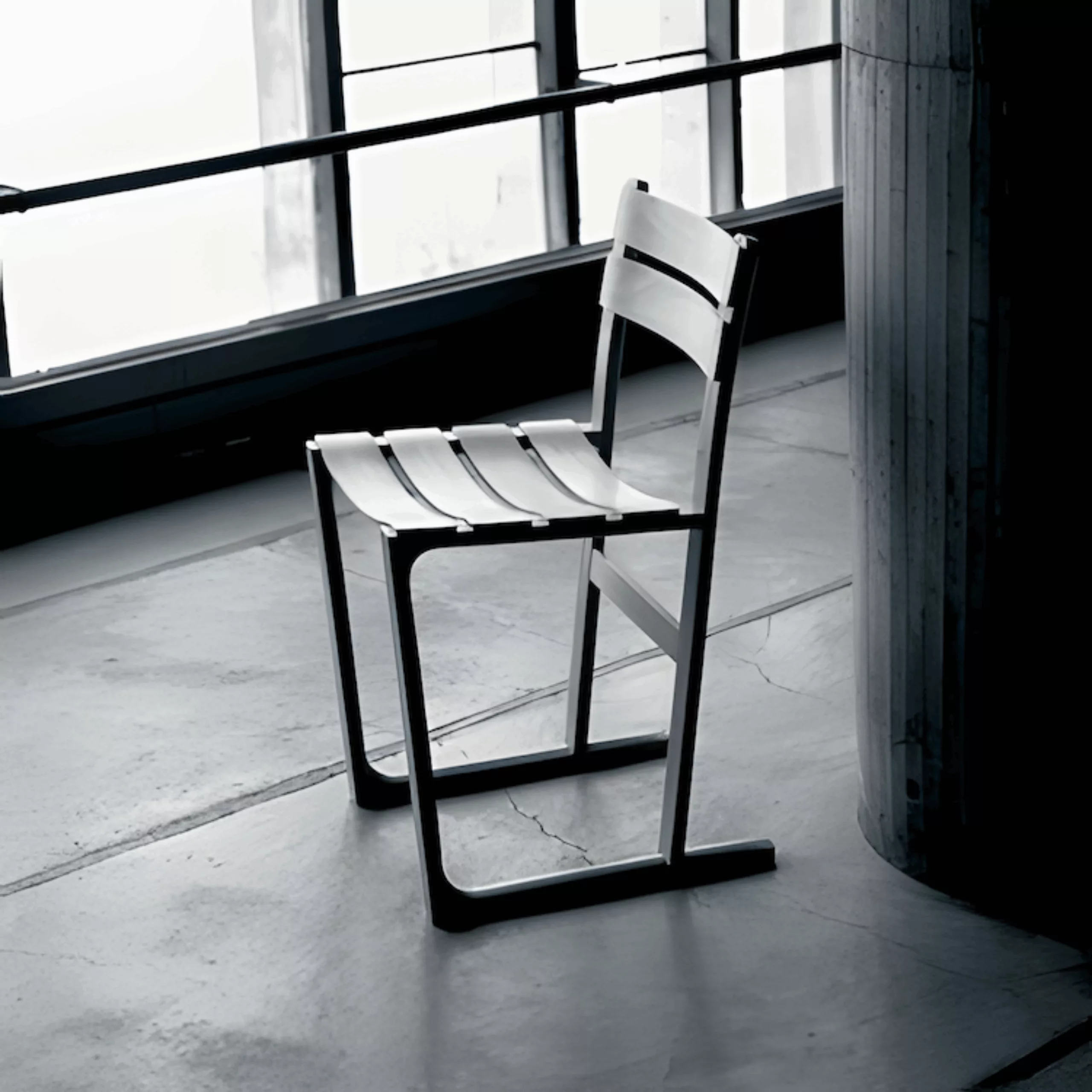
Another curiosity: in 1998, the convent commissioned Jasper Morrisson to design chairs for the refectory. These monastically sober chairs have the particularity of not allowing you to sway back and forth… so even this little swaying movement, usually so harmless, could become conducive to too much daydreaming?
On the subject
-
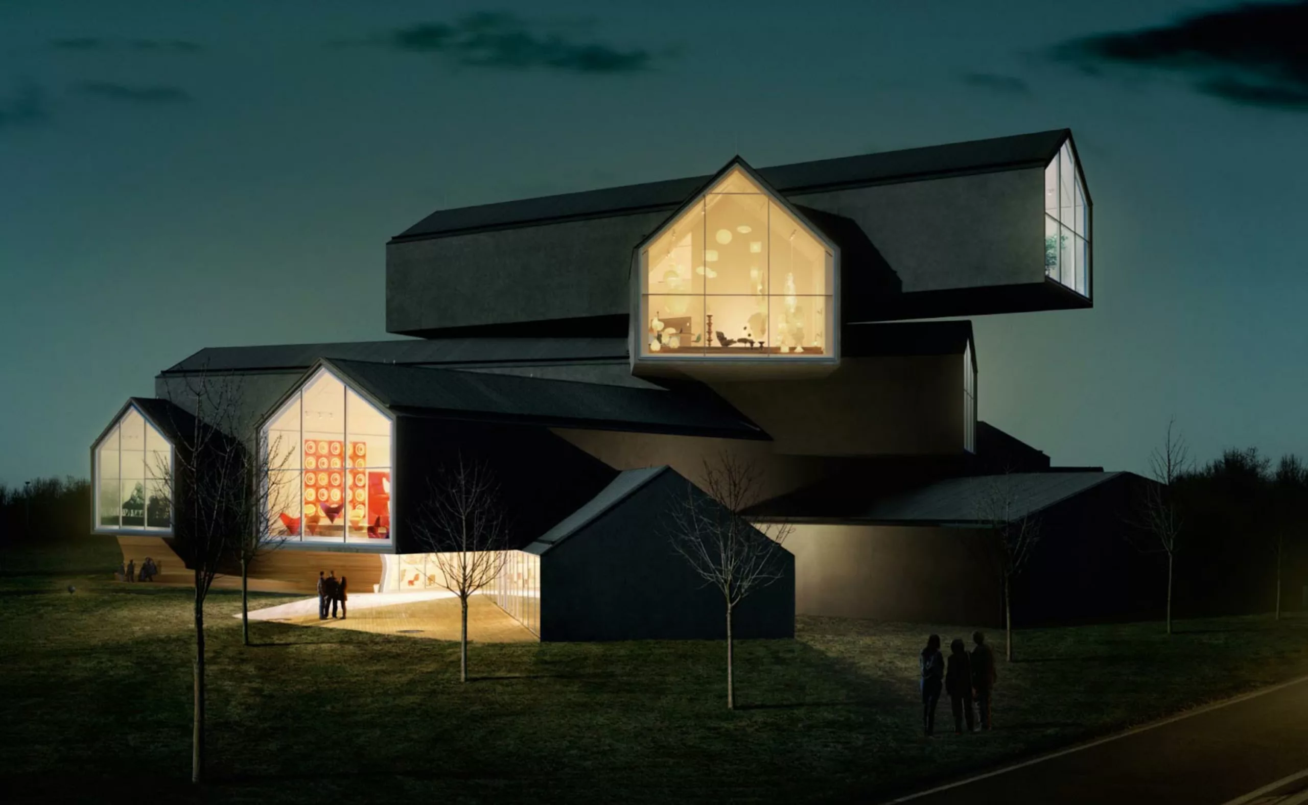
Vitra Design Museum
Visit of the Vitra Design museum near Basel. A delight of architecture, Pop Art, design furniture… and also graphics!
-
Design Biennial 2013
A brief review of the Saint-Étienne Design Biennial. Of course, it’s difficult to give you an exhaustive account of this event, which brings together several hundred exhibitions all around Saint-Étienne, let alone when visiting it with two little girls aged 3 and 5! In this context, I can already announce the 2013 design prize awarded by them : the Barbie-Foot !
-
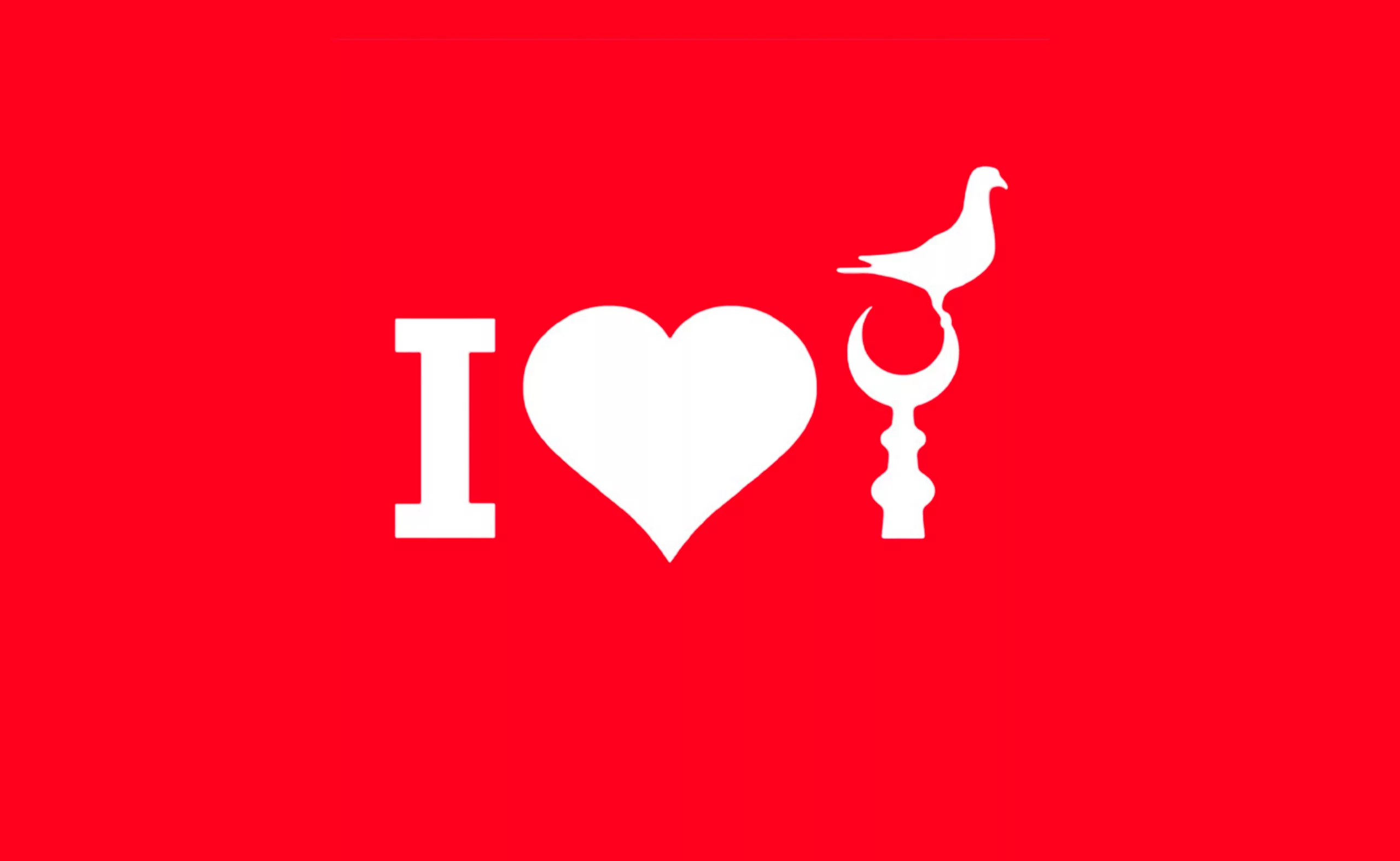
Turkish graphics
Fortunately, as I turned down an alleyway, I came across the “Istanbul Design Center”. It’s a school of applied art, a venue for exhibitions, workshops and conferences, a publishing house… in short, just what I was looking for!
A few posters have piqued my curiosity!
Unfortunately, I had to drop in outside opening hours… not a single student, just a calligraphy teacher who suggested I drop in again the following week… sniff… So it’s back in France that I find out more about this place and discover an amazing communication made by the founder of this place: Faruk Akın ( with a “ı” without a dot ! like in our Graphéıne logo! 🙂 )