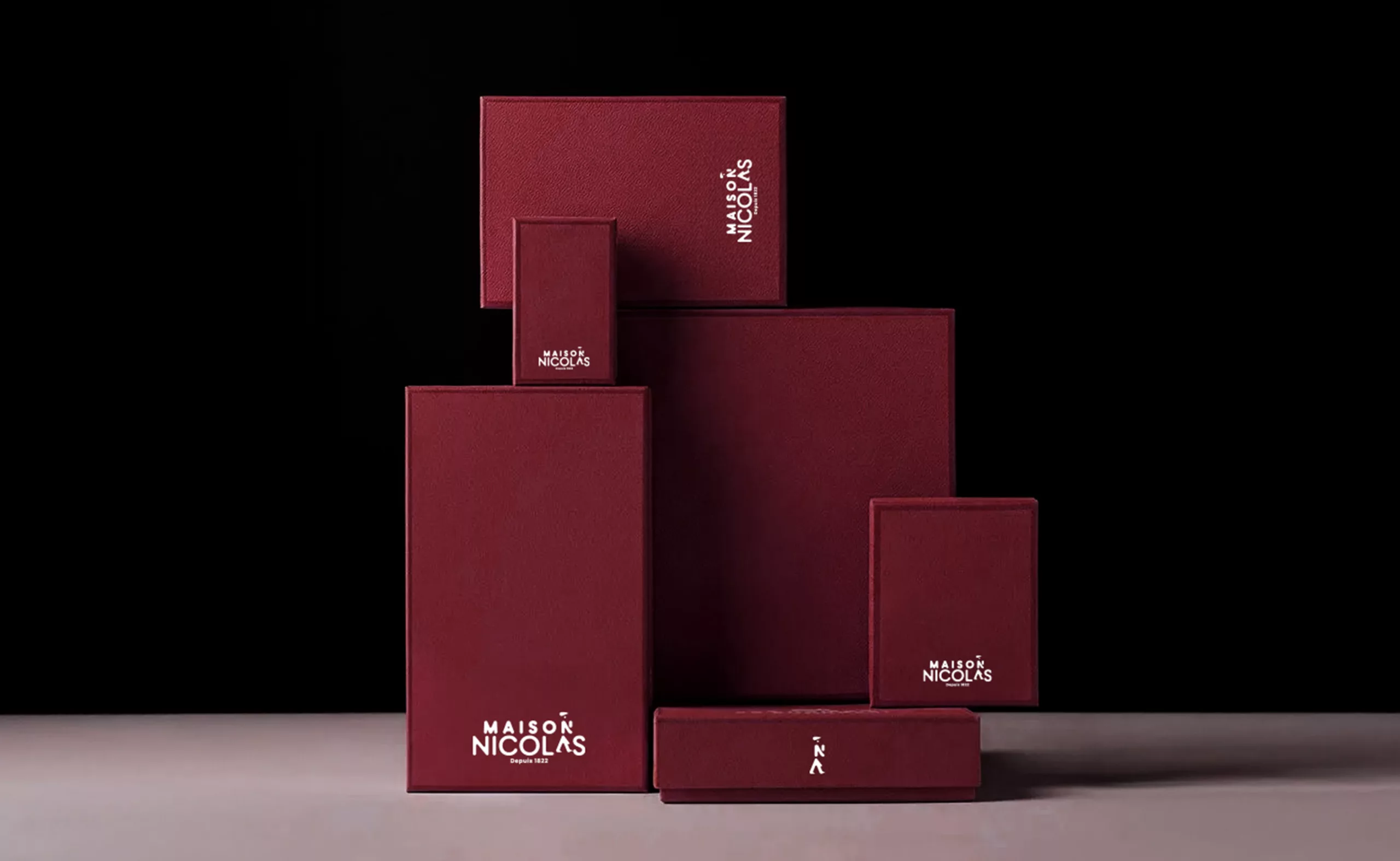
Maison Nicolas, a new logo for a new strategy
We’re not telling you something you don’t already know: Nicolas has changed its logo and name to become Maison Nicolas. But rather than taking a radical “like it or hate it” stance, as we see everywhere on social media, we wanted to tell you the story of Nicolas, the context behind this change of identity, and the magnificent visual heritage of this brand, which has been part of the French landscape for over two hundred years.
France is drinking less alcohol
COVID-19 has led to a drastic drop in alcohol sales, and dinners and large gatherings with friends have become rarer since health measures were introduced. Maison Nicolas’ new logo, created by the agency 181 degrés, is a strategic response to adapt to the changing market and new consumer habits.
Non-alcoholic beverages now represent a growing market with 7% growth (compared to 1% for traditional alcohol), with +30% sales for non-alcoholic spirits in 2020, and an estimated +11% growth in the coming years for non-alcoholic wine. It should be added that more and more millennials (18-24 years old) and women over 30 are turning to alternative non-alcoholic beverages, which are more trendy and healthy (source: ISWR study, via desalcoolisation.com). Nicolas’ wine merchants therefore had to reinvent themselves, and not just in the sale of alcohol.
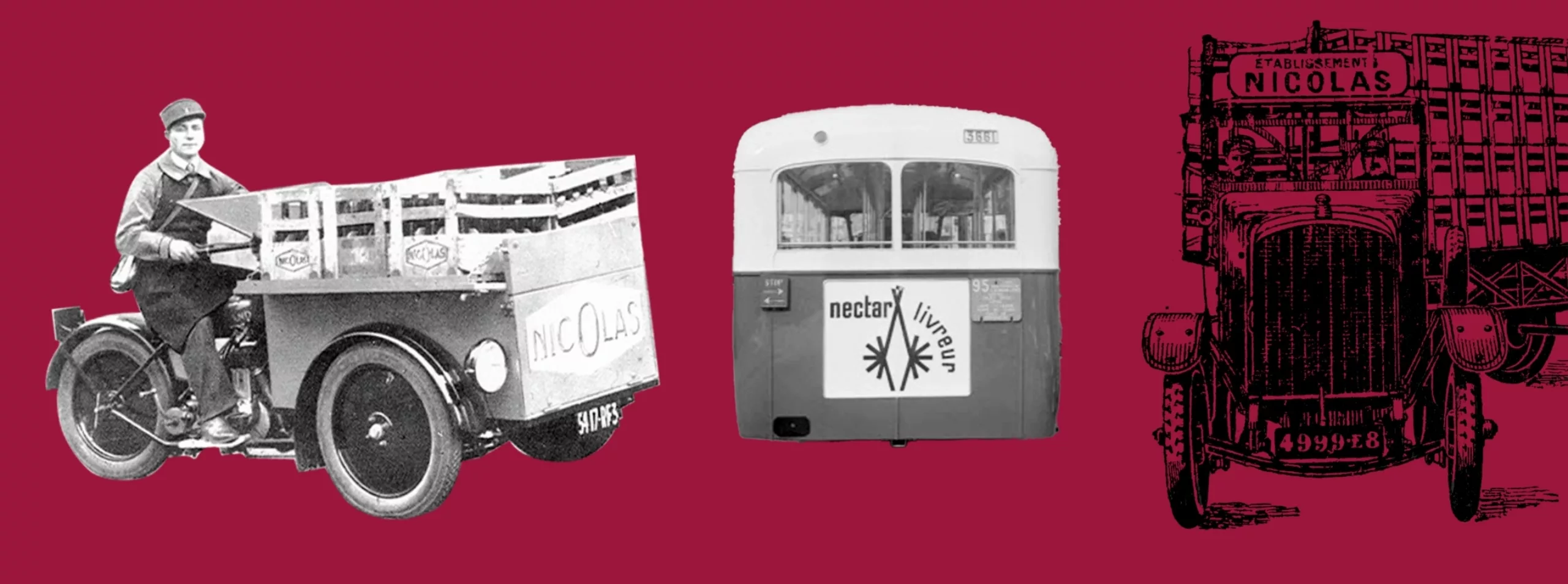
Nicolas’ brand image had not changed since the 1980s. Like many brands, it started out with the simple name of its creator written in large letters on the front of delivery trucks.
The new Nicolas logo is causing quite a stir
Following the arrival of a new director, Cathy Collart Geiger, Nicolas’ new logo responds to the need to stand out once again in the French landscape, changing its image and getting people talking about it. By adding the word “maison” to its name, Maison Nicolas aims to become a reassuring, welcoming place where people feel at home. Although this is a common term in the world of luxury, it does not seem to be a move upmarket, but rather an invitation to conviviality and gathering (around a bottle of wine), becoming a starting point for sharing. This is confirmed by the new slogan: Source of conviviality since 1822.
It should be noted that to legitimize its new positioning, the company is relying on a study that shows that “the French feel lonely and suffer from it.” Proposing a convivial wine cellar as a response may seem surprising… or even a hidden incentive to drown one’s sorrows in alcohol, for lack of finding friends to share a bottle with? Less likely.
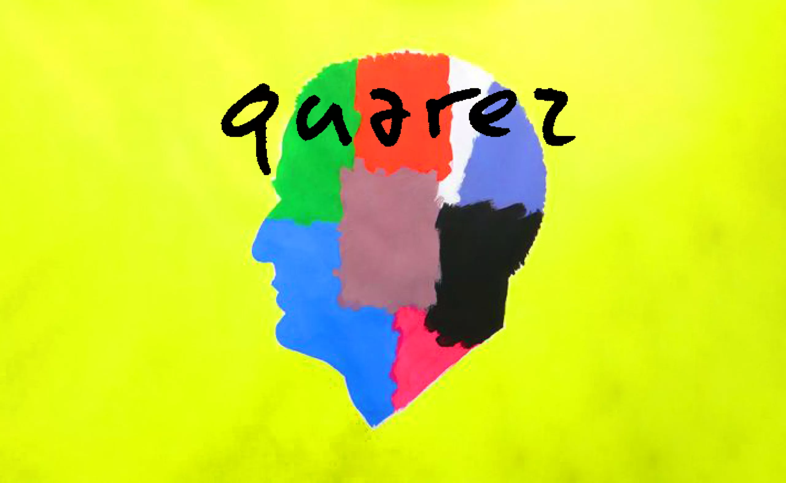
The logo has been the subject of much discussion, particularly the lack of legibility of the A in Nicolas, which is smaller than the other letters and seems to float on the surface for no reason. Let’s not talk about it. However, there are no wine codes here, with their predominantly slender, curved, Gothic, or serif typefaces, nor are there any labels or luxury codes. The rounded typography is reminiscent of eco-friendly signage, or even candy, and adds a human touch because it is soft (cuddly?), in contrast to the flat, angular, and linear trend of the last 10 years. Let’s give the new identity time to unfold—it may have some surprises in store for us.
Nicolas, innovator, inventor, and distributor
The decision to completely overhaul the brand’s identity (apart from the burgundy color) is quite surprising. Especially since Nicolas is not a newcomer: its history began in 1822 in Paris, with Louis Nicolas. At the time, to buy wine, you had to either drink it on the premises at a restaurant, go directly to the producer, or buy a barrel. Nicolas invented the concept of the wine merchant, an expert retailer and intermediary between producers, and revolutionized wine tasting at home by offering the nectar… in bottles!
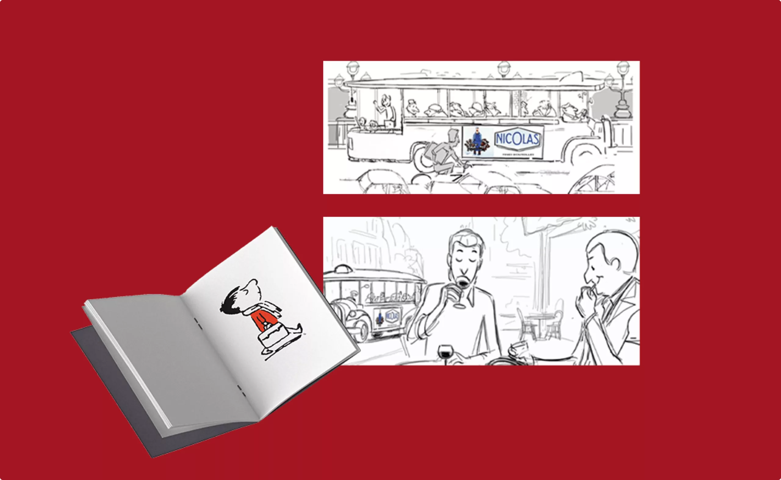
It was also while looking at an advertising poster that Sempé and Goscinny found the name for their little Nicolas. In 1959, on the terrace of a café, Sempé was showing his first sketches and René Goscinny asked him, “Does this little boy have a name?” At that moment, a bus with a Nicolas advertisement passed by our authors, and Sempé, who had been thinking, exclaimed: “Let’s call him ‘Nicolas’!” Le Petit Nicolas was born.
Nicolas continued to innovate over the years. In 1840, the company began offering home delivery of wine, a true luxury that did not yet exist. In 1955, it registered the 100cl bottle design with the INPI, and in 2000 launched the very first online wine retailer. In 1966, the company popularized Beaujolais Nouveau. In 2018, Nicolas reintroduced bottle deposits for organic Côte du Rhône Villages wines, then developed a new concept store focused on craft beers, Craft Beers & Cie, to adapt to the growing market.
Nicolas wine cellars take a back seat in the French landscape
Today, however, who would think of associating Nicolas with innovation? The brand, which is (too) well integrated into the French landscape, conveys (in our opinion) a more “run-of-the-mill” image: Nicolas has always been there, and we don’t really notice it anymore. It’s not that French people no longer like Nicolas, on the contrary (it was voted France’s favorite brand in the “wine merchant” category on its bicentennial, and again in 2024), but the 481 stores across the country probably no longer attract the same customers, who are becoming fewer and farther between.
In the past, people went to Nicolas for his expertise and advice, but today they go there because it’s convenient, open, or close by. In fact, we don’t go there at all anymore because we prefer to quickly buy a bottle at the supermarket, tucked between a carton of eggs and a bag of chips, which is more convenient when we know what we want to buy (even if we end up disappointed).
The posters, once so creative, graphic, and offbeat, have become unsurprising in recent years.
Nectar, Maison Nicolas’ gentleman delivery man
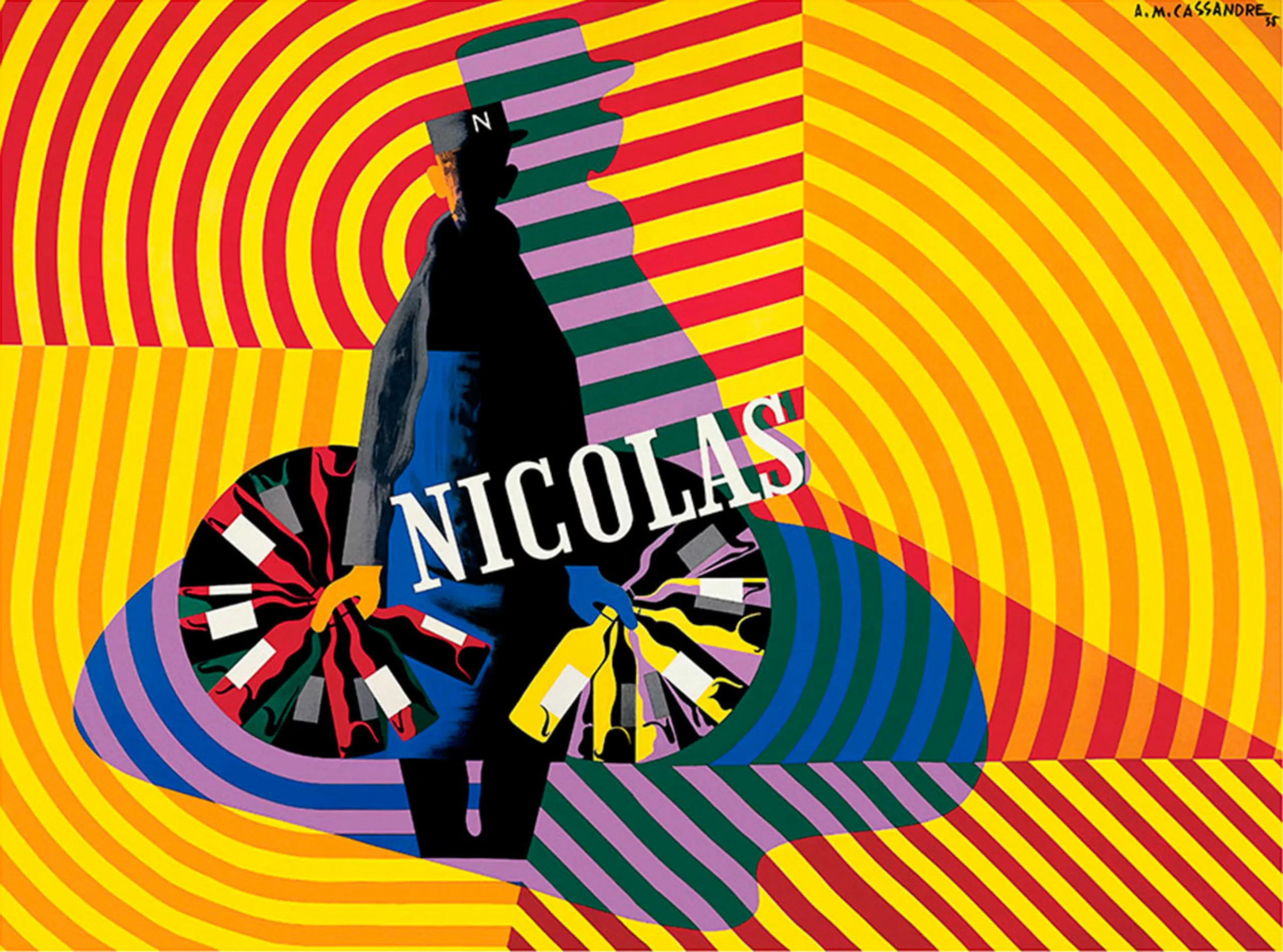
In 1922, Nicolas teamed up with Dransy, a Swiss artist, to create his mascot, Nectar, the delivery man with 32 bottles and eyes as wide and yellow as headlights. Colorful posters feature Nectar’s silhouette, with 16 bottles in each hand radiating out in a starburst pattern, serving as a geometric motif used by dozens of artists. As the brand ambassador, the mustachioed “gentleman delivery man” in his apron brought a friendly, devoted, and human touch to the company. His partner Félicité and their son Glou-Glou joined the family a few years later.
Like Bibendum in its day, Nectar was one of the first brand mascots, appearing in cartoons shown during intermissions at the cinema, and even appearing as a “sponsor” or in subliminal images in animated films (such as Sleeping Beauty in 1936).
For decades, Nectar adapted to the times, becoming a legionnaire, a lighthouse, a lantern, a music hall artist… or a bottle. During World War II, Nectar was a soldier, always ready to “serve well.” He even delivered to the moon! His instantly recognizable appearance made him a true graphic icon. However, Nectar disappeared from posters in the era of photographic advertising in the 1980s…
For its bicentennial in 2022, Maison Nicolas is once again teaming up with illustrators (Alice Des, Mathieu Persan, and Alice Wietzel) to revive Nectar in a younger, more dynamic version featuring black and mixed-race women. Proof that the brand is capable of reinventing itself!
In 2025, a delivery man reappears in the Maison Nicolas logo (is it really Nectar?), no longer holding 32 bottles but just one. Has he lost his touch? The cap and apron are still there, but once again, the brand could have reinvented the key geometric shapes of its heritage, using the asterisk as an O to adorn the logo and communication materials. But why, oh why, did it choose not to draw on its rich past?

Maison Nicolas and art posters
From the very beginning, Nicolas was a visionary in its advertising campaigns. Etienne Nicolas, the son who had been at the helm of the company since 1898, had the idea of collaborating with renowned artists to create communications and publish price lists for luxury bottles. Poster artists and artists such as Dransy, Cassandre, Loupot (who turned them into metal posters and objects), Buffet, Brunhoff (the father of Babar), Iribe, and Reiser contributed to the reputation of Maison Nicolas.
In 1934, Cassandre produced a bewildering and radically different poster in which geometry, letters, and colors undulated in what Marcel Zahar called “a kind of sublime graphic vociferation, a choreographic intoxication of syncopated planes where masses of concentric circles swirled madly.”
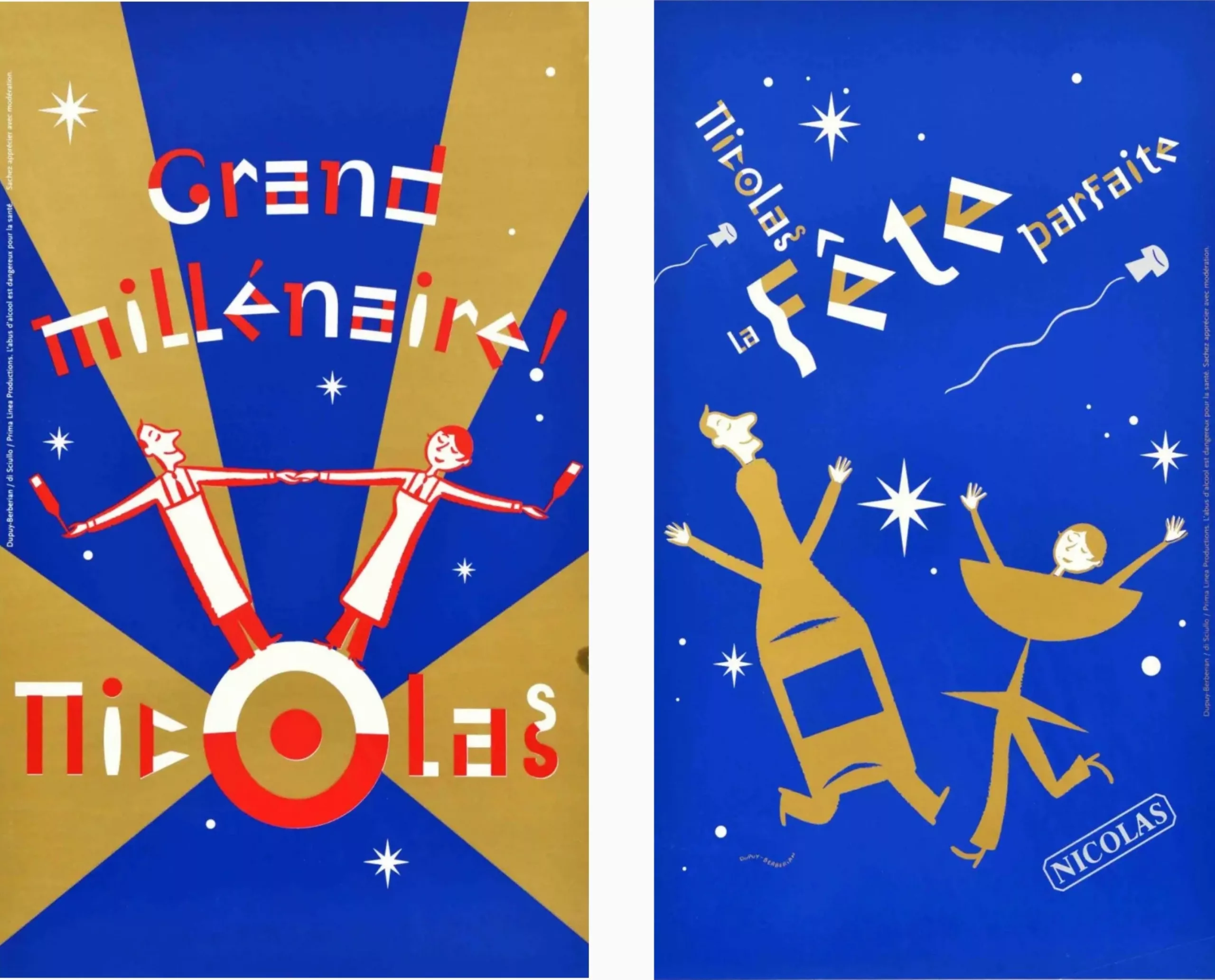
This was followed by colorful and vibrant illustrations and a sparkling collaboration with Pierre Di Scuillo & Dupuis-Berberian, who created the posters for the transition to the new millennium in 1999. There will be nothing particularly striking until the bicentennial in 2022.
We therefore hope that the company will be able to reinvent itself and innovate in its future campaigns, calling on other talented artists to continue to keep French heritage alive. Because in this dreary urban landscape, we need some graphic euphoria!
To find out more, visit the Nicolas bicentennial website.
On the subject
-
Where does modernism come from? 2 – The two faces of modernism and the social ideologies surrounding ornamentation
L’usage ou l’absence d’ornementations symbolise pour l’homme “moderne” deux visions utopiques et différentes pour changer la société.
-
We ❤️ Milton Glaser !
Graphic designer Milton Glaser gave the 70s and 80s a cheerful and colourful face and New York a reason to love him. Among his most famous creations are the logo “I ❤ NY” and Bob Dylan’s psychedelic poster. Let’s go into the history of a very, very big name in American design.