Manchester City Football Club restores its heraldic coat of arms
The English club’s new branding
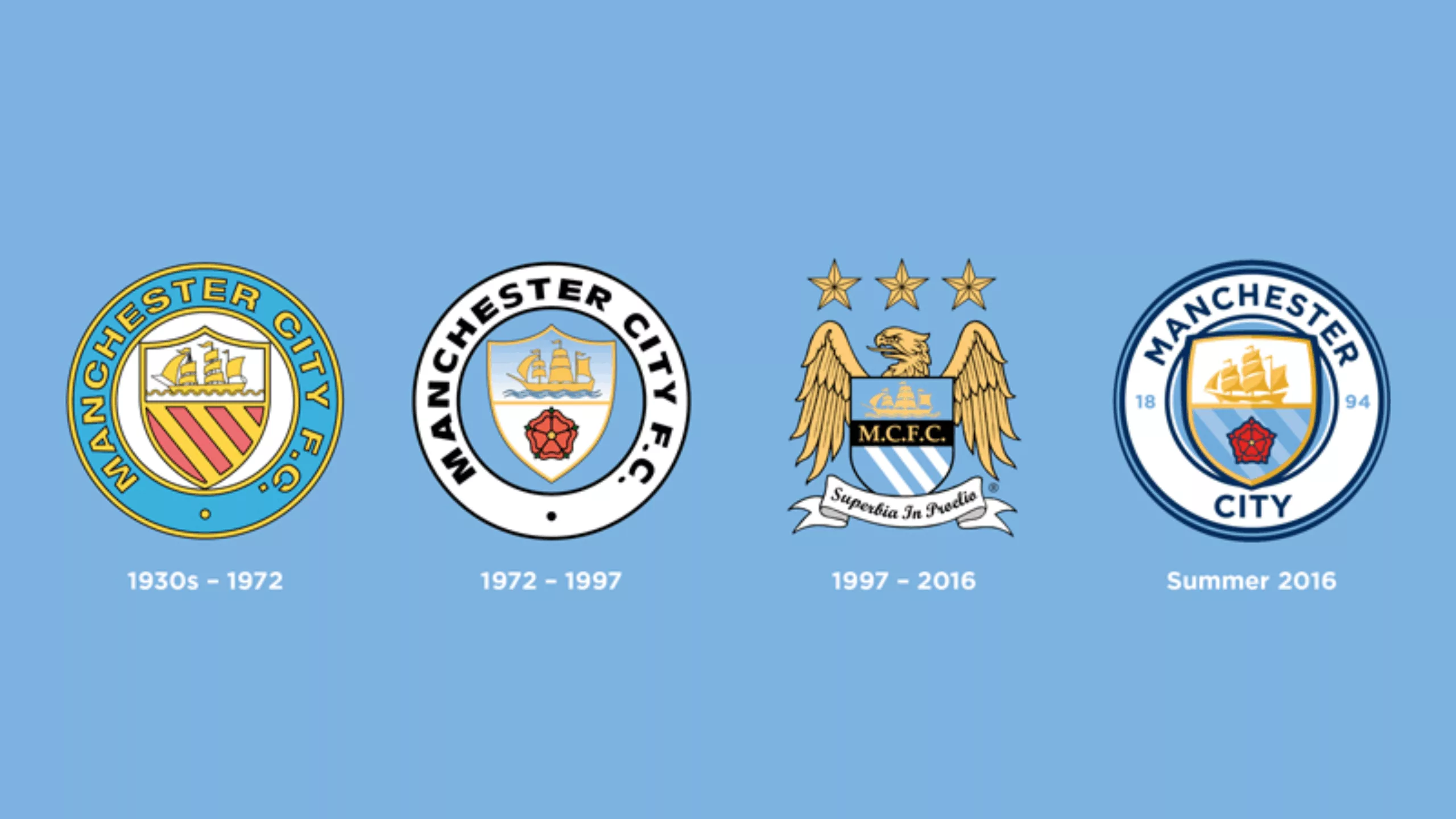
Here is Manchester City football club’s new logo. To be honest, there isn’t much of interest to say about the graphic design. It is very classic in style and rather well done in its own way. What is interesting is the method chosen to arrive at this new logo.
The supporters’ logo
The club organized a large consultation with its supporters to develop its new crest. They started by putting on an exhibition. The aim was to explain the history of the logo to Manchester fans and decipher its various meanings. Gary James, an expert on the history of football in Manchester, even gave a series of lectures on the subject. Then, over a period of 30 days, thousands of supporters let the club know whether or not they wanted a new crest and, if so, how they envisaged it evolving.
The three symbols most favored by supporters, all of which form an integral part of the new design, are, in order of preference:
• The Manchester ship (85%), which appeared on the club’s three previous crests and symbolizes the city’s commercial links and international standing
• The three rivers (67%)—the Irwell, Medlock, and Irk—a vital part of the city. These are represented on the coat of arms of the city of Manchester, which appeared on two of the club’s three previous crests.
• The red rose (60%), featured on the original coat of arms of the city of Manchester and one of the previous crests, symbolizes the club’s ancient heritage and its historical link with Lancashire.
Ultimately, it can be noted that this new logo is similar to the 1972 logo.
Noel Gallagher promoting the logo
Where these Brits really excel is that they managed to hire Noel Gallagher from the band Oasis to promote their new logo.
On the subject
-

Groupama’s new visual identity, a logo in the open countryside
Groupama has just unveiled a new logo that updates its graphic design by abandoning its campaign in favor of a “startup” aesthetic.
-
From surnames to acronyms: creating a brand name from letters
From founders’ surnames to initials and acronyms, brand names have always oscillated between abstraction and familiarity.
-

The UN logo takes on water during COP28
For COP28, two designers have come up with a new UN logo showing the rising sea levels and the future disappearance of much land and coastline.