Michel Quarez, an artist/graphic designer eager to live life in color

“Run, comrade, run, the old world is behind you!!!”
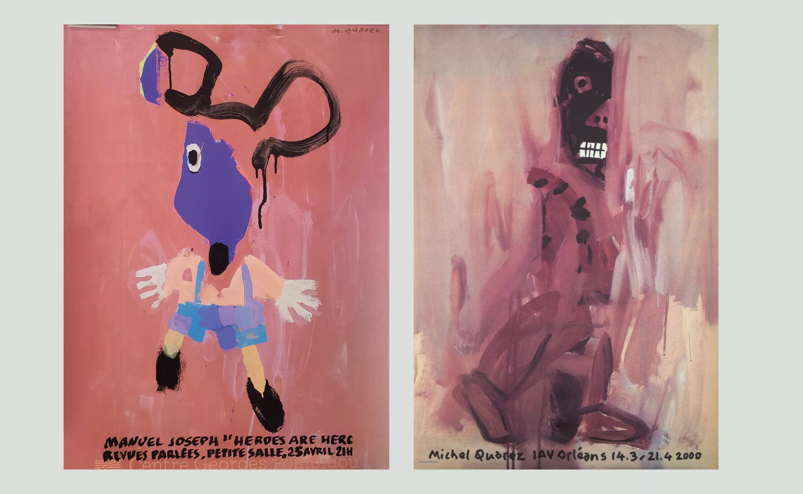
Michel Quarez was a graphic designer, painter, and poster artist. In truth, he made no distinction between these different categories, unable to bear being pigeonholed. What mattered was color, often bright and fluorescent, and the joy he displayed throughout the city.
Quarez was eager to paint and live freely!

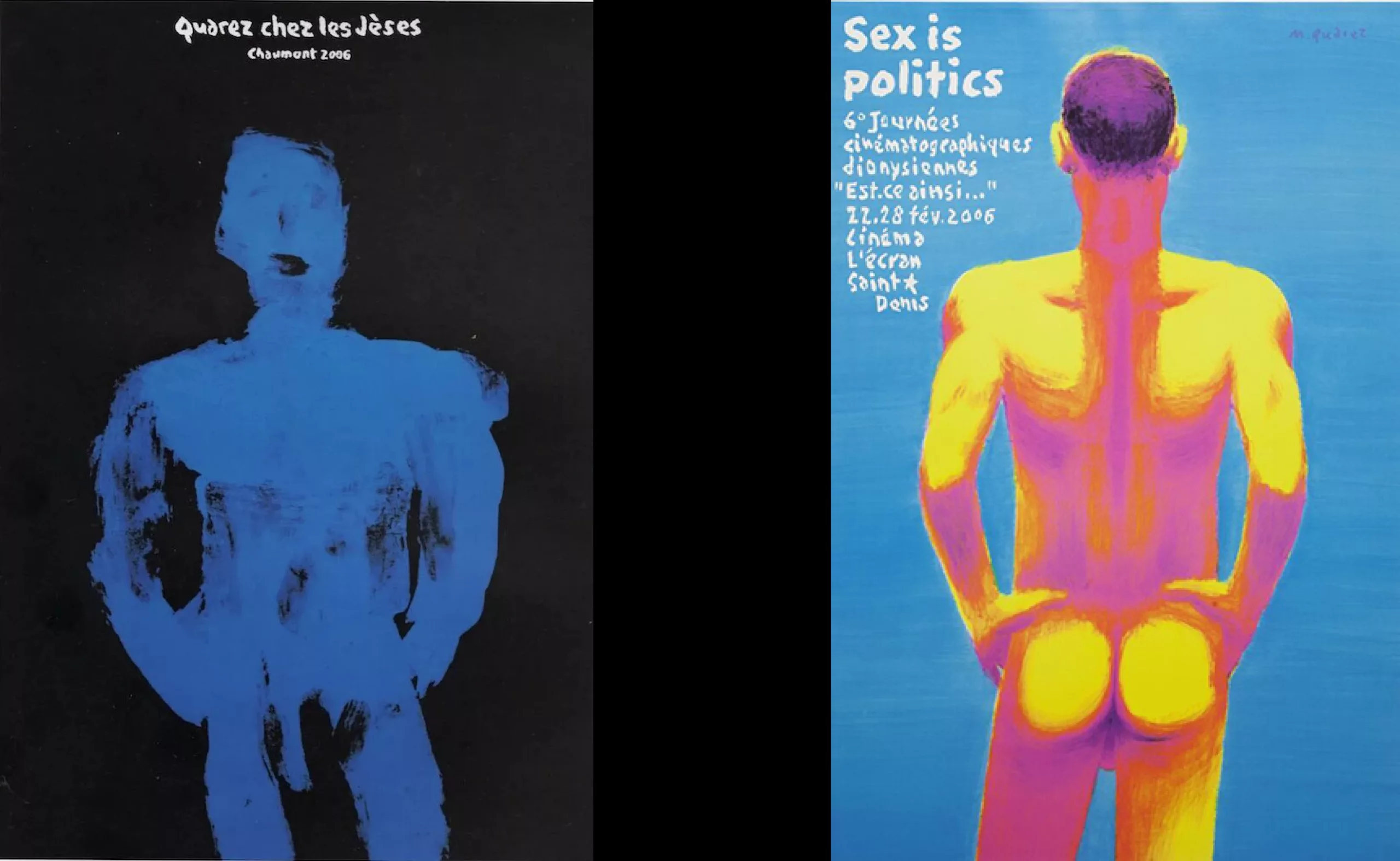
Michel Quarez is an unlikely mix of American Pop Art, psychedelic comics, and the work of Savignac, the great French poster artist.
Quarez seeks out symbols.
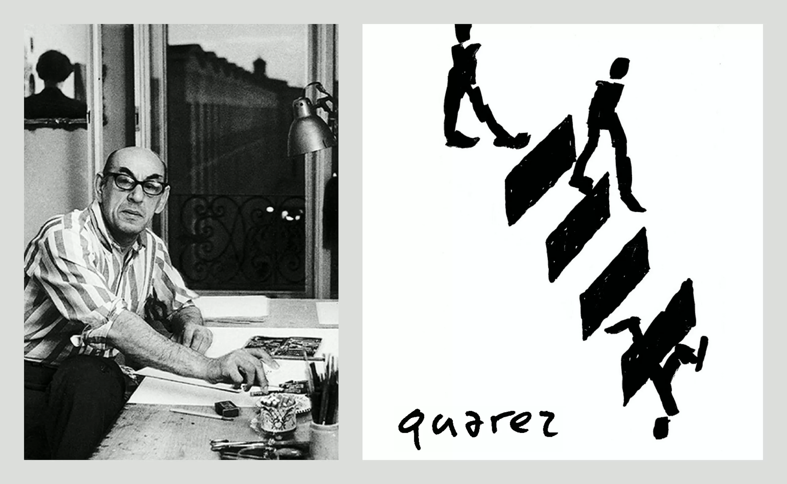
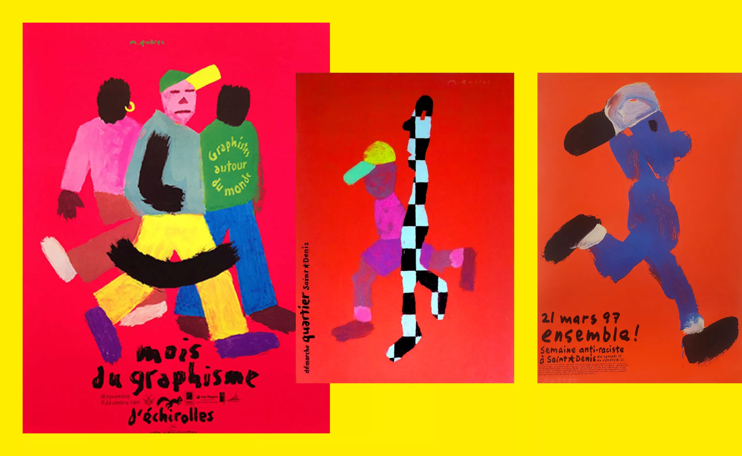
His signature image is a boy in the street, a black silhouette in baggy pants, running with his cap flying in the wind. He arranges his forms so that they become symbols of movement and life. “Run, comrade!”
Quarez is all about bright, flat colors, neon, freshness, and spontaneity. And childhood.
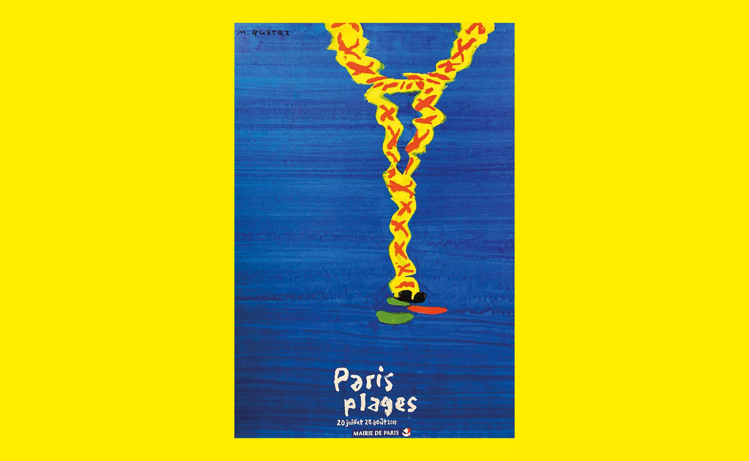
Quarez designed the poster for Paris Plage in 2010. Everything about Quarez is in this poster. It’s almost a manifesto!
A blue poster, the Eiffel Tower upside down, a yellow tower reflected in the water, with a cap and sunglasses. “Paris Plages” written in brushstrokes.
“This poster isn’t complicated,” he explained. “Paris isn’t a beach, and Paris isn’t by the sea… so you have to find a graphic solution to bring the two together!”
Ultimately, there is very little on the poster, and that’s what makes it so powerful. The power of color. Synthesizing and revealing.
“It’s the very little that we remember more than the too much or the very big. It’s the blue that needs to be imposed. That’s the difficulty… Bringing the blue of the southern seas to Paris. And then a glance with the reflection in the water. Let’s not kid ourselves, we can only convey a few hints in a poster.”
“Let’s make a clean break with the past”…
Quarez is in a hurry and colors the present.
Michel Quarez spent his childhood in Damascus, Syria. He was born in 1938. After studying fine arts in Bordeaux, he enrolled at the École nationale supérieure des Arts Décoratifs in Paris in the early 1960s. Even then, he felt stifled in the studio of Swiss graphic designer Jean Widmer, who was just 30 years old. The grid, the rigor, and the international Swiss style did not suit Quarez’s temperament. He skated through the school corridors on roller skates and had no intention of fitting into the mold.
A few years later, Pierre Bernard would put it another way. “Swiss graphic design was inspired by architecture, while French graphic design referred to painting.” And Quarez was already clearly on the side of painting. Of color.
It is 1961, Quarez has just graduated and, like many other conscripts, finds himself having to go to Algeria, where the war is not yet over.
“For me, it was either going to Algeria, in khaki, with a gun in my hand, which I couldn’t see myself doing at all, but at all… Or…?”
The other prospect that Quarez saw was the scholarship program that the Arts Déco had just set up with the Fine Arts Academy in Warsaw.
For many, Poland was the Eastern Bloc. It was the Iron Curtain and the wall that had just been erected during the summer in Berlin.
But there was the poster. Poland was not an ideological abstraction, it was the country of the poster that Quarez had discovered in the Swiss magazine Graphis.
Quarez had an idea in mind: he wanted to join Henryk Tomasczewski’s studio at the Art Academy in Warsaw.
“Tomasczewski was a legend in Europe, even though no one in France talked about him in art schools.”
He arrived in Warsaw in the winter of 1961. He was 25 years old.
Quarez was impressed. Very impressed by Tomaszewski.
What he discovered in Warsaw was the value placed on a profession that was not yet recognized in France.
Tomaszewski was convincing: “You must treat a subject as authors, taking a stand.” The question of signing the work arose. Important for Quarez. Essential for Grapus.
After spending more than a year in Warsaw, Quarez returned to Paris in 1963 and rejoined the Arts Déco, where he organized an exhibition of Polish posters.
For two years, from 1964 to 1966, Quarez joined Prouvost’s advertising agency SNIP, which owned Lainières de Roubaix, Rodier, and Lacoste.
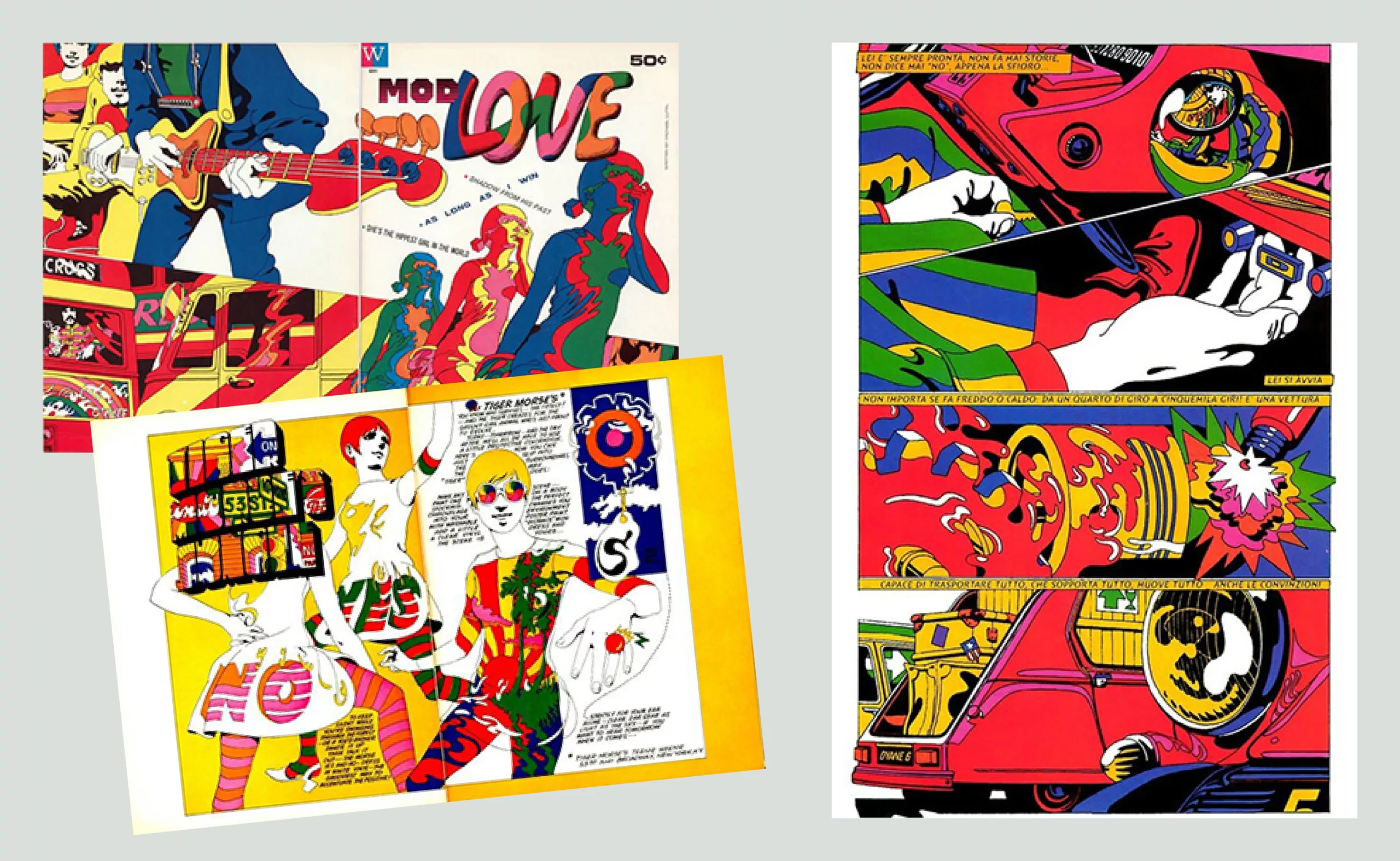
He then left for New York and became involved in the Pop Art scene, rubbing shoulders with Andy Warhol, at a time when color was becoming increasingly prominent. He created Mod Love, a pop comic book written by Michael Lutin.
Upon his return to Paris, he became an art director and illustrator in advertising, notably for the publisher and advertiser Robert Delpire. He designed an 18-page comic strip, “La vie privée de Dyane” (The Private Life of Dyane) for Citroën. It was a collaboration that would not last.
Then came the spring of 1968 in a France ruled by General De Gaulle, without any particular enthusiasm.
But that was without counting on a youth that wanted to live. “Live without downtime and enjoy without hindrance.”
At the beginning of May, Quarez was involved in the creation of the political newspaper Action. He created several covers, including that of issue 36, which he co-signed with Wolinski, “Chassez le flic de votre tête” (Get the cop out of your head).
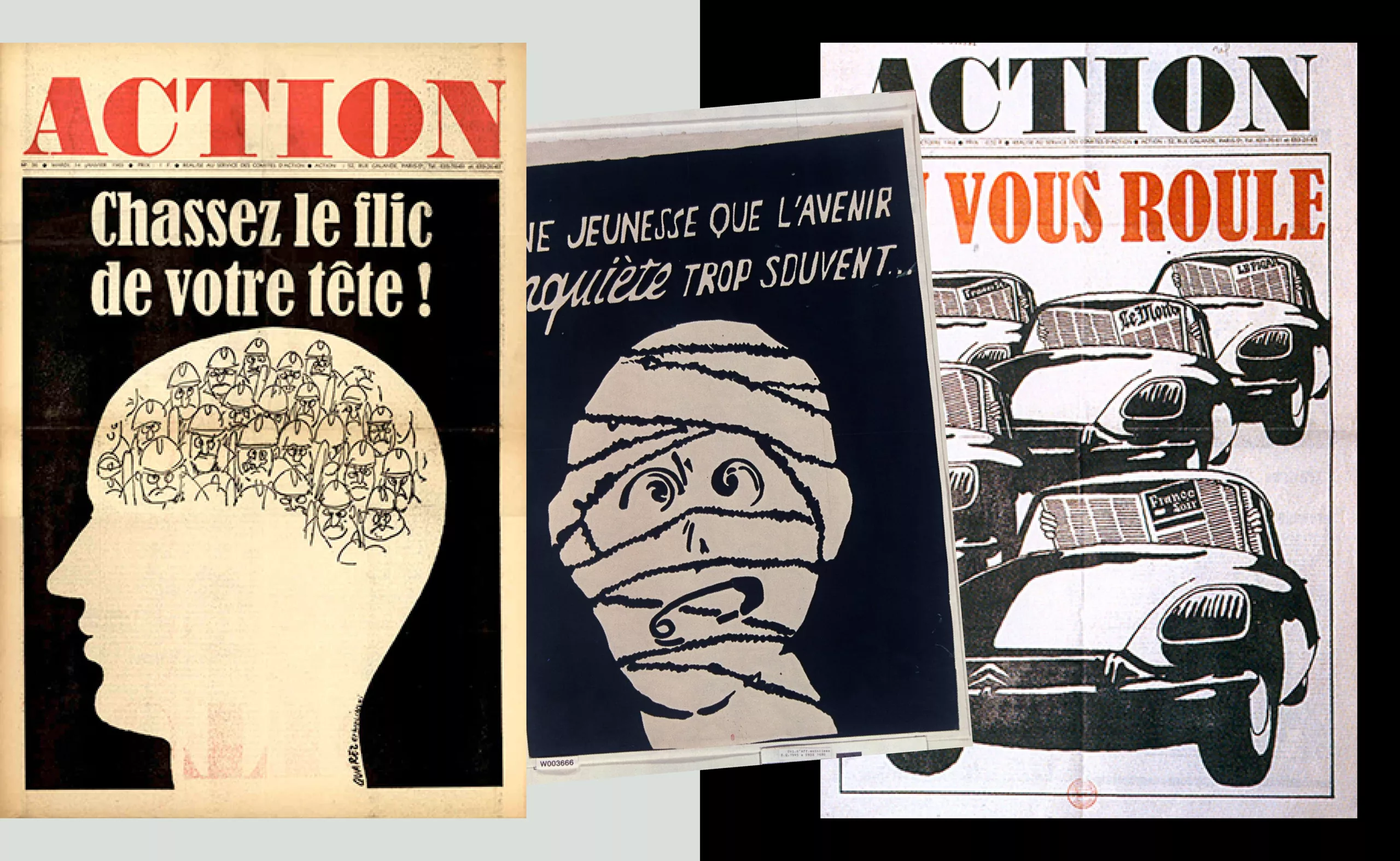
In art schools, protest was taking shape. At the Arts-Déco workshop, Quarez helped create some of the posters that symbolized this turbulent period. Slogans blossomed on the walls…
“Power to the imagination!”
“A youth too often worried about the future…”
“Let’s turn our desires into reality!”
In the 1970s, Quarez produced illustrations for various magazines: Marie-Claire, L’Expansion, La Nouvelle Critique, and Télérama.
Later, Quarez joined Grapus for a few months in 1976, which allowed him to return to poster design and get closer to the French Communist Party, particularly in Seine-Saint-Denis, where he settled permanently. “The collective and its conflicts weren’t his thing,” recalls Gérard Paris-Clavel. “We parted on friendly terms.”
In the early 1980s, with the advent of digital technology in graphic design, he obtained a grant from the Ministry of Culture to create images on a graphics tablet, the Graph’8 and the Silver from Graaf. At a time when graphic designers were still wary of digital rendering, Quarez fully embraced this new digital aesthetic. He played with it. In color.
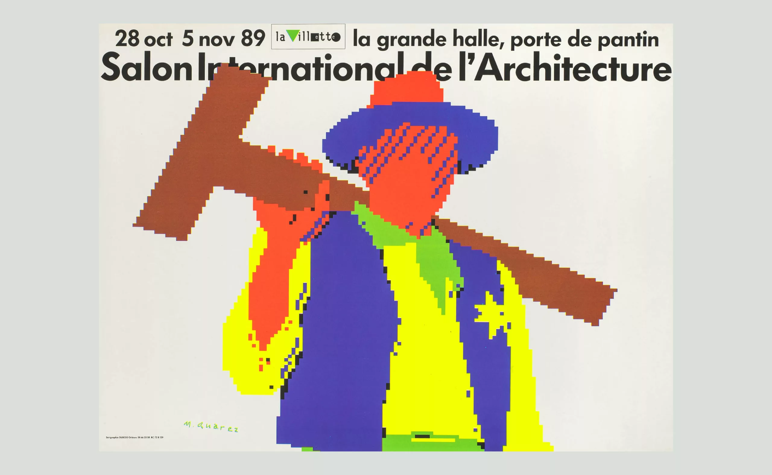
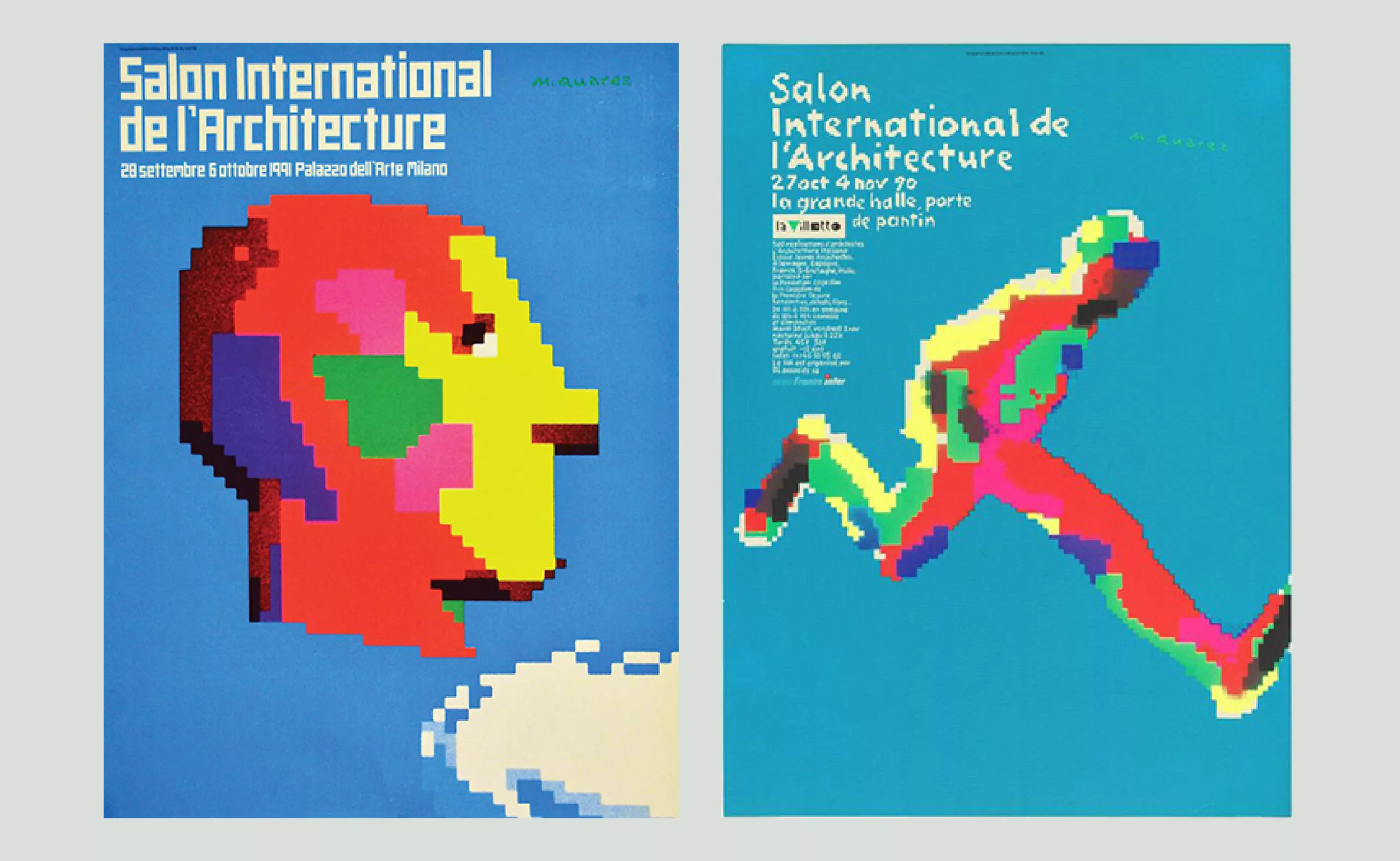
Between 1988 and 1992, he created a series of posters for the International Architecture Exhibition. John Wayne in “Rio Bravo” appears pixelated, wearing an architect’s T-shirt instead of his Winchester rifle. And as always, the colors are bright, fluorescent, and luminous.
“The street is my gallery, and I make no distinction between painting and making a poster.”
Never feeling confined to one discipline or style, Quarez claimed his freedom throughout his life.
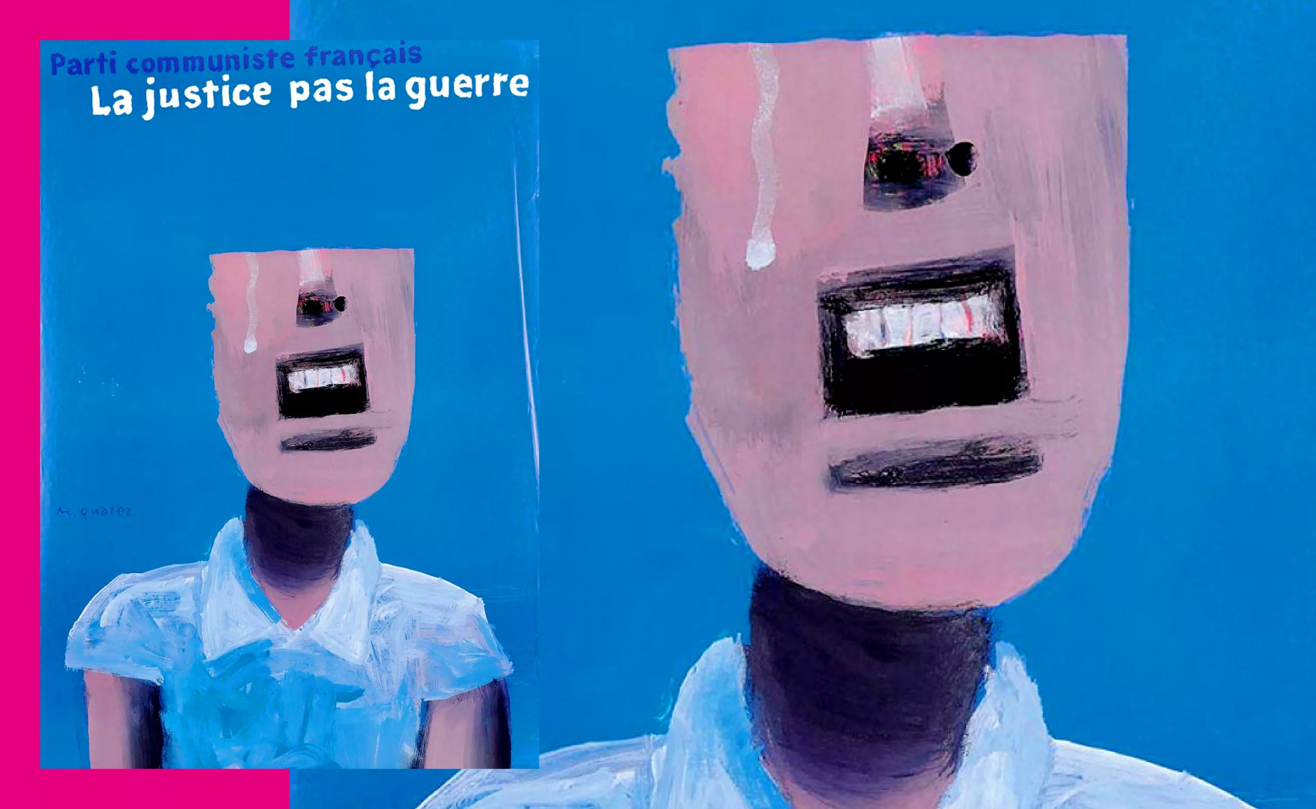
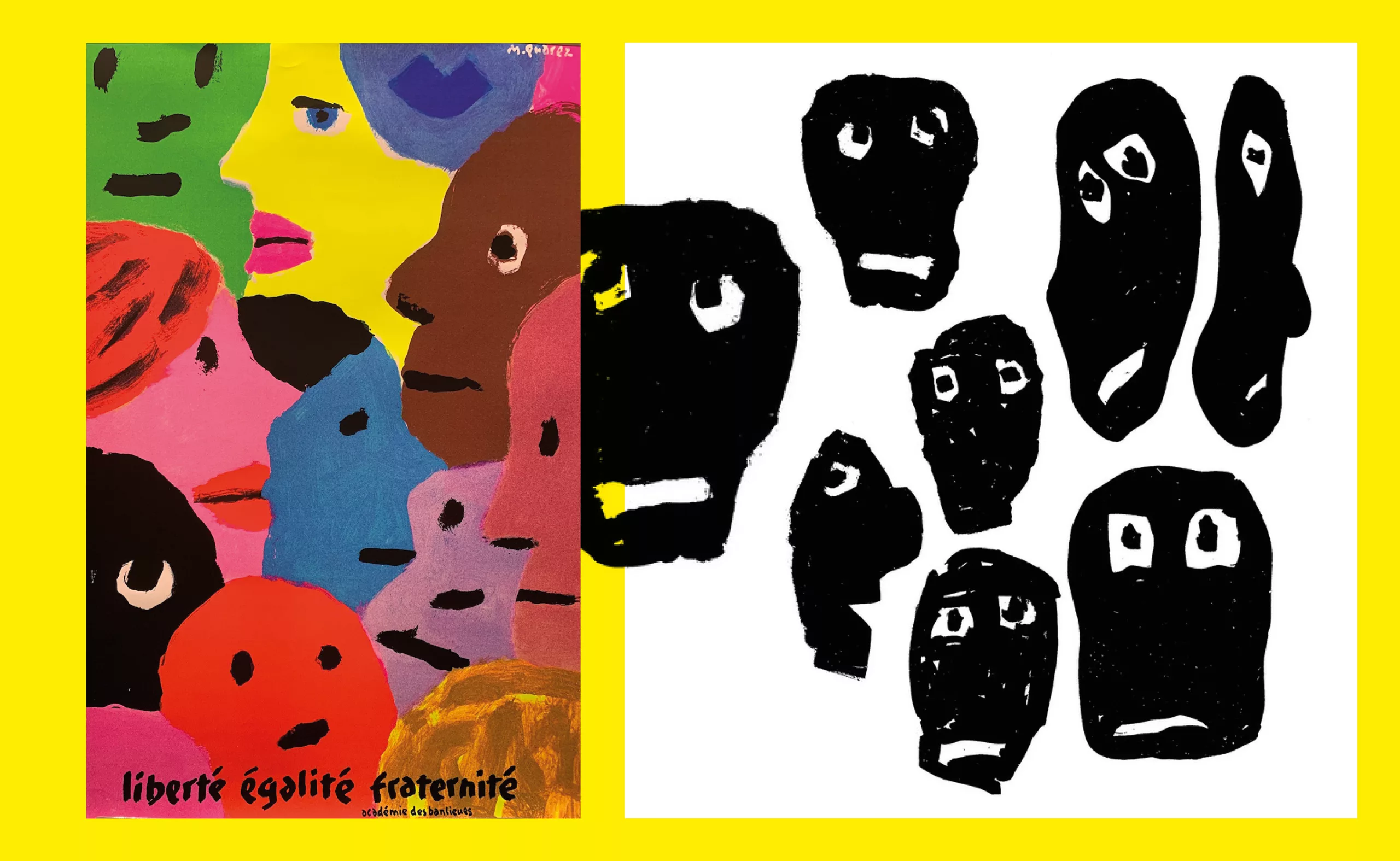
Quarez’s silkscreen posters covered the walls of the Paris suburbs, always promoting tolerance and peaceful coexistence. He championed socially, politically, and humanly engaged graphic design. Liberty, Equality, Fraternity, but also posters against racism and intolerance.
Sporting events, Fête de l’Humanité (1985), Fête de la Musique (1984), Bastille Day celebrations in Aubervilliers (1996, 1997, 1998), New Year’s greetings from the city of Bobigny (2003).
His work has been recognized with numerous international awards.
In 2006, an exhibition was dedicated to him at the Stedelijk Museum in Amsterdam, as well as at the Chaumont Festival. In 2009, the Bibliothèque Forney in Paris presented its first major retrospective of his work as a poster artist.
Rare are the artists/graphic designers whose work stands the test of time. Quarez transcends fashions with his energetic and imaginative painting, which often appeals with its joyfulness. The streets were tinged with his colors, which remained vivid and luminous. The colors of childhood…

Michel Quarez died on 9 December 2021, aged 83. His gravestone in Saint-Denis bears three inscriptions: Graphic Designer, Painter and Poster Artist.
— Catalogue de l’exposition Michel Quarez – Bibliothèque Forney, Paris 2009
— Mort de Michel Quarez, l’affichiste qui donnait des couleurs aux villes de banlieue, Télérama
— Quarez fait le mur
— Dans l’atelier de Michel Quarez, 2010
— Raoul Sangla et Macha Mieg rencontrent Michel Quarez dans son atelier. 2006
Written by: François Chevret
On the subject
-
Maison Nicolas, a new logo for a new strategy
Maison Nicolas has unveiled a new logo and identity, unfortunately without drawing on its rich graphic heritage.
-
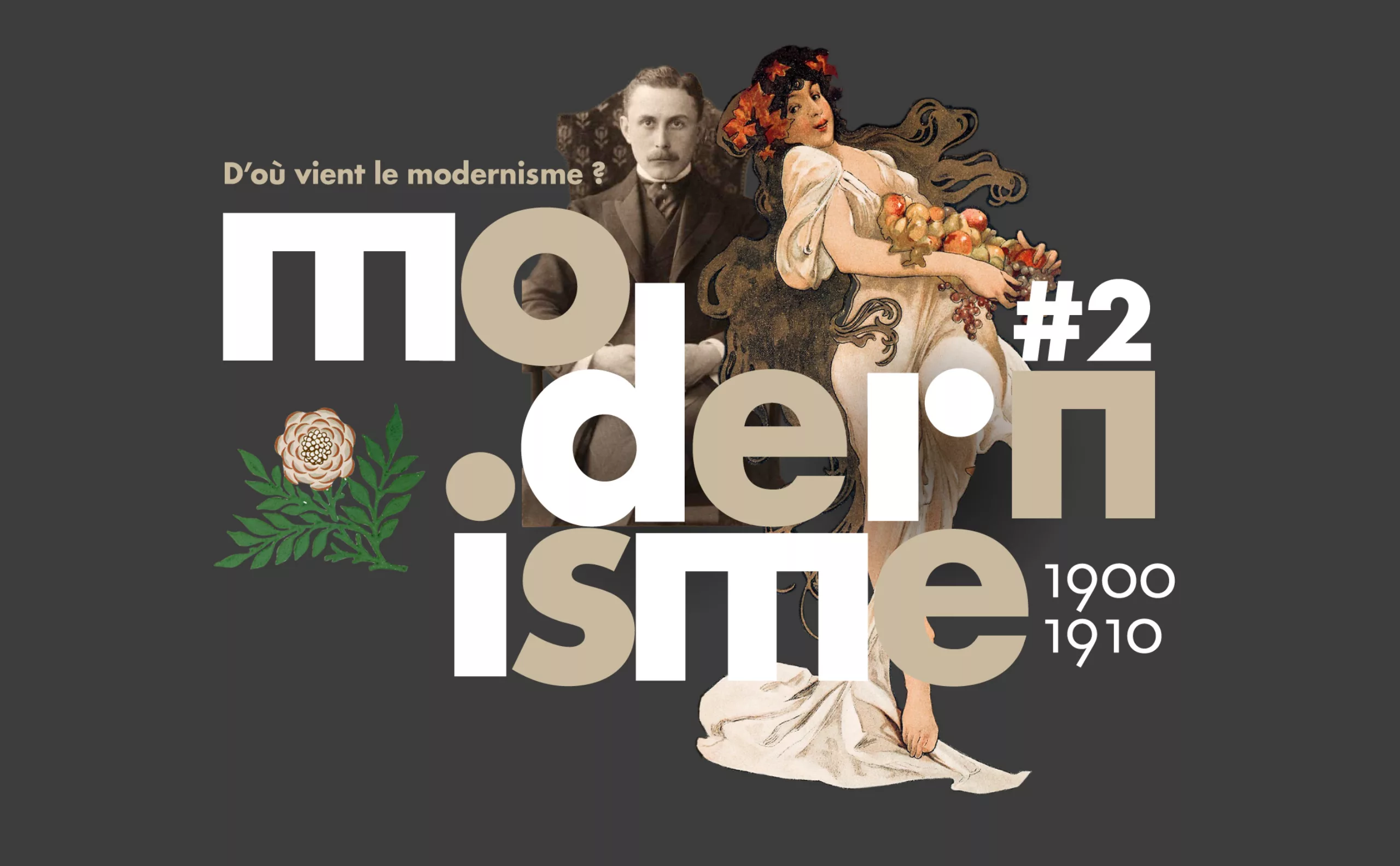
Where does modernism come from? 2 – The two faces of modernism and the social ideologies surrounding ornamentation
L’usage ou l’absence d’ornementations symbolise pour l’homme “moderne” deux visions utopiques et différentes pour changer la société.
-
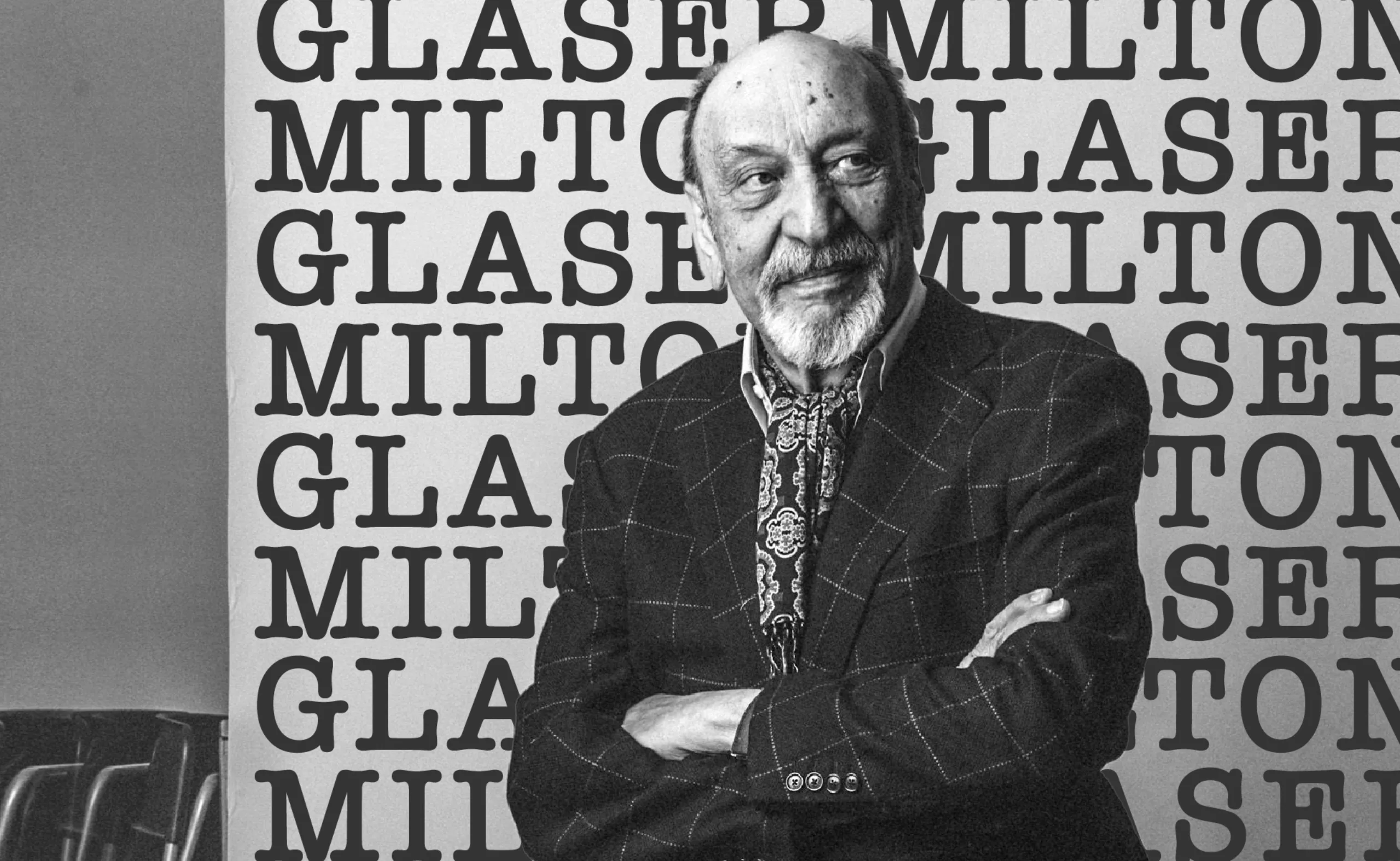
We ❤️ Milton Glaser !
Graphic designer Milton Glaser gave the 70s and 80s a cheerful and colourful face and New York a reason to love him. Among his most famous creations are the logo “I ❤ NY” and Bob Dylan’s psychedelic poster. Let’s go into the history of a very, very big name in American design.