nature “bold” our loves…
A short while ago, we were talking about ecology and typography, which made me want to revisit an article originally published in April 2008, 6 years ago…
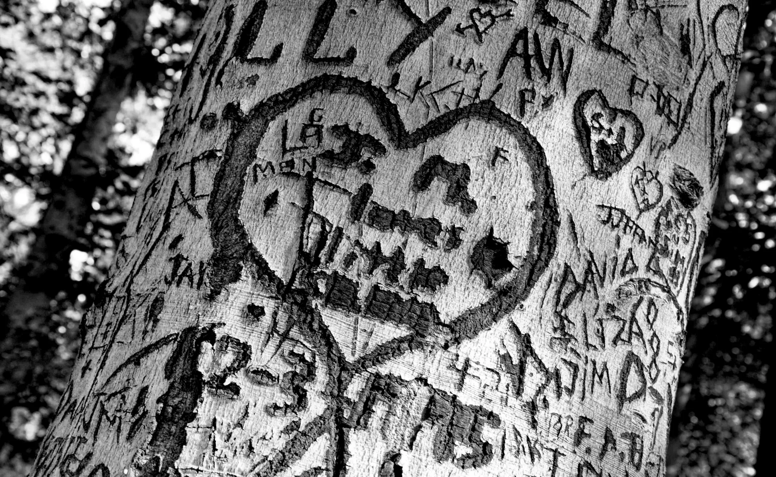
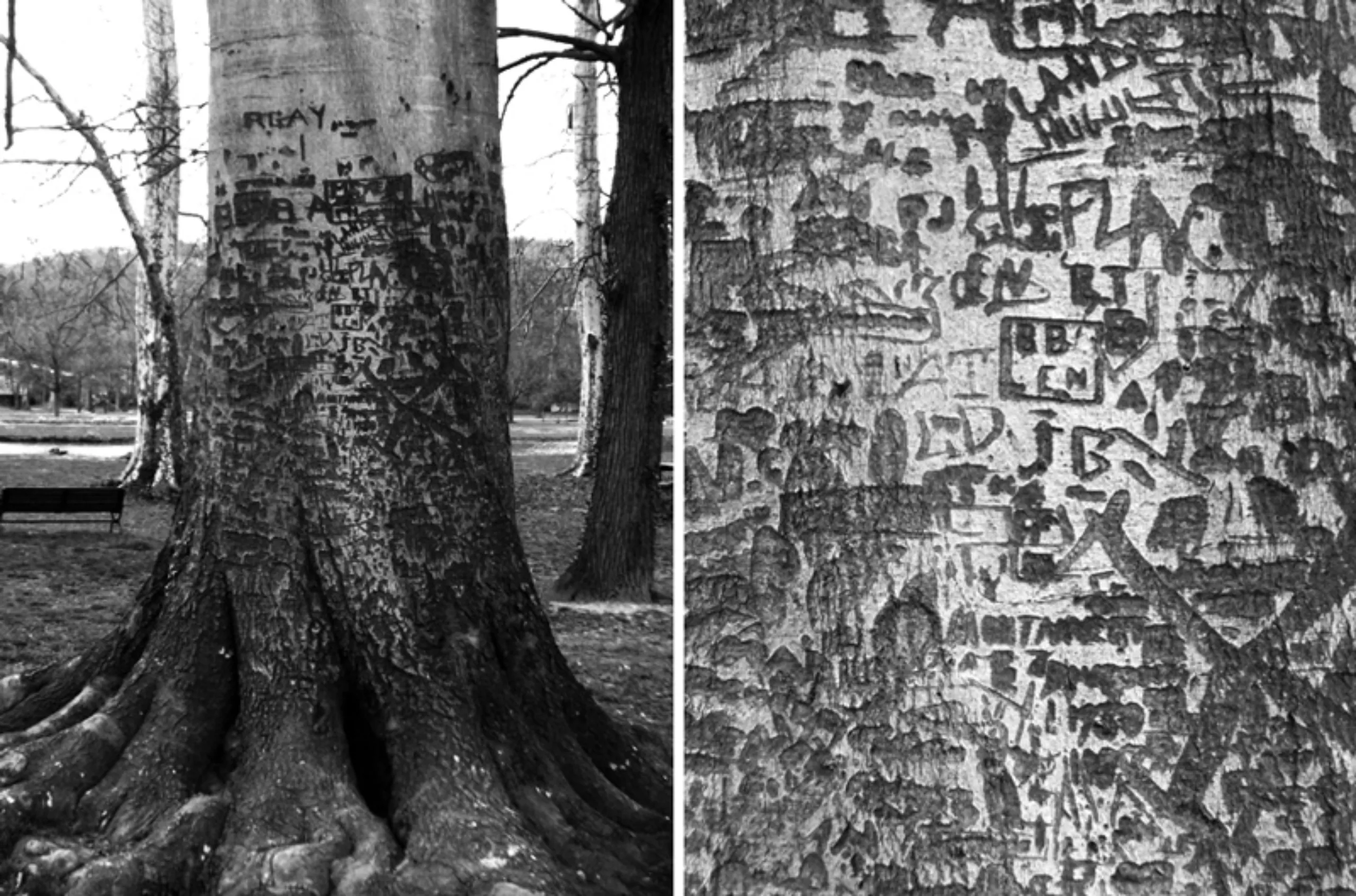
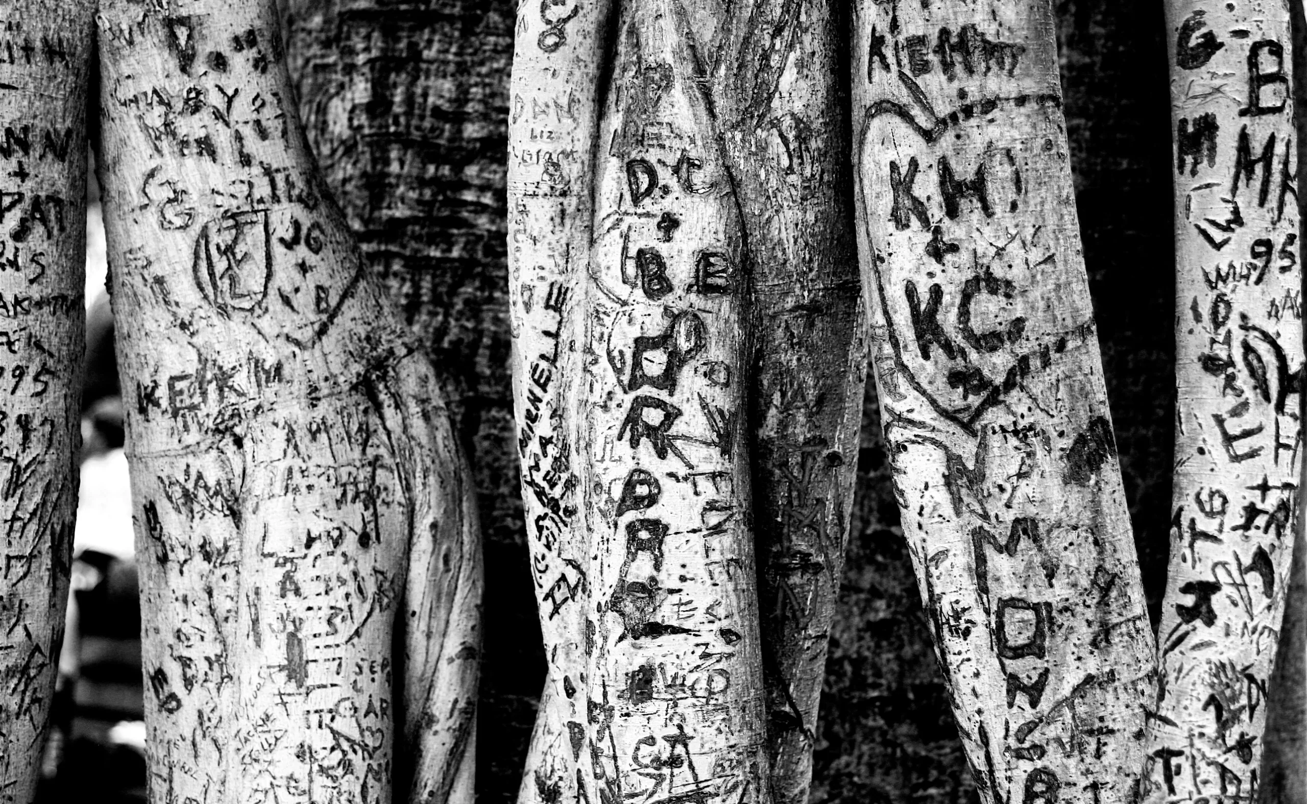
Initially, you want to say “I love you” with a penknife… Whatever the moral of the story, we engrave a few initials with the tip of an opinel N°2 (the smallest there is … the n°1 having been abolished in 1930). Beautiful, fine letters, an extra-light “for life”… well cut, well pointed ! And then time takes its toll : marriage, children, a five-door 807… and our beautiful “for life” on its tree, it does what we do : it gets a little thick (Regular), a lot thicker (Bold), too much thicker (Extra-bold)… before fading away…
On the subject
-
The symbolism of cut hair in Iranian protest posters
In Iran, Mahsa Amini died for a lock of hair poorly concealed behind her headscarf, giving rise to a massive protest movement against the mullahs’ regime. The gesture of a severed lock of hair becoming the symbol of this struggle gives us the opportunity to look back at the many symbolic of hair.
-
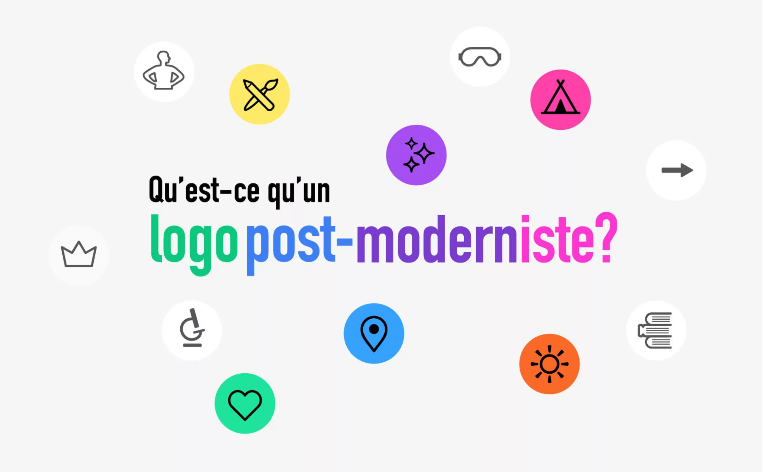
The graphic codes of post-modernism in brand logos
We are entering the “time of the tribes”. Let’s discover the impact of this post-modernity for the logos and visual identities of brands and companies.
-
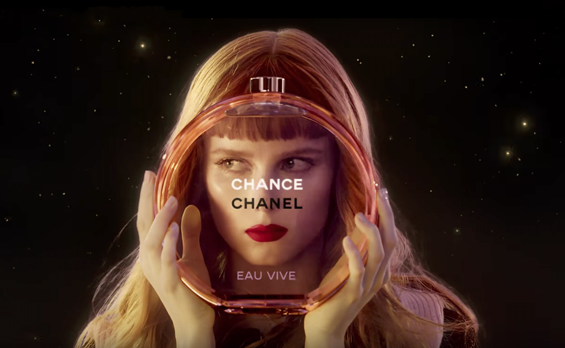
The hidden secret of CHANCE by CHANEL is Goude
Advertising sometimes offers us UFOs that seem to escape simple marketing specifications to project us towards an unexpected elsewhere. Here’s an analysis of the symbolic mystery of Chanel’s latest Chance perfume ad, directed by Jean-Paul Goude in 2016.