New logo for OM: analyzing a sports crest
Behind the scenes at the Vélodrome, a quiet revolution is underway. OM club is currently working on a new logo, a change that club president Pablo Longoria justifies as “part of the club’s transformation for the future.” In the digital age, the visual codes of traditional soccer logos can seem outdated. But does that mean we should abandon all references to the past? This announcement, which might seem insignificant in the constant flow of sports news, raises fundamental questions about our contemporary relationship with symbols, collective identity, and the commodification of sporting heritage.
Archeology of the OM logo: delving into Marseille’s identity
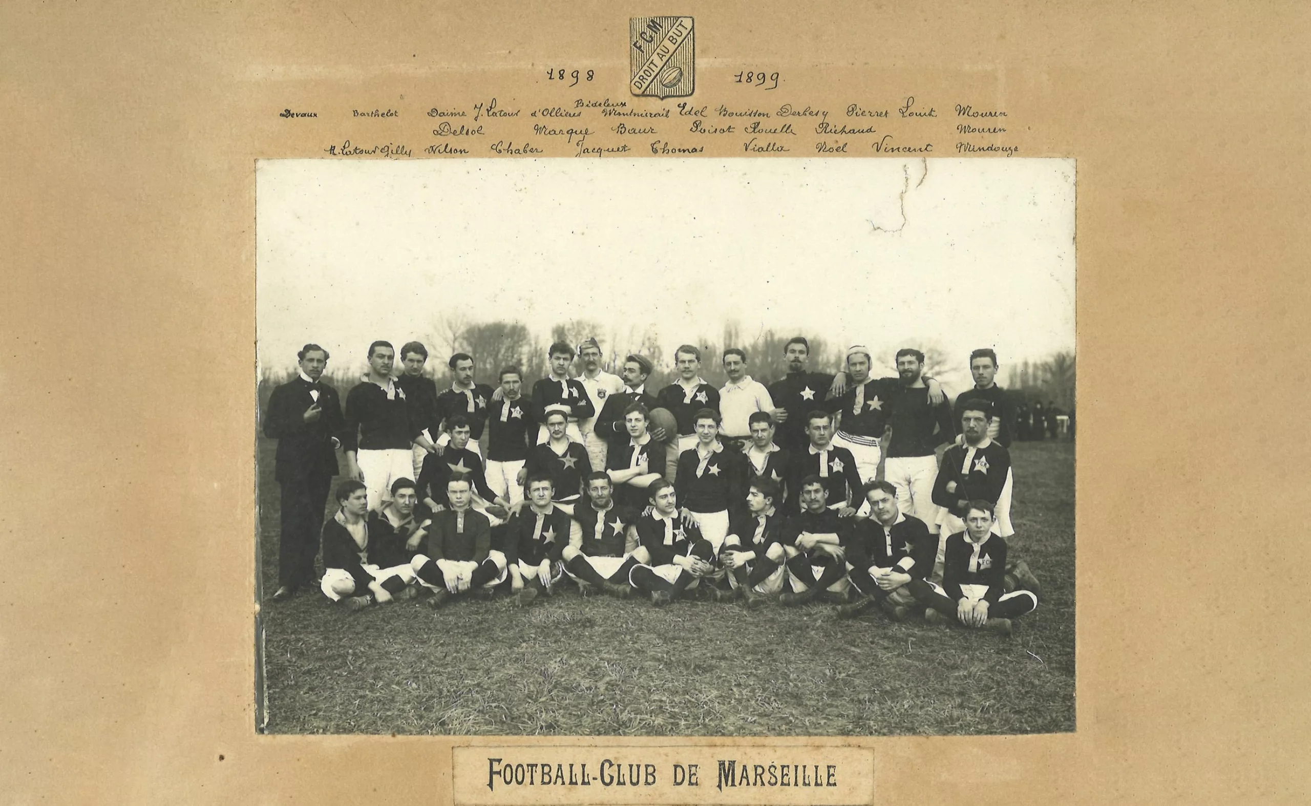
To understand the implications of this new OM logo, we need to take a look back at the graphic history of the Marseille club, founded in 1899 by René Dufaure de Montmirail. Born in Verdun, he spent his childhood in Algeria until the age of 18, following his military father. Upon his return to France, he played for the “Junior Club,” which he transformed into the “Football Club de Marseille” (FCM) before merging it with the fencing club and founding Olympique de Marseille in 1899. The club organized Olympic competitions in rugby, soccer, fencing, and swimming.
A couple, a motto, and a two-letter monogram
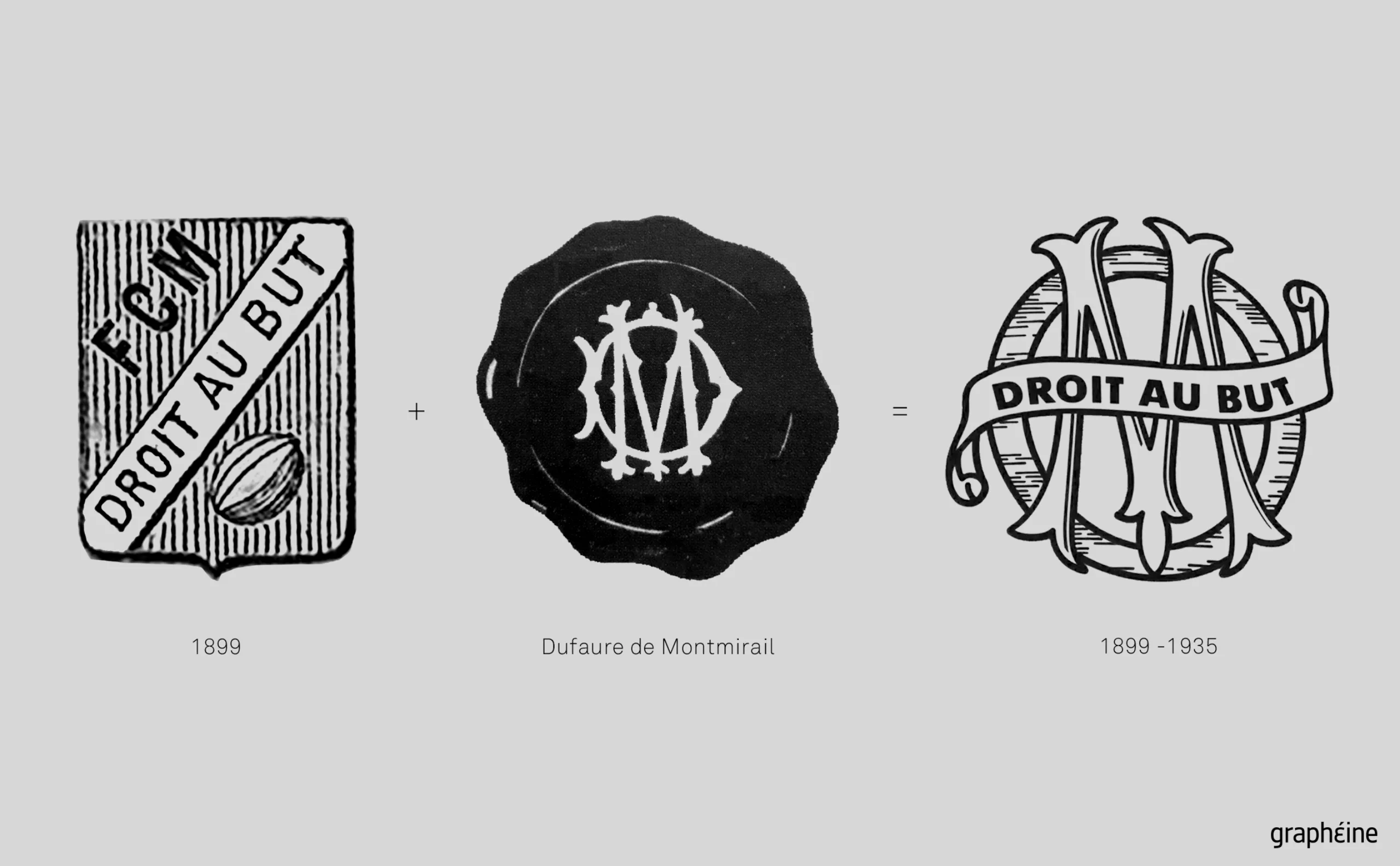
The OM motto “Droit au But” (Straight to the Goal) was already visible in 1898 on the logo in the photo of the rugby team (below) and was inherited from the Football Club de Marseille. It is the personal motto of his future wife, Marguerite, known as “Madeleine” Dubois, whom he met on the field and whose go-getting character inspired the Olympique Marseillais club. This logo is in the form of a simple heraldic coat of arms, crossed by the motto in a banner, with a ball (a rugby ball, yes, yes) and the initials of the FCM.
For his part, René Dufaure de Montmirail signed with his personal seal, a monogram intertwining his initials “DM.” The calligraphic typography is clearly Art Nouveau, in keeping with the era, with ornamental serifs at the ends of the M, inspired by floral motifs, which become entangled in the D.
The fusion of the initials of Dufaure de Montmirail and the FCM logo resulted in the very first OM logo, with an M for Marseille rather than Montmirail, adorned with the motto “droit au but” (straight to the goal) on a banner, flying in the manner of military banners carried by knights (called a ‘listel’ or “phylactery” in heraldry).
The “modern vintage” trend: old logos brought up to date
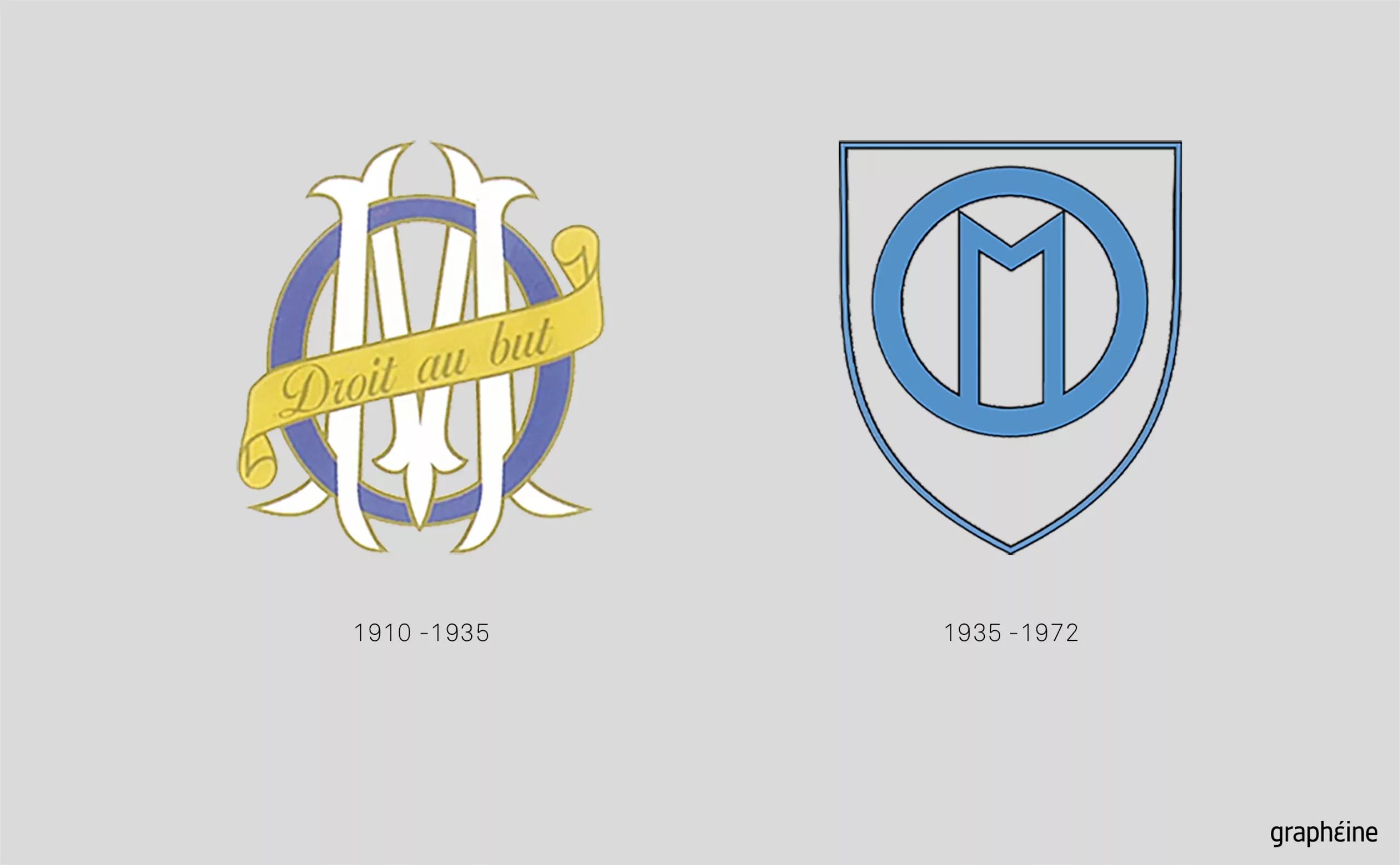
The OM logo remained unchanged typographically until 1935, when it became an Art Deco coat of arms (below: right). It features a small, stylized, thin “M” in block letters, set within a ring-shaped O that stabilizes the whole, surrounded by a coat of arms. This sleek, flat logo would have been perfect for a retro comeback if OM had followed the recent trend of “old logos of the future,” advocating a return to the original logos of the last century.
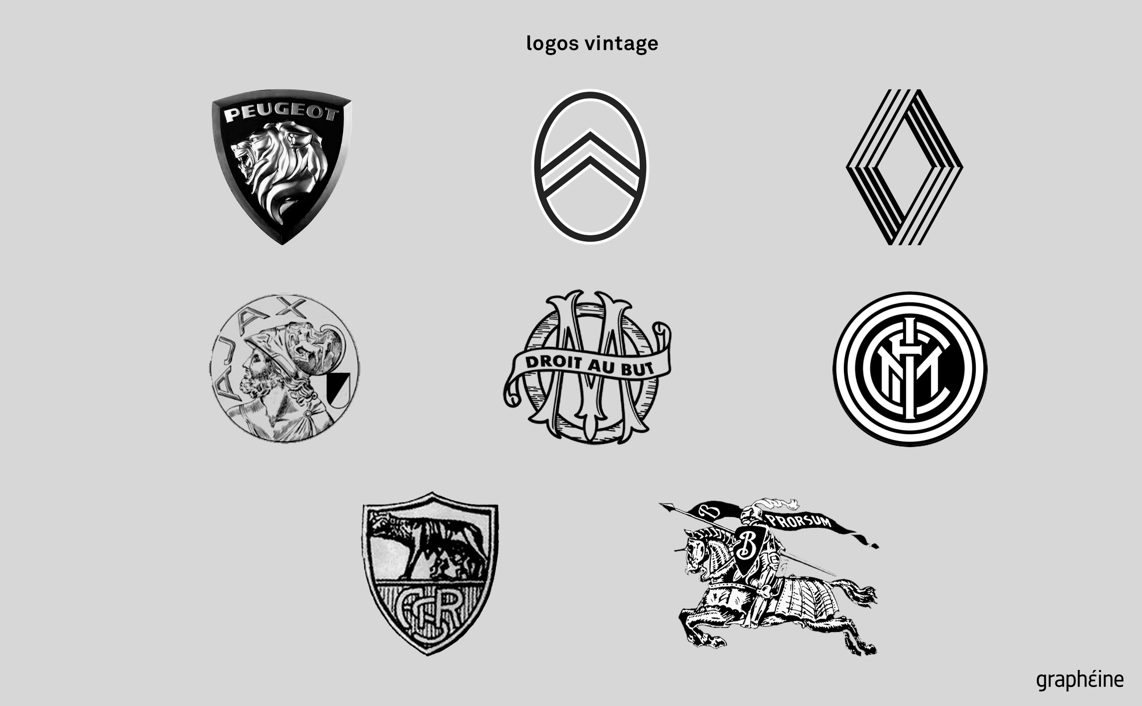
This is what Peugeot, Burberry, and Citroën did when they adopted their old logos, and Renault did with its 1970s logo designed by Vasarely. Burger King and Pepsi also chose to dive into nostalgia with new logos inspired by the 1990s.
In the world of soccer, Ajax has reverted to its 1928 logo (second row, left), while Inter Milan reused its 1908 logo in 2014 (second row, right). AS Roma recovered its historic logo in June 2025 (bottom left), which echoes the one created in 1927 and used since the 1970s. The last logo dated back to 2013 with the words “Roma 1927,” but fans had been calling for the return of the original “ASR” inscription, and management finally gave in.
For baby boomers and Generation X, these vintage logos evoke their youth, creating an authentic emotional connection. For millennials and Generation Z, they represent a “cool” and authentic aesthetic, free from the artifice of contemporary design. This dual reception explains the commercial success of these retro strategies.
For its 125th anniversary, the Marseille soccer club chose to revive its original 1899 logo, which is closer to the current logo than the 1935 version, adding a star. A preview of OM’s future new logo? However, this nostalgic strategy carries risks specific to the world of sports. A soccer club cannot simply play on the emotional strings of the past; it must also embody ambition and a vision for the future.
In 1972, making the surprising choice of a style from the previous century (at a time when the focus was more on the future with the conquest of space), OM once again chose a monogram logo with an antique look, more solid and symmetrical, with legs decorated at their ends and straight as two posts, surrounded by an outer circle. There are two Os, an outer circle and an inner oval, reminiscent of the initial D of Dufaure or perhaps a nod to the rugby ball played at the time of Olympique’s birth? This OM logo was used for almost 10 years.
Without wishing to offend fans, its graphic composition—with its M and two circles—is almost reminiscent of an ancestor of Inter Milan’s current logo.
The motto “straight to the point” as a banner for OM
Then, in the 1980s, the motto “straight to the point” made a comeback in the form of a wavy scarf, reminding us that the OM brand also draws on its ancestral sporting roots. In heraldic coats of arms, these banners allowed text to be incorporated without disrupting the visual harmony of the crest, creating a clear informational hierarchy between the image (the crest) and the message (the motto).
The M extends beyond the front and back of the O, which is still elliptical and will remain so until the 1990s, before becoming round again to this day. It was then colored solid blue for contrast, a change that was not merely ornamental. This visual hierarchy reflected a desire to assert identity with the arrival of Bernard Tapie, where the “M” for Marseille took precedence over the “O” for Olympique, reflecting a renewed sporting and media ambition.
The typographic composition of the logo from the 1990s onwards plays on the perfect interlocking of the “O” and the “M,” creating a monogram of formidable simplicity where each element has its function: the outer circle delimits, carries, and protects, the banner draws the eye to the center, while the geometry of the central “M,” with its right angles and balanced proportions, anchors the whole in a timeless yet retro modernity, always with that typographical reference to 1900.
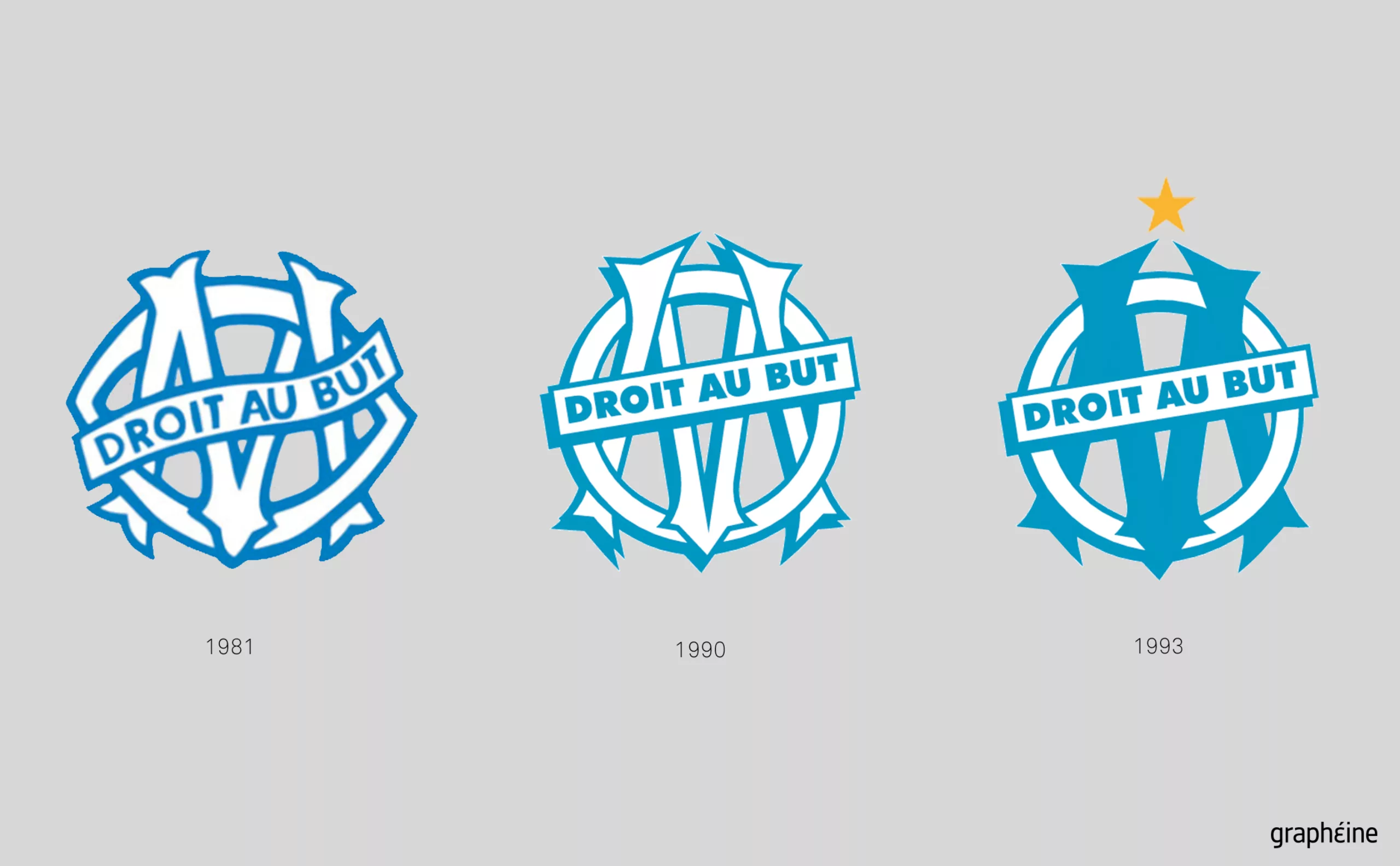
Following the Champions League victory in 1993, a gold star was added to the monogram for the first time and the M was redesigned in a more modern style with simplified embellishments. The strength of this logo lies in its immediate legibility and instinctive memorability—two essential pillars of graphic effectiveness.
In 2004, a redesign by the local agency Encore Nous homogenized the visual: an O and an M merged and united in Pantone blue, bringing the two letters to the same level, as in 1935. The motto in gold linear letters was placed under the monogram, and the gold star returned to crown the whole. The logo is technically more legible, visibly more suited to digital use as it works as a favicon, and more solid on its “legs.” The feet of the M, slightly apart, give it more support and form a pyramid base that draws the eye to the star. In fact, as we write this article, we realize that this logo holds up rather well.
Twenty years later: a new OM crest?
However, redesigning the OM logo in 2025 or 2026 could prove wise, not to revolutionize this well-oiled machine that works so well, but to refine a few details. Firstly, typography: adjusting the font weight, optimizing the internal spaces of the “M”, redesigning or even simplifying its legs, or, conversely, playing the vintage card to the full by adding ornamentation, changing the typography of the motto, which sorely lacks character and personality, rethinking its position (and bringing back the banner?), and finally harmonizing the typographical choices to ensure consistency across the website and accessories.
Perhaps the color palette should then be enriched with derivative colors to increase its impact on high-definition screens, while preserving the iconic architecture that has been the strength of the Marseille club for decades. Like any sports logo, it will obviously be essential in 2025 to imagine the logo in motion, in lights, with its variations.
Below, we can see on the scarves the lack of harmony between the colors and typographies, which vary from one medium to another. A harmonized identity is a more coherent and therefore stronger banner for supporters.
The challenges of a sports logo in the digital age
The current OM logo bears the marks of an era when visual communication favored illustration and immediate recognition. But this simplicity, once a guarantee of effectiveness, can now be perceived as out of step with the demands of the digital age and contemporary aesthetic expectations. A modern football club logo must now work simultaneously on multiple media: jerseys, smartphone screens, social networks, and global merchandising. This multiplicity of applications imposes constraints that were previously unheard of: legibility in small formats, monochrome reproduction, and adaptation to Instagram and TikTok formats. These technical constraints directly influence aesthetic choices: favoring high contrast, avoiding overly fine details, opting for saturated colors that stand out on screens… Can these imperatives coexist with the preservation of a century-old visual heritage?
Not to mention the fact that tampering with a logo that brings together so many supporters is tantamount to striking a chord with the people of Marseille. It’s impossible to ignore or make a mistake: the logo is ingrained in the fans, drawn on their faces, worn like a second skin. Much like logos for cities and regions, the emotional attachment is such that a creative error can incur the wrath of an entire population. In fact, soccer clubs rarely change their identity, unlike brands.
A soccer club’s logo is no longer just a symbol of identity, it is also a commercial asset worth millions of euros. Any change can impact the brand’s value, merchandise sales, and attractiveness to international sponsors.
Towards a minimalist coat of arms for the OM logo?
The redesign of club logos is not unique to Marseille: today, the question of the new OM logo is part of a broader context of visual standardization of football and sports identity. Over the past decade, several historic clubs have embarked on total redesigns, embracing either a break with the past or, conversely, stylized historical continuity. They have all used similar graphic codes: simplification, minimalism, and digital adaptability. This homogenization raises the crucial question of preserving cultural specificities and centuries-old codes in the face of the imperatives of global communication.
OM seems aware of this pitfall. Longoria refers to a difficult exercise in which it is necessary to “respect history but also have your own identity.” This statement of intent reveals an awareness of the excesses of flat design applied blindly to the world of sports. But how many clubs have lost their substance by adopting sanitized logos designed for social media rather than to embody their century-old history?
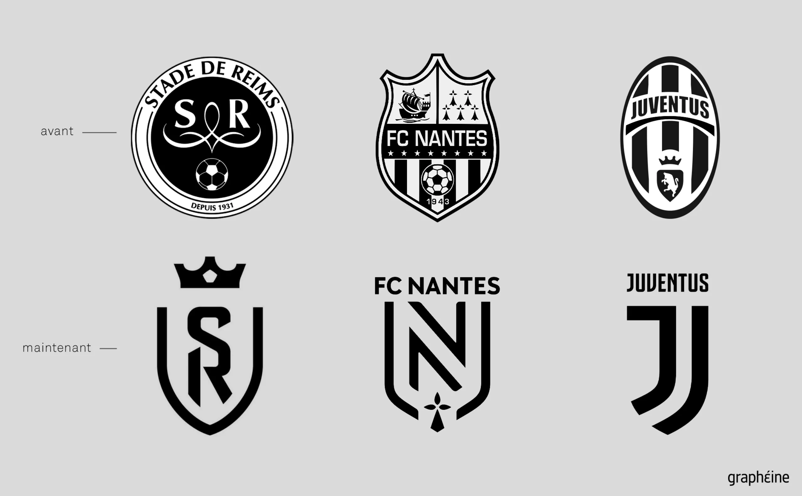
Juventus Turin, with its controversial rebranding in 2017, perfectly illustrates this issue with its double “J” graphic in black and white. Gone are the shield, the bull, the stripes, and the ornaments; the Italian club has favored formal modernity at the expense of its symbolic richness. The Turin club has adopted a minimalist, modular icon, designed primarily to exist in the world of luxury, fashion, NFTs, and digital content. This choice, which was heavily criticized at first, has nevertheless opened up a new path: that of the club-brand, with a logo that has been stripped of its pure sporting identity to embrace a lifestyle approach.
We saw the same debates with Stade de Reims and FC Nantes. In France, Asvel (now LDLC) opted for a logo with clean geometric lines and a stylized vertical lightning bolt. Here again, the visual identity aims for digital efficiency, merchandising impact, and mobile adaptability, while retaining a strong signature.
A modernized heritage: the solution for sports logos?
And yet, for brands, especially luxury brands, the era of flat design seems to be over: heritage is being reinvented with modern codes. This is what several sports clubs seem to be doing.
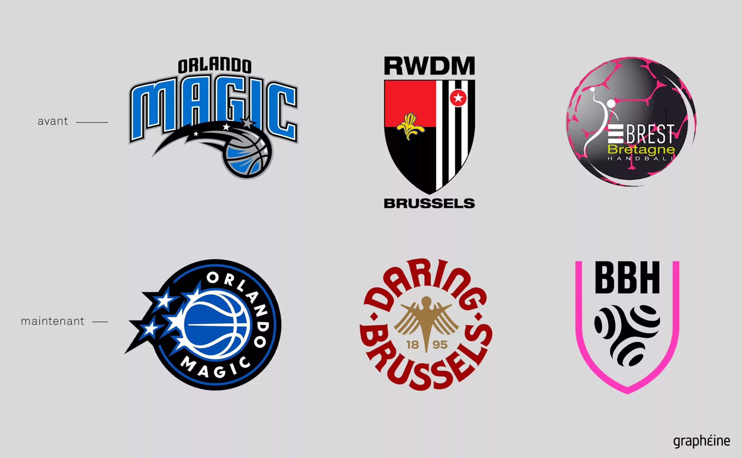
Most recently, in June 2025, Daring Brussels (formerly RWDM) underwent a careful, understated, and effective graphic transformation, returning to more classic forms. The circular crest, in sober colors, plays the card of reassuring neo-classicism. The approach is not so much a break with the past as a reaffirmation of historical continuity, reimagined with a heightened sense of detail.
Regarding NBA, also in June, Orlando Magic chose to return to vintage codes while preserving the club’s colors, with a logo updated to meet digital constraints, round and compact.
In 2021, our agency Graphéine redesigned the women’s logo for Brest Bretagne Handball BBH, creating a modern logo rooted in cultural heritage.
Another remarkable sports identity that caught our eye is that of the Dallas Trinity Football Club women’s team, created by the Moniker SF agency, which in 2023 successfully harmonized ultra-modern symbols with rich heritage. The pegasus, the city’s emblem, is stylized into an almost typographic and abstract icon, and the typography is inspired by engraved tiles.
When fans become designers of the new OM logo
As we have seen, the attachment to the club’s colors is such that some fans even submit their own designs, notably the MercatOM account, which launched a call for ideas on X (formerly Twitter). This spontaneous initiative illustrates a profound change in the process of creating visual identity. Democratized design tools such as Canva now allow everyone to contribute their vision.
However, this facilitation of graphic design is not without its questions. On the one hand, it allows the fan community to be involved in a process that directly concerns them. On the other hand, it dilutes the coherence of a professional and comprehensive creative approach.
While AI can generate technically perfect logos, the human brain remains the creative spark, with tools serving only as a means to support this expertise. Anyone can copy or create a logo, but you still need to have the idea and the logical approach that goes with it. This technological revolution is accompanied by an inevitable and paradoxical return to traditional values and human expertise. The more sophisticated the tools become, the stronger the search for human authenticity becomes: emotion, intuition, local cultural knowledge, and expertise will always remain real added value for agencies and freelance graphic designers.
A creative and participatory solution?
Finally, we cannot repeat it enough: the logo is only the visible part of the visual identity that is displayed on a whole range of physical and web media. Let’s imagine the opposite and put our team of graphic designers on the field: scoring a goal does not make us soccer players! So how can we combine the expertise of the designer with popular expression? How can we transform collective emotion into a coherent graphic proposal?
This phenomenon is not isolated, but occurs repeatedly. When the logo for the 2024 Paris Olympic Games was created, for example, or regularly when logos for cities are created (in Neufchâteau in France or Clermont-Ferrand, for example), alternative proposals from internet users flourished on social media, revealing a thirst for collective creative participation. This democratization of design calls into question the very status of graphic designers and redefines the terms of visual innovation. It is up to us to come up with appropriate responses.
We hope you enjoyed this analysis. What do you think of the OM logo and current sports logos?
On the subject
-
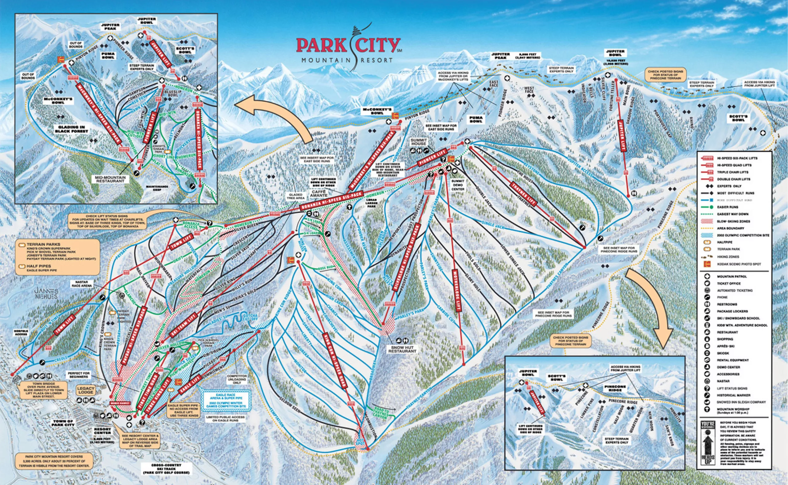
Ski trail map designer: such a cool job!
A rare profession just as the yeti: ski trail designer. Without knowing it, you’ve most probably already seen Novat’s or Nieuhe’s works.
-
Manchester City Football Club restores its heraldic coat of arms
Manchester City FC has signed Noel Gallagher to promote its new logo!
Classic branding, but well done.