Peace & Love ☮ the activist icon

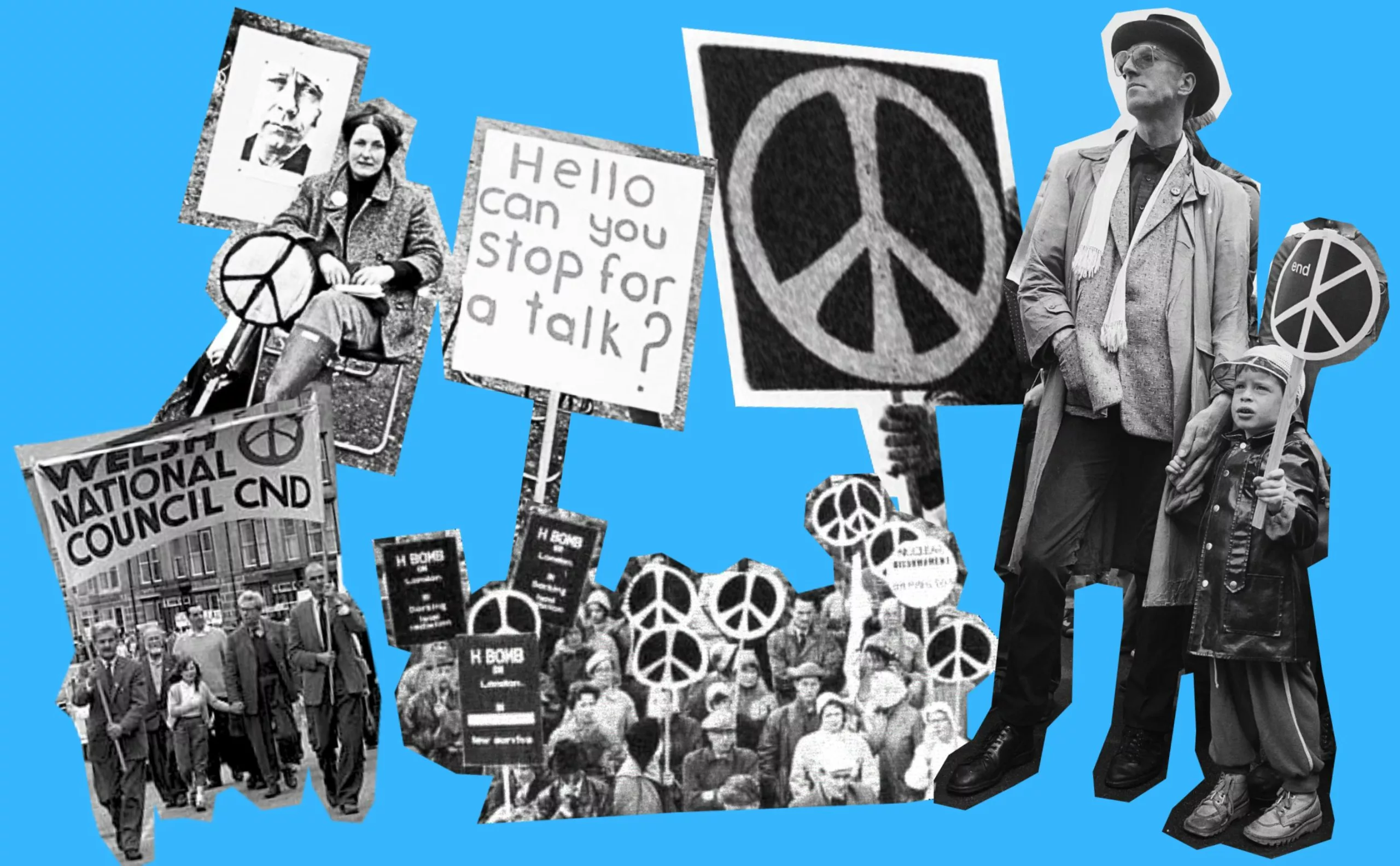
While today you can buy mugs, luxury bags, and sunglasses adorned with the “peace and love” symbol, when it was first created, it was much more than a fashion accessory. This icon, born in 1958 during a time of crisis, was originally designed to unite activists around an anti-nuclear protest. A banner for the hippie movement, the symbol came to embody peace and love in opposition to capitalist values, soon becoming one of the most recognizable signs in the world. It was then hijacked, commercialized, and stripped of its original meaning to better serve overconsumption. How did this sign come to be, and how did it prevail over other symbols of peace?
Here we begin a mini-series deciphering iconic symbols that have marked the visual landscape and protest movements.
In the shadow of the bomb: the birth of a symbol of peace in the heart of the Cold War
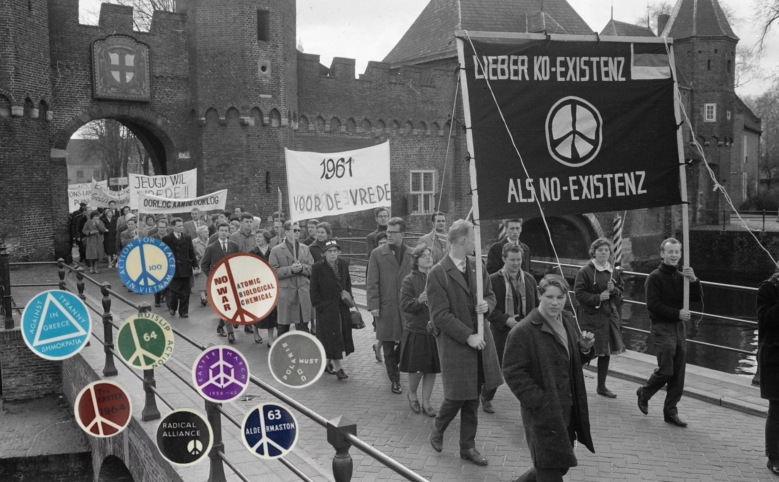
Thirteen years after Hiroshima and Nagasaki, humanity lives under the constant threat of nuclear apocalypse. The United States and the Soviet Union are locked in a proxy war, NATO has just been created, and the H-bomb, a thousand times more powerful than the Hiroshima bomb, portends the worst. As the Cold War escalates, the United Kingdom develops its own atomic weapons at Aldermaston, a military research center that has become a symbol of destructive madness.
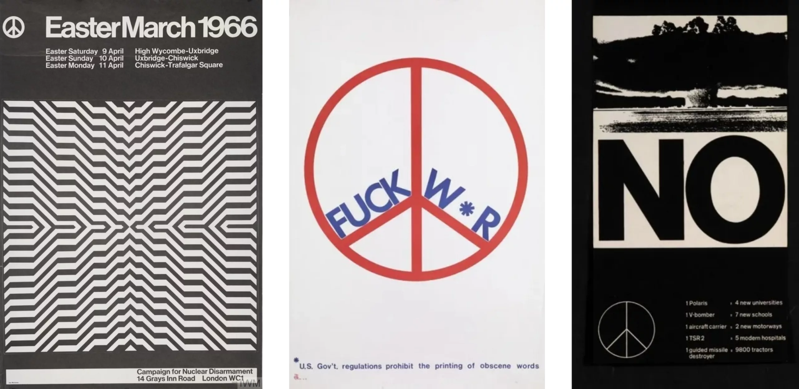
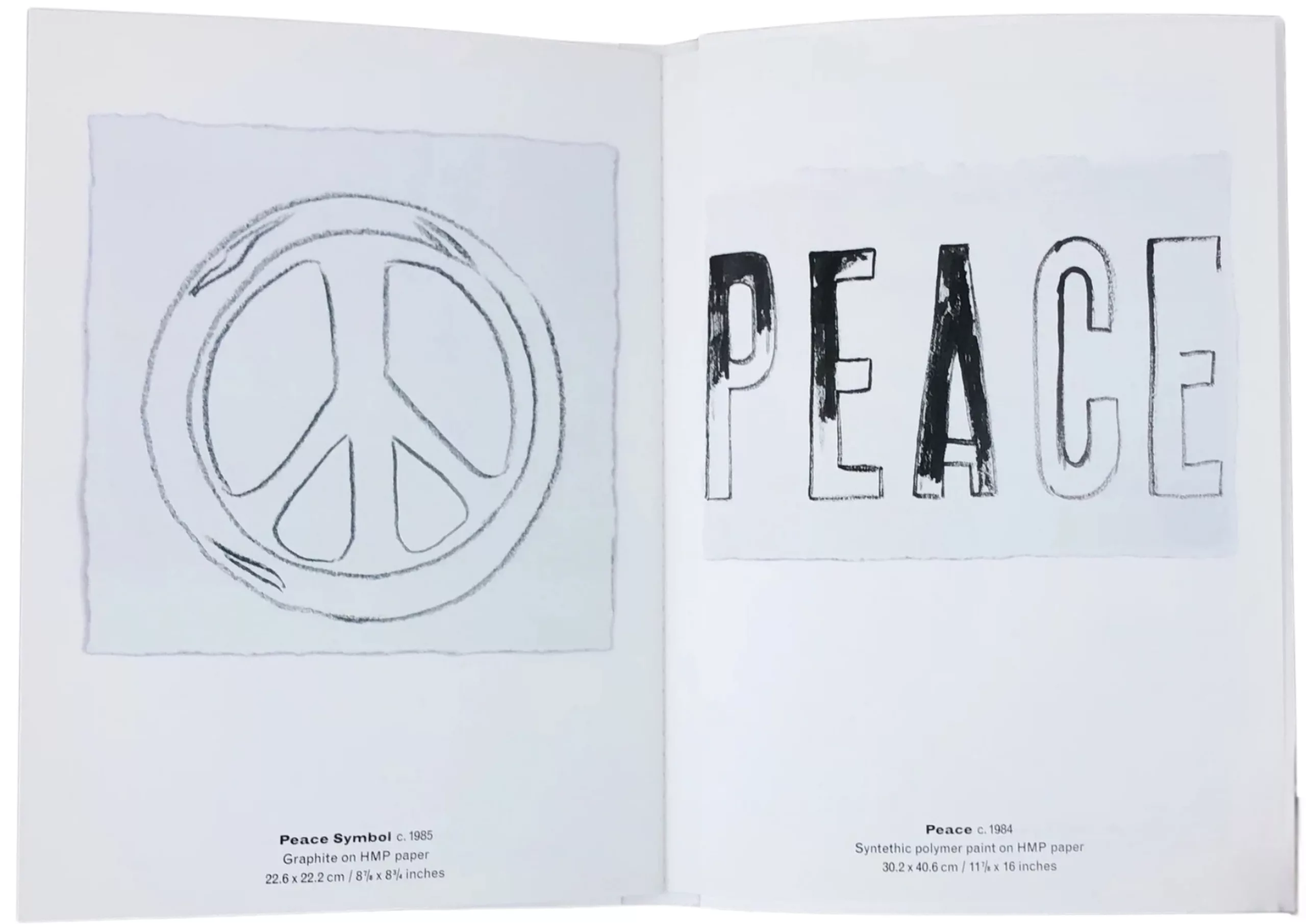
It was against this facility that the first major British peace march was organized. The Campaign for Nuclear Disarmament (CND) was formed with the help of several pacifist associations and mobilized a population still haunted by the bombings, aware that the next war would be the last. On Easter weekend 1958, Gerald Holtom, a British graphic designer and artist who graduated from the Royal College of Arts, was given a crucial mission: to create the CND logo to unite the protesters. He lent his pencil to defend this cause in a traumatized England.

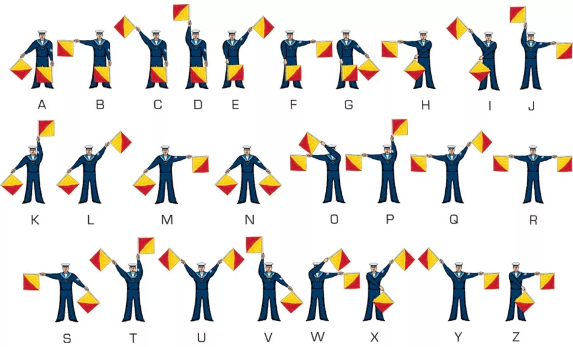
Holtom combines the semaphore signals for the letters D and N (for Disarmament Nuclear), a maritime communication system using flags that has been in use since the 19th century. He adds an emotional dimension: “I was desperate. Really desperate. I drew myself as the spokesperson for an individual in distress, with my hands outstretched downward, palms upward, like Goya’s peasant facing the firing squad. I drew it in one stroke, and I circled it.”
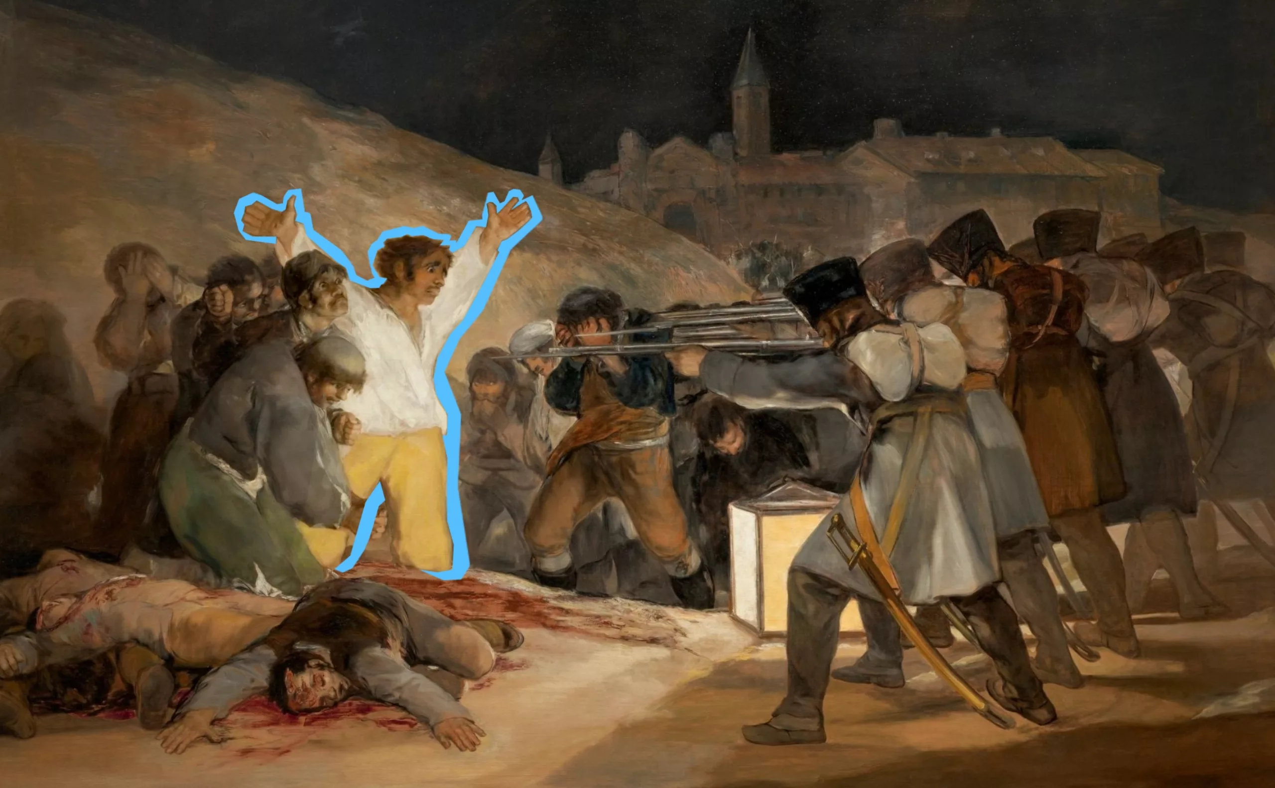
This reference to the “Tres de Mayo” (although the Spanish fighter in the painting has his hands raised) places the symbol within a genealogy of protest art. As early as the 1958 peace march, five hundred placards decorated with symbols were displayed: a black side to be waved on Good Friday, a green side for Easter, symbolizing the transition “from winter to spring, from death to life” and transforming the sign into a militant object. Its extreme simplicity became its major asset, allowing the symbol to be democratized.
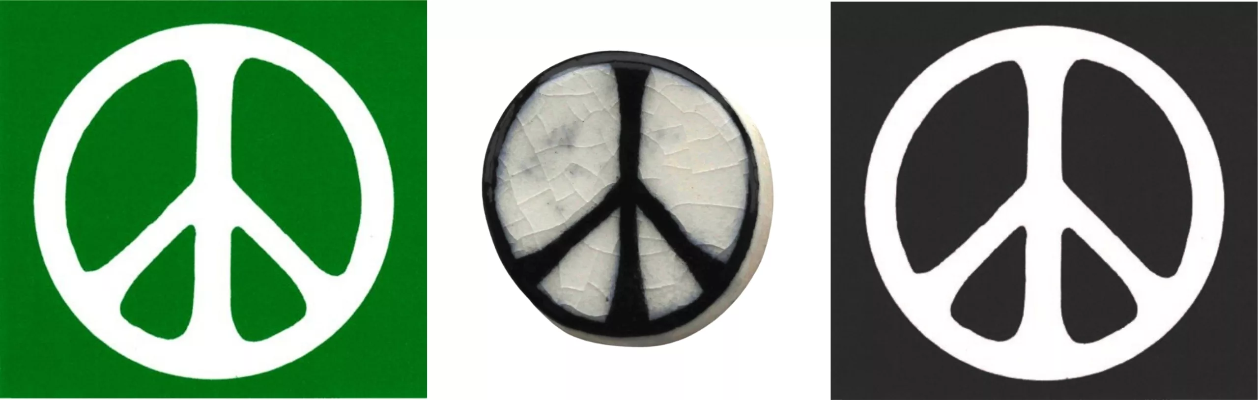
The first badges for the CND were handmade from terracotta and distributed with a leaflet explaining that, in the event of nuclear war, these badges would survive the inferno of nuclear fire… A symbol of despair, colors of change, fire-resistant material: nothing was left to chance in the symbolism of the sign!
A symbol of peace for America
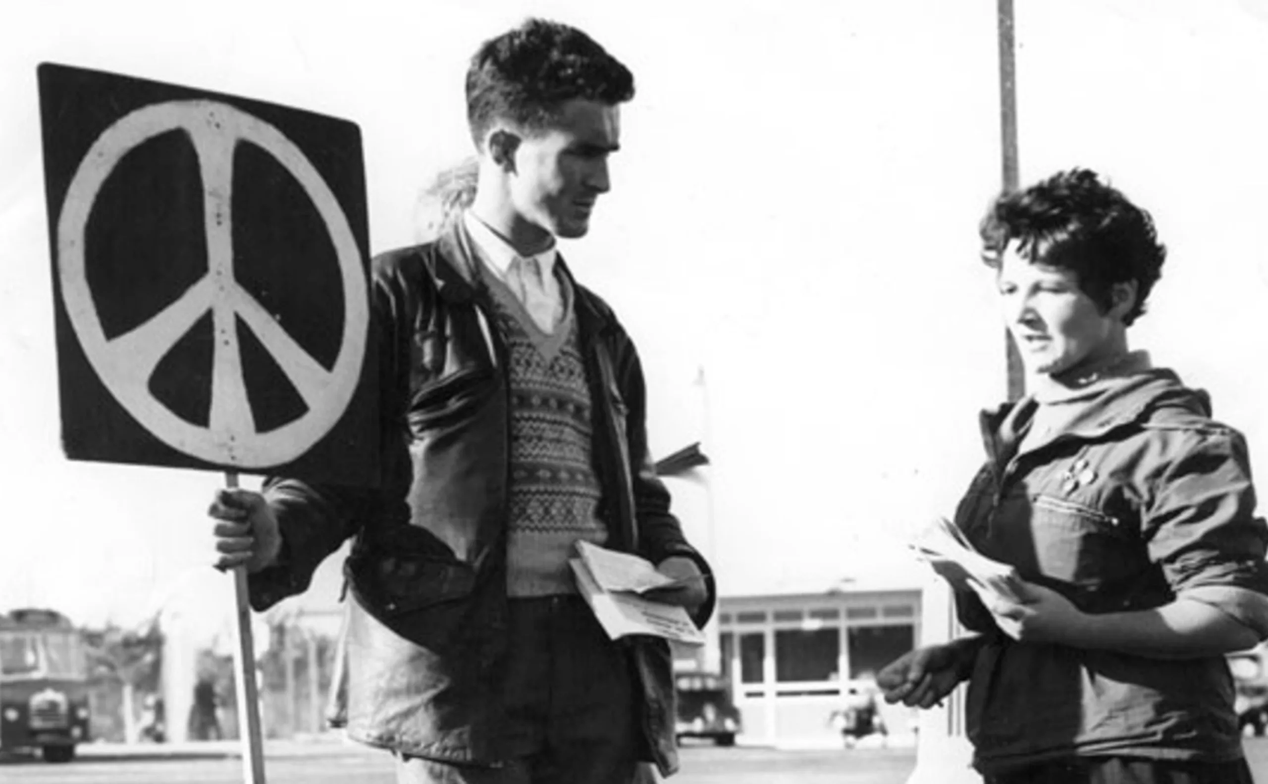
Holtom decided not to copyright his logo, thereby turning it into a public asset. No one has to pay anyone to use it, and the symbol is shared freely around the world. Most social movement logos have this distinctive feature of being accessible to everyone and easy to draw or adopt (such as the yellow vests or the raised fist).
In the early 1960s, a student at the University of Chicago introduced it widely in the United States after rubbing shoulders with British pacifist groups. He convinced the Student Peace Union across the Atlantic to adopt it: thousands of badges bearing the ☮ symbol were sold on campuses.
Holtom’s symbol arrived at a time when Kennedy’s America was bogged down in Vietnam and the baby boom generation was discovering the absurdity of war. Faced with authorities who viewed pacifists as potential communist agents, the ☮ symbol offered protesters a strong, apolitical visual identity.
Battle of the symbols: why did ☮ defeat the dove, the olive branch, and the V sign?
But why did this sign prevail over other symbols of peace, some of which had existed for centuries? These include the olive branch, the dove, and the V sign. A brief explanatory aside.
he olive branch, as seen by the Greeks
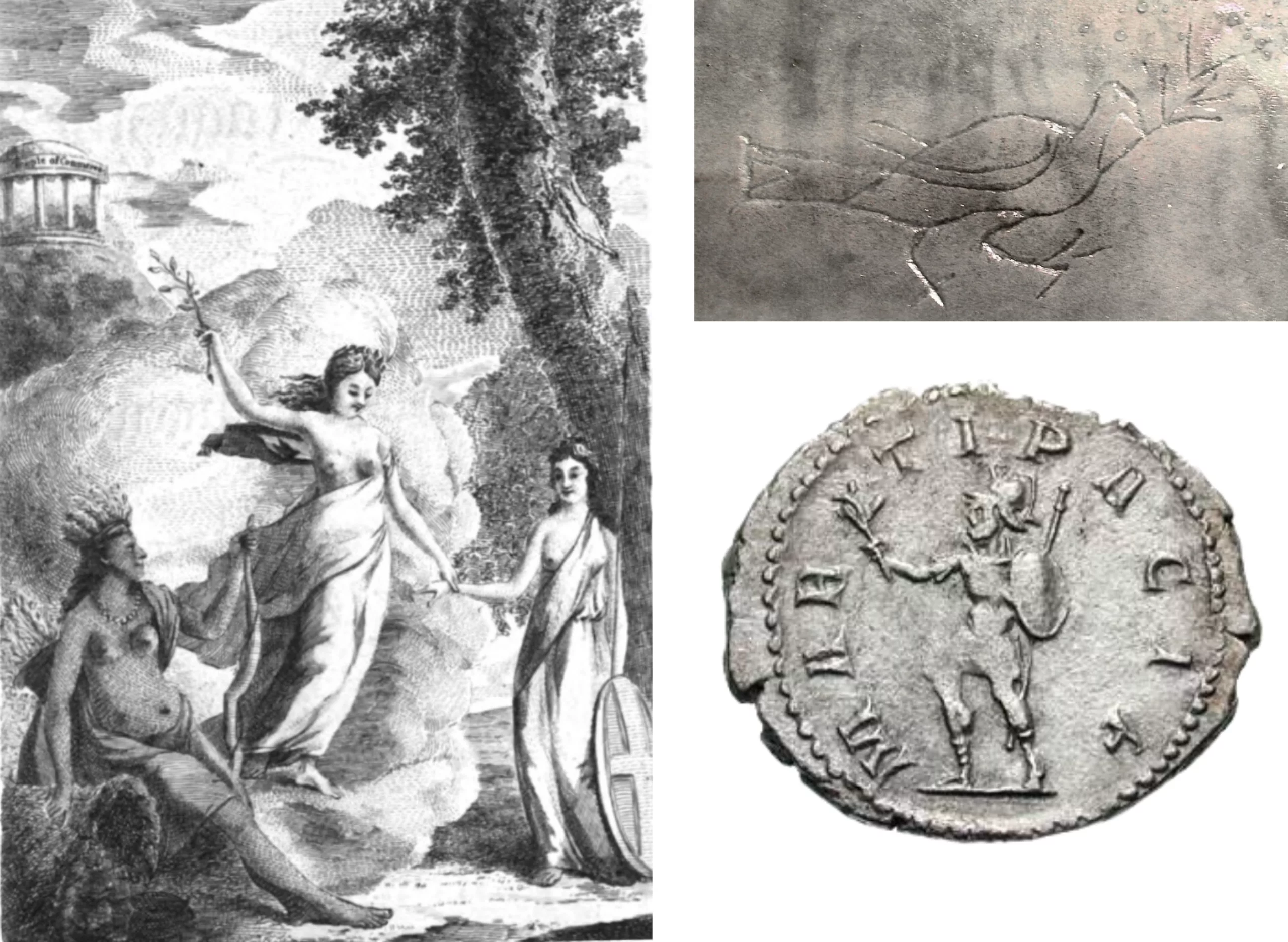
It has been used since ancient times, since the 5th century BC, as a symbol of peace. Athena is said to have given this “immortal” tree to Athens for its many virtues. The olive branch is found in the goddess Eirene, called Pax in Roman mythology (which gave us the word “peace”), and even in Mars, the god of war, in his pacifist version. It was used to weave crowns for the winners of the Olympic Games, before the laurel. The notion of branching is essential to its symbolism, as it evokes the promise of life that grows back from a simple cut branch. It was in the 4th century that the word “branch” was translated as “rameau” in the Latin Bible, and became synonymous with peace, carried by the dove.
The dove, a thousand-year-old biblical symbol… and communist symbol
In the Bible, the dove brings Noah an olive branch, heralding peace with the end of chaos and the return of life. For the ancient Greeks, the dove was a symbol of love, a messenger between the earthly and spiritual worlds.
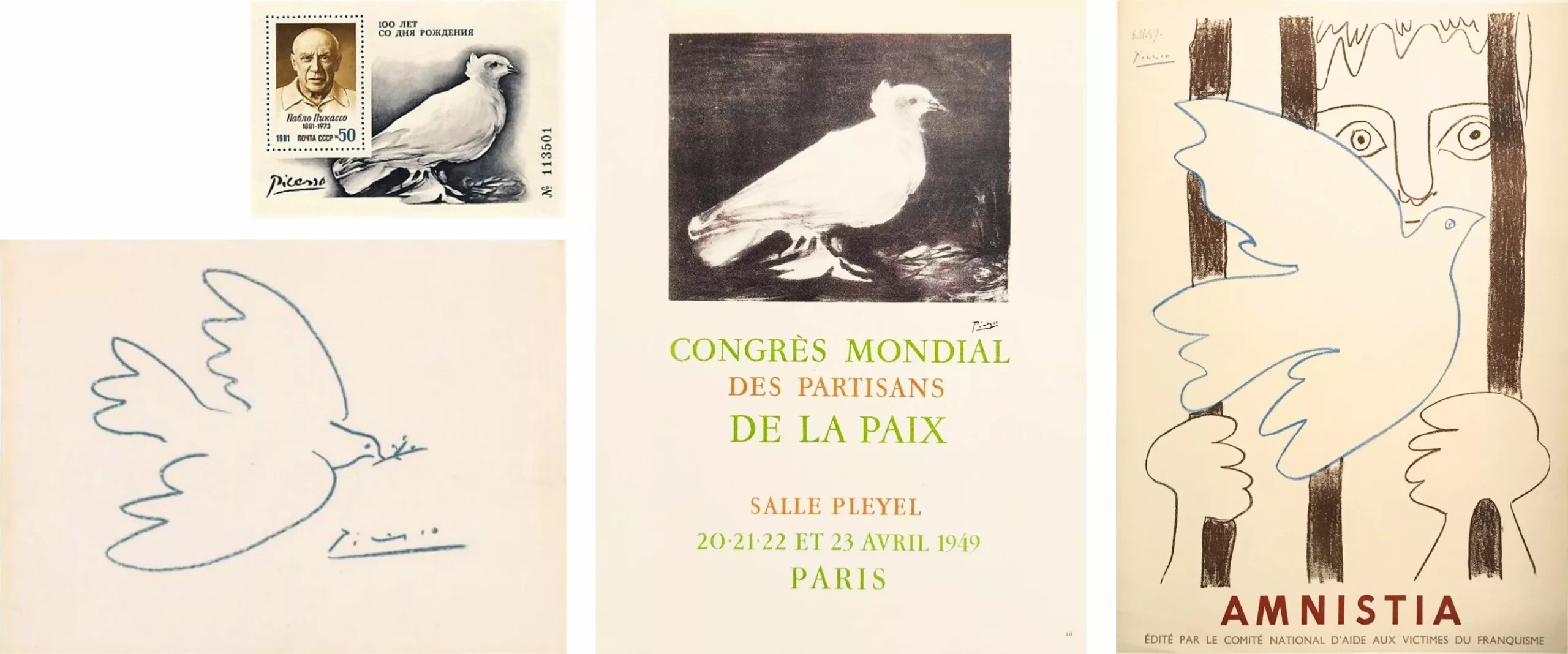
It became a symbol of peace in 1949 when Louis Aragon chose one of his friend Picasso‘s lithographs of a dove to illustrate the poster for the World Congress of Peace Supporters (organized by the international communist movement). Picasso would systematically use the dove in his pacifist posters until the 1960s.
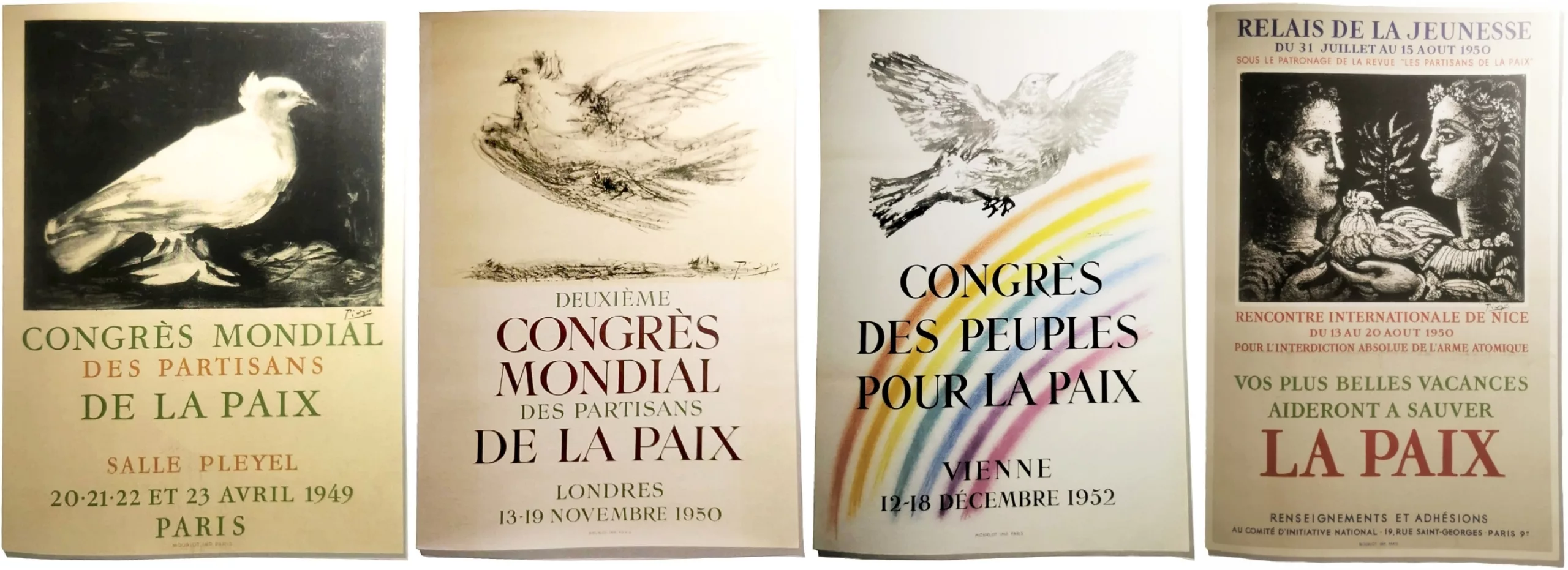
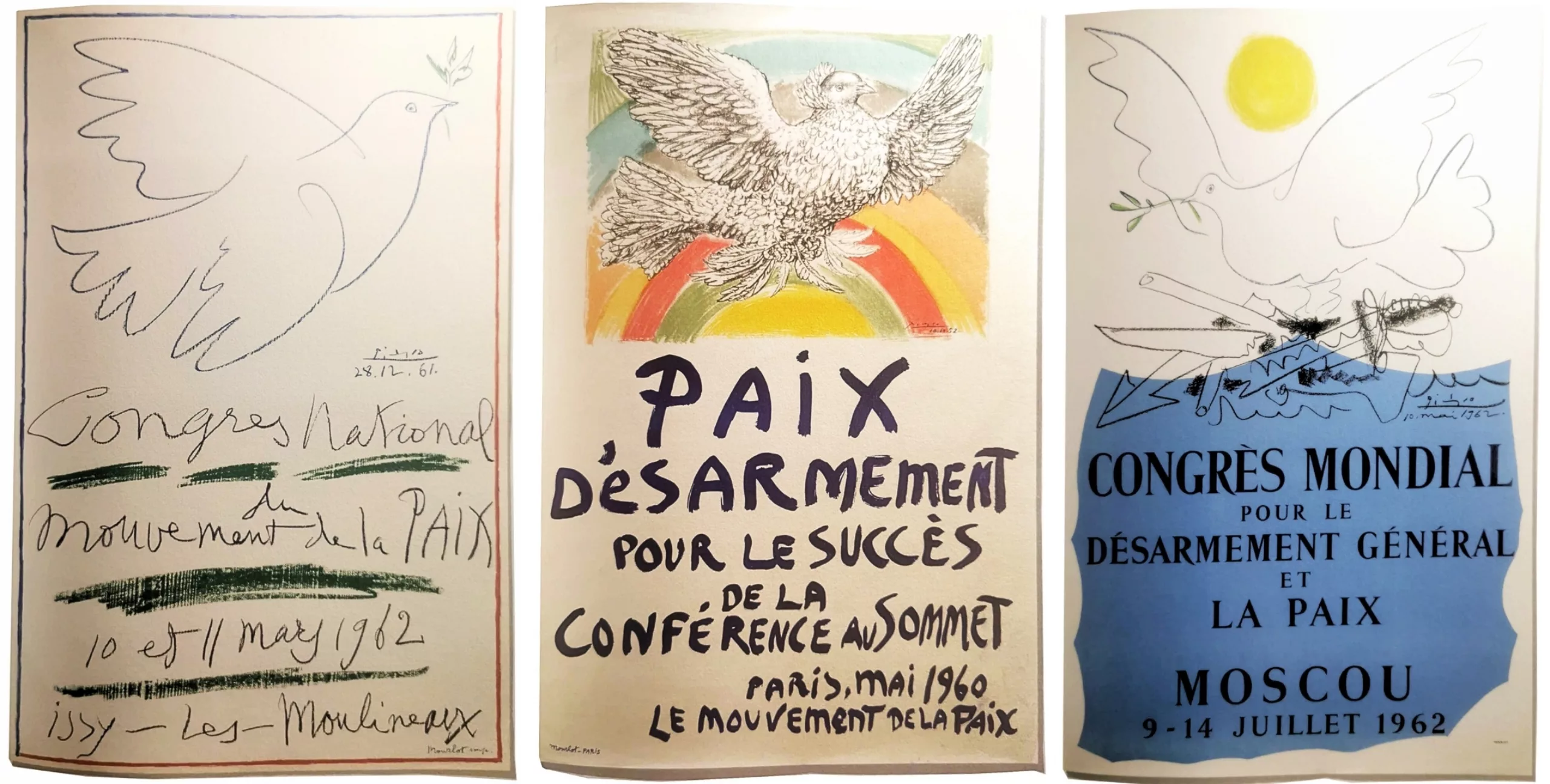
This creates a paradox: the Christian symbol becomes the banner of an atheist and political movement. This dual religious and communist connotation limits its adoption by young people who are breaking away from traditional institutions and distrustful of political indoctrination.
V for victory with fingers
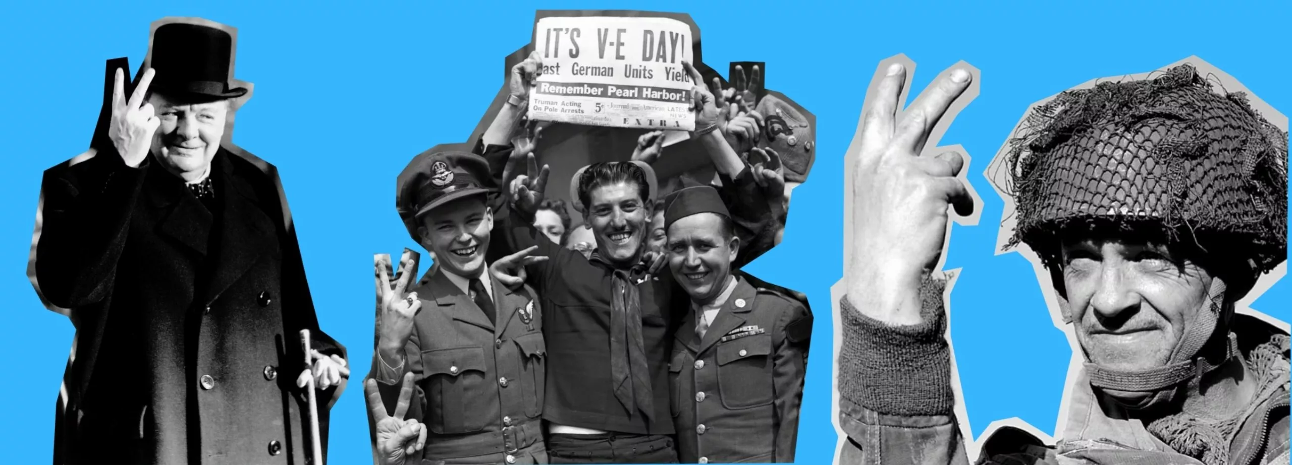
The gesture was first made on the radio by Victor de Laveleye, presenter of the Belgian section of the BBC, then popularized by Winston Churchill during World War II as “V for Victory,” a symbol of military resistance against Nazism. The gesture was nevertheless adopted by pacifists and hippies, with a certain ambiguity: it celebrates victory, rather than campaigning for an end to conflict altogether…
The CND peace logo ☮
As we have seen, the latter arose specifically from the pacifist disarmament movement, without any pre-existing political affiliation. Unlike the dove, which is too figurative or political, or the V, which is too martial, the CND symbol functions as a truly timeless and universal icon. This does not prevent certain symbols from being used together.
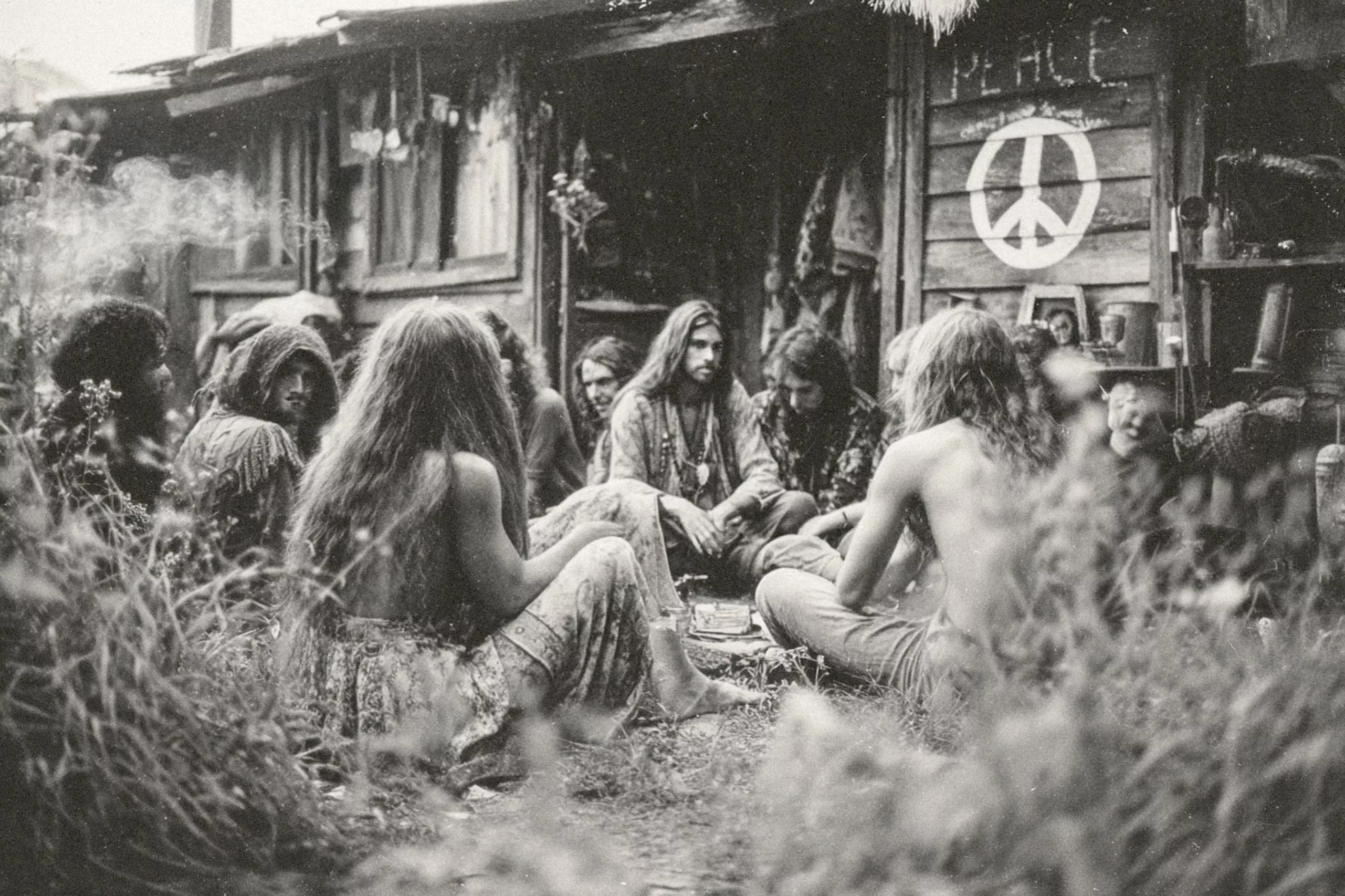
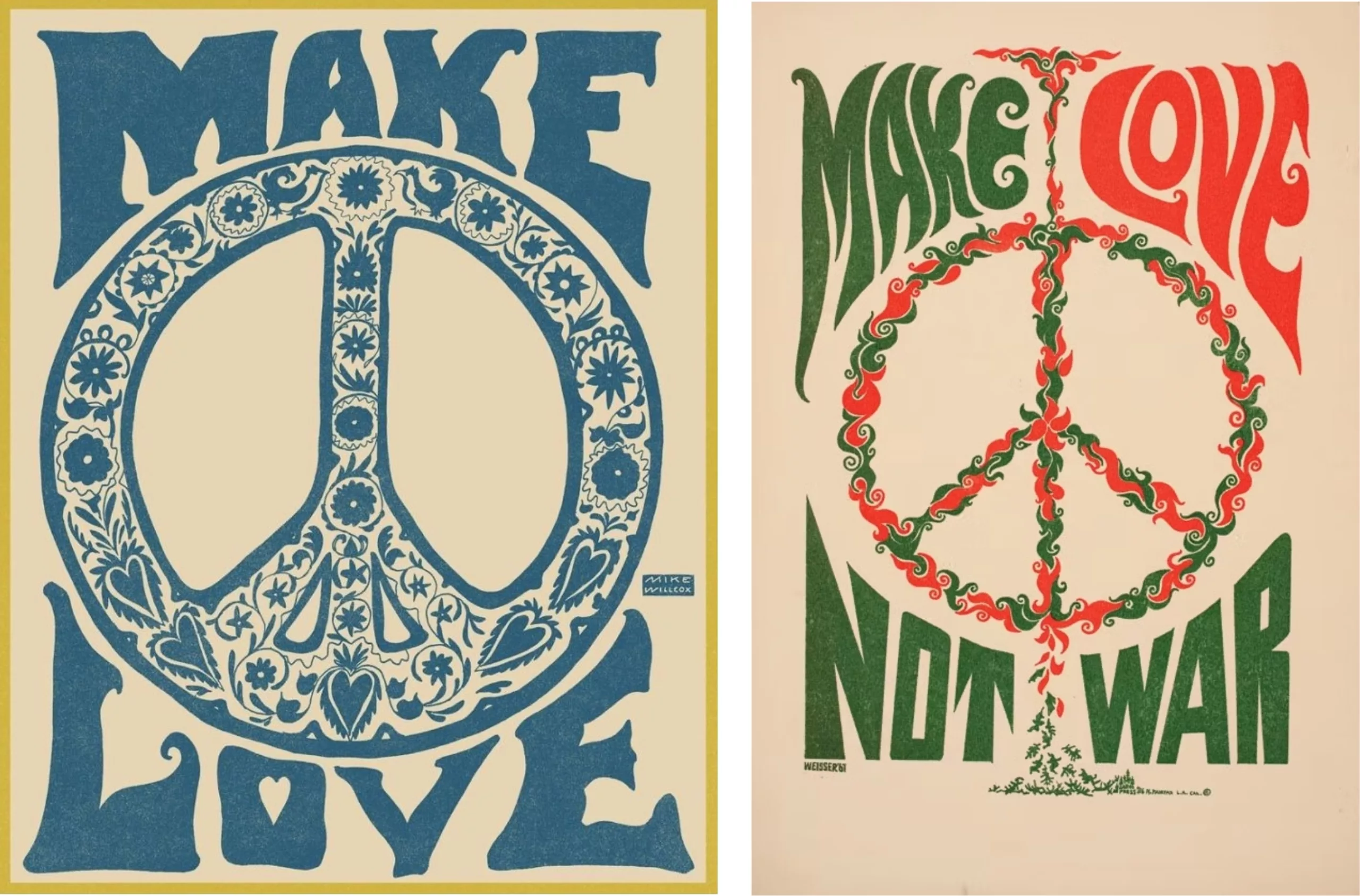
From Flower Power to Dior
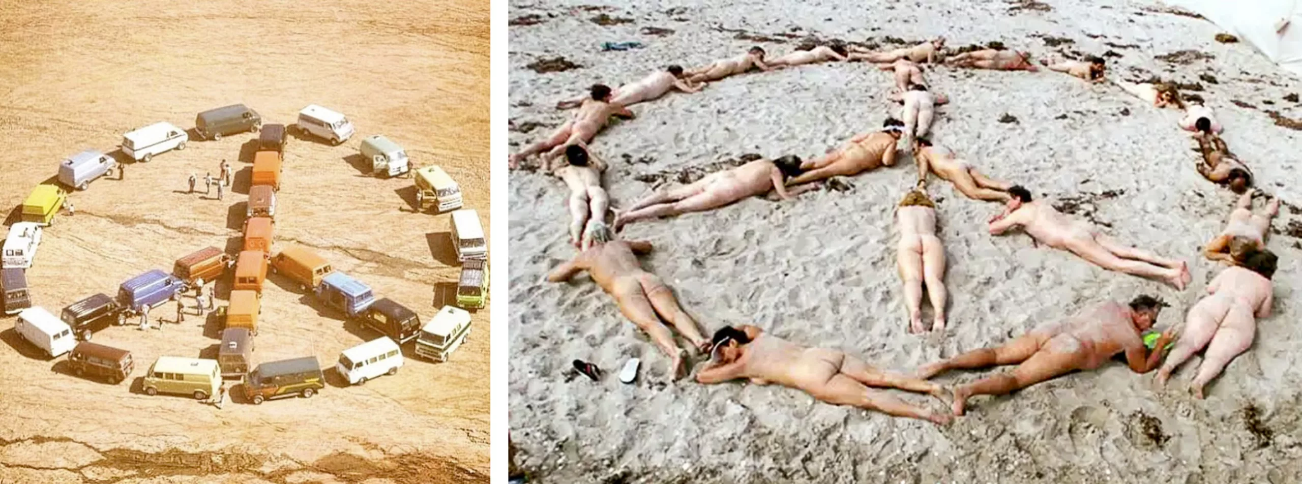
Around 1968, the symbol ☮ became a generic emblem of peace, associated with the hippie counterculture movement. It became the symbol for “peace & love” two founding principles of the movement, which sought to break free from consumerism, capitalism, and militarism. In short, it was about regaining human freedom and not being merely consumers or workers.
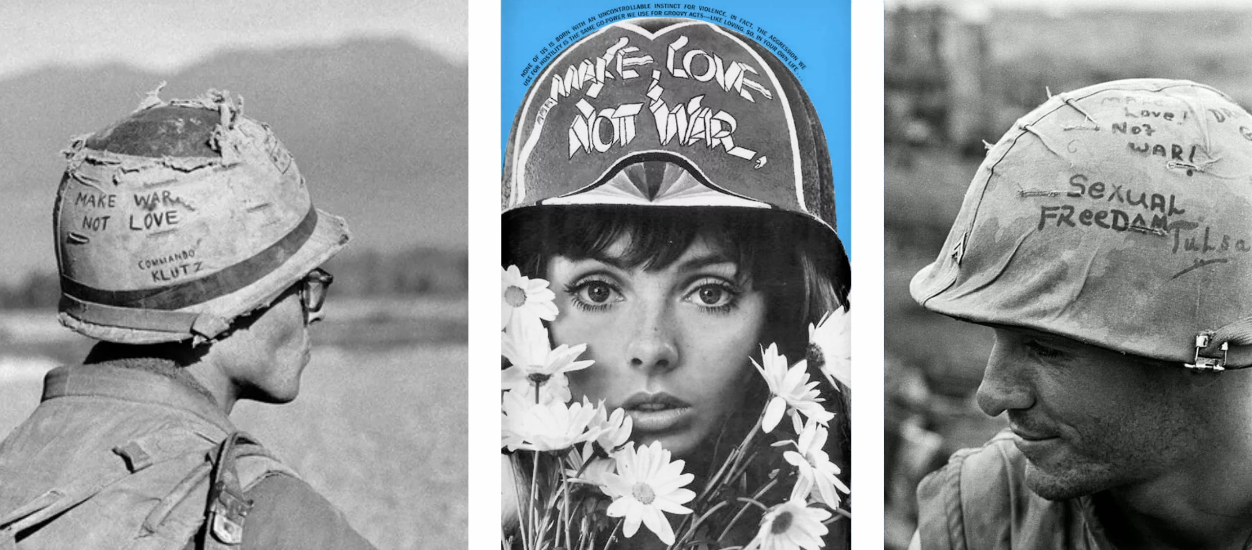
Deeply distressed by the Vietnam War, the hippie youth invented the slogan “make love, not war”, which marines wrote on their helmets (along with the military variation “make war not love”).
The symbol took on new forms with psychedelia, inviting pacifism and psychic experiences as a means of escaping this absurd world. Psychotropic drugs, causing auditory or visual hallucinations, allowed people to explore heightened and liberated creativity linked to an altered perception of the senses. Psychedelic art thus opened up a new artistic movement that was colorful, detailed, fluid, and surreal, inspired by Indian folklore, Secessionism, and Art Nouveau, in stark contrast to the very “Swiss” style of the time, which was considered rigid and overly corporate.
Hippies preferred second-hand, handmade clothing, rejecting big brands to avoid contributing to traditional consumerist habits. Fashion was unconventional, colorful, and liberated.
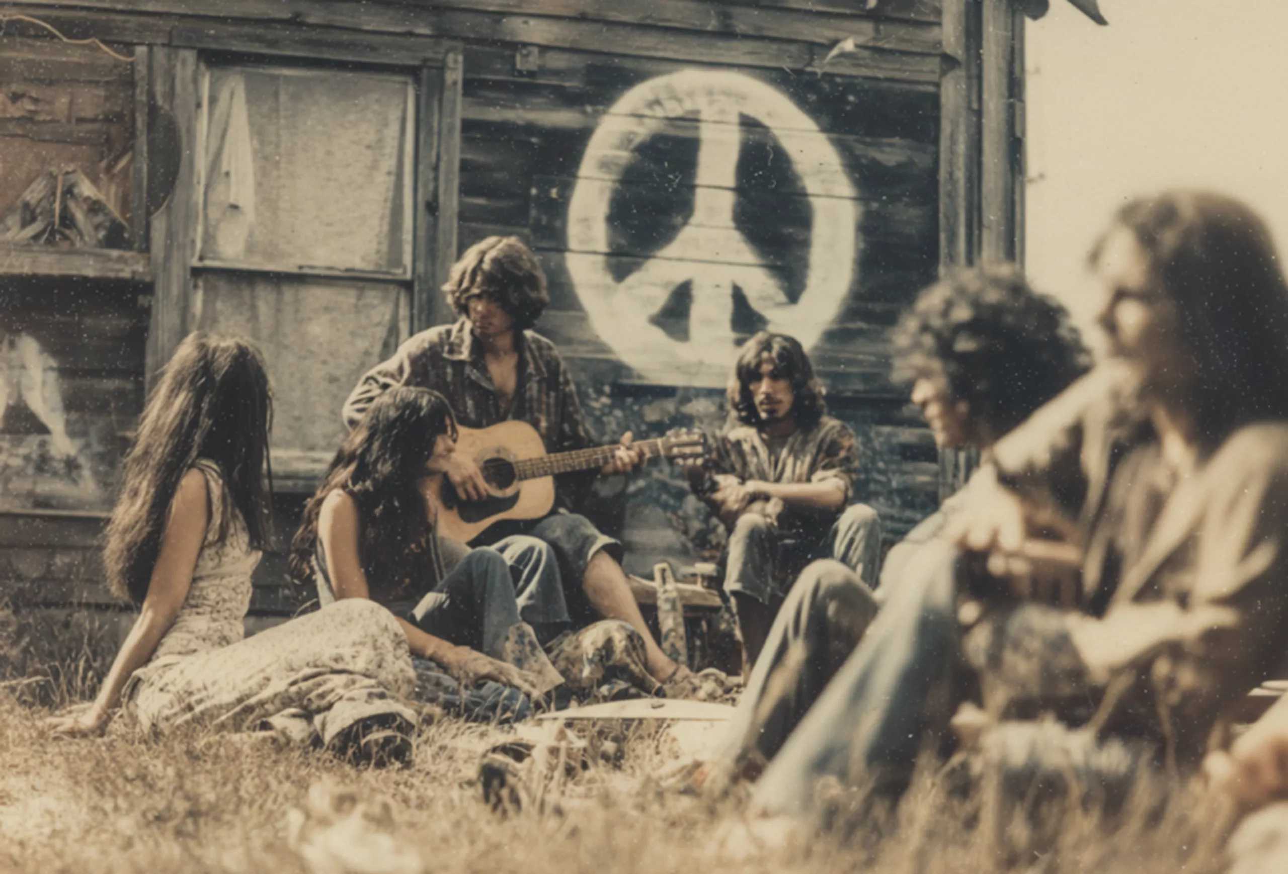
But Holtom observed during his lifetime that the symbol was “printed everywhere on fashionable clothing for the rich”. Consumer society appropriated and hijacked this symbol of rupture and peaceful anti-consumerist revolt to turn it into… merchandise.
Today, Moschino offers it in gold bling or on handbags, Uniqlo exploits Uyghurs to create a “let’s peace together” collection with Keith Haring, and Dior makes handbags out of it. This commodification reveals contemporary semiotic amnesia: the sign persists, but its history is fading. Commitment is giving way to cool.
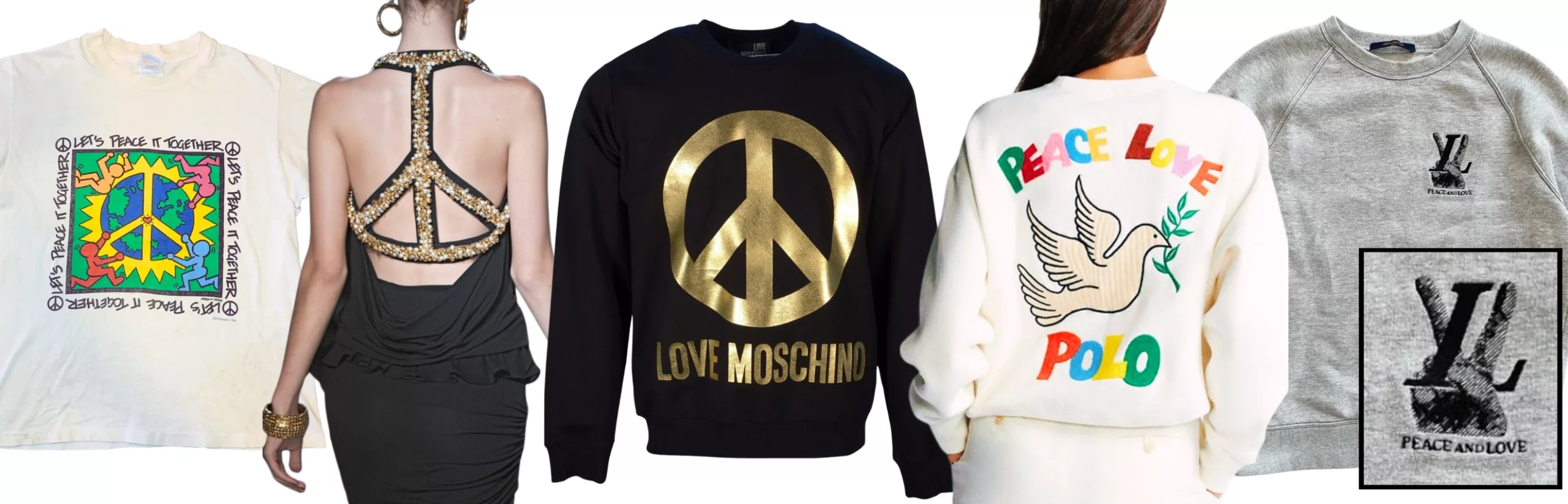
Joseph Kotarba, a sociologist at the University of Houston, sums it up: “Nowadays, when we see the peace symbol, it is primarily a fashion accessory.” This adaptability reveals both the strength and weakness of social symbols: their universality allows them to spread, but also makes them easy to misappropriate.
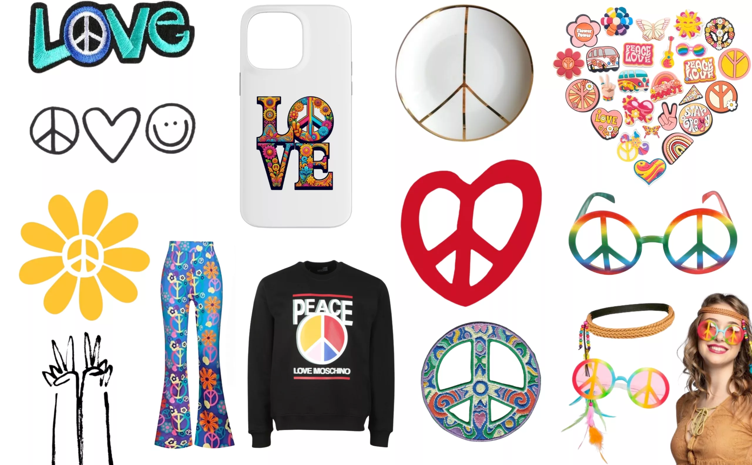
oday, when you search for the peace symbol or photos of hippies, you come across costumes and grotesque, watered-down scenes of groups of friends wearing bell-bottoms and flowery shirts. Peace and love has become nothing more than a colorful, folkloric decor trend that you can buy made in China on Amazon. Absurd.
More than sixty years after its creation, the peace sign questions our relationship with symbols of resistance. Its history reveals the mechanisms by which capitalism digests and neutralizes protest.
Symbols of peace today
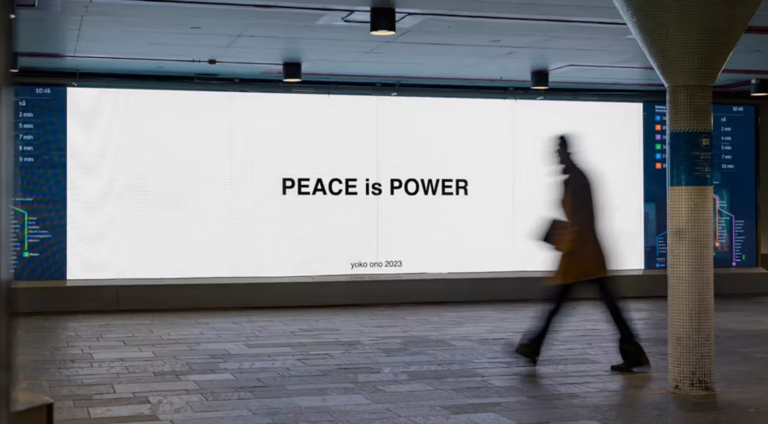
Nevertheless, the fact that there has been no need to unite and demonstrate for peace over the past 20 years probably reflects a relative global stability, even if it unfortunately does not reflect the end of conflicts… Nowadays, it is artists who are taking up the cause, as spokespersons or influencers, in the absence of crowds. Yoko Ono and John Lennon, and Andy Warhol used their voices for the cause in the 1980s, and Yoko Ono has continued to spread messages of peace in the streets of major cities since 2023.
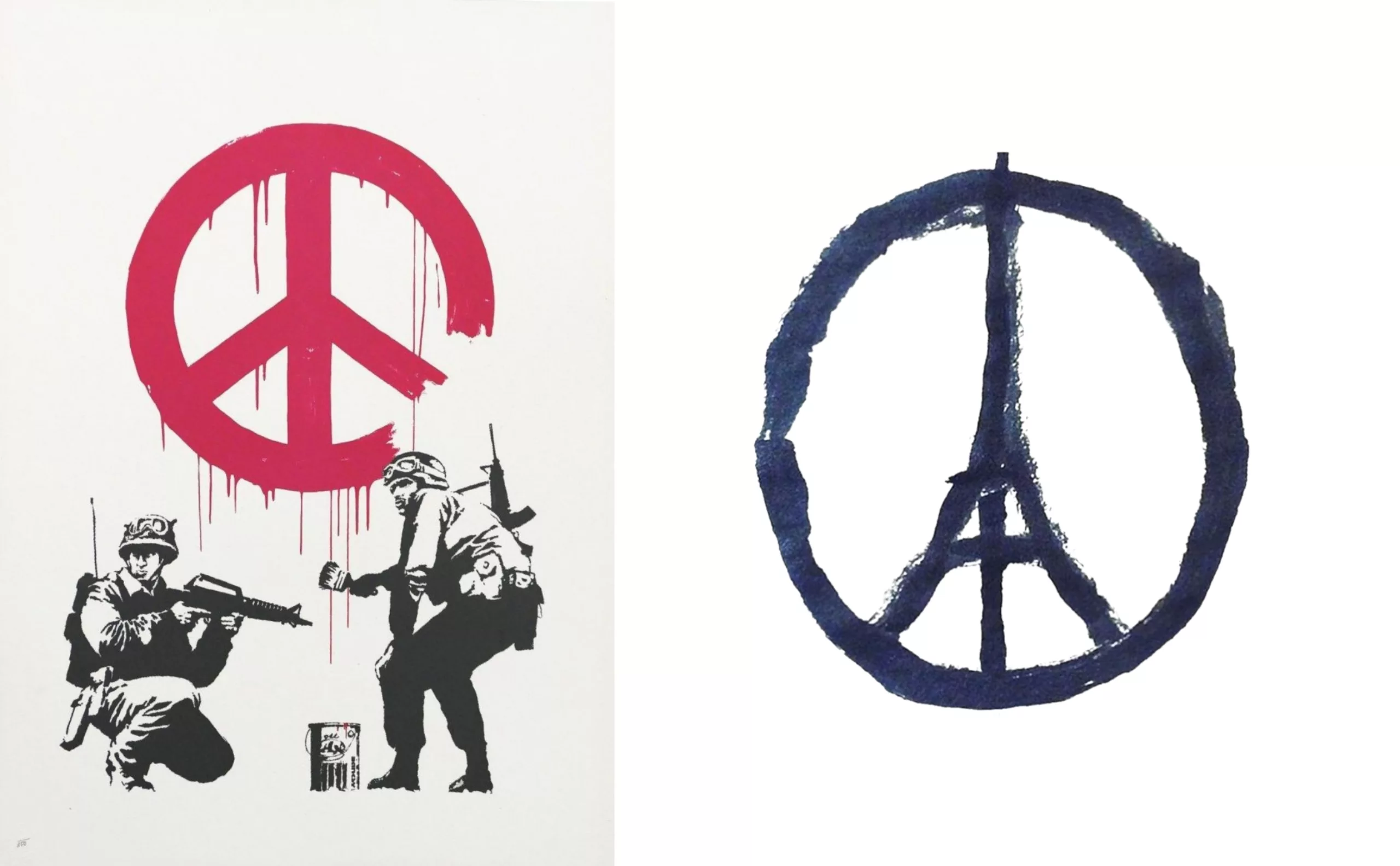
The peace symbol reappeared during times of global tension: in 2005, Banksy depicted two armed soldiers painting the symbol on a wall in his work “CND Soldiers” (illustration, left), ironically questioning the role of the army in maintaining peace, in this case during the conflict in Iraq.
During the 2015 attacks, Jean Jullien drew “Peace for Paris”, incorporating the Eiffel Tower into the peace circle (illustration, right), showing the continuing need for unifying symbols in times of crisis
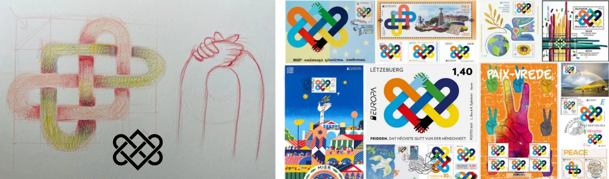
In 2023, a duo of designers, Linda Bos and Runa Egilsdottir, invented the “peace knot” for the EUROPA Stamp Competition, whose theme was “Peace, humanity’s greatest value,” and won first prize. They reinterpreted the Celtic love knot with arms and hands of all colors coming together, emphasizing European solidarity with the Ukrainian people. The symbol, although rich and beautifully executed, is surely too complicated to be reproduced by everyone as a modern banner.
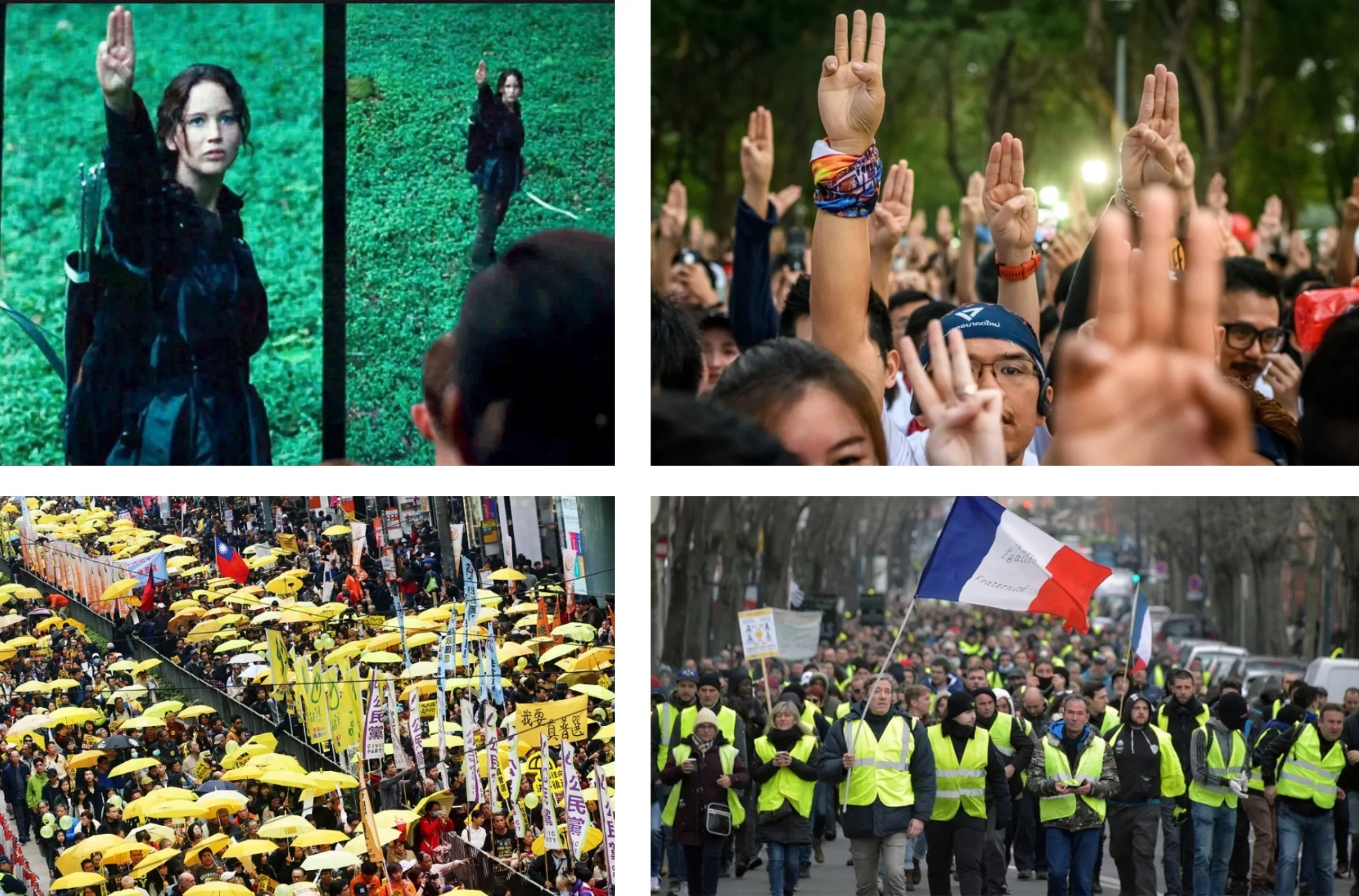
Today, new conflicts generate their own visual codes. In Myanmar, Thailand, and Hong Kong, people raise three fingers (inspired by the movie The Hunger Games) as a sign of protest, or raise their fists to defend black lives with #blacklivesmatter. Colors also play a role: yellow for the yellow vests or the umbrella movement in Hong Kong.
Aujourd’hui, les nouveaux conflits génèrent leurs propres codes visuels. En Birmanie, en Thailande et à Hong-Kong, on fait le salut à trois doigts (inspiré du film Hunger Games) en signe de contestation, ou on lève le poing pour défendre les vies des personnes noires avec #blacklivesmatter. Les couleurs ont elles aussi un rôle à jouer : le jaune pour les gilets jaunes ou le mouvement des parapluies de Hong-Kong.
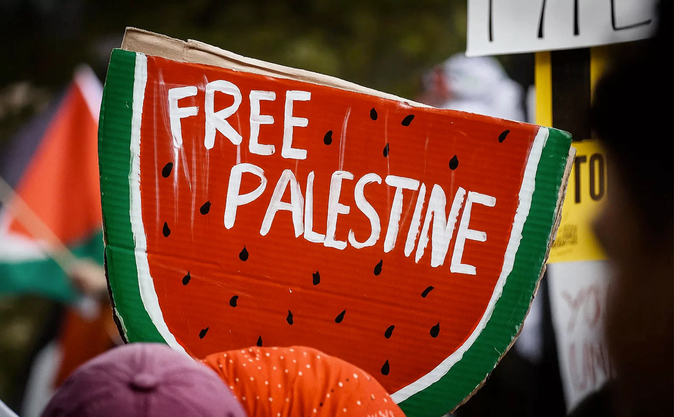
Pro-Palestinian movements prefer the flag, the watermelon (in the colors of the Palestinian flag), or the keffiyeh to the peace symbol. Protest and peace movements thus adopt more specific, less universal symbols to fight oppression in the face of a less diffuse threat. In addition, social media and the creation of hashtags enable widespread, targeted sharing to support causes.
Peace as seen by AI
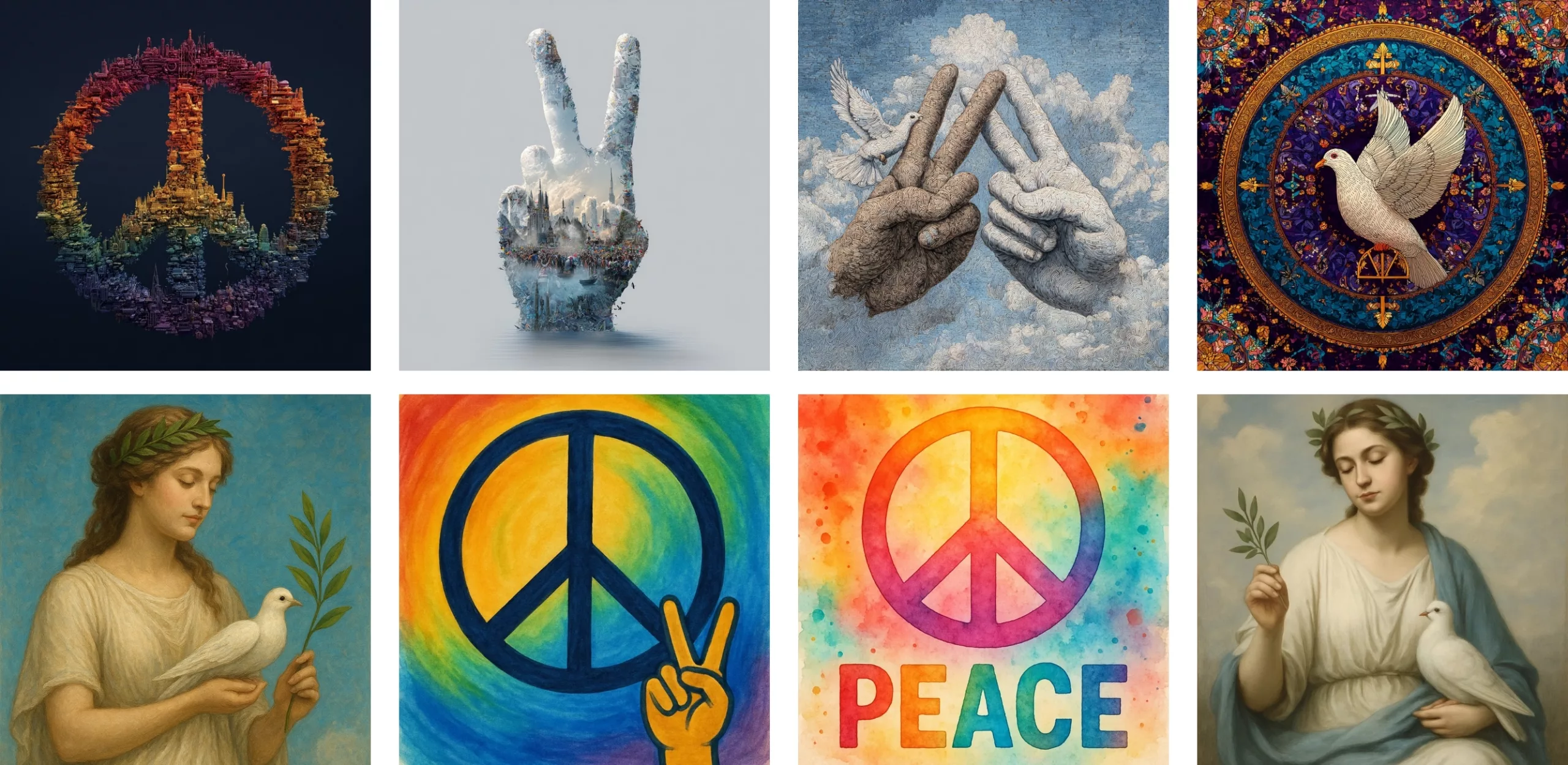
Finally, since it condenses a vision that claims to be “universal” (but is in fact Western), we thought it would be interesting to ask the AI to illustrate its version of peace, using a very vague and basic prompt so as not to influence it. Several symbols appear: the peace sign, the V-sign, and the Greek goddess with a dove and an olive branch, even though no one waves olive branches anymore… Interestingly, the machine adds rainbow colors and a multitude of monuments in the background, probably to symbolize humanity united in its multitude and diversity. These colors are derived from the “peace” or pride flag used by the non-heterosexual community, which has been adapted here to represent universal peace. A nice message (albeit with a rather ugly rendering).
The history of the CND logo thus sheds light on contemporary changes in militant iconography. From its beginnings as a symbol of British nuclear disarmament to its status as a global icon and then a derivative product, it illustrates both the power of simple symbols and their vulnerability to appropriation. Its relative obsolescence in current movements, replaced by more specific, less universal but more authentic codes, perhaps reveals the end of an era: one in which it was still possible to dream of a visual language capable of uniting humanity beyond its divisions. In a fragmented world, each struggle now seems to seek its own symbols, rejecting the prefabricated signs of a universalism that has become suspect. Holtom’s symbol, however, remains a herald of graphic hope and proof that a simple line can, in the space of a few decades, carry humanity’s most noble aspirations.
Discover the next chapter in our series on protest symbols with Extinction Rebellion.
Sources
Love, Peace and Psychedelia: the Role of Symbols in the Sixties Counterculture — Stephen Poon
Peace and love | Un symbole, une cause (1/5) | ARTE
Peace sign makes a statement in the fashion world
The Counterculture Hippie Movement of the 1960s and 1970s — The Collector
Fifty years of the peace symbol — The Guardian
History of the Symbol — CND UK
On the subject
-
Tote bag, a new social totem?
The tote bag has become an essential part of our everyday urban lives.
What does it say about our society, our times, our habits and our behaviour? -
Donald Trump, the martyr who makes history
Donald Trump, his face bloodied, raises his fist and seems to proclaim “I’m alive, fight!”.
Let’s decipher an image that has gone down in history at the speed of a shotgun blast. -
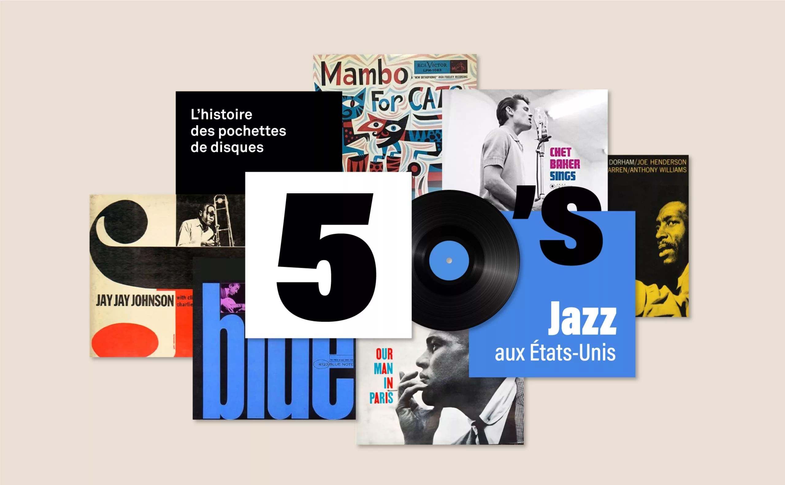
History of record covers: the face of 50s jazz
The vinyl sleeves come to life with jazz. It is a whole graphic universe that makes the music heard, through the illustration or the photo.