Preamble : The history of theater posters in 6 acts
This article is the first in a VI-act series on the history of the theater poster in France. It traces the origins of theater posters and their specific characteristics, mirroring our society’s evolution from text to image, via typographic creation and digital media.
Complete series
Preamble : The history of theater posters in 6 acts
ACT I – The golden age of the poster in the 19th century
ACT II – The Glorious Thirty of theater posters 1950/60
ACT III – The legacy of the Polish school and the 70/80s
ACT IV – The Posters of the Théâtre de la Colline, from Batory to the ter Bekke & Behage Studio
ACT V – The intrusion of Contemporary Art
ACT VI – The decade of social networks + the typographic reign

The poster as a mirror of our society
It’s trite to say it, but beyond what the poster is supposed to advertise, sell or communicate, its presence on walls tells us about the environment that created it. “The image tells us more about the society that looks at it than about itself,” says historian Benjamin Stora. Images also speak about us, about the way we look at them.
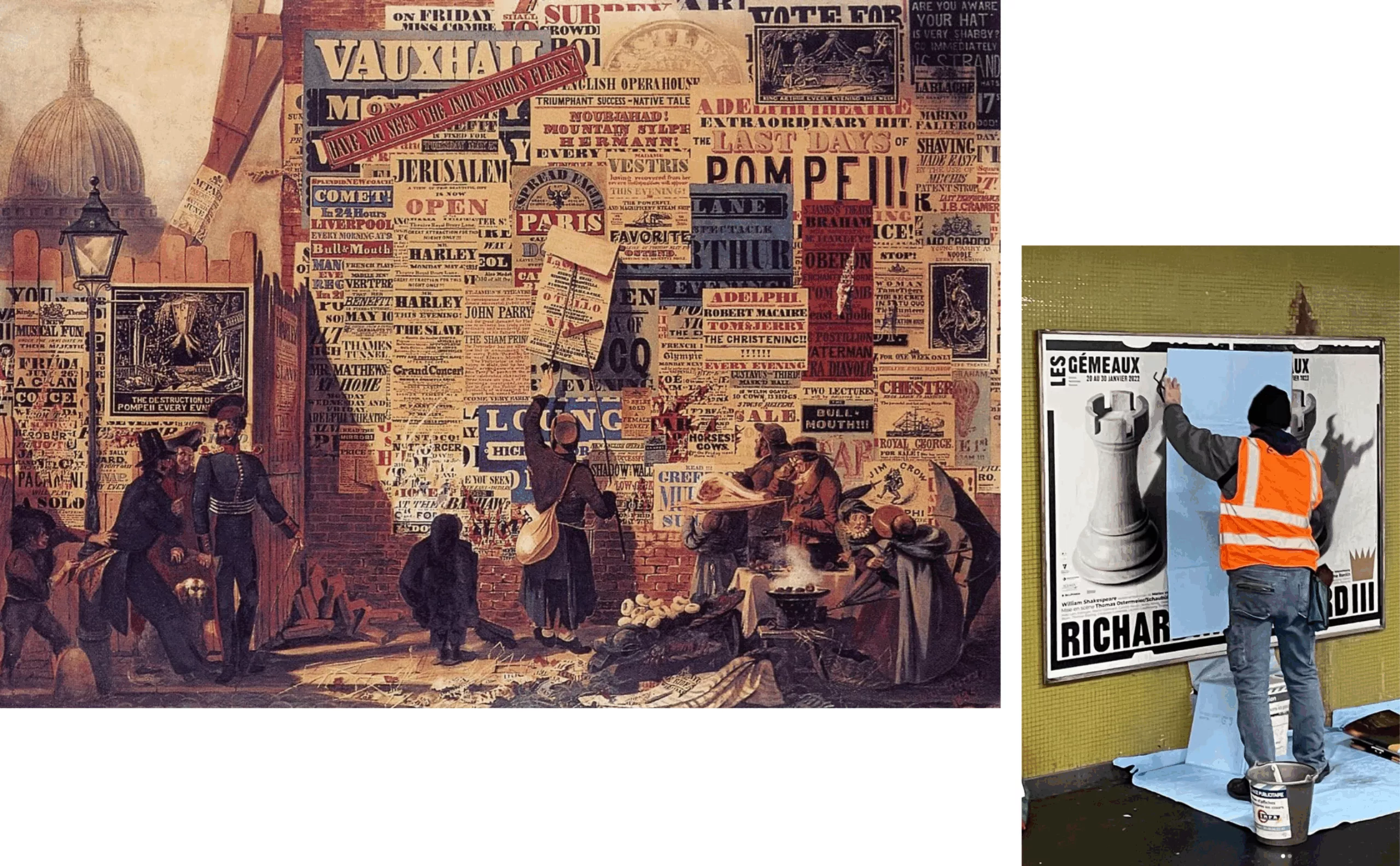
For a long time, posters were the poor relation of graphic design. A simple medium that disappeared as posters were put up and information renewed. At the end of the 19th century, posters took to the streets, and it was the art of poster painters that seduced city dwellers. It was at this point that the French identity of graphic design really took shape, and in May 68, posters became a means of protesting France’s ills and “the walls took the floor! At the same time, advertising began to shout loudly, to the point of invading public space! Early on, Gérard Paris-Clavel, one of the protagonists of May ’68 and co-founder of Grapus in 1970, railed against this all-consuming commercial communication.
“Most of today’s images are linked to events that follow one another at breakneck speed. They are born and die with the event. Because they are quickly replaced by other forms, the eye has no time to appropriate these ephemeral forms, regardless of what they convey.”
Yet the theater poster is part of a parallel temporality, and can even slow down time. No more injunction to consume, to buy. And we discover that the theater poster can be perceived as a moment of poetry, a possibility for the imaginary. As far back as 1913, in his poem “Zone”, which opens ‘Alcool’, Guillaume Apollinaire proposed a “manifesto” for new, modern writing through posters :
[…] “You read flyers, catalogs and posters that sing out loud.
That’s poetry this morning, and for prose there are newspapers” […].
It wasn’t until the 1970s and 1980s that graphic designers appropriated the cultural poster as a privileged medium for authorial expression. They reclaimed the place of the poster painter represented by Toulouse-Lautrec and made their mark on the city.
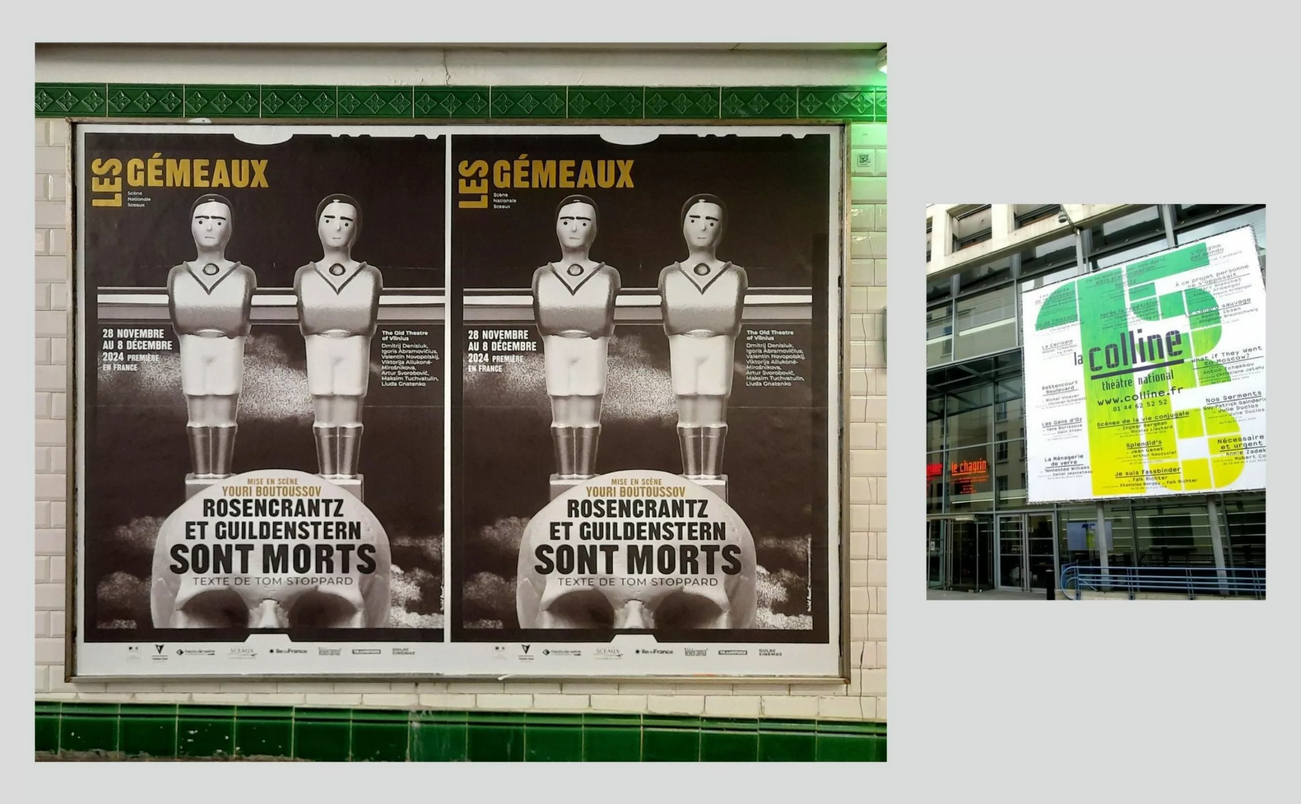
Michel Bouvet, one of France’s best-known graphic designers for his theater posters, agrees. “Today’s images stigmatize more than they should, with everyone wanting to see what they want to see! It’s hardly surprising, then, that today’s theaters (often public ones) are turning away from images in favor of posters in which typography takes center stage. We’ll talk about this a little later in another article.

The history of the theater poster, it doesn’t exist yet
Many books exist on the History of the Poster, just as on the History of the Theatre. But on the History of the Theatre Poster… nothing! Just do a Google search and you’ll see that there are no publications… (feel free to share with us if you know of any books on the subject).
Surprisingly, books on the history of graphic design focus only incidentally on theater posters. The commercial posters of Capiello, Cassandre and later Loupot, Colin, Savignac and Villemot are rightly praised, but all these great poster artists had little or no involvement with theater posters.
Political and propaganda posters are archived, but theater posters are not. Very few theaters today have kept their posters over the years. It’s often the designers themselves who are concerned with this heritage aspect.
And even Roland Barthes, in his inescapable “Mythologies”, doesn’t touch on it, even though he takes the time to reflect on the political poster, the Paris Match cover or the Harcourt studio photograph. At a time when more and more theaters were opening in Paris.
Before we raise the curtain on Act 1, let’s take a look at some of the key features of theater. After all, the life of a theatrical poster resembles a grand dramaturgical narrative, with its emblematic locations, its characters who step into the limelight or disappear into the shadows, its coups d’éclat and its betrayals.
The theater locations
Theater has been around for over 25 centuries. In the 5th century BC, there was ancient Greece, with its comedy and tragedy. Then Rome. Before being a live performance, the theater was a place of visibility and democracy. And its architecture was to respond to this need, to enable everyone to see and hear a show on offer.
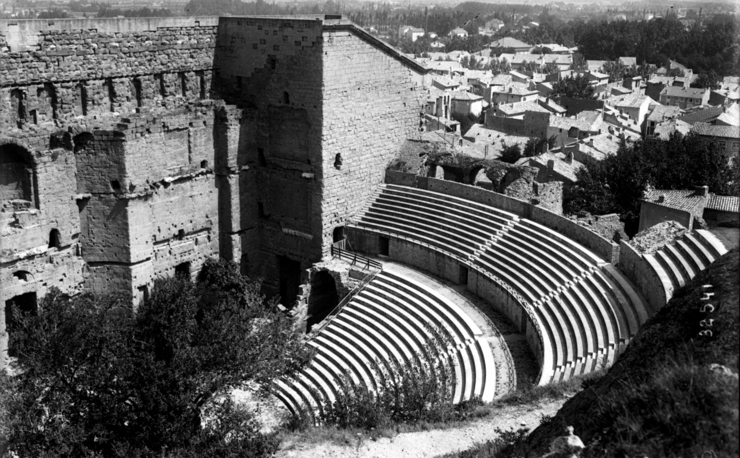
In the Middle Ages, it was in public squares and church squares that theater existed, between the stage and the sacred space. These were the mysteries and farces. The “Farce de Maître Pathelin”, created in 1464, is applauded throughout France.
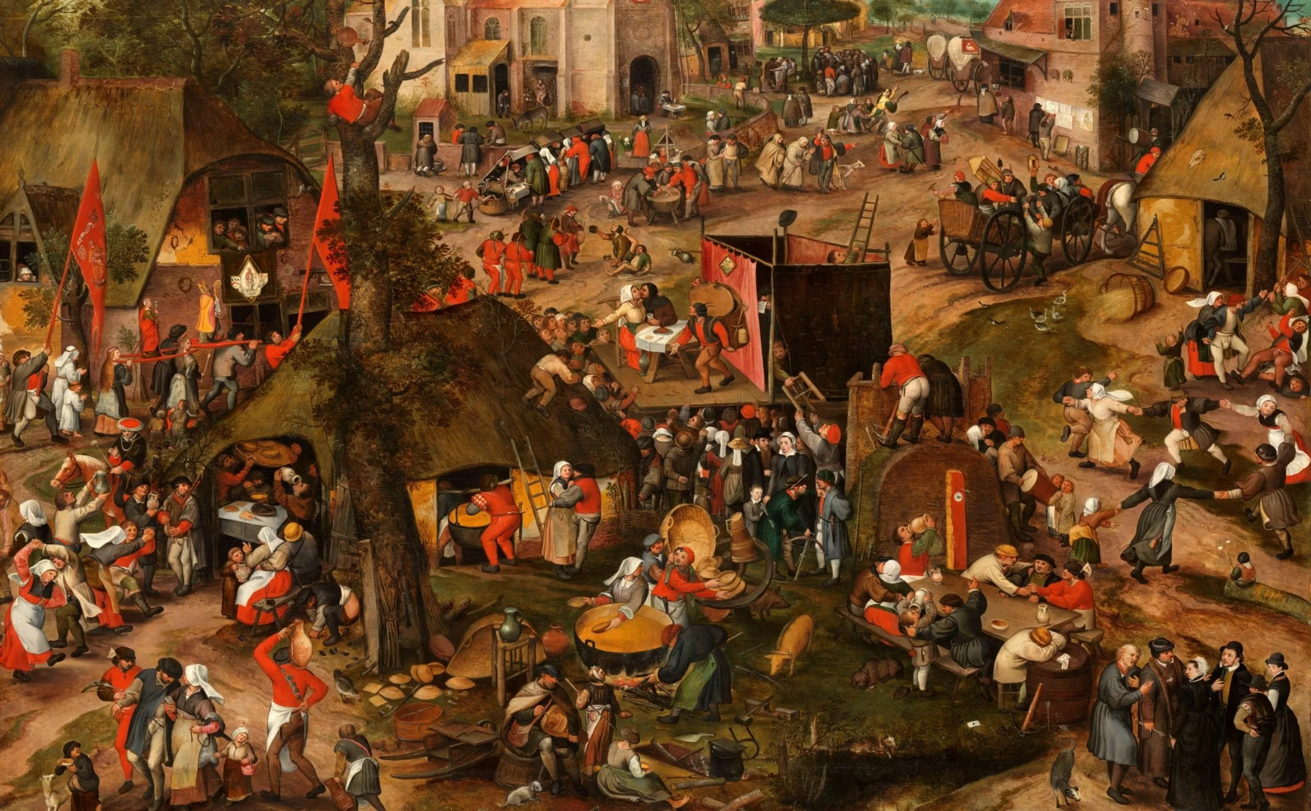
It’s all about educating and entertaining the people. We perform soties, short satires dealing with current events. And the audience often took part in the show. And so, for 20 centuries, the theater was an open-air space, closer to the stadium and the street show than to the Italian-style theater.
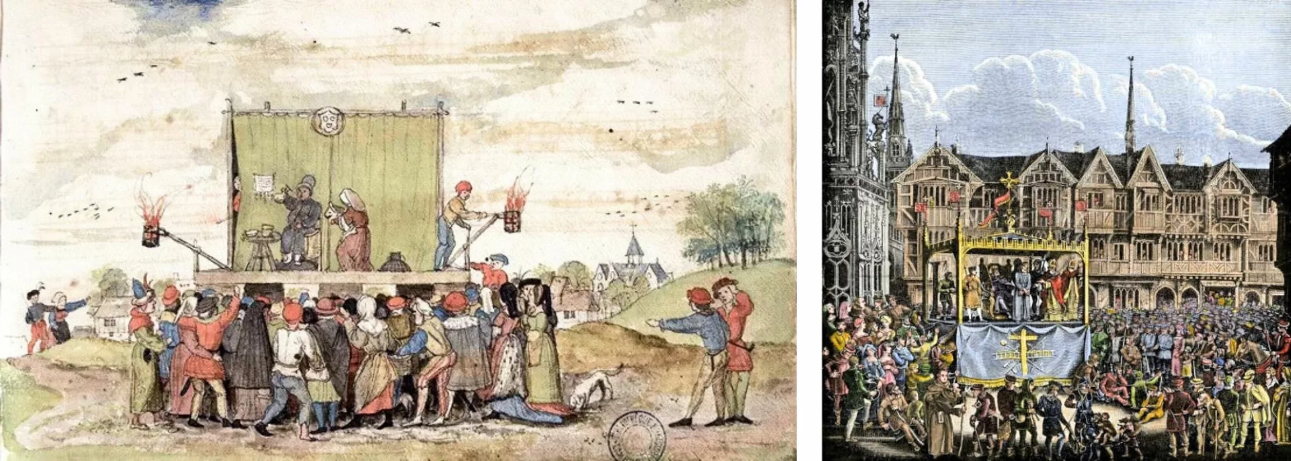
During the Renaissance, the theater retreated to fixed, enclosed locations. It was no longer freely accessible, and was now performed for an audience that could afford to pay to attend. We all remember the first scene of Edmond Rostand’s “Cyrano de Bergerac”, with a real separation between the more affluent spectators, seated in the box, and the more modest ones downstairs and standing, or grouped together on bleachers at the back of the auditorium.
This was the period when the first theater posters relayed what the criers had announced in the street. They were generally typographical, medium-sized, single-color and rarely illustrated.
Then came the Italian-style theater, which spread throughout Europe. This was the model for the Salle Richelieu at the Comédie Française in Paris.
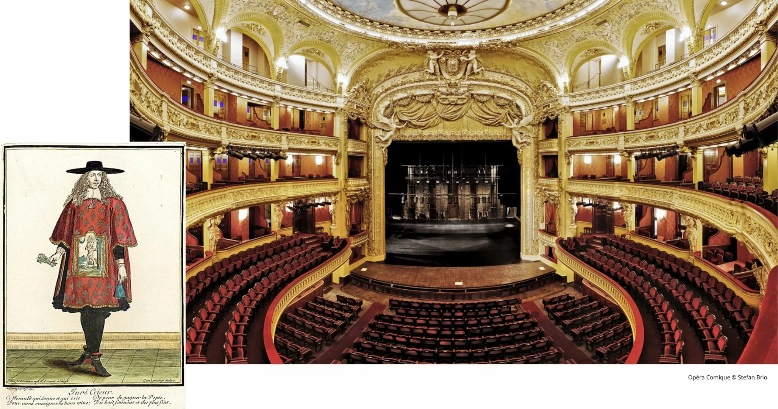
The stage is transformed into an image box, with the audience in frontal contact with the show. Once again, the view of the stage depended on social class. This was to remain the norm until the end of the 19th century. As for the general public theater poster, it was the first steps of chromolithography, in 1827, that truly marked its birth.
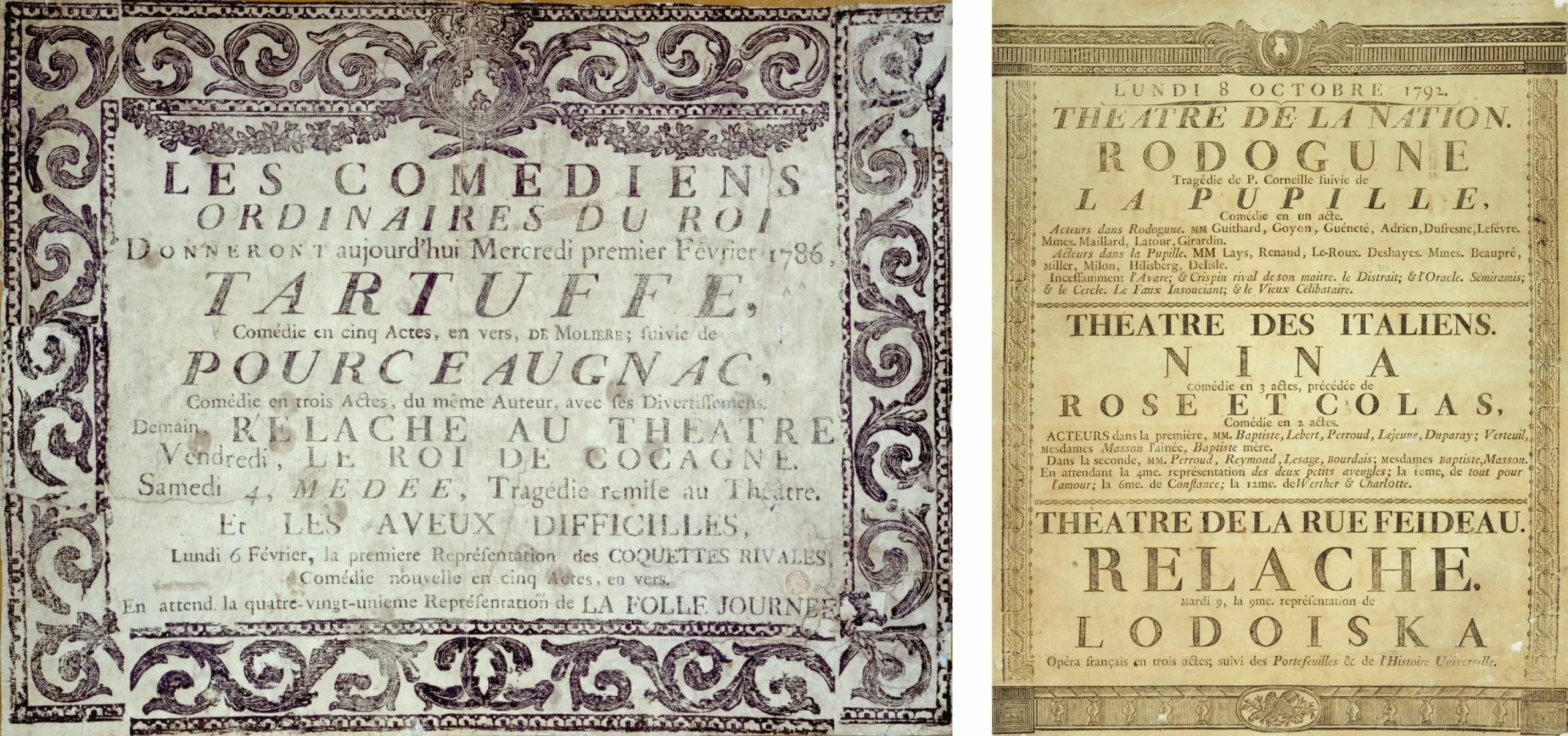
At the beginning of the 19th century, Paris was in a state of incredible effervescence, with theaters multiplying at breakneck speed and unregulated public signage spilling over the walls. From 1853 onwards, Haussmann’s roadworks encouraged the spread of posters. Entire neighborhoods were covered with hoardings where they were posted.
In 1868, printer Gabriel Morris imported from Germany the cast-iron, cylindrical poster column we still know today. To these were added mobile supports such as the advertising carriage and the sandwich man.
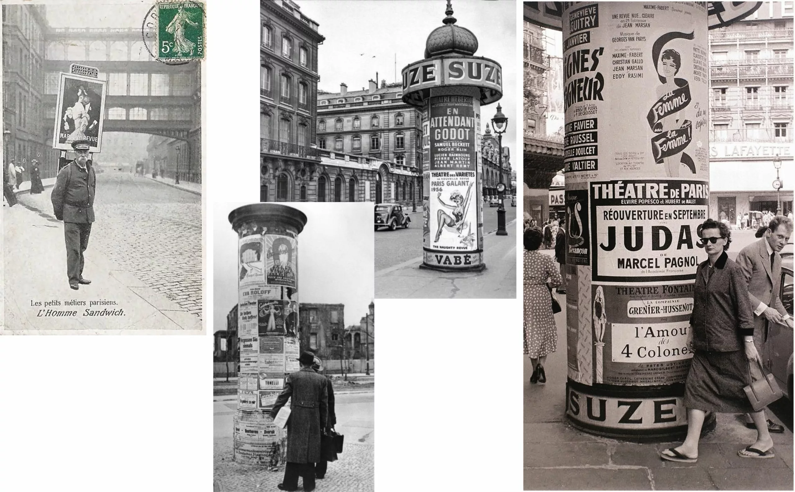
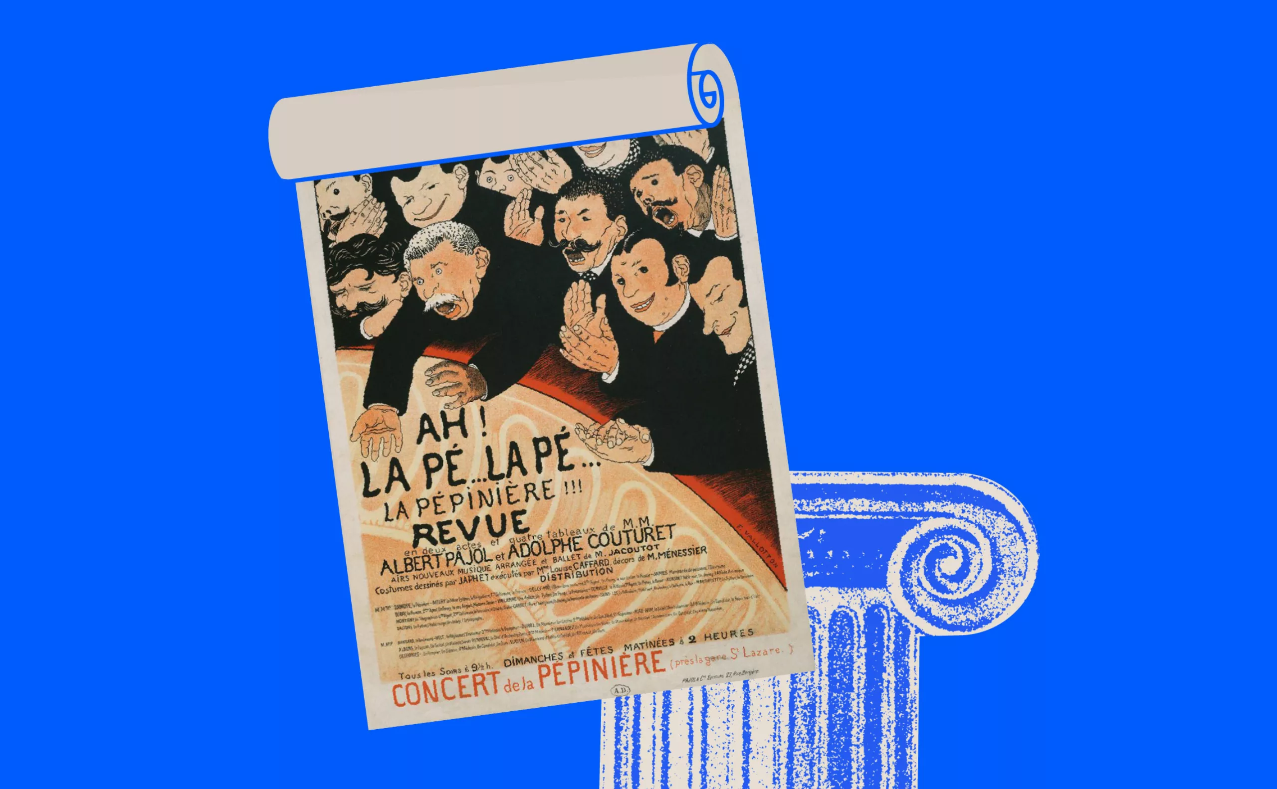
At the beginning of the 20th century, “boulevard” theater was the best way to fill theatres with light-hearted, quiproquo plots. People were entertained by Feydeau and Labiche. Then came the “time of the directors” who shook up theatrical codes. Experimentation flourished with each new creation. Always with the aim of questioning the social relationship with the audience.
The “Théâtre du Soleil” in Vincennes, directed for many years by Ariane Mnouchkine, is yet another vibrant example. At La Cartoucherie, the actors prepare themselves for the audience, take care of their placement in the auditorium, and everyone shares a meal at intermission.
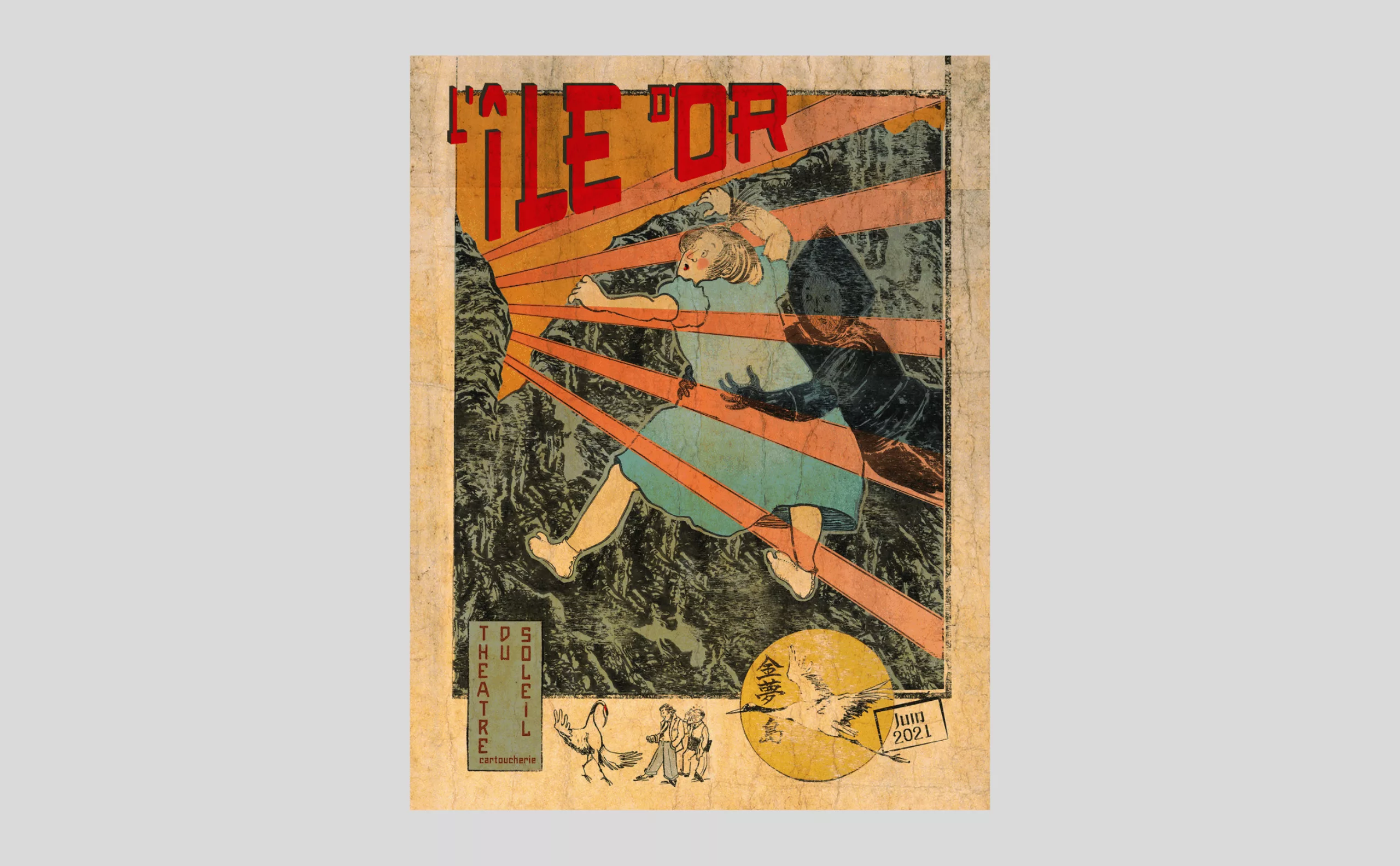
“Let’s be realistic, let’s ask for the impossible!”. In May 68, theater, like other artistic fields, became contemporary. At the end of the “Trente Glorieuses”, Paris experienced a veritable theatrical explosion, with so many new venues opening.
Theater in France, and its nuances
Today, Paris offers over 150 live performance venues. From the smallest, the 25-seat “Petite Loge” in the Saint-Georges district, to the most imposing, the 2,500-seat “Théâtre du Châtelet” in the heart of Paris. In 2022, a staggering 90,000 theatrical performances were given in France. On the Paris stage, there are 300 shows a week throughout the year (450 in high season). It would be illusory to attempt to draw up an exhaustive panorama of theatrical presentations in such a large and diverse number of venues.
All the more so since a distinction needs to be made between public and private theaters, most of which are located in Paris. In terms of theatrical history, this distinction is a recent phenomenon, since private theater was born in the 18th century.
What’s the difference between private and public theater? On the one hand, private theater is made up of commercial structures subject to market principles. On the other, public theater, as its name suggests, is a public service, financed by public funds managed by the State, the Regions and other local authorities.
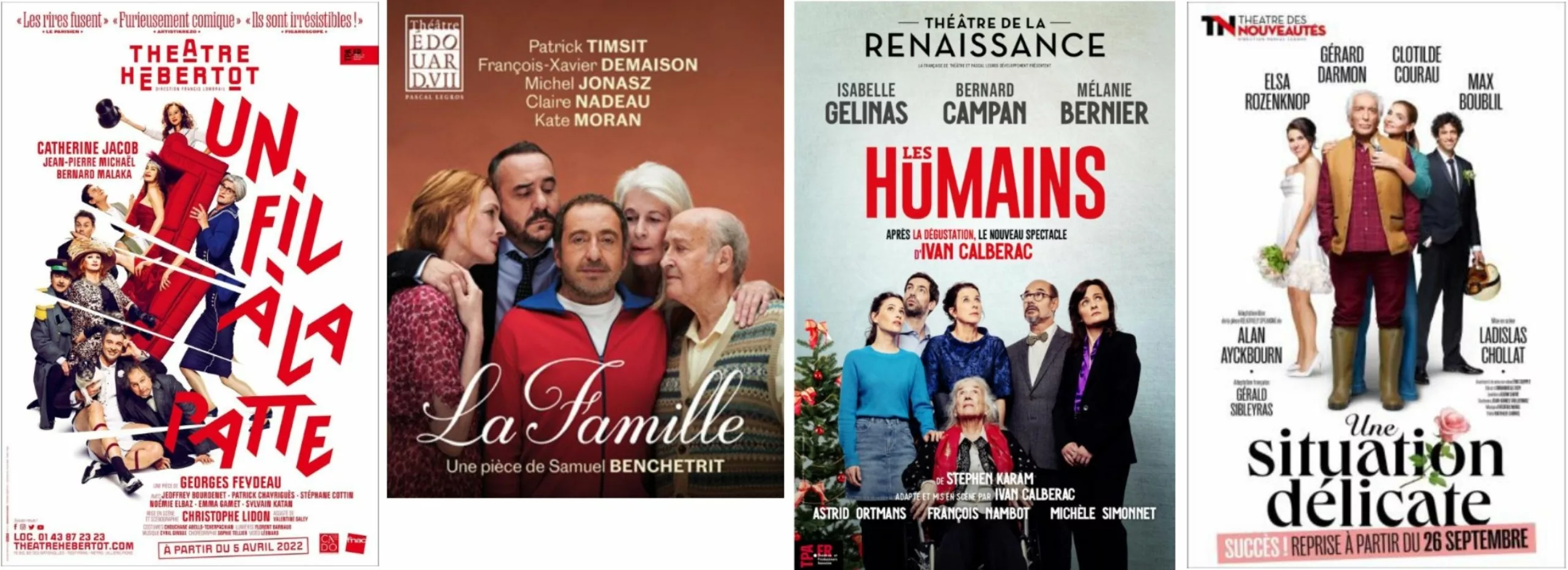
The repertoire (more accessible), unsubsidized (private-seat prices are higher), number of performances and audience are often the distinguishing features between private and public. It’s in the private sector that the best-known stars attract the most spectators.
Public and private theater, two distinct communication strategies
The generic term public theater covers a wide range of performance venues.
There are 6 Théâtres Nationaux, the most prestigious, 5 of which are in Paris! Comédie-Française, Odéon, Chaillot, Théâtre de la Colline, Théâtre National de Strasbourg, Opéra and Opéra-Comique.
The Centres Dramatiques Nationaux (CDN) were set up by the French government in 1947 as part of the theatrical decentralization process. There are now 38 CDNs throughout France.
The Scènes Nationales were created in 1980 and installed in 1991, and now number 78. They bring together under a common name the Maisons de la Culture, the Centres d’Actions Culturelles and the Centres de Développement Culturel.
This great diversity and the sheer number of venues have had the effect of encouraging real competition between establishments. This is all the more true given that the same show can be performed in both public and private theaters.
We’re beginning to see the role of theatrical communication. With well-established characteristics. To put it simply, public theaters sell subscriptions at the start of the season, while private theatres sell single tickets for each show. On the one hand, you build loyalty over the course of a season; on the other, you need to communicate for each show.
In terms of visual communication and posters, for over 50 years, public theater has offered a diversity and graphic creativity that allows us to grasp the major trends and evolutions. Private theater is all too often reduced to the commercial patchwork posters you see on the subway platform, where all you see is the image and name of one or more of the best-known actors. So, for this series of articles, we’ll confine ourselves to public theater.
Communication in public theater
In the public theater environment, the appointment of a new director is generally accompanied by a change in communications. The aim is often to give new visibility to programming and a renewed state of mind. With a new director comes a new graphic designer (exceptions are rare!). An appointed director arrives with his graphic designer and leaves with…! For many years, communications were entrusted to individual graphic designers or small independent structures. It’s only recently that visual communication agencies have become involved in the cultural field.
Michal Batory, a Polish graphic designer who was very active at the end of the 20th century (see poster photo, right), explains this distinction, which he discovered when he arrived in Paris in the 1980s. We talk about it in Act IV.
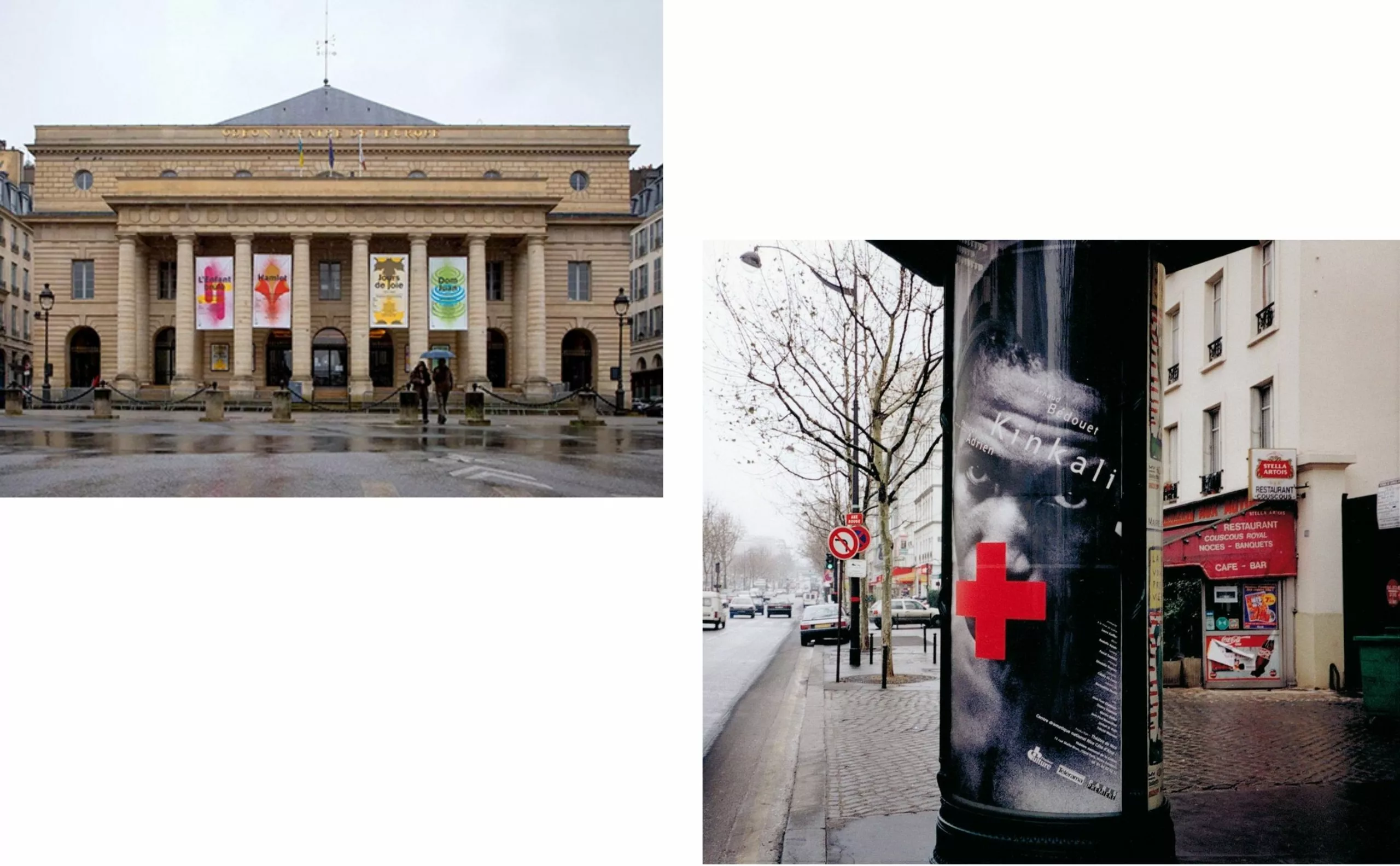
“There was a huge gulf between advertising and cultural graphics. The two worlds hated each other, which is a peculiarly French phenomenon. I went over to the cultural side and saw this contempt for advertising right up until the 1990s. In my opinion, today this divide is melting away. Graphic designers create advertising campaigns, theaters hire communications agencies. In the 1990s, this would have been impossible! Graphic designers got all the orders, from the city, the region, etc. The theatres only worked with advertising agencies. Theaters worked exclusively with artists.
Now that we’ve met the theater and its organization, it’s time to turn off the cell phones for the curtain call… Act I of our theater poster epic can begin!


