Rolland Garros in the spotlight
Here’s an article that’s not really in the news… it’s more of an off-season article!
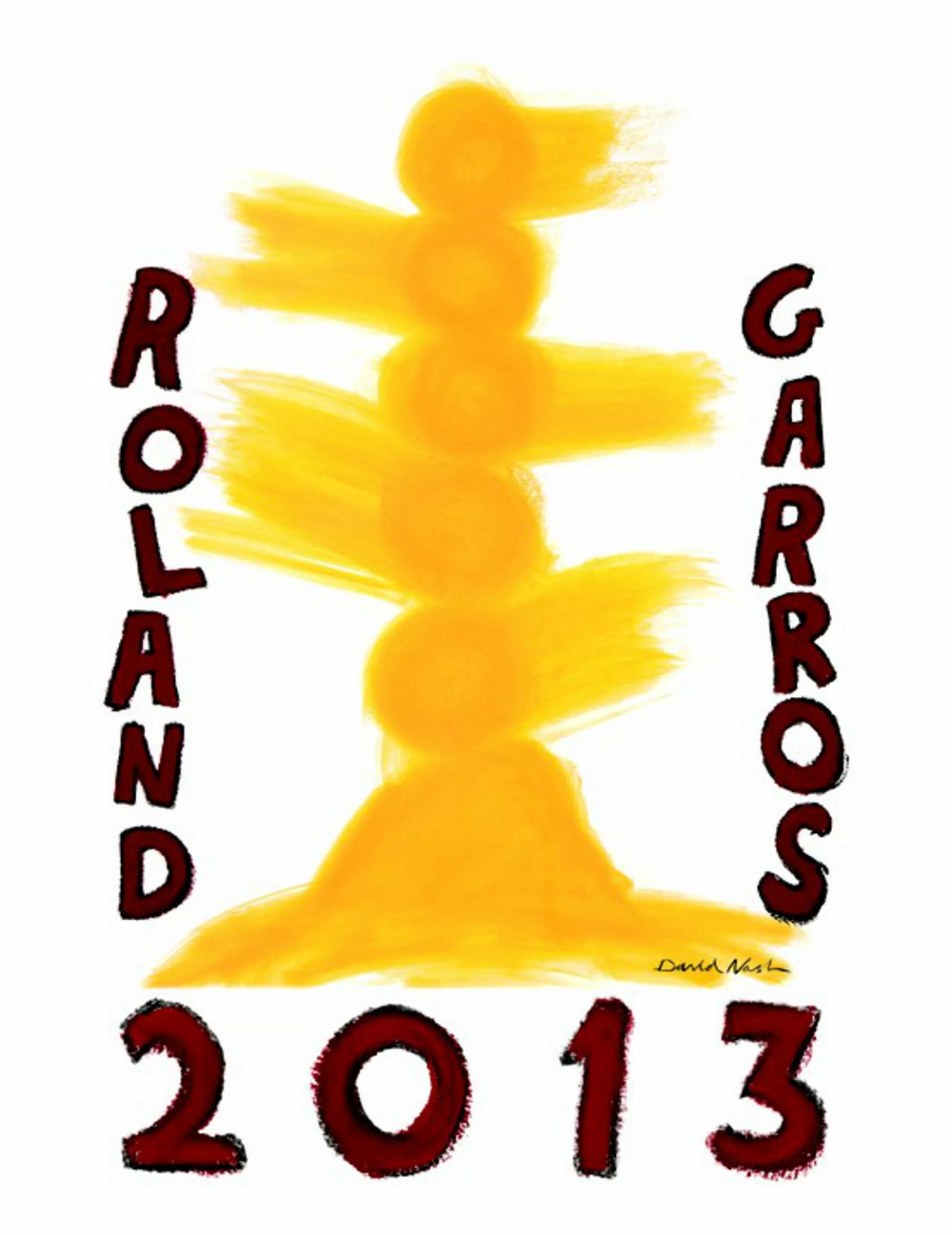
The 2013 Internationals poster unveiled at the end of 2012… with the tournament kicking off at the end of May… it’s the perfect time to get out the balls and cut some shorts!
International artists
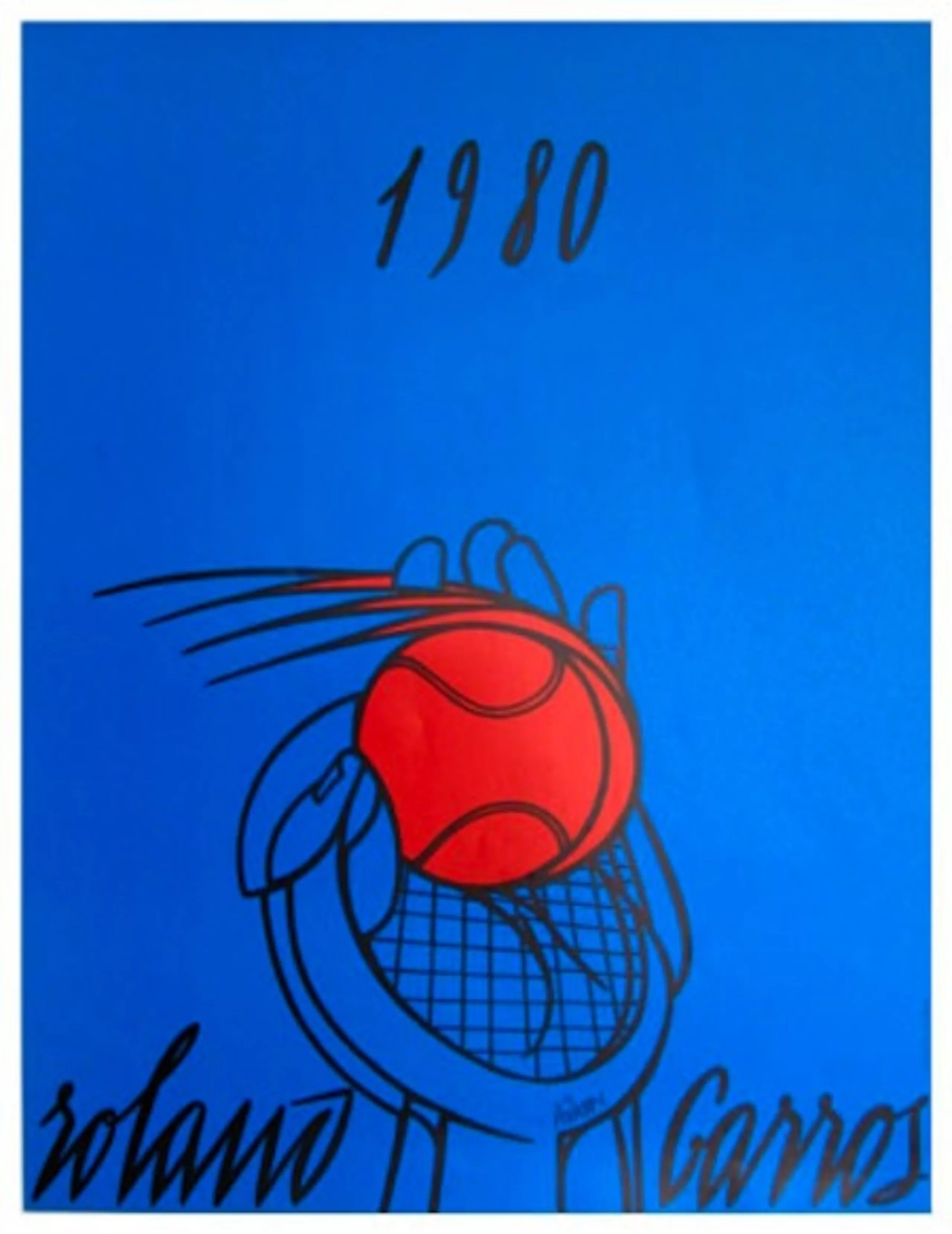
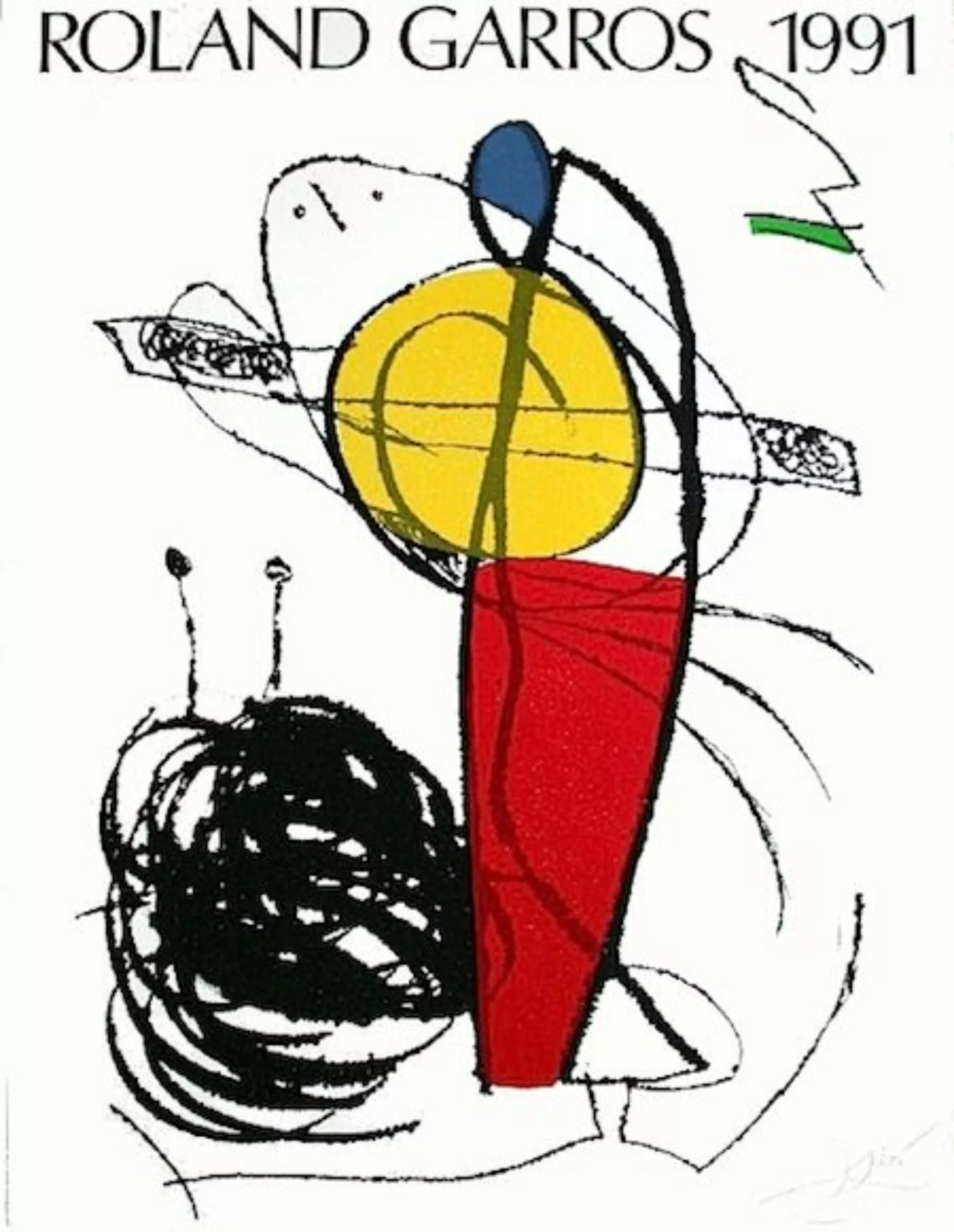
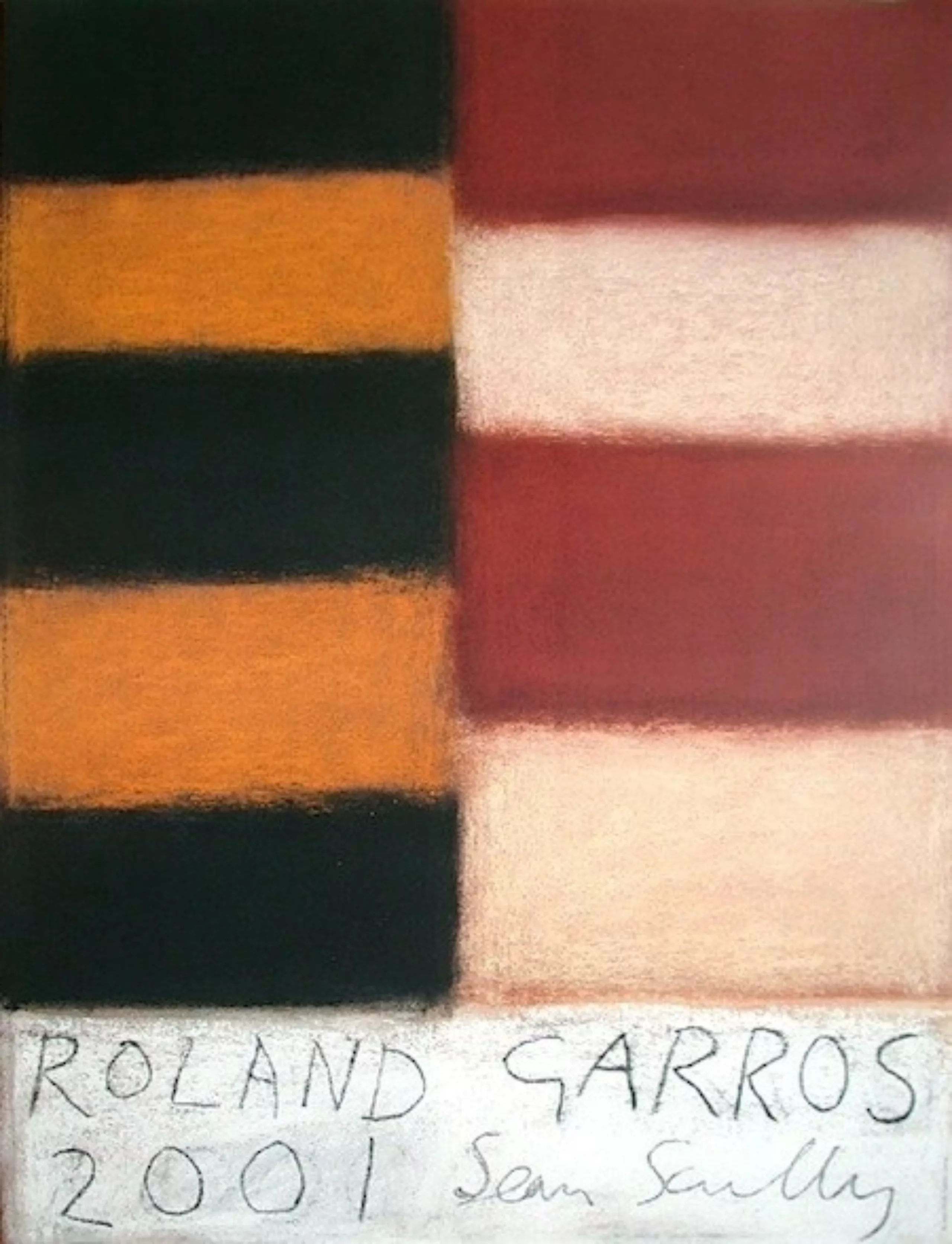
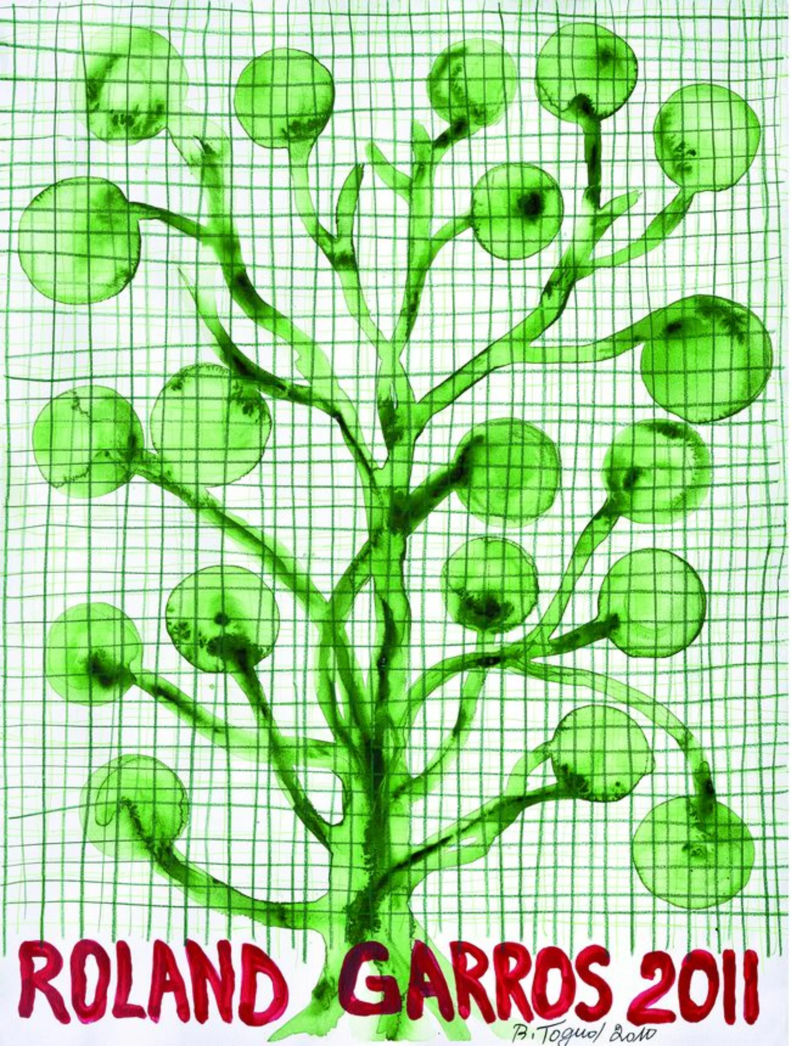
It was in 1980 that Daniel Lelong, director of the gallery of the same name, suggested that the French Tennis Federation entrust the design of the poster to a great name in contemporary art. Valeria Adami signed the 1980 poster, followed by Miro, Arman, Tapies, Pignon-Ernest… Today, David Nash has signed the 34th poster in this collaboration.
In the words of the FFT, it’s a “simple tennis ball. Yellow, solar, burning… In a poetic abstraction. A work that combines strength and delicacy. Between heaven and earth, these balls swirl above an imaginary, invisible net. They express Nash’s creativity and that of the tournament. The brilliance of a sunny Parisian spring is matched by the power of the exchanges on the clay of Court Philippe-Chatrier.
For my part, I would say that this is a good poster for a “MANAA” ( upgrading in applied arts ).
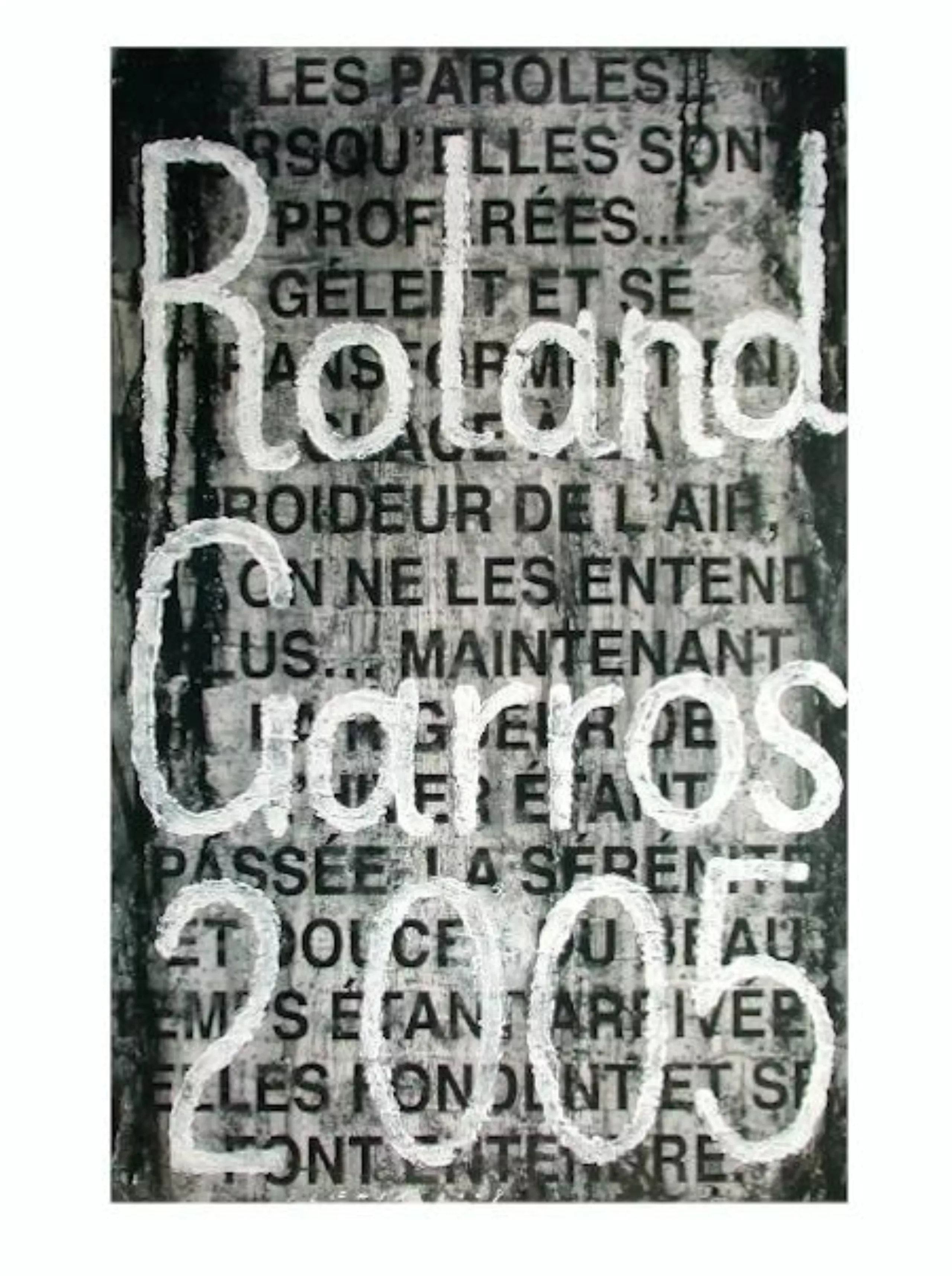
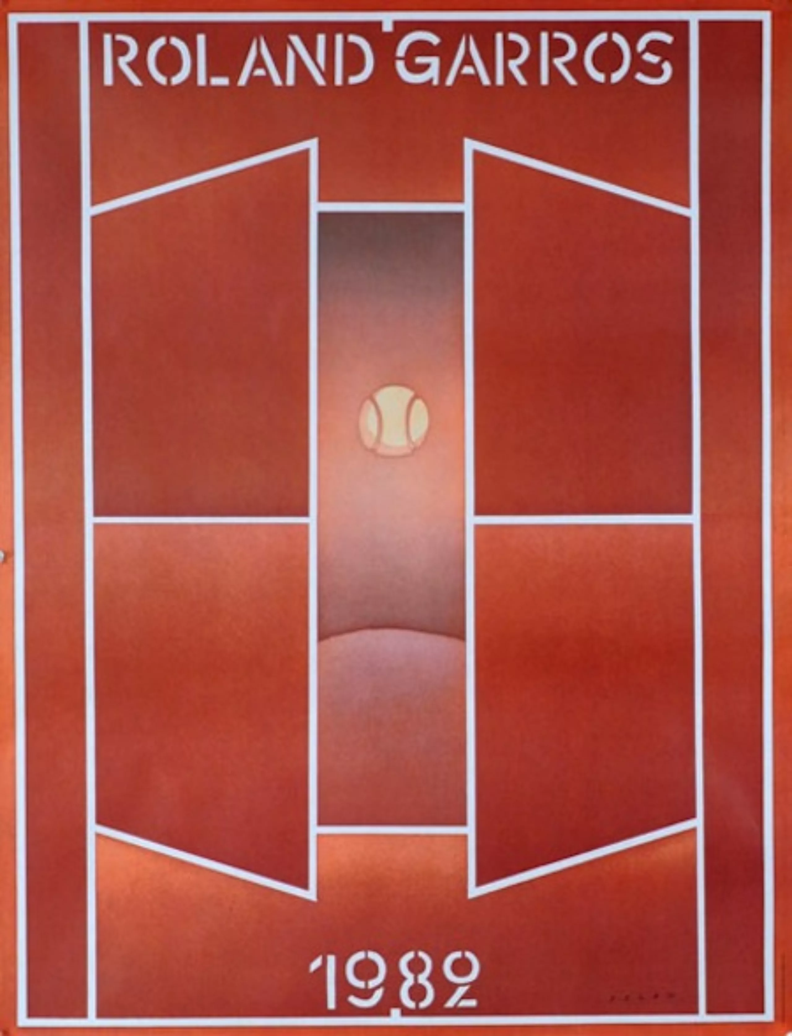
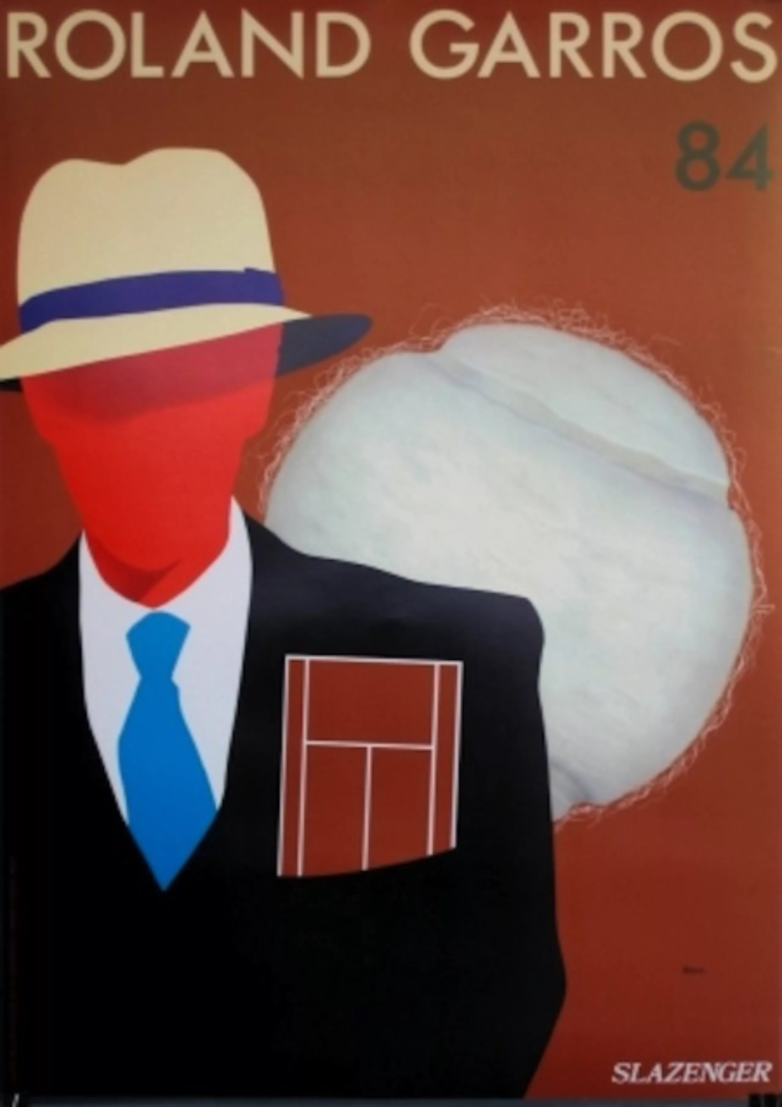
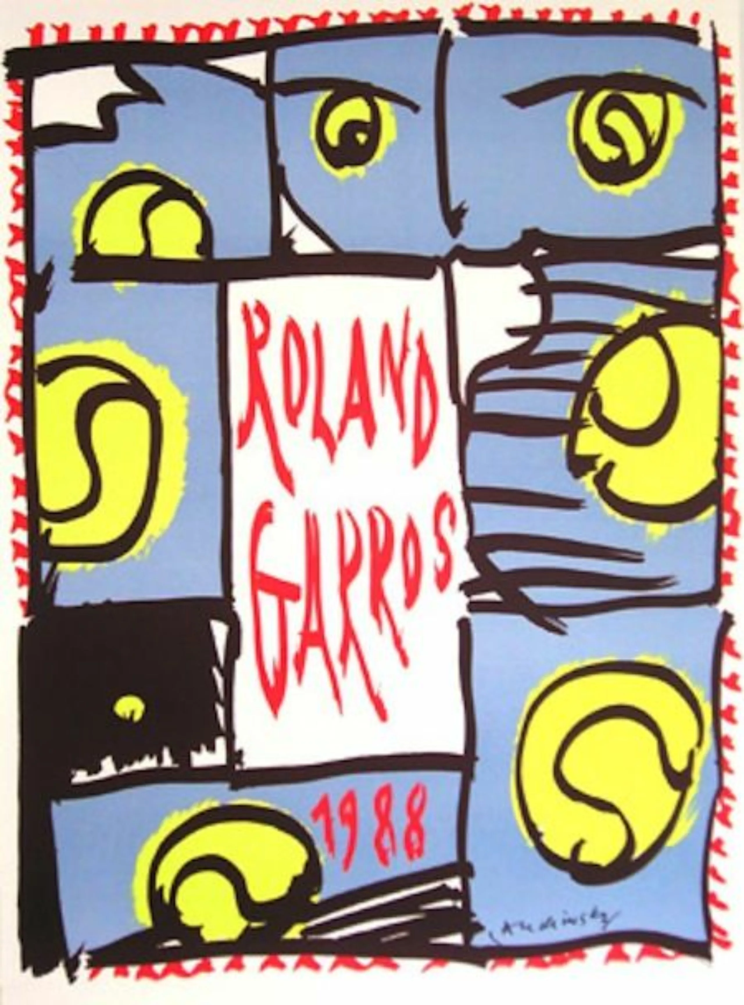
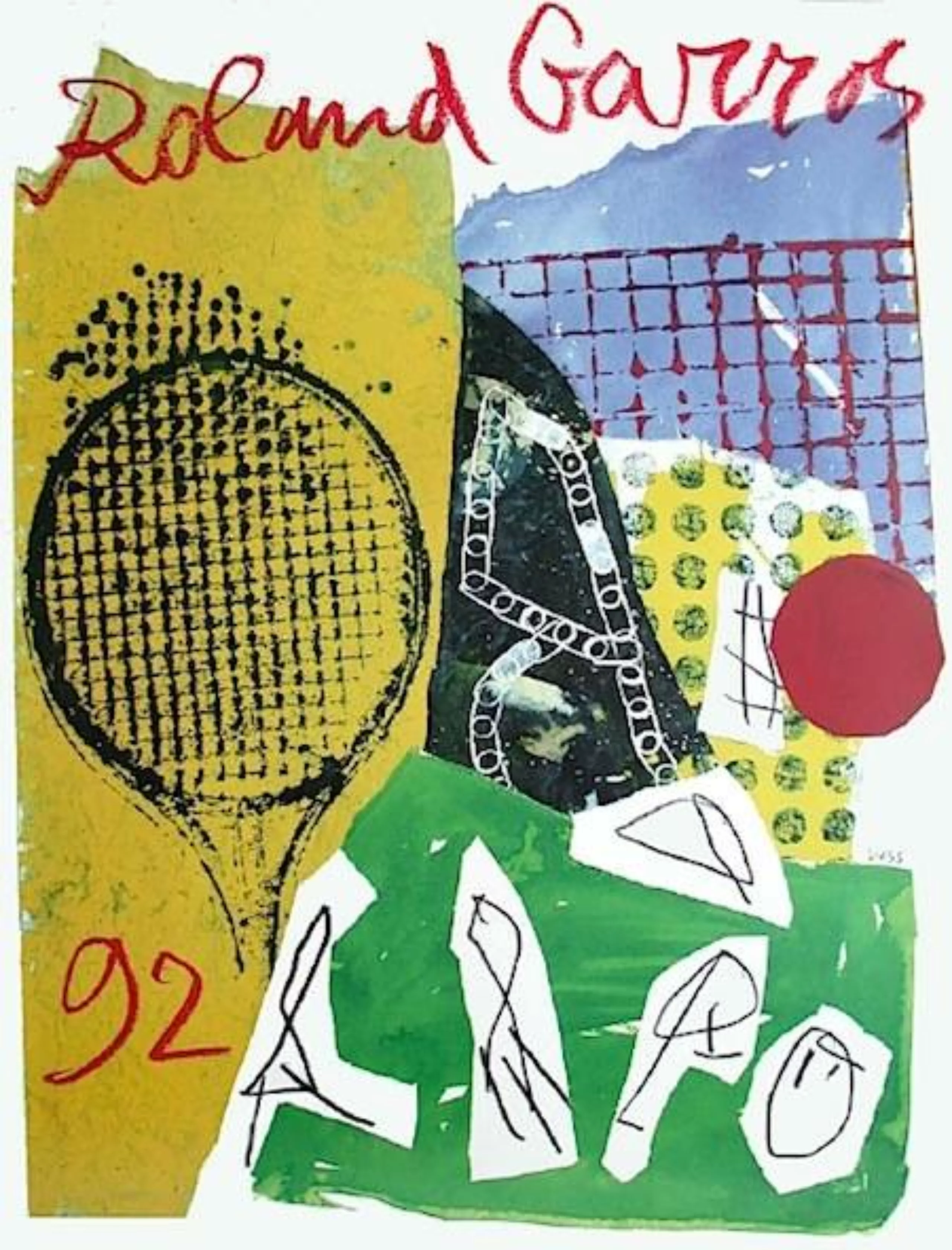
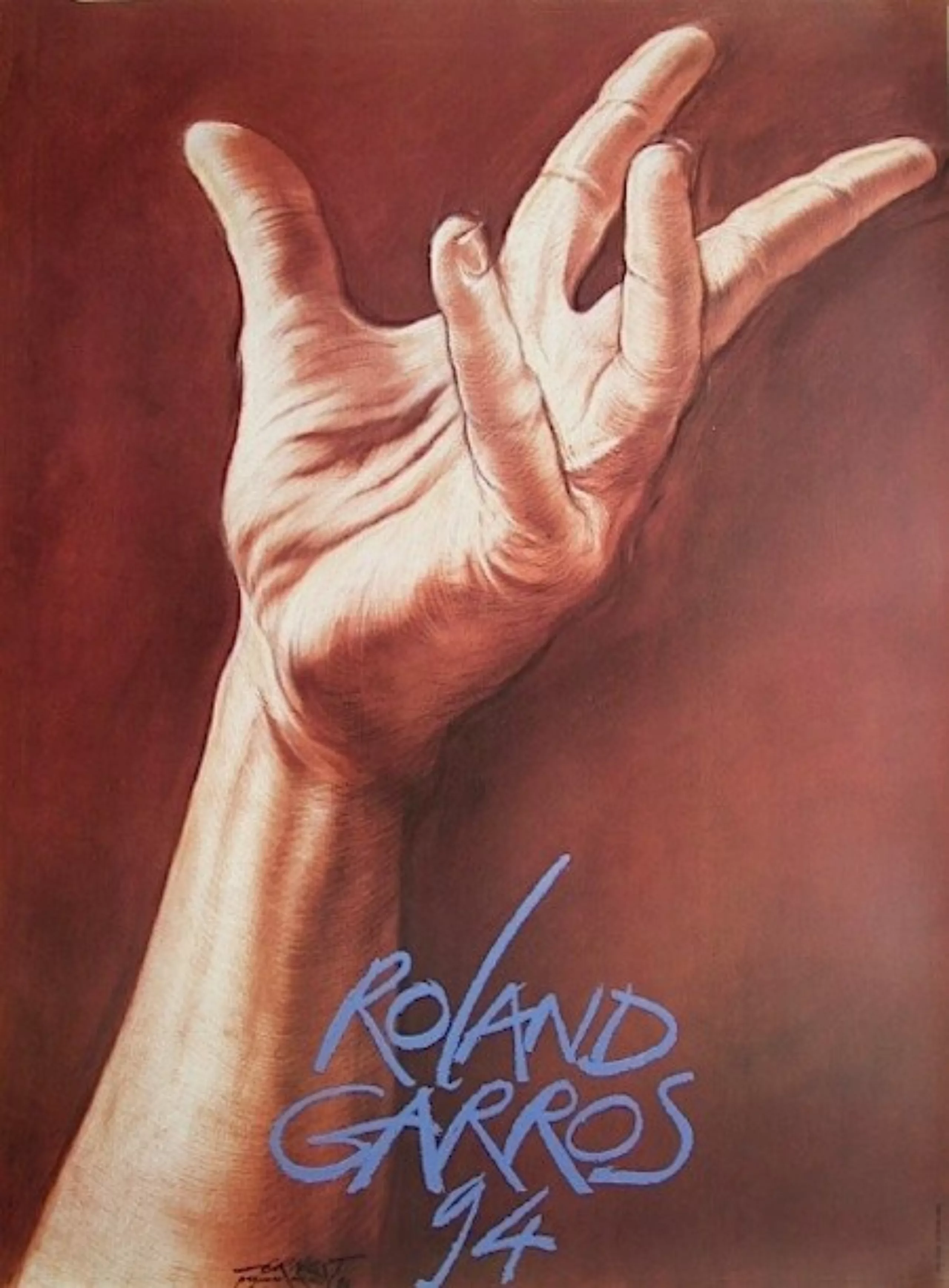
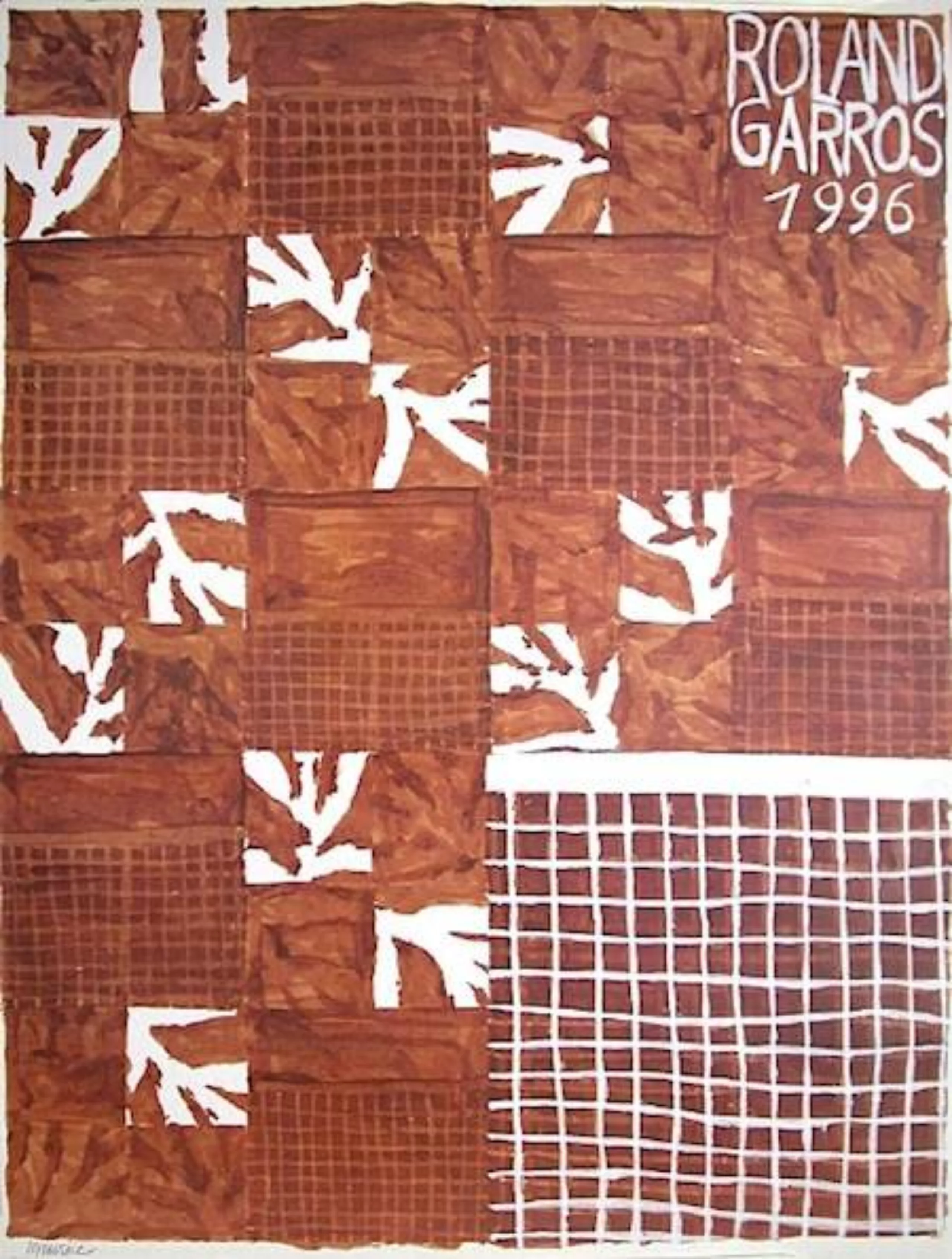
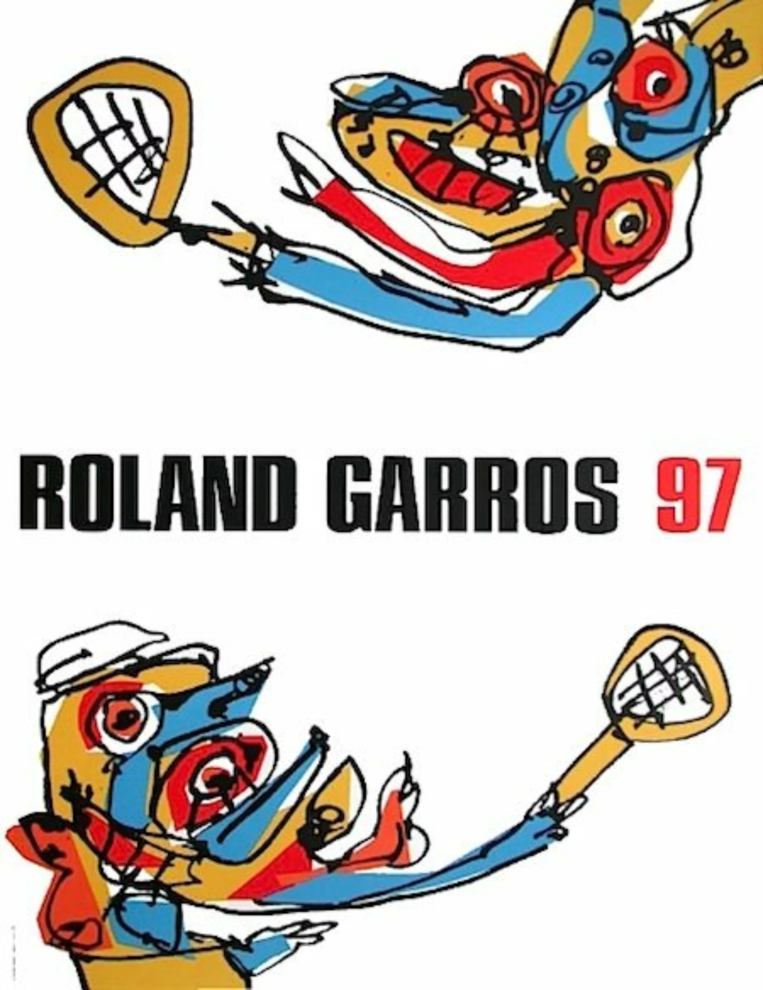
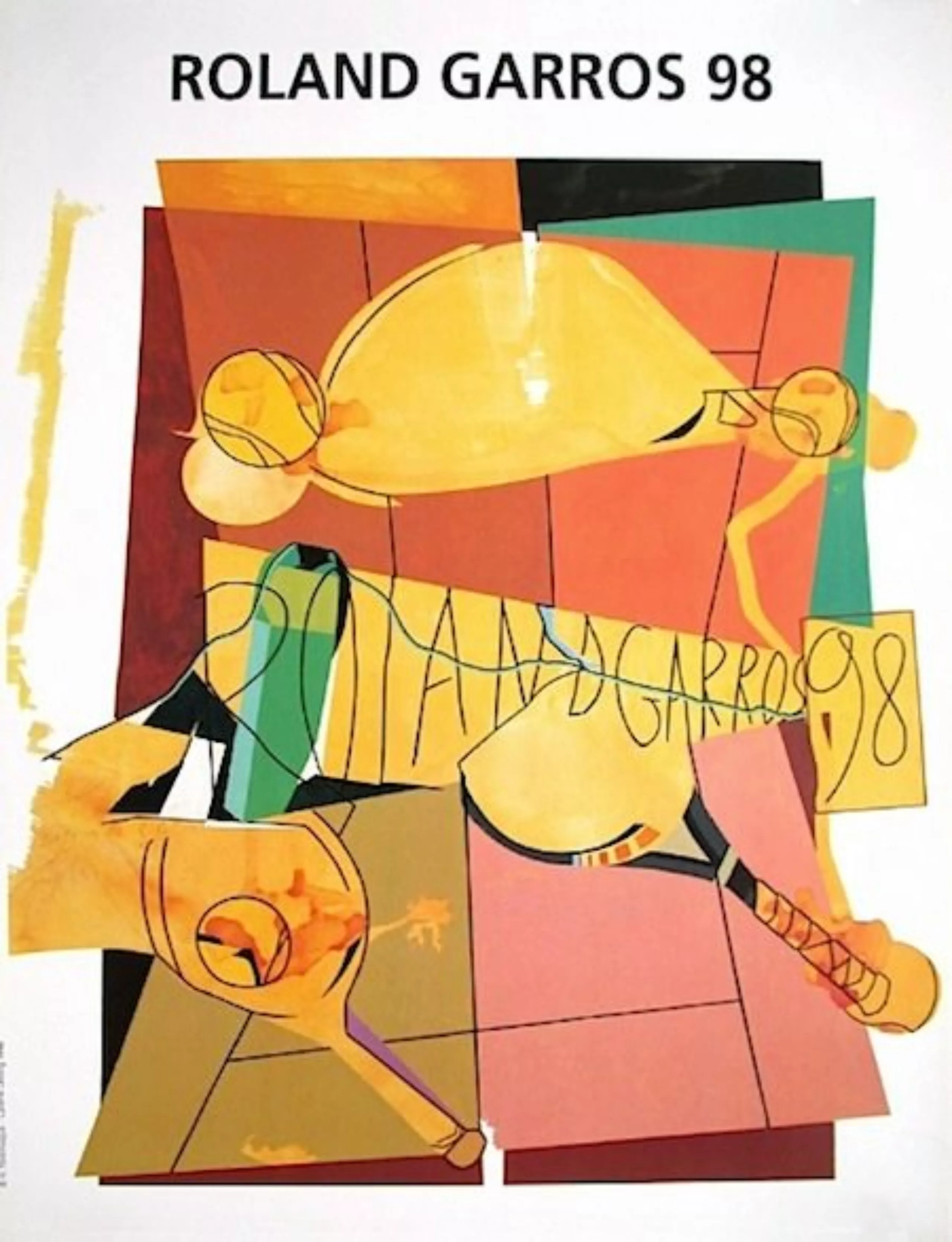
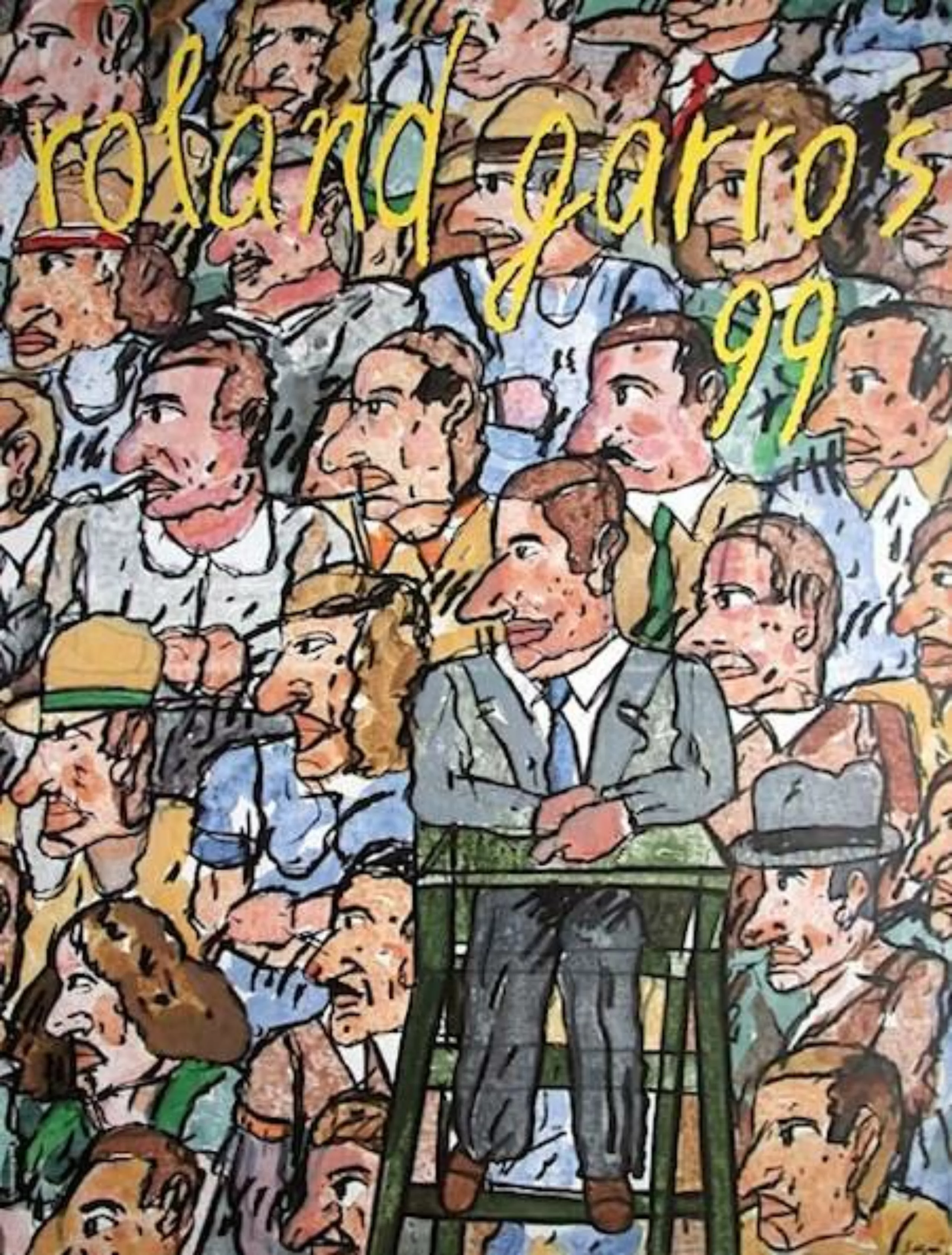
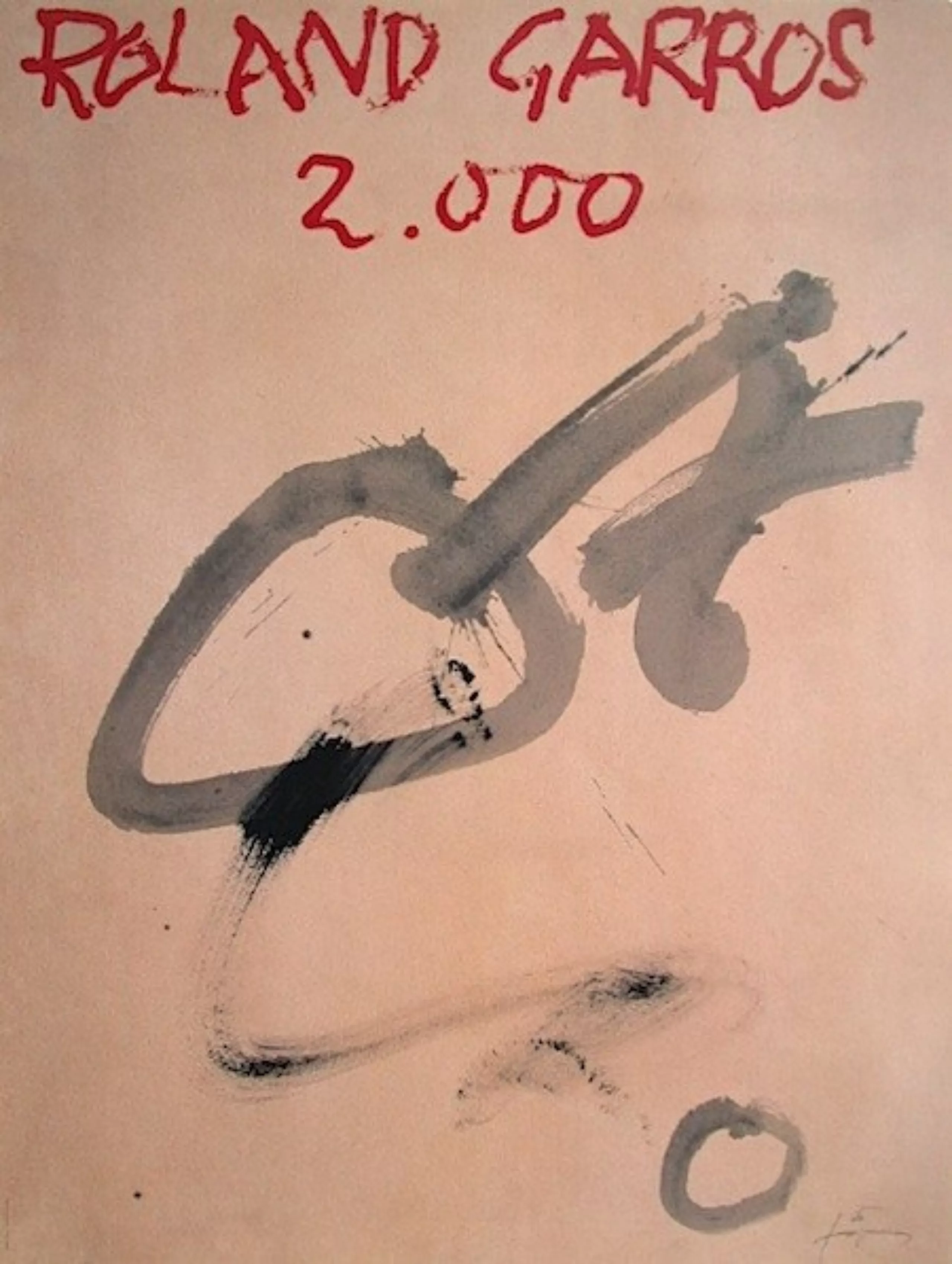
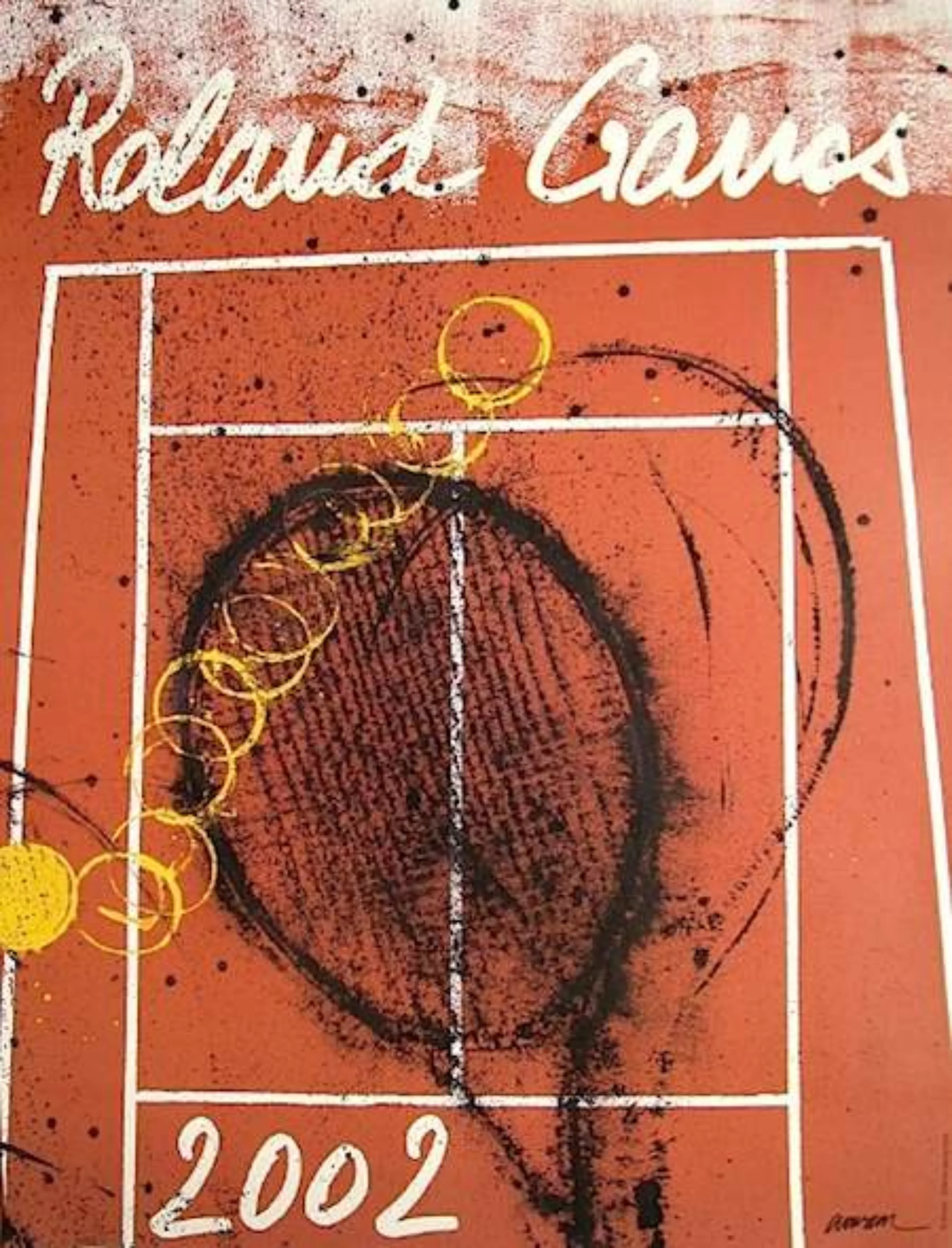
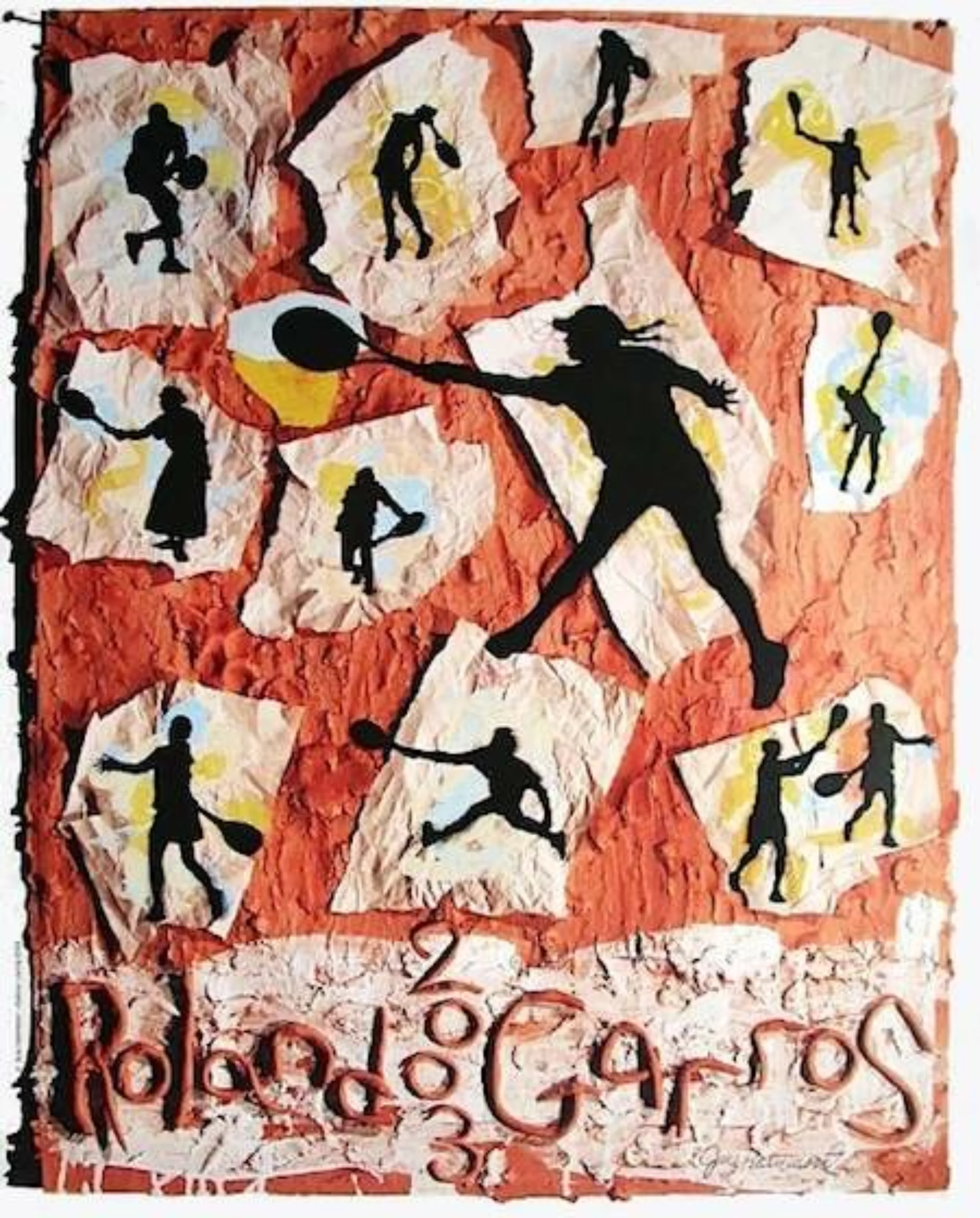
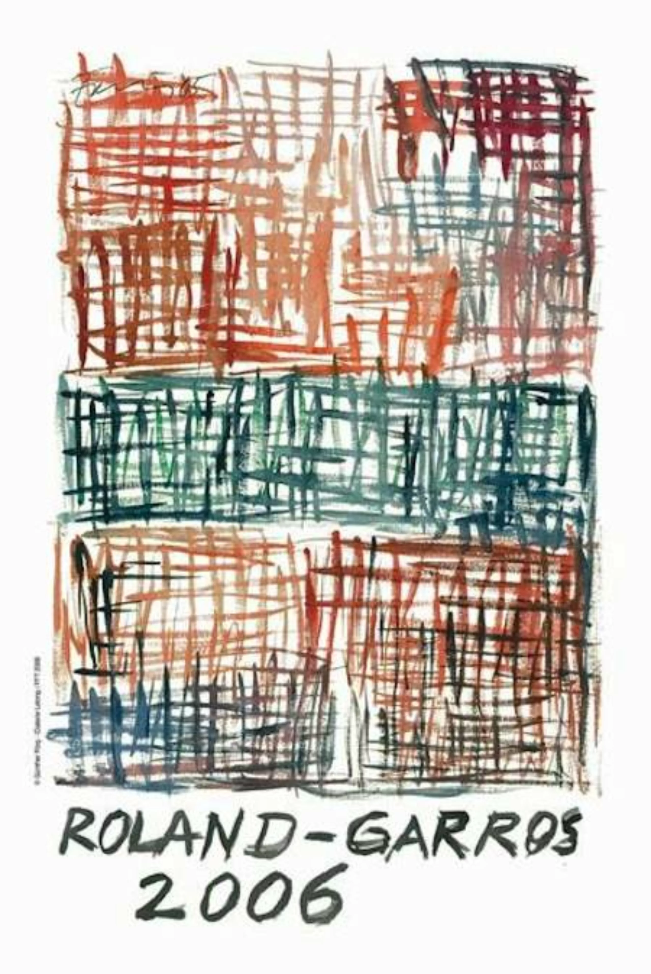
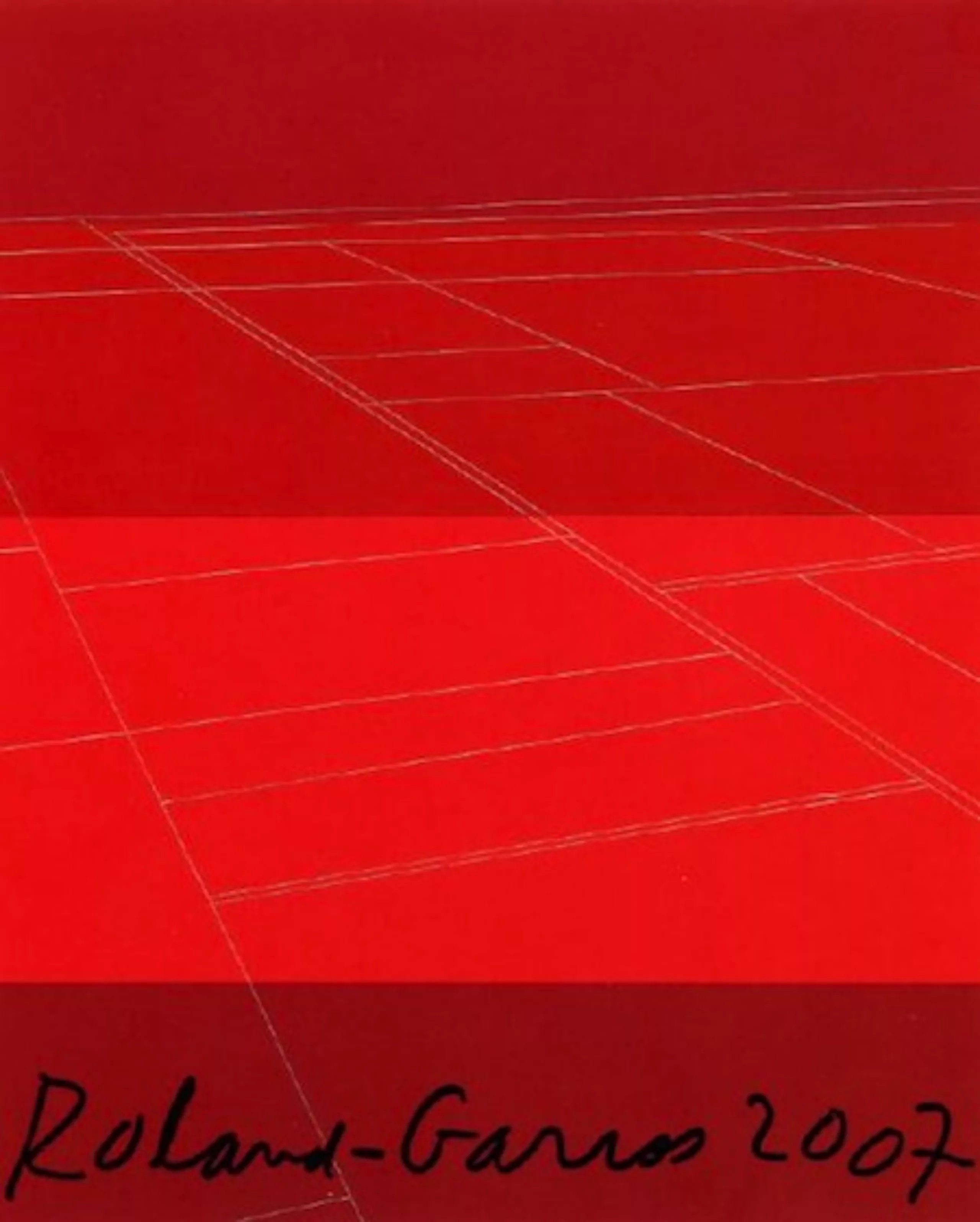
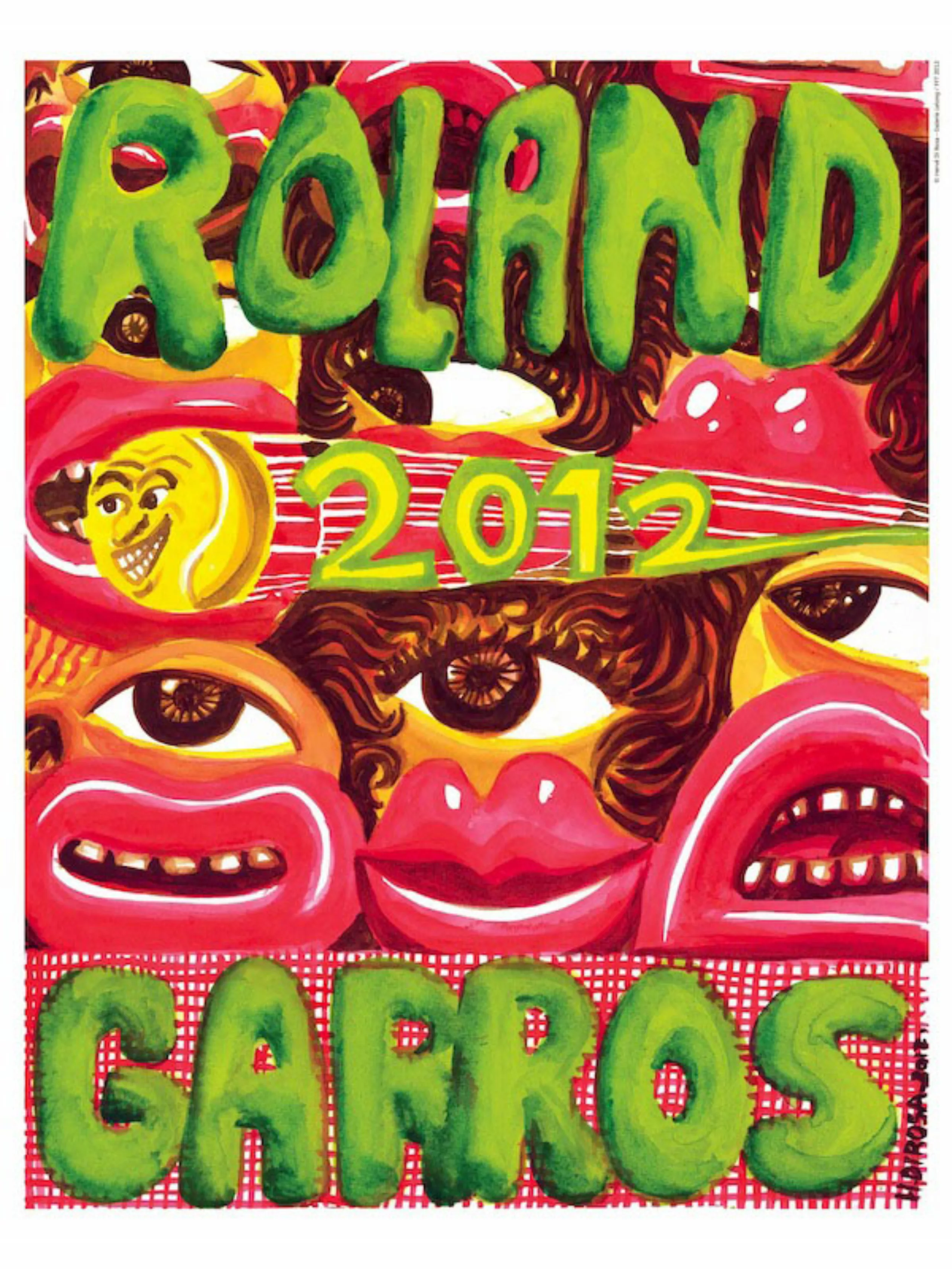
In the history of Roland Garros posters, there have already been a few “gems”.
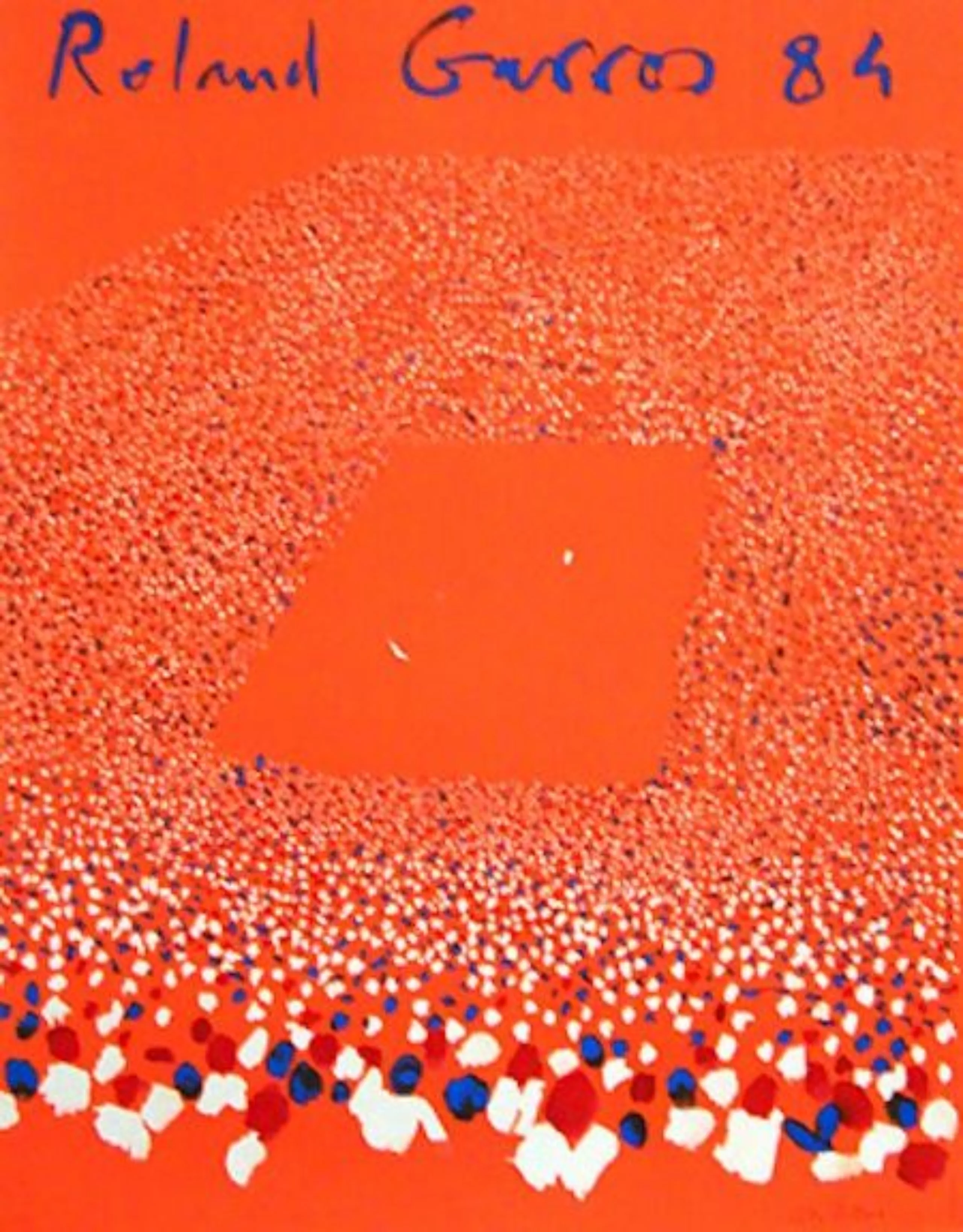
Posters that cross the white line !
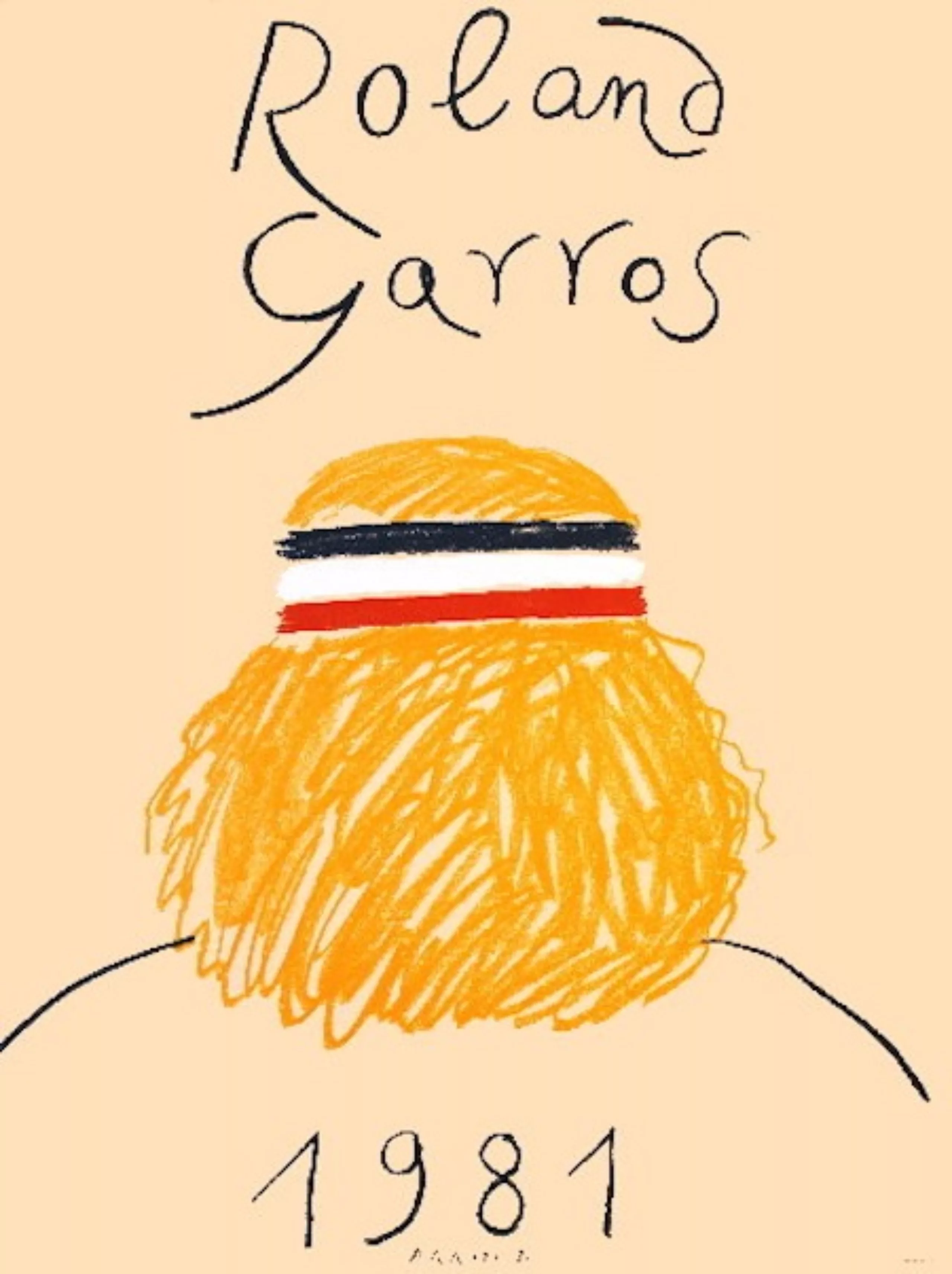
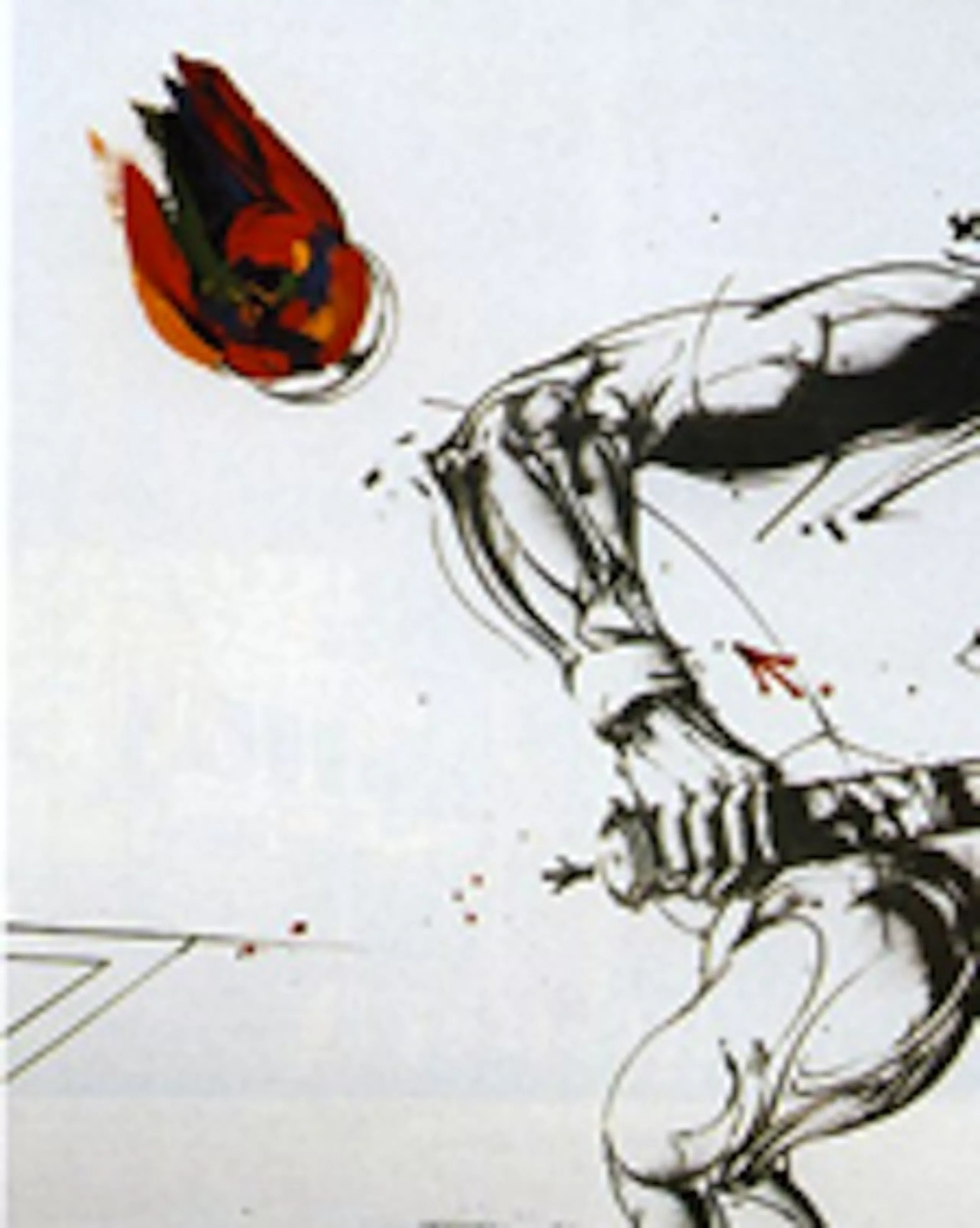
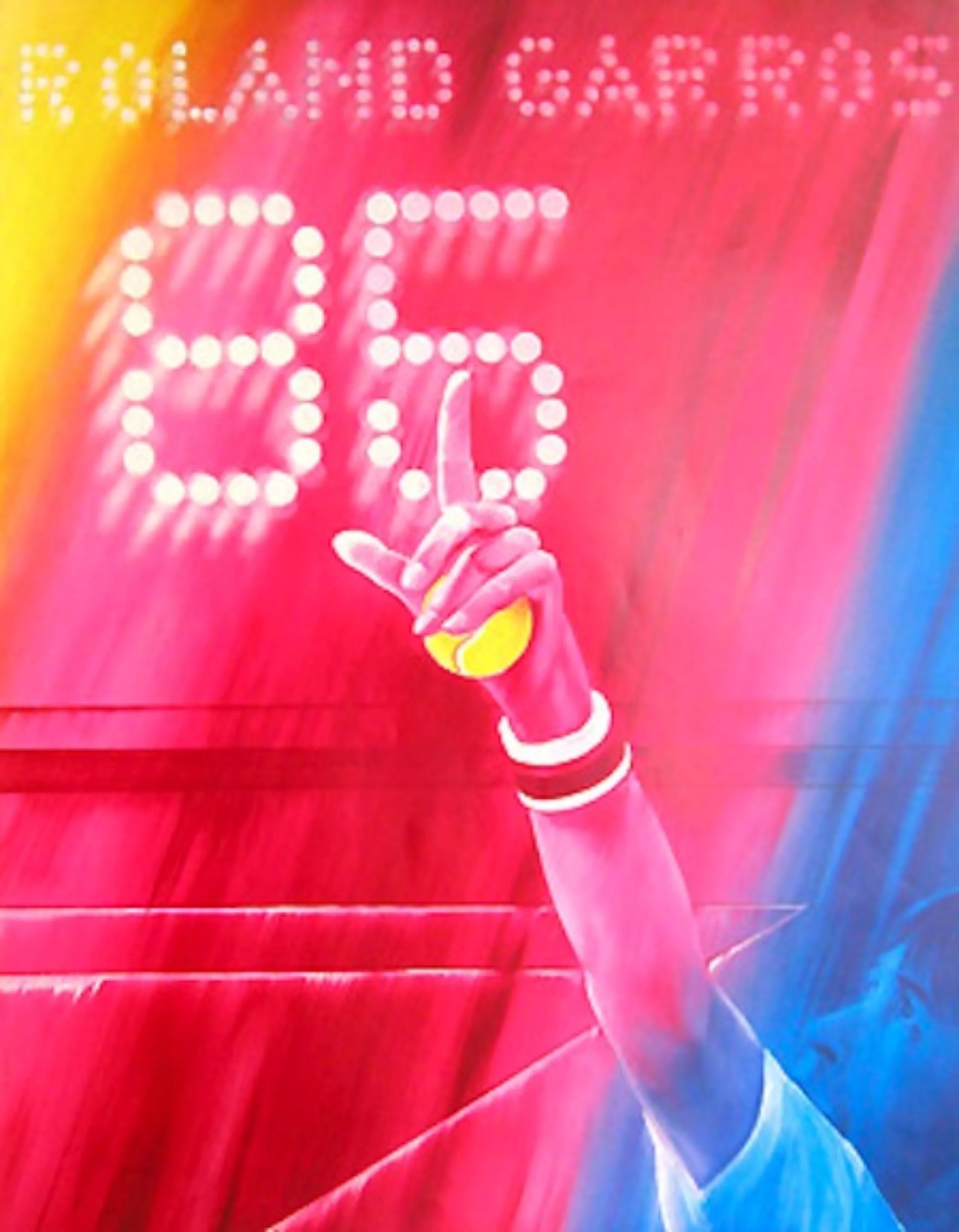
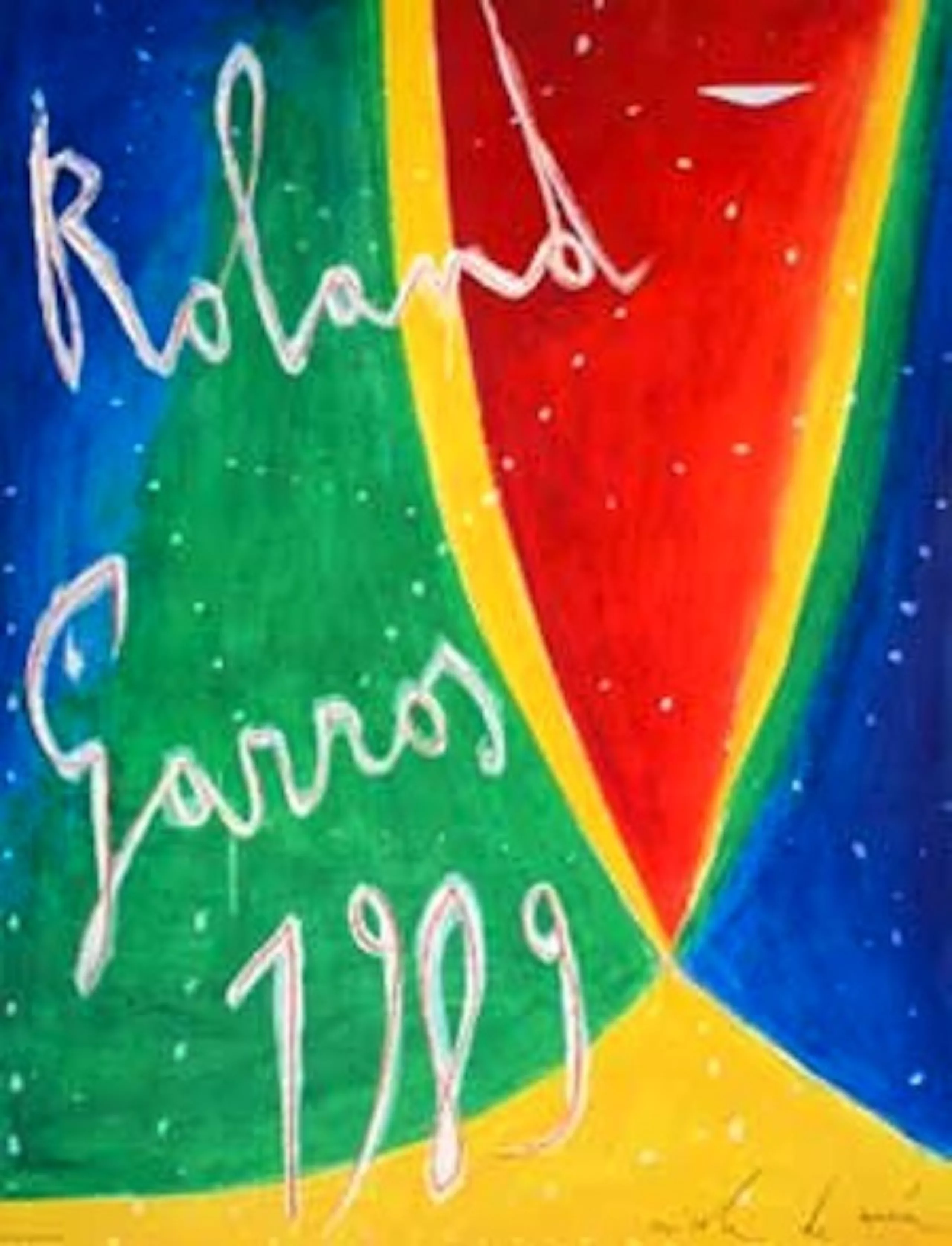
The idea of entrusting the poster design to an artist is a generous one, but the result is far from convincing ! An artist is not necessarily a good graphic designer. The reverse is rarely true either.


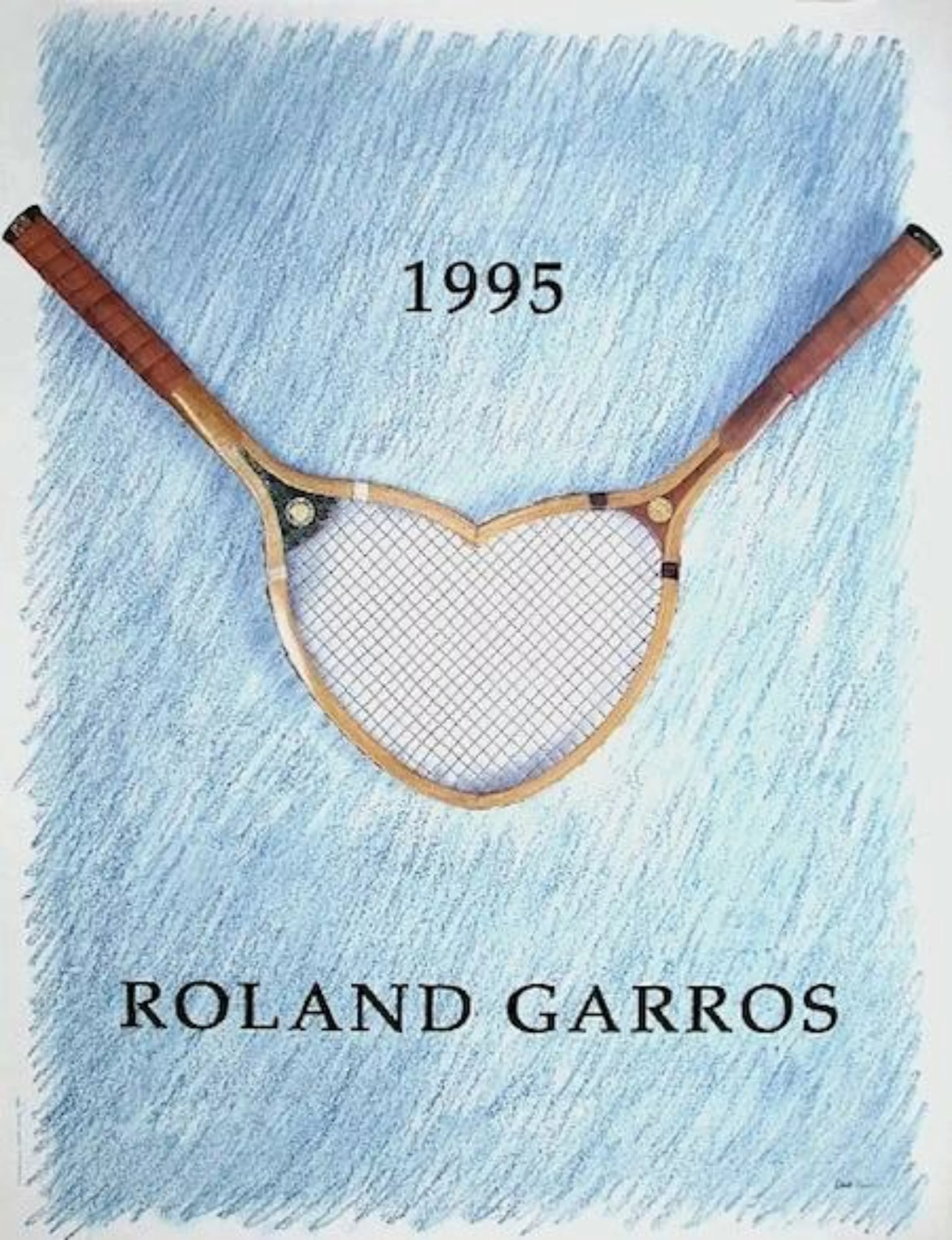
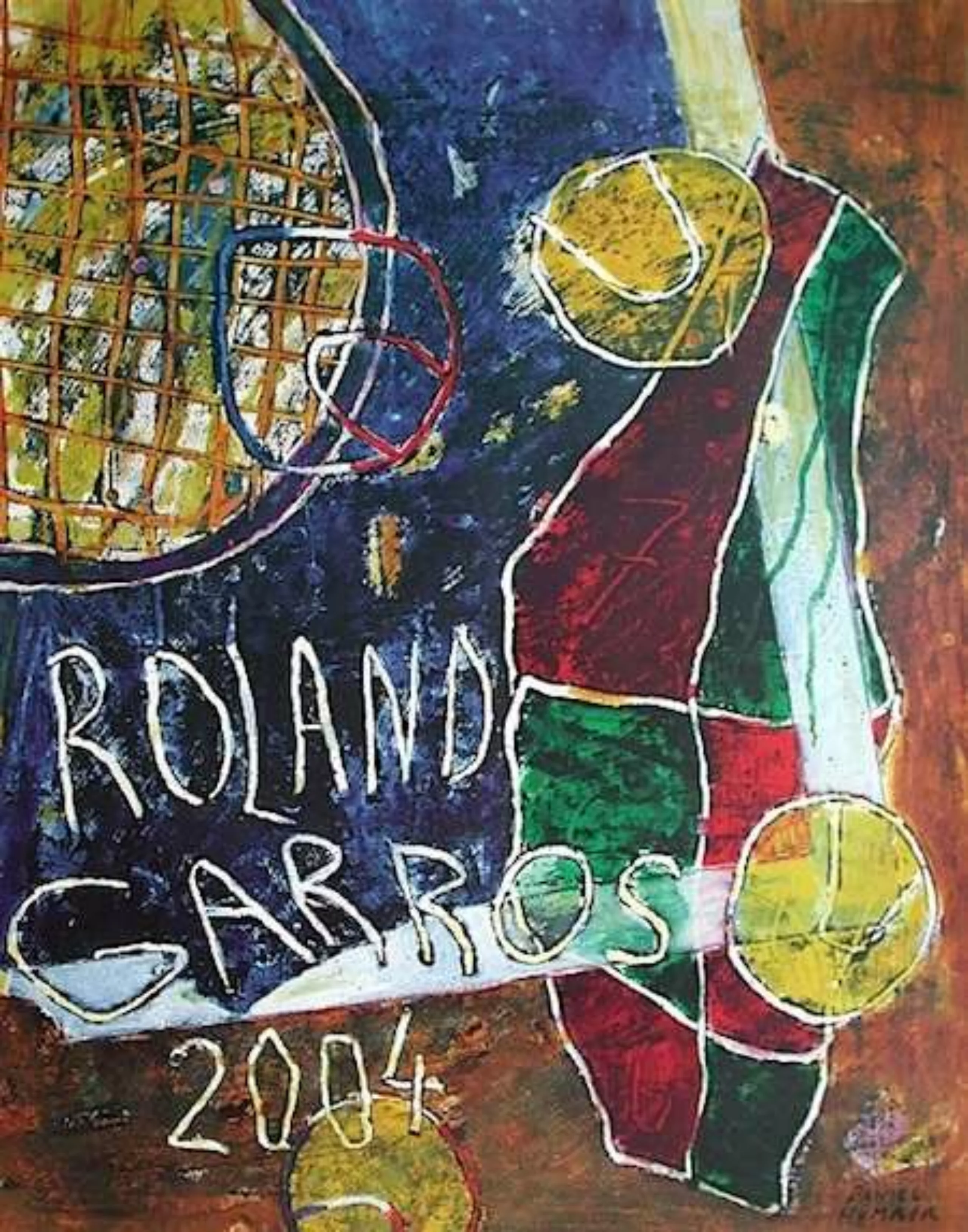
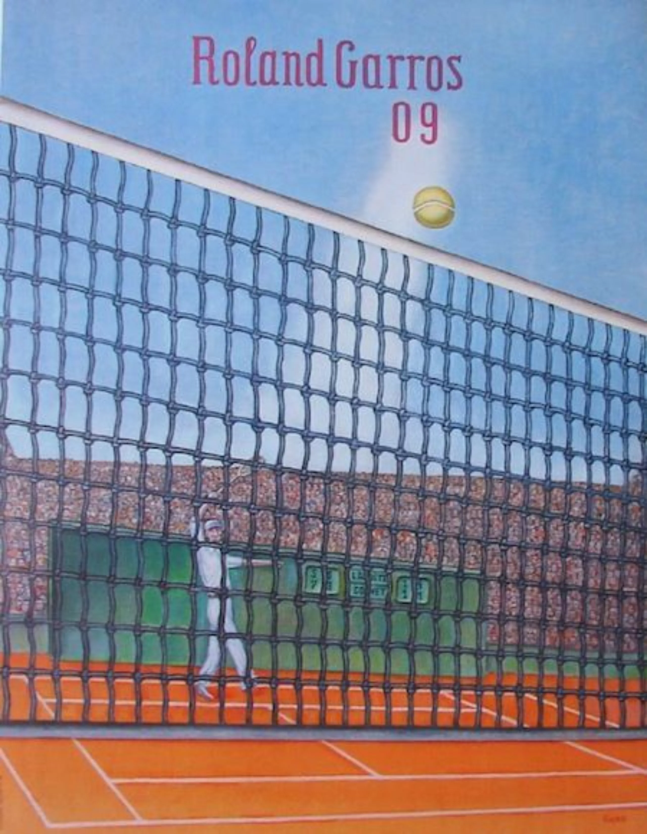
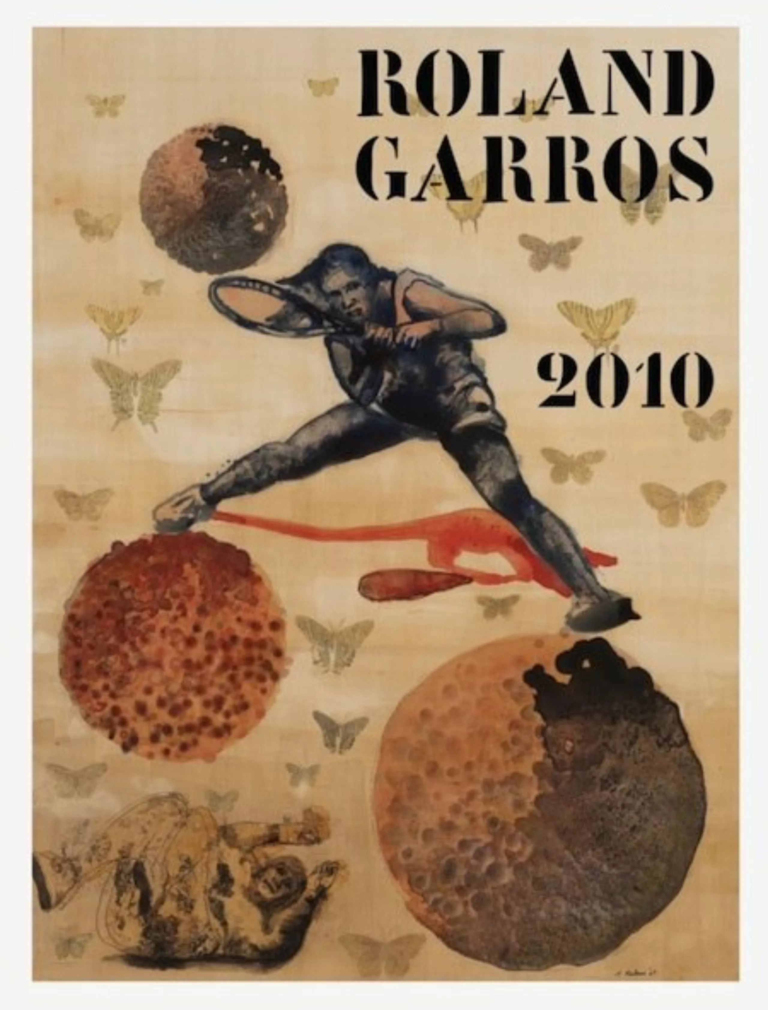
The finalists !
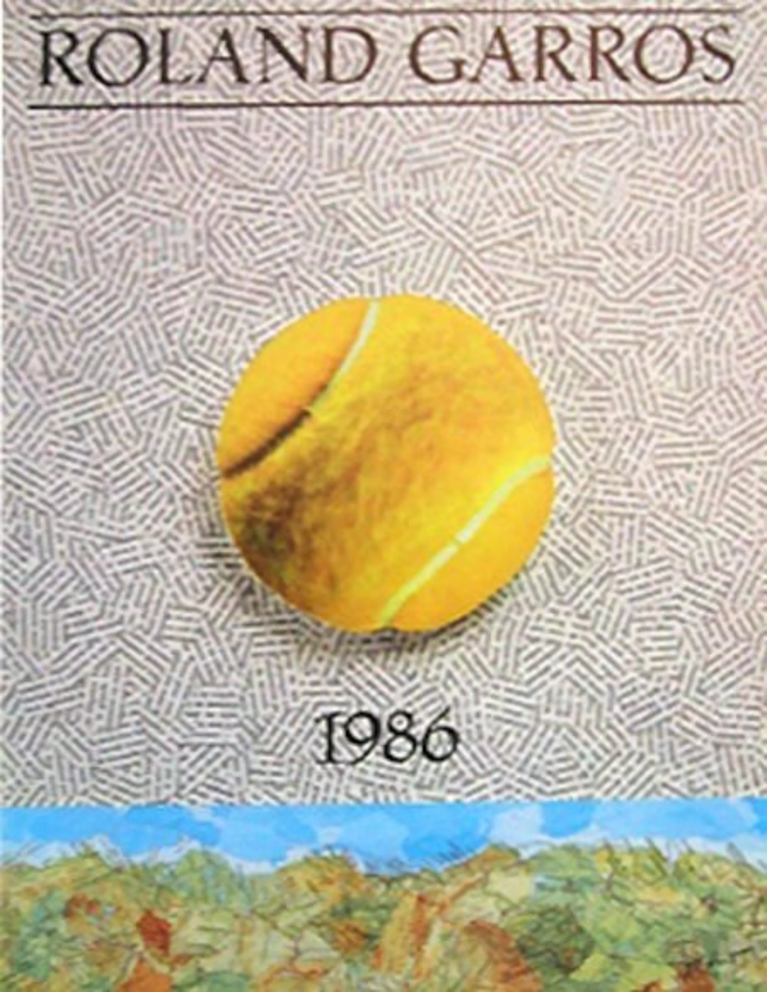
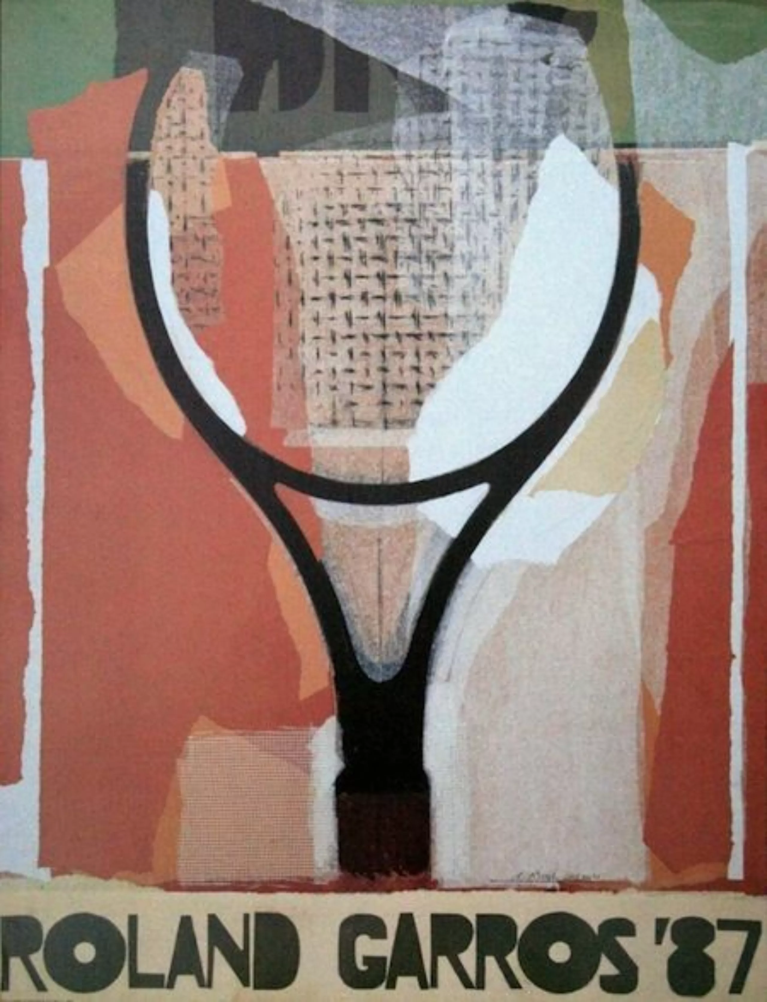
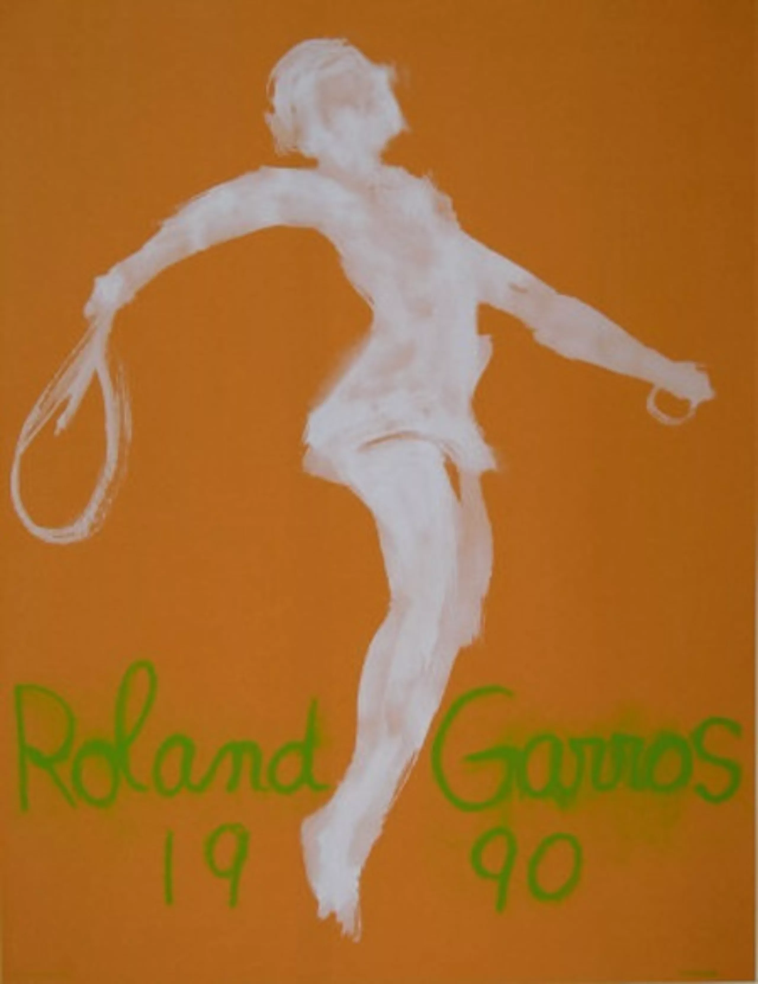
Fortunately, there were a few successes among the lot !
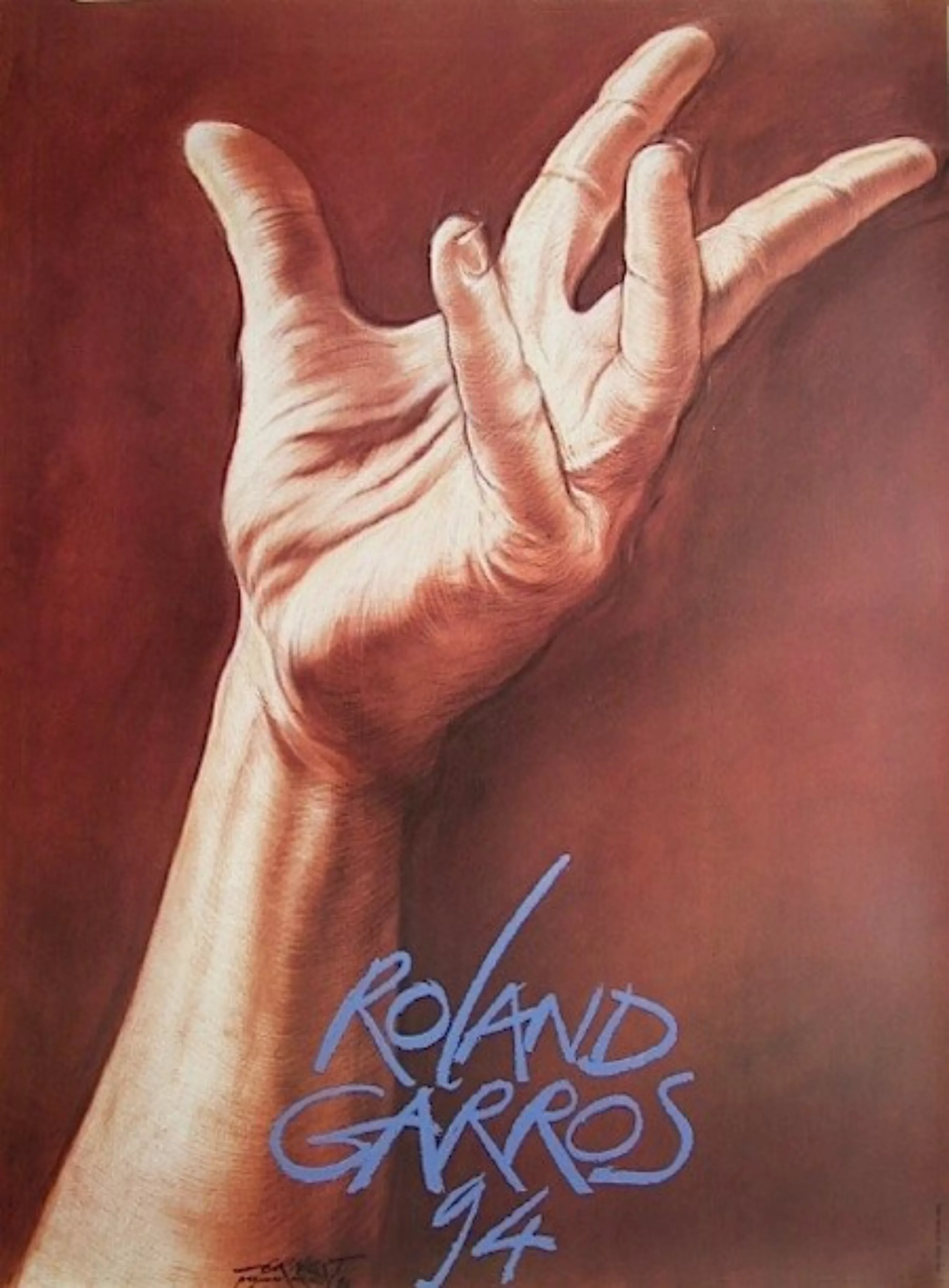
And my favorite is this gorgeous haircut !


On the subject
-
New logo for OM: analyzing a sports crest
OM will soon be changing its logo. This is an opportunity to delve into 125 years of heritage to understand the challenges of the future.
-
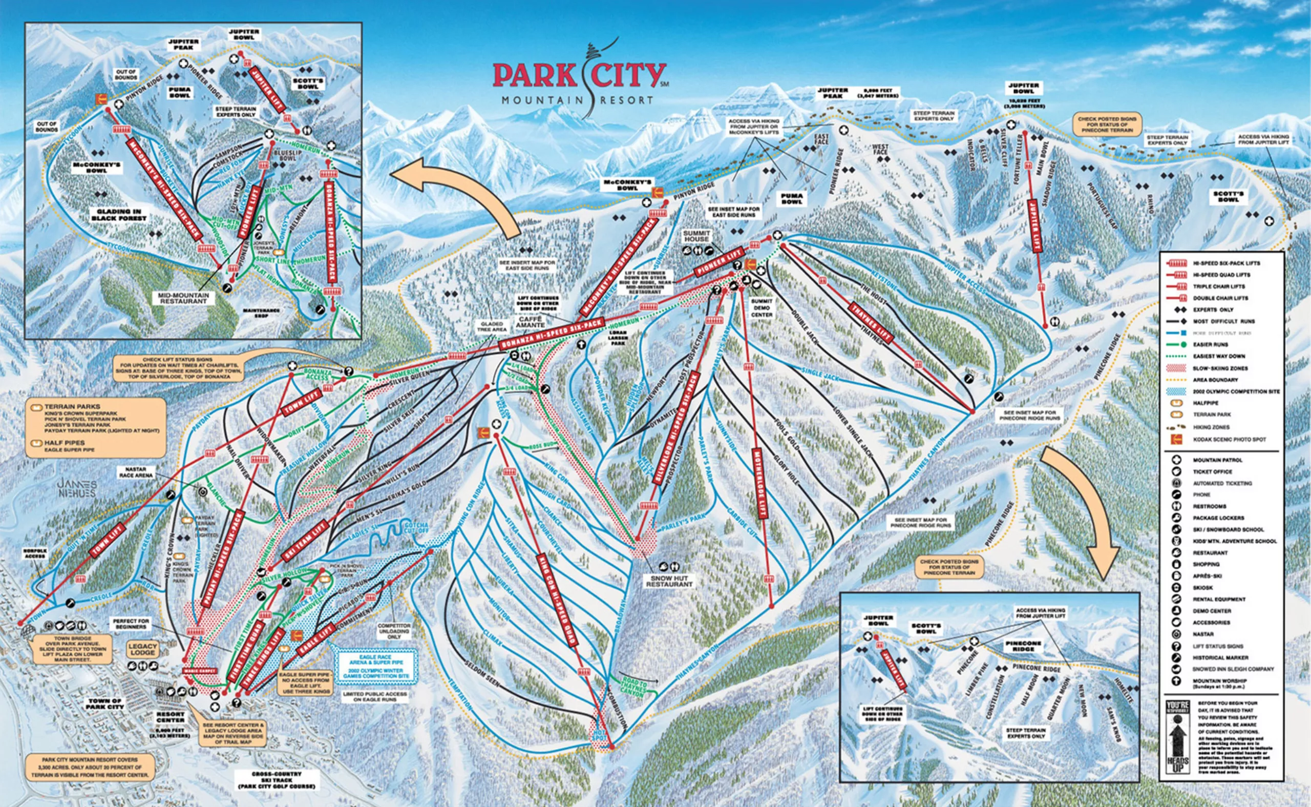
Ski trail map designer: such a cool job!
A rare profession just as the yeti: ski trail designer. Without knowing it, you’ve most probably already seen Novat’s or Nieuhe’s works.