Zuzana Licko, pioneer of digital typography
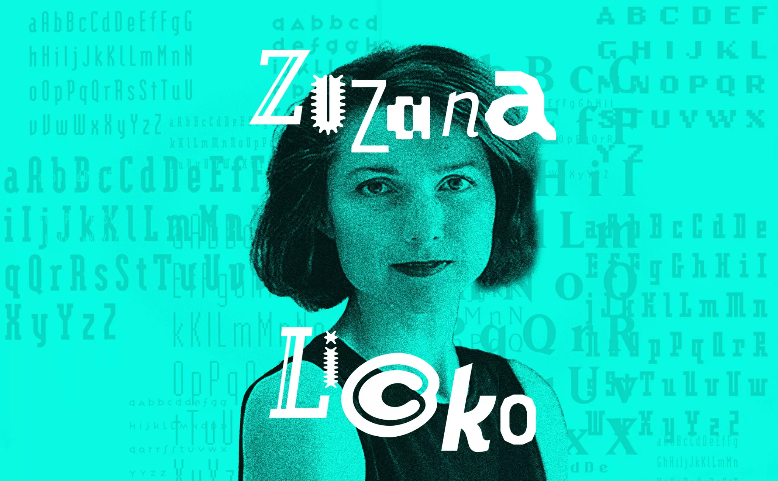
In the 1980s in the USA, an American-Slovak woman revolutionized the landscape of typography, and more specifically of digital typography: Zuzana Licko (born 1961). An avant-gardist, she played with pixels on the first Macs and designed emblematic typefaces.
1984, the digital revolution is just beginning
The digital revolution really begins in 1984. Ridley Scott’s now legendary Apple commercial, a pastiche of Orwell’s “1984”, was broadcast just once to 90 million American viewers: on January 22, during the third quarter of the 18th Super Bowl. The film’s ending prophesied: “On January 24, Apple Computer will launch the Macintosh. And you’ll see why 1984 won’t be like 1984!” An athlete projected a mace in the middle of a screen at a propaganda meeting.
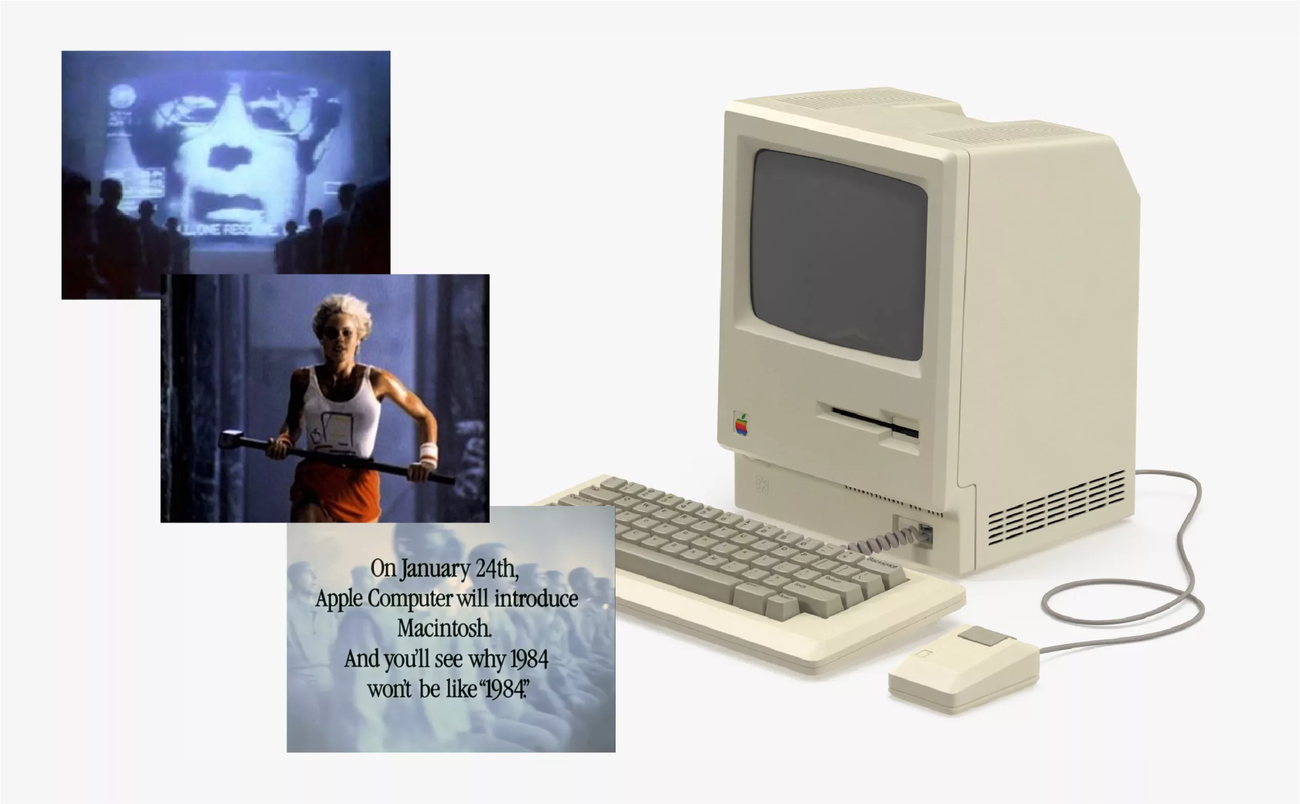
Legend has it that Zuzana Licko saw this advert for the Macintosh 128K (128 kB RAM!!!). But just a few months later, the most famous American digital typography designer was also about to shatter the still confidential field of typeface design, reserved for a small circle of initiates.
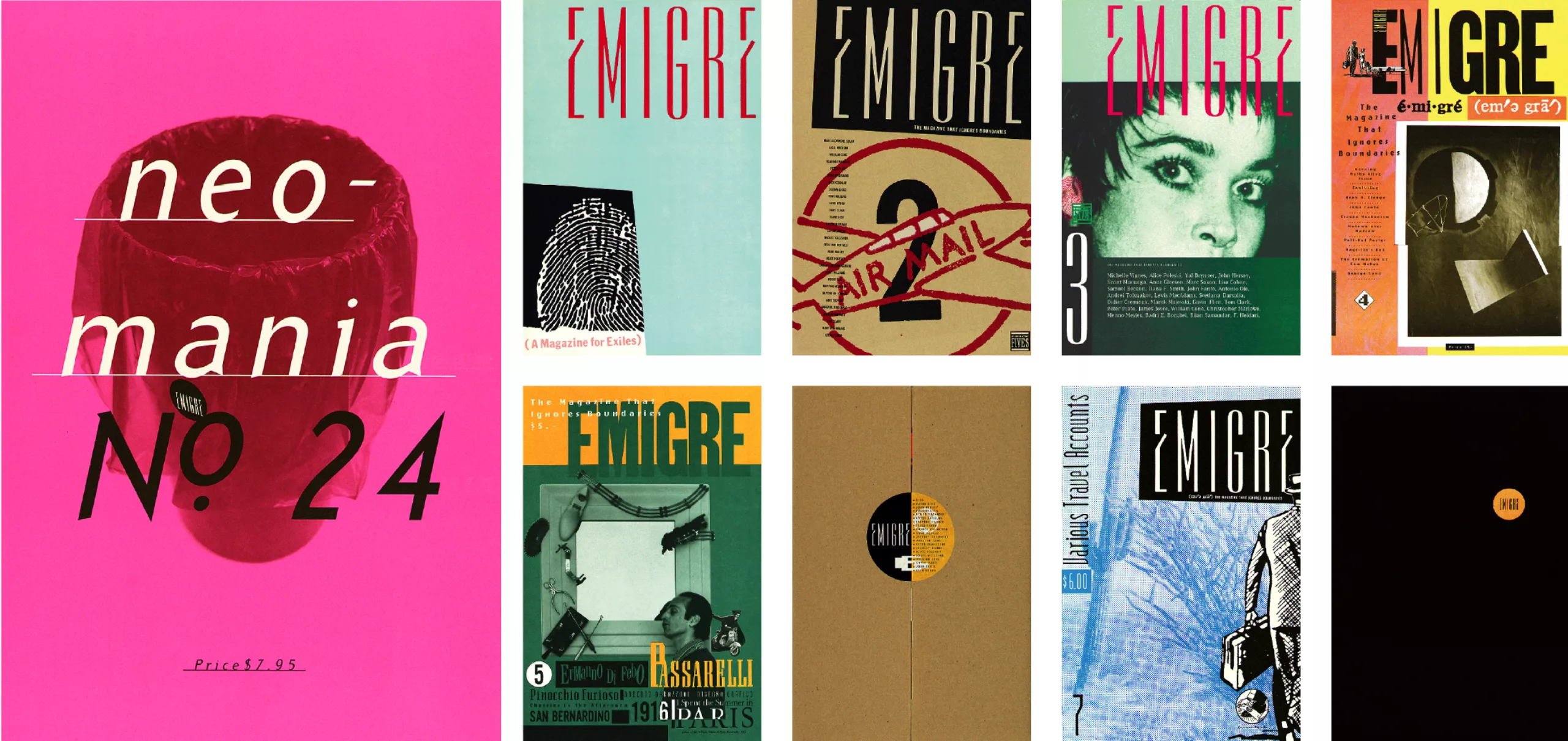
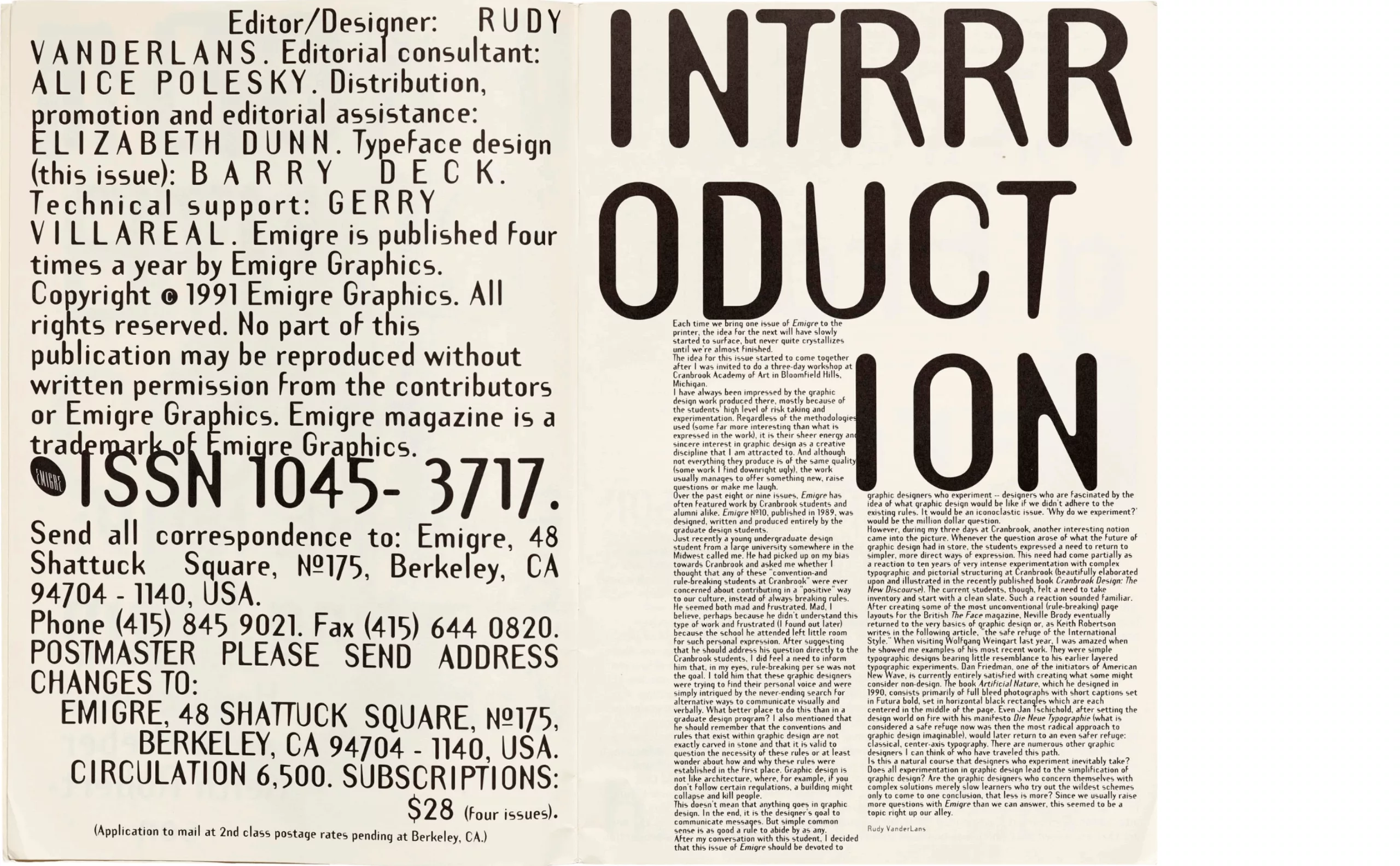
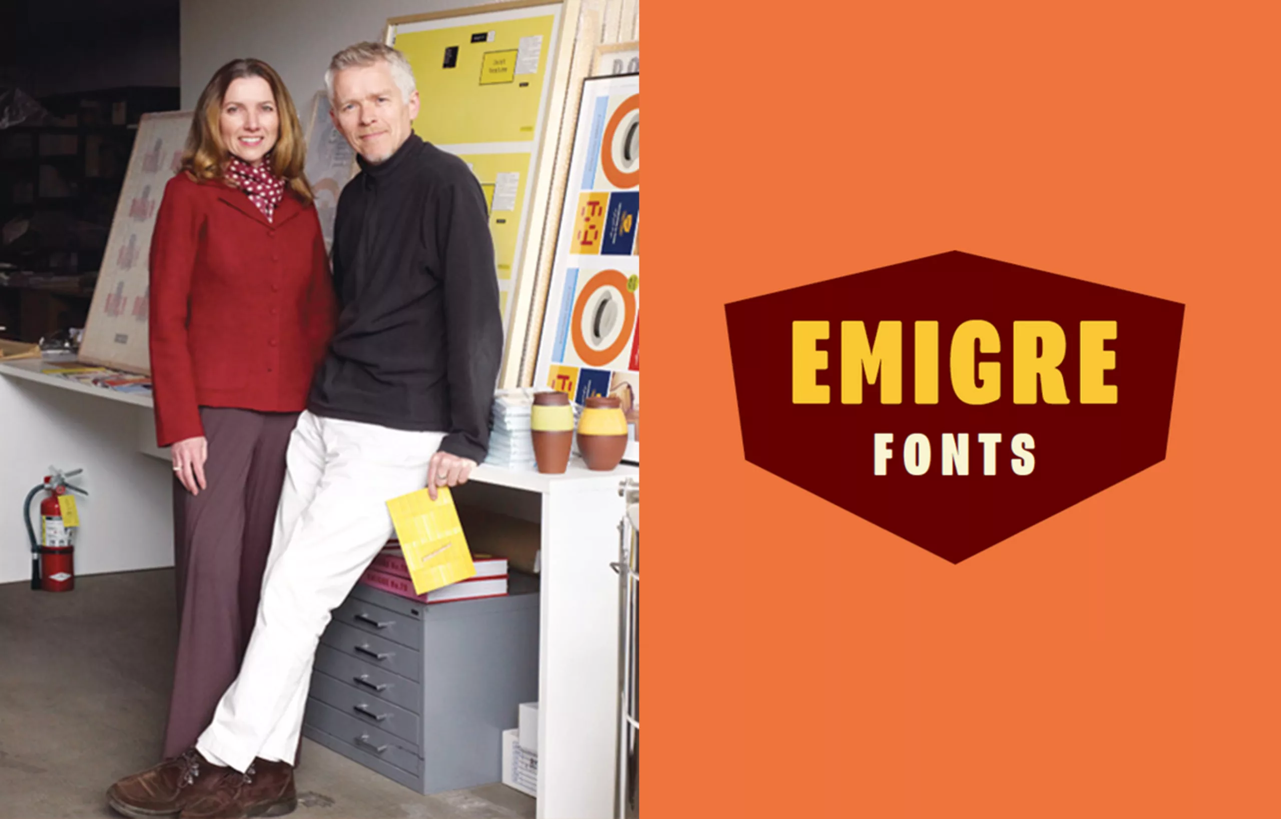
At the time, few graphic designers embarked on the digital adventure. In 1984, Zuzana Licko (pronounced Litchko) and Rudy VanderLands (a native of the Netherlands) created a type foundry that would become legendary for the next 20 years, Emigre Graphics. The first time Zuzana Licko uses a Macintosh is to lay out Emigre Magazine launched by her partner Rudy VanderLands and two other Dutch artists. After a few issues, Emigre evolved from an artistic “fanzine” into an innovative, experimental graphic medium. Both will say that “type design is a wonderful craft that allows us to simultaneously exercise our personal quirks, our technological obsessions and our cultural heritage.”
Each issue is built around a unique theme. Everything is revisited and graphically customized.
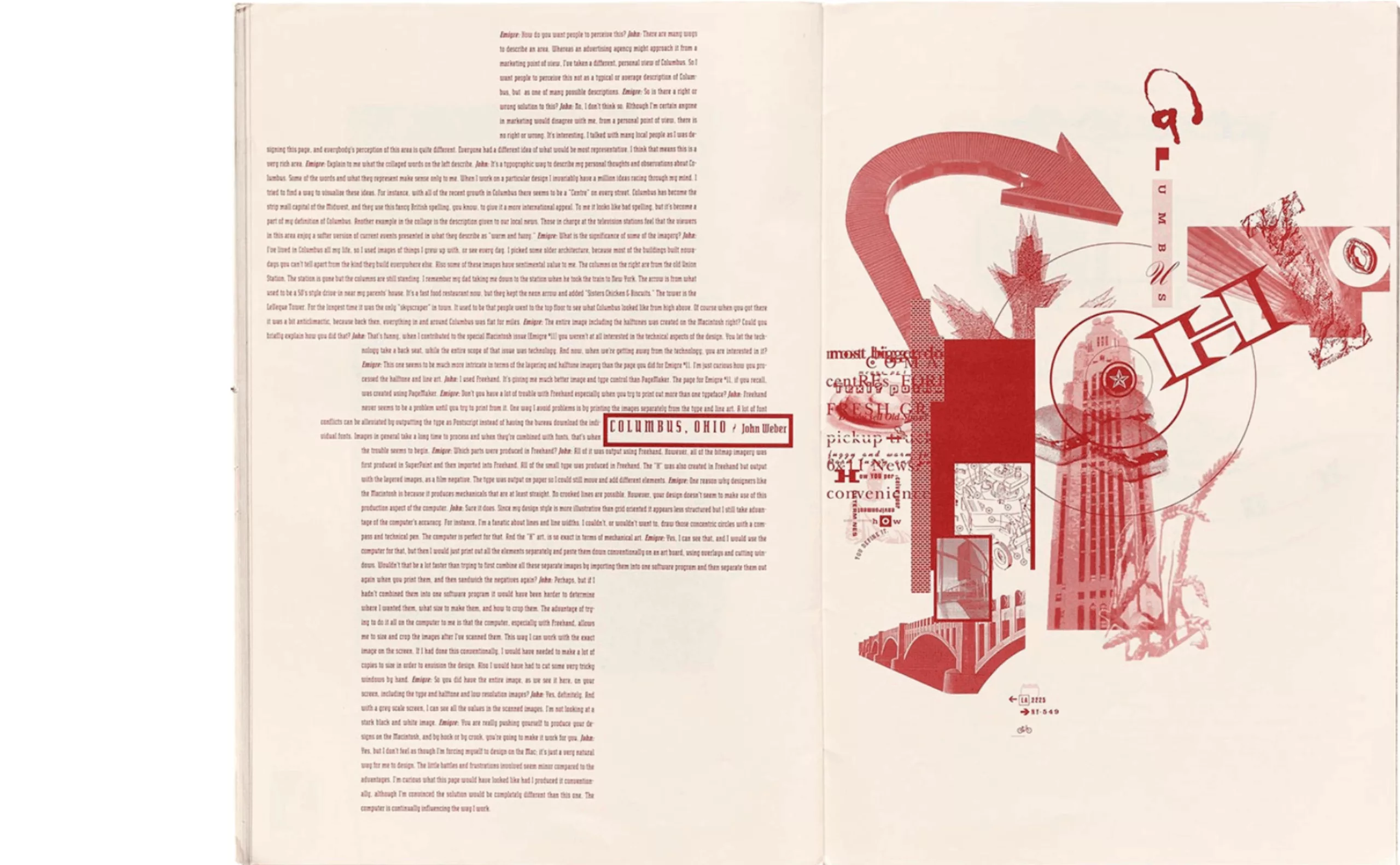
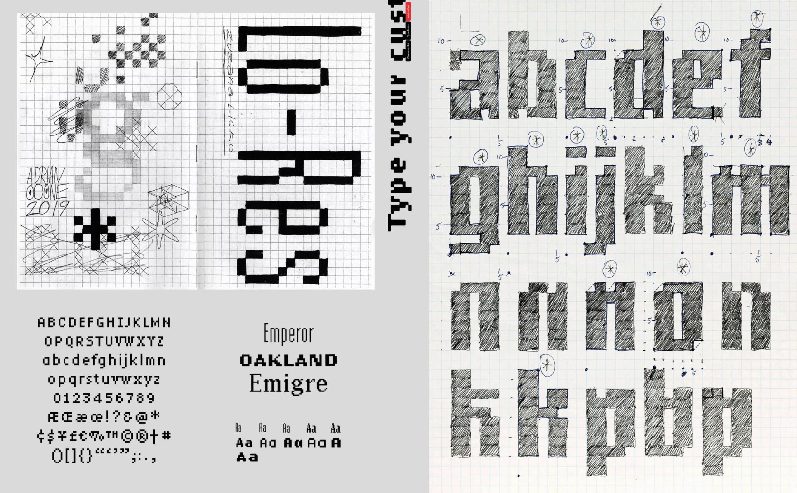
At the time, photocomposition was still expensive. So it was by “tinkering” directly on a “primitive” Mac that Zuzana explored these new territories. “When I started creating bitmap fonts for Macintosh in 1984, it was a purely experimental venture. I had no customers for these fonts, nor did I intend to develop a type foundry. It was Emigre magazine that opened up these possibilities for me.” The low-resolution typefaces were printed on an ImageWriter matrix printer, then reduced using a stat camera. Licko is a major figure in digital graphics alongside Susan Kare, featured in this article, who for his part set about creating the first icons and emojis to humanize the Apple company’s computers.
Emigre magazine’s digital typography empire
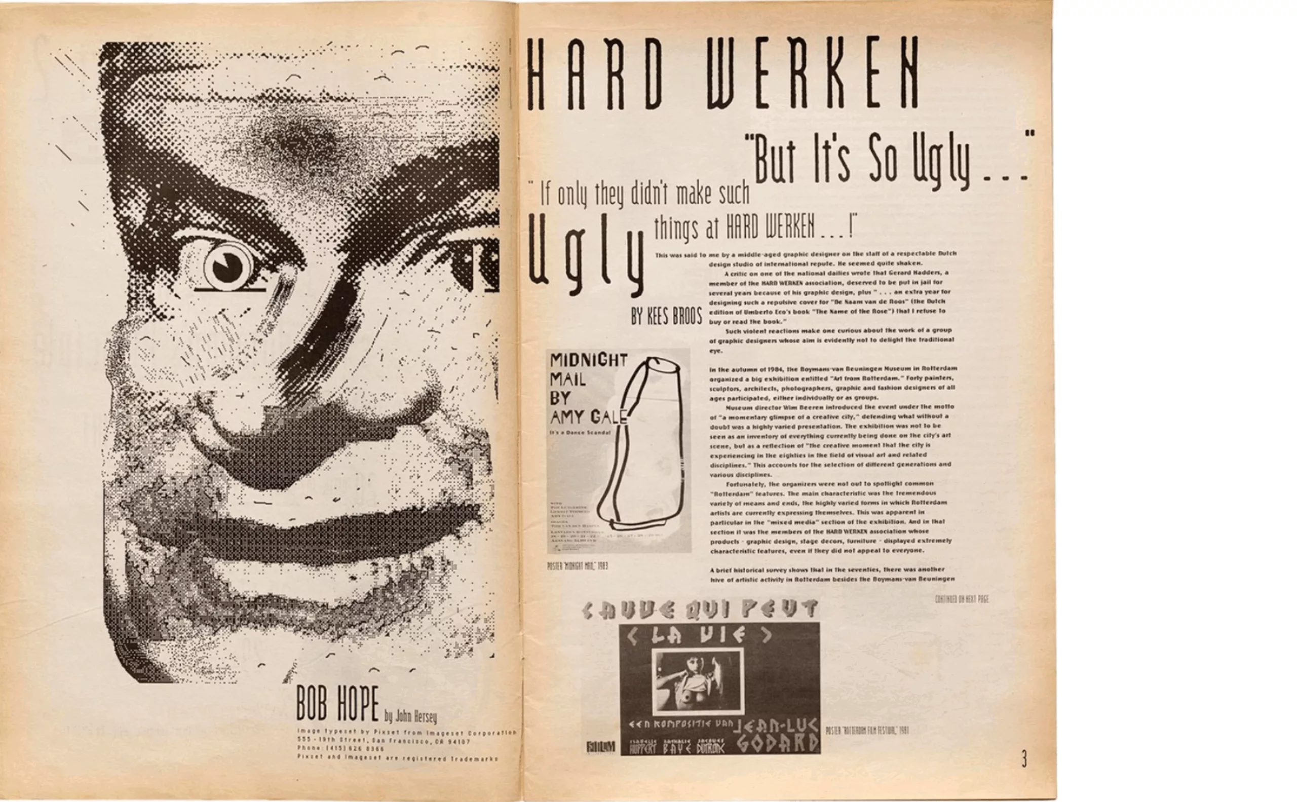
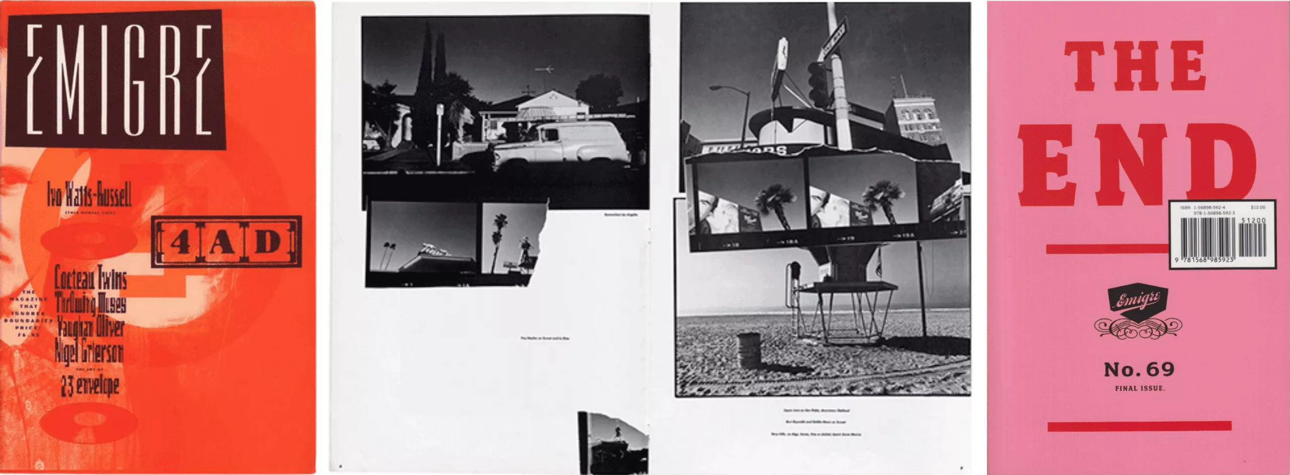
In the mid-1980s, computers were not widely used, and few graphic designers dared to venture into what was beginning to be called DTP (Desktop Publishing). Gradually, external demand became more specific. Avant-garde, “postmodern” creators like David Carson began to emerge. “Do you sell the original typefaces featured in the magazine?” This is how the foundry was born, with fonts on floppy disks sent by mail.
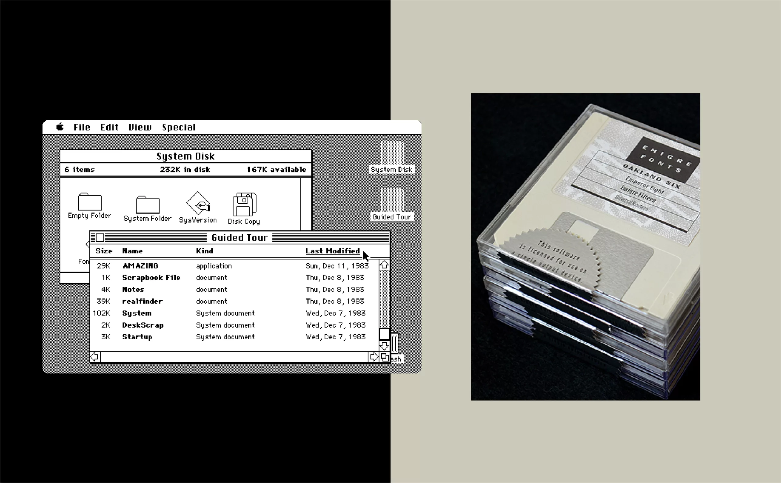
It was through the distribution of the magazine, rather than through the usual channels of recognition such as competitions and awards, that the visibility and appeal of Zuzana Licko and Rudy VanderLans’ work gained international traction—sparking both controversy and jealousy. All these typefaces, adapted to the low resolution of screens and early printers, would later be grouped under the Lo-Res family.
This was a time when major foundries were often content to simply digitize classic typefaces. For a while, Emigre was the only foundry creating original typefaces for Macintosh.
Then, starting in 1989, other digital type designers joined the duo. Around twenty of them would go on to enrich the catalog. Barry Deck with Arbitrary and Template Gothic, Jeffery Keedy with Keedy Sans. Barry Deck expressed the spirit of those early days: “What interests me in a typeface is that it’s not perfect, not precise. A typeface that better reflects the imperfect language of an imperfect world inhabited by imperfect beings.”
Zuzana Licko quickly brushed aside the question of the readability of her bitmap fonts. One phrase has endured as a testament to the changing times: “People read best what they read most.” A phrase that likely remains the only valid rule when it comes to the cultural parameters of text legibility.
After the early bitmap fonts came vector fonts (Citizen, Matrix II, Totally Gothic) and geometric fonts (Modula, Lunatix, Variex…), followed by more sophisticated and conceptual typefaces like Triplex, a humanist sans serif that felt friendlier than Helvetica. Today, several logos use Zuzana Licko’s typefaces, such as the brands Shiva, mk2, and Baskin Robbins, which keep Modula, Matrix II, and Variex alive.
For 23 years, from 1984 to 2005, Zuzana Licko and Rudy VanderLans published 69 issues of Emigre Magazine, which remains a testament to a period overflowing with creativity.
Mrs Eaves, a tribute to the woman and the typefaces of Baskerville
After the experimental early years and the technological advancement of tools (notably the Fontographer software), Zuzana Licko began revisiting several great classics of typography. This was a time when some designers harshly criticized Emigre’s creations for their perceived lack of refinement and harmony. Leading the charge, Massimo Vignelli described Emigre fonts as “garbage, lacking depth, refinement, elegance, and a sense of history”!
Then came the 1990s and the creation of Mrs Eaves, which remains to this day the foundry’s greatest commercial success. A reinterpretation of John Baskerville’s Baskerville (1750). Zuzana Licko approached this revival by drawing the typeface from memory, letting her impressions of the various versions of Baskerville rise to the surface—a method suggested by Erik Spiekermann. Today, you can see Eaves in the WordPress logo, for example.
What are the characteristics of Mrs Eaves? Less contrast between thick and thin strokes, a significant size difference between lowercase and uppercase letters, and increased letterspacing. Due to its relatively wide proportions compared to the original Baskerville, Mrs Eaves is well-suited for short texts. It encourages a slower, more deliberate reading pace.
But where does the name Mrs Eaves come from? The question has been asked a thousand times. Zuzana Licko wanted to pay tribute to Sarah Eaves, John Baskerville’s young housekeeper who became his second wife and carried on his work after his death. It’s a small detail, but one that speaks volumes about the “relative” place of women in typography. The widows of Caslon and Bodoni, the daughters of Fournier—all contributed to preserving and promoting the work of men. In 2009, she created Mr Eaves, the sans-serif companion to Mrs Eaves.
Another reinterpretation in the same year was Filosofia, a geometric Bodoni whose gently rounded, slightly curved serifs often appear in printed specimens of Bodoni’s work. Compared to many digital Bodonis, Filosofia is sturdier and less high-contrast. After studying various specimens, she drew her version of Bodoni from memory—just like with Mrs Eaves—“recovering a process of transcription.”
From the beginning, Zuzana Licko has used Fontographer and Robofog, a special version of Fontographer that supports the Python language. The work is primarily done on screen, although some corrections require pencil sketches on paper.
In 2006, the 10 best-selling Emigre fonts were Mrs Eaves, followed by Vista Sans, Cholla, Dalliance, Filosofia, Fairplex, Priori, Matrix, Solex, and Tarzana. Today, the Emigre catalog still includes more than 300 typefaces.
Tarzana, a symbolic ε
How could we not mention Tarzana, created in 1998, which was a major success in early 21st-century press and branding? It holds a special place in Graphéine’s heart: it traces back to both the origins of the Duperré School and its former logo, where the epsilon (ε) would later feature in the first identity of Graphεine, in homage to the school and to Hervé Aracil, a former teacher of the agency’s two founders and a passionate admirer of Licko’s work.
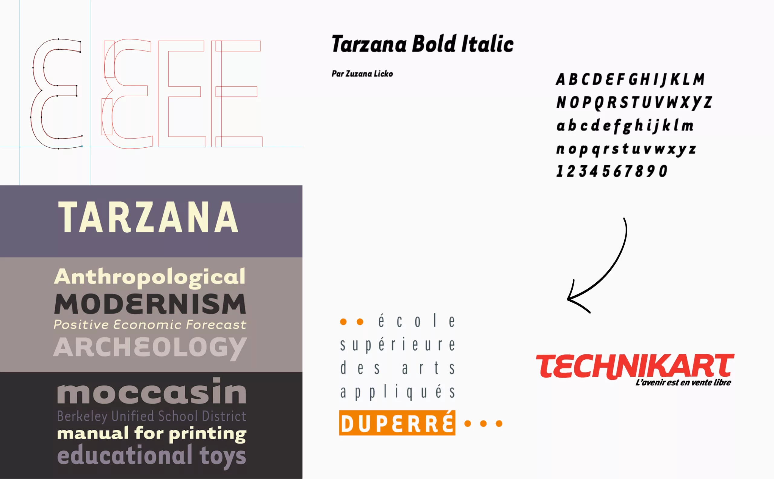
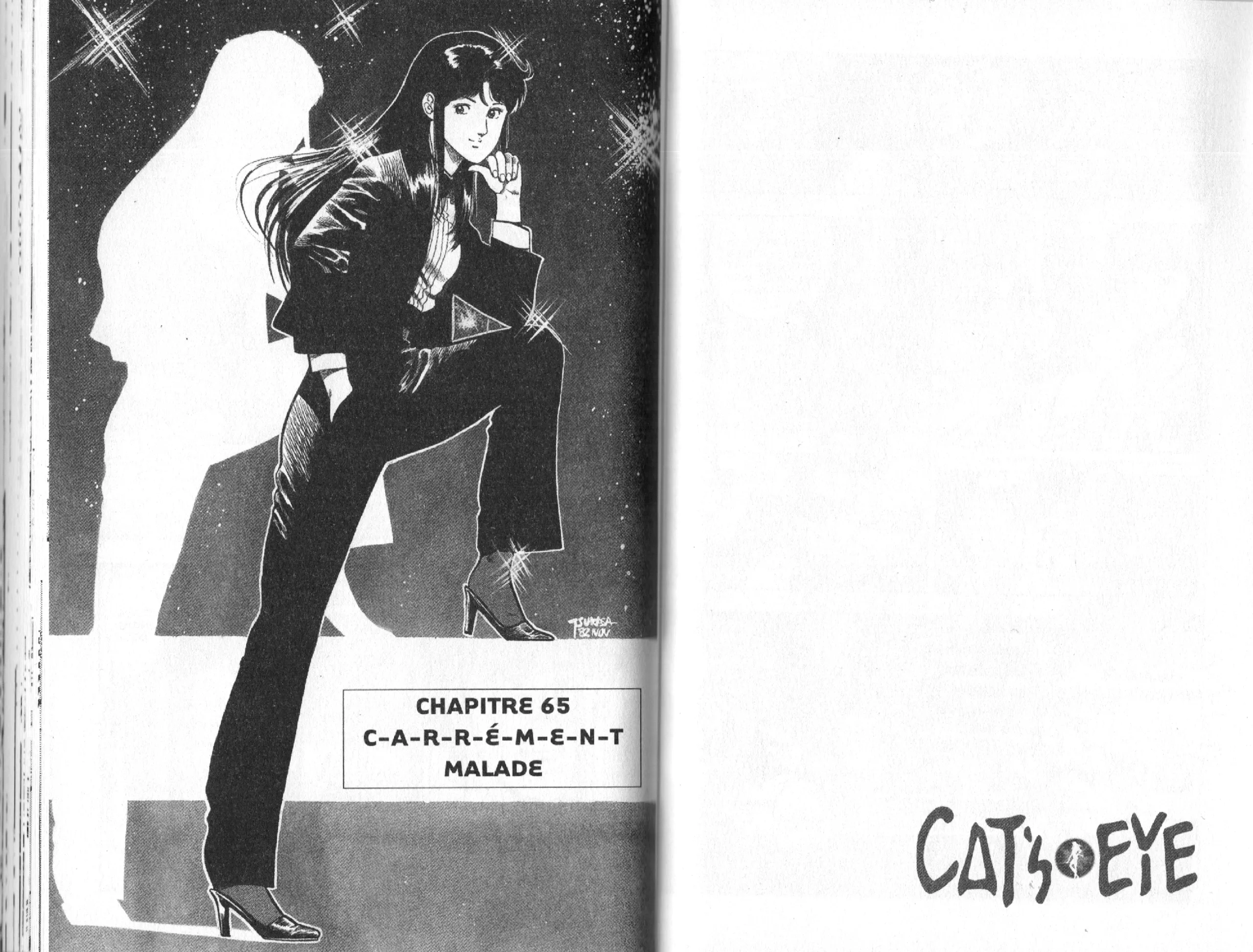
We were also recently surprised to find the Tarzana typeface in… the manga *Cat’s Eye*!
Zuzana Licko has often revisited the unusual and intriguing style of Tarzana.
“The design process for Tarzana was a visual editing process; it was about eliminating overly familiar ideas and absorbing new ones without compromising legibility. Often, a particular decision raised more questions than it answered, and altering one character often led to reworking a whole set of related characters.”
By working on the roman and italic simultaneously, Zuzana Licko created a play of resonances that gives Tarzana its unique character. The rounded capital ε, the arm of the R and K, or the asymmetry of the Y develop principles that would reappear in many typefaces of the 2000s and 2010s.
Ceramics and type design
In the mid-1990s, she took up ceramics, initially as a hobby to “take a break from the tedious aspects of typeface drawing.” A counterpoint that’s not so far removed from type design, since both disciplines are about creating visually and structurally balanced forms. One draws curves, hollows, and straight lines on a flat surface in search of harmony, the other brings those concepts into three-dimensional form.
In a talk given at Gallery 16 in San Francisco in June 2023, Zuzana Licko shared her approach to ceramics. Here are a few excerpts. One senses the same rigor, the same methodical thinking applied to working with clay:
“I’m often asked about my cone-shaped ceramic sculptures and their connection to my work in type design. I approached these sculptures much as I would a typeface. That is to say, creating a system of elements that can be combined and repeated in various configurations. With an alphabetic font, these combinations create words, but if the elements are abstract, they can form patterns.”
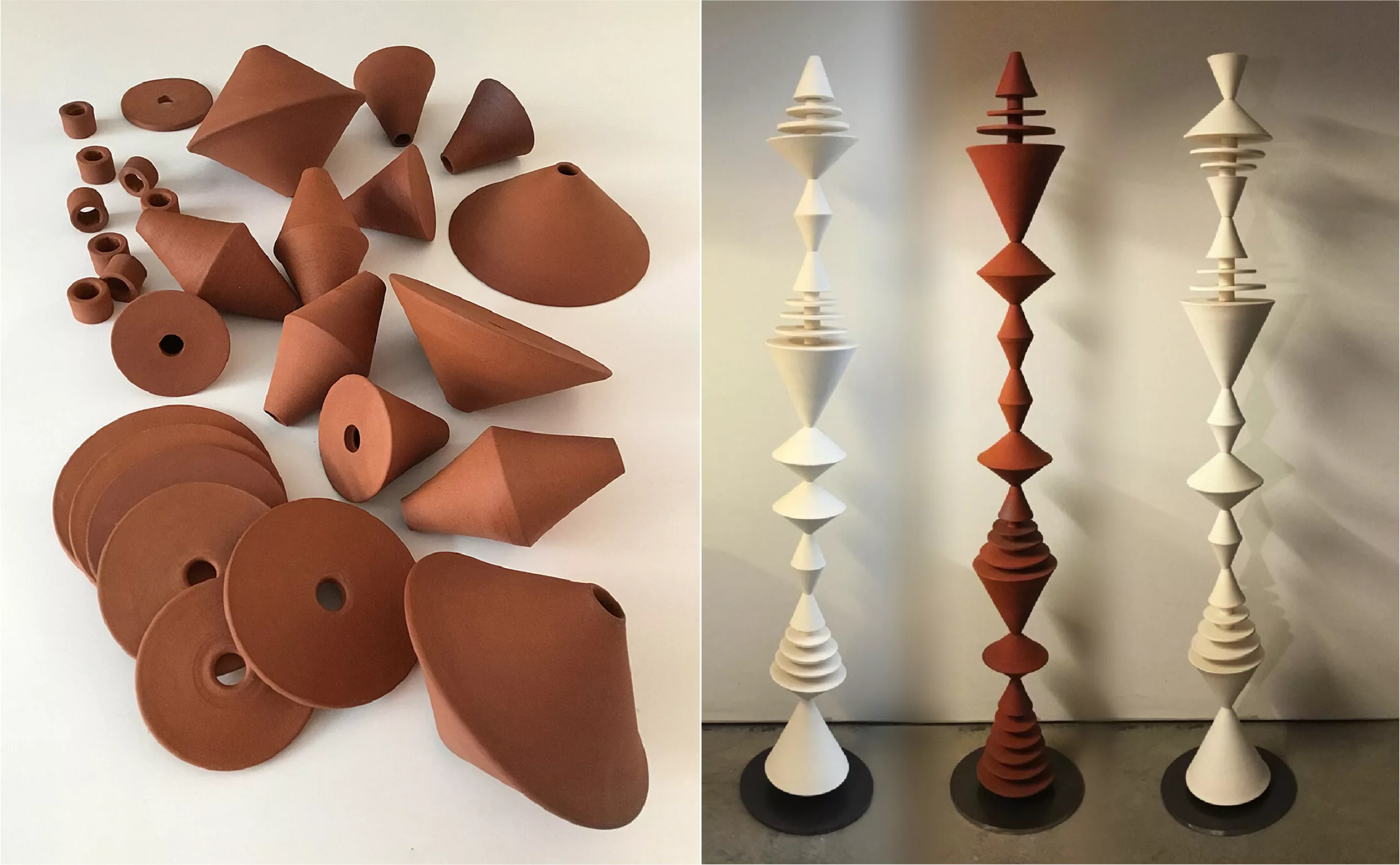
The process begins with establishing rules, because setting limits helps guide the thinking process. As you apply these rules, you quickly realize if they need to be adjusted or expanded. That’s why I like to start with very simple rules—so I began with a single straight line, drawn at specific angles. The next step was to translate these ideas into ceramic forms. Working on a potter’s wheel, as it spins, a diagonal line becomes a cone, and a horizontal line becomes a disc. I ended up with three cone shapes: small, medium, and large. The medium cone has a 45-degree angle, so the height is half the width. The small cone has the same height but is narrower. And the large one has the same width but is taller. […]
These elements are stacked on a metal support with a central rod—so it’s like stringing beads. […]”
Matthew Carter, the renowned American type designer (Georgia, Verdana, Charter, Cascade…), sums up the uniqueness of Zuzana Licko’s work: “Two ideas are present in her work: at the center of any study of typography is the typeface—not calligraphy, nor History. Legibility is not an intrinsic quality of a typeface, but something acquired through use.”
To that, one might add a sense of freedom. The freedom to create a typeface for a specific use, to design a typeface for the sheer joy of it. In the 1980s and 90s, Zuzana Licko pioneered a new approach to typography—freer, more creative, more personal. Forty years later, Emigre remains a key reference. The digital revolution has come and gone, and while the sophistication of modern type design has advanced tremendously, Emigre’s avant-gardism has gradually given way to a more classic foundry that has earned its place in design history.
And being one of the few internationally recognized women type designers?
“It’s not a problem being a woman in a man’s world. The issue is being a type designer in a world that gives little recognition to this form of art,” says Zuzana Licko.
To learn more:
We encourage you to visit the website Women in Type, which helps highlight the role of women in typography (site in English).
Zuzana Licko on Emigre
Emigre typefaces on Indexgrafik
The new primitives of graphic design
MyFonts – Creative Characters – June 2016
Étapes°172 September 2009 – Interview with Pascal Béjean
The most successful typefaces from the Emigre catalog are available on Adobe Fonts.
Design: François Chevret
Proofreading and visuals: Graphéine
On the subject
-
Debbie Millman: searching for the meaning of design
From consumer logos to social movements, Debbie Millman questions the meaning of design in society through her work.
-
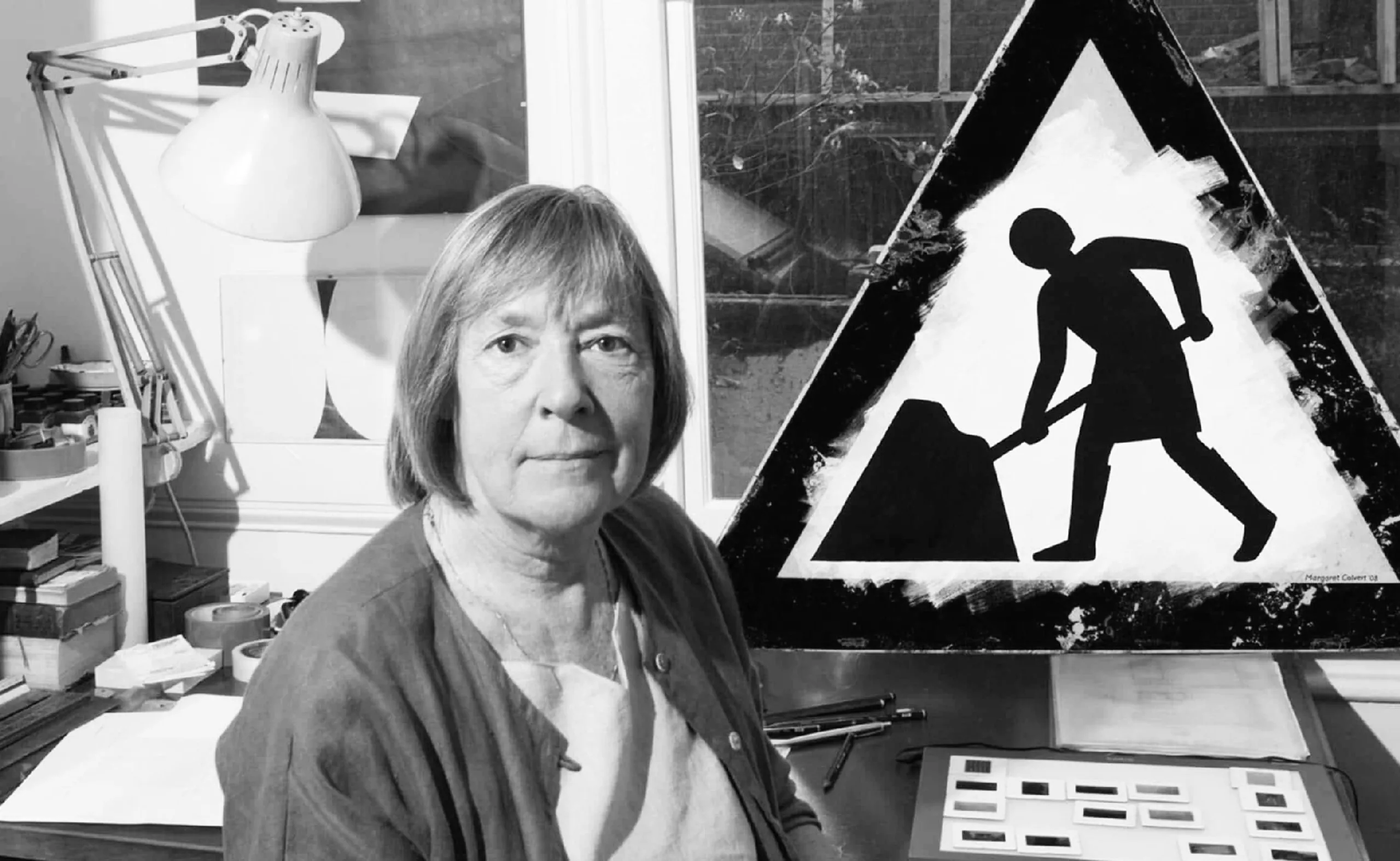
Margaret Calvert: woman at work! How design saved UK’s drivers.
By designing UK’s road signs, Margaret Calvert’s discreet work helped to save hundreds of thousands of lives in the United Kingdom.
-
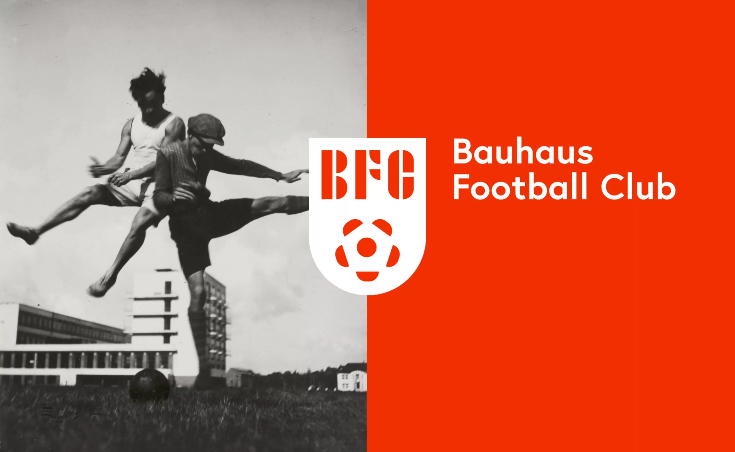
Bauhaus Football Club, the greatest design team of all time!
The Bauhaus Football Club, the story of the most beautiful design team in the world.
When the football world cup is a pretext to revise your classics…