fr
fr

Centre for French baroque music – Versailles

Promoting French music of the 17th and 18th centuries

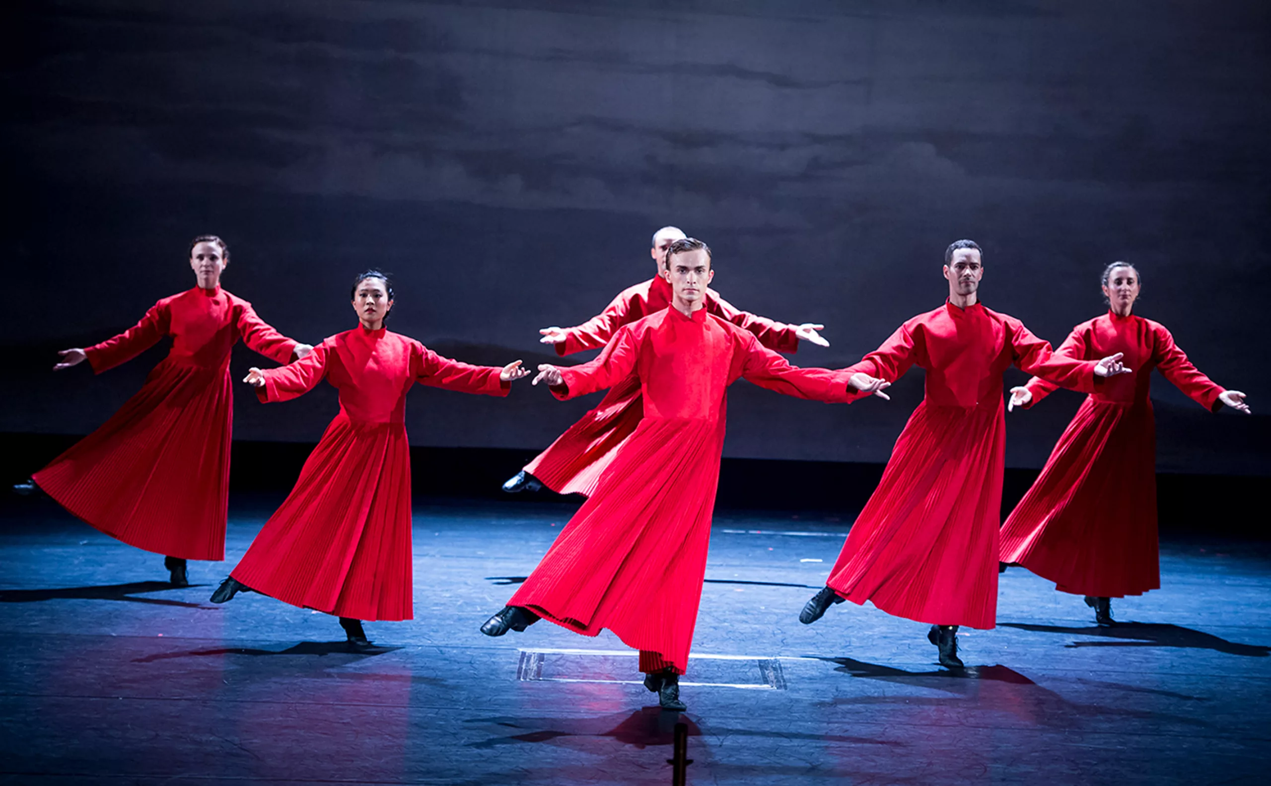
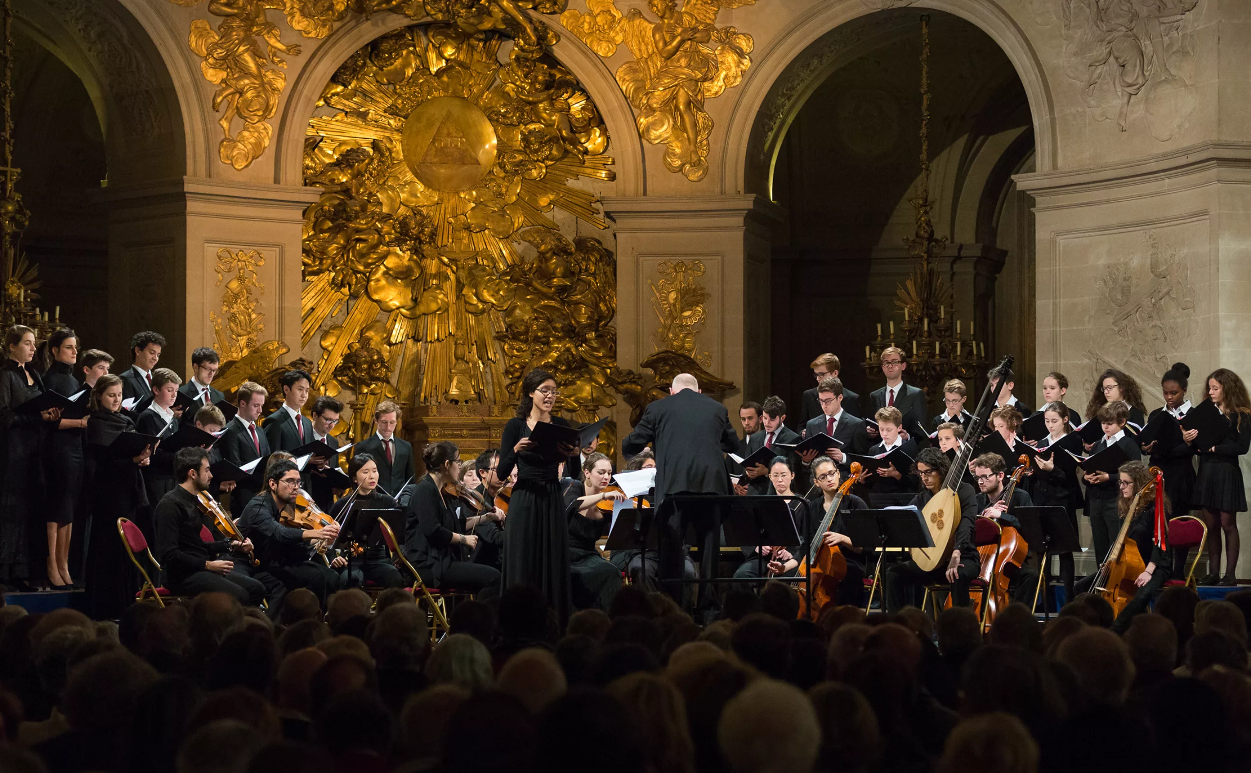
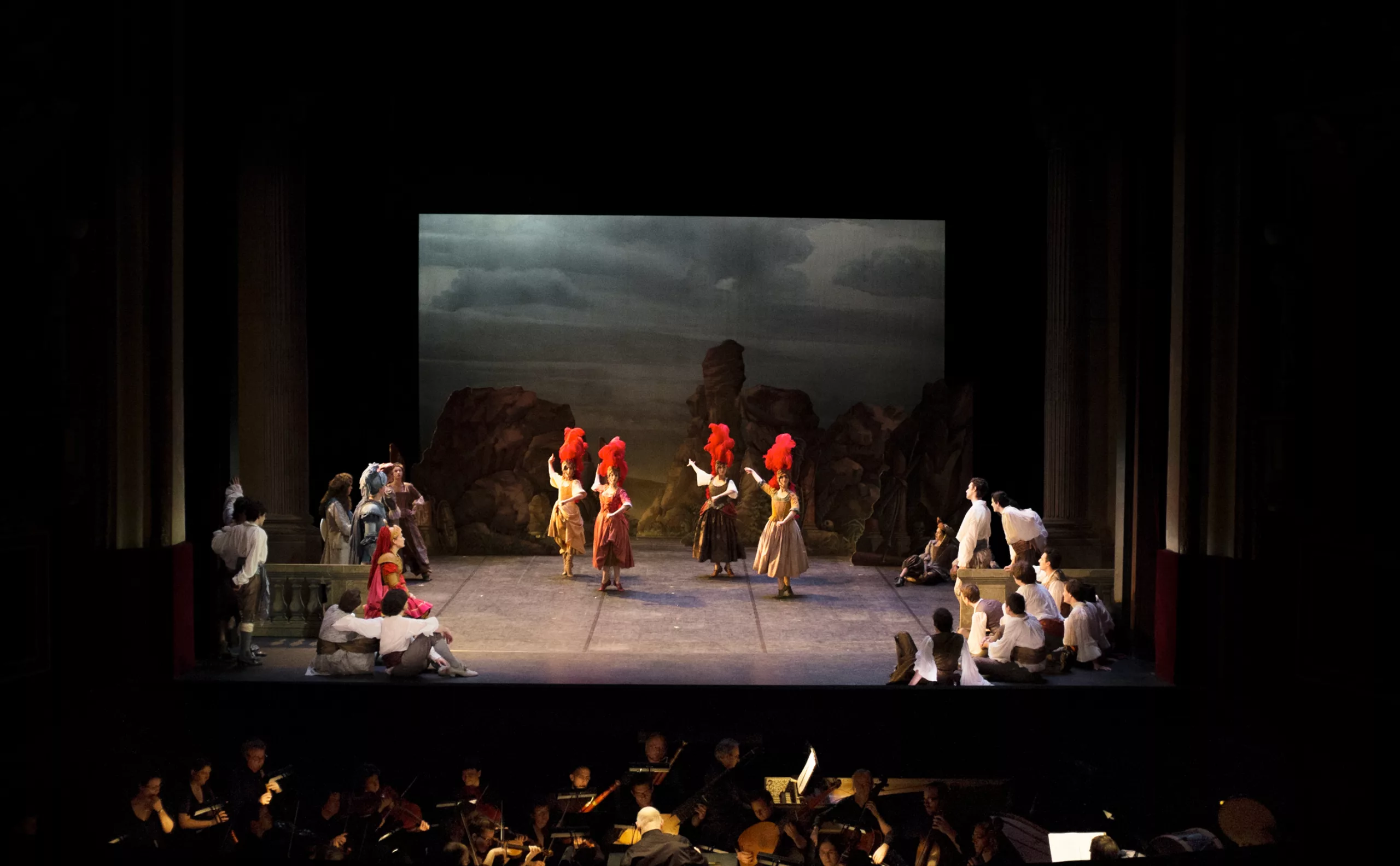
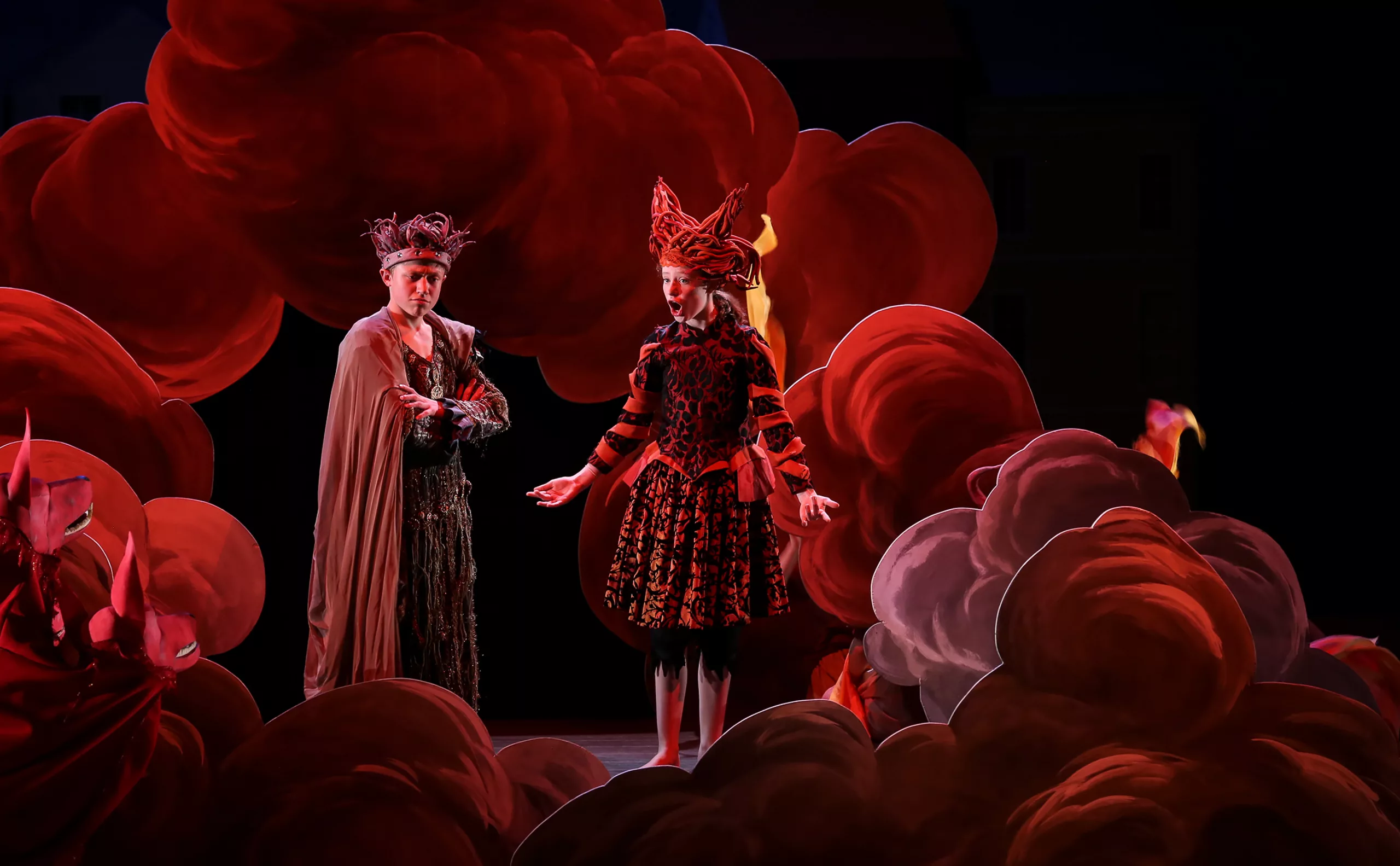
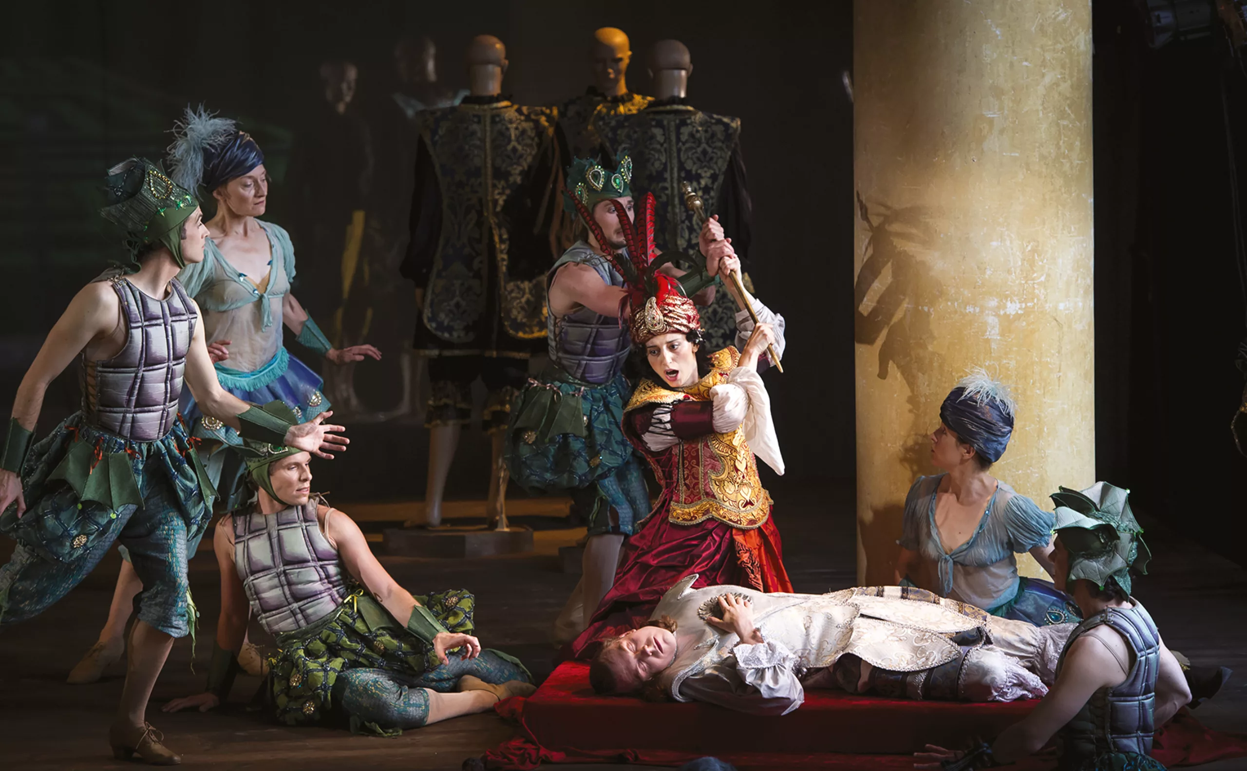
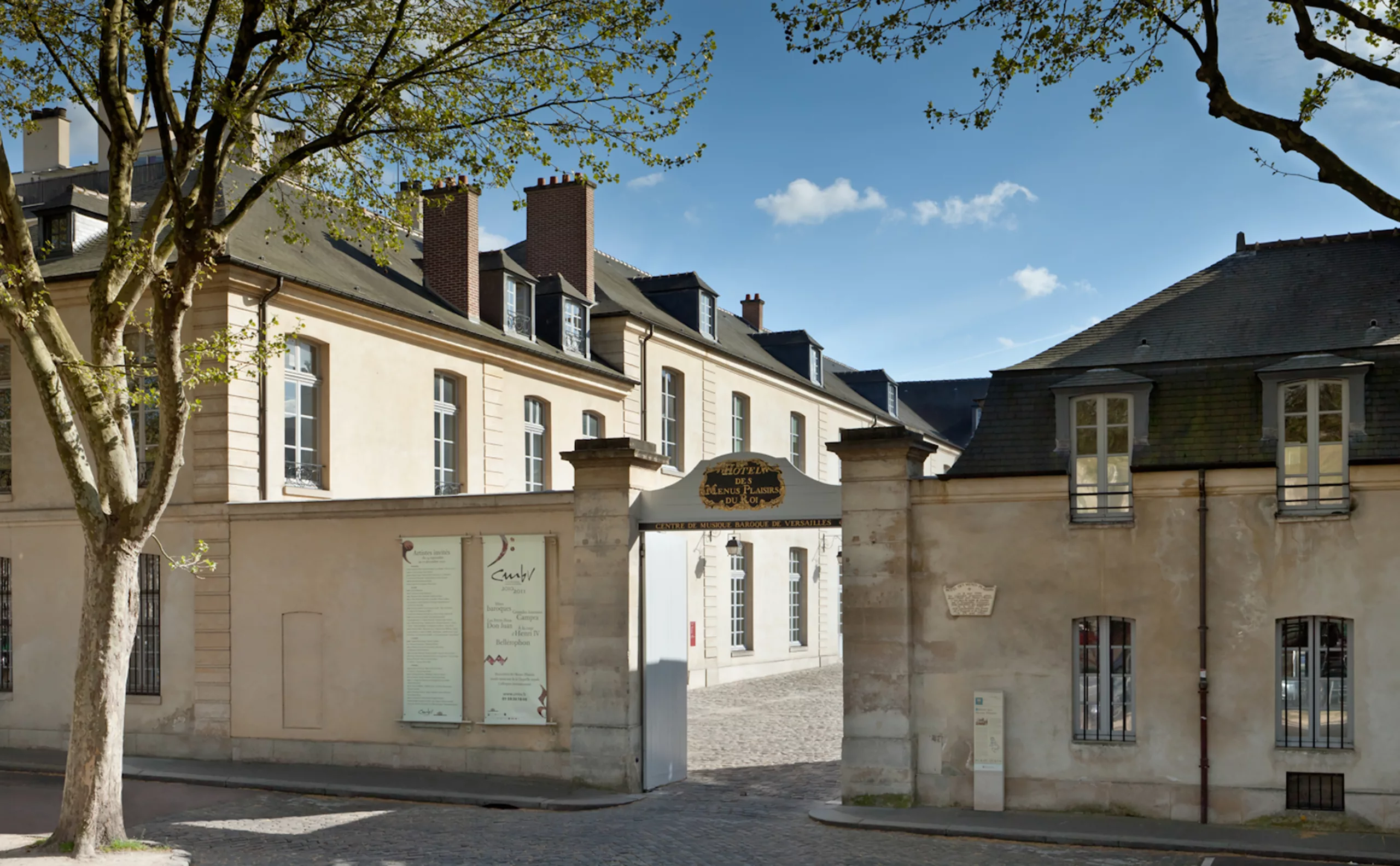
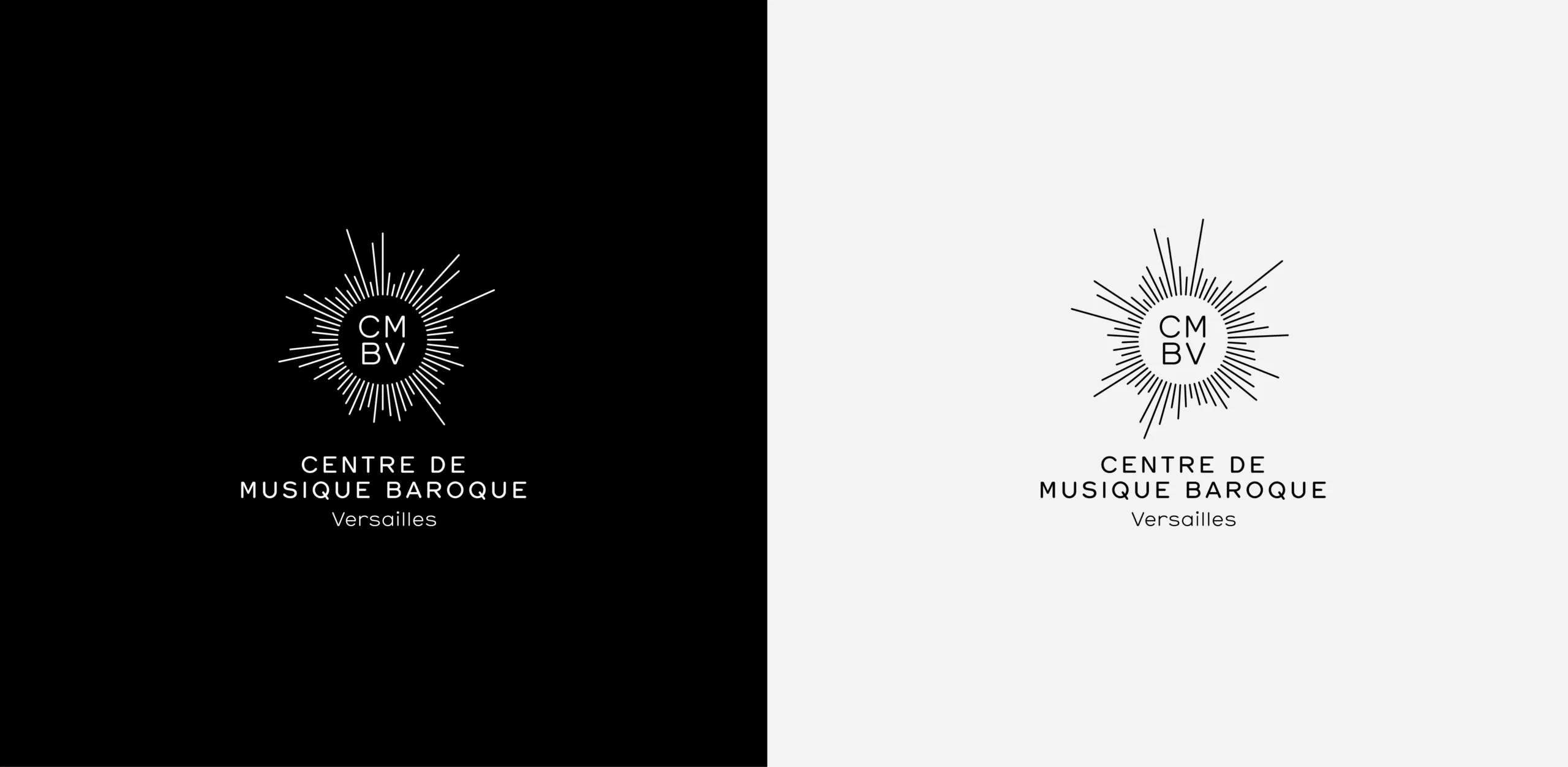
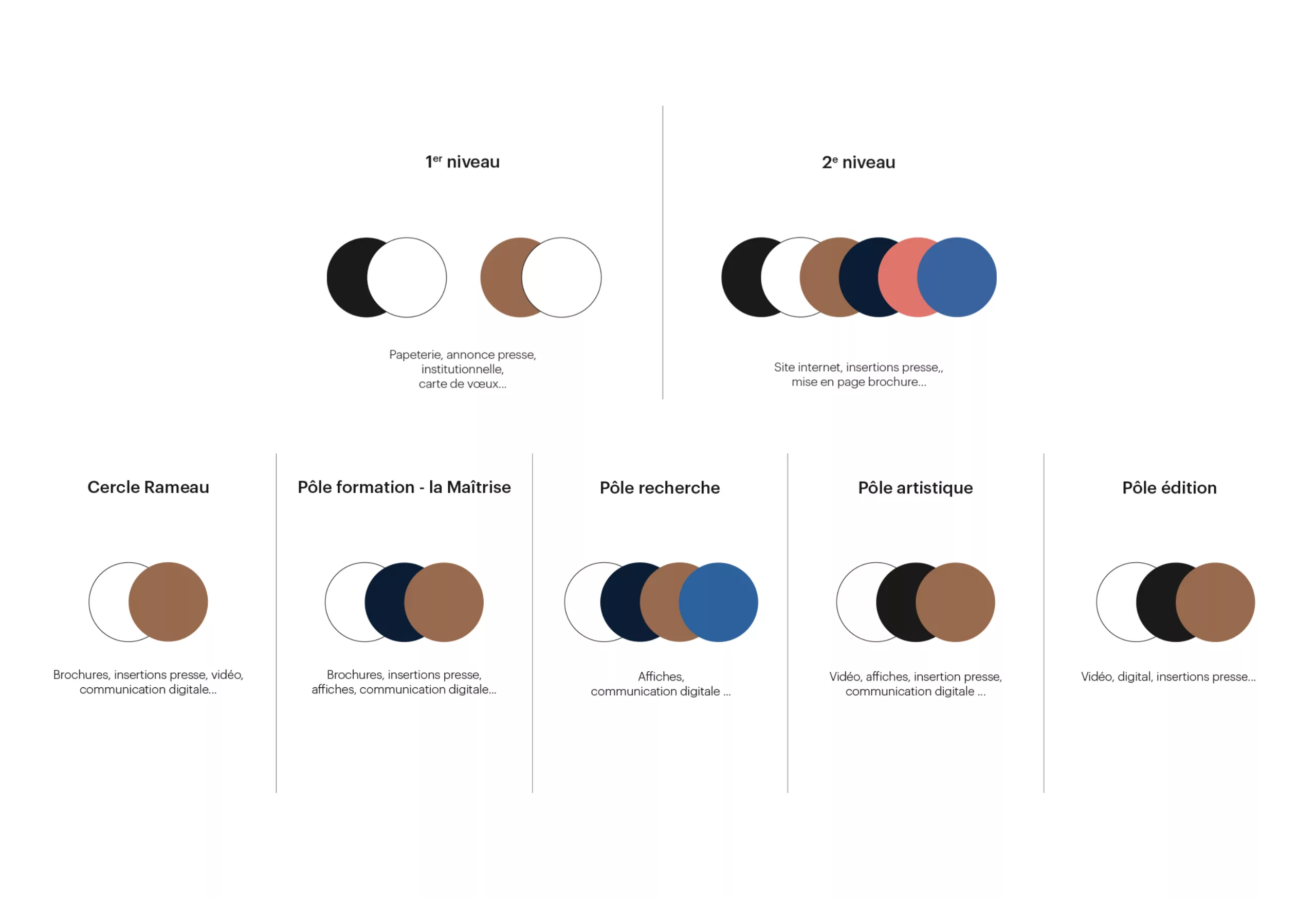
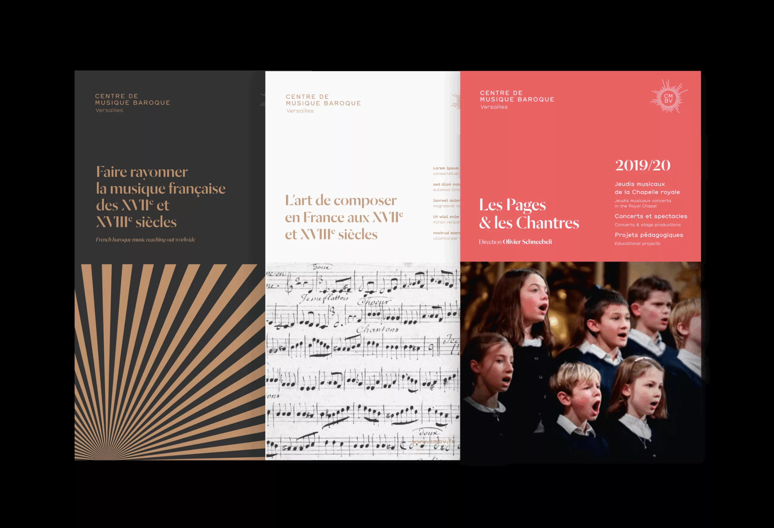
The Centre de musique baroque de Versailles is a unique institution in the world. Its mission is to rediscover and promote French music of the 17th and 18th centuries. The CMBV covers all the fields needed to promote French baroque music, including training (150 students), research (scientific publications and the organisation of symposia), the production of performances and a resource centre.

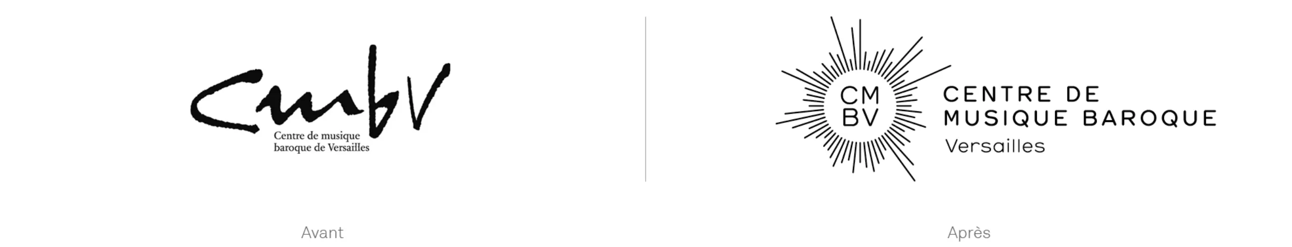
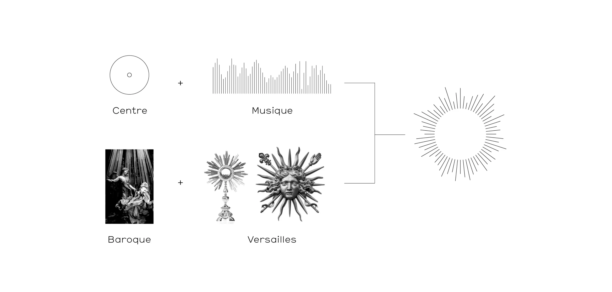
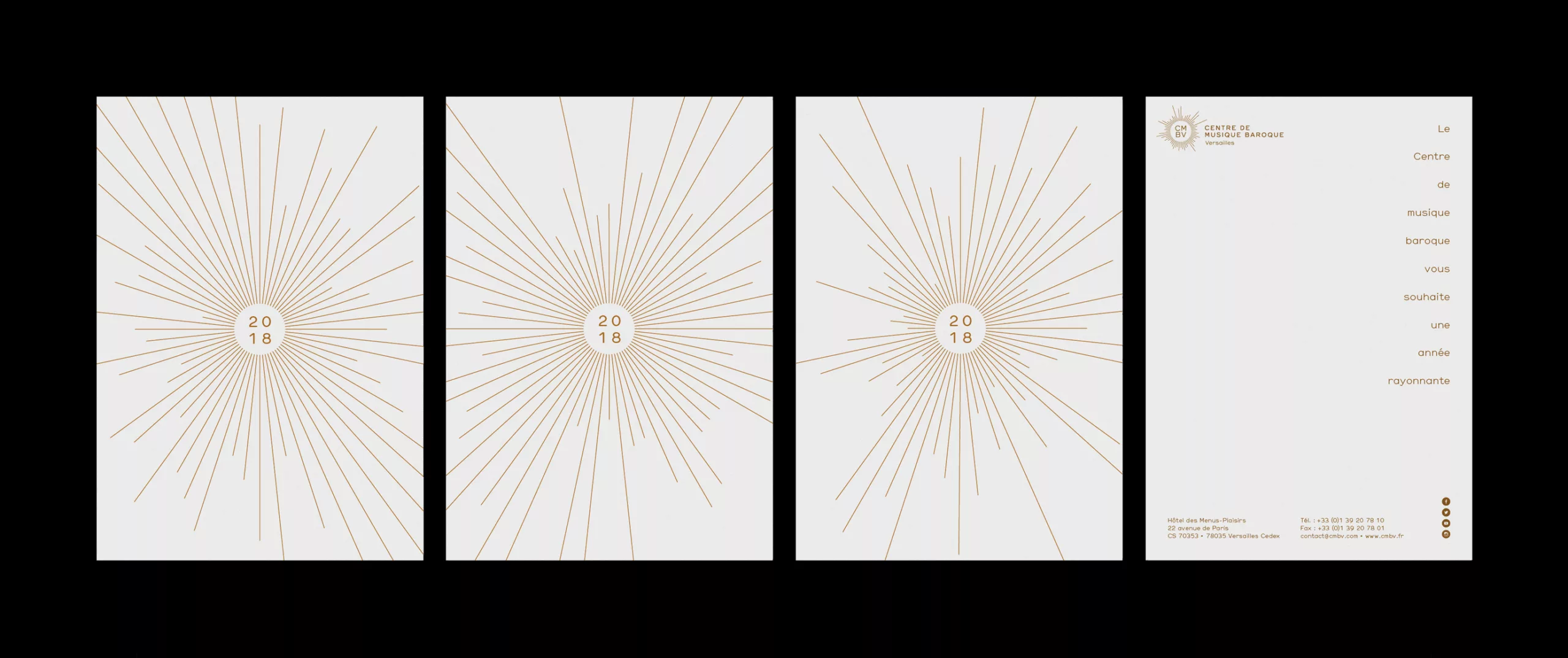
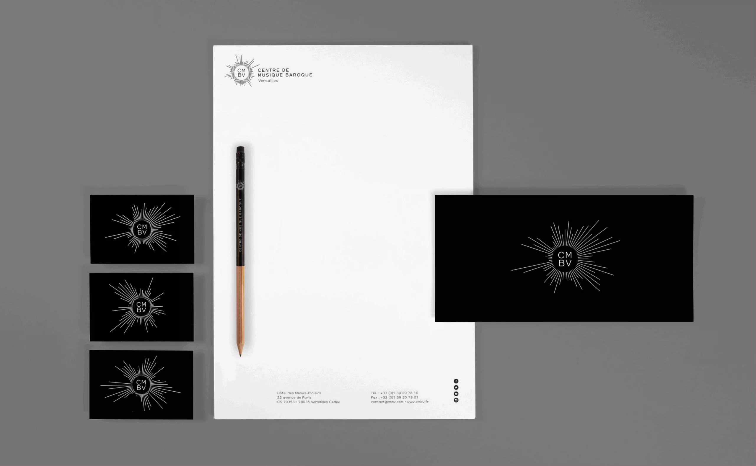
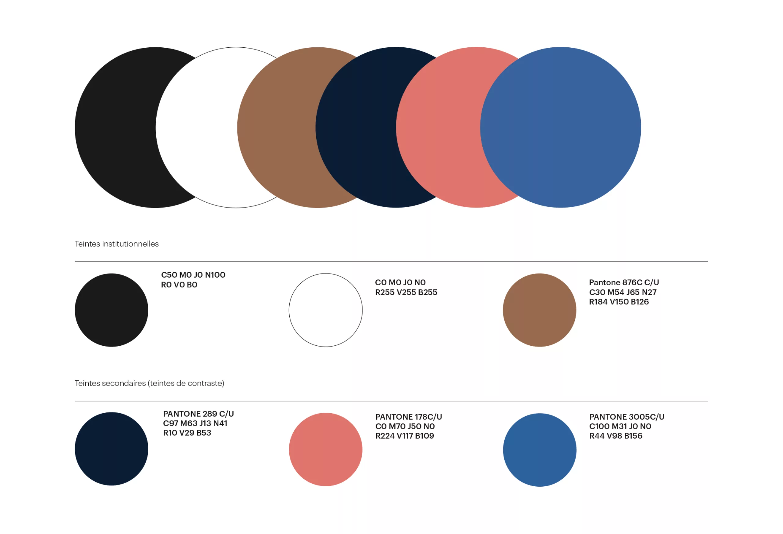
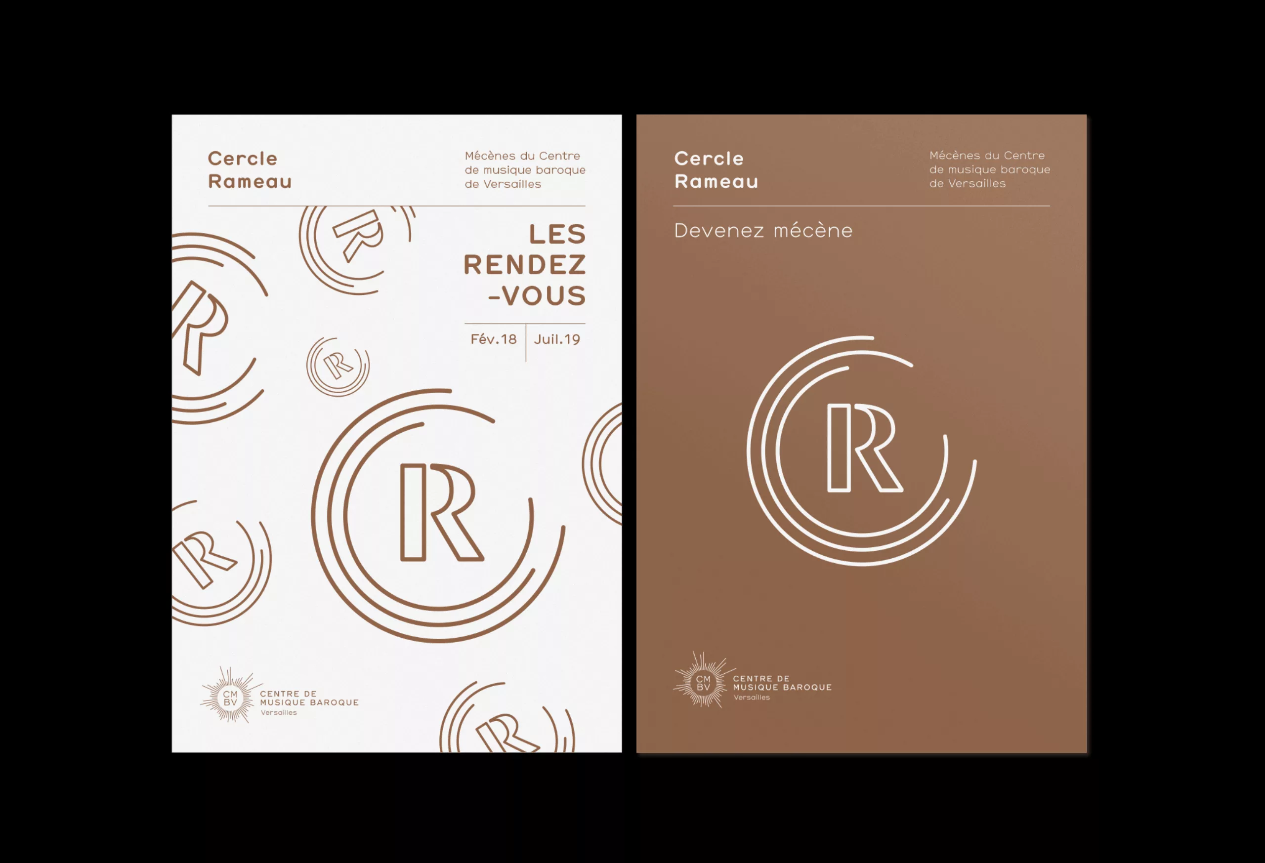
Our role was to completely rethink the visual identity in order to modernise and harmonise all communication media. It was an opportunity for us to discover a lively, contemporary and unique venue, run by eclectic, passionate and cutting-edge personalities. It was up to us to visually convey the feeling of obvious modernity that this fine institution inspired in us.

Podcast

The Graphéine team takes you behind the scenes of this project. Decipherments, analyses and anecdotes in your ear…

Please accept cookies to watch this content.

Logotype

The logotype is the meeting of the symbol of the ‘Sun King’ and the vibration of music. It works like a sonograph. The rays come to life. They react to the intensity and frequency of the sound. The sign is alive and becomes a graphic interpretation of the music being played. It is the visual translation of the promise to ‘make baroque music shine’.

Please accept cookies to watch this content.

Colours

The colour chart has been designed to meet the specific communications needs of the various sections that make up the structure. In this way, each section uses specific graphic and colourimetric rules, while remaining within the graphic environment of the Centre de Musique Baroque. In this way, it is possible to meet the communication needs inherent in each section while respecting the overall coherence.

Typographic contrast

Two typefaces have been defined, to evoke both the Baroque world and the institution’s place in its time. The Hermes (Lineto) typeface, round and thin, is used in commercial typography. Its filigree structure also echoes the design of the logo. It is set against a larger typeface, made up of full and loose strokes (Dala Moa, Commercial type), used as a title typeface.

Design system

Following the same logic as that used in the colour chart, several page layout templates are proposed to facilitate the production of documents of all types, for each division.

Cercle Rameau

The Cercle Rameau is the name of the club of partners of the Centre de musique baroque. A specific visual identity has been designed, in line with this new institutional graphic charter.

Brochures

Des brochures pour le Cercle Rameau sont éditées chaque année.

Webdesign

Le site web du Centre de musique baroque a entièrement été revu par Supersoniks.