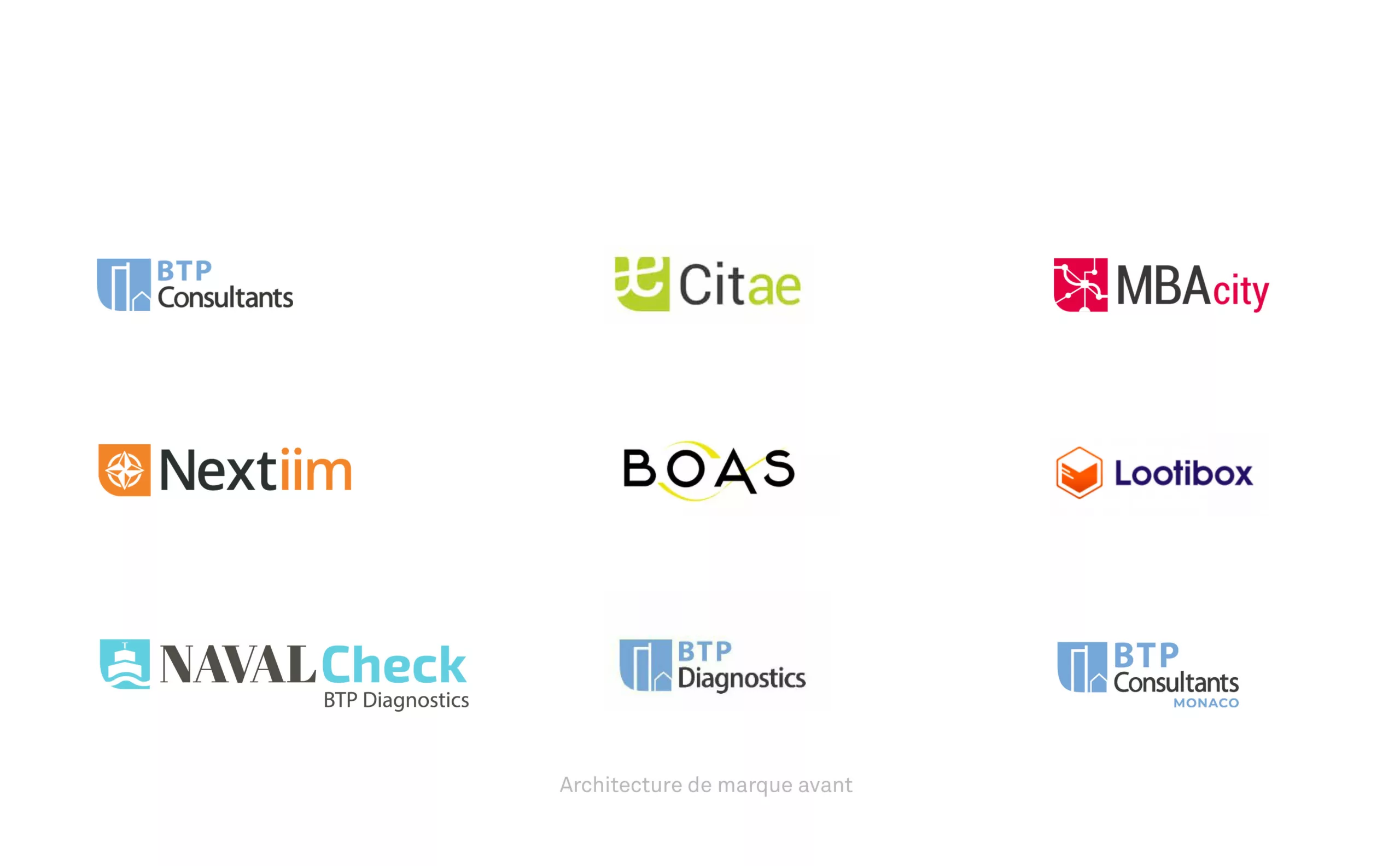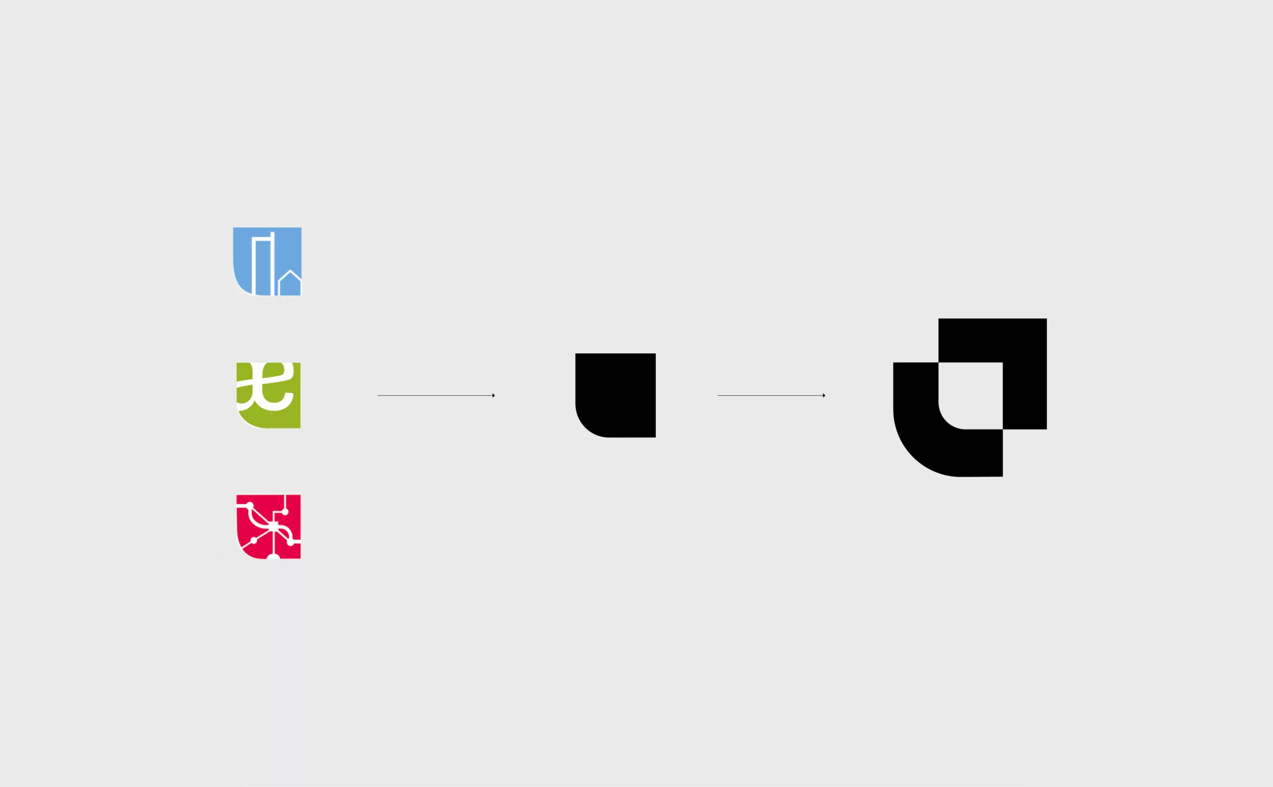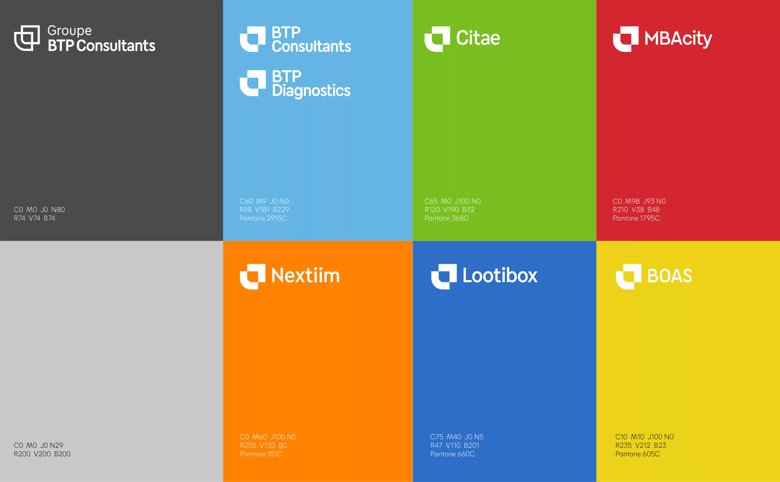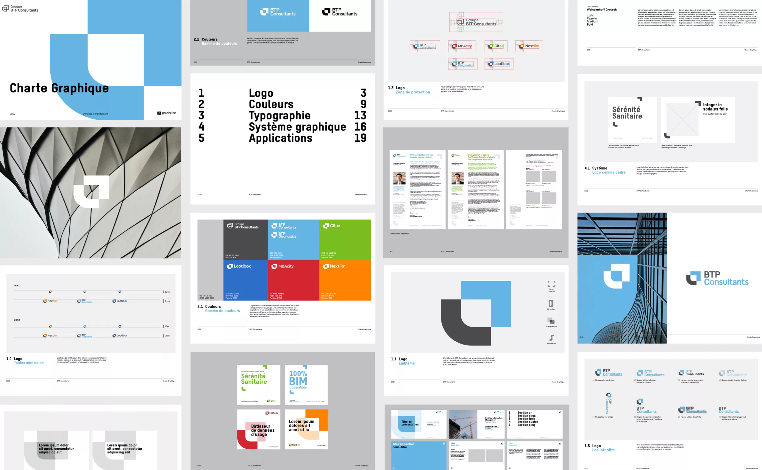
Since 1996, BTP Consultants has been active in the construction and consultancy sectors through its various specialised subsidiaries. For its customers, BTP Consultants carries out property diagnostics and project management assistance. The existing visual identity lacked coherence, harmony and clarity. The group’s visual identity was not formalised, and all the sub-brands were represented by different emblems. A figurative pictographic emblem for BTP Consultants, an abstract icon for MBAcity and a set of typographic ligatures for Citae. The wordmarks also lacked coherence.
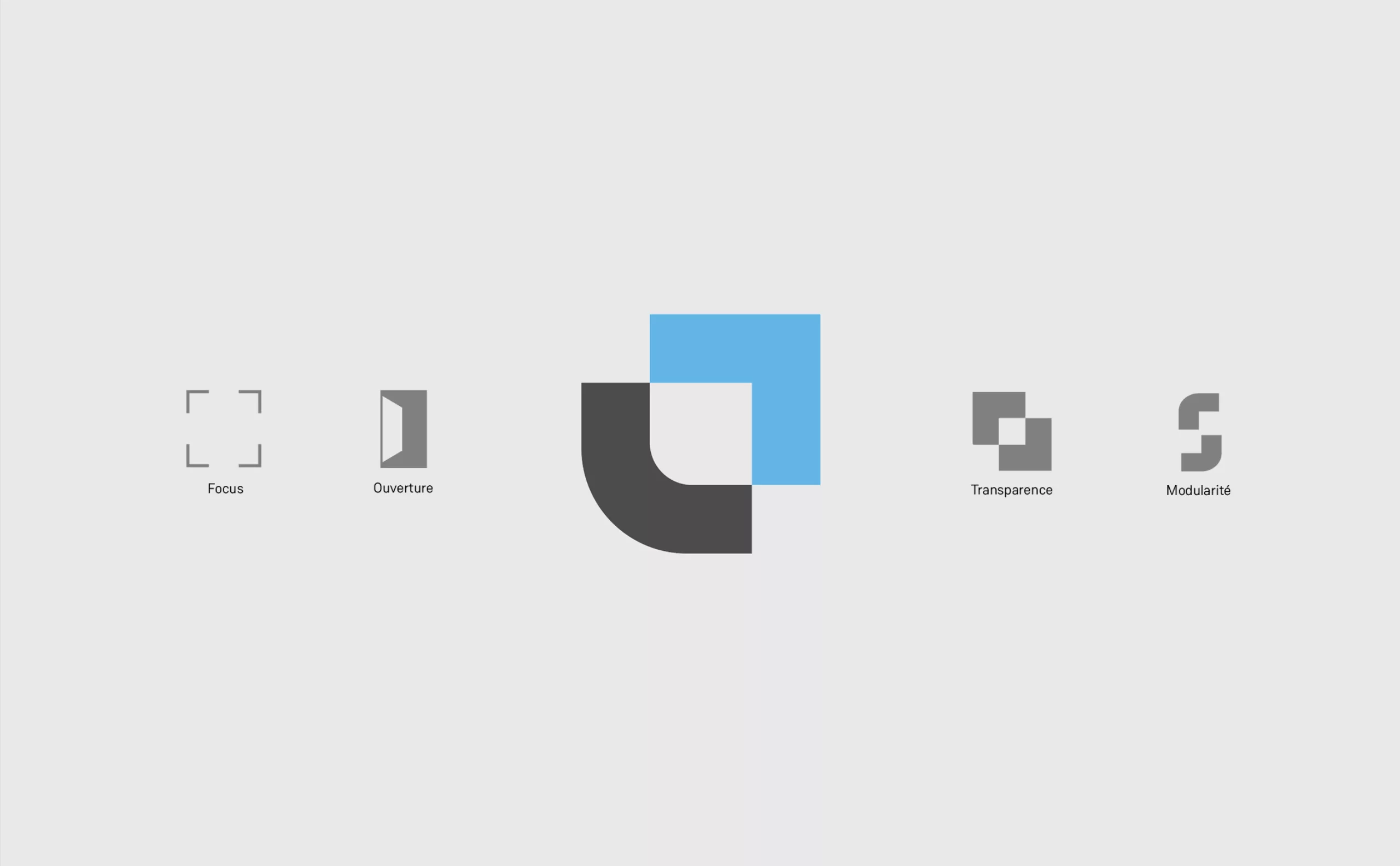
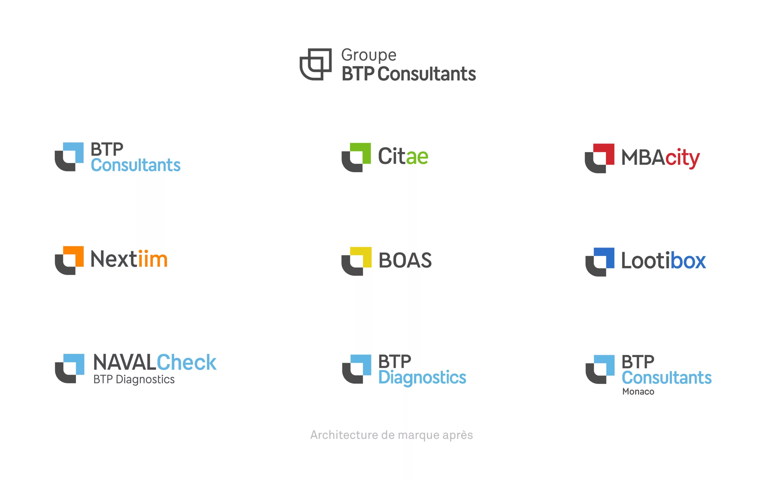
In the midst of rapid growth and strategic development, the group seized the opportunity to rethink its brand image and improve the legibility of its brand architecture.