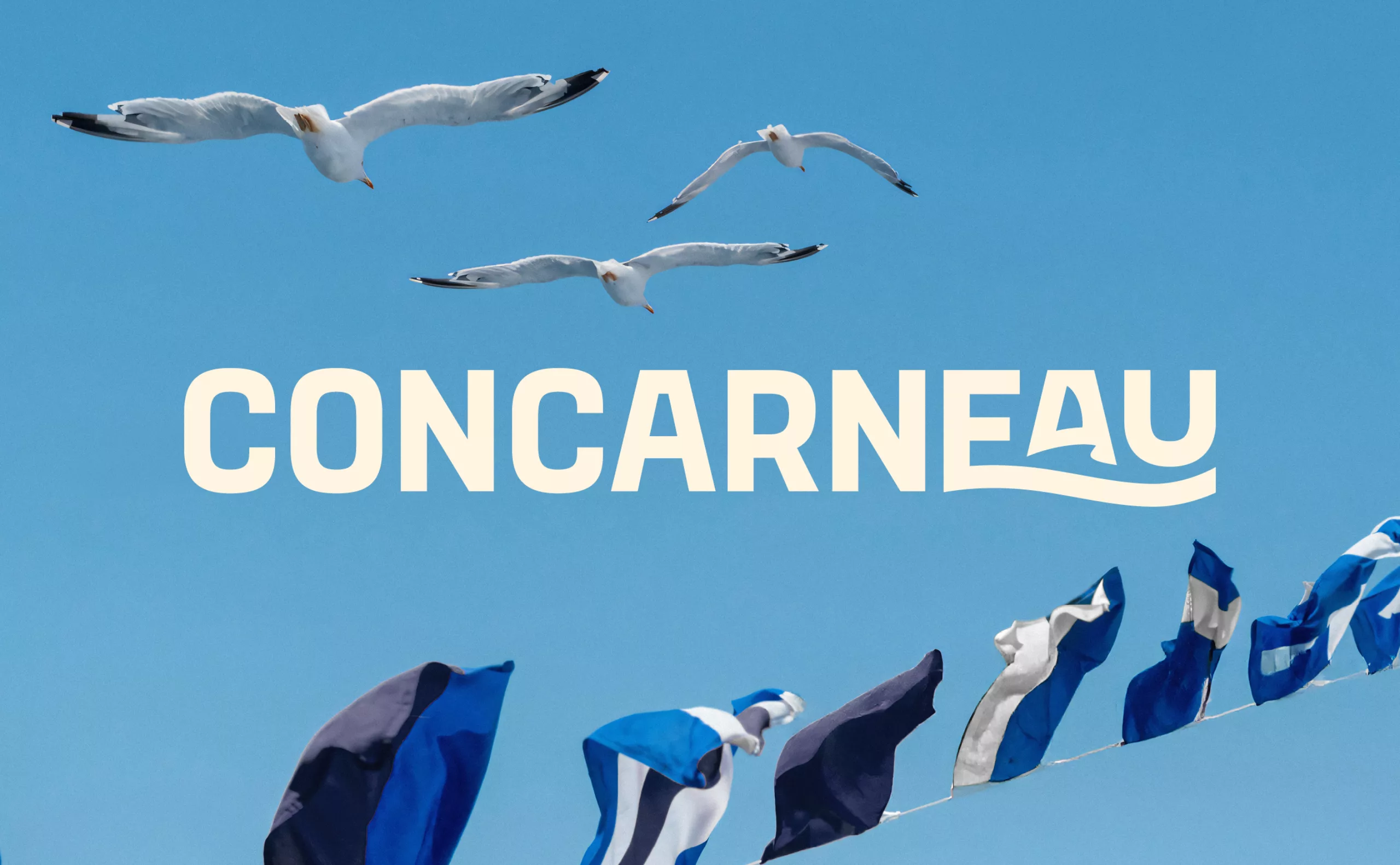
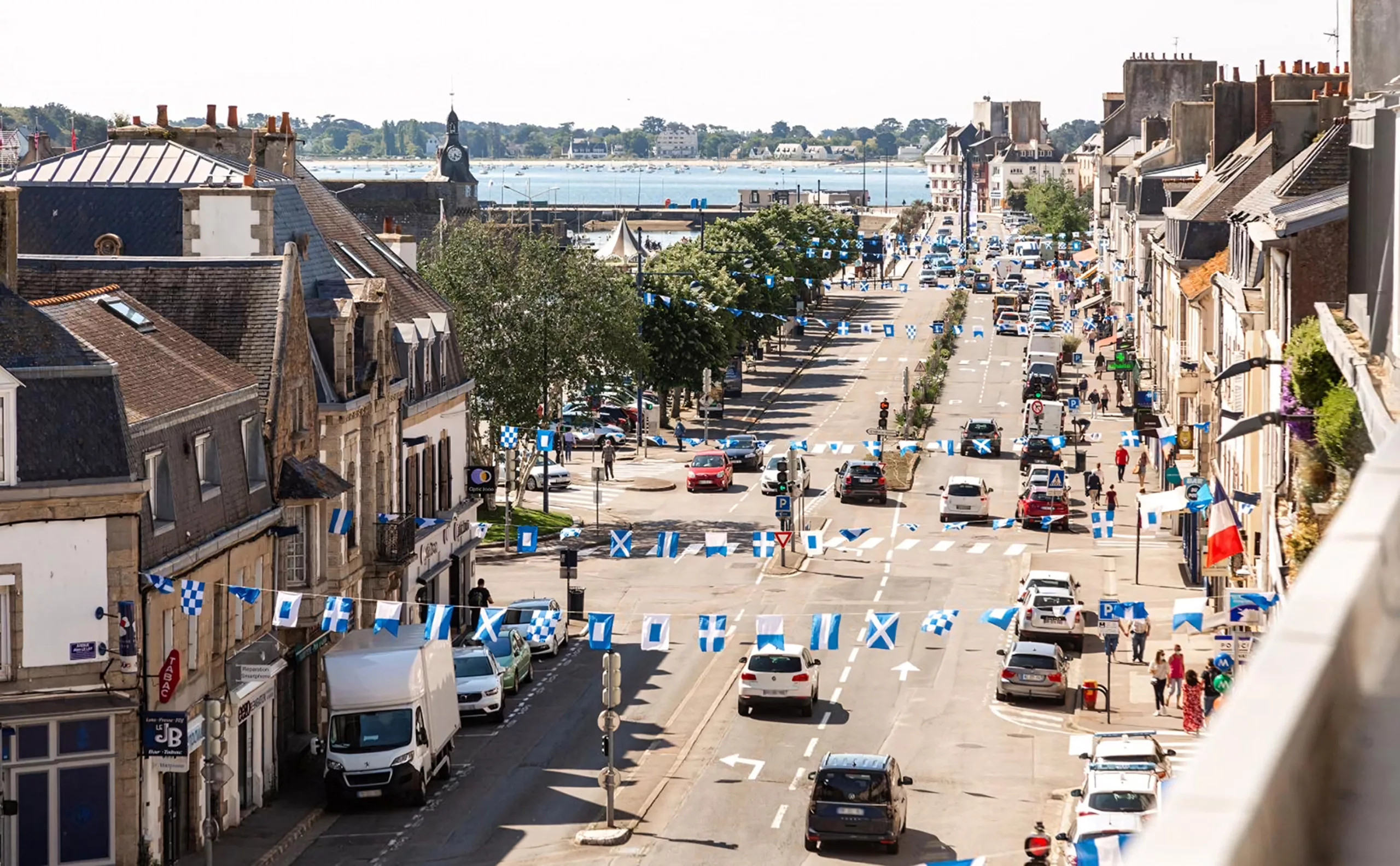
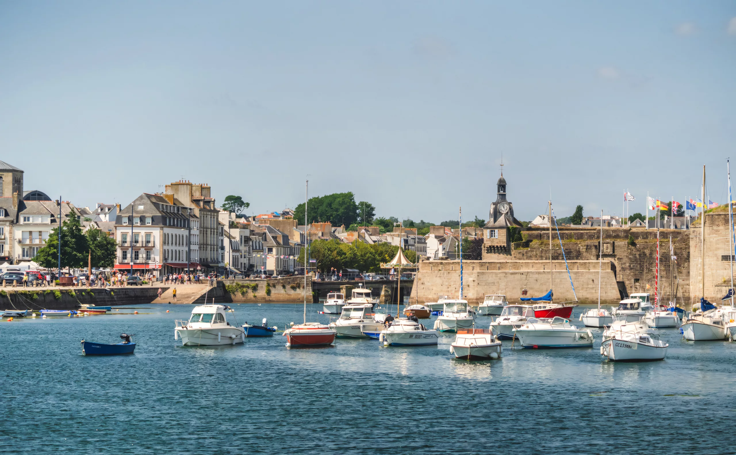
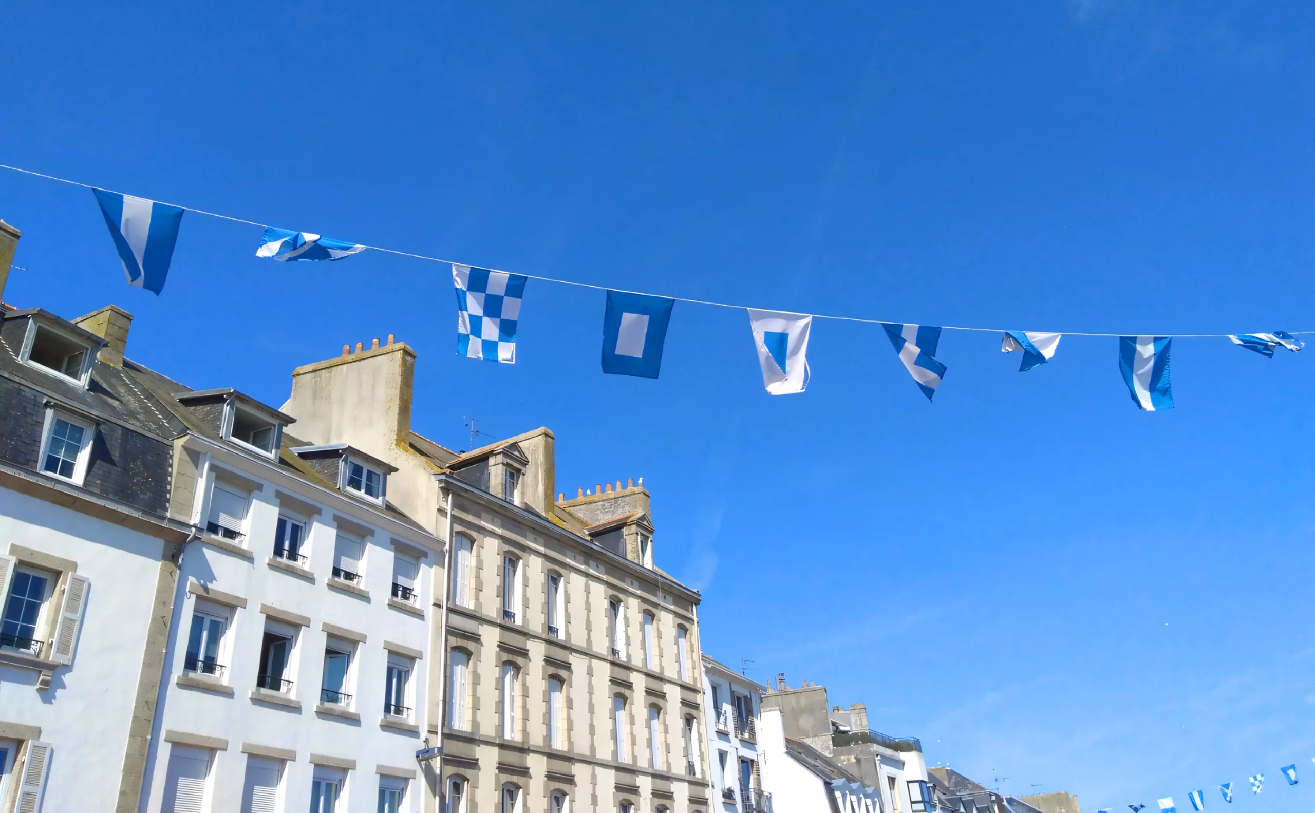
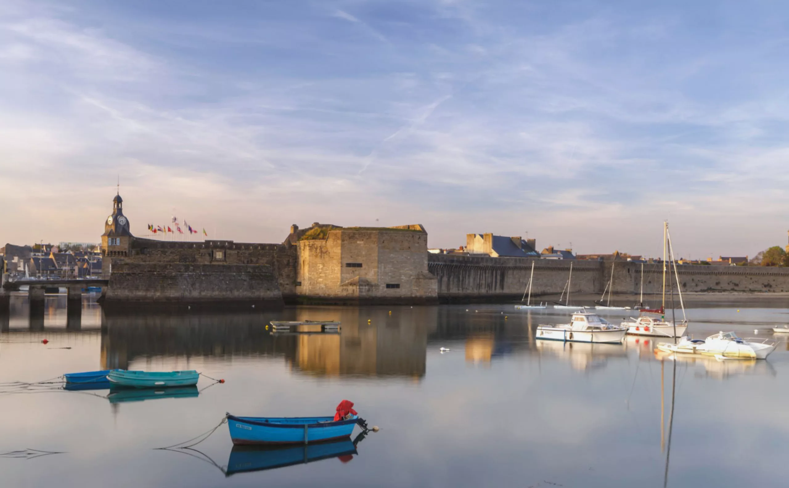
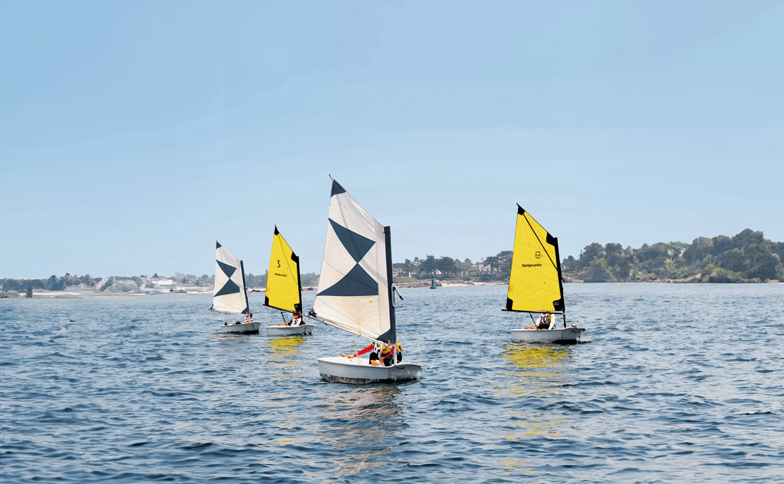
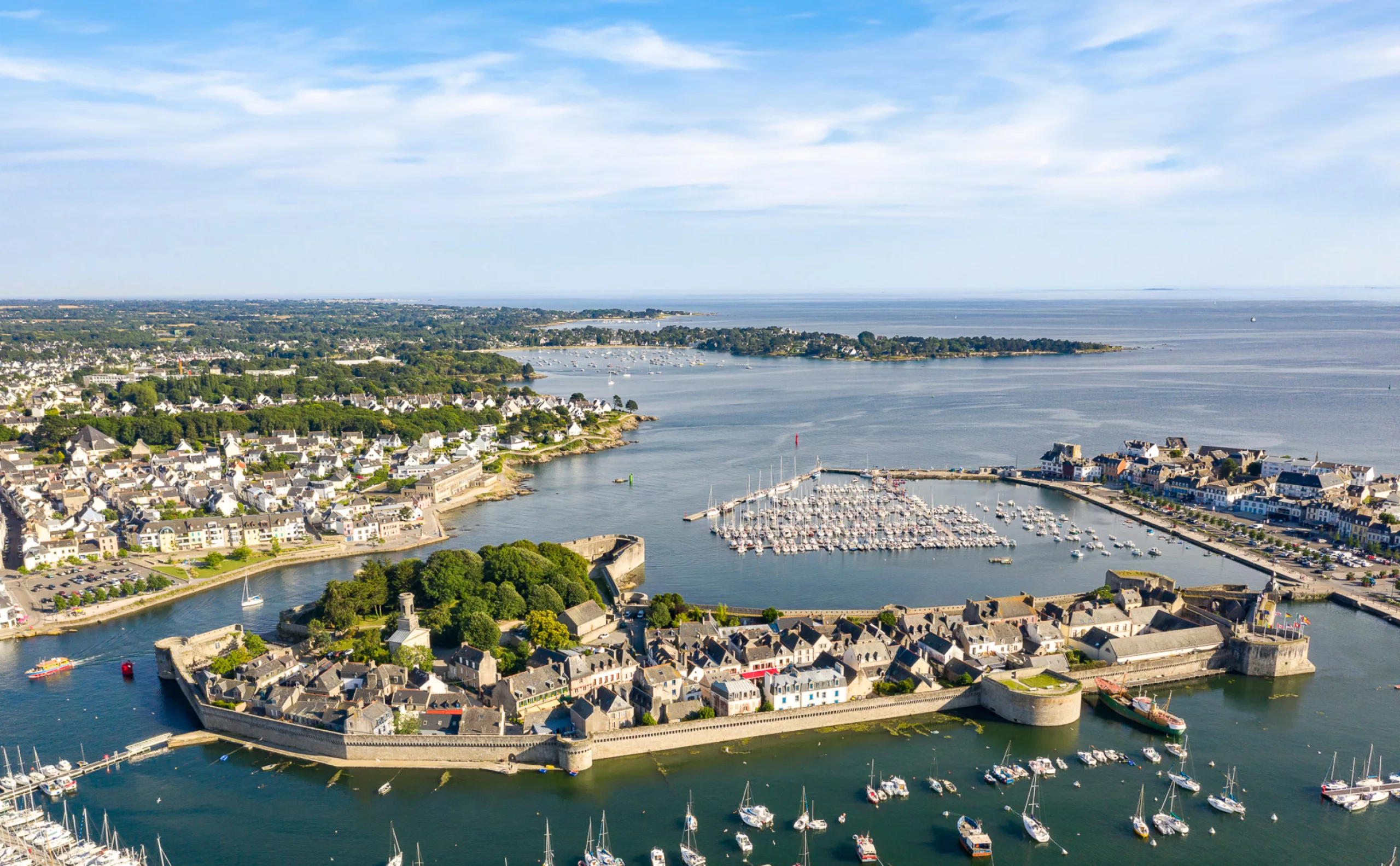
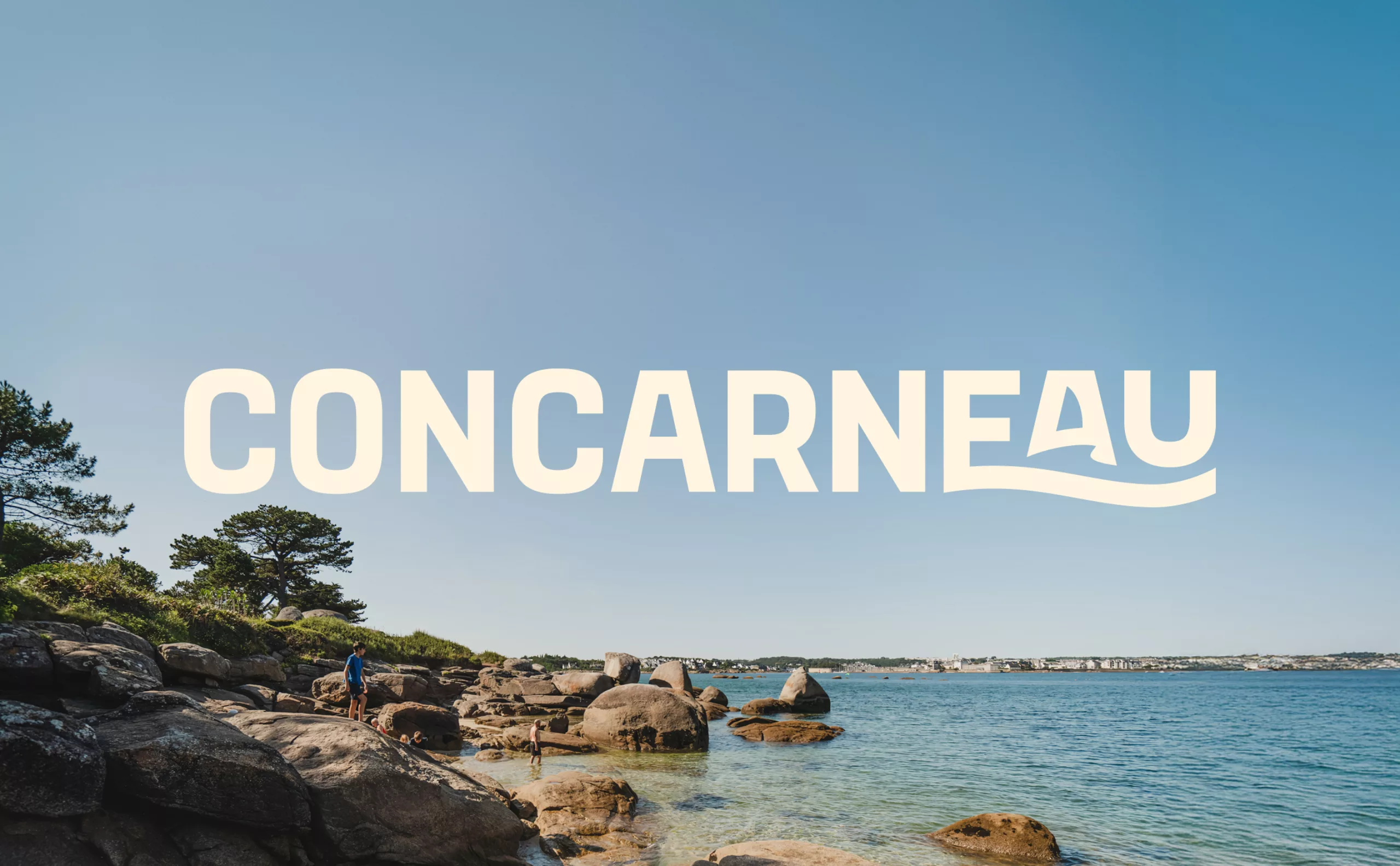
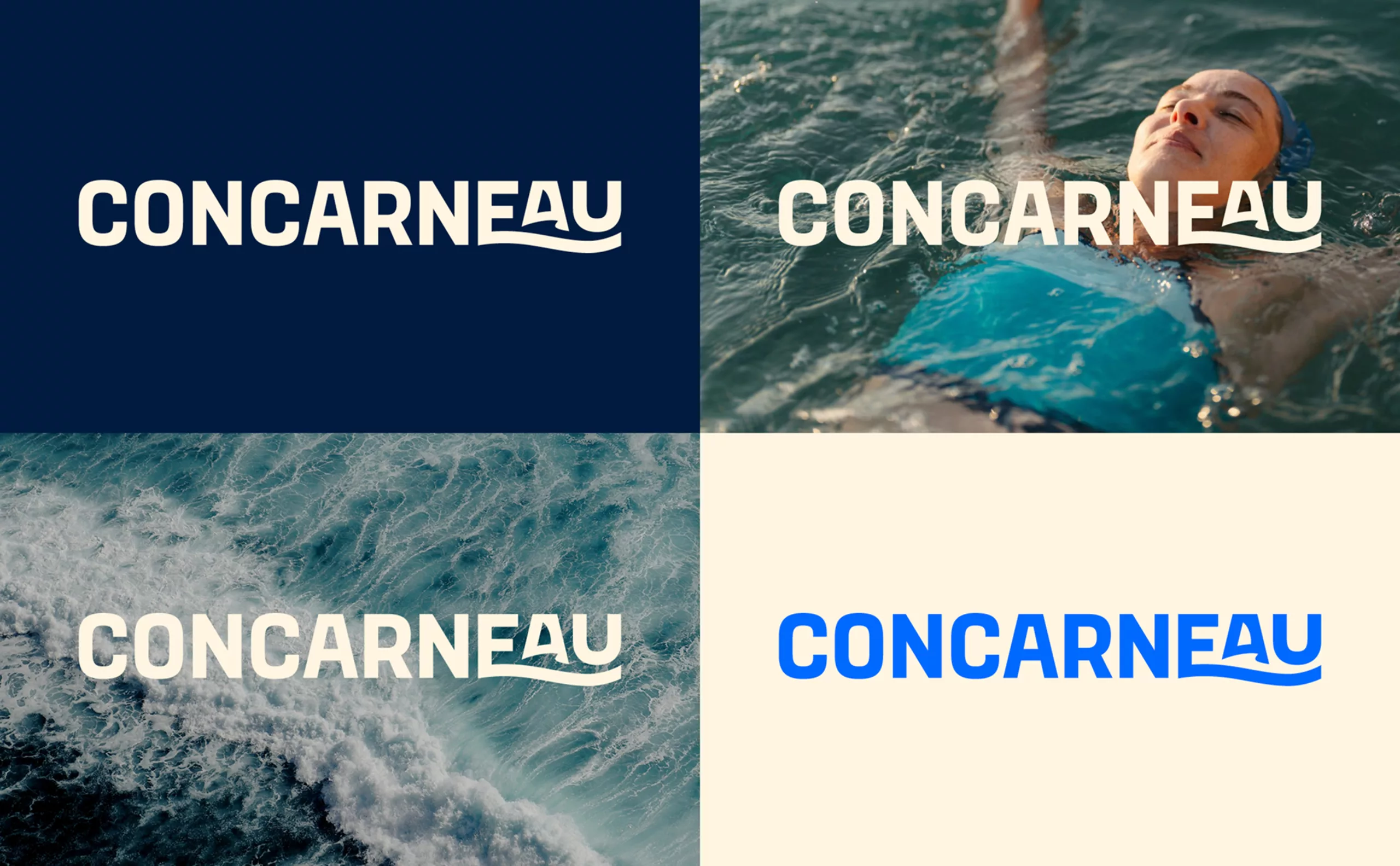
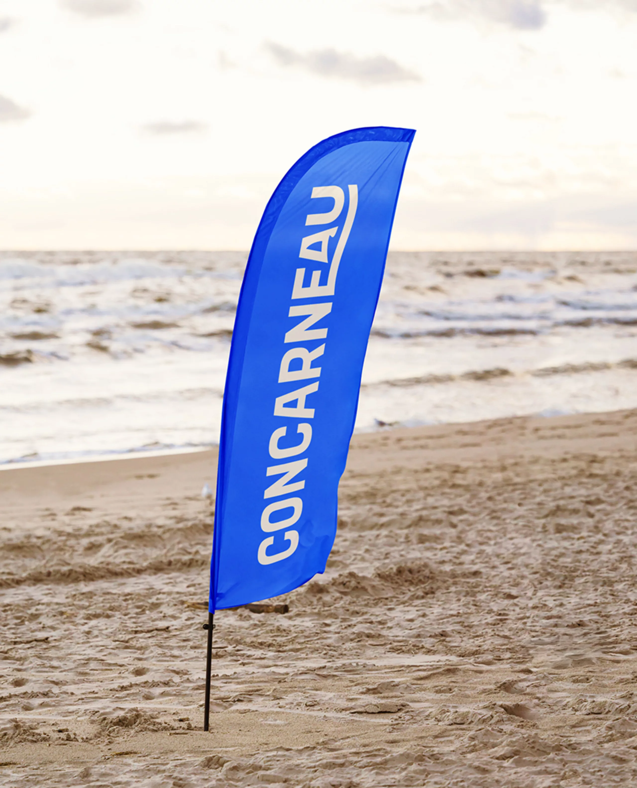
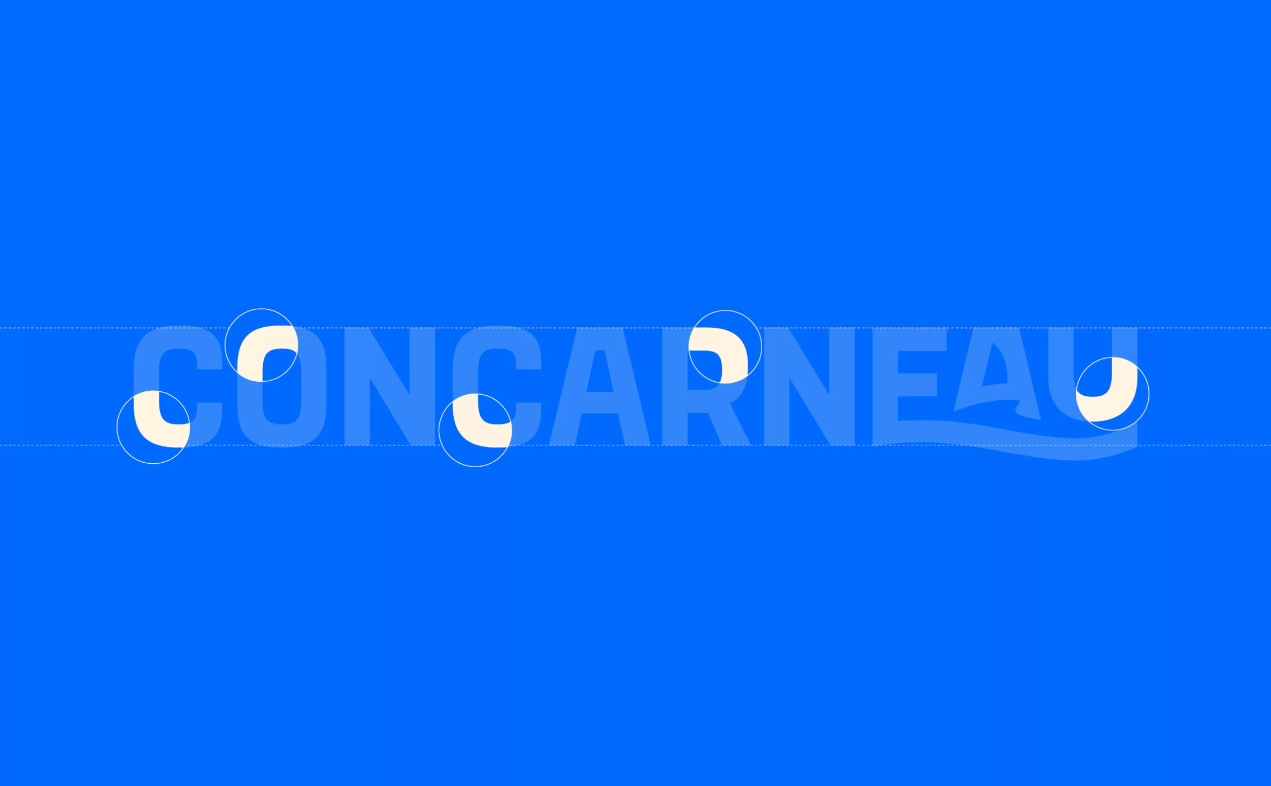
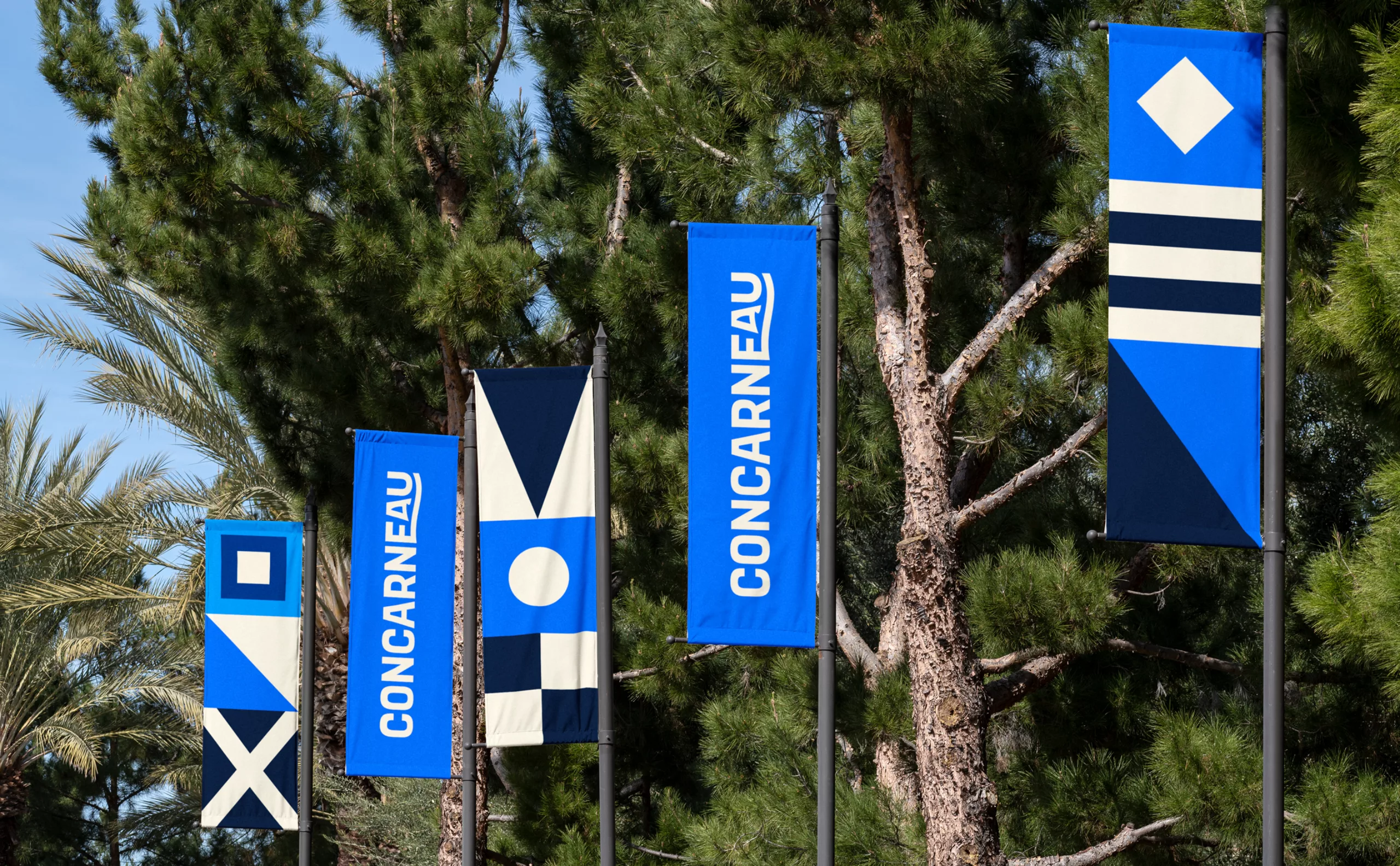
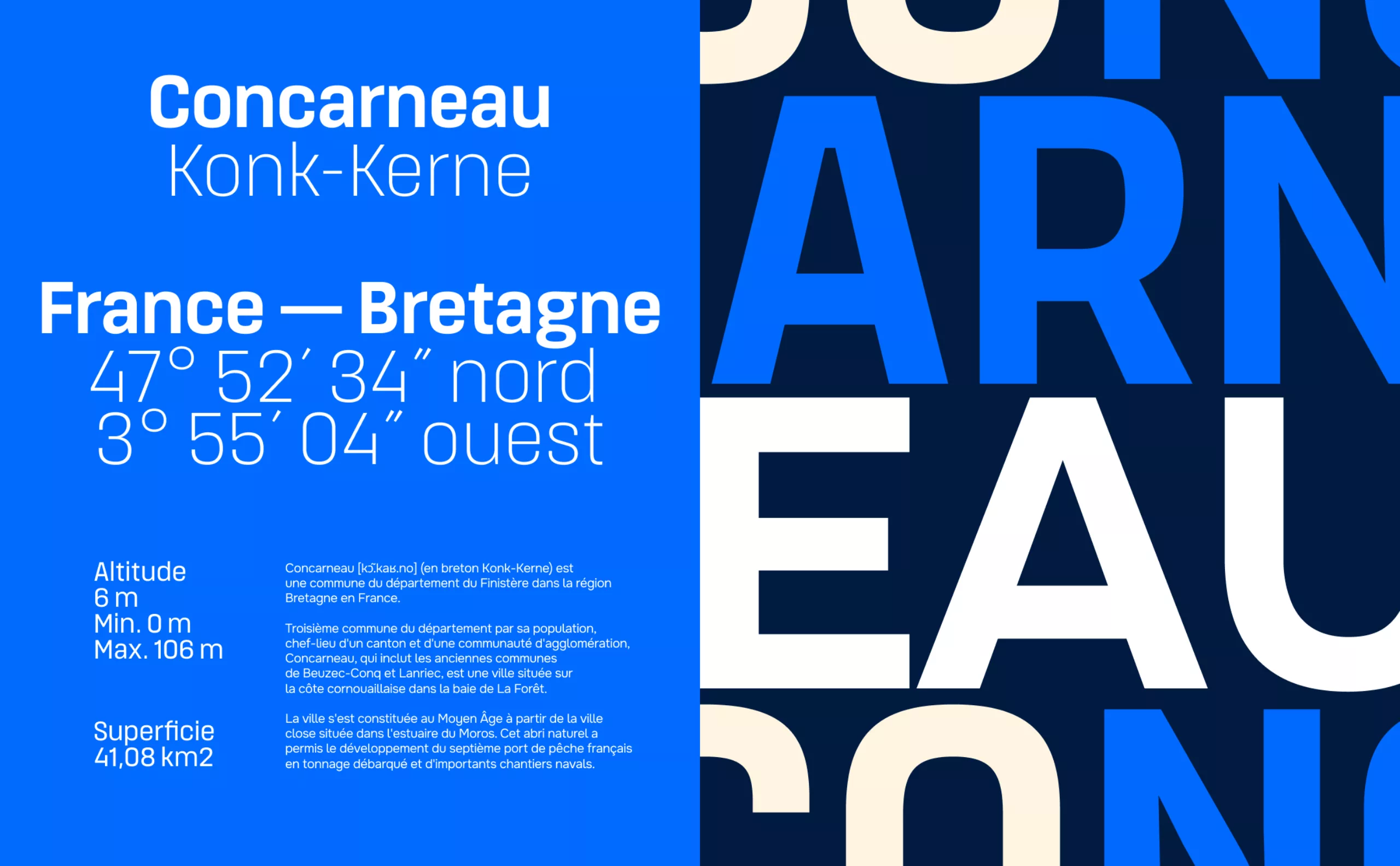
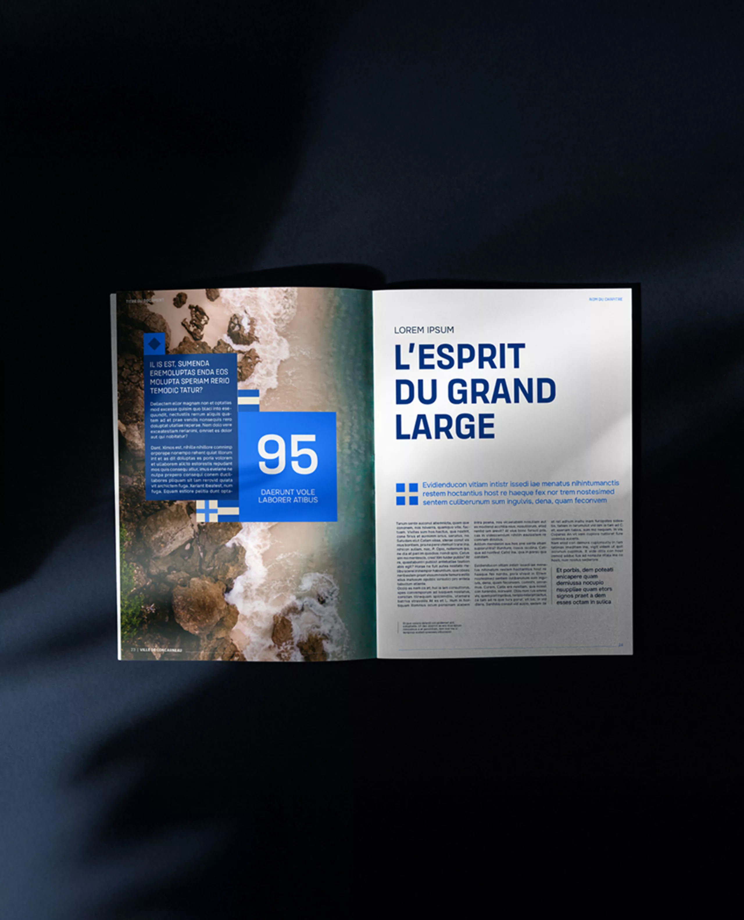
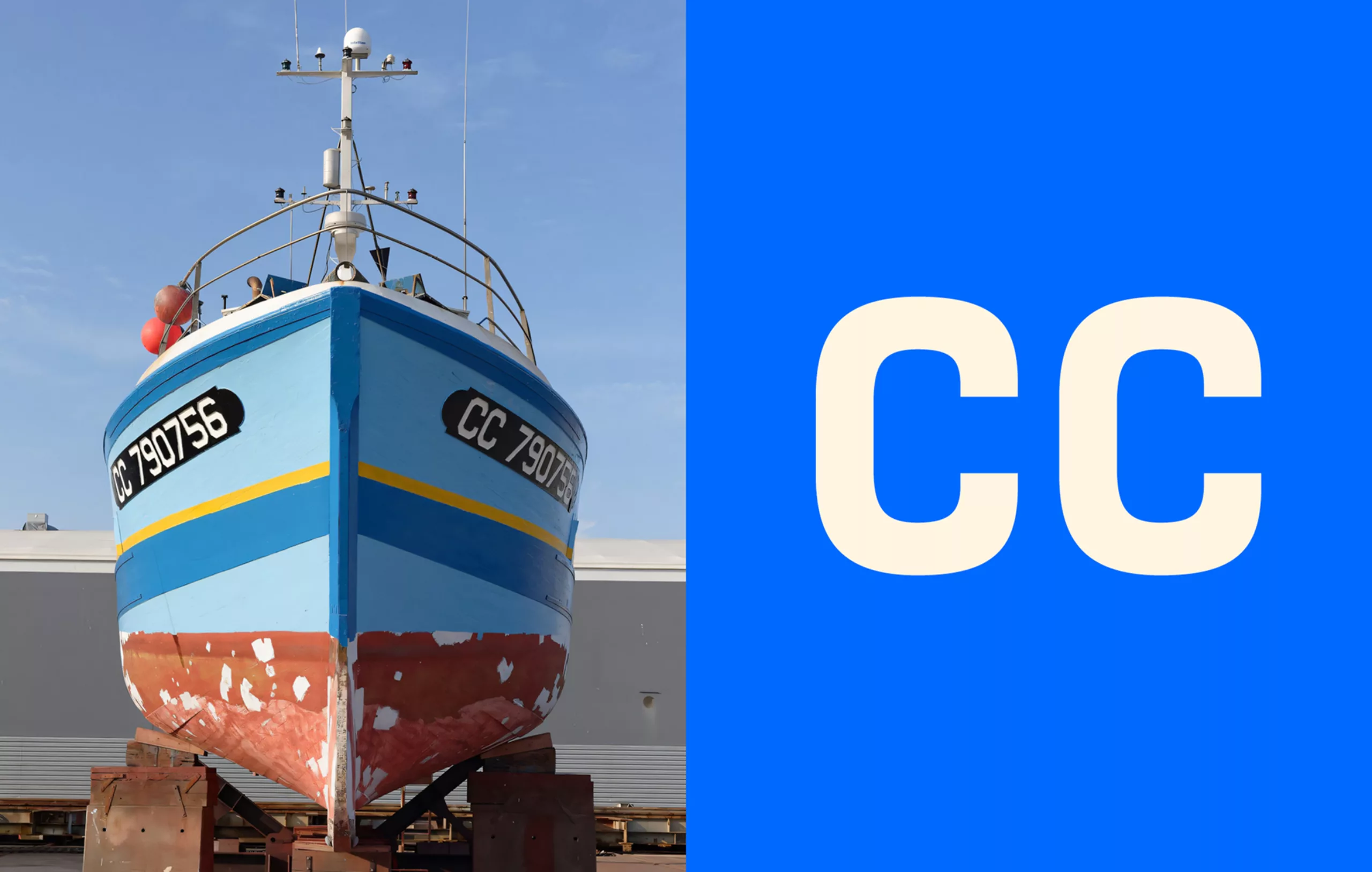
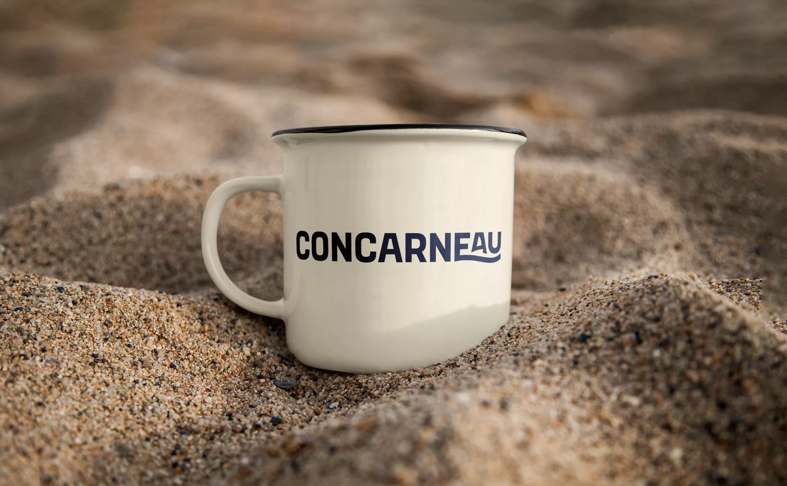
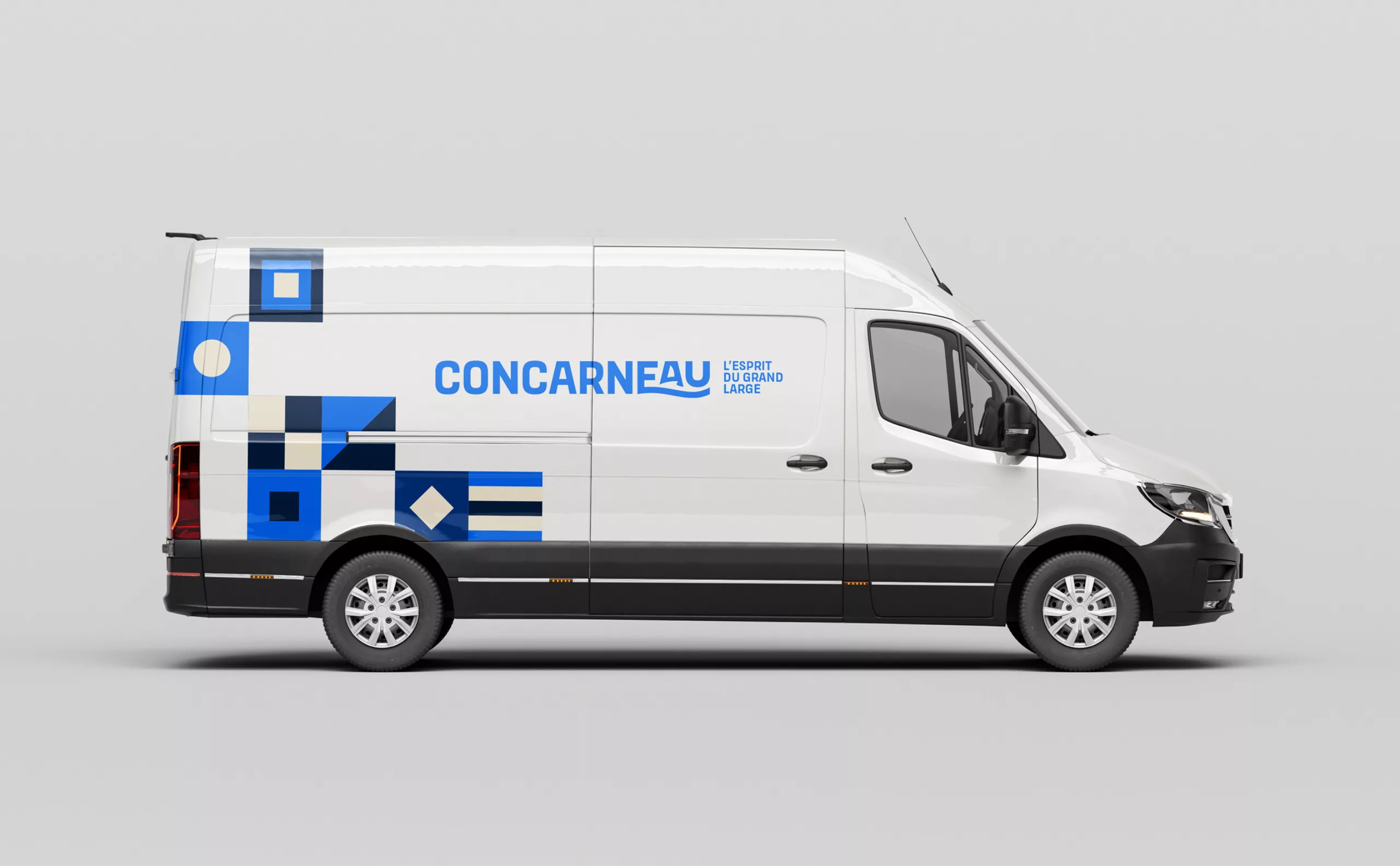
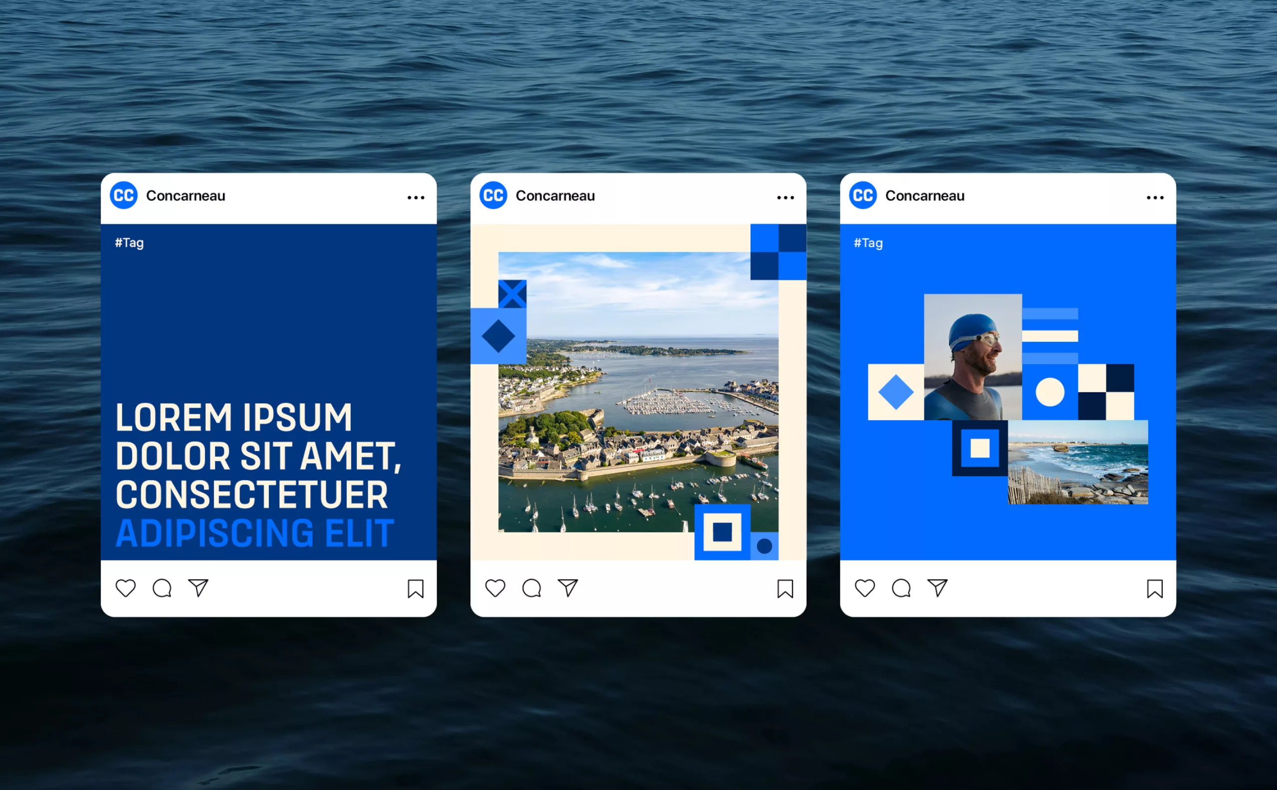
An iconic town in Finistère, Concarneau has a strong identity shaped by the sea: a city of sailors, a seaside resort, and a heritage site. But like many coastal areas, Concarneau is currently facing profound changes: evolving lifestyles, residential appeal, economic diversification, ecological transition, and increased competition between tourist destinations. These changes raise questions about how the city presents itself and communicates its identity.
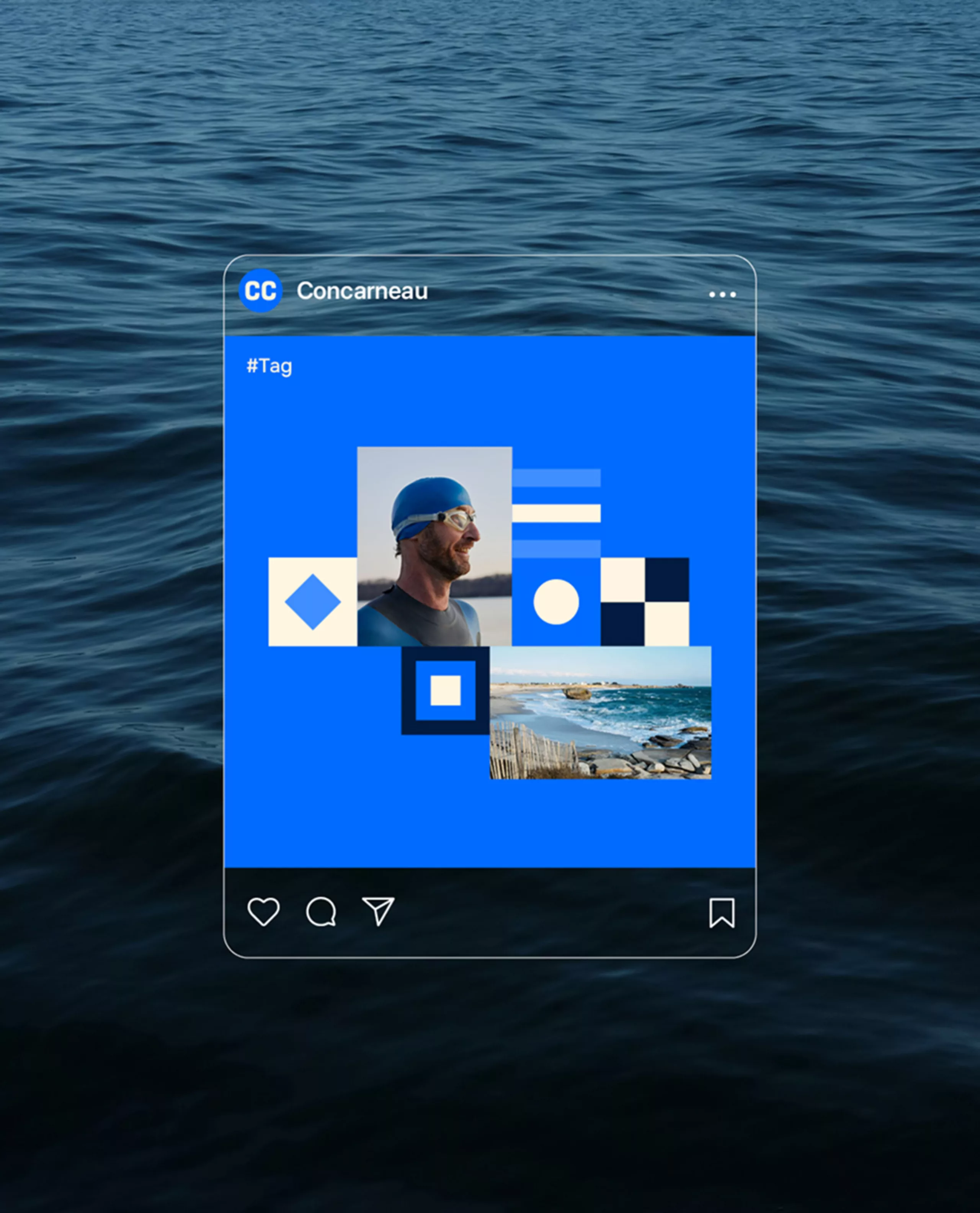
The previous visual identity was no longer able to fully respond to these challenges. With outdated graphic codes and unclear uses, it struggled to reflect the real dynamism of the area and the vision of the municipality. The City of Concarneau therefore decided to completely overhaul its identity, not as a simple aesthetic exercise, but as a strategic lever to support its regional development project.
The challenge was twofold. On the one hand, to modernize the city’s image to better support its development: a city that is active all year round, focused on maritime innovation, ocean racing, research, naval industries, and the blue economy, without denying its roots. On the other hand, to enhance Concarneau’s appeal and recognition among a variety of audiences: residents, new households, young professionals, economic players, visitors, and institutional partners. The identity had to become a common unifying foundation.
The work carried out by Graphéine was based on an in-depth diagnosis and analysis of the territory. This stage highlighted Concarneau’s key strengths: a unique maritime and historical heritage, a privileged coastal location, recognized expertise in the naval world, and a sought-after quality of life. It also revealed certain tensions: an image sometimes perceived as static or seasonal, an aging population, and the need to attract new profiles to keep the city alive in the long term.
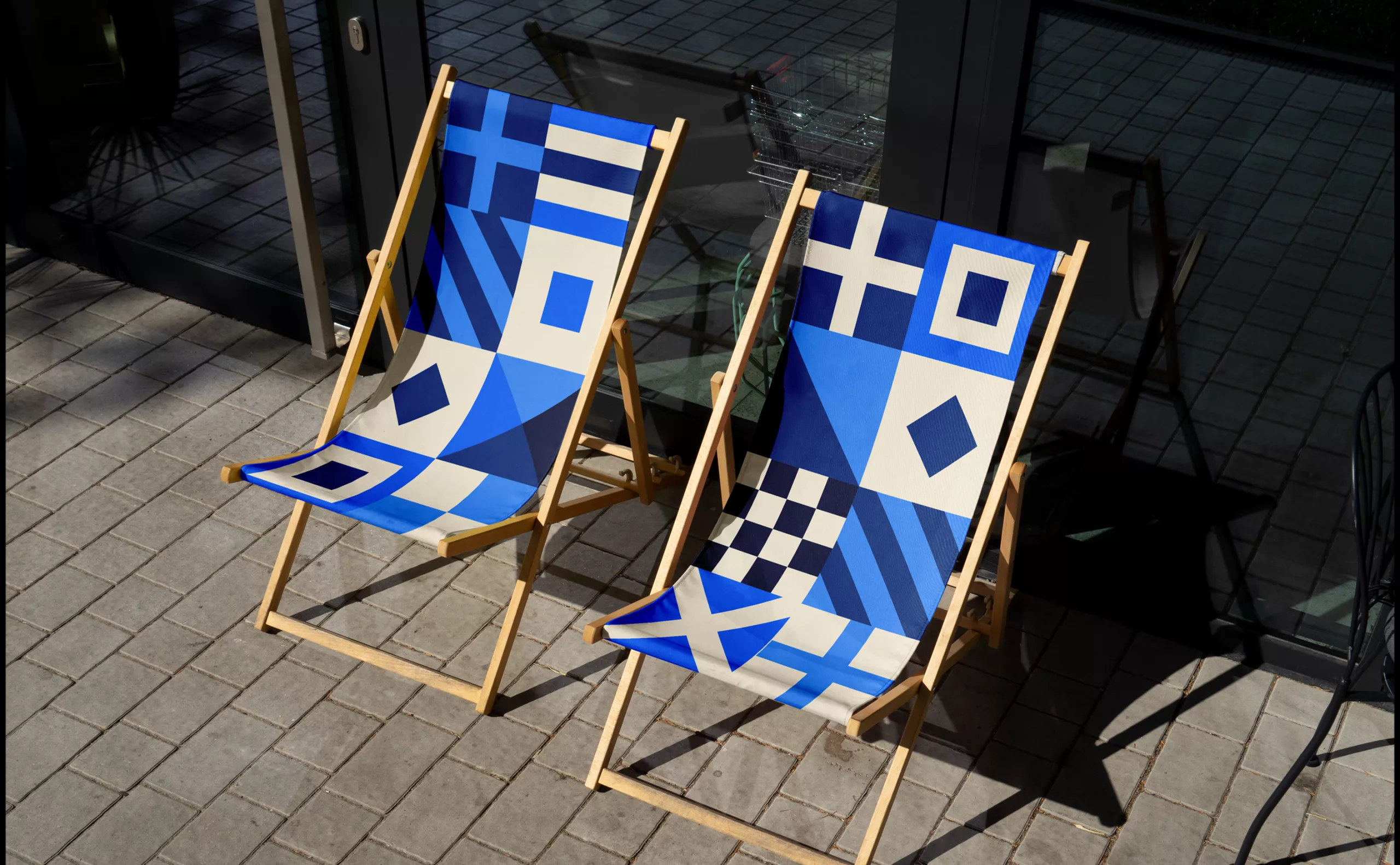
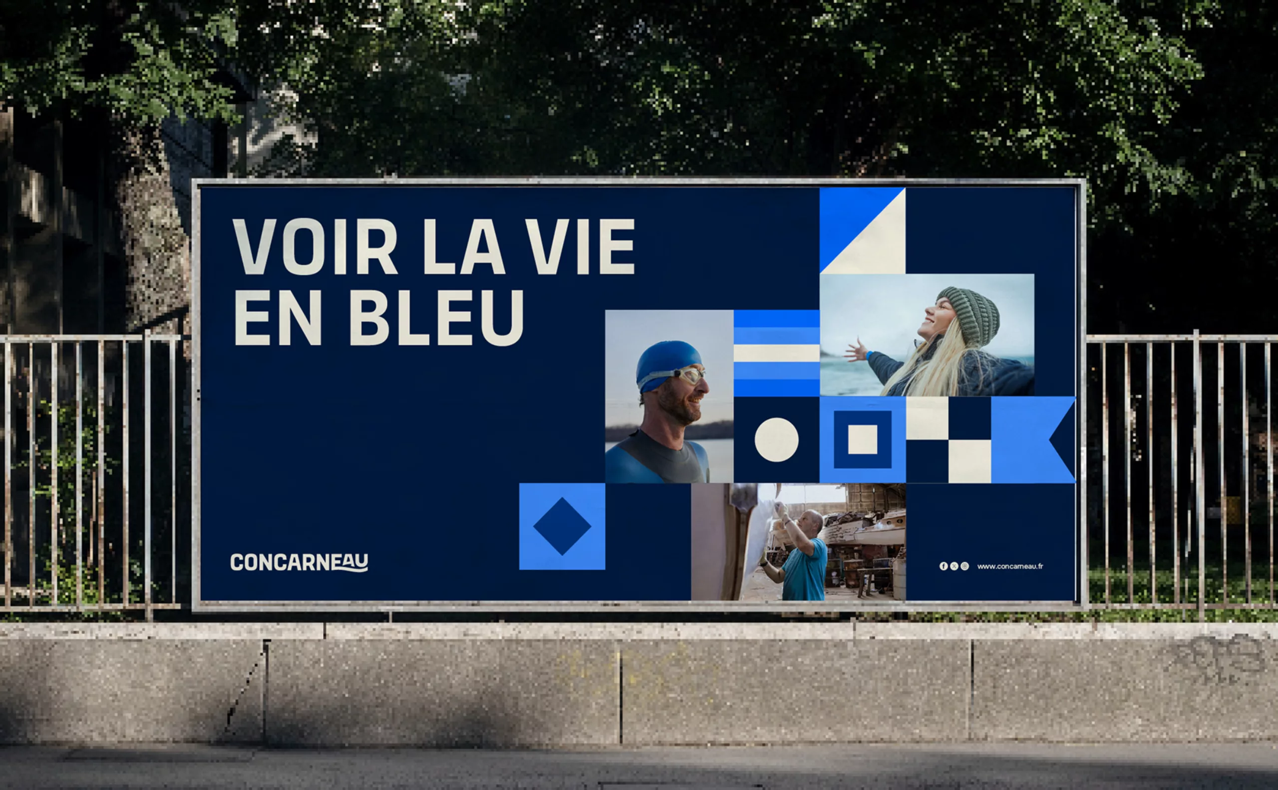
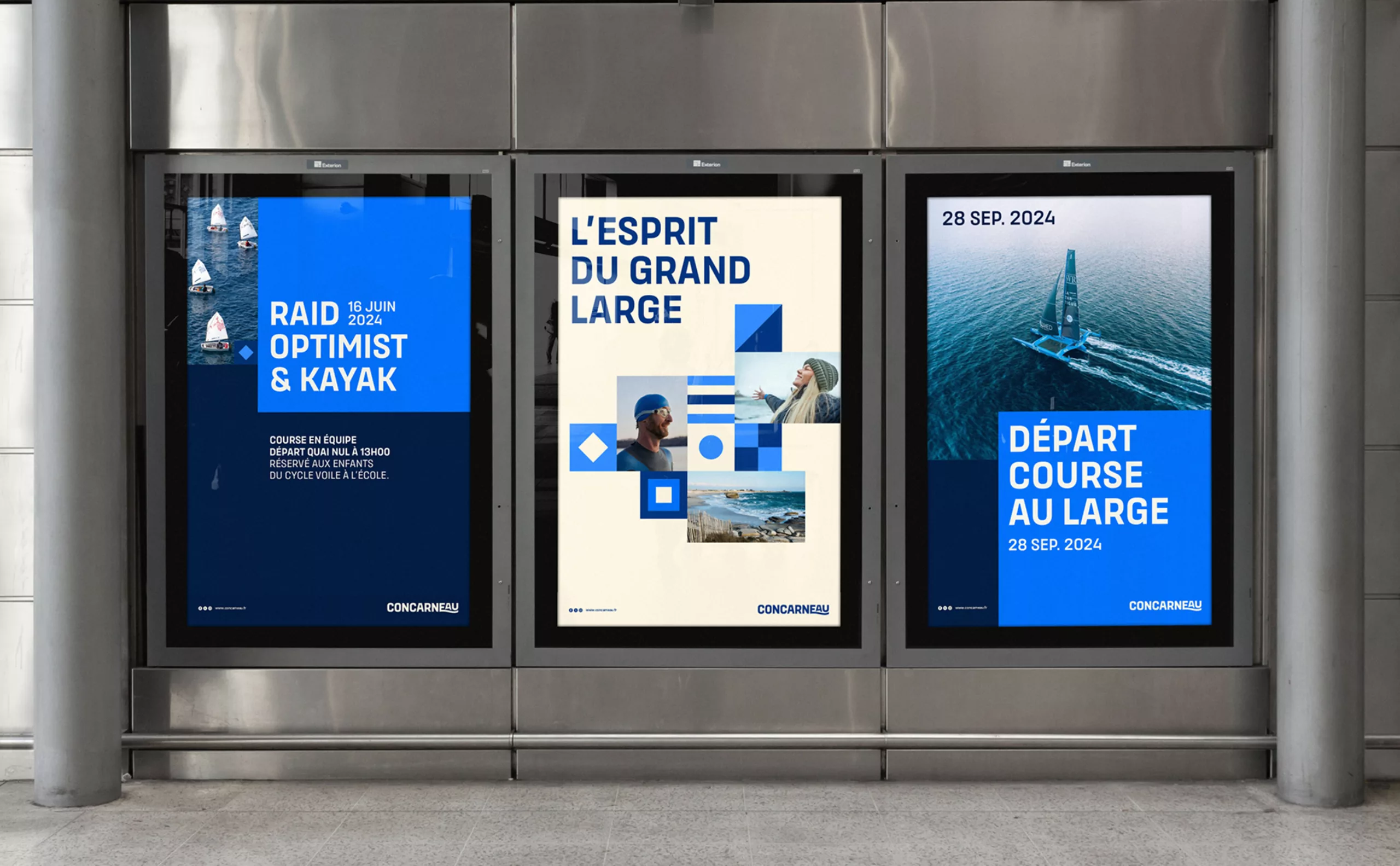
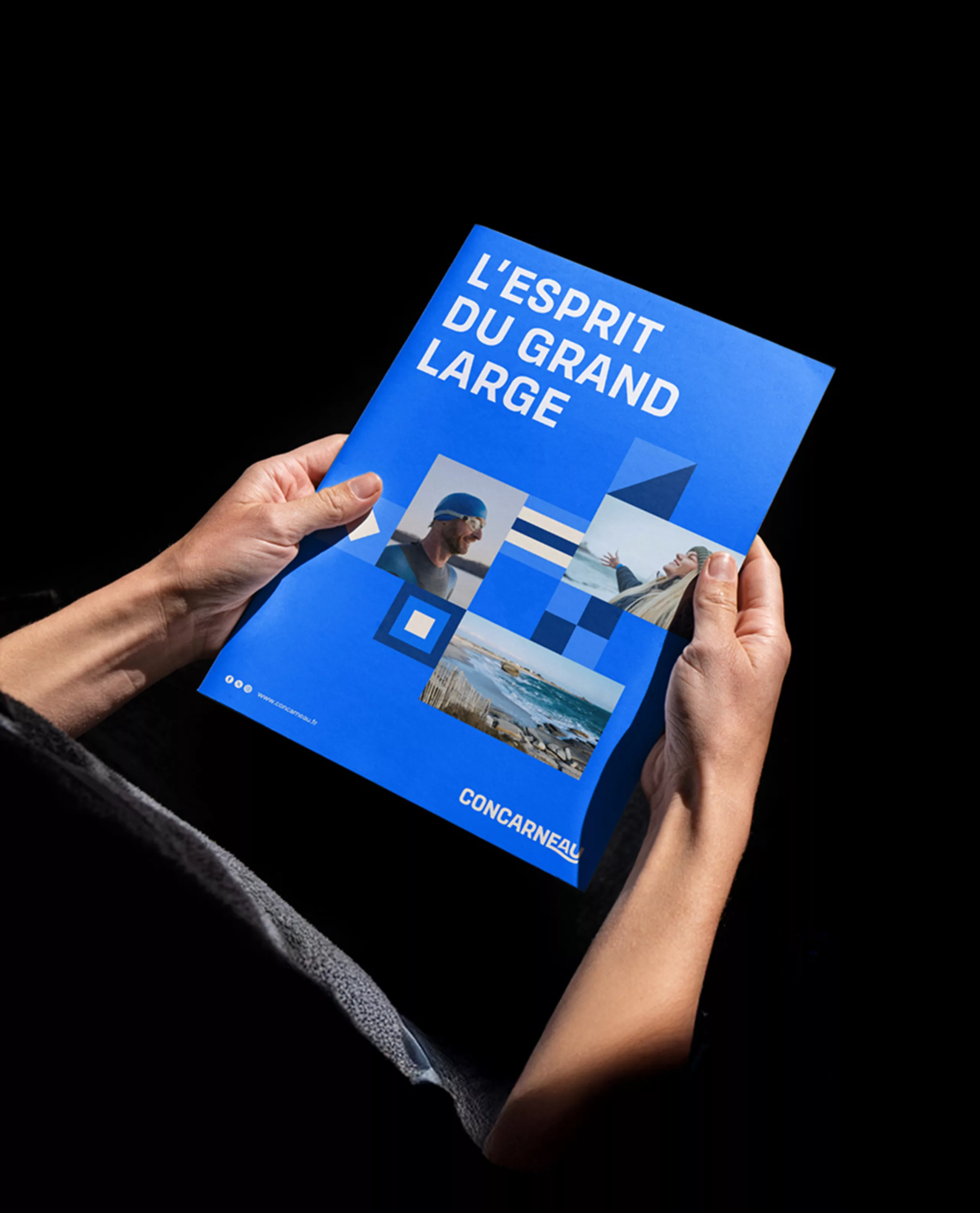
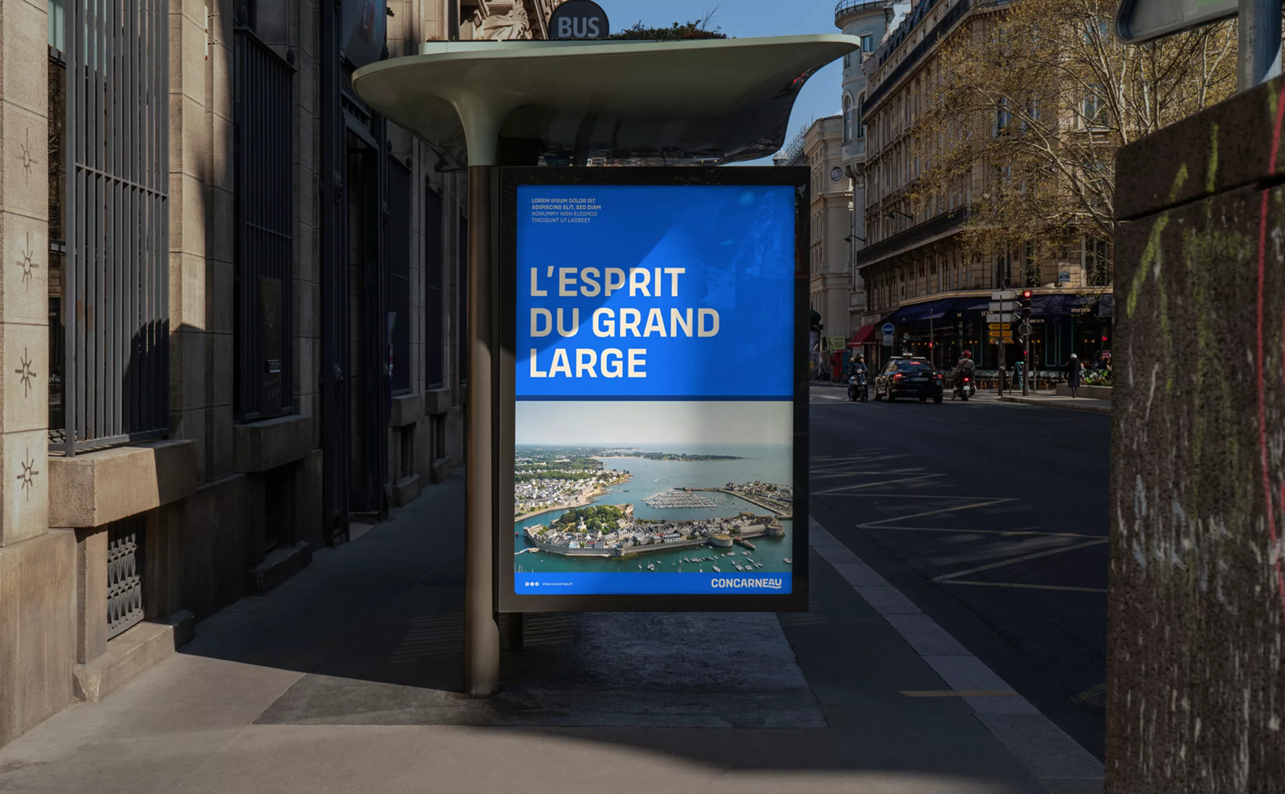
These observations gave rise to a new positioning: “Concarneau, the spirit of the open sea,” an open, dynamic, and fluid city, capable of navigating between tradition and modernity. A city shaped “by and for” the sea.
