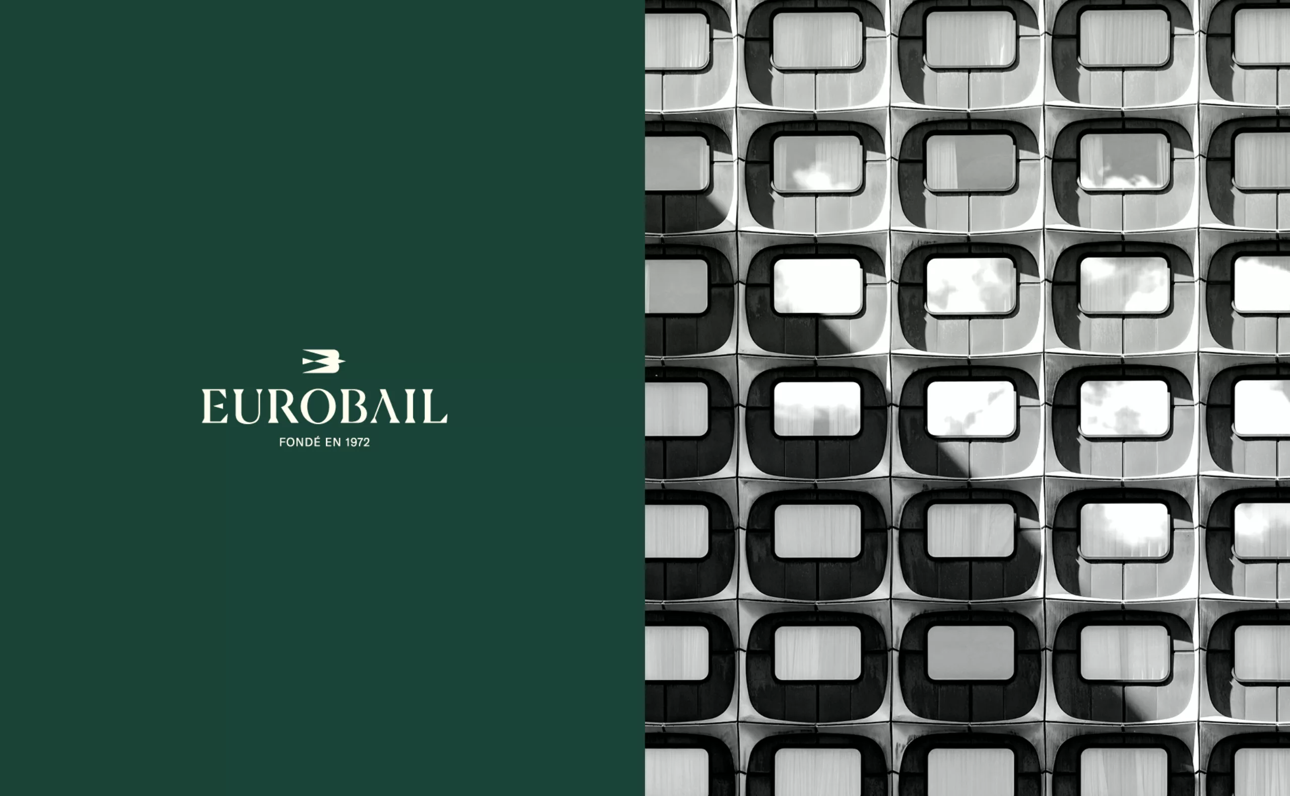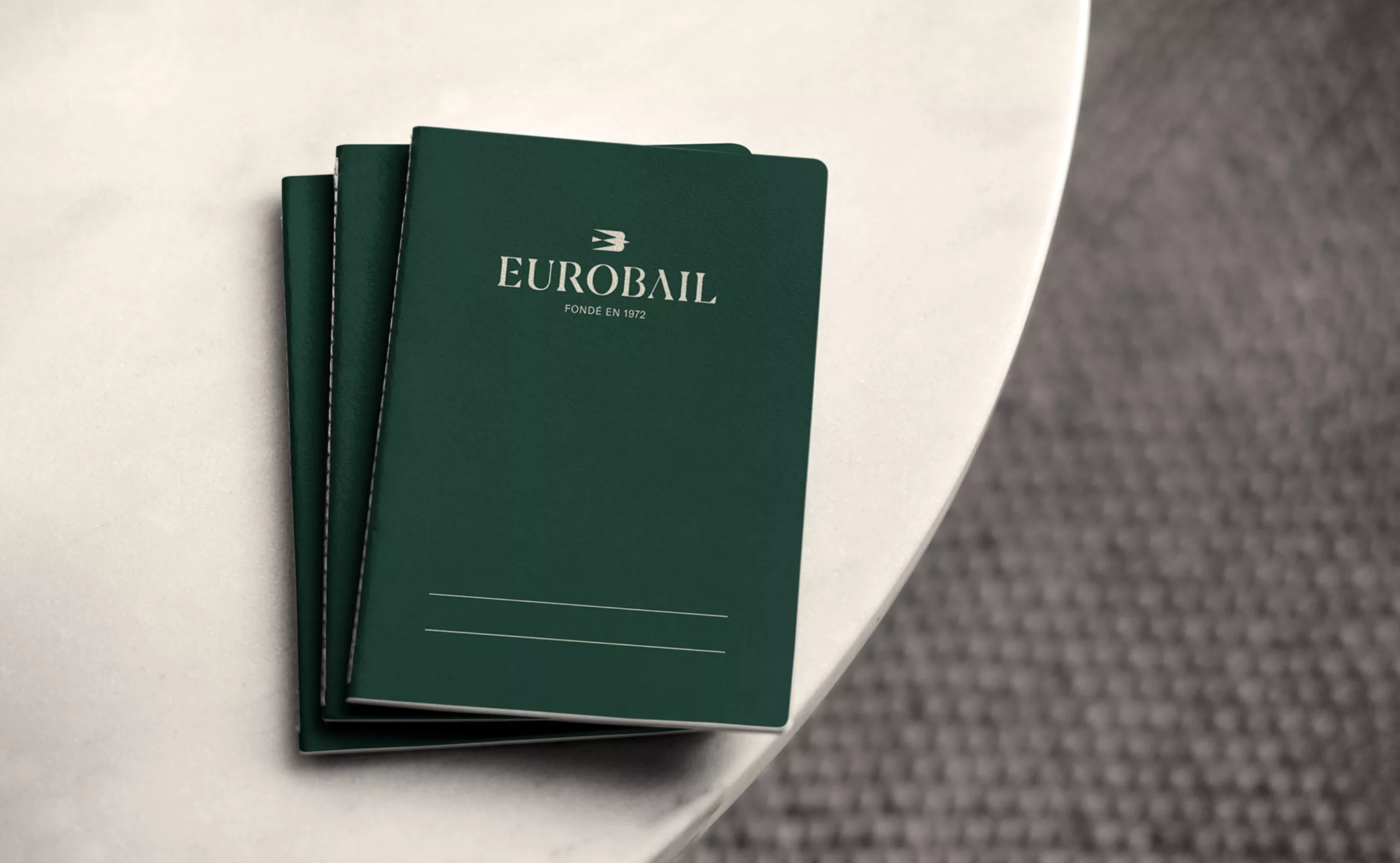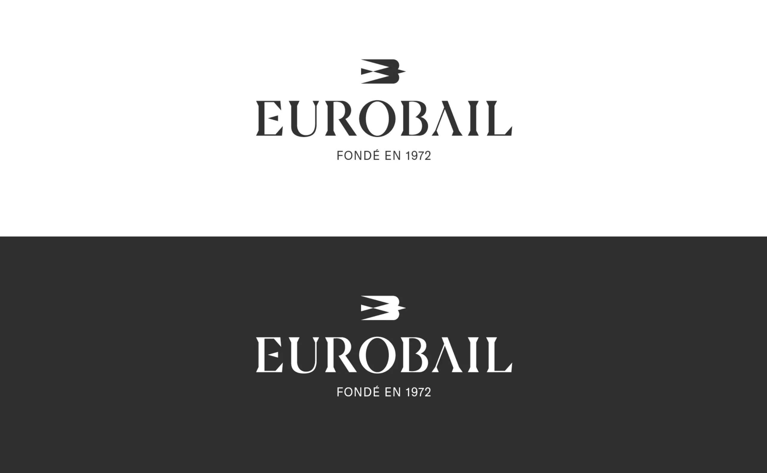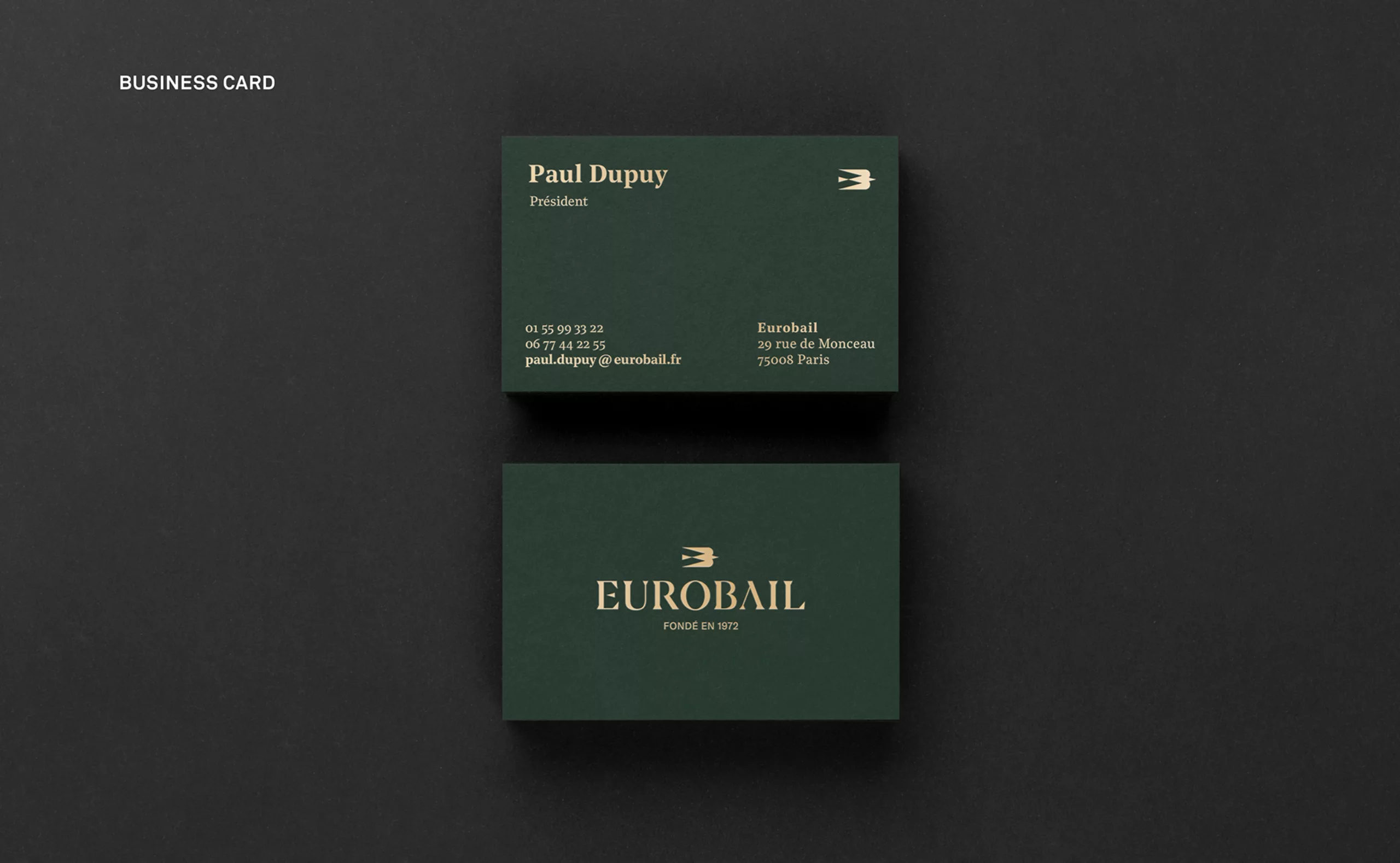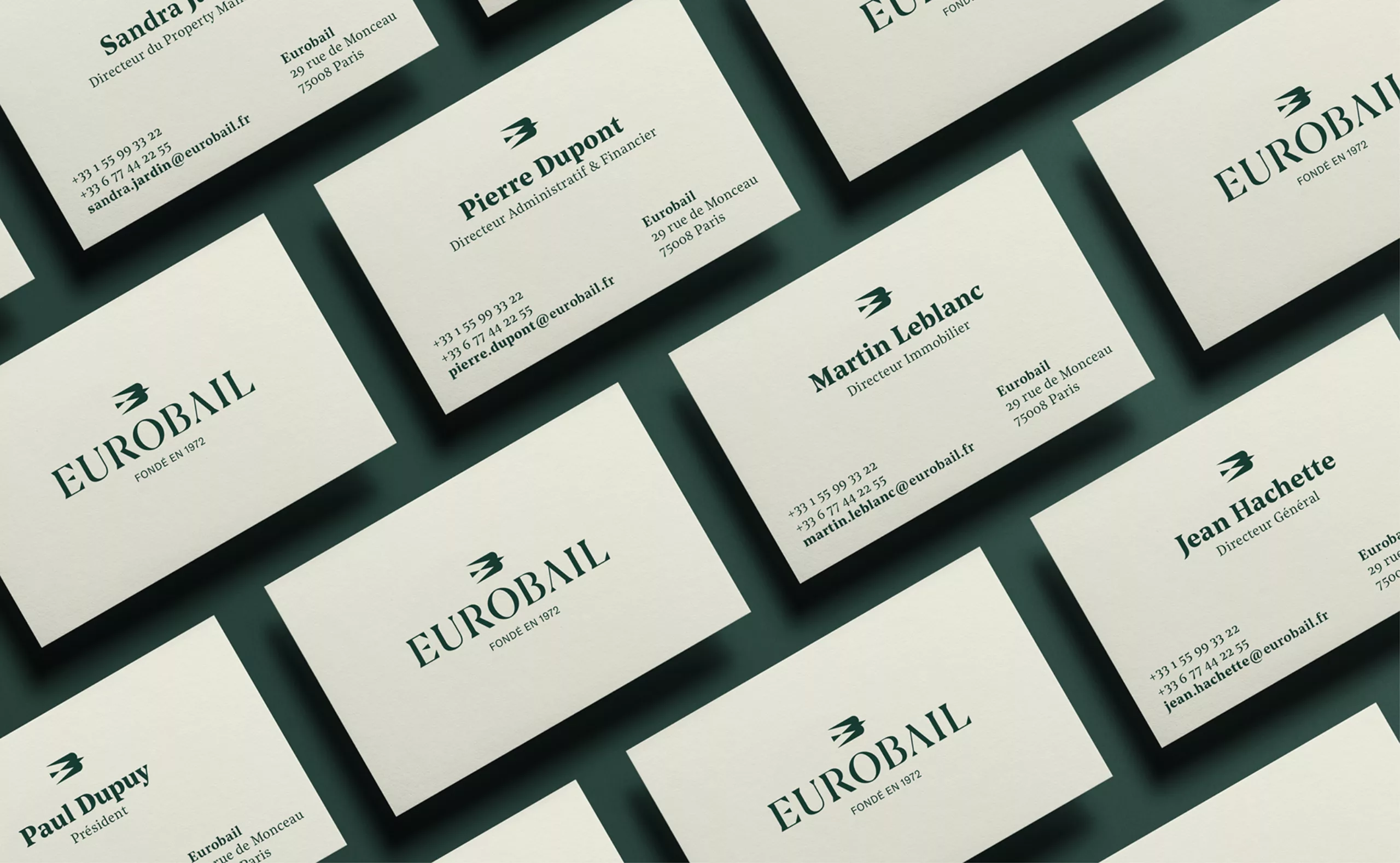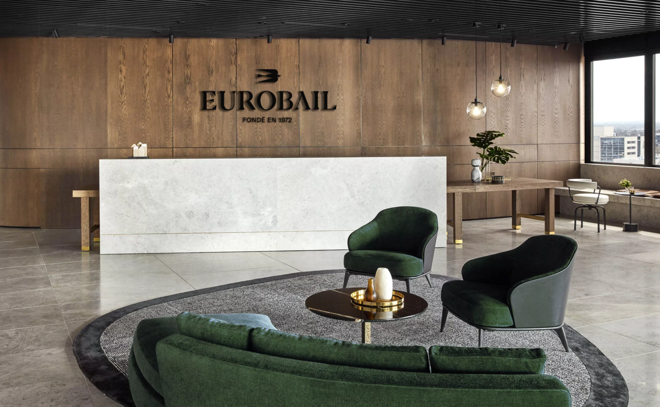
Graphéine worked on the design of Eurobail’s new visual identity. Eurobail is a real estate investor with an expertise in the management and leasing of commercial spaces. It is a family enterprise headed by Chuc Hoang and Nicolas Hoang.
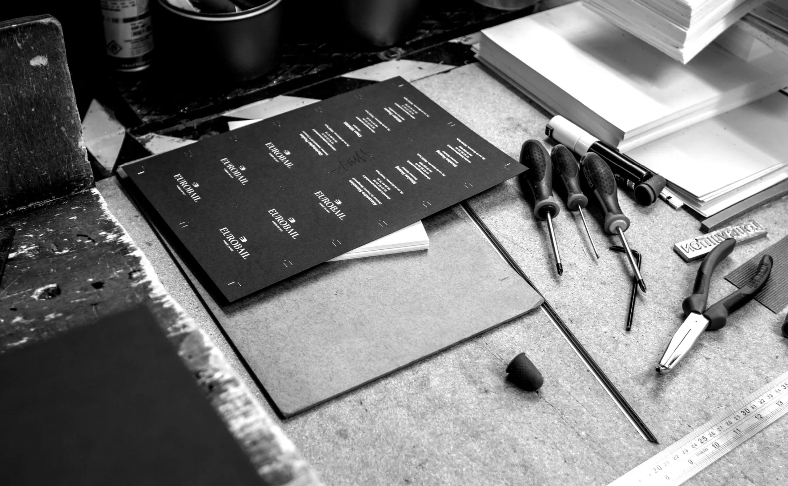
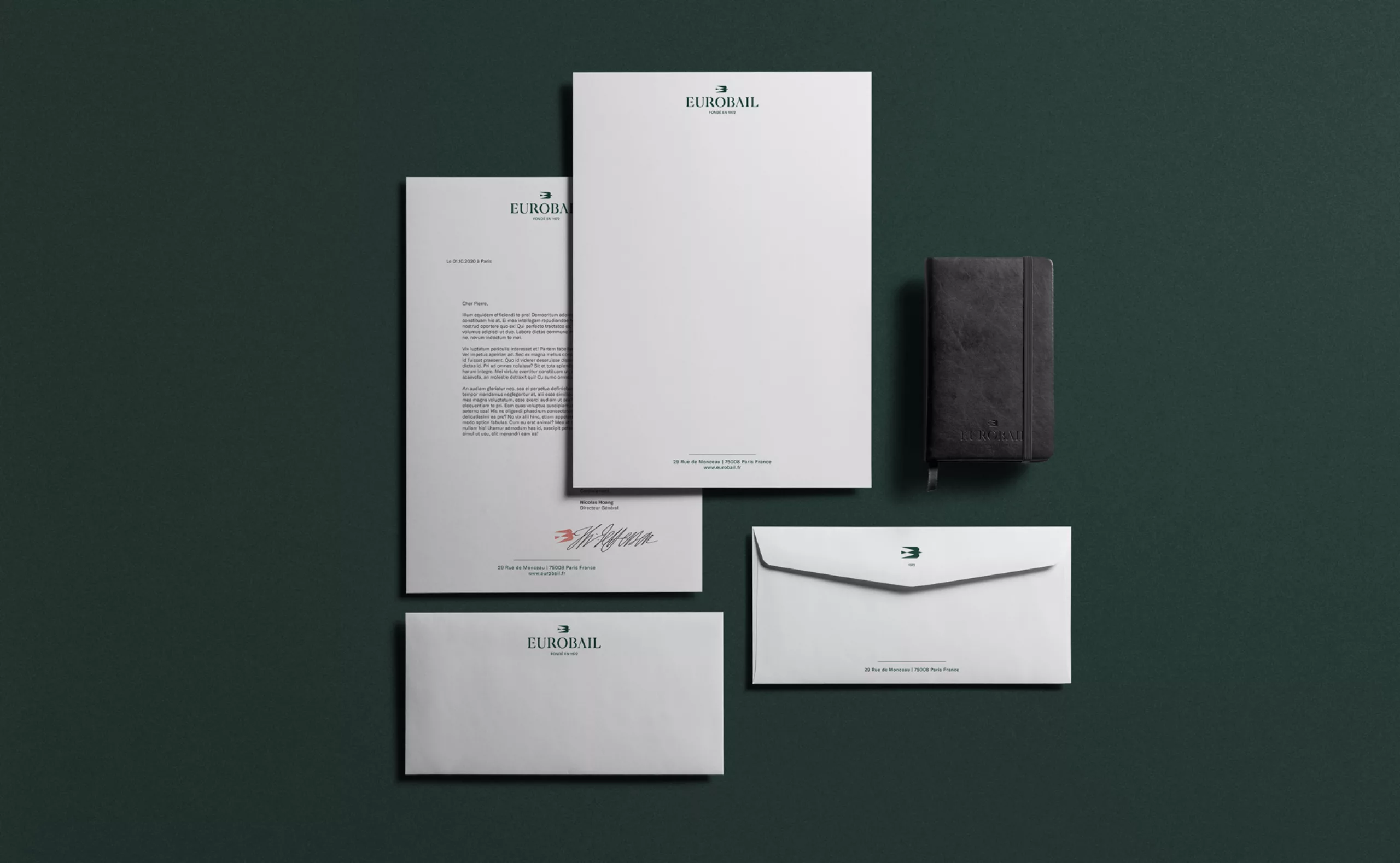
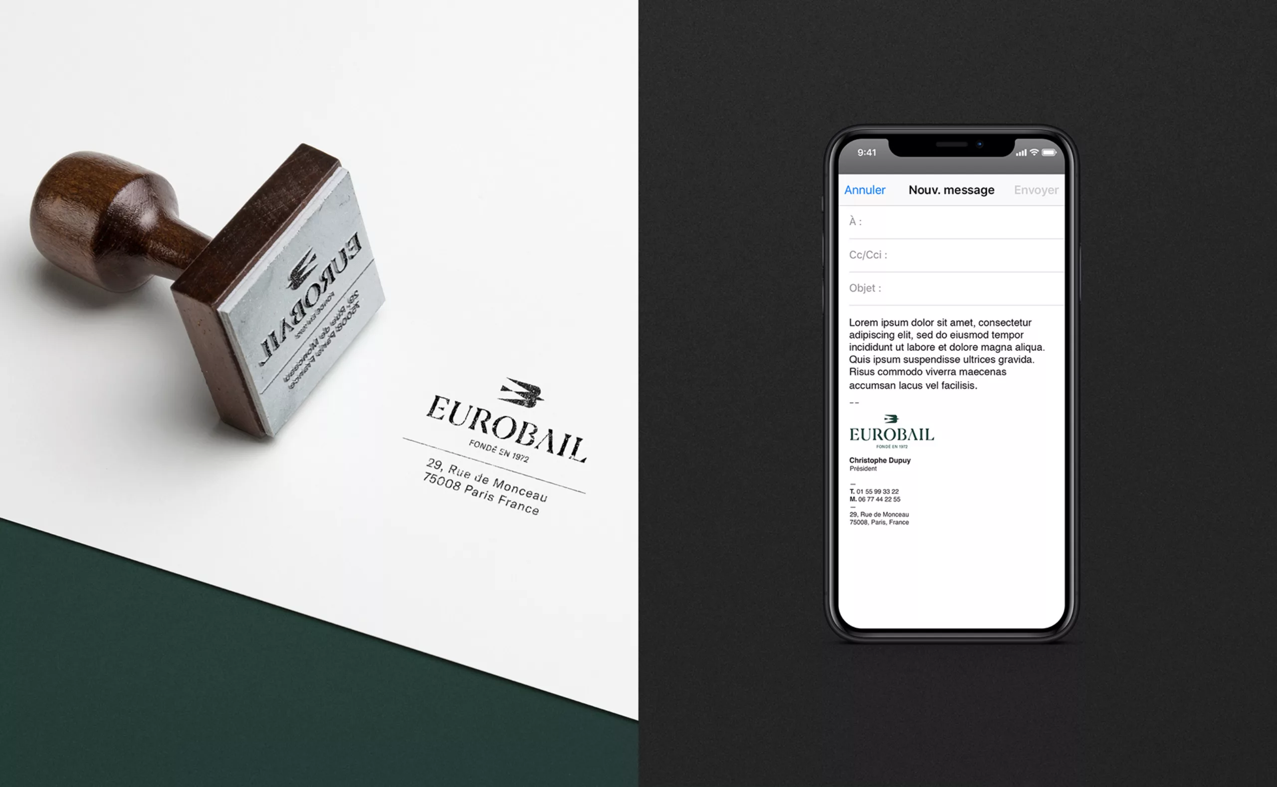
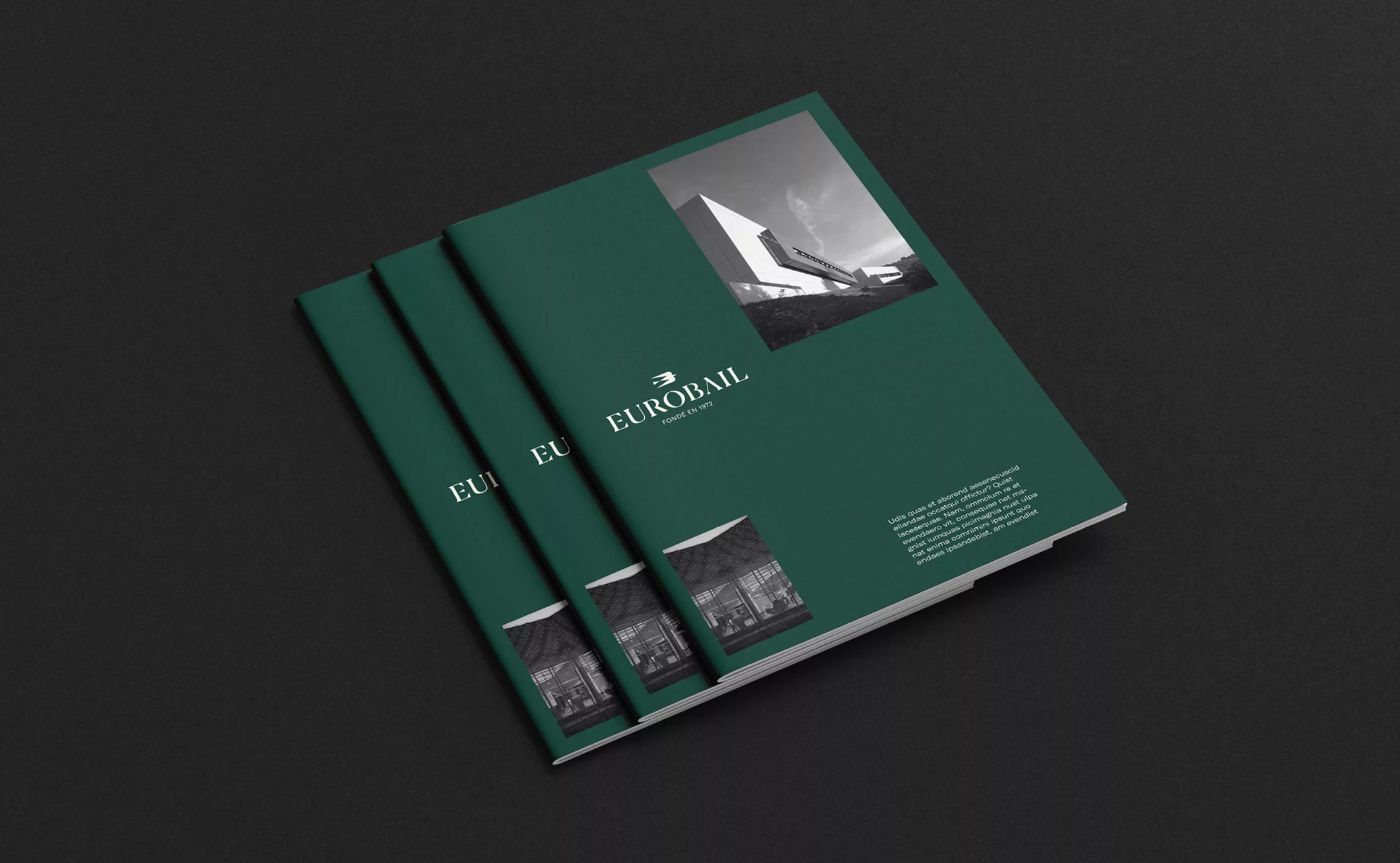
Founded in 1972, the company never had a visual identity before. And for good reason: Eurobail never needed to communicate to the general public. However in today’s rapidly evolving real estate sector, brand image has become the key differentiator in the larger competitive landscape. To stay relevant in this context, Eurobail felt the need to consolidate its brand image through a strong visual identity. To respond to this need, we provided the brand with a logotype and brand identity guidelines. The objective was to develop Eurobail’s brand story: the values it embodies, the personalities who run it. Given the dearth of previous communication materials, we had to identify the symbolic characteristics of Eurobail.
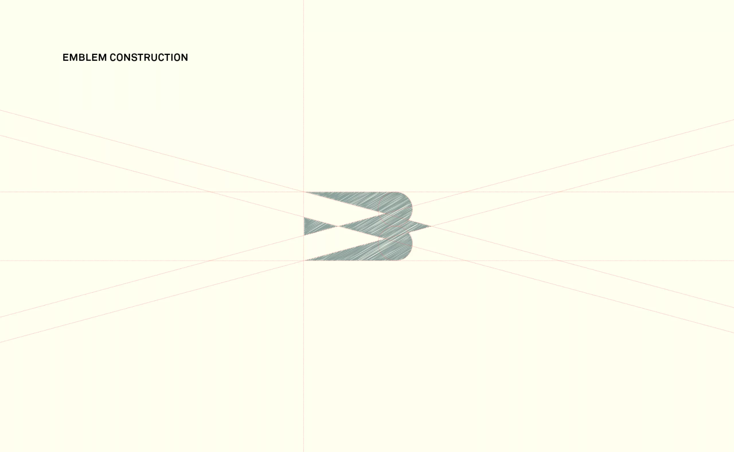
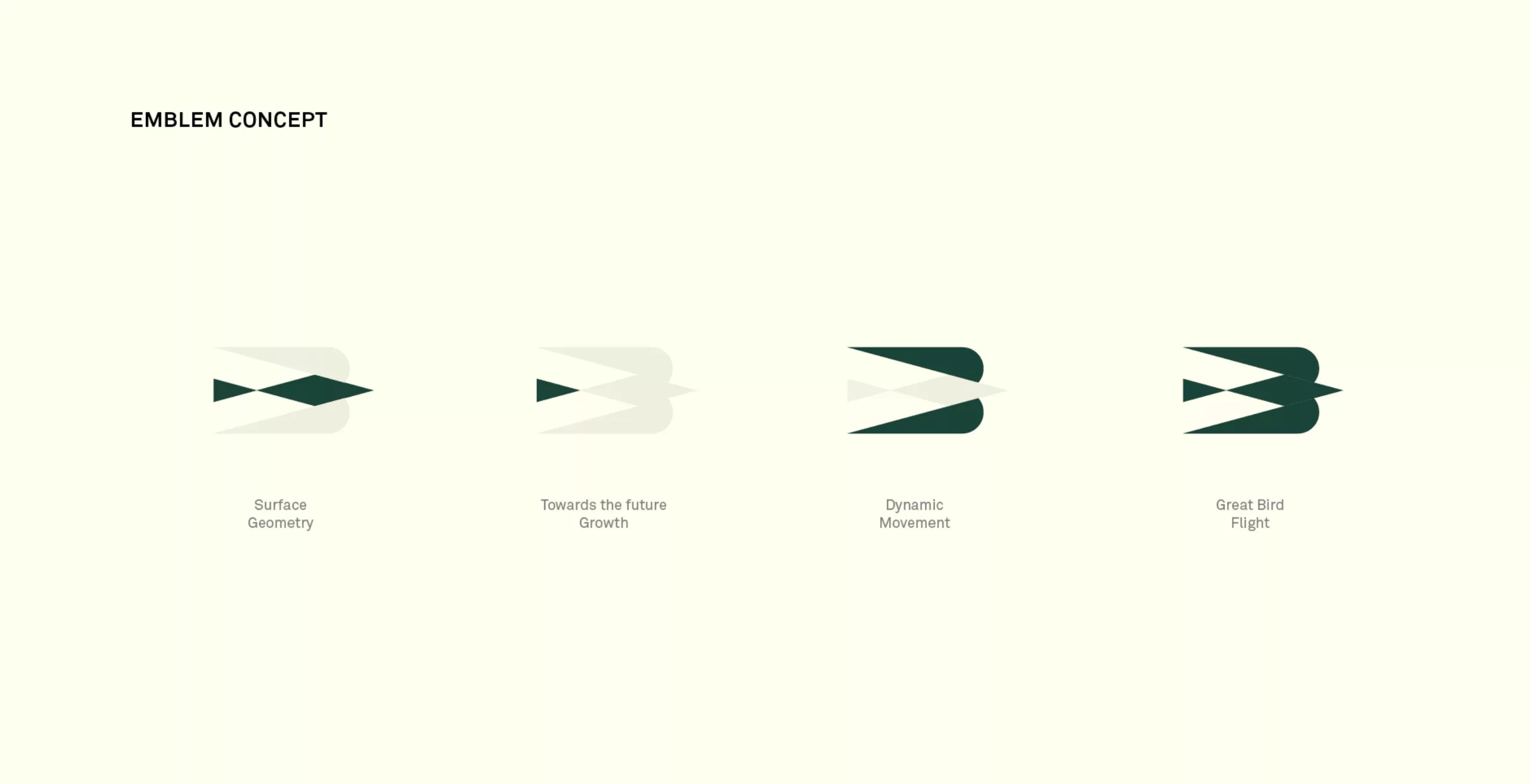
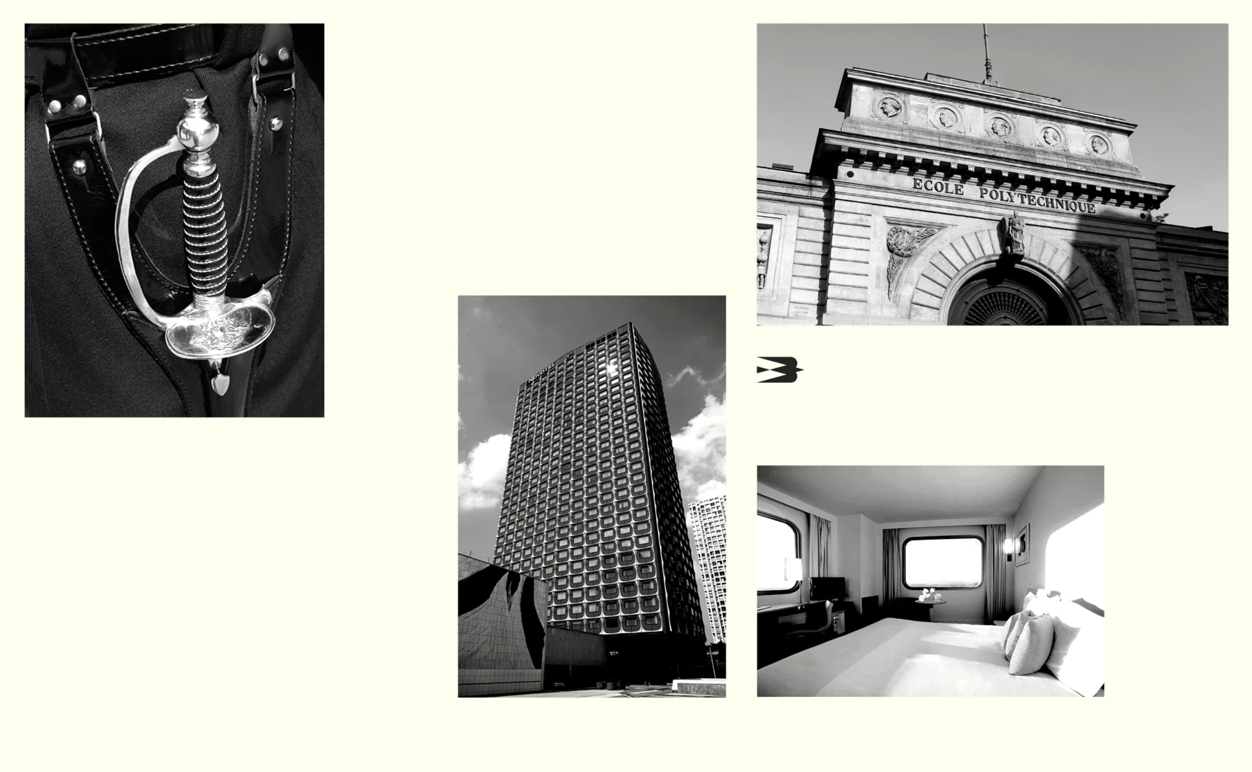
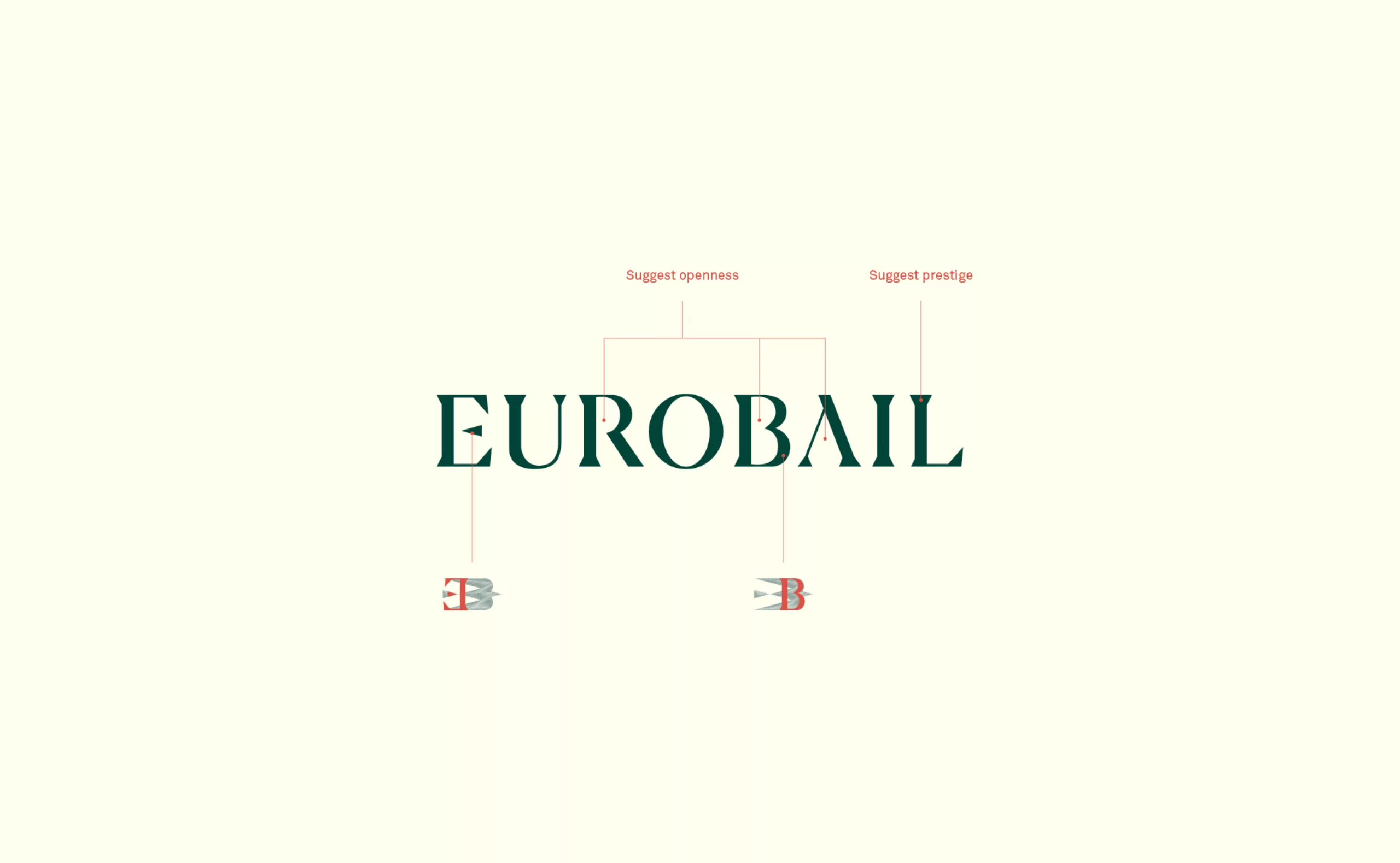
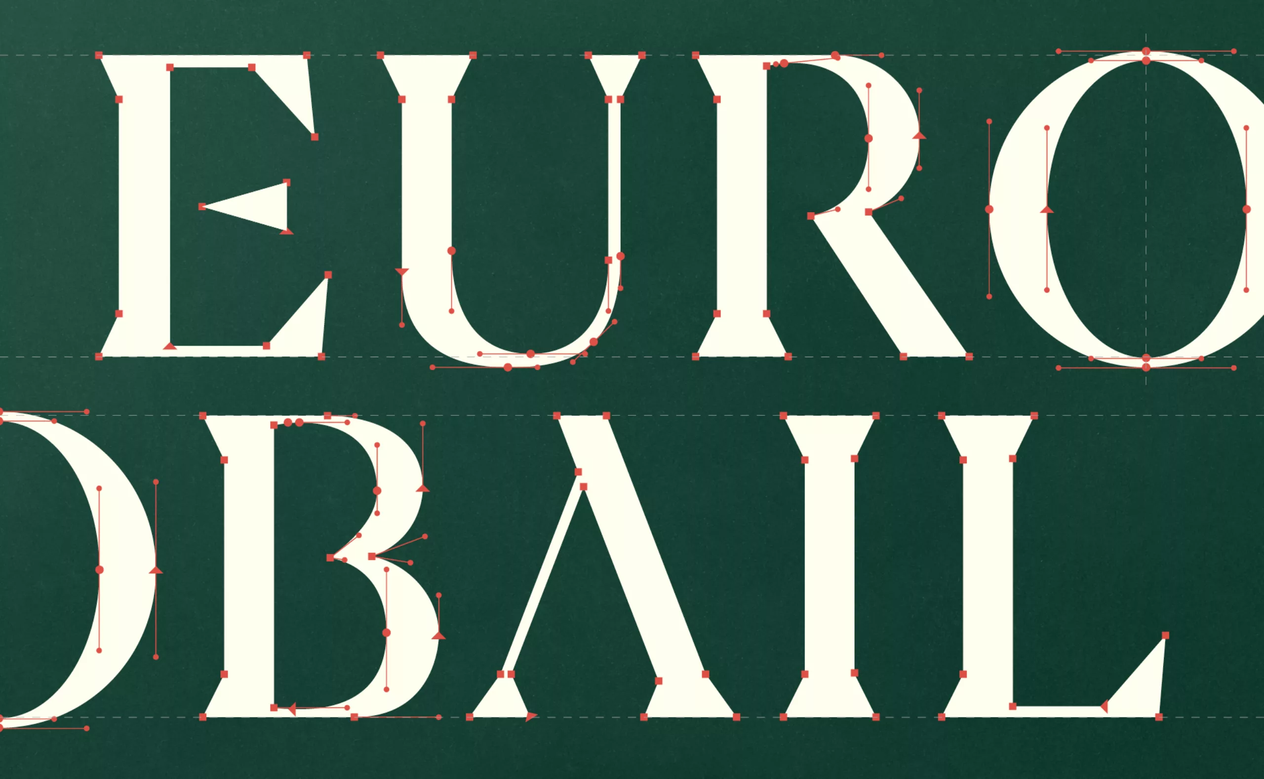
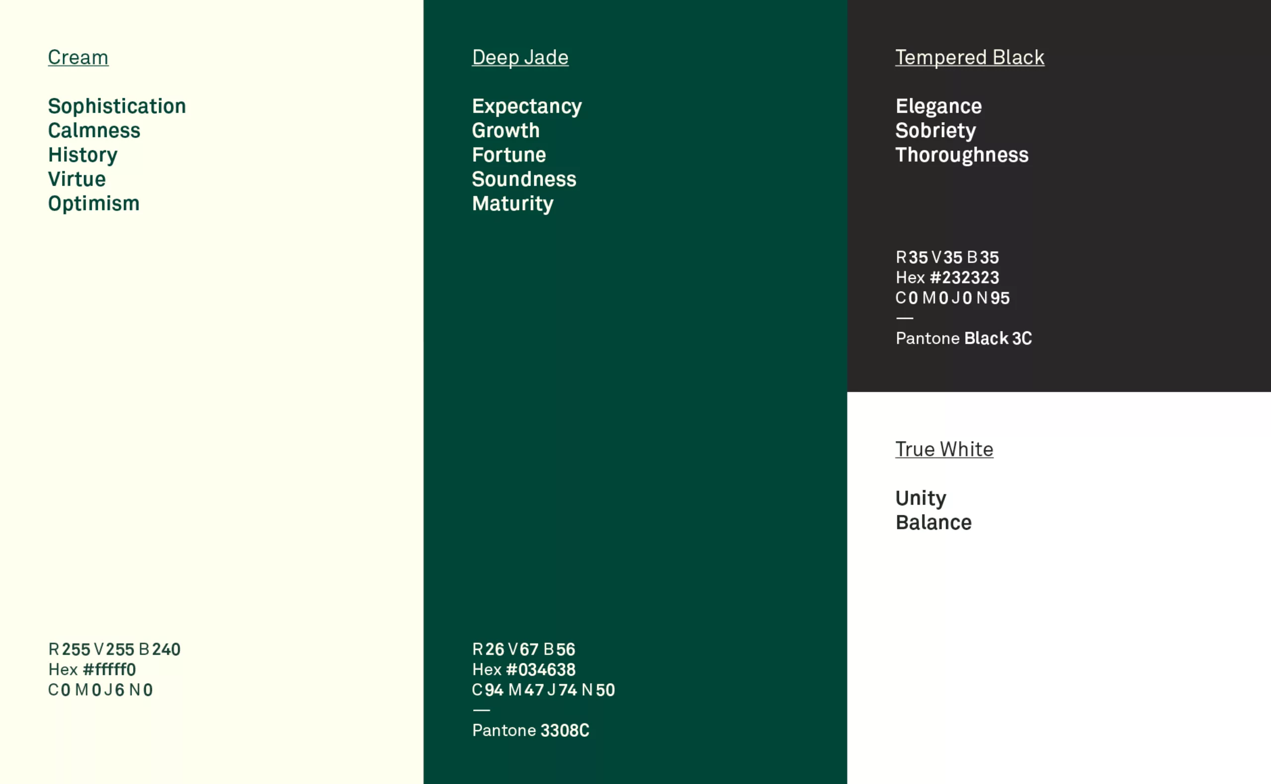
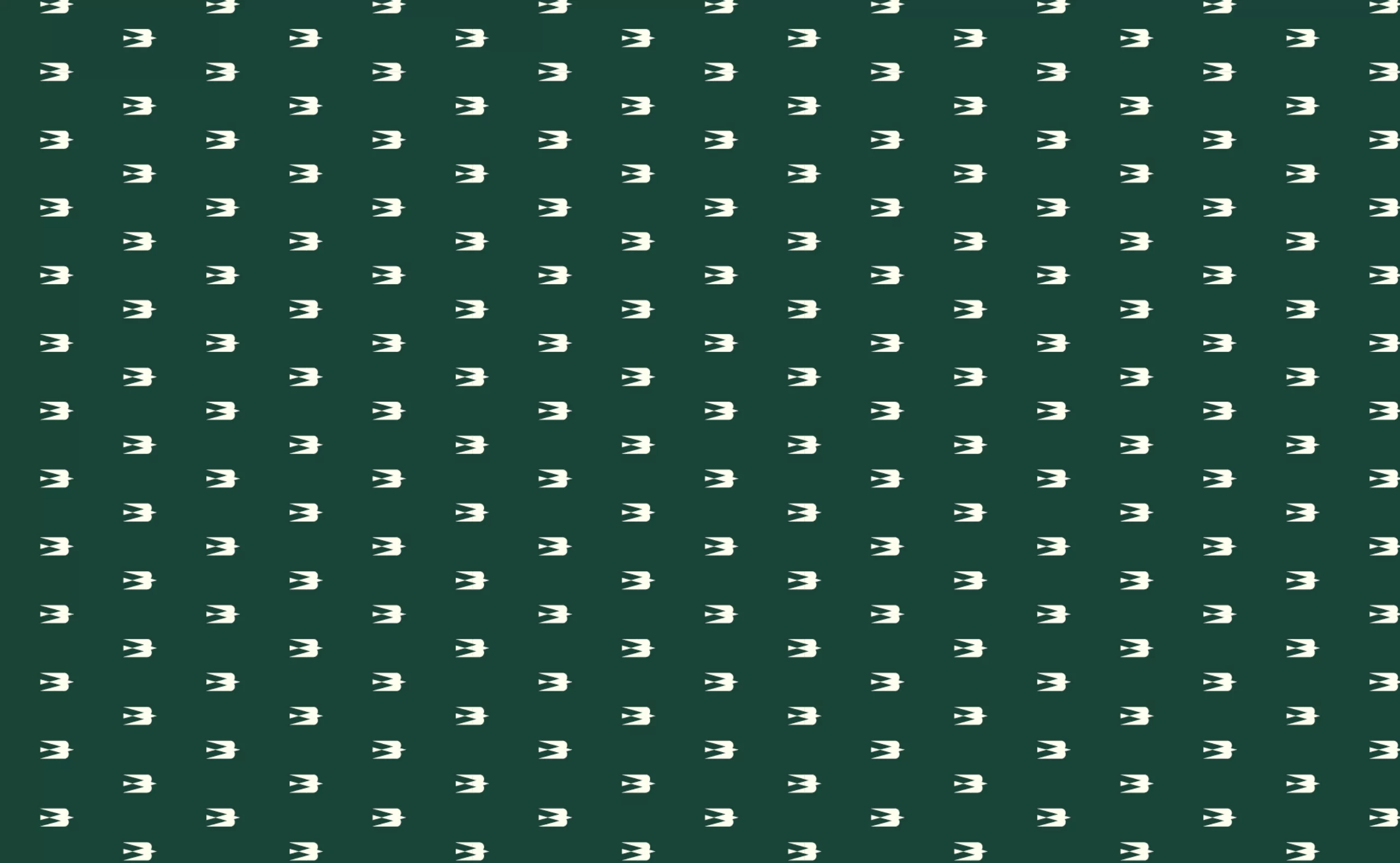
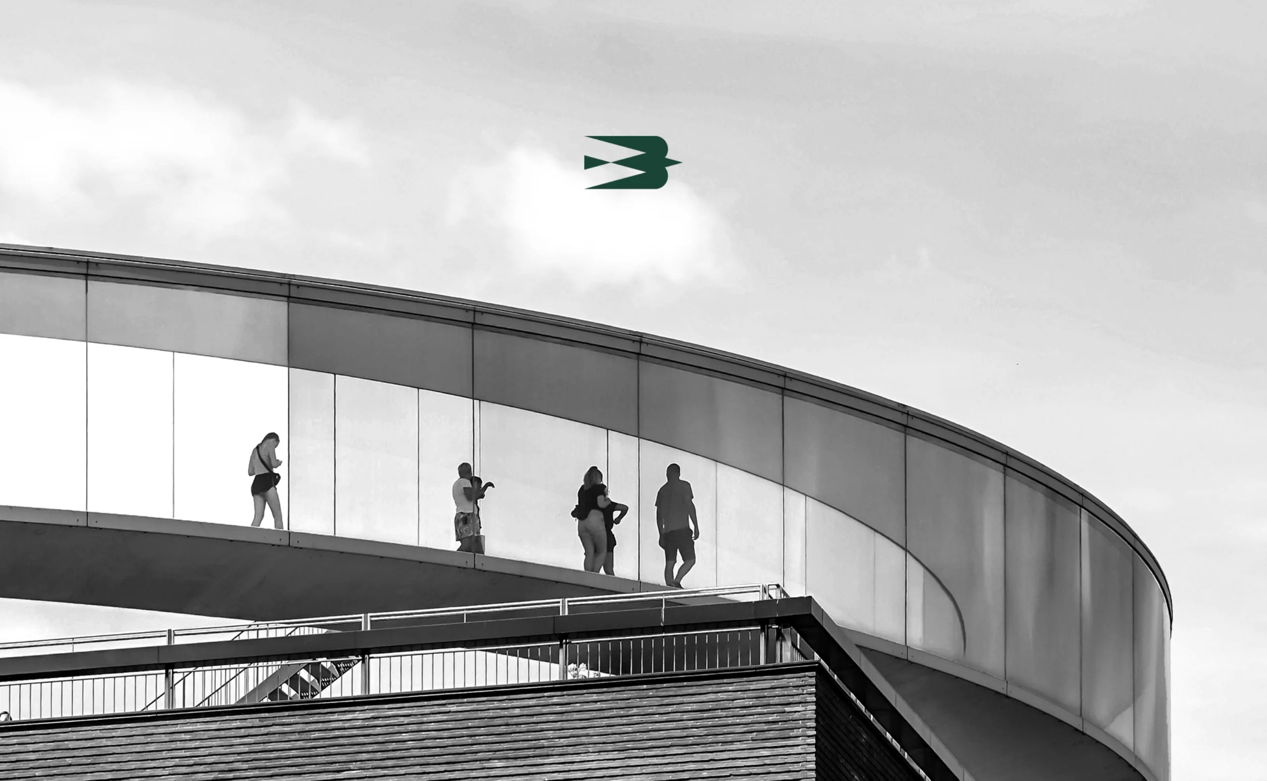
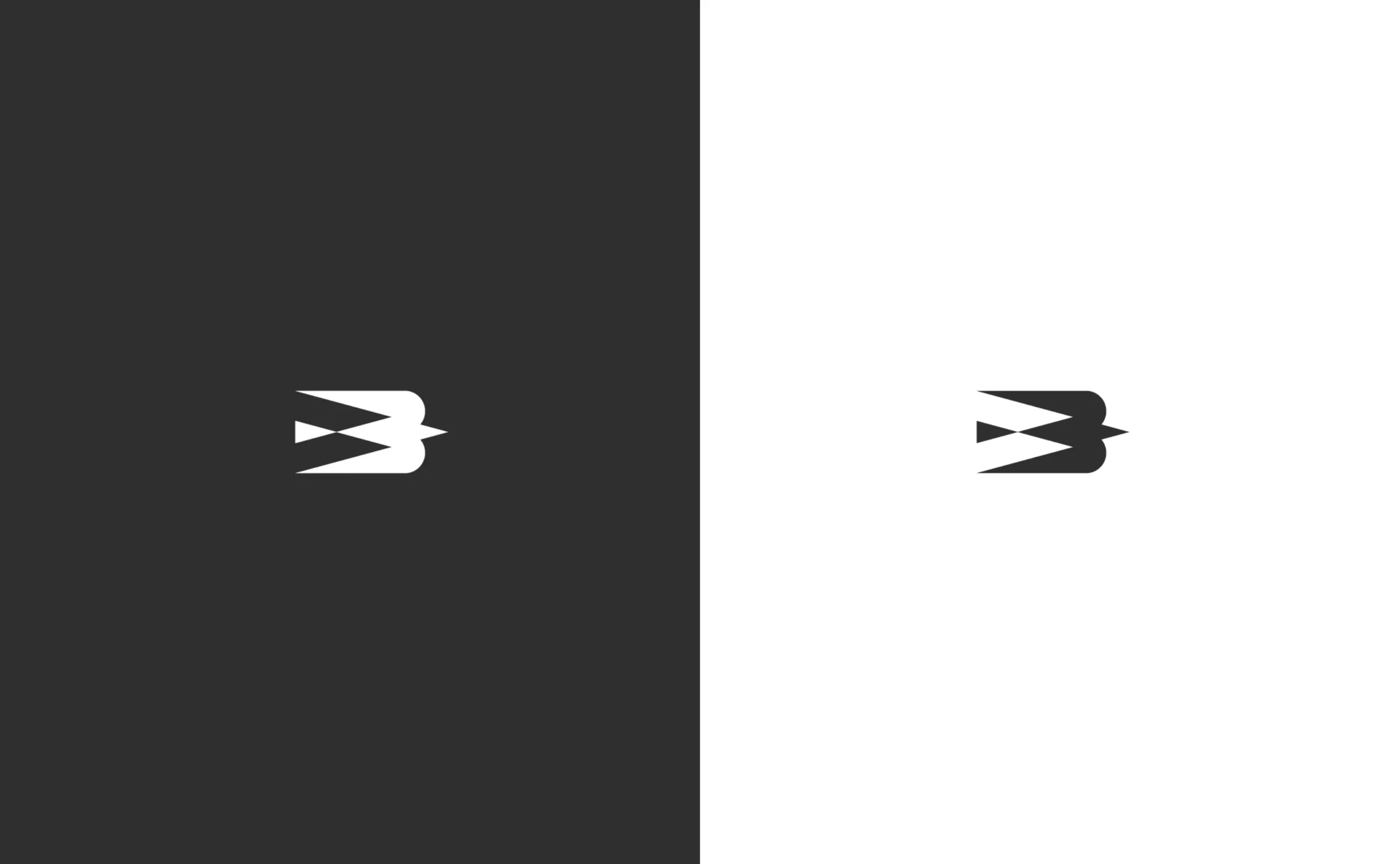
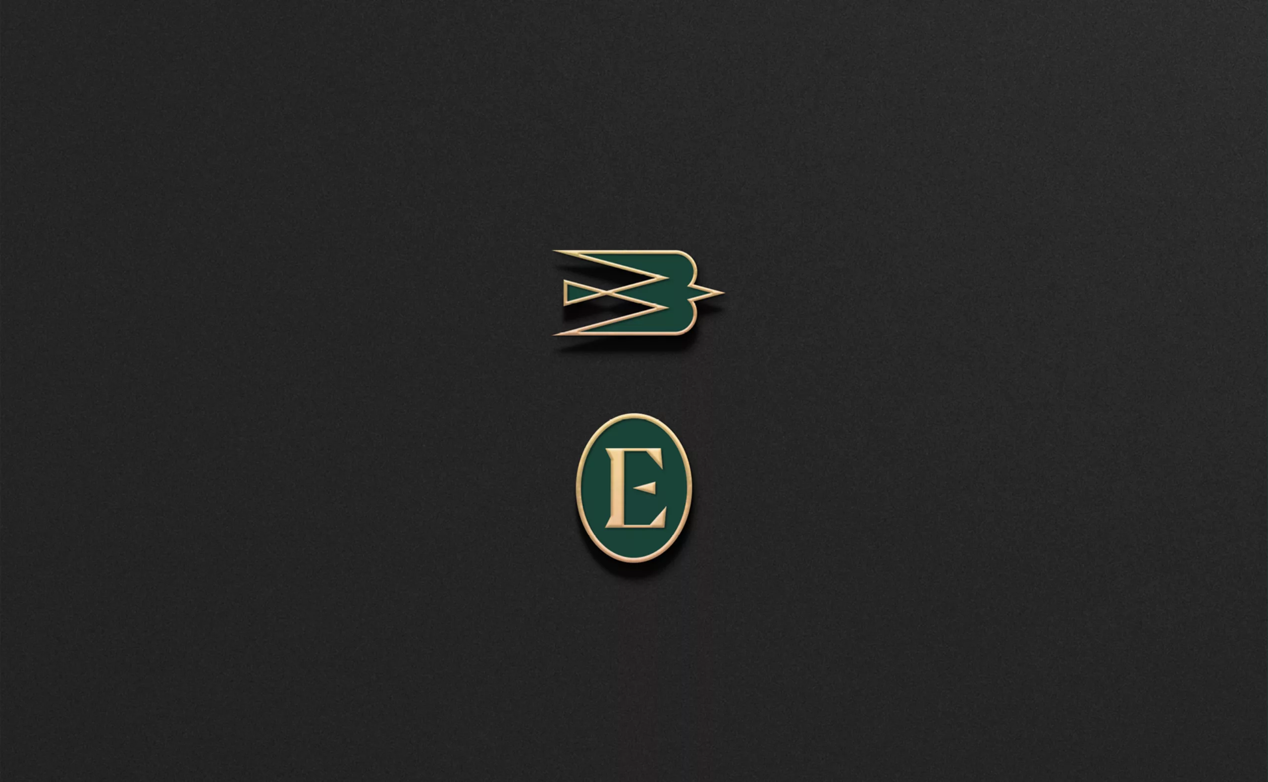
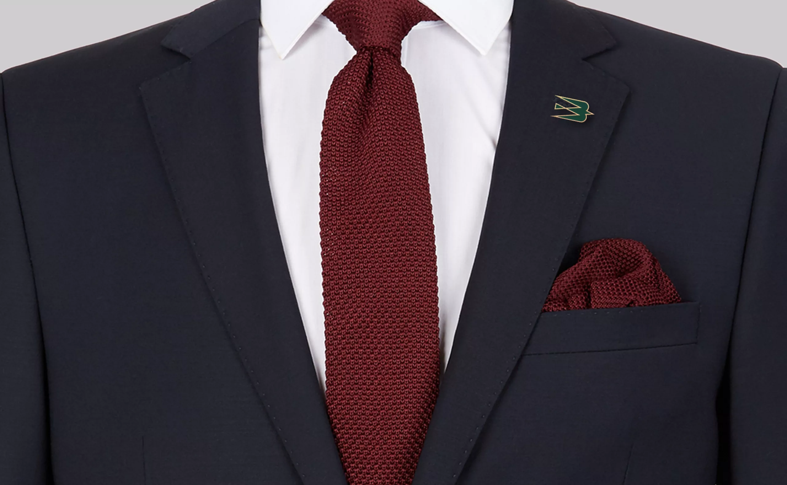
For the brand, the competitive aspect of business is balanced by humanist and responsible values. Eurobail is a model of success that embodies excellence and discretion. While the name “Eurobail” may have a connotation of ‘discount’, its identity is discreet and flamboyant. In order to translate the heritage of a family business that has been active for almost 50 years, we used heraldry as a point of inspiration. Soon enough, the idea of creating an emblem became apparent. It catalysed the brand DNA and proposed a spirit animal for Eurobail.