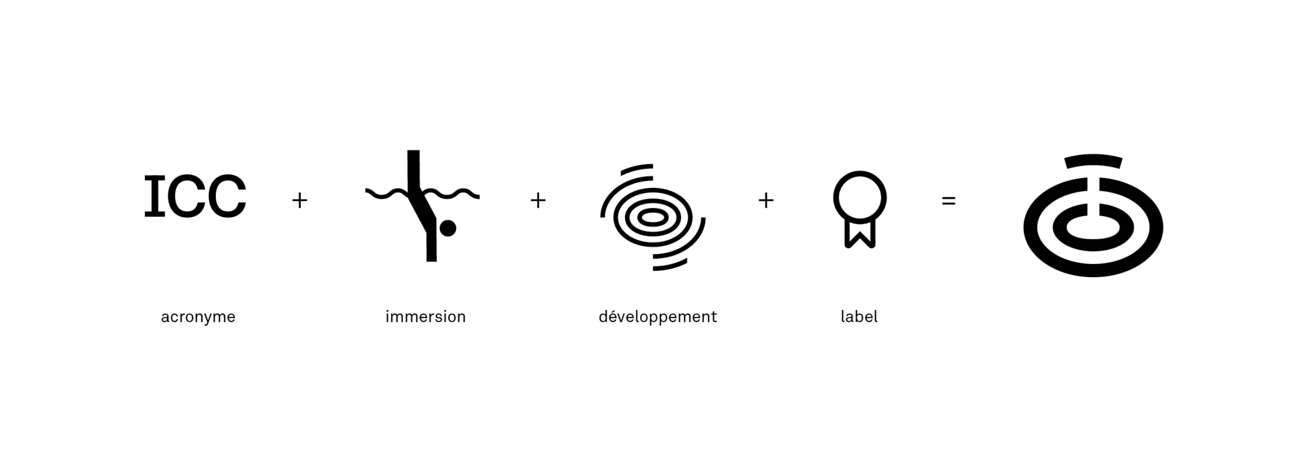
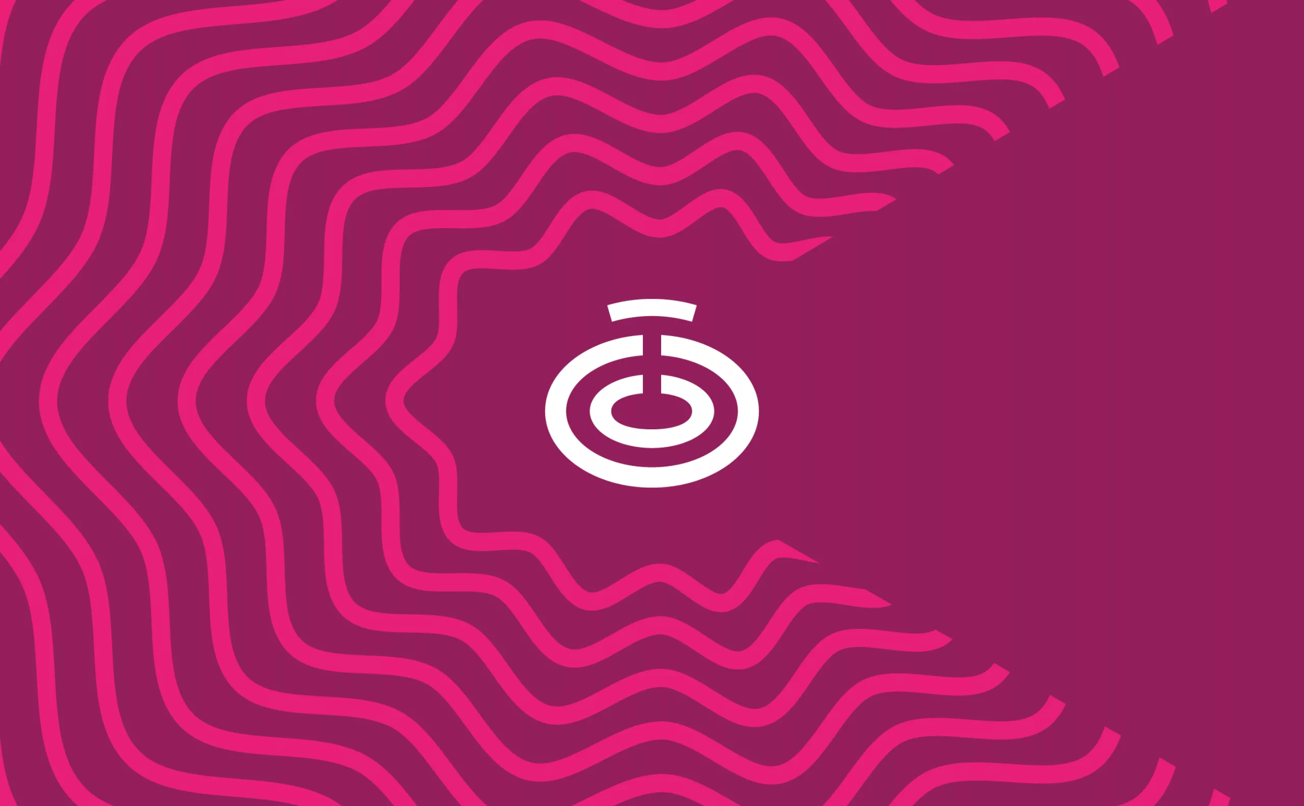
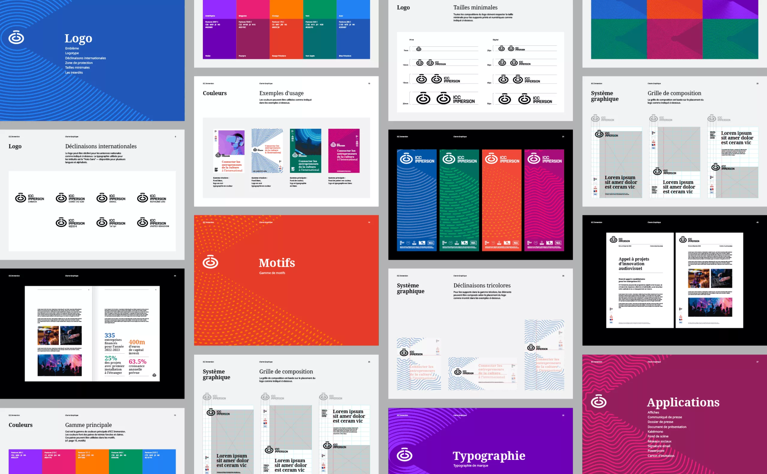
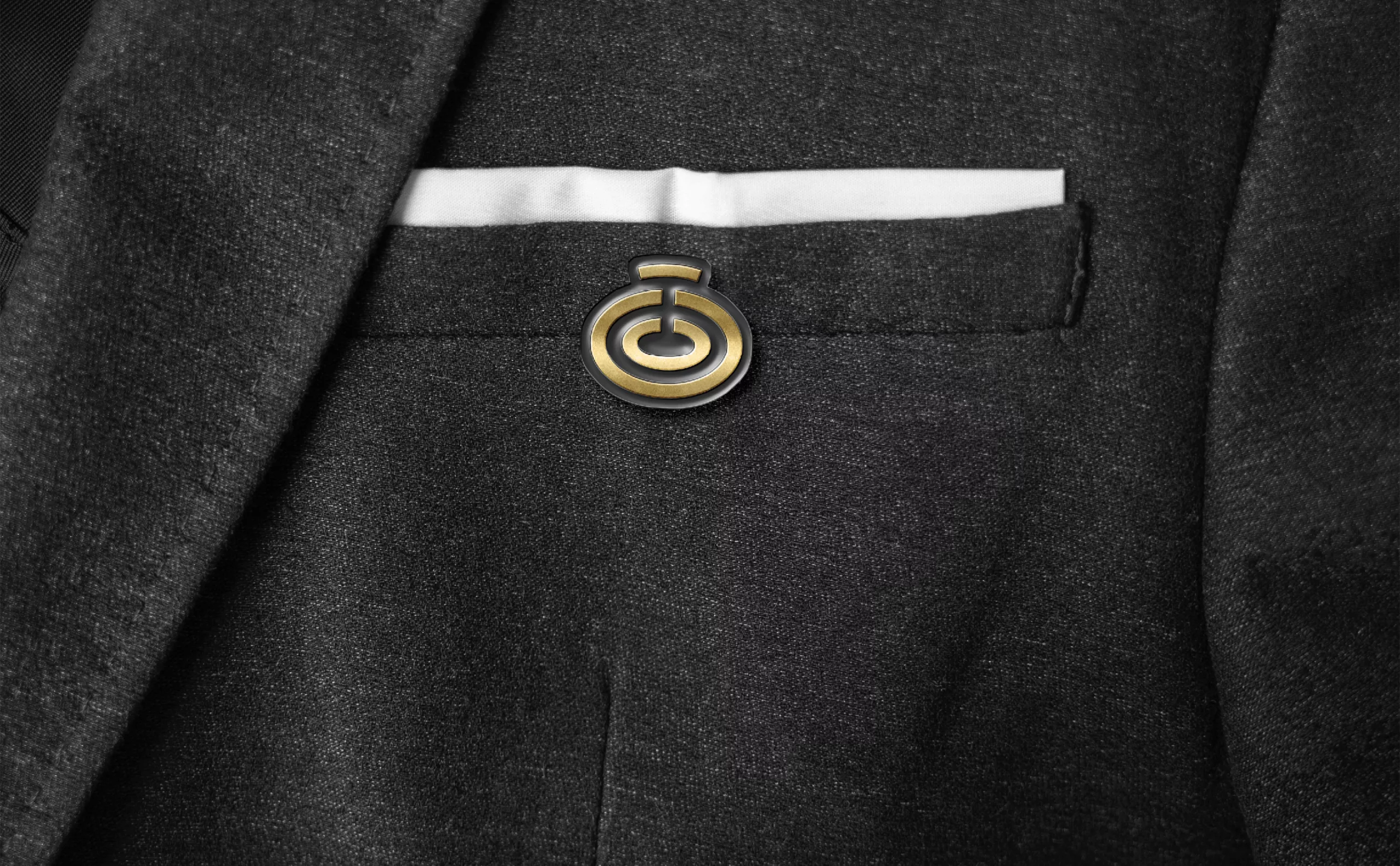
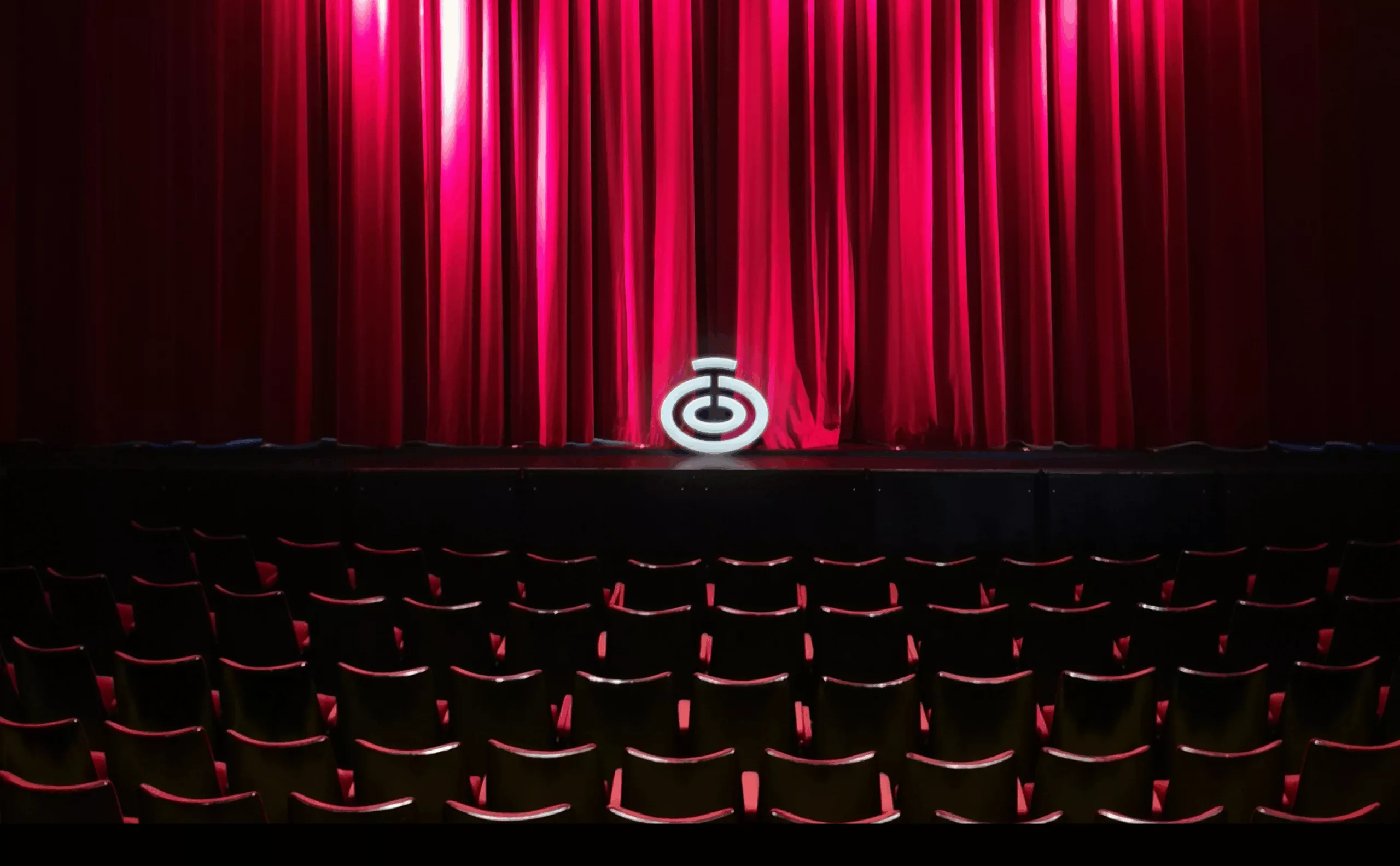
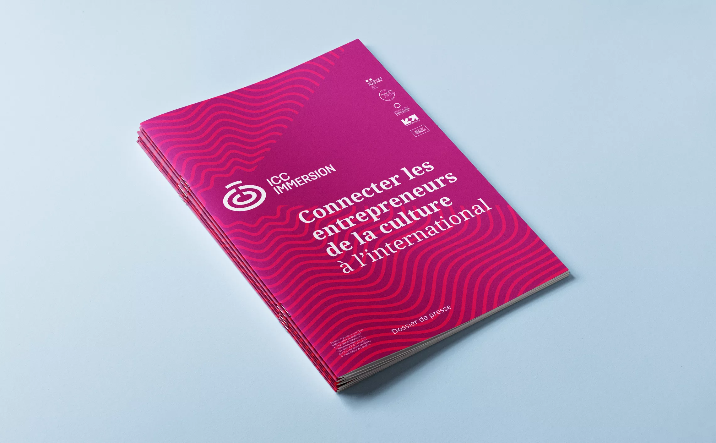
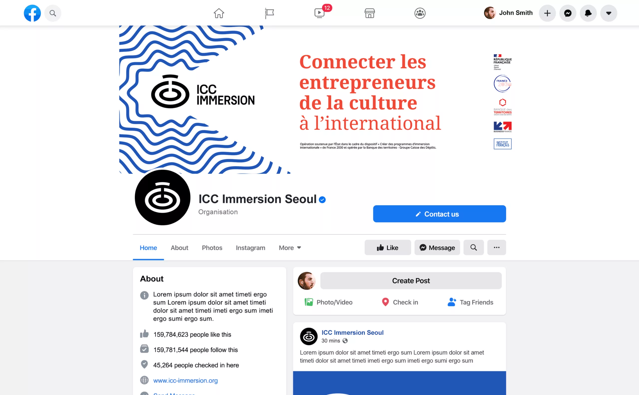
A visual identity born from a large, vibrant and shape-shifting “C”
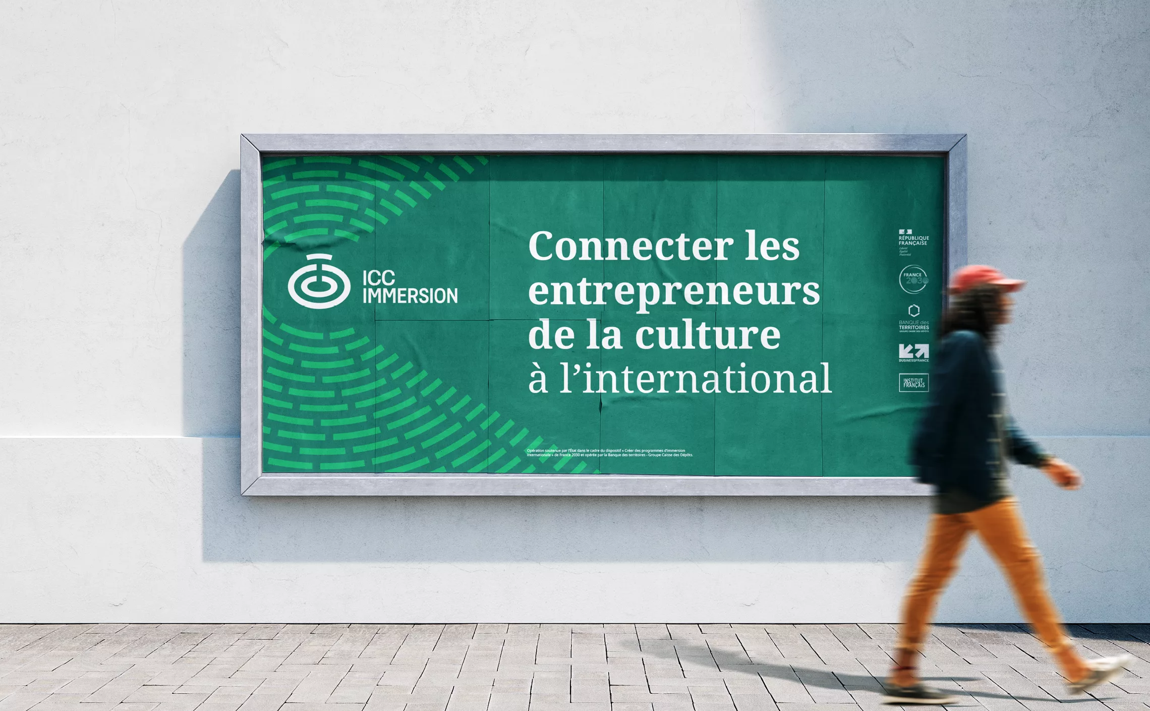
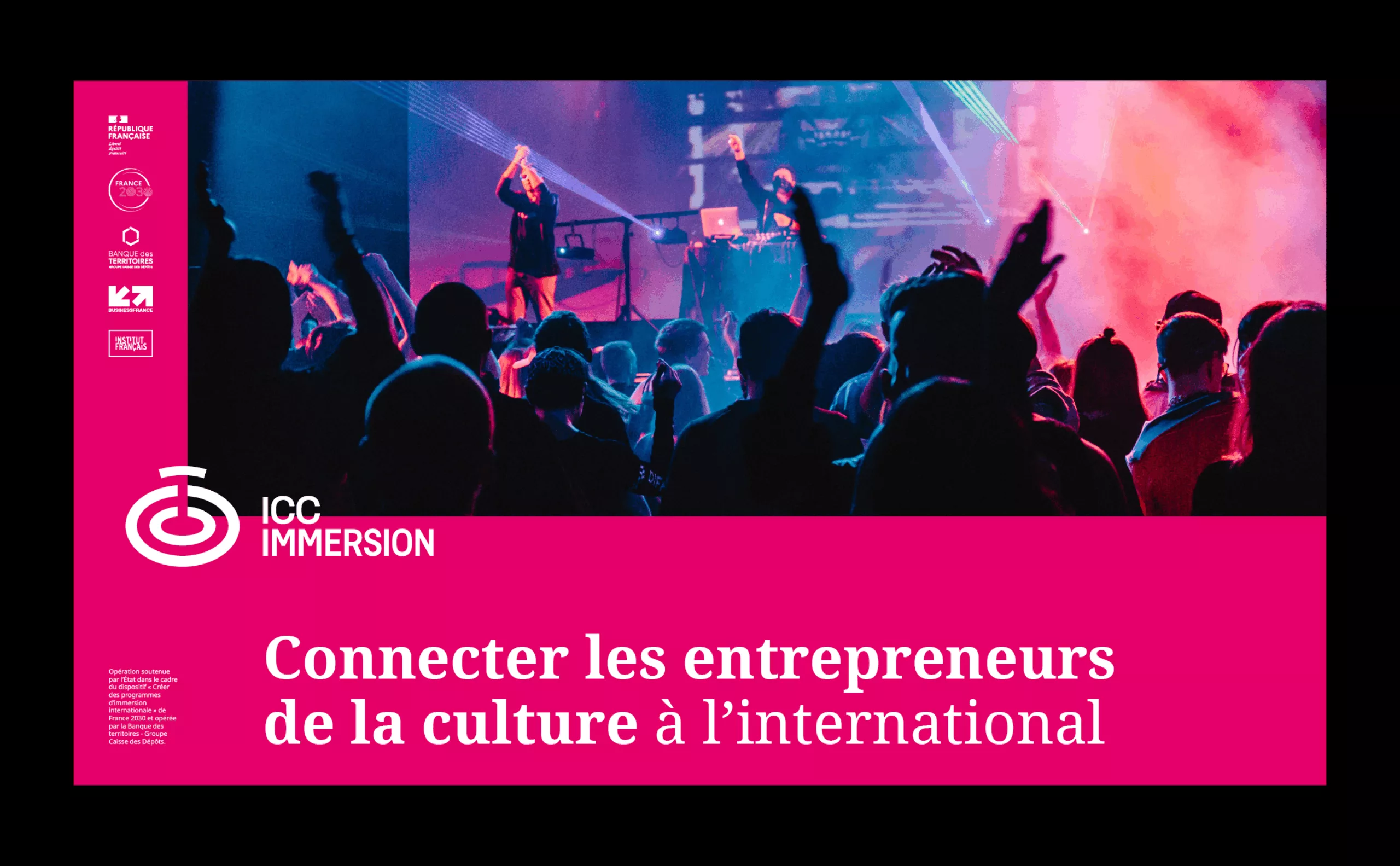
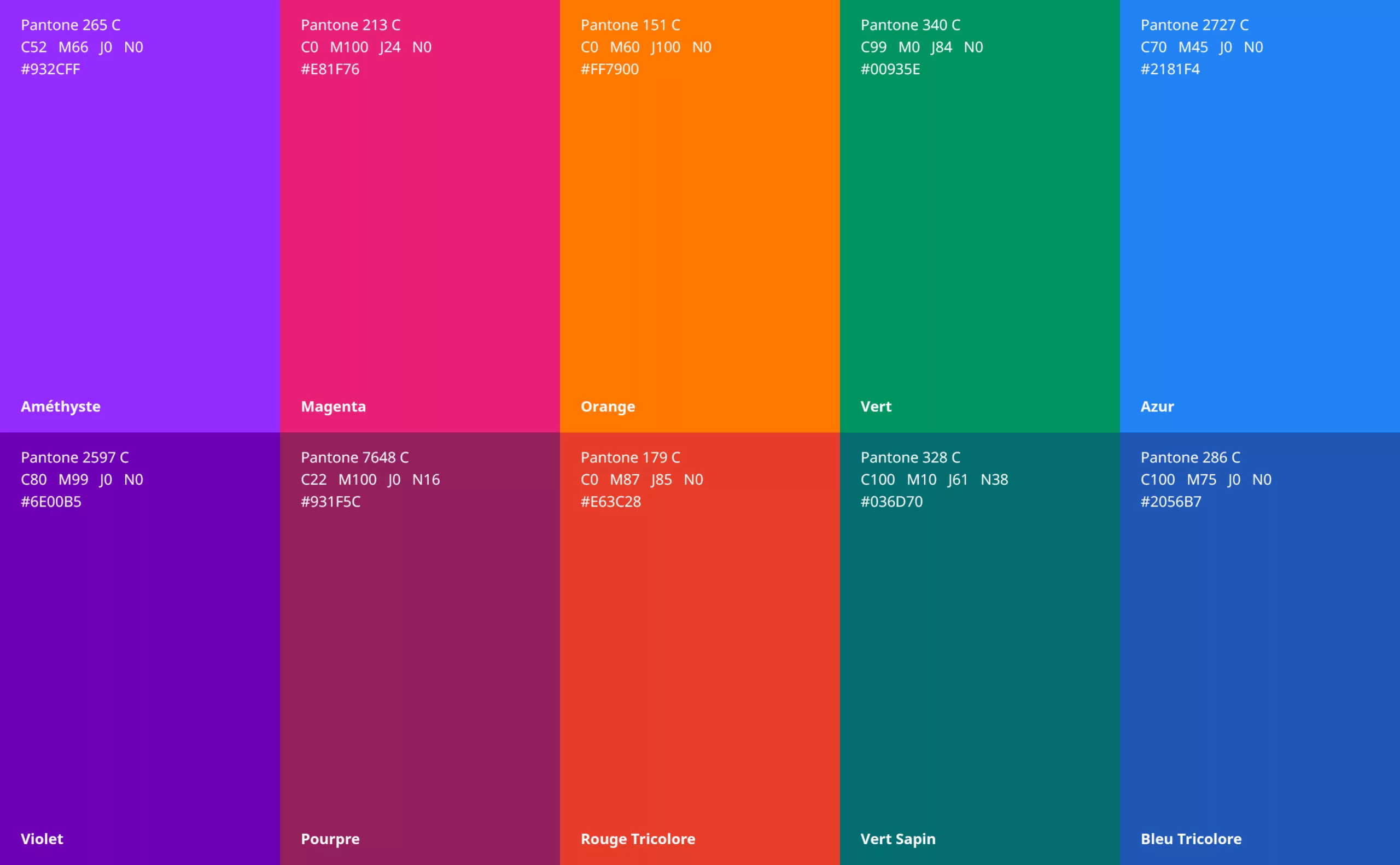
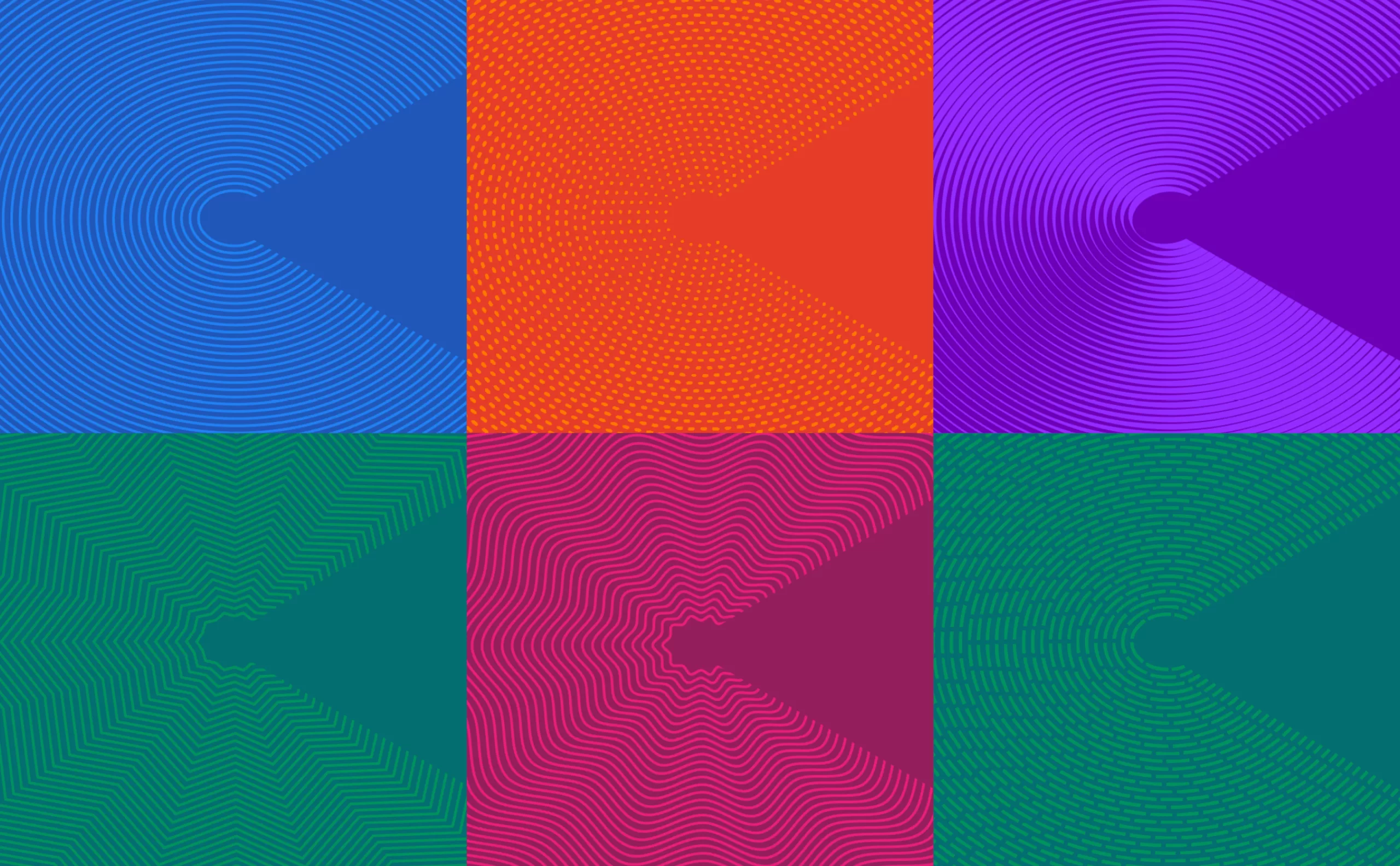
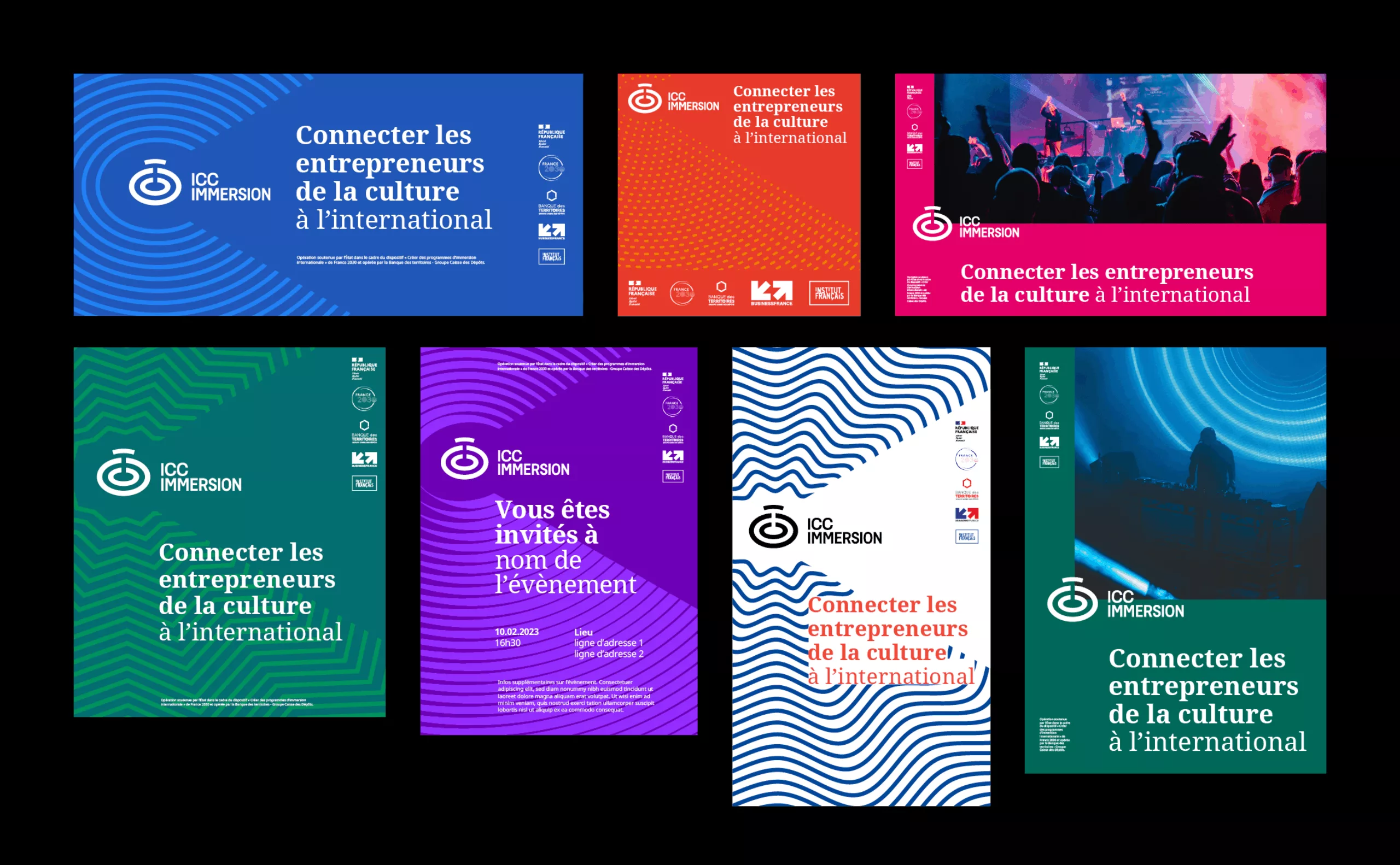
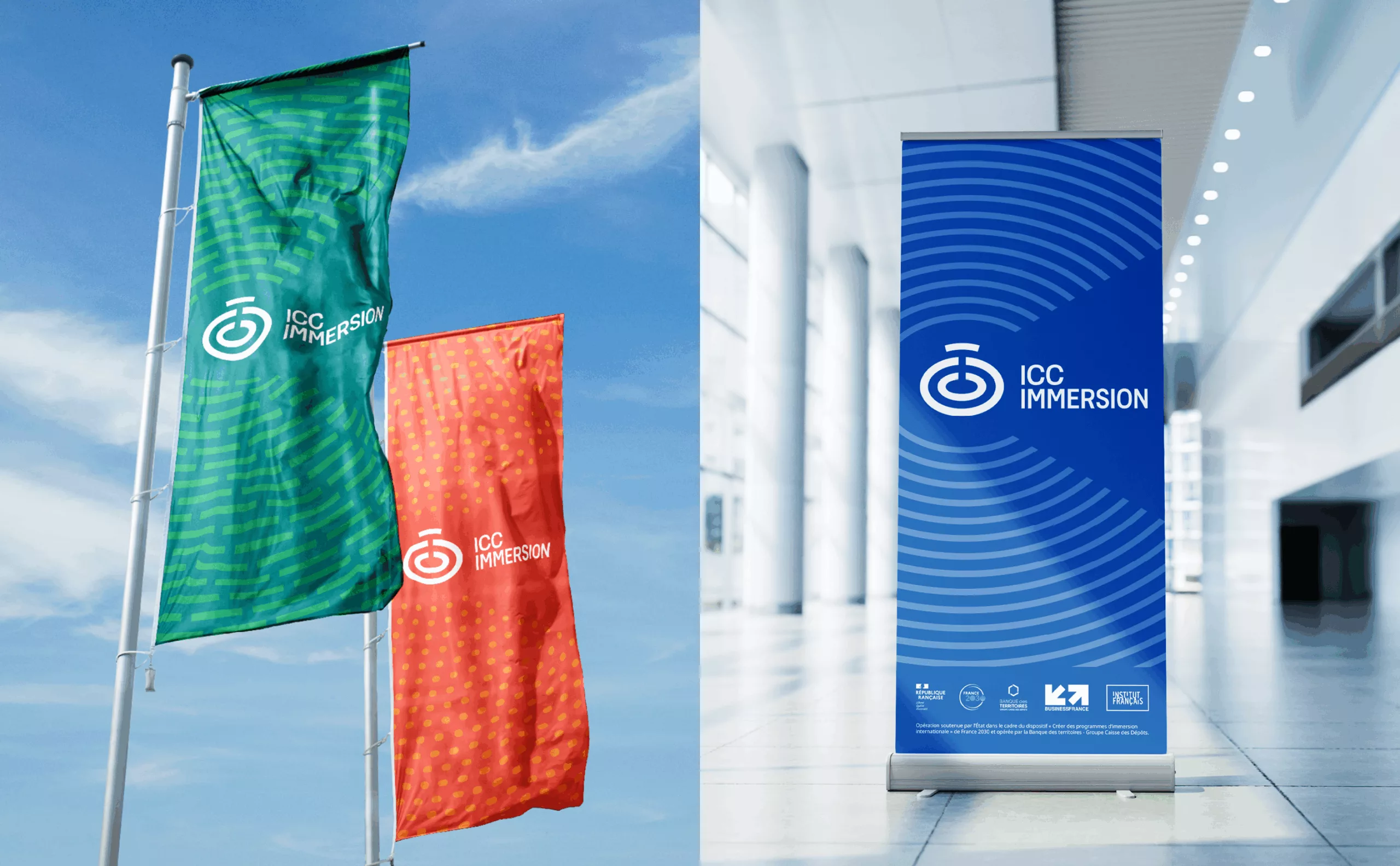
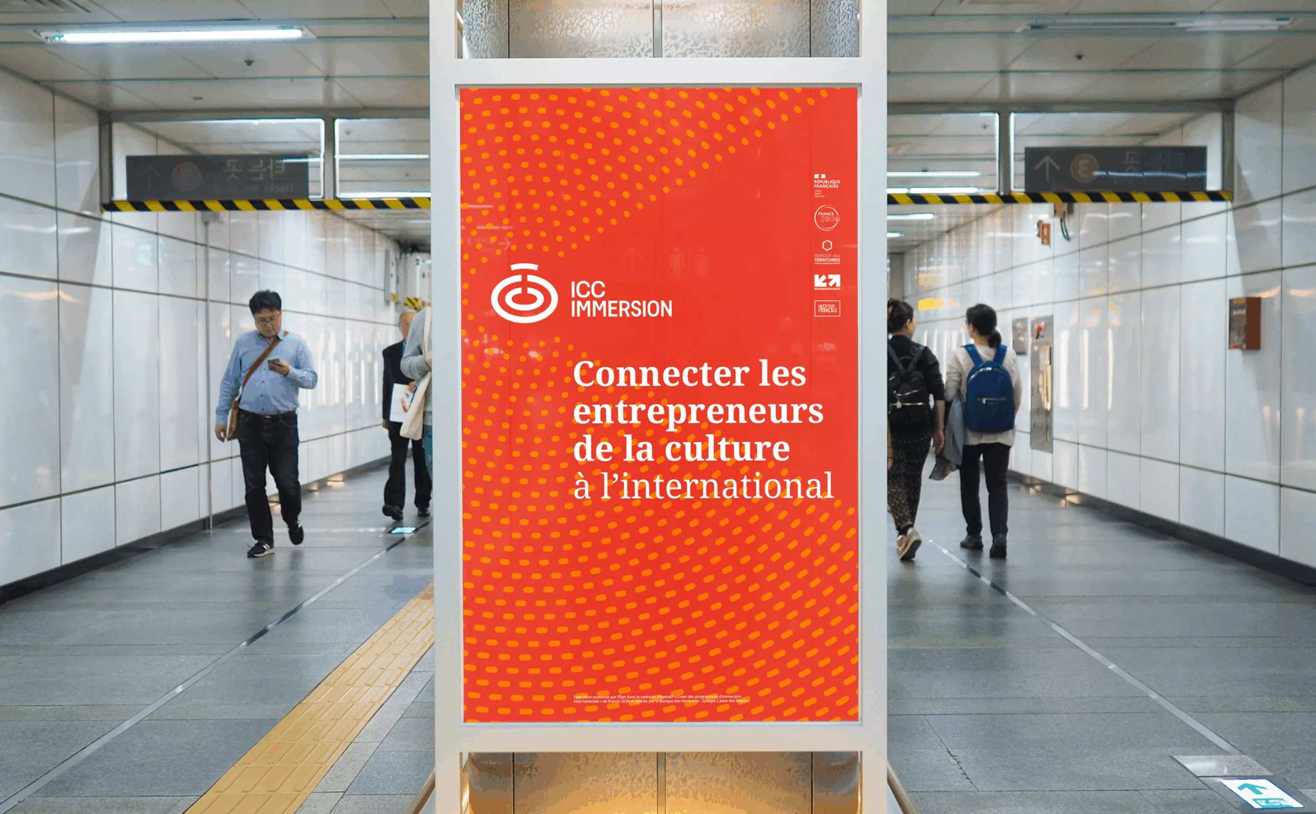
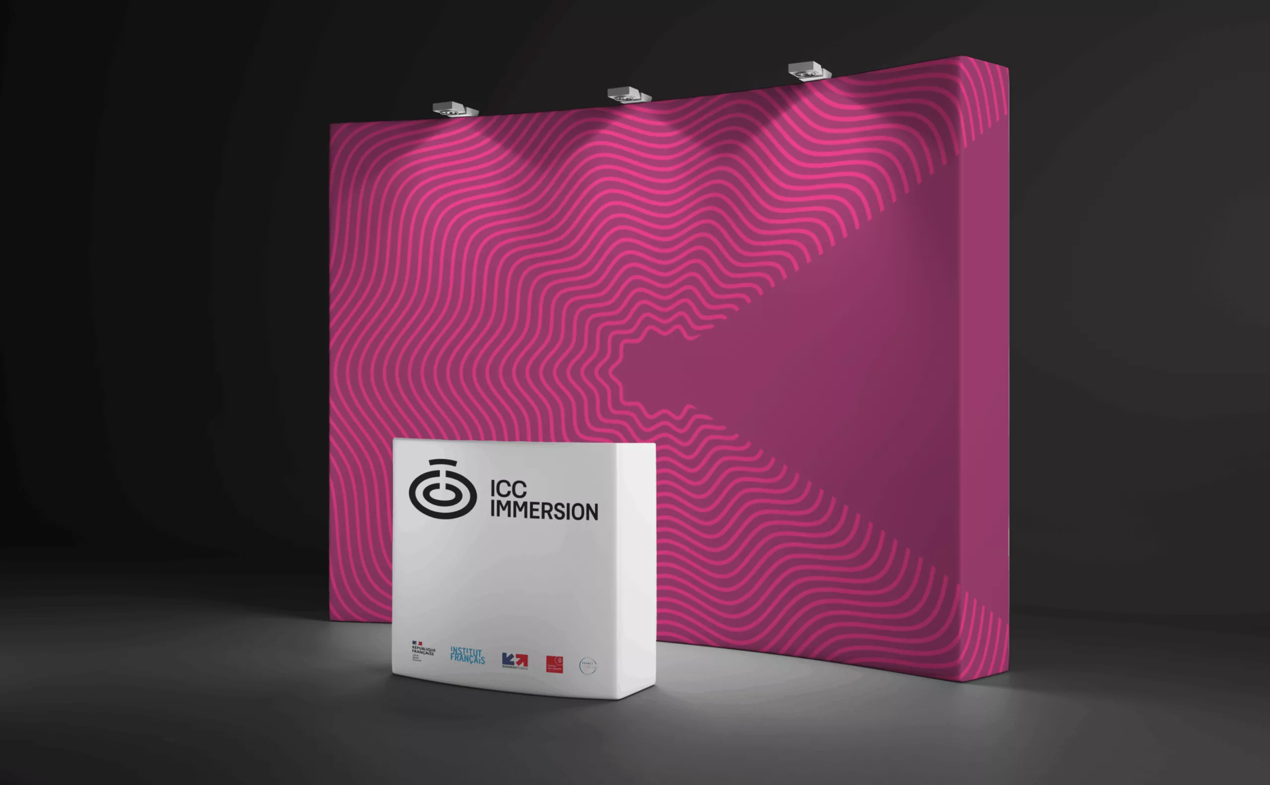
The “ICC waves” monogram functions as the epicenter of the ICC Immersion graphic system. Around the emblem, a seismic wave spreads out and draws a big C. This graphic system completes the brand territory by creating a range of 6 patterns. Each wave has its own path and colour combo in order to communicate the diversity of the CCIs. This graphic principle makes it possible to create a reassuring logotype that functions as a certification mark, without sacrificing a lively and innovative appearance.
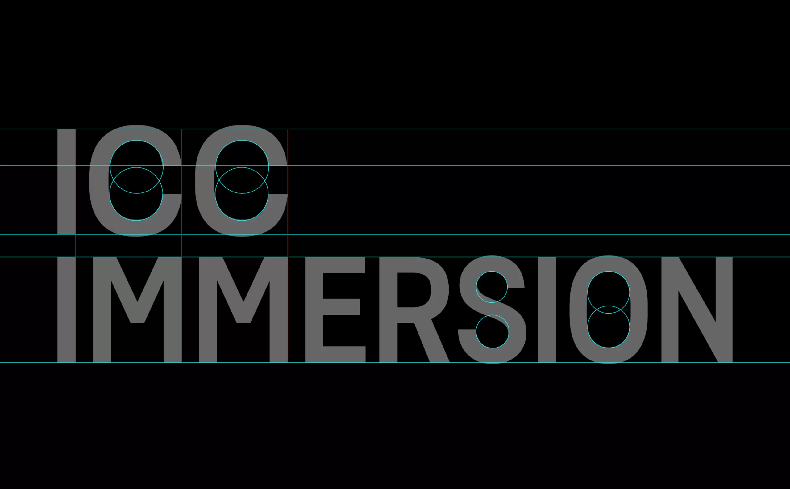
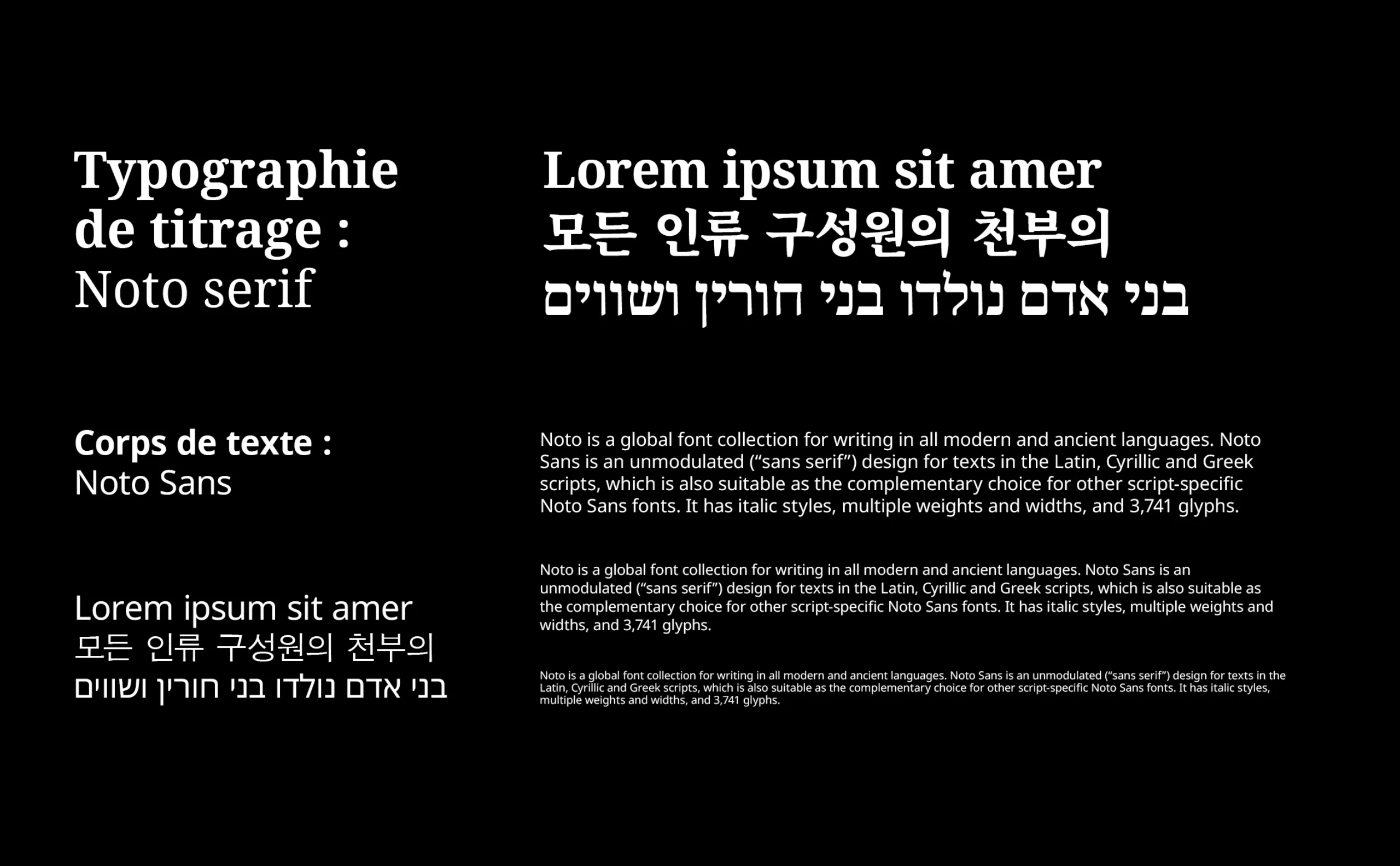
The accompanying typefaces used are Noto Serif and Noto Sans. We chose these open source typefaces which have the unique quality of being an extensive typeface family with versions in all modern and ancient languages.
Since ICC Immersion is being notably launched in Israel and South Korea, this typeface allows a multilingual adaptation of the identity.
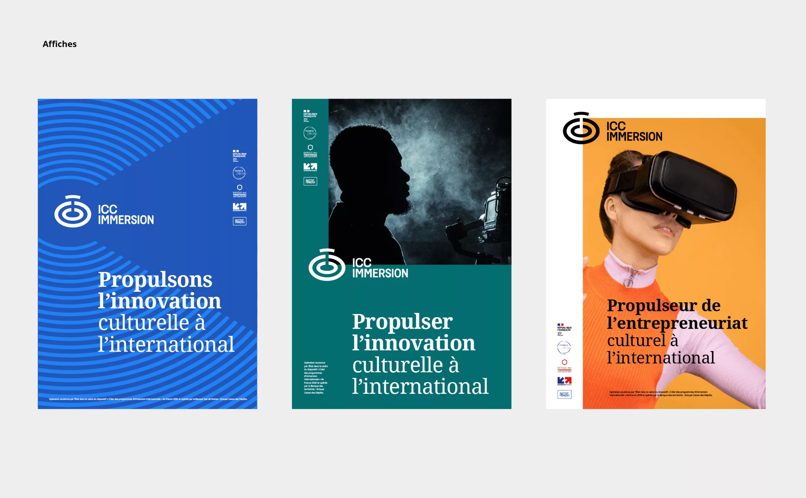
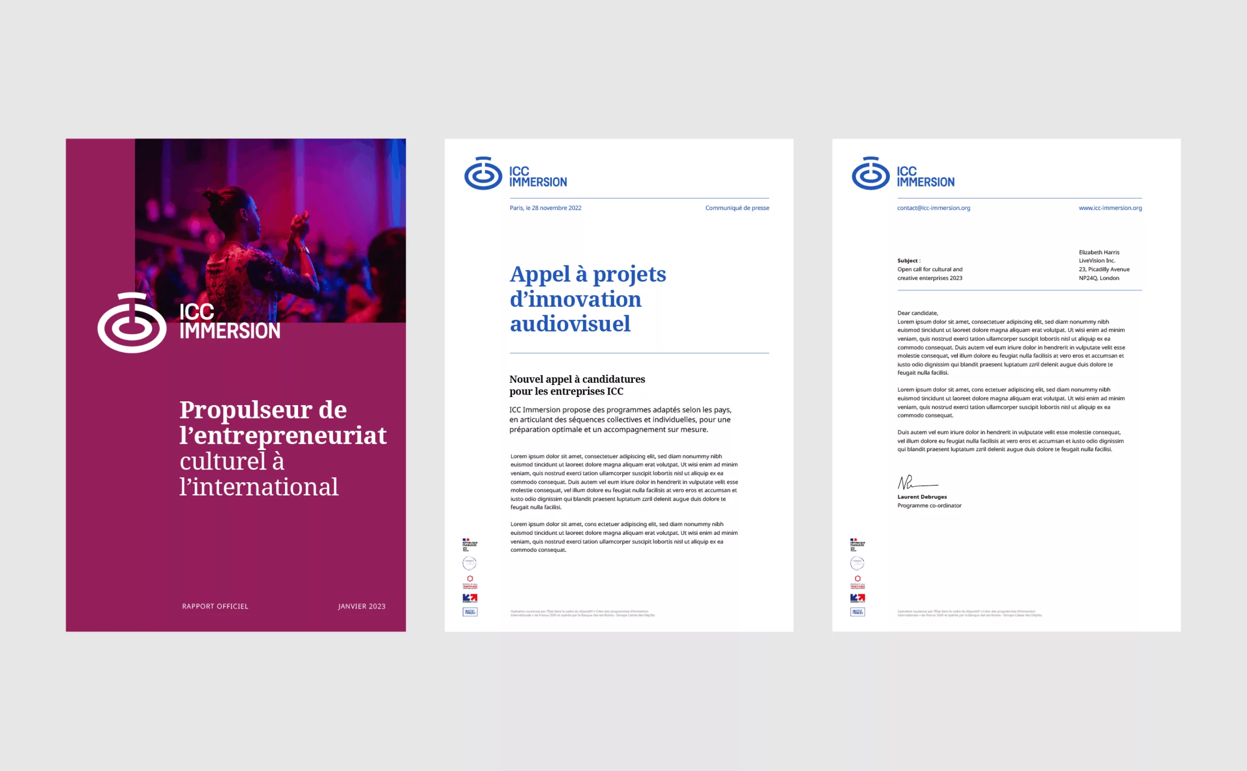
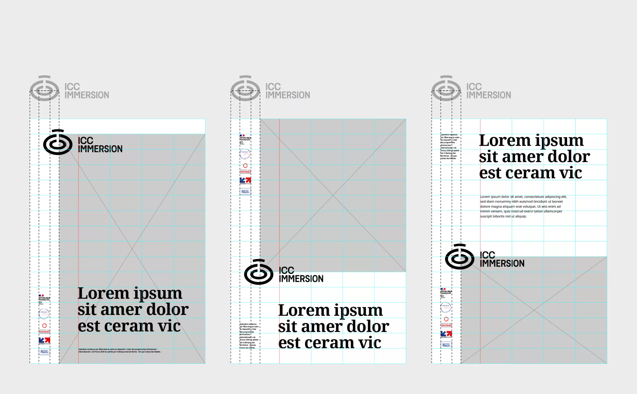
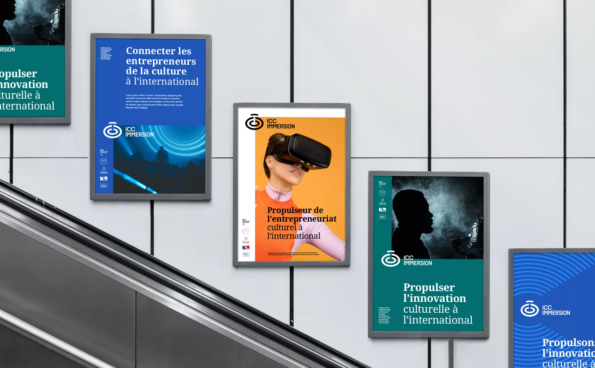
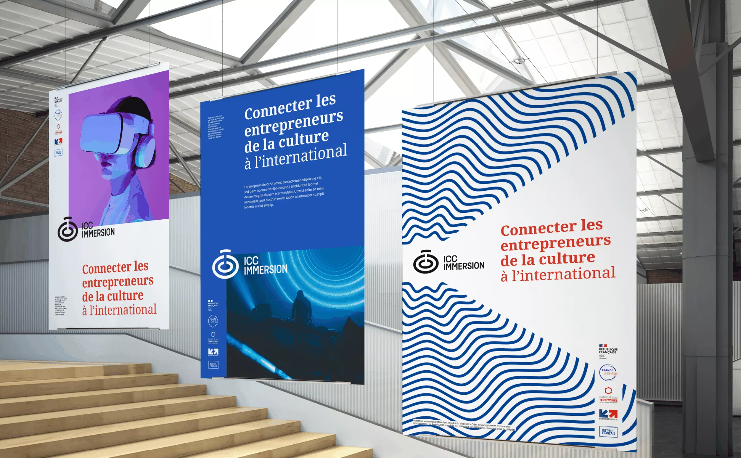
By taking advantage of the possibilities offered by digital media and motion design, we created a visual language that is perfectly adapted to motion graphics and video clips. For print media, the positioning of the logotype functions as a unit of measurement, allowing us to define a coherent and flexible composition grid. By being at the heart of the system and bringing alive the content of brand communications, the visual identity conveys the mission of accompanying and developing the creative and cultural industries.
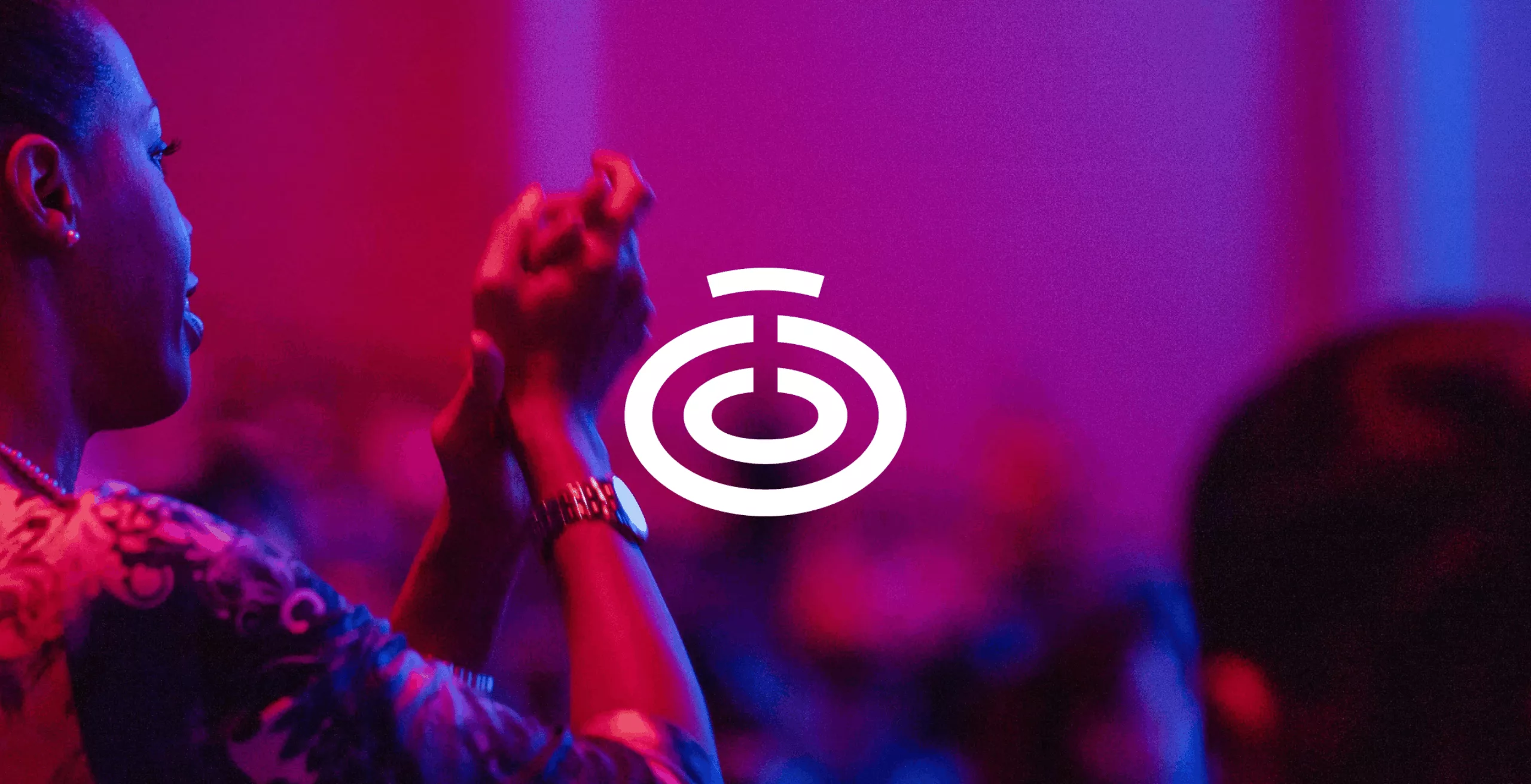
A visual identity that is simultaneously institutional and lively while reflecting the dynamism and success of our cultural and creative industries. A strong mark of the French cultural landscape and its international outreach.