fr
fr

Intiqal

Intiqal - Archaeological heritage preservation programme

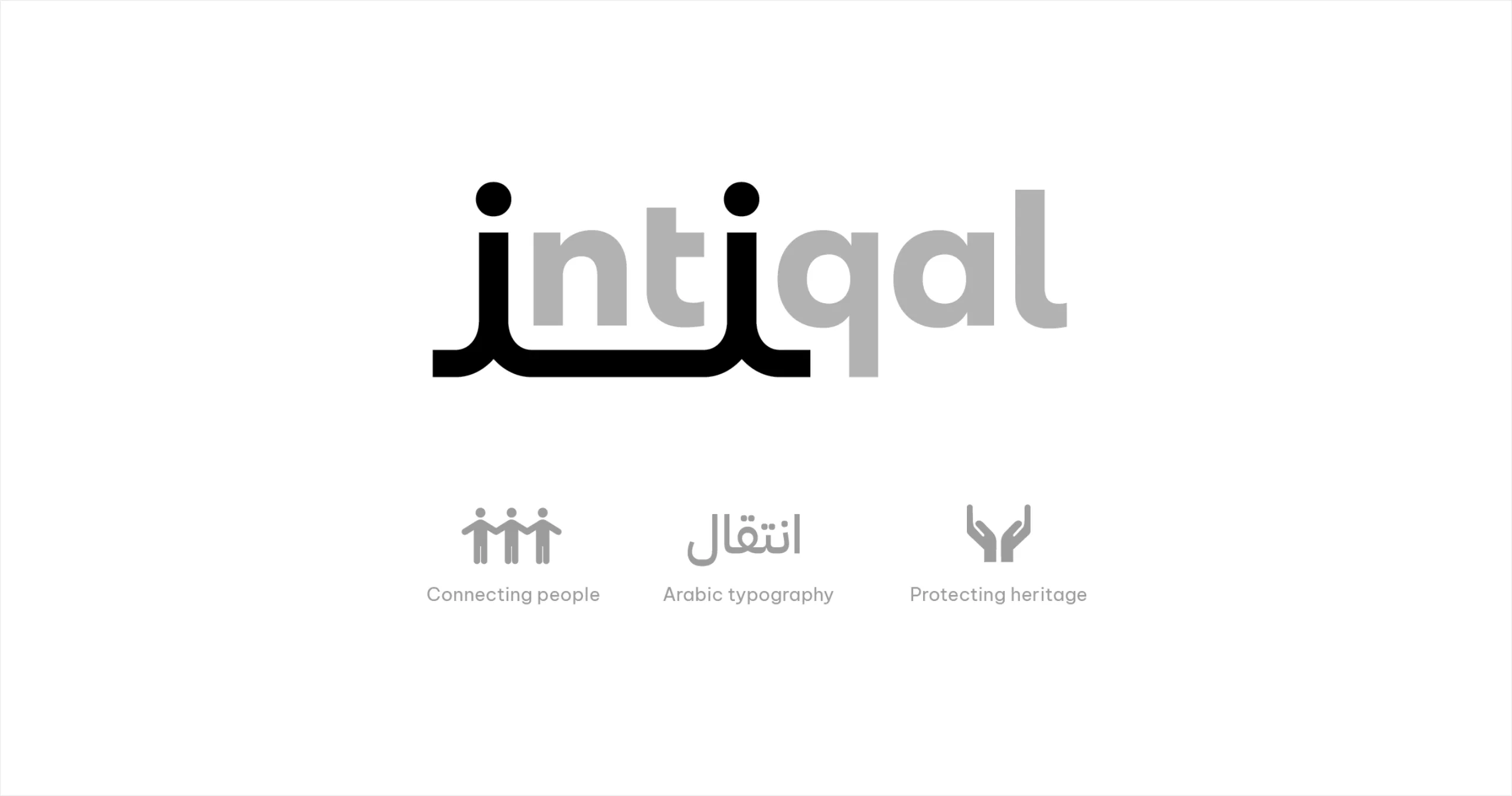
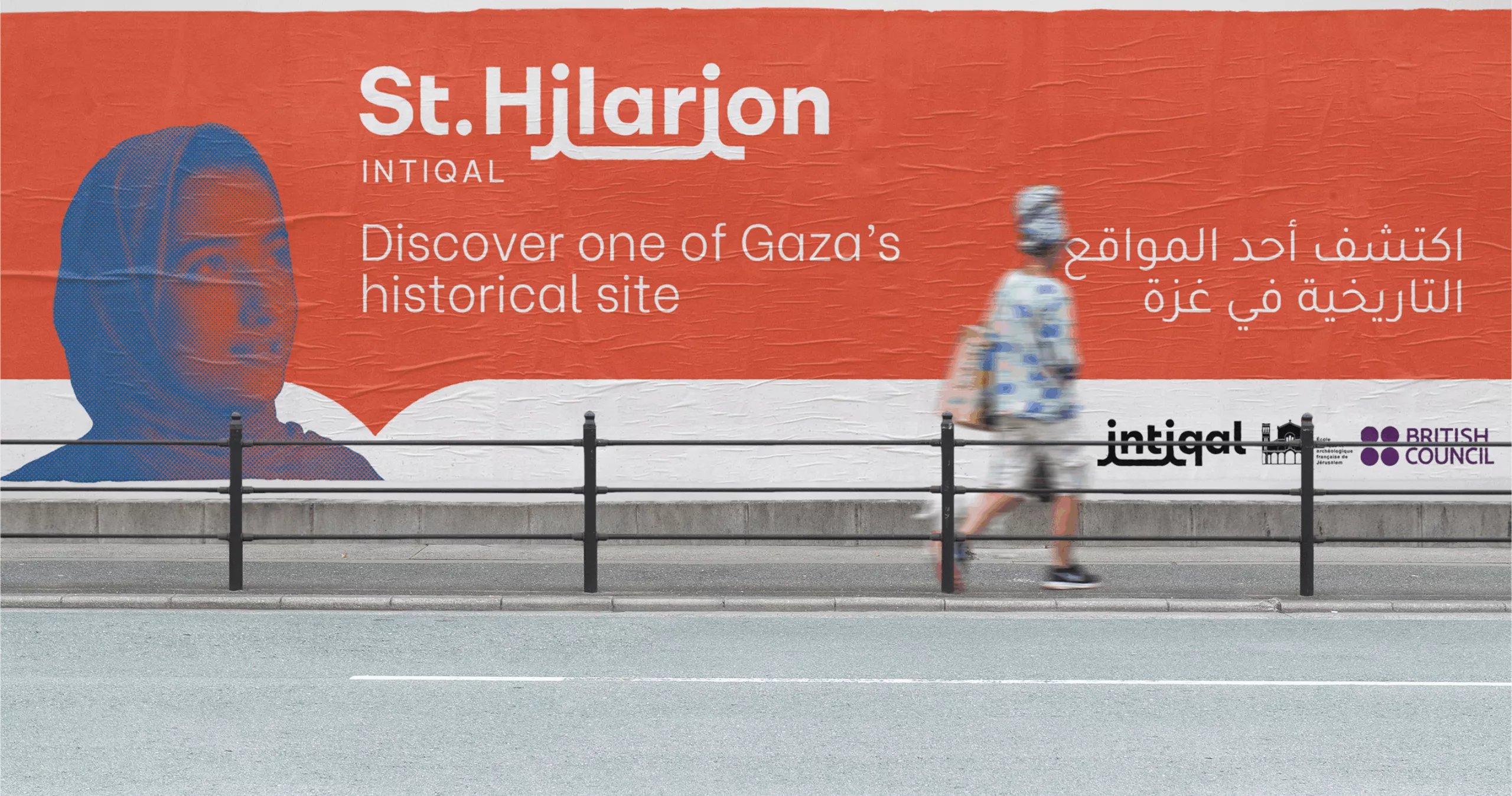
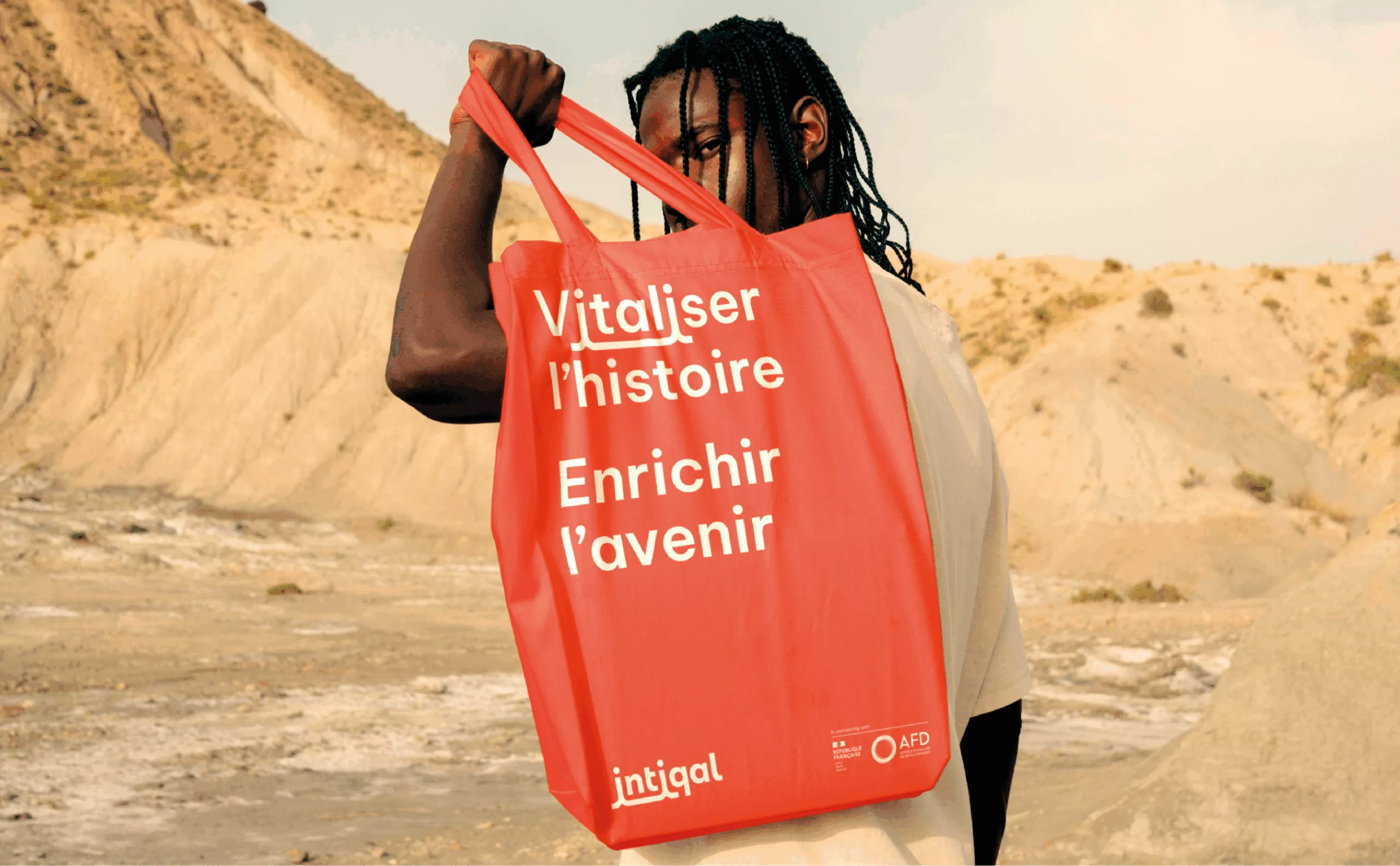
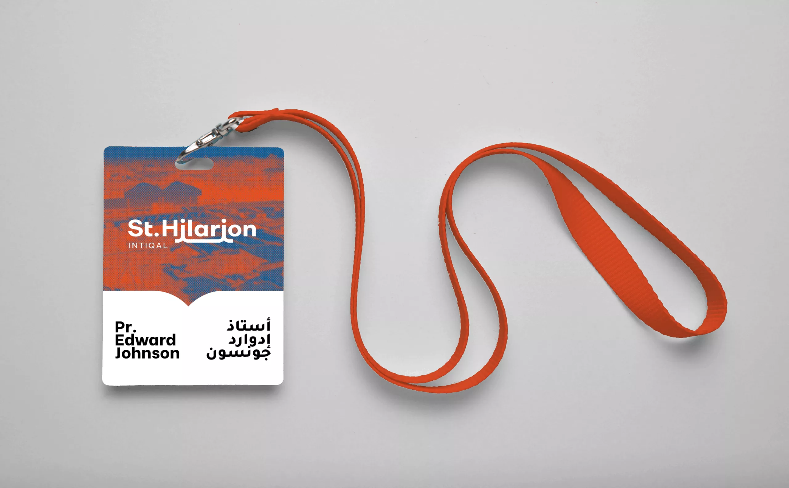
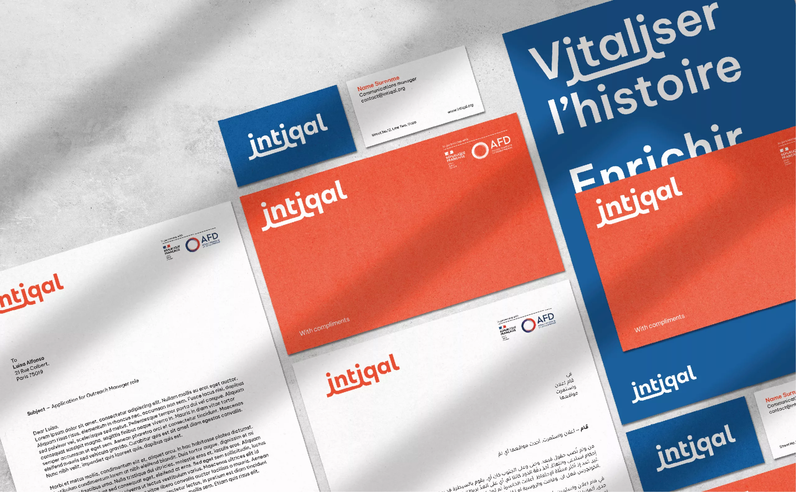
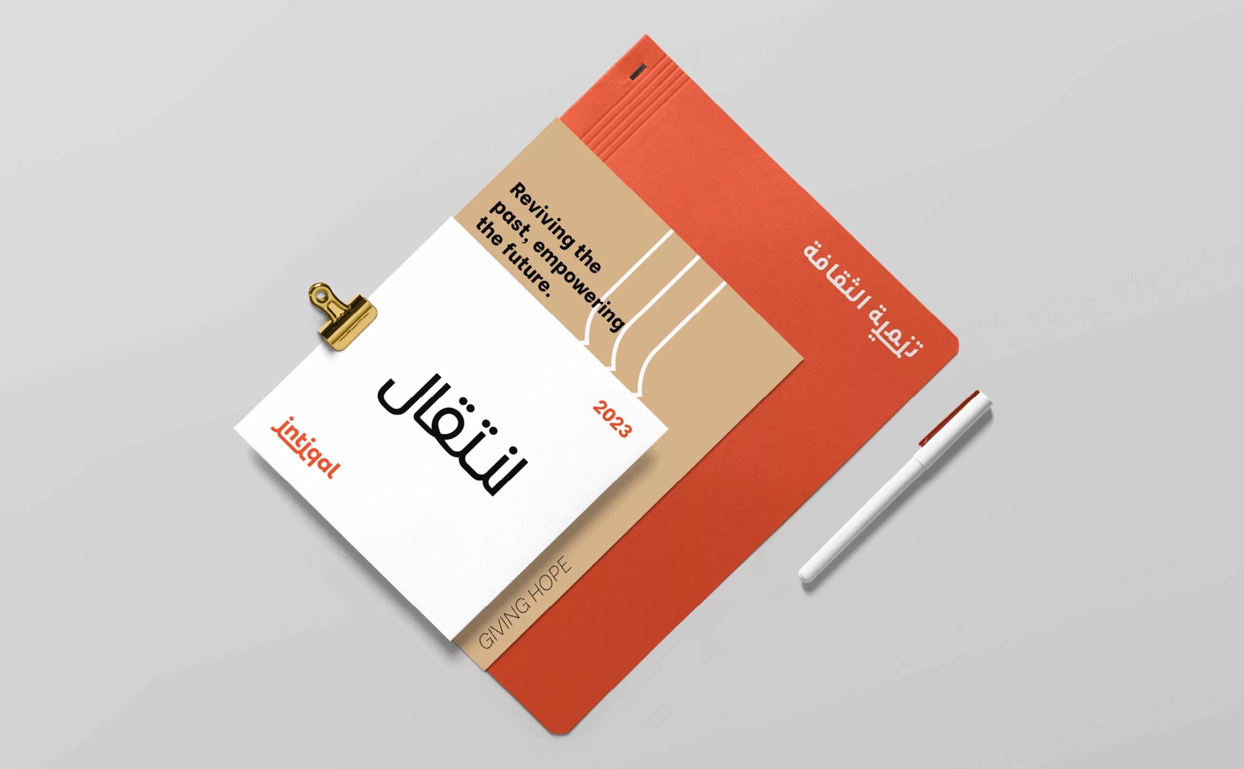
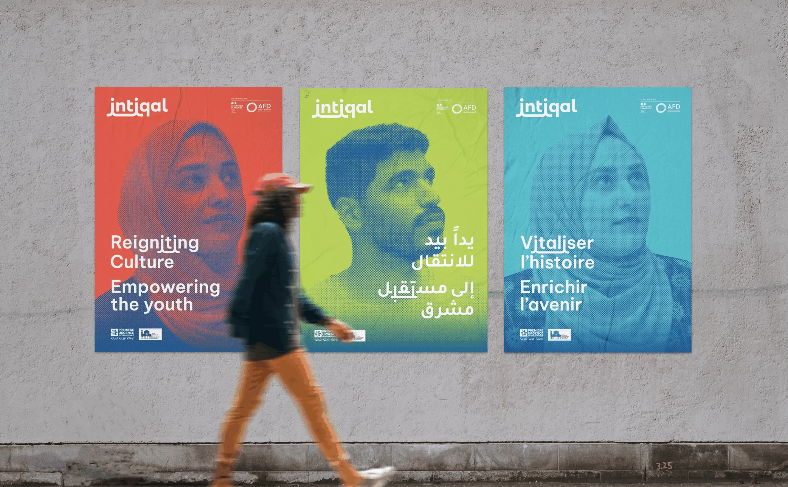
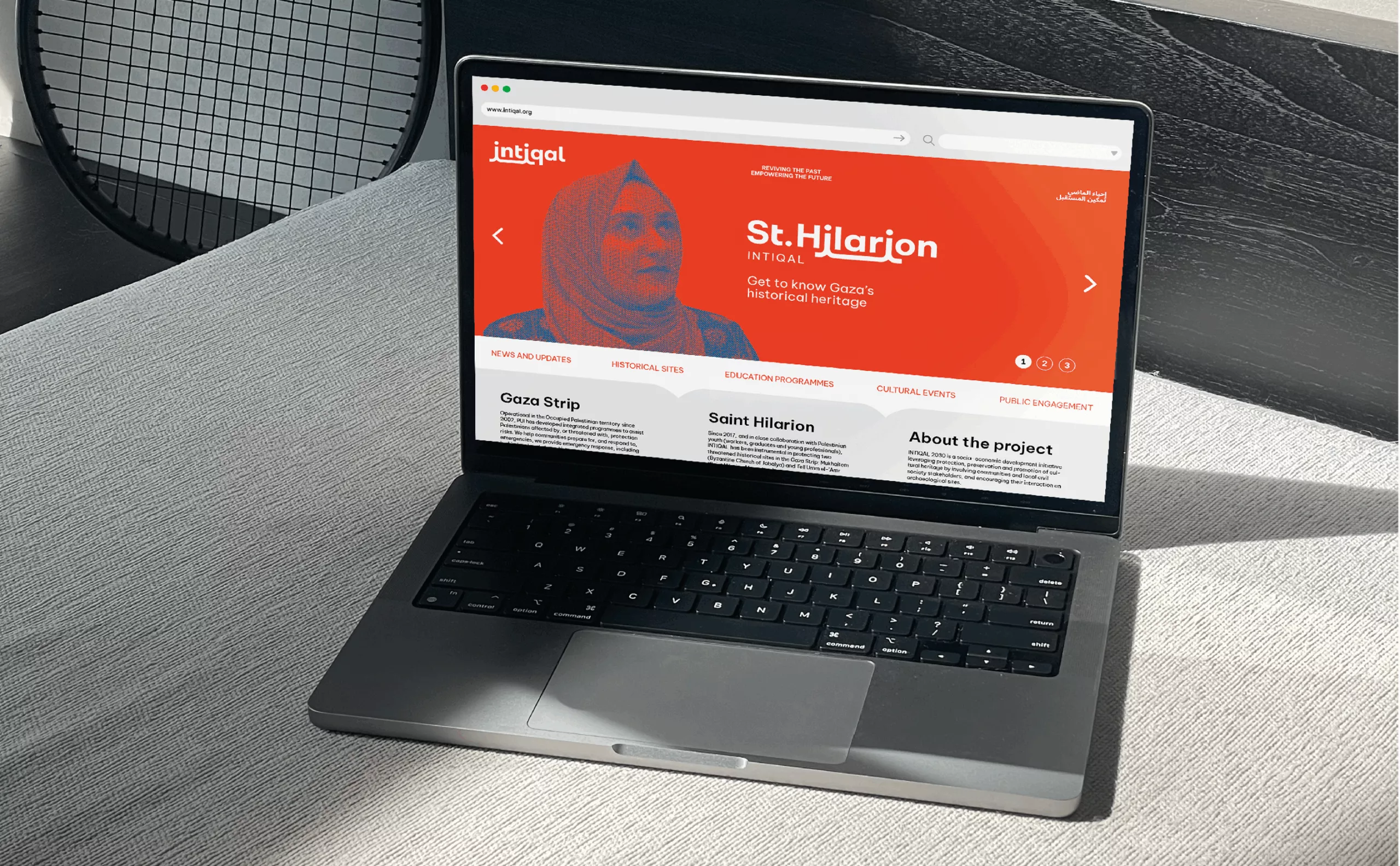
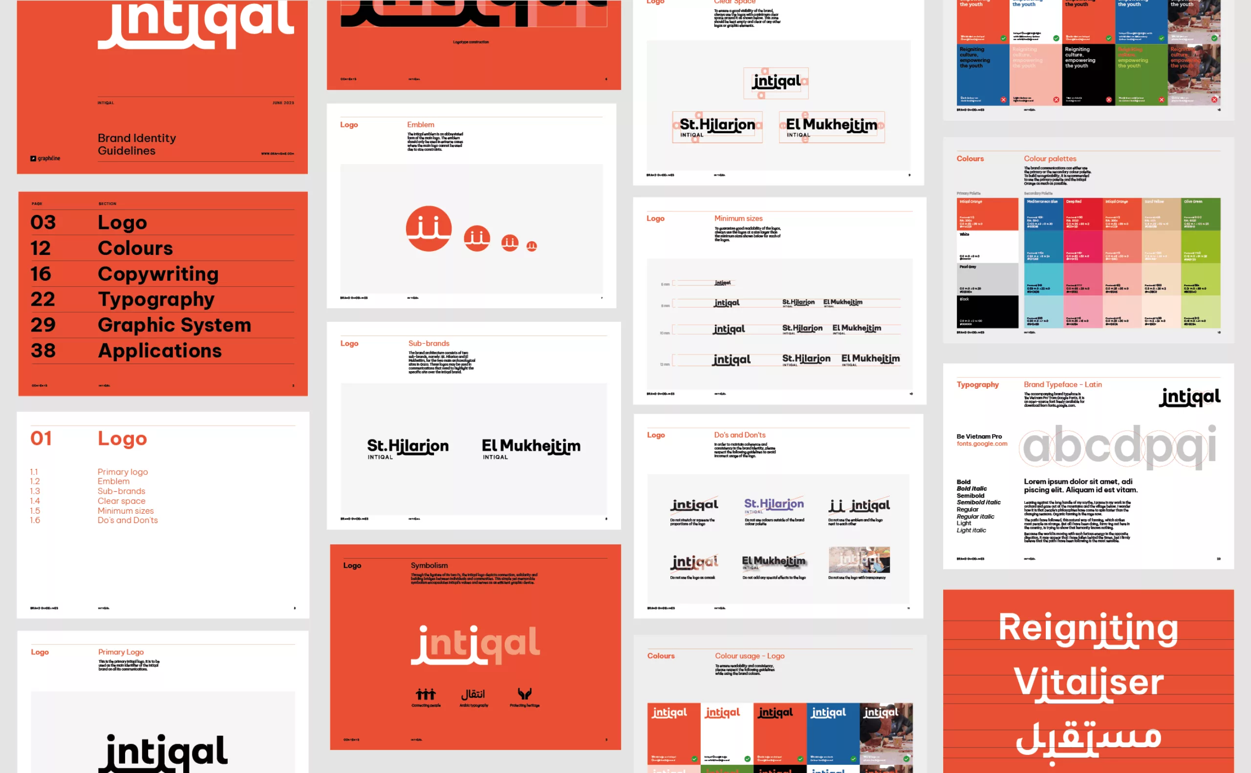
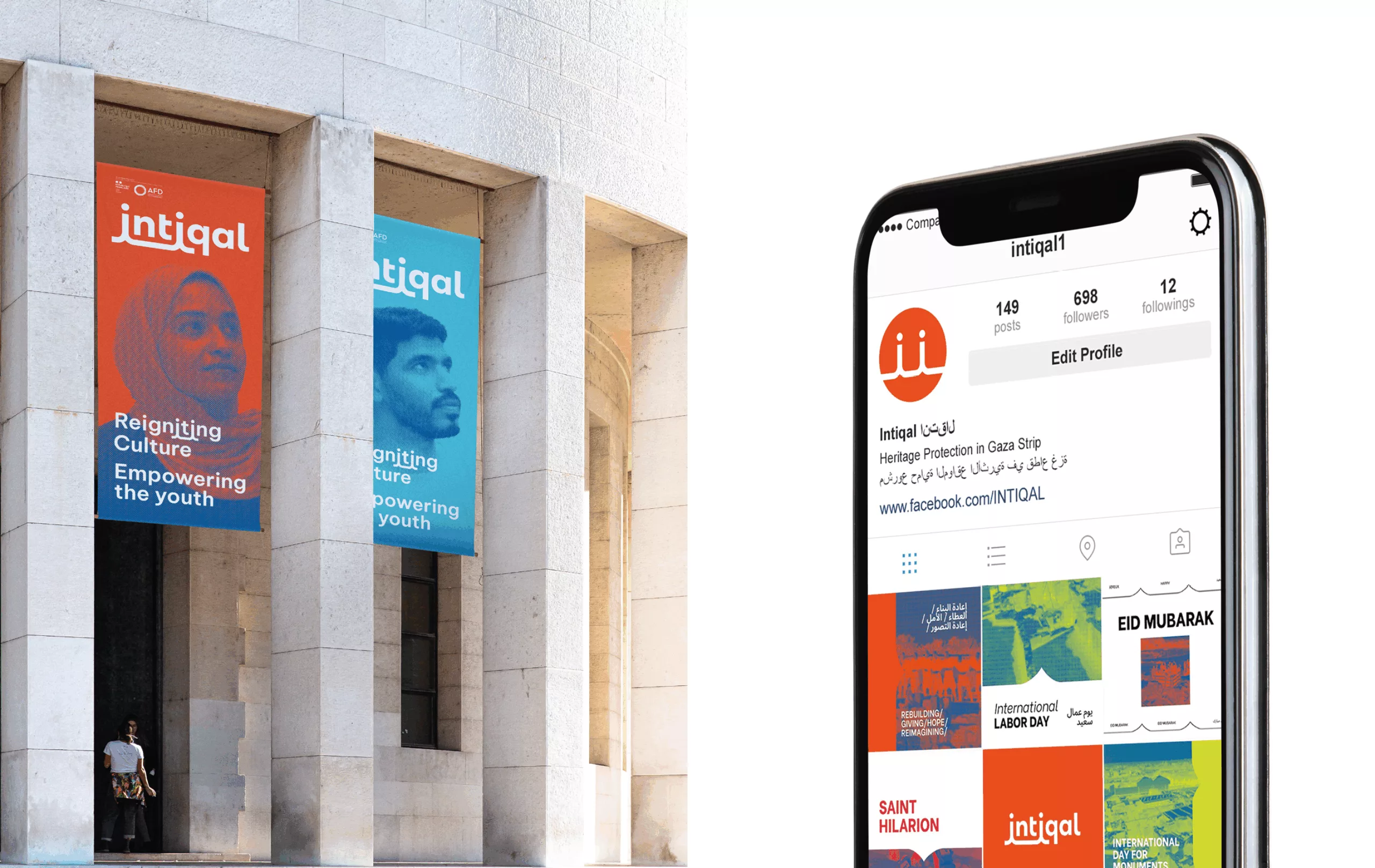
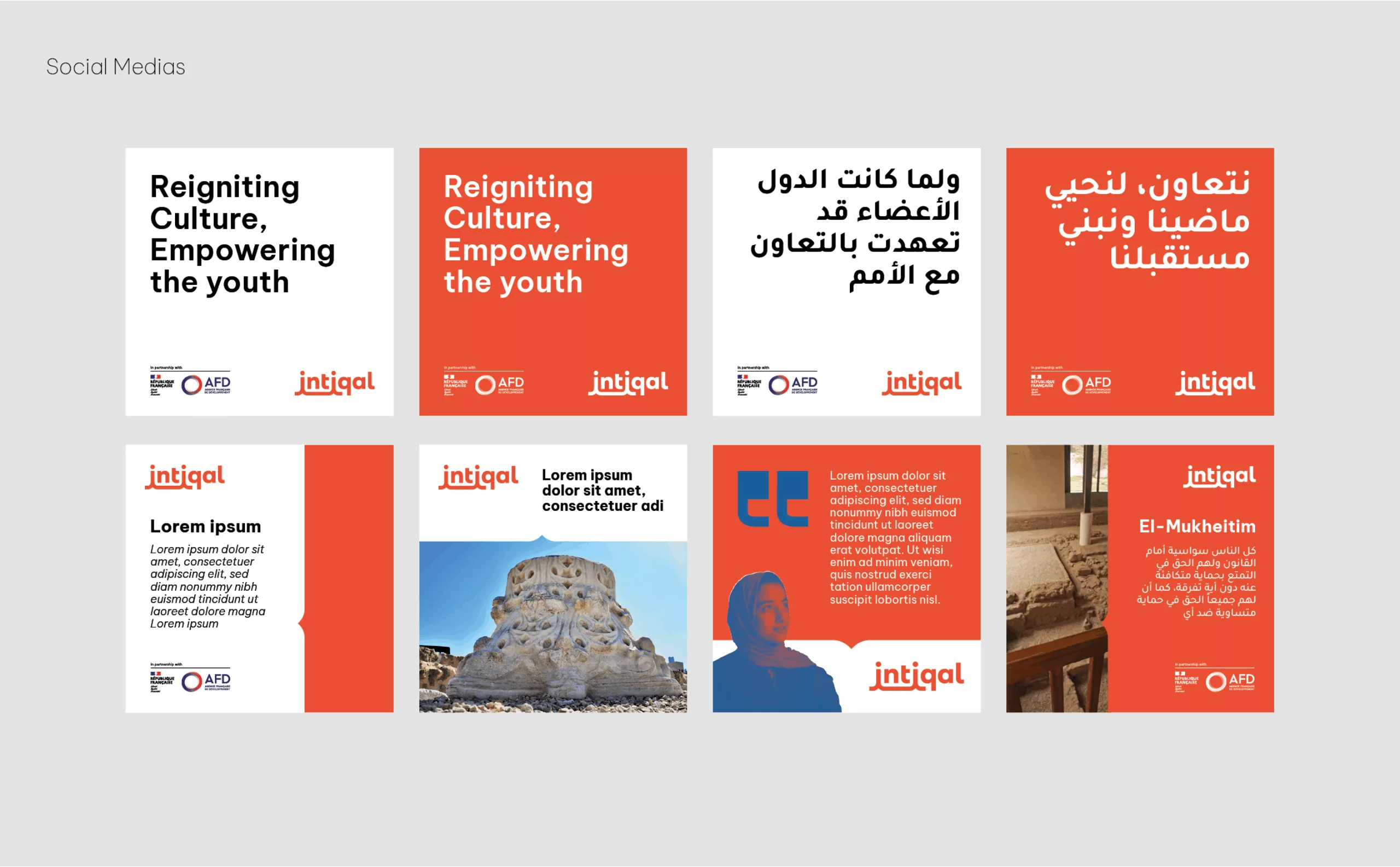
In 2023, Graphéine helped the NGO Première Urgence Internationale create the storytelling and visual identity for its “Intiqal” program, currently operating in occupied Palestinian territory.

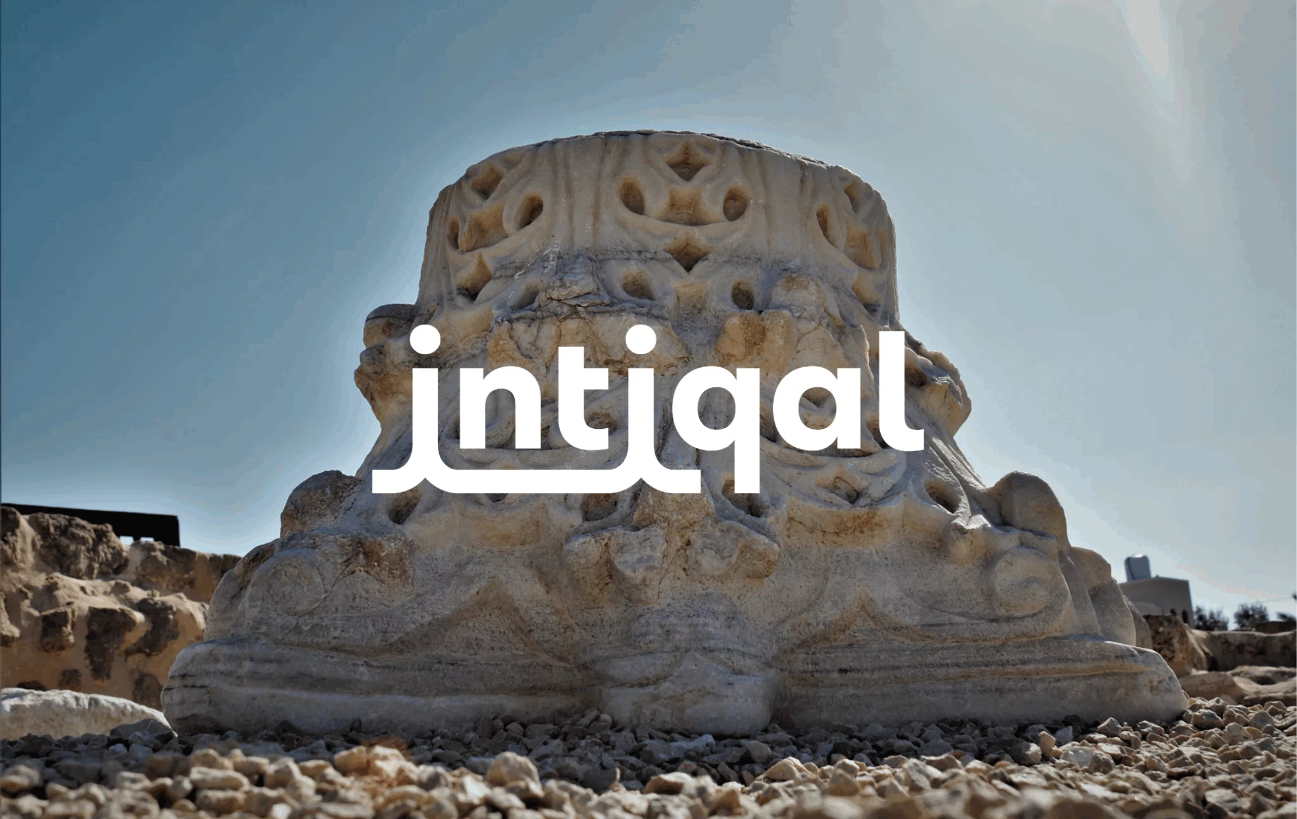
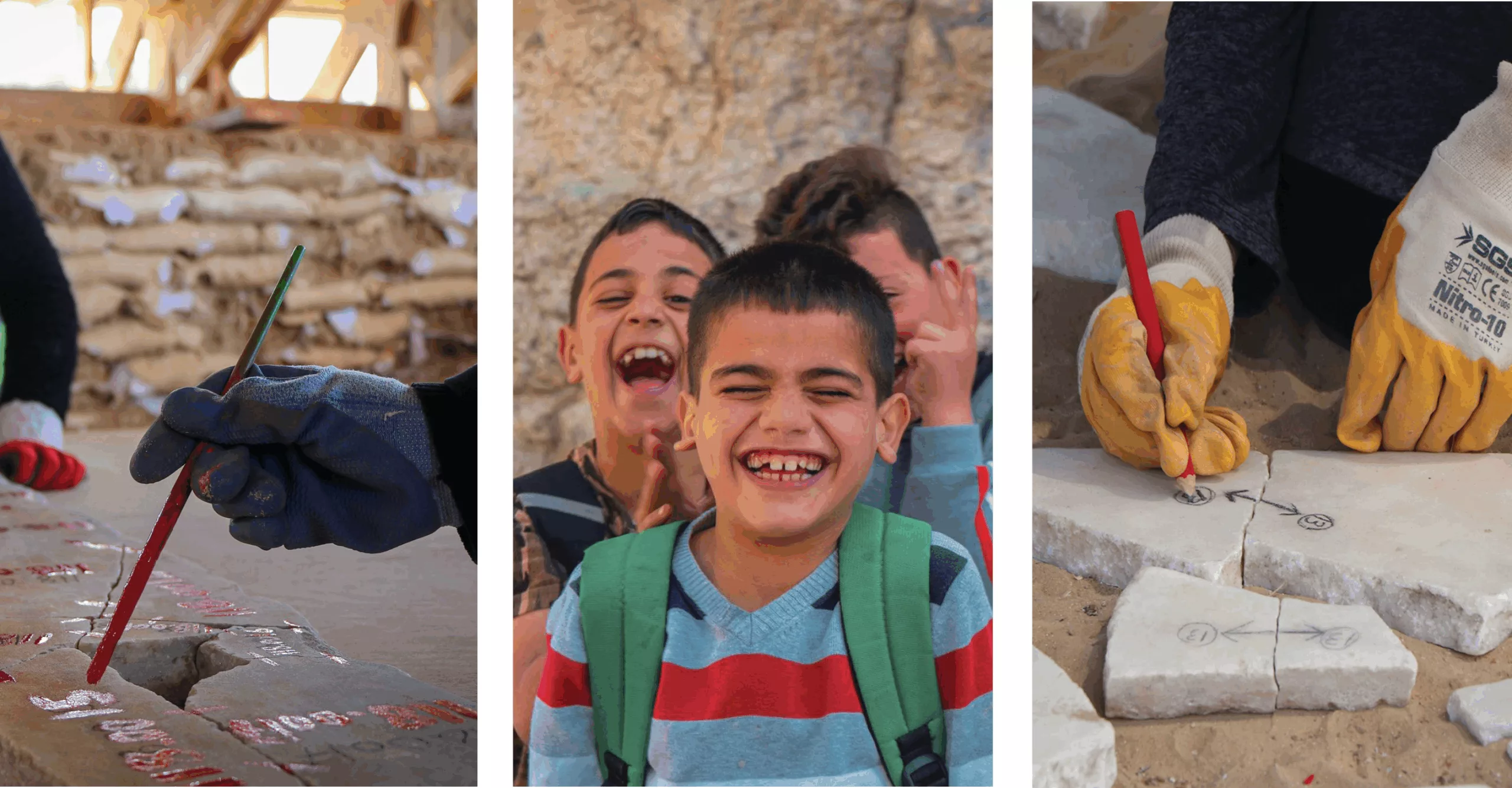
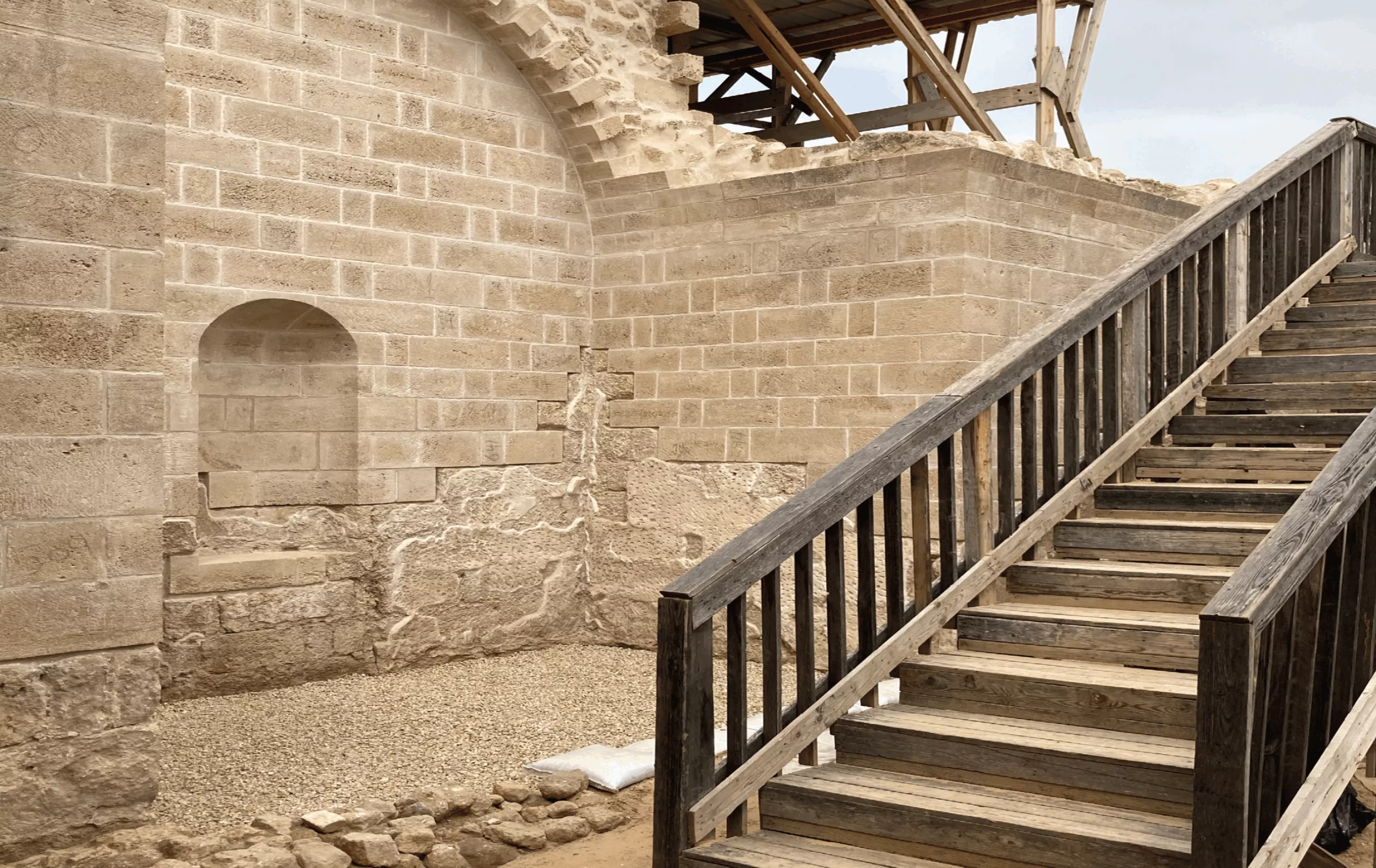
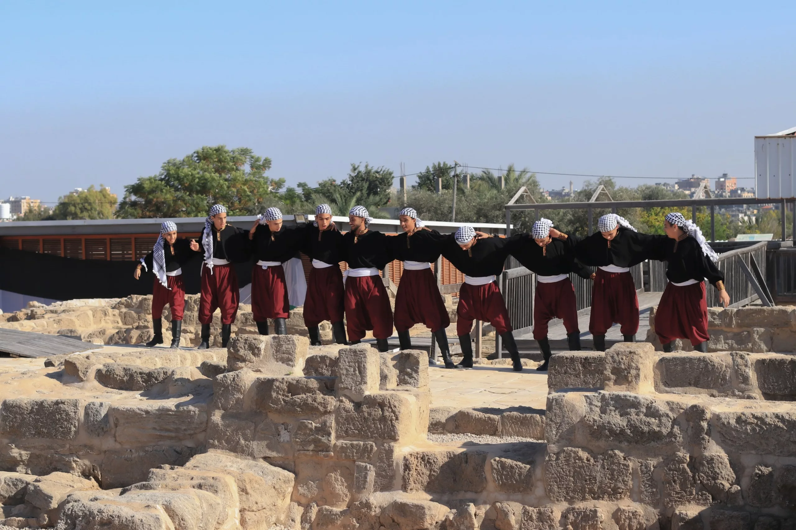
Between 1997 and 2001, the archeological site of the Monastery of St Hilarion in the heart of the Gaza Strip was discovered before excavations began. Première Urgence Internationale has been working in the Palestinian territory since 2002, developing the Intiqal project for heritage preservation and youth training.

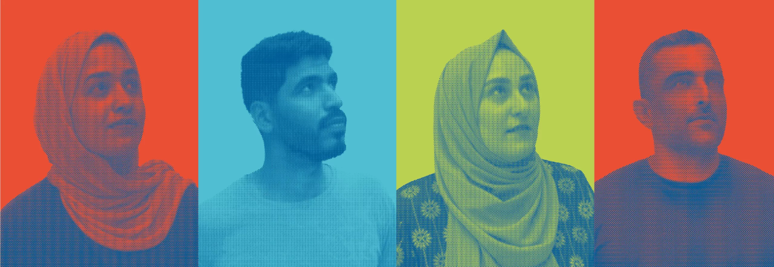
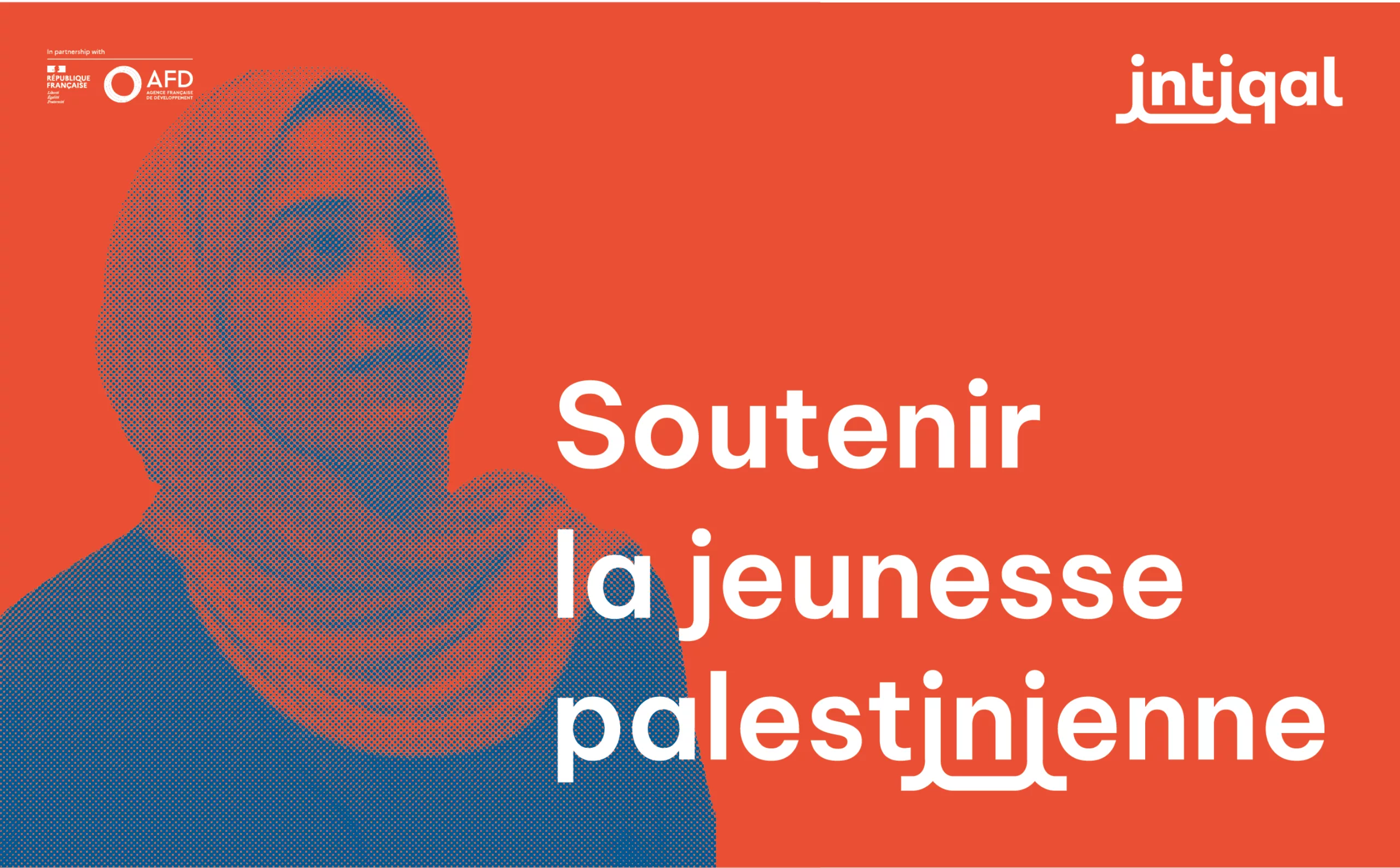
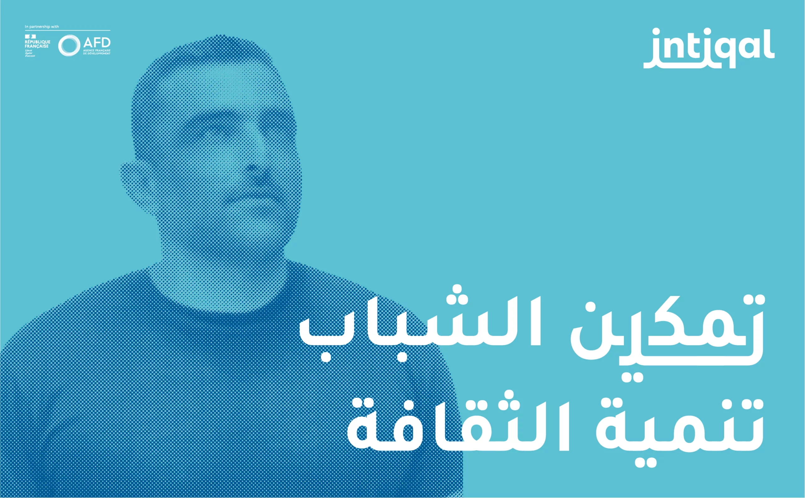
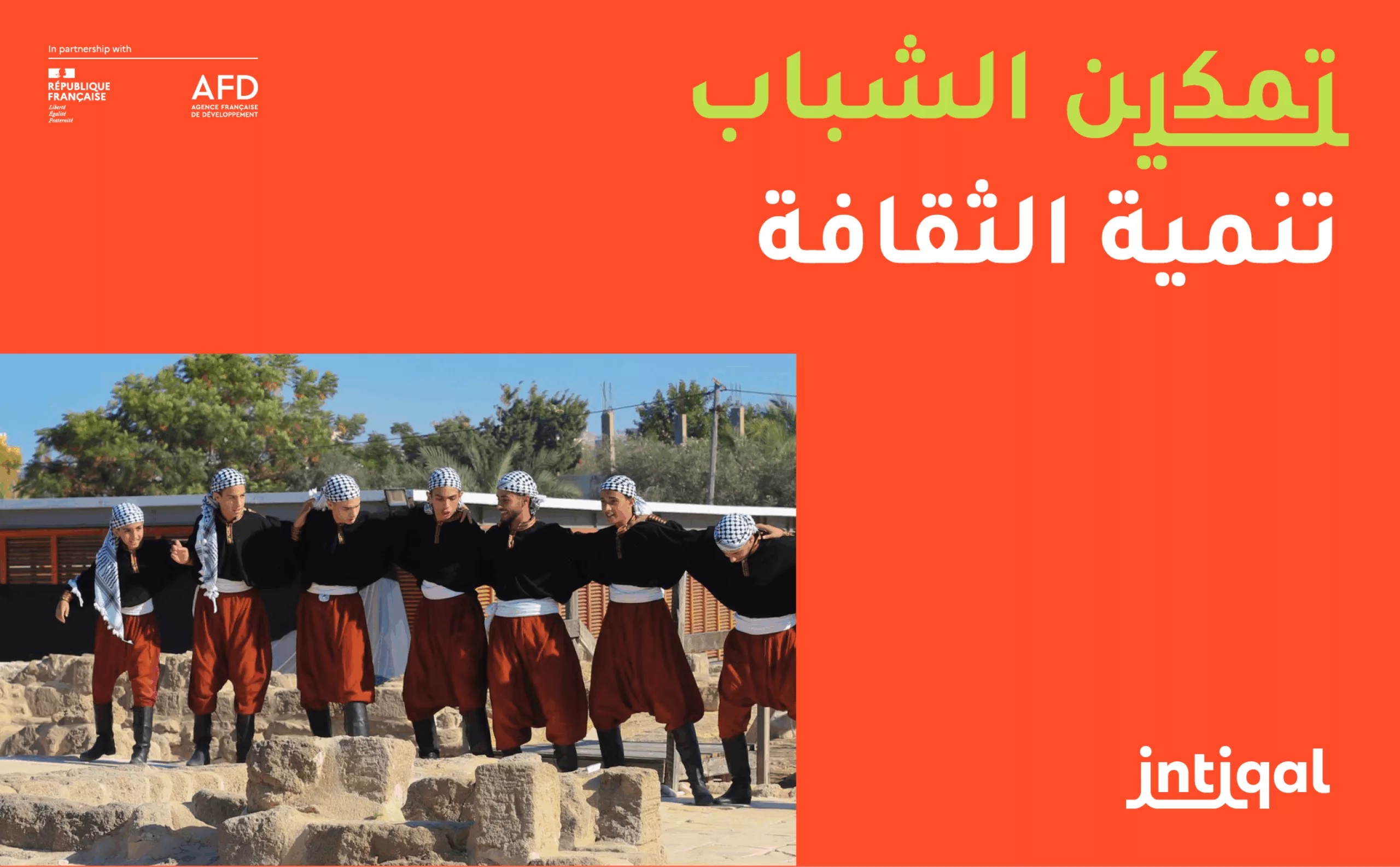
This project, supported by the Alliance Française de Développement, involves young people in Gaza and trains them in archaeology, heritage conservation and cultural mediation.
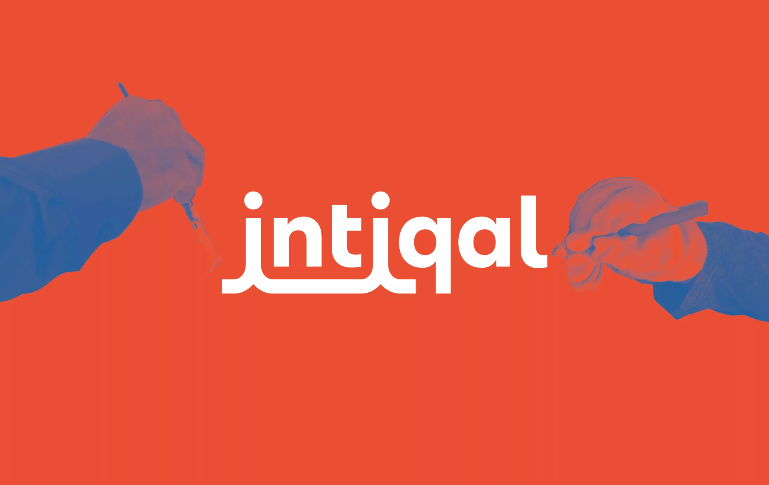
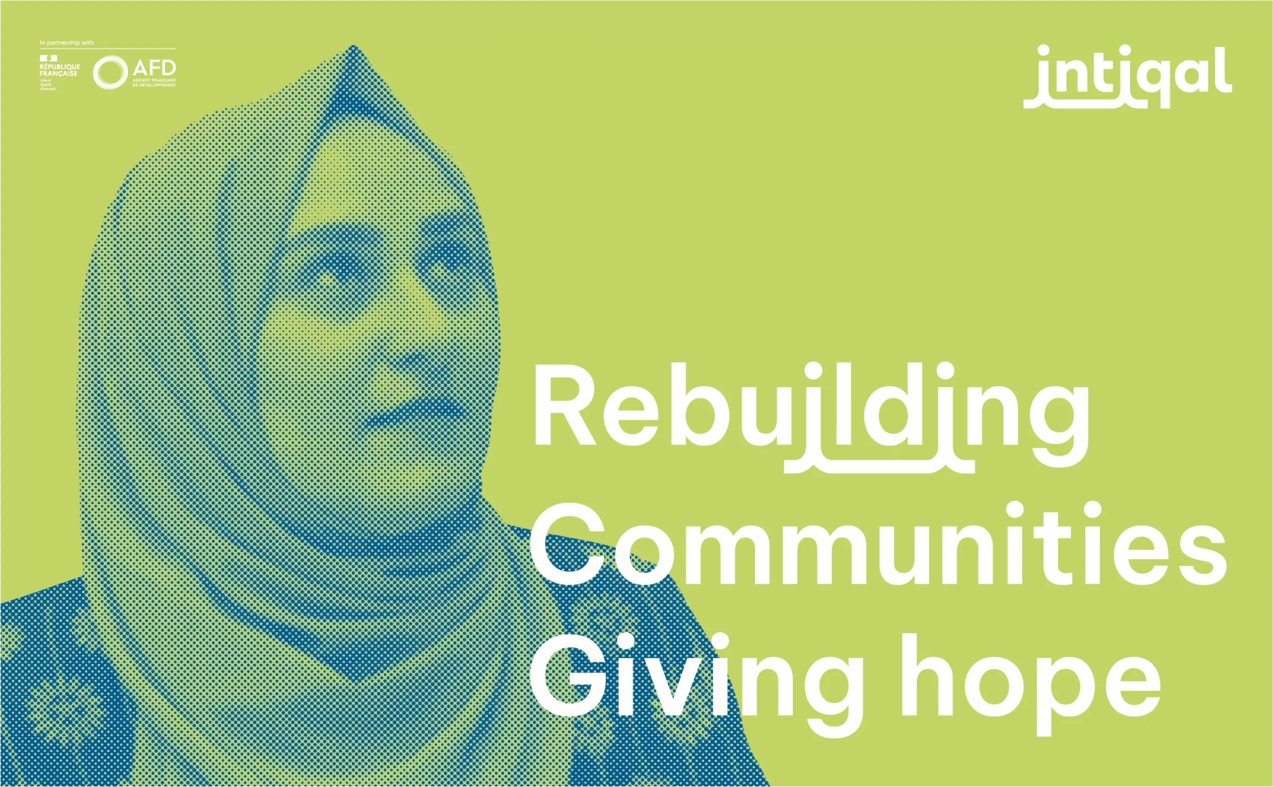
A beneficial program that aims to build a better future for the population and offers a space for resilience within the occupied territory.

A new INTIQAL logo that brings generations together and links the present to archaeological history

The scope and autonomy of the project required the creation of its own identity. We imagined a visual identity based on the link that Intiqal develops: to the people, to history and to heritage. We also drew inspiration from Arabic typography and the way certain letters are written, which naturally reflect this link.

The result is a typographic block that links the two i’s in the name Intiqal. This ligature depicts the connection and solidarity that is being built at the heart of the community thanks to this initiative. From this logo, we extracted the “ii” ligature to create a particularly functional emblem for social networks.

The Intiqal brand block is available for the various archaeological dig sites, and uses the same ligature principle to design the St. Hilarion and El Mukheitim logotypes.

A warm INTIQAL graphic to inspire optimism in the hearts of Palestinian youth

Orange is Intiqal’s corporate color. We wanted to move away from red, which conveys the notion of urgency and is very present in NGO communications. The sunny orange conveys the optimism embodied by Intiqal.

The trilingual visual identity is available in French, English and Arabic, and plays with the ligatures of each language to develop choreographed copy. The tone of the campaigns is aspirational and enthusiastic. A series of slogans in each language describes the project’s impact on the region and its population.

The graphic charter includes two iconographic registers. The first is based on enhancing the value of the archaeological sites and the actions carried out there. The second is dedicated to promotional campaigns, and features portraits of the young people who benefit from the program, looking to the future.

Now endowed with its own visual identity, the project can spread throughout the region and enable the deployment of new initiatives in the continuity of Intiqal.