fr
fr

L’Autre Soie

L'Autre Soie, Participative visual identity

L’Autre Soie is a project halfway between social housing and a third location, in Villeurbanne near Lyon, France. Located within the perimeter of the “Carré de Soie” district, it will combine housing reserved for people in difficulty as well as places dedicated to culture and the social and solidarity economy.

The ambition is to make L’Autre Soie a creative and attractive place in the city, with strong citizen involvement. Everyone, in its diversity, will be able to find their place and have a social, cultural and economic environment that contributes to the development of their capacity to act. The project is led by an economic interest group composed of Alynea, Aralis, Est Métropole Habitat (EMH) and Rhône Saône Habitat (RSH). They are also supported by the CCO, the cultural centre of Villeurbanne.

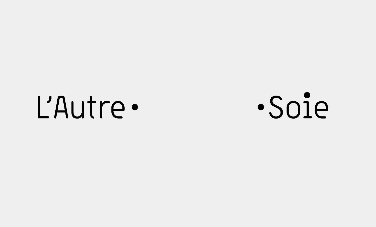
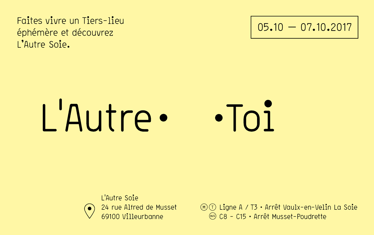
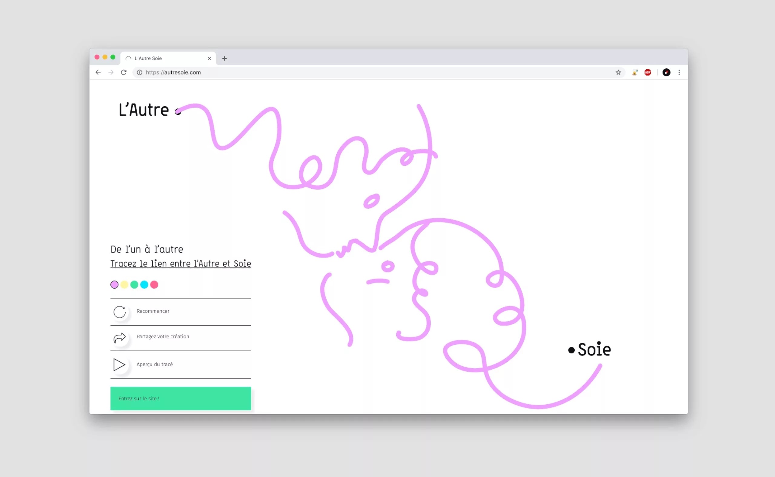
We imagined a visual identity as a manifesto. A manifesto to make the link between us tangible and concrete. A rule of the game inviting us to do things together. As a collective and participative work allowing us to question the principle of otherness. A space for free, open and developing expression.

Concept

The logotype is an invitation to connect the “Other” (“L’Autre” in French) to “oneself” (“Soi” in French / the use of “Soie” being a play-on-word in reference to the district of the project).

It only exists once the dots are connected. No matter whether the dots are connected physically or mentally, it is in this action that the words become signs, and the logotype appears. The rule of the game is not only binary, since a third point slips into the project name, as an invitation to hijack the rule. This logo “L’Autre Soie” is continuously reinventing itself, while retaining the coherence and recognition necessary for a brand.

Typography

The visual identity created for the project is based on the Storno typography. Its very “standardized” design contrasts with the joviality of its big dots on the “i “s, allowing for many graphic games. It is a typography that only exists in one fat. A form of minimalism limiting superfluous effects within the layout. Therefore, only the scale of the words can be used to establish reading levels.

We also imagined a name architecture for the different entities of the project. Probably more a poetic game than a functional proposal. This principle inspired the invitation card for the inauguration… L’autre quoi ? moi ? toi ? toit ? Soie ?… (“The other what? Me? You? Roof? Soie?…”)

The Ordinary Adventure

Organised by the CCO, an inauguration day entitled “L’aventure ordinaire” (The Ordinary Adventure) provided an opportunity to invite a hundred volunteers over a weekend to reflect on the future directions of the project. On Sunday, the general public was invited to discover the exhibition presenting their reflections.

In addition to setting up the exhibition, we proposed a symbolic inaugural gesture to the officials and the press.

Please accept cookies to watch this content.

Participative workshops

In order to reveal the visual identity to everyone, we also proposed participative workshops to help them understand the values of otherness, exchange and experimentation of the project.
Each person was invited to reflect and illustrate their relationship to the other by drawing on supports studded with dots to be connected.

Participate!

About a hundred drawings were made during the workshop… and today the system is extended online on the site of L’Autre-Soie.
To access the site, the user is invited to link ‘LAutre” to “Soie”, in line with the participative logic of this singular and “living” project.