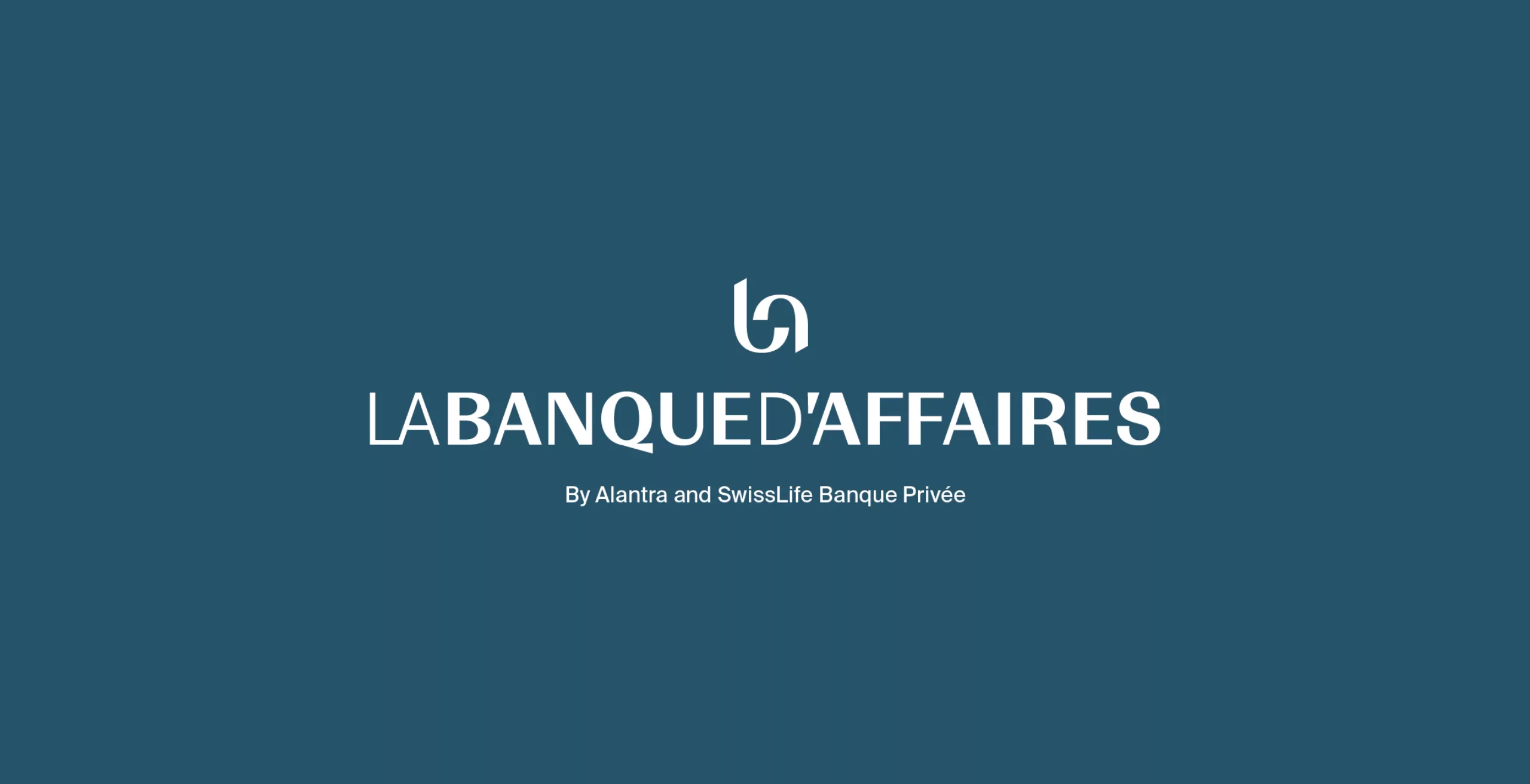
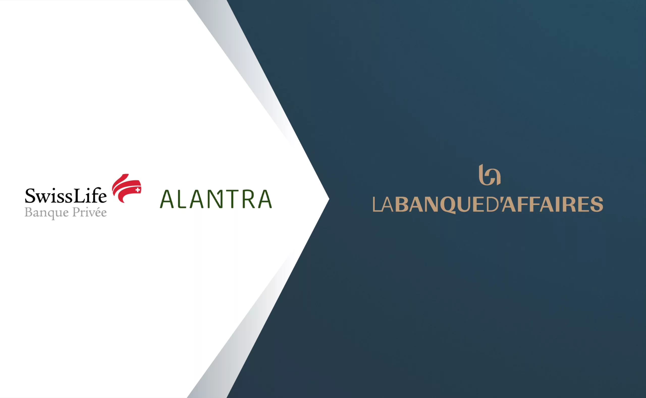
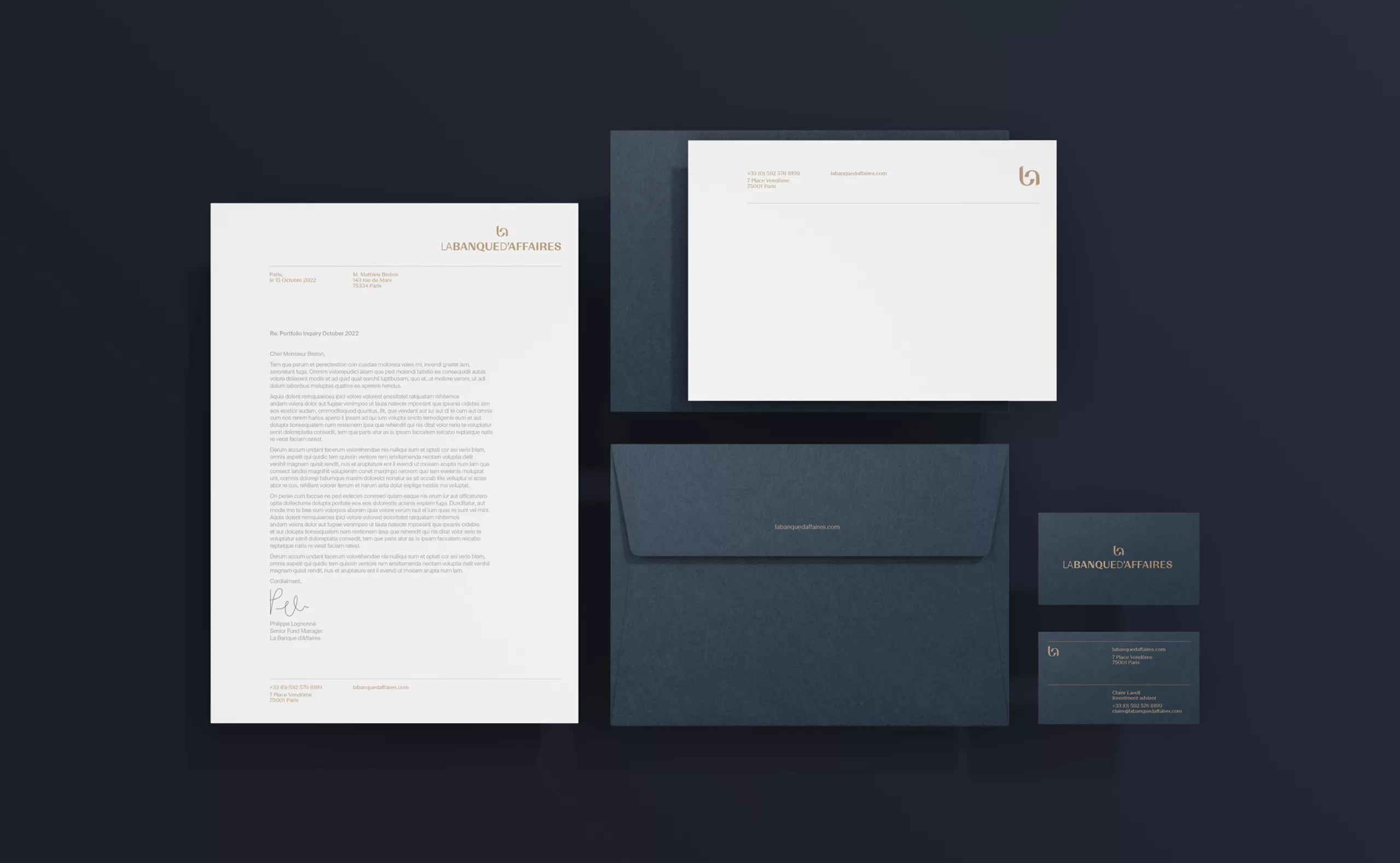
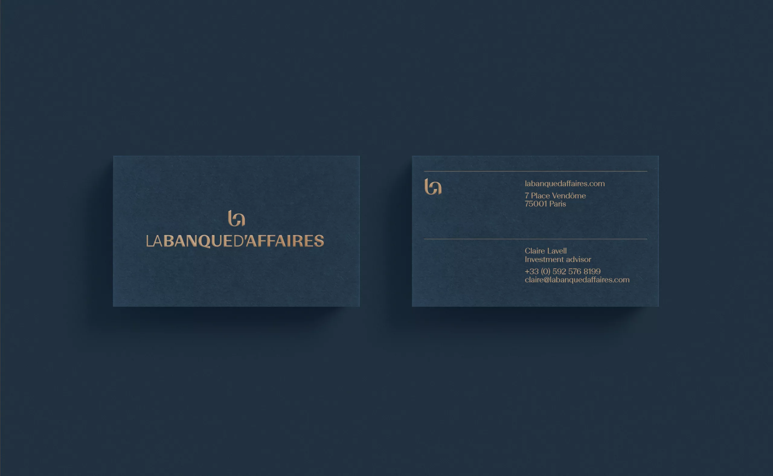
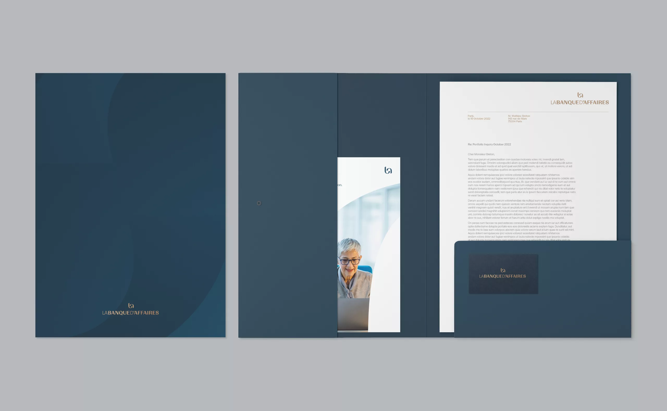
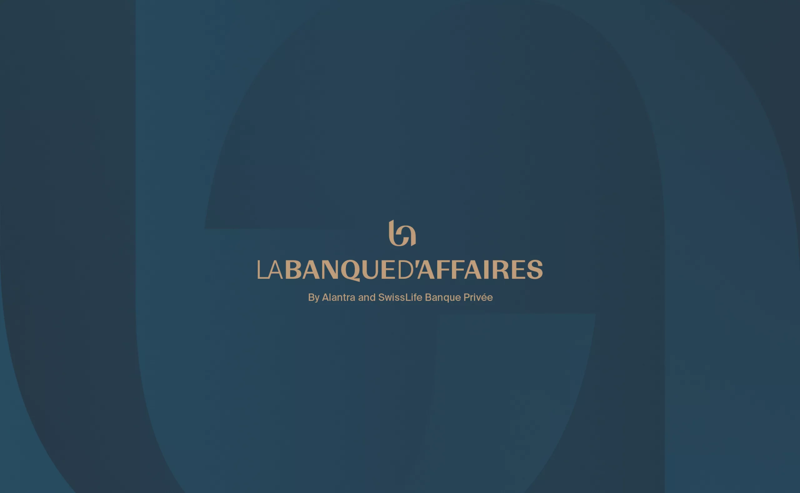
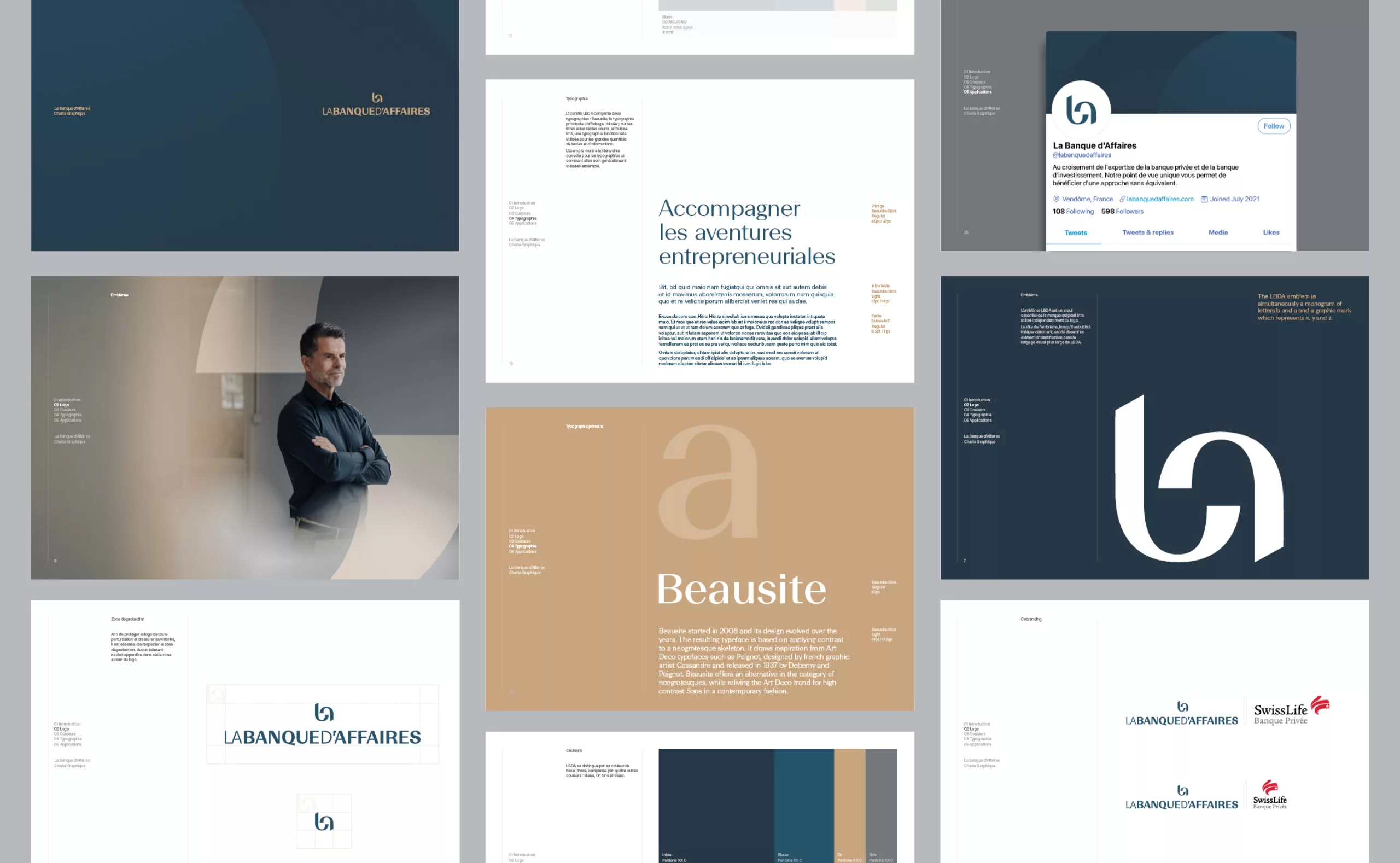
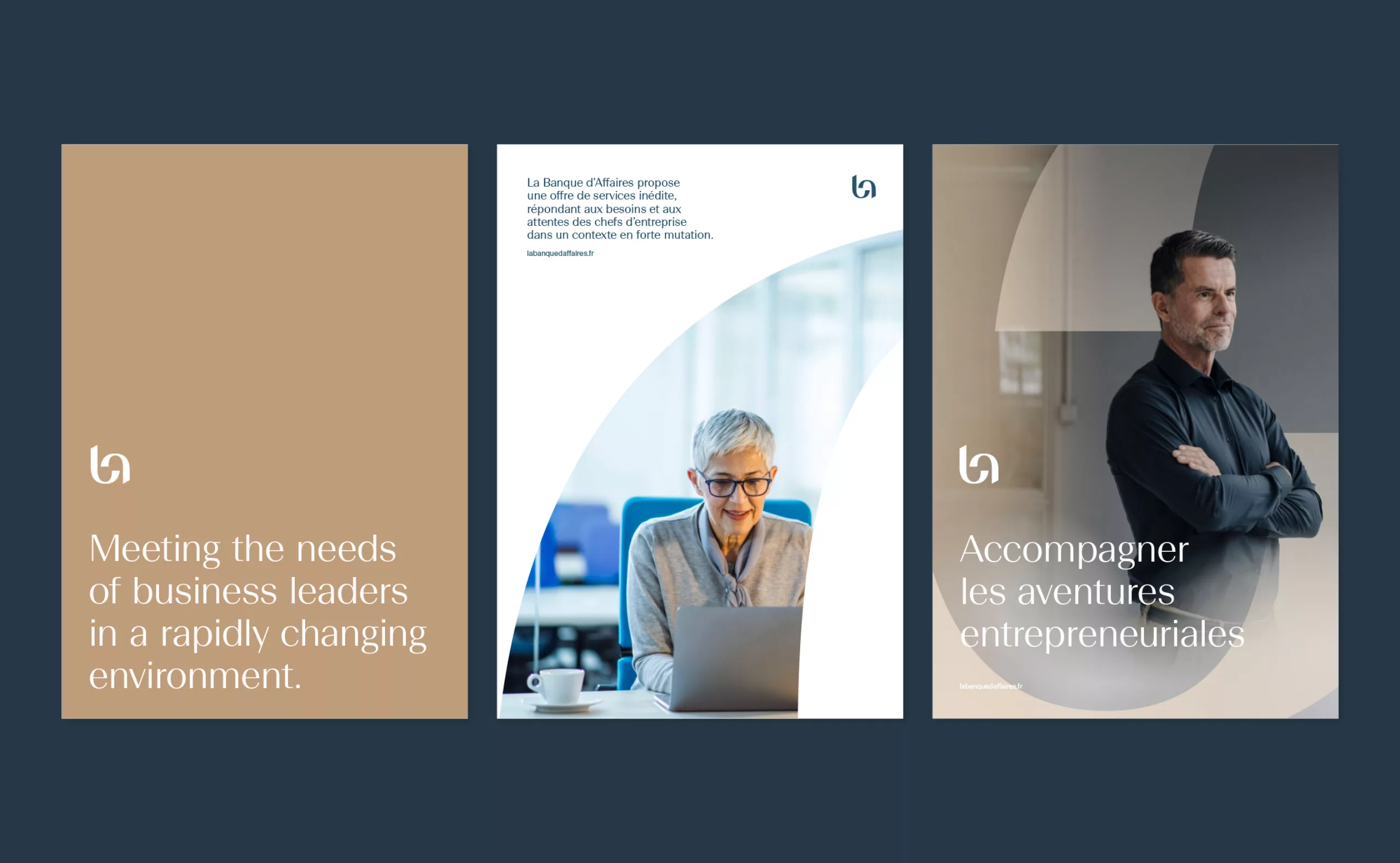
A graphic identity geared towards premium consultancy
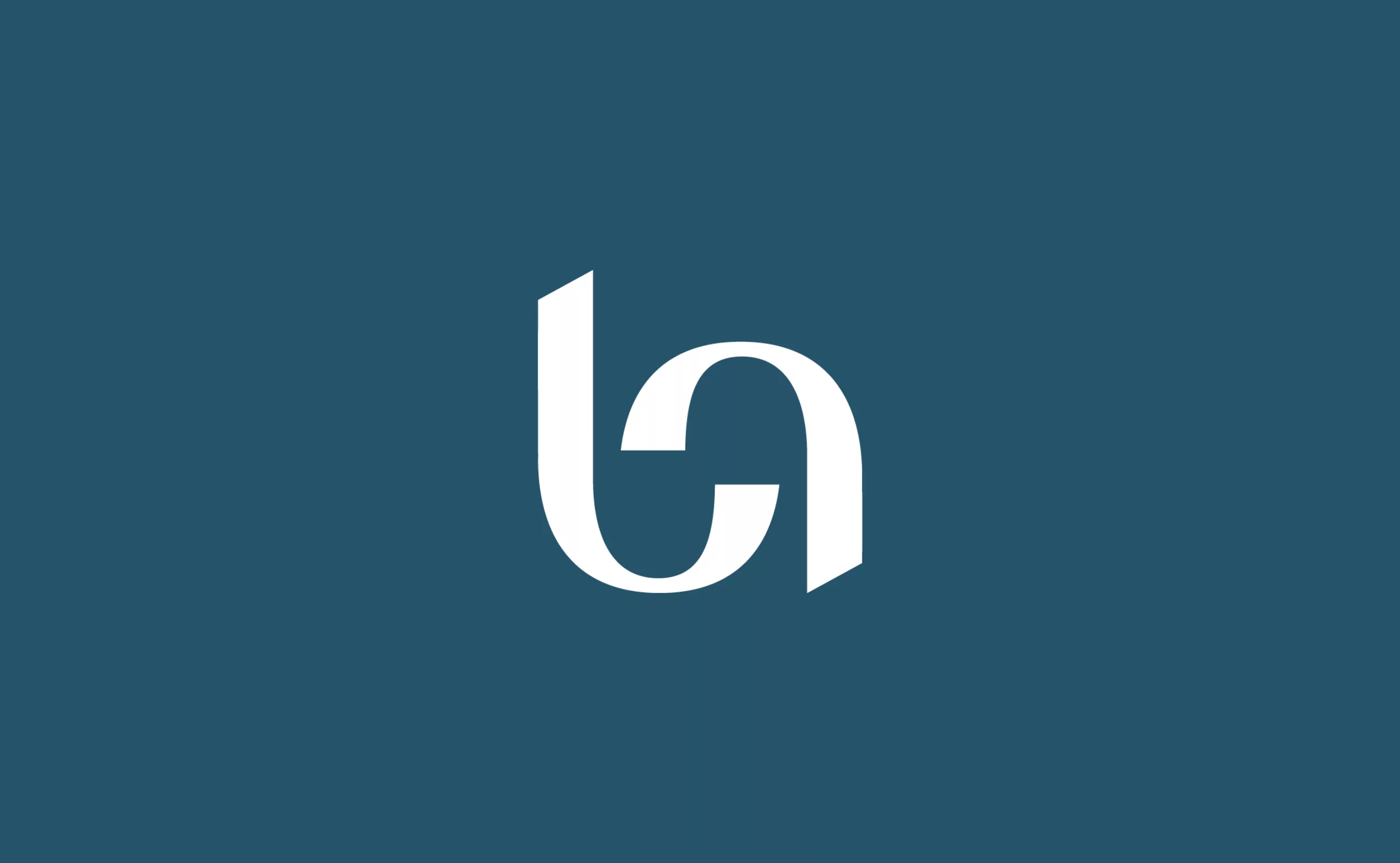
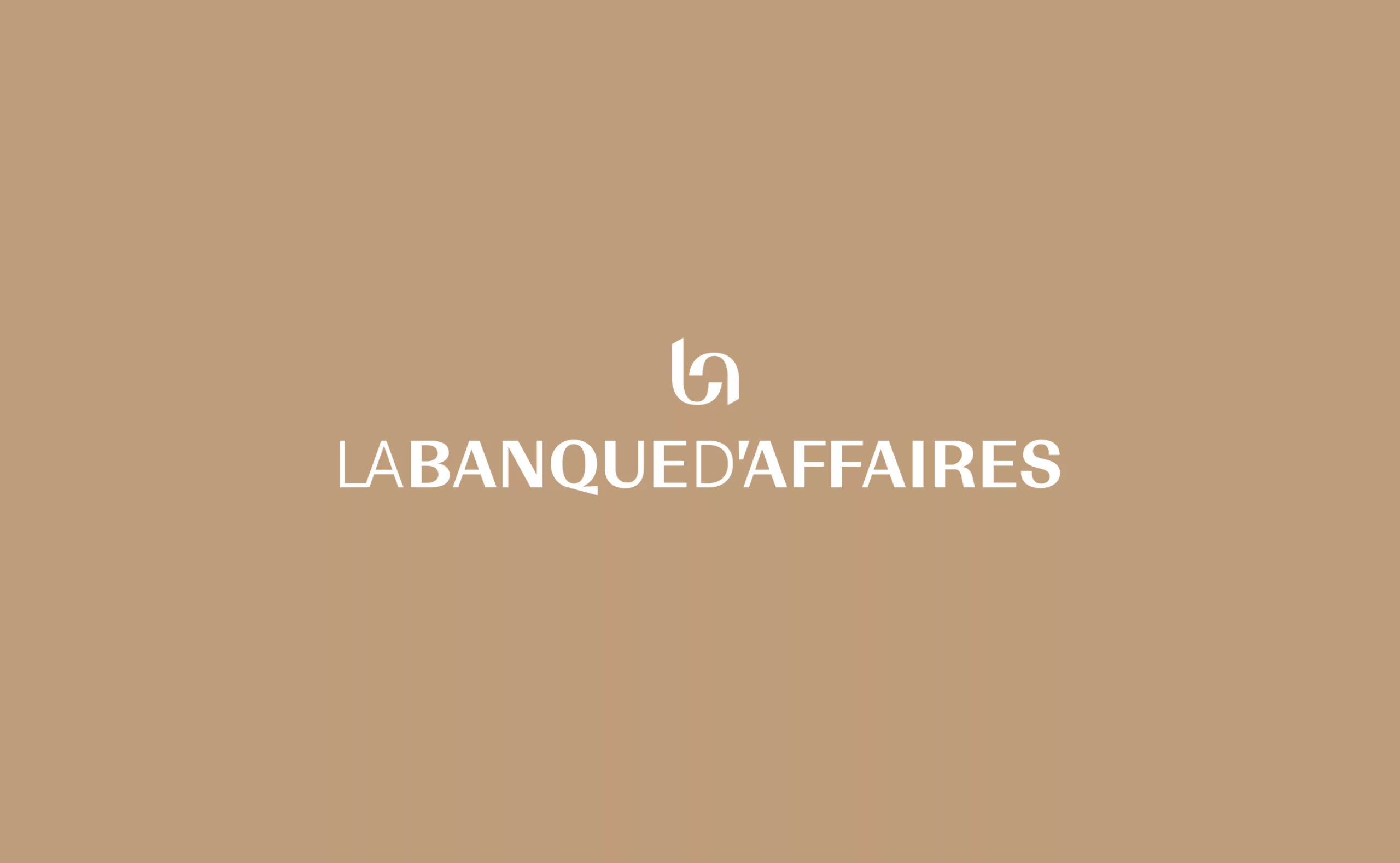
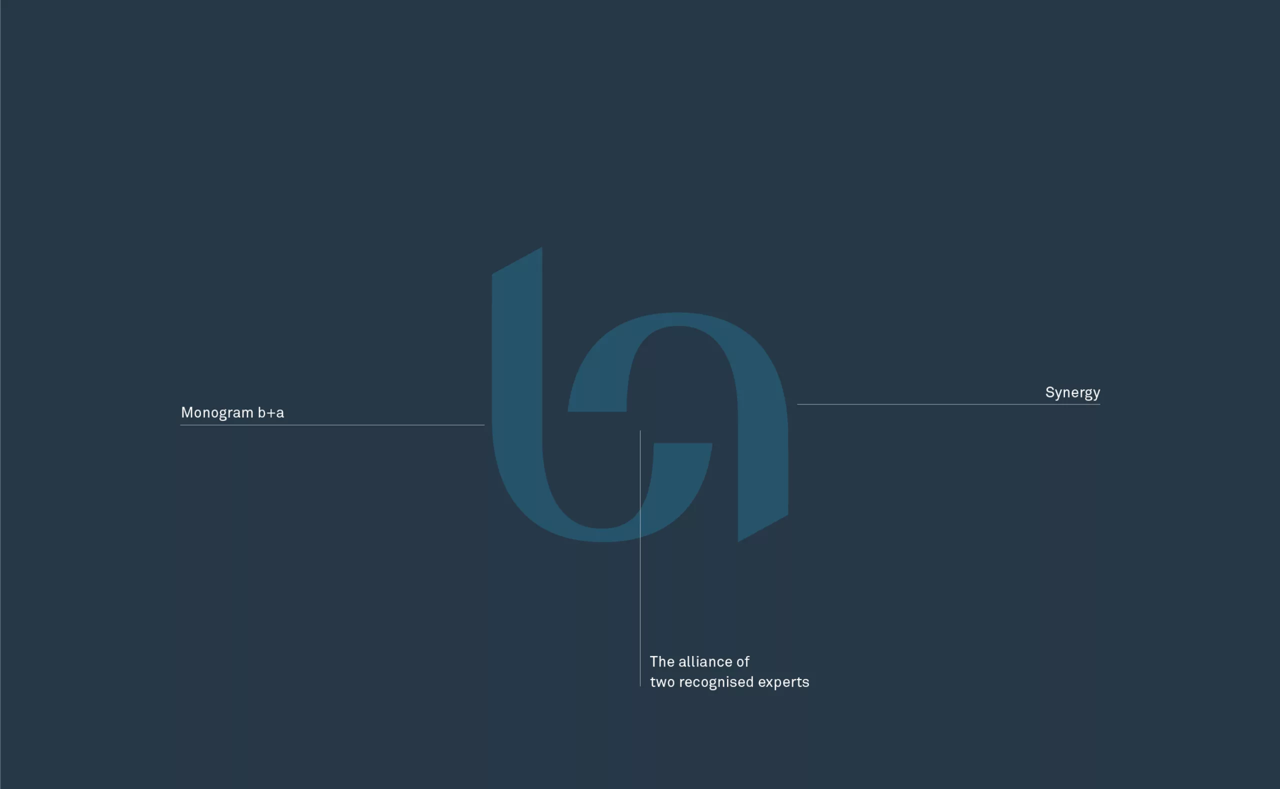
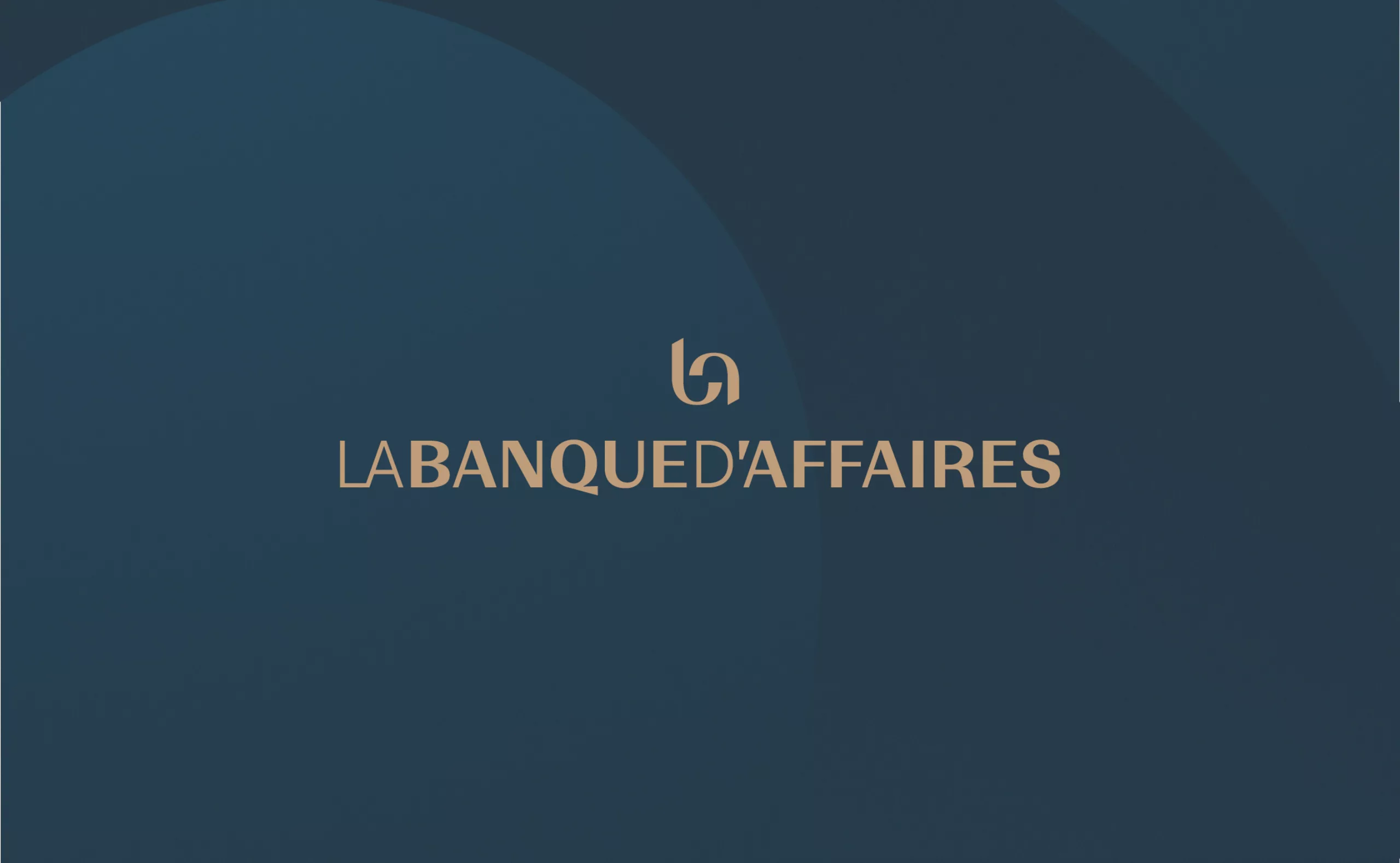
The brand name “La Banque d’Affaires” is a generic title with a strong presence in the banking world. It was necessary to turn the word into a logotype with a strong character. To achieve this, we wanted to create maximum distinctiveness and originality by giving the visual identity an emblem and transforming the brand name into a single word. The emblem takes the form of a monogram and becomes the symbol of a balanced partnership. The monogram represents the synergy between the two founding entities and the notion of exchanges (human and transactional) between the bank and its customer.
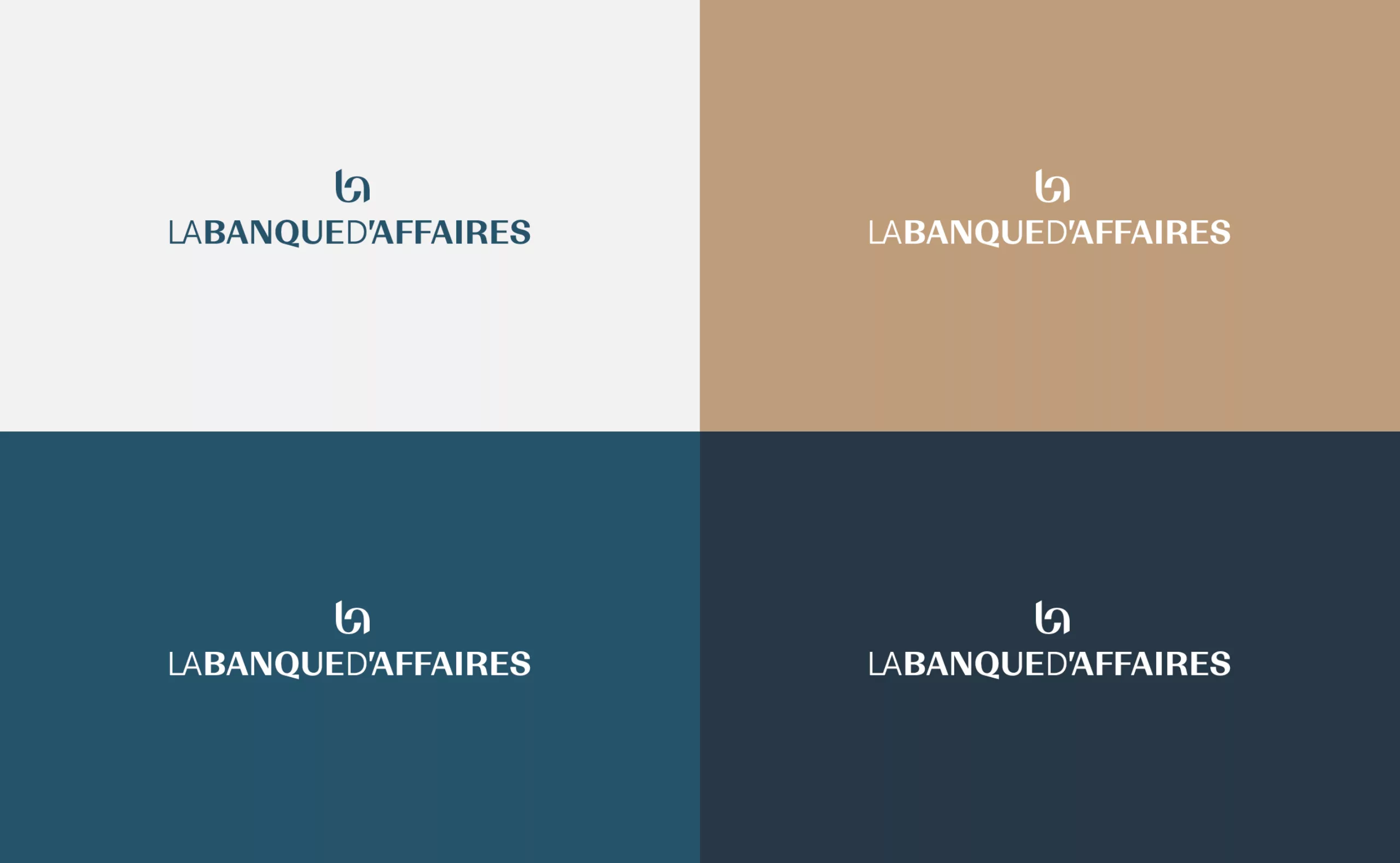
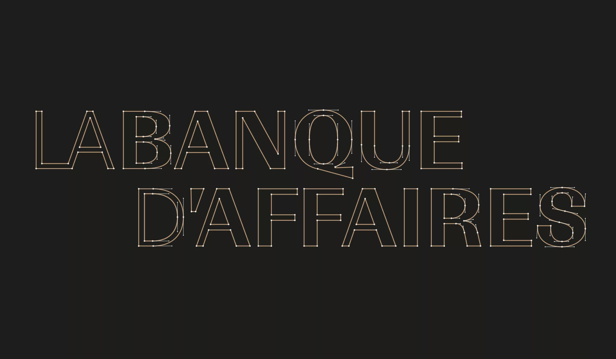
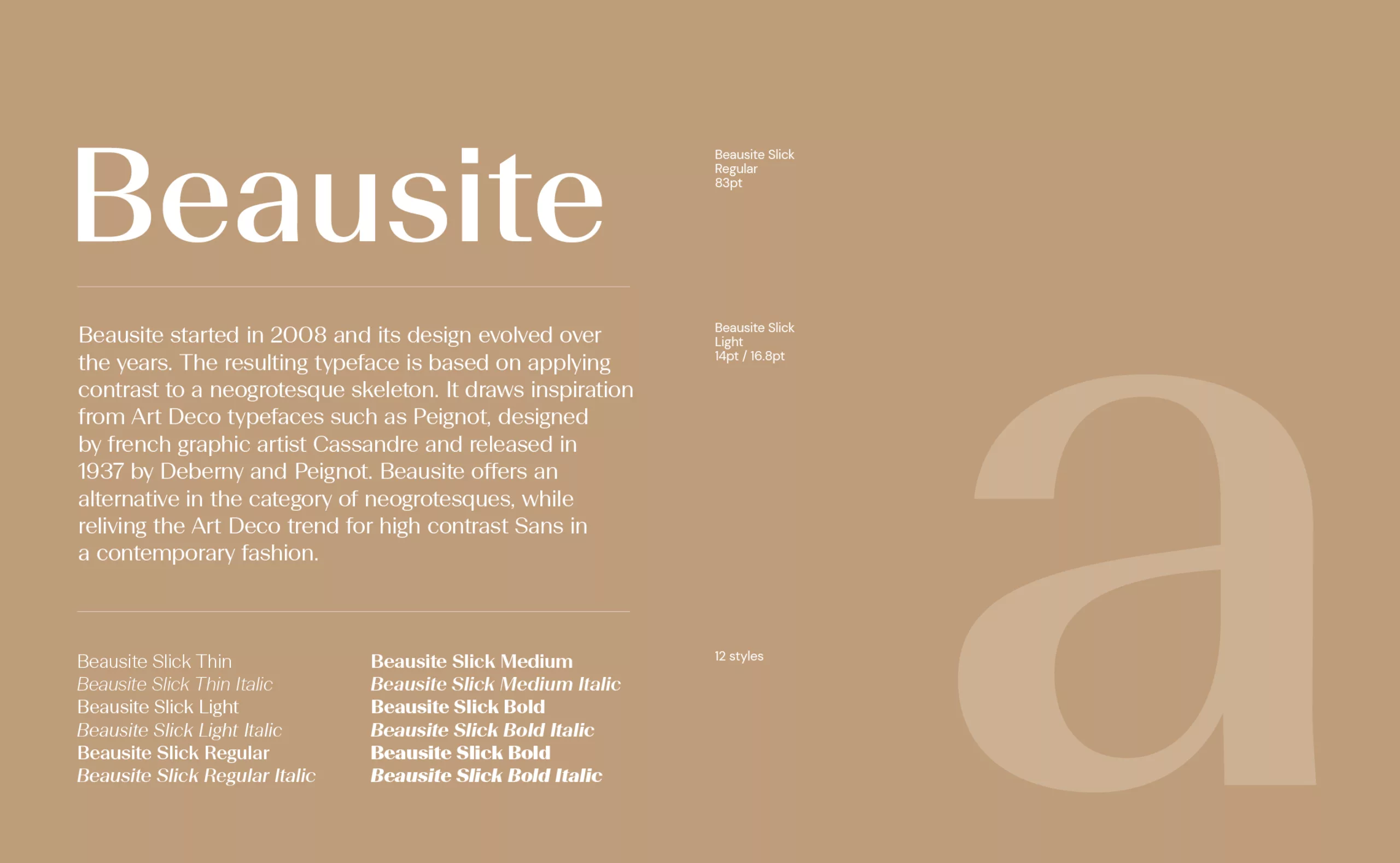
The “La Banque d’Affaires” wordmark is a tailor-made design that makes it possible to compose the elements of the brand name in a compact way. A set of weights ensures that the name is easy to read. Certain details, such as the tail of the “Q” and the apostrophe of the “D'”, are graphically linked to the curves of the emblem, conveying the fluidity of the service.