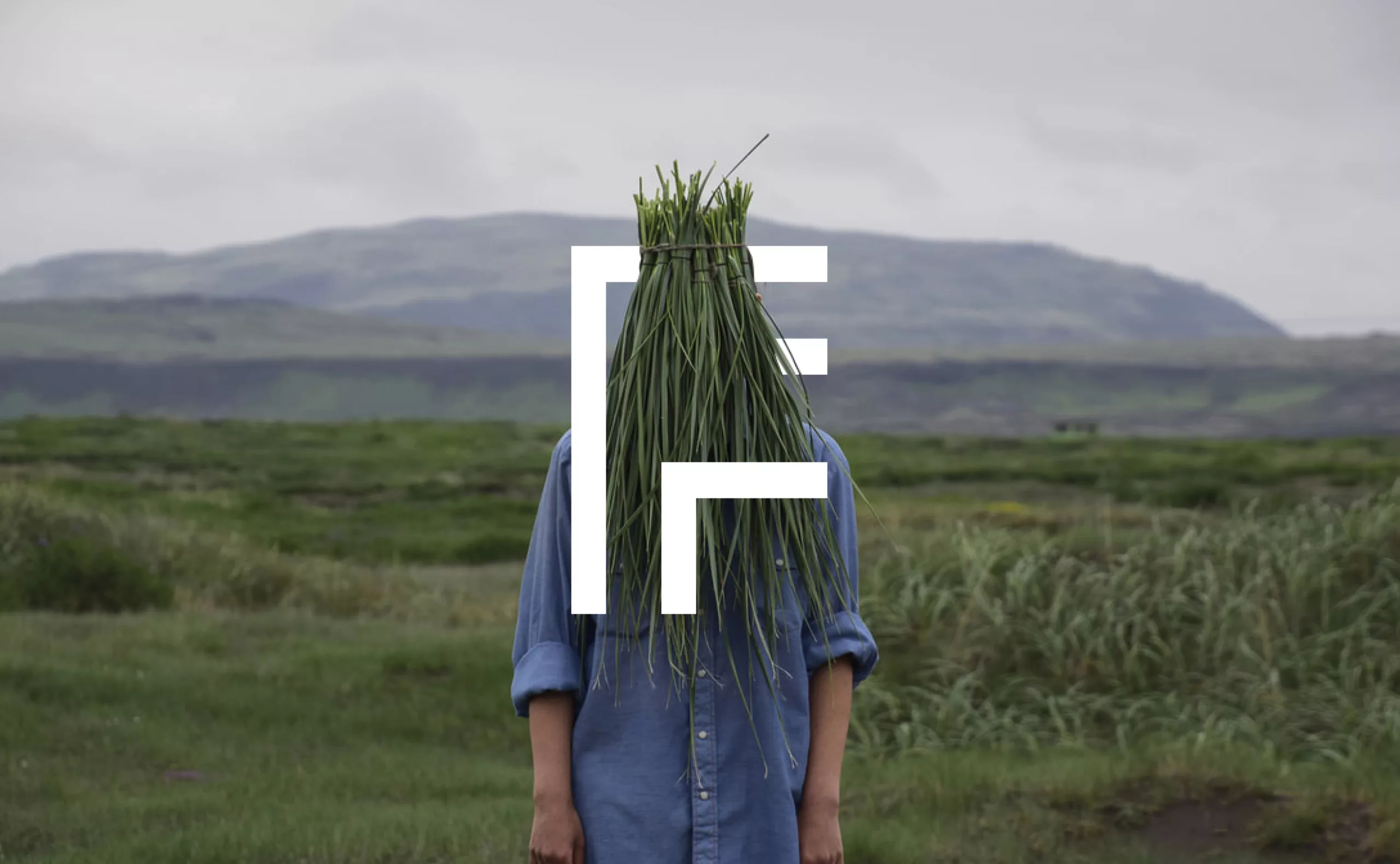
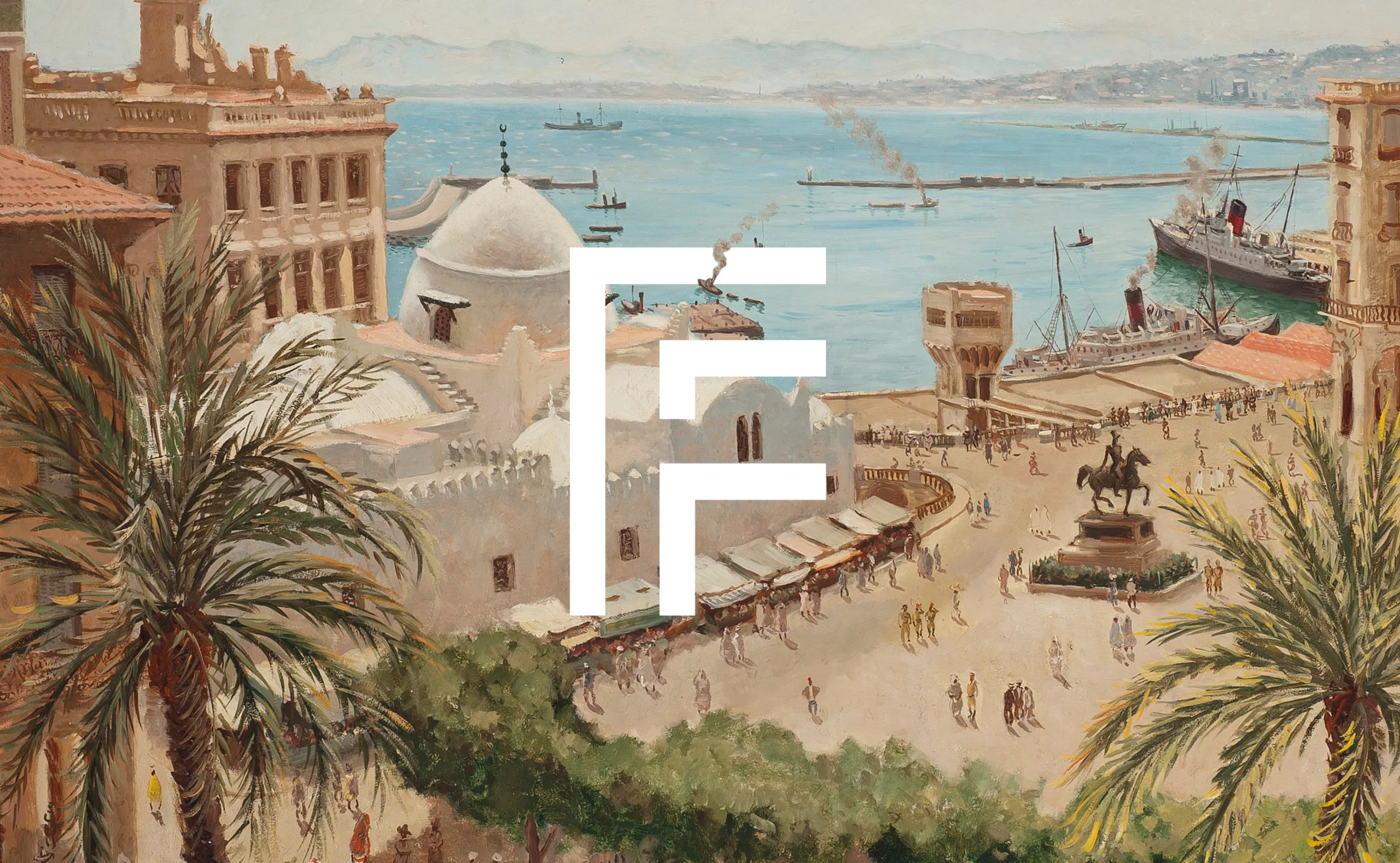
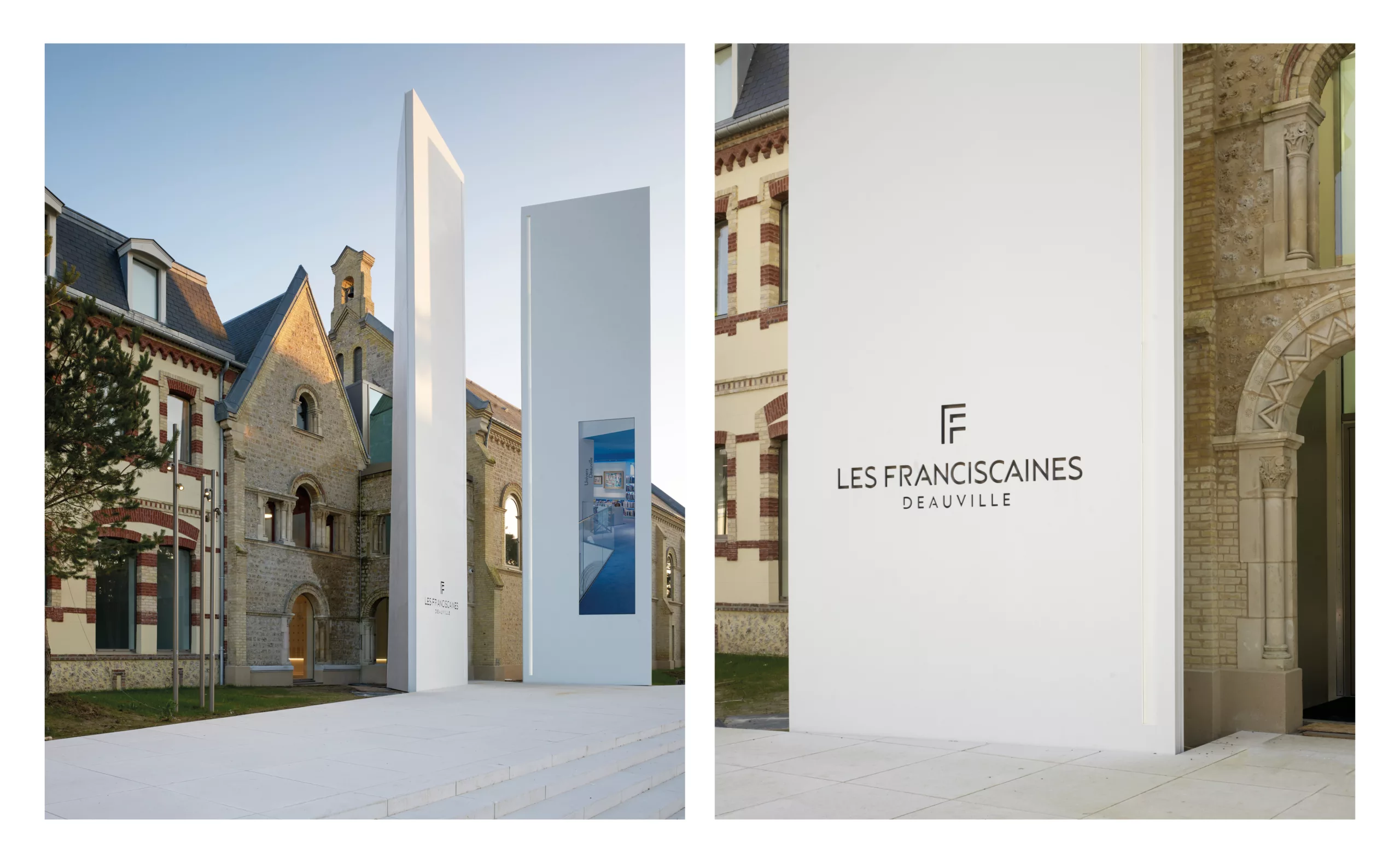
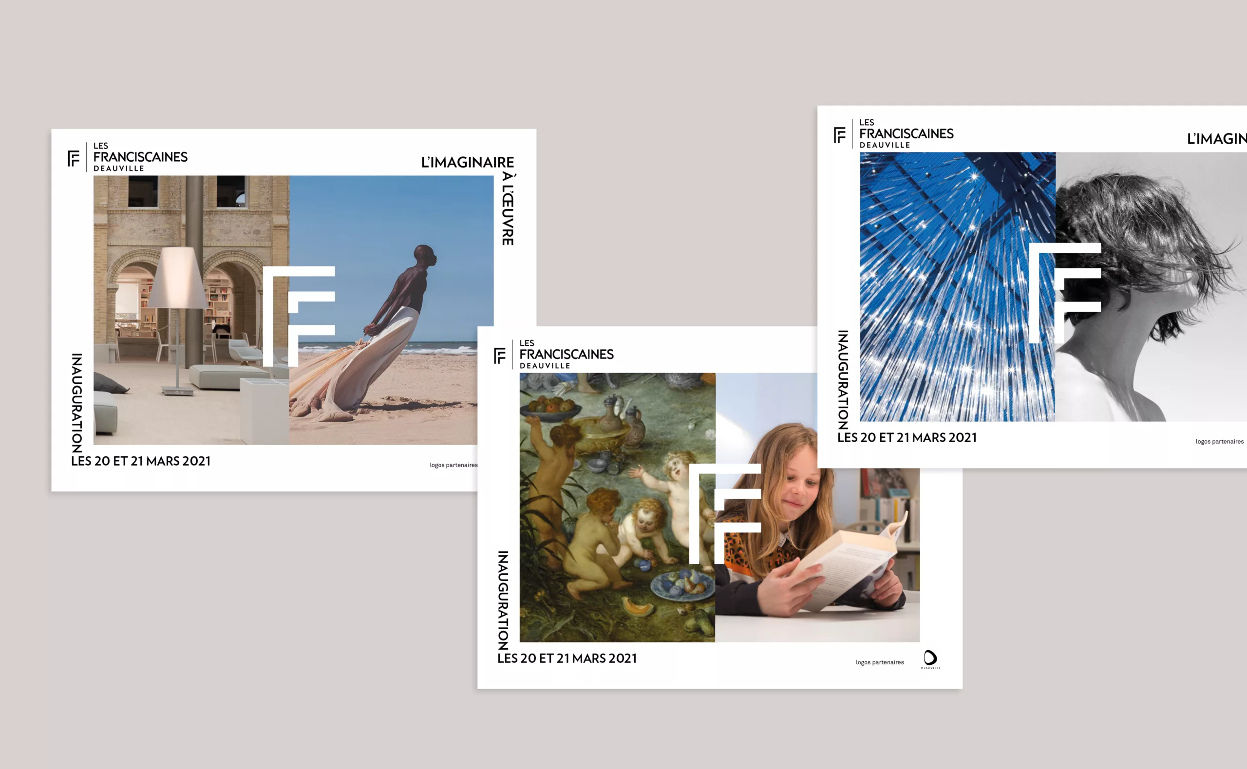
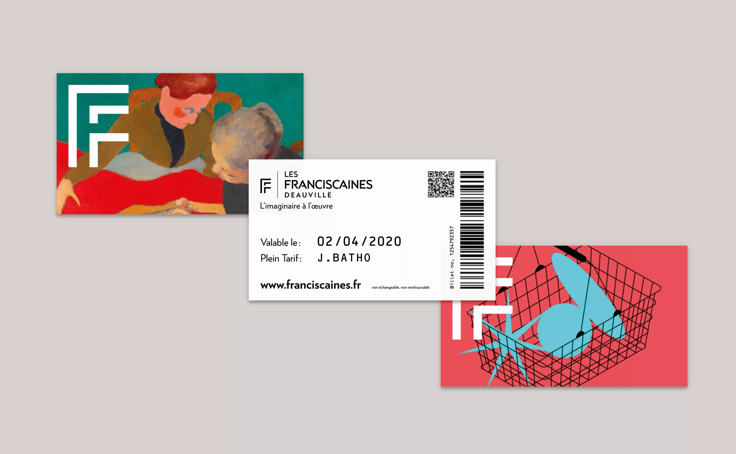
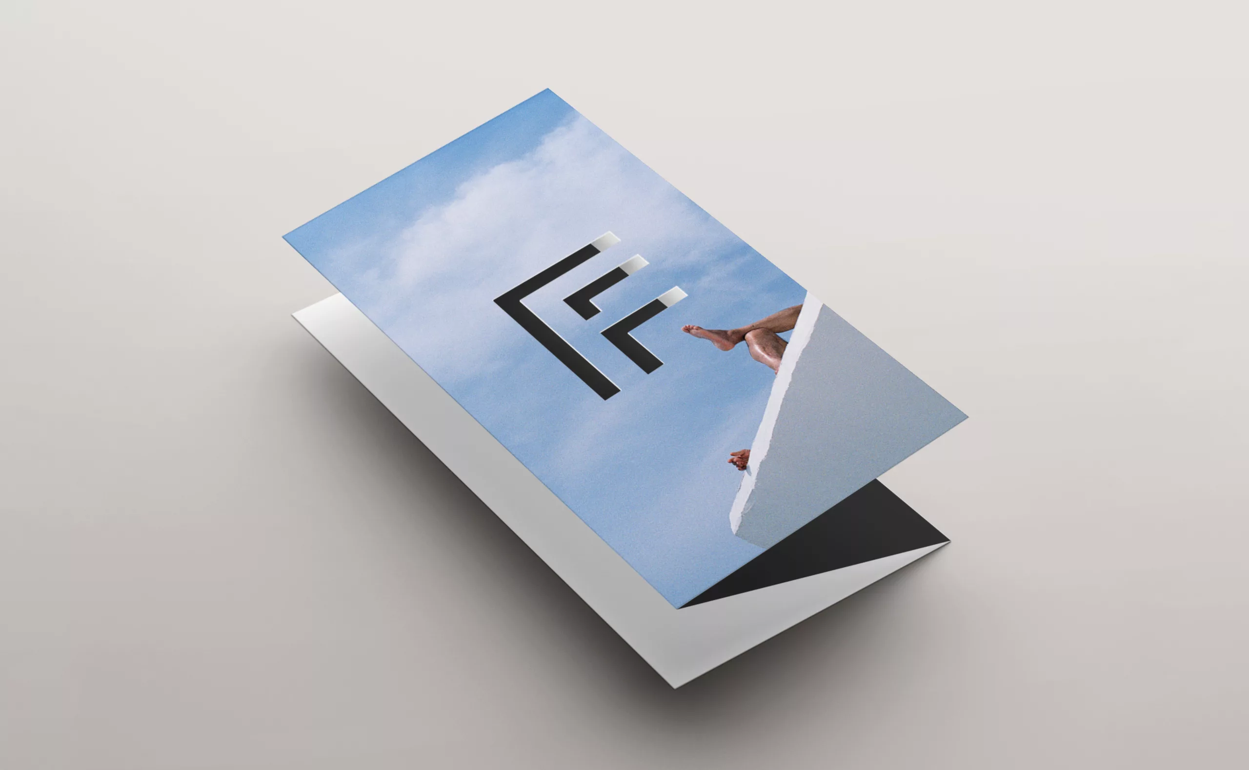
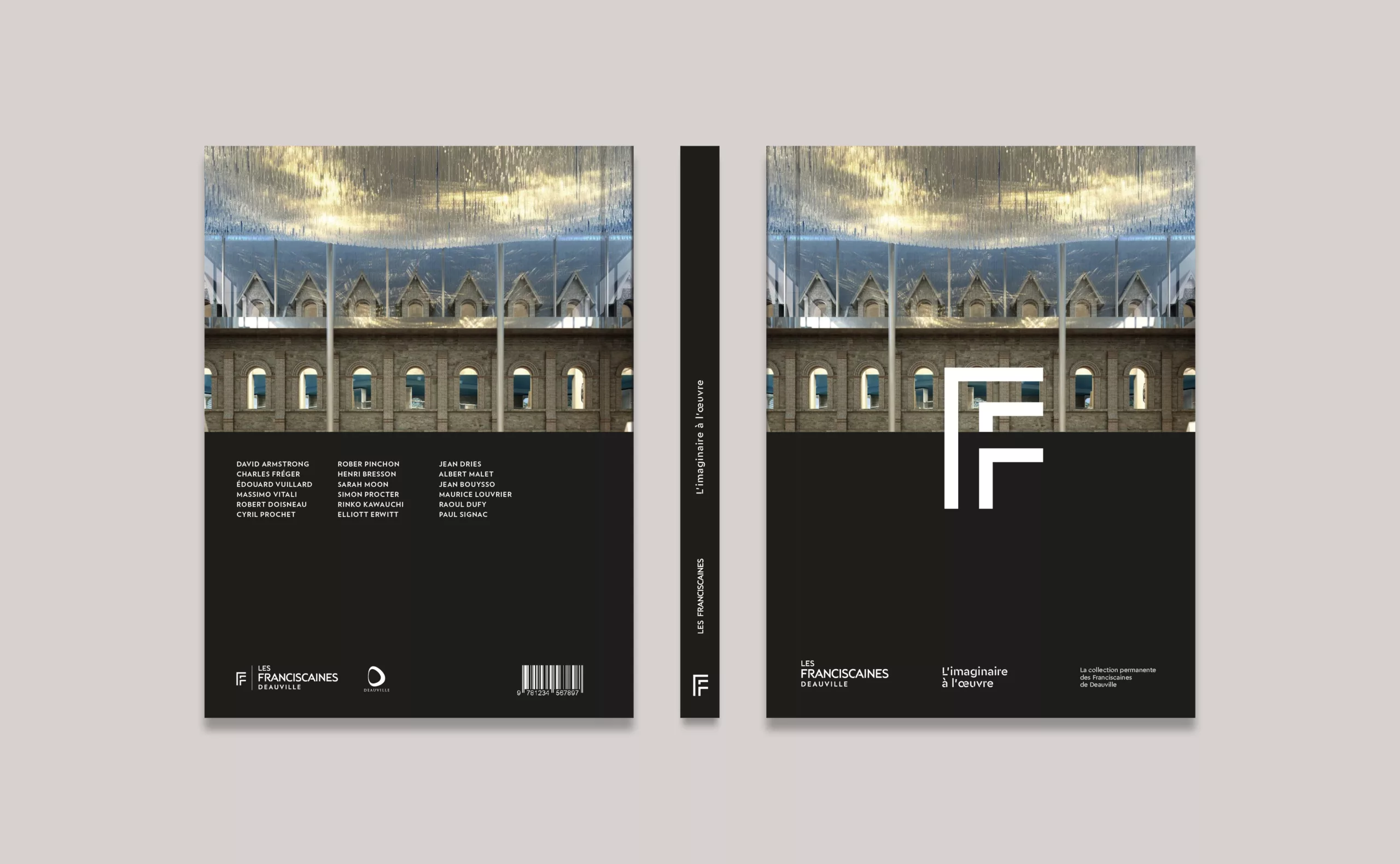
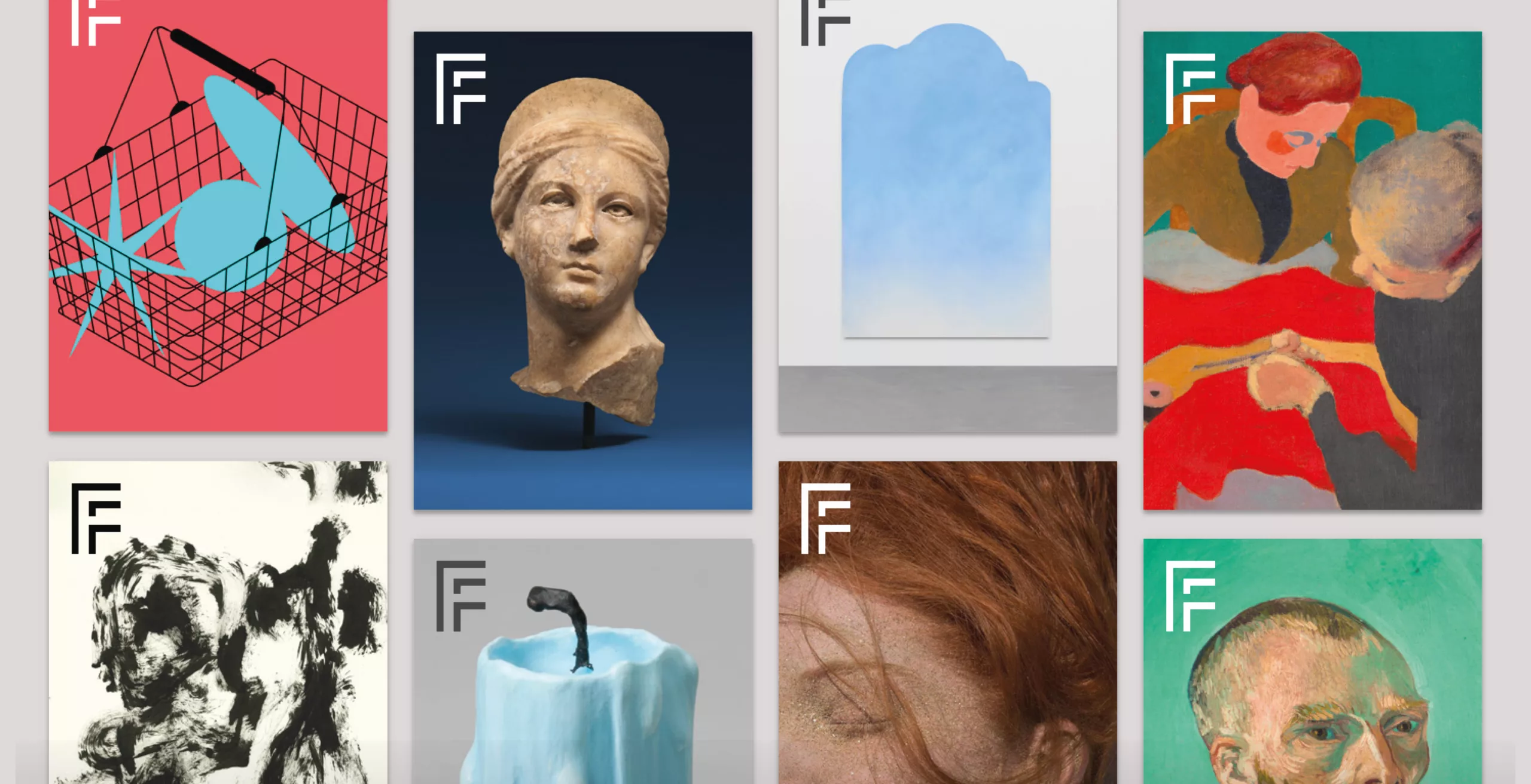
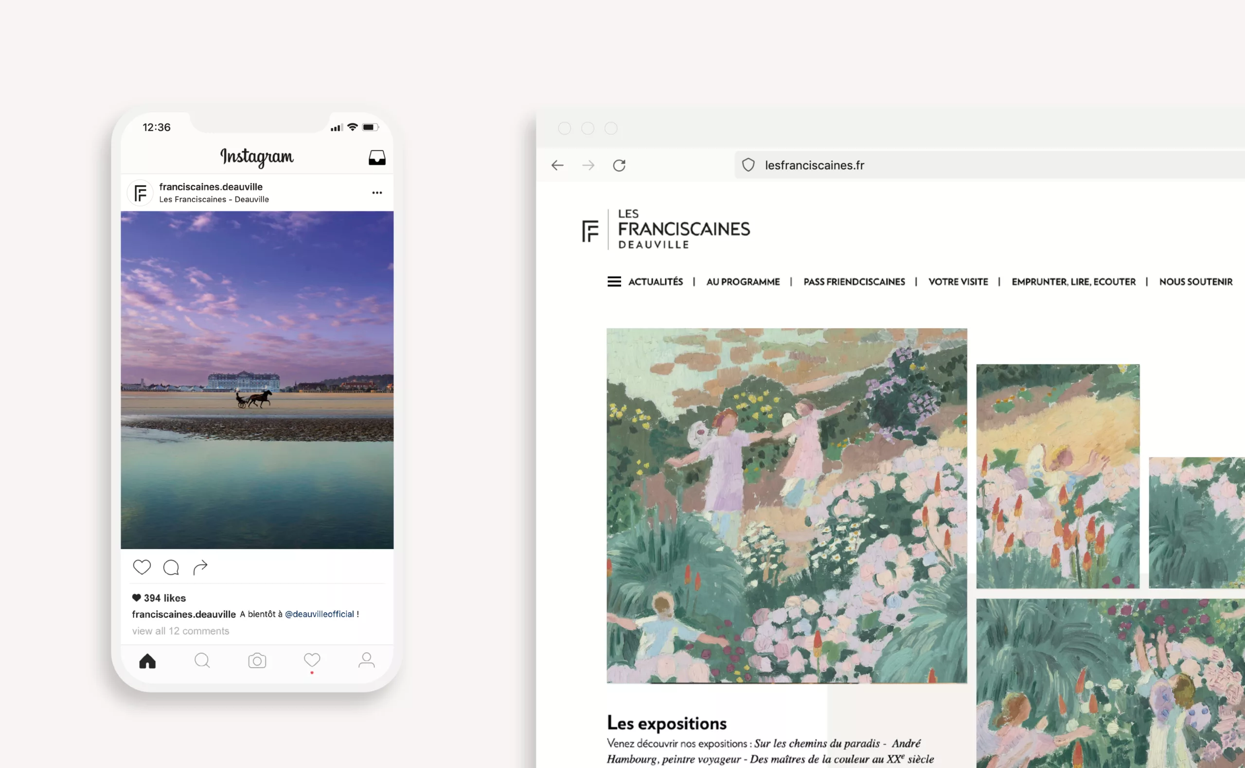
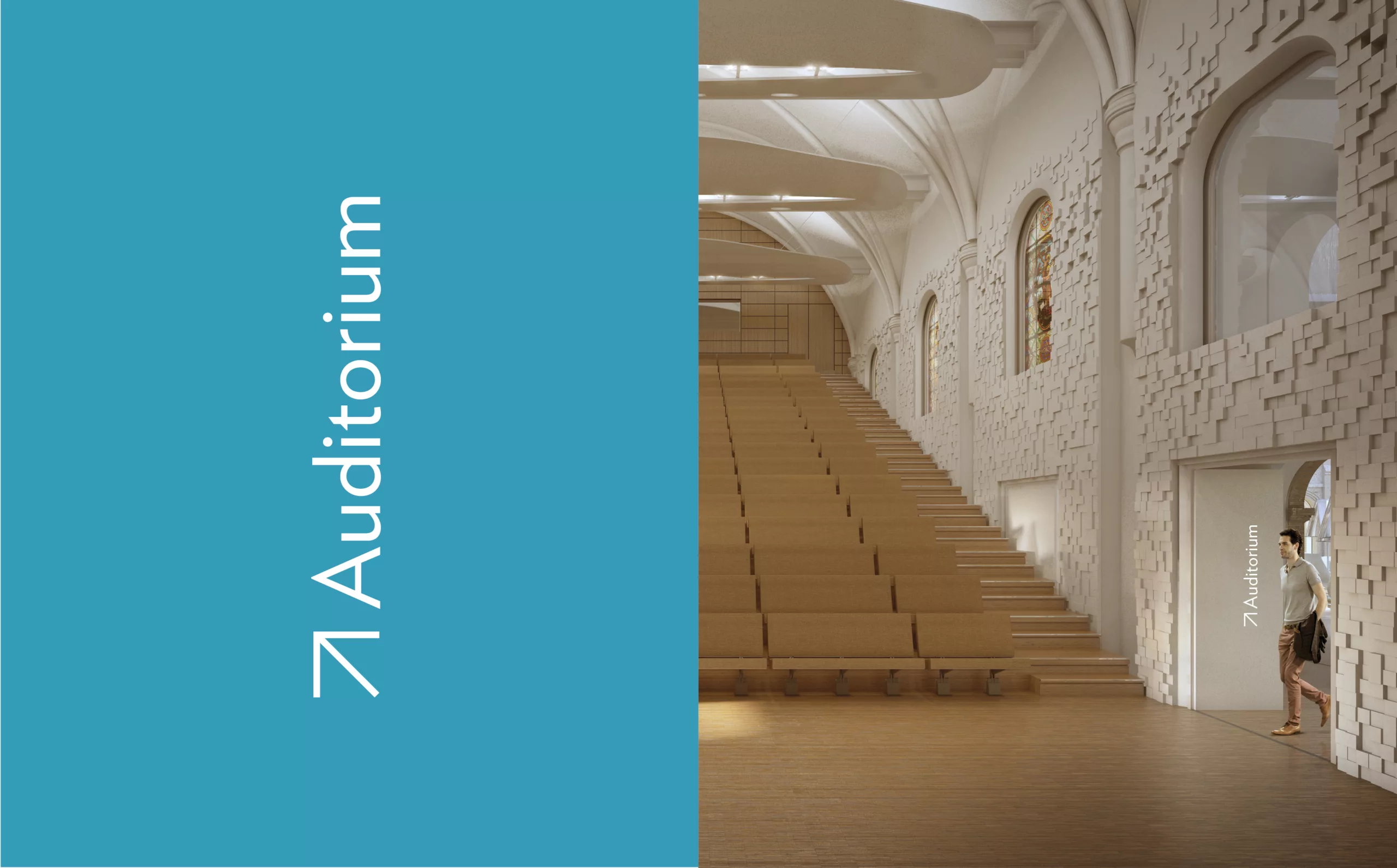
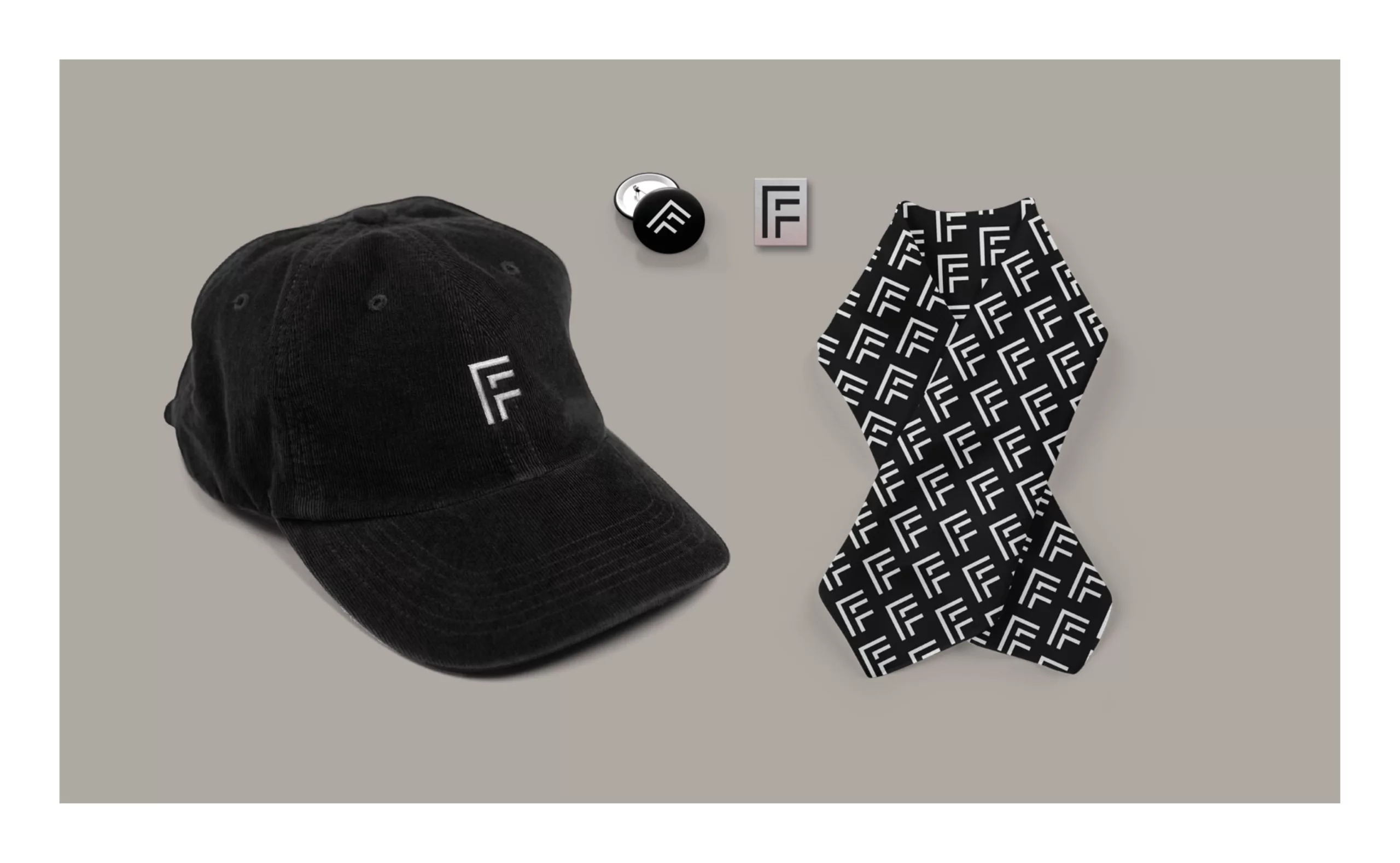
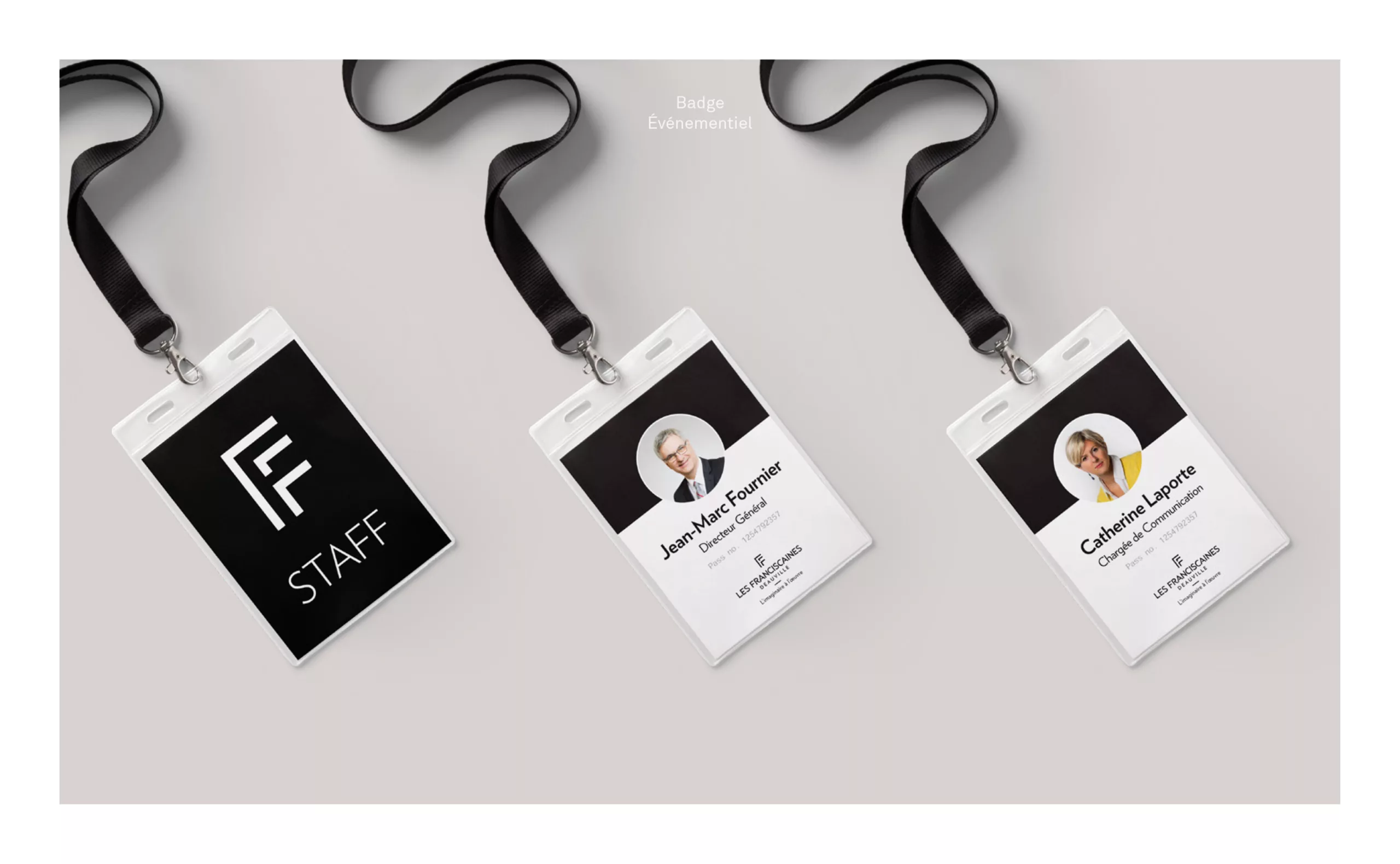
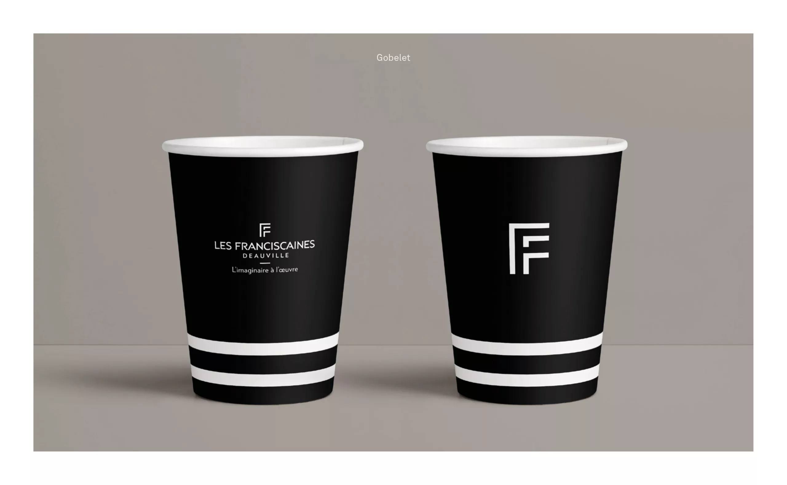
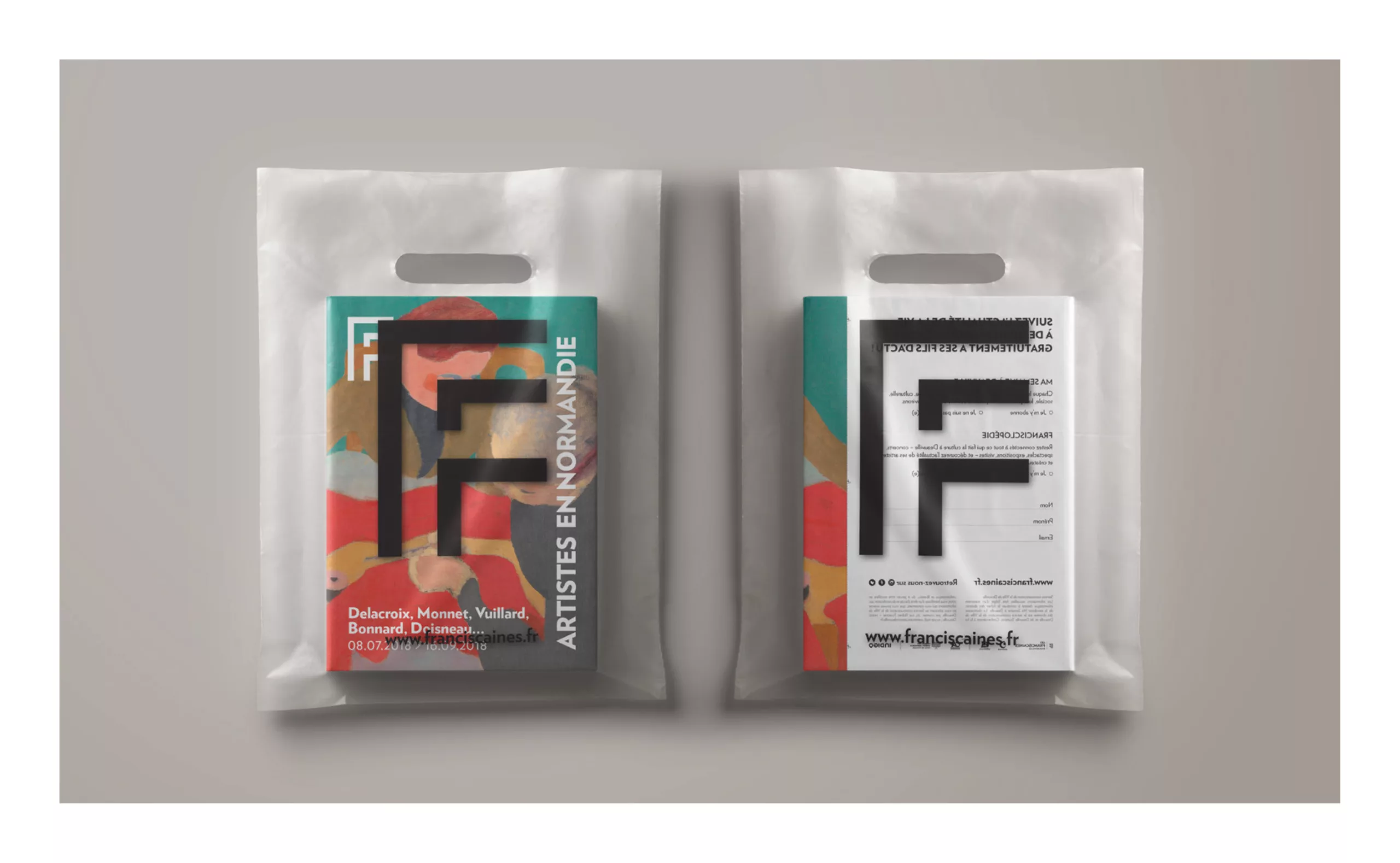
A logo that affirms the identity of the place with pride and modernity
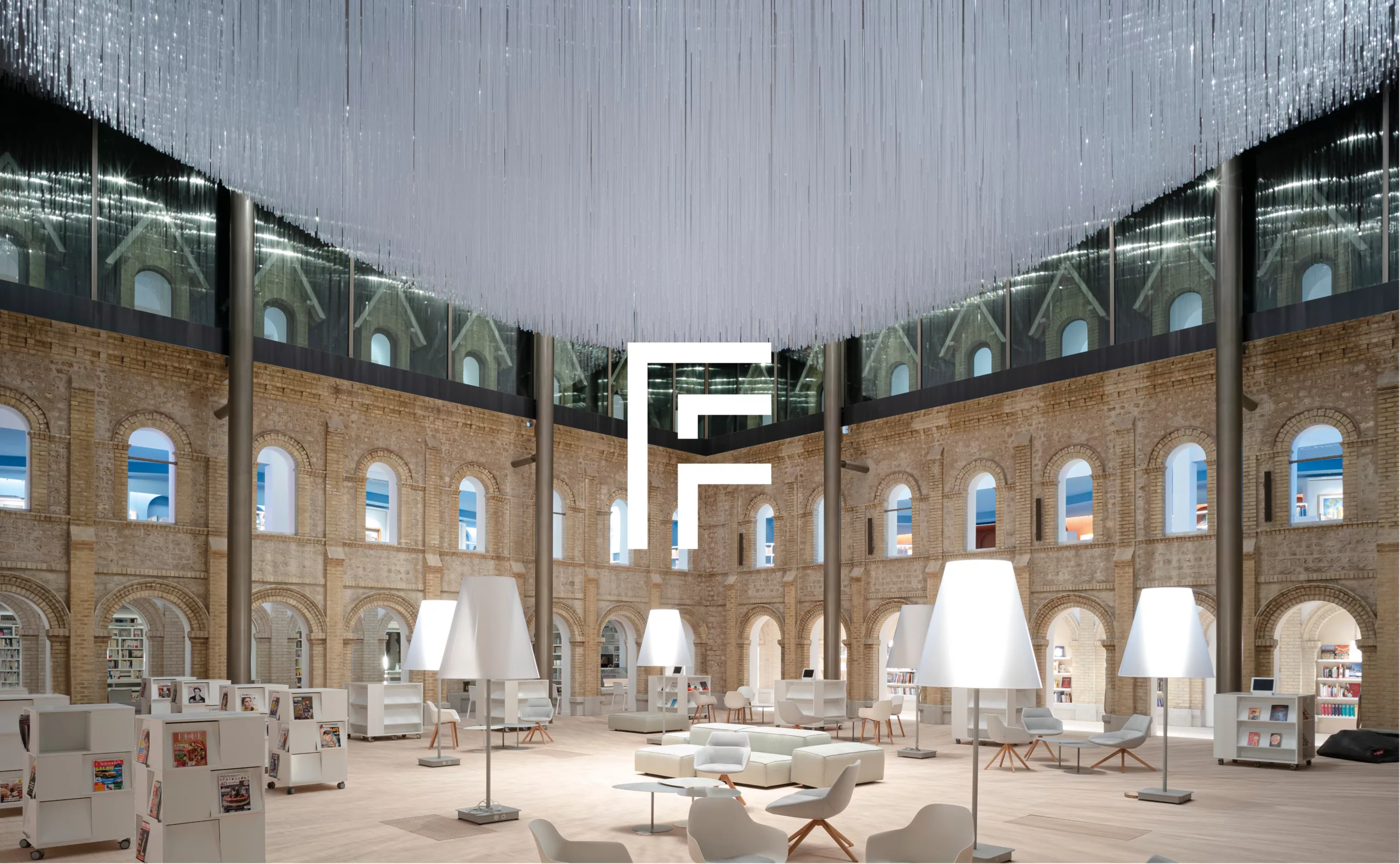
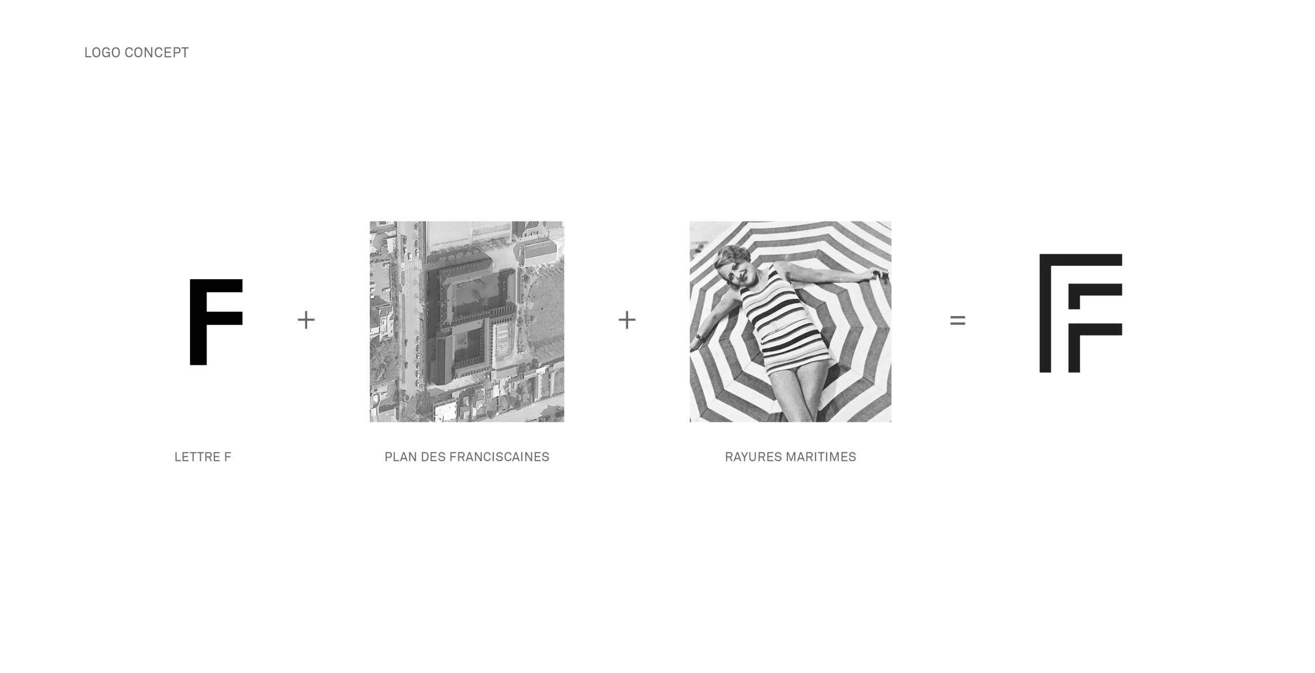
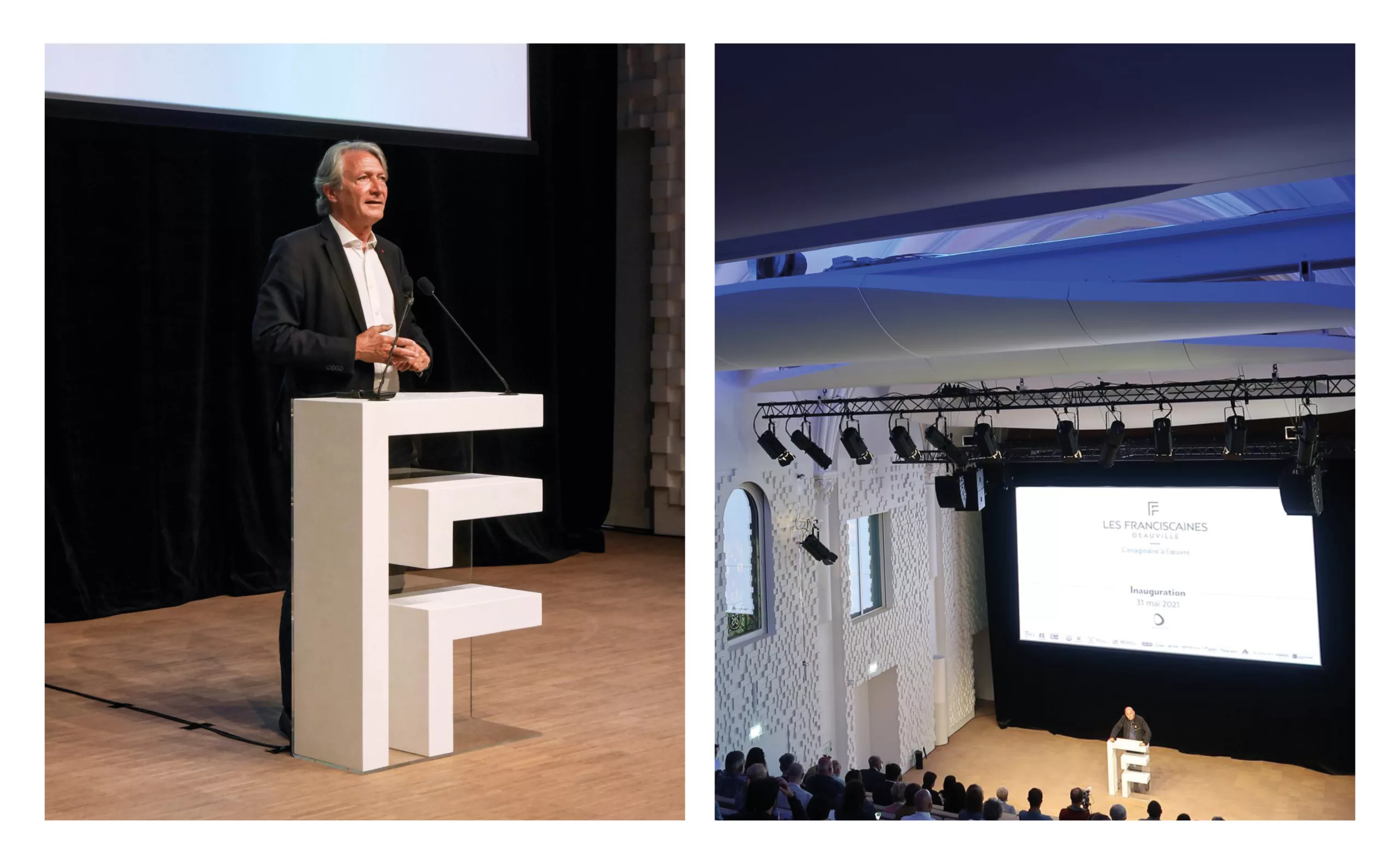
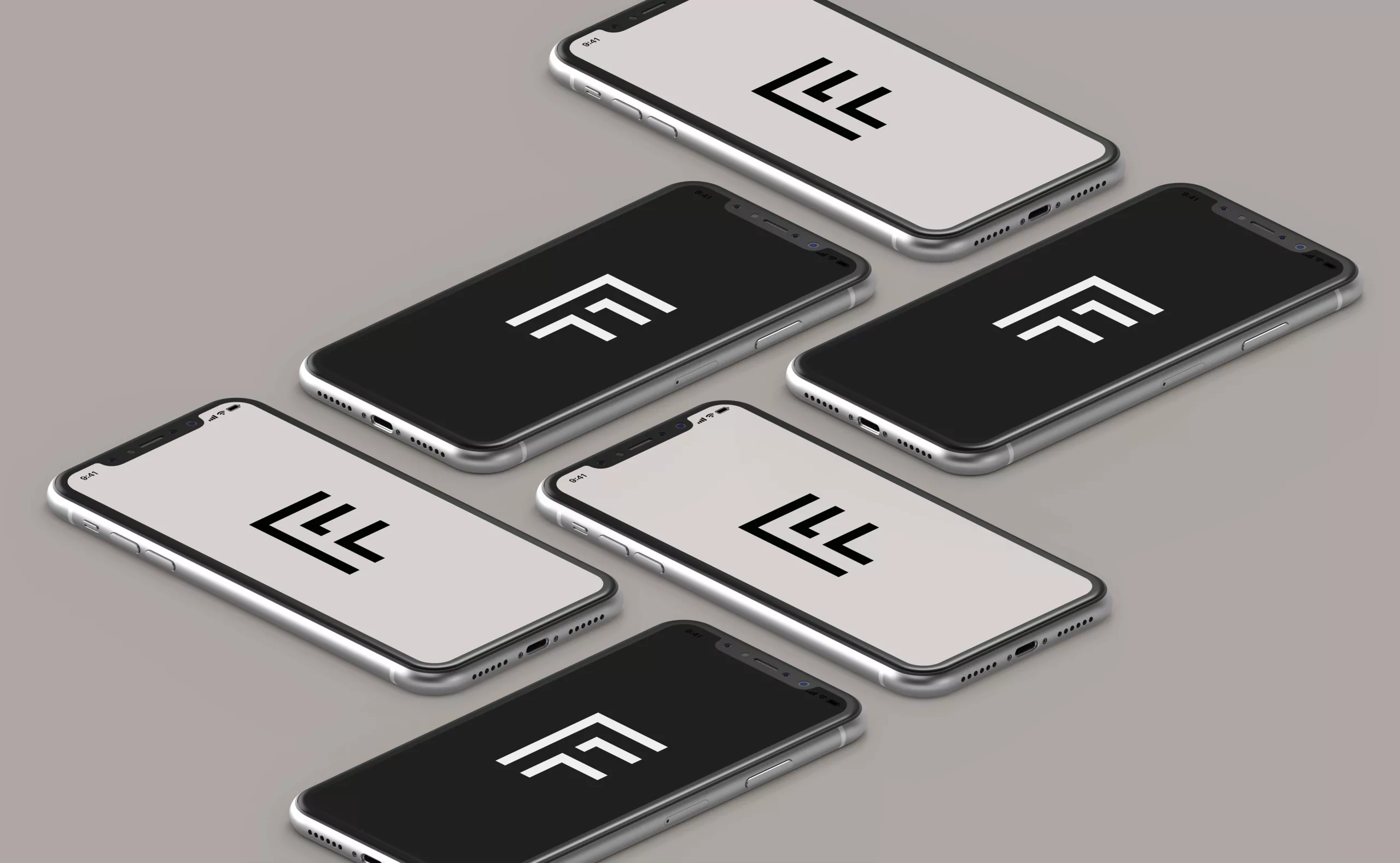
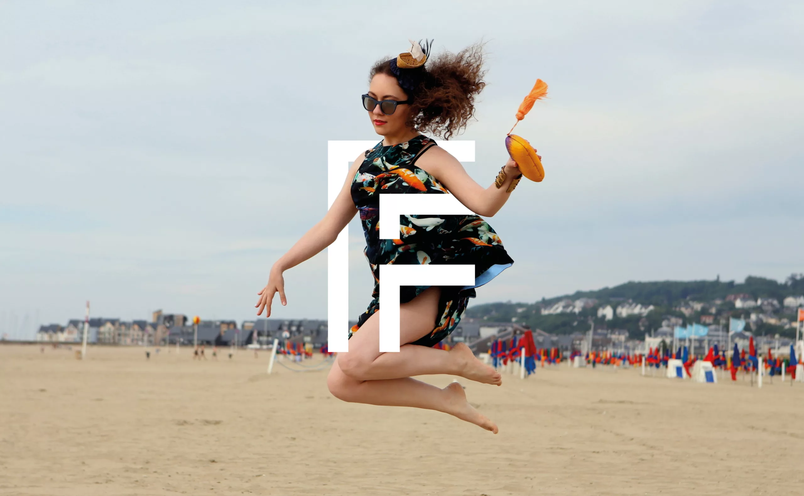
Right from the project study during the initial pitch stage, we have given great importance to the architectural dimension to define the visual identity of Les Franciscaines. The study of the building allowed us to appreciate this highly open space with a great potential for free movement. From a bird’s eye view of the project, we discovered the letter “F” that the building creates when viewed from the sky. The choice of the monogram was then an instant realization, both for its evocative force and its effectiveness in communicating a new offer in the daily life of Deauville’s inhabitants.
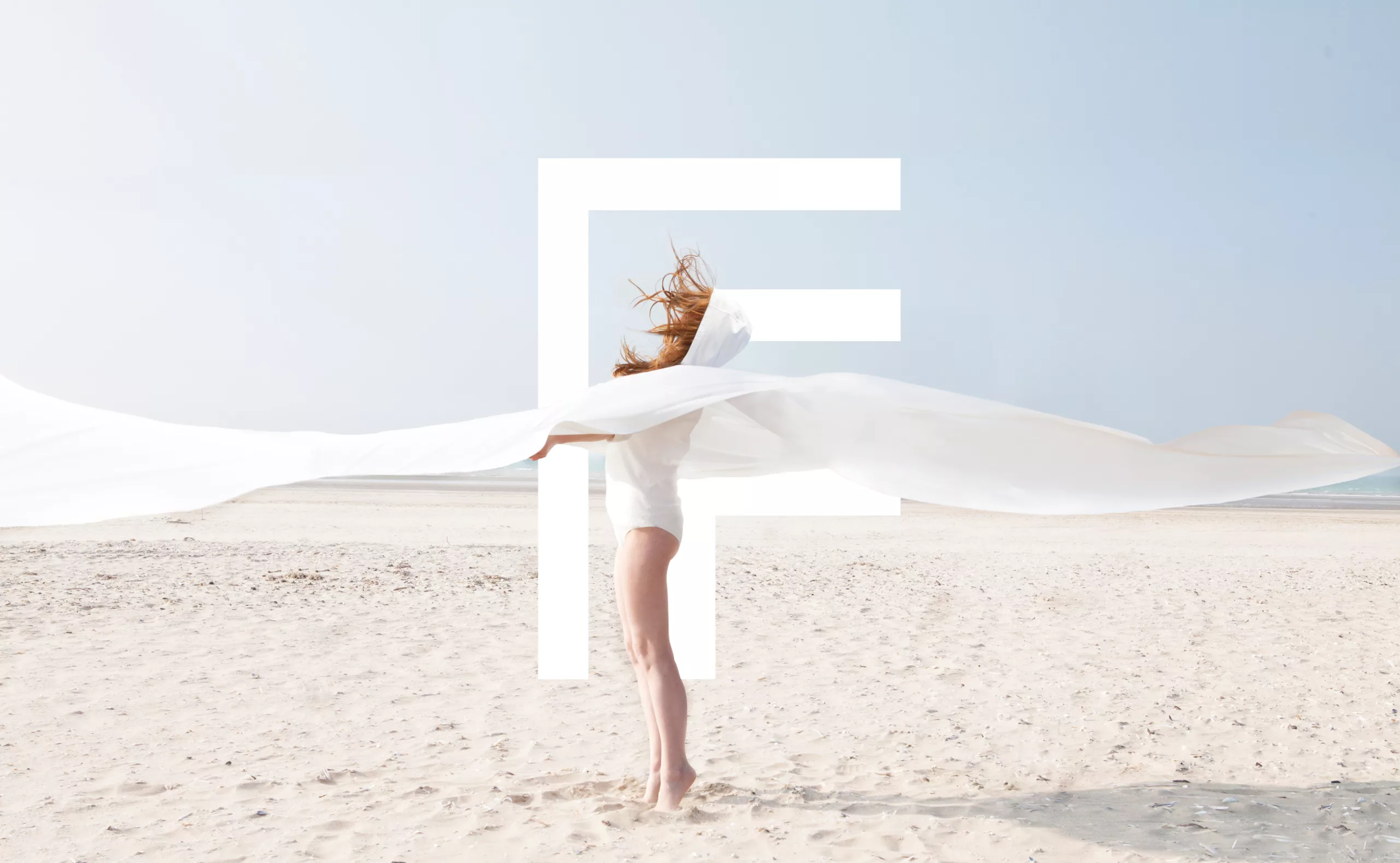
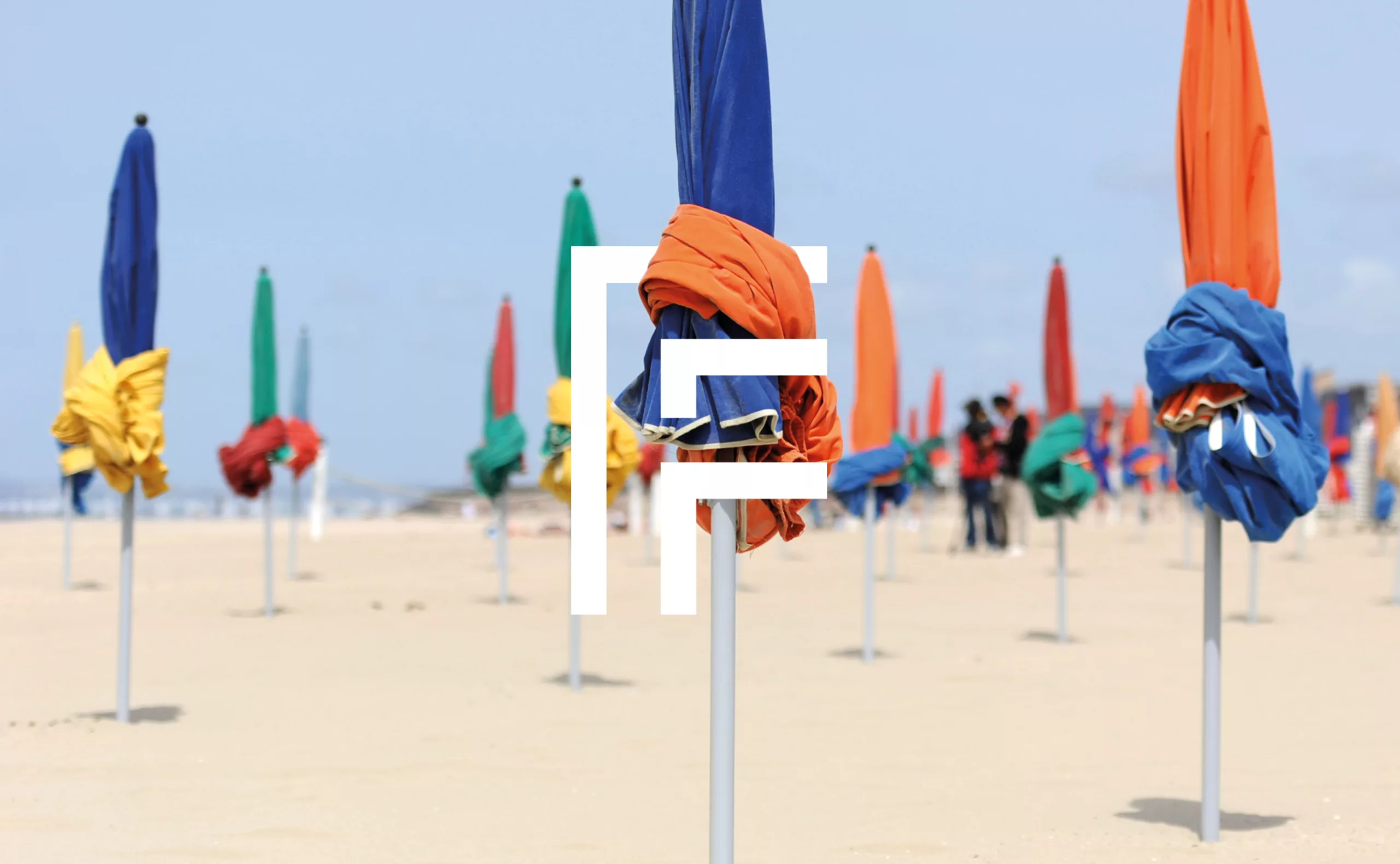
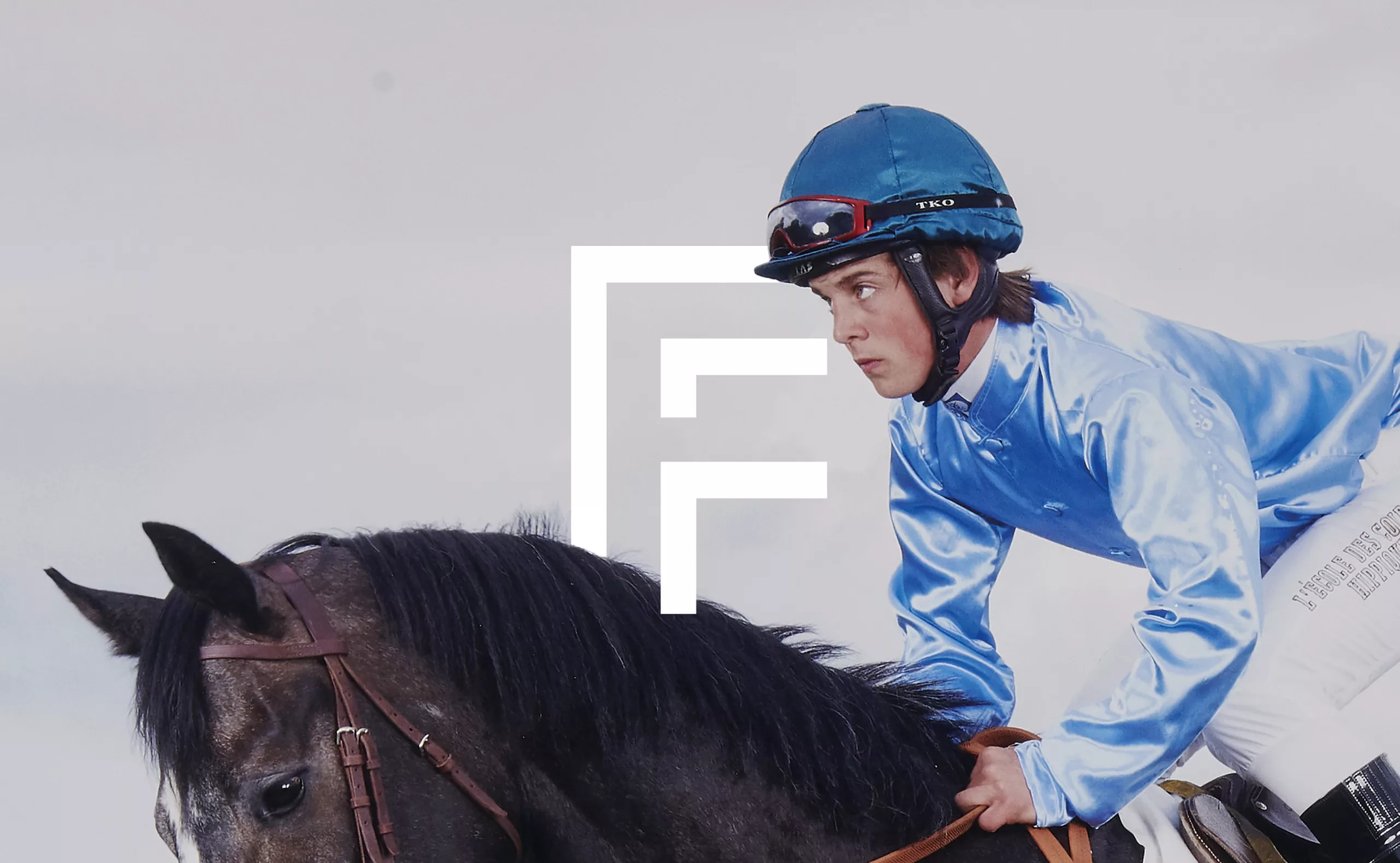
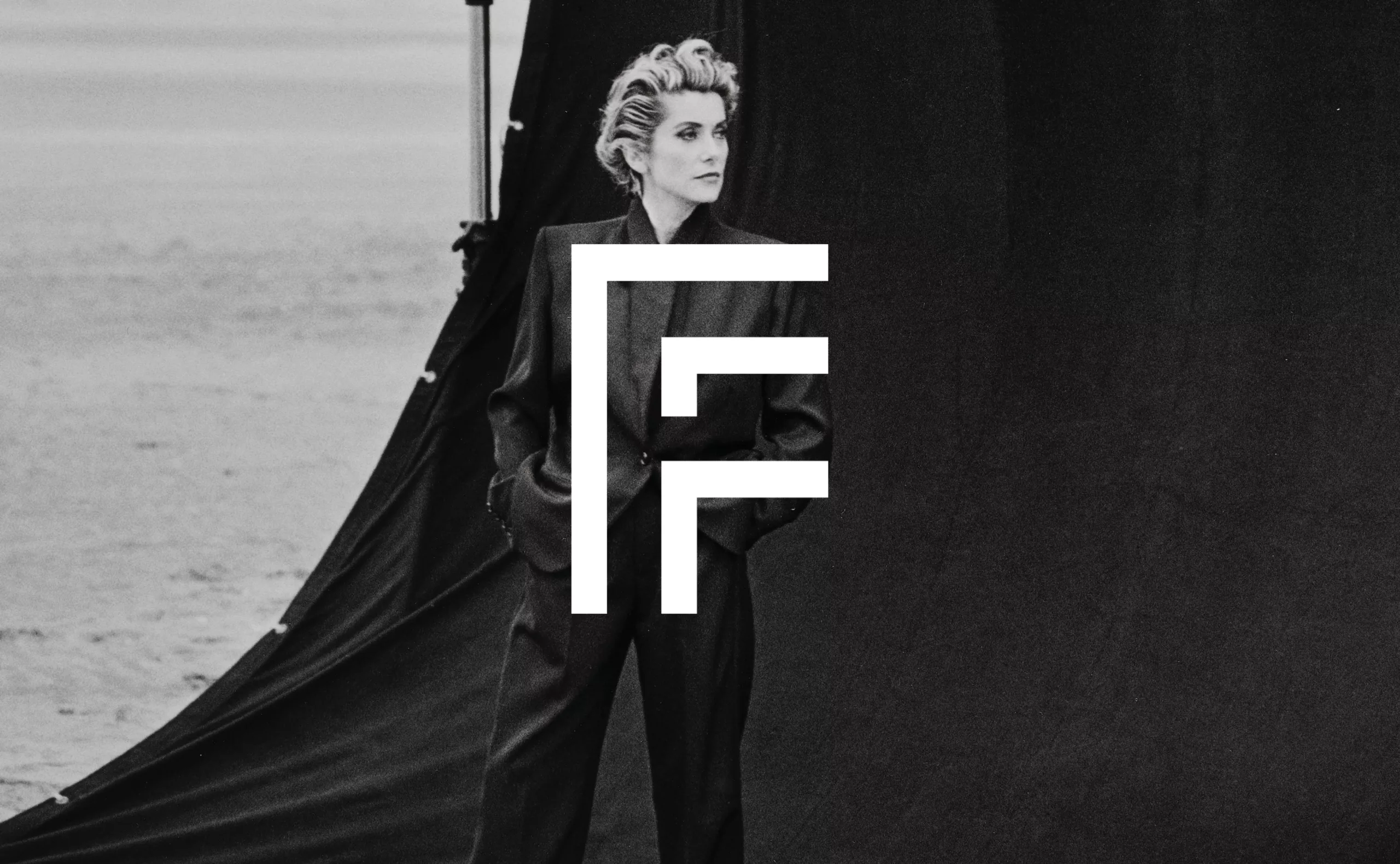
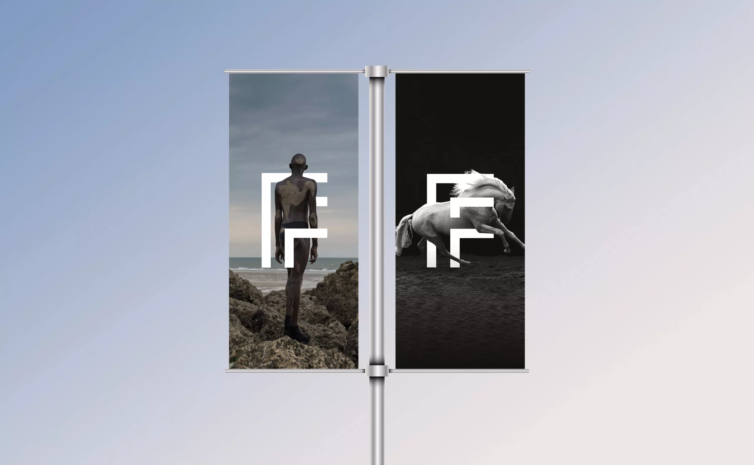
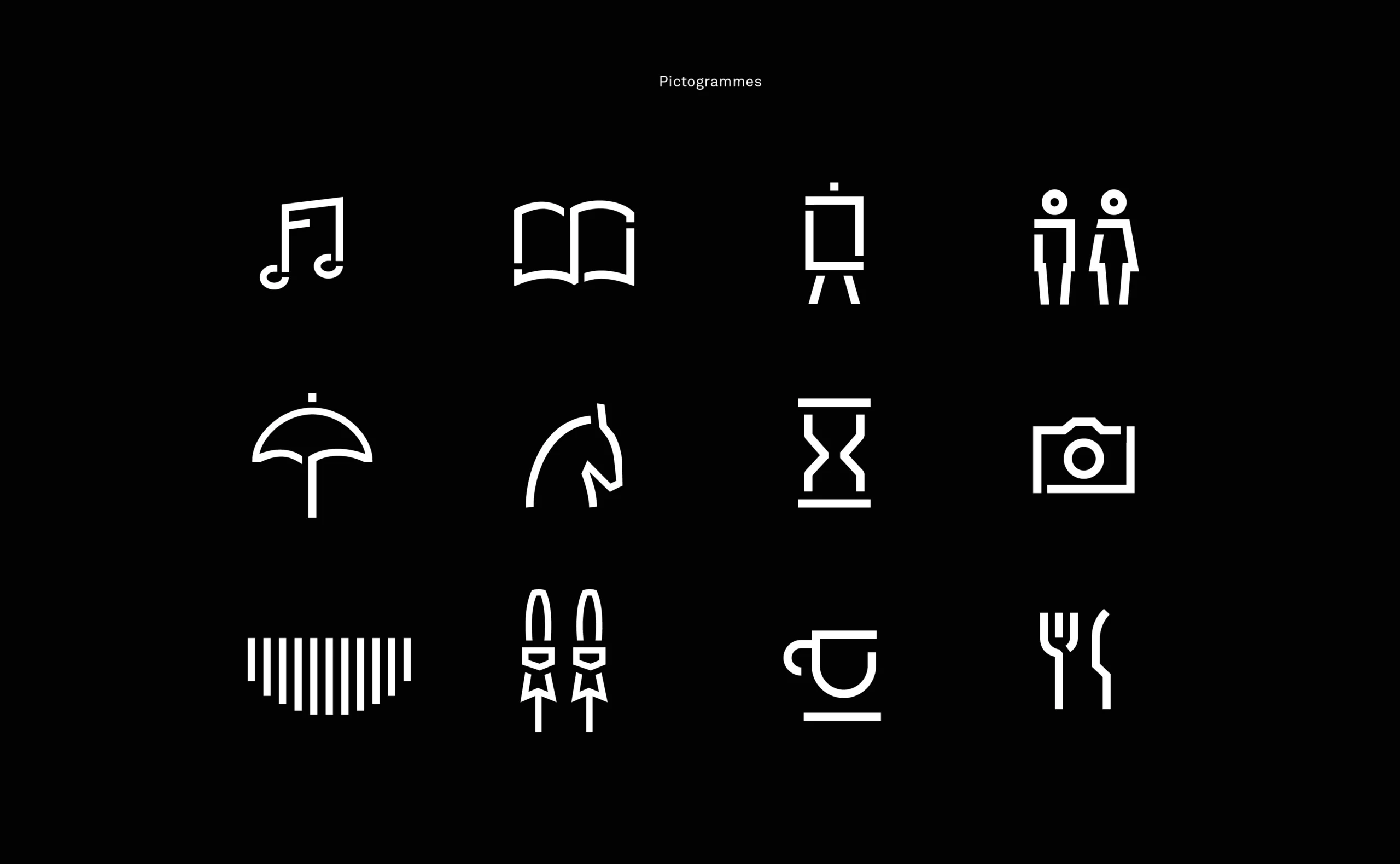
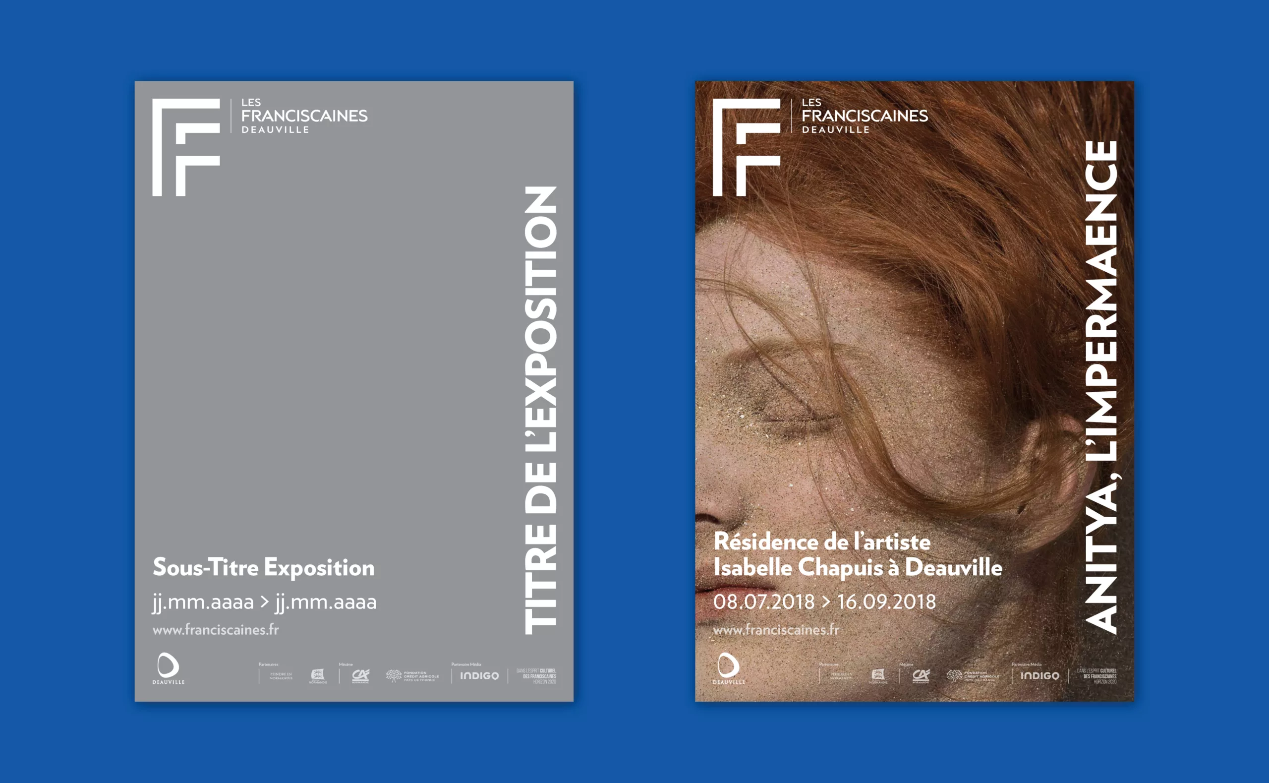
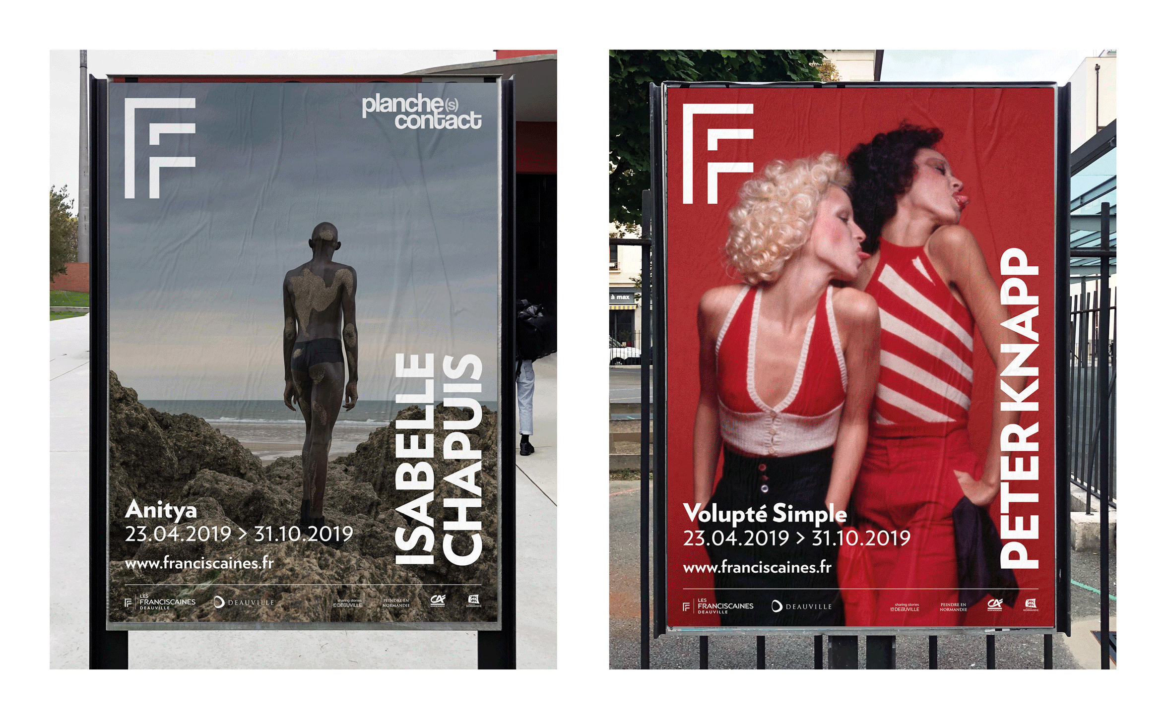
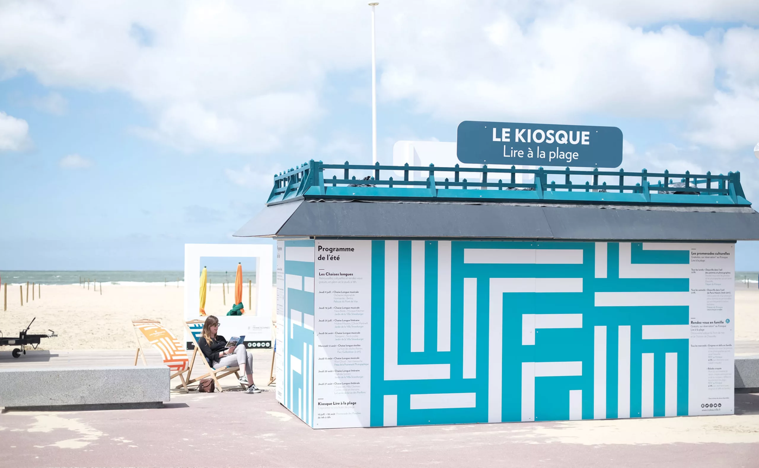
Deauville is also, and most importantly, its wooden promenade along the beach, its photography festival, its American film festival, its Casino and its horse-riding culture which make it a glamorous and chic holiday destination. The graphic choice of the “F monogram” embodies the role of an ambassador by representing the Deauville ethos beyond the city’s borders. Its style is also a nod to the “retro-chic” stripes of beach umbrellas and swimsuits. This graphic identity is a tribute to the city, its population and the imagination it conveys.
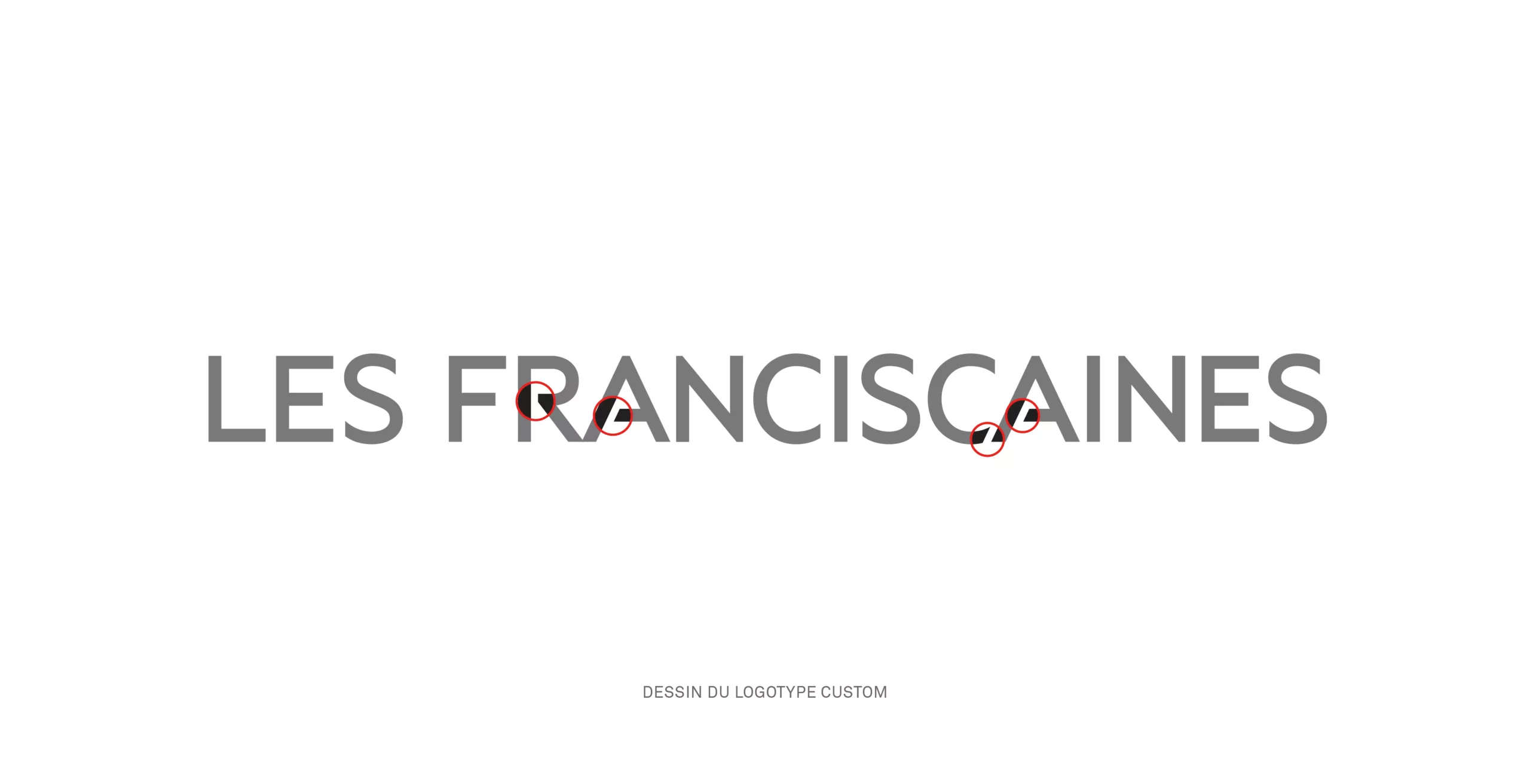
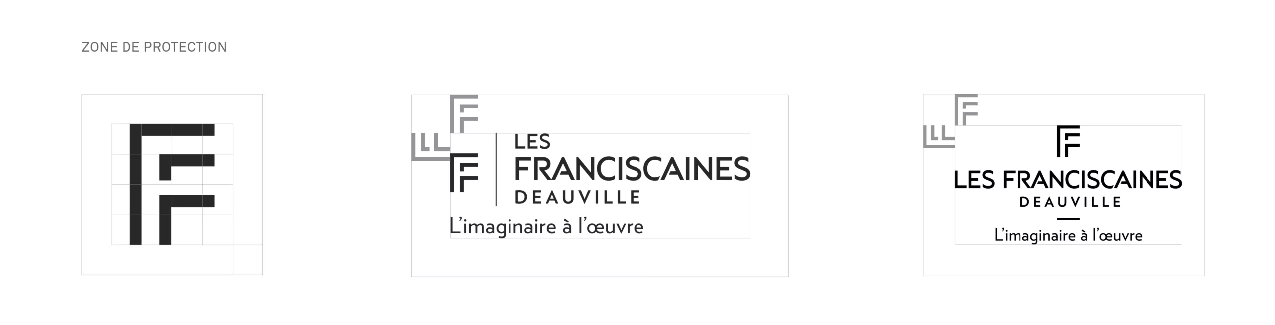
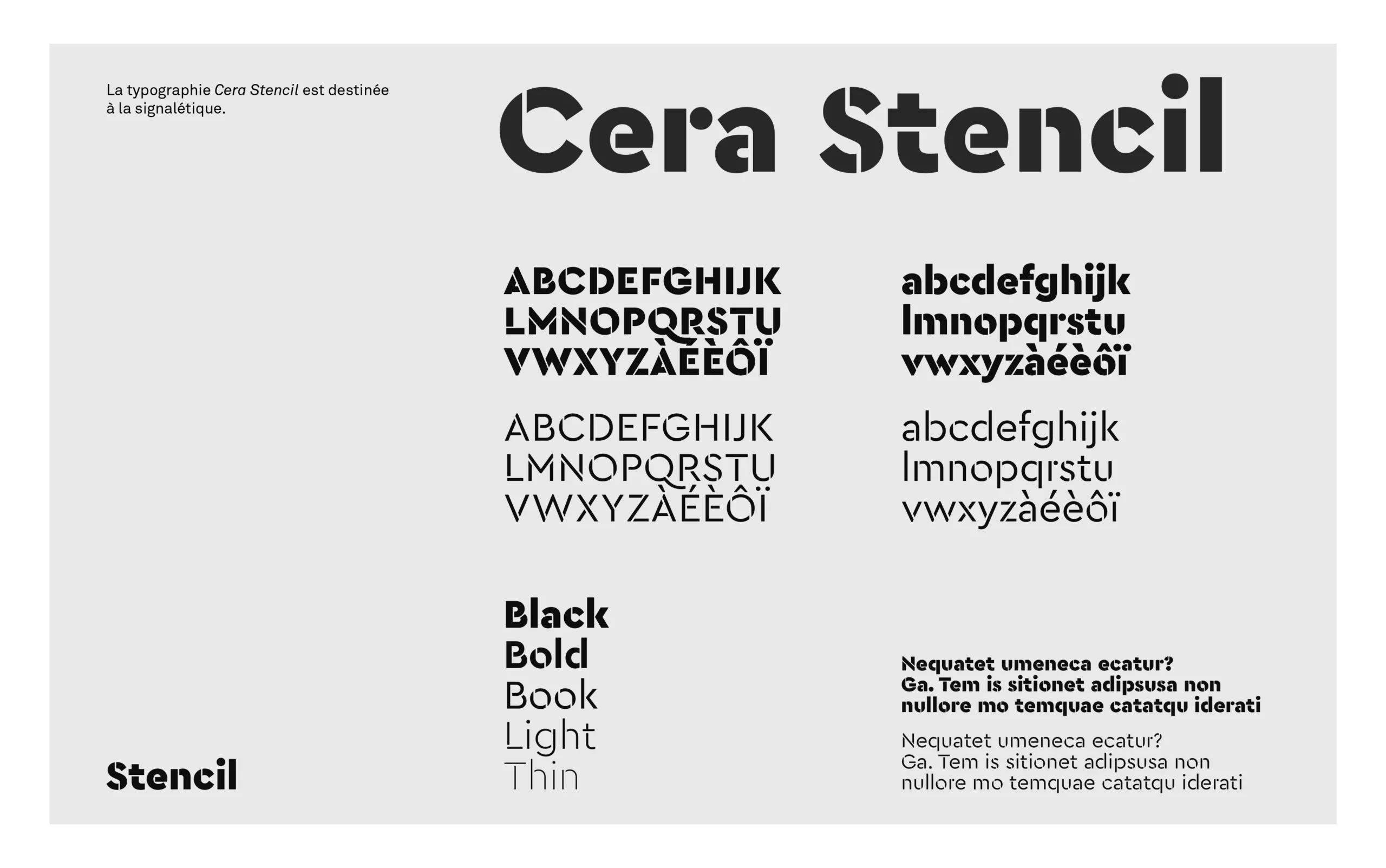
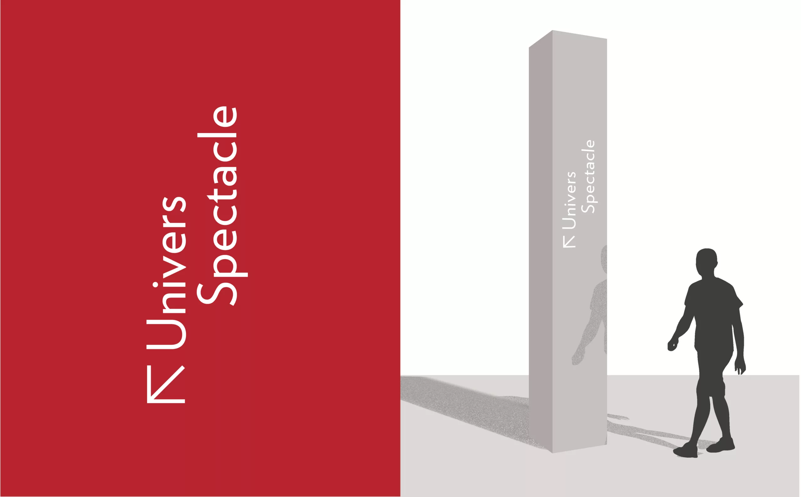
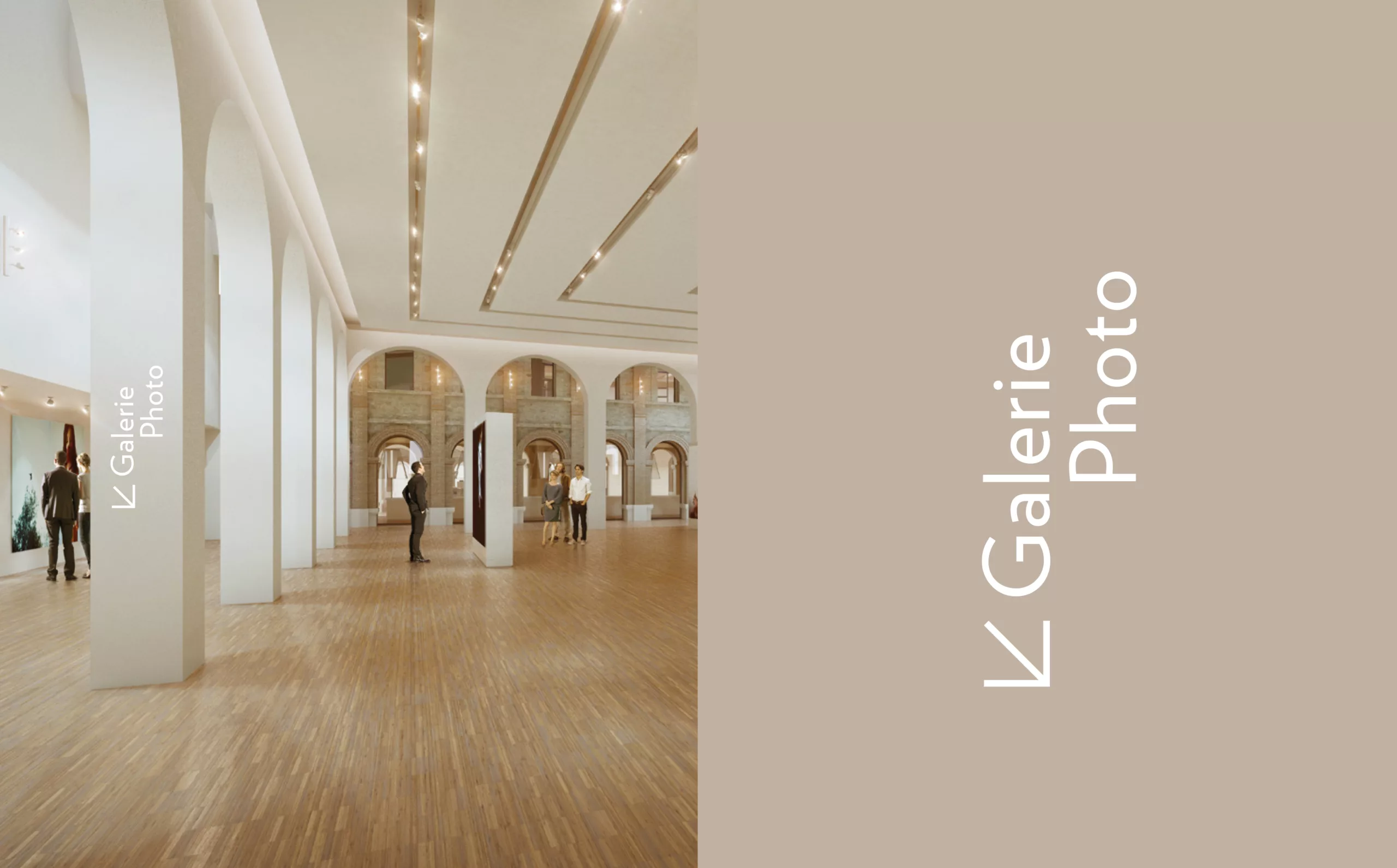
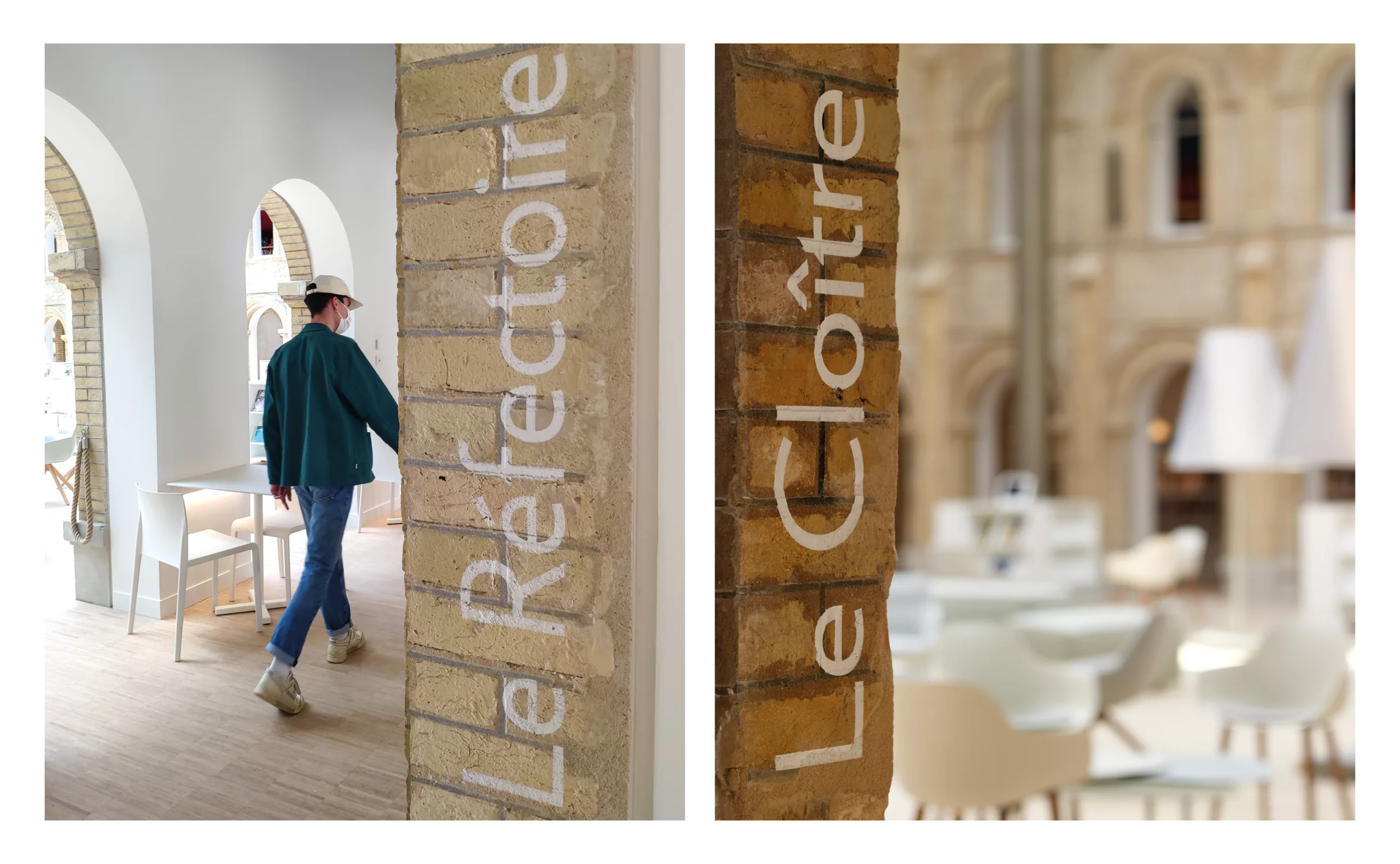
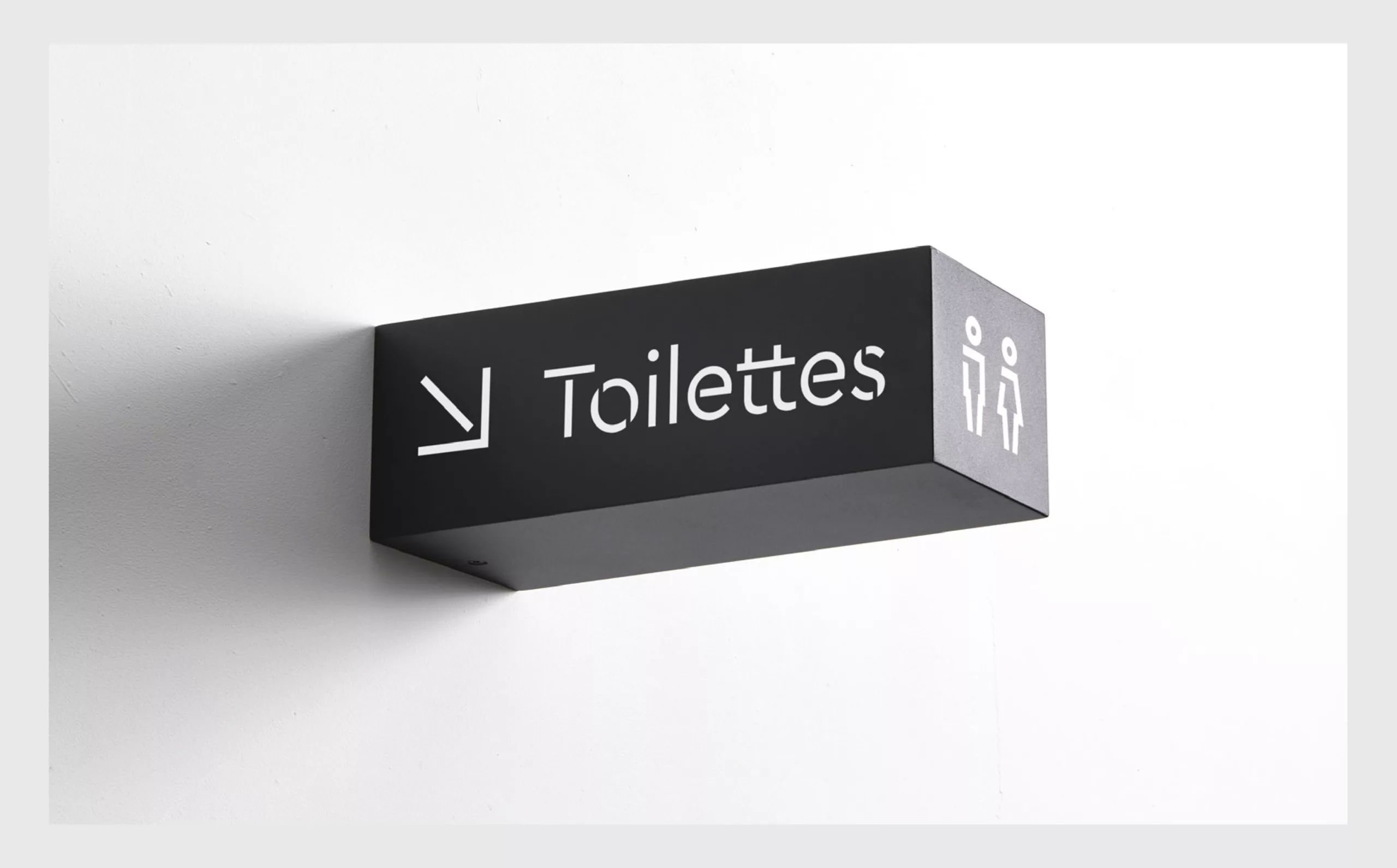
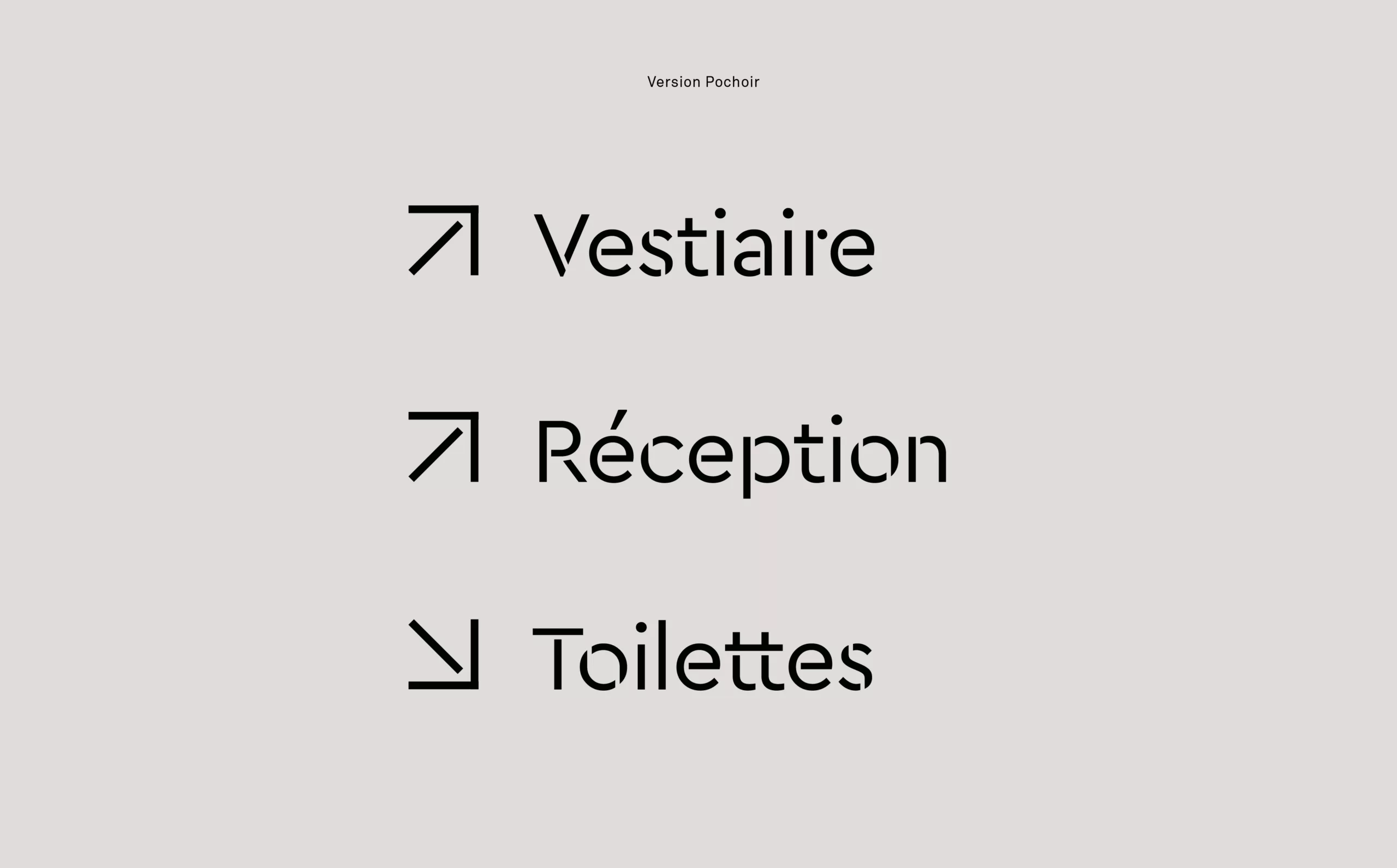
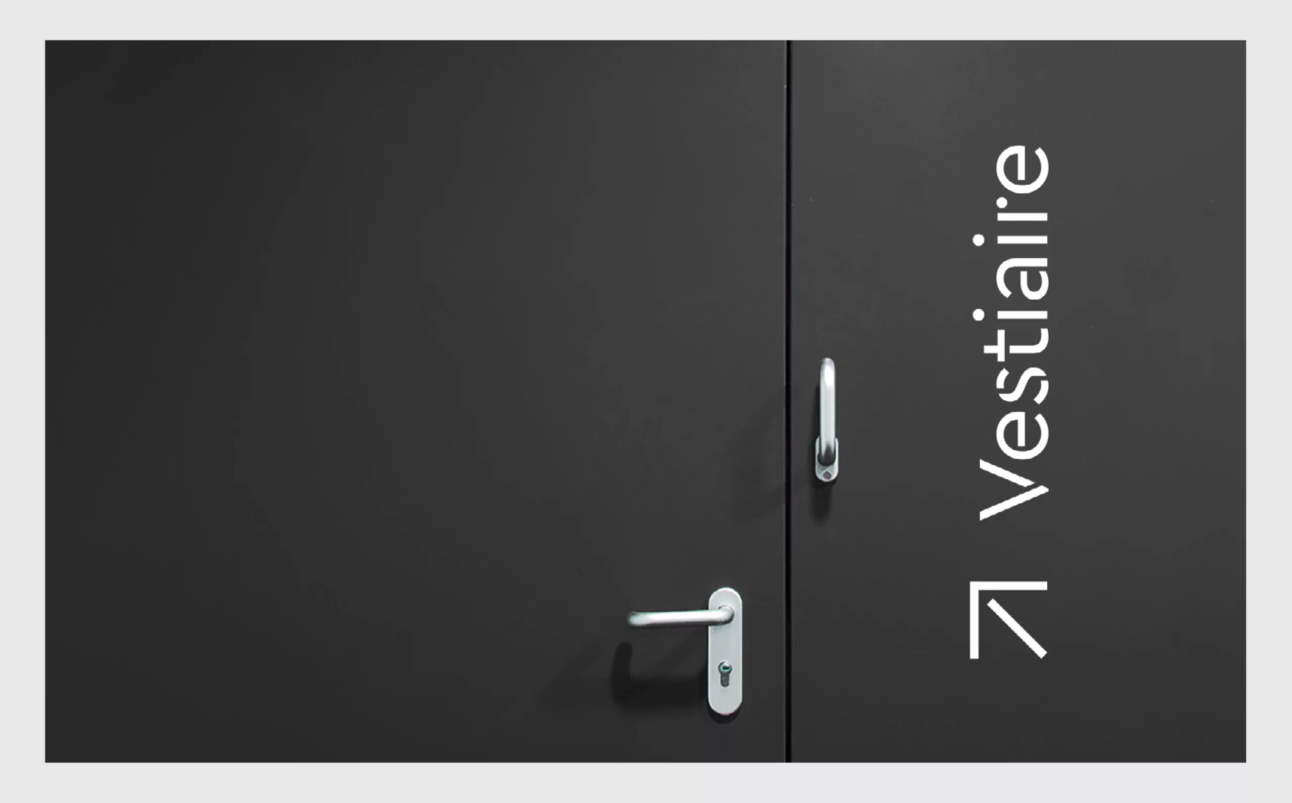
The geometric “Belle Époque” style and the openness of the monogram communicate the ambition of the place: A space for movement that encourages curiosity and sharing. The design of the Les Franciscaines logotype was inspired by the Art Deco style, and adapted for the stencil treatment required for the signage. The openings in the letters A and R create a visual connection to the open style of the monogram. The result is a contemporary and powerful logotype.