fr
fr

Fondation for educational success

Giving wings to children!

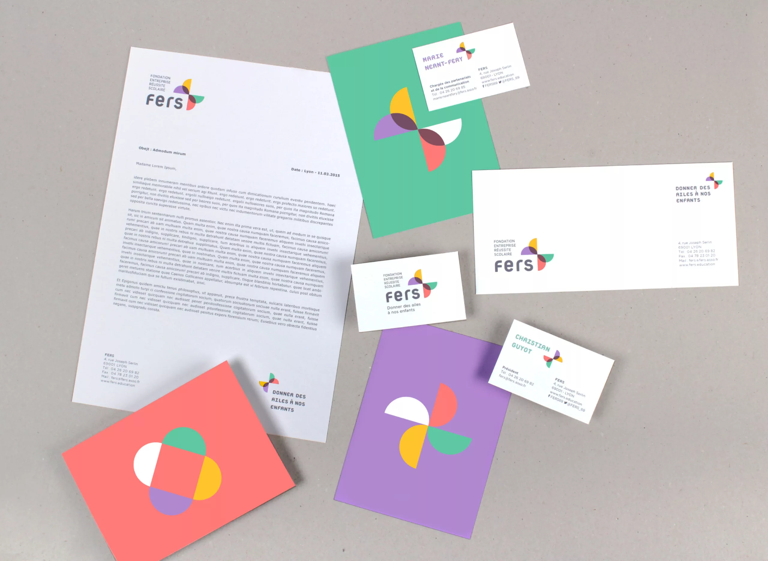
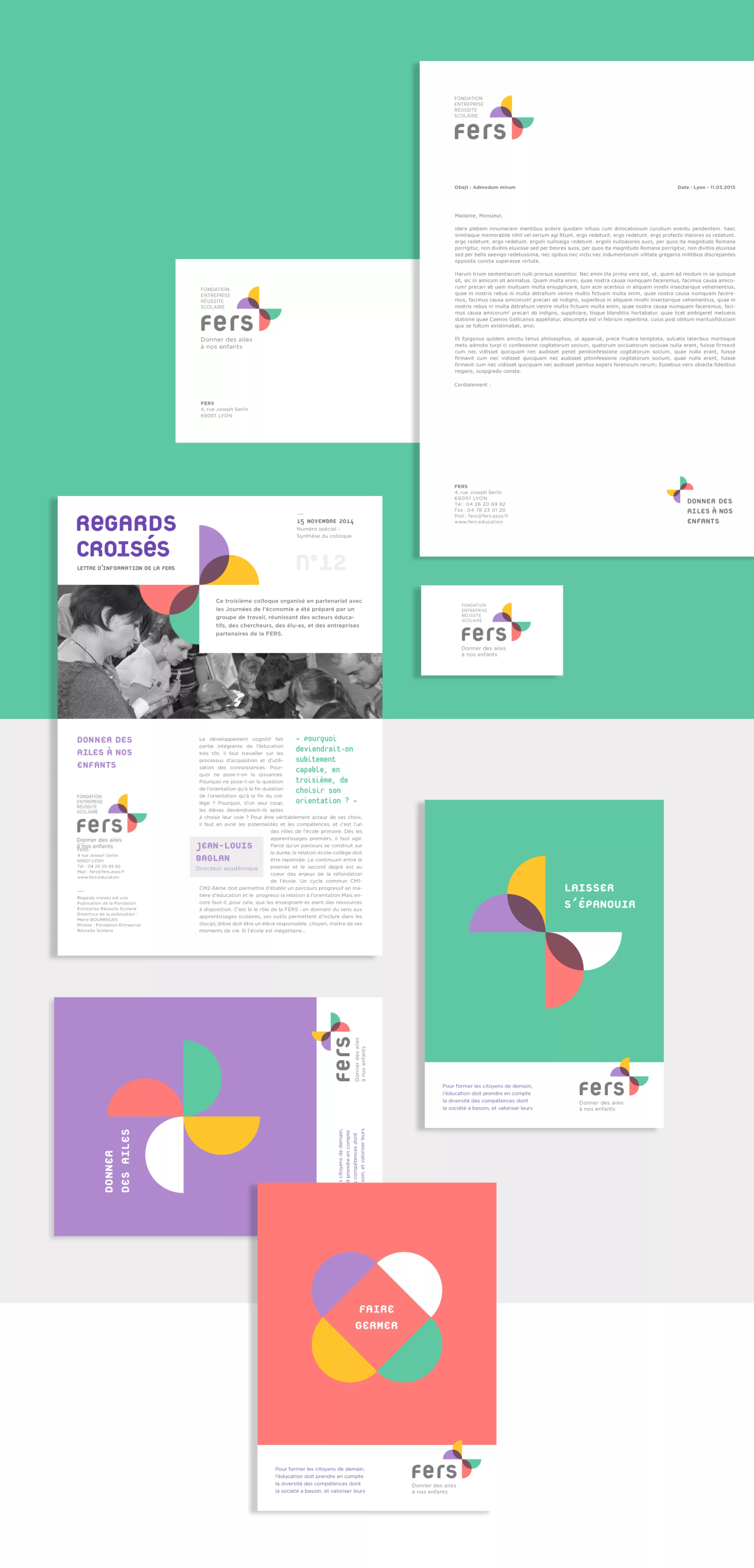
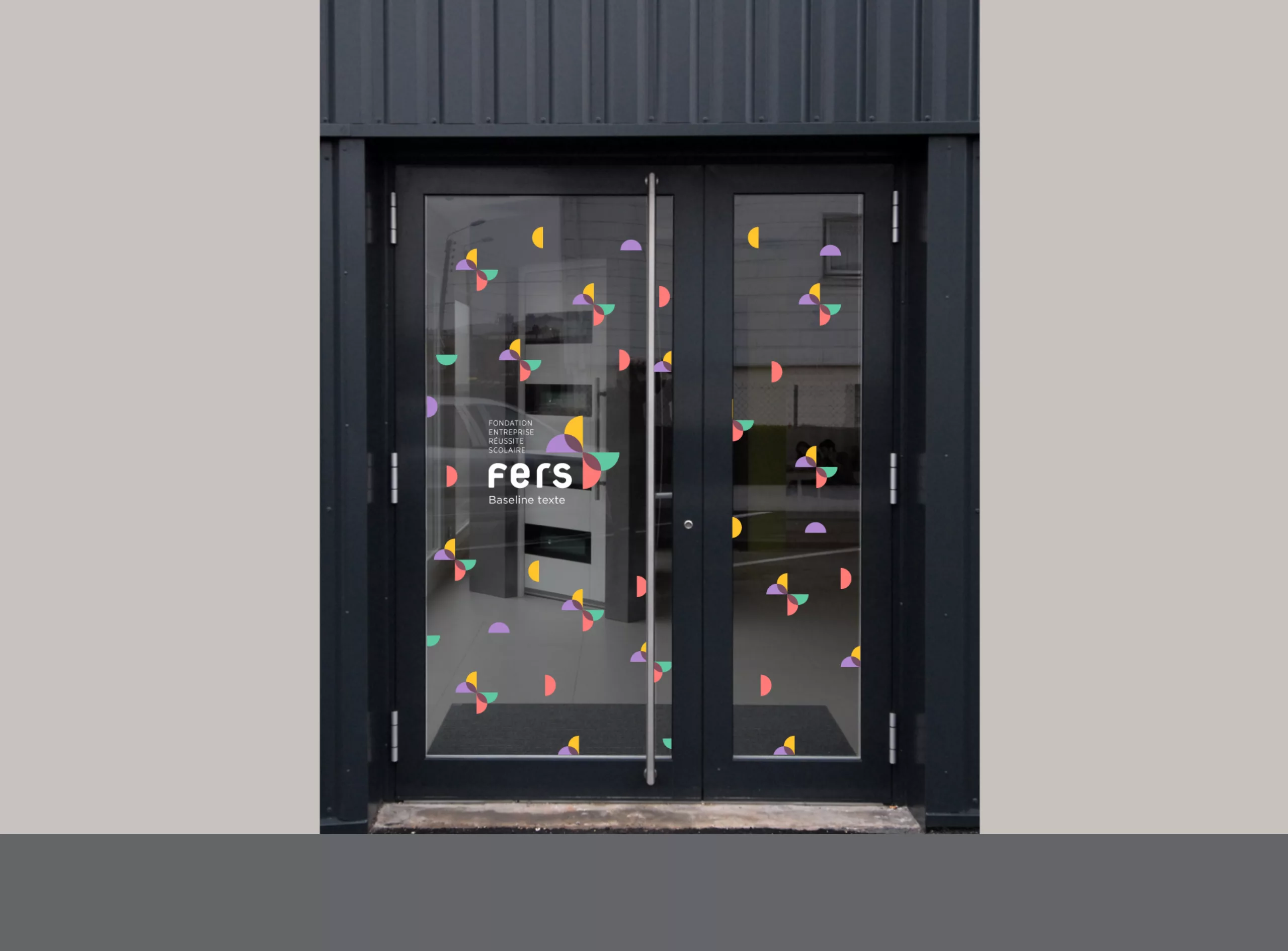
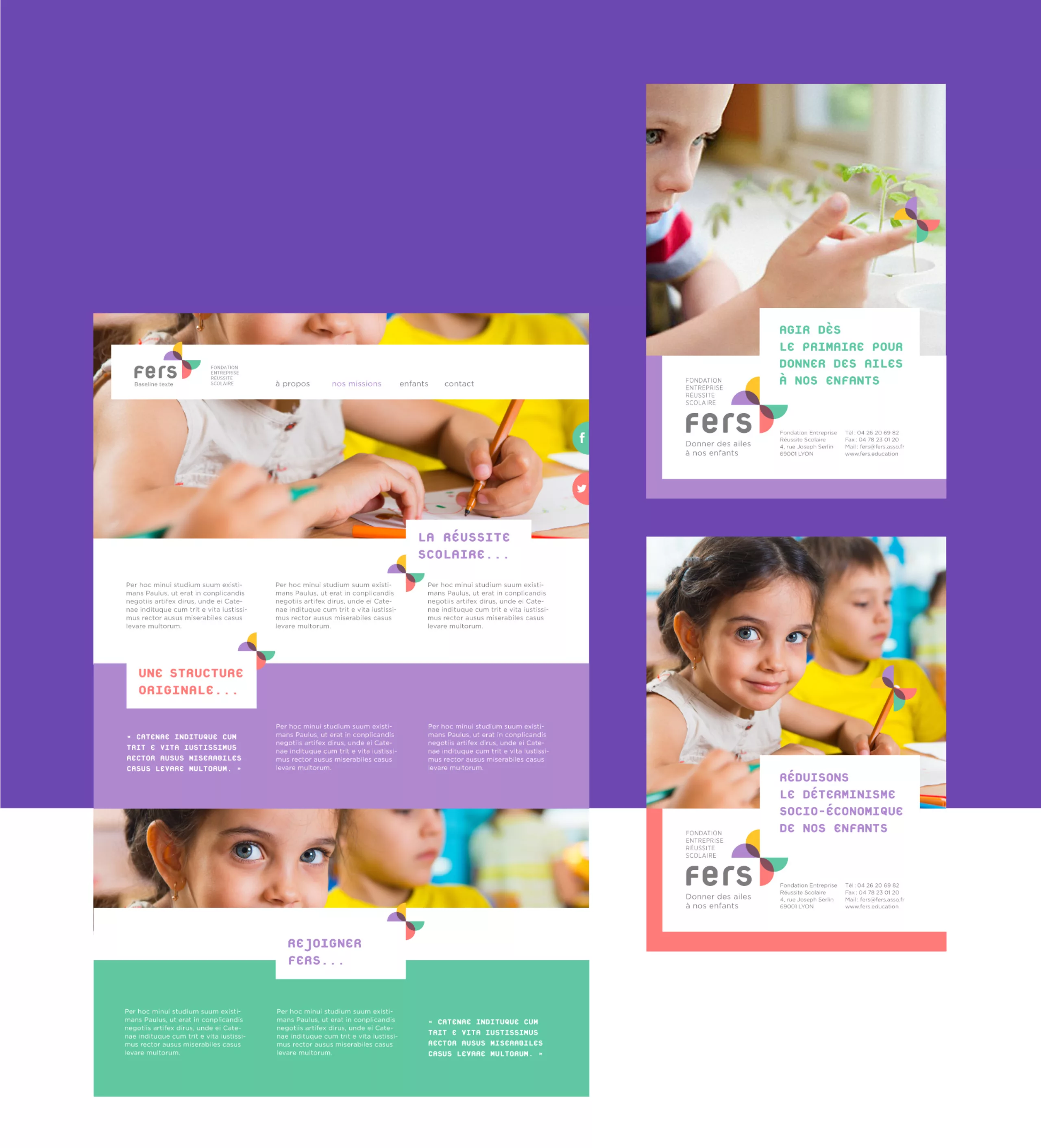
Rebranding for the Fers Foundation (Fondation Entreprise Réussite Scolaire). The goal was to update the flower in their logo to give it a fresh look and, in the process, improve some legibility issues with the name.

Founded in 1990 by the City of Lyon and several companies, supported by the Rhône National Education system, and recognized as a public utility, the FERS promotes children’s awareness of the economic, technical, and cultural realities of the contemporary world. Giving meaning to school learning, broadening children’s horizons to build their confidence, and promoting all forms of skills and all career paths—these are the goals shared by those involved, whether they come from the educational, business, or elected sectors.

Logo concept

Initially, the flower could symbolize, in a way, the idea of “making children blossom.” Each petal represented a component of the foundation (children, parents, teachers, and professionals). The association’s idea, in short, was to bring together all these components to improve children’s development. Our work is therefore a logical extension of this flower concept. To summarize our creative process, we blew on the flower so that it would take flight, like a butterfly. “Giving wings” to this little flower is like giving it the ability to surpass itself, to transcend itself, and to achieve freedom. This is precisely the foundation’s mission for children.

We can add the idea of the butterfly effect. You know, the idea that a small change in initial conditions can bring about a big change in the end. It’s another way of explaining their mission. Graphically, the orthogonal composition of the butterfly produces a play of “forms/counterforms”. Thus, one has the impression that the word “Fers” is placed on a white cartouche in the foreground. This is certainly what gives the sign its dynamism.

The entire graphic charter will reflect the geometric simplicity of the logo, as well as the play of four colors. Even the pictograms are designed using these semicircles. A stylistic exercise that really amused us!