fr
fr
Paysage côtier du Mont-Saint-Michel minimaliste

Mont Saint-Michel

A new horizon for Mont

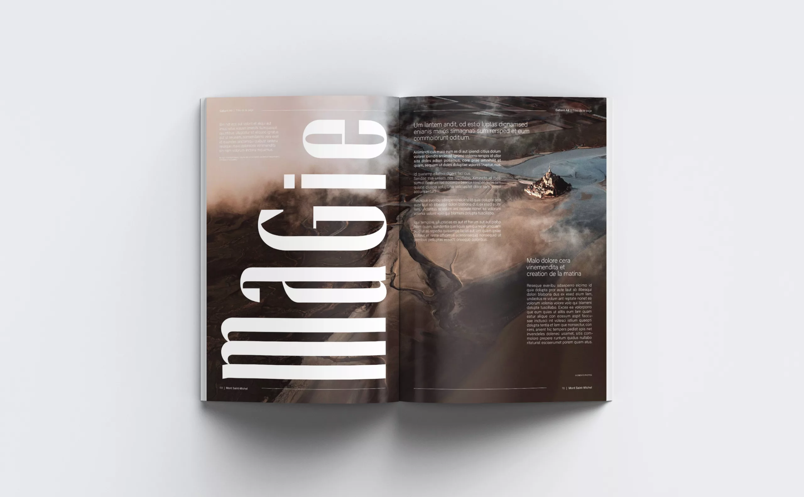
An aesthetic and architectural marvel nestled in the natural setting of its bay, Mont-Saint-Michel has been a source of constant wonder since its creation. The site, which along with its bay is listed as a Unesco World Heritage Site, attracts an estimated 2.5 million visitors per year.

Numerous stakeholders share the day-to-day management of this extraordinary site: the Centre des Monuments Nationaux, the regions of Brittany and Normandy, the municipalities of Beauvoir, Pontorson, and Mont-Saint-Michel, a joint association, and numerous private stakeholders. To coordinate all of these parties, the French government created the Établissement Public National du Mont Saint-Michel.

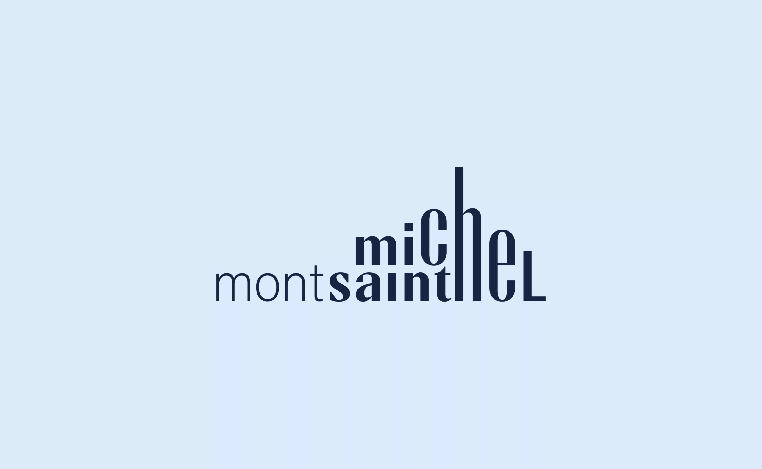
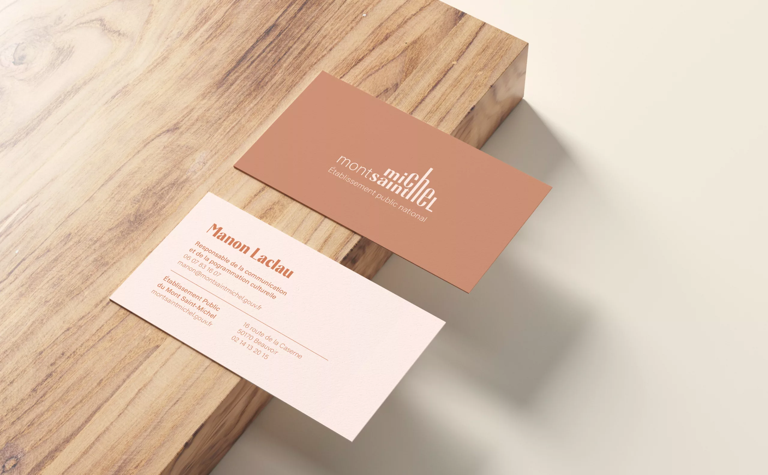
Graphéine was tasked with designing an institutional brand that embodied the unified management of the site. This new organization involved creating a brand architecture aimed at building a coherent system and making it easier to understand. To do this, we had to answer two fundamental questions: how could we project the image of Mont Saint-Michel into the modern world? How could we create a strong, protectable brand? For several months, we perched alongside the archangel Michael to observe the bay, the village, and the abbey…

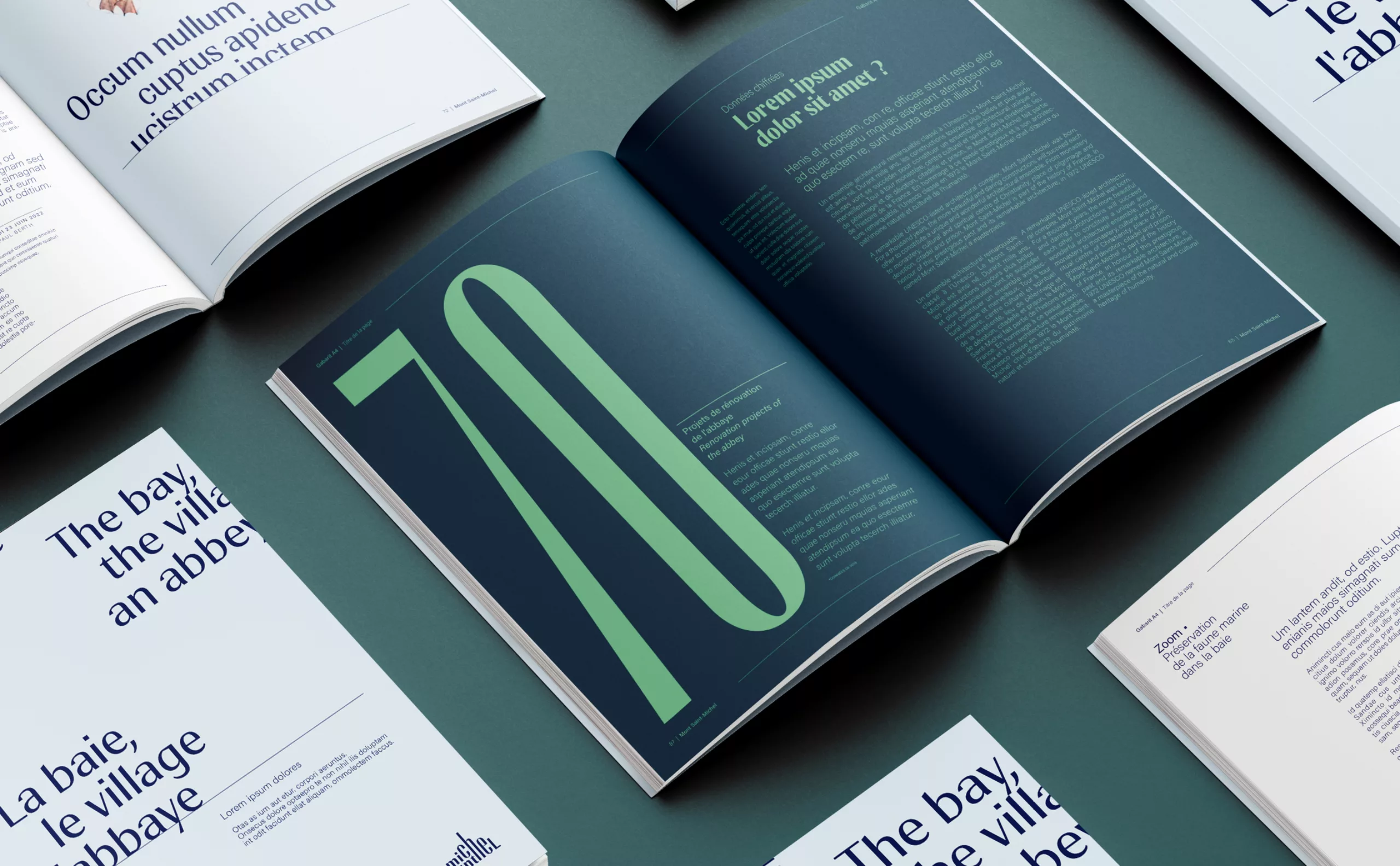
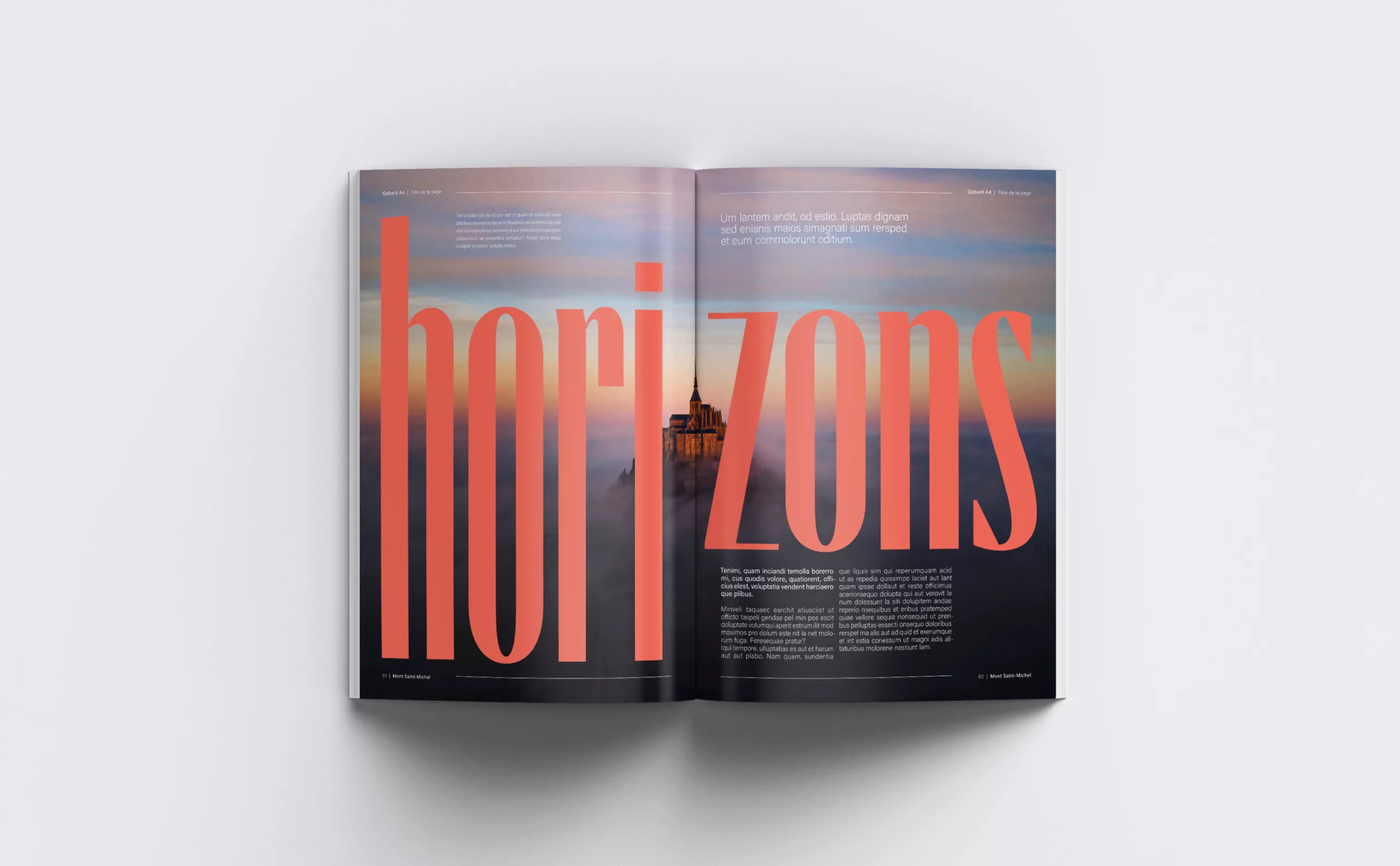
To meet this creative challenge, we had to break free from stereotypical representations of the silhouette, while ensuring universal understanding of the brand. We therefore took into account both the heritage of the place and the desire for modernization, in order to arrive at a typogram that is as simple as it is unique.

The podcast

The Graphéine team takes you behind the scenes of the project.
Insights, analysis, and anecdotes whispered in your ear (but in French).

  • Paysage côtier du Mont-Saint-Michel minimaliste

A silhouette that stands out from the crowd

The image of Mont Saint-Michel is deeply rooted in the collective imagination. It carries considerable symbolic and stereotypical weight, associated with the image of France internationally. Most representations of Mont Saint-Michel in the press, on postcards, on the web, or in our minds are associated with its unique silhouette. In fact, there are hundreds of logos featuring this silhouette. The challenge was therefore to find an original way to represent the Mont in order to give this public brand a unique identity that would guarantee it solid legal protection.

A typographic creation

In keeping with the logo design, an original typeface was developed in collaboration with Blaze Type. A cornerstone of the new identity, this typeface is one of the brand’s central elements. It draws inspiration from the medieval Gothic scripts found in the manuscripts of Mont-Saint-Michel.

Its design is based on a subtle balance between finesse and power: the thick and thin strokes, combined with Gothic-inspired endings, give the whole an expression that is both elegant and assertive. Designed to soar vertically, the typography echoes the architectural principles of the abbey itself. Thus, it is not only functional or aesthetic; it is also designed to provoke a form of inner elevation. This is also the founding principle of its variable version.

Conceived as a tribute to the history and heritage of Mont-Saint-Michel, this typography is nevertheless part of a resolutely innovative and contemporary approach.

The colors of the bay

With its flora and fauna, the bay challenges our senses. At 10 a.m., cross the bay and discover its flora and fauna; at 3 p.m., climb to the top of the abbey; and at 9 p.m., dance to electro music at the top of the mountain! The colors imagined range from soft shades, directly inspired by the bay, to more vibrant hues, intended to reflect the actions and events promoted by the public institution.

Illustrate the bay’s horizon

While the logo frames the Mont, the system invites us to broaden our view and admire the bay in its entirety. The text appears on the horizon and floats, as if in constant motion. The iconography blends into the landscape and creates a layered effect. The result is an ethereal and contemplative universe, reflecting the natural and protected character of Mont-Saint-Michel.

Thanks to Thomas Velter, Hervé Bierjon, and Cécile Ozanne for their trust throughout the project. A huge thank you to Manon Laclau, who was a demanding, bold, creative, and attentive partner throughout the project. Thanks to Matthieu Salvaggio and Blaze Type foundry for their work on the typography.

Photo credit: Établissement public national du Mont Saint-Michel – Pascal Biomez