In 2015, we designed the visual identity of the Saint-Étienne Opera House. A typographic logo describing both the building (with its pagoda-shaped accent) and the mission of this opera (welcome and entertain all publics). As the seasons went by, the challenge was to continue and renew this story. For the first edition, we highlighted the agents, then the orchestra the following year. In 2017, we decided to mix agents, musicians and publics!
Saint-Étienne Opera House – 2017/18 Season
Saint-Étienne Opera House - 2017/18 Season
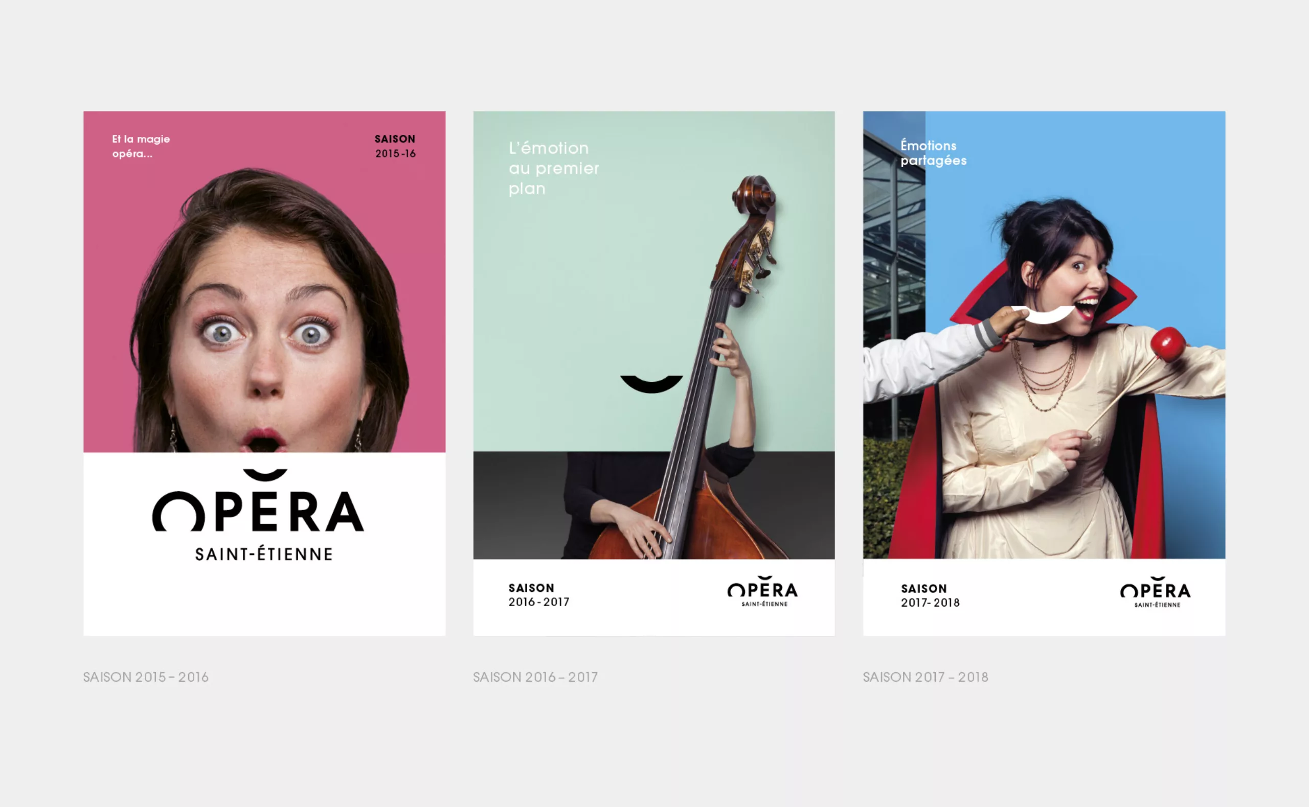
Shared emotions
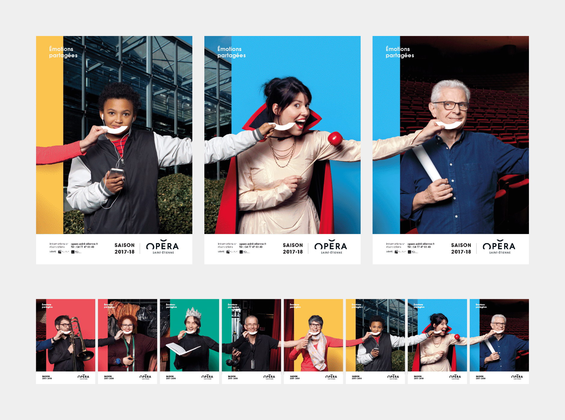
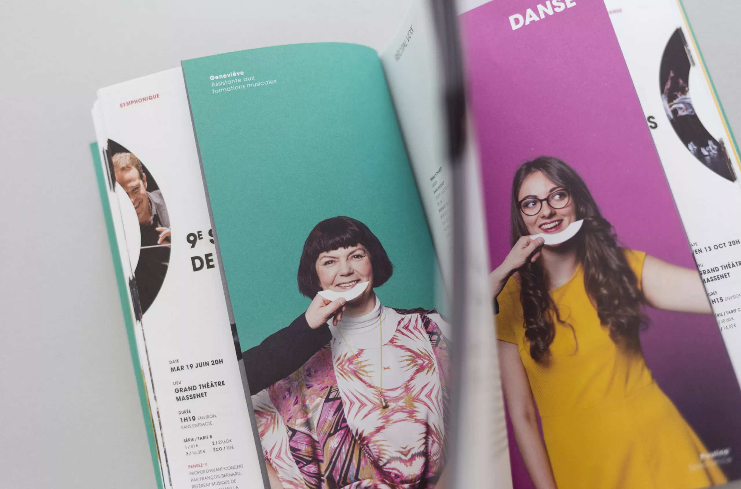
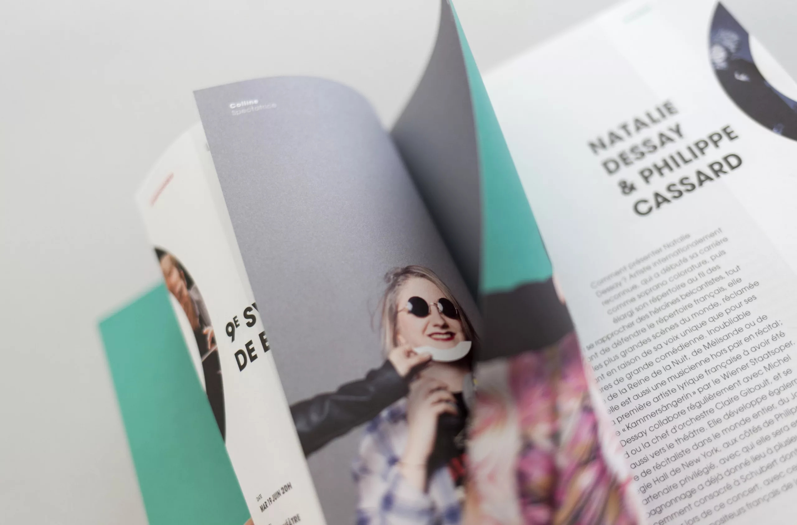
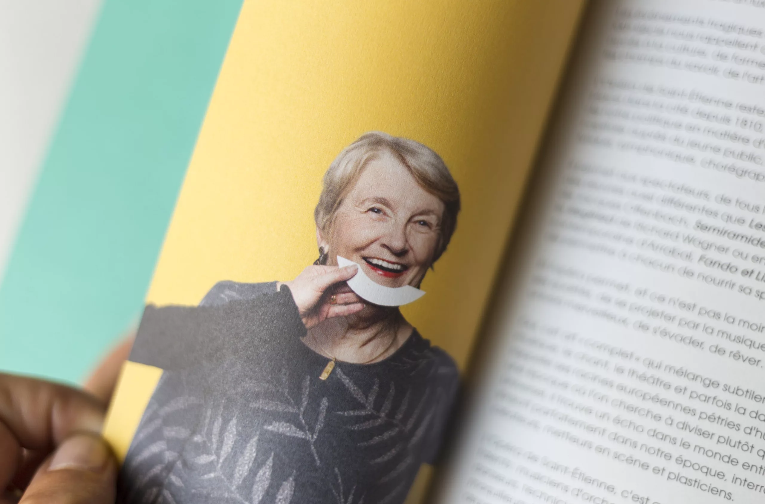
One of the main challenges for this season was to highlight the diversity? of works, women and men, and crafts that make up an opera.
- The public, the building and the halls…
- Agents, workshops, backstage…
- Artists, productions and concerts…
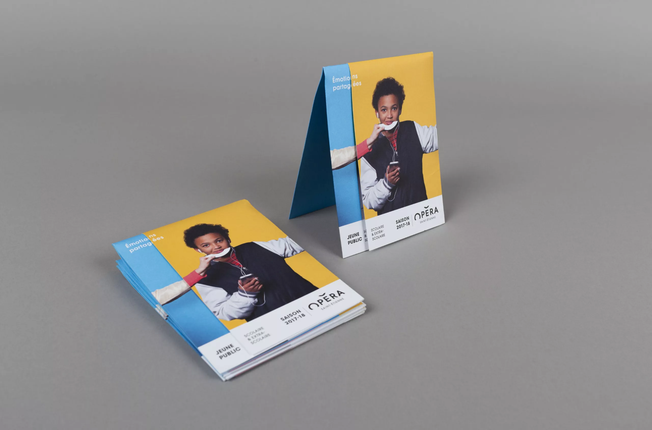
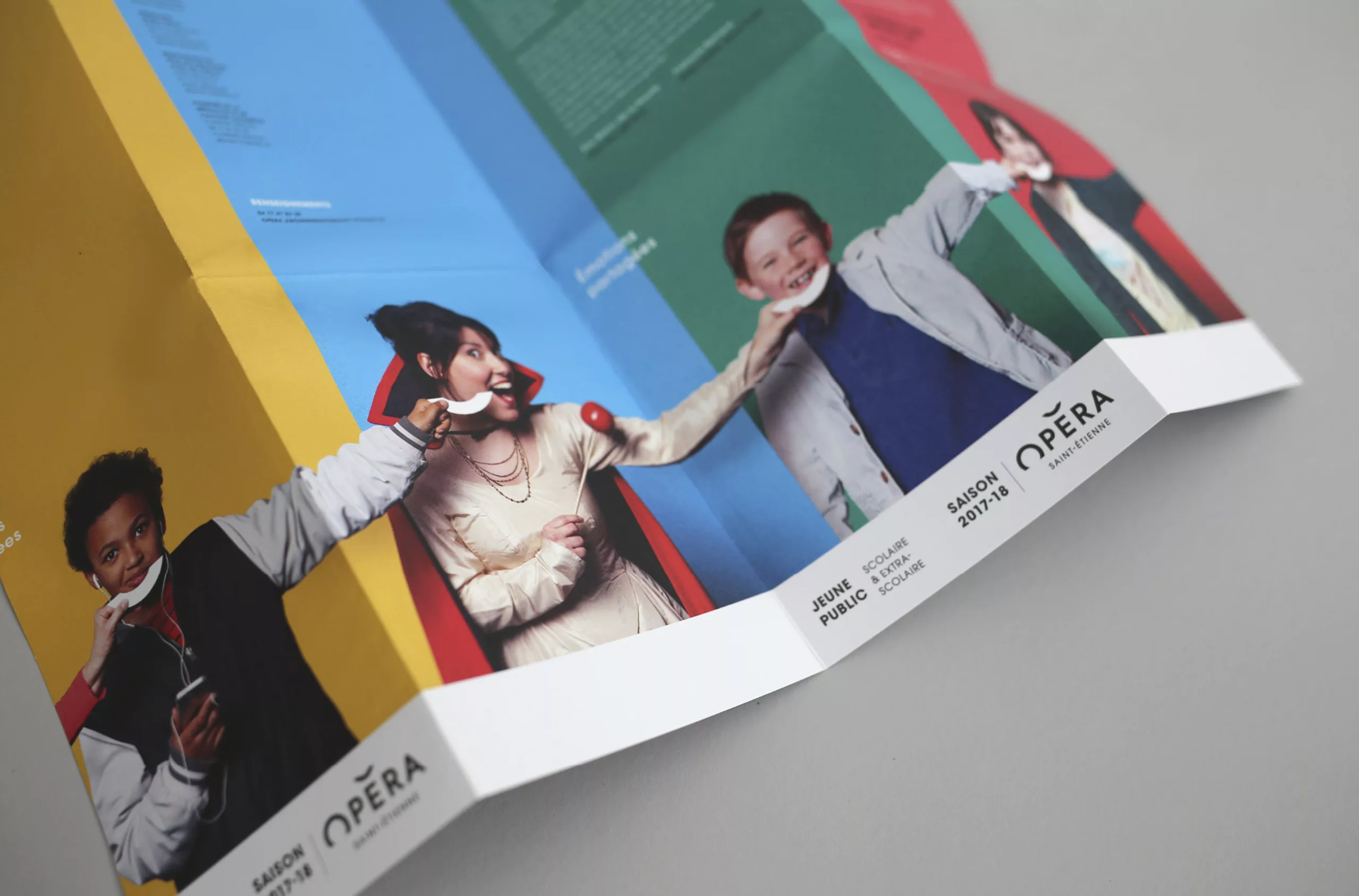
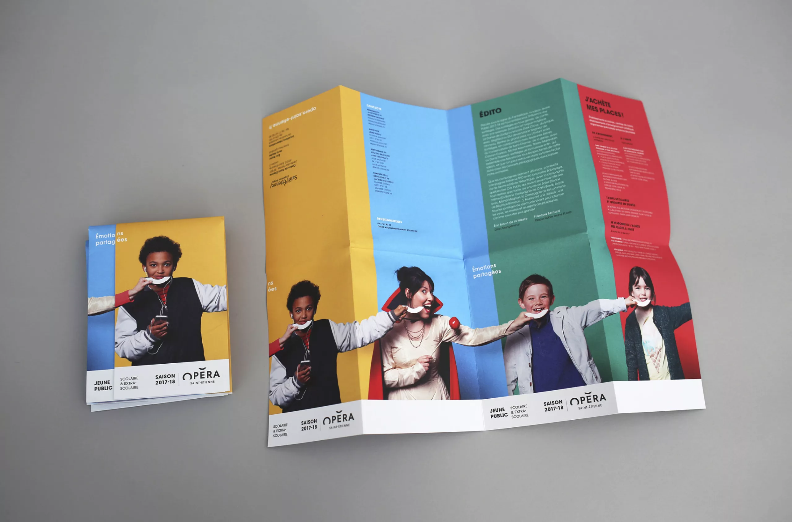
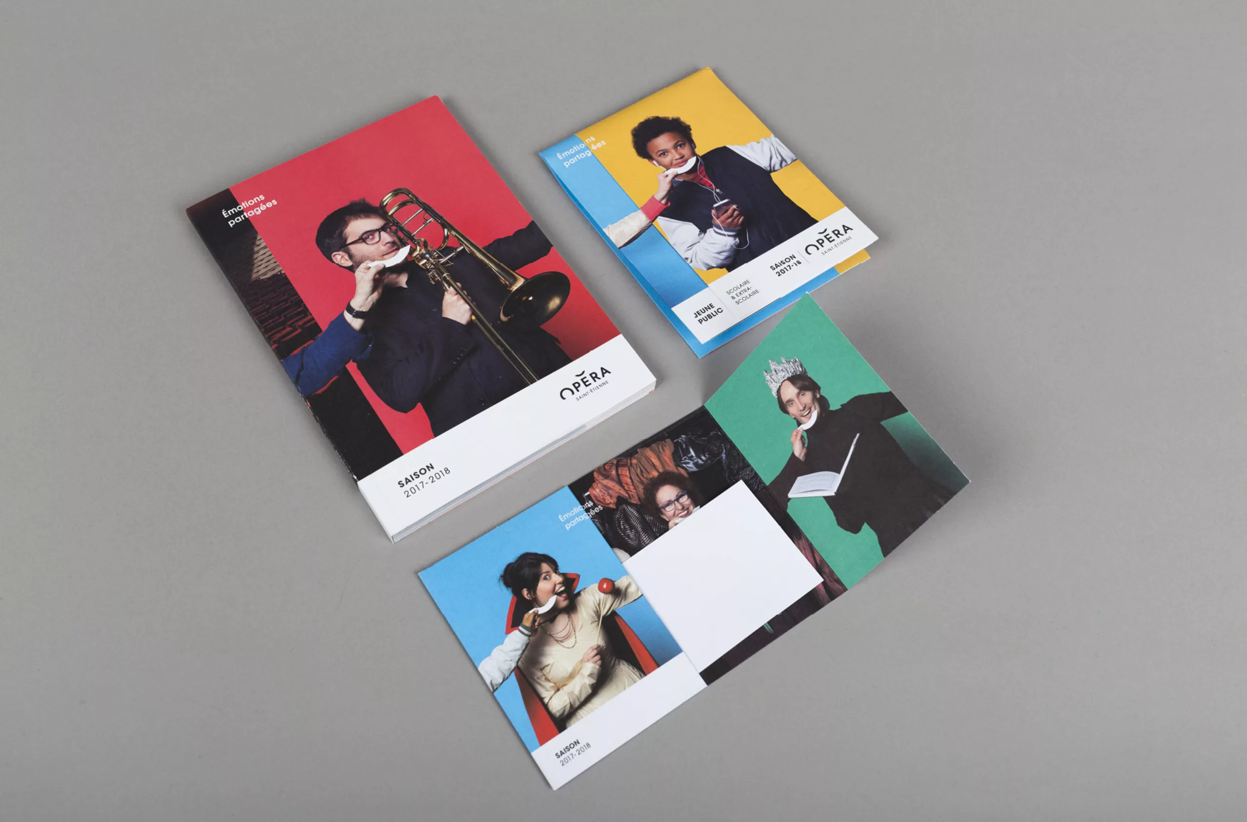
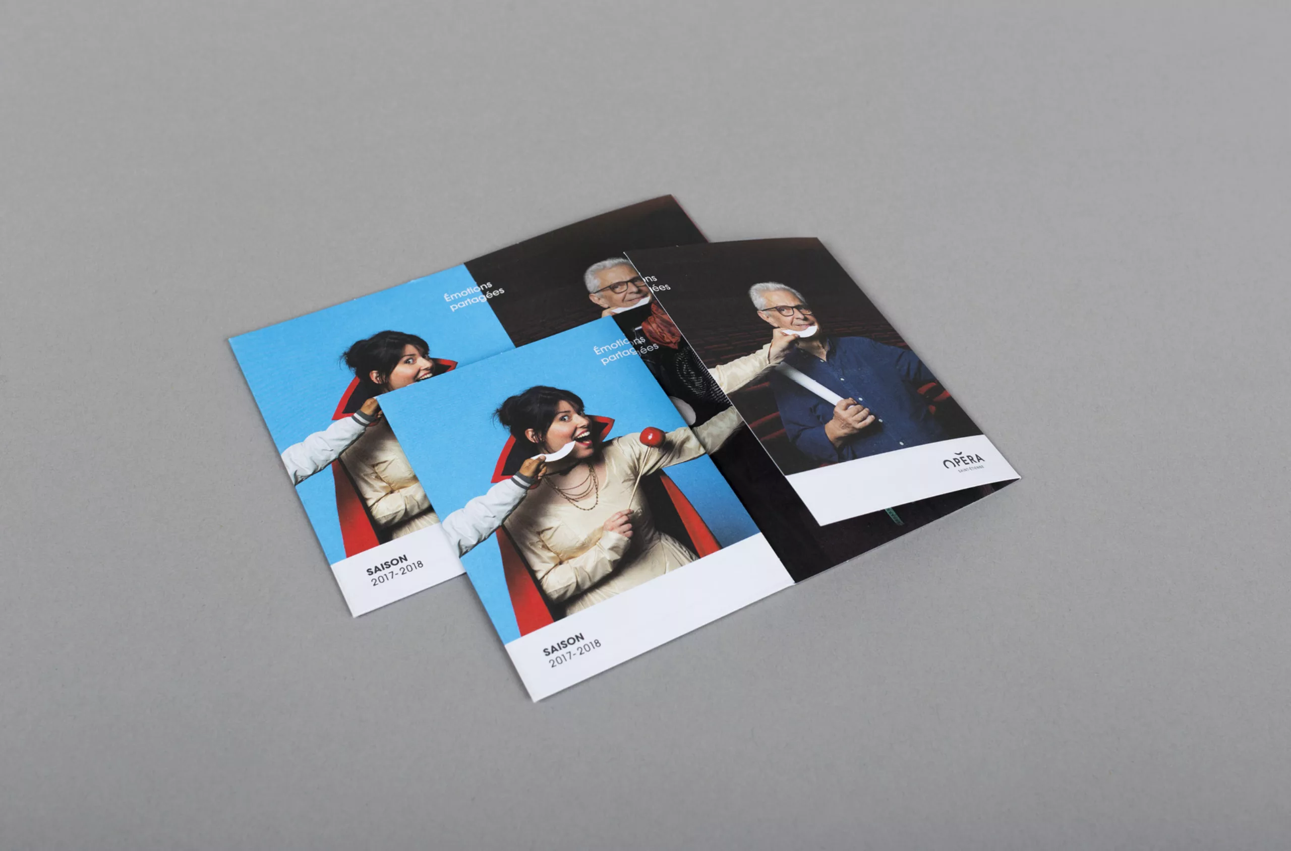
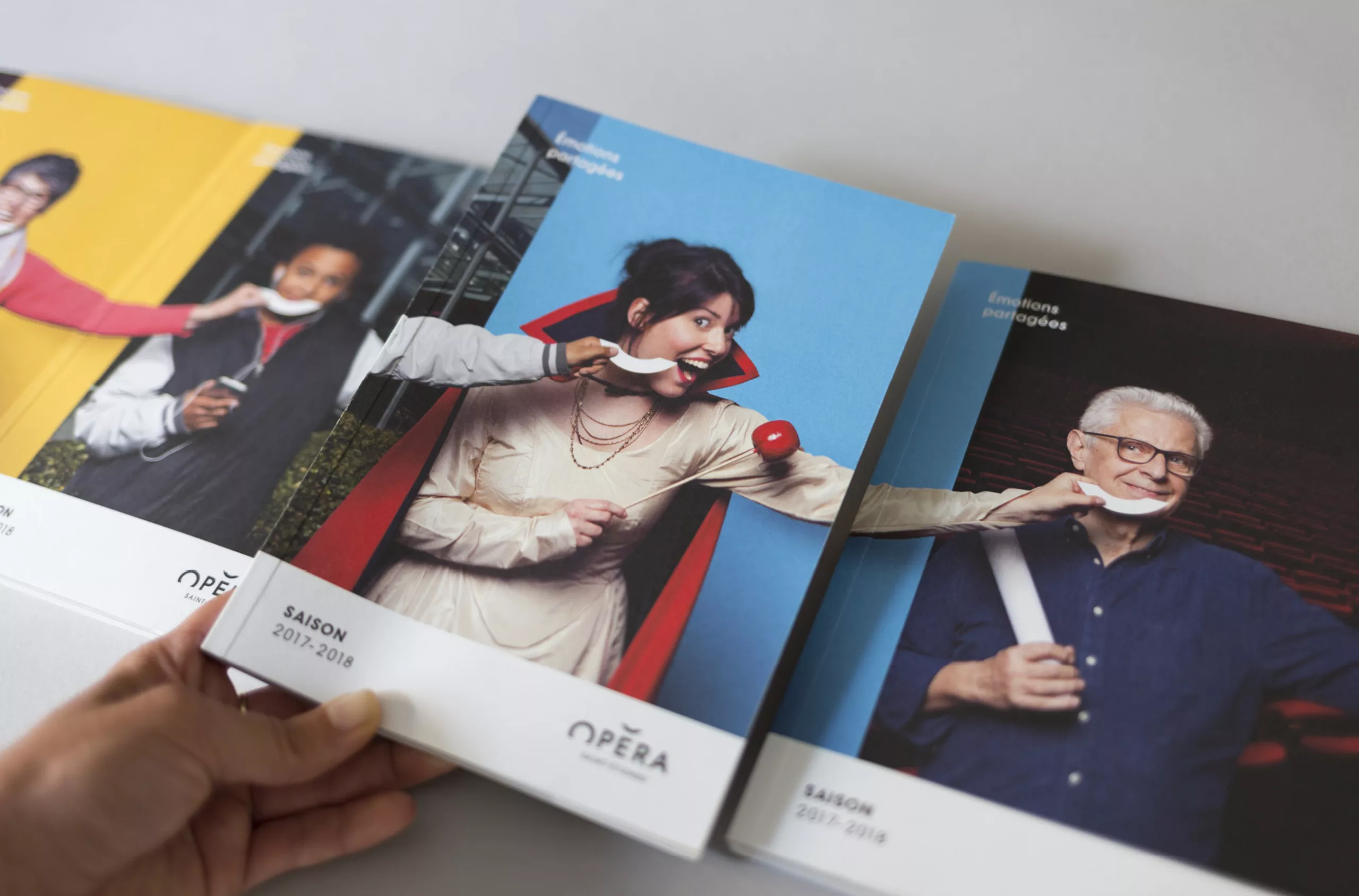
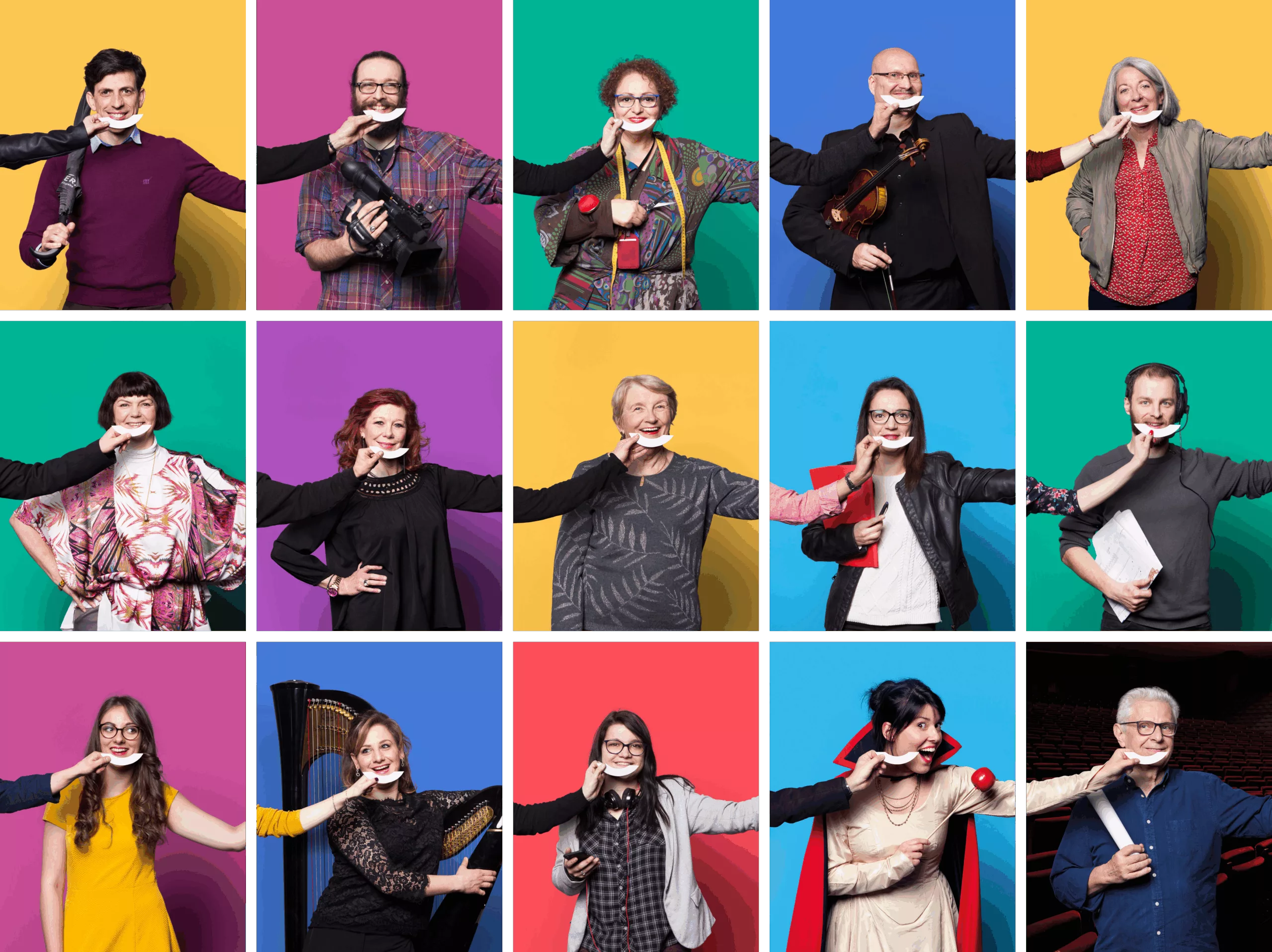
As in previous seasons, we imagined a series of 8 visuals of covers. Each cover is followed by the next to form a farandole. Smiles seem to pass from hand to hand. A spirit of strong generosity emerges from the whole. Give your neighbor a smile!
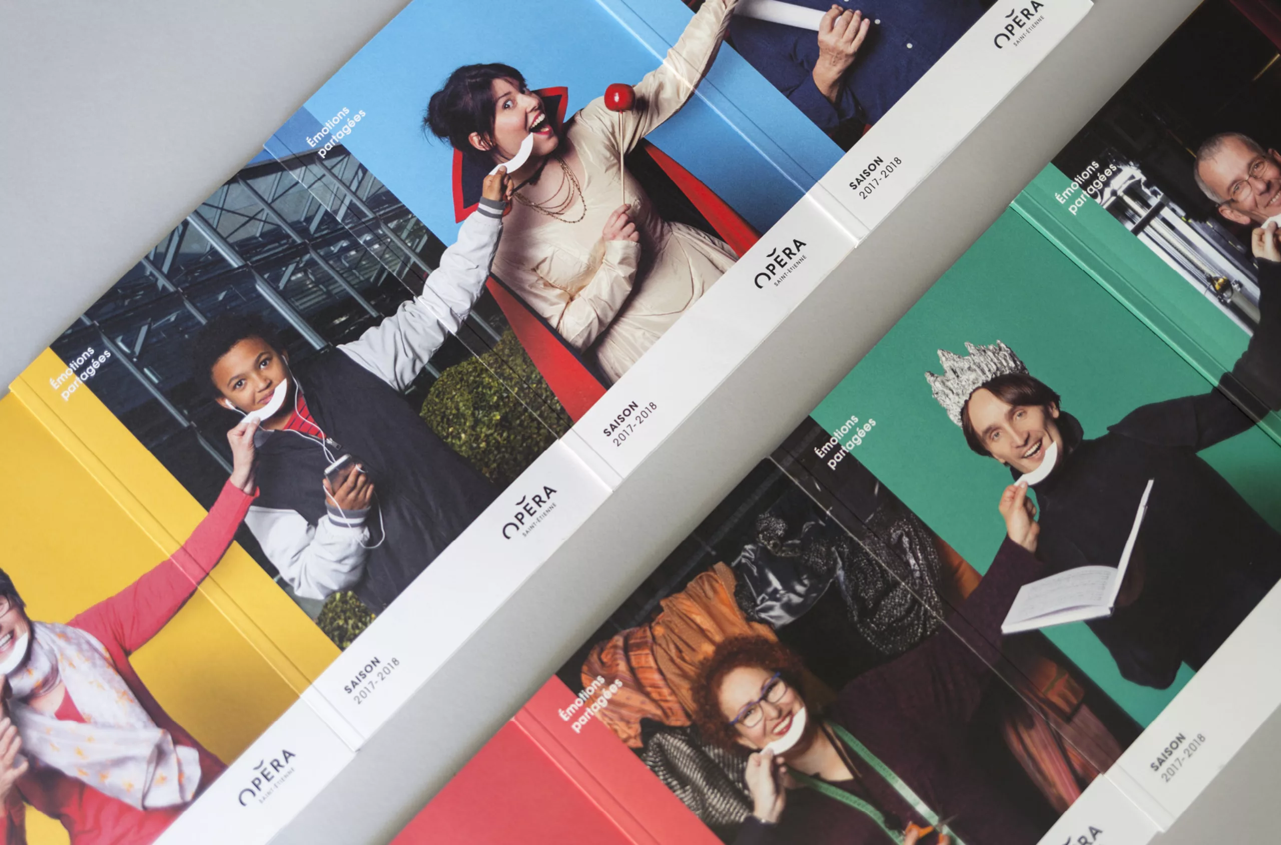
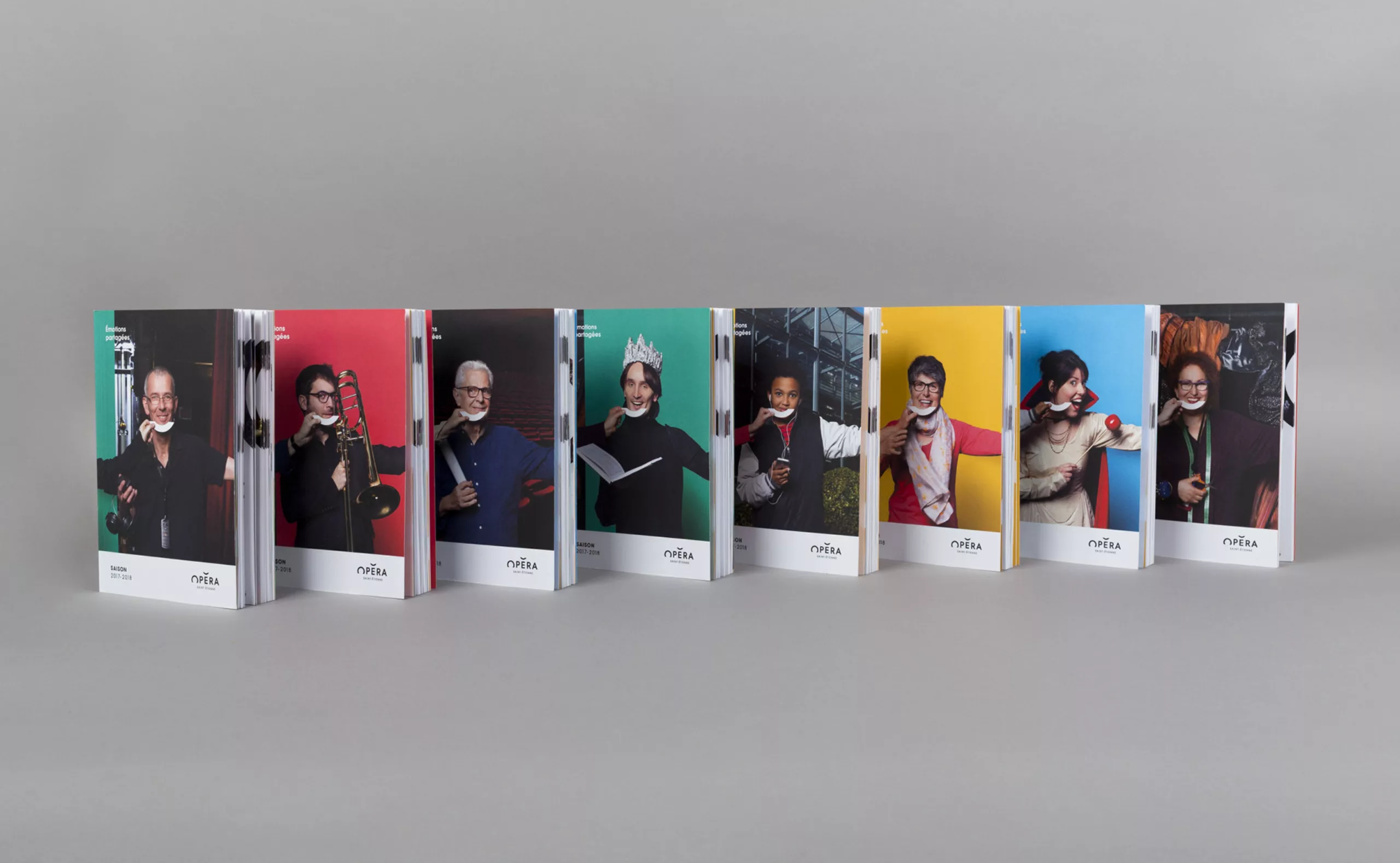
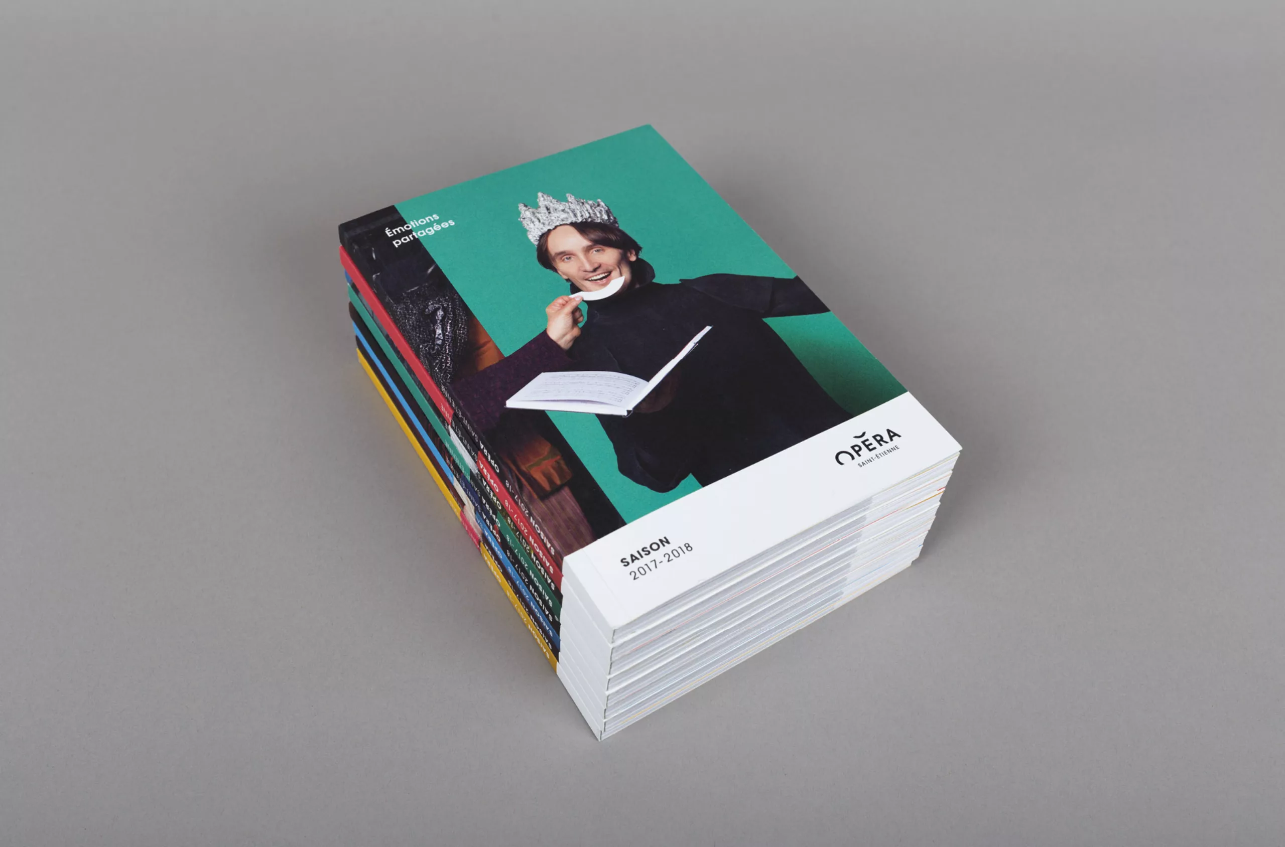
Brochure
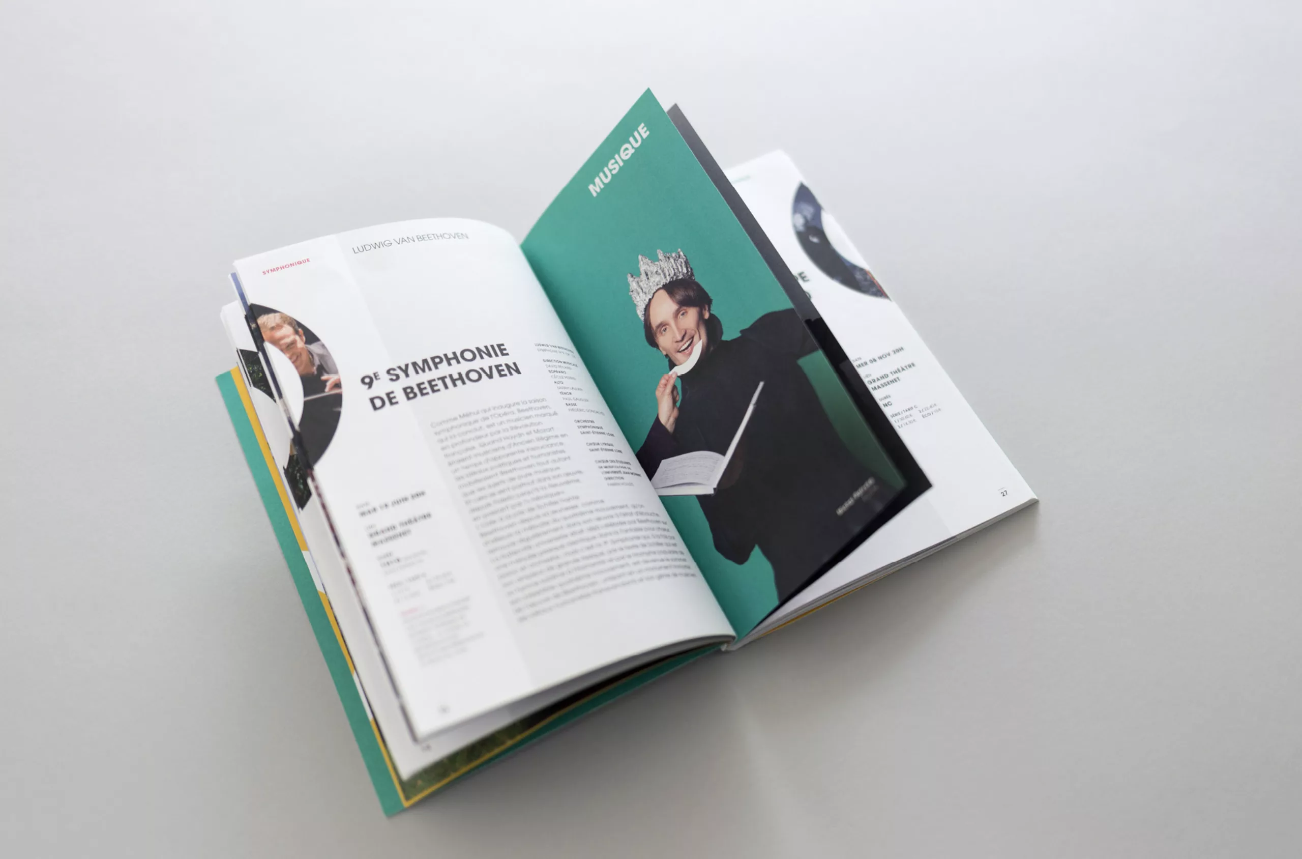
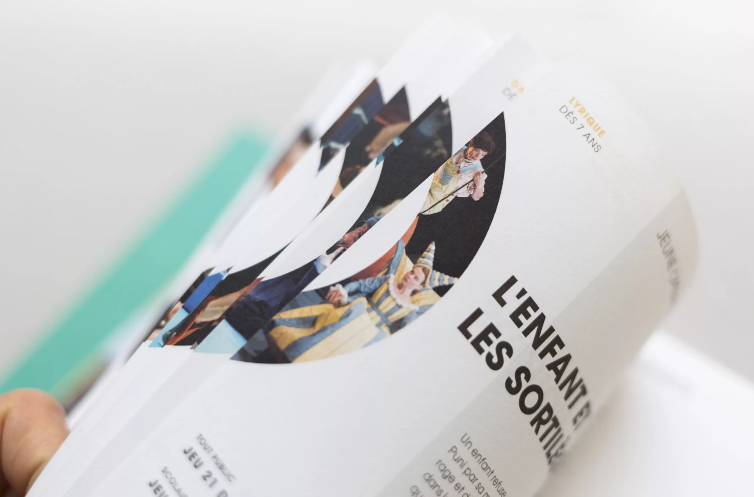
Chapters are separated by shorter series of pages that act as tabs to make the document easier to read.
Photography
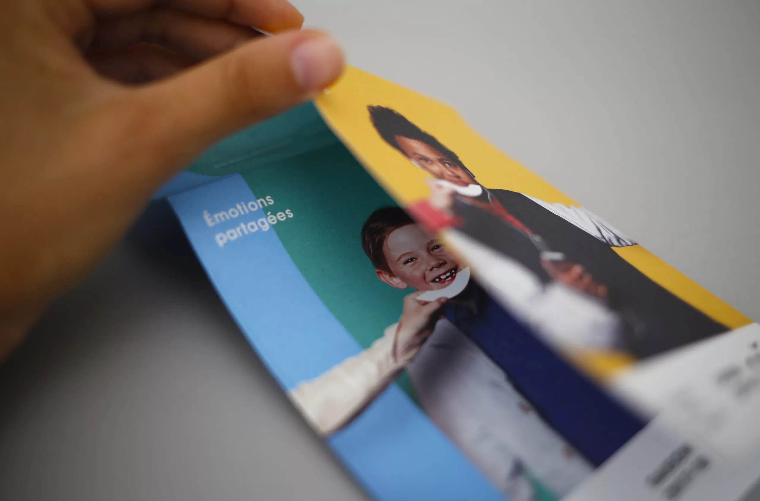
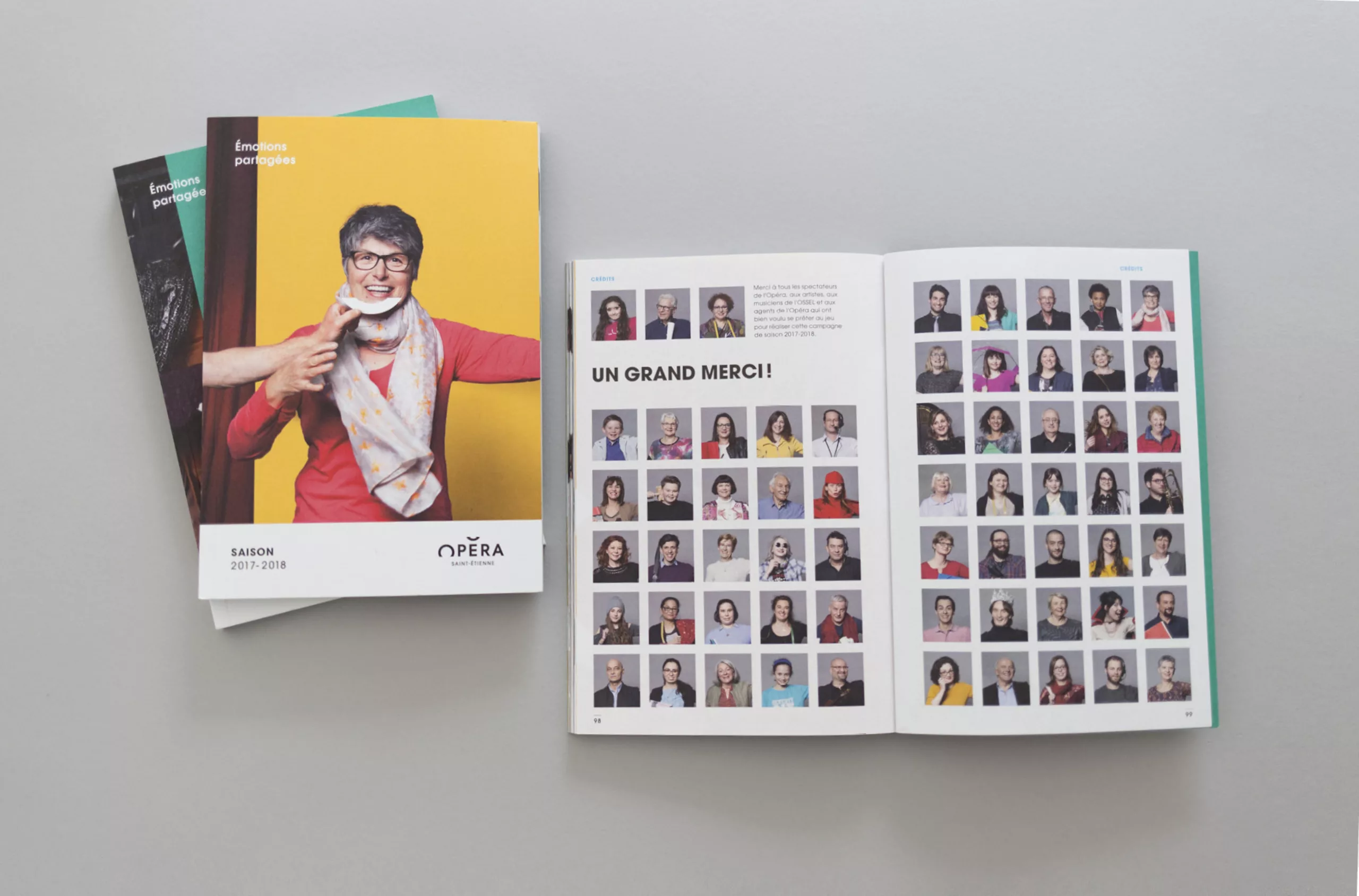
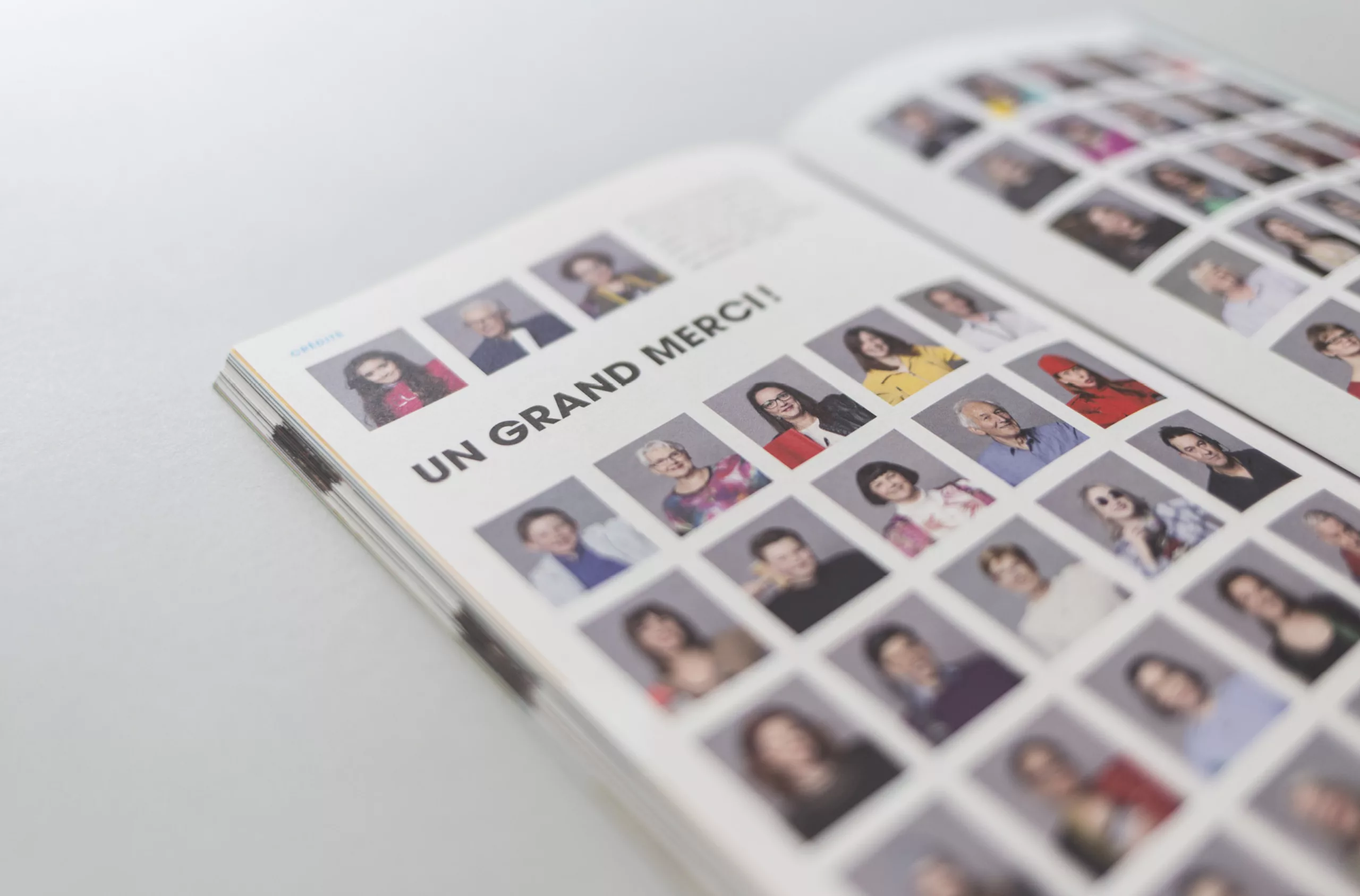
All different, all complementary, all in solidarity, here are the ideas behind this series of photos. As in previous years, we organized a shooting day with more than 50 extras to give their smiles, all under the watchful eye of Ghislain Mirat behind the lens.
Making of
Get behind the scenes of the photo shoot, and find out how to make 50 people smile in one day!
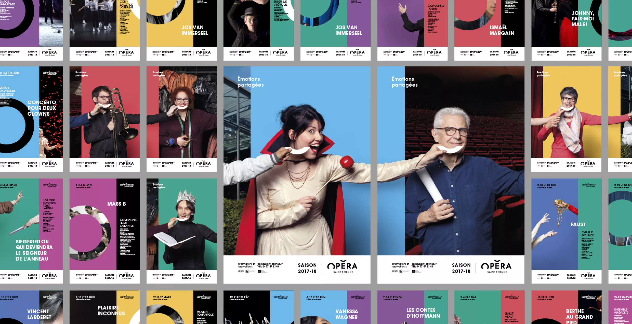
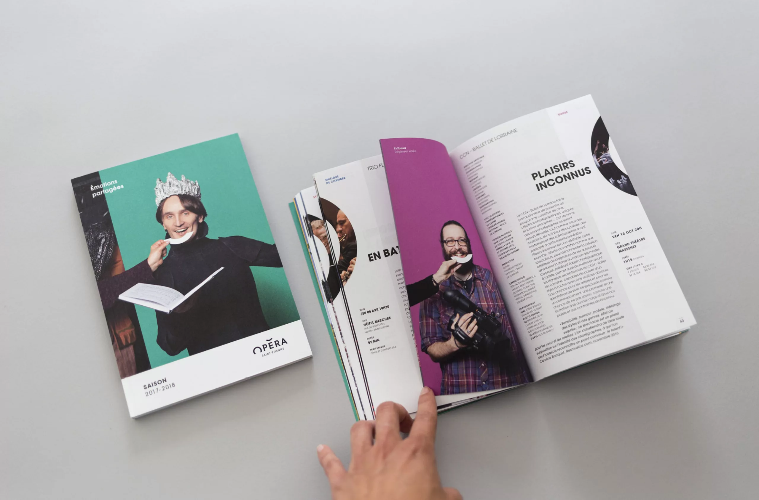
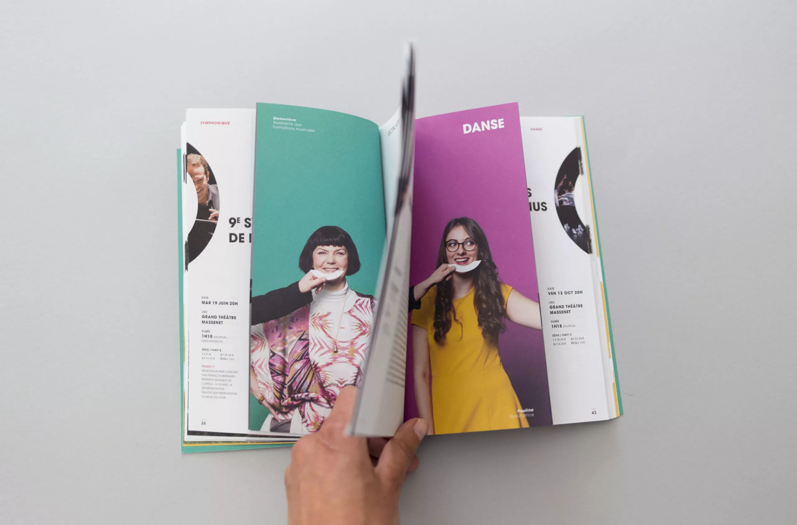
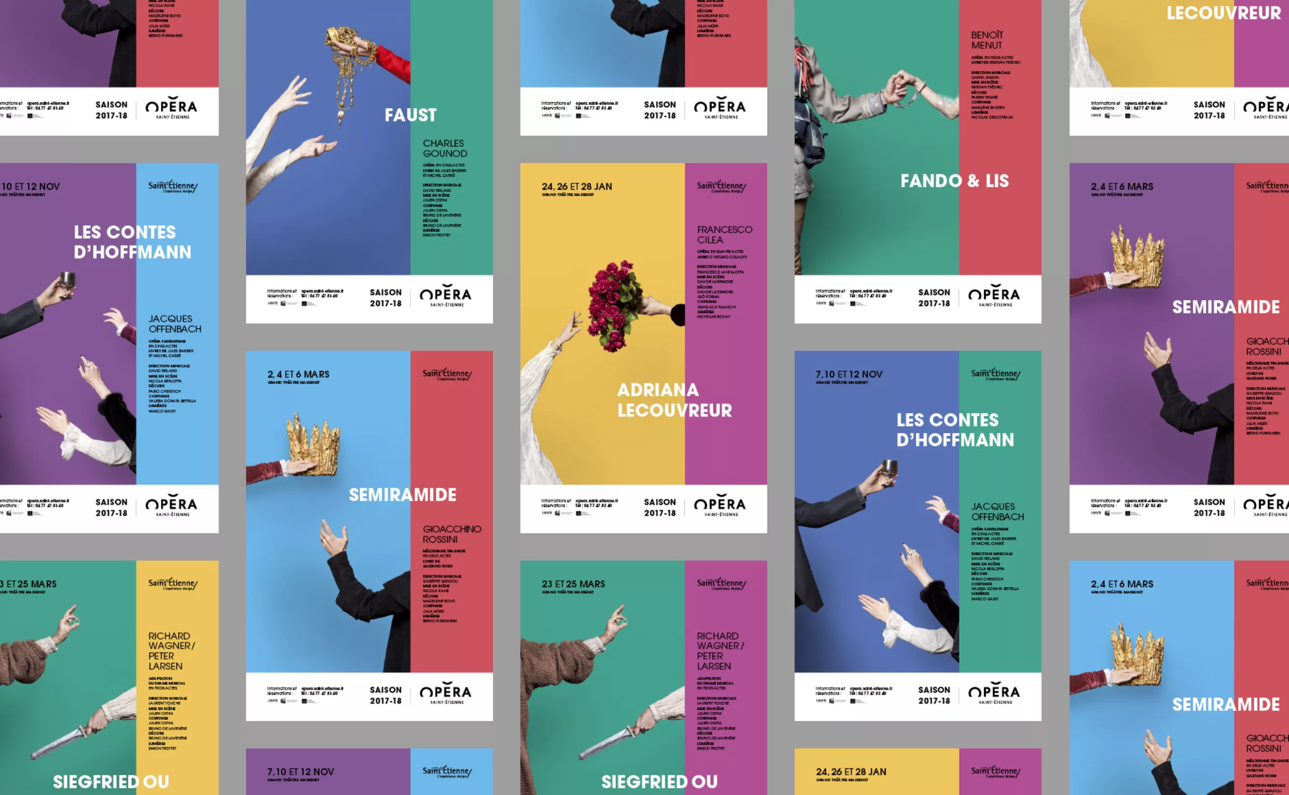
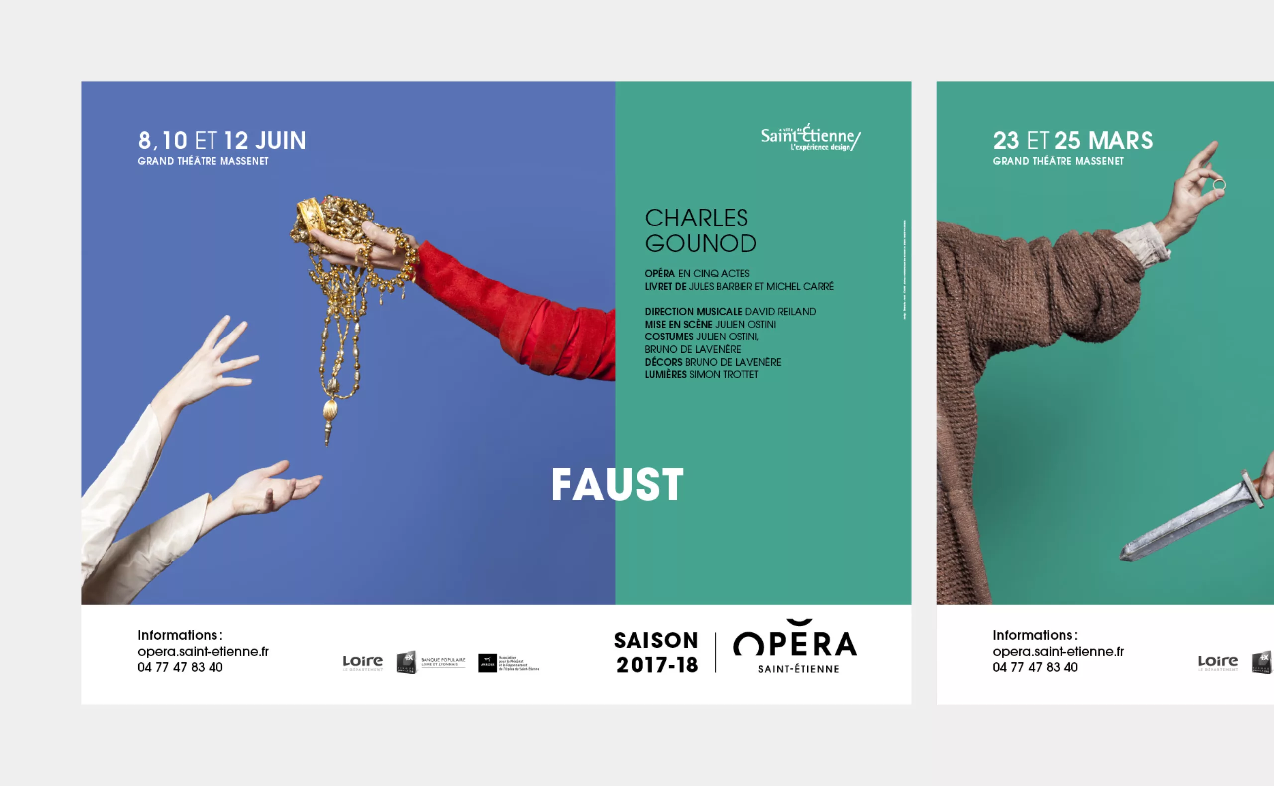
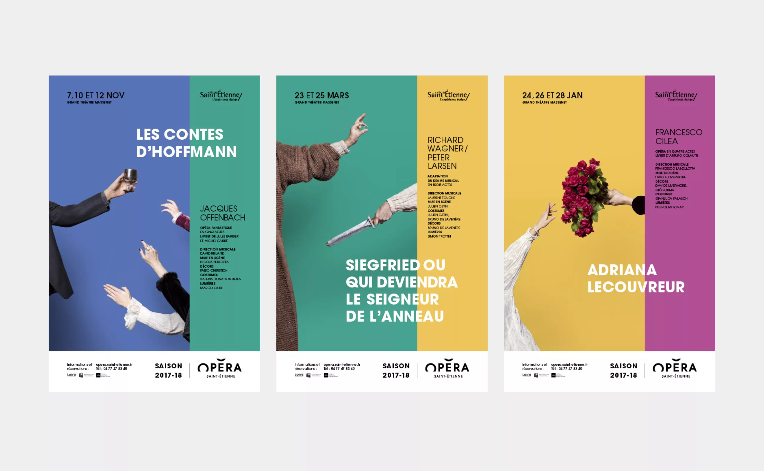
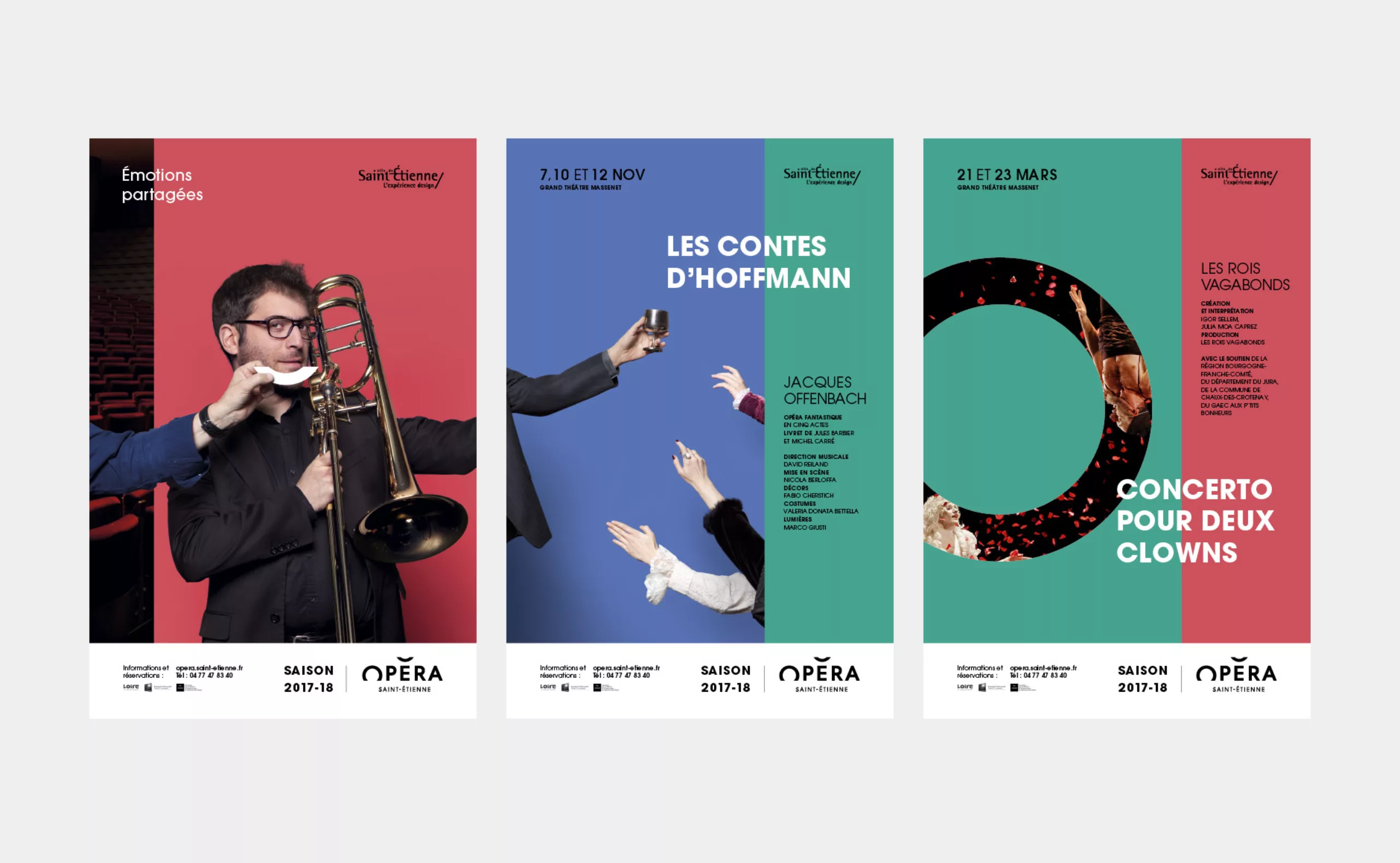
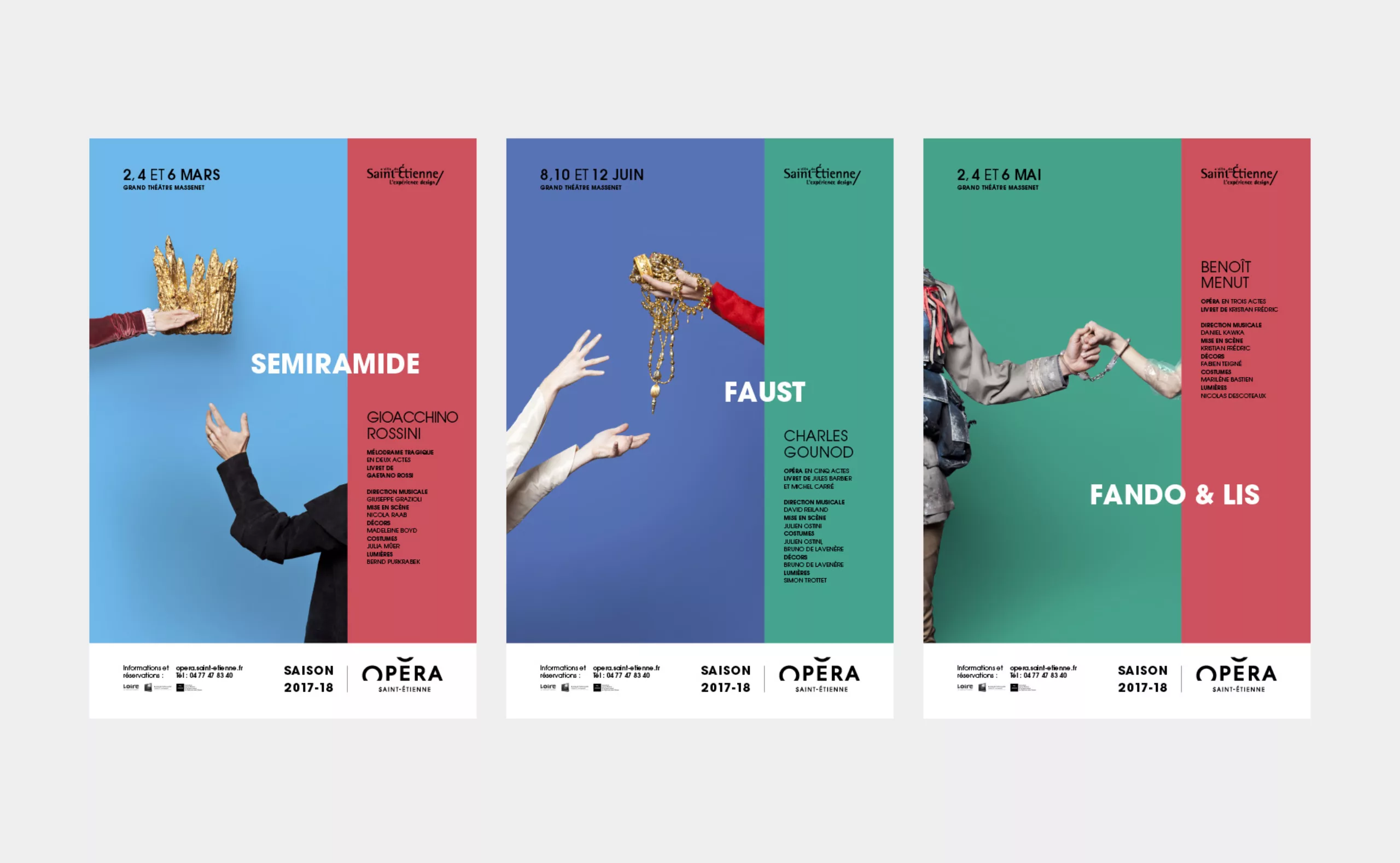
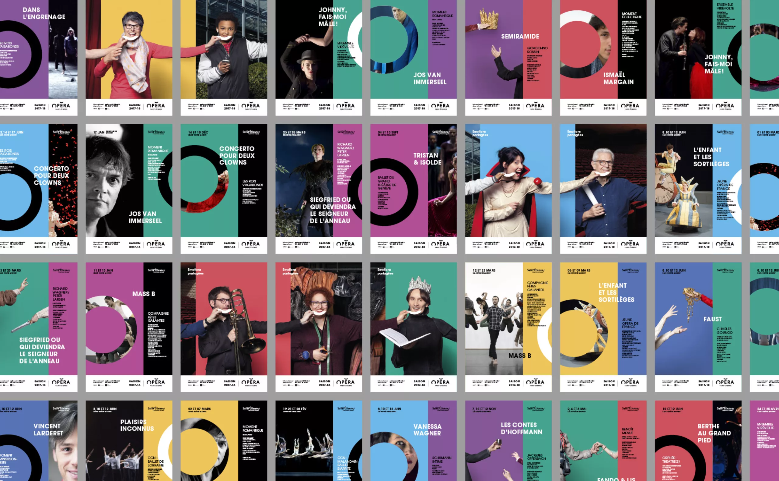
Shows posters
The visual universe of the season is applied for the shows communications.
Here again, a set of hands enters the stage, and characterizes the work through a symbolic accessory.
Young program leaflet and tickets envelope