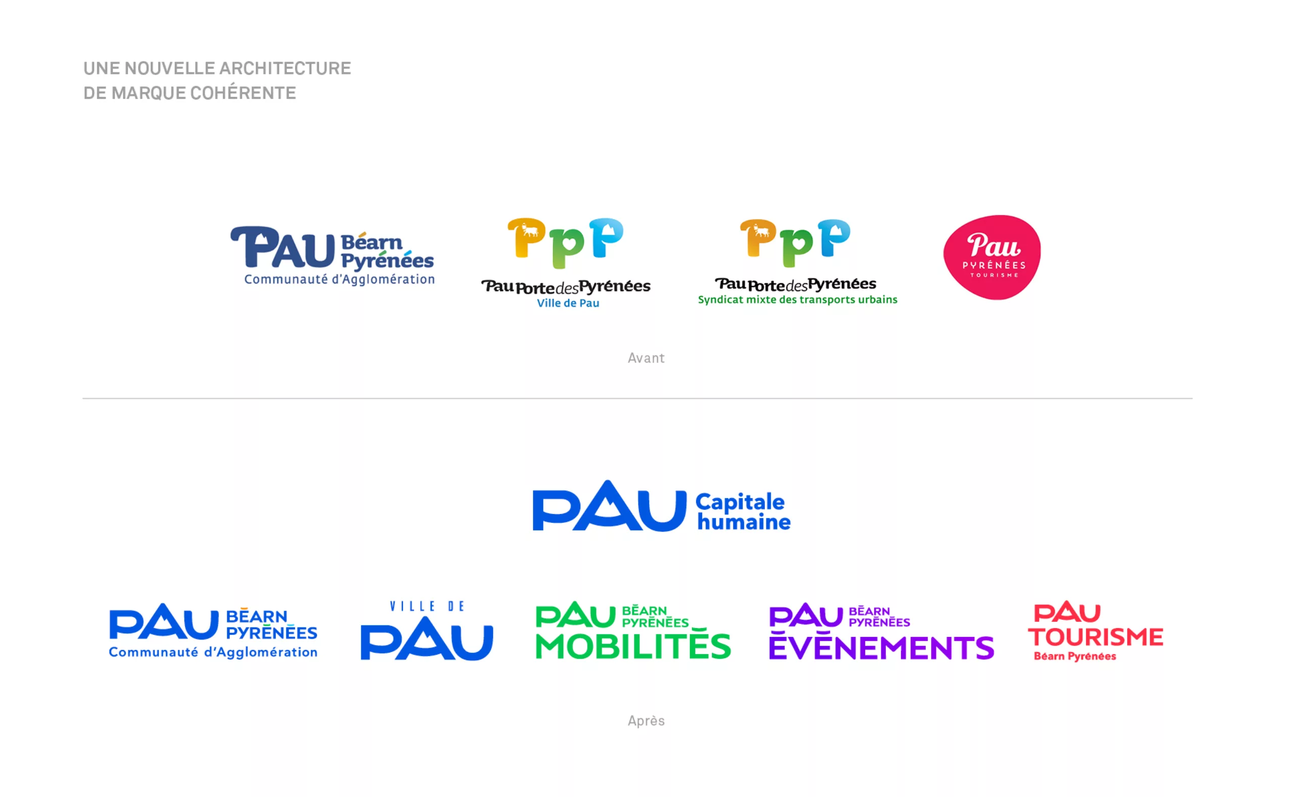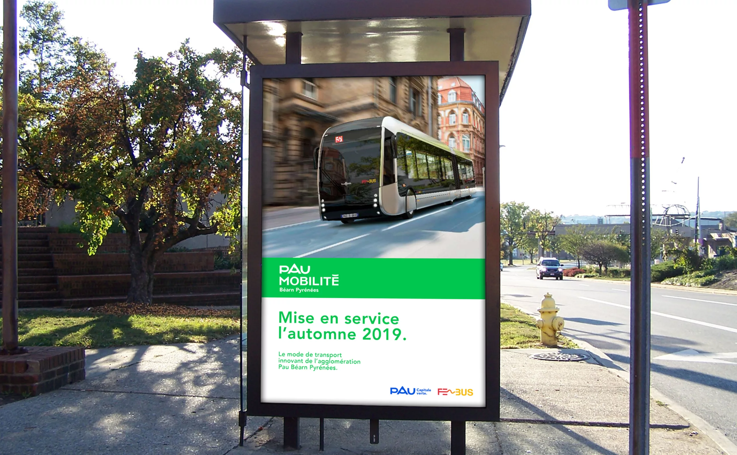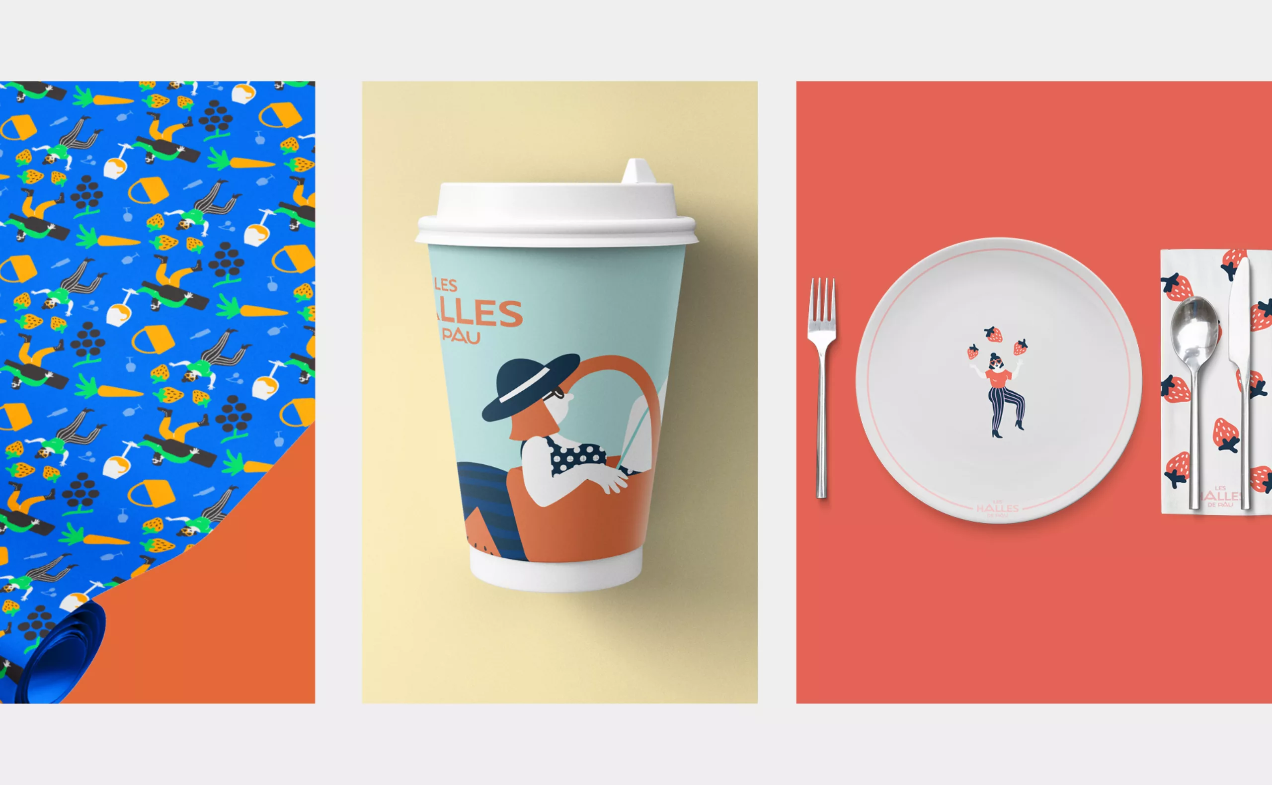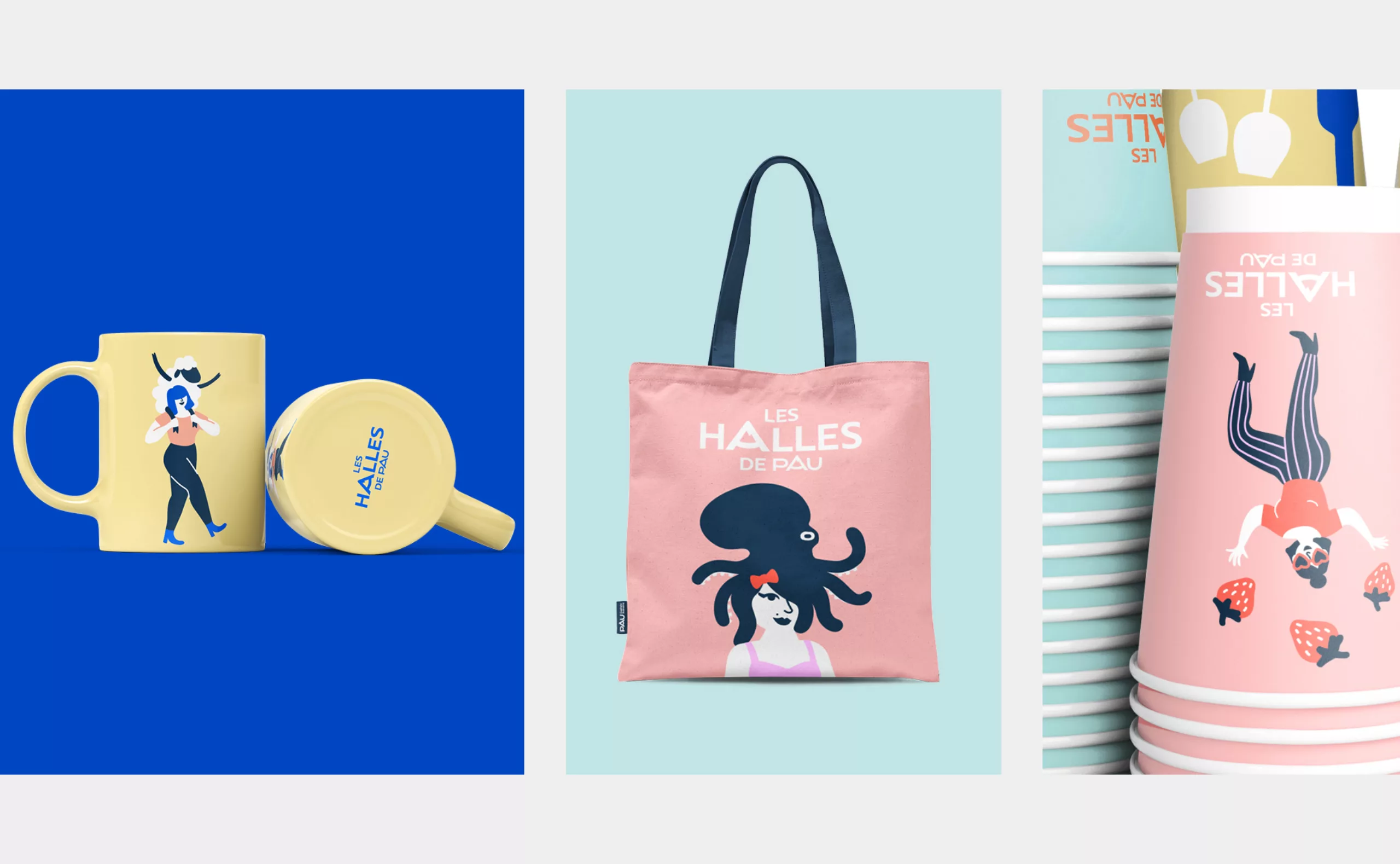
Graphéine supported the agglomeration of Pau in the creation of its territorial brand and the harmonisation of its brand architecture. Pau, a town in the southwest of France, is a city with a rich heritage.
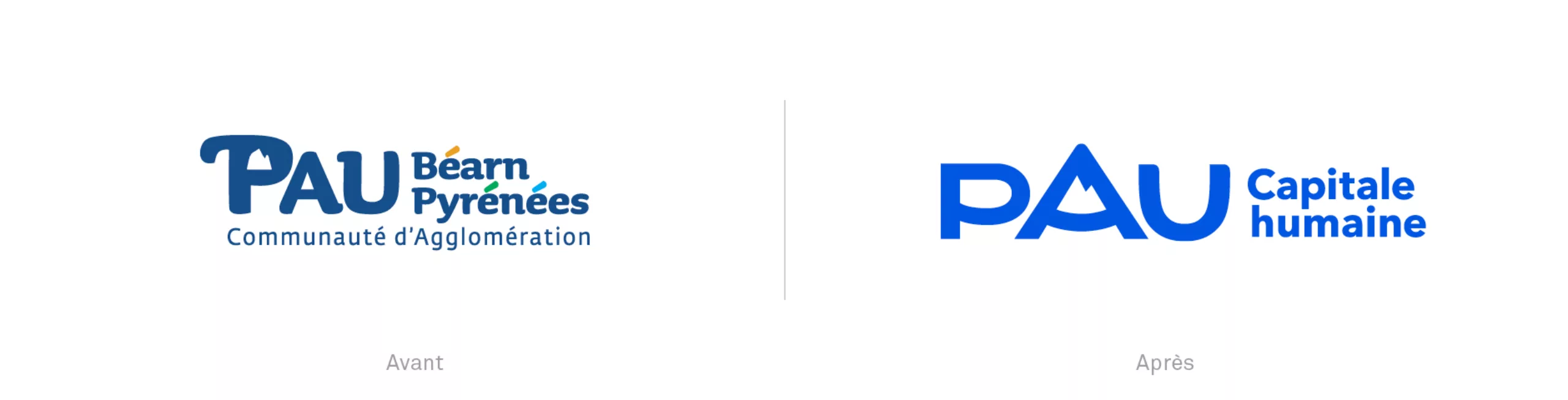
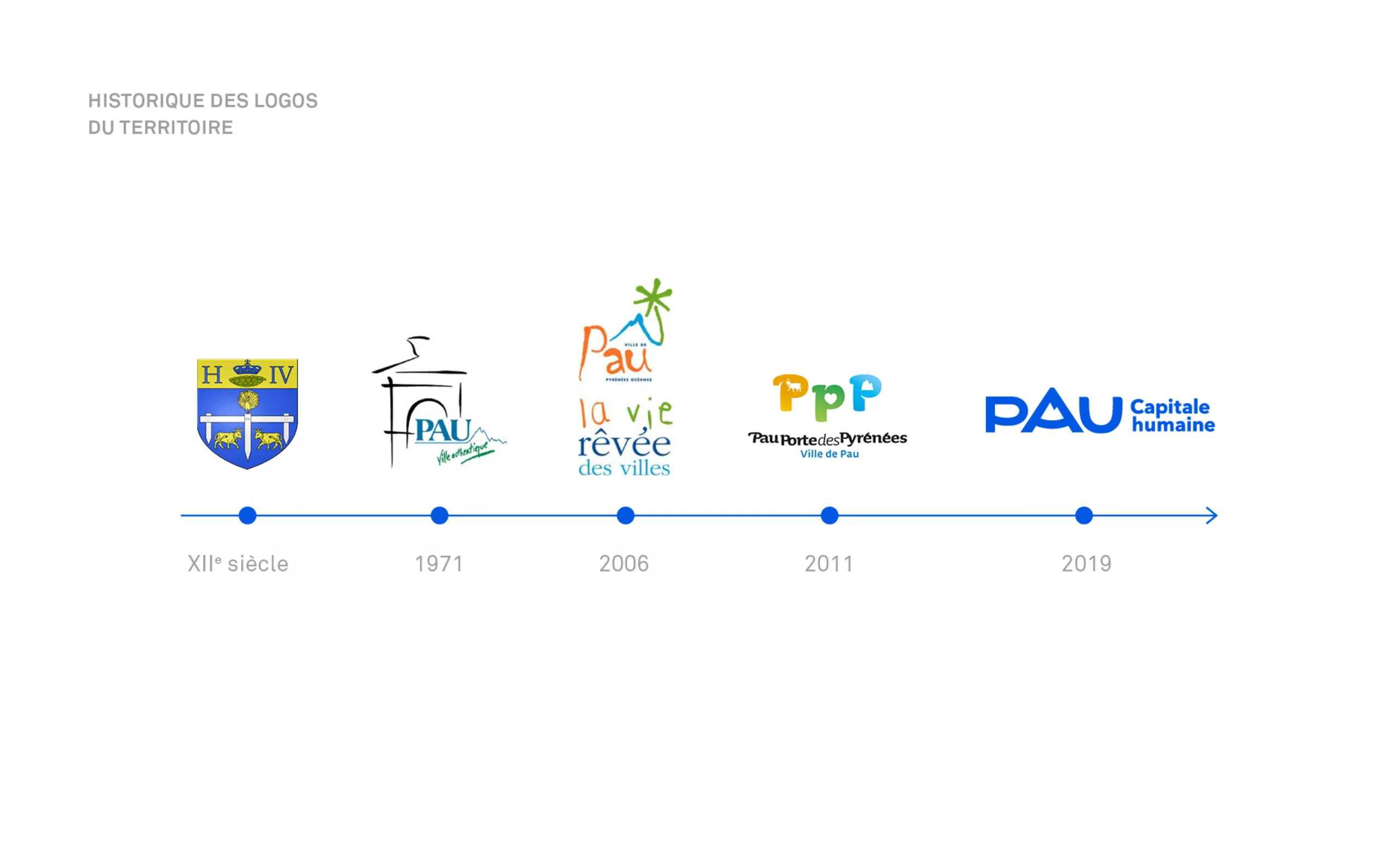
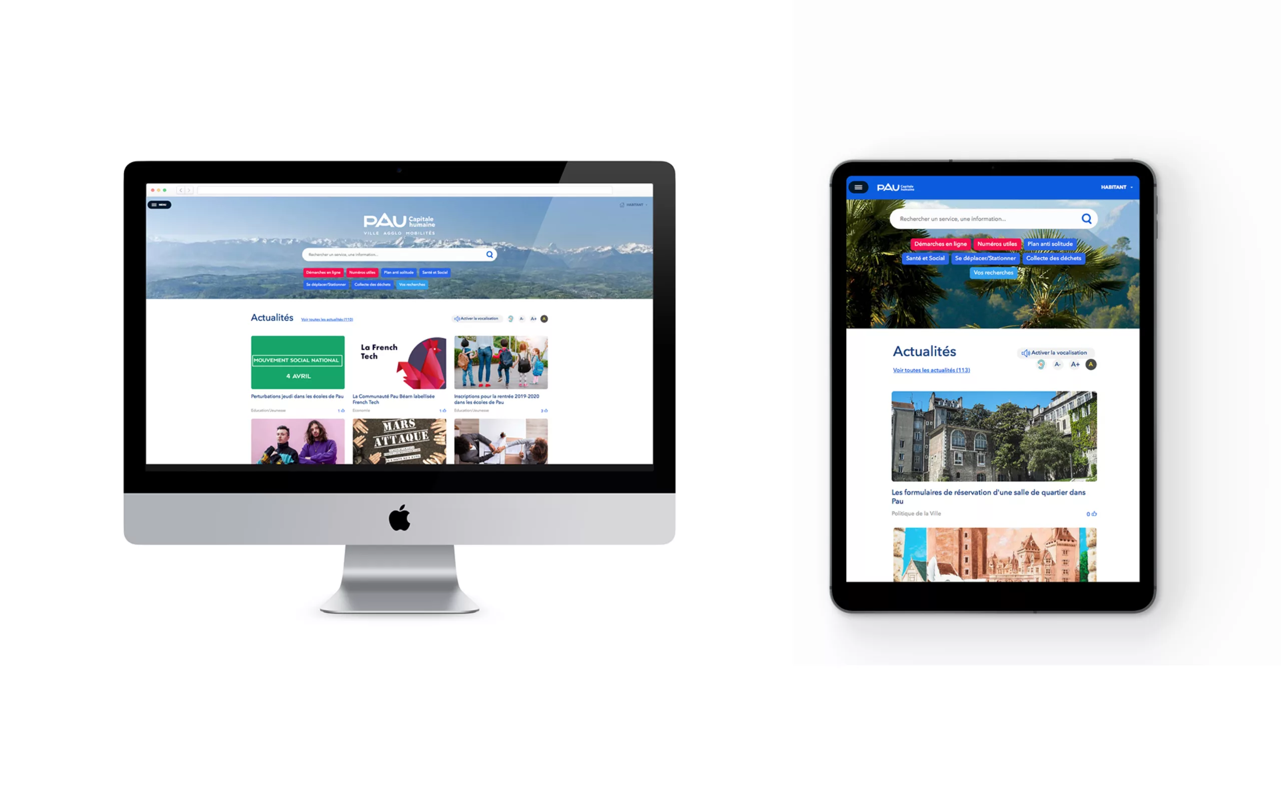
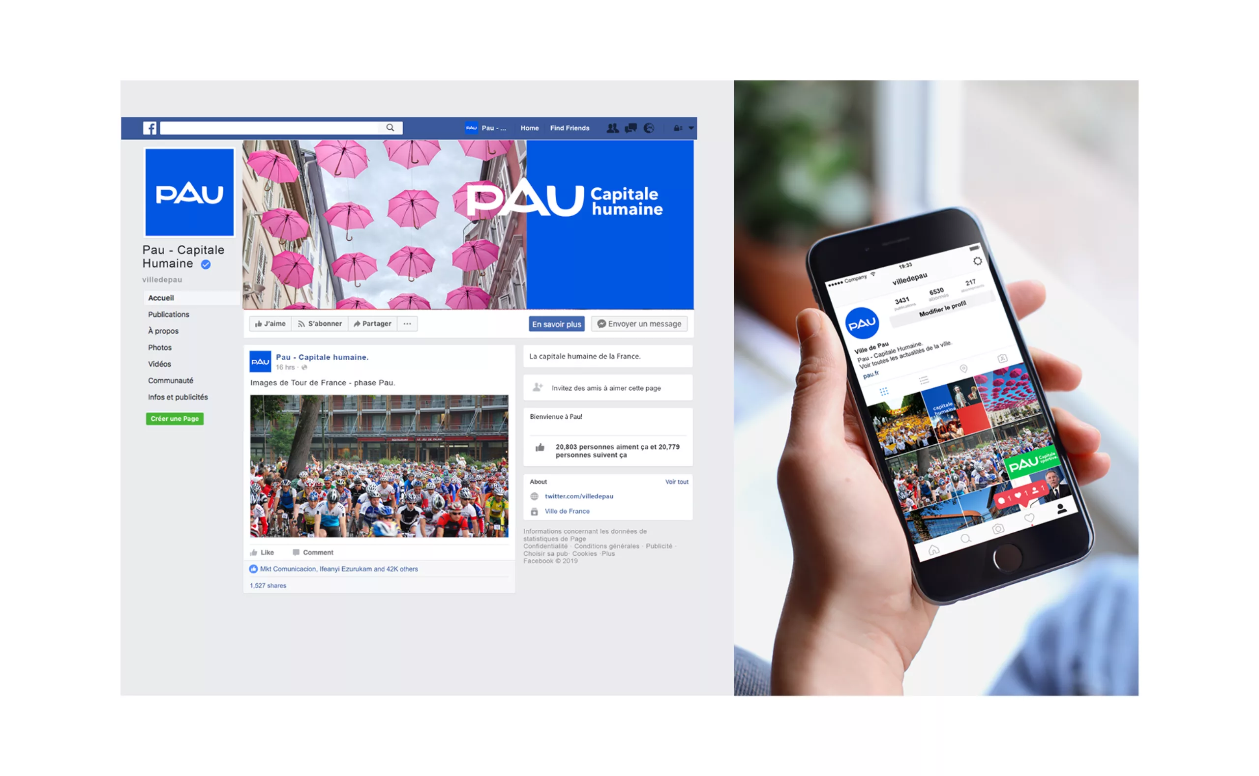
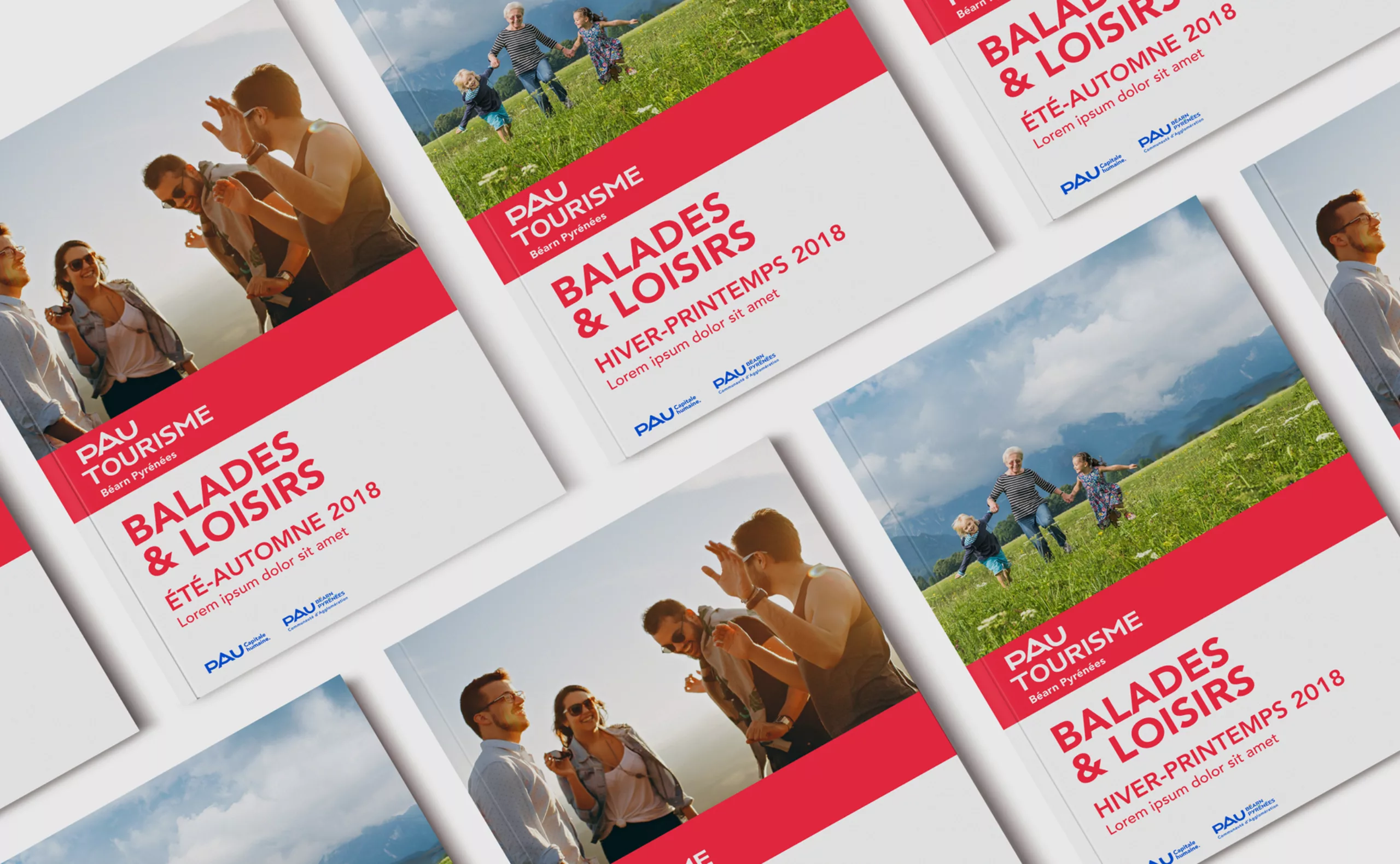
Several identities have followed one another since 1971. The last one was signed “Pau Porte des Pyrénées” and was designed in 2011 by Dragon Rouge agency. With the creation of the Pau Béarn Pyrénées agglomeration in 2017, a project to harmonize brand architecture was initiated. The objective was to create the territorial brand “Pau Capitale Humaine” and to rationalize all the city’s brands. It was also a question of designing an editorial charter adapted to all sectoral public policies: supply of services, equipment… in order to allow identification and readability of all the city’s communications.
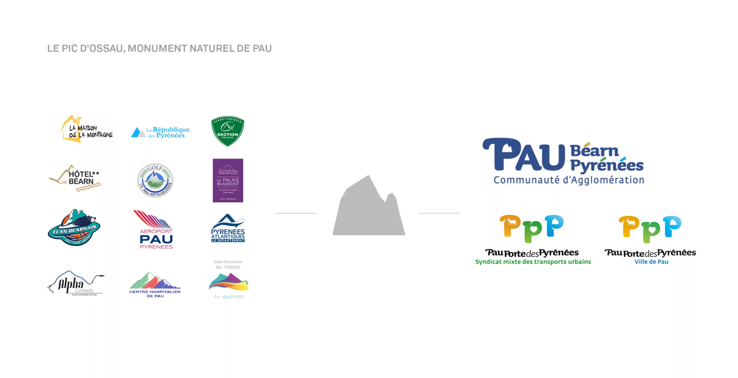
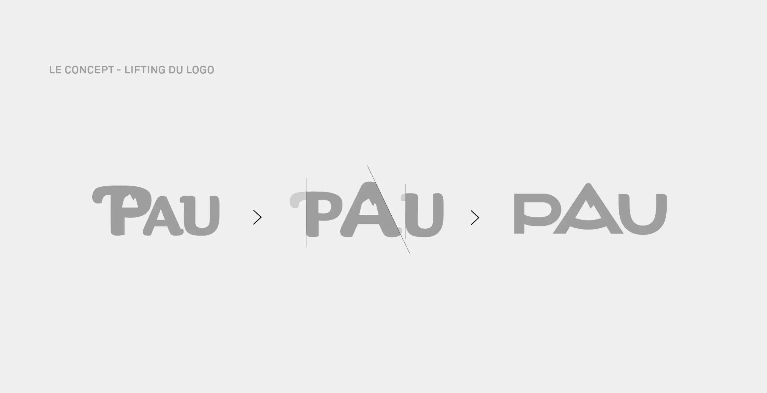
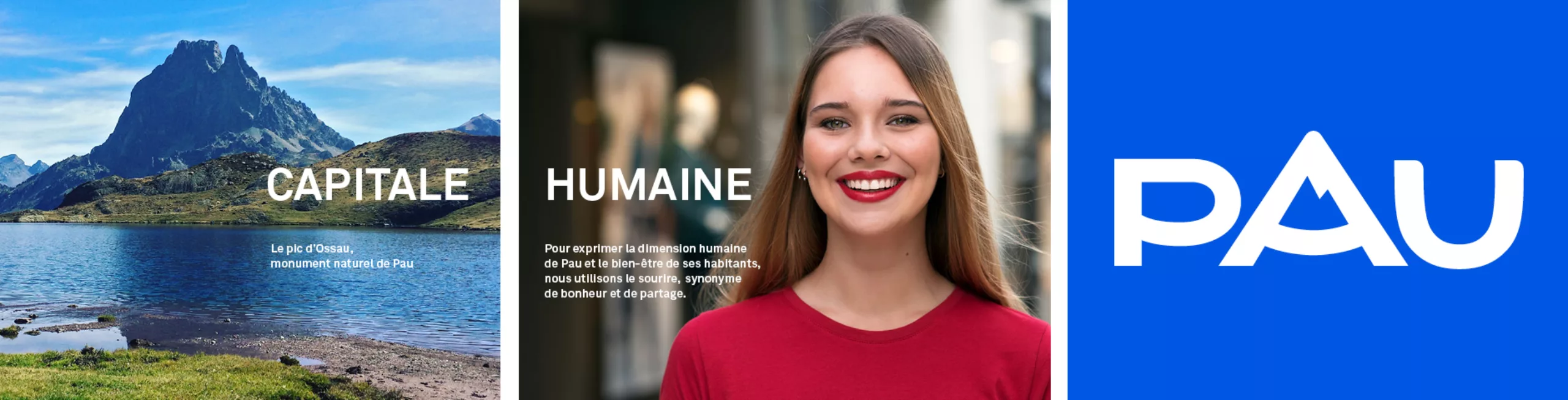
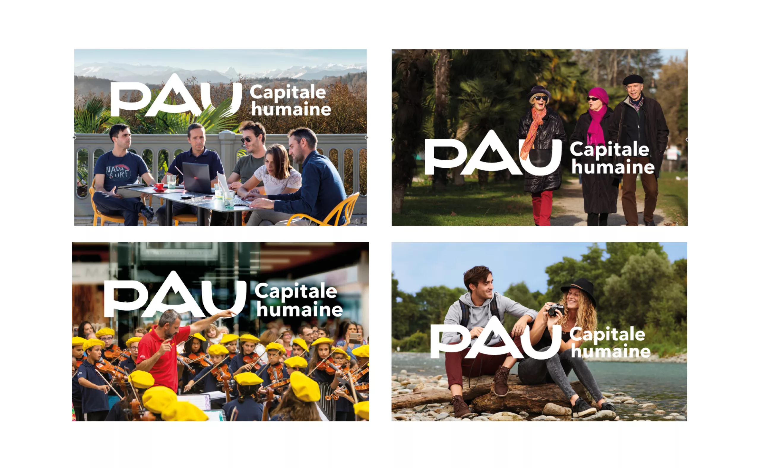
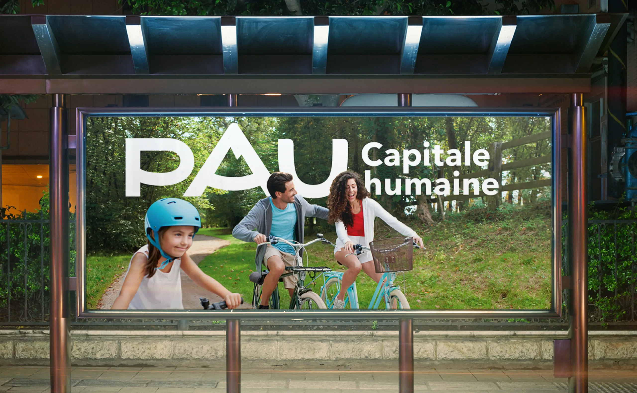
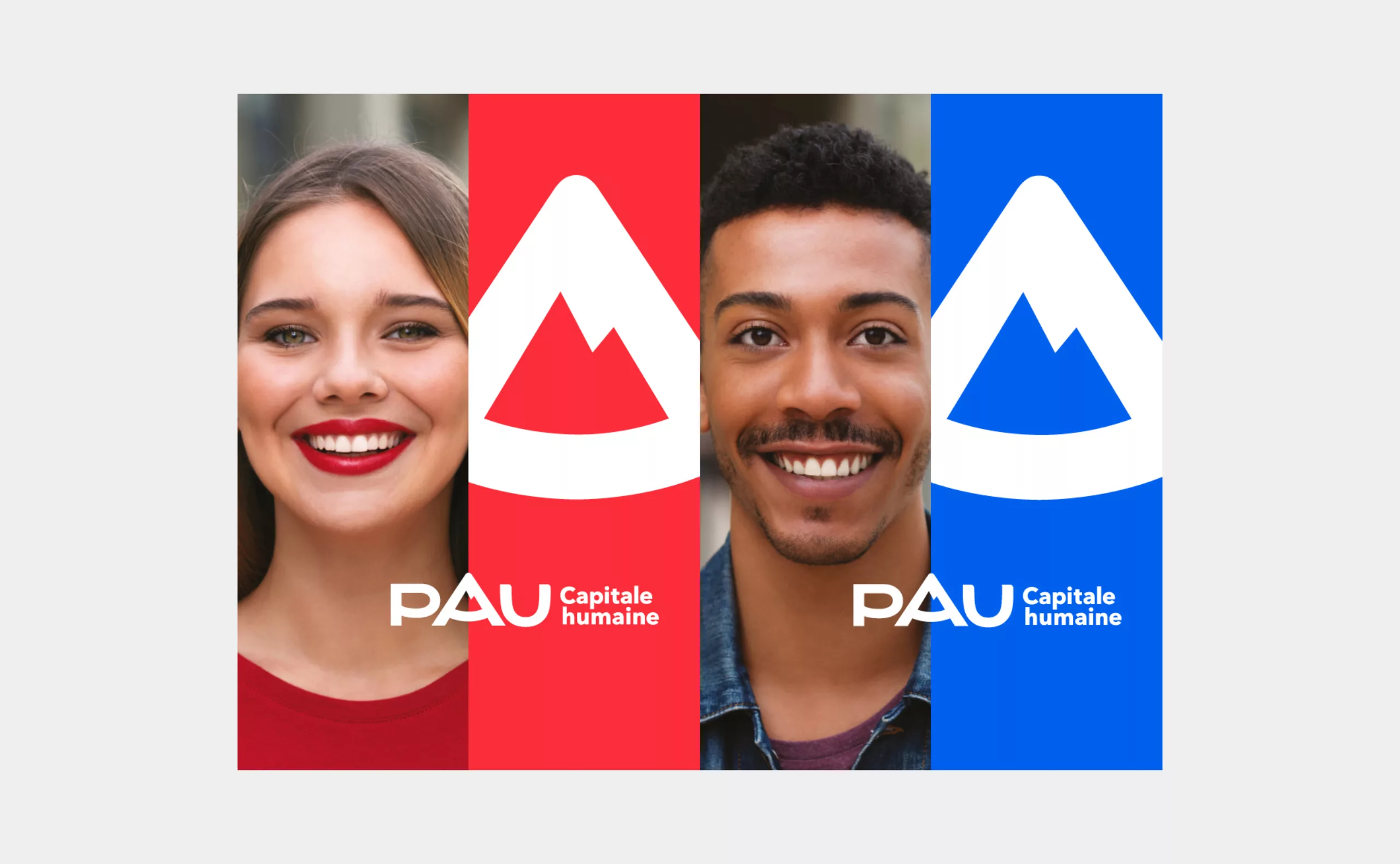
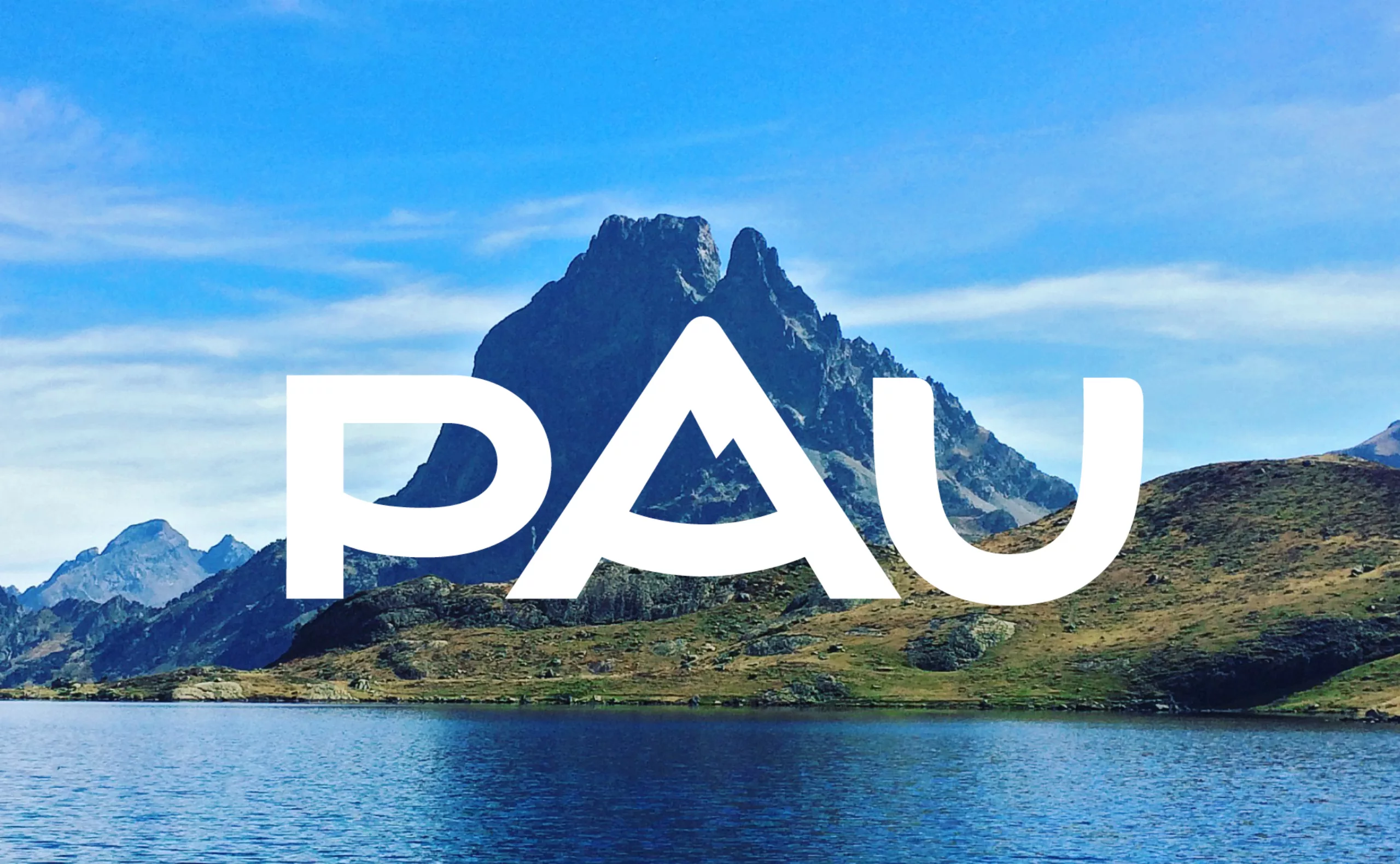
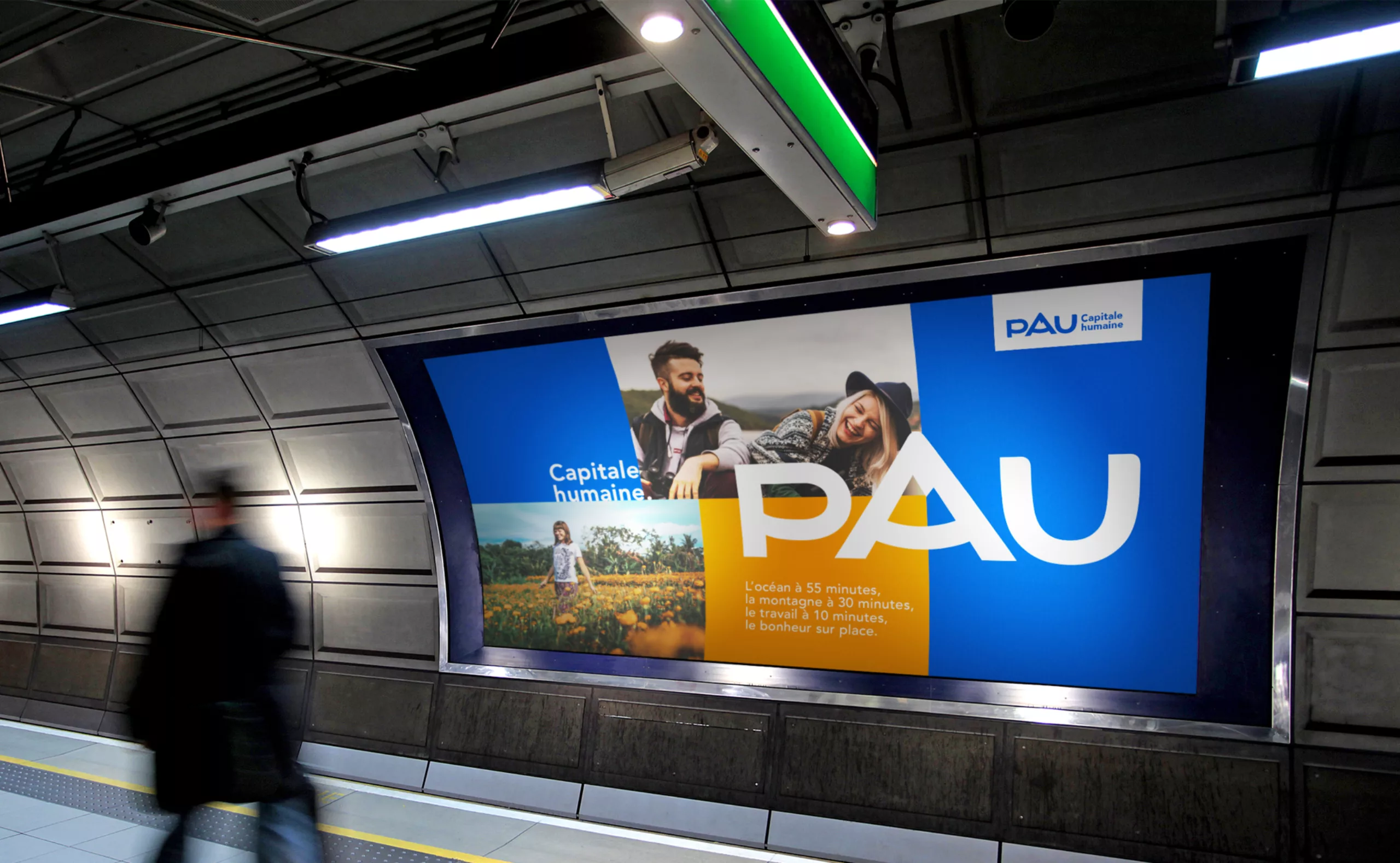
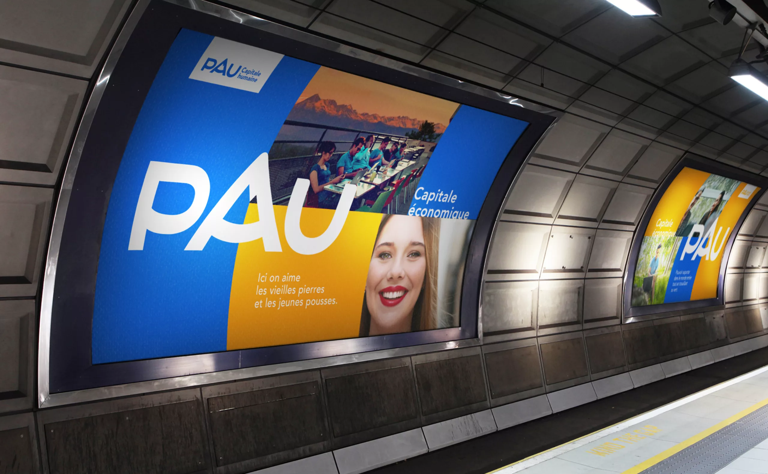
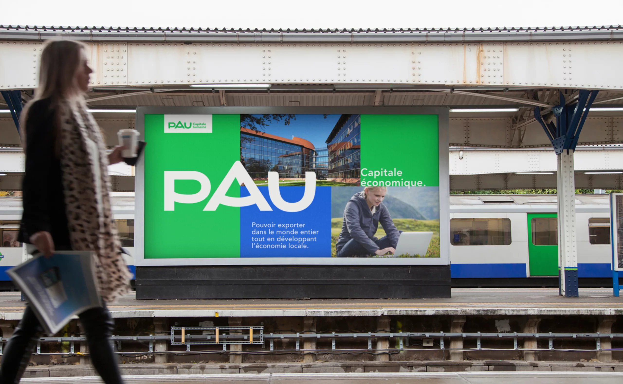
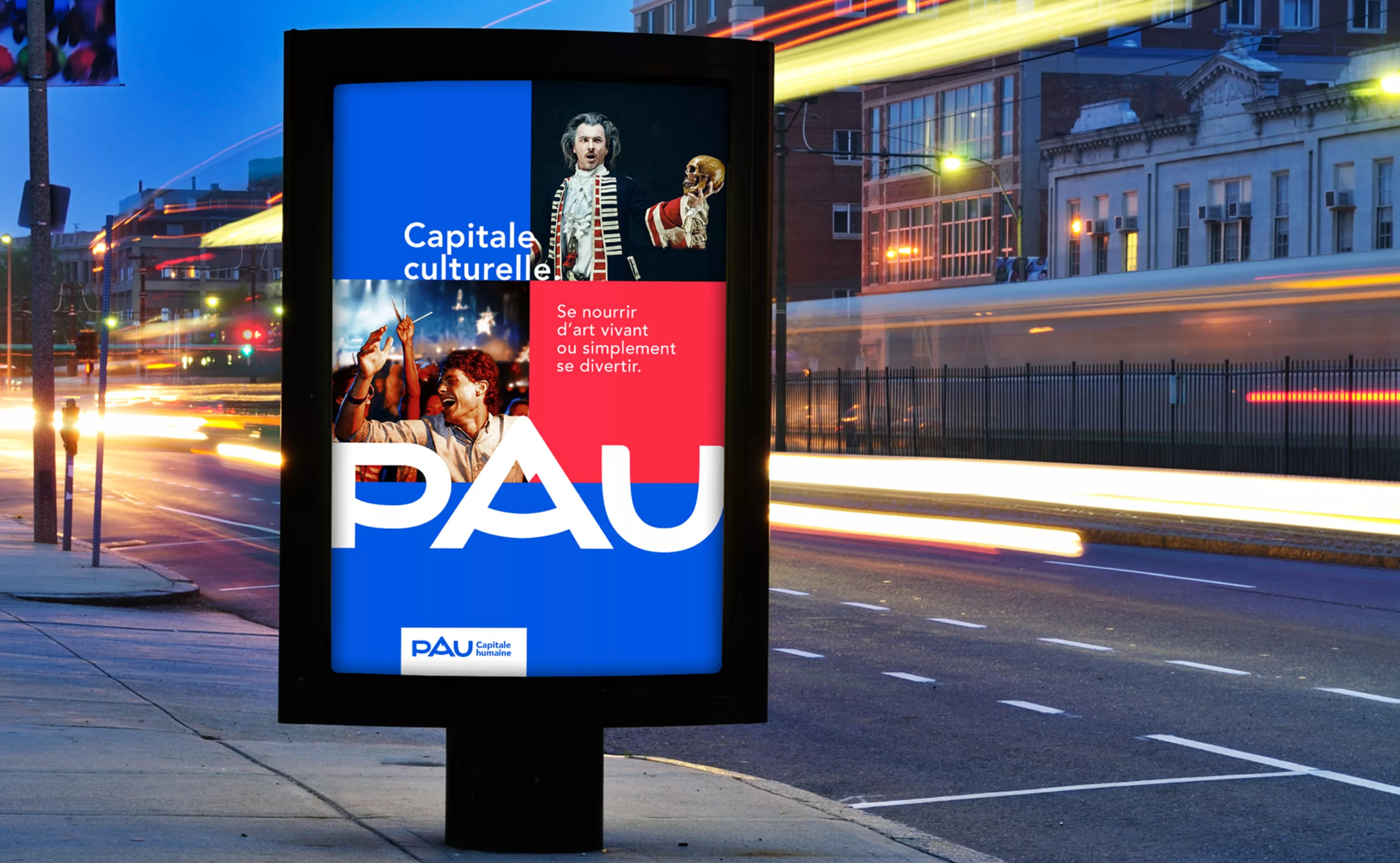
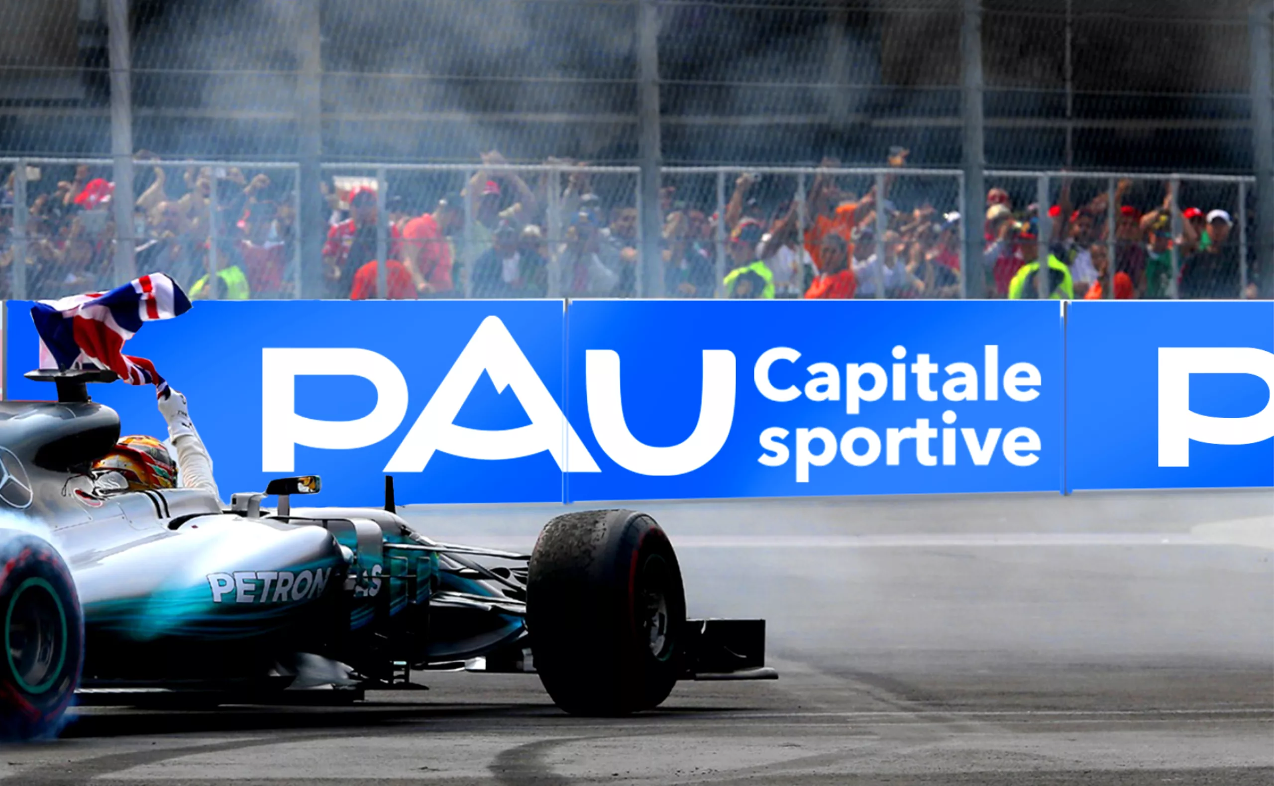
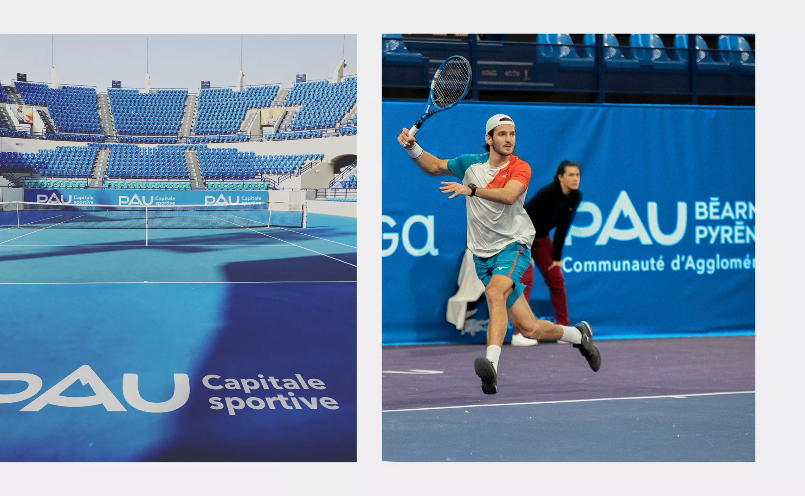
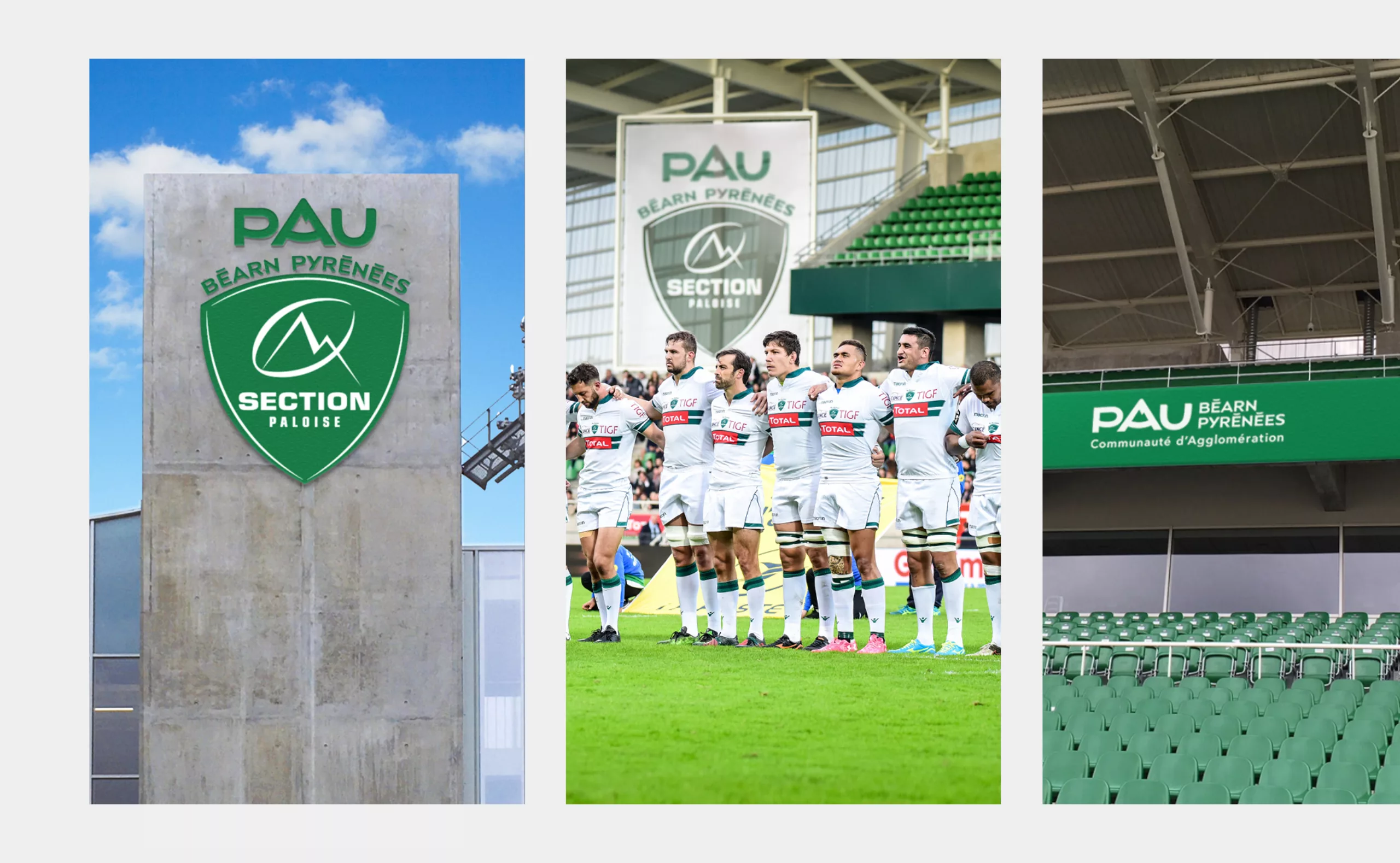
At the root of this demand: the evolution of the old “PPP” logomark in order to create the main brand “Pau capitale humaine”. This territorial brand emphasizes the territory’s quality of life: its human size, its cultural dynamism, its economic attractiveness. A territory that has the same assets as Paris, but that is 1h30 from the ocean, the first slopes of the Pyrenees and Spain.