fr
fr

Catholic University of Lille

On the eve of its 150th anniversary, the “Catho de Lille” is reinventing itself with a modernised brand identity, reinforcing the visibility of all its constituents.

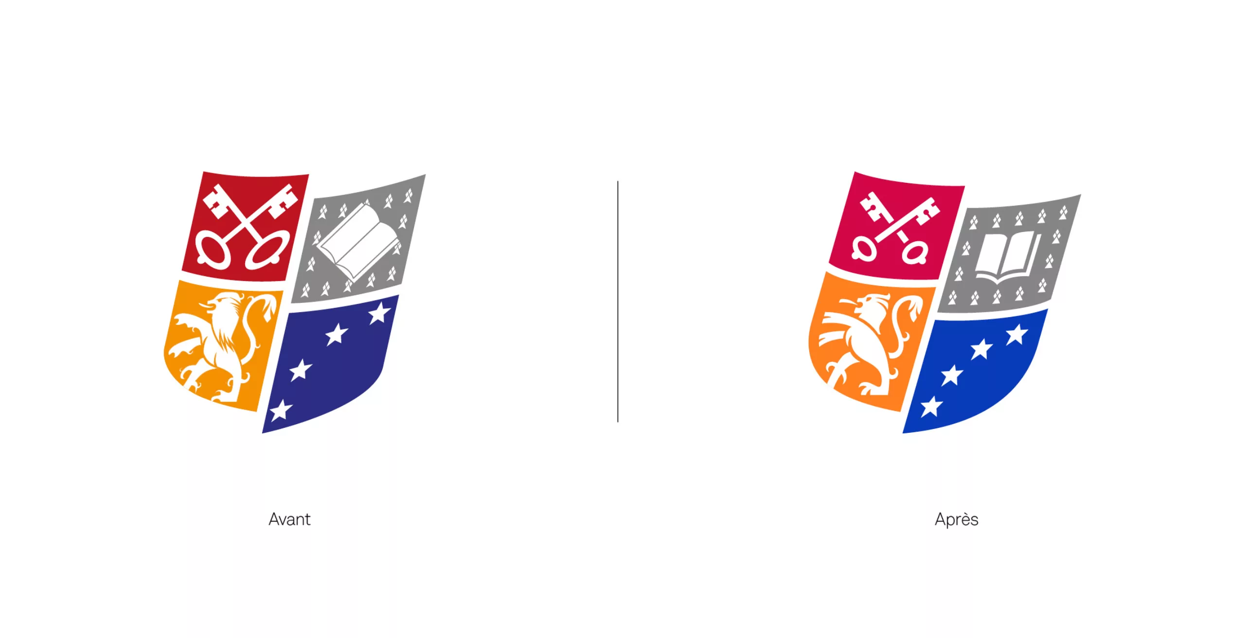
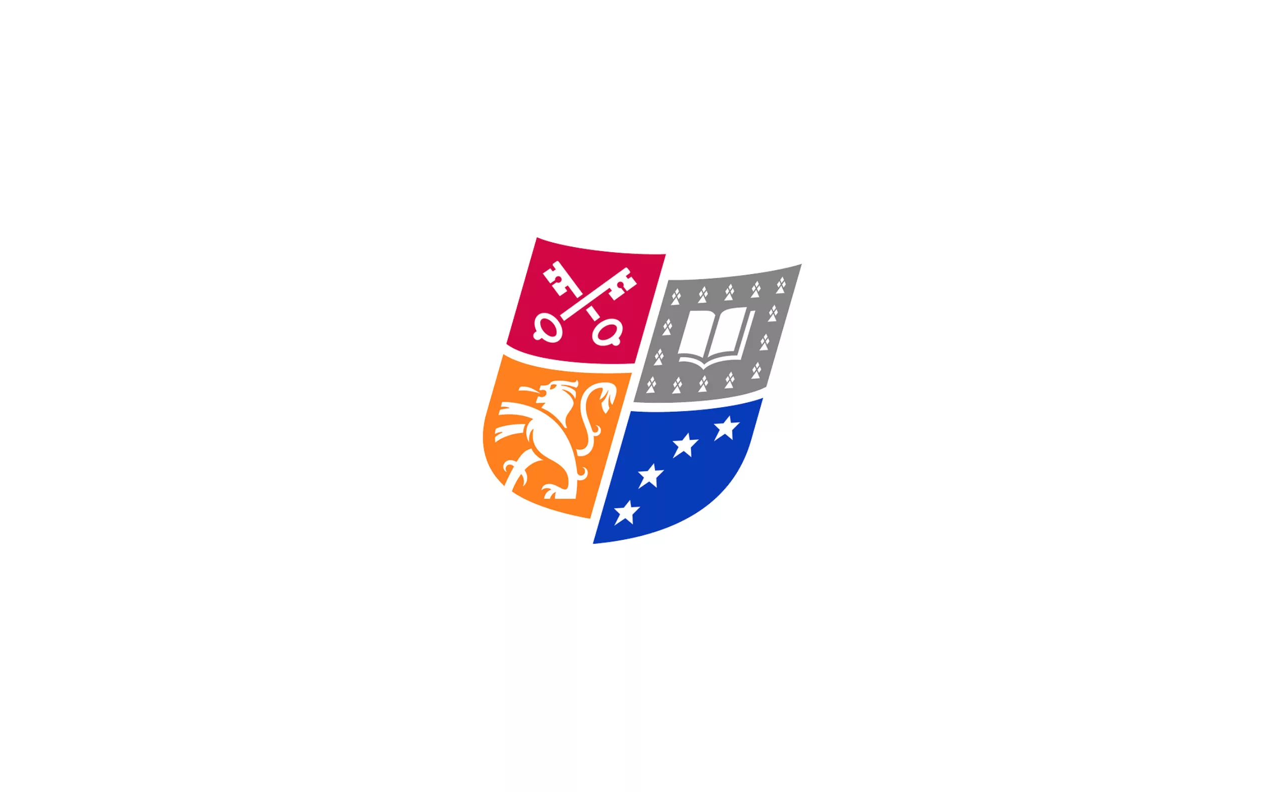
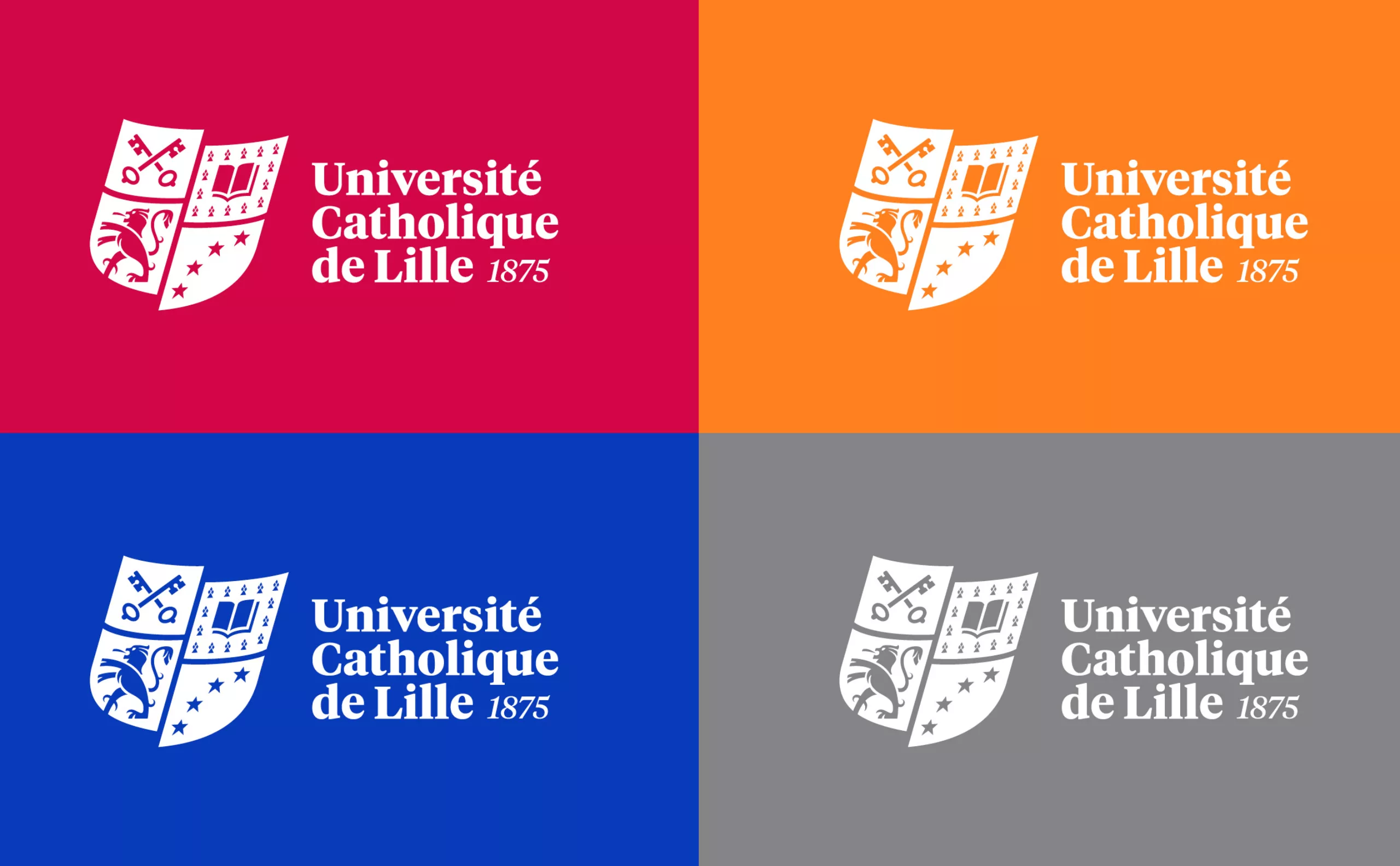
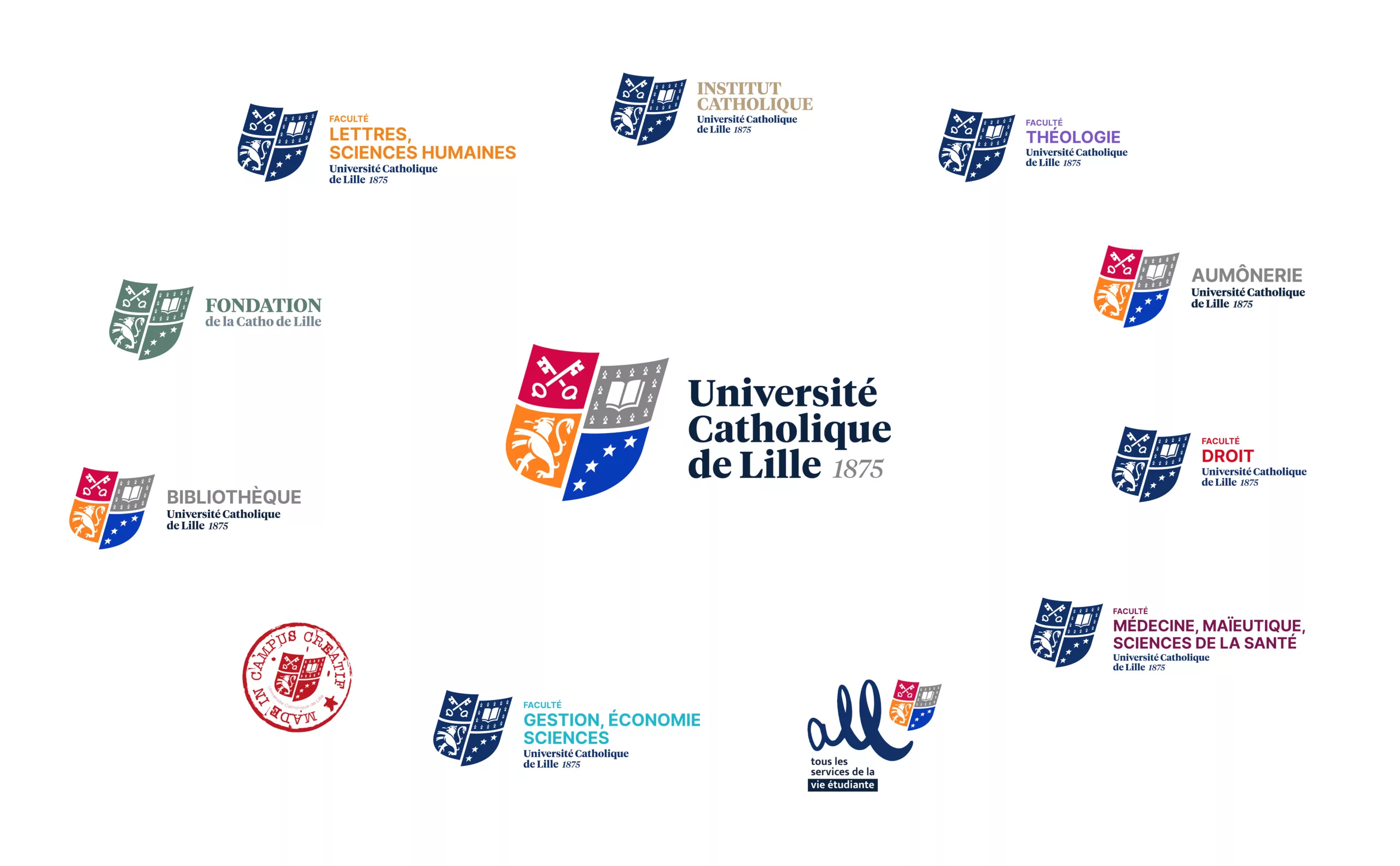
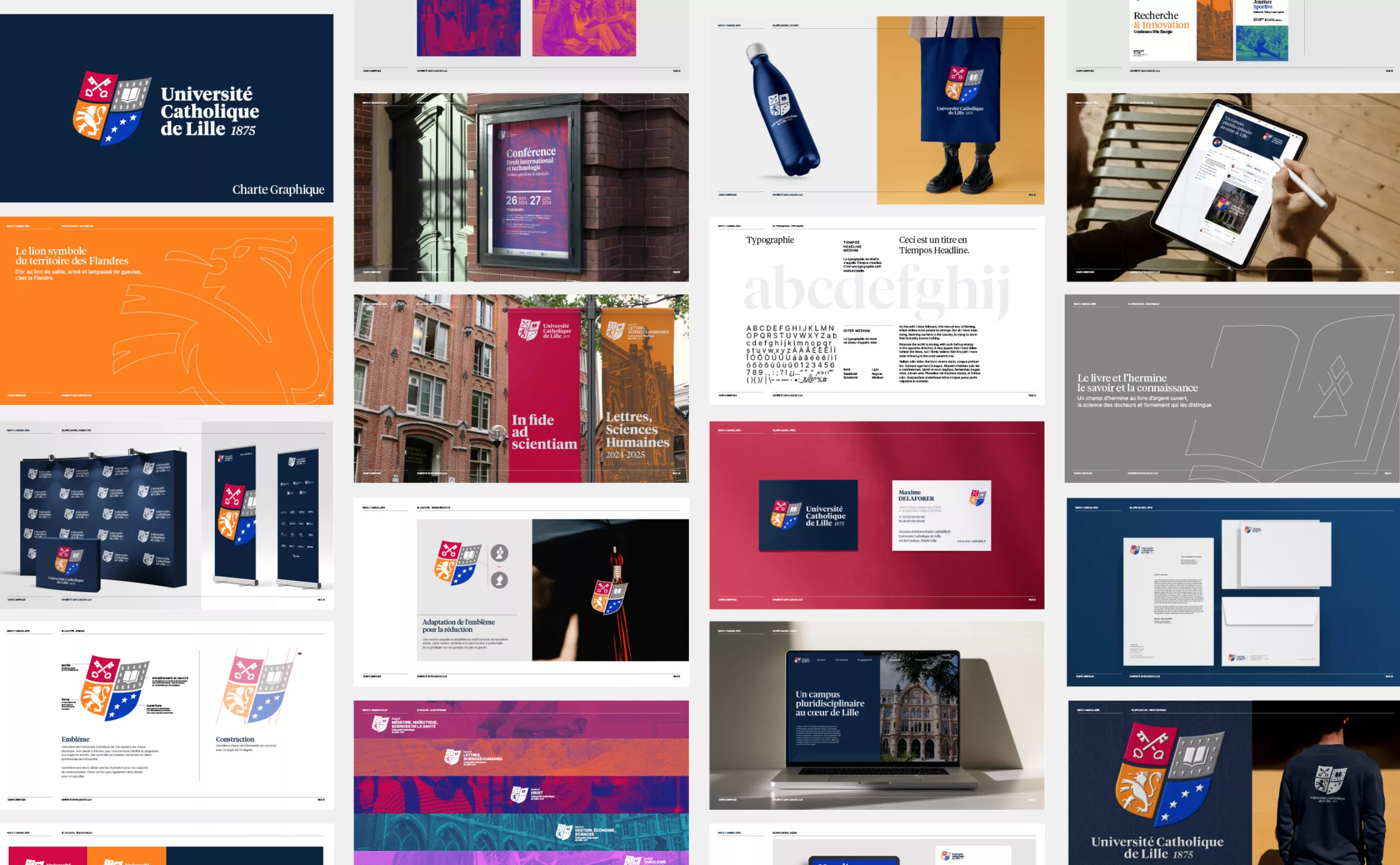
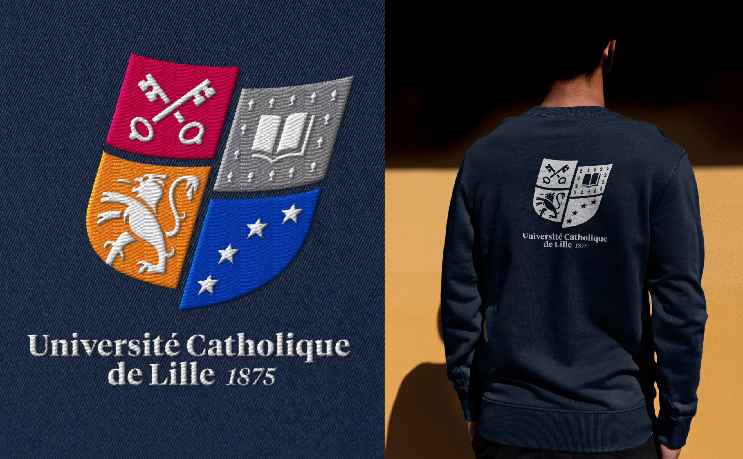
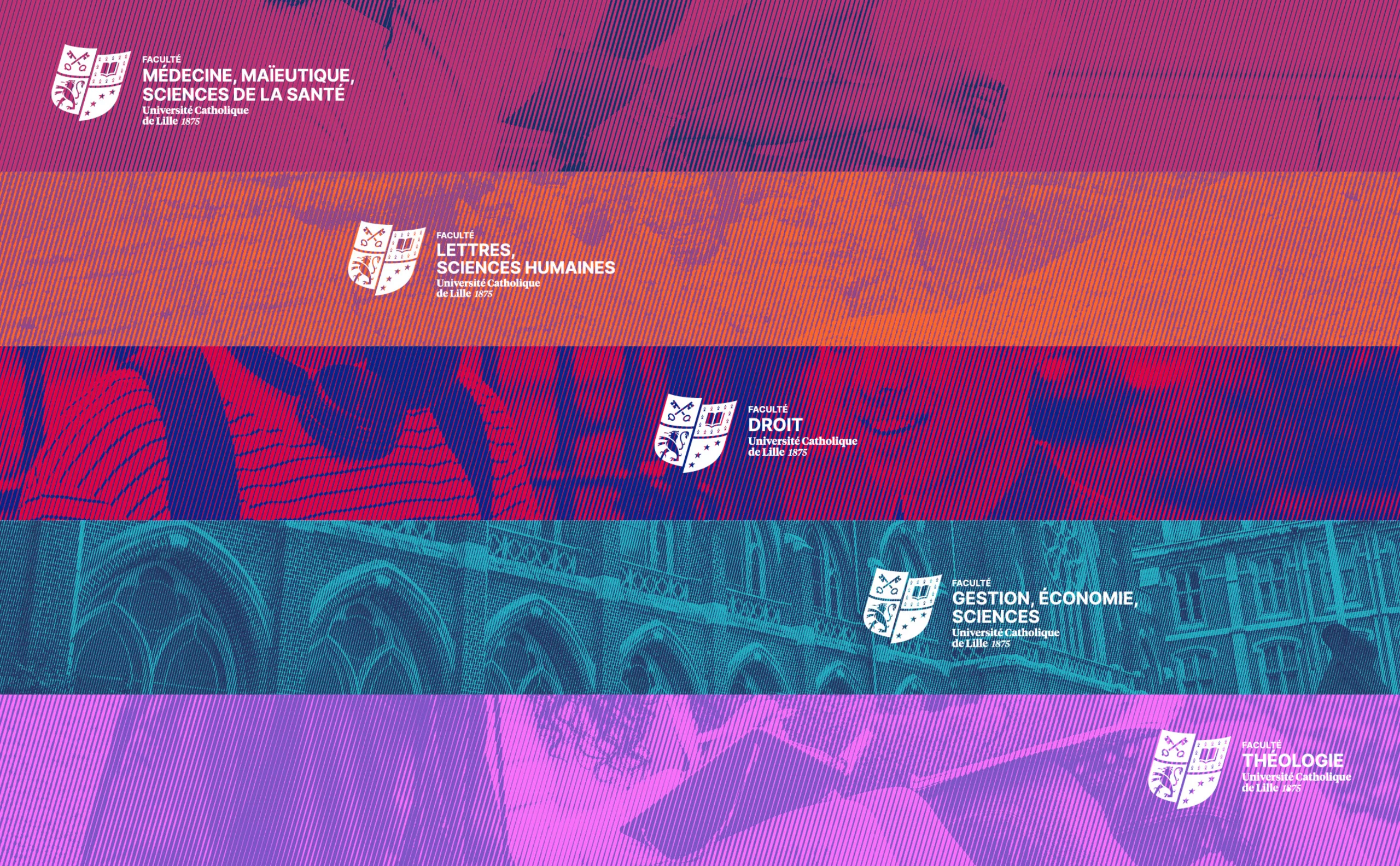
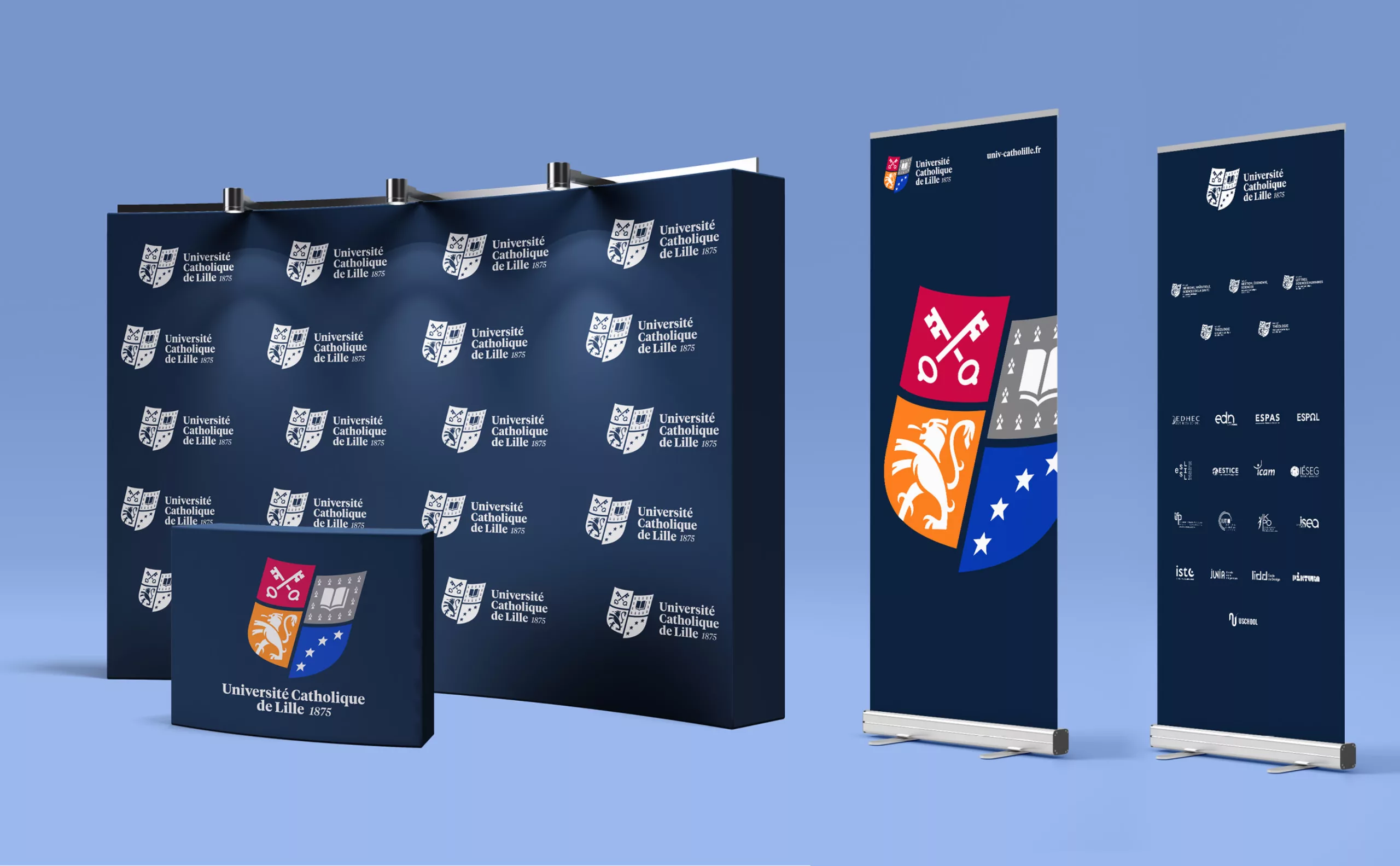
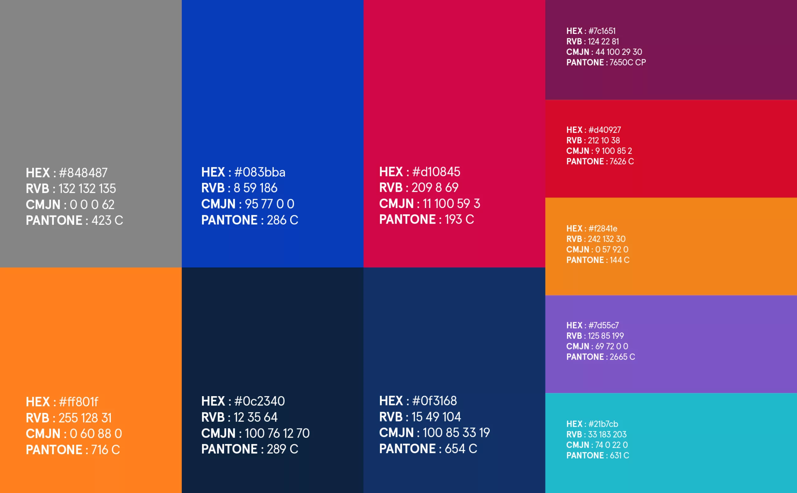
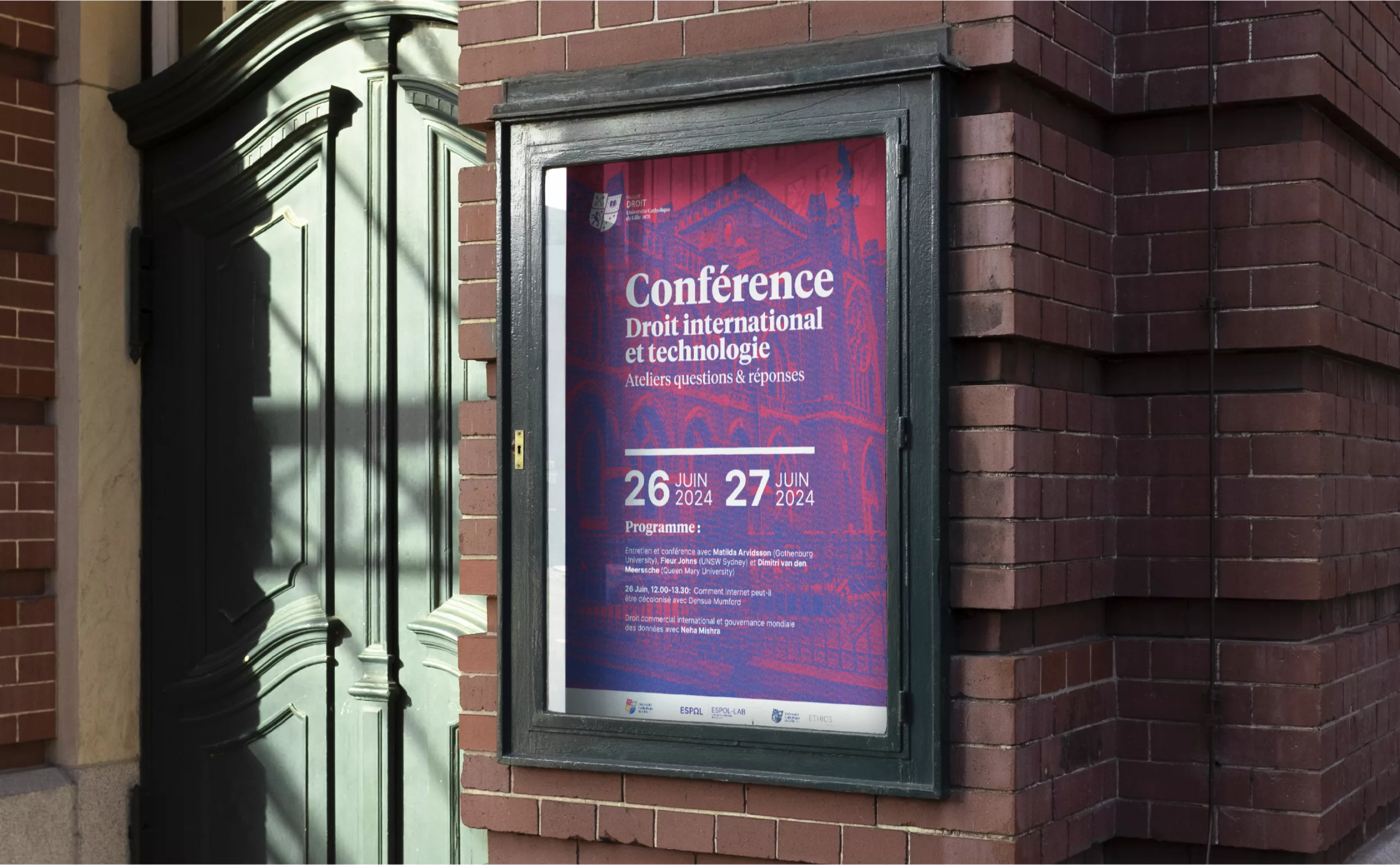
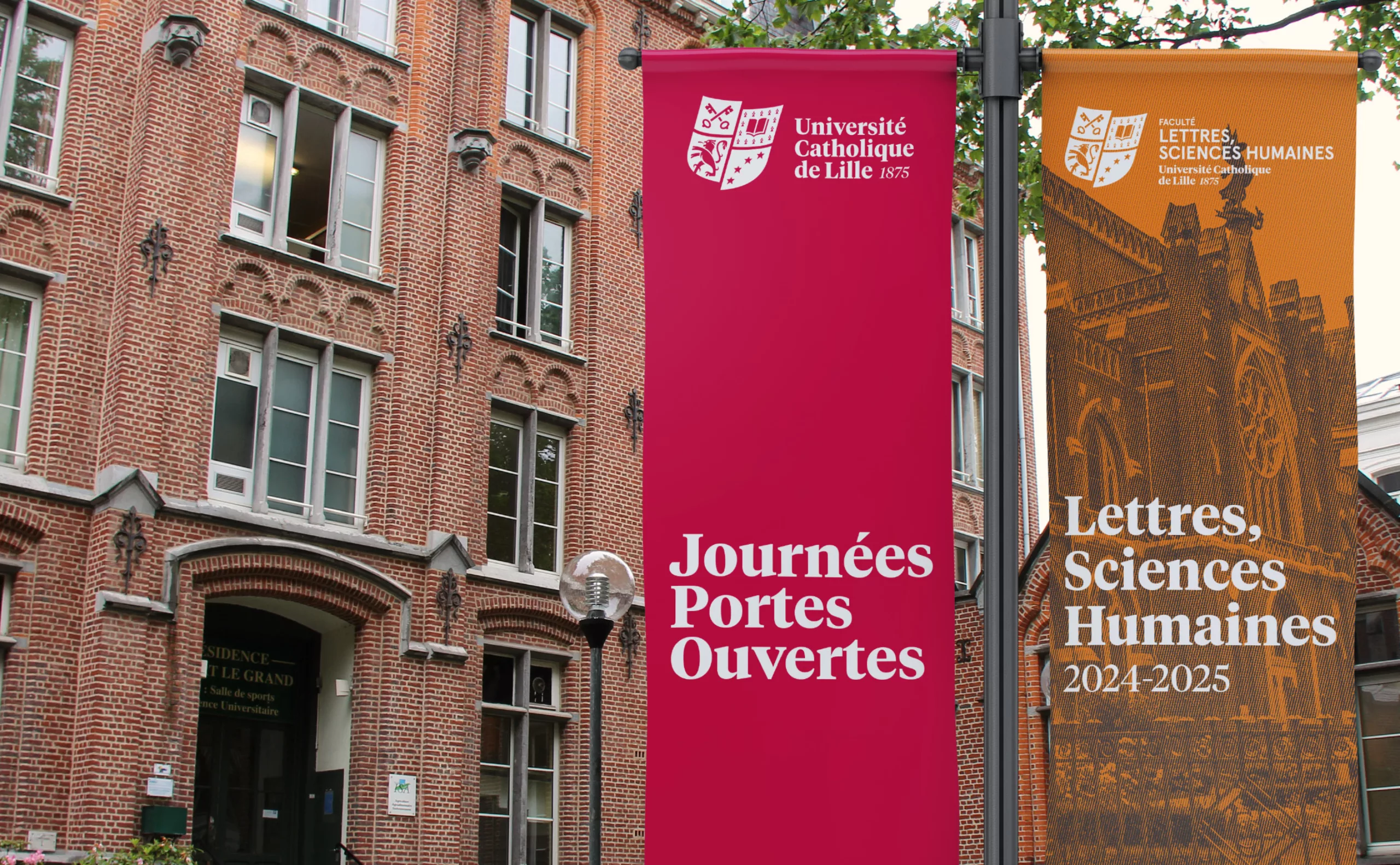
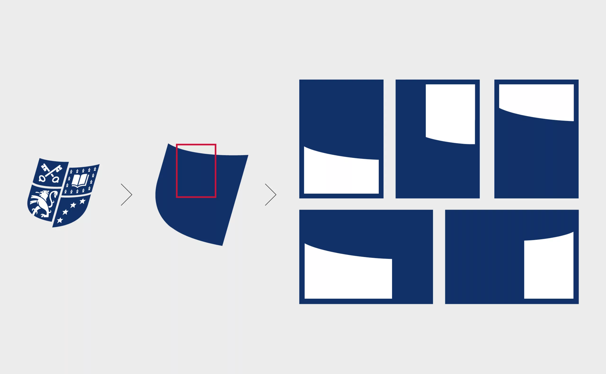
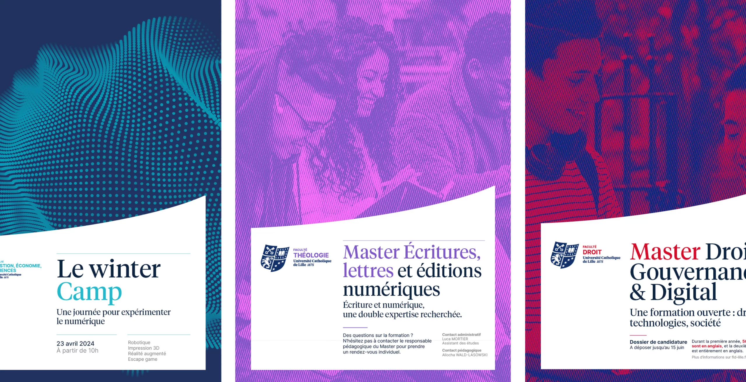
Founded in 1875, Université Catholique de Lille is a multi-disciplinary institution of higher education that brings together 5 Faculties, 20 Schools, Grandes Écoles and Institutes. With over 40,000 students, it is the largest private, not-for-profit university in France. In 2023, the Université Catholique de Lille commissioned Graphéine to strengthen its employer brand and clarify its brand architecture. The institution’s emblematic coat-of-arms was being used irregularly without standardised guidelines, and the institutional brand was being diluted with a segmentation that failed to establish its legitimacy.

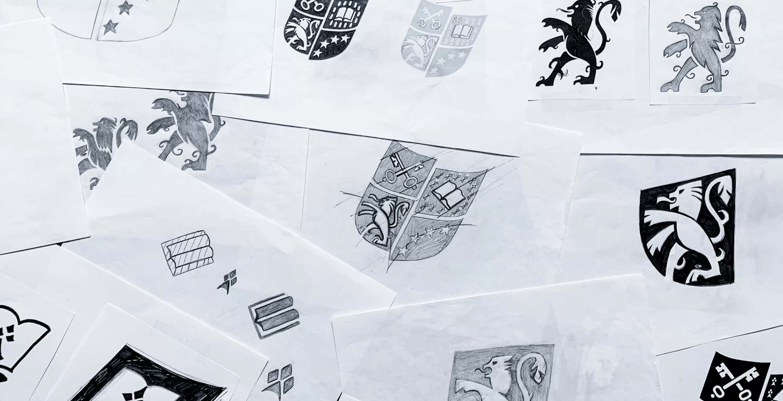
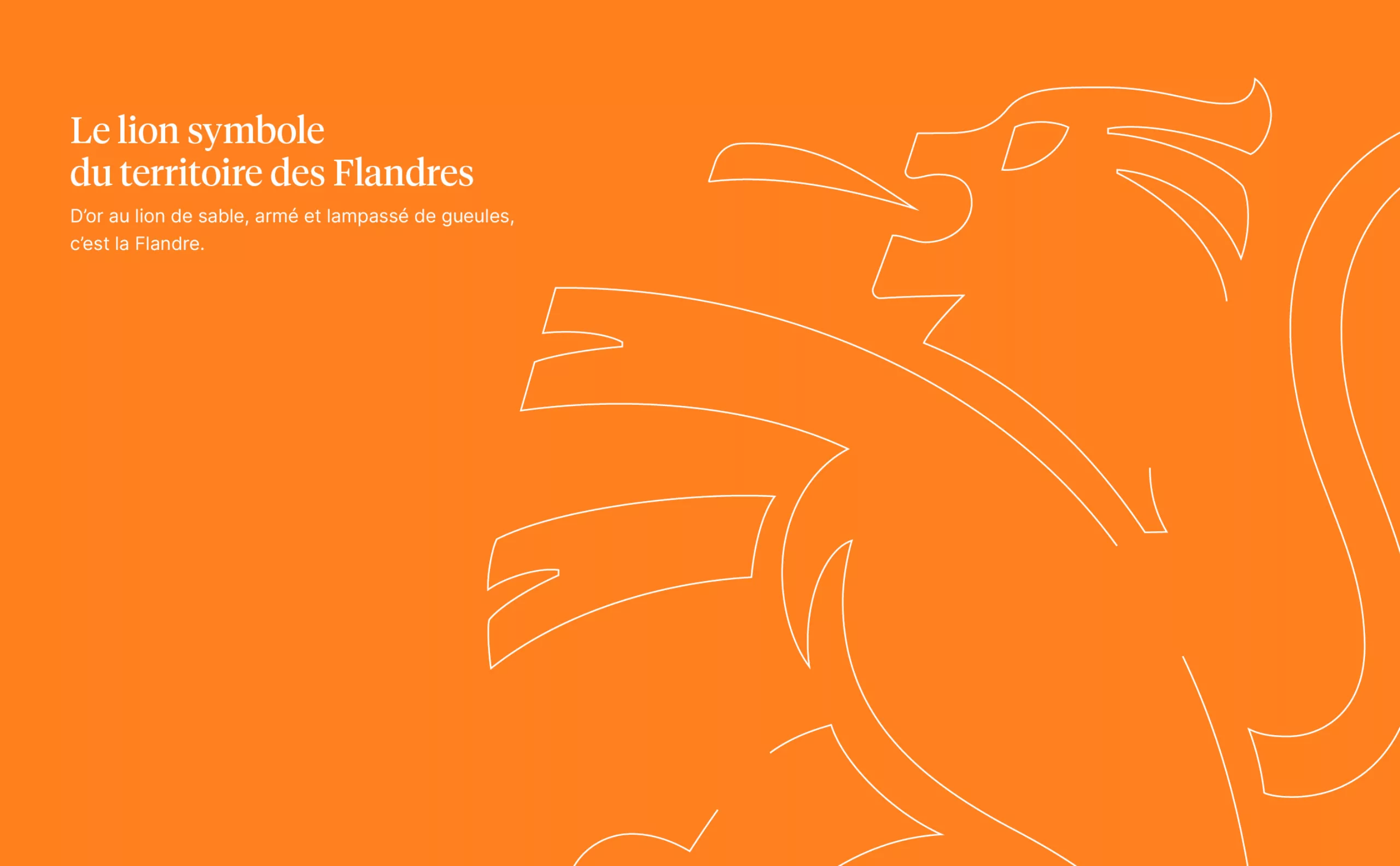
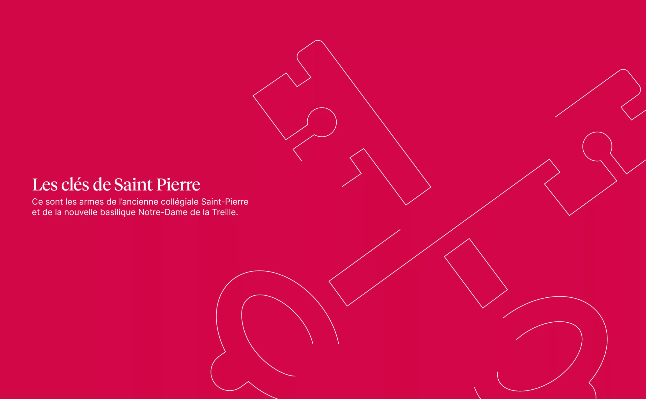
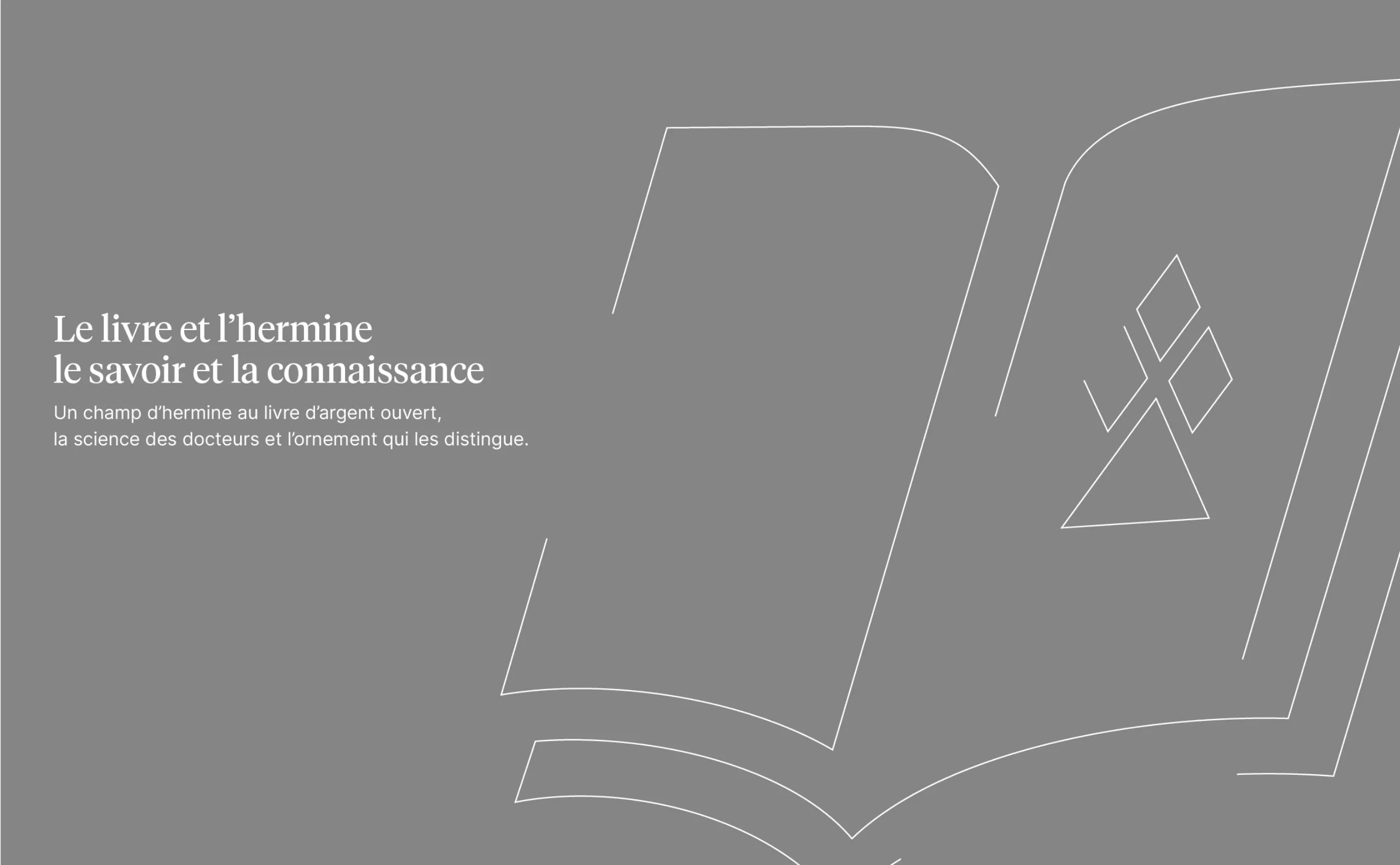
After questioning and rethinking the brief, Graphéine helped Université Catholique de Lille to modernize and clarify its overall visual identity. The project was built around workshops involving the institution’s stakeholders, focusing on the Université Catholique de Lille brand, its history and its attributes.

A new logo that updates the design of a centuries-old coat of arms

Université Catholique de Lille’s visual identity was primarily based on its heraldic coat of arms, but in a redesigned version with its fair share of clumsiness and approximations. It’s a symbol immediately associated with the university world, and one that characterises the longevity and legitimacy of the institution. We wanted to preserve the coat of arms’ age-old structure, while modernising it to make it more legible and better suited to digital media. The four heraldic symbols have been redesigned. The shape of the shield has been rounded off, while its angle of inclination has been reasserted.

We can still find the keys of Saint Peter, a reminder of the University’s origins, the lion symbolising the territory of Flanders, and the book and ermine embodying knowledge and learning. The last quarter of the coat of arms has seen its symbol evolve over time, and is now composed of WWthe European stars, affirming its openness to the world. The original colours of the coat-of-arms have been retained, but have evolved for a brighter rendering and better overall contrast.

Typefaces aligned with the university’s ambitions and values

The previous wordmark was composed in the Cocoon typeface. This typeface is widely used in the food and packaging industries. We chose the contemporary typeface Tiempos Headline by Klim Type Foundry to compose the wordmark, but also as the typeface family for the editorial content of all Université Catholique de Lille communication materials. This serif typeface helps convey the university’s academic excellence. These stylistic choices further anchor the North European university aesthetic. The entire brand architecture is based on the same typeface. The italicized “1875” signature has been retained and is now perfectly integrated into the brand block.

A graphics standards manual that unites the university’scomponents under a common banner

The new brand architecture, based on the Tiempos Headline typeface and the modernised coat of arms, provides a coherent voice for all of the university’s courses, institutes and facilities. Distinct colour palettes have been developed to identify each entity, be it a faculty or a student assistance service, for example.

The graphic guidelines provide the basis for the design of the communication materials, drawing on the various ingredients of the brandidentity. Photographs are treated with a colour filter to indicate the corresponding faculty, making it easier to associate images with the right sub-brand. A holding shape derived from the curves of the coat-of-arms is overlayed on the images. This holding shape creates a well-defined zone for organising the text content.

By updating and reaffirming its historic coat of arms, Université Catholique de Lille is uniting all its students and staff under a single banner. The new brand identity is a blend of modernity and tradition. With rejuvenated colours and contemporary typography, the identity reflects itsambition to be a leading academic institution, rooted in the values of humanism, ethics, optimism and openness, and resolutely focused on the future.