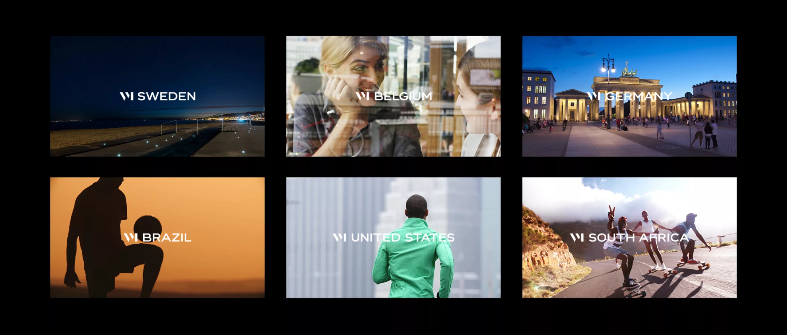
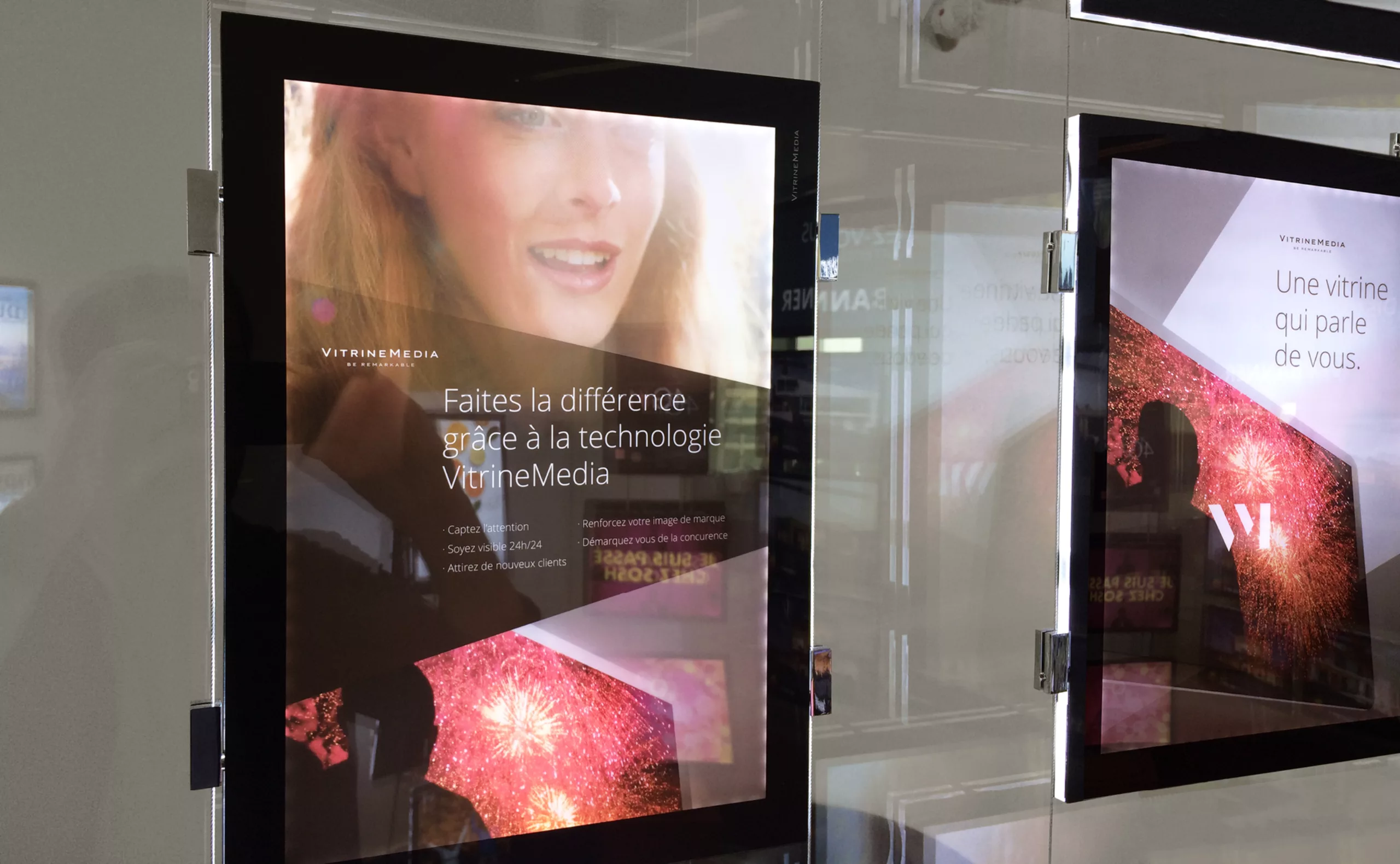
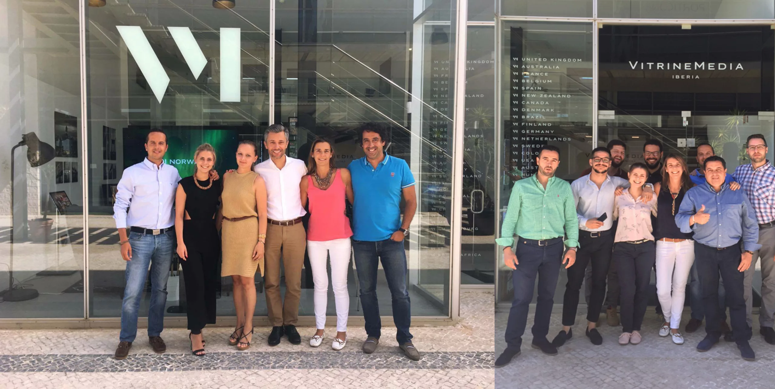
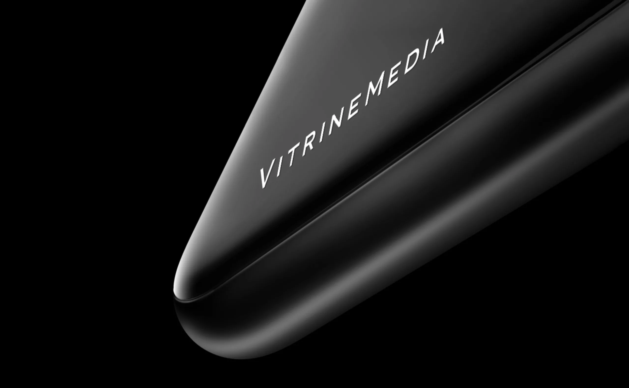
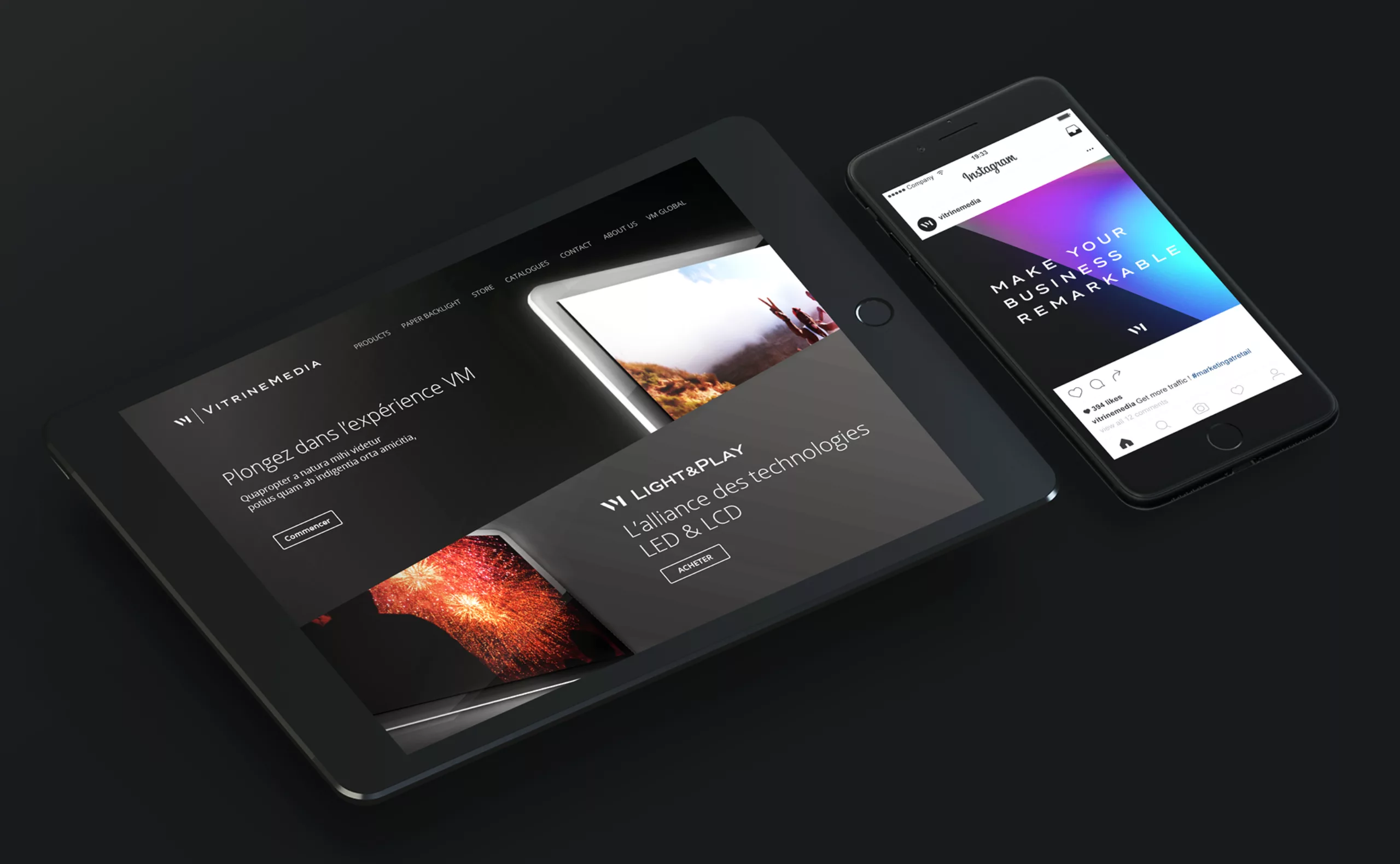
VitrineMedia is the pioneer and world leader in LED displays specially designed for retail spaces. Graphéine upgrades the company’s brand image, and brings consistency to the graphic identity that is deployed in more than 25 countries around the world.

VitrineMedia
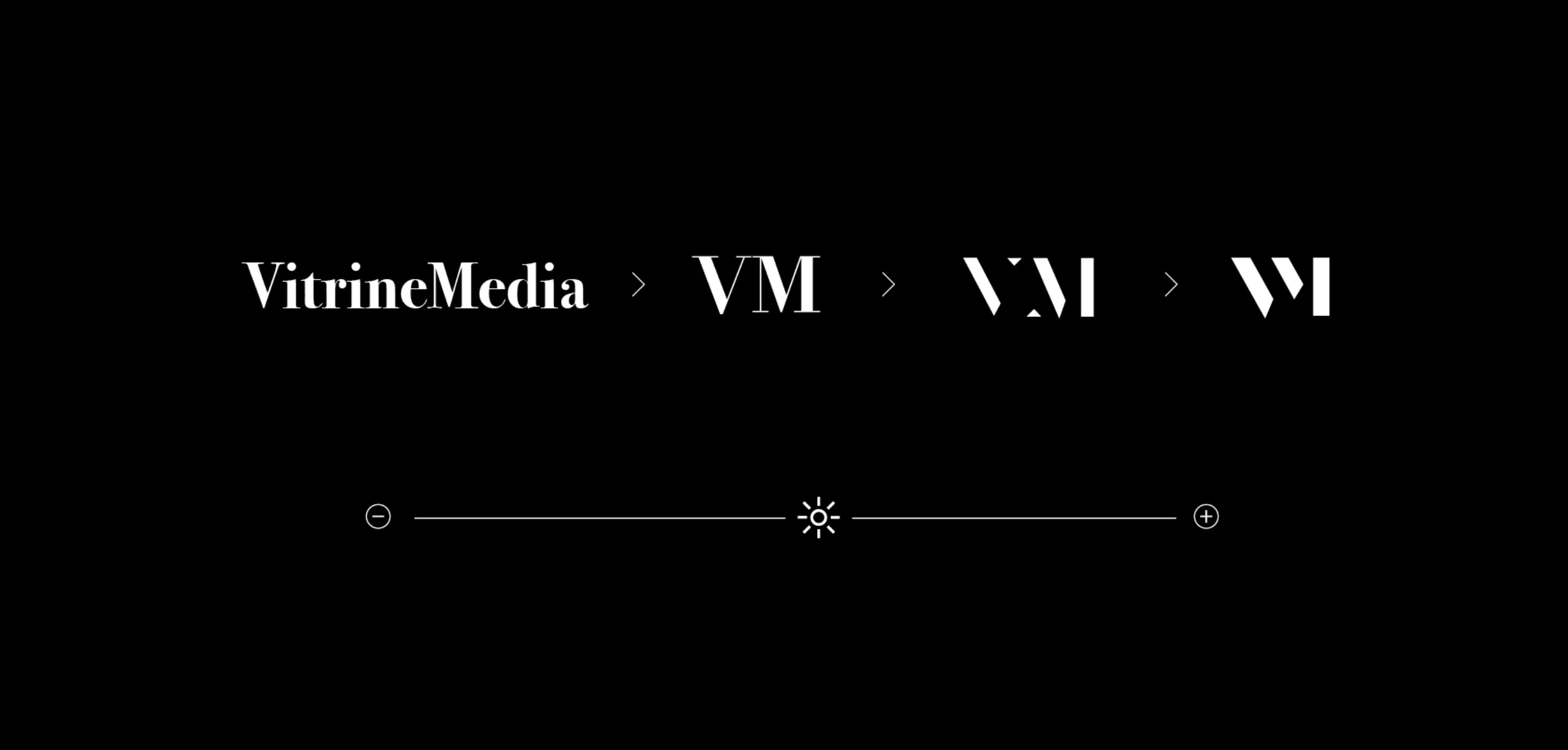
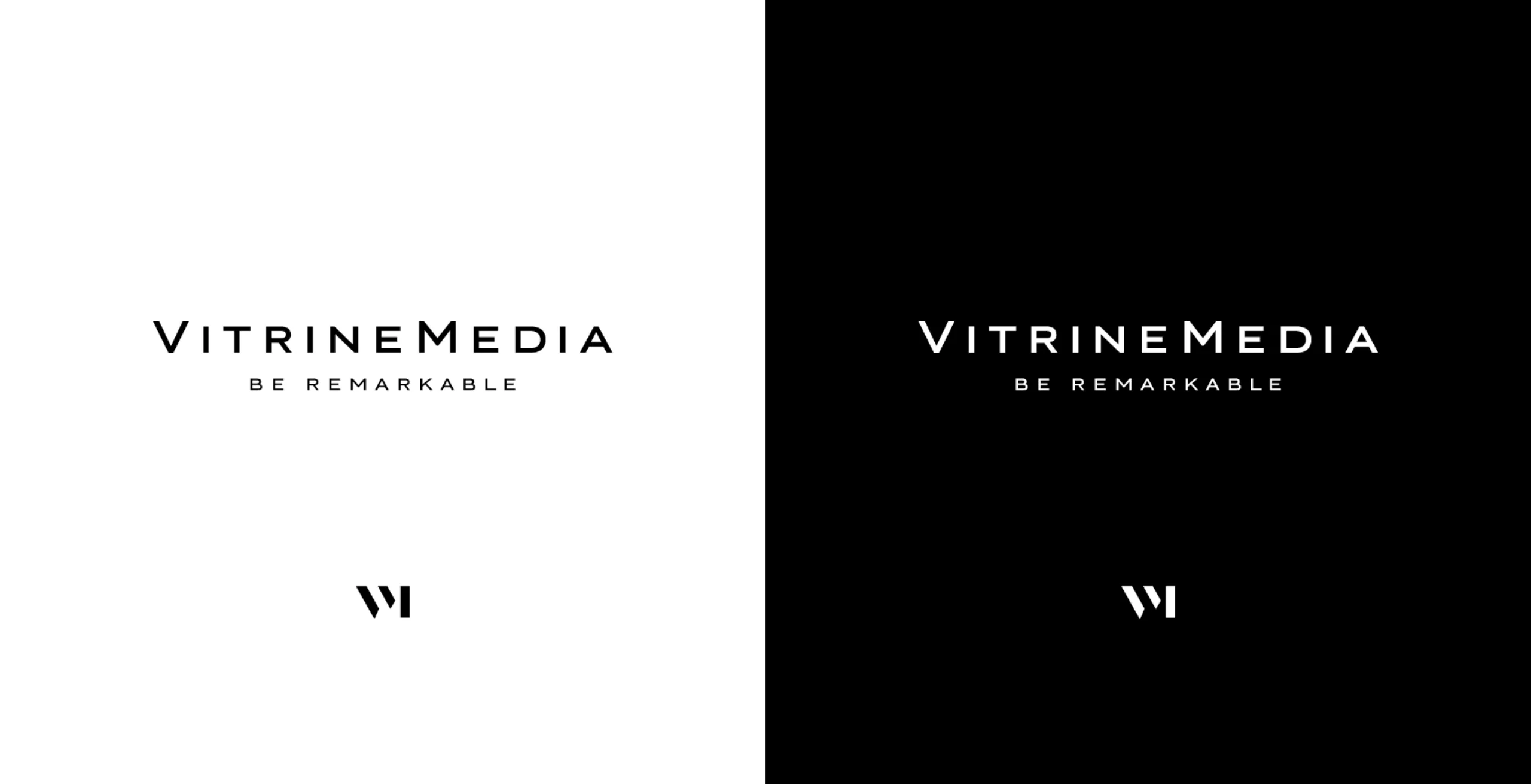
VitrineMedia, a new visual identity, minimalist and sophisticated
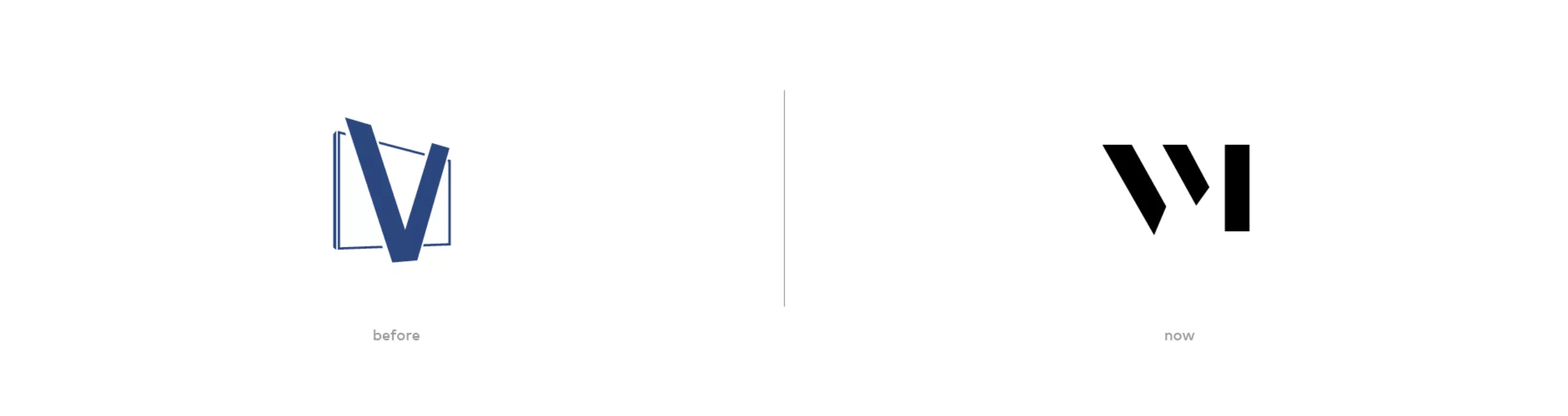
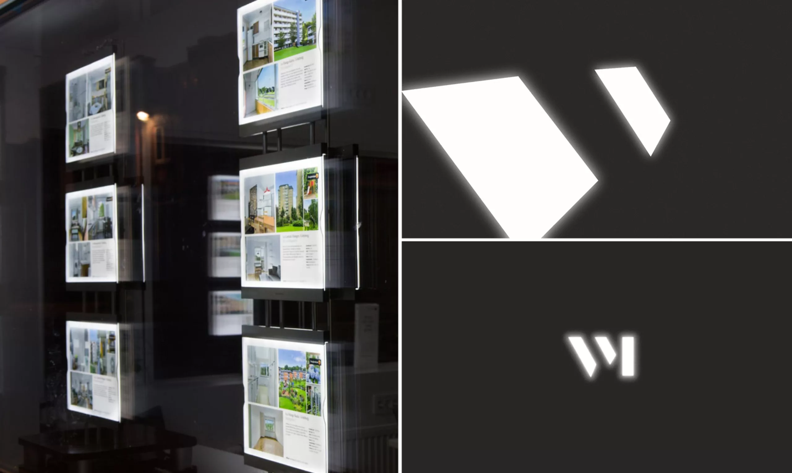
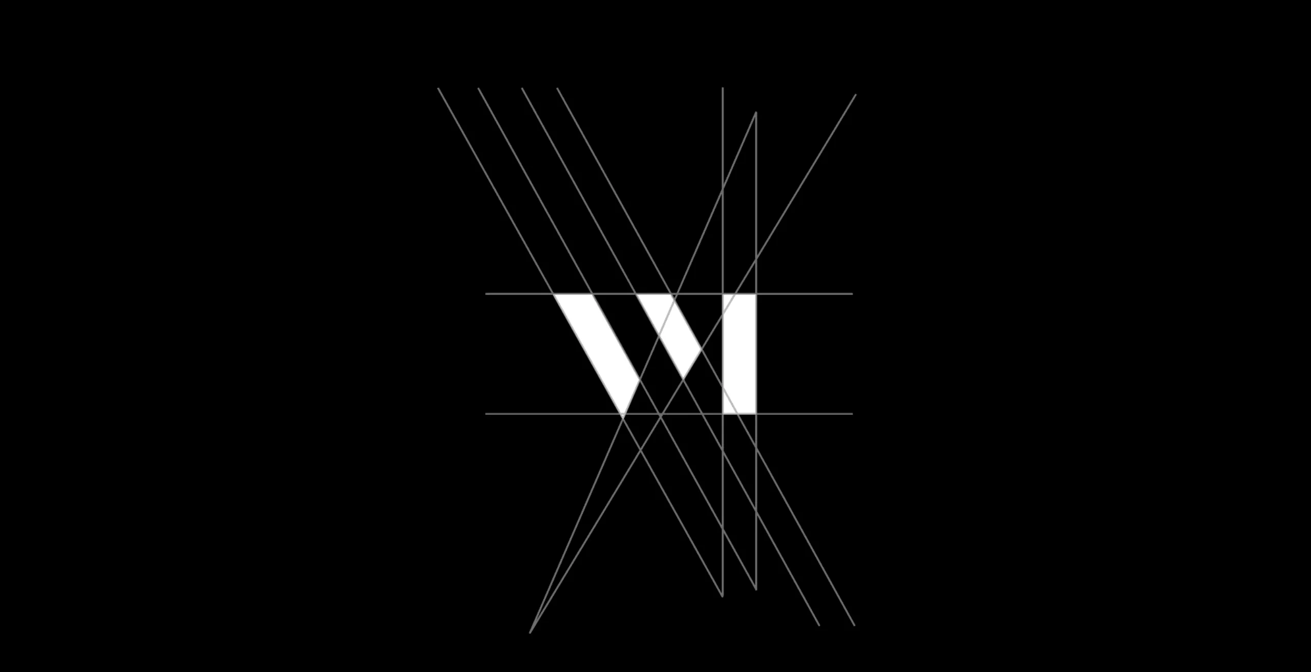
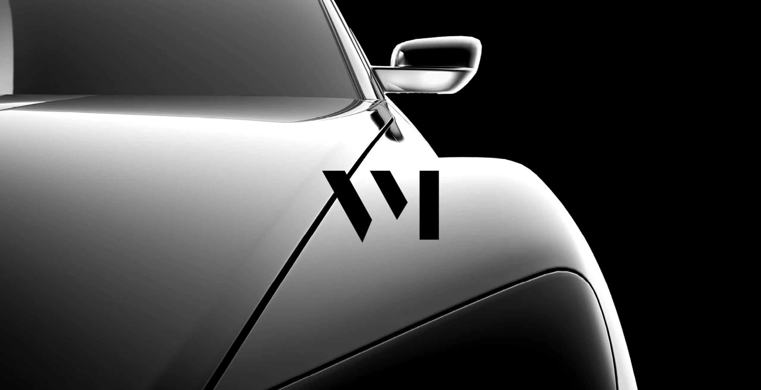
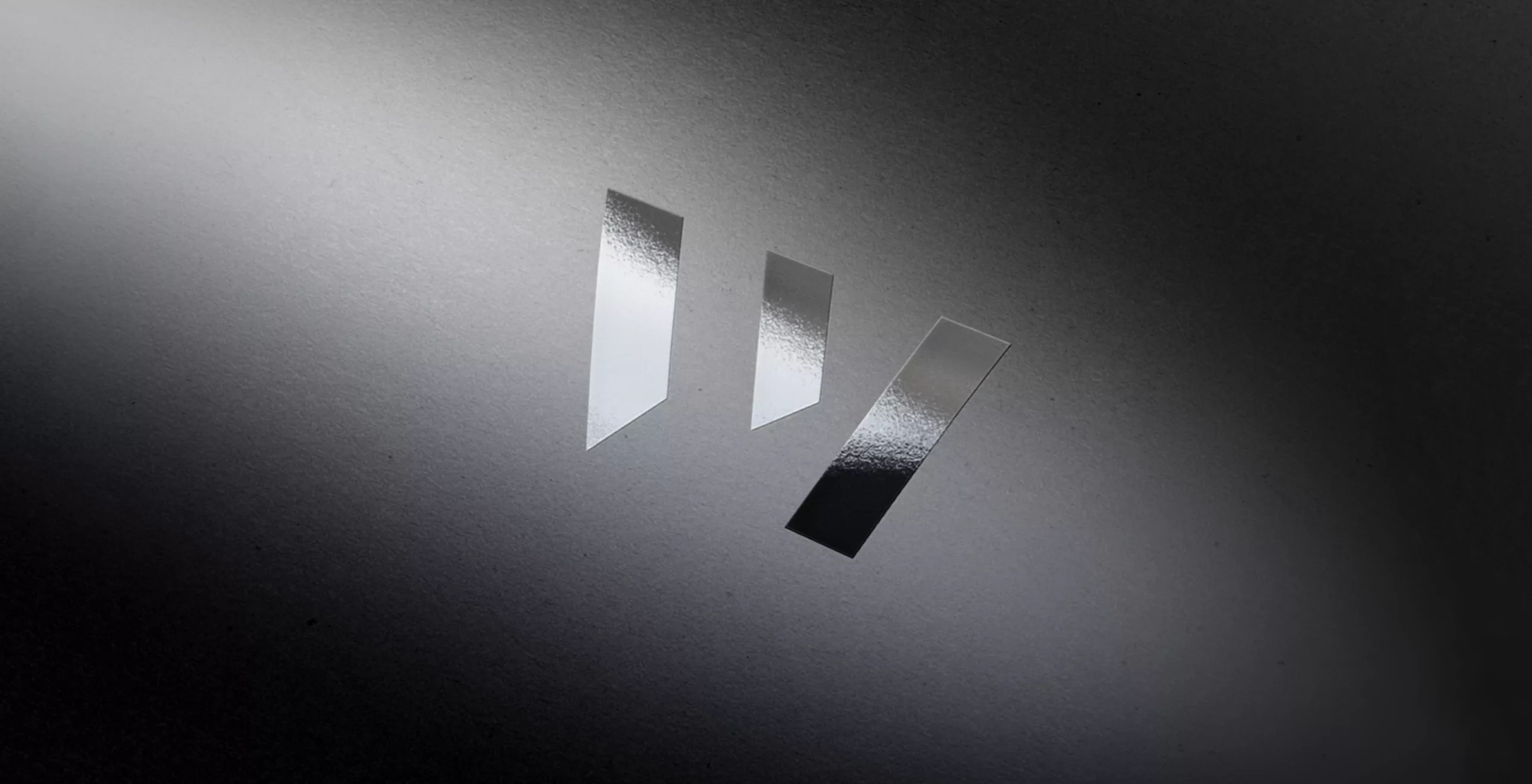
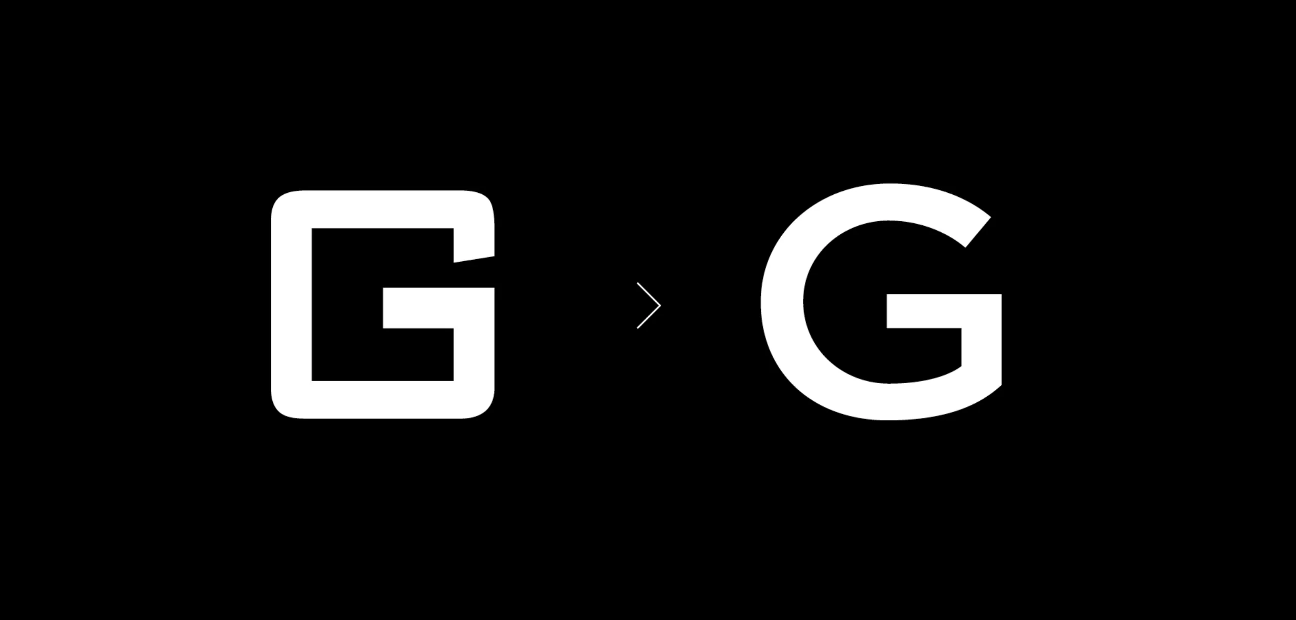
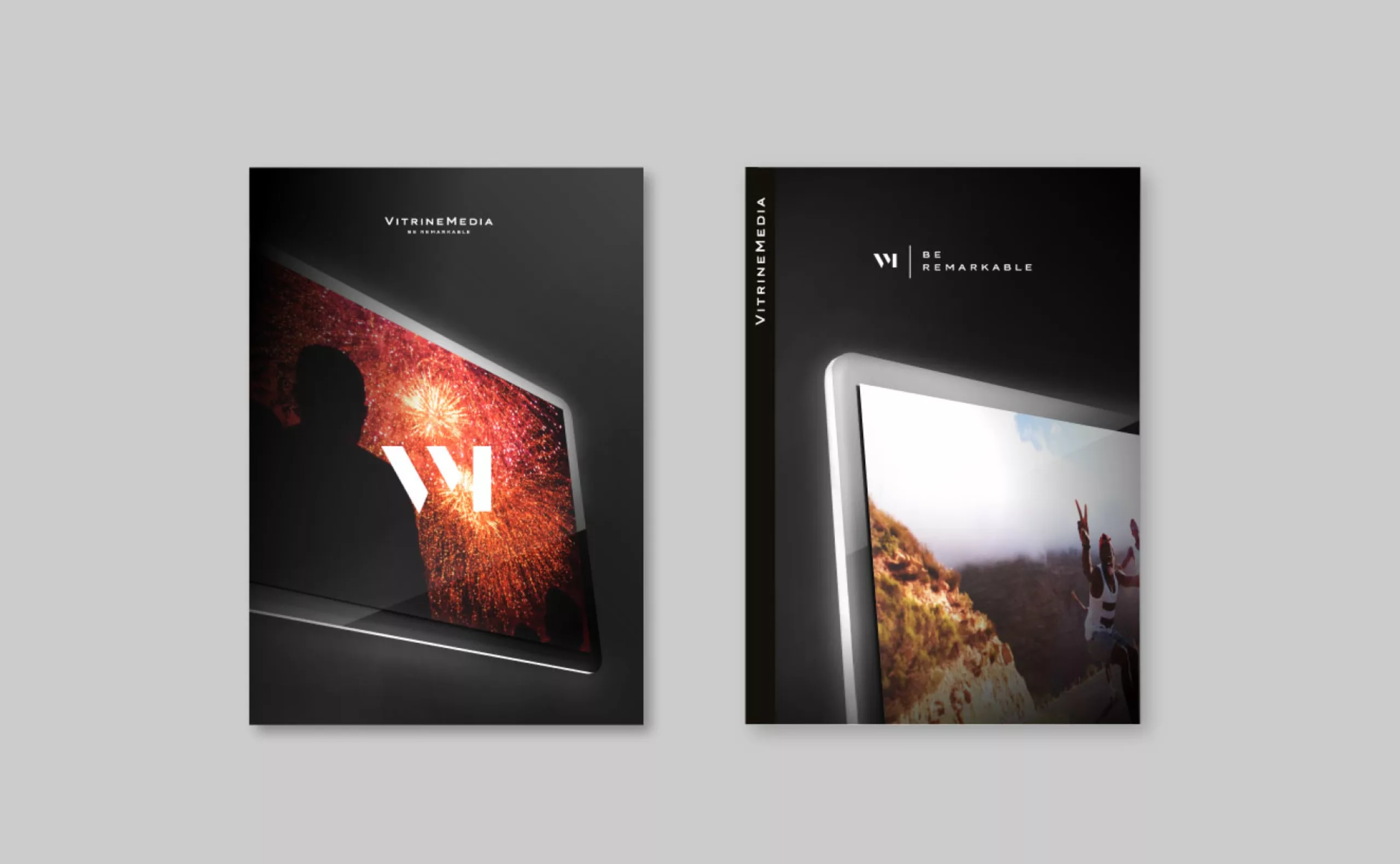
The new VitrineMedia icon is a monogram resulting from the V and M ligature. Its geometrical “stencil” treatment evokes a luminous screens perspective.
At the edge of abstraction, it is both a acronym and a symbol whose style is close to pictograms and digital interfaces designs. The VM icon is like a “goldsmith’s punch”, that guarantees the quality of the products manufactured at the VM workshop. Using the major codes of the renowned parisian luxury houses, VitrineMedia now assumes its leader position, while offering the possibility to expand its clientele for all the retail sphere.
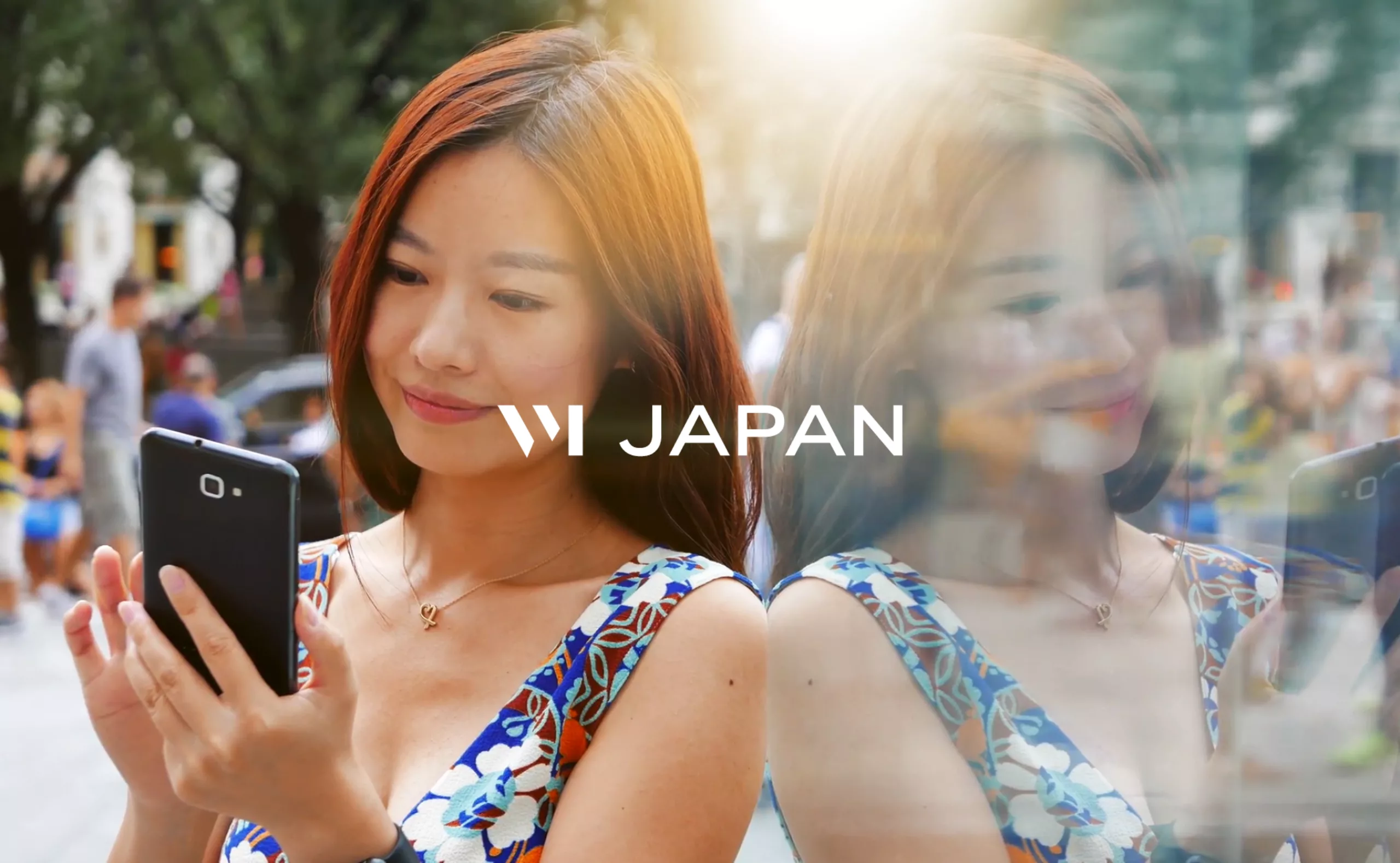
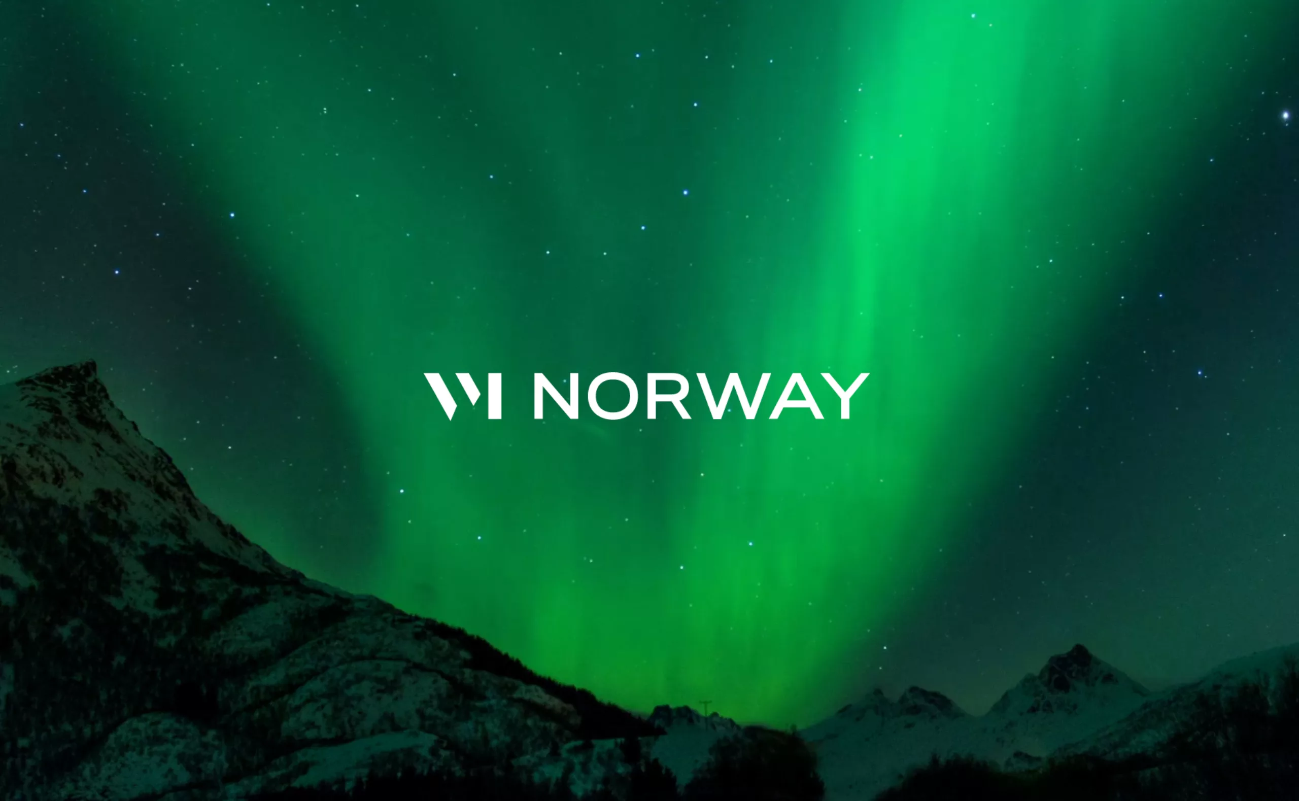
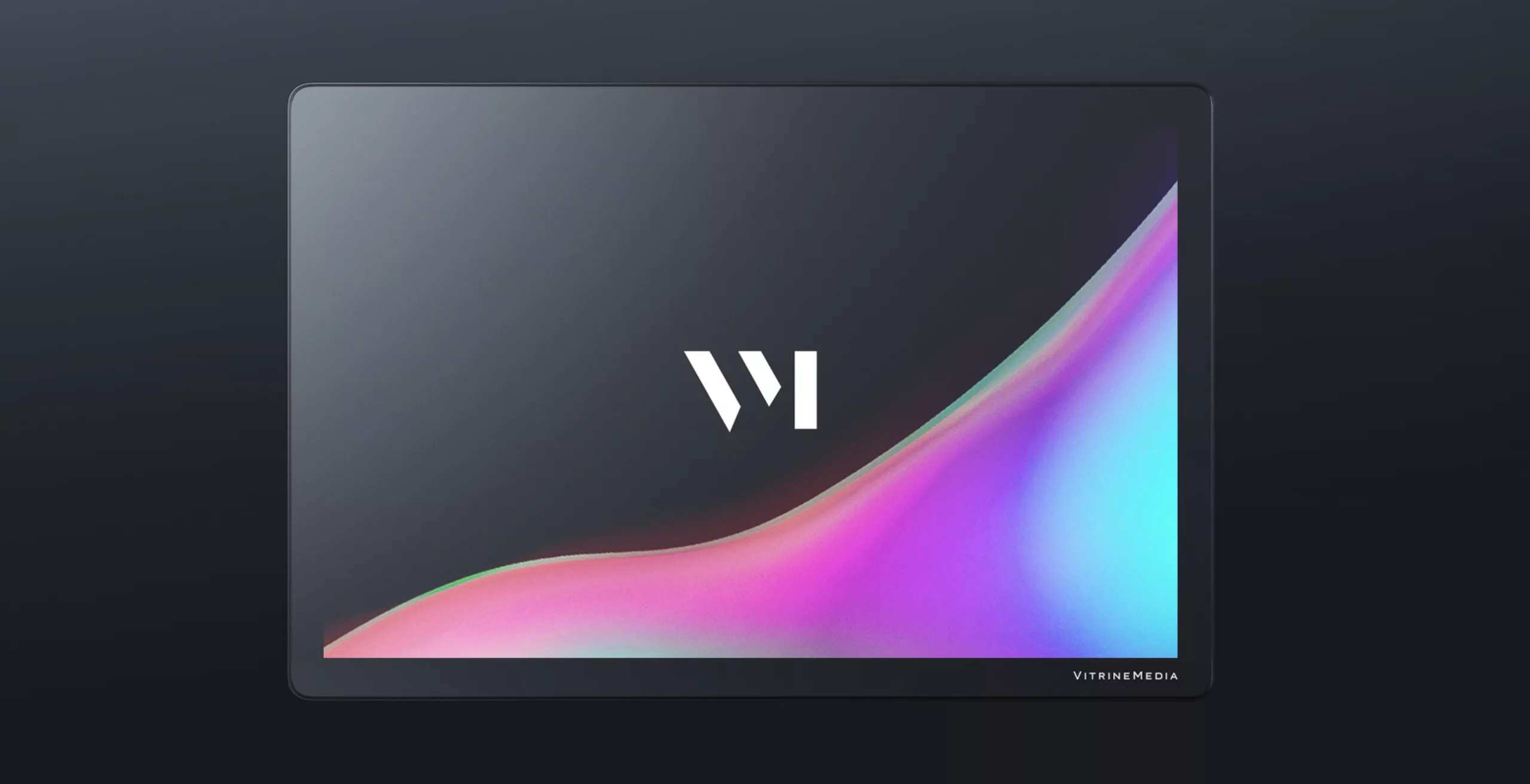
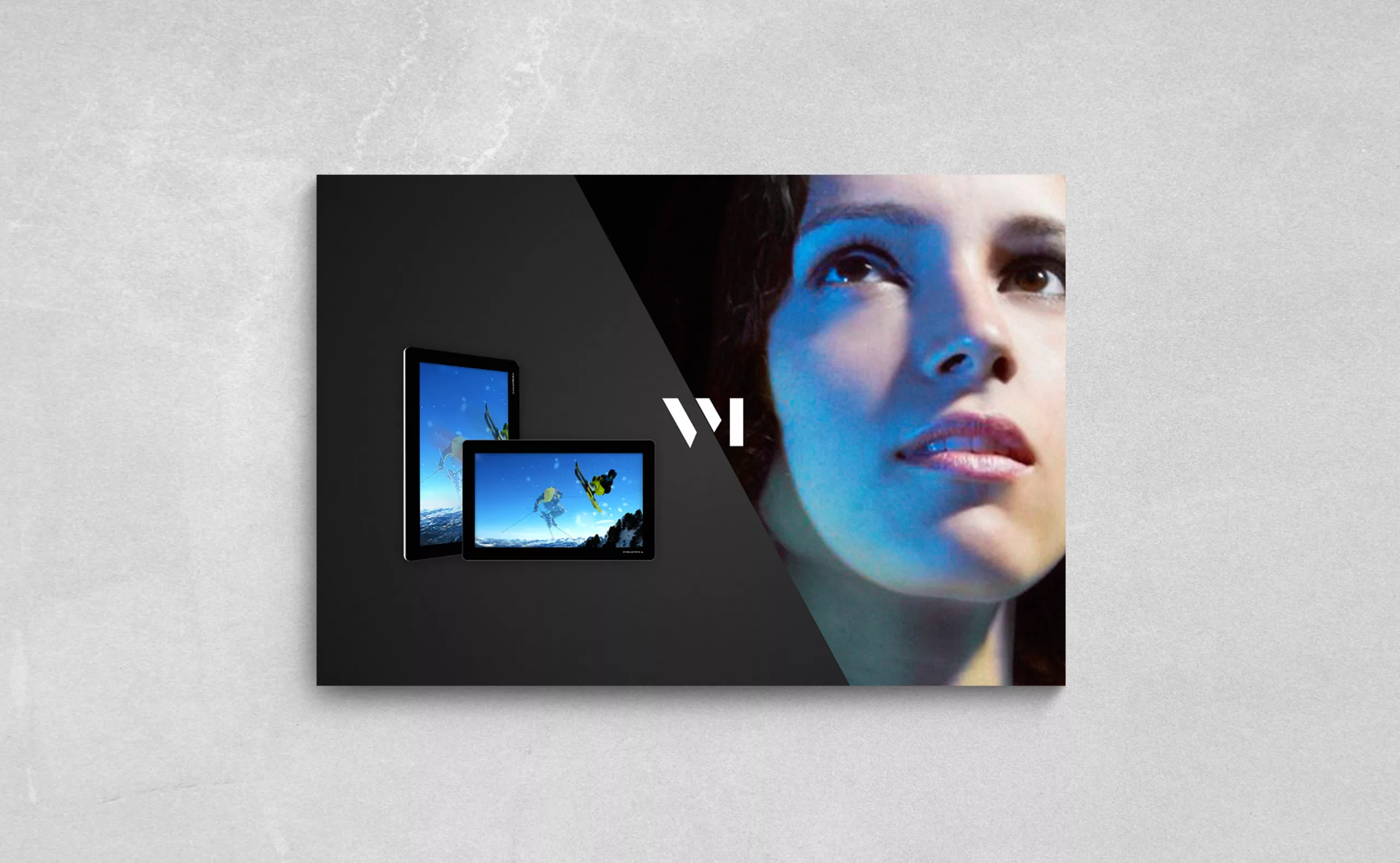
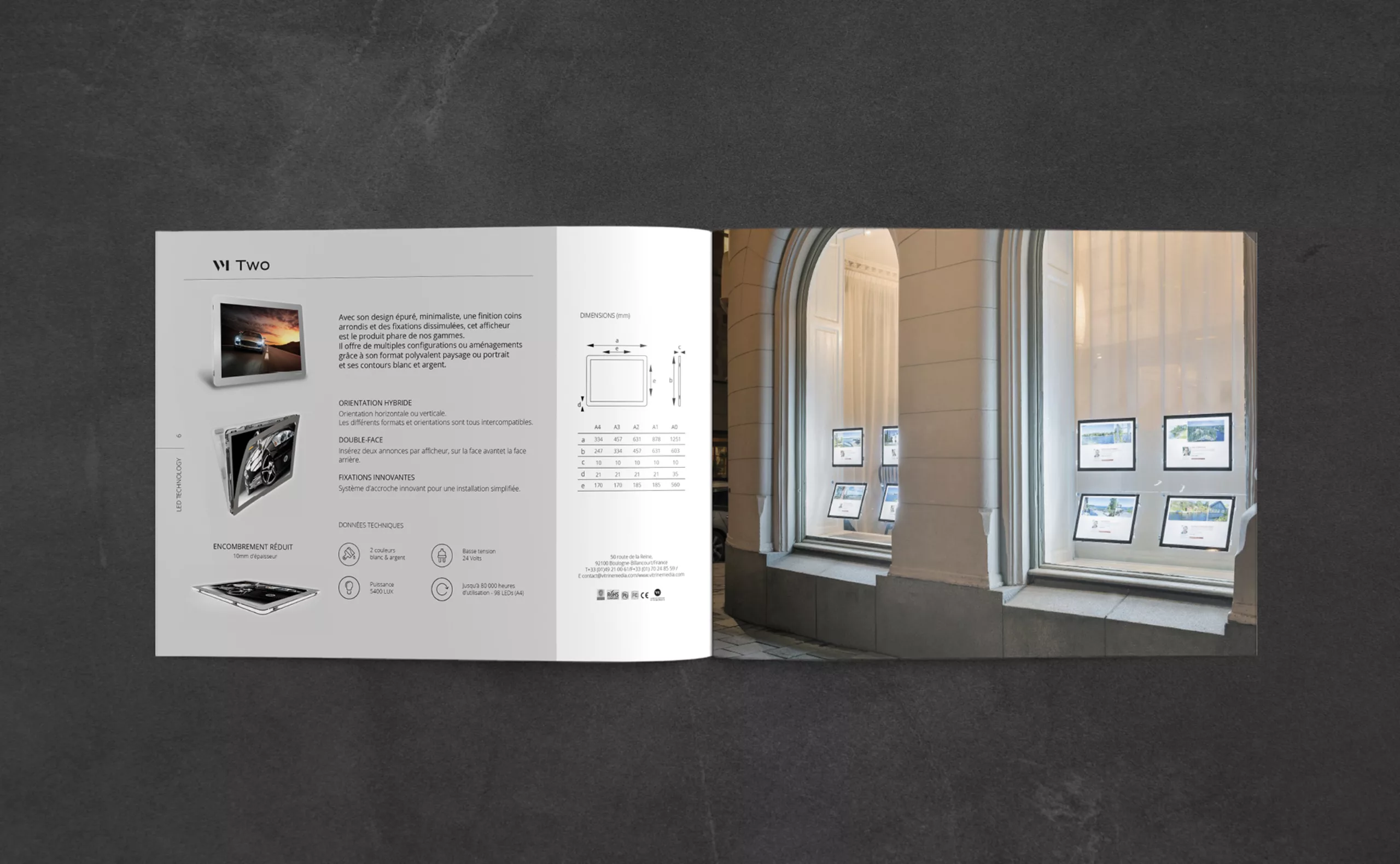
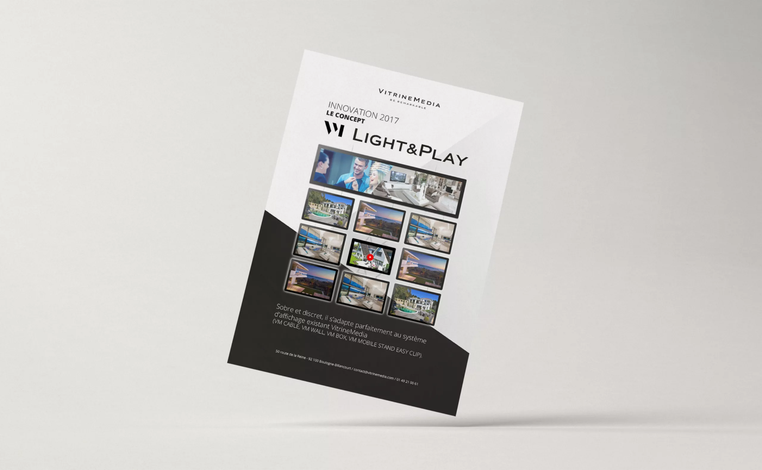
The VM trademark is applied to the new VitrineMedia products nomenclature: VM Light & Play, VM Two, etc.
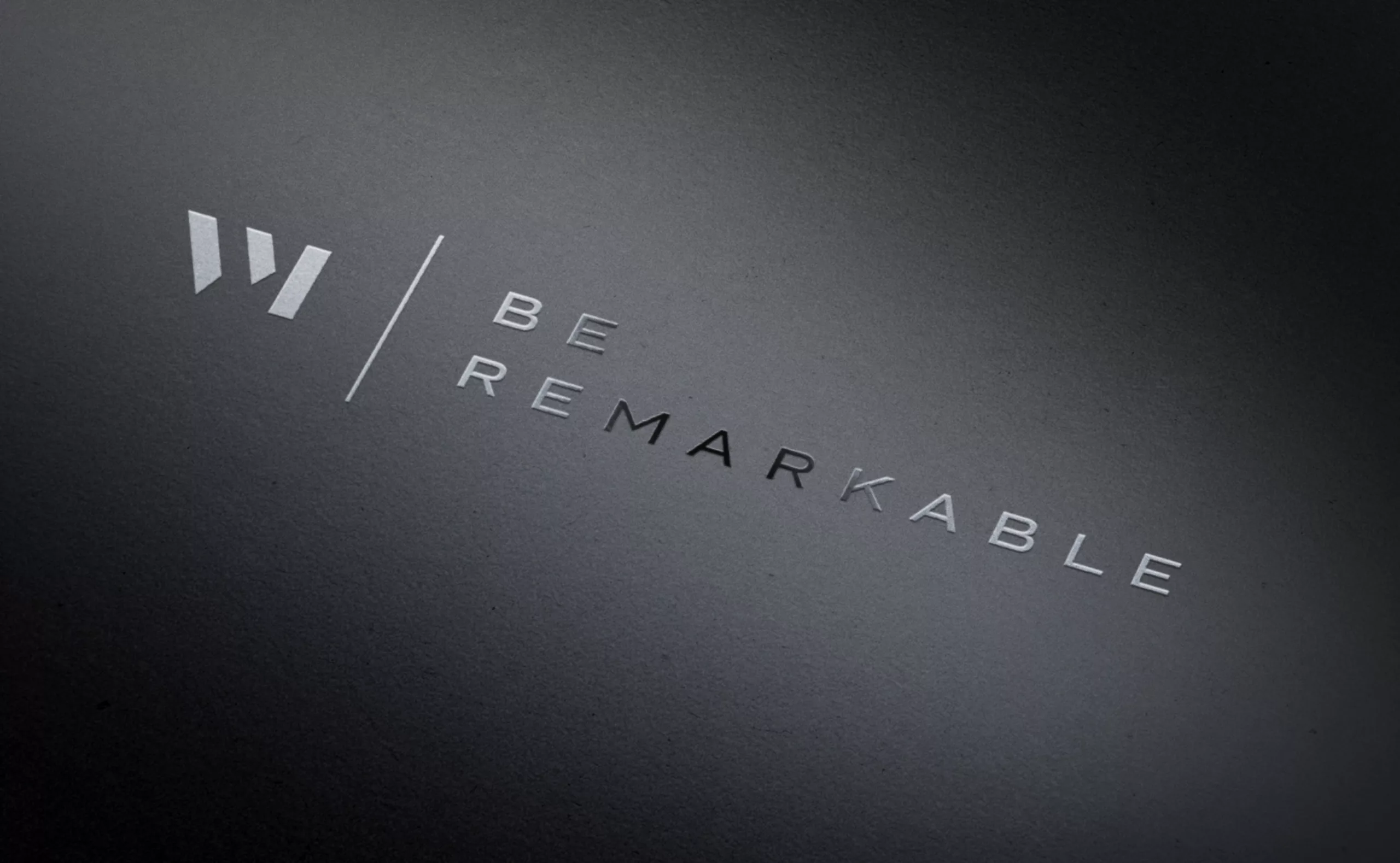
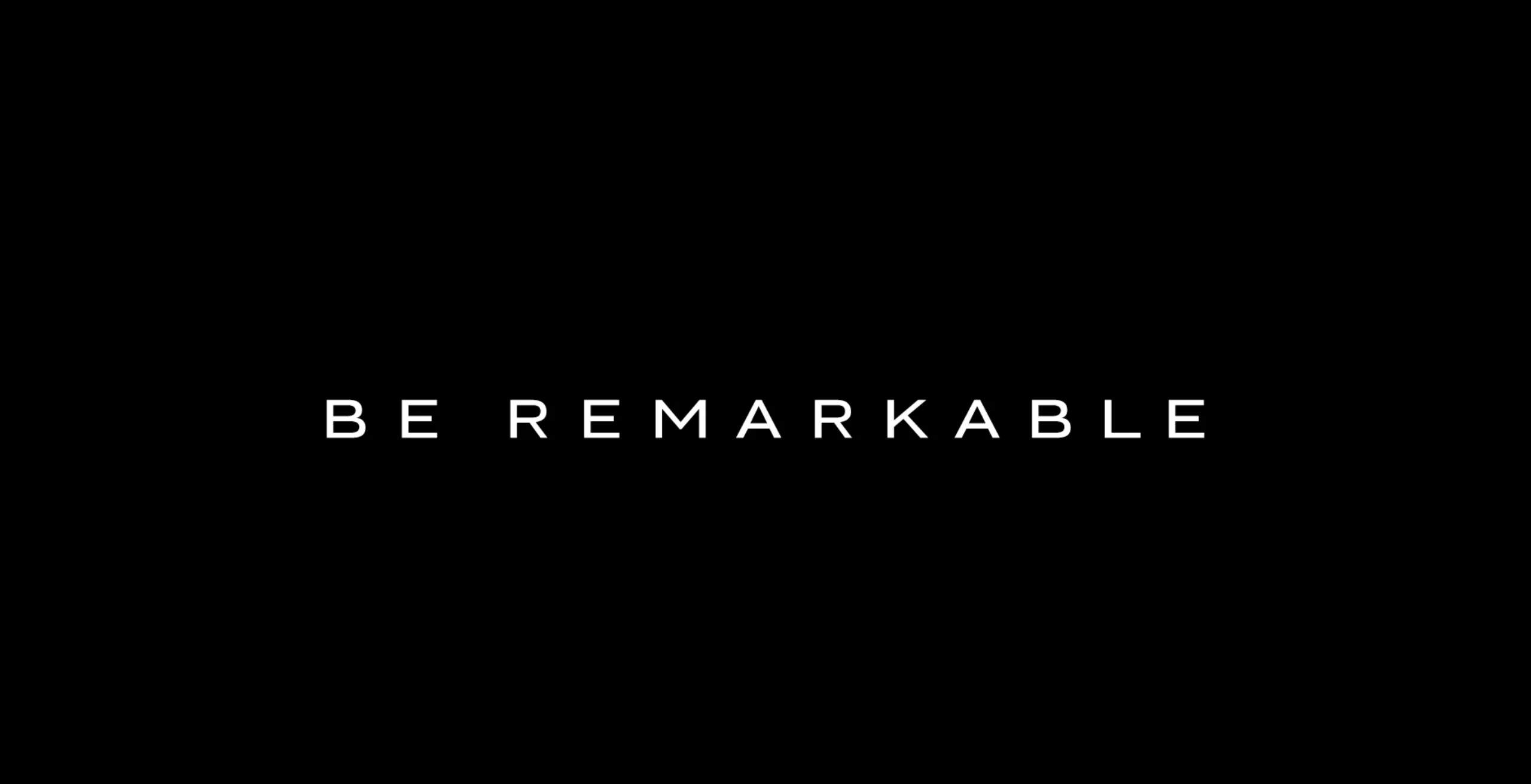
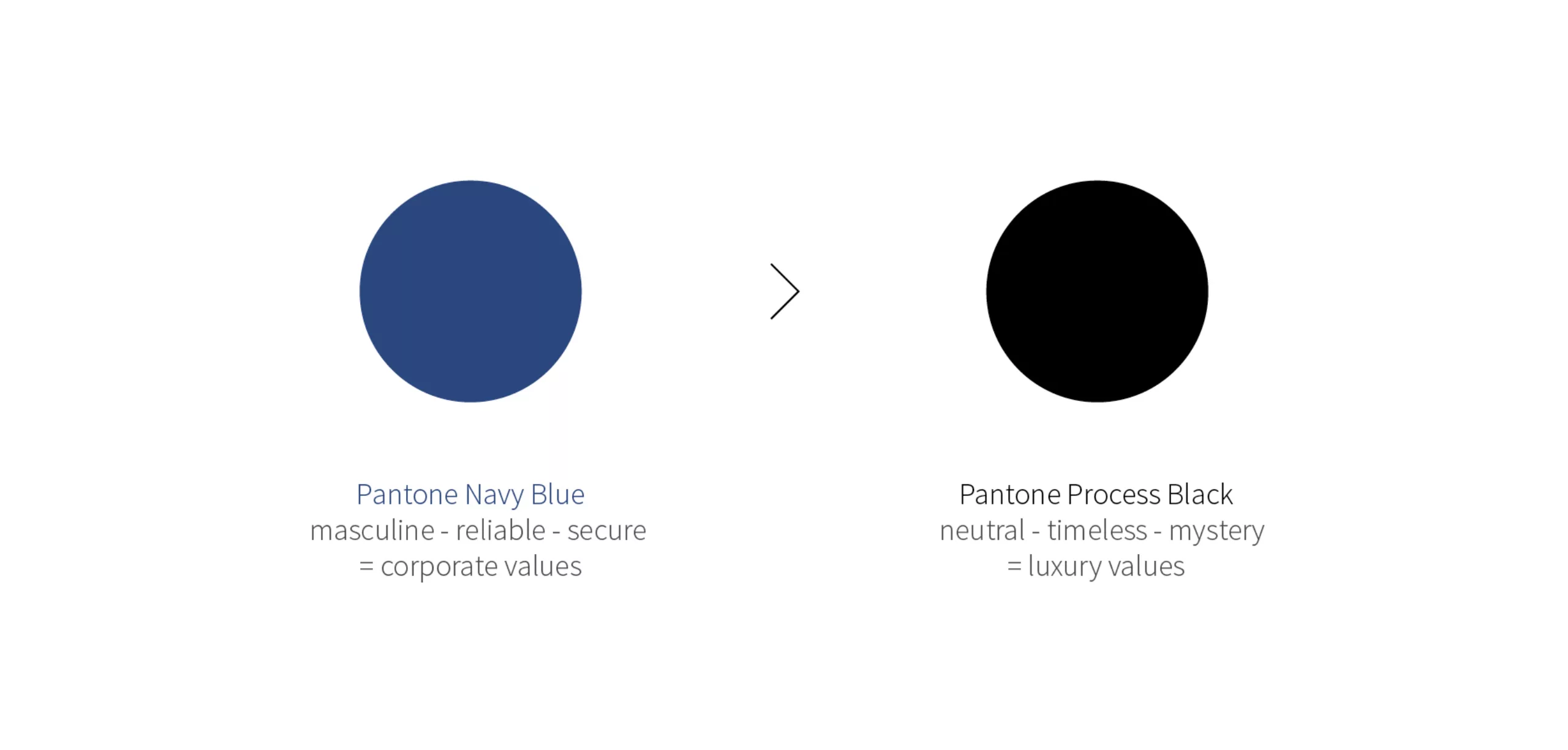
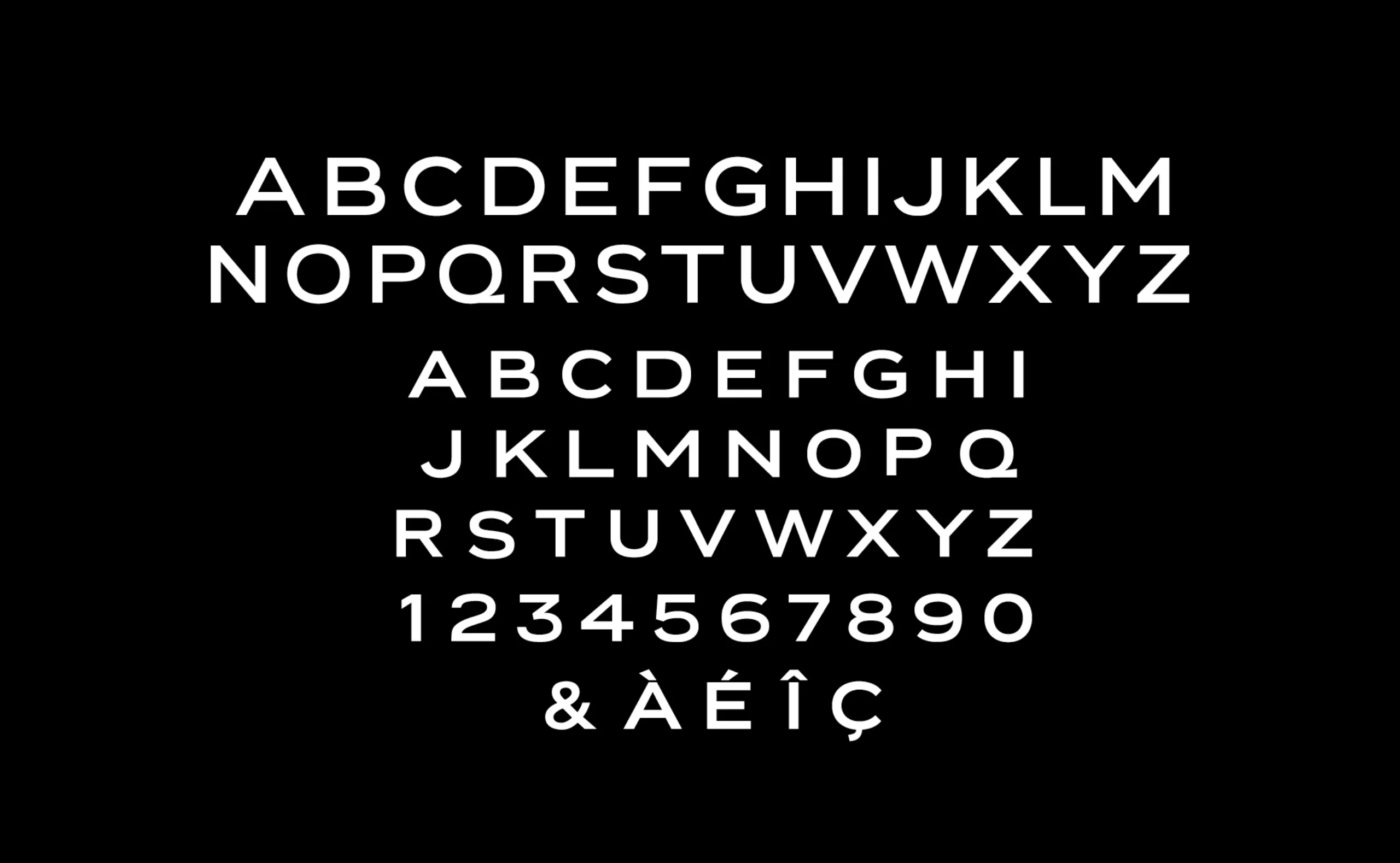
This new logotype aims at making VitrineMedia the ambassador of a simple, sophisticated and timeless design. Its graphic design diverts from Didones capitals drawings where contrast has been pushed to the extreme, until the complete loss of hairlines. This typographical game causes an optical effect close to glare. Playing on the concept of fascination with light, the new icon reflects the promise of VitrineMedia: “Make your Business Remarkable”.


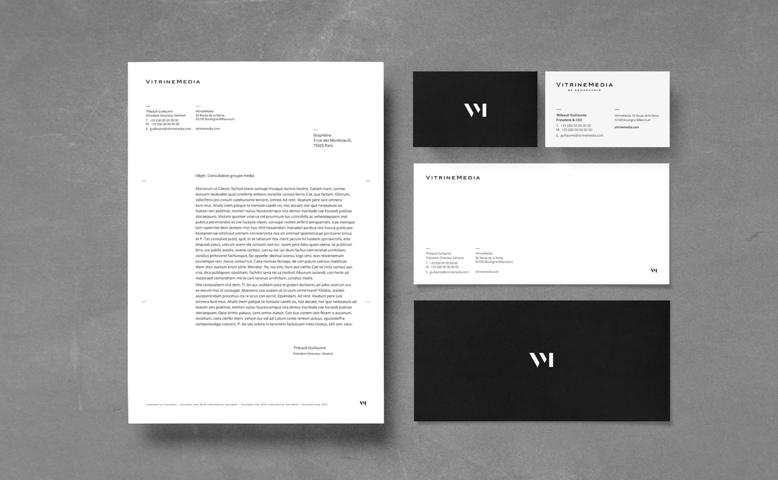
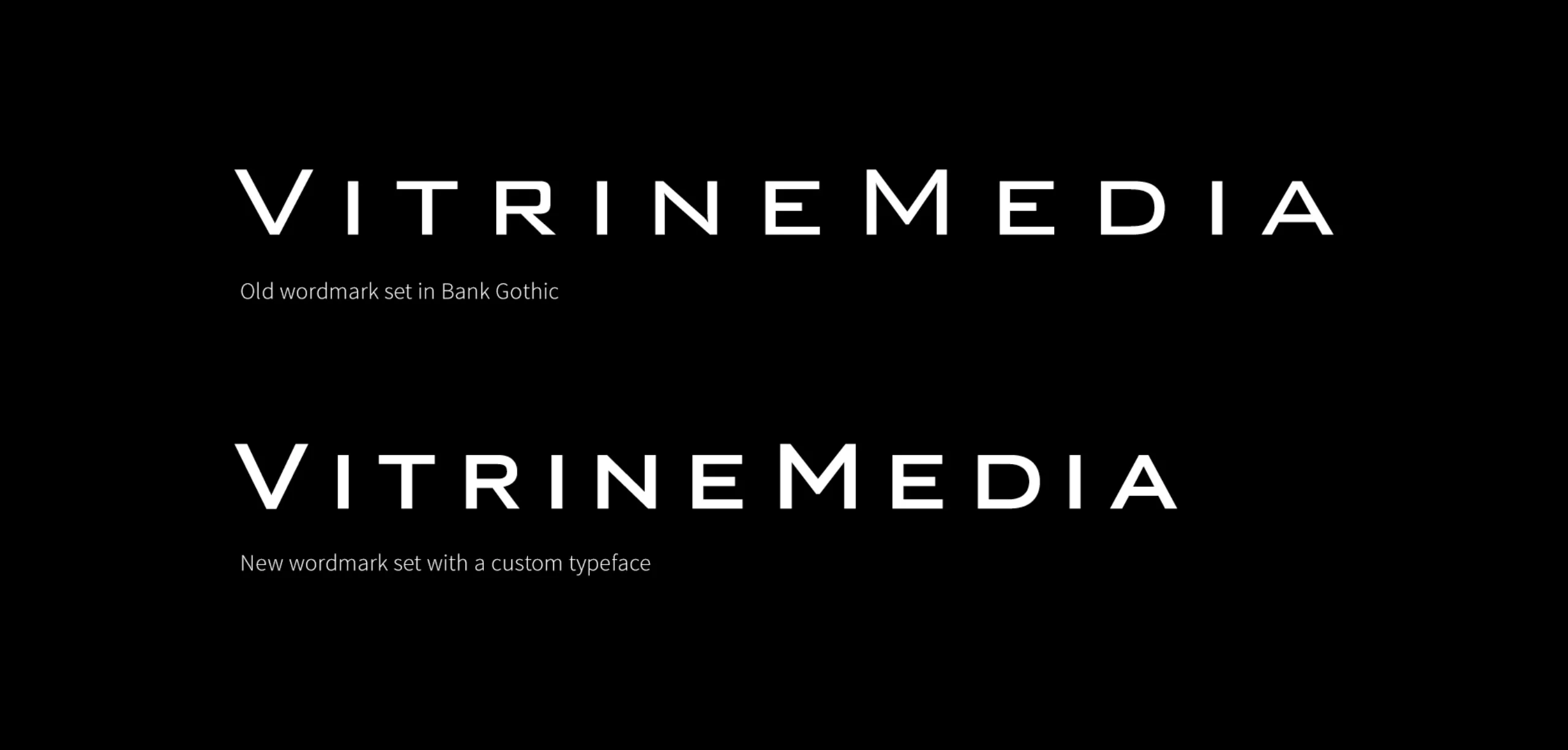

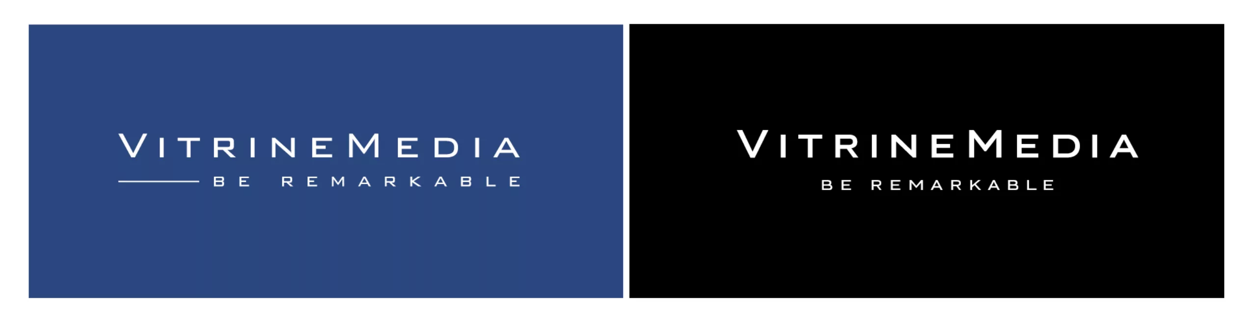
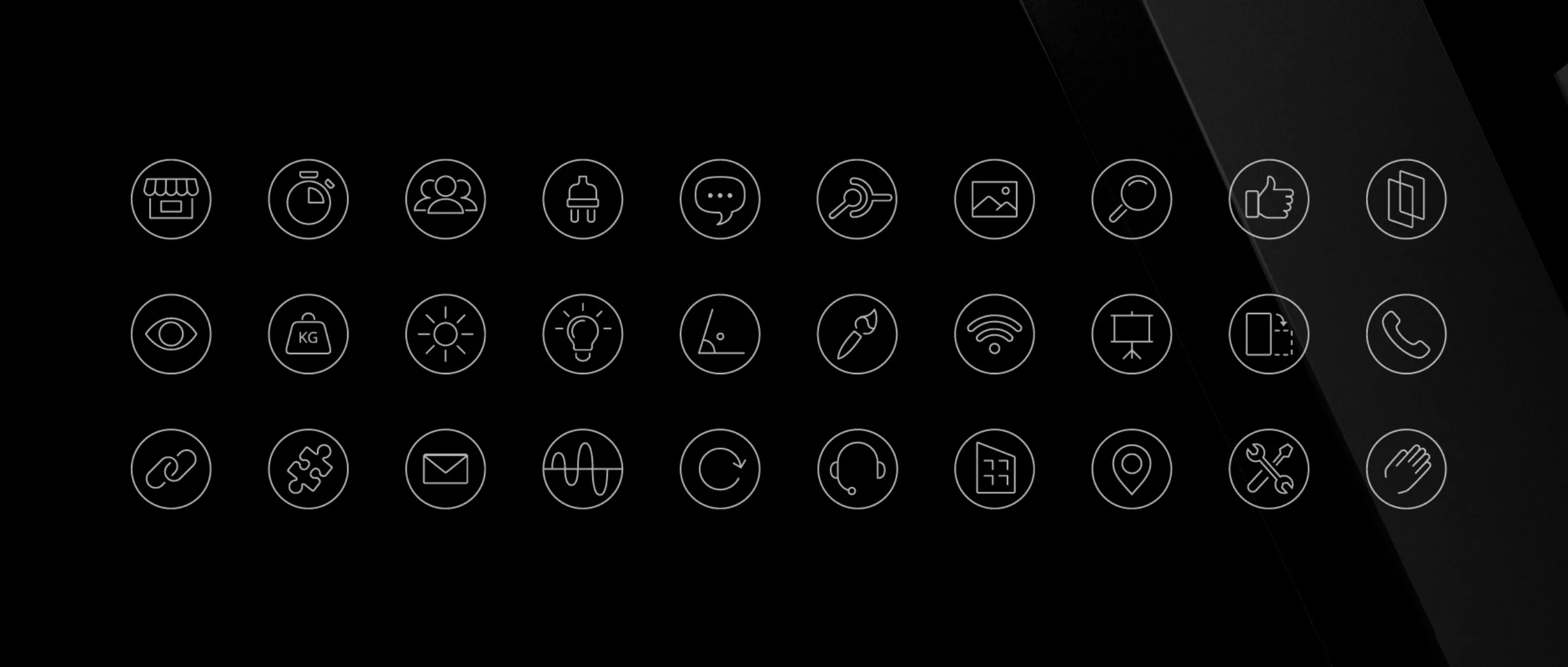
The new graphic charter also introduces an original typography specially designed for VitrineMedia. It is intend to be used through the 25 countries where the brand is settled, with the ambition to reinforce the cohesion and elegance of its communication. Its role is to shape logotypes and title elements from the communication applications. This new typography “VM font” replaces the Blank Gothic font designed in 1930 by Morris Fuller Benton, whose modular and square design evokes an obsolete robotic retro futurism.
The lifting of the VitrineMedia typographic wordmark put the brand up to date with the current digital codes by introducing a “grotesk” inspiration drawing. Rounder and more flexible, it is a balanced drawing, both technic and dynamic.
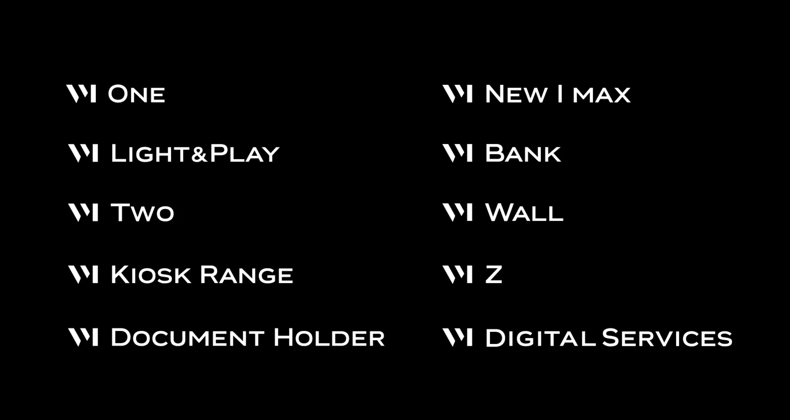
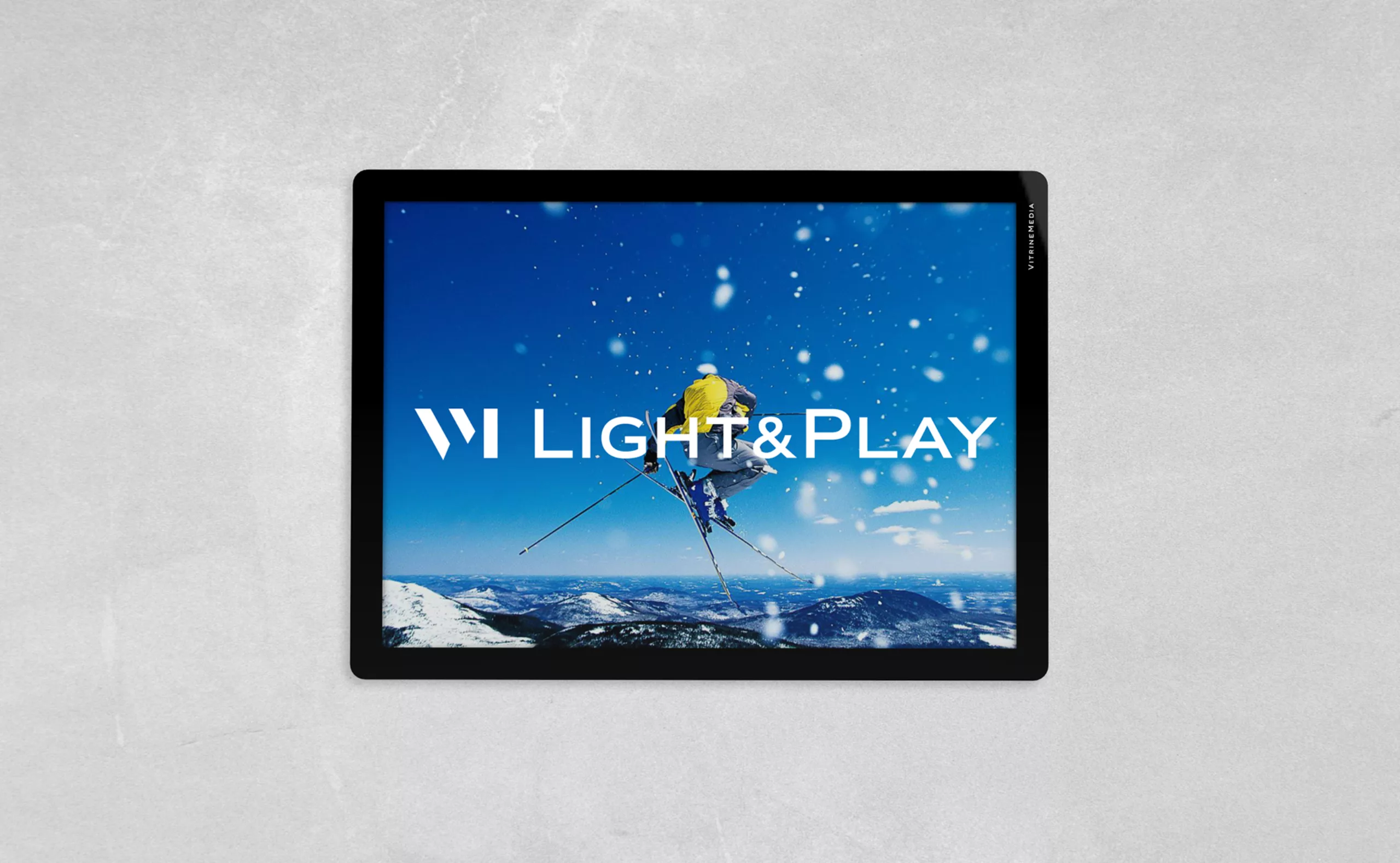
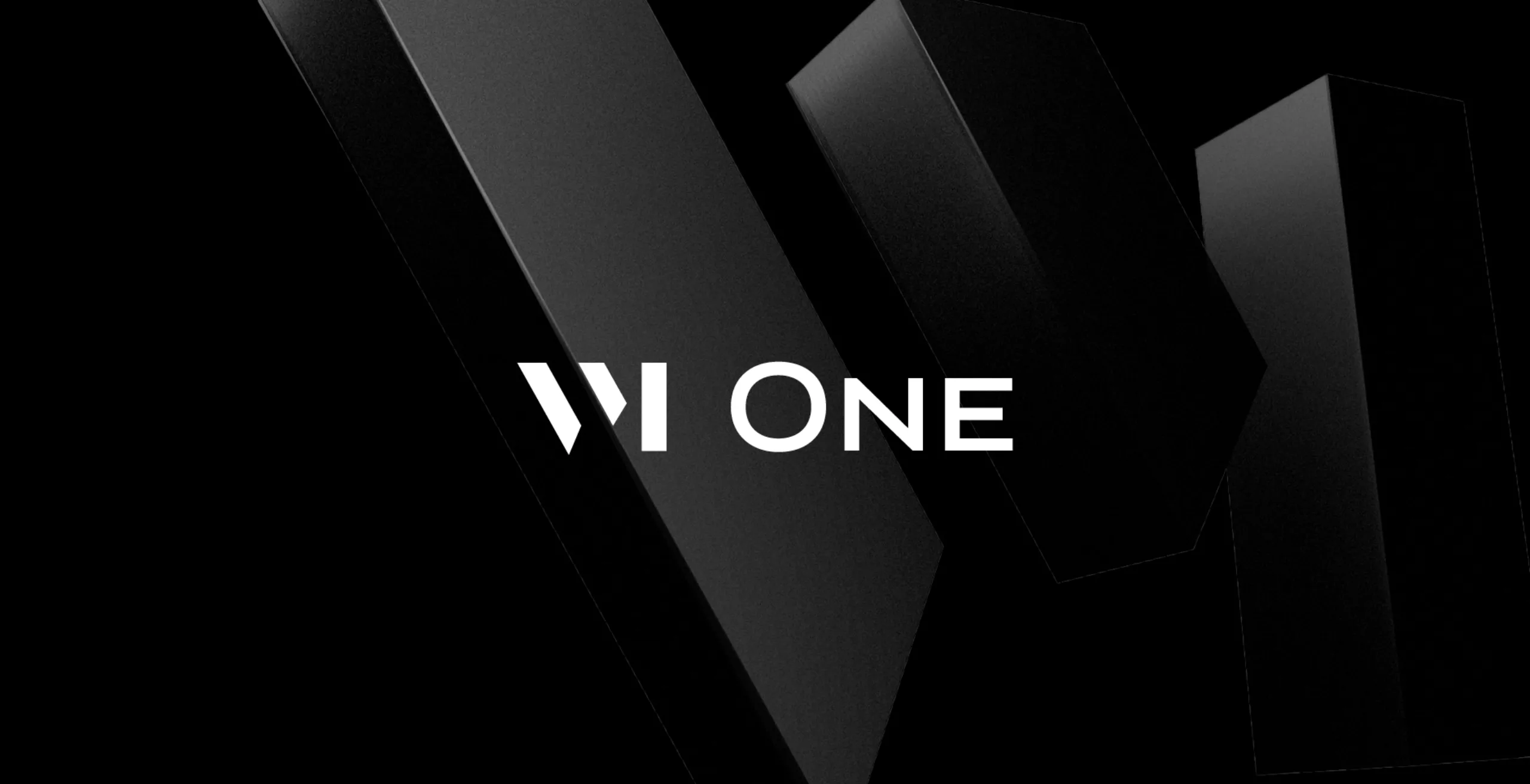
The new VM lettermark is now used in all the products sub-brands.
VitrineMedia videos: creation of an intro jingle and a signature packshot including an original sound design.