Archive
-
2026
-

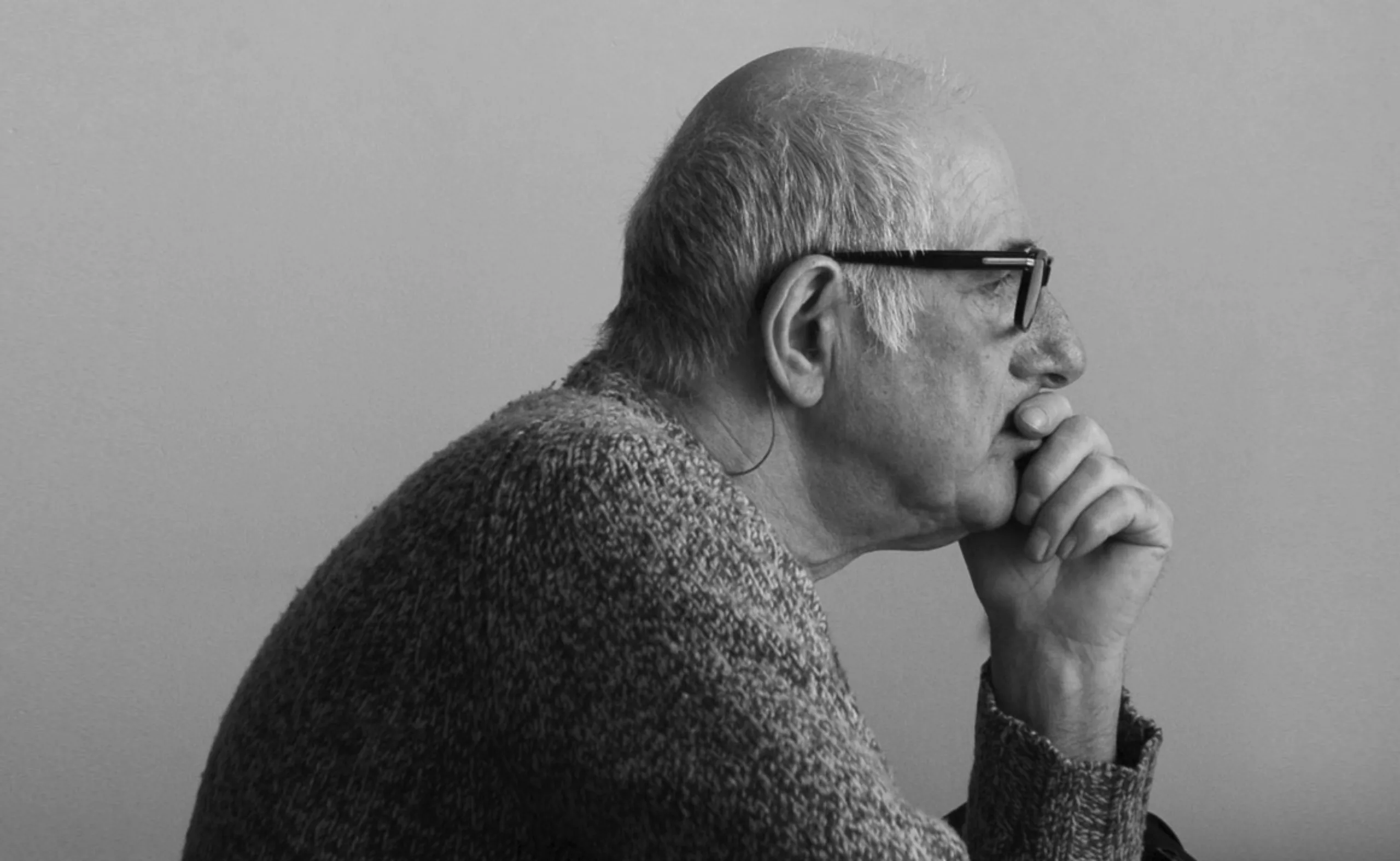
3 Questions for Paul Vacca About the Brand
Paul Vacca analyzes the evolution of brands: the disappearance of the claim, new strategies, fluid identities, and the concept of a “habitable world.”
-

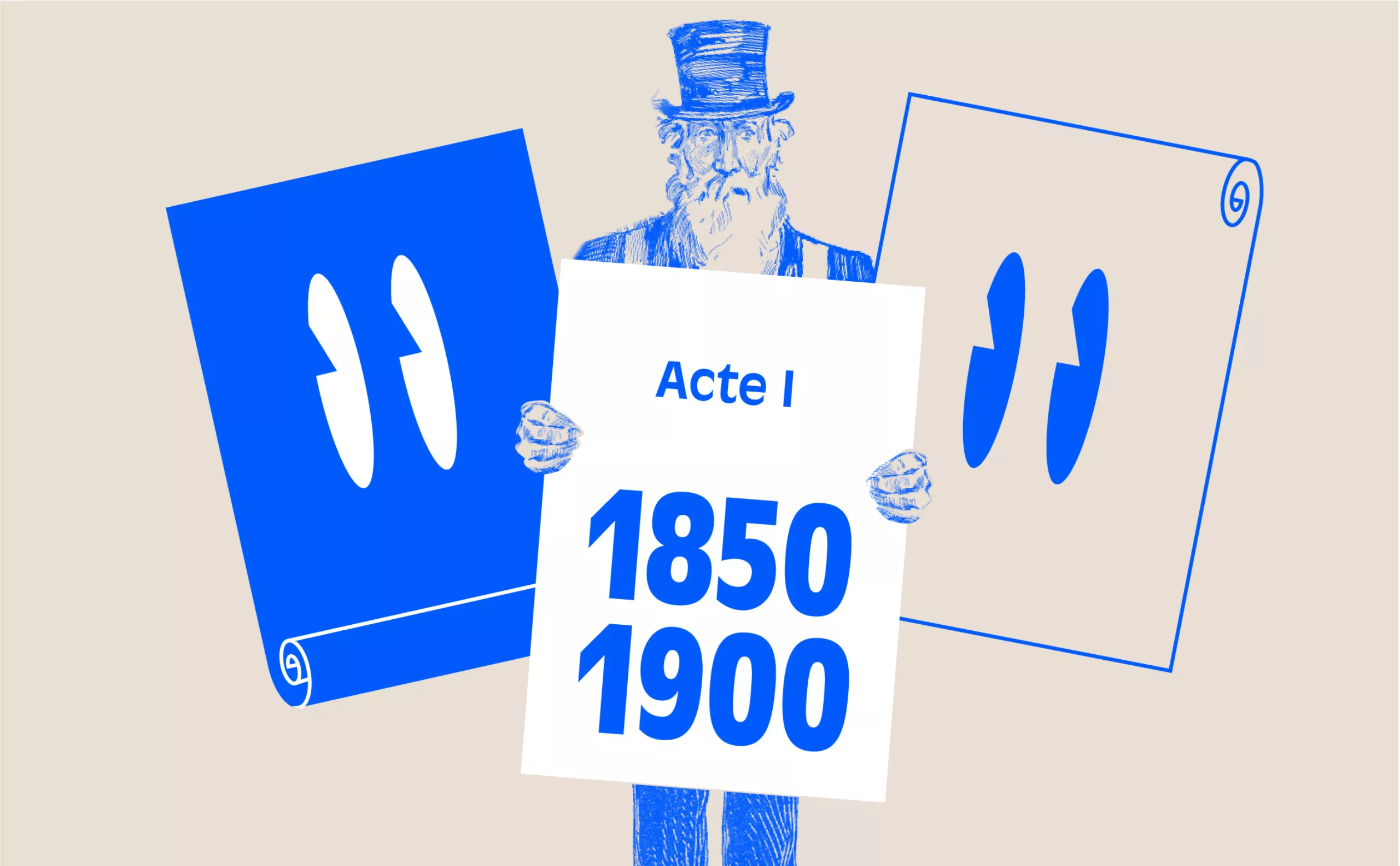
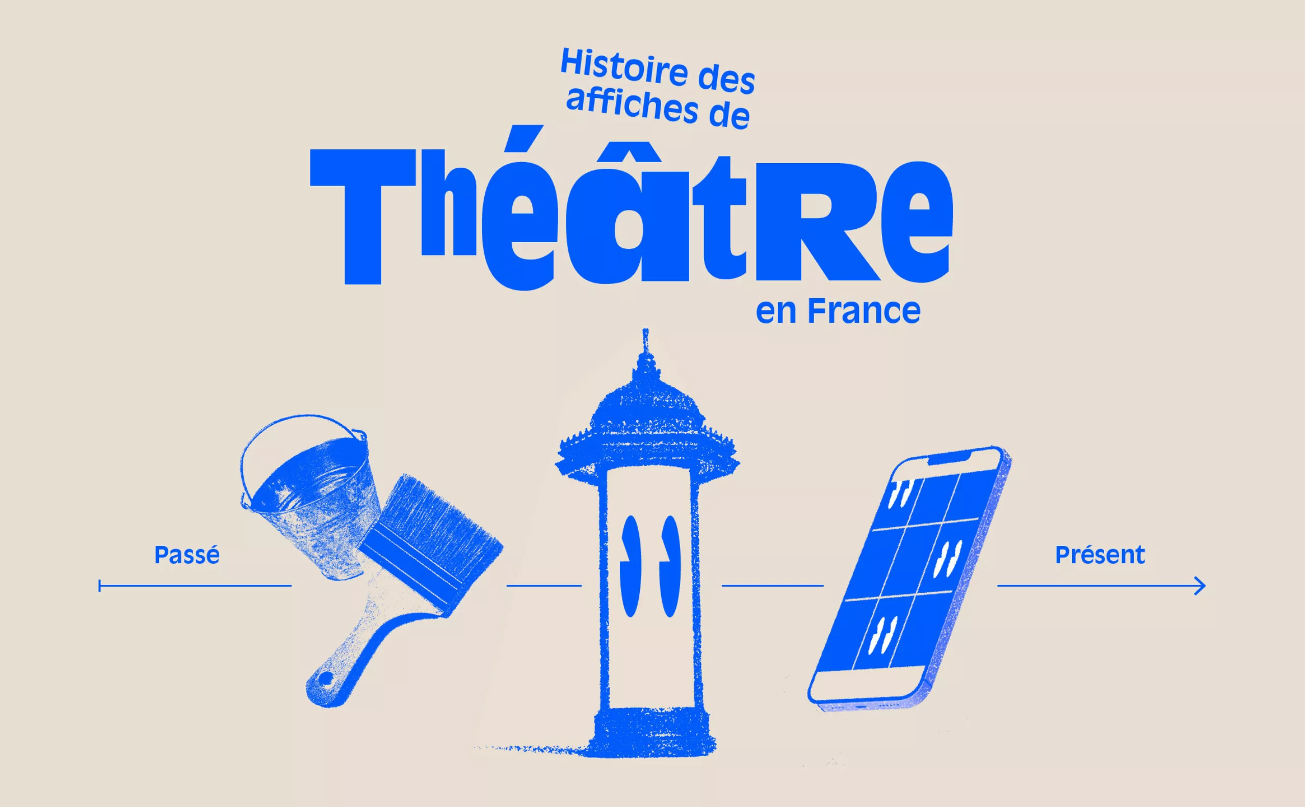
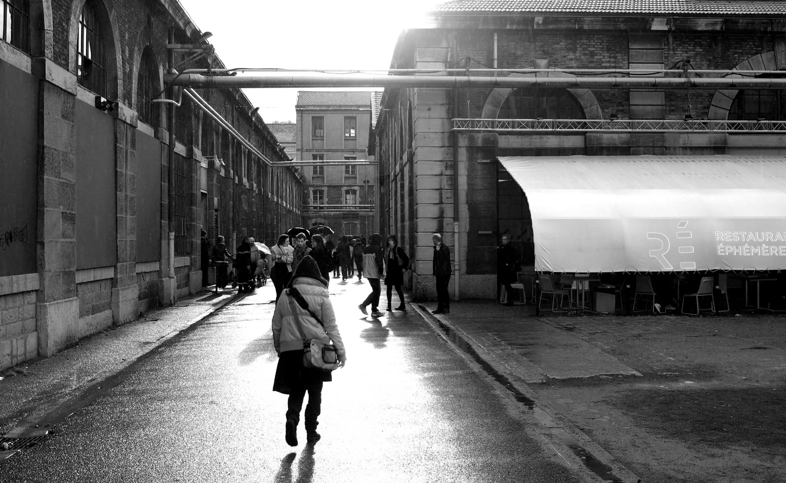
When the Anatome gallery was the place to be for graphic design in Paris
For a long time, Paris did not have a specific space for exhibiting graphic design. It was not until the turn of the 20th century, in 1999, that Marie-Anne Couvreu and Henri Meynadier opened the Anatome gallery. For more than 12 years, they have taken up the challenge of promoting and bringing to life the diversity of graphic design. For a long time, Paris did not have a specific space for exhibiting graphic design. It was not until the turn of the 20th century, in 1999, that Marie-Anne Couvreu and Henri Meynadier opened the Anatome gallery. For more than 12 years, they have taken up the challenge of promoting and bringing to life the diversity of graphic design.
-
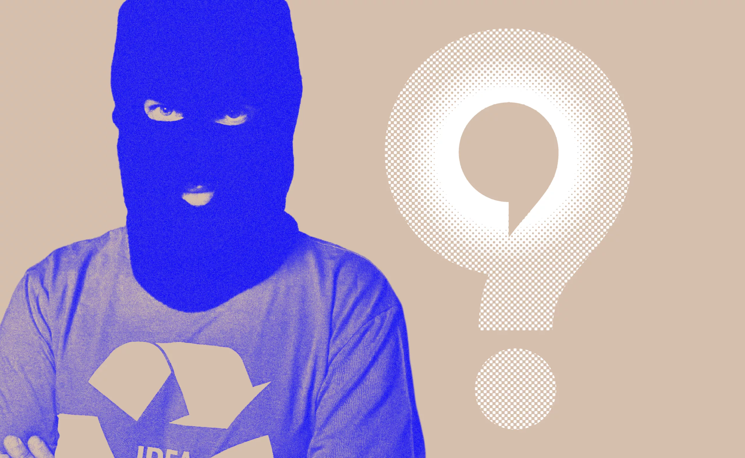
3 questions to Joe La Pompe
Joe La Pompe analyzes the impact of digital and AI on creativity: more images, but no more originality. A lucid look to discover.
-
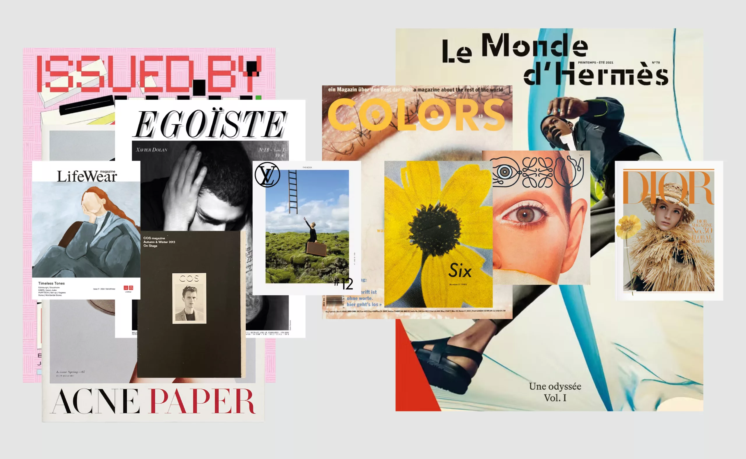
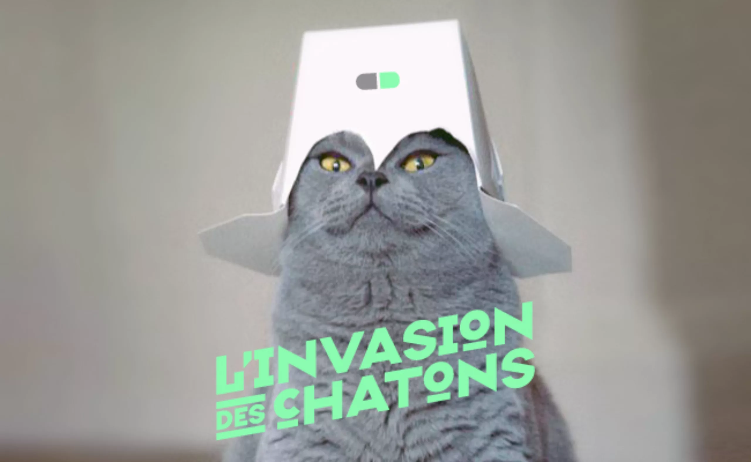
Luxury brand magazines are putting up a fight
An overview of luxury brand magazines seeking to stand out and resist the accelerating pace of current events.
-
-
2025
-
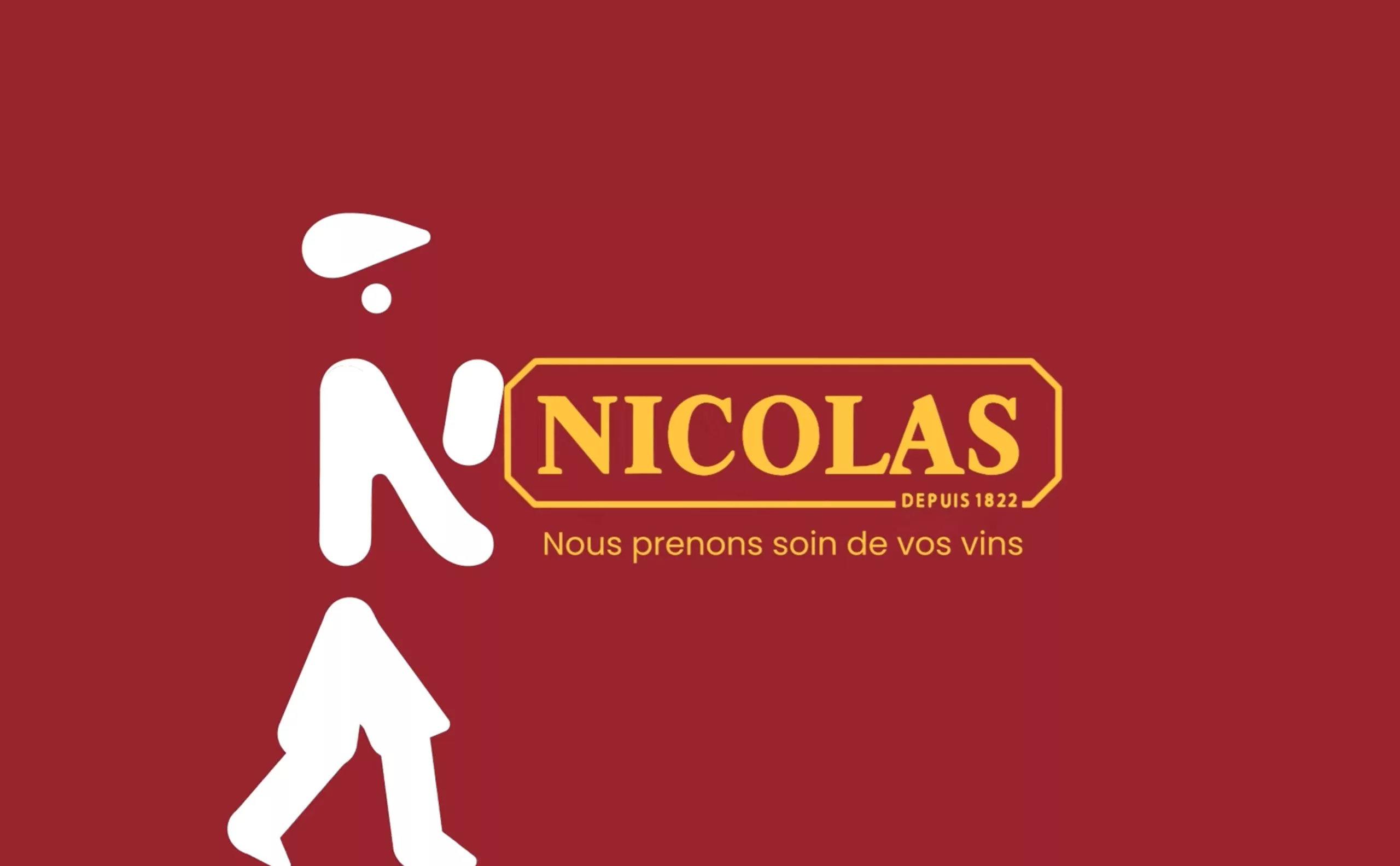
Maison Nicolas, a new logo for a new strategy
Maison Nicolas has unveiled a new logo and identity, unfortunately without drawing on its rich graphic heritage.
-
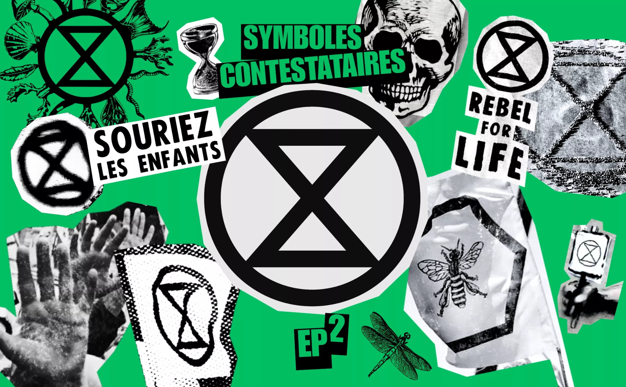
Extinction Rebellion, committed to the living
The 1960s fought for peace; our generation is raising the symbol of Extinction Rebellion, committed to ending the extinction of the living.
-

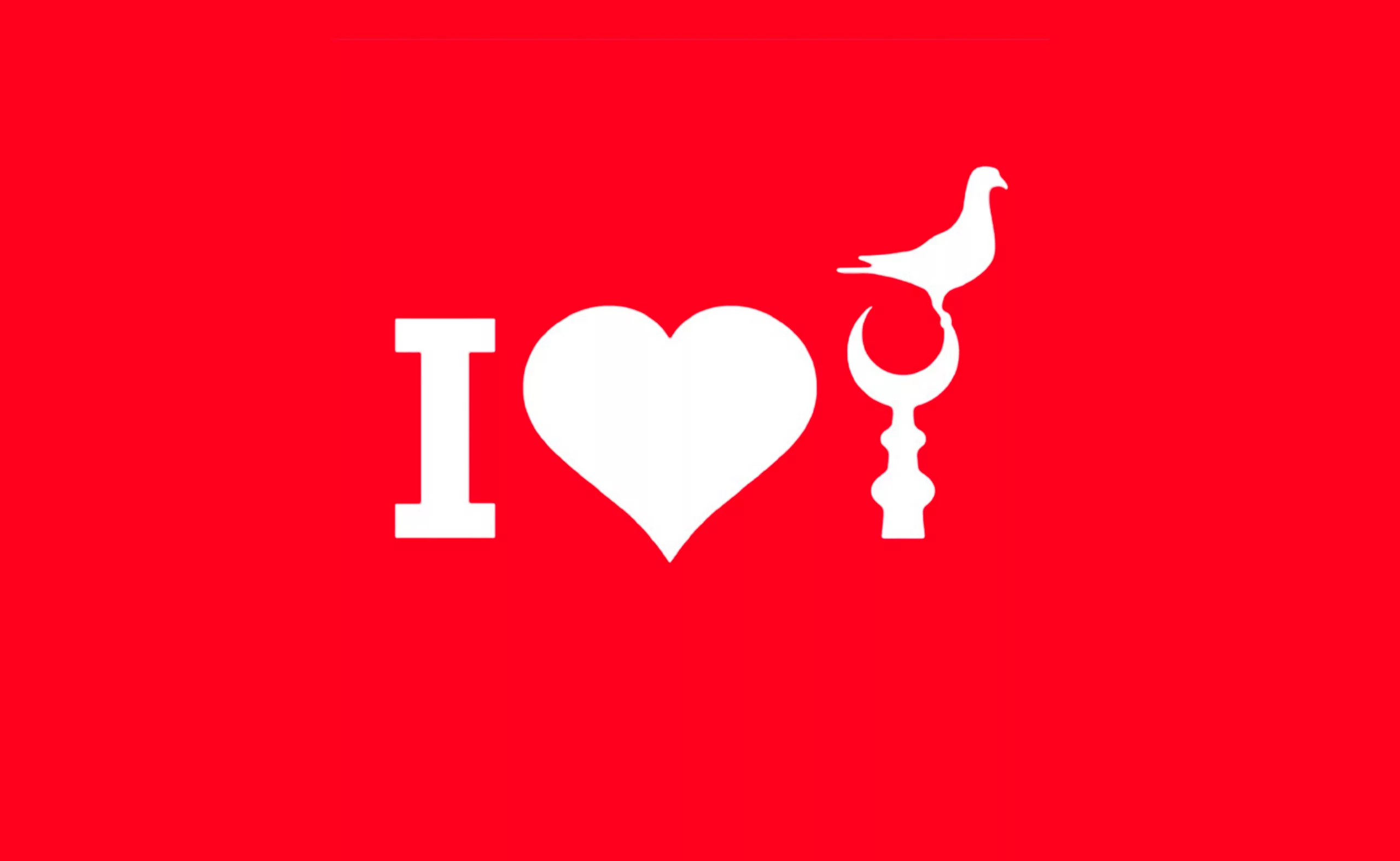
Peace & Love ☮ the activist icon
How did the most politically charged and well-known symbol on earth become a commonplace fashion accessory?
-
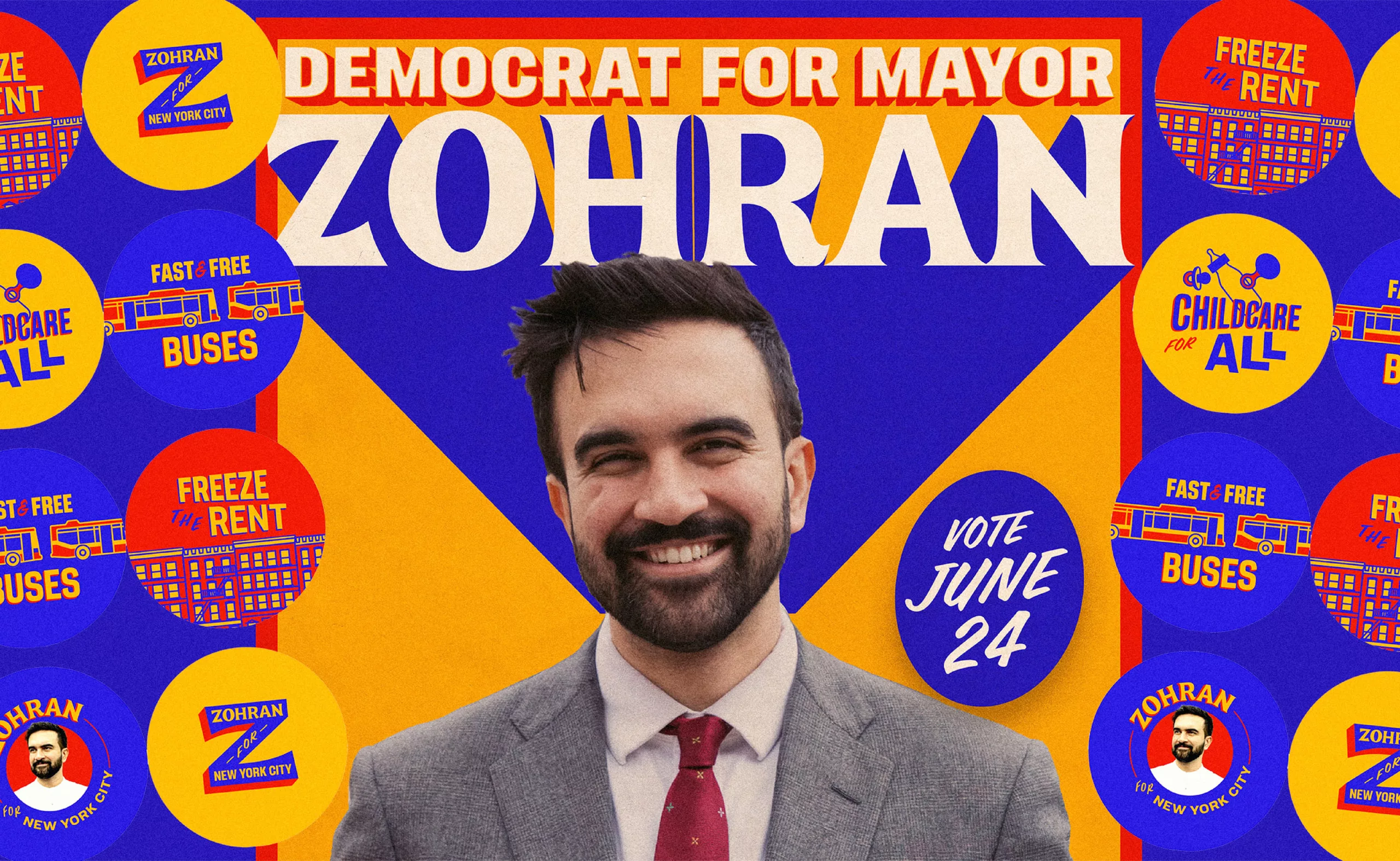
The Colors of Zohran Mamdani in New York
Zohran Mamdani has just been elected Mayor of New York, becoming the city’s youngest socialist and Muslim mayor — a first in the United States. Decoding his visual communication.
-
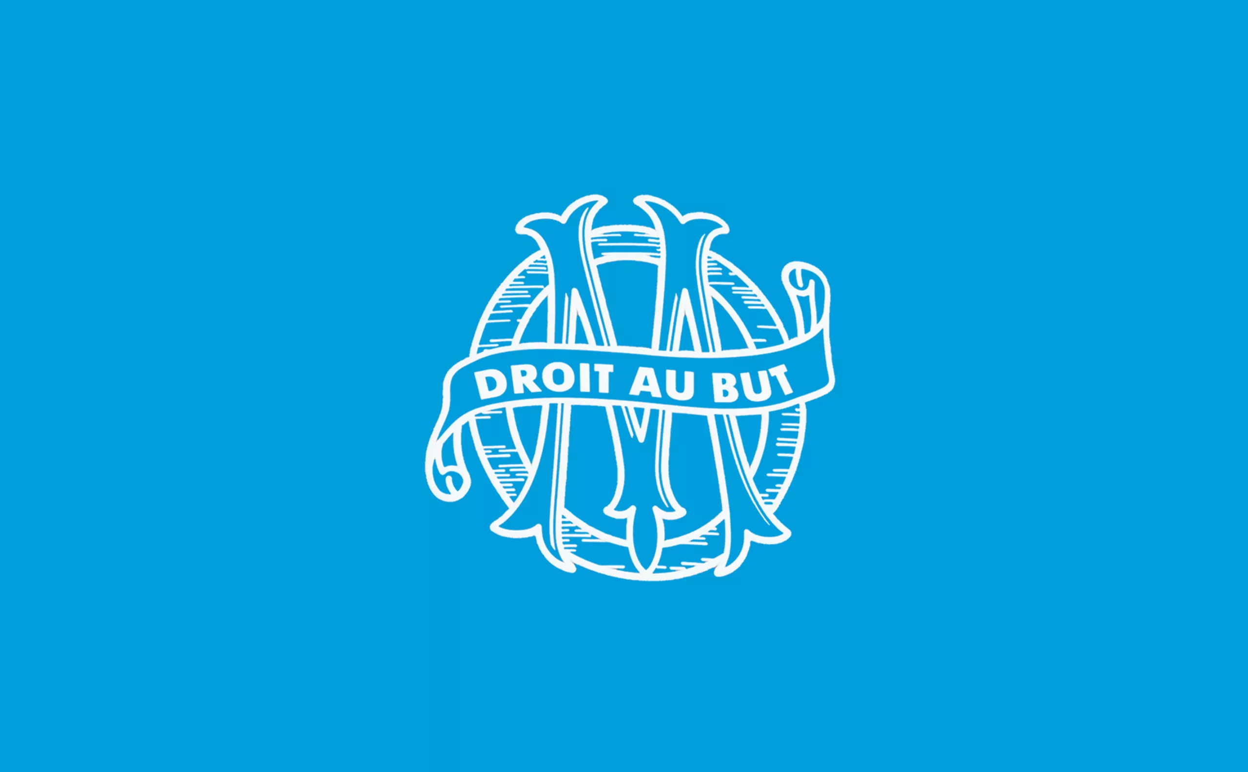
New logo for OM: analyzing a sports crest
OM will soon be changing its logo. This is an opportunity to delve into 125 years of heritage to understand the challenges of the future.
-

Erecting the image of the penis: anatomy of an iconic symbol
Two testicles, a shaft, sometimes a few hairs, rarely any talent. The penis is a universal icon, but no one dares talking about it. Except us.
-
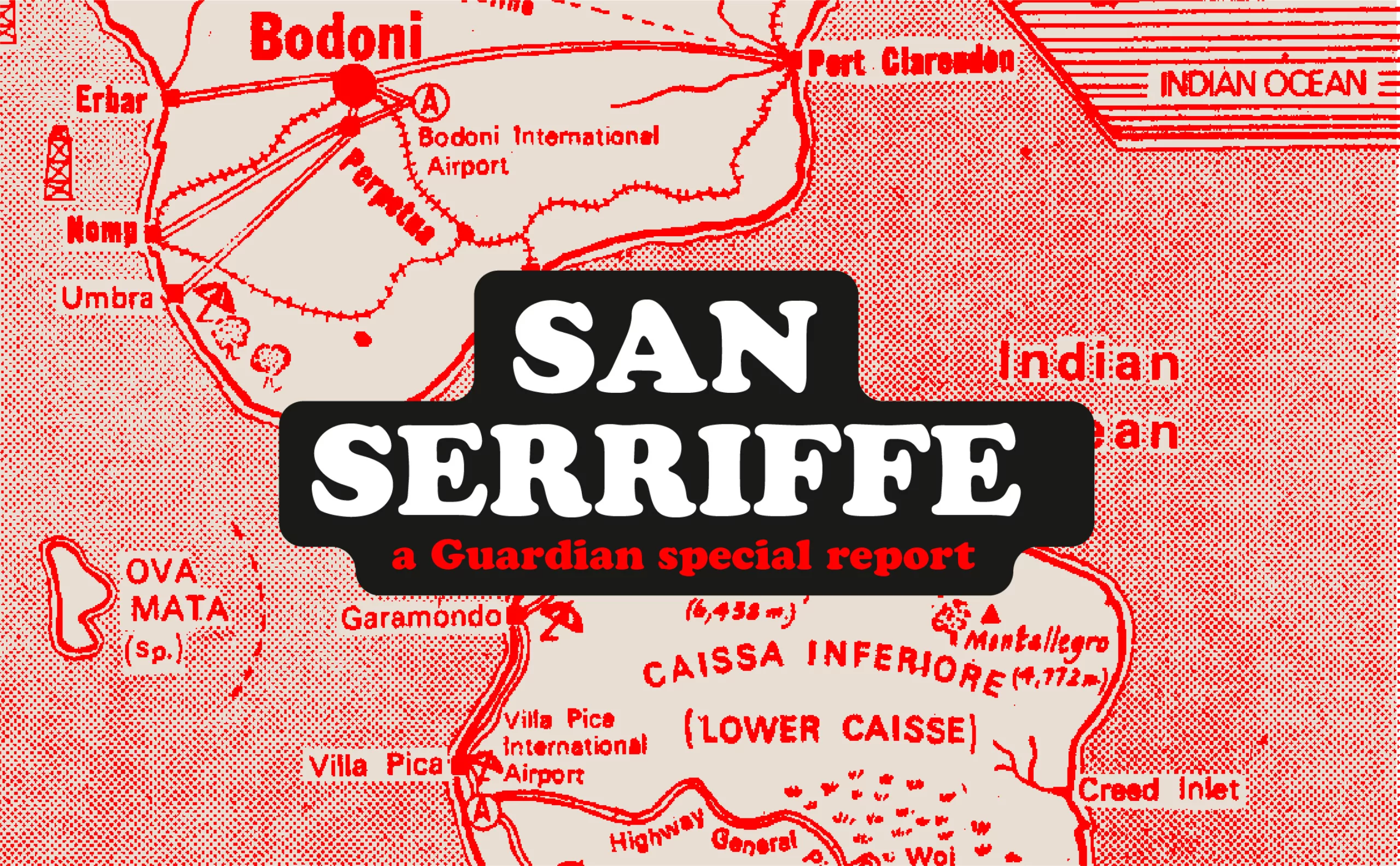
San Serriffe typographic Island
Discover how The Guardian tricked its readers into inventing the island of San Serriffe, a fictional republic born of a typographic April Fool’s joke that has become cult status. Between subtle satire and typographic wordplay, immerse yourself in one of the most brilliant journalistic hoaxes of the XXᵉ century.
-
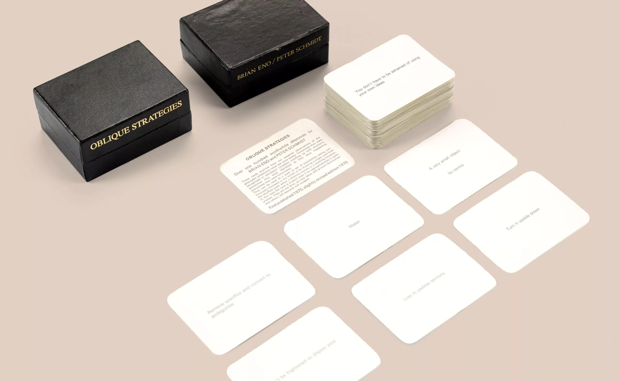
Design, creativity and oblique strategies!
Discover how Brian Eno, genius musician and producer (David Bowie, Iggy Pop, U2…), pushed back the limits of creation thanks to a simple card game: “Oblique Strategies”.
-
2024
-
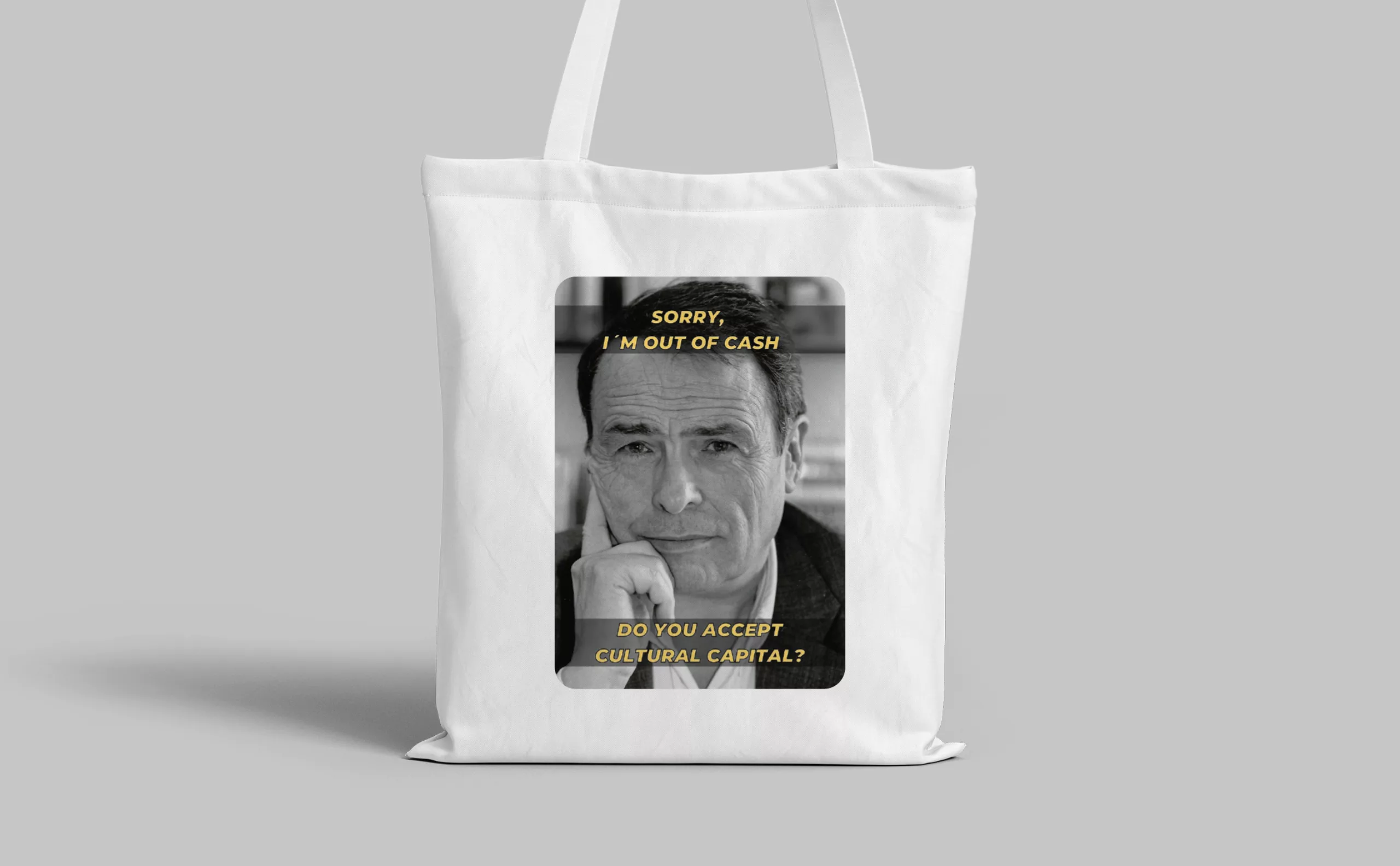
Tote bag, a new social totem?
The tote bag has become an essential part of our everyday urban lives.
What does it say about our society, our times, our habits and our behaviour? -

Groupama’s new visual identity, a logo in the open countryside
Groupama has just unveiled a new logo that updates its graphic design by abandoning its campaign in favor of a “startup” aesthetic.
-
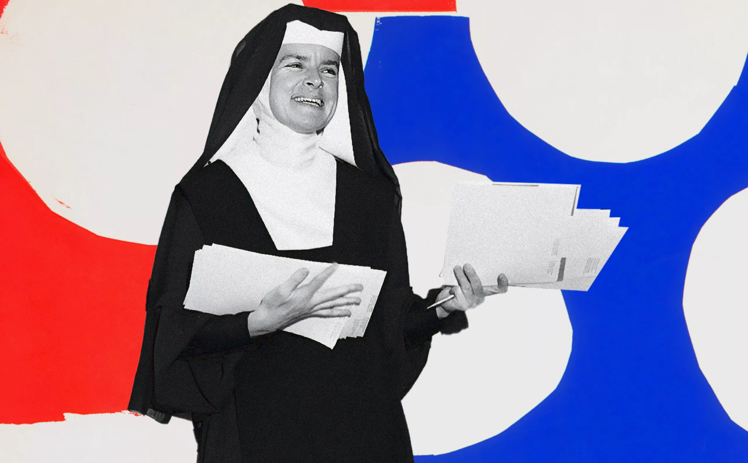
Sister Corita Kent, the Pop Art nun
Sister Corita Kent (1918-1986). Committed graphic artist and Pop Art pioneer.
-
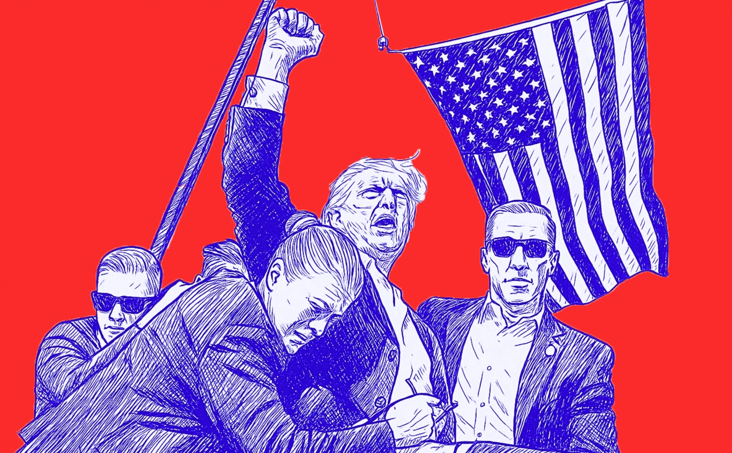
Donald Trump, the martyr who makes history
Donald Trump, his face bloodied, raises his fist and seems to proclaim “I’m alive, fight!”.
Let’s decipher an image that has gone down in history at the speed of a shotgun blast. -
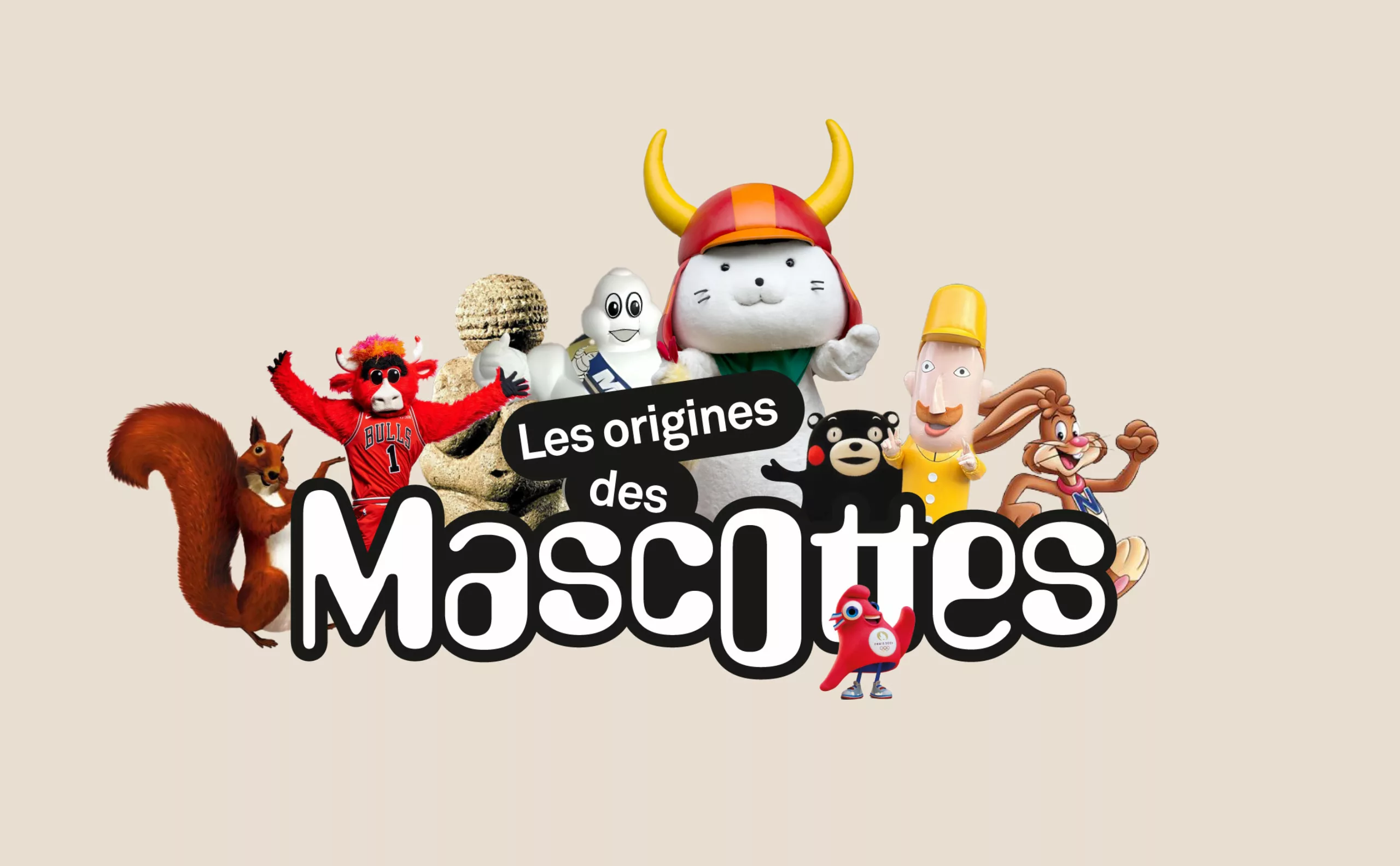
A history of mascots
Mascots, those soft, slightly silly characters, are nothing new. Here’s a look at their origins, from Antiquity to Japan.
-
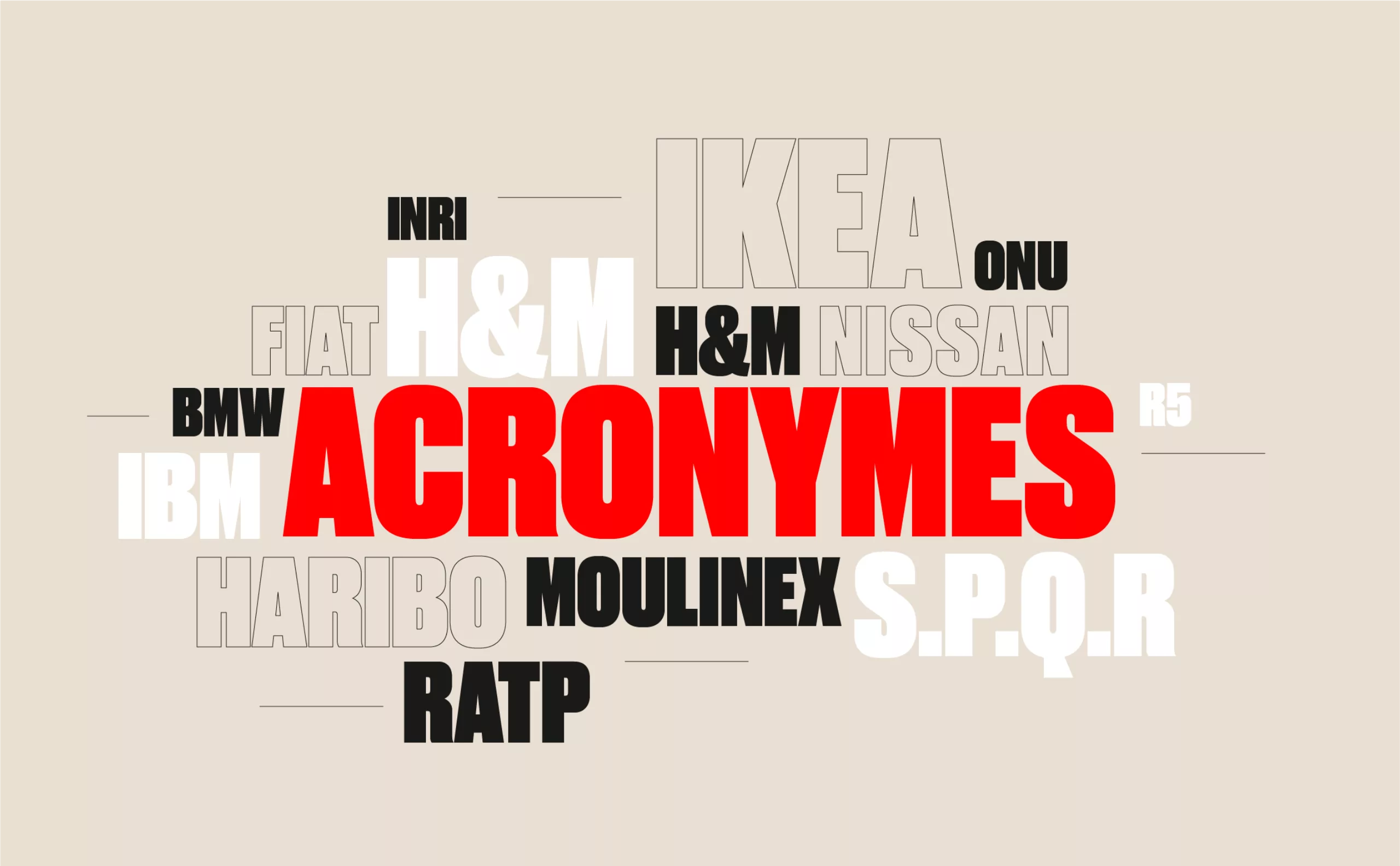
From surnames to acronyms: creating a brand name from letters
From founders’ surnames to initials and acronyms, brand names have always oscillated between abstraction and familiarity.
-
-
2023
-
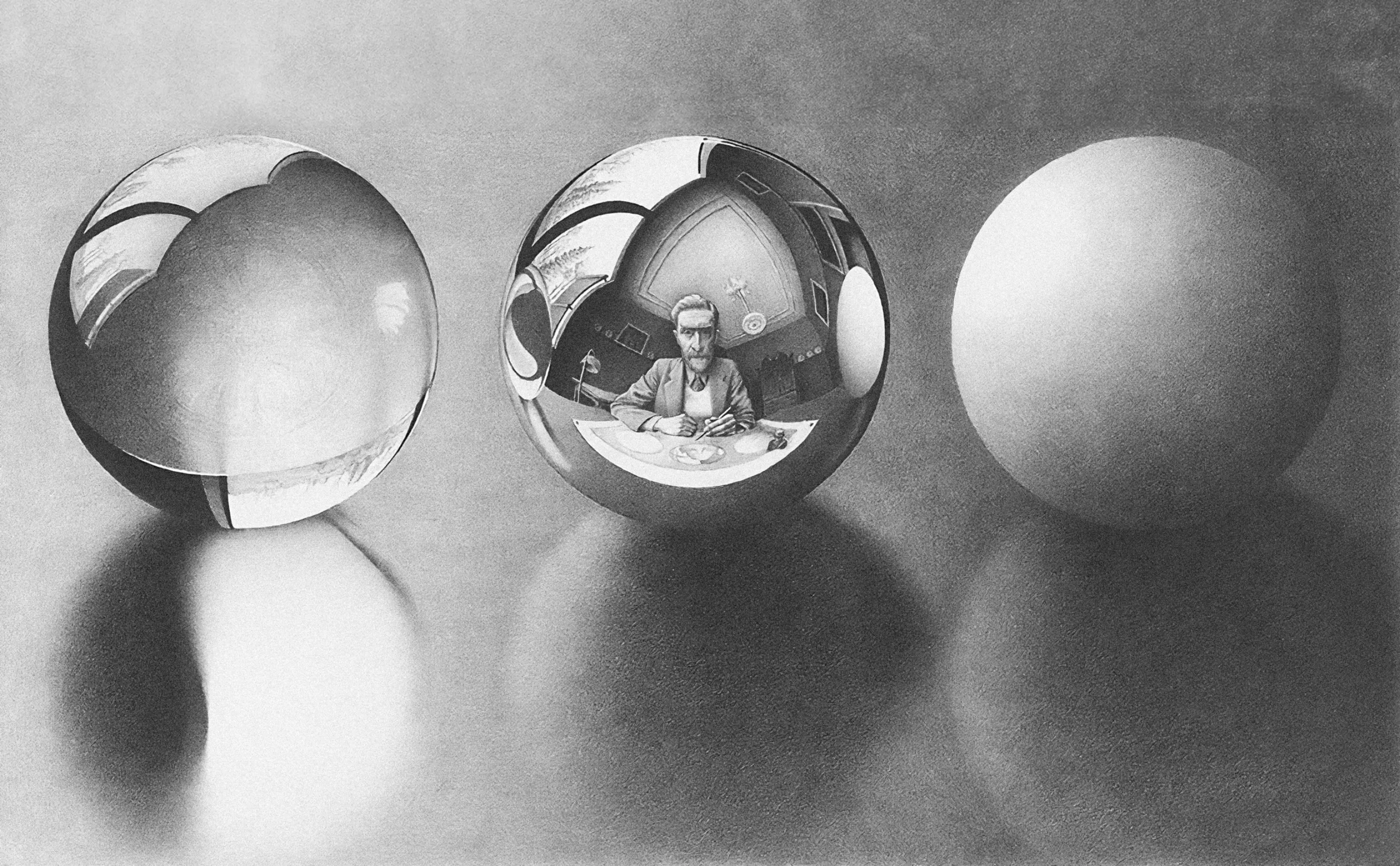
Maurits Escher’s impossible reality
Escher is a “mathemagician” who created realistic yet physically impossible works, combining art and mathematics.
-

The UN logo takes on water during COP28
For COP28, two designers have come up with a new UN logo showing the rising sea levels and the future disappearance of much land and coastline.
-
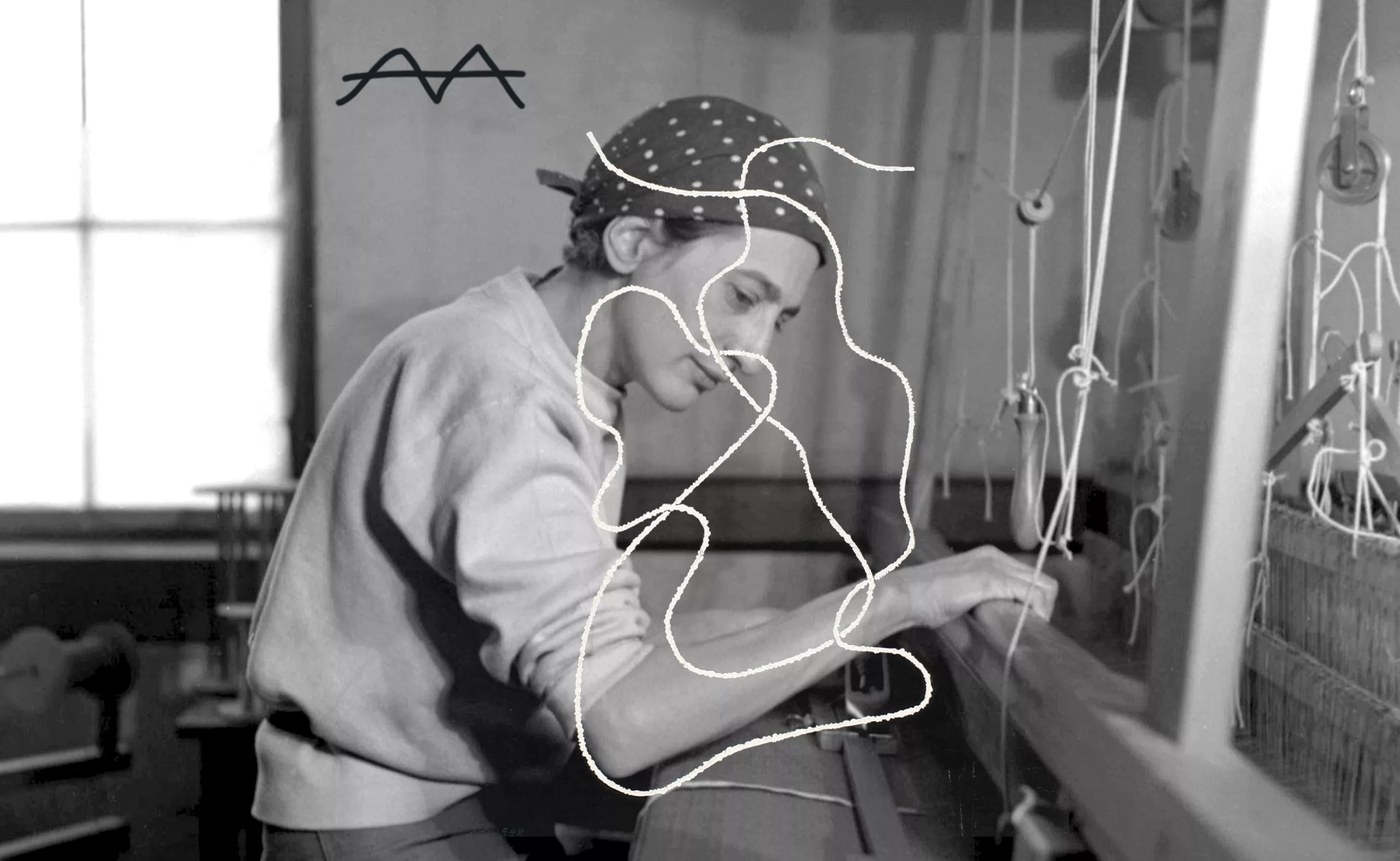
Anni Albers, weaving Bauhaus and modernity
Anni Albers was one of the few Bauhaus women to achieve fame in her own lifetime. Her work dusted off and modernized tapestry.
-

The smart set of ambigrams, graphic symmetry and word reflections
Ambigrams, visual and symmetrical puns, have mysterious origins and are used today in logos and art.
-
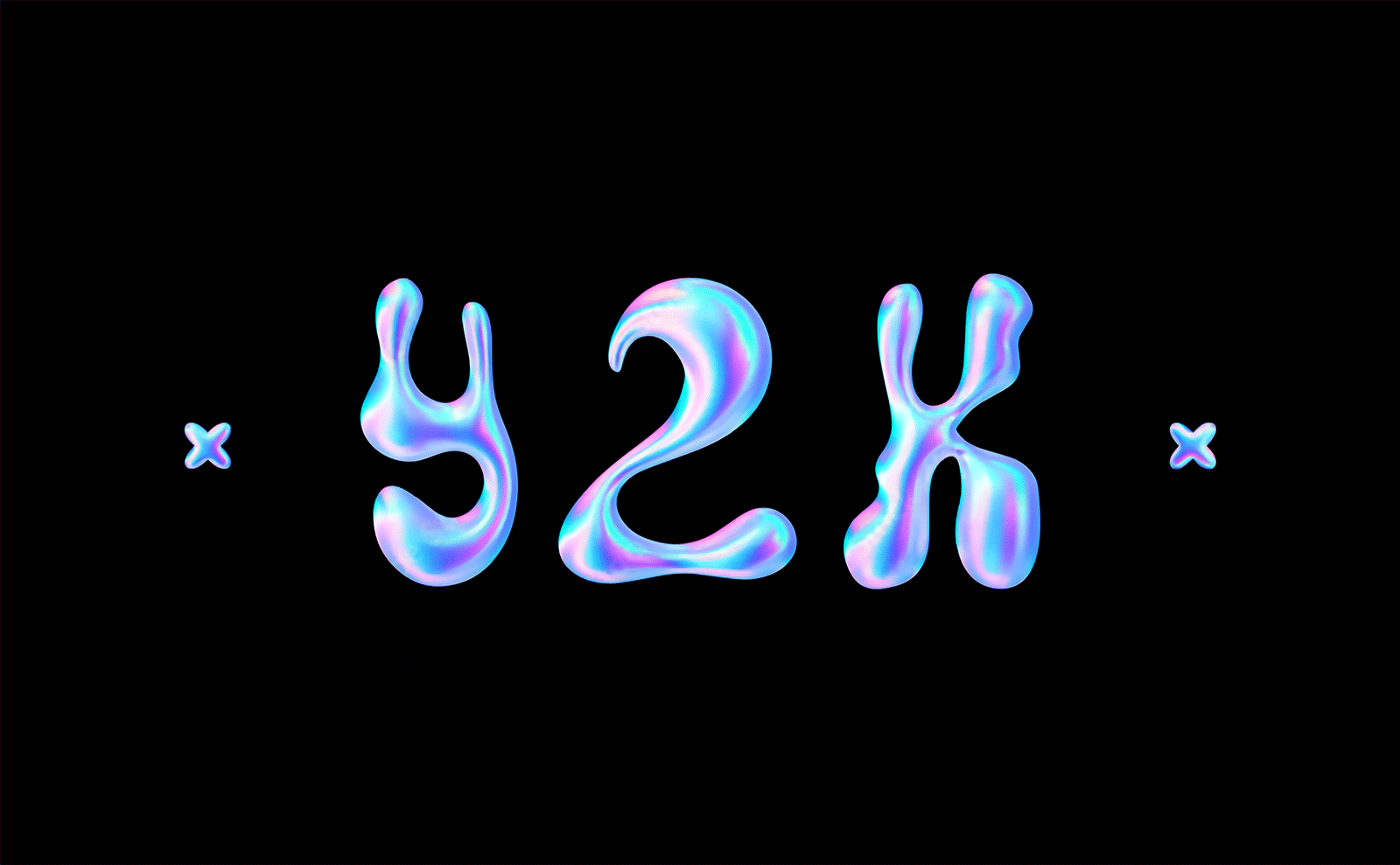
Y2K trend, the 2000’s style is back
Y2K, the trend of the 2000s, is back. Embodying an already retro future, its iridescent reflections shake up digital codes.
-
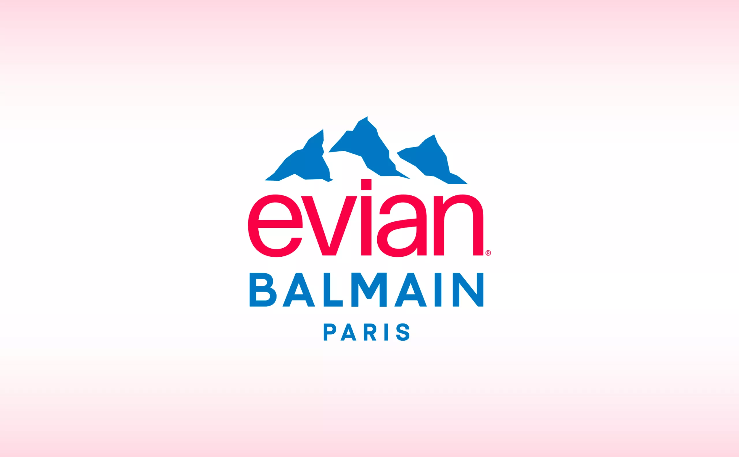
Evian x Balmain, a deep water co-branding strategy
This surprising co-branding gives us the opportunity to look back at the history of evian and to decipher the stakes of this strategy of luxification, greenwashing and the issue of plastic waste.
-
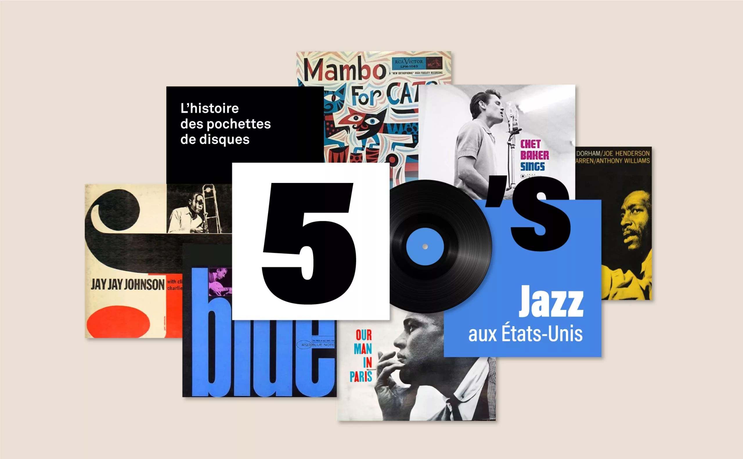
History of record covers: the face of 50s jazz
The vinyl sleeves come to life with jazz. It is a whole graphic universe that makes the music heard, through the illustration or the photo.
-
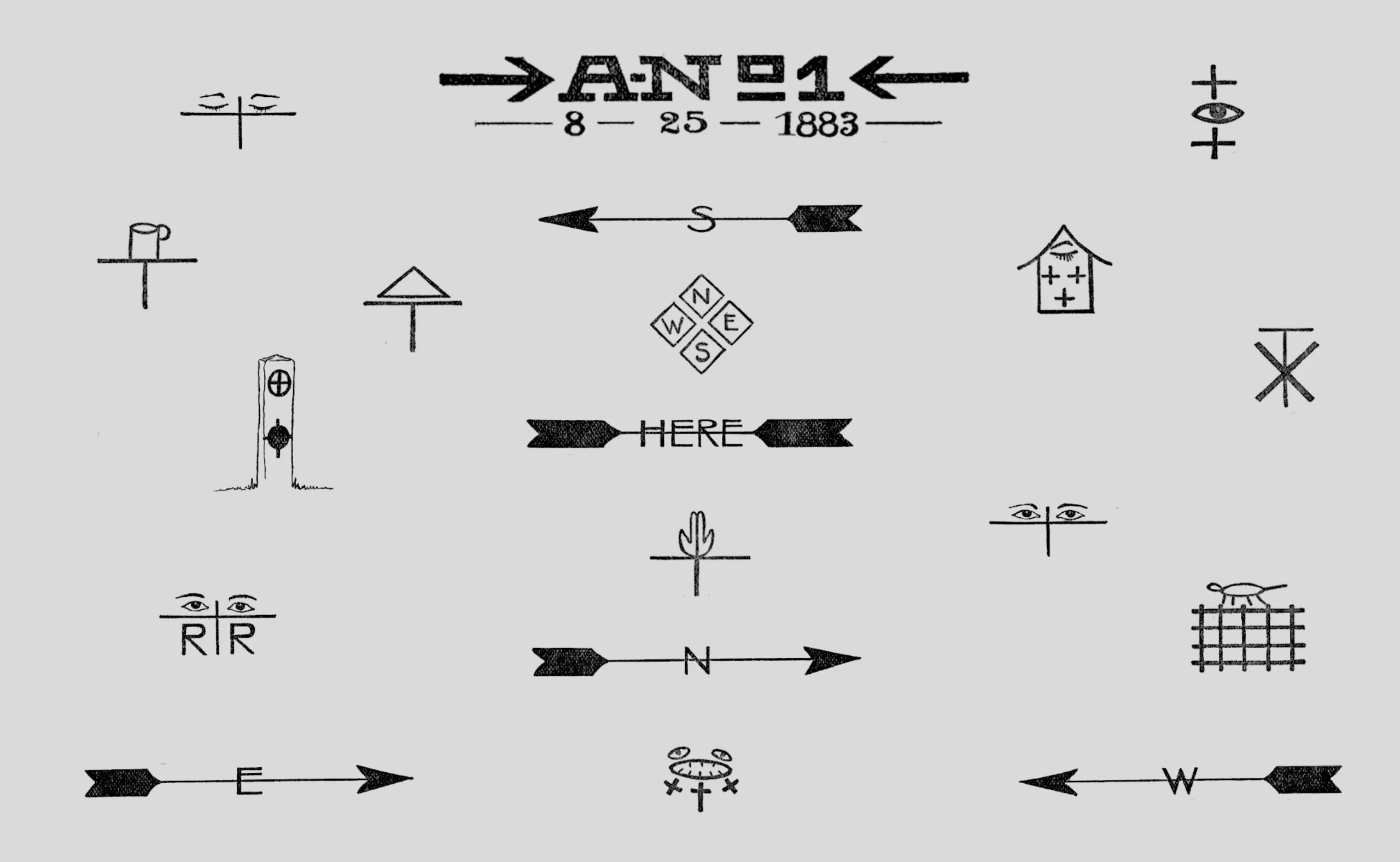
Hobo signs, the secret language of America’s wanderers
Resourceful and itinerant, the hobos developed a secret language system, doomed to disappear, to leave clues for their fellow hobos.
-
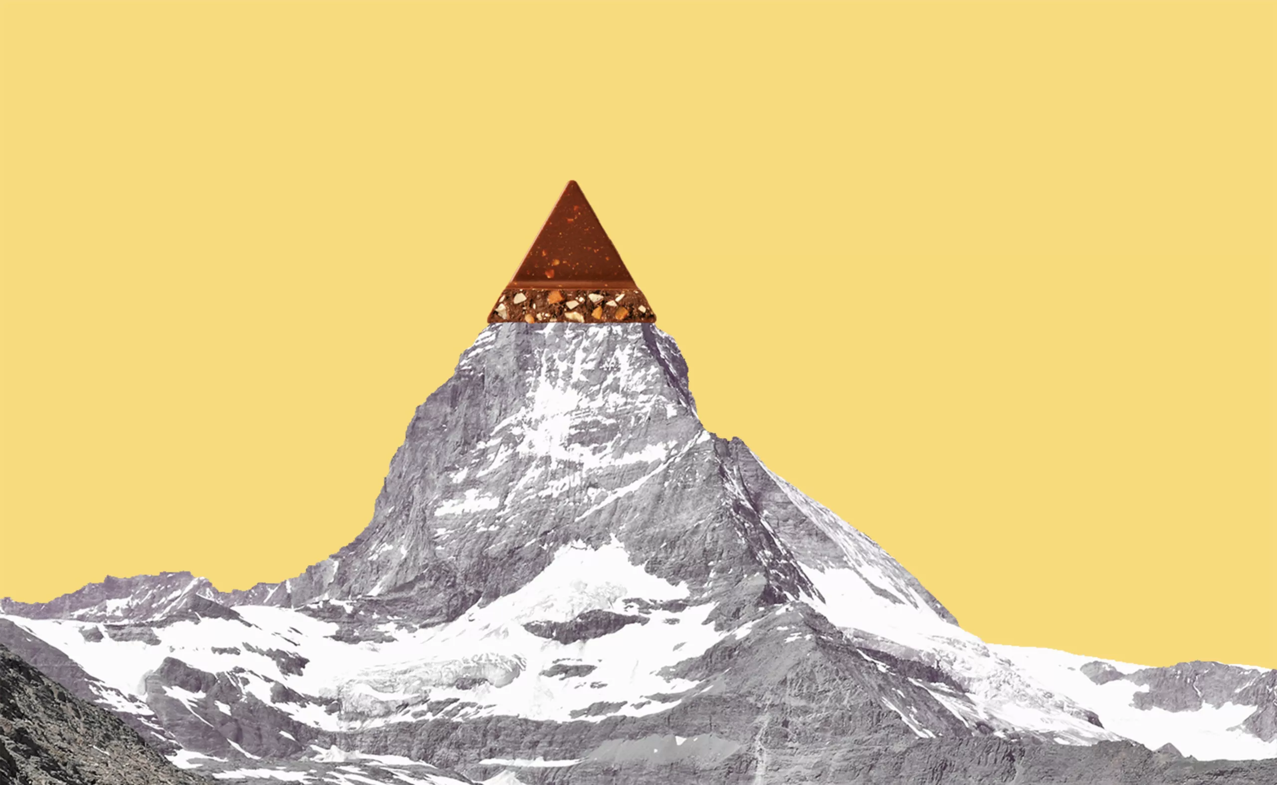
Toblerone’s new mountain: when packaging brands a territory
From Toblerone to Milka to feta cheese, brands mark their territory on their packaging and are sometimes caught up in the globalization game.
-
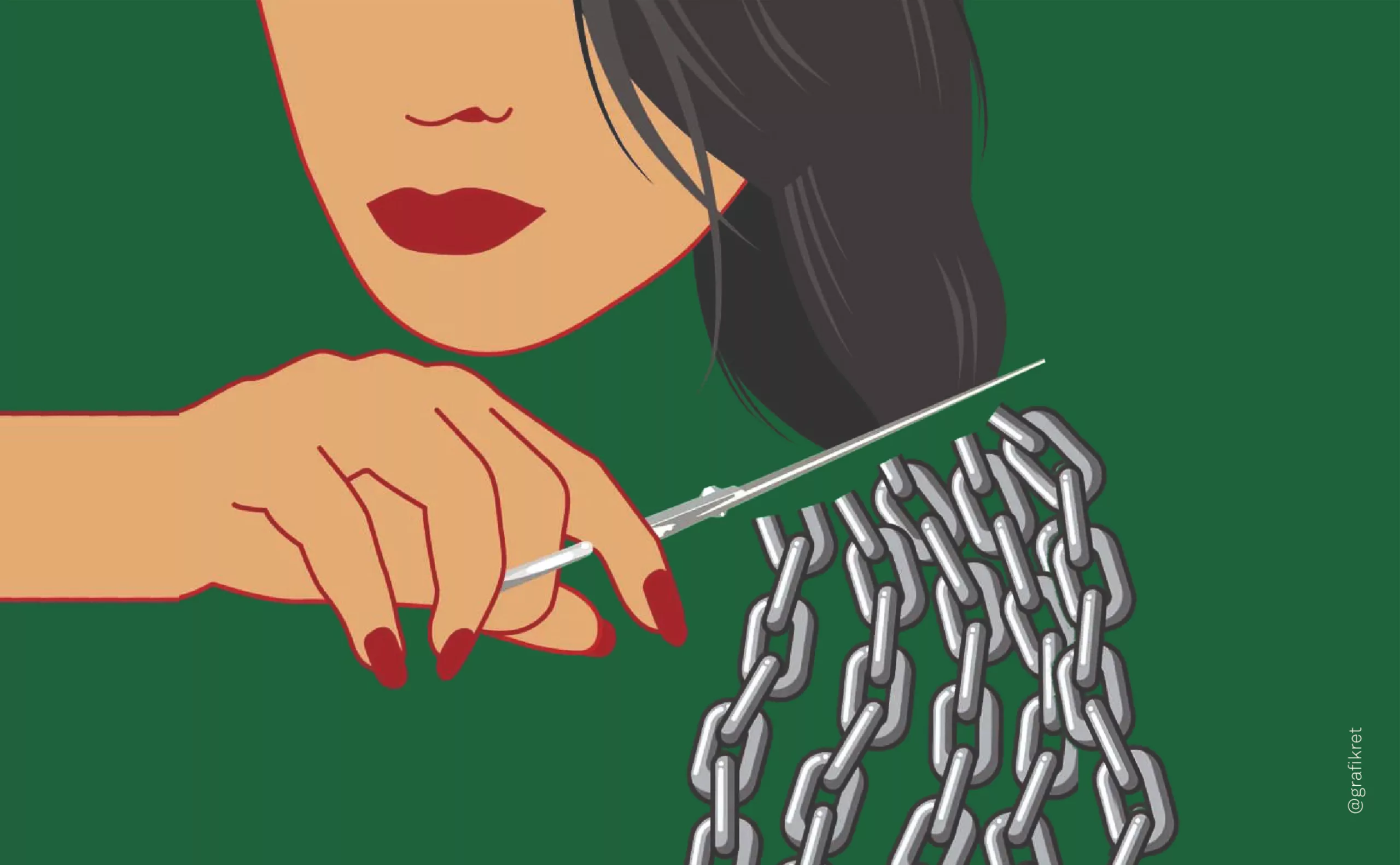
The symbolism of cut hair in Iranian protest posters
In Iran, Mahsa Amini died for a lock of hair poorly concealed behind her headscarf, giving rise to a massive protest movement against the mullahs’ regime. The gesture of a severed lock of hair becoming the symbol of this struggle gives us the opportunity to look back at the many symbolic of hair.
-
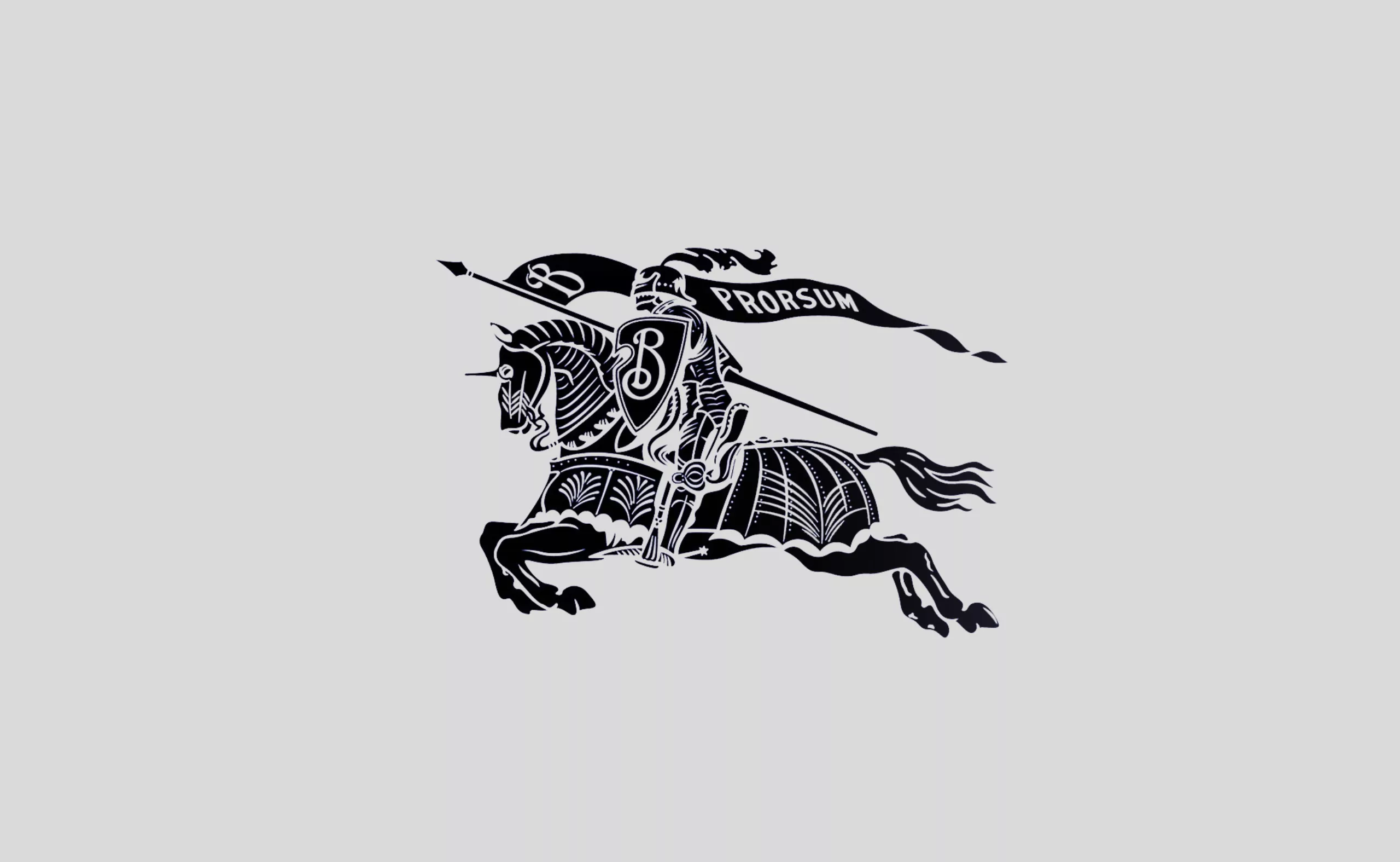
Burberry regains prestige with a new antique logo
Burberry’s new logo revives the brand’s coat of arms by adopting an antique typography and recovering its knight.
-
The 2024 Olympic Games will not get a gold medal for their pictograms
The organizers have unveiled the new Olympics pictograms of the Paris 2024 Games, which totally lose us.
-
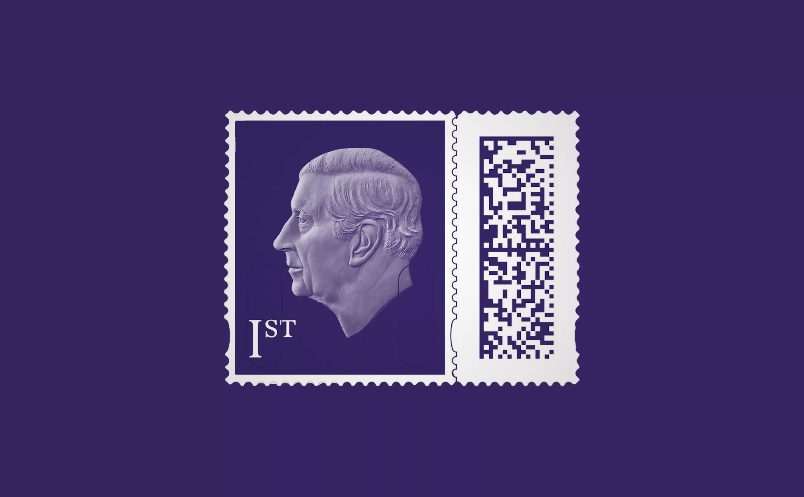
A king-size stamp for Charles III
The UK Postal Service presents the new stamp of King Charles III, a very sober portrait without a crown, a very symbolic first for the British crown!
-
Minimalism: aesthetics of sobriety
Both a visual or life discipline, minimalism has become a questionable trend and consists in simplifying to keep only the essential.
-
-
2022
-
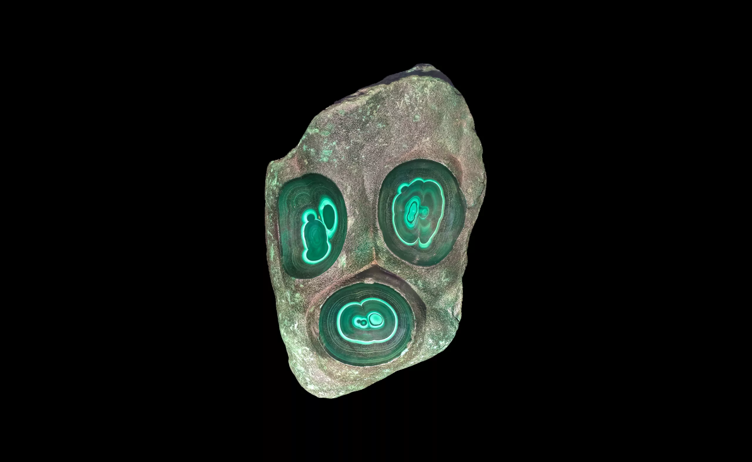
Picture stones, fascinating natural wonders
The stones of the French Museum of Natural History design patterns and natural landscapes, fascinating mineral creations of millions of years.
-
Writing with images: from pictographic scripts to emojis
The first writings were drawings, and universal languages have always used images to communicate.
-
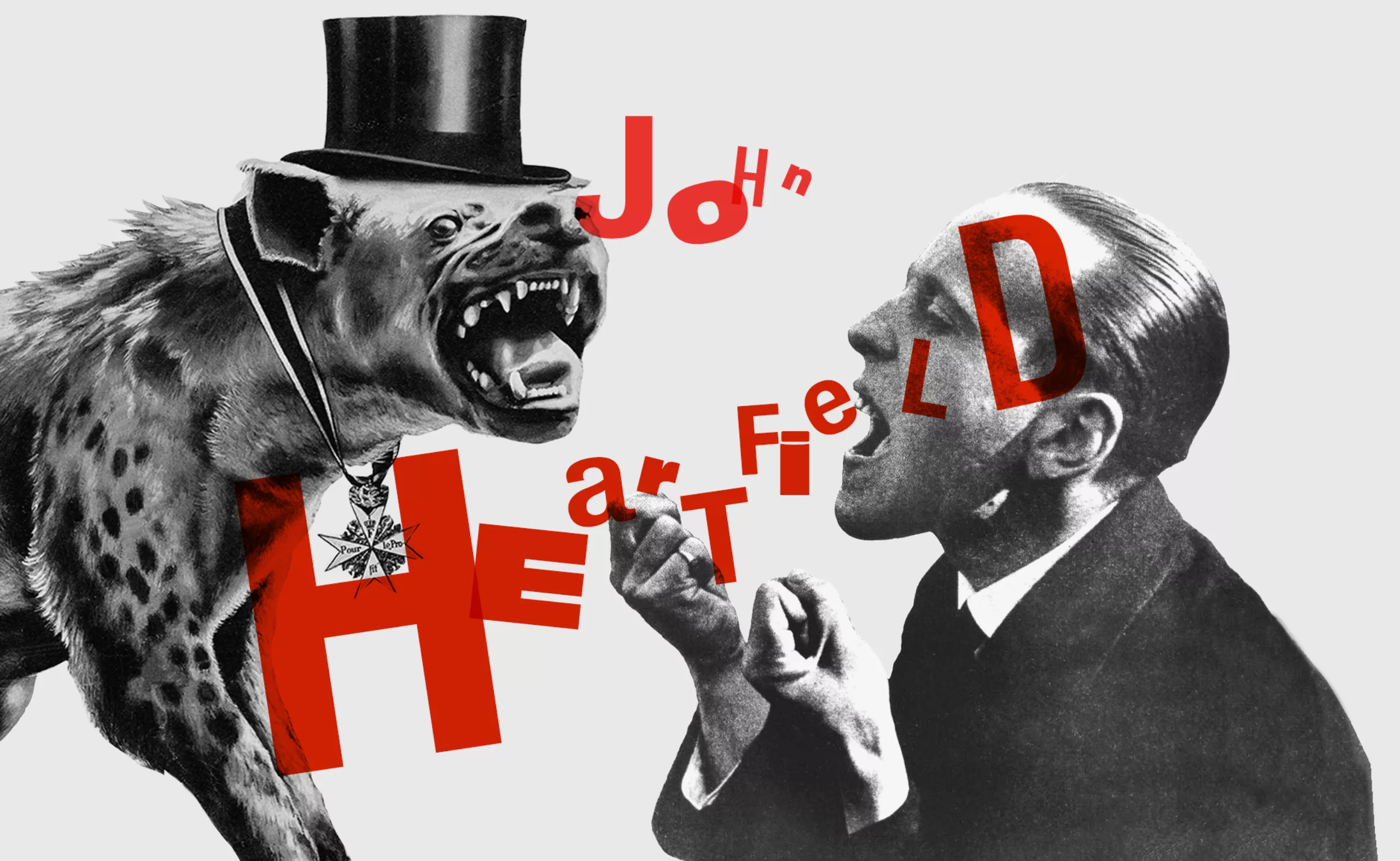
John Heartfield, photomontage as a political weapon
John Heartfield is a German “photomontage technician”, politically engaged with his collages against Nazism and fascism.
-
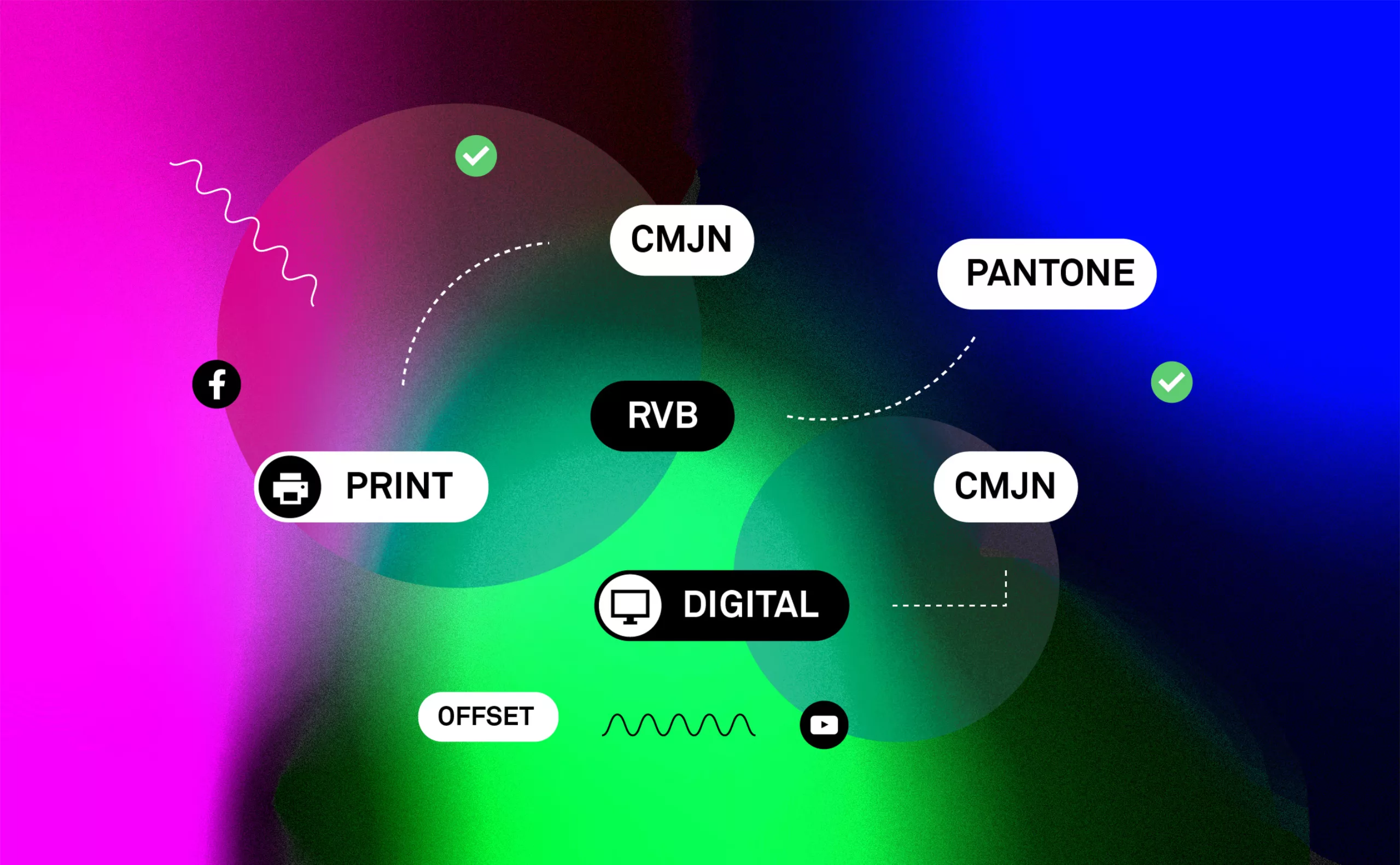
Branding and colorimetry: The “RGB First” strategy
The strategy of “RGB-First”: Reflection on the colorimetric chain RGB / CMYK in print and digital communication.
-
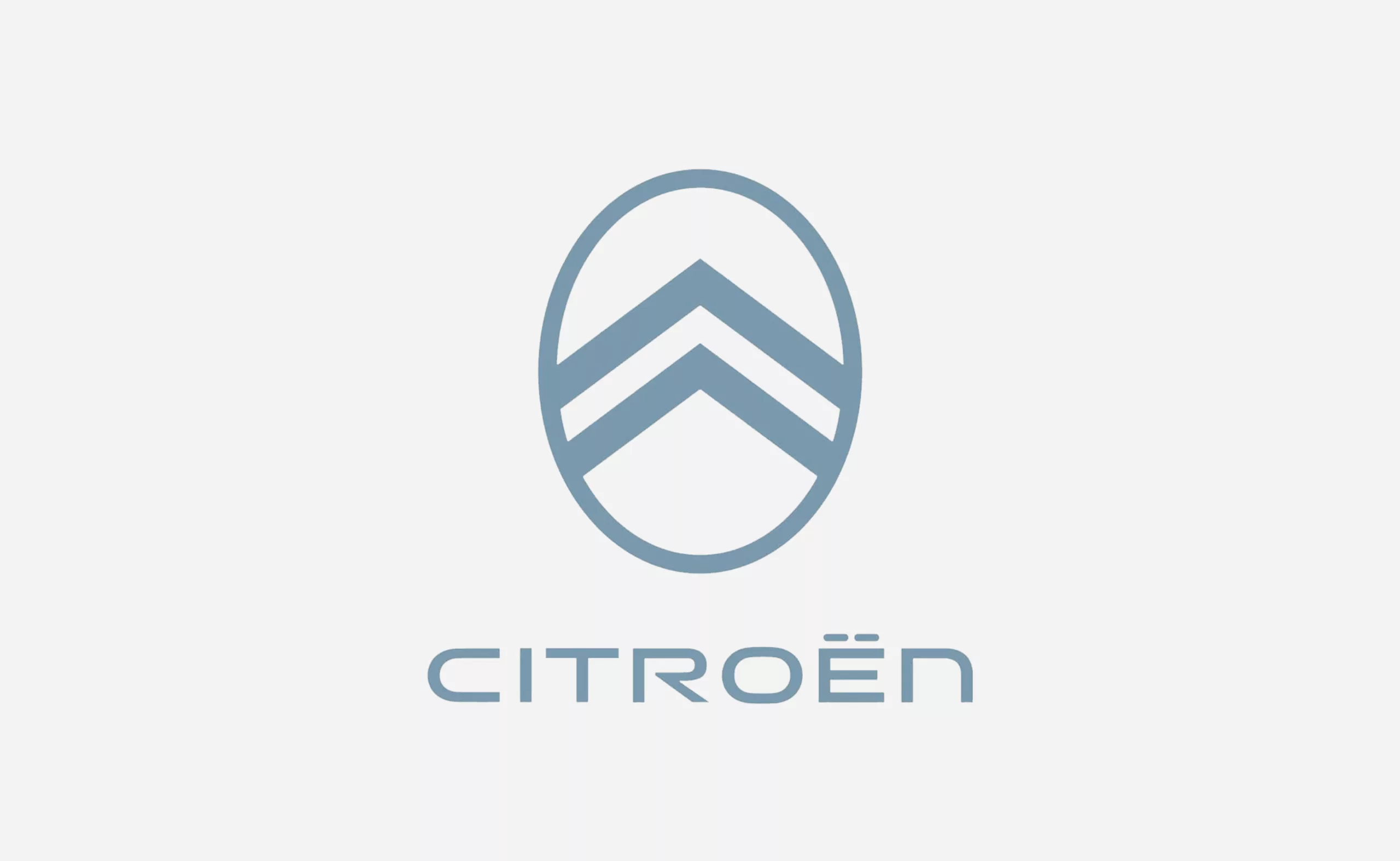
Back to the future for the new Citroën logo
Back to the future for Citroën which reveals a new logo inspired by the past. Nothing surprising for this necessary yet futuristic strategy.
-
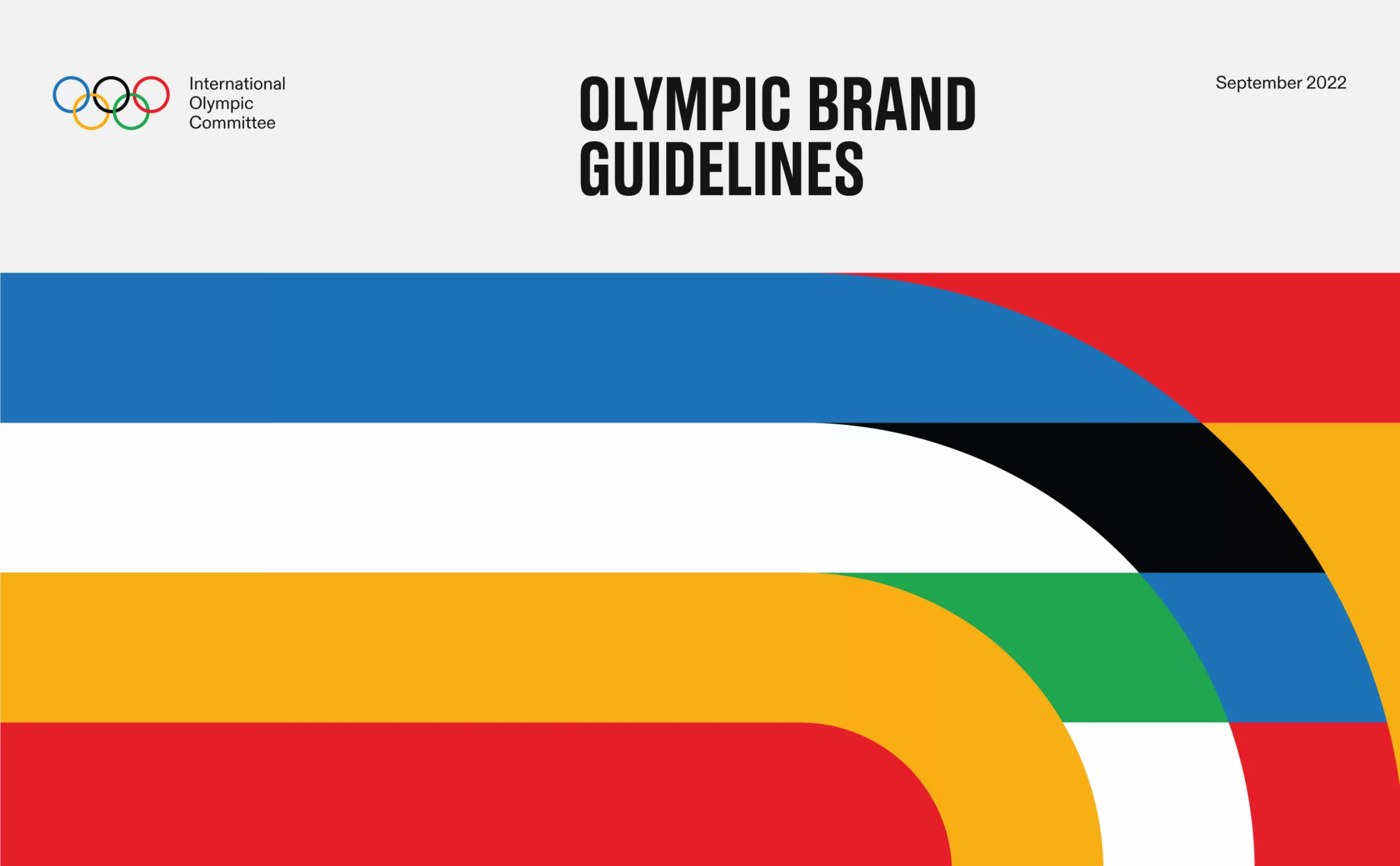
The new graphic charter of the Olympic Games
The Olympic Games are redesigning their identity to harmonize their visibility in all countries and on all communication media.
-
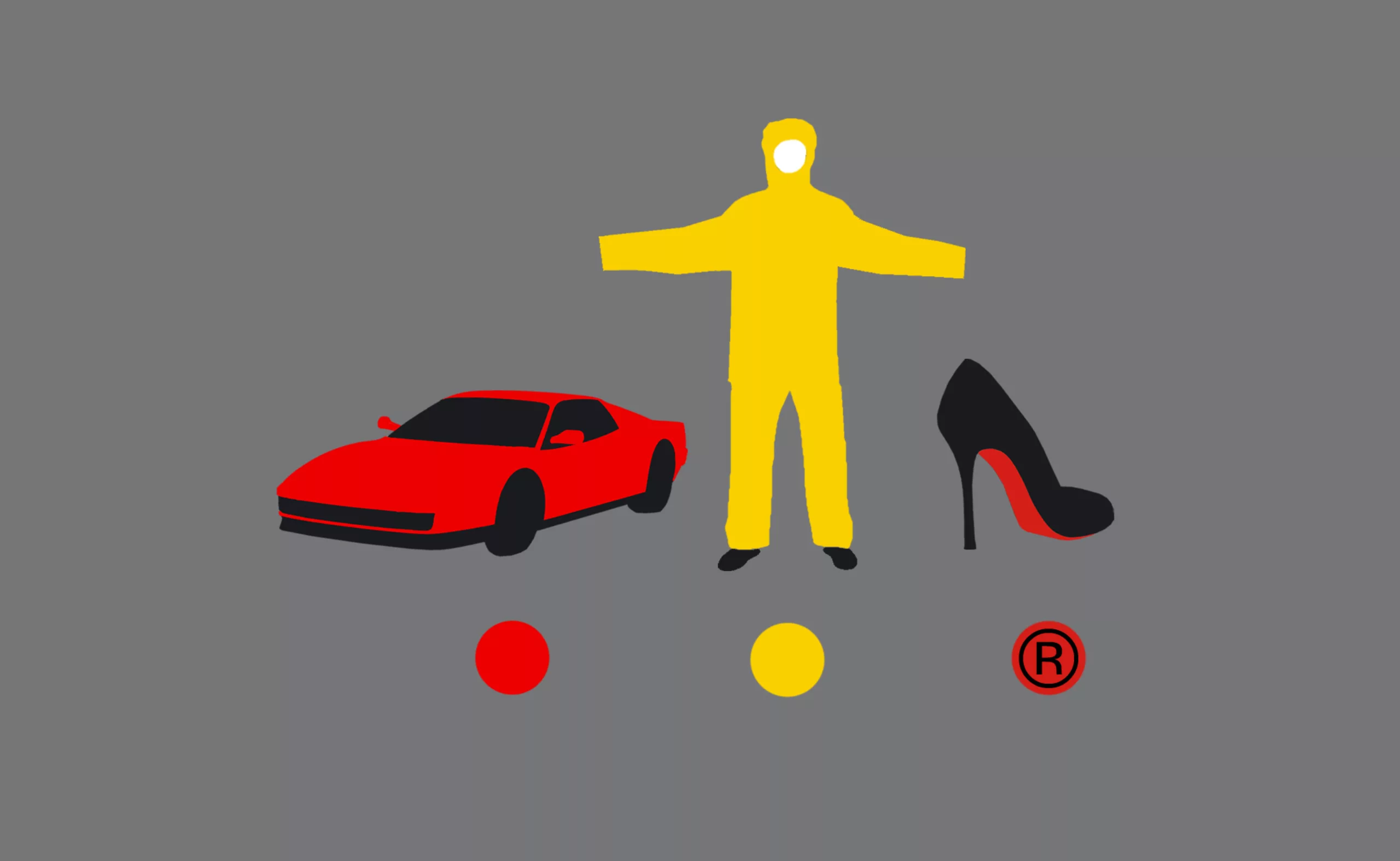
Color and brands are all about identity !
Many brands use colors as symbols to convey their identity. But can we really legally appropriate a color?
-
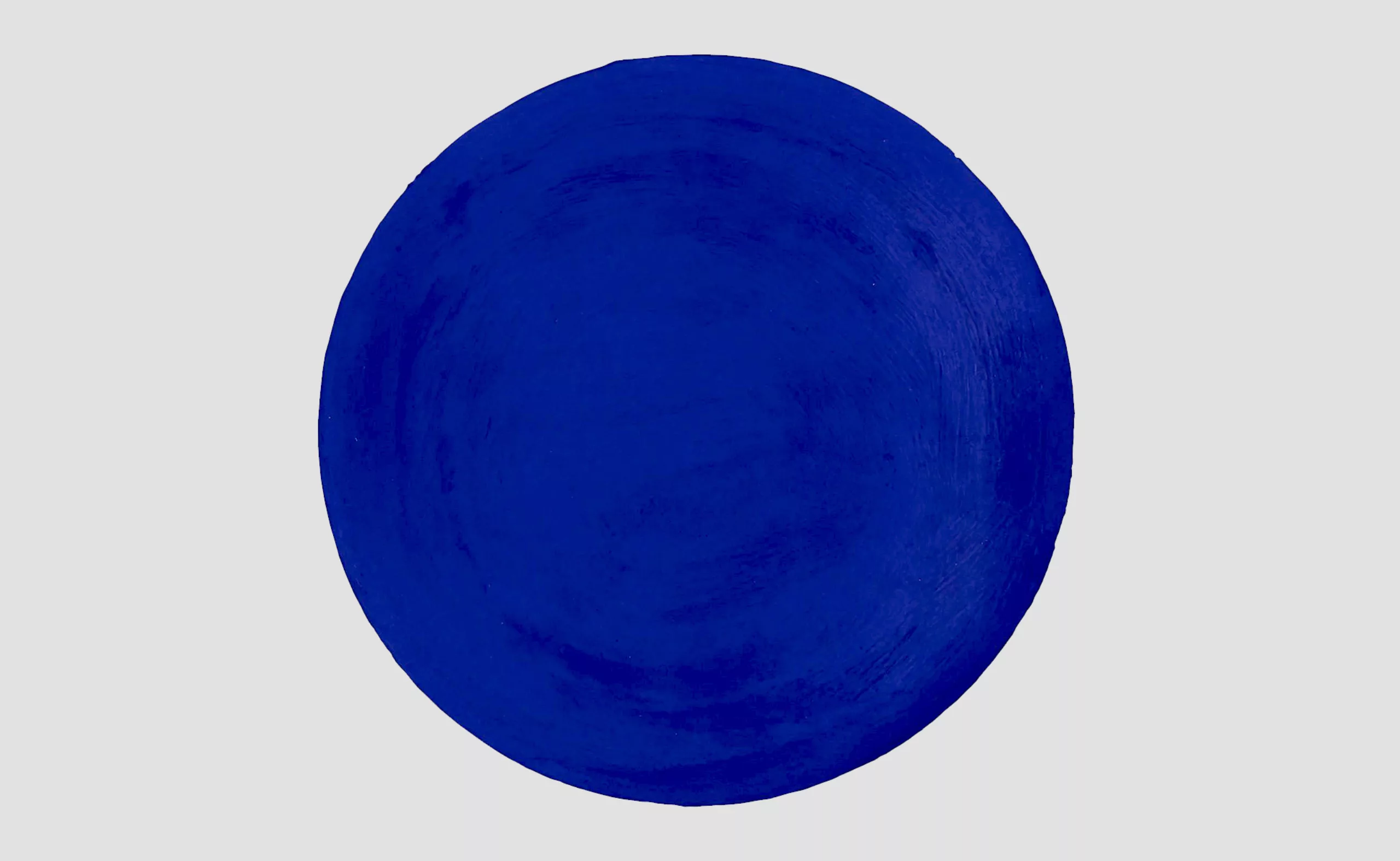
Black and blue: registered and exclusive colors?
When artists are the users of an exclusive color, one may wonder if it is the color or its symbolism that unleashes the passions.
-
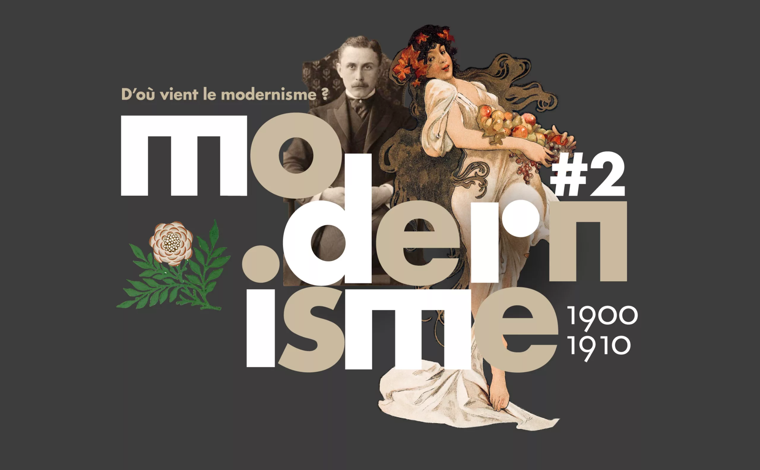
Where does modernism come from? 2 – The two faces of modernism and the social ideologies surrounding ornamentation
L’usage ou l’absence d’ornementations symbolise pour l’homme “moderne” deux visions utopiques et différentes pour changer la société.
-
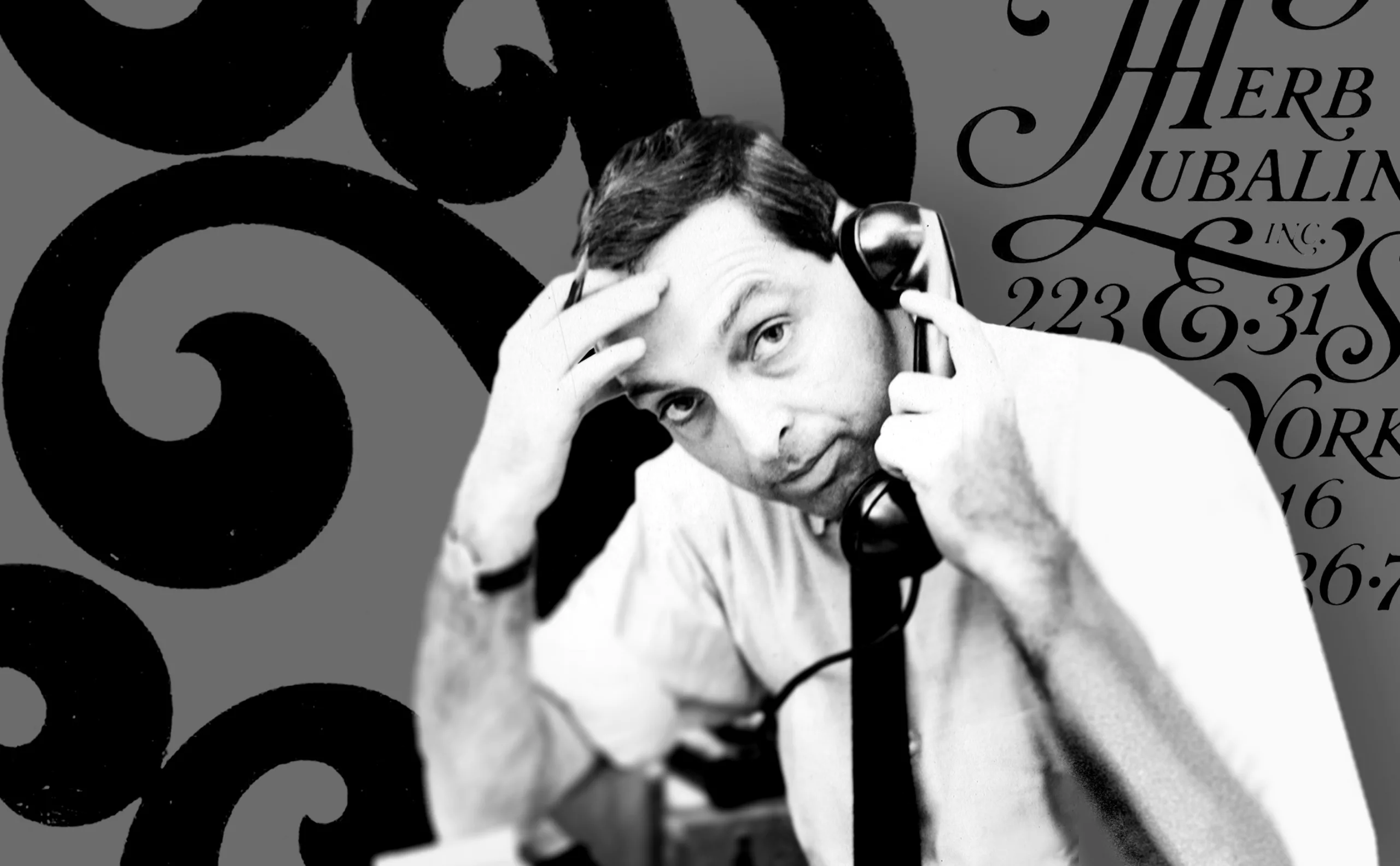
Herb Lubalin, the letter as an image
Herb Lubalin’s biography in pictures. In his 40-year career, Lubalin has revolutionized the landscape of American graphic design by composing images with text.
-
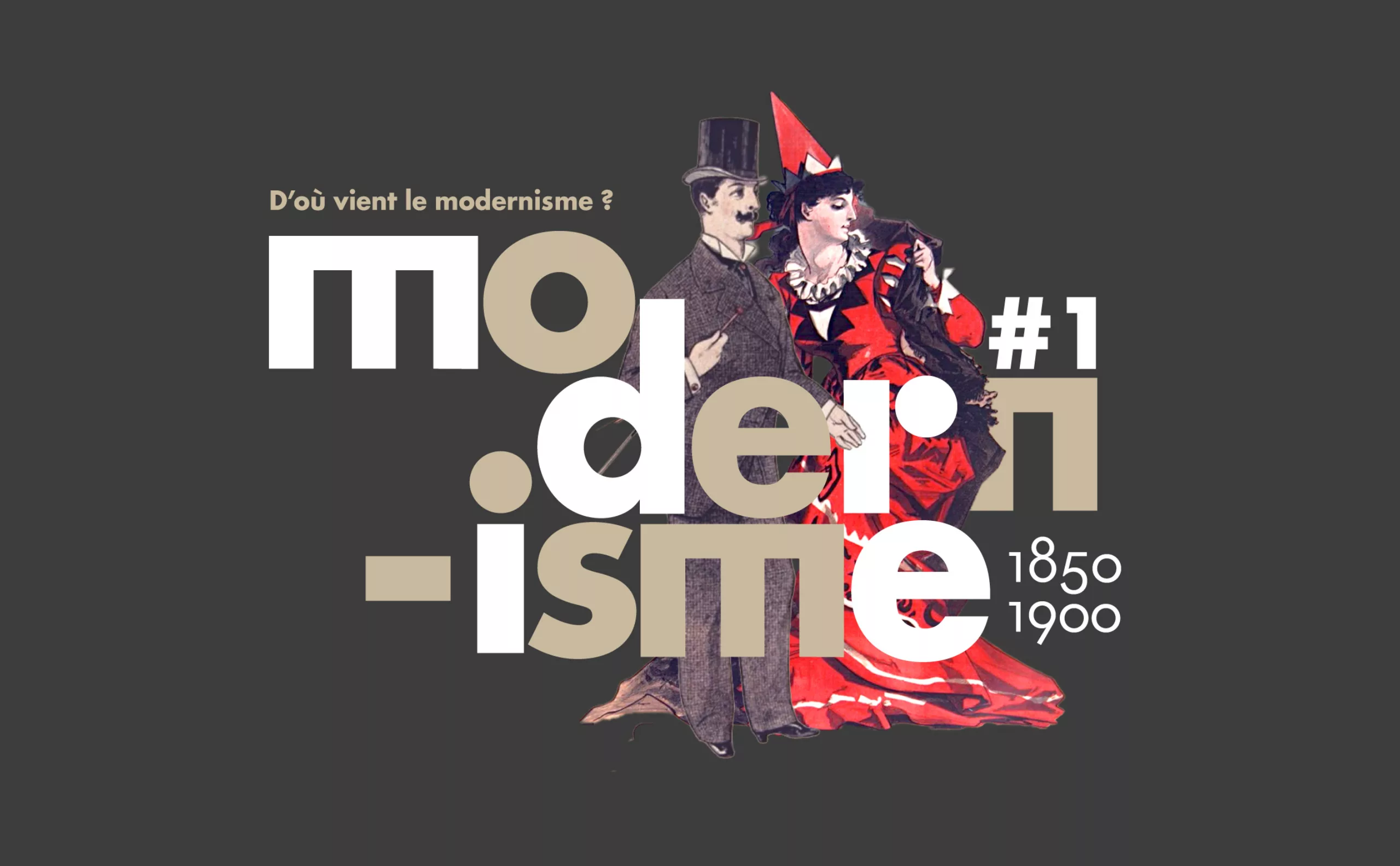
Where does modernism come from? 1 – Man propelled by Modernity
Episode #1. To understand modernism, we need to understand its relationship with modernity, and its meteoric rise at the end of the 19th century.
-

Dropbox and Indesign: the end of broken links!
Avoid broken links in indesign or illustrator when working on documents shared with colleagues in a drive or dropbox.
-
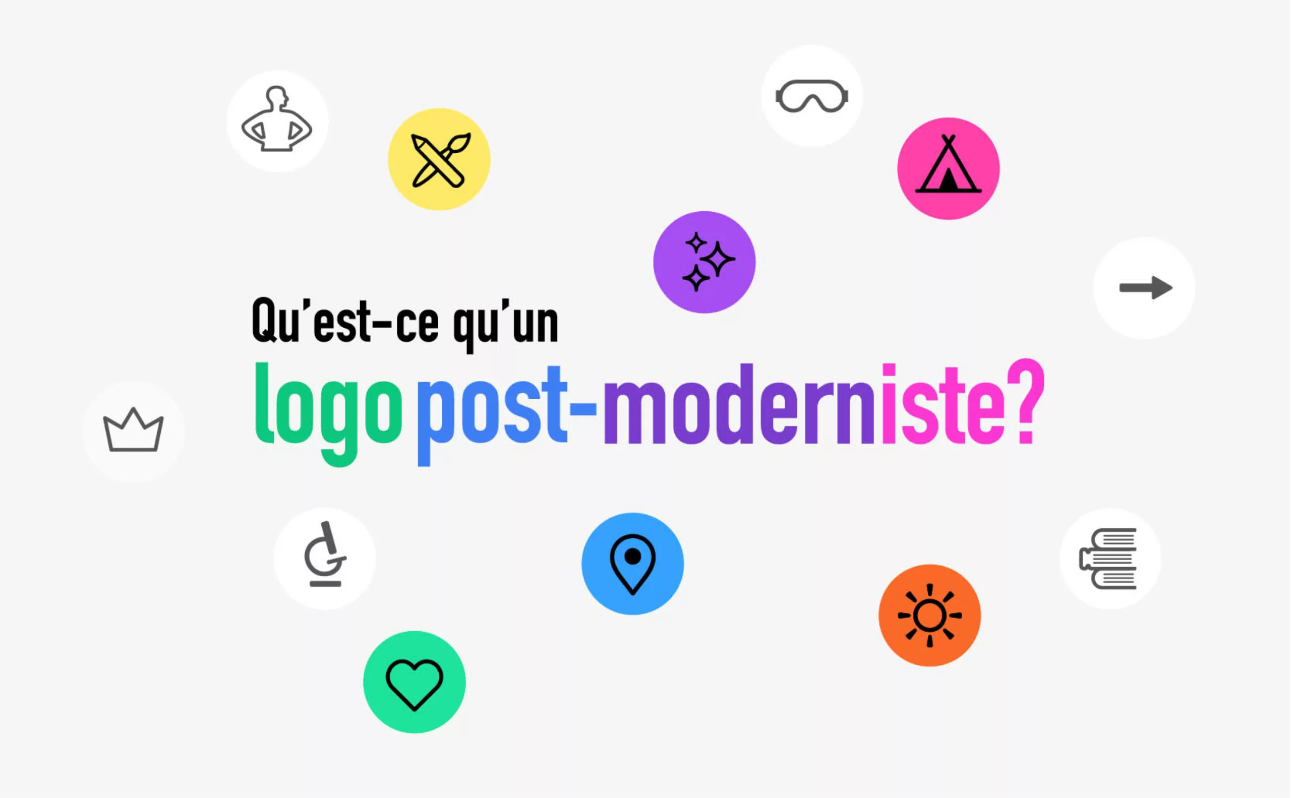
The graphic codes of post-modernism in brand logos
We are entering the “time of the tribes”. Let’s discover the impact of this post-modernity for the logos and visual identities of brands and companies.
-
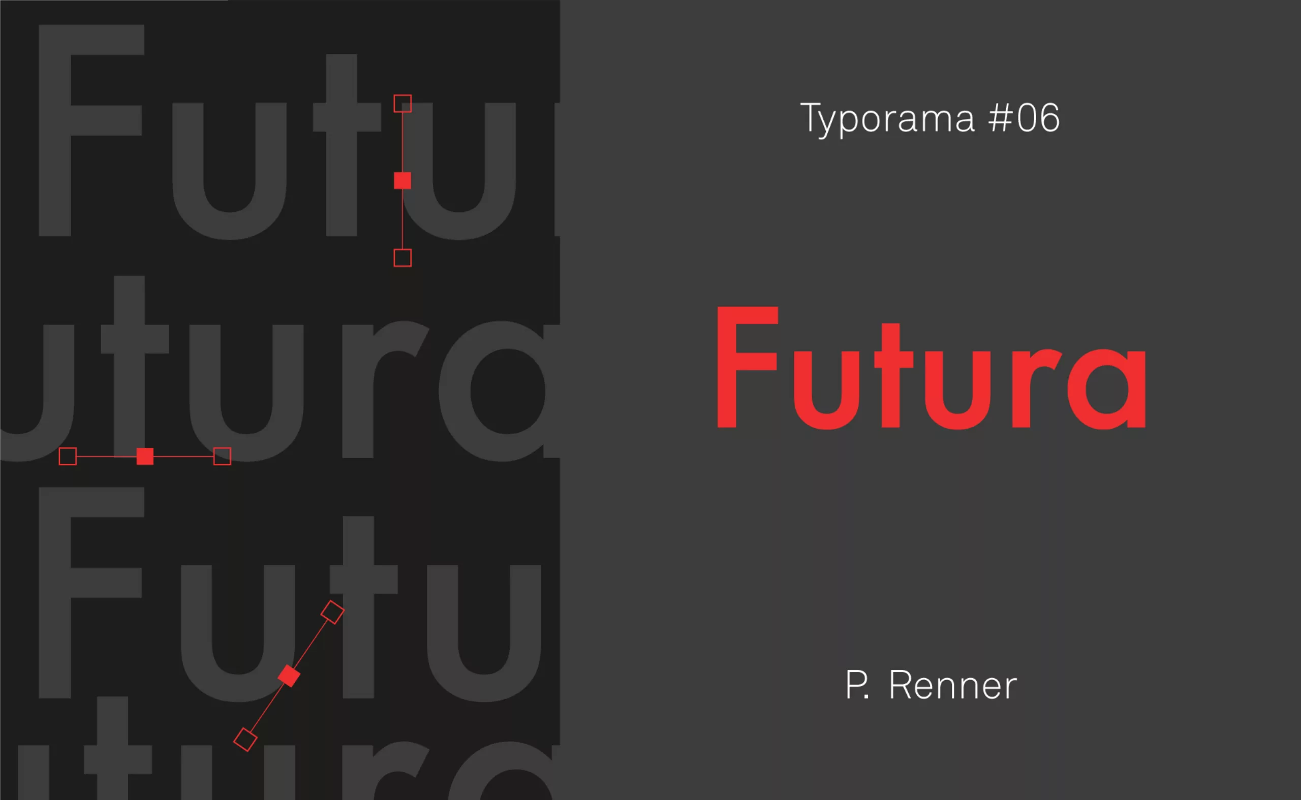
Typorama #06 : Futura by Paul Renner
From the Nazis to the moon, Futura is probably the most used typeface in the world, and yet it’s not new!
-

Le Slip français puts on a new logo
After 10 years of existence, le Slip français washes its image and puts on a new logo. Simple, basic, more inclusive, but is it enough?
-
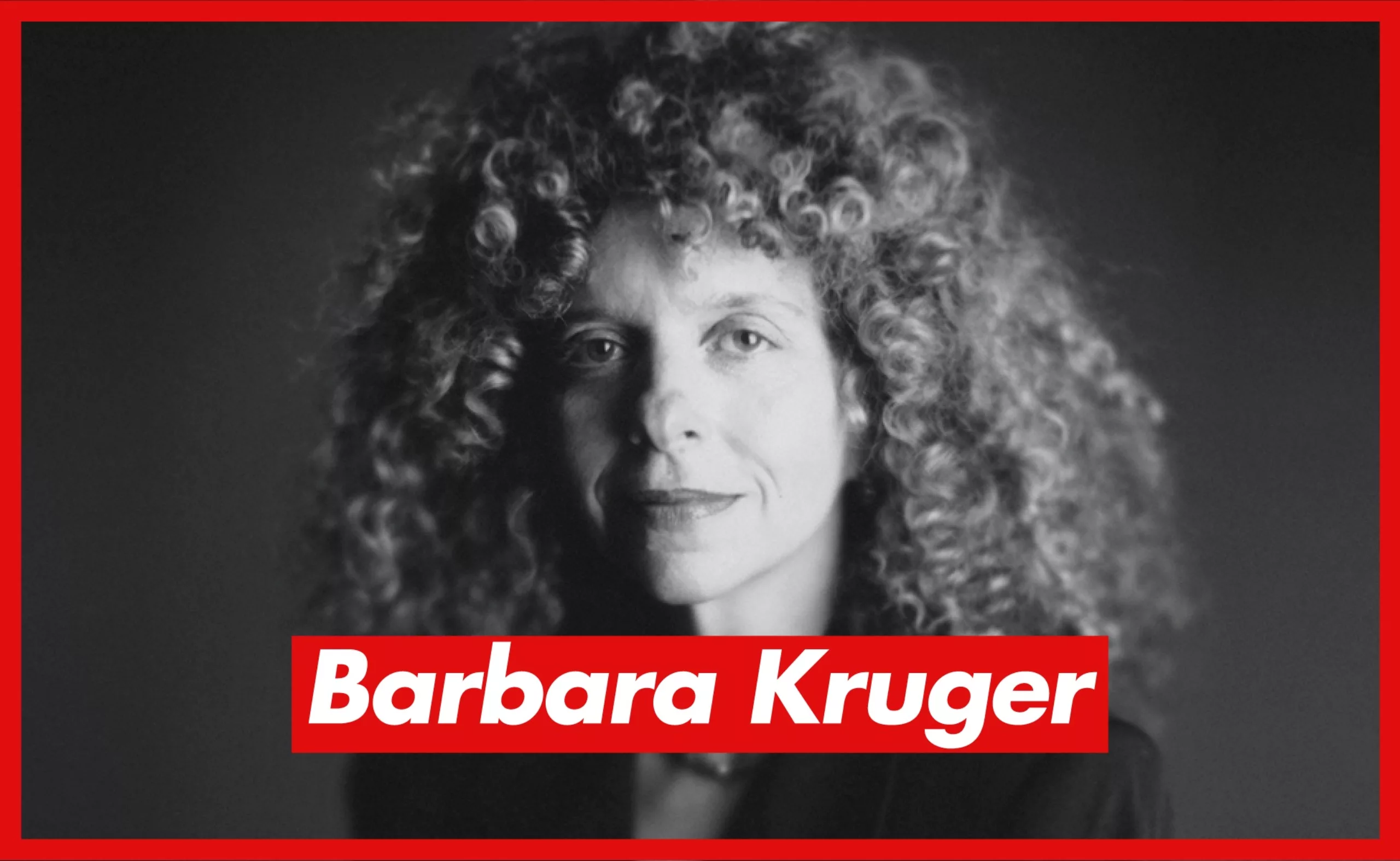
Barbara Kruger/Supreme: who’s hijacking whom?
Barbara Kruger denounces the over-consumption since the 70s. The Supreme brand has appropriated her graphic codes. But who is hijacking whom?
-
-
2021
-
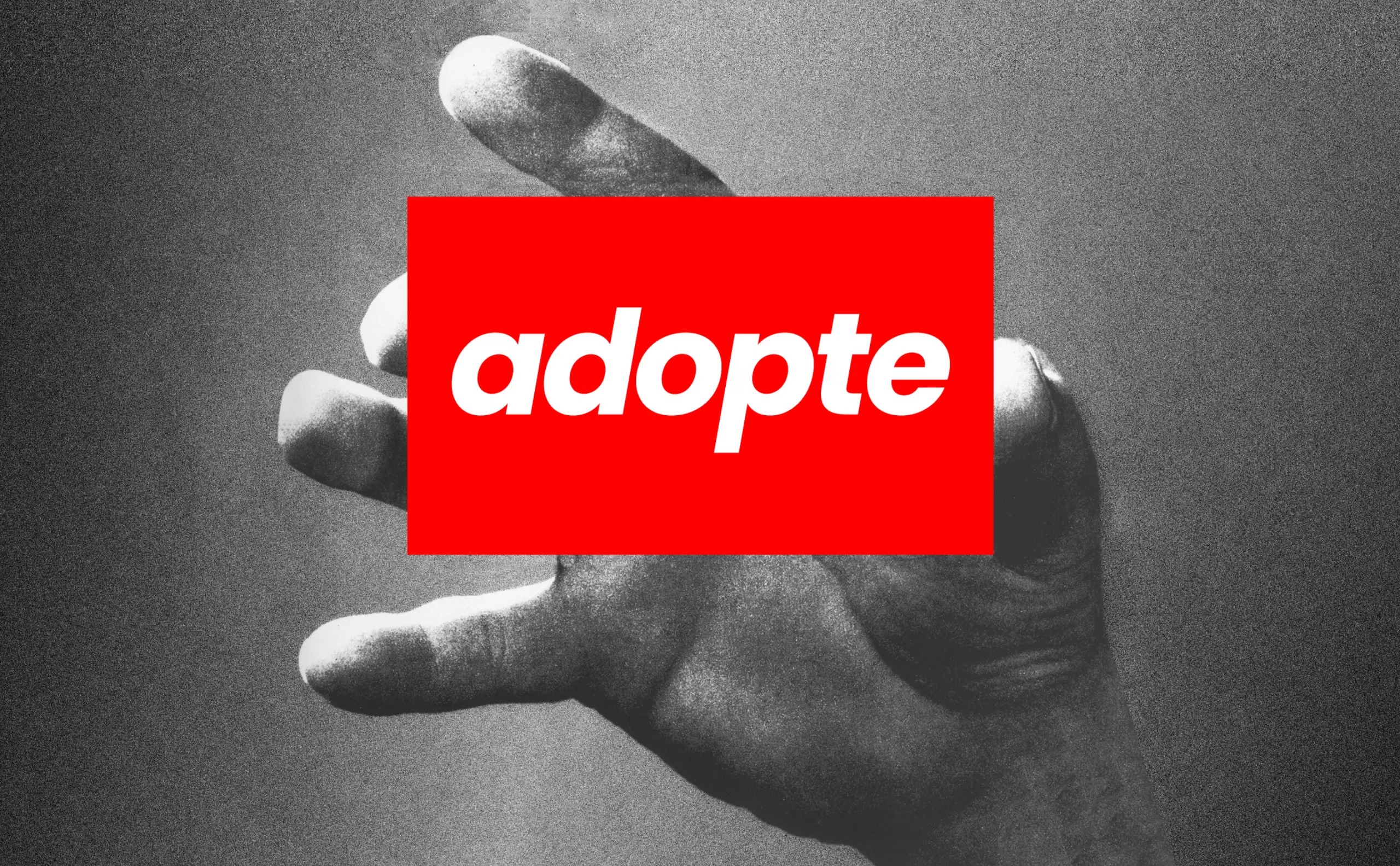
adopte un mec: a new logo for the dating app
“Adopte un mec” abandons its shopping cart and unveils its new logo: if women consume more, they devour! A look back at sexist ads.
-
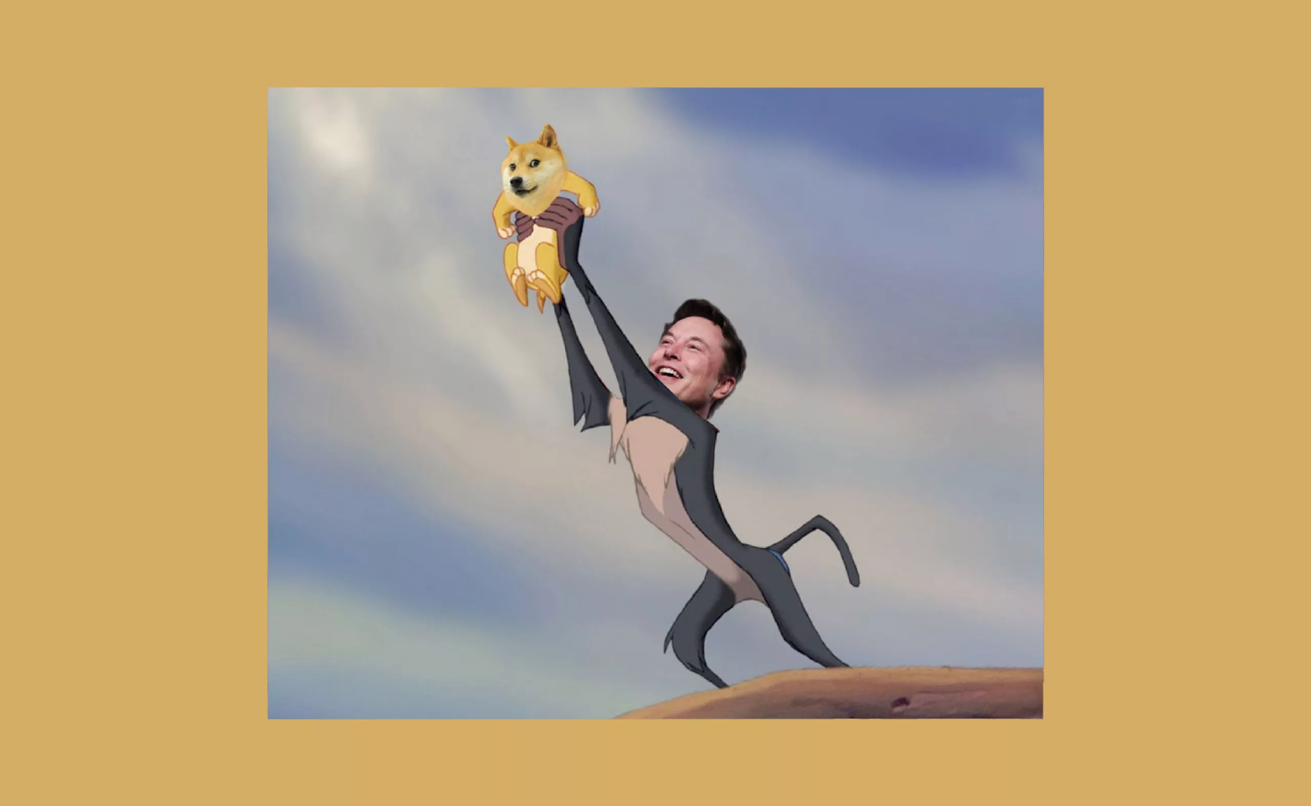
Who controls the memes, controls the universe
Who controls the memes controls the universe! Analysis of the meme phenomenon,
comparison with the stakes of brands and analysis of the impacts on political communication. -
Brands and movies: a history of product placement
Product placement in movies is sometimes irritating, funny or totally fictitious. Brands from movies sometimes even come to life.
-
Debbie Millman: searching for the meaning of design
From consumer logos to social movements, Debbie Millman questions the meaning of design in society through her work.
-
Recognize and play with typographic classification
How to see more clearly in the typographic classification and which tools allow to choose and recognize the typographies?
-
Time and and creation #04 – optimize and boost creativity with flow
How to optimize and boost your creativity: techniques to be here and now and dive into flow, an optimal state of consciousness.
-
Time and creation #03 : in search of creative time
What is creativity and what does it depend on? Our analysis of the context and conditions necessary for a creative idea to flourish.
-
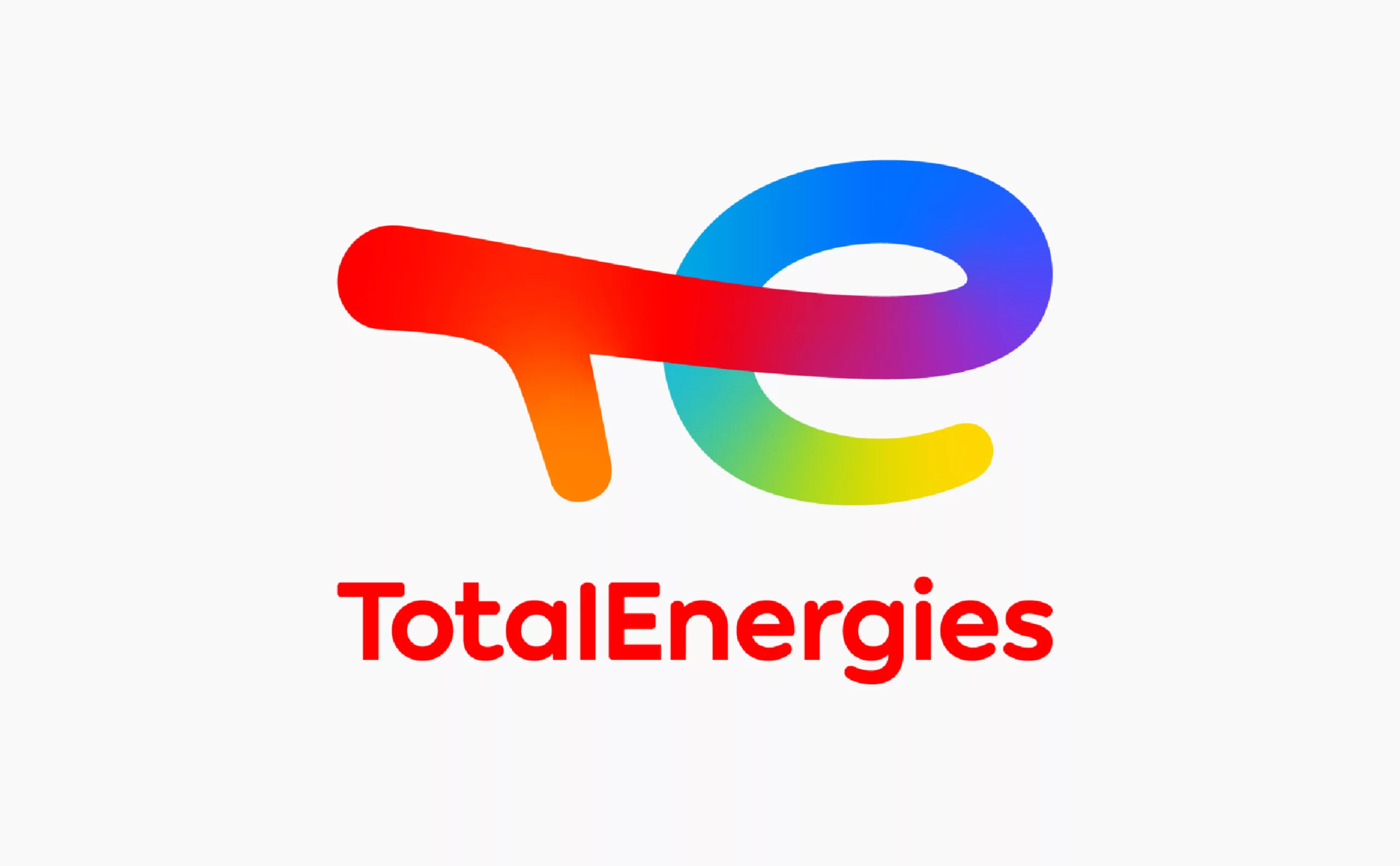
Deciphering Total’s new faded logo, becoming TotalEnergies
Total has changed its name, with a new logo and a new identity: TotalEnergies. Is this a faded strategy to go green without denying its past?
-
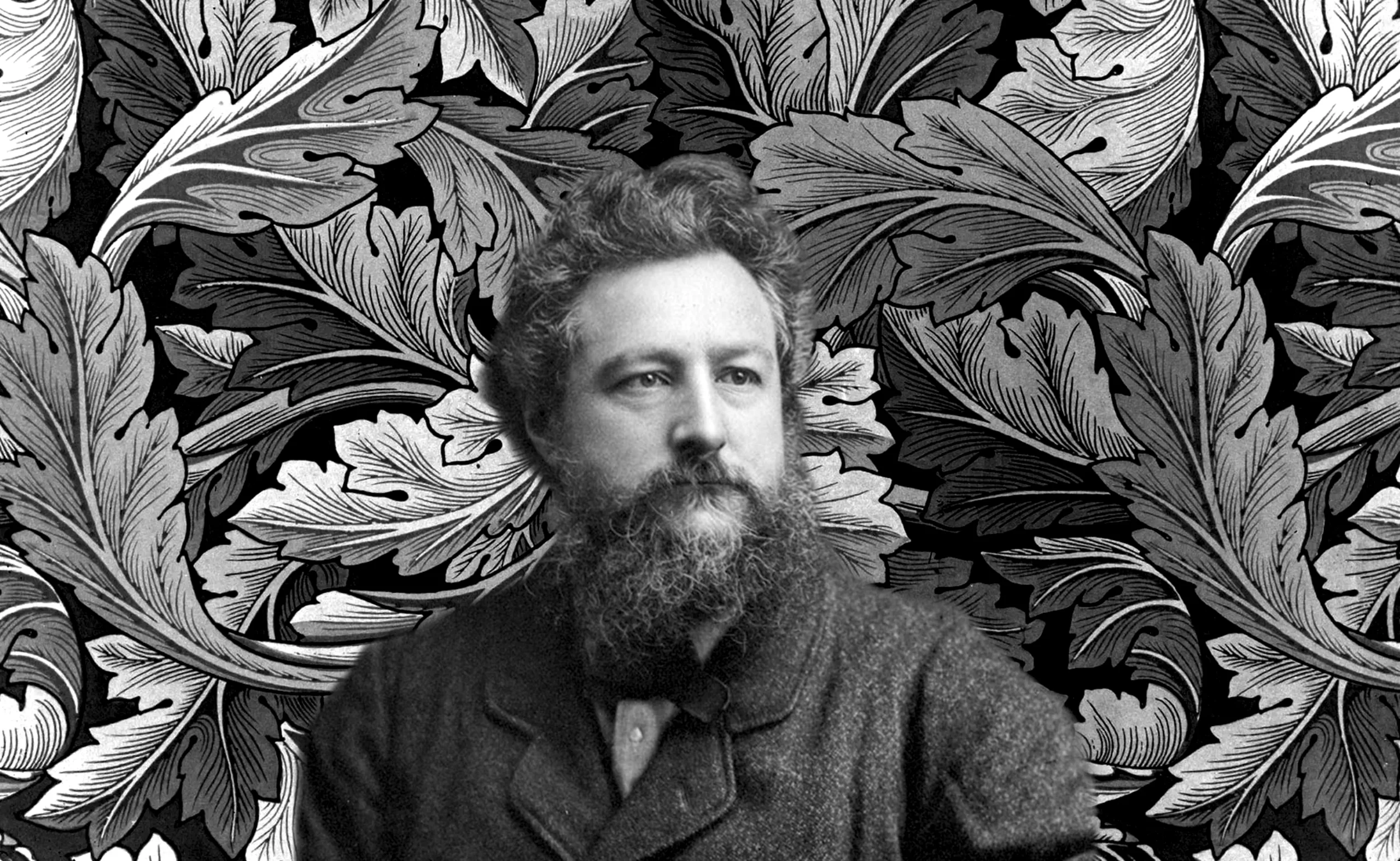
William Morris: (interior) design is not a luxury
An activist designer, W. Morris founded interior design and Arts & Crafts, improved the living conditions of workers and revalued craftsmanship.
-
Time and creation #02 : how does time impact our creative brain?
Stress impacts our creativity. How do we perceive time and how does it affect creativity in our brain?
-
Time and creation #01 : working flat out, a tiring tradition
Flat out again at work… In a hurry, rushed by time and overwhelmed until last minute. But what does the expression “charrette” mean anyway?
-
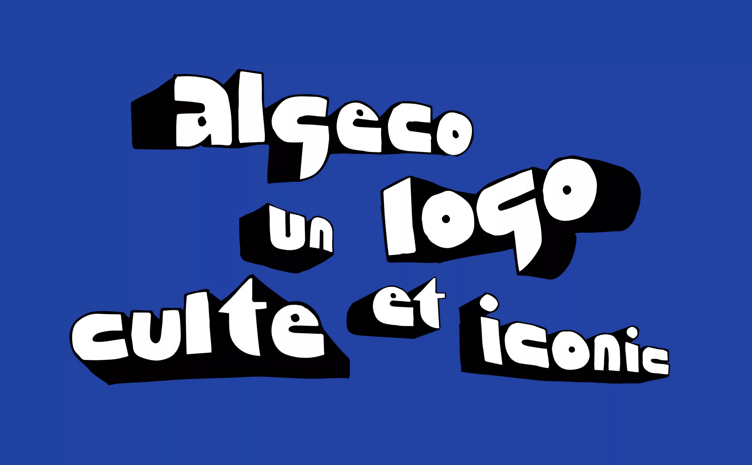
Algeco®, an iconic logo and the quest of timeless brand identities
What is a cult and timeless logo? We take advantage of an invitation to decipher the Algeco logo to look at the case of “iconic” logos.
-
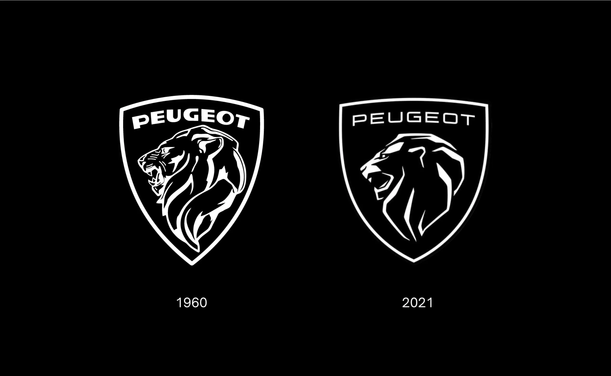
New Peugeot logo and car rebranding, it smells musky!
Peugeot reveals its new logo, a revival of the 1960 logo.
An astonishing or worrying positioning? Here are a few insights. -
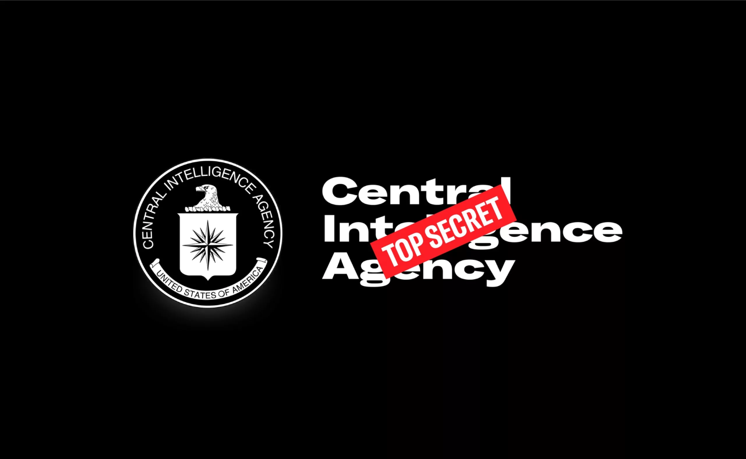
The CIA gets a new identity!
Nouvelle identité visuelle de la CIA, avec un petit look de festival electro ou de série Netflix !
-
-
2020
-

In India, the political logos are of a very original banality
How to make millions of voters, 50% of whom are illiterate, vote? India offers visual political logos that are out of the ordinary.
-

Helvetica brands, for those who are fond of typography
Helvetica, as an icon, has become a brand: you can now drink, wear or even smell Helvetica.
-
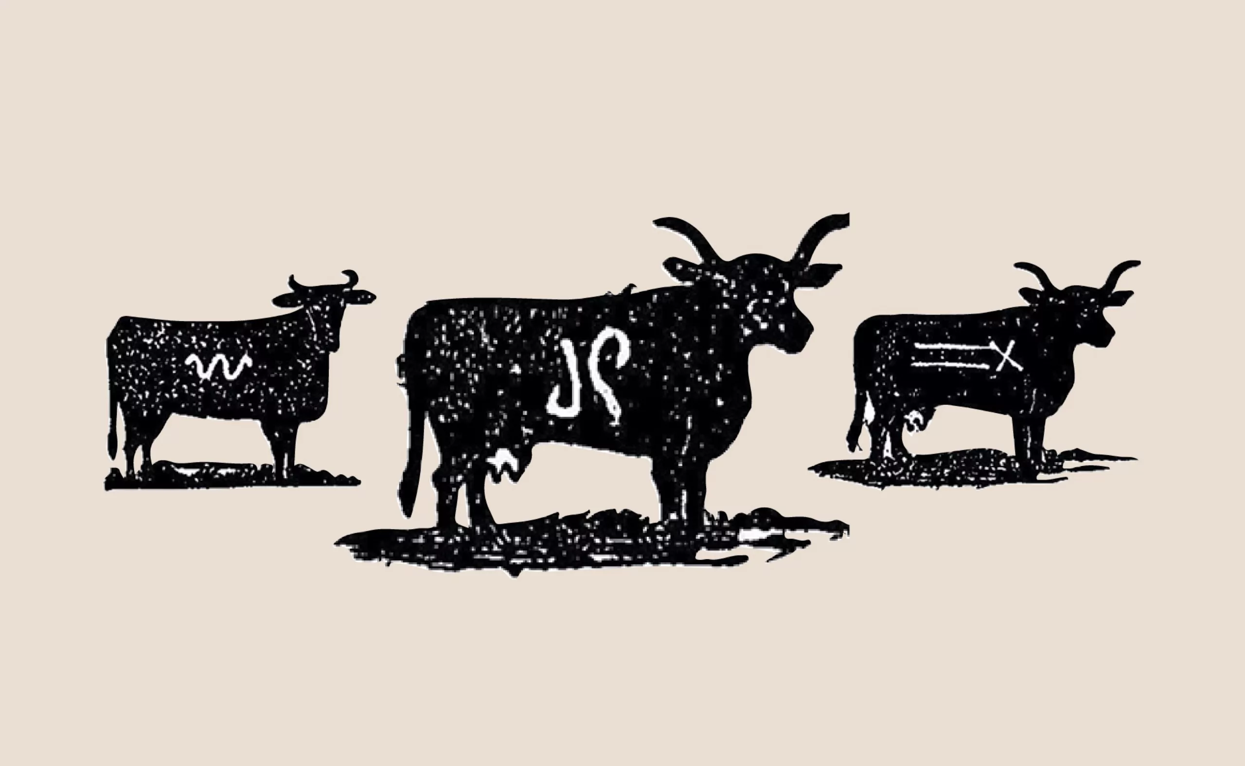
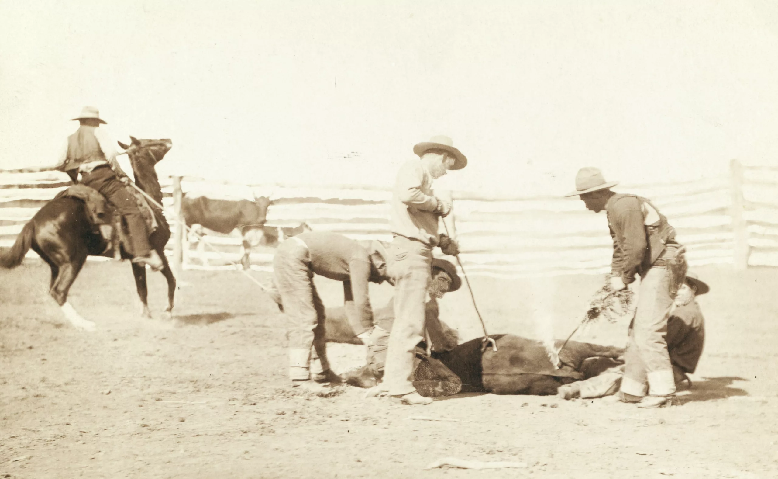
Hot-iron cattle branding: brand on the skin
To understand cowboys’ branding system, it is necessary to look at the hot-branding of cattle, and artists’ monograms.
-
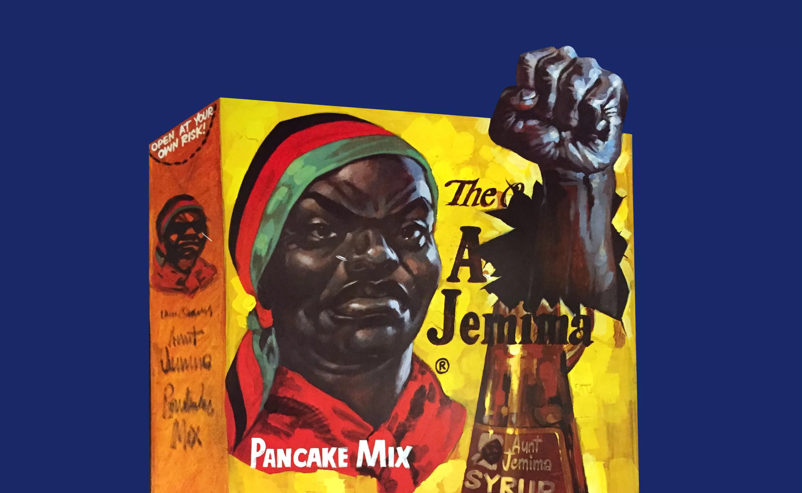
Uncle Bens’, Aunt Jemima… racist packaging rises up
From Uncle Ben’s or Aunt Jemima’s brand name history to Mammy’s syrup, the racist packaging are sitting on a (pancake) powder keg.
-
Creating a universal language
In their search for a universal language, Leibniz and his disciples may have attempted to create the impossible. And yet…
-
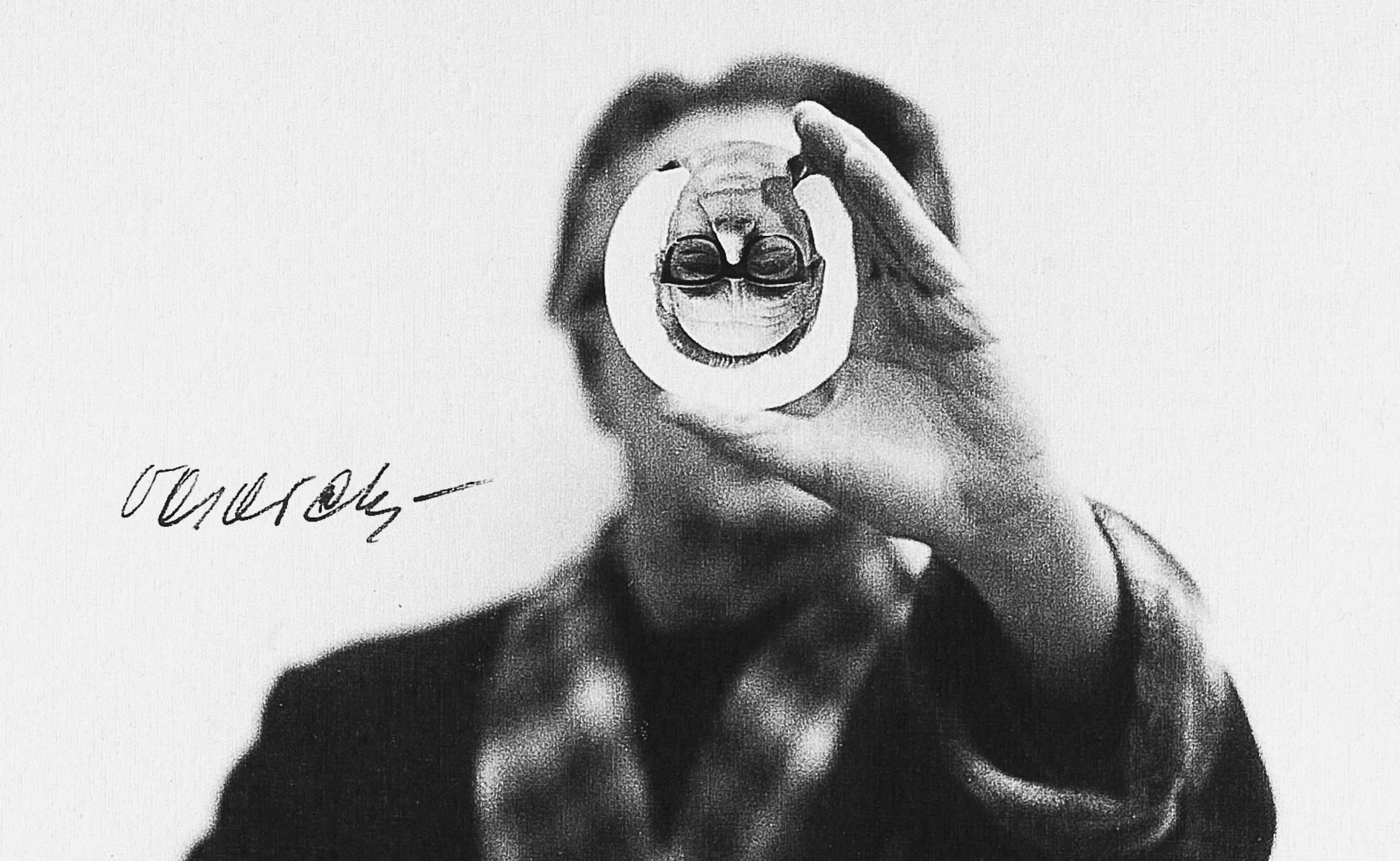
Do you speak Yerkish, the language of monkeys?
Imagine a silent language, without letters or words, for non-humans. In front of your eyes, the yerkish, a language for communicating with monkeys, takes shape.
-
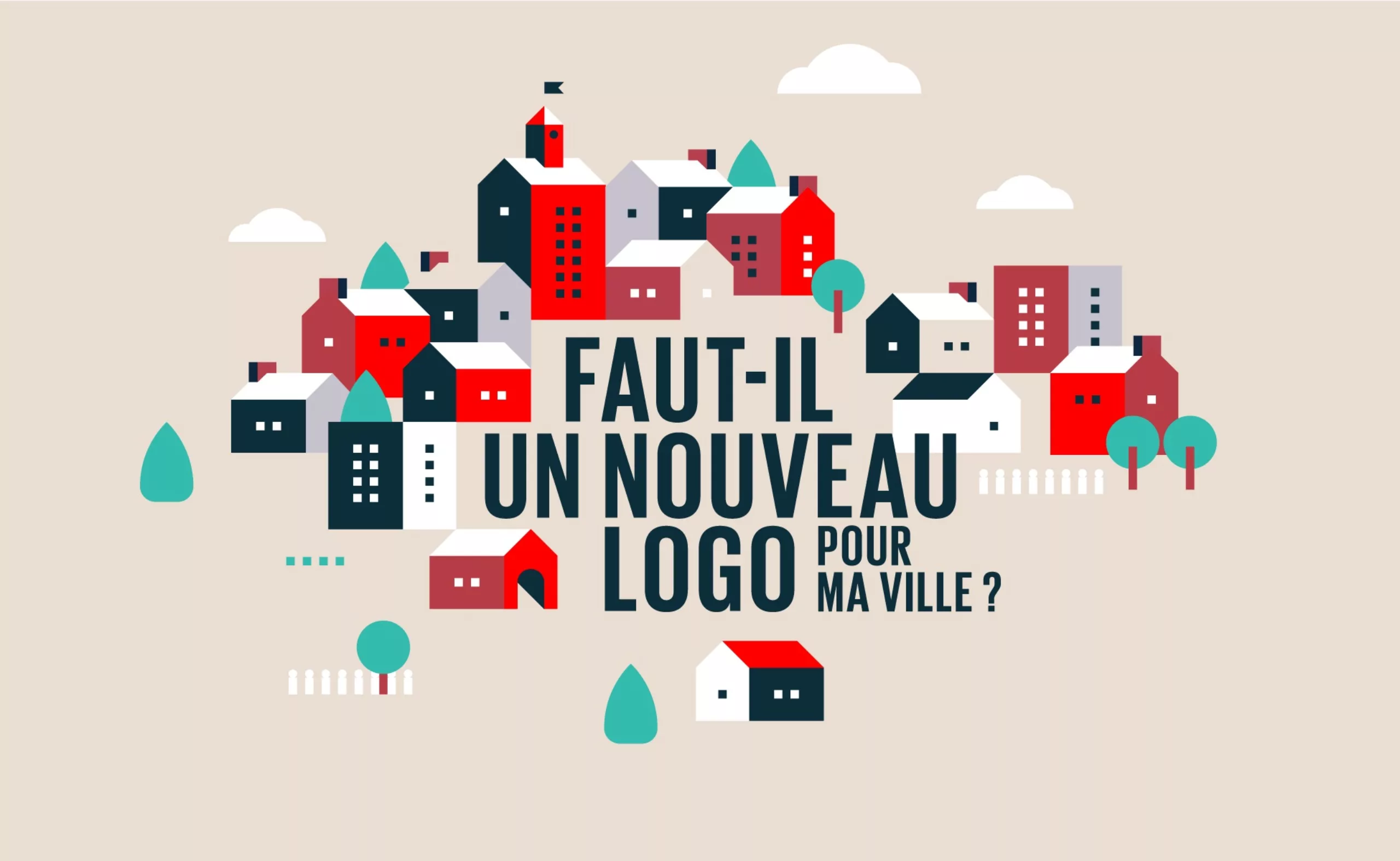
Why and how to create a new city or territory logo?
Before creating a new city logo, several elements have to be taken into account: the purpose of the new logo, the budget, its inhabitants…
-
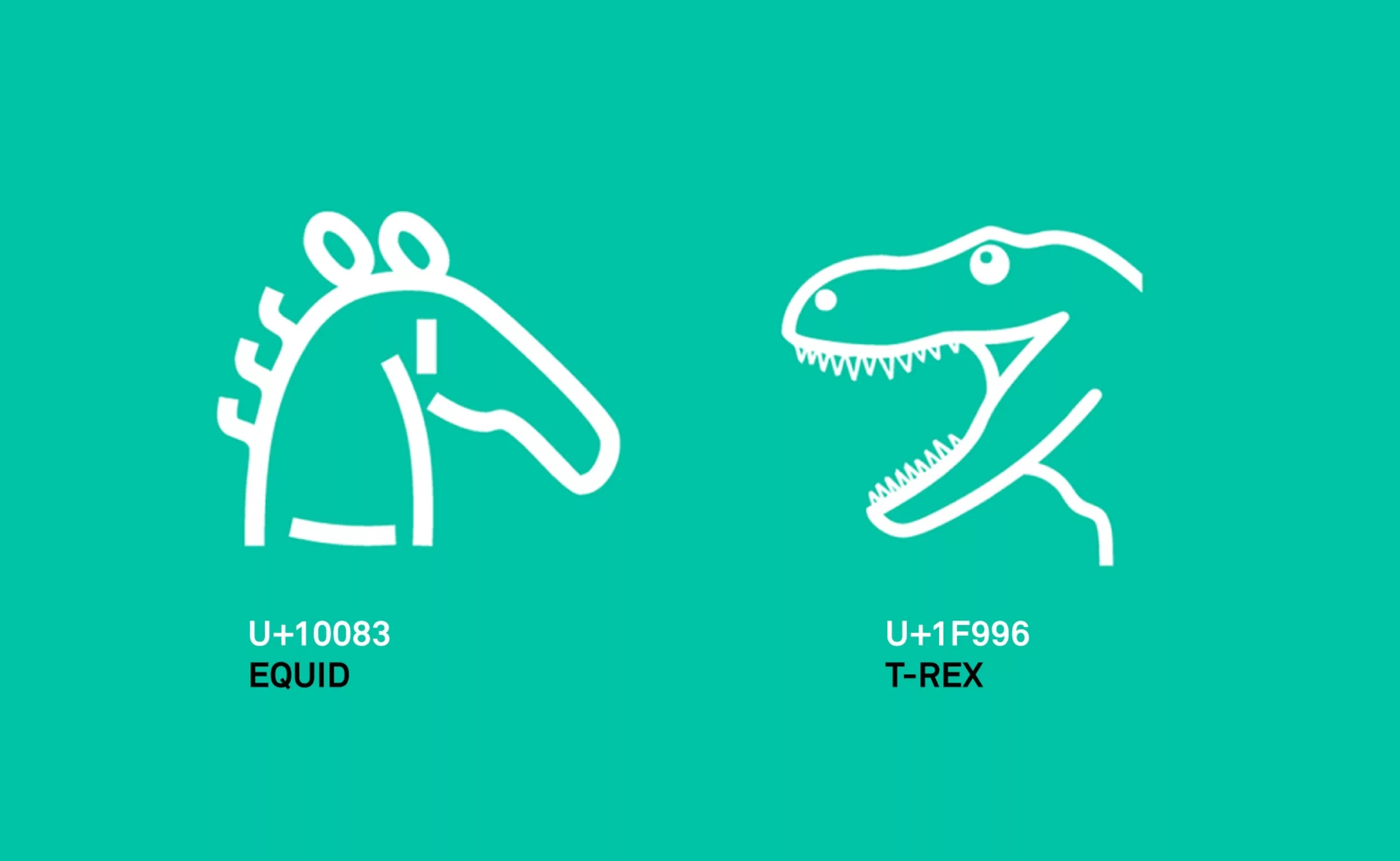
Unicode wants to save scripts by standardizing them
Bizarre as well as strange, the Unicode language aims to collect and preserve writings… by standardizing them.
-

Heliophore, the animated paper
If Louis Dufay’s name has fallen into oblivion, one of his inventions will be remembered: the heliophore, the kinetic paper that shone in the 60s.
-
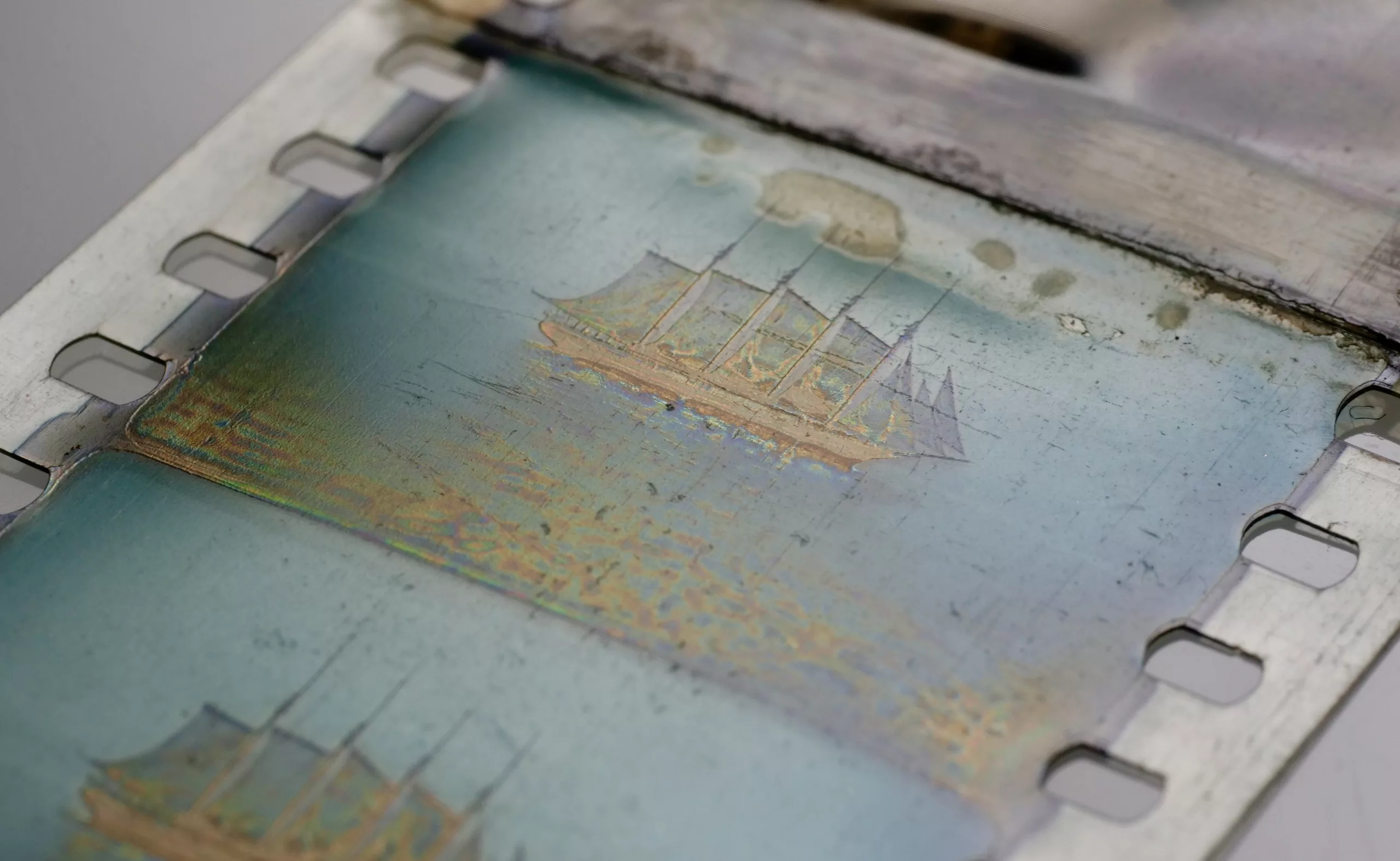
The colour photography rush
A furtive glimpse of some of the techniques used in the early days of colour photography, from the Lumière brothers to Louis Dufay, the forgotten inventor.
-
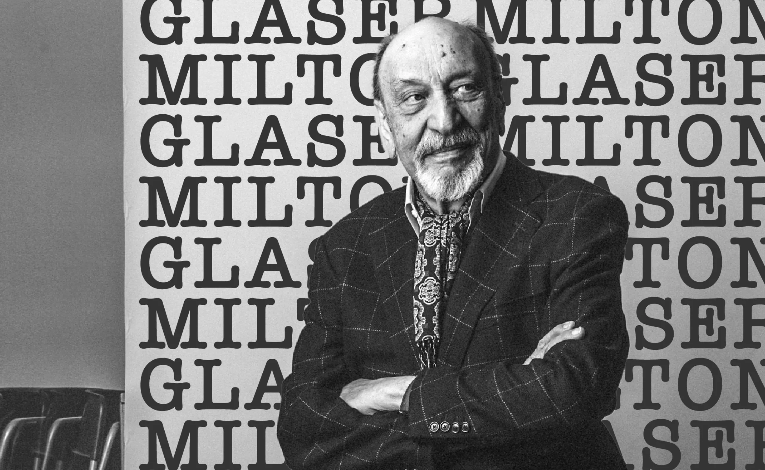
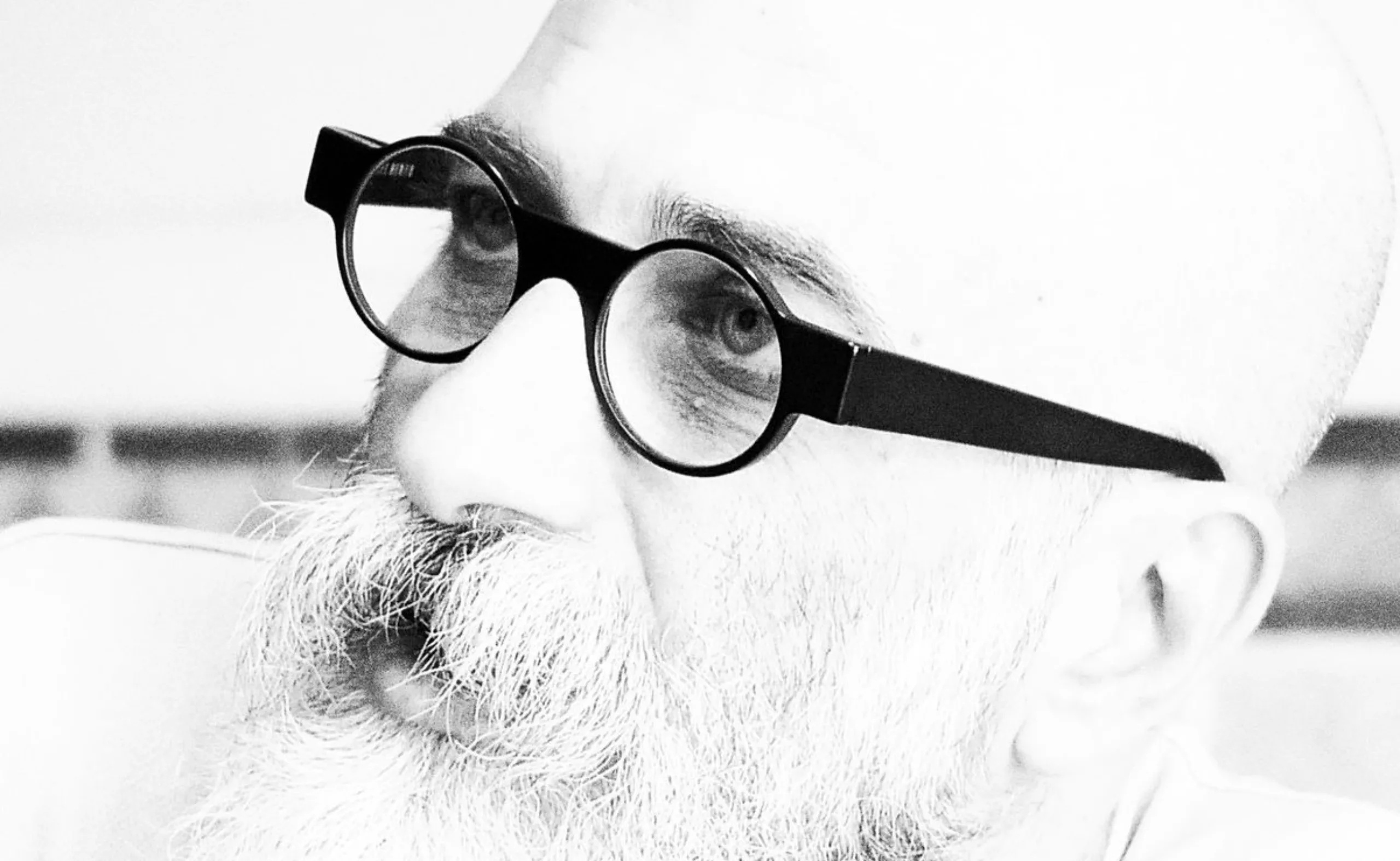
We ❤️ Milton Glaser !
Graphic designer Milton Glaser gave the 70s and 80s a cheerful and colourful face and New York a reason to love him. Among his most famous creations are the logo “I ❤ NY” and Bob Dylan’s psychedelic poster. Let’s go into the history of a very, very big name in American design.
-
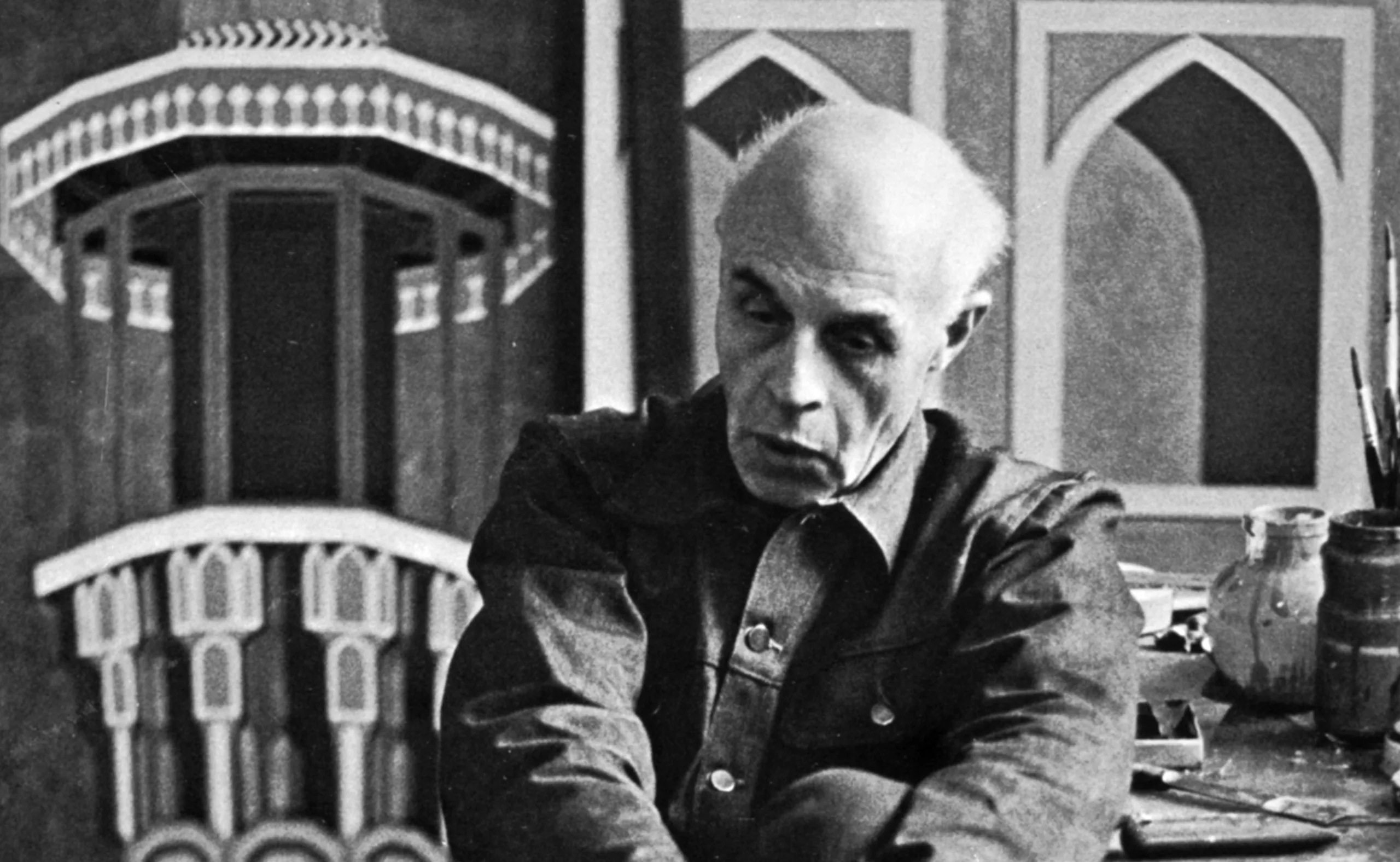
Reza Abedini, father of iranian contemporary graphic design
Being a designer like Reza Abedini in a country such as Iran means juggling with an incredible artistic, visual and calligraphic heritage that is 3000 years old.
-
The Art and Science of Hybrid Images
Let’s discover hybrid images and see how neuroscience can help us better understand our “gaze”.
-
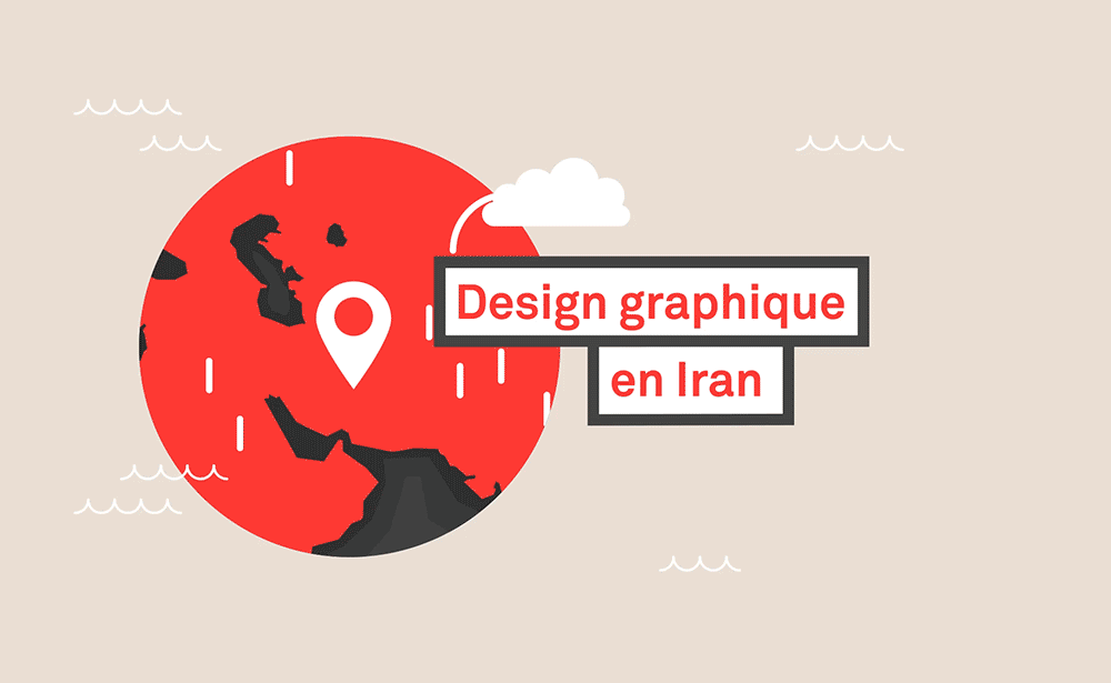
The genius of Iranian graphic design
To grasp the genius of Iranian graphic design one must understand its incredible heritage in the arts, and the current upheavals. A short journey from ancient Persia to the most contemporary graphic design.
-
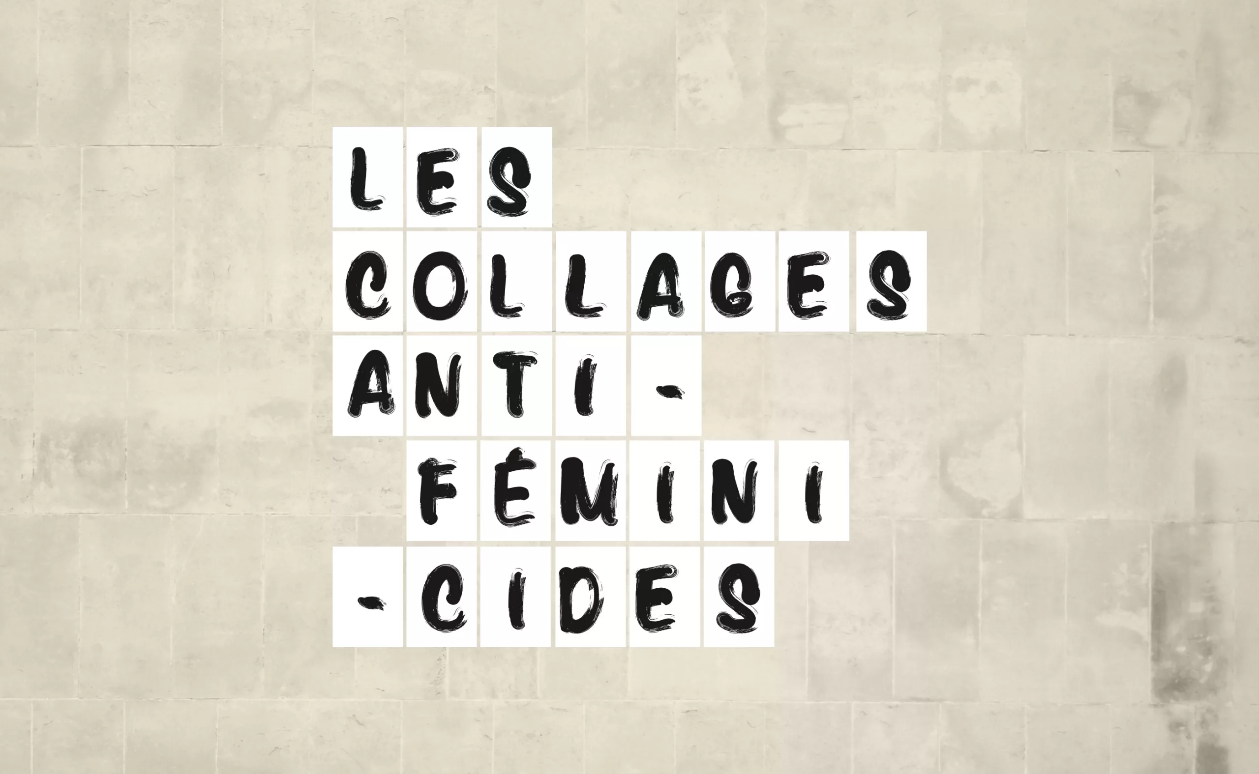
The branding of a social movement: Collages against feminicides
Why and how anti-feminicide collages, through their “graphic charter” as simple as it is powerful, have opened a wide breach in the public debate.
An opportunity to try to untangle how the “branding of a social movement” differs from the “classic branding of brands”. -
Stereotypography: typical, even racist, typefaces
Used mechanically and out of context, certain typographies convey cultural stereotypes. We call them “stereotypographies”.
-
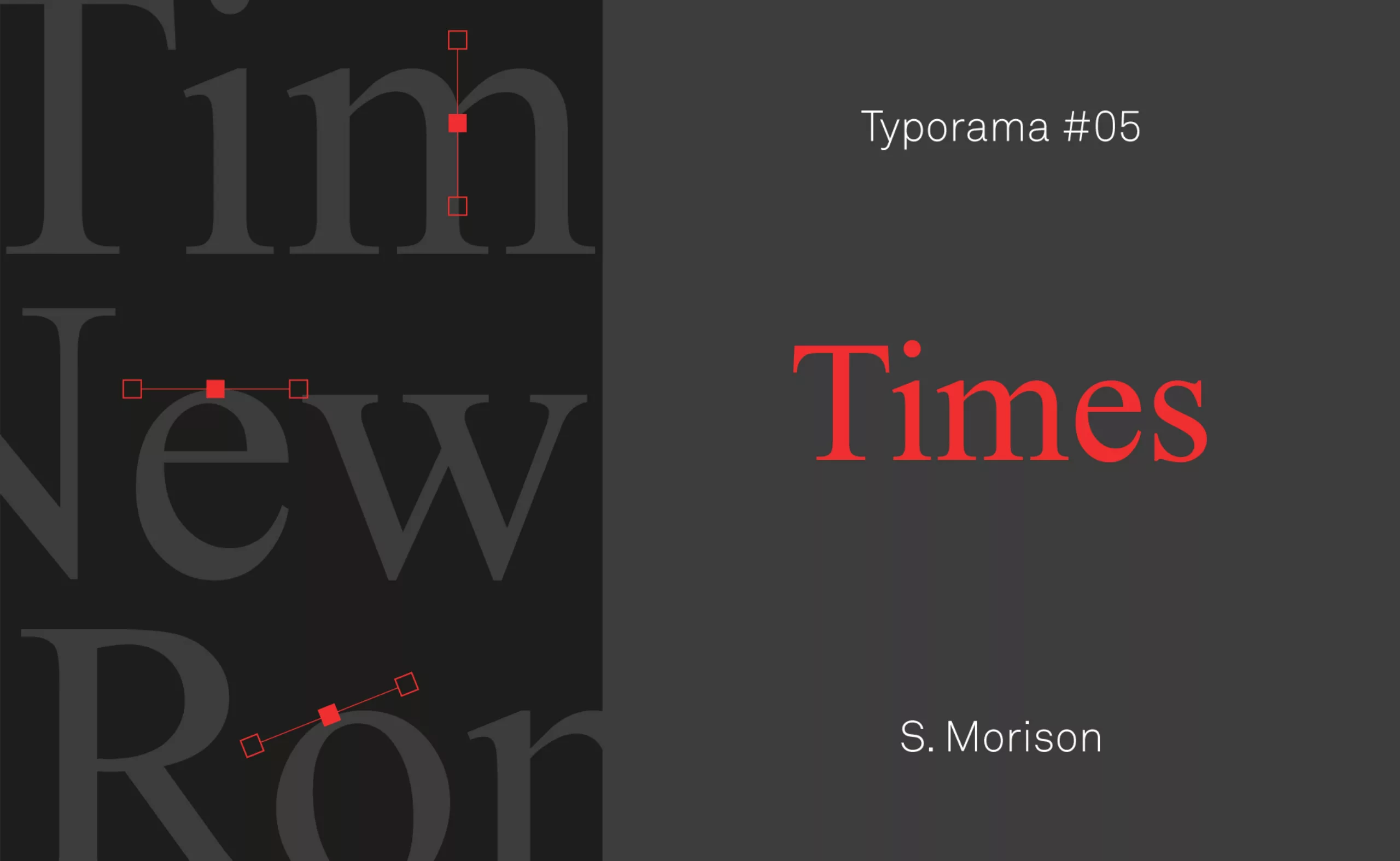
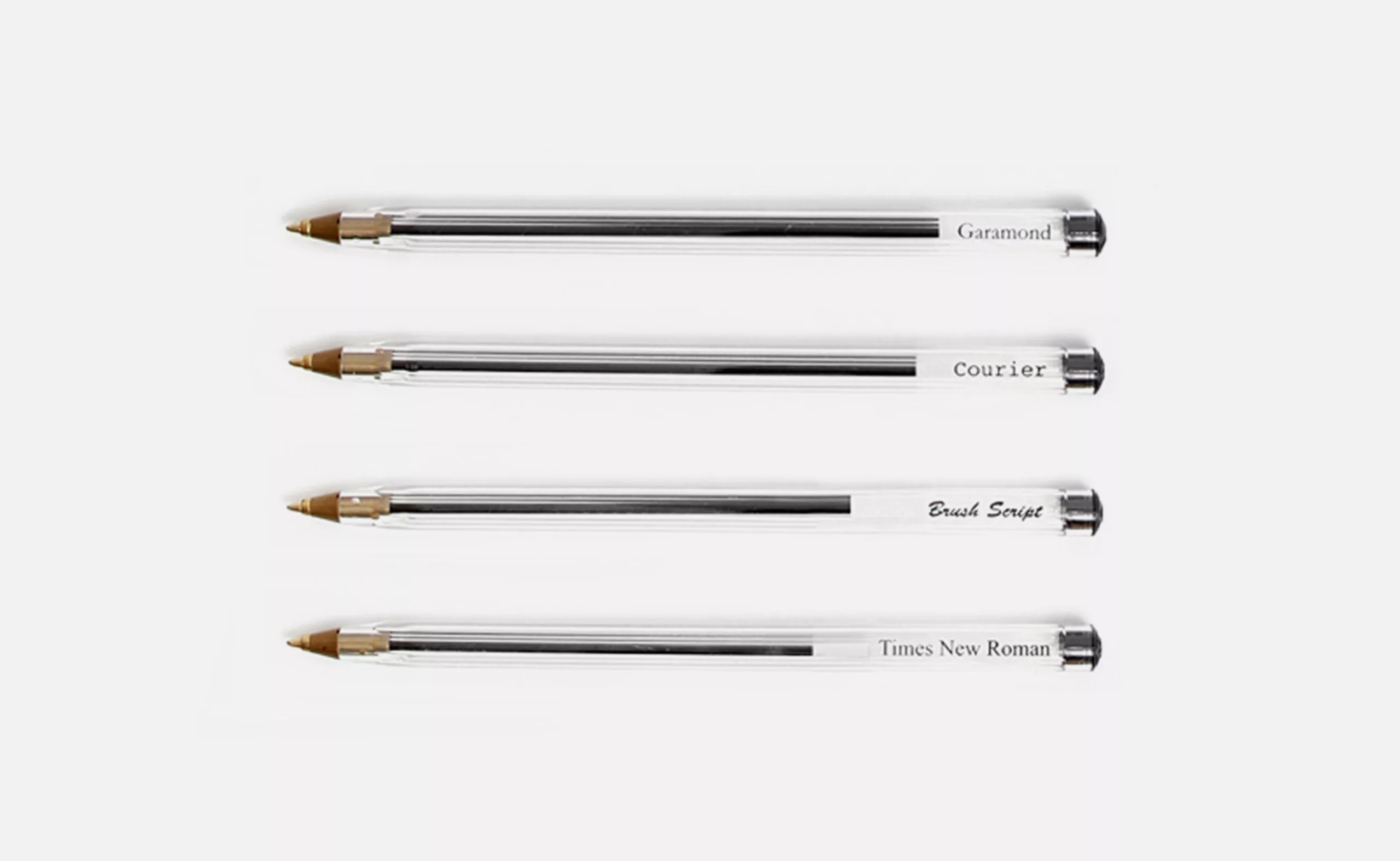
Typorama #05 : Times after time
A short history of Times New Roman, the essential typeface designed in 1932 by Stanley Morison for The Times newspaper.
-
-
2019
-
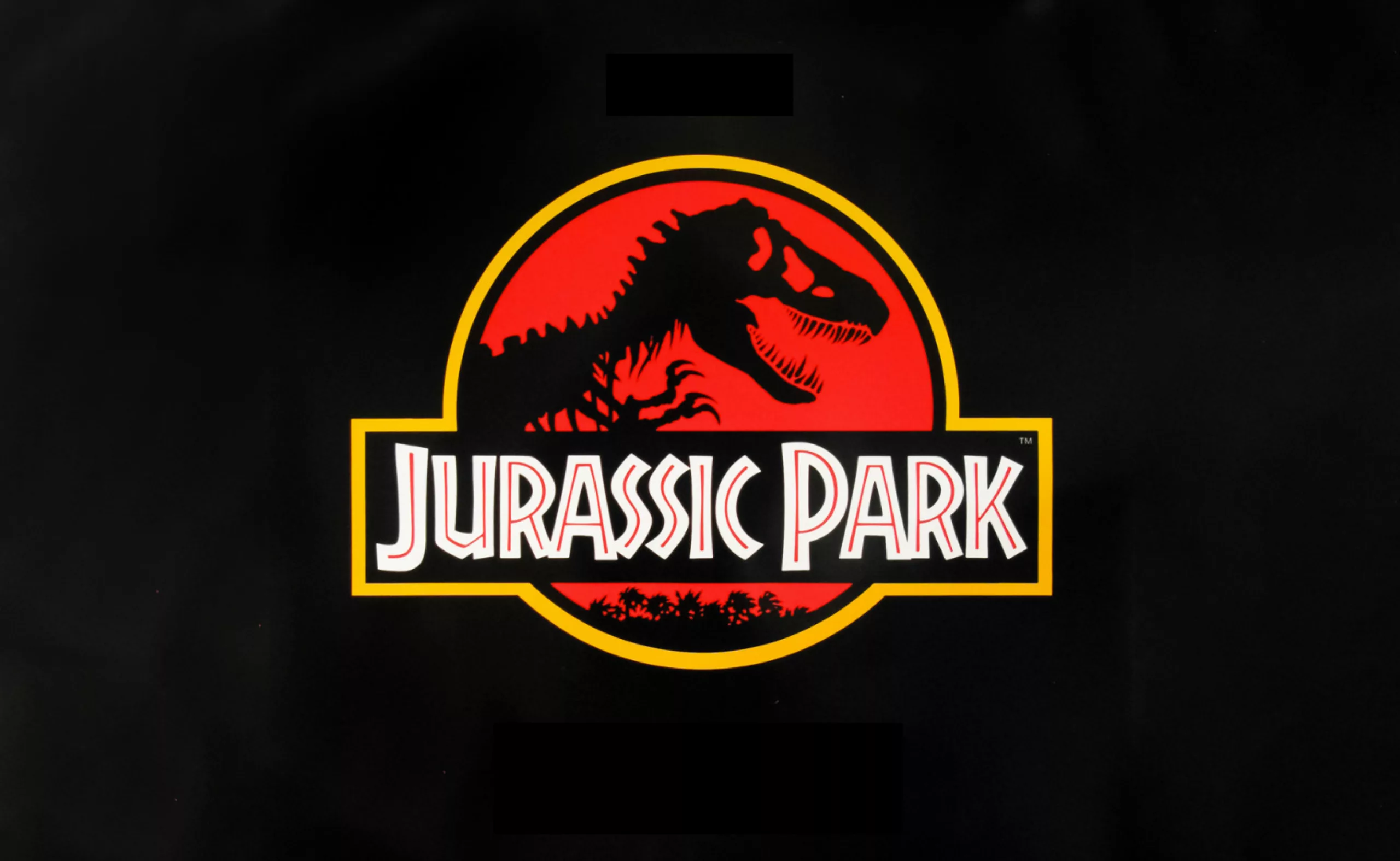
The story of the big bad Jurassic Park logosaurus
It took 68 million years to resurrect a T-rex, and almost as long to create the Jurassic Park logo. Here is his wicked adventure.
-
Wally Olins, father of territory branding
Wally Olins is the inventor of business and territorial branding and all the influence that comes with it. Discover his work and our exclusive interview.
-
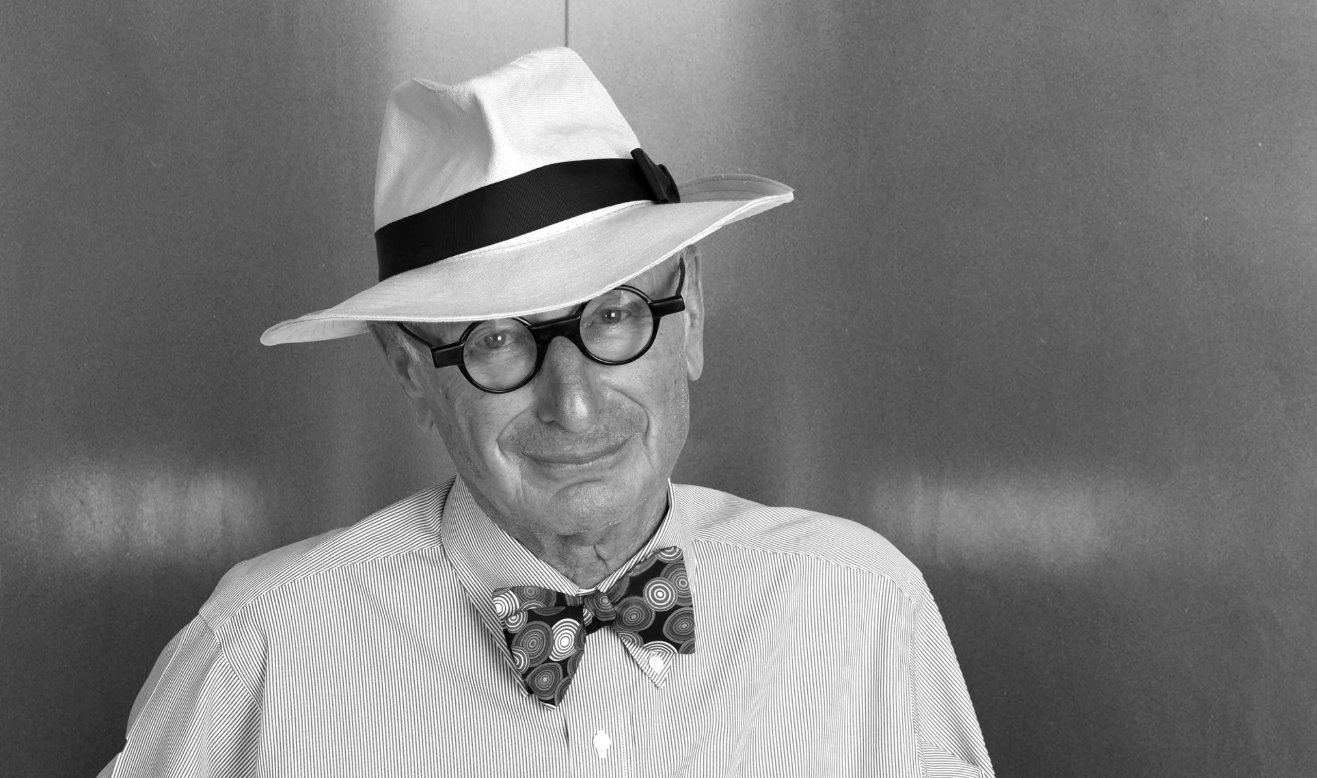
Paul Rand, everything is design!
In the 1950s, in the midst of the Cold War, Paul Rand transformed the use of graphic design and the face of American companies.
-
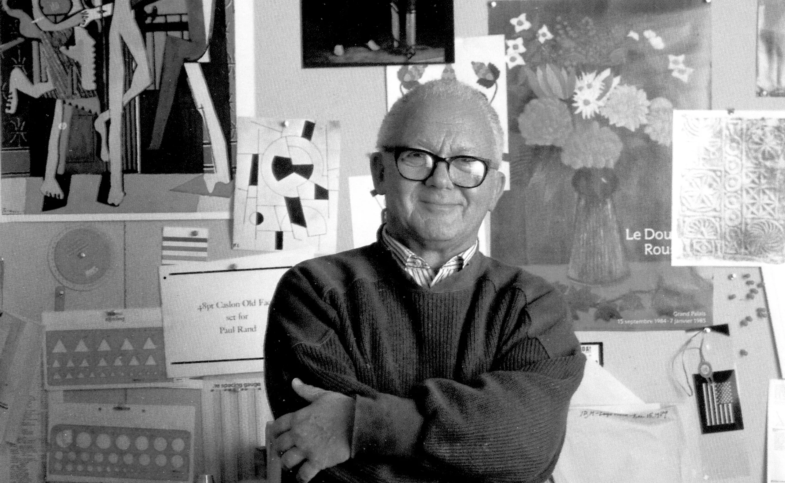
Who is the PoPA of the MoMA logo?
Thoughts about contemporary brandingThe MoMa is a must-see museum and its logo has become a reference for visual identity and cultural branding. Discover who is at the origin of its creation.
-
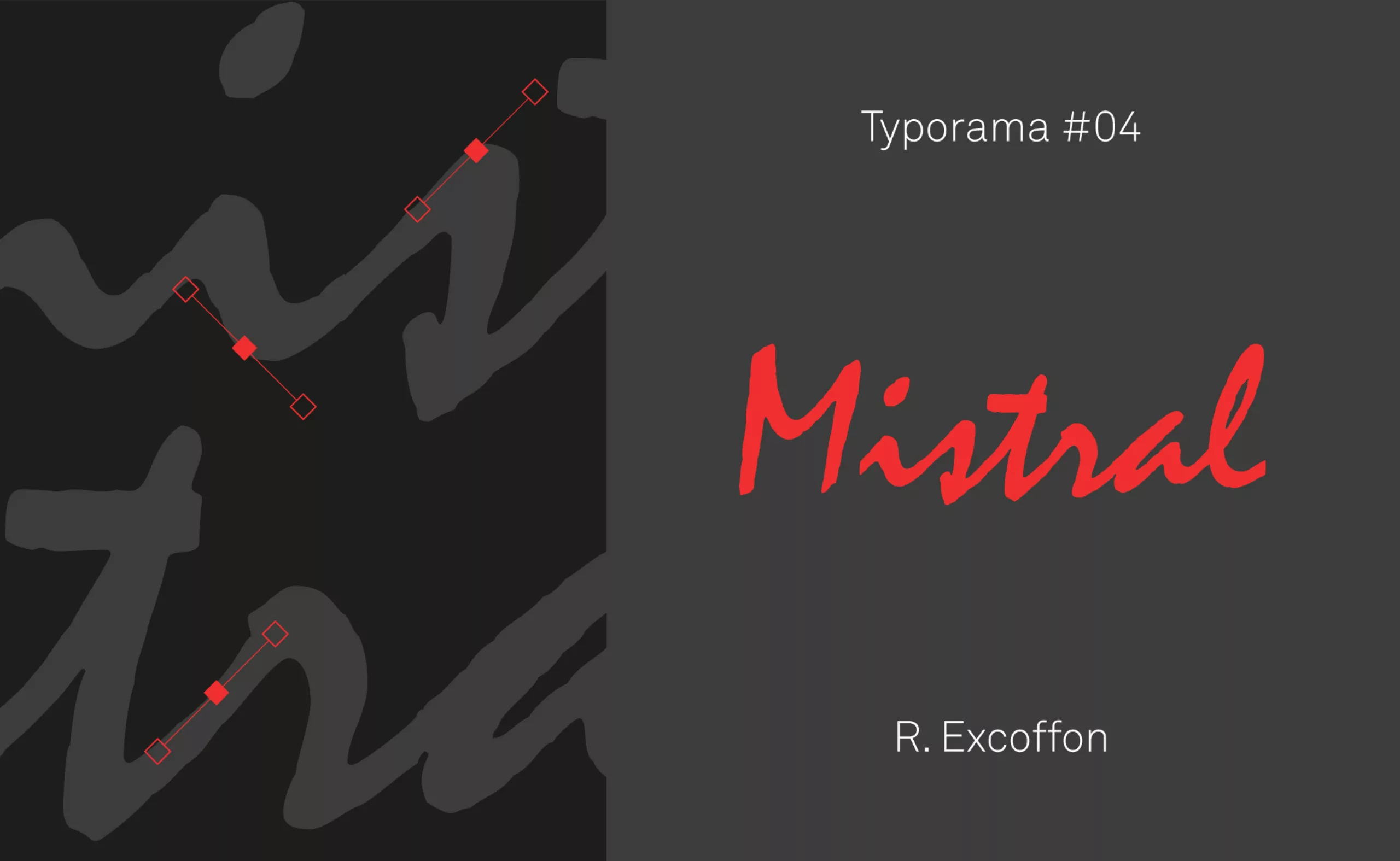
Typorama #04 : Mistral, a typography in the wind !
The Mistral ! This typeface which shares its name with a cold wind, but which breathes Provence, is without question the favorite typeface of bakers, butchers, craftsmen… Its name alone is enough to awaken an imaginary world as old-fashioned as it is modern!
-
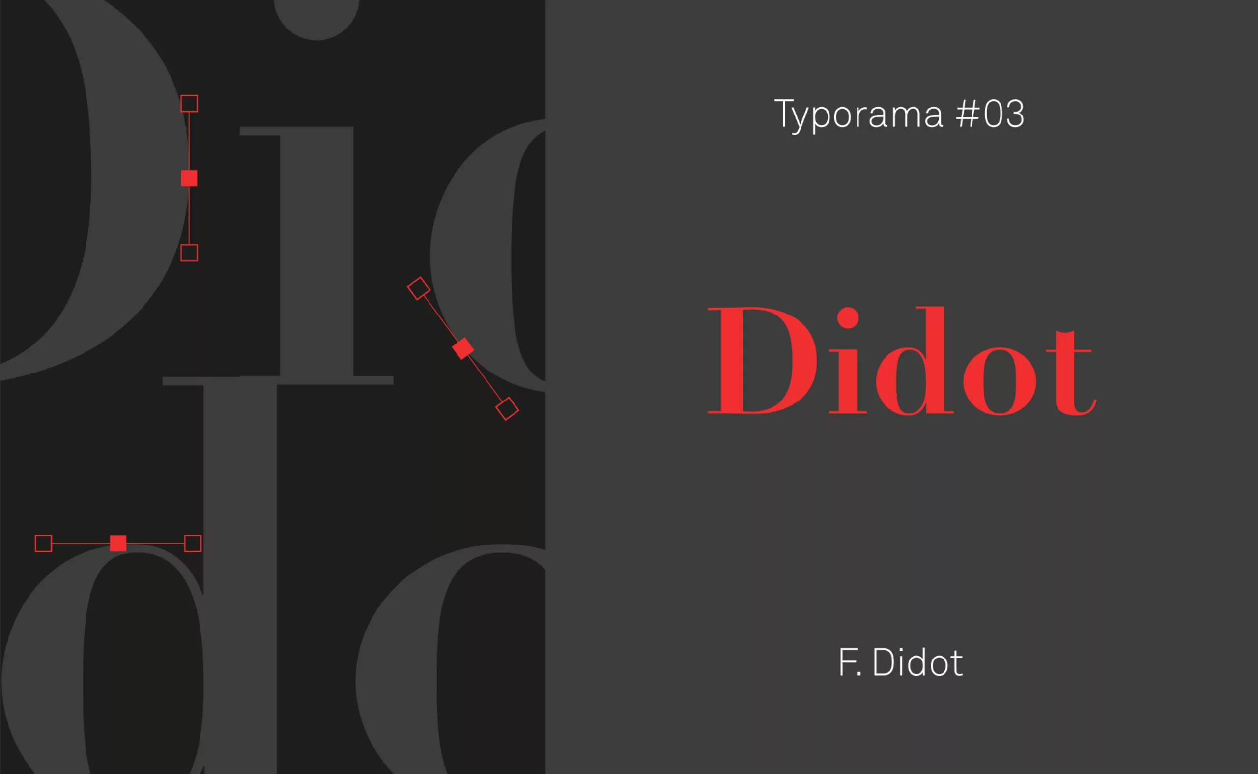
Typorama #03 : Didot, in fashion since 1811 !
Didot was for a long time the spearhead of French typography. Let’s discover how this bicentennial typeface managed to combine finesse and elegance to cross the centuries, and remain at the forefront of fashion!
-
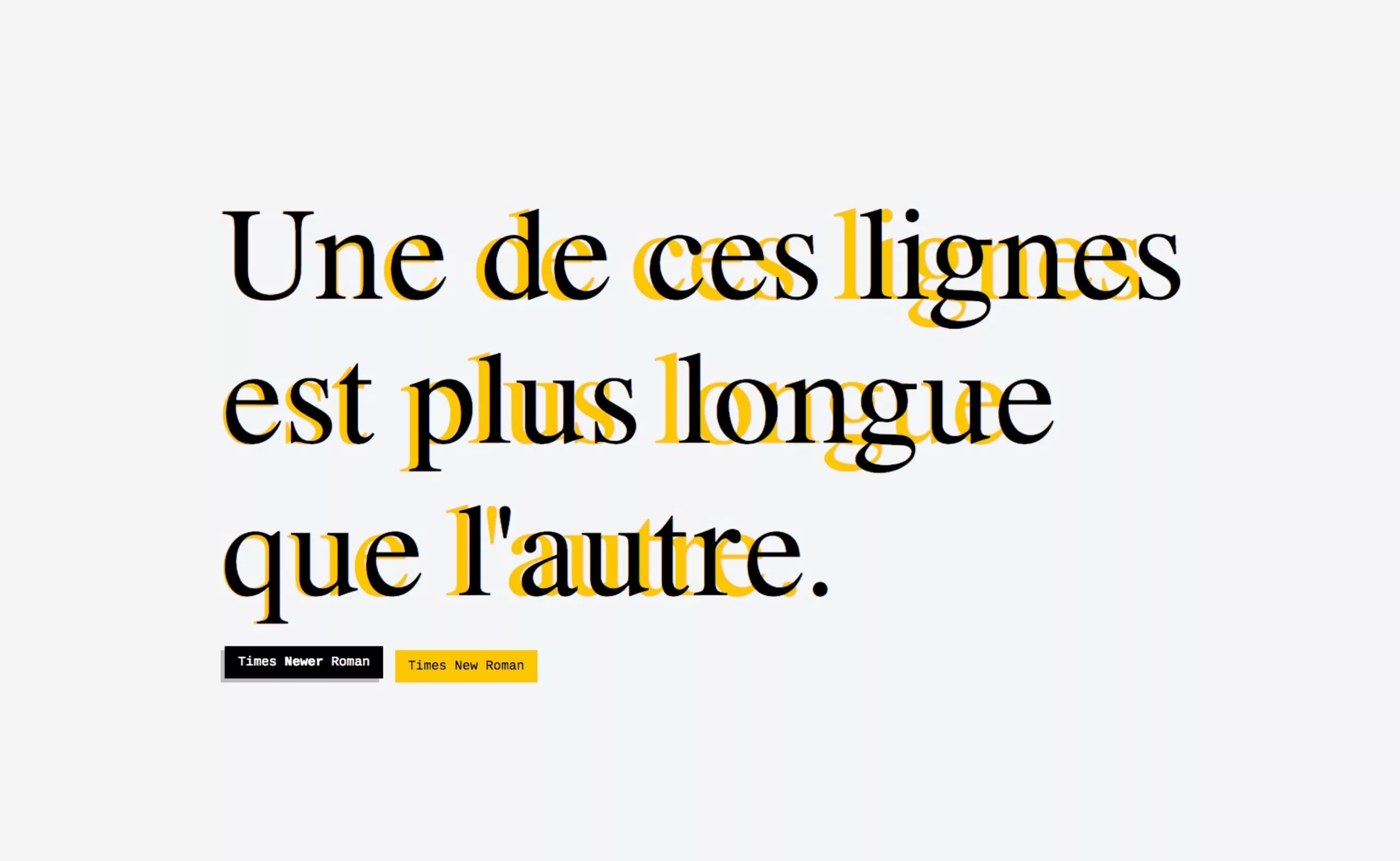
A cheater’s (typographic) typeface!
Times Newer Roman is 10% more bulky than its Times New Roman equivalent!
A typeface for cheating! -
The city of Paris revises its visual identity
At the beginning of January, the city and the department of Paris merged, the opportunity for the capital city to review its visual identity.
Here is the analysis of this logo made by Carré Noir.
-
-
2018
-
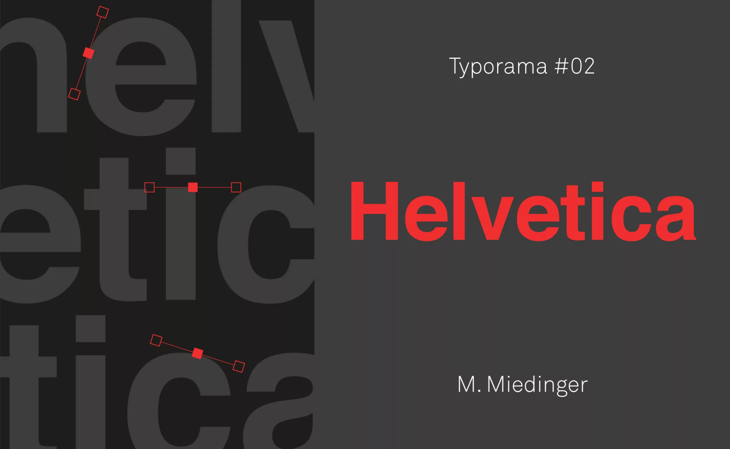
Typorama #02: Helvetica, my love!
Let’s discover Helvetica, a typeface that can’t be ignored! Its longevity, influence and neutrality mean we love it as much as it annoys us.
-
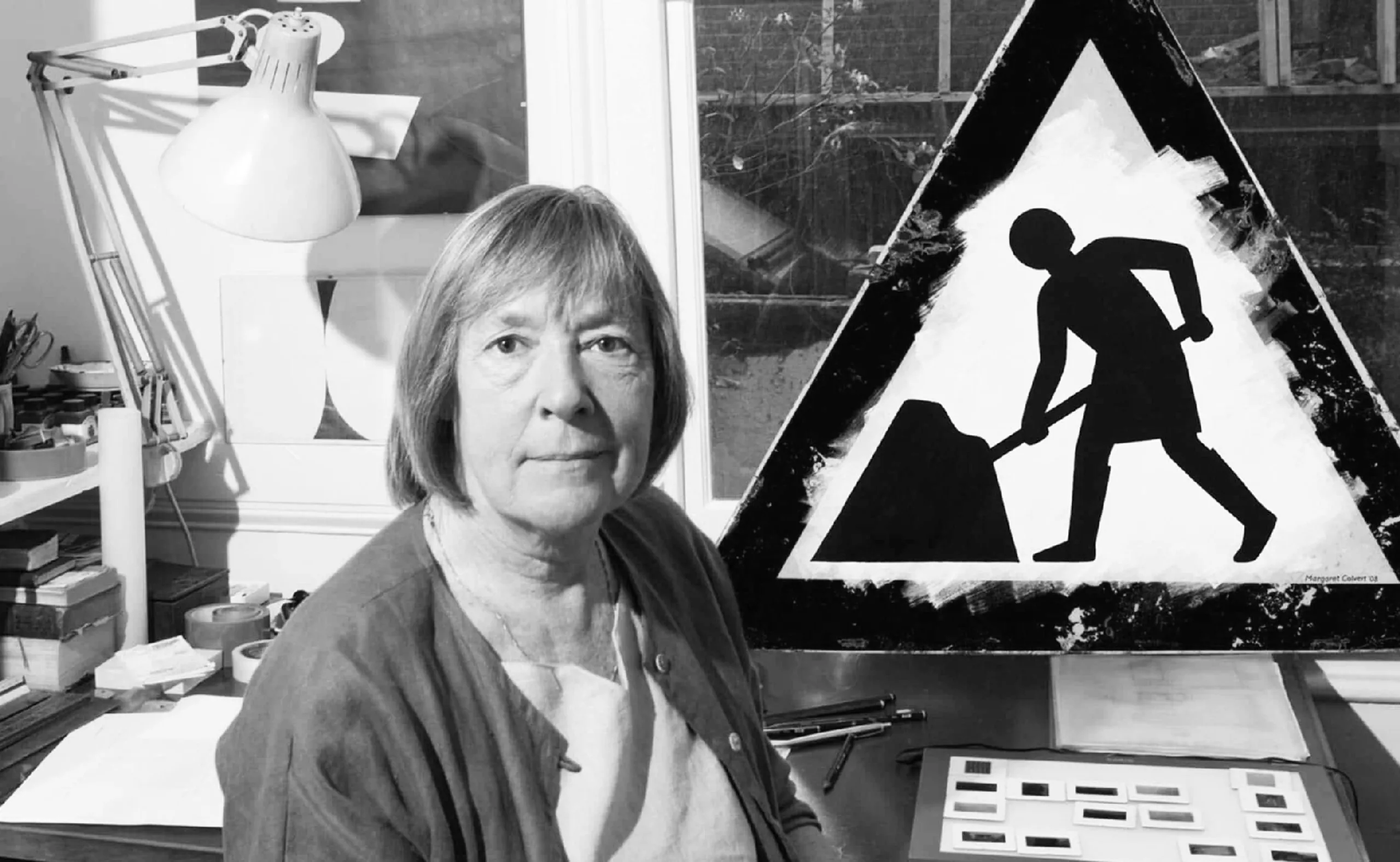
Margaret Calvert: woman at work! How design saved UK’s drivers.
By designing UK’s road signs, Margaret Calvert’s discreet work helped to save hundreds of thousands of lives in the United Kingdom.
-
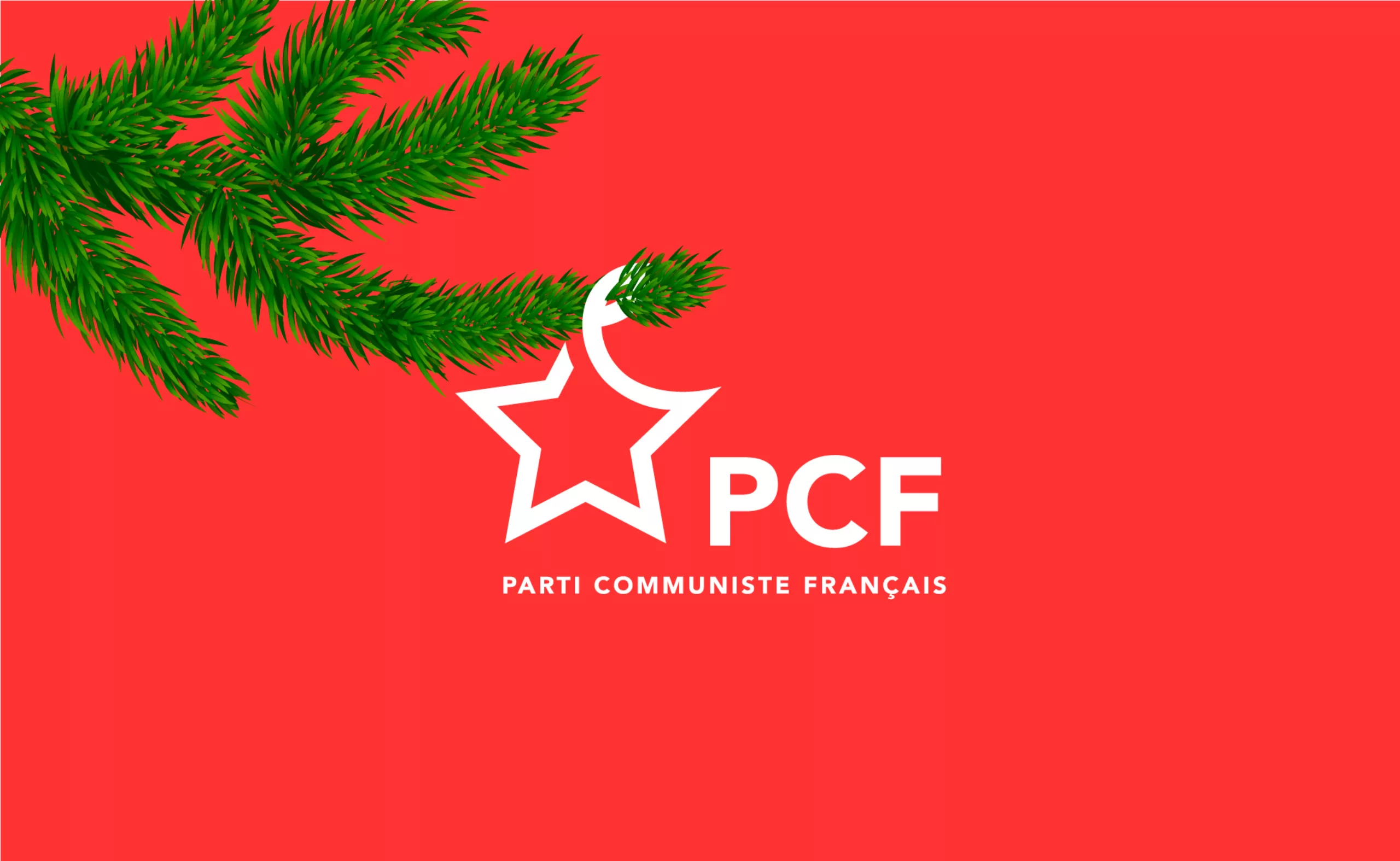
C’est Noël ! Le Parti Communiste change de logo !
On the occasion of its annual congress, the French Communist Party (PCF) has just given itself a little present: “A new logo!”
This is an event, since the previous logo dated from 1990. Let’s decipher this logo. -
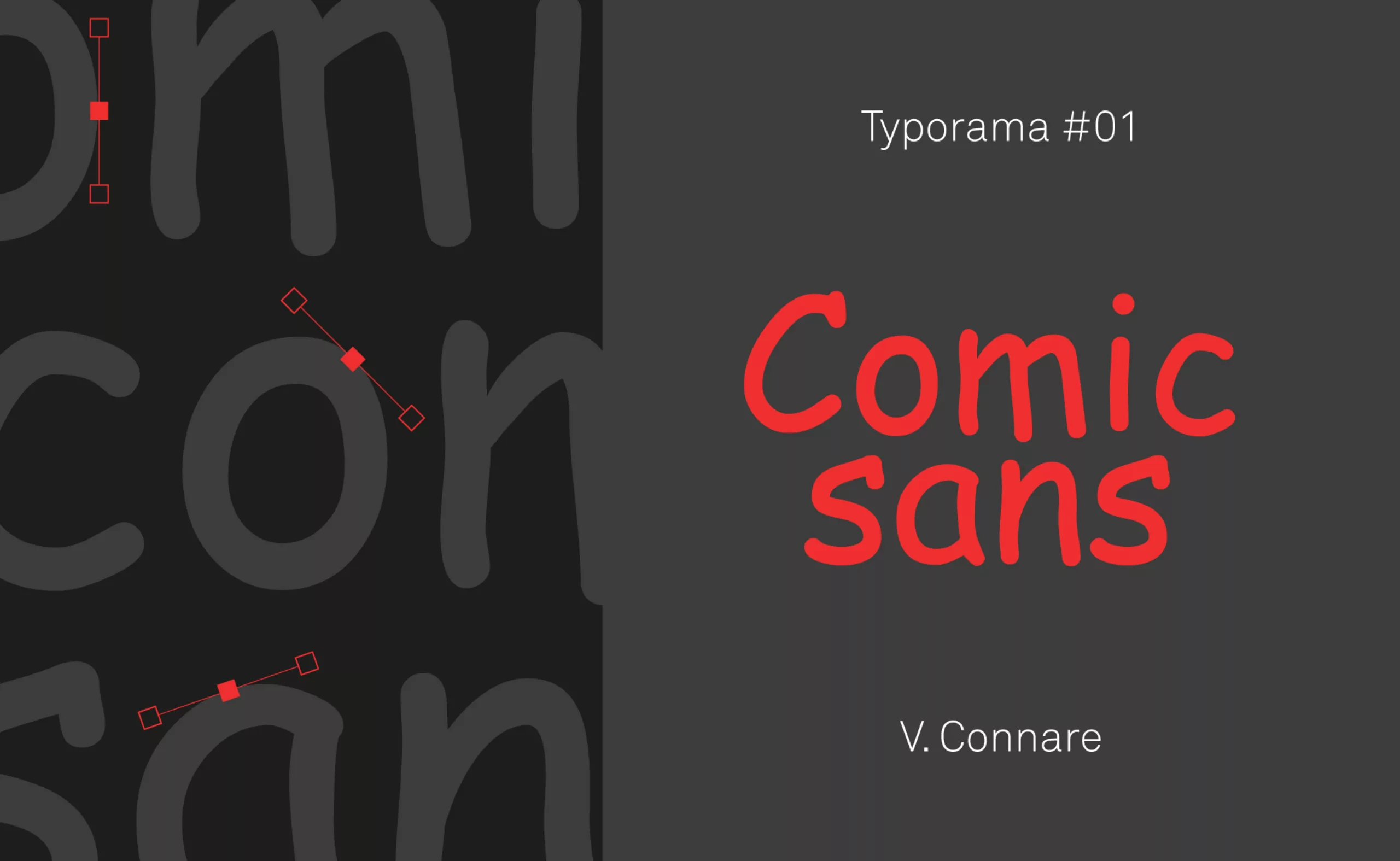
Typorama #01 : The Comic Sans MS
Nothing predicted the Comic Sans MS to become what it is today: a font hated by graphic designers and yet very popular with the general public. Discover its history… and its some qualities.
-
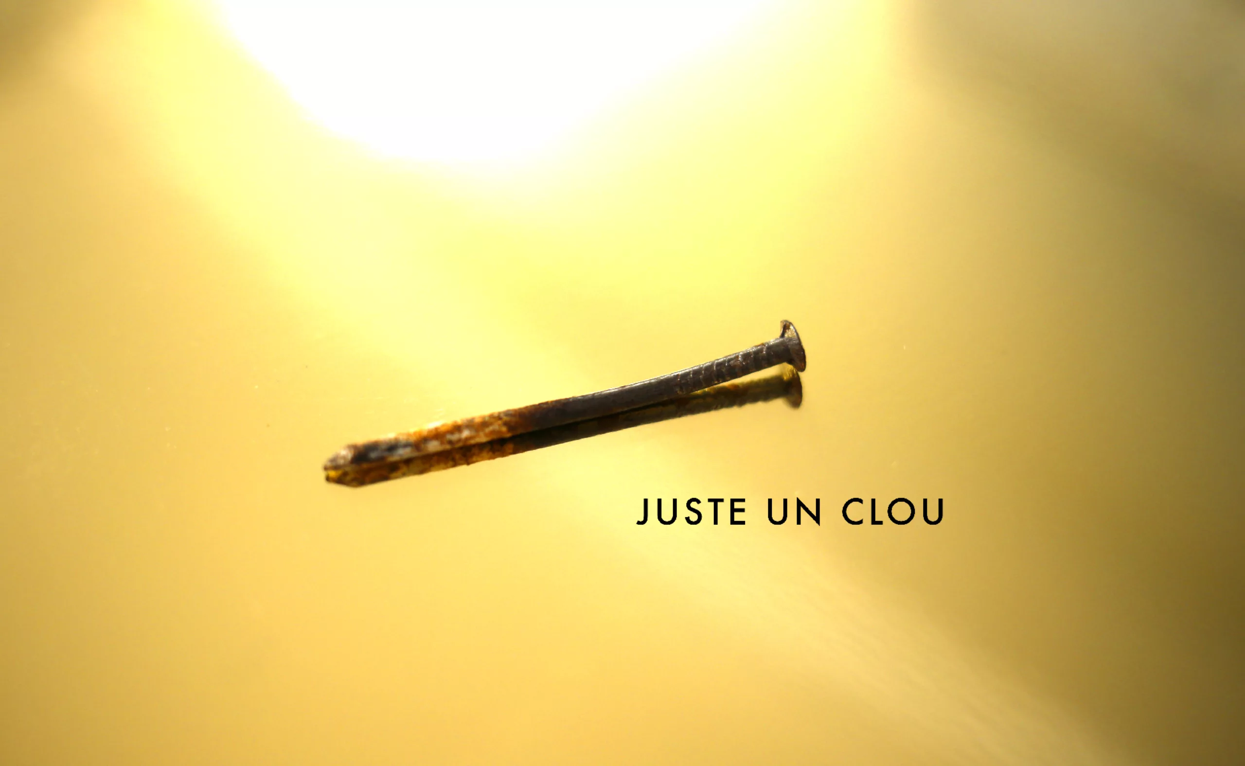
Luxury is going to drive the final in the coffin!
No mercy for Juste un Clou, the luxury bracelet that makes our skin crawl. From the 70s to today, a look at the evolution of the world of luxury.
-
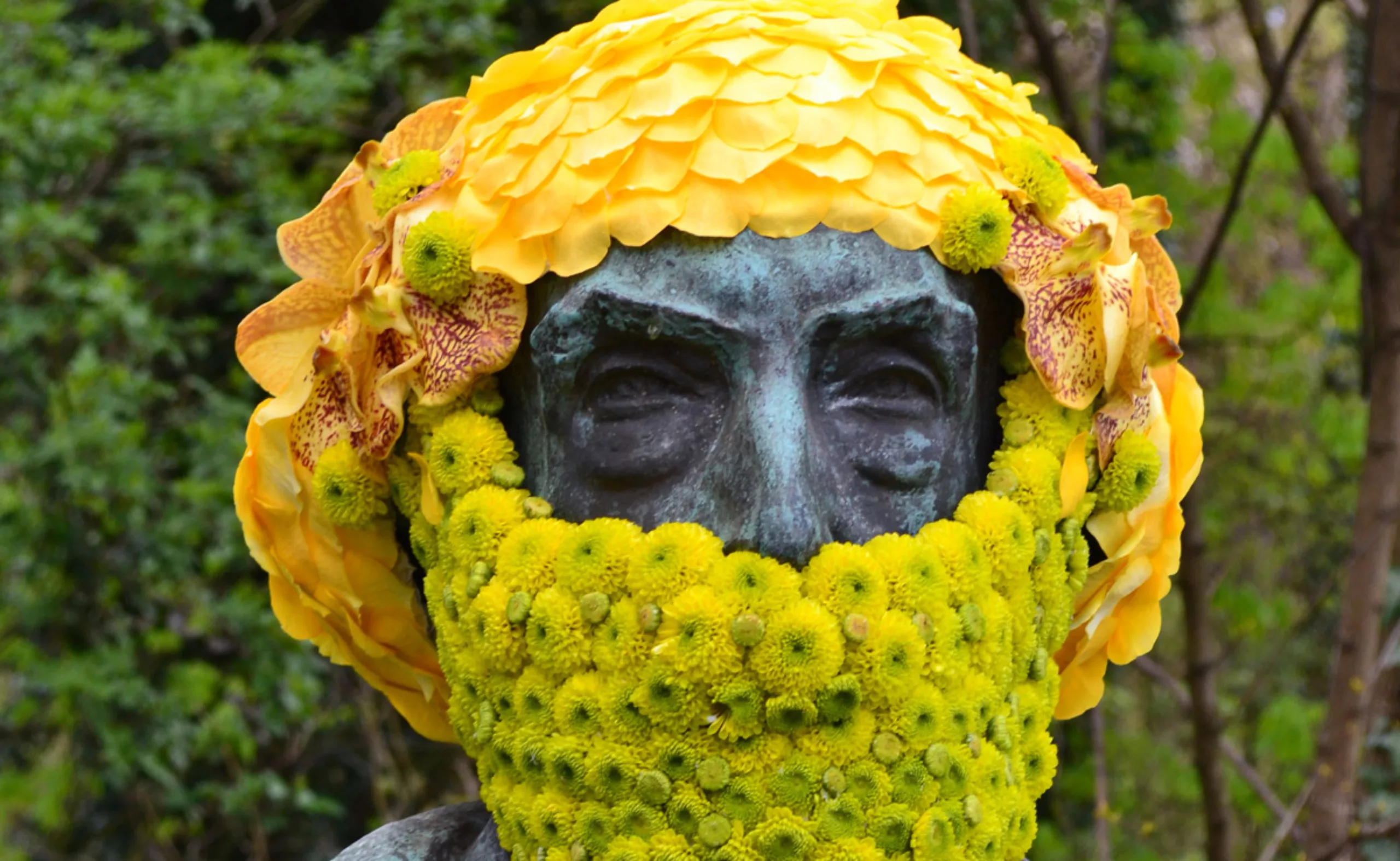
Plant art & land art: when nature puts itself to work
Get out and create in and with nature, that’s what land artists do. Here’s a brief overview of land art, to get some fresh air.
-
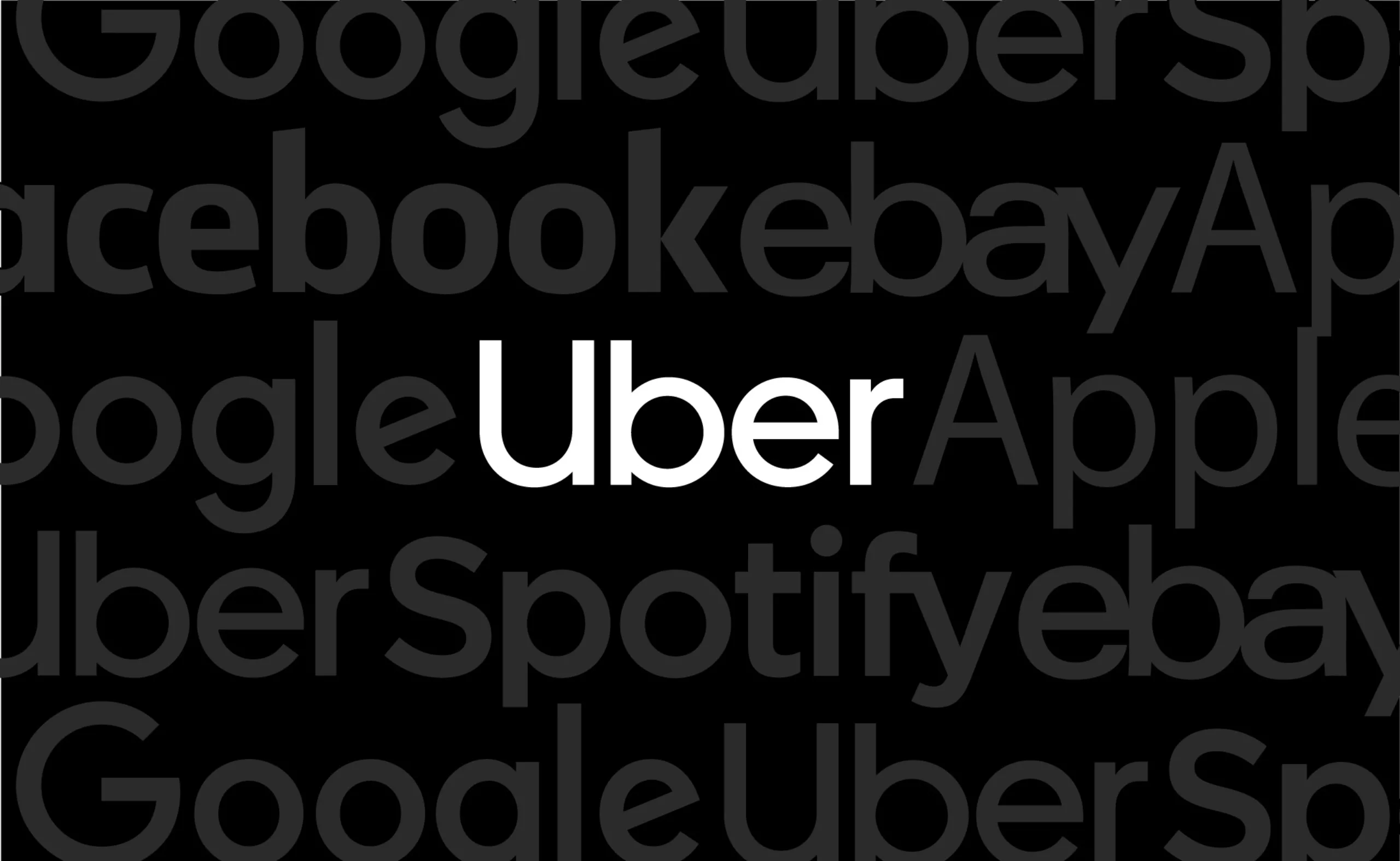
Uber’s new visual identity doesn’t transport anyone!
Uber has chosen to go for a logo that doesn’t make waves, is neutral and anything but singular. In short, a visual identity that transports no one!
-
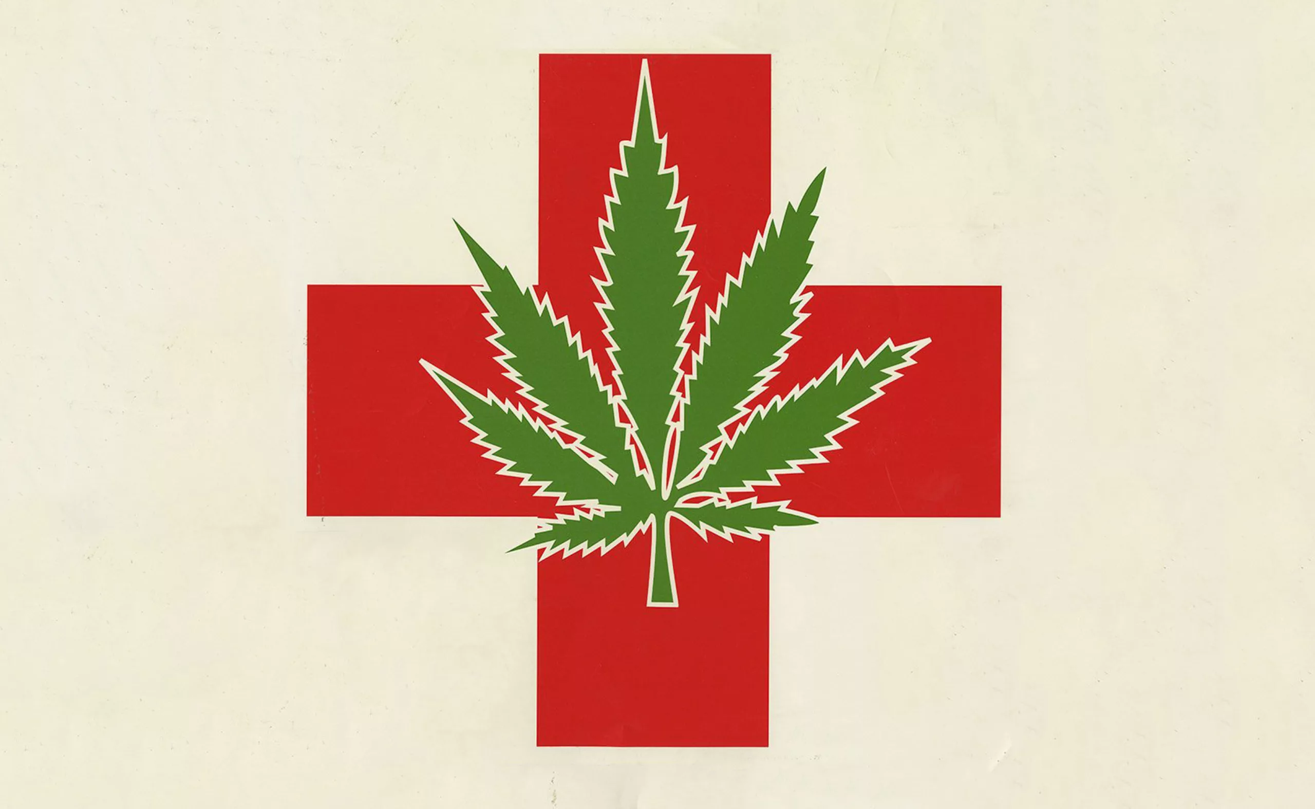
Cannabis branding: a green history
With the superpowers found in this medicinal plant, cannabis is gradually freeing itself from the codes of the high kingdom. History and analysis.
-
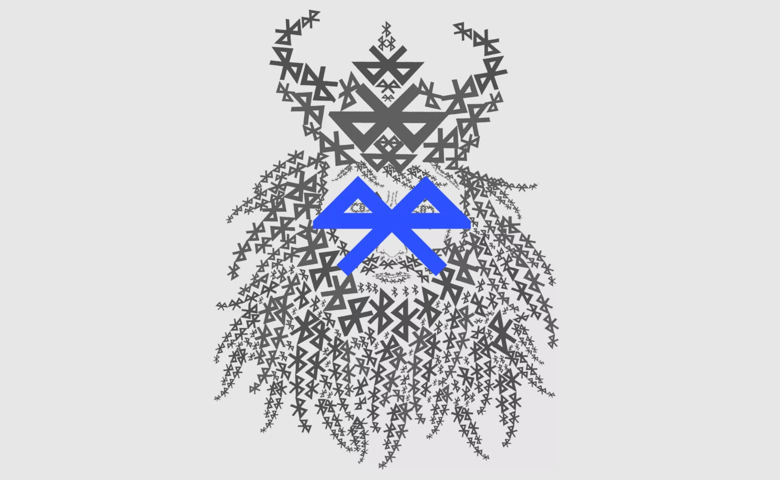
The story of Harald with blue teeth!
Discover how Harald with blue teeth, a Danish king of the 9th century, inspired the name and logo of Bluetooth.
-
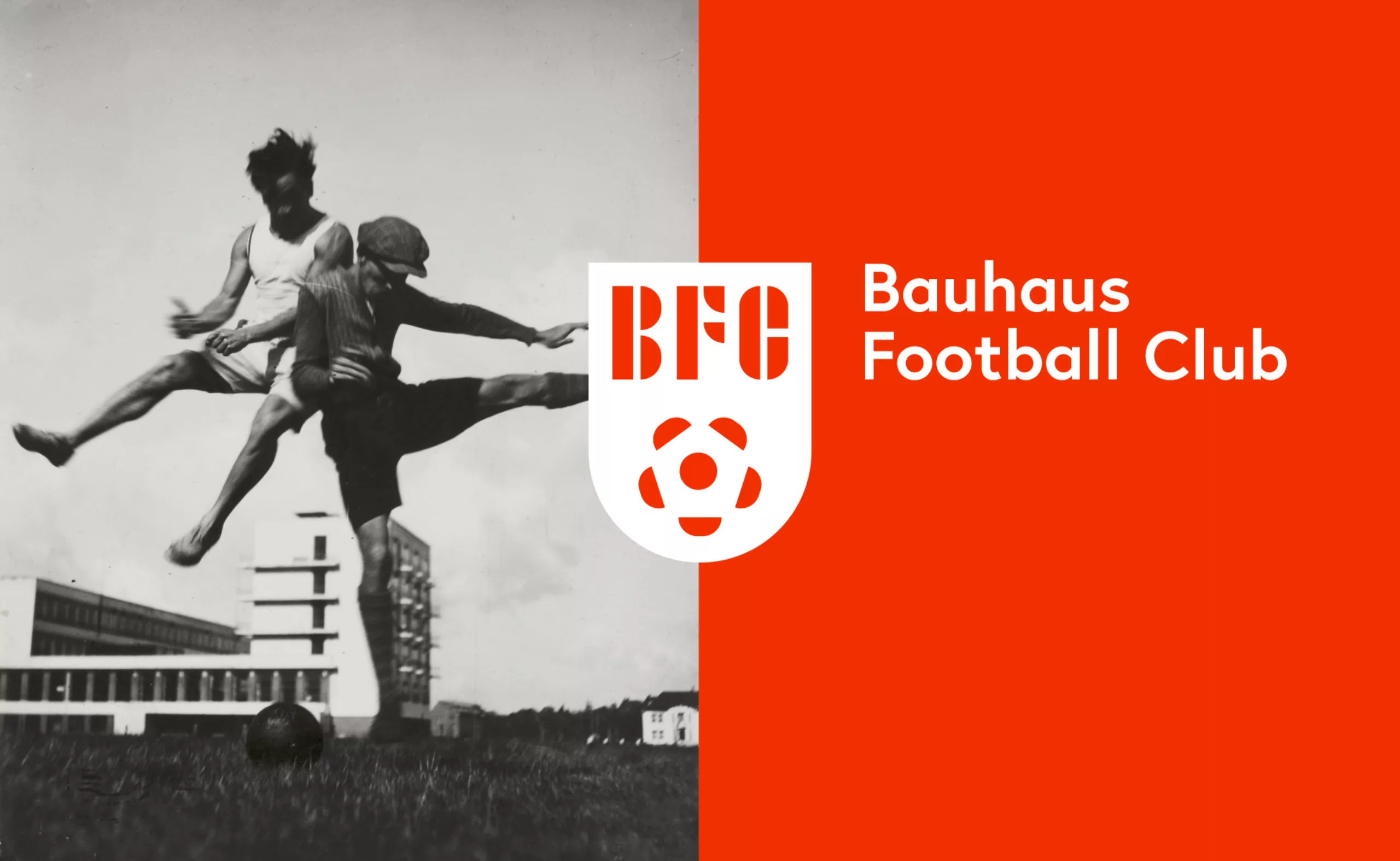
Bauhaus Football Club, the greatest design team of all time!
The Bauhaus Football Club, the story of the most beautiful design team in the world.
When the football world cup is a pretext to revise your classics… -
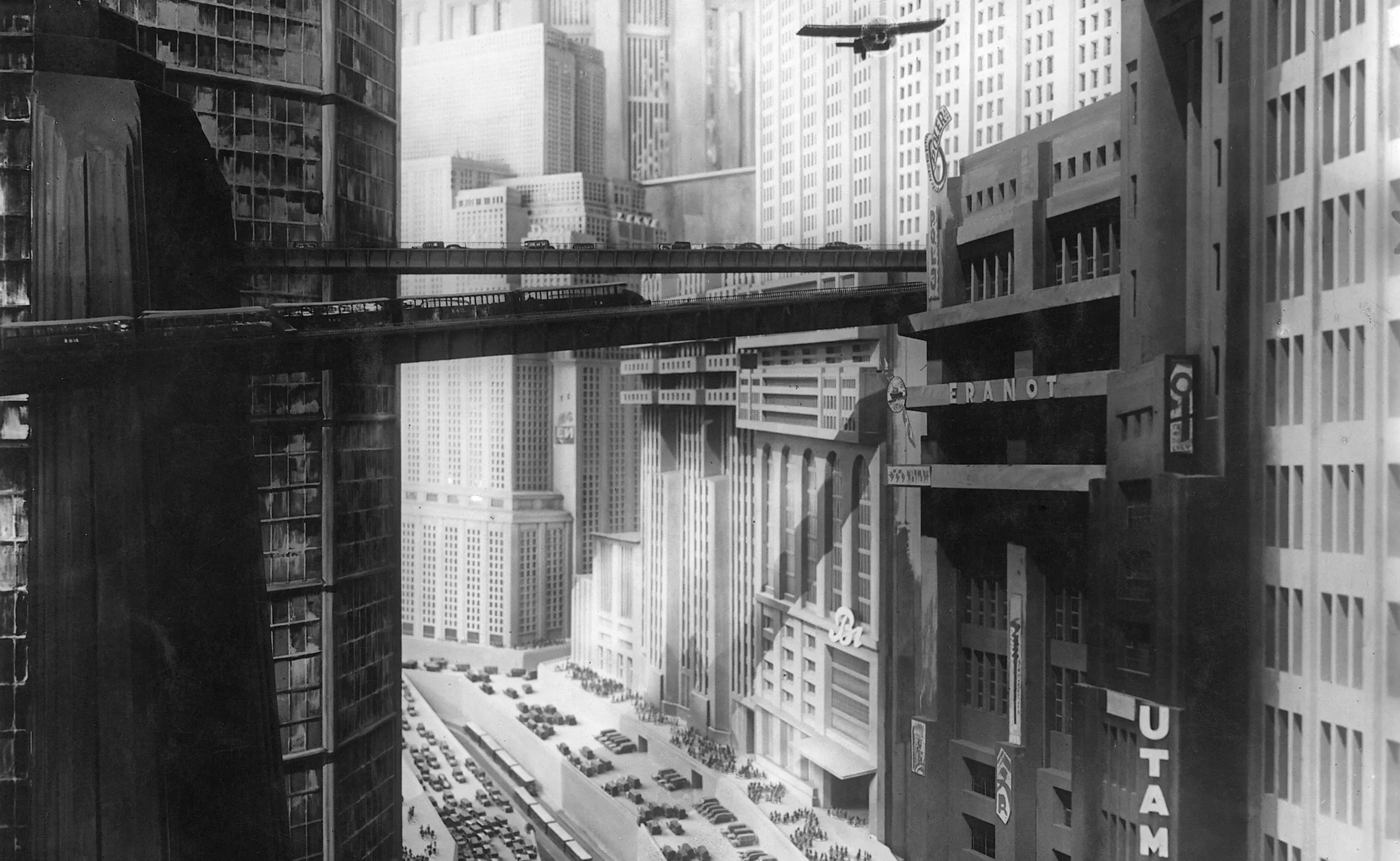
The utopia of representing futuristic cities
Robida, Verne, Schuiten… Here is an overview of the representations of writers, draughtsmen, scriptwriters and architects who have contributed to dreaming of the city of the future in a utopian impulse, or to underline its limits.
-
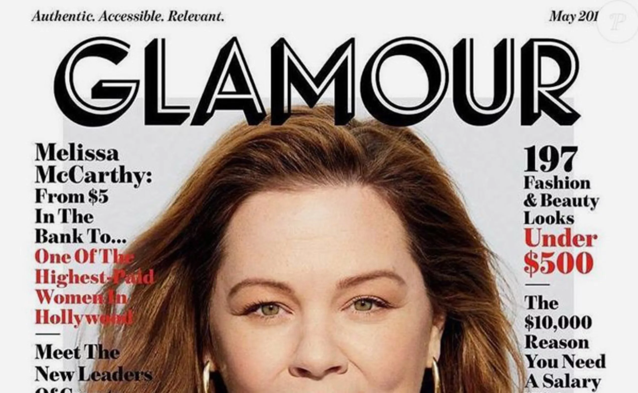
From glam to filter-free, Glamour’s new look
The women’s magazine Glamour changed its logo and layout several times before taking a radical turn in early May. Glamour displays a new logo in the United States, a new model in France, and a promise of less “girly” content.
-
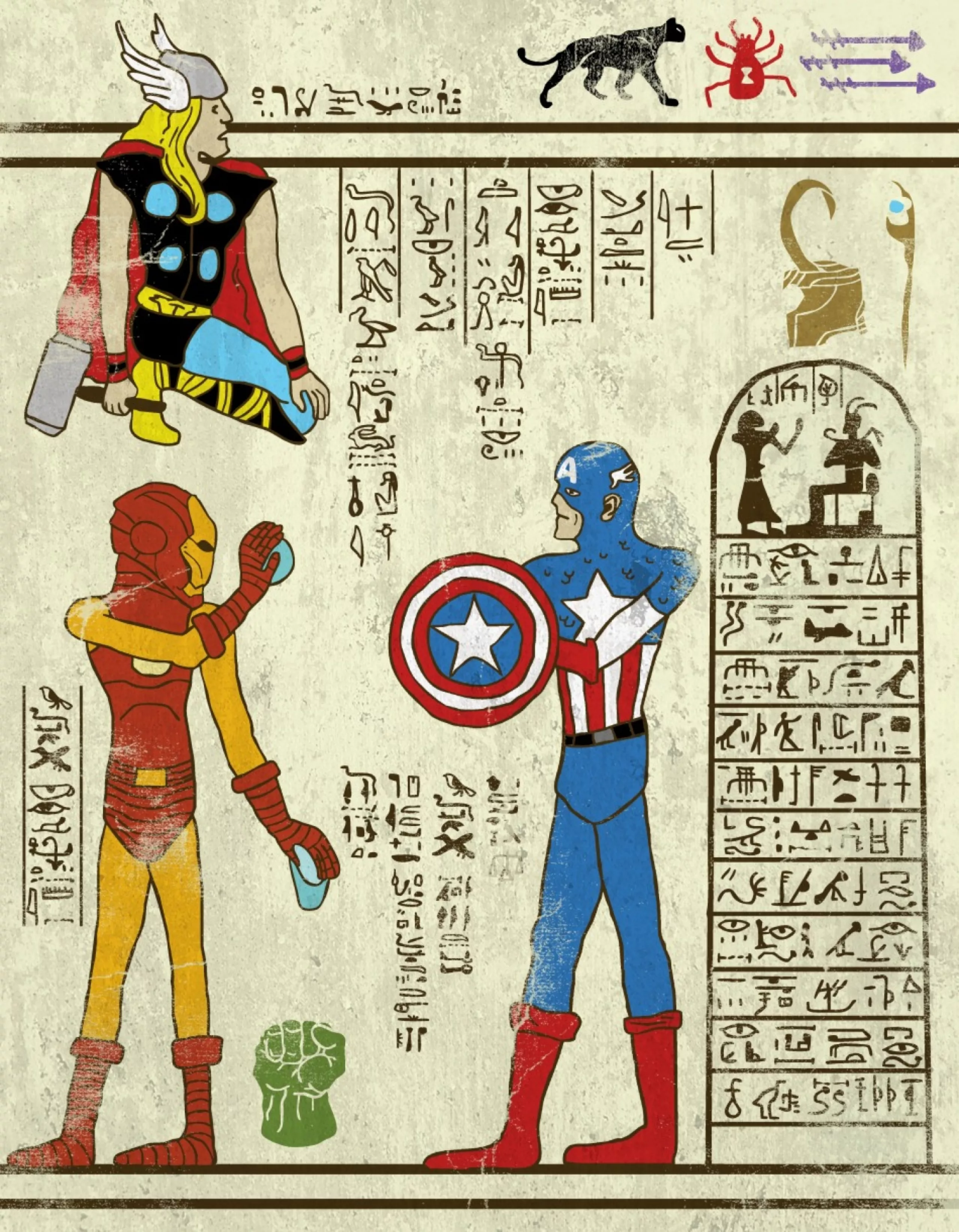
Superhero-glyphs are coming!
The graphic designer and illustrator Josh Ln had fun imagining “super-hiéroglyphs”.
Totally influenced by geek culture, he offers us a uchronic and eccentric reinterpretation of Egyptian history. -
Brand New Conference, brand new every year!
The Brand New Conference is an annual 2-day event that brings together the crème de la crème of influential graphic designers and during which brand identity and logos are discussed. An American-style must-have led by a couple of designers who create a new identity for each edition.
-

How about saying no to video advertising screens in public spaces?
It’s an article about advertising screens, attention-grabbing ecology, JC Decaux, cheap stares… and above all these “Local Advertising Regulations” that are being voted on just about everywhere in France, and against which each of us can take action !
-
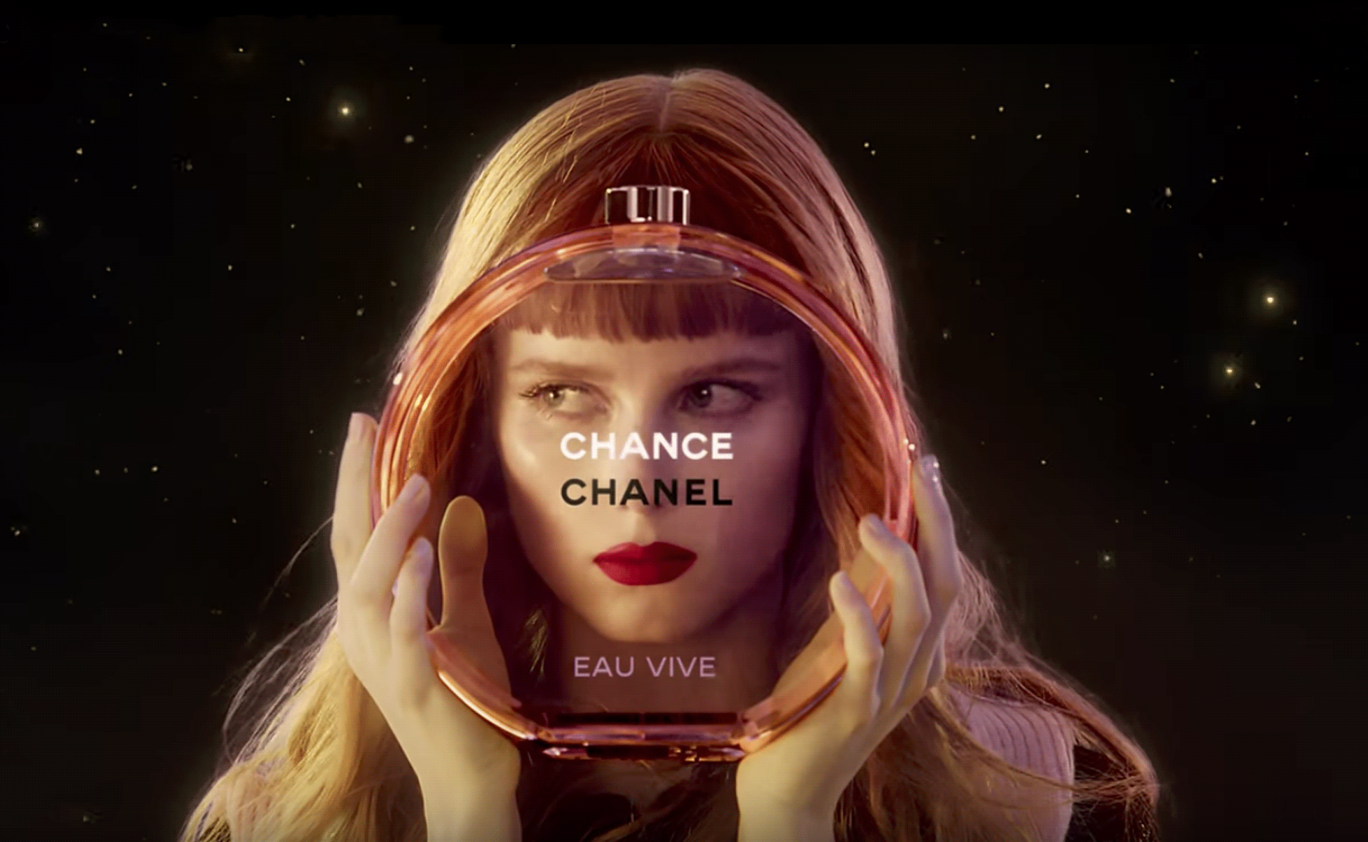
The hidden secret of CHANCE by CHANEL is Goude
Advertising sometimes offers us UFOs that seem to escape simple marketing specifications to project us towards an unexpected elsewhere. Here’s an analysis of the symbolic mystery of Chanel’s latest Chance perfume ad, directed by Jean-Paul Goude in 2016.
-
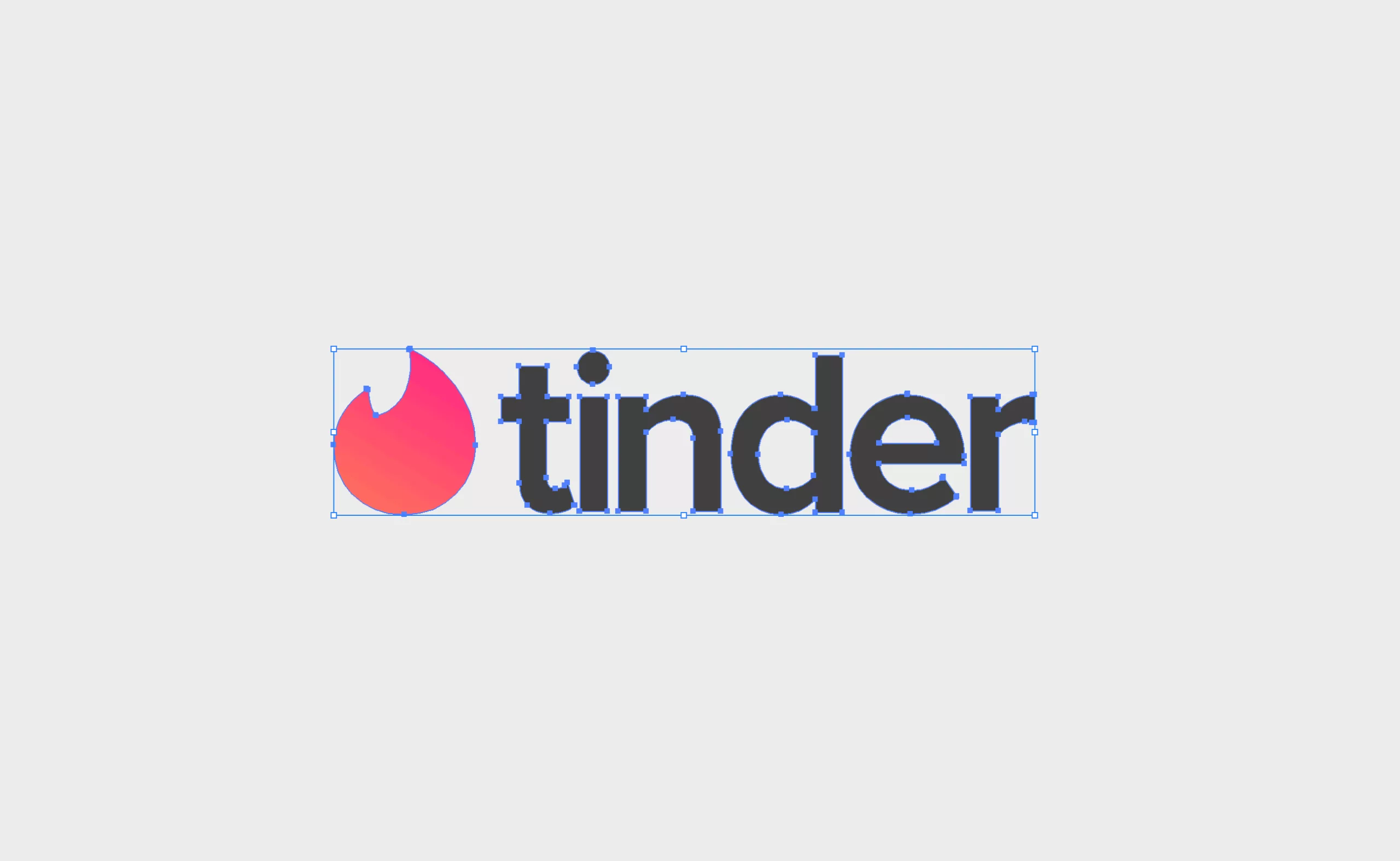
Don’t be tender with the tinder logo!
8 errors are hidden in the Tinder logo! Can you find them?
Here’s a short and fun presentation of the tinder logo, where we’ll not be tender. -
Rule number 1: break taboos
From beardless art to Freud’s omerta, via the blue rules of period protection ads, the female sex is a source of shame, mainly because it’s been hidden so much, voluntarily. But since 2017 it finally seems to be emerging from the shadows and gradually breaking taboos.
-
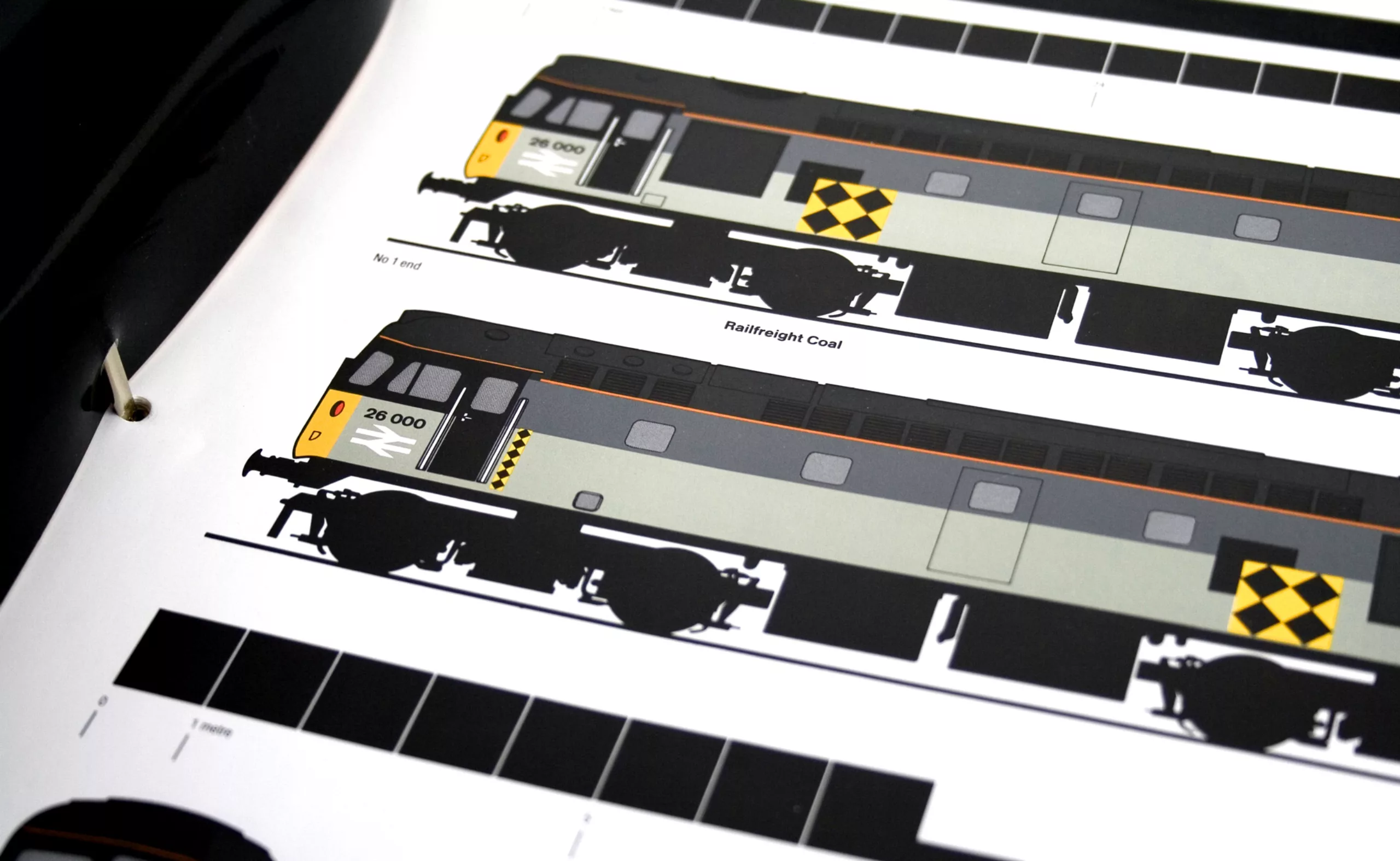
Railfreight visual identity (1987)
With their modern, minimalist and lively identity, Railfreight’s rail freight badges will leave their mark on the British transport landscape for a long time to come. So much so, in fact, that they have become designers’ favorite trains!
-
Duperré School changes of visual identity
The Duperré School changes its visual identity.
A project designed by L’atelier Ouf ! and the Production Type foundry. -
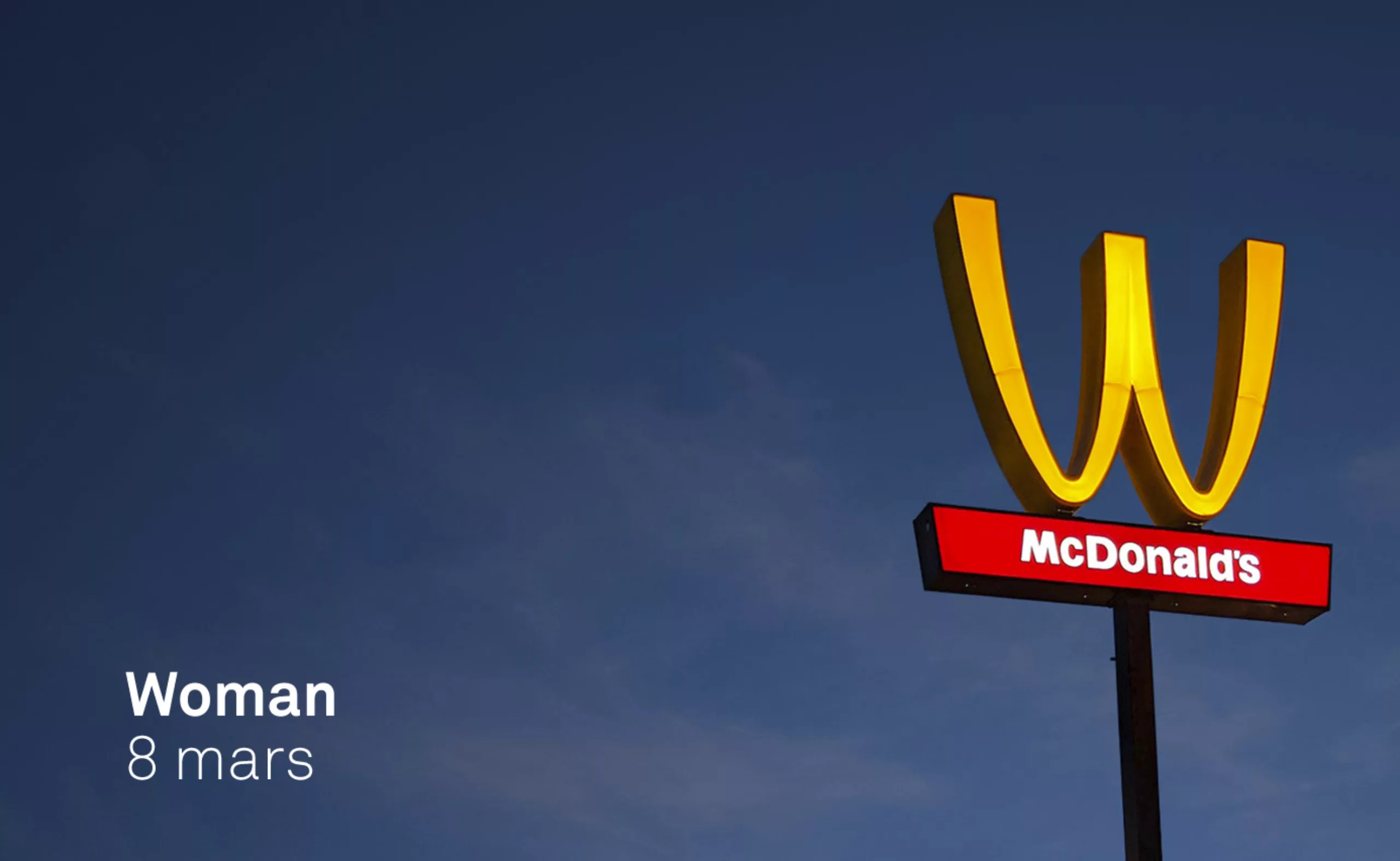
McDonlads turns over its logo for International Women’s Rights Day…
McDonlads turns over its logo for International Women’s Rights Day… not sure it’s really a feminist act!
-
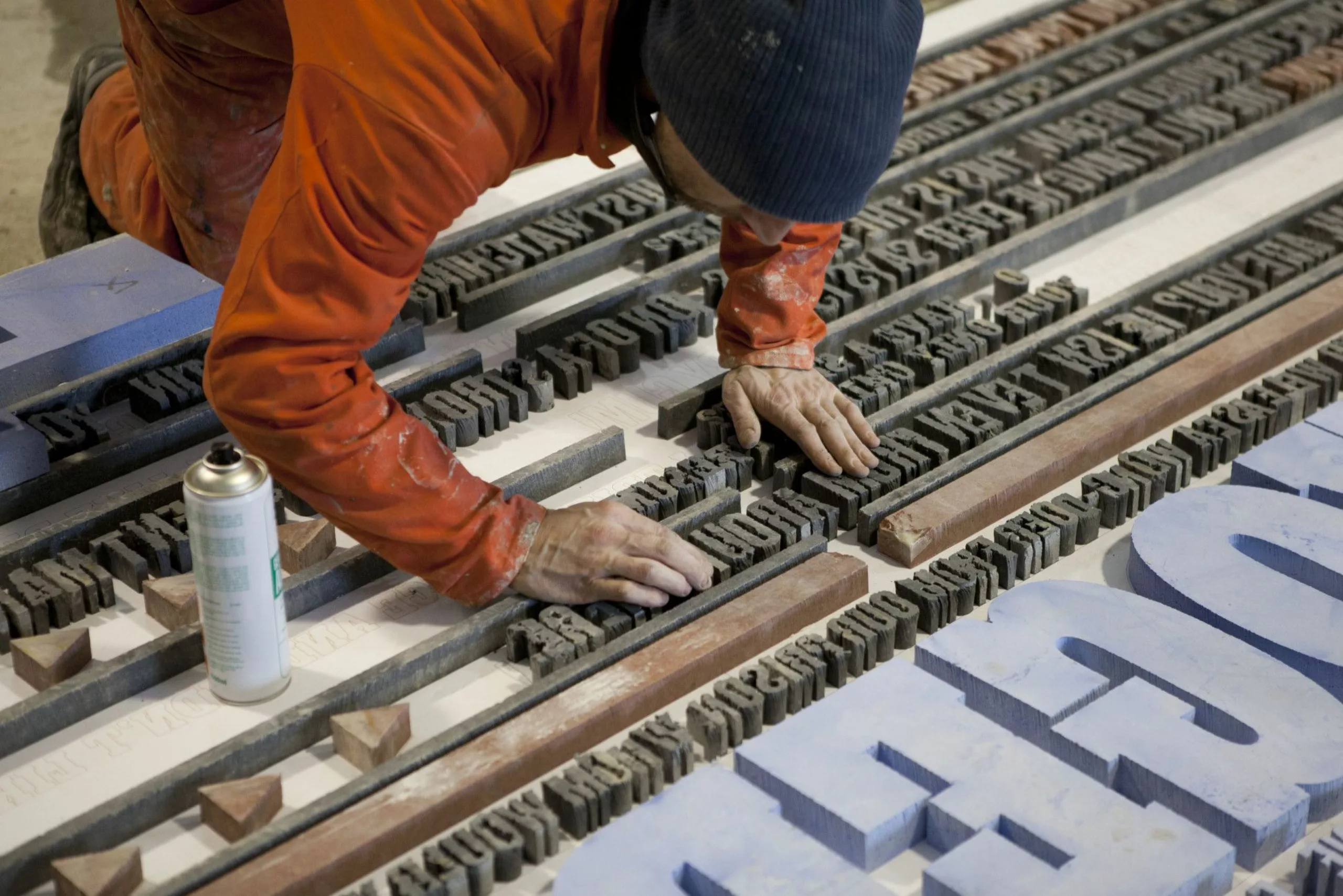
Gordon Young, a mason typographer!
For over 20 years, Gordon Young has been working on the border between art, graphic design and typography. To his credit, he has created dozens of art installations in public spaces, a forest of typographic trees, a wall of wishes in a school and this incredible Comedy Carpet in Blackpool!
-
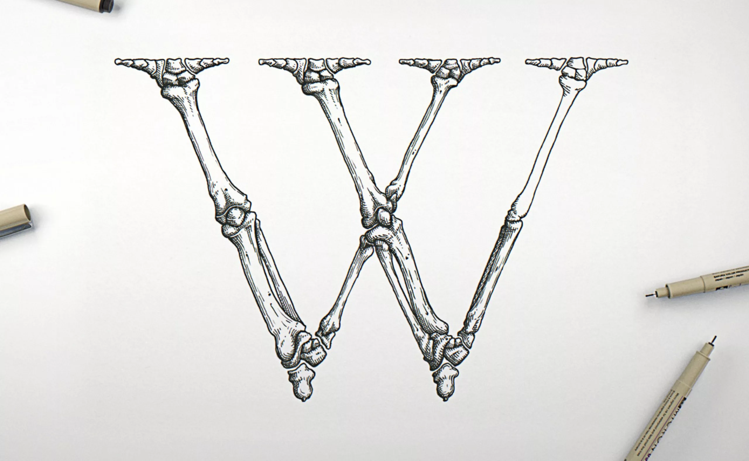
Garamond Corpvs a corp alphabet
Passionate about typography and anatomy, Swedish artist Björn Johansson has dissected Garamond typefaces to create a bony alphabet. From Tory to Vitruvius, letters take shape.
-
The new BlaBlaCar logo wishes you a safe journey
BlaBlaCar, the European carpooling start-up bringing drivers and passengers together, is adorned with a new talking logo.
-
History of Turkish Graphic Design
Ever wondered how it is like to be a designer abroad? Here is an illustrated portrait of Turkish graphic design, through history and contemporary designers.
-
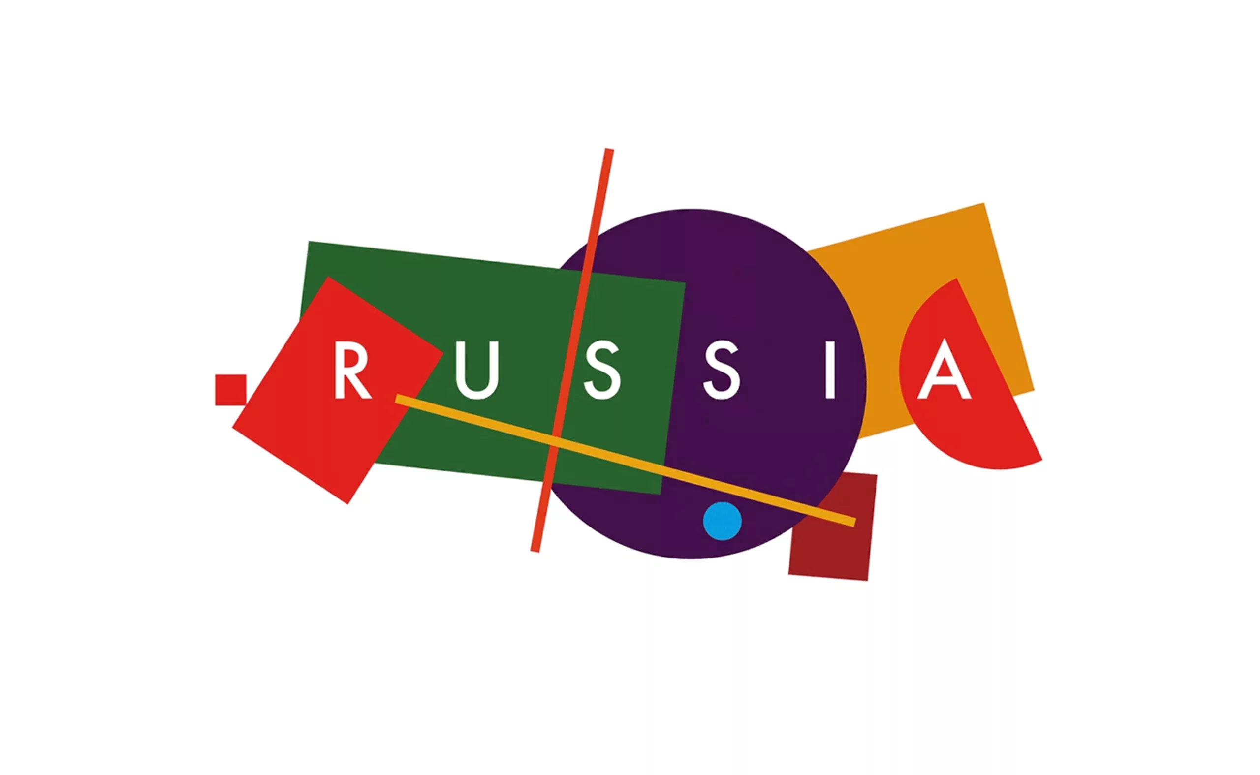
A constructivist logo for Russian tourism
After 2 years of public competition, Russia unveils its new tourist logo to illustrate the country internationally. An identity with supremacist accents that tells the story of Russia.
-
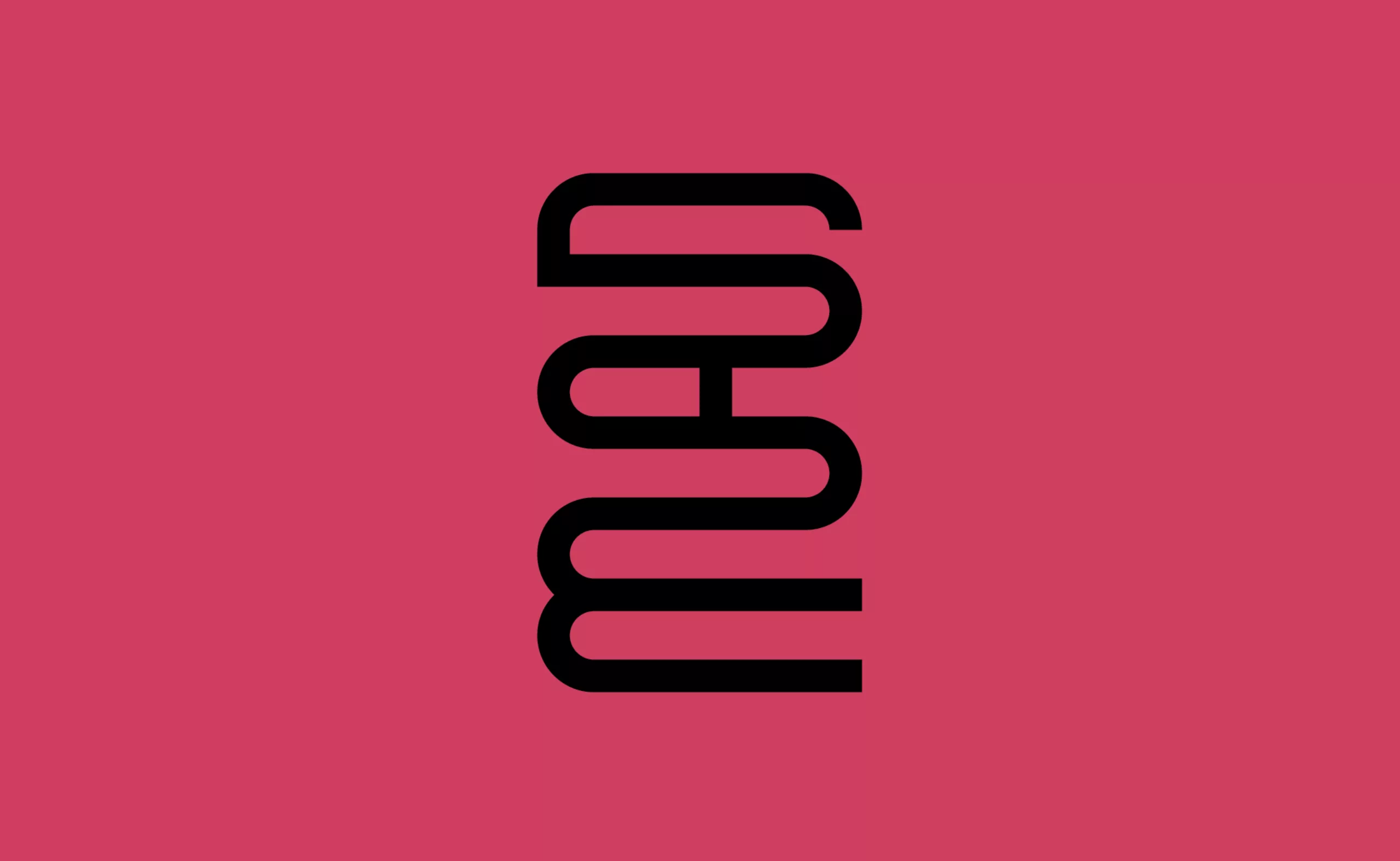
A mad logo for the “Musée des Arts Déco”
A new visual identity for the Musée des Arts Décoratifs that becomes “MAD”… Fashion, Arts, Design!
-
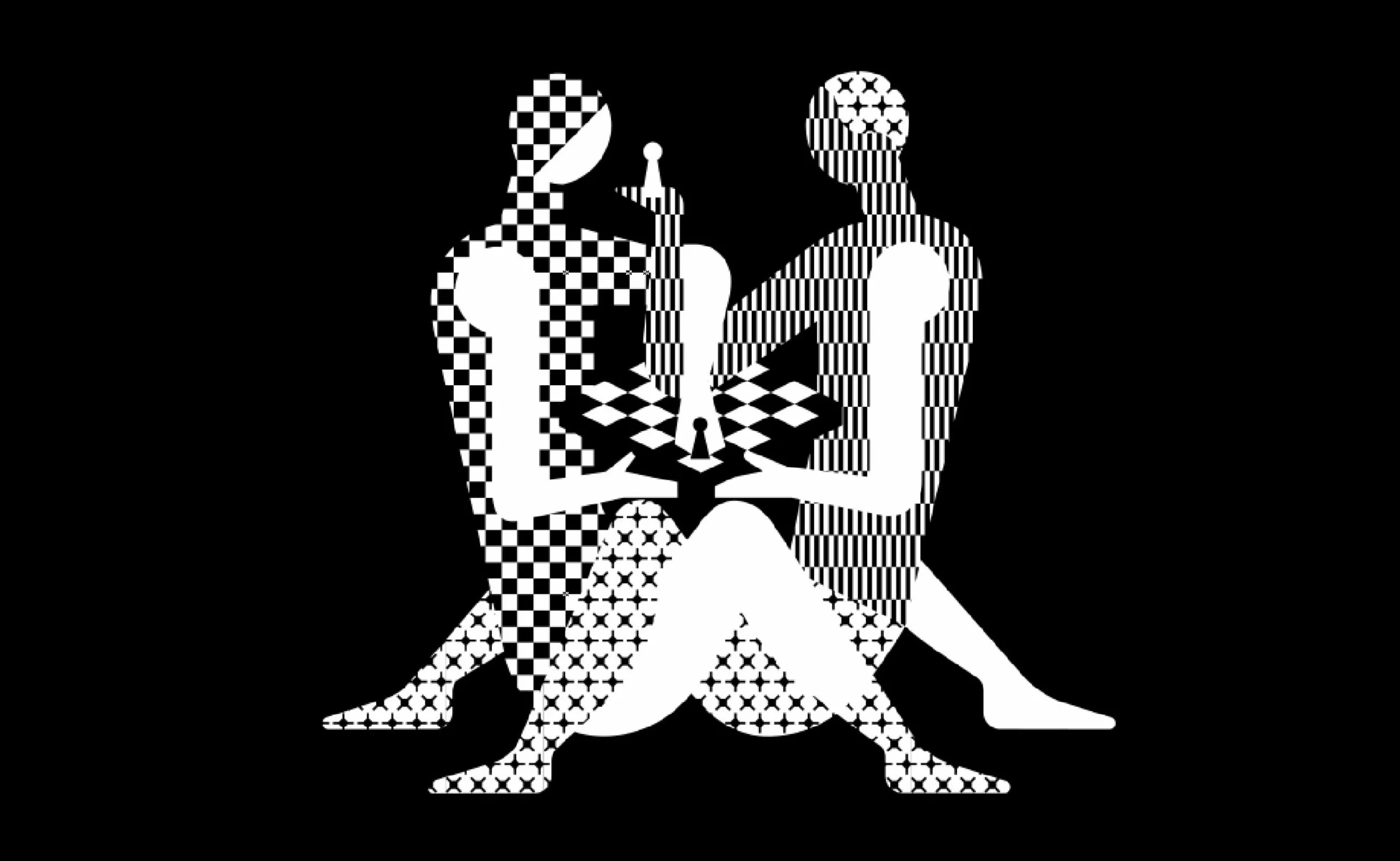
World Chess Championship: a poster that plays footsie
The next World Chess Championship should please chess players… and Kamasutra fans. Here is the new identity of the World Chess, with a “hot” poster.
-
-
2017
-
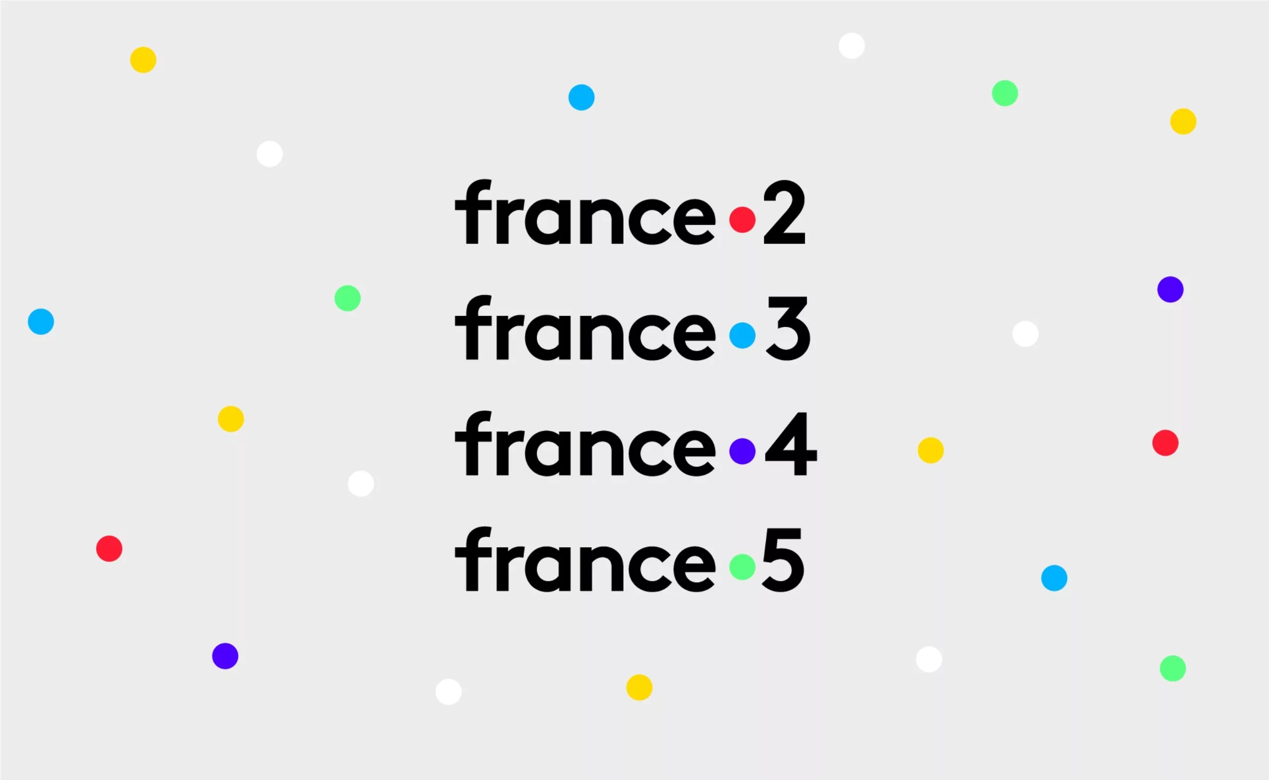
France Télévisions’ new visual identity. Period.
France Télévisions and all its channels are about to change their visual identity!
A story of a dot. Period. -
A serious logo for the Cité des sciences
Bye bye red square from the Cité des sciences, glory to you for having rendered service to science and the graphic nation.
Welcome to serious business… -

ebay’s new identity ebayit nobody!
Ebay reveals its new visual identity, with taste of already (too) seen!
It’s clean. It’s corporate. But what the hell it’s boring. -
Étienne Robial: “Decoded!”
Every day, millions of french people see Étienne Robial’s work. In this article we decode, in plain language, a long career in graphic design, from Canal+ to Inrockuptibles.
-
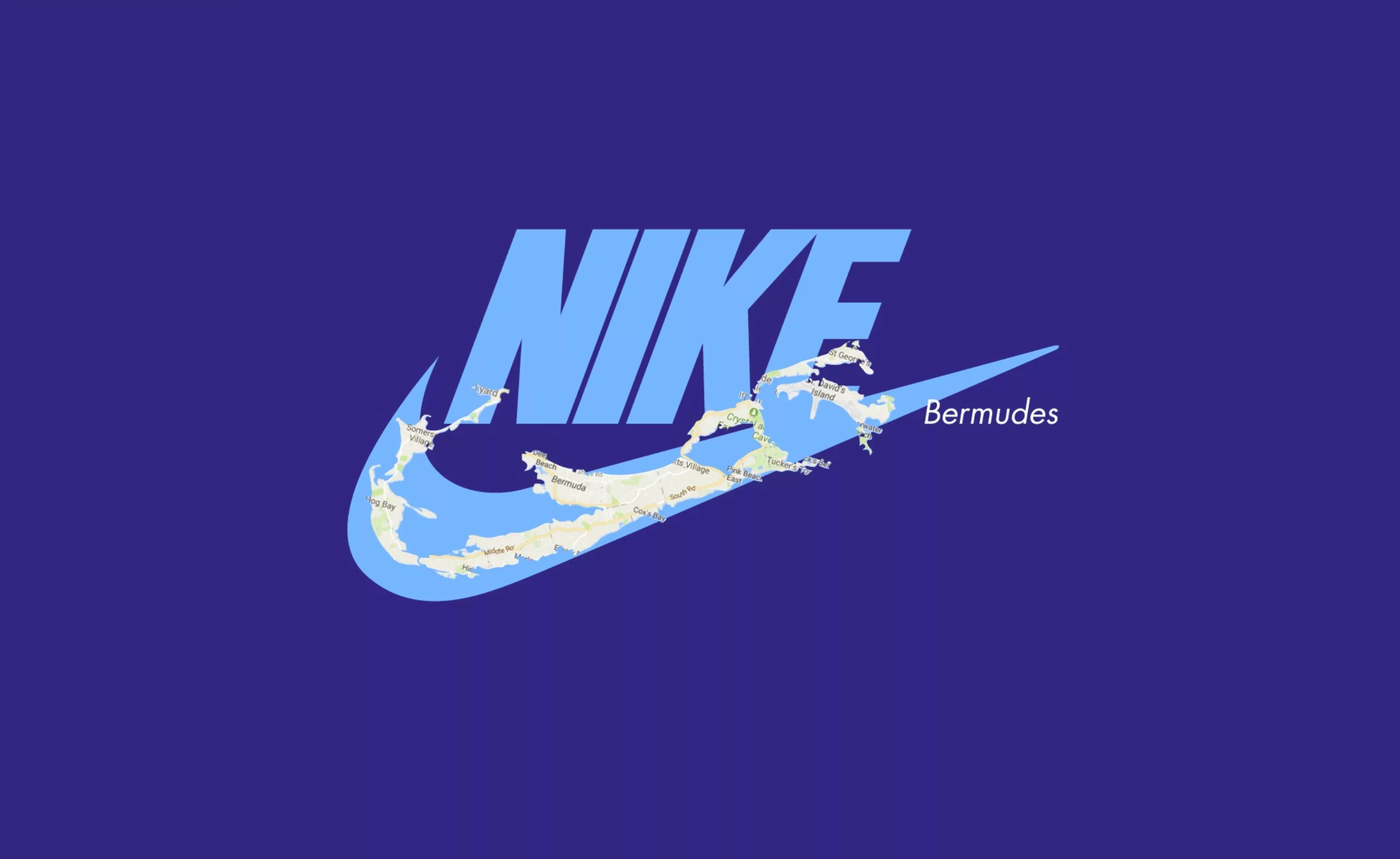
How to avoid paying tax with your logo !
When you want to cheat the tax, there’s nothing like a good logo!
Let’s take a look at Nike (among others), a champion in this field. -
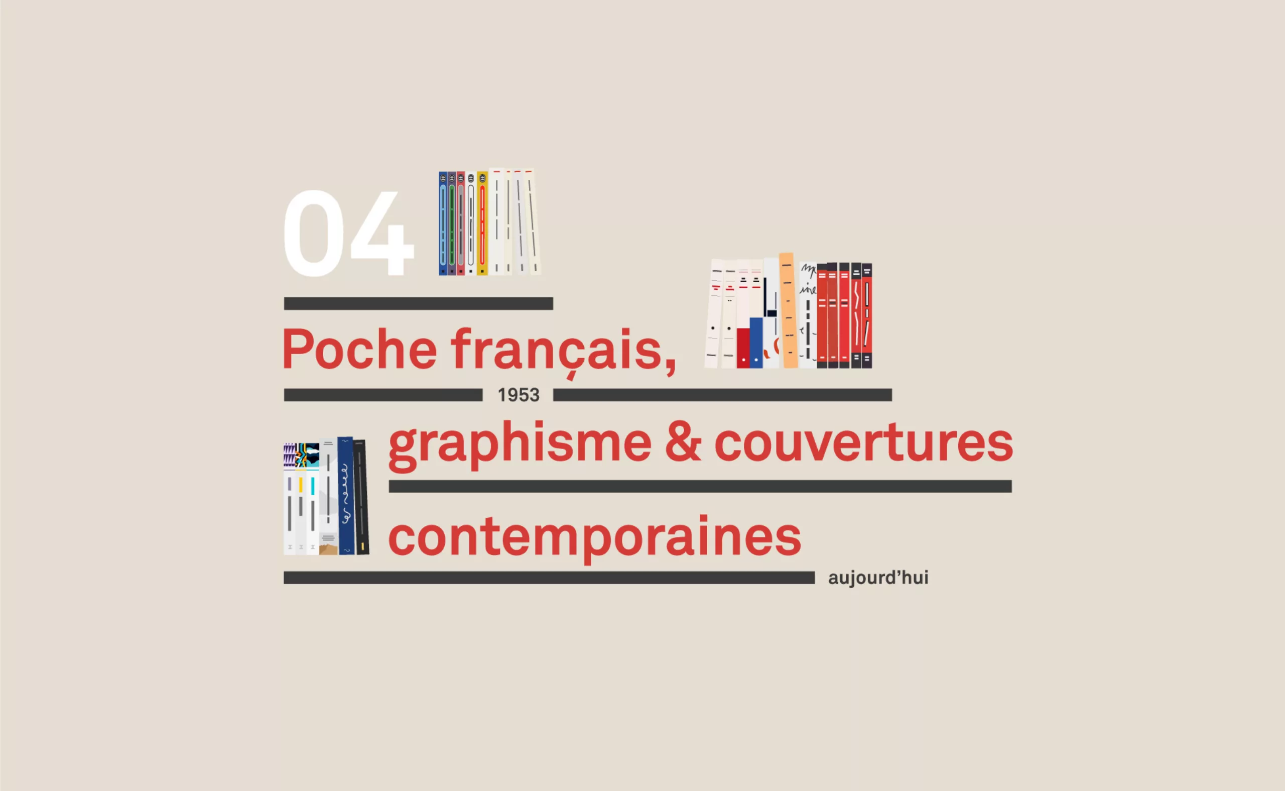
A short history of book covers – 4/4
Last chapter on french publishing houses, the split between Poche and Folio, the graphic inventors, and the return of the beautiful independent book.
-
A short history of book cover design – 3/4
From Penguin Editions to the birth of graphic design, the cover is an open book on the social mores of a country and an era.
-
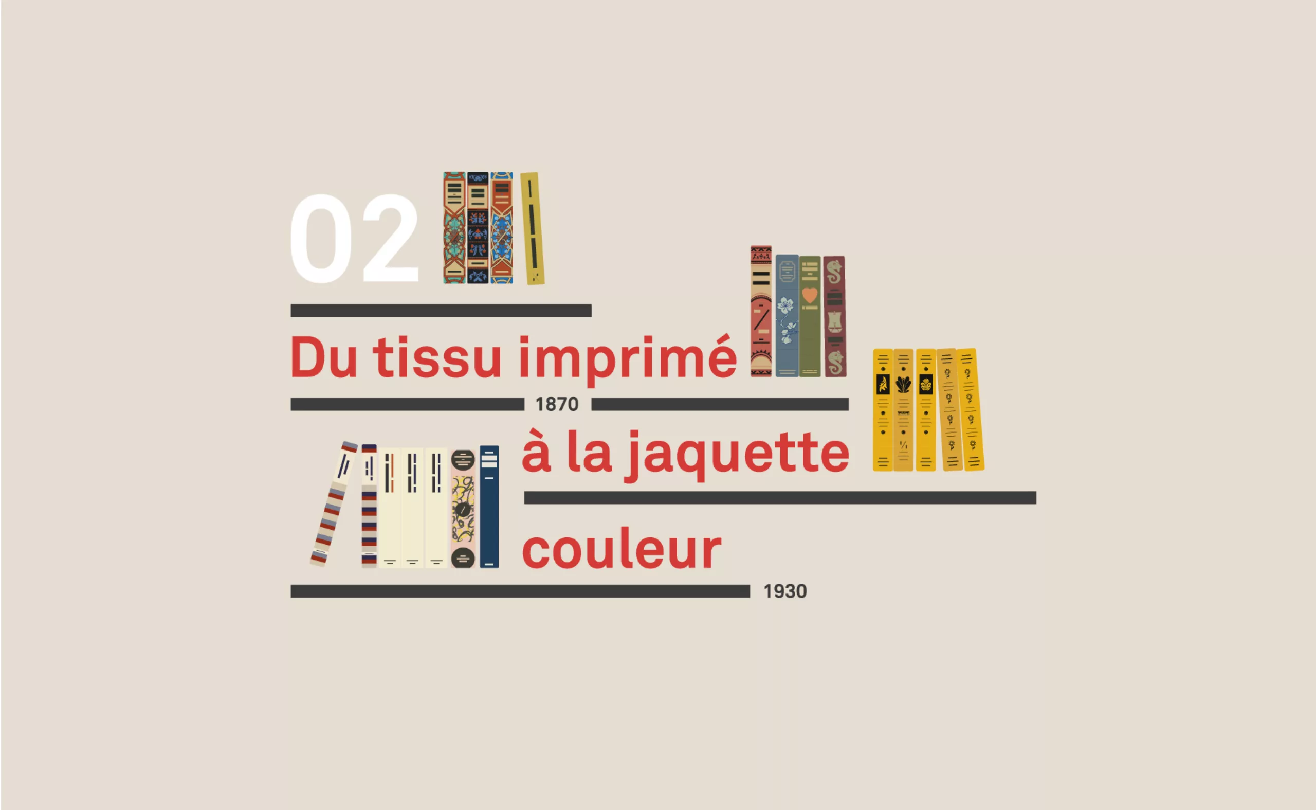
A short history of book cover design – 2/4
Under the influence of Japan, France or Russia, book covers are constantly evolving with technical progress and crises.
-
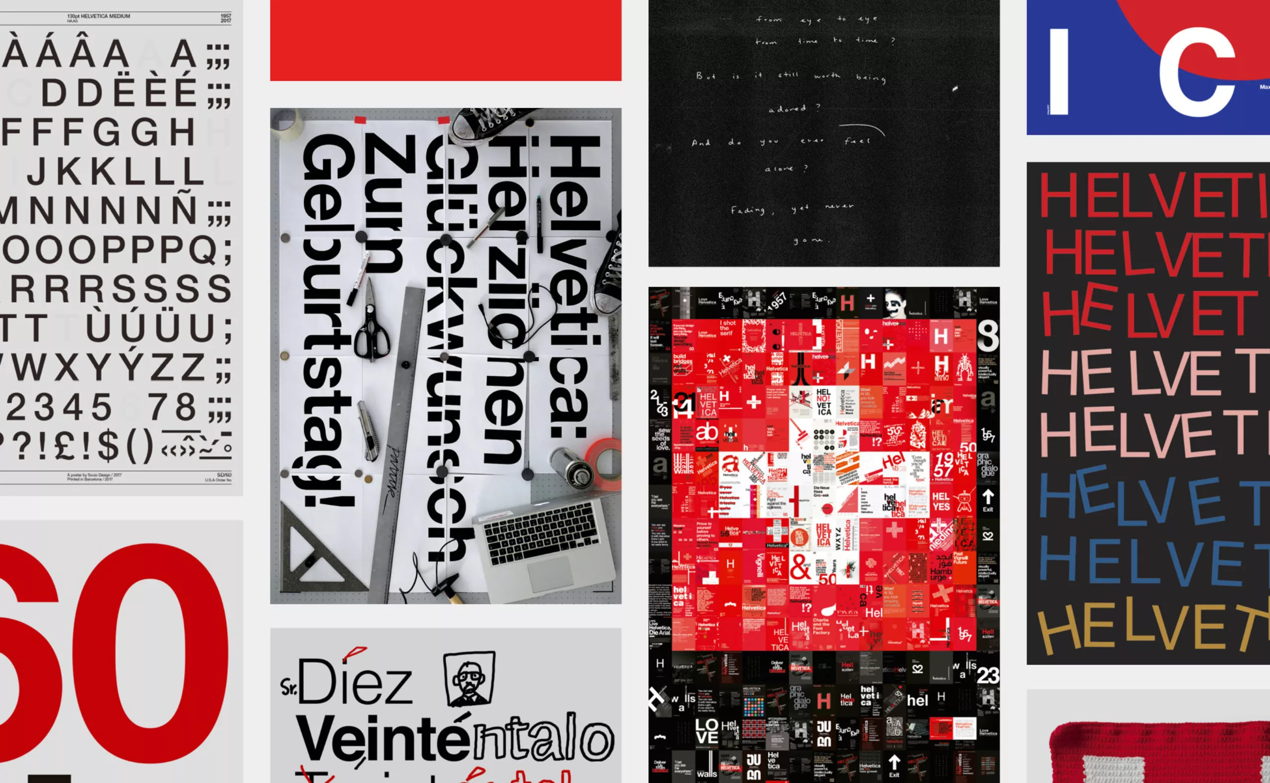
Happy Helvetica to you!
Happy birthday Helvetica! The spanish studio Husmee has invited a selection of international studios to create a tribute poster to celebrate the 60 years of the creation of the famous typography.
-
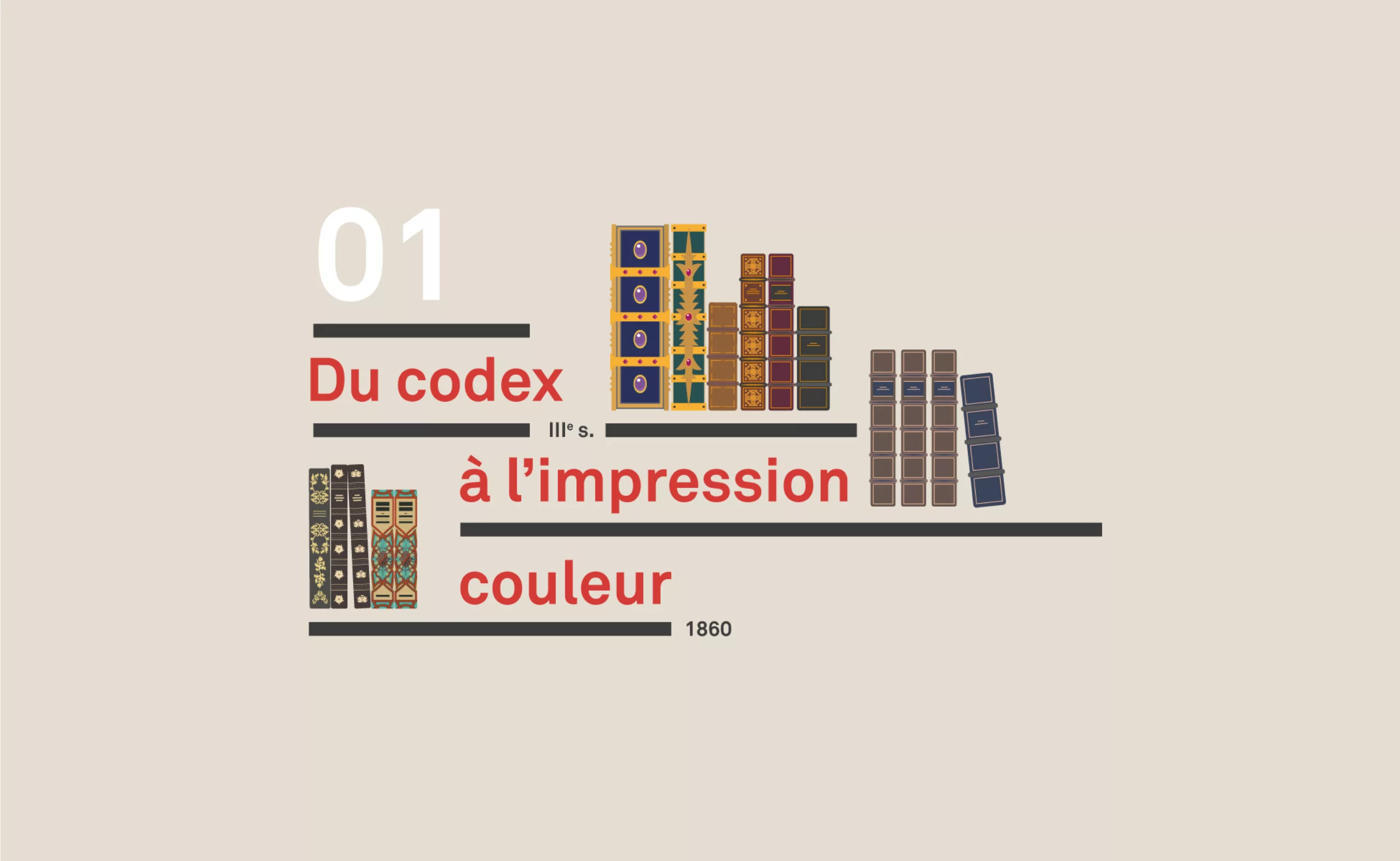
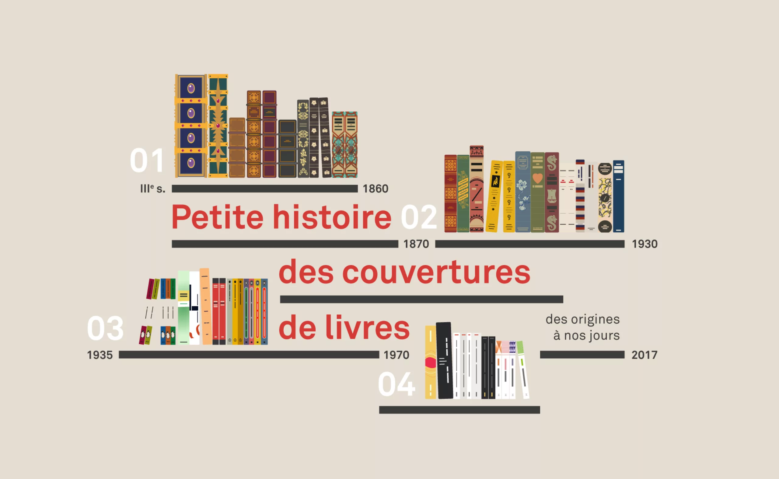
A short history of book cover design – 1/4
From codex to colour printing!
Here is the first part of this series of articles sweeping the evolution of book covers to the present day, through the most striking revolutions. -
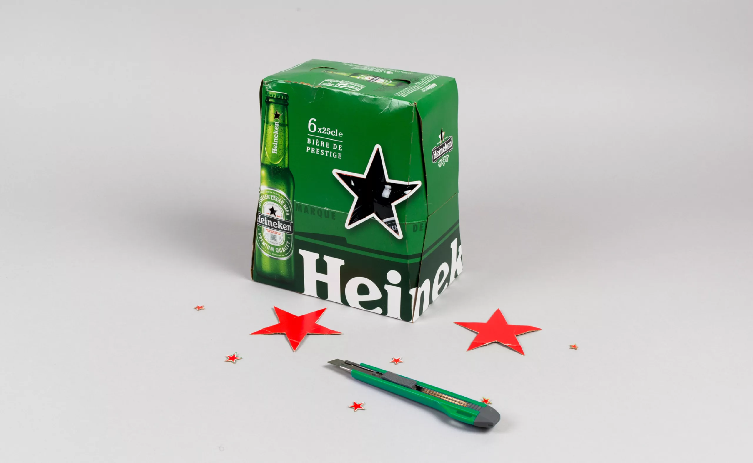
Heineken saves its star
Hungary and the Heineken beer brand are at loggerheads.
The Hungarian parliament wants to pass a law banning the commercial use of the red star.
A law aimed directly at Heineken… -
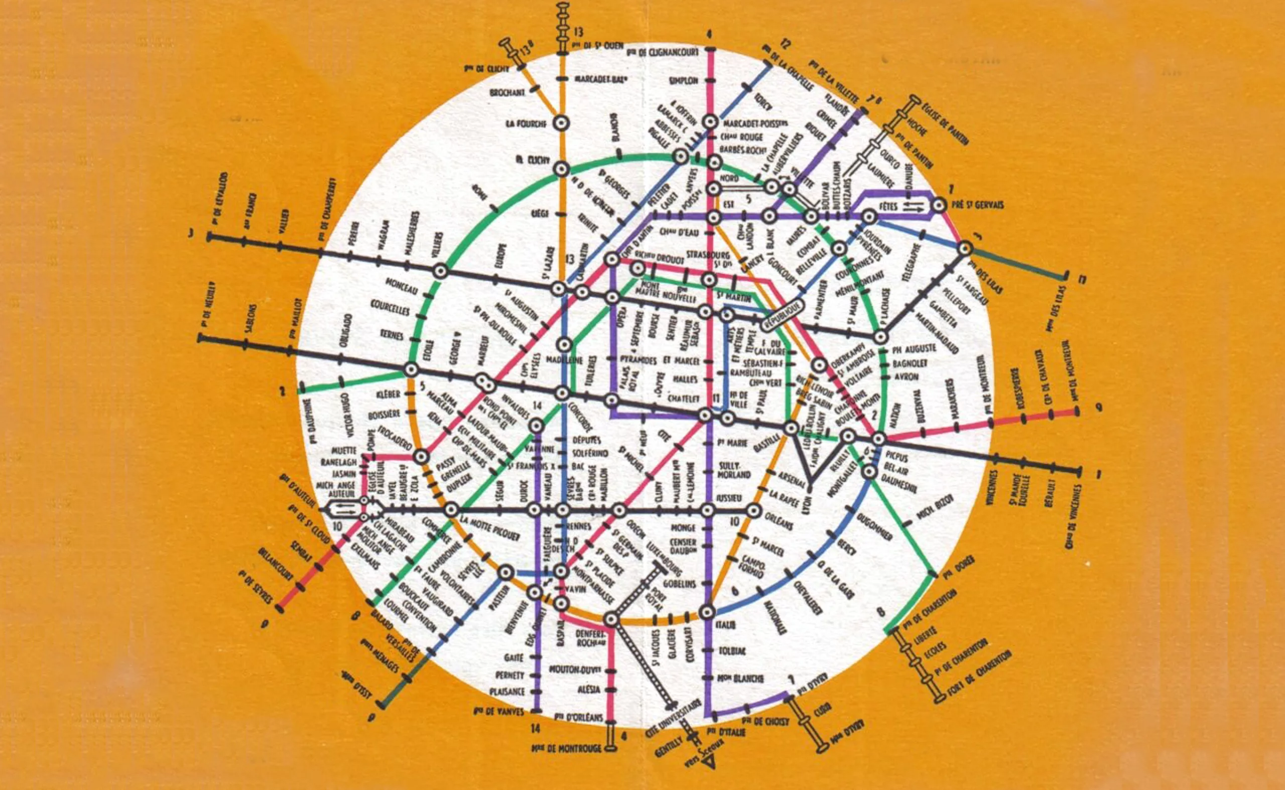
Evolution of the Paris metro map: from spaghetti dish to futuristic city
A concentrate of the evolution of the Paris metro map and beyond, in which we also talk about spaghetti, beer and futuristic cities.
-
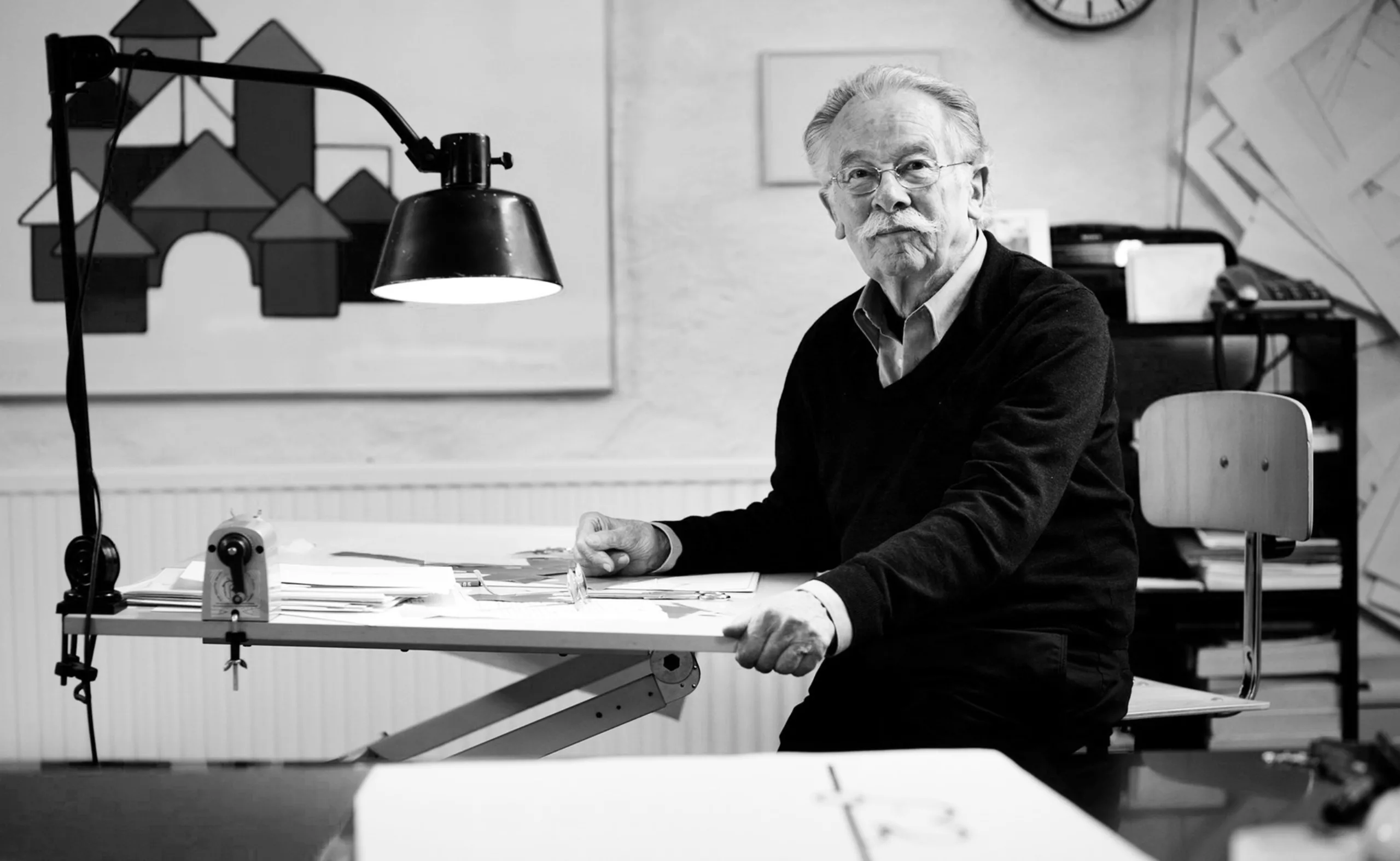
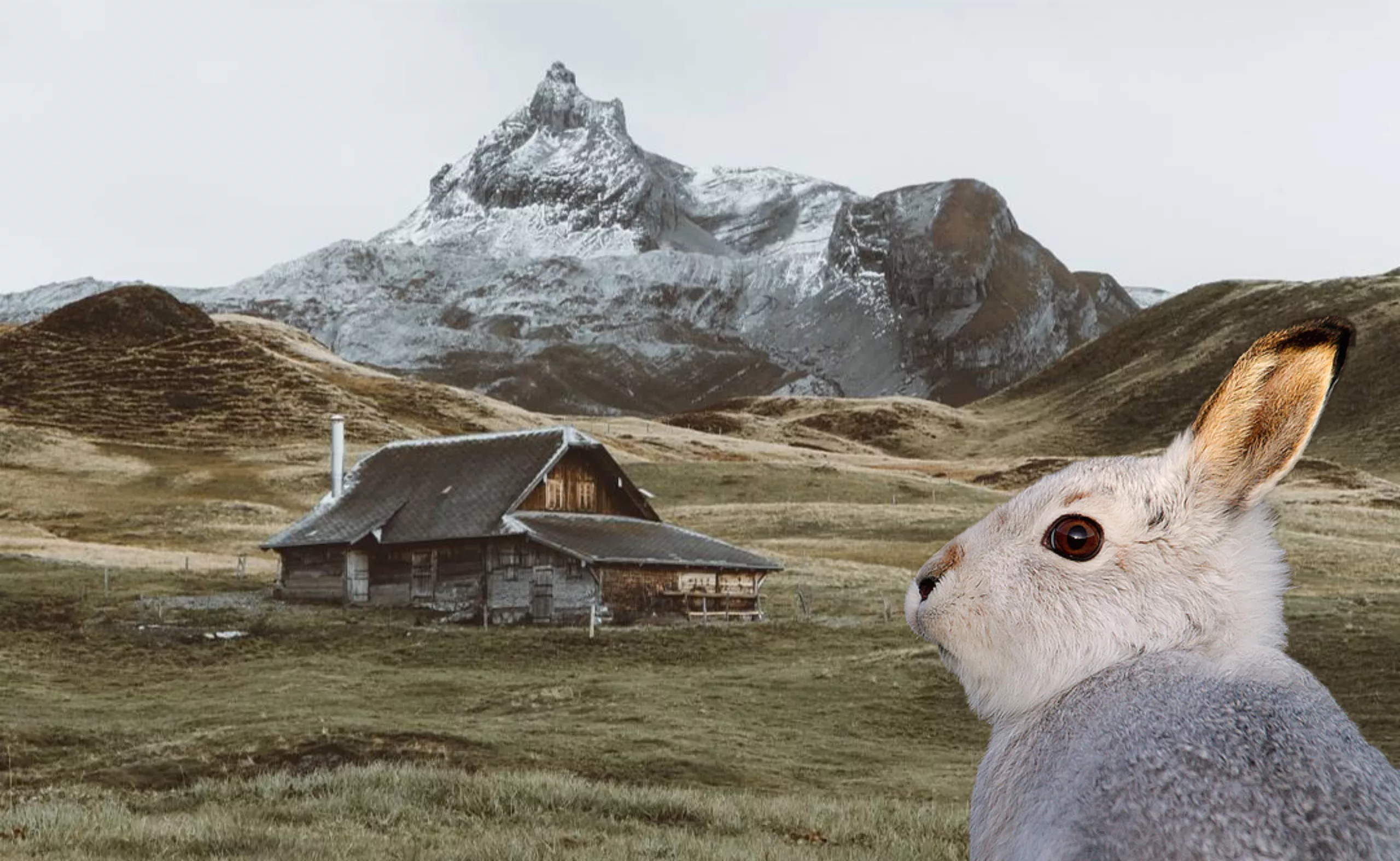
Dick Bruna, minimalist graphic designer and father of the most famous rabbit on the planet
Dick Bruna was the father of the most famous rabbit on the planet: Miffy. He passed away on February 16, 2016 and we wish to pay tribute to his work as a graphic designer, beyond the simple designer of a minimalist white rabbit.
-
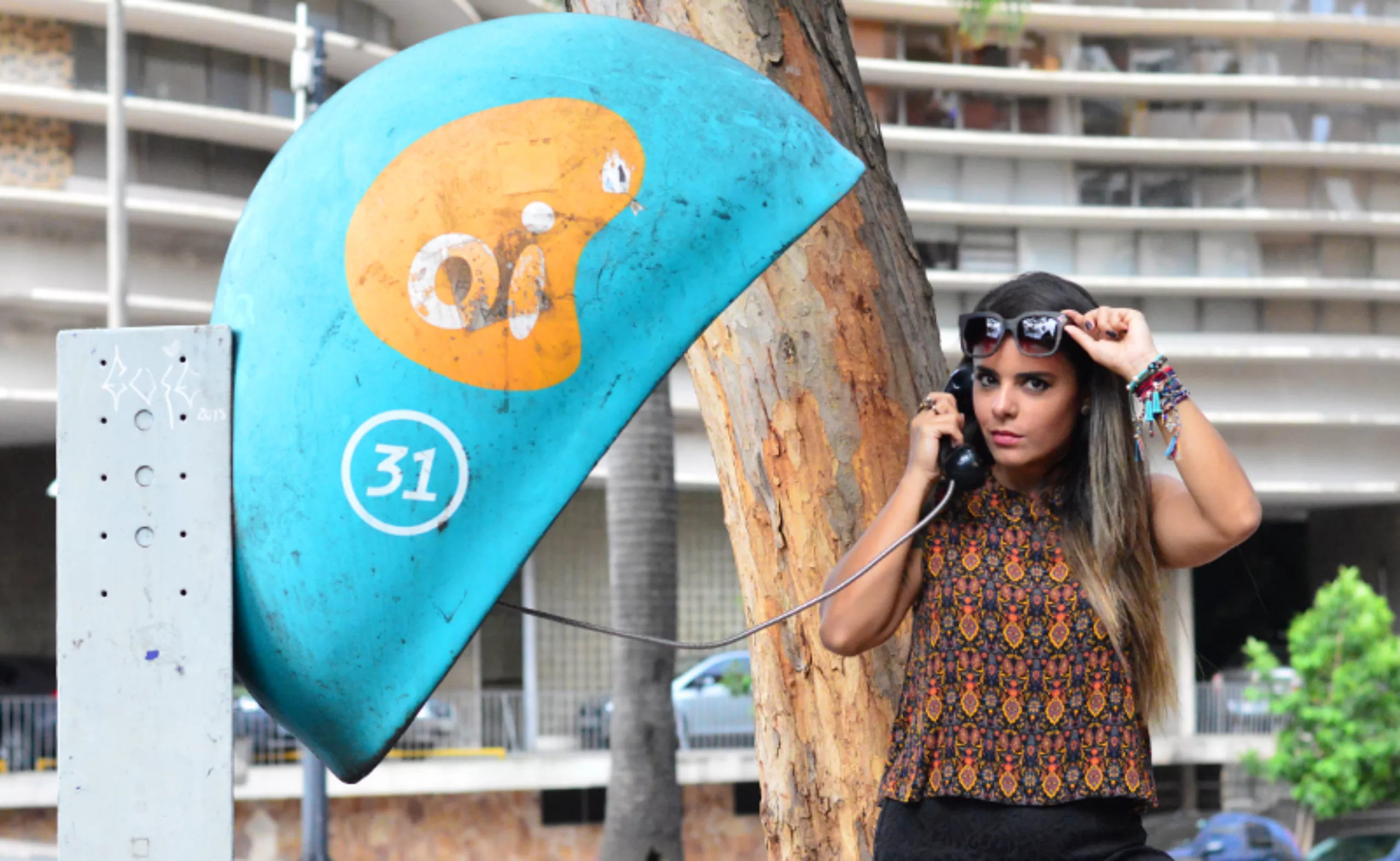
Oi! In love with a Brazilian ear
Let’s fly to Brazil to meet a local star. It’s neither the Cristo Redentor, nor Gilberto Gil, Pelé or even Giselle Bündchen. We will talk about curves though, but introduce you to the famous orelhões, the Brazilian phone booth of Oi -the local phone company.
-
Karel Martens: the impression that matters
Portrait of Karel Martens, the man with multiple motifs and lovers of constraints, reference in the world of graphic design and plastic research.
-
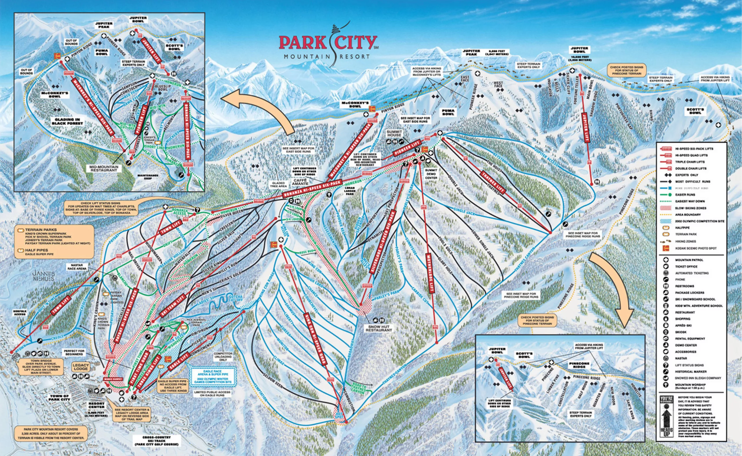
Ski trail map designer: such a cool job!
A rare profession just as the yeti: ski trail designer. Without knowing it, you’ve most probably already seen Novat’s or Nieuhe’s works.
-
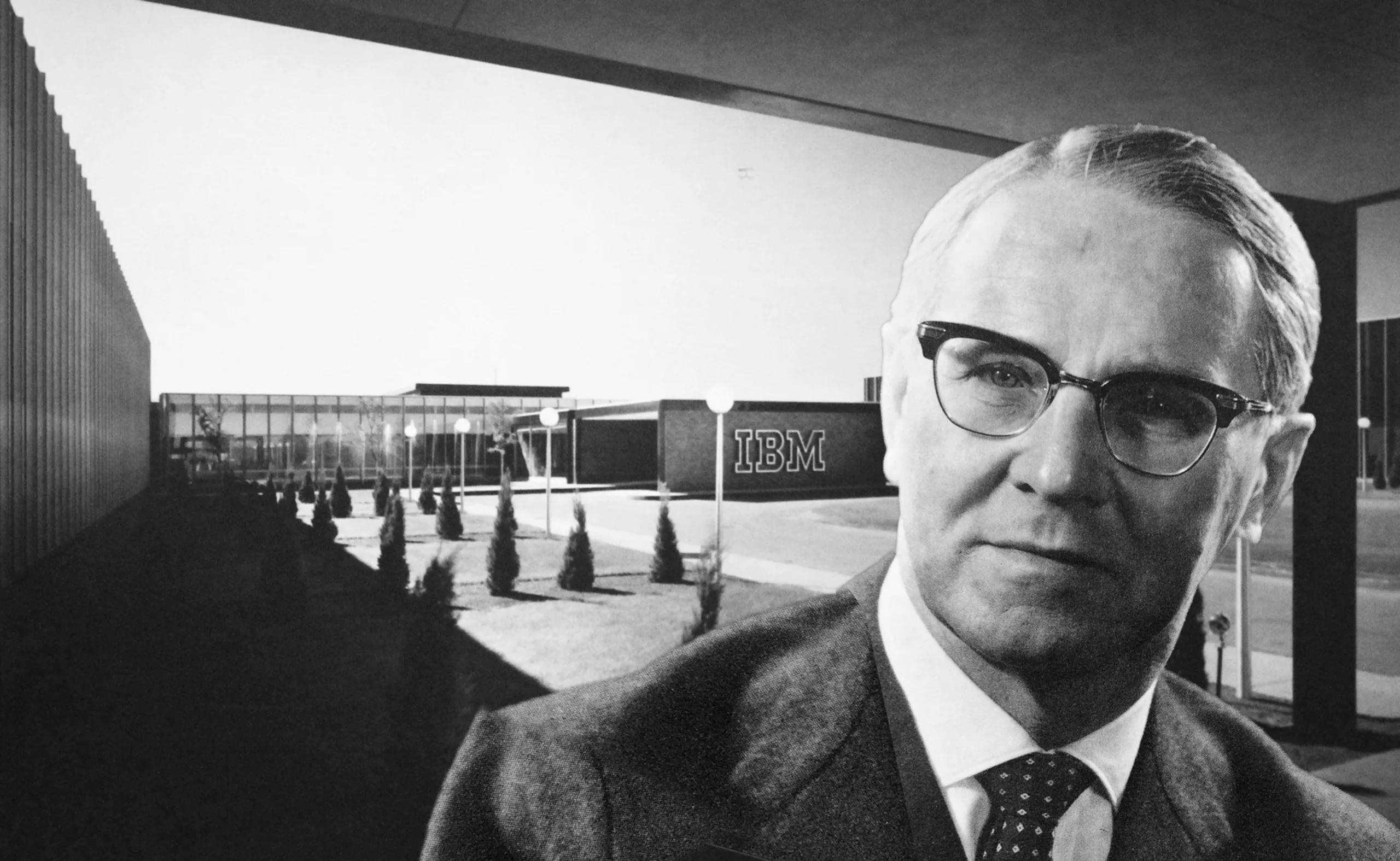
Trump was a graphic designer!
Trump will soon be designated as « most powerful man in the world » and we went digging into his past. We actually have evidence that Trump was a graphic designer. True story: he even created the type of IBM’s logo!
-
New identity for the Gaîté Lyrique, a nice logo to start 2017
New visual identity for the Gaîté Lyrique, a nice logo to start 2017.
Yorgo Tloupas, our hexagonal madmen has struck again! -
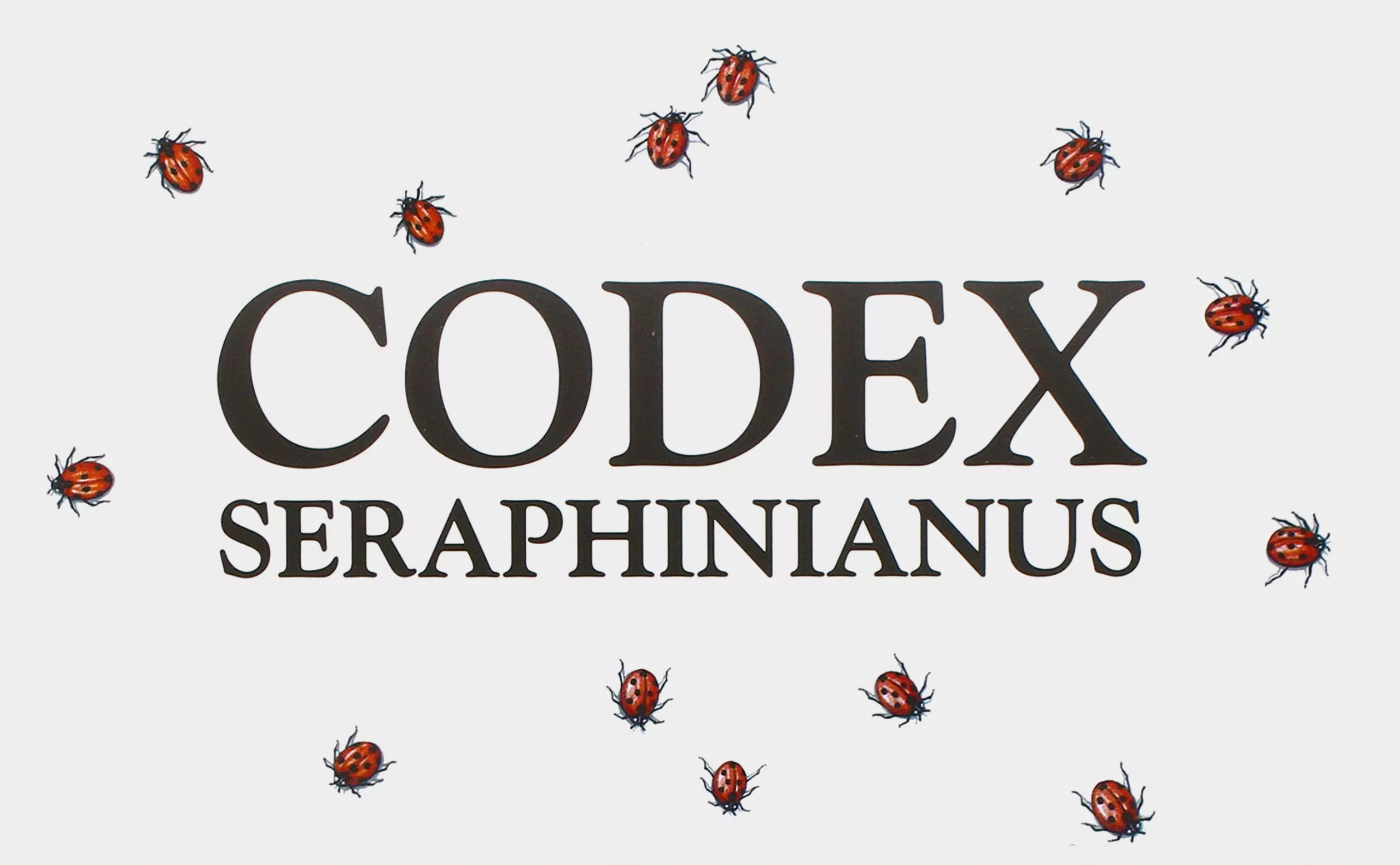
Codex Seraphinianus: the most peculiar book in the world
The Codex Seraphinianus is considered by some as the strangest book ever published. A unique, beautiful, confusing… and above all indescribable art book!
-
Follow your passion or work with passion: a story about summit
How to work with passion, and what career choices to follow to avoid cracks?
-
-
2016
-
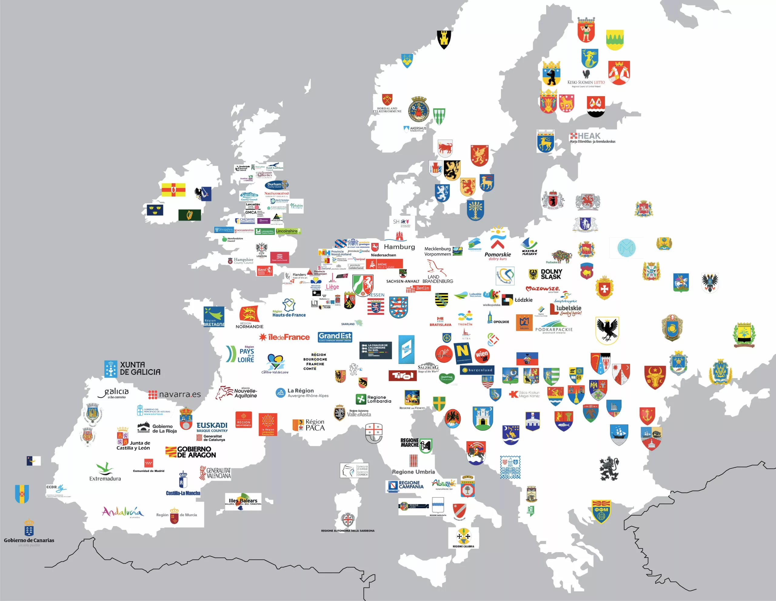
Europe and its regional visual identities
European panorama of regional visual identities.
Is there a Yalta of graphic design ? -
The Great Cassandre 1901/1968
Ode to Cassandre, the man of a thousand talents. His design of posters and graphics revolutionized the role of visual communication.
-
Vasarely, the father of optical art
Inventor of optical art, but also advertising and graphic designer, Vasarely is a giant at the origin of an art form accessible to all, for all.
-
My client is a graphic designer
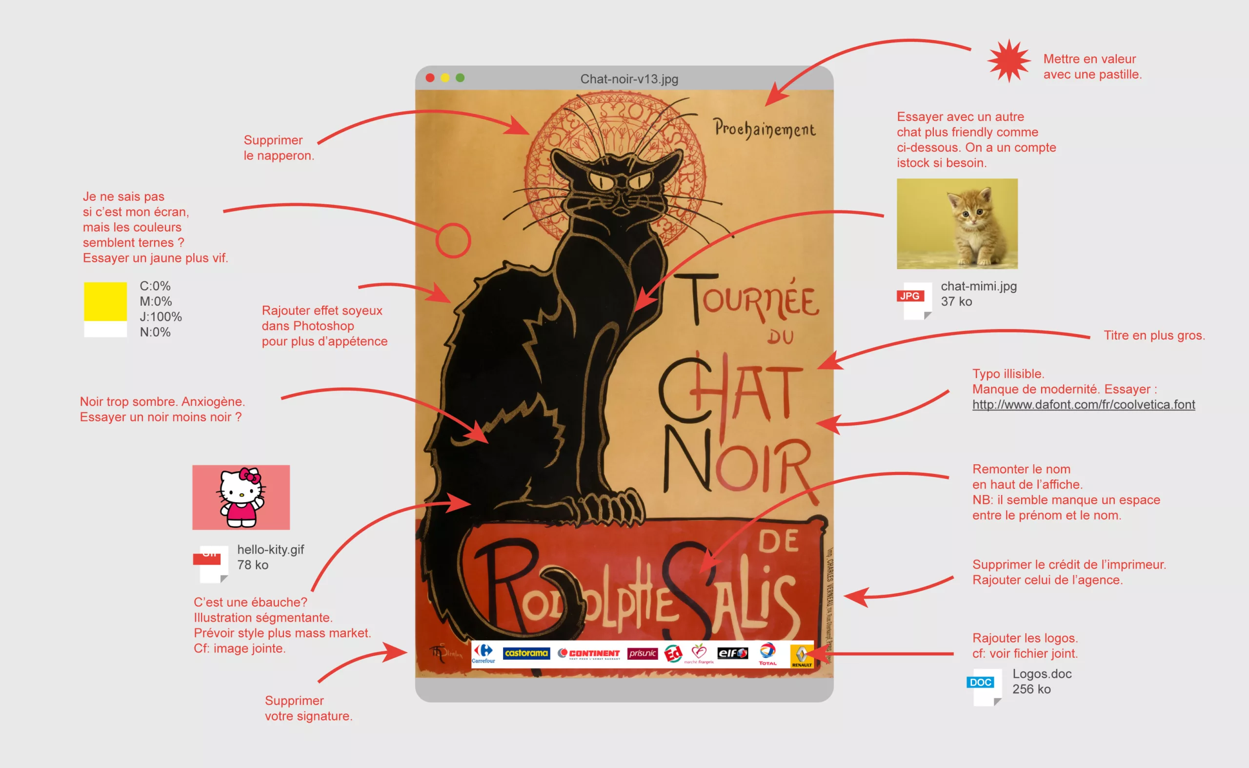
Imagining customer feedback on mythical posters. The tone is exacerbated and any resemblance to real and actual feedback is purely coincidental.
-
Graphic design and children : “They lived children ever after and had many happily !”
Adult drawings inspired by children’s drawings, a diversion into surrealism and an exercise in style.
-
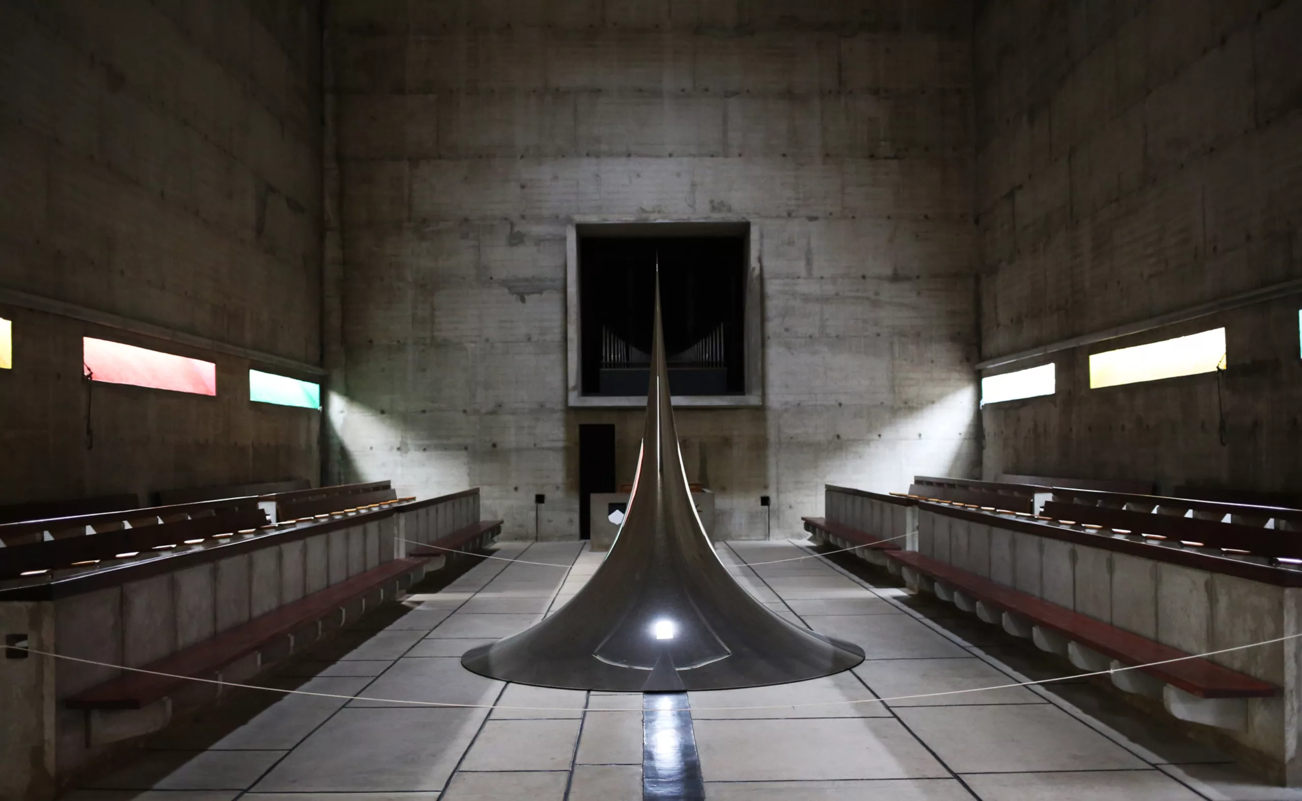
Humanity as Heritage. Dialogue between Le Corbusier and Anish Kapoor
17 works by Le Corbusier enter the World Heritage inventory at the Tourette convent.
-
Ben Bos, the big “Bos” of dutch graphic design!
Ben Bos (1930-2017) The big Bos of Dutch design!
Portrait of a graphic design giant who worked for Total Design for 3 decades. -
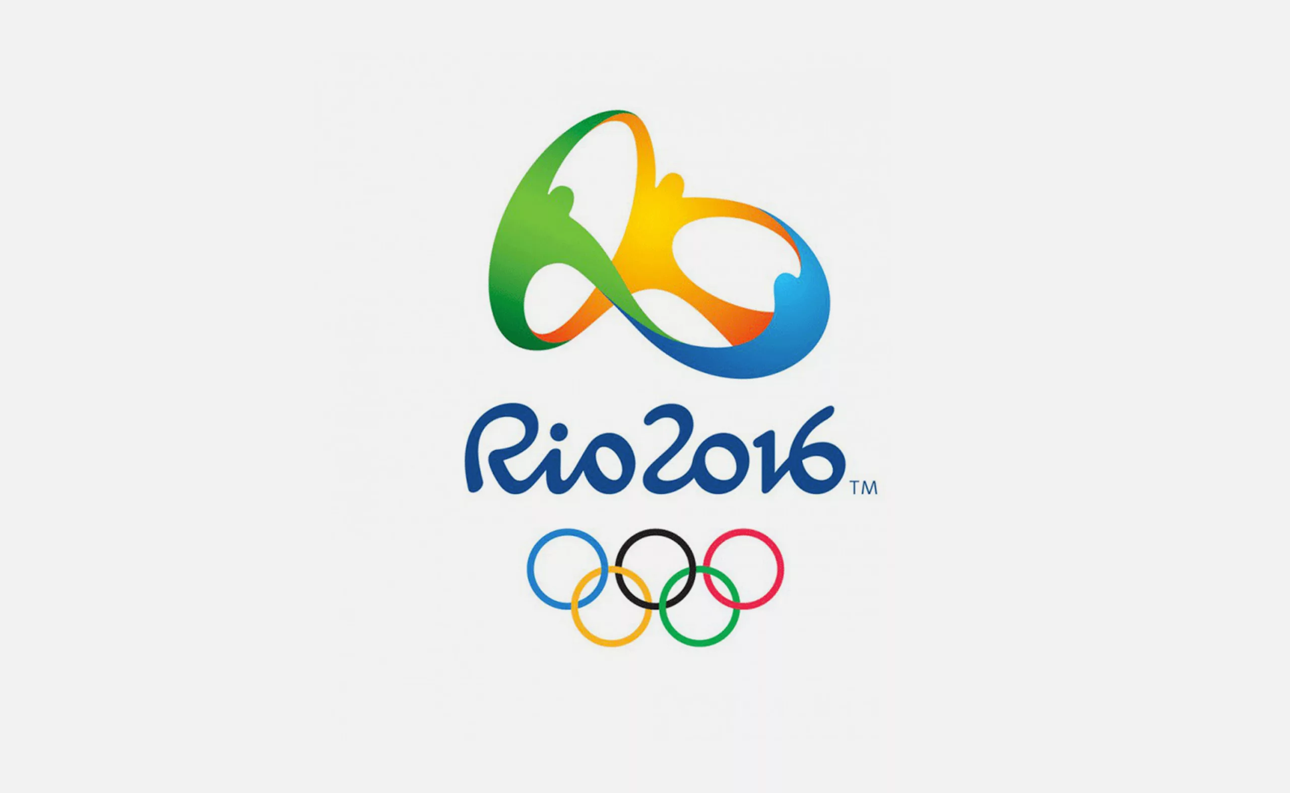
The genesis of the Rio 2016 Olympic Games logo
We tell you how the logo for the Rio 2016 Olympic Games came about, and more importantly, how to make a logo by walking on water…
-
Shepard Fairey, “the worm that shone with the stars”
Shepard Fairey, “the worm that shone with the stars!” (Victor Hugo)
Portrait of a street artist, illustrator and activist graphic designer. -
Pierre Bernard & Grapus, “Graphic design of public utility”, 1942/2015
Pierre Bernard & Grapus. Collective and individual itinerary of a committed graphic designer, tireless defender of the notion of public utility in graphic design.
-
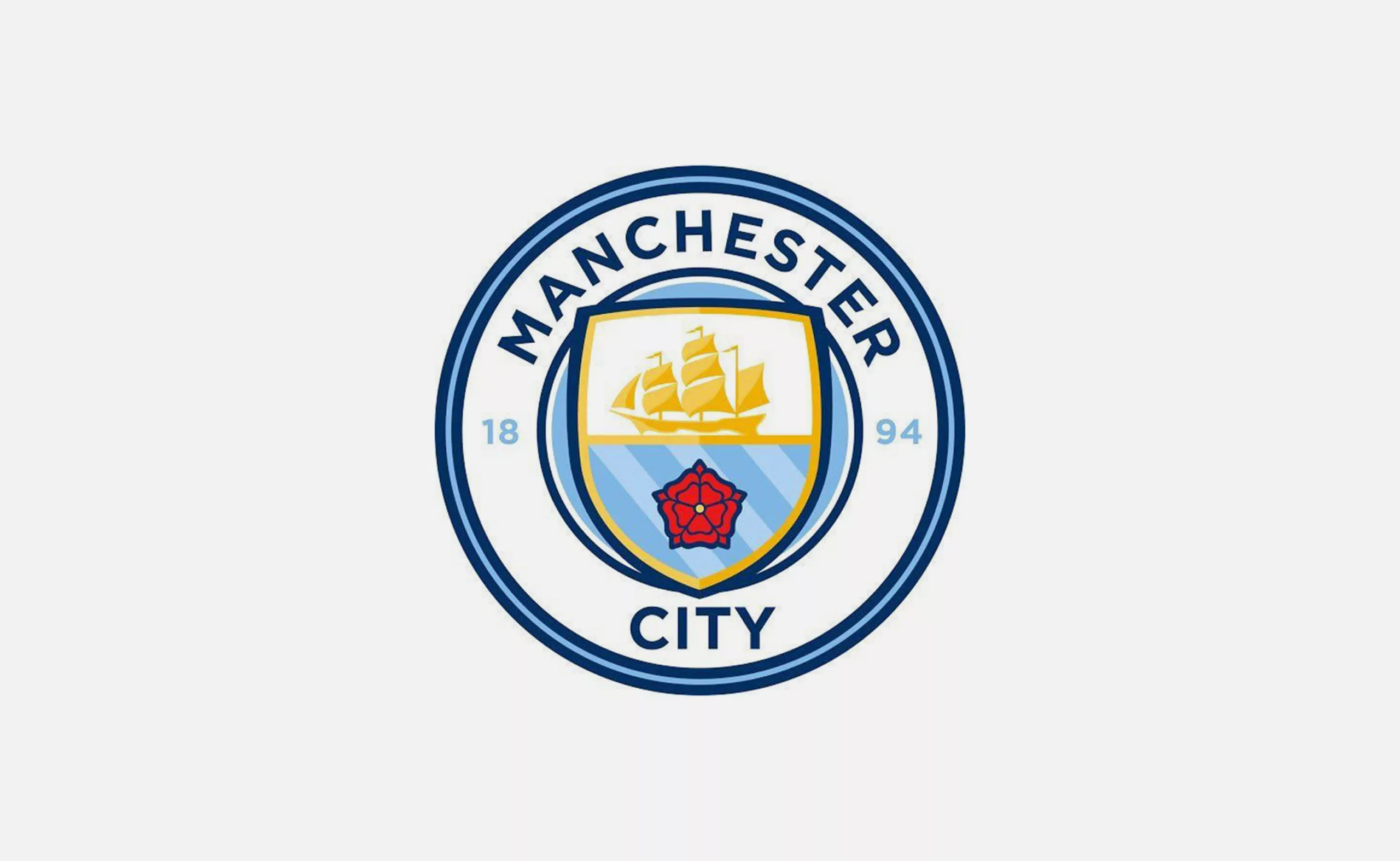
Manchester City Football Club restores its heraldic coat of arms
Manchester City FC has signed Noel Gallagher to promote its new logo!
Classic branding, but well done.
-
-
2015
-

Jacno, “Five capital letters!”
Marcel Jacno (1904- 1989), known as Jacno, is a french graphic designer, famous notably for having designed the NPT logo, as well as the Gauloises cigarette pack.
-
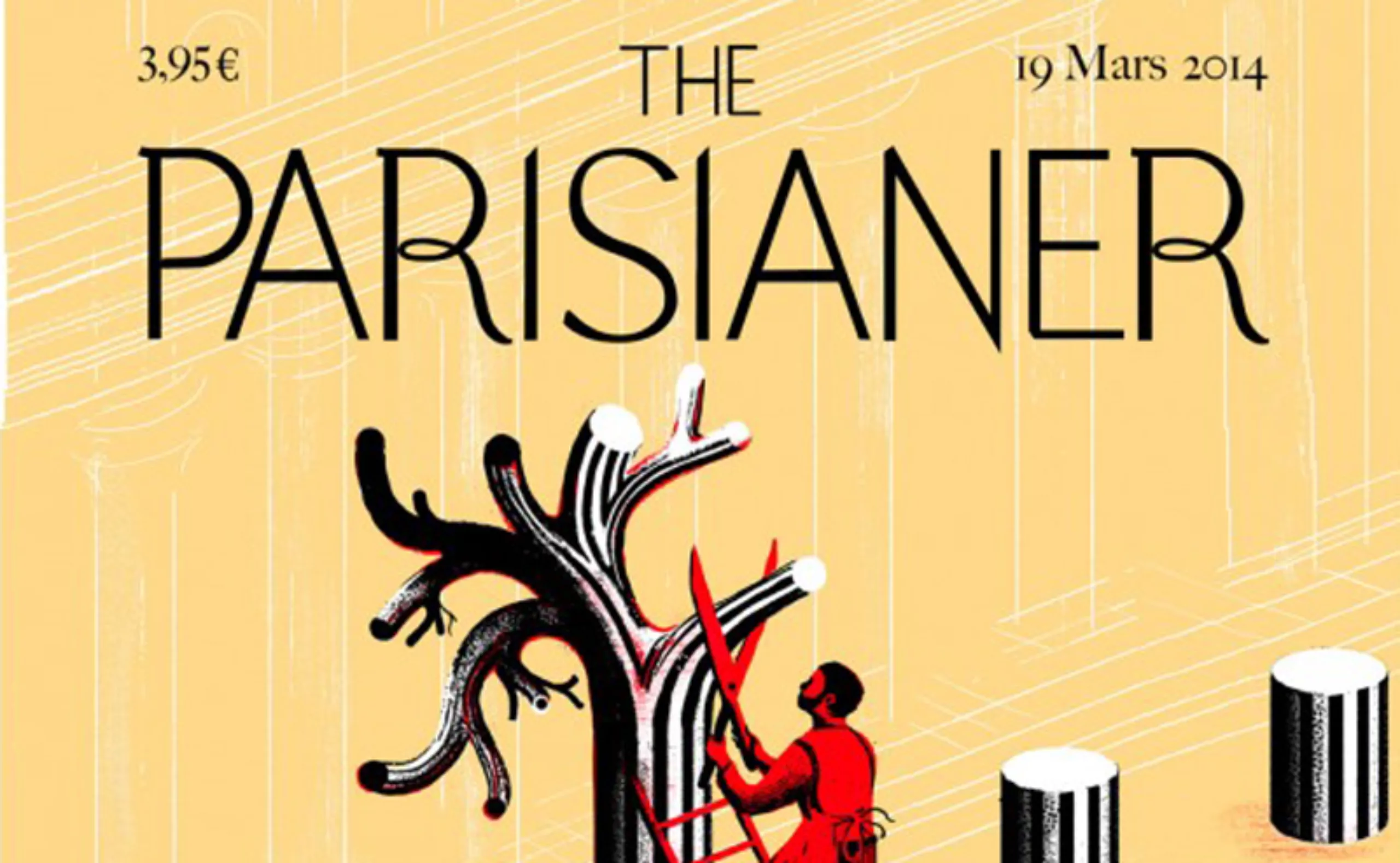
The Parisianer, a real Paris !
A Parisian tribute to the covers of The New Yorker, The Parisianer brings together illustrators for the front cover of a virtual magazine. Illustrating a multiple and colorful Paris.
-
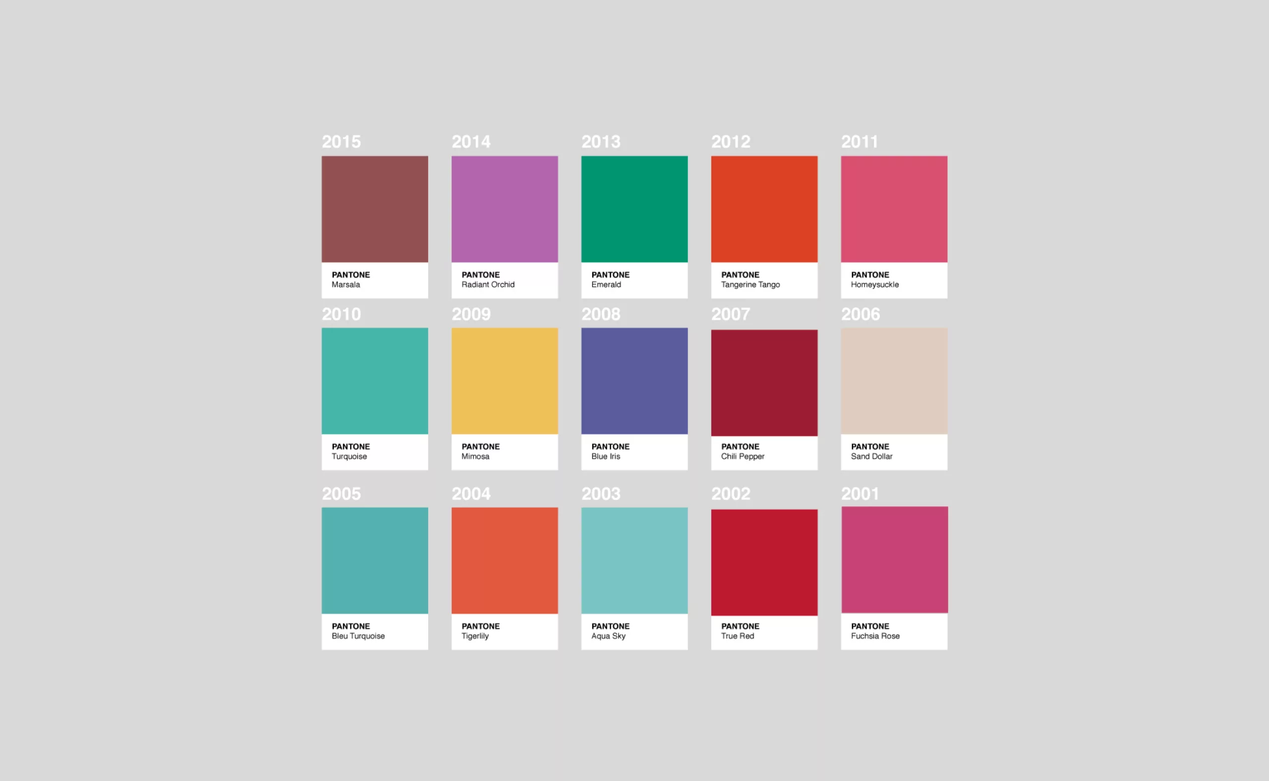
How Pantone colors the world !
Twice a year Pantone proposes ten seasonal colours… a little technicolour deciphering from the big man of colour!
-
Peter Gut “sketches real life”!
Peter Gut, a multiple work navigating between caricature, press drawing and illustration for children, with humour in the background.
-

DNA and advertising marketing
A Hong Kong advertising campaign using DNA sequencing raises questions about the link between marketing and genetics.
-
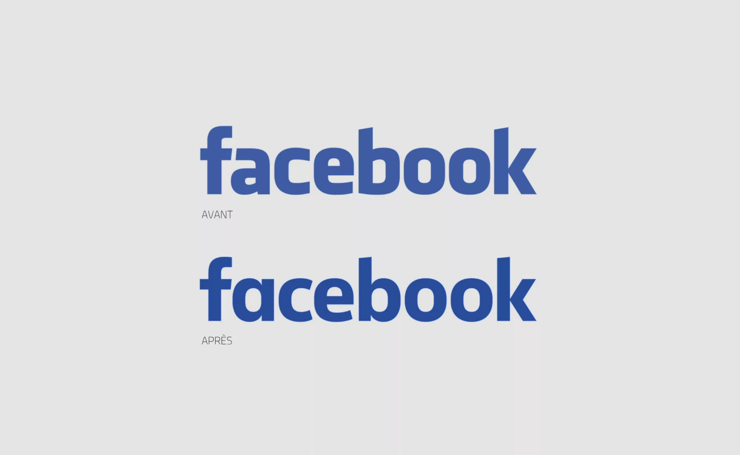
Behind the scenes of Facebook’s visual identity
Facebook’s visual identity redesign led by the American designer Ben Barry between 2009 and 2015. Logo, typography, colors, icons…
-
Hans-Peter Hort, “bon vivant” and unknown
Portrait of the Swiss graphic designer Hans-Peter-Hort (1924-2010). No biography is dedicated to him. Here is an attempt to catch up…
-

A visit to Basel’s printing museum
A short visit to the Basel ( Switzerland ) printing museum.
A unique opportunity to discover a little treasure: the Helvetica protocol ! -

Pareidolia, or the art of seeing faces everywhere !
Pareidolia, or the art of seeing faces anywhere! A cognitive phenomenon to which we may owe the survival of the human species and some amazing image collections !
-

A new logo for “Quick” without a roof
Presenting the new logo for restaurant “Quick”. My first thoughts go immediately to the previous logo that has lived 22 years.
-

Generative visual identity for Bordeaux Métropole
New visual identity of Bordeaux Metropole. An opportunity to examine the generative visual identities.
-
-
2014
-
W®rds are dead, w®rds live!
The privatization of languageWhen brands privatize language, it’s death of words. Yet language must remain a common good, not susceptible to privatization.
-
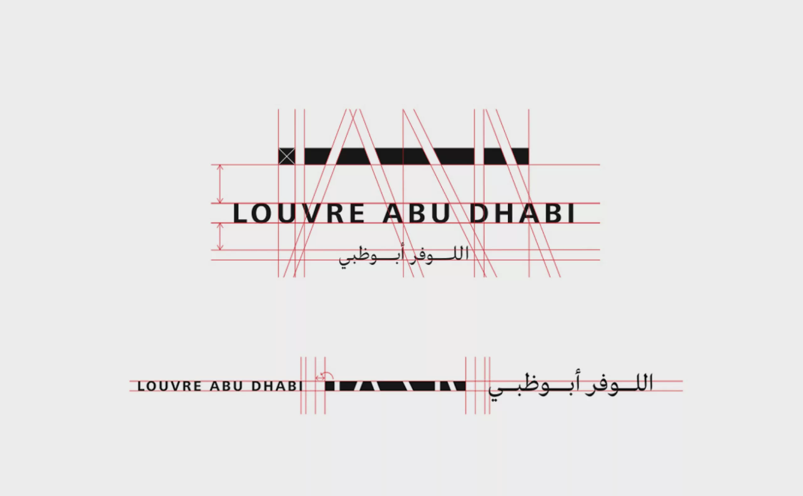
Louvre Abu Dhabi’s new visual identity
Presentation of the visual identity of the Louvre Abu Dhabi. When french interests meet petrodollars, it gives a beautiful logo!
-
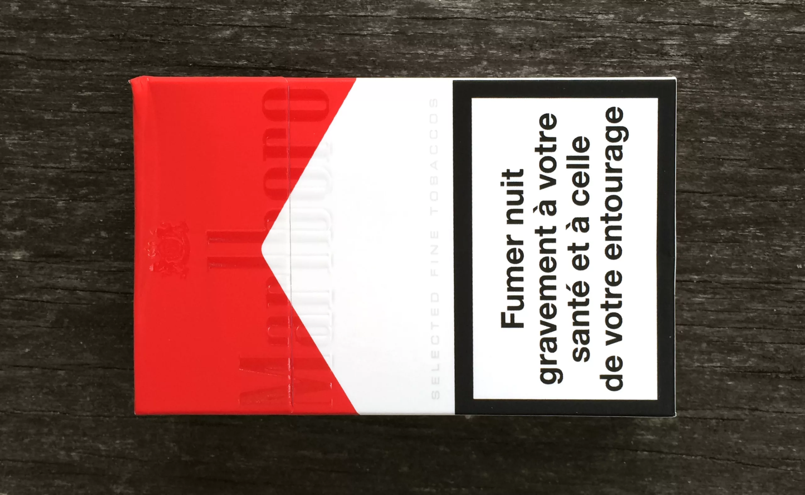
There is no smoke without brands!
As there is no smoke without brands, see why the cowboy firm tries to pack of cigarettes without logo.
-
Hans Hillman, “poster art without fuss”!
Hans Hillman, German graphic designer, illustrator and designer (1925-2014).
He was a pioneer who, as early as the 1950s, re-invented the art of film posters in Germany, designing German versions of posters by Godard, Bunuel, Eisenstein, Kurosawa and Bergman. -
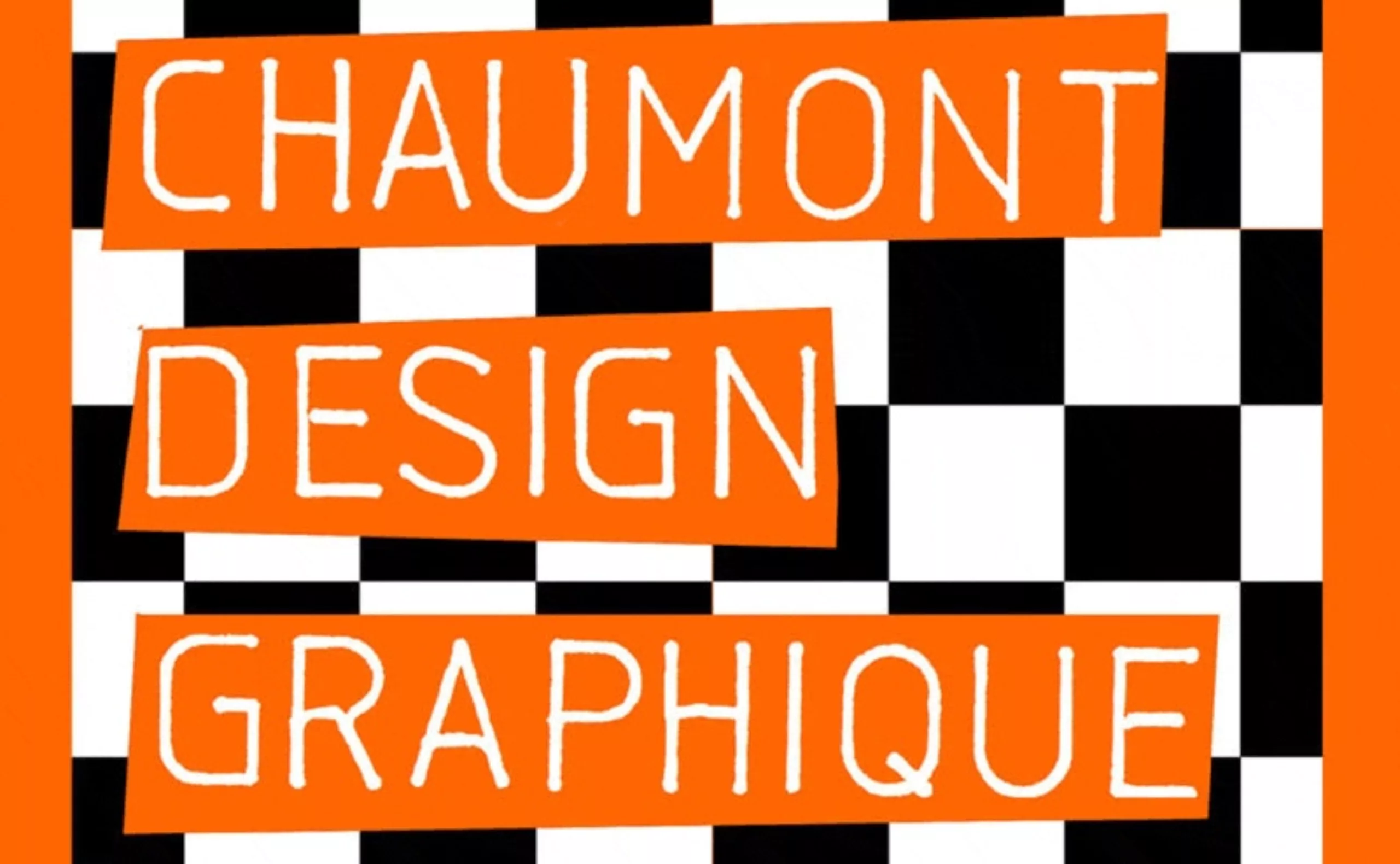
Chaumont festival goes bazooka
The two ironic, subversive posters for the 2014 Chaumont Festival question current affairs with a bazooka… and it’s great !
-
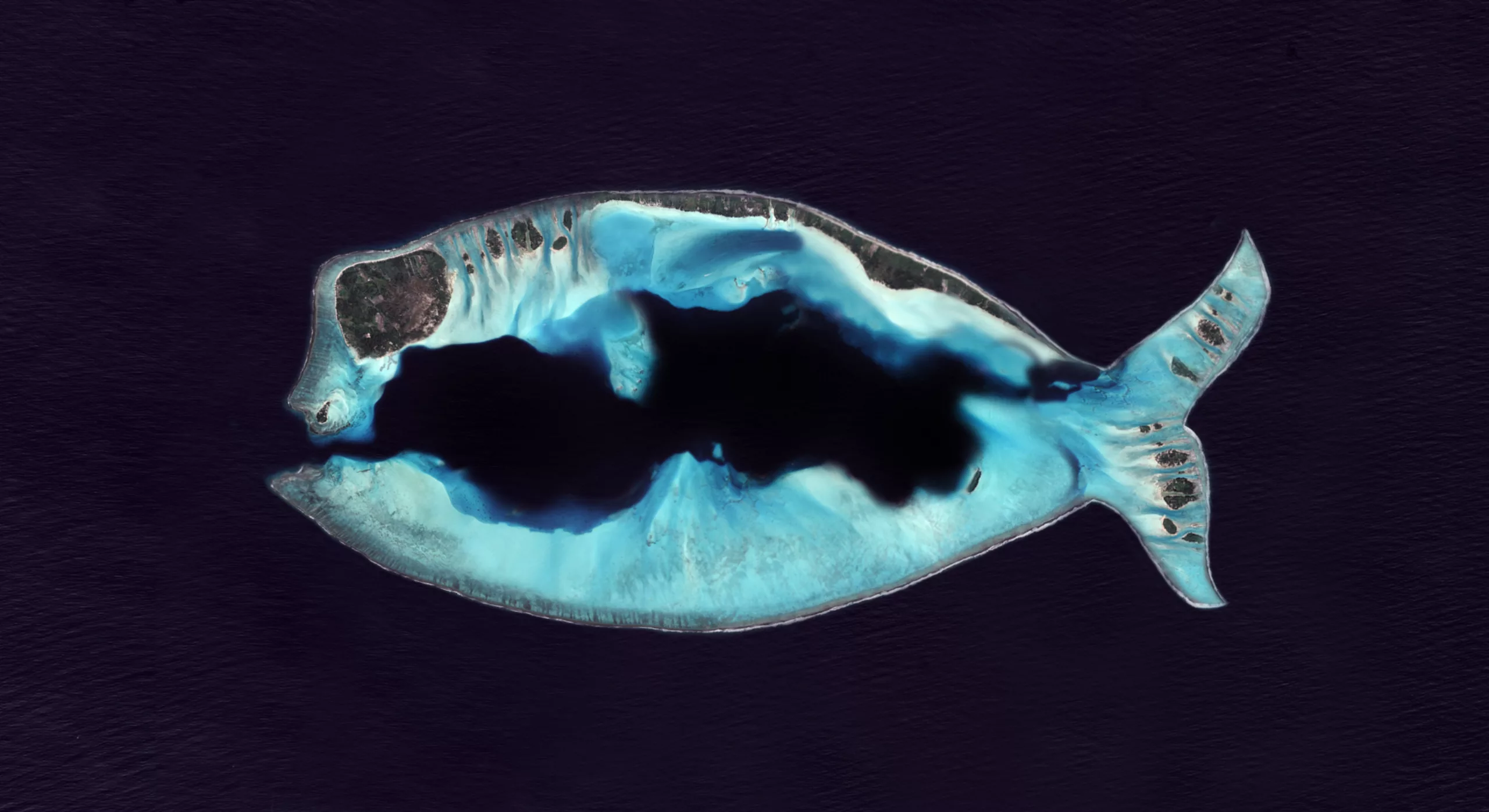
An island shaped like an April fool’s
CNES unveils a new island discovered by the Pleiades satellites, a new kind of high-resolution earth observation satellite ! It’s also a great opportunity to discover a visual April Fool’s !
-
Typography and ecology
Ecology and typography : Garamond typography, the 14-year-old prodigy and $136 million in savings ! Why this equation isn’t entirely true !
-
Herb Leupin “A great swissman“
Herb leupin (1916-1999). Swiss graphic designer who produced more than 1000 advertising posters.
-
-
2013
-
Martin Sharp, “sydneydelic”
When some wanted to make revolution with their voices or their guitars, he armed himself with his pencils and brushes. It was the early’60s, and Kennedy wasn’t an airport yet.
-
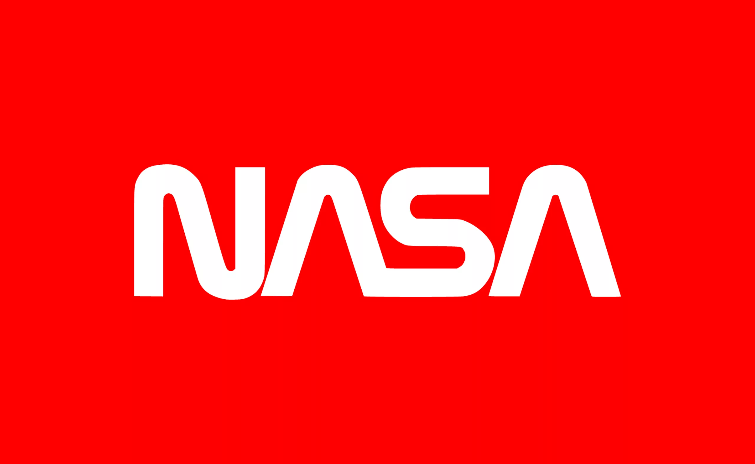
The history of the nasa logo
The story of the Nasa logo. How the meatball beat the worm ! A unique opportunity to delve into the history of this famous visual identity.
-
Edward Bawden, “Great illustrator from Great Britain”
Painter, graphic designer, English illustrator little known in France. Yet, Edward Bawden remains a great illustrator from Great Britain!
-
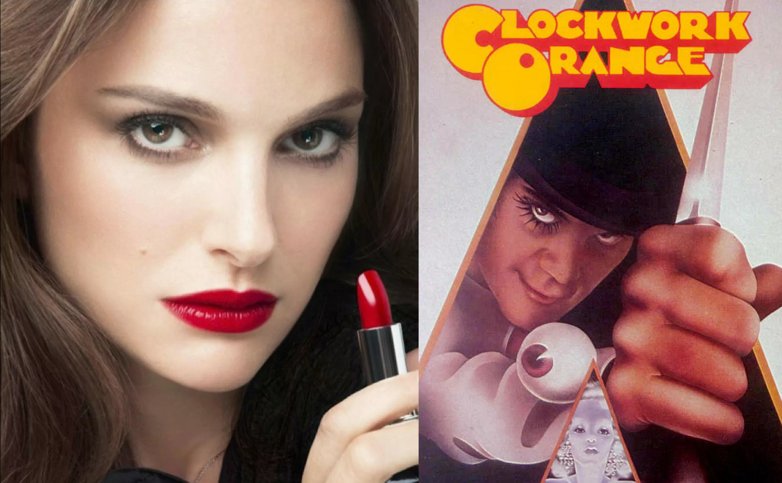
Natalie Portman, serial killer for Dior Rouge
After eight eventful seasons, the Dexter series has just come to an end. (You can continue reading this article without fear, it’s guaranteed spoiler-free!) It’s hard to come back down after being inside the head of a serial killer for so long. Will you miss it? I’m not so sure.
-
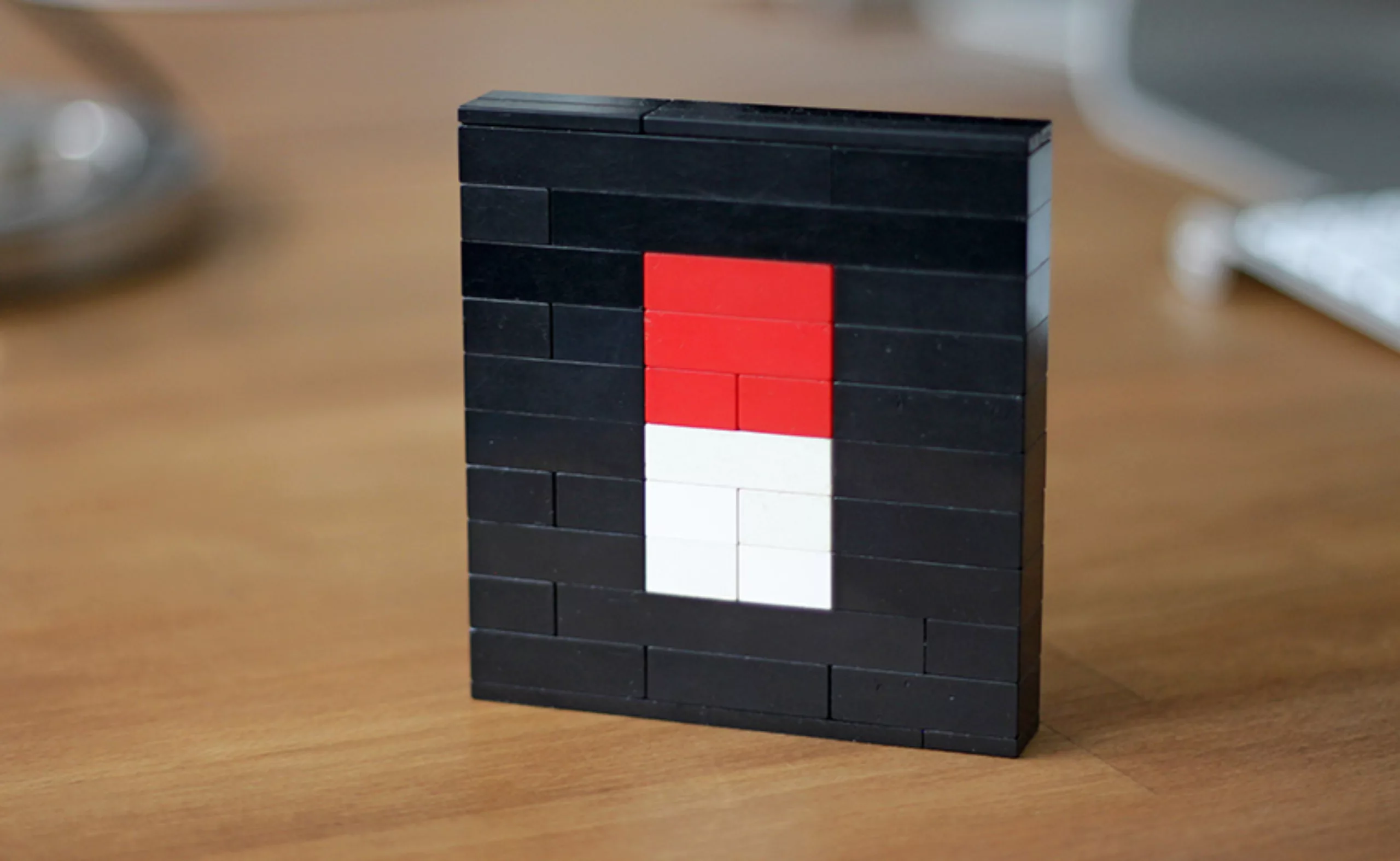
Another brick in the wall : lego graphics !
Ah the pleasure of rummaging through a crate full of Legos in search of the right brick and the right color – a real Proust’s Madeleine !
As you probably know, graphic designers are big kids, and they love to play this timeless construction game. The return in force of a certain “minimalist wave” mingled with regressive geek culture has given rise in recent years to a sudden appearance of creation and various reinterpretations of popular icons based on lego. -
The secrets of the “Rencontres de Lure”
Les Rencontres de Lure. For 61 years, strange wackos have been meeting every summer in “Lurs-en-Provence” to redo the typography in particular and the world in general. In a climate of camaraderie, under the Provençal sun, perched on a rock, all the faces of typography are discussed.
-

“Wild idea”, magical Land Art installations and photographs
Land Art, artistic installations, sculptures and photographs. Ludovic Fesson’s art invades the banks of the Loire.
-
Alexander Girard, “the color-fool”
Designer textile, graphiste, designer de mobilier…. Rien n’est assez coloré pour cet Italo-Américain !
-

Flat design vs Skeumorphism : The game !
Flat design versus Skeumorphism, a brief analysis of the latest trends in web design and communication. Google, Apple and Microsoft, 3 case studies under the microscope!
-
The Noailles “A Life of philanthropy”
Let’s explore the fabulous history of Villa Noailles and its illustrious inhabitants Charles and Marie-Laure de Noailles, great patrons of the arts, design and fashion!
-
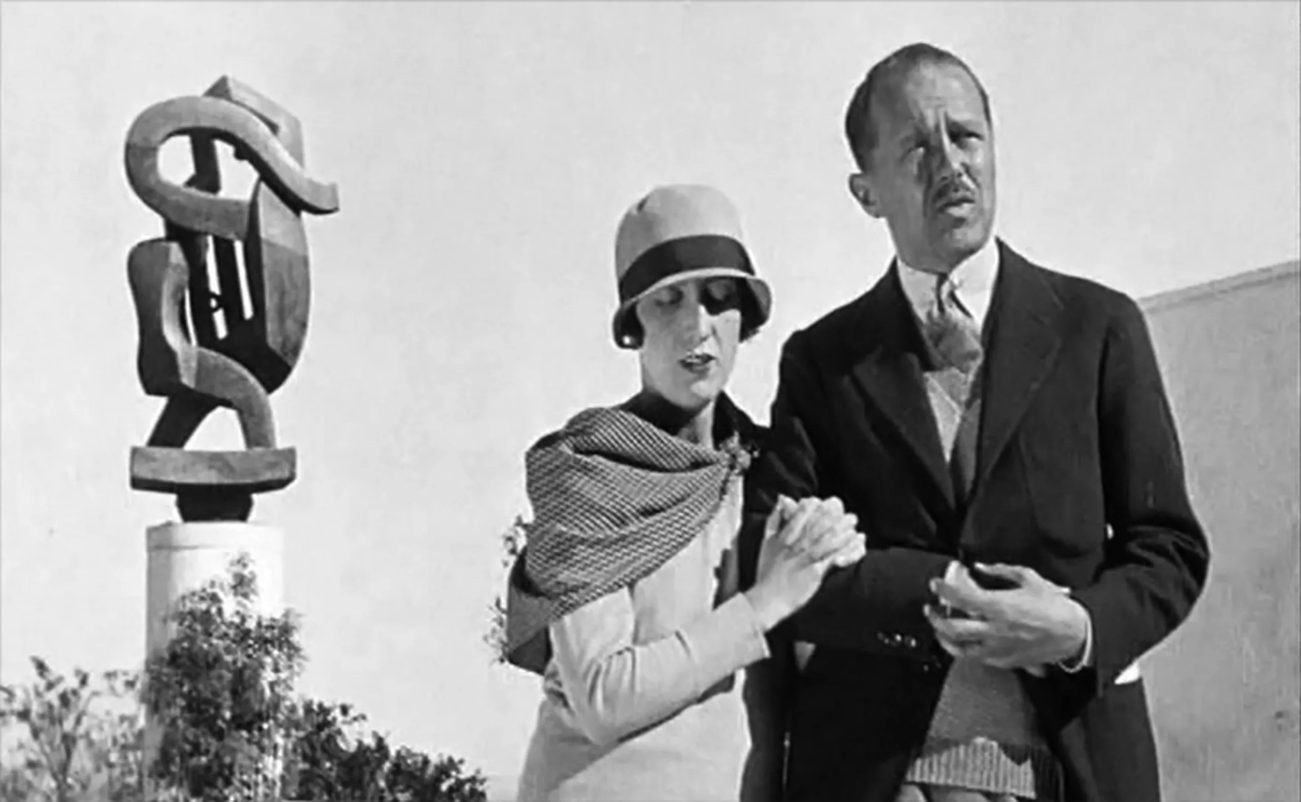
Roger Excoffon, a master of French graphic design
Retrospective of Roger Excoffon’s work. Graphic designer, typographer and type designer 1910-1983. The creator of the Banco, Mistral, antique olive typography… but also of the Air France visual identity.
-

Vitra Design Museum
Visit of the Vitra Design museum near Basel. A delight of architecture, Pop Art, design furniture… and also graphics!
-
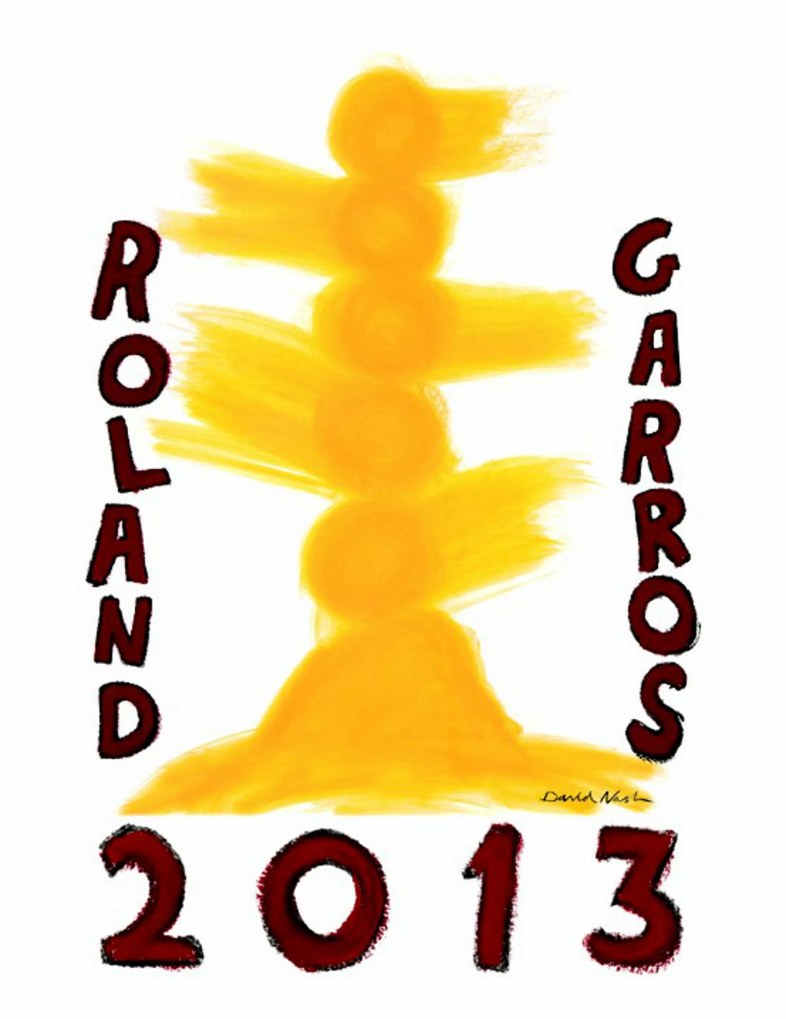
Rolland Garros in the spotlight
In 1980, Daniel Lelong, director of the gallery of the same name, suggested to the French Tennis Federation that they entrust the design of the poster to a great name in contemporary art. Valeria Adami signed the 1980 poster. Today, David Nash has signed the 34th poster in this collaboration.
-
Design Biennial 2013
A brief review of the Saint-Étienne Design Biennial. Of course, it’s difficult to give you an exhaustive account of this event, which brings together several hundred exhibitions all around Saint-Étienne, let alone when visiting it with two little girls aged 3 and 5! In this context, I can already announce the 2013 design prize awarded by them : the Barbie-Foot !
-
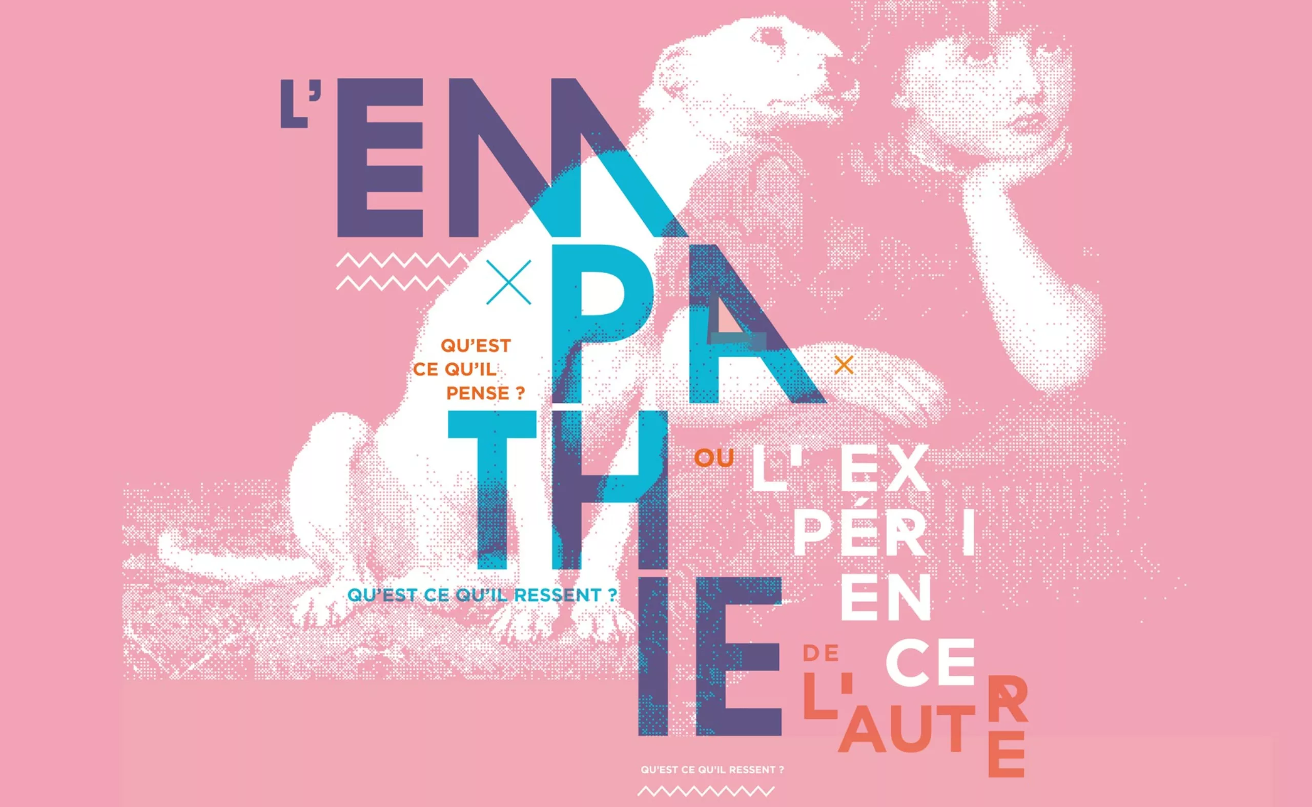
Design and empathy
Design and empathy, a reflection that brings together all areas of society. Whether it’s putting ourselves in the user’s shoes to understand and anticipate their needs, or enabling and supporting new forms of social bonding, empathy has been at the heart of the design discipline since its origins.
-
Josef Müller-Brockmann “swiss style”
Müller-Brockmann is one of the most influential graphic designers in the history. His work is always taught, studied and published. It is certainly the figurehead of Swiss graphic design (which also takes the name of international style). His work is influenced by Bauhaus and constructivism. Typography and geometry are predominant.
-
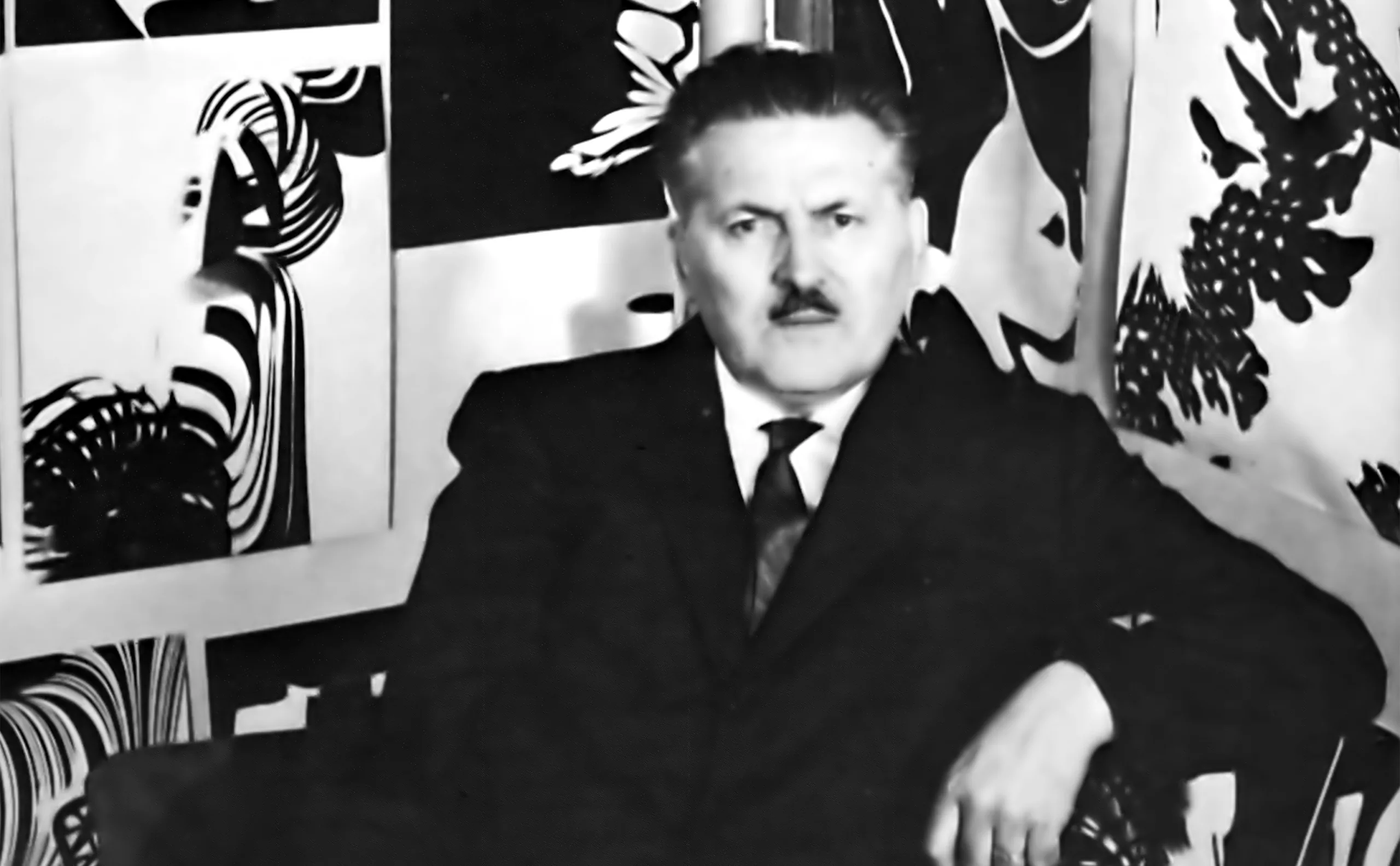
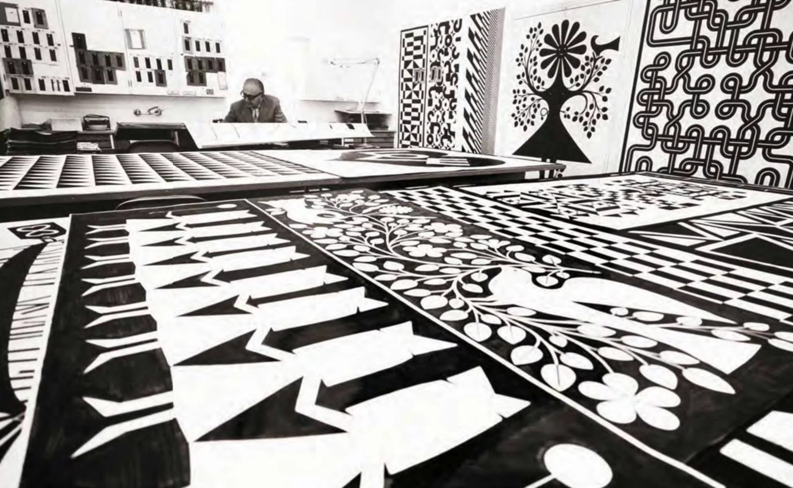
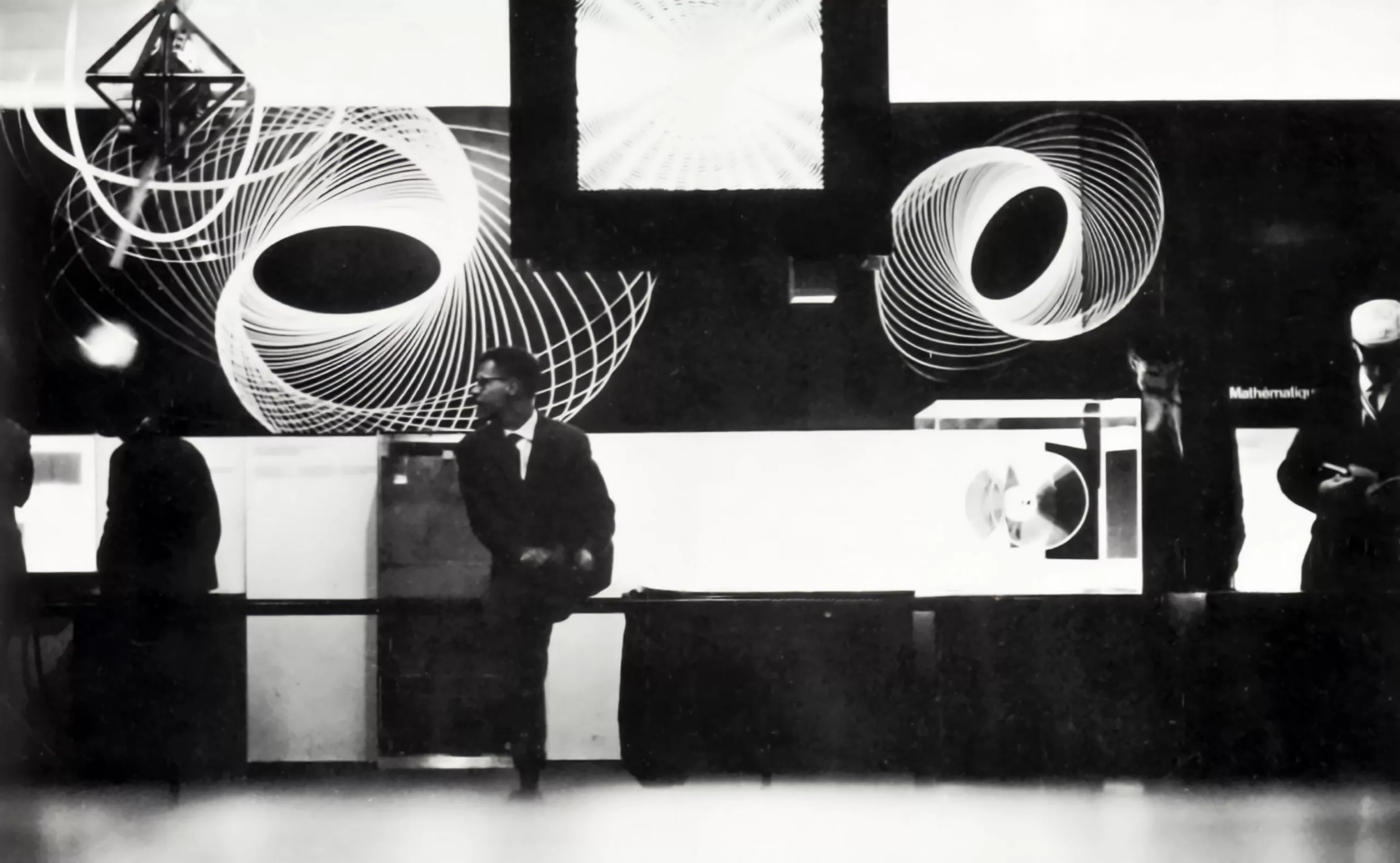
Franco Grignani: “Grafica cinetica”
Presentation of the Italian graphic designer Franco Grignani (1908-1999) This is a text where he presents himself his work and his vision of the profession (initially published in the collection “Graphic Designers in Europe” in 1973). Surprisingly, many of his reflections remain very contemporary.
-
Rolf Rappaz, “The art of Swiss design!”
The Rappaz Museum is located in the historical heart of Basel, more precisely in the studio of the eponymous graphic designer Rolf Rappaz (1914-1996). It presents a permanent exhibition on the work of this Basel artist and graphic designer.
-
A short history of the word “Branding” !
A short history of the word Branding.
Brander, brandir, branler… when etymology sheds light on the meaning of words!
-
-
2012
-
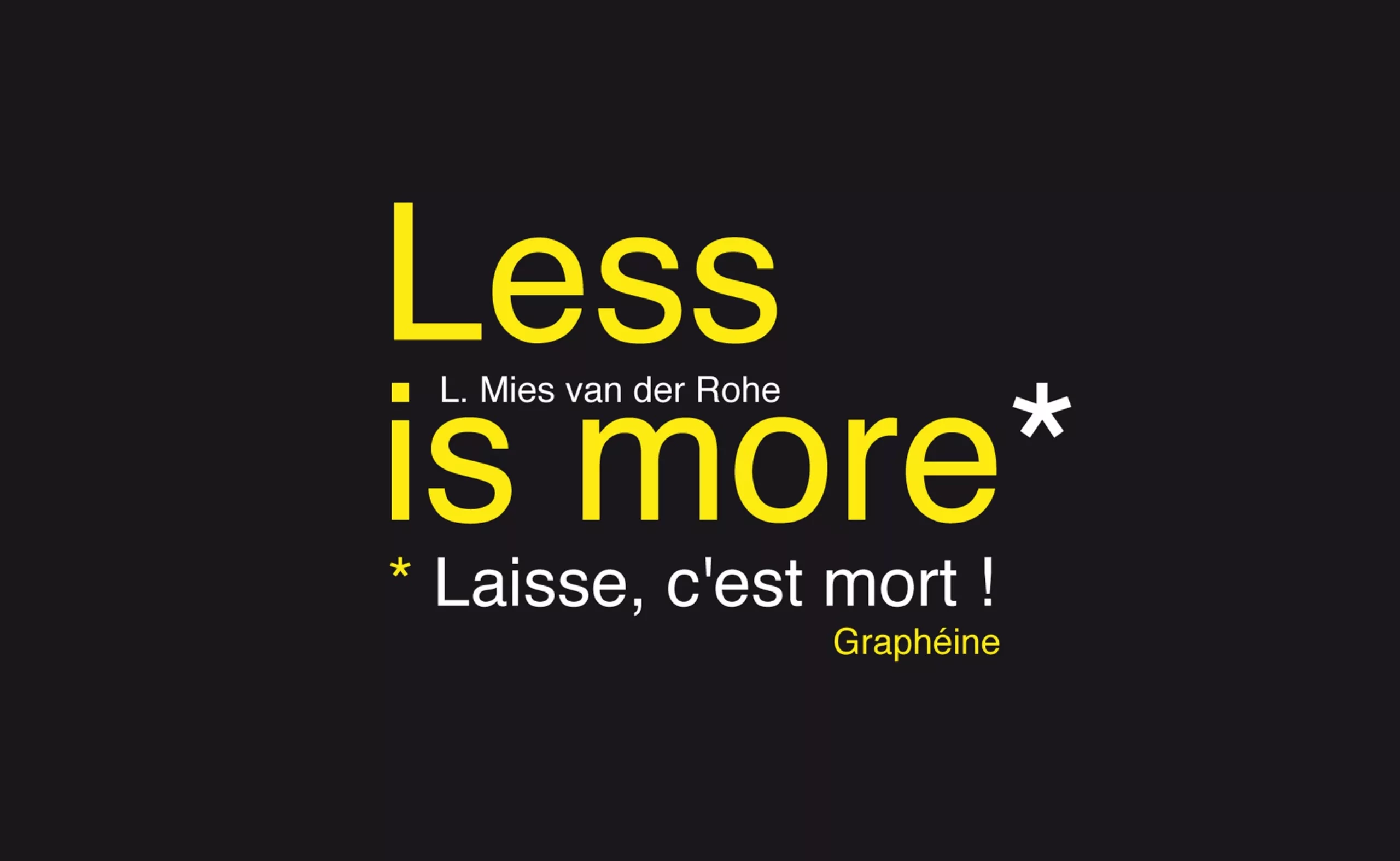
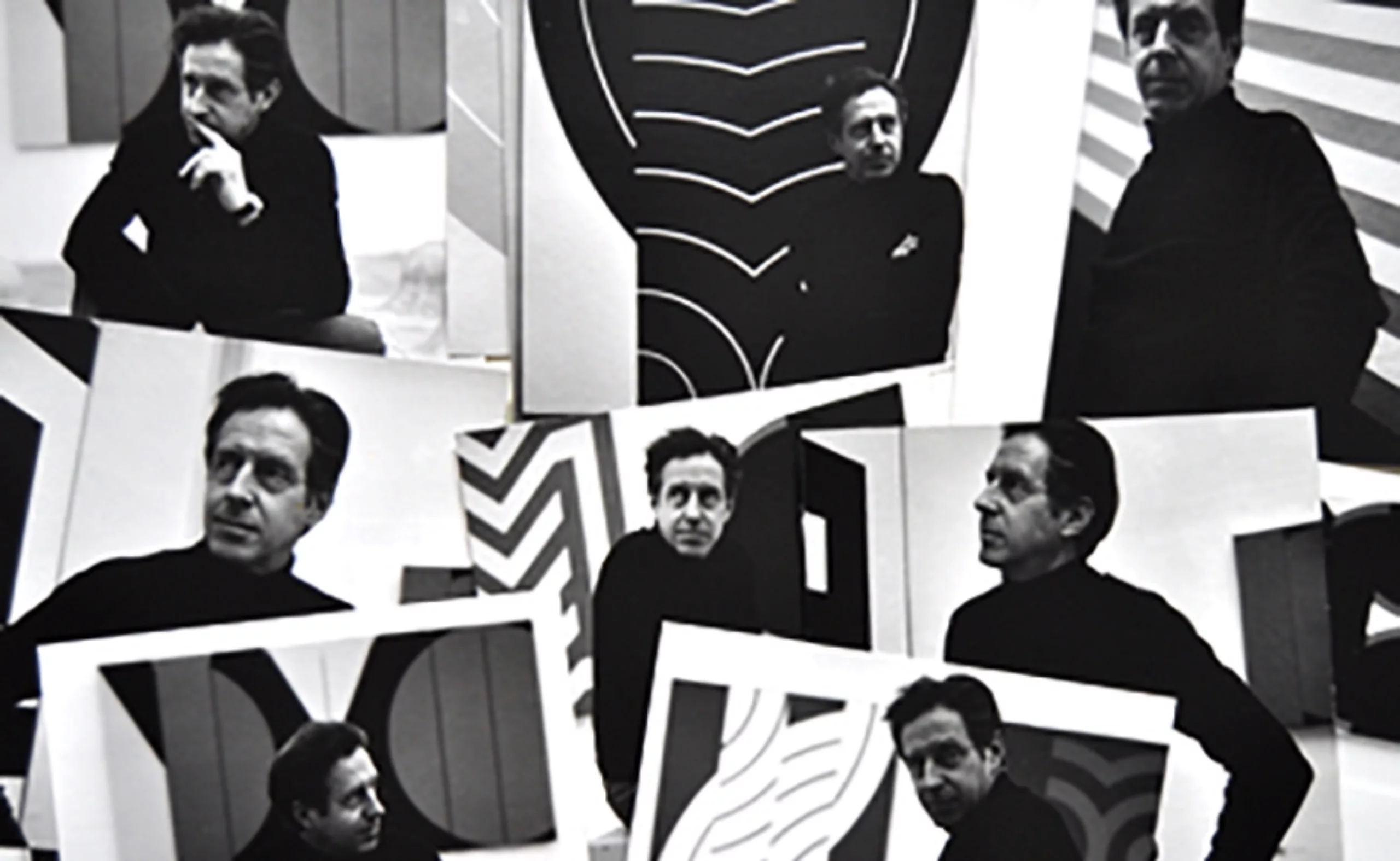
Minimalism is dead !
Less is more, or “laisse, c’est mort” ?
In graphic design, as in architecture, we’ve been oscillating for centuries between two paths… minimalism or baroque… simplicity or visual overload.
-
-
2011
-
Miles Newlyn, cool design
Miles Newlyn, designer of logos for Unilever, Suez, Tate Galleries and Société Générale, answers ActuLogo’s questions.
-
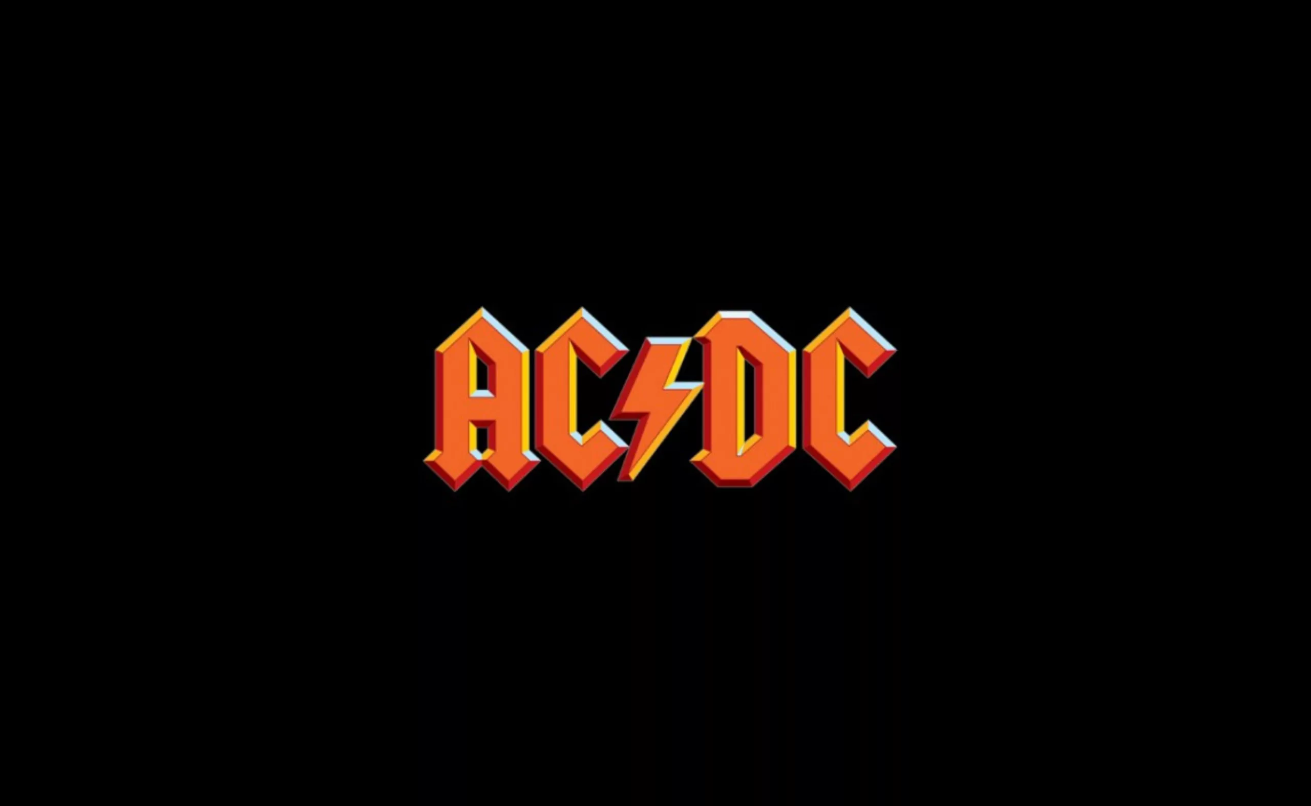
Interview with the designer of the AC/DC and HBO logos: Gerard Huerta
Gerard Huerta, designer of many famous logos, including AC/DC, PC Magazine, Time, HBO and the Swiss Army, answers ActuLogo’s questions.
-
Turkish graphics
Fortunately, as I turned down an alleyway, I came across the “Istanbul Design Center”. It’s a school of applied art, a venue for exhibitions, workshops and conferences, a publishing house… in short, just what I was looking for!
A few posters have piqued my curiosity!
Unfortunately, I had to drop in outside opening hours… not a single student, just a calligraphy teacher who suggested I drop in again the following week… sniff… So it’s back in France that I find out more about this place and discover an amazing communication made by the founder of this place: Faruk Akın ( with a “ı” without a dot ! like in our Graphéıne logo! 🙂 ) -
Tips and tricks for a graphic designer’s CV
What are the pitfalls to avoid and the tips you need to know to make a good CV and internship application when you’re a graphic designer?
-
-
2010
-
Gaumont modernises the daisy in its logo
The Gaumont logo has been modernised and changed from a rosette to a daisy. A logo discreetly unveiled on their website.
-
ENSAD’s new visual identity
ENSAD (École Nationale Supérieure des Arts Décoratifs) has unveiled its new visual identity, designed by the Atelier Trois collective.
-
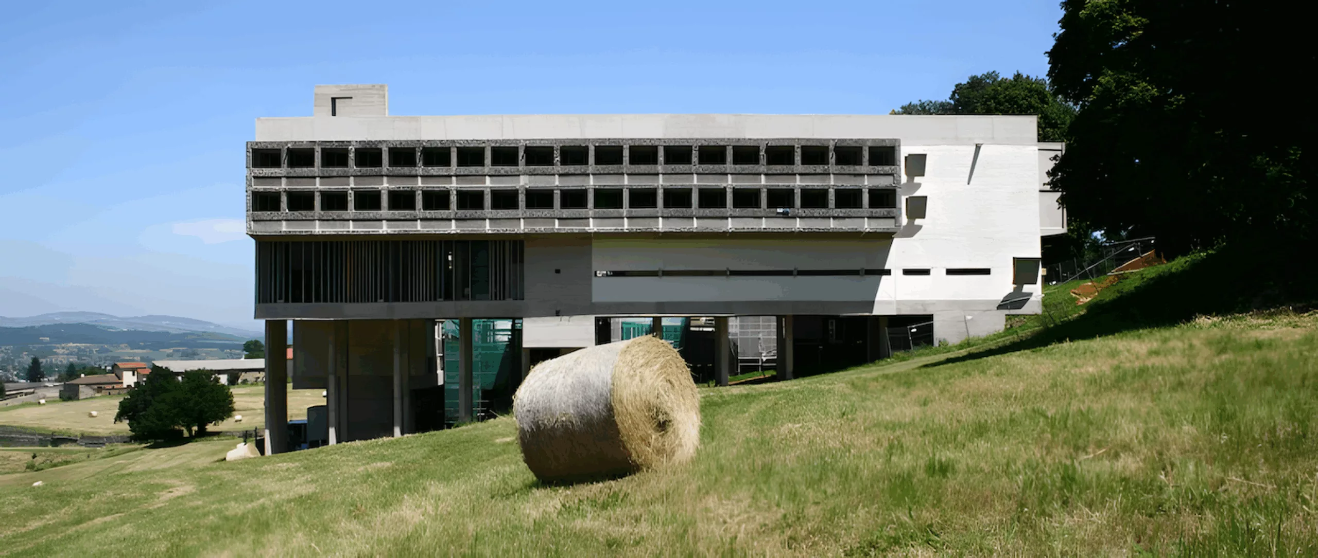
Le Corbusier and the Tourette convent
While taking a briefing near l’Arbresle (69), I took the opportunity to visit the Couvent de la Tourette, built by Le Corbusier between 1953 and 1960. Built in accordance with the precepts of the Dominican order, Le Corbusier used his favourite materials here: the sun, space, trees, steel and reinforced cement, all under the sign of the Modulor.
-
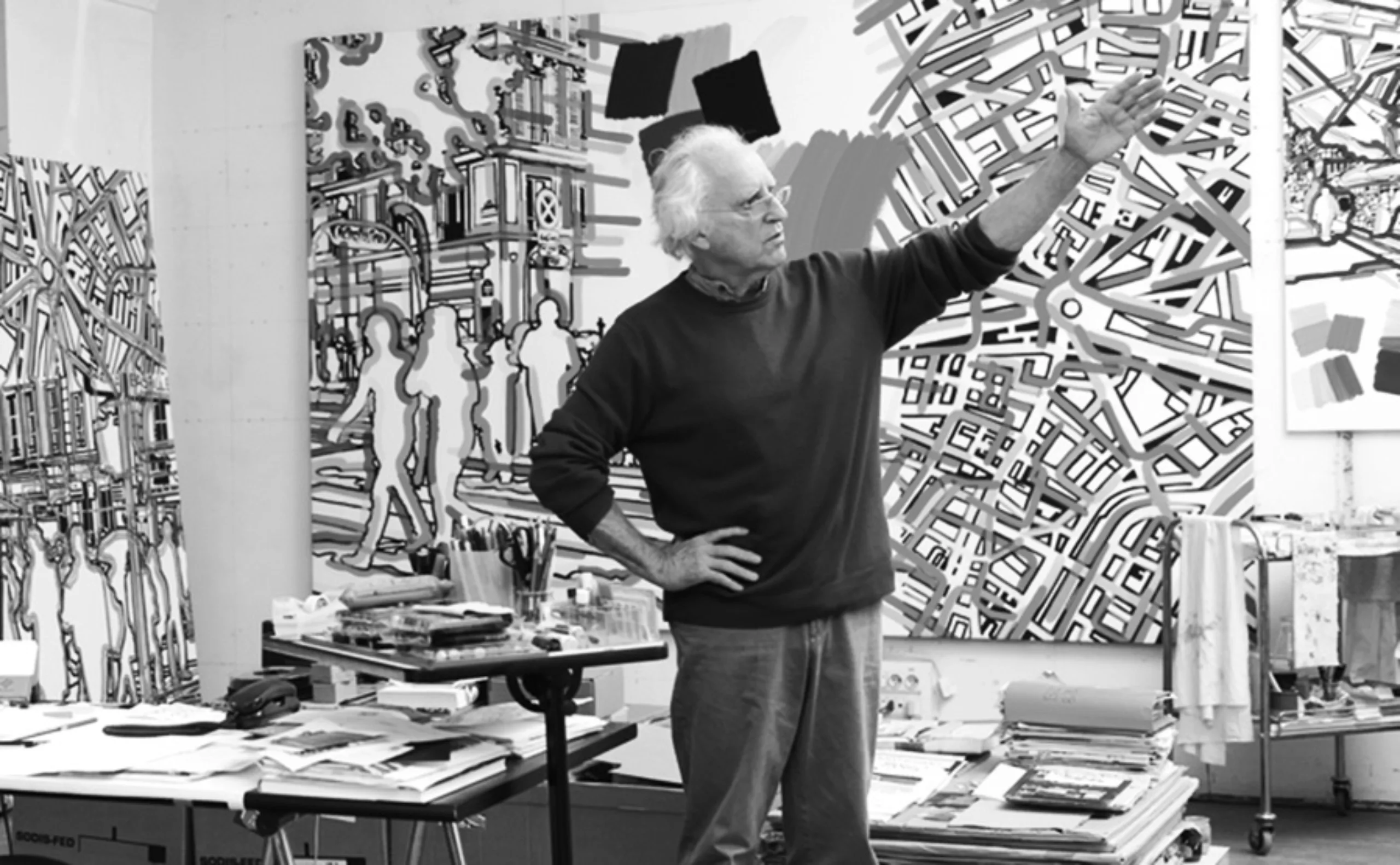
Gérard Fromanger, life-size silhouettes
The name Gérard Fromanger conjures up a series of motifs, figures and events that trace a part of the history of post-war France. An essential artist of narrative figuration.
-
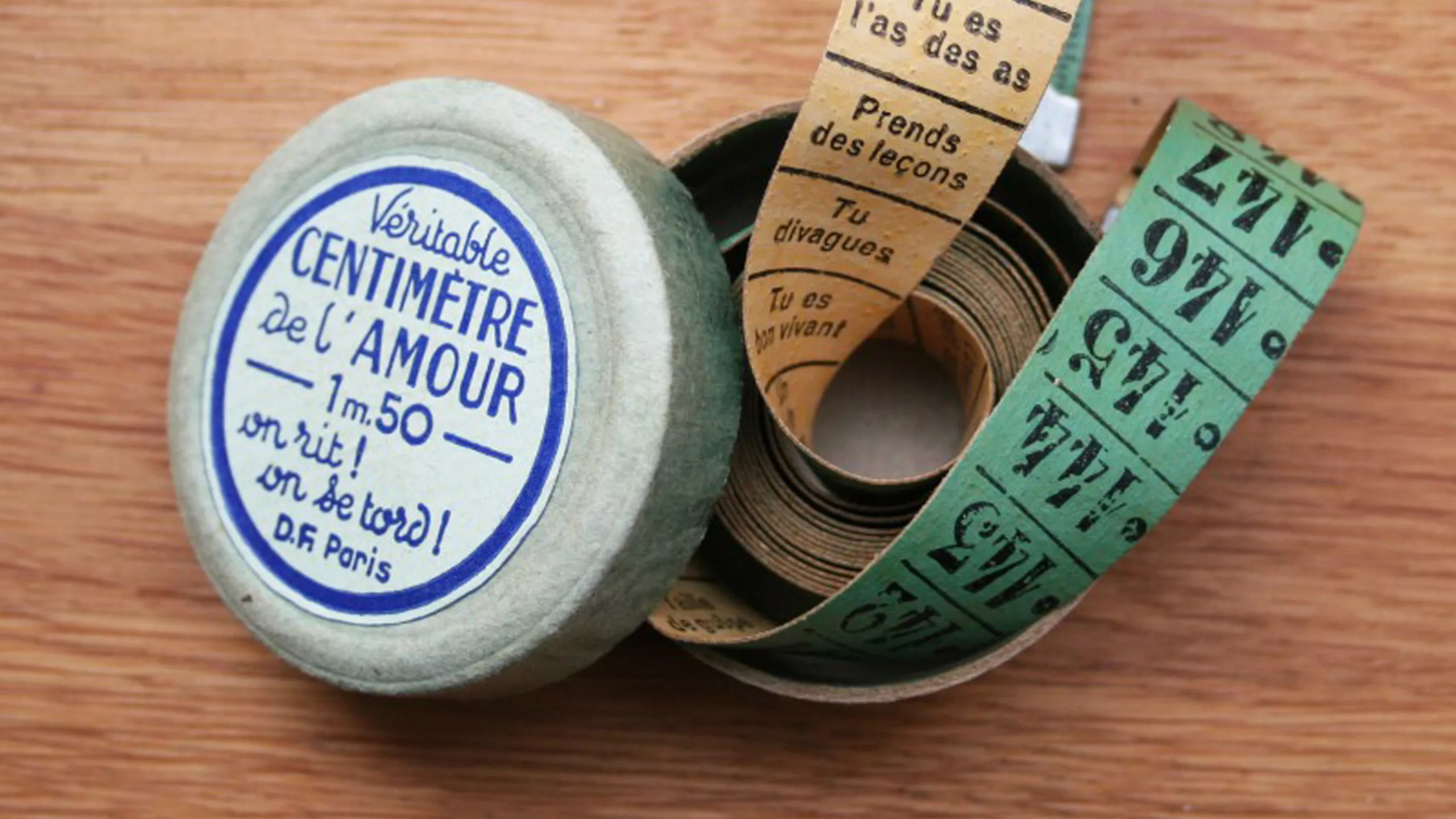
The authentic centimetre of love
The authentic centimetre of love reminds us of the first Graphéine project!
-
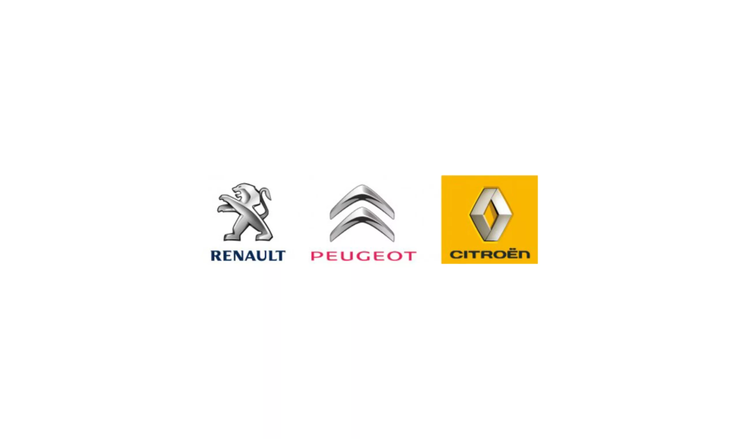
Logos: Peugeot vs Citroën vs Renault
In 3 years, the 3 French carmakers have renewed their visual identities: Renault in 2007, Citroën in 2008, and Peugeot in 2009. Chrome, chrome and chrome…
-
Courir, a new logo in the run…
Research Studio Paris was given the task of creating a new visual identity for Courir, the sports shoe retailer.
-
-
2009
-
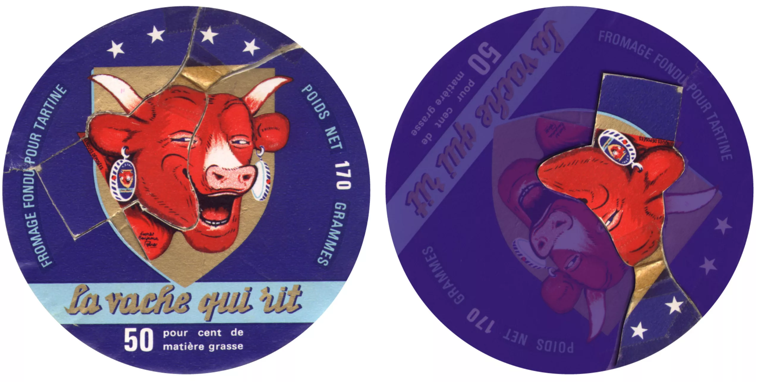
General de Gaulle in a laughing cow!
How to turn a tin of Laughing Cow into a famous French general… An activity that must have livened up after dinner in the 60s!
-
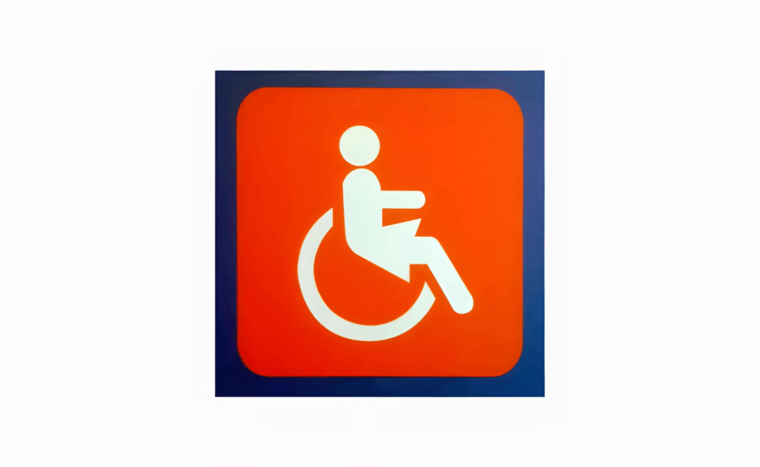
A “female” PRM pictogram?
The PRM pictogram was created in the 1960s as part of the international movement to defend the rights of people with disabilities.
-
-
2008
-

Mickey Mouse is a cheater! Semiological chronicle
When Mickey Mouse’s ears inspire us to write an acidulous chronicle!
A story of illustration, semiology and cartoons with big ears. -
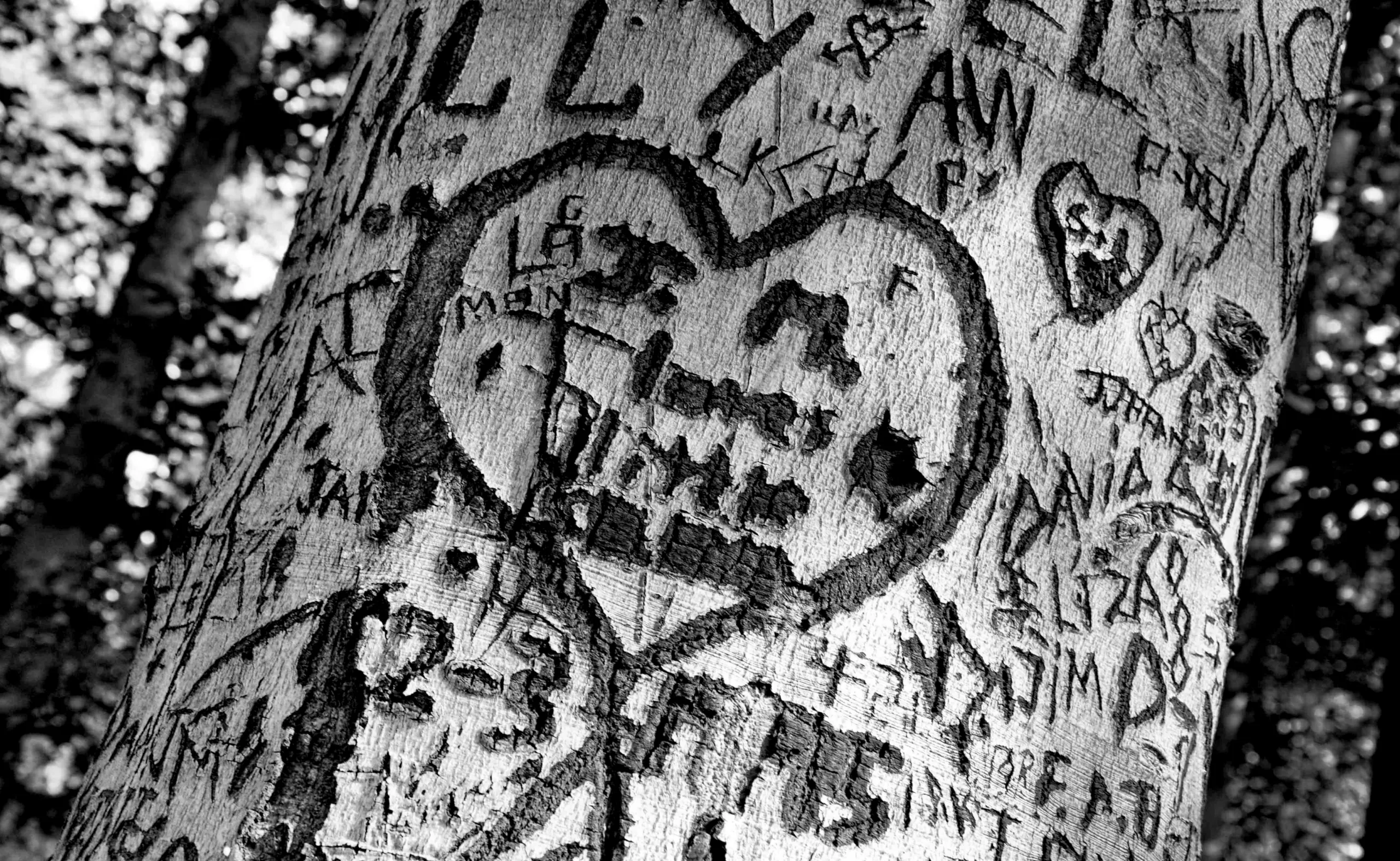
nature “bold” our loves…
At first, you want to say “I love you” with a penknife… Whatever the moral is, we engrave a few letters with the tip of a N°2 opinel, and let time do its work: light, regular, bold, extra-bold…
-