The Deadly Logo of the Paris Catacombs

The Catacombs logo,
the world’s largest ossuary!
As always in our Brand Culture section, we like to showcase remarkable new logos. So here’s a project by some of our colleagues that really caught our attention.
Commissioned by Paris Musée, Thomas Oudin of the Mo-To studio called upon the typographer Thomas Bouville to assist him in developing the visual identity for the world’s largest ossuary: the Catacombs of Paris (containing around 6 million human remains).
This unmissable Parisian attraction attracts a highly international audience (over 500,000 visitors a year, 47 per cent of whom are from abroad), necessitating a simple, direct and understated visual language.
Following their exploration of the Catacombs, the team collected, archived and extracted visual material that directly influenced the identity of the site. Here, then, is the logo of the Paris Catacombs.
A cemetery in a disused quarry
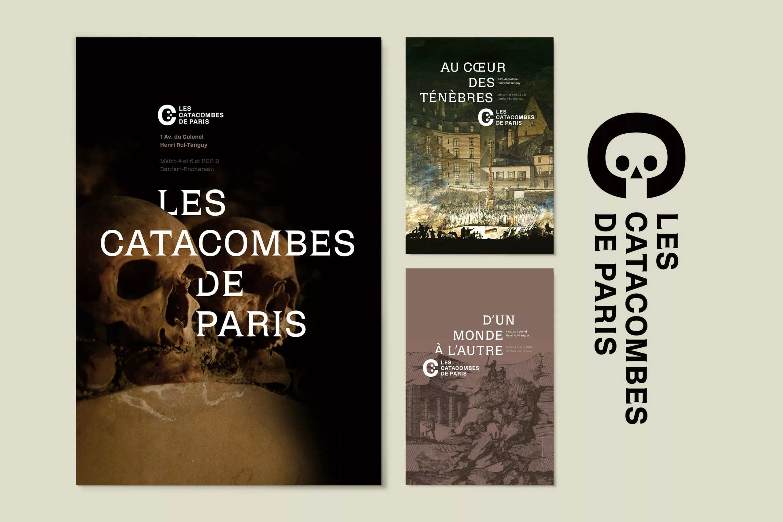
The graphic identity reflects the two distinct visitor routes: one focusing on geology (the former stone quarry) and the other on the ossuary. The logo thus evokes the underground galleries – through a cut-out effect that reveals, within the letter ‘C’, the iconic image of the Catacombs: the skull. Engraved into the counterform, two ovals and a triangle form a minimalist skull.
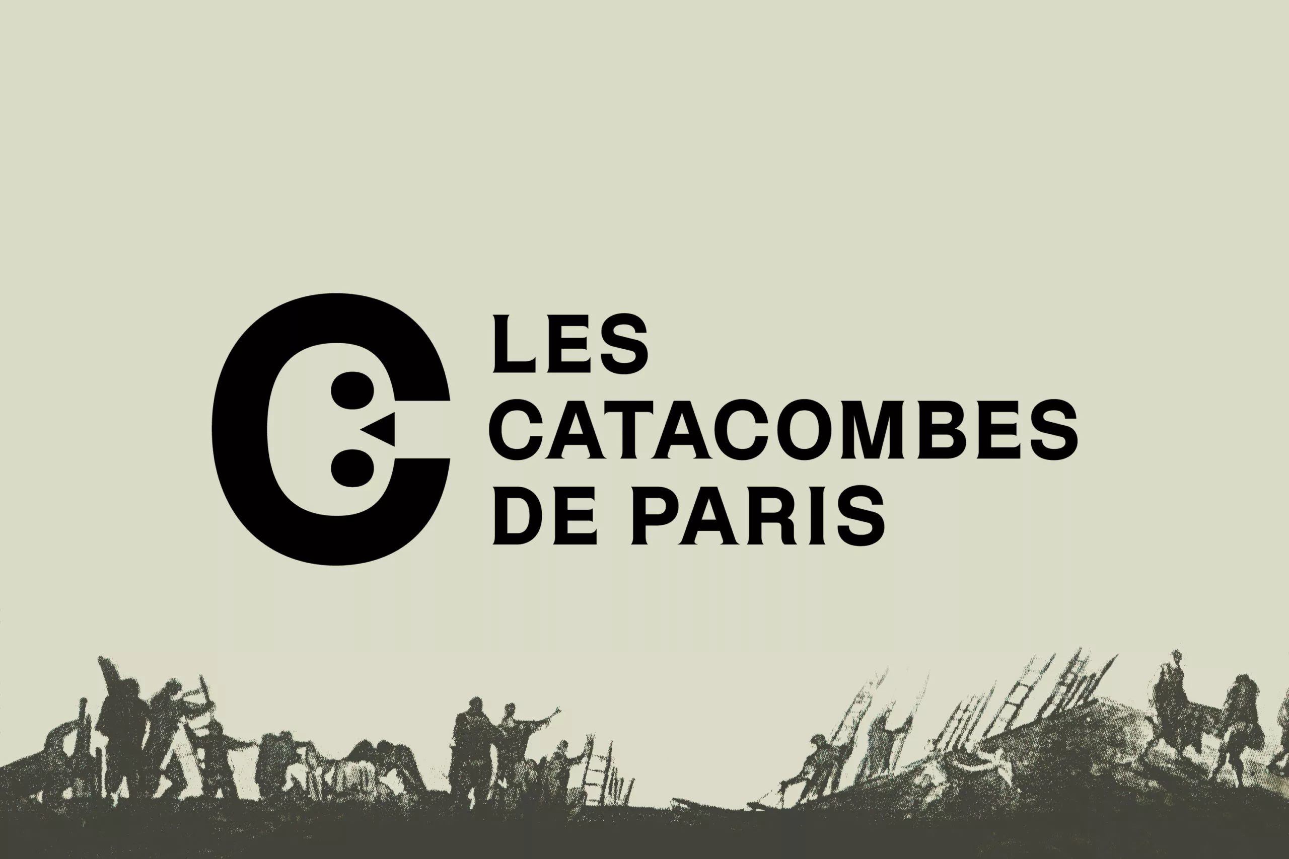
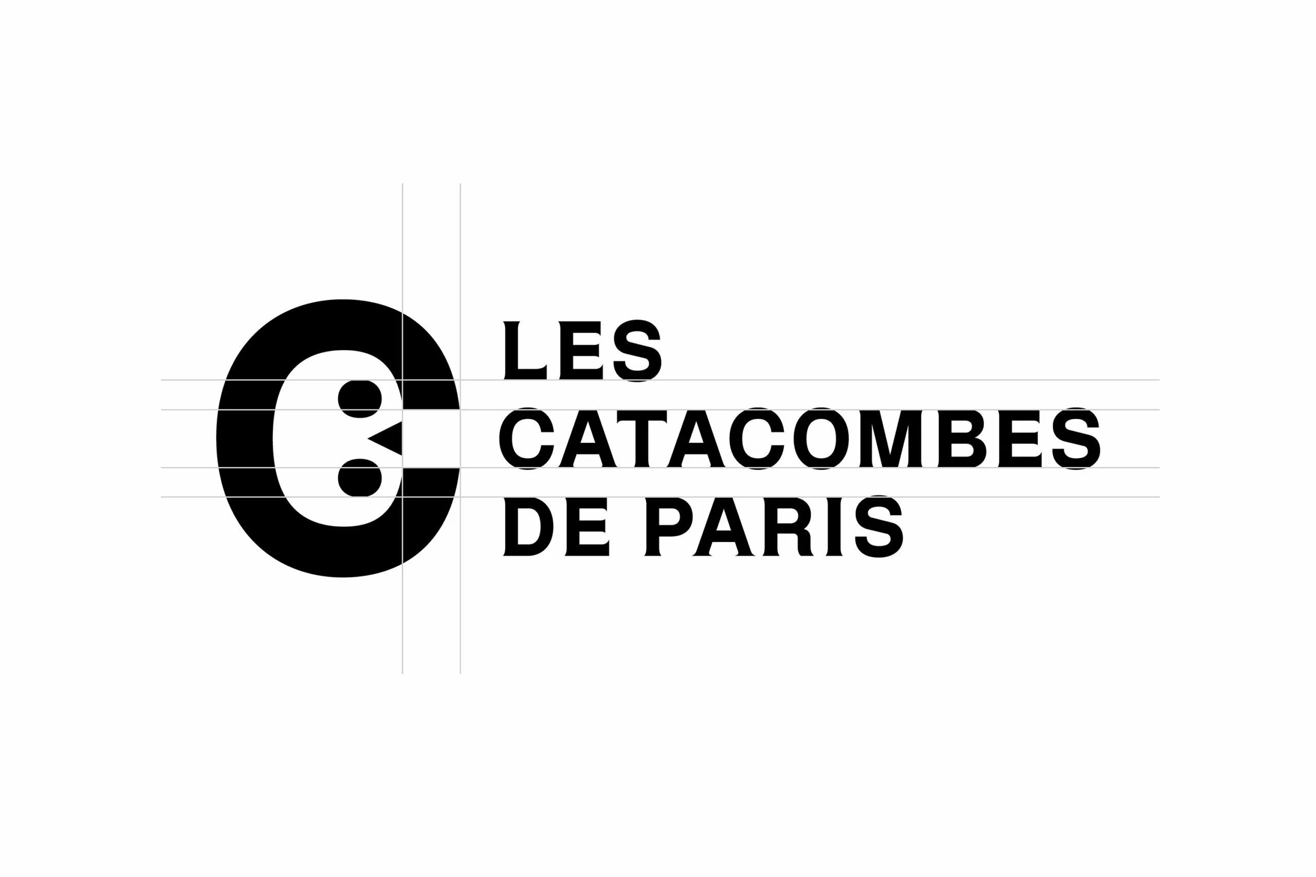
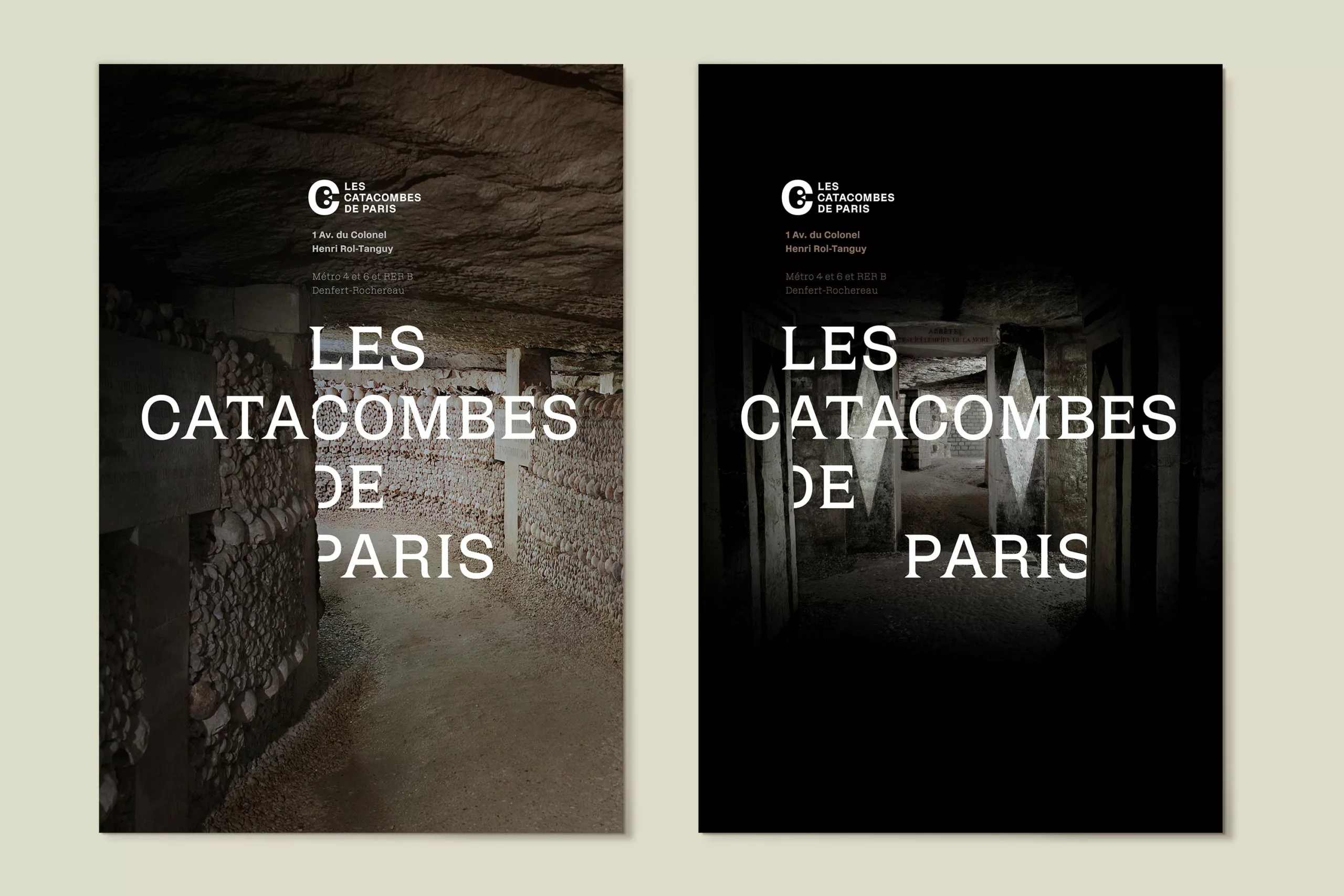
The visual identity is centred on the architecture of the ossuary and builds on the theme of the logo.
The full-page visuals feature a play on typographic recesses and stacking, reminiscent of the ‘ hagues ’ of bones.
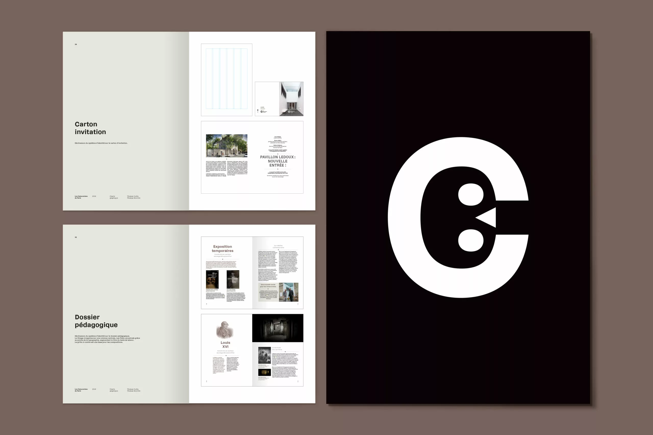
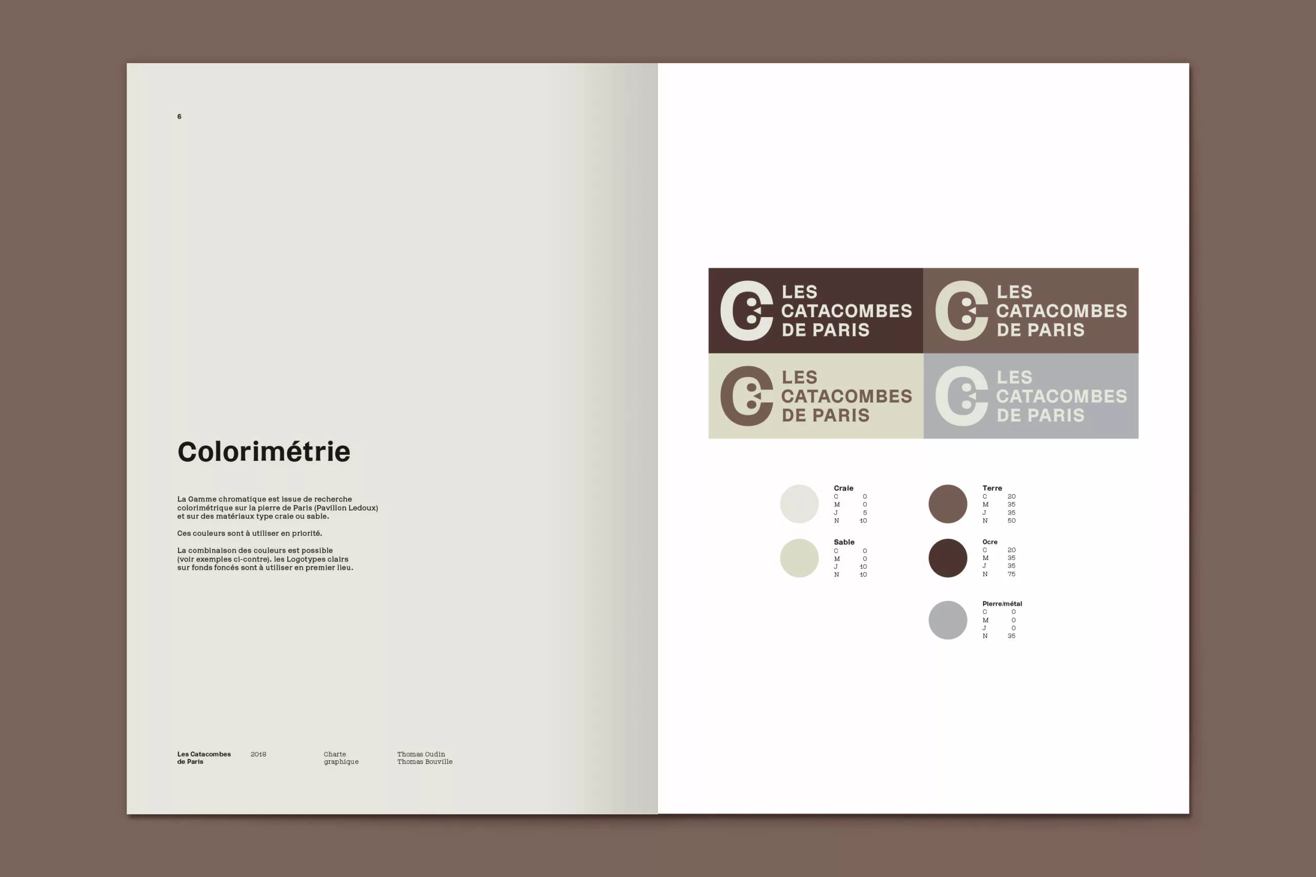
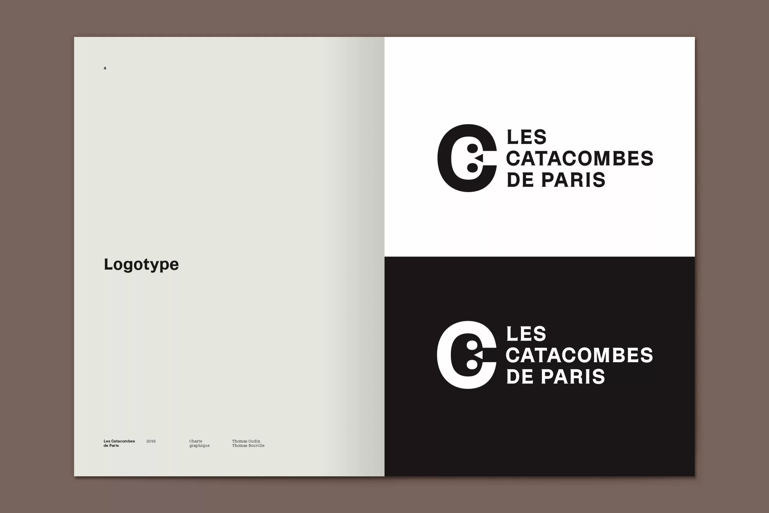
A typeface
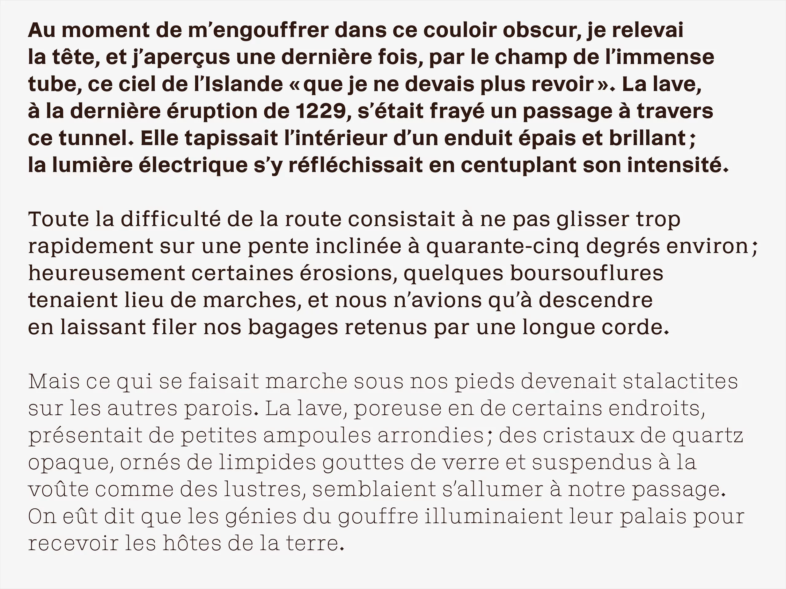
Finally, this project featured a custom typeface, ‘Dédale’, designed by Thomas Bouville.
This hybrid typeface straddles the line between incise and mechanical typefaces. It is available in three distinct weights to cater for common typesetting needs: a light style for headings, a regular style for body text and a bold style for emphasising text elements.
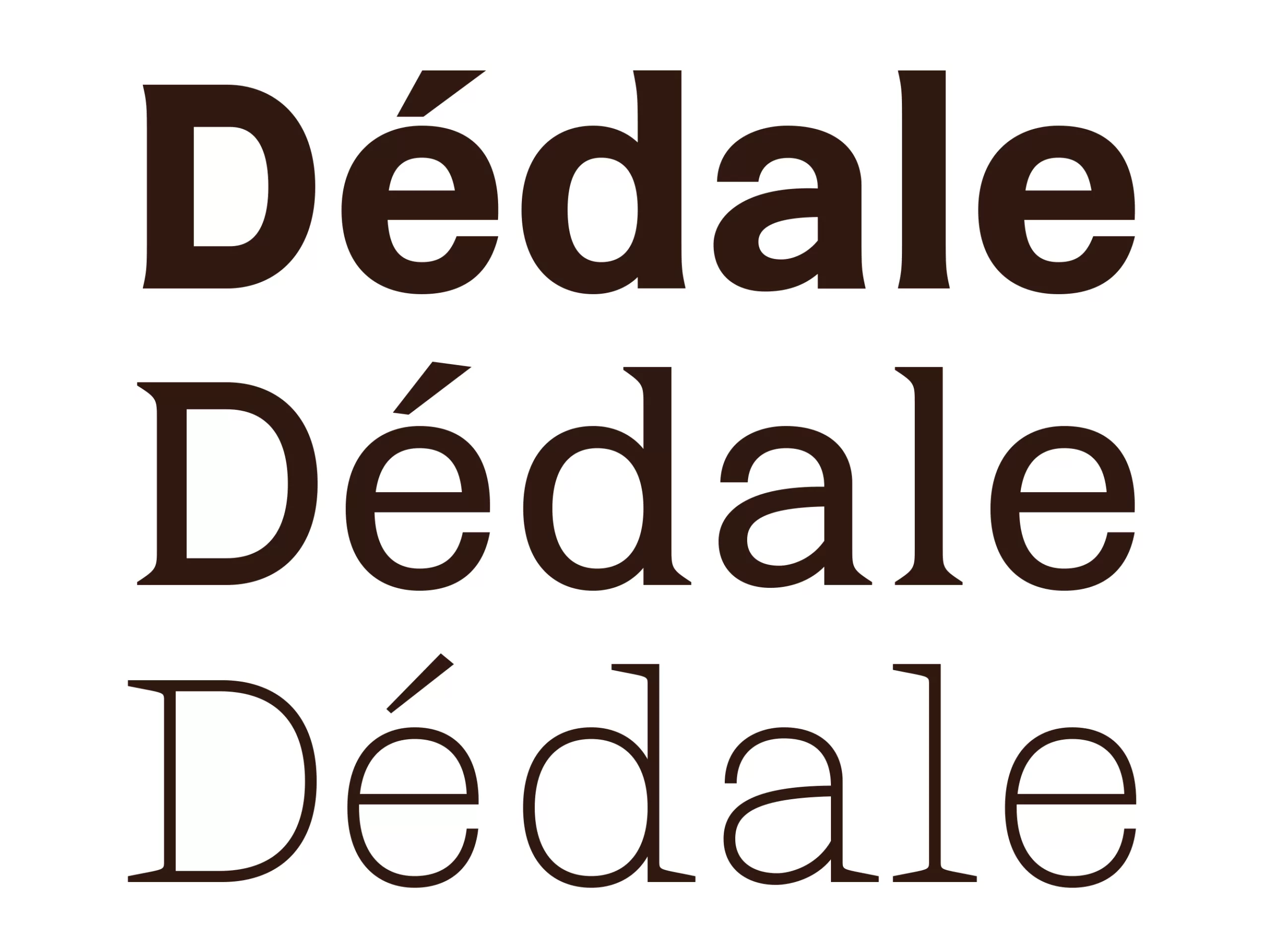
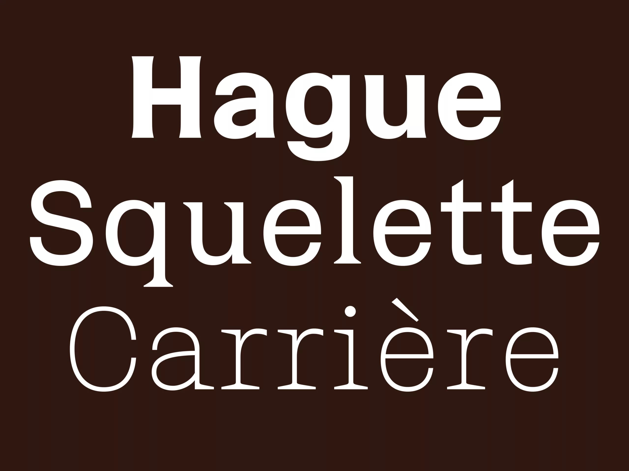
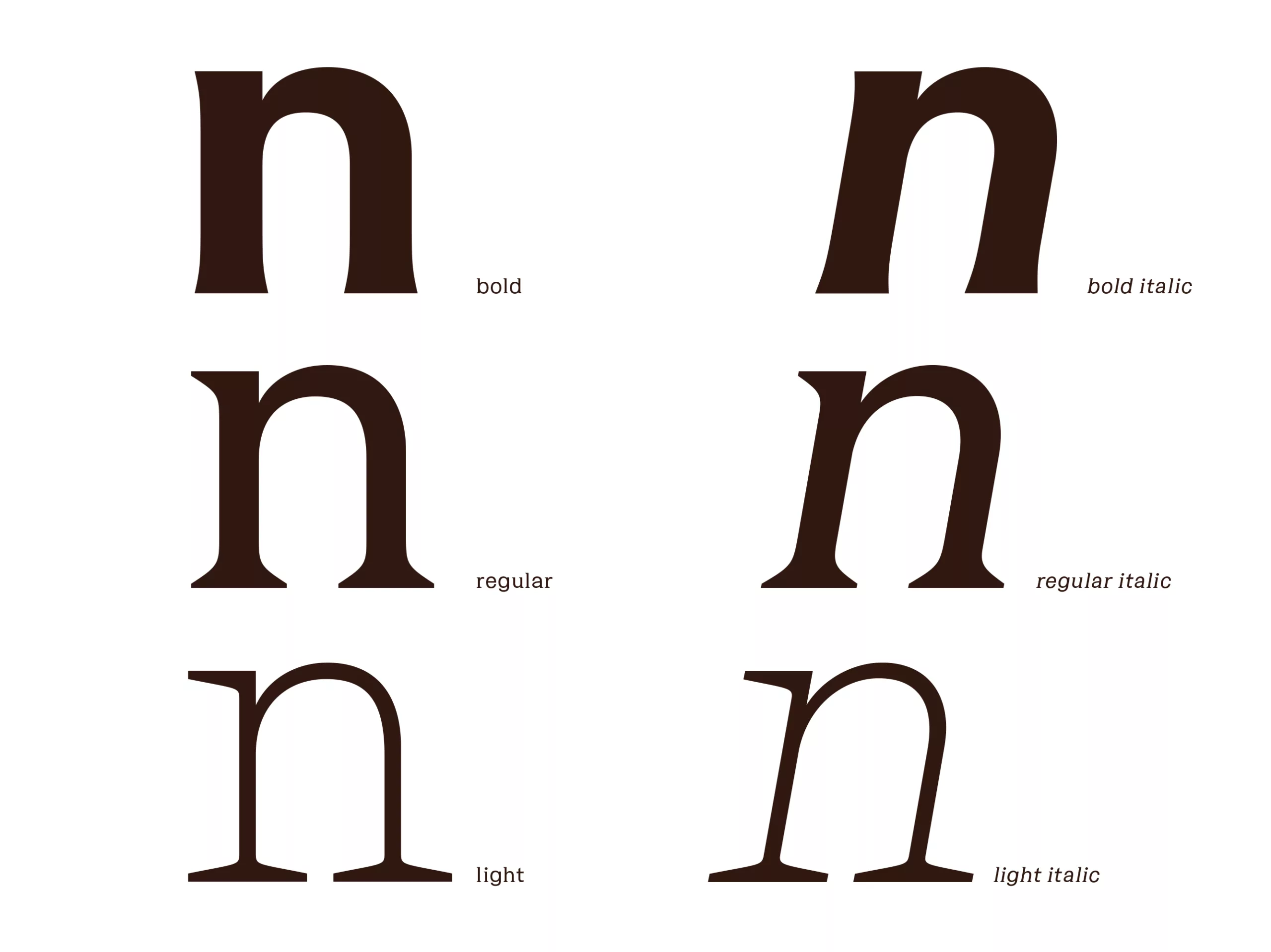
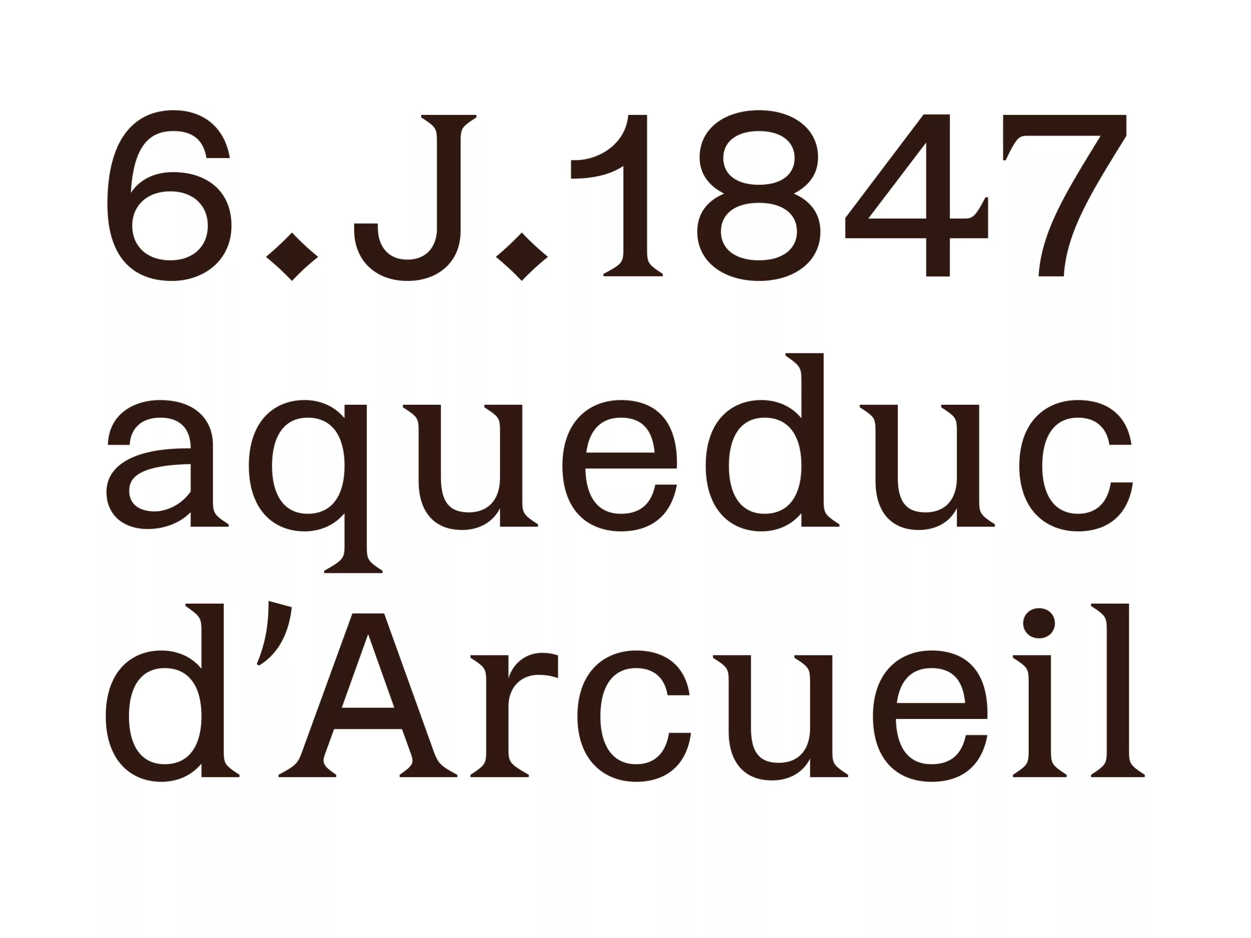
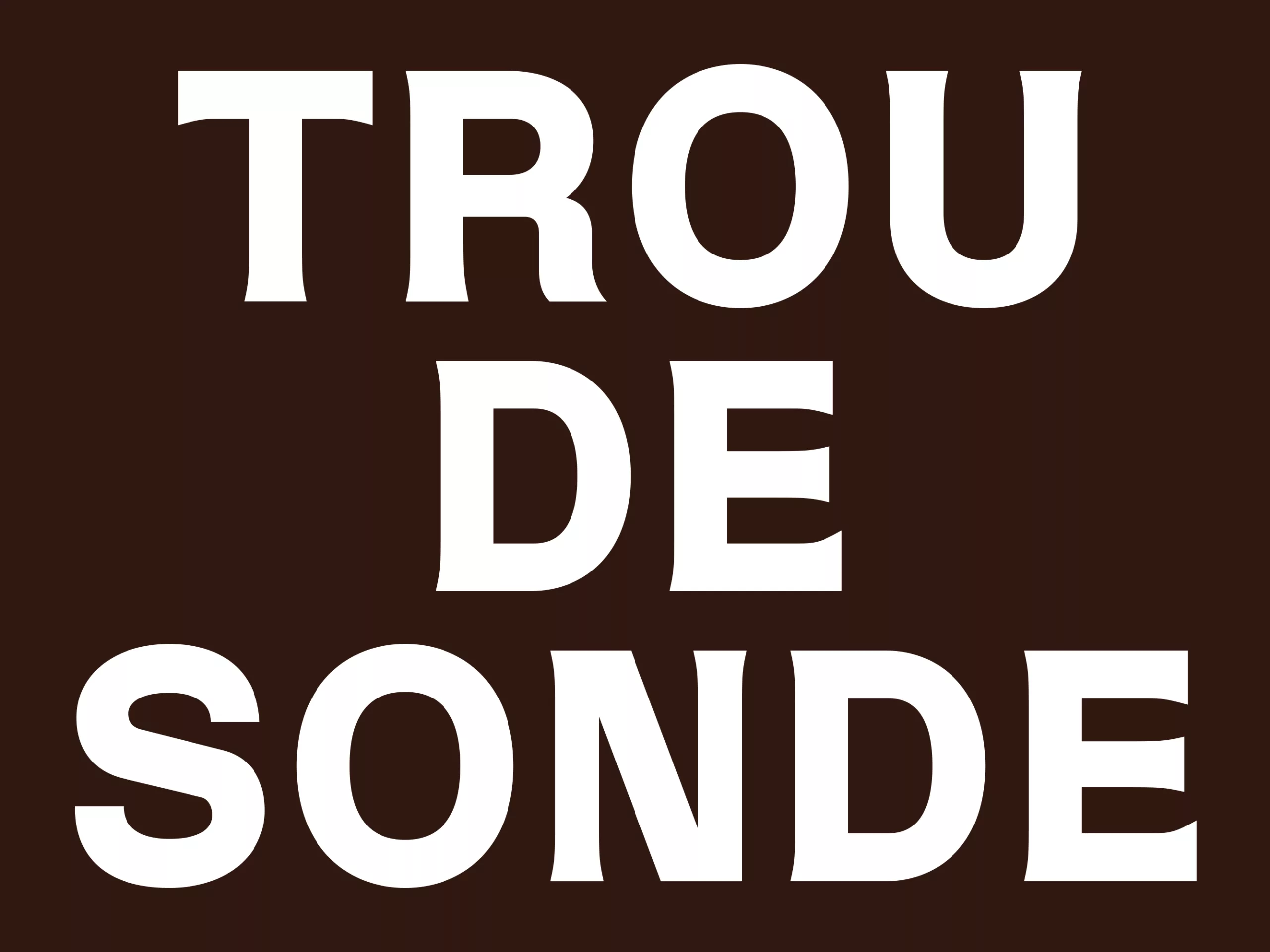
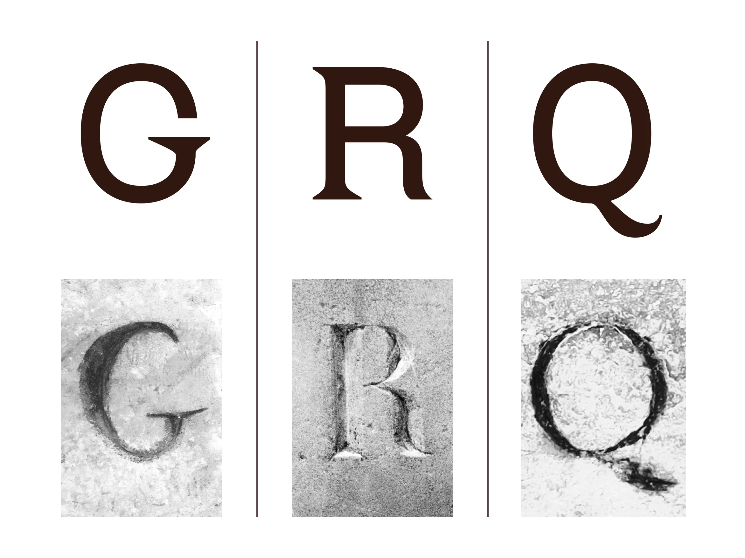
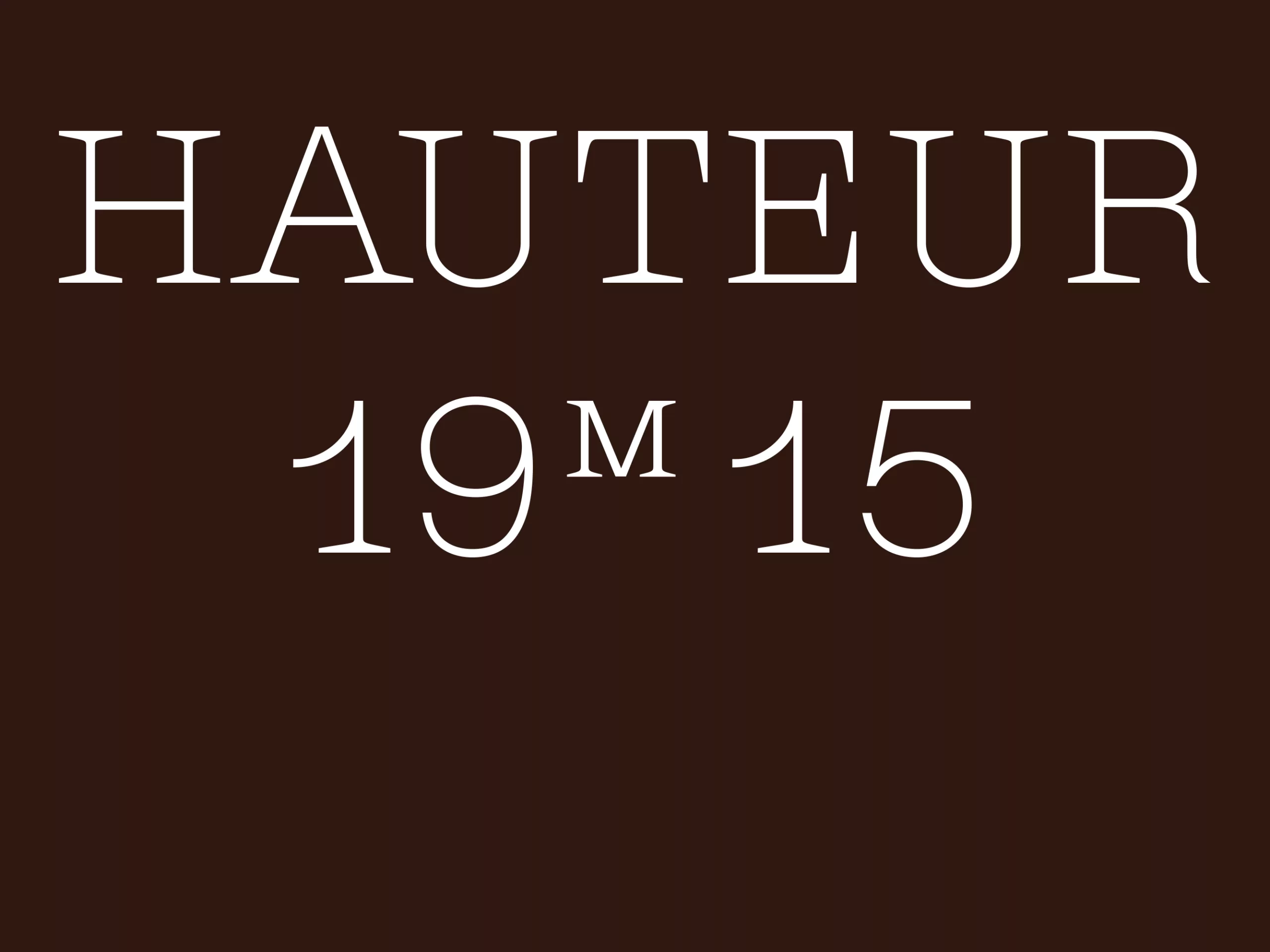
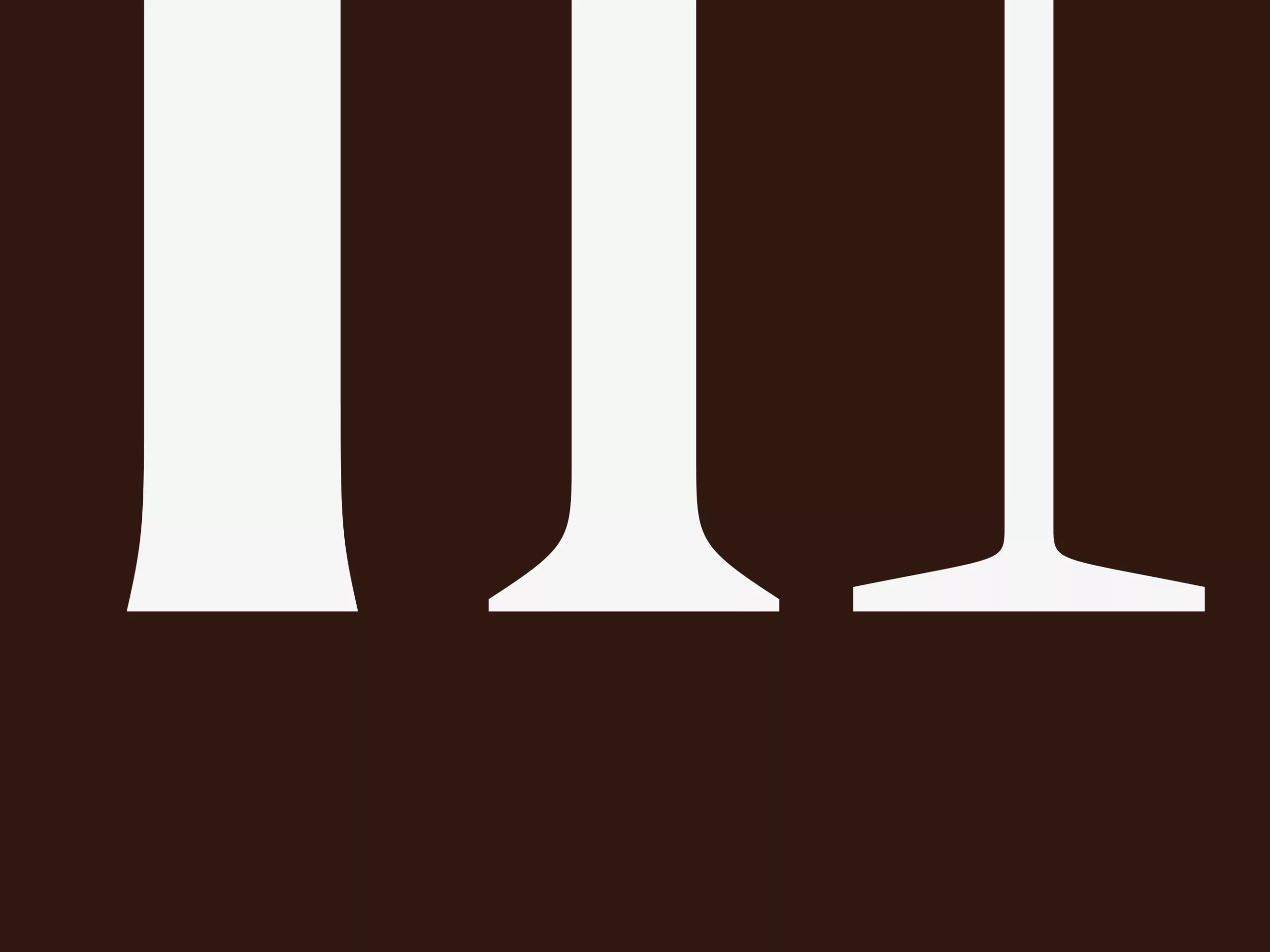
Several details have been borrowed from the stone inscriptions that adorn the walls of the Catacombs’ underground passages. The variation in the structural characteristics of the letters according to their weight pays homage to the ossuary; it highlights an analogy with the human body, which consists of a physical shell, various organs and a skeleton. In this way, the typeface symbolises a passage from one state to another, a transition from life to death.
For your information, here are the key messages from the brief:
- A site showcasing Paris’s underground history, affiliated with the Carnavalet Museum.
- Heritage value, listed building, quarrying operations and the status of human remains (between a research collection and an ossuary)
- Visitor experience in a ‘scenographic’ ossuary
- Appearance of a mandatory skeletal element
Thank you to Thomas Oudin for sharing his images and text to showcase this project on our blog.
And you can find more information and images on the website of the Catacombs of Paris.
On the subject
-
Who is the PoPA of the MoMA logo?
Thoughts about contemporary brandingThe MoMa is a must-see museum and its logo has become a reference for visual identity and cultural branding. Discover who is at the origin of its creation.
-
A mad logo for the “Musée des Arts Déco”
A new visual identity for the Musée des Arts Décoratifs that becomes “MAD”… Fashion, Arts, Design!
-
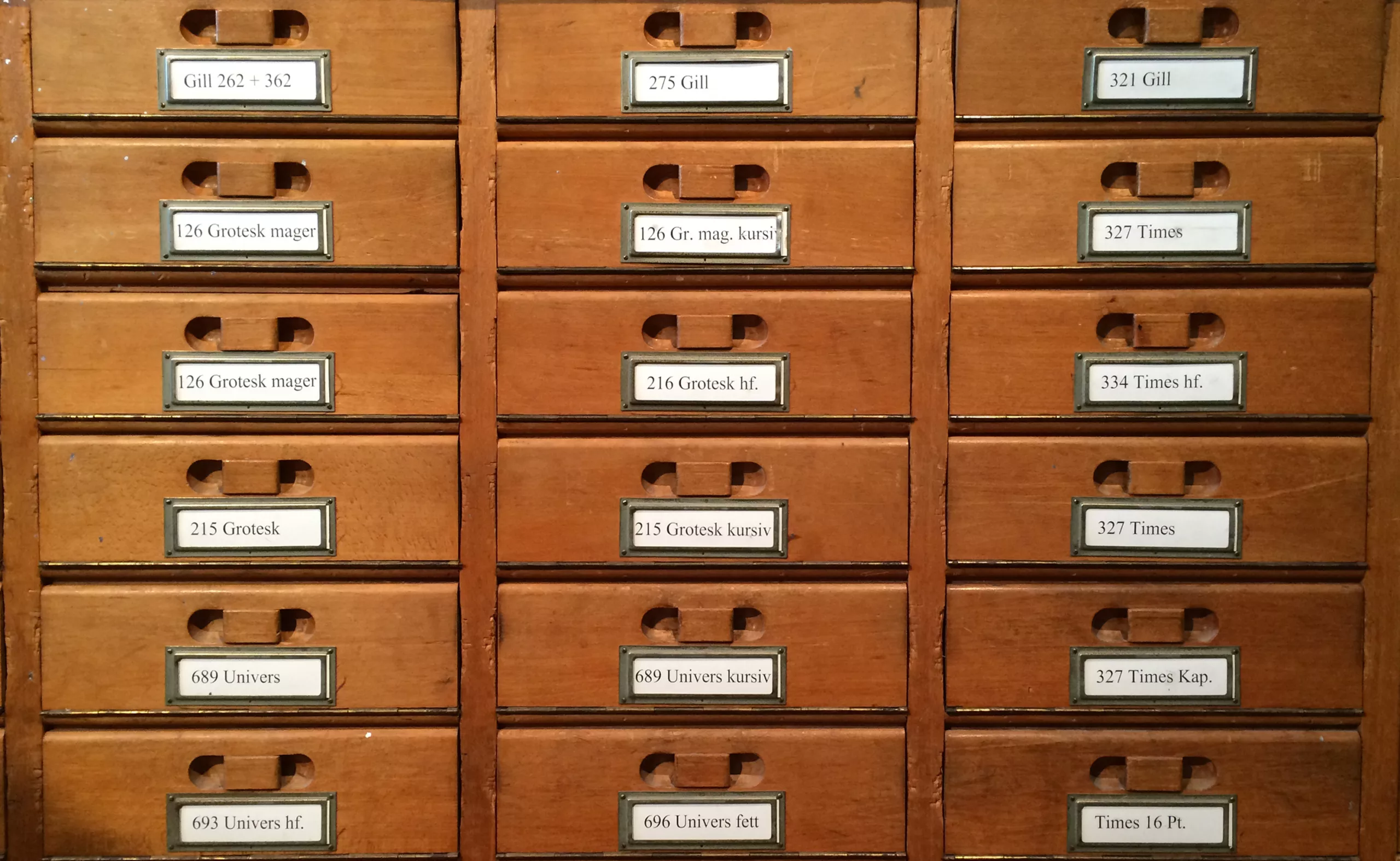
A visit to Basel’s printing museum
A short visit to the Basel ( Switzerland ) printing museum.
A unique opportunity to discover a little treasure: the Helvetica protocol !