Alpes 2030, the Olympic logo that stings!
The New Logo
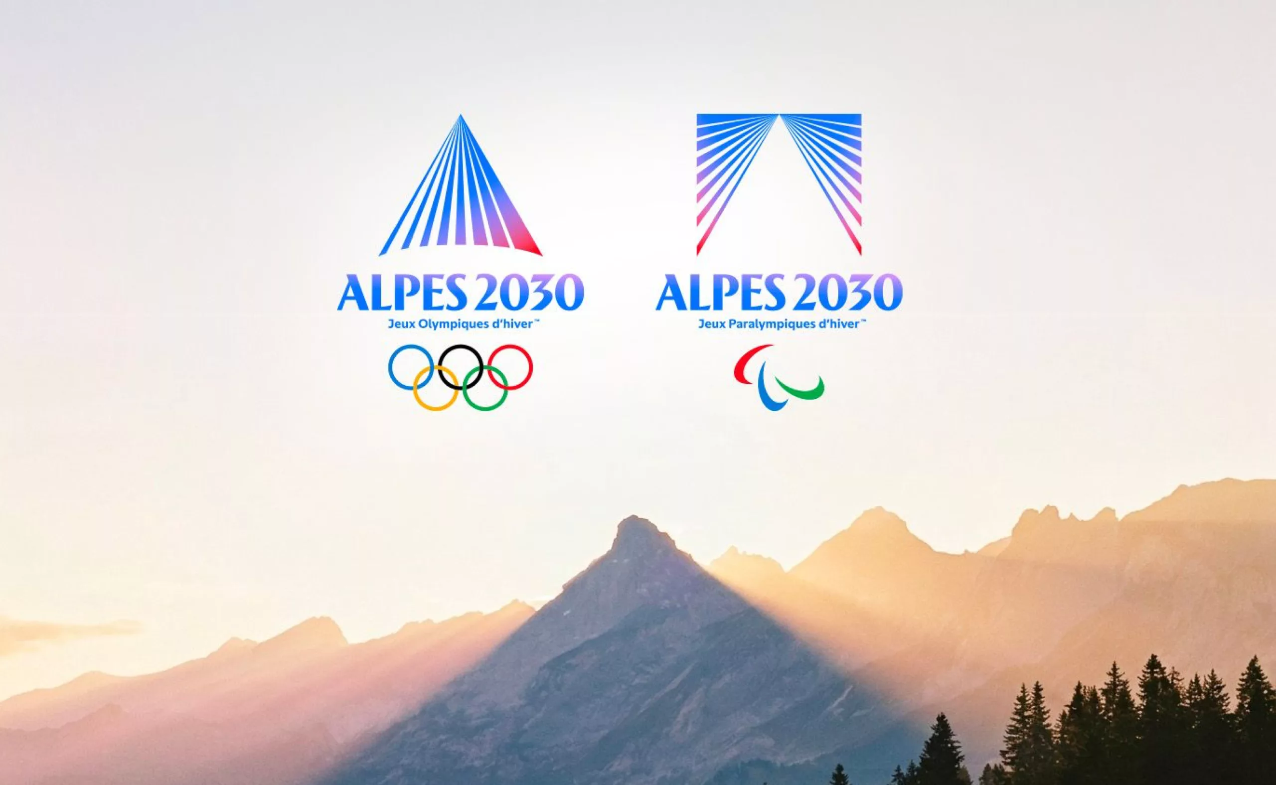
This Thursday in Briançon, in the heart of the Southern Alps, the Alpes 2030 Olympic and Paralympic Winter Games unveiled their new emblem. Designed under the direction of Mathieu Sakkas, Brand and Image Director of the Organising Committee, the selected symbol was the one that President Edgar Grospiron considered the boldest among several proposals.
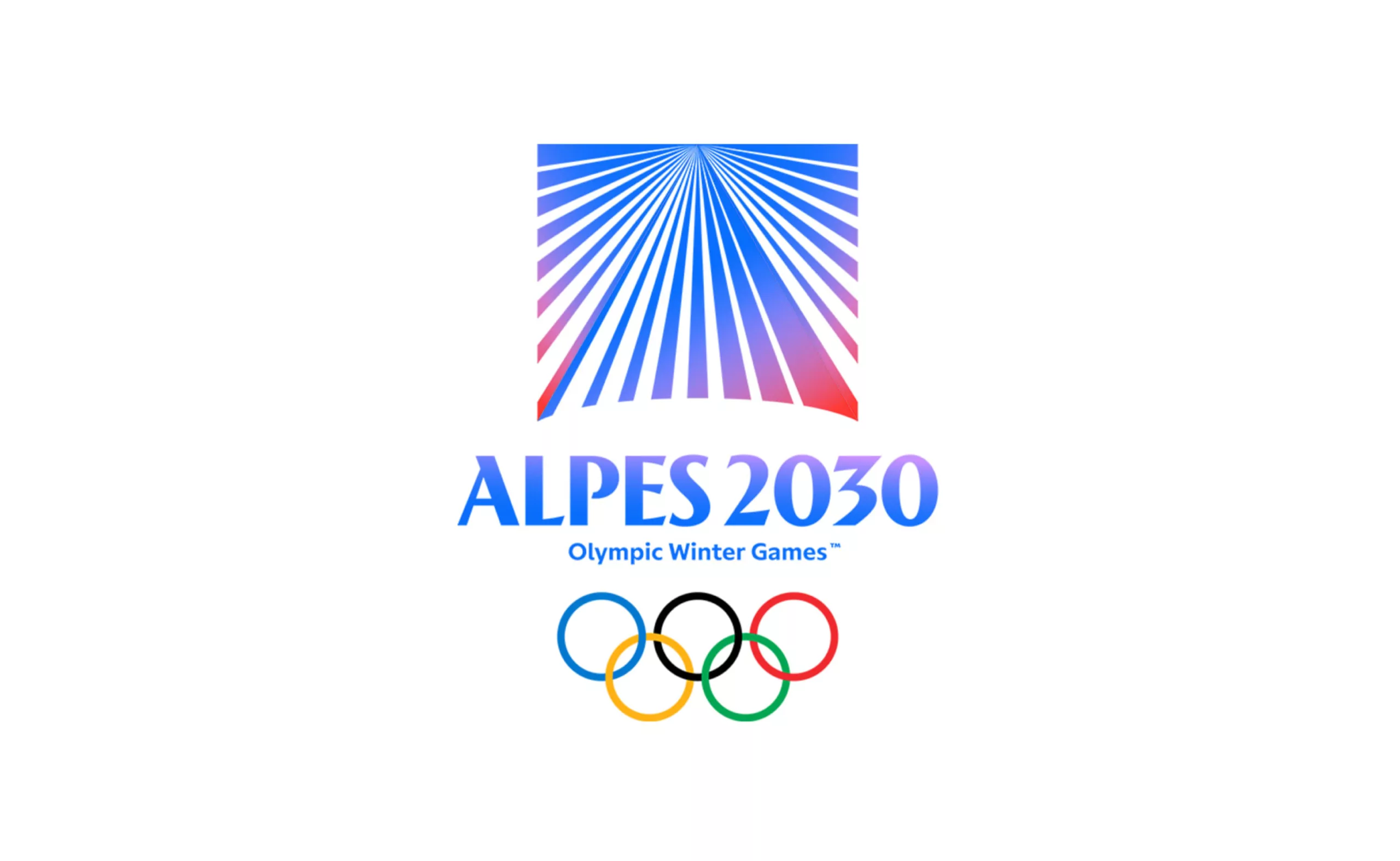
Where the other concepts depicted the mountain in a more literal and descriptive way, the final emblem embraces a certain geometric simplicity. Reduced to an essential triangular form, it offers a minimalist interpretation of the Alpine landscape while opening the door to a secondary reading.
At this point, we must admit that a large bead of sweat appeared on our foreheads upon learning that Grospiron himself had chosen the logo…
The former Olympic champion went on to explain: “This choice reflects a clear ambition: to move beyond a simple geographical representation and create a symbol capable of embodying both the Olympic and Paralympic Games. A single emblem for two distinct events, united by the same promise: self-transcendence and the pursuit of excellence. More than a mountain, the symbol seeks to express a trajectory, a shared aspiration toward a summit.”

he 1992 Olympic moguls champion points out that “the typefaces created by Mathieu (Sakkas) stand apart from those used for previous Games because they are highly vertical, much like the mountains themselves. Then there is the combination of azure blue and alpenglow red* — colours that are deeply rooted in the region” says the Haute-Savoie native.
*Alpenglow is an optical phenomenon that bathes mountain peaks in shades of pink and red at sunrise or sunset.
It is worth noting the graphic device used to adapt the emblem for the Paralympic Games: the symbol is simply inverted. The two versions fit together perfectly, like two sides of the same construction. From a design systems perspective, the idea is elegant. From a symbolic perspective, however, it raises questions, since the Paralympic Games are not the inverse or negative image of the Olympic Games.
Where Paris 2024 made the bold choice of using a single emblem for both the Olympic and Paralympic Games, Alpes 2030 opts for two distinct marks built from the same underlying framework. Why separate the two at all? In 2026, that approach feels surprisingly outdated.
Kudos to the Logo Designers
The designers behind the logo are not supposed to publicly discuss their involvement, but word has it that the project was created by Saint-Lazare. A studio known for its editorial elegance, understated sophistication, and obsession with timelessness. It’s a visual language that works remarkably well for a luxury hotel or a high-end fragrance house. The question is what it communicates when applied to a sporting event rooted in the Alps. Should the Alps become a premium brand?
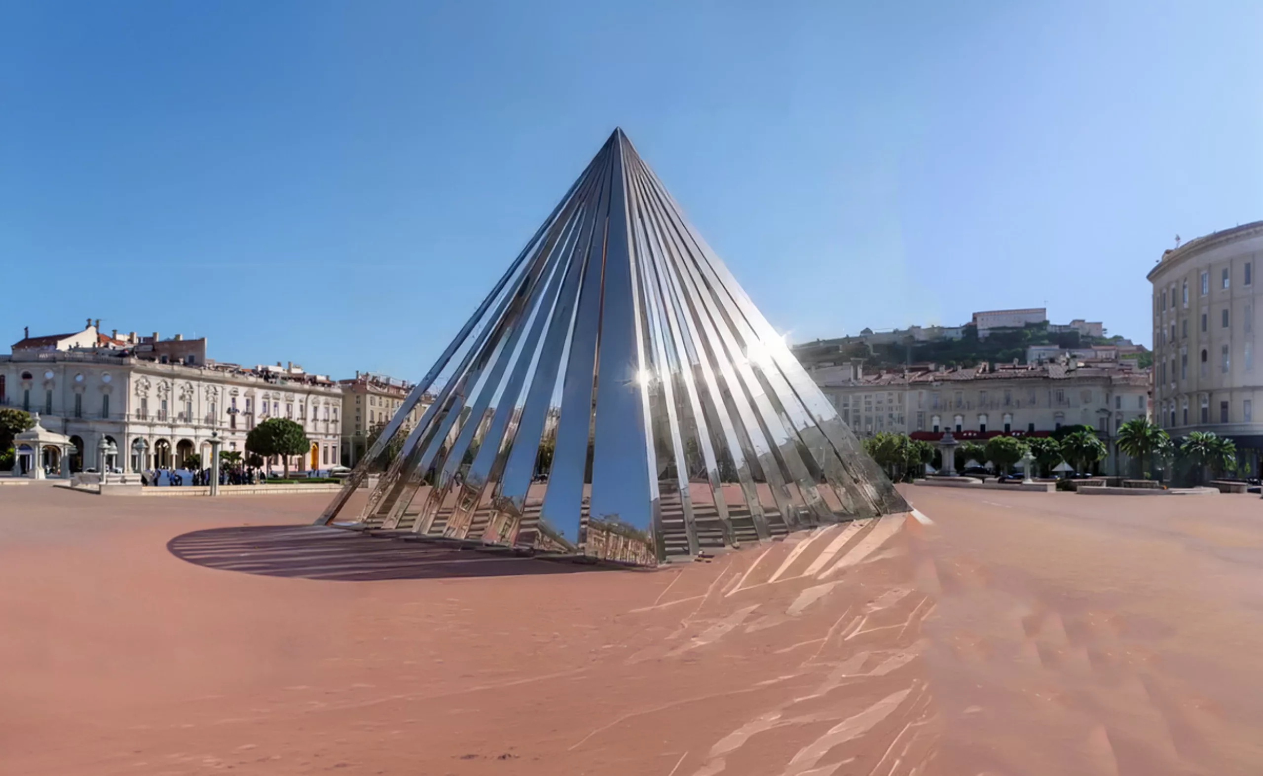
In any case, it is hardly surprising that this logo conveys a distinctly metropolitan spirit. Looking at it, one could almost imagine a few events taking place atop the Louvre Pyramid. And that is not entirely far from reality: the organizers have envisioned a giant pyramid in Place Bellecour, in Lyon.
The Look of the Games
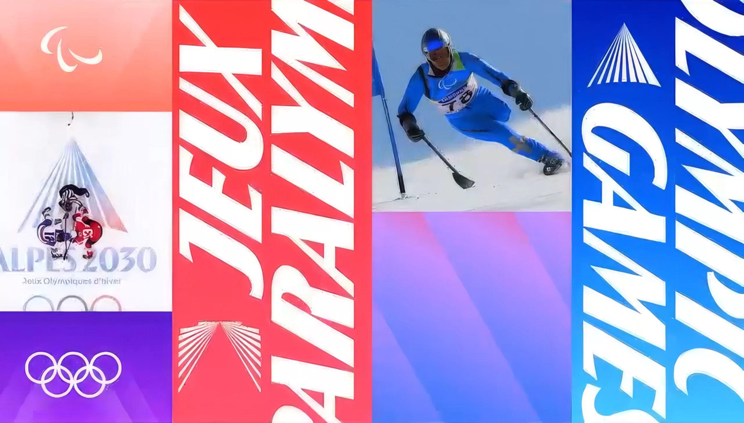
ogically, these Games should spare us the visual mishmash that characterized the Paris Games. We all remember a logo designed by Royalties, followed by a broader visual identity developed by agency W under somewhat controversial circumstances. The lack of coherence between the different elements was widely criticized. This time, it appears that the entire identity system has been conceived as a unified whole from the outset.
Below is a first glimpse of this visual language and its accompanying typeface. The latter brings to mind a sporty reinterpretation of Peignot, the iconic typeface designed by A.M. Cassandre in 1937.
An Unpaid Design Pitch
For the record, the Games’ visual identity was commissioned through an unpaid design competition. Participating agencies were asked to submit a “concept sketch.” A seemingly harmless requirement, yet in the world of brand design, a sketch often represents the bulk of the creative work: the concept, the visual direction, the core idea behind the symbol, and sometimes even the first applications.
It is difficult not to question a practice that still persists in 2026, especially when initiated by public or semi-public institutions. Behind the notion of competition often lies a transfer of economic risk onto designers, who are expected to invest time, expertise, and resources without any guarantee of compensation.
The paradox is all the more striking given that design is routinely presented as a strategic tool for differentiation and influence. Its value is readily acknowledged once a project has been selected, but far less so when it comes to paying for the research and exploration that make the strongest ideas possible. In a sector that prides itself on innovation, attractiveness, and excellence, this form of speculative work is becoming increasingly difficult to justify.
Between Jean-Michel Jarre and Roger Excoffon
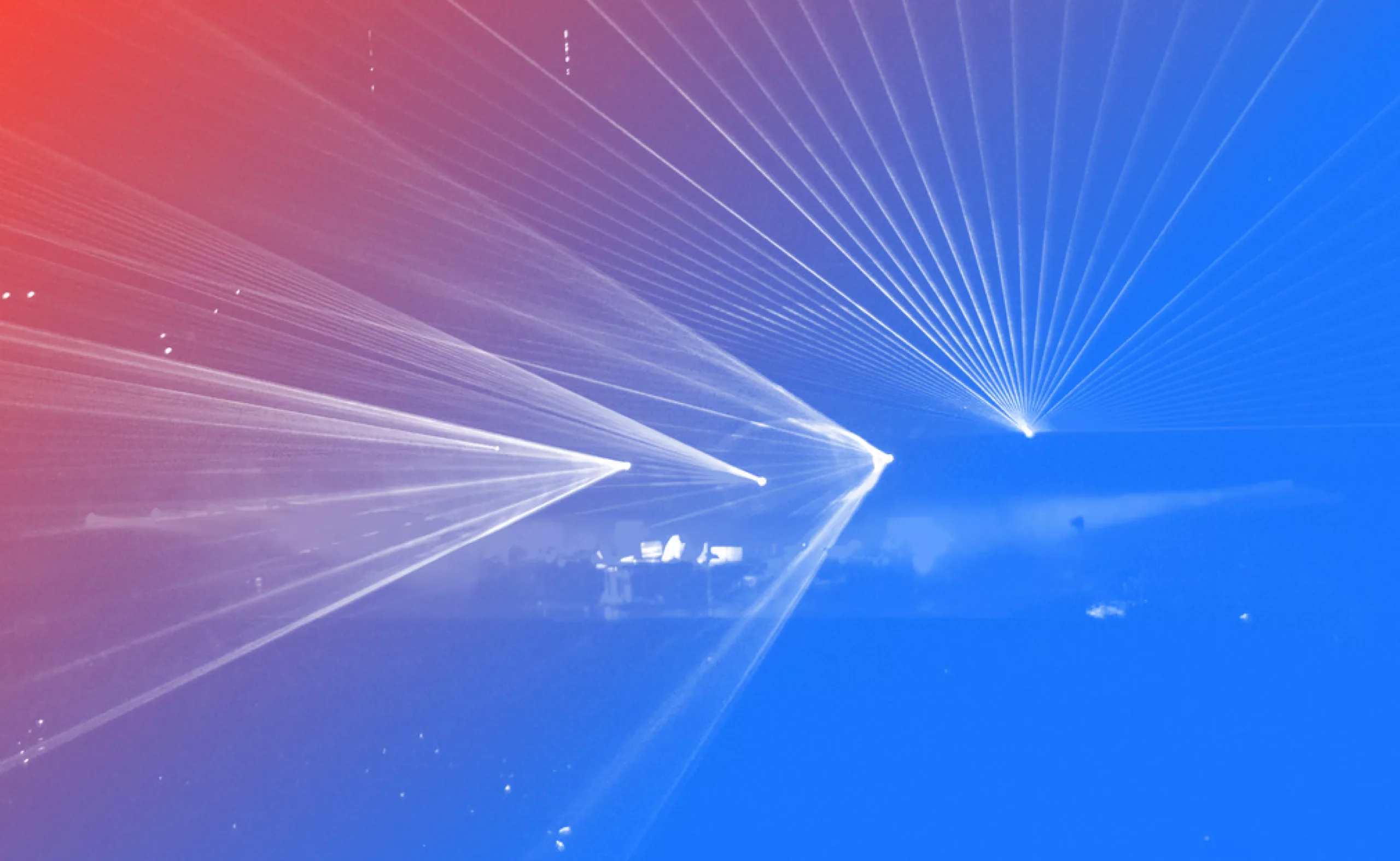
Looking at the symbol, it is hard not to think of the visual style of the 1970s and 1980s. The beams of light, the repetition of lines, and the kinetic screen-like effect evoke everything from Jean-Michel Jarre’s legendary light shows to television title sequences and institutional identities of the era.
Long dismissed as outdated, this graphic vocabulary is now enjoying a revival. Across contemporary branding, we are seeing a renewed interest in more kinetic forms, embracing optical effects, light, movement, and a certain sense of spectacle. The Alpes 2030 emblem taps directly into this aesthetic lineage, favouring visual vibration and radiance over literal representation.
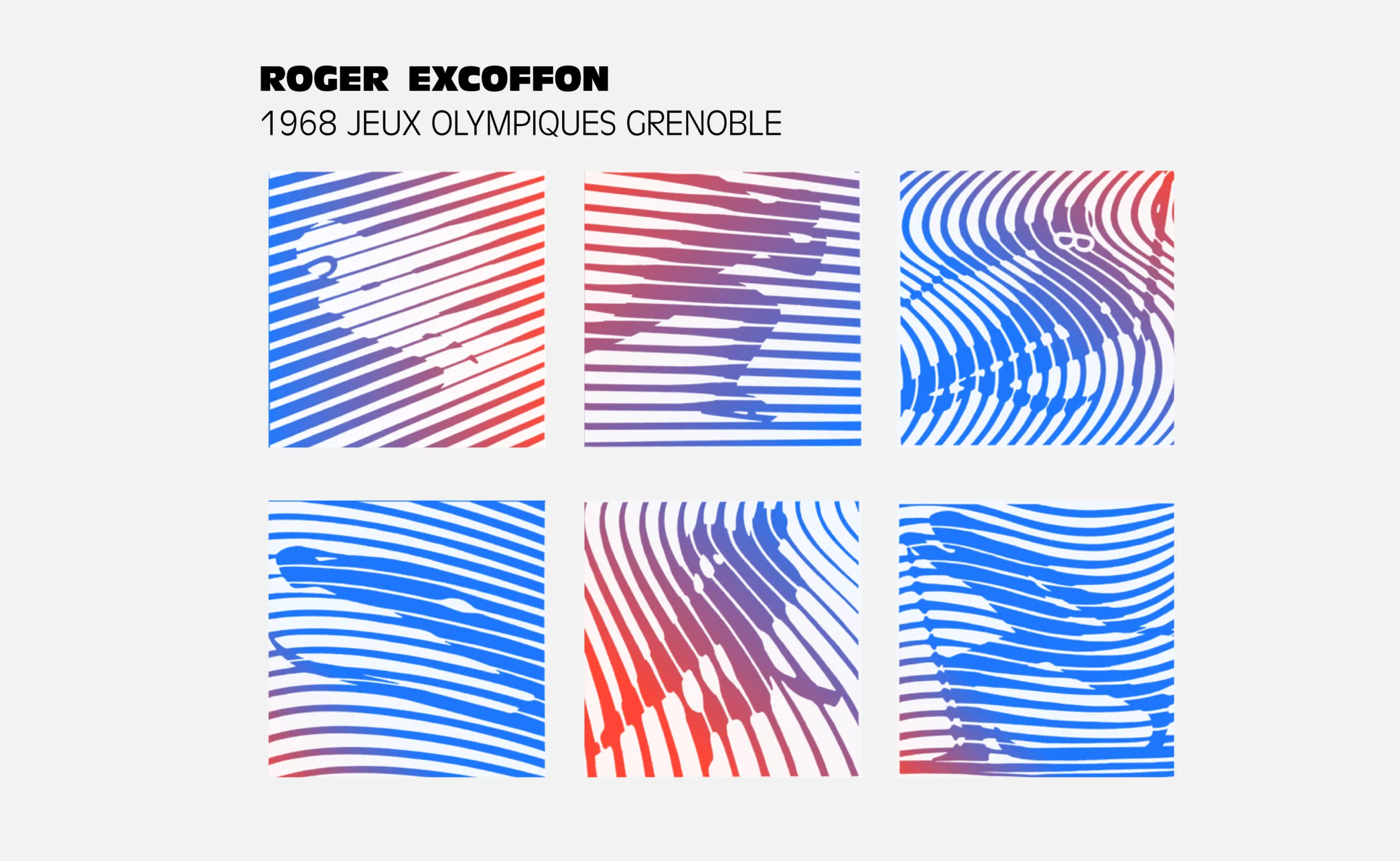
These light beams also recall the pictograms designed by Roger Excoffon for the Grenoble 1968 Winter Olympics. At the time, the French typographer and designer broke away from the traditional figurative representation of sport. His pictograms were constructed from repeated lines, screen-like patterns, and fragmented gestures that conveyed the impression of movement in progress rather than a fixed form. Skiers, skaters, and jumpers seemed to emerge from a continuous graphic flow.
A trace of this kinetic language can be found in the Alpes 2030 emblem, albeit nearly sixty years later. The parallel lines create an optical vibration and suggest energy more than they do a mountain. Yet where Excoffon placed human movement at the heart of his visual system, the new logo favours a more institutional form of abstraction. The athletic gesture disappears, replaced by a geometric signal.
What remains is a clear visual lineage: that of a distinctly French modernism that uses the repetition of lines to generate a sense of speed, radiance, and projection into the future.
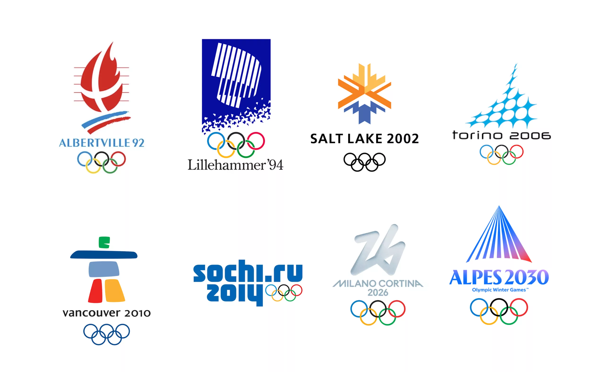
The previous Olympic logos are worth remembering. Each of them tells us something about the era in which it was created.
Vancouver stands out in particular. Going against the growing trend toward geometric abstraction, it embraced a powerful cultural symbol: the Inukshuk, a stone landmark rooted in Inuit traditions. The logo tells a story of place, people, and heritage. It remains one of the most territorially grounded identities in the history of the Winter Games.
Then came 2014 and a complete break with tradition. The logo became a web address: sochi.ru. We were not particularly kind to it in our review at the time, memorably titled: “Sochi, so cheap“
As for Alpes 2030, the logo is technically accomplished: contemporary, simple, and highly functional. Symbolically, however, it may also be the most abstract and disembodied emblem in the series.
Celebrating the Mountains while increasing their vulnerabilities
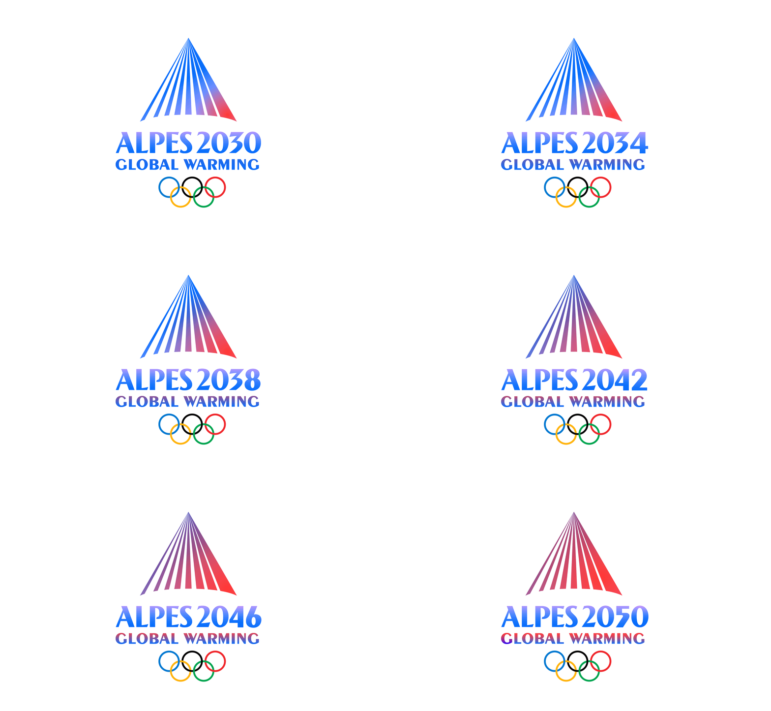
It is no secret that the Alpes 2030 Winter Olympics have become a focal point for broader tensions. While organisers promise a restrained event relying on 93% existing or temporary venues, environmental groups and local collectives argue that the project remains fundamentally at odds with the climatic realities facing the Alpine region. Between new infrastructure, land artificialisation, snowmaking, and increasing pressure on water resources, the Games have come to embody a paradox: celebrating the mountains while intensifying the very vulnerabilities they already face.
In our view, one of the emblem’s limitations lies in its lack of sensitivity. The Alps naturally evoke landscapes, fragile ecosystems, and human practices deeply rooted in place. Yet the logo chooses a radically abstract path.
Its geometric construction, composed of radiating beams of light, speaks more to a technological imaginary than to the lived reality of the mountains. The territory is rendered almost as a signal rather than a landscape. The result is a visual language that feels calculated and distant, struggling to convey the emotional, sensory, and ecological dimensions of Alpine life.
Graphic design is never neutral. It helps shape collective imaginaries and makes certain visions of the world more desirable than others. By embracing an abstract, technological, and spectacular aesthetic, the Alpes 2030 identity extends a vision of the mountains as a promotional asset — a premium backdrop designed to project an image onto the international stage. It belongs to the same narrative framework that underpins the ideals of the “startup nation” and the “luxury nation”: efficient, optimised, attractive, yet often disconnected from the environmental and social realities of the territories it represents.
At a time when the Alps stand on the front line of climate change, one might have expected a different story. An identity capable of expressing the interdependence between people and their environment, the fragility of ecosystems, or the emerging ways of inhabiting mountain landscapes. Not a mountain-as-spectacle reduced to a luminous sign visible from afar, but a lived mountain — inhabited, negotiated, and shaped by relationships, constraints, and care.
The debate therefore extends far beyond aesthetics. It raises questions about the narratives we choose to project into the future, and about design’s capacity to support(or resist) the ecological and cultural transitions that lie ahead.
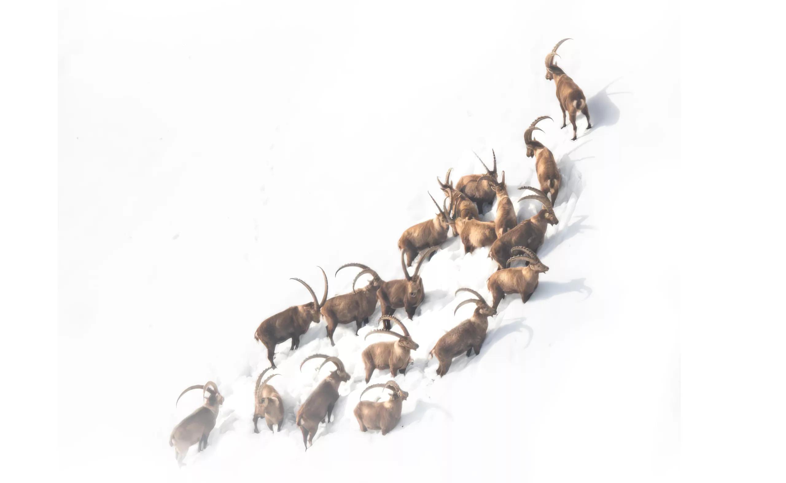
P.S. For a more sensitive and deeply Alpine visual imagination, we highly recommend discovering the photography project “Les heures invisibles“.
On the subject
-
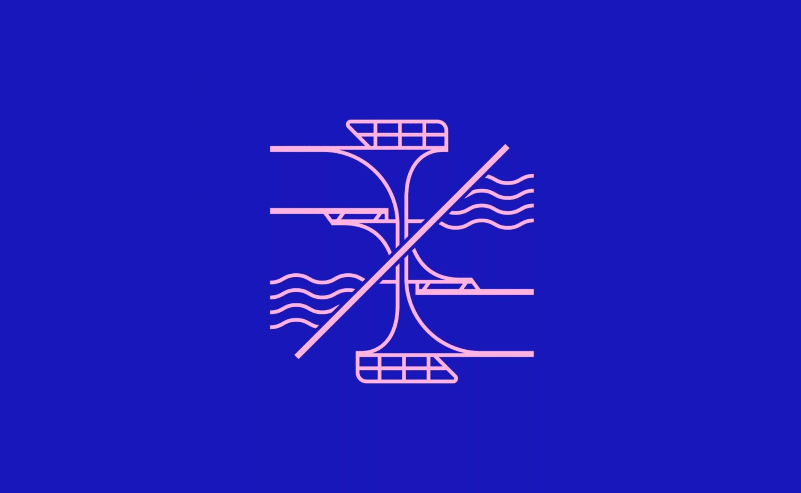
The 2024 Olympic Games will not get a gold medal for their pictograms
The organizers have unveiled the new Olympics pictograms of the Paris 2024 Games, which totally lose us.
-
The new graphic charter of the Olympic Games
The Olympic Games are redesigning their identity to harmonize their visibility in all countries and on all communication media.
-
Wally Olins, father of territory branding
Wally Olins is the inventor of business and territorial branding and all the influence that comes with it. Discover his work and our exclusive interview.