Branding for gig workers: crossed for struggle

(article updated in 2026)
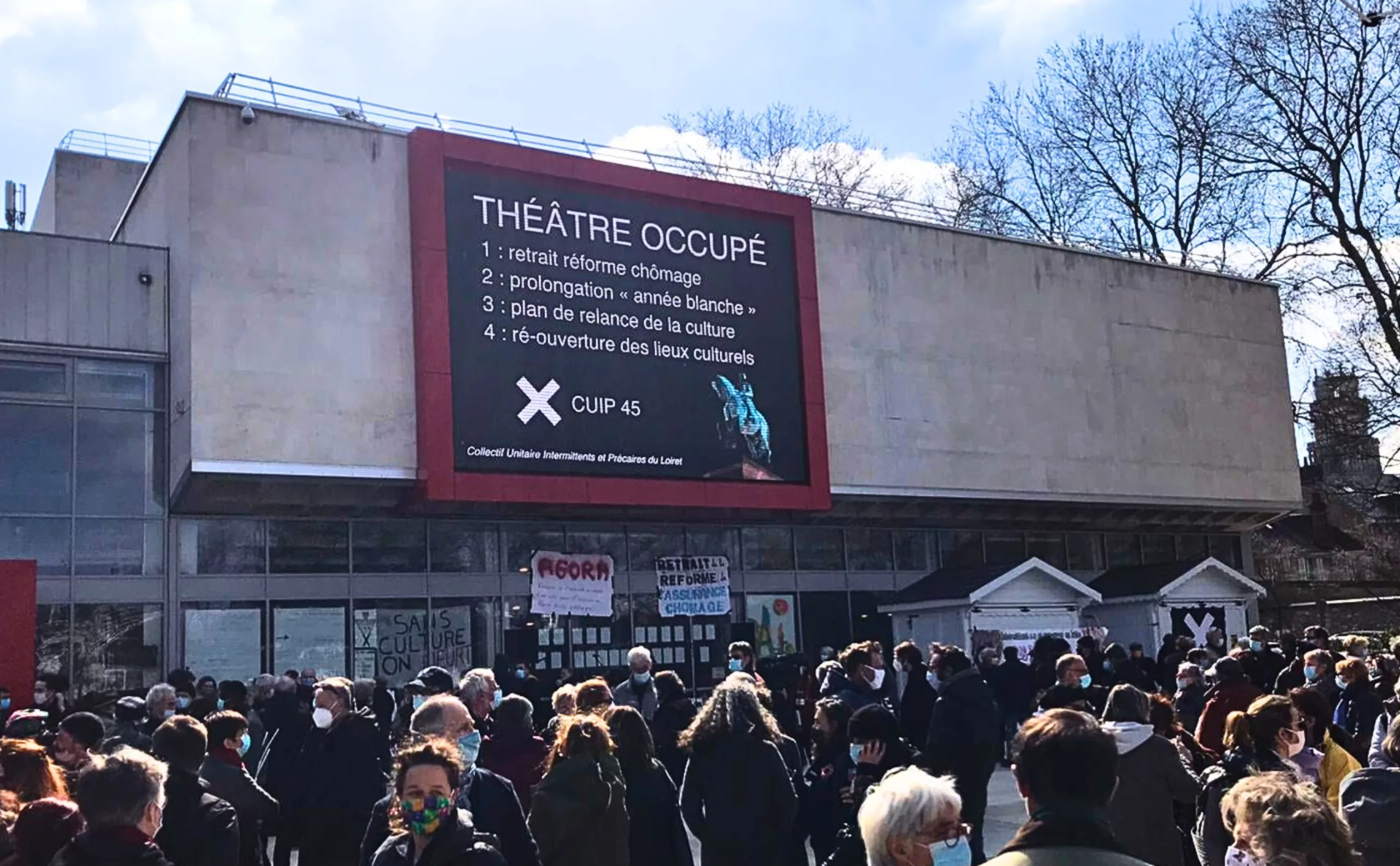
In 2014, casual workers spoke out against the new unemployment insurance agreement. A strange symbol then began to appear on their T-shirts: a white cross on a black background… Two overlapping strips of white gaffer tape – that seems to be all the freelance workers need to assert their rights. Beyond the contrast and the excellent legibility of this graphic symbol of protest, this provides an opportunity to discuss the symbolism of the cross and its graphic history.
A Brief History of the Cross
The cross symbolises the intersection, the meeting point, the crossing – to put it in a bit of a redundant way.
When depicted vertically and horizontally, it is one of the oldest symbols in the world. We usually learn in our first-year semiotics course that the vertical, upright branch symbolises the masculine principle, and the horizontal, reclining branch the feminine principle; and that their union is a sign of life.
If you’d studied Latin as your ‘dead language 1’, you’d know that the word ‘cross’ comes from the Latin word *crux*, which means ‘post, gallows or pillory’. And if you weren’t taught the catechism, you’ll learn that the cross of torture, a symbol of Christ’s humiliating death, only began to be used as a symbol around the 5th century.
However, the gesture of making the sign of the cross on the forehead is one of the oldest Christian rites. Used during baptism, or made as a sign of protection, it refers to a prophecy in the Book of Ezekiel: ‘Go through the city and mark the foreheads of the people with a tav’. The tav is the last letter of the Hebrew alphabet, which, in its archaic form, is represented by an upright cross (+) or a horizontal cross (x).
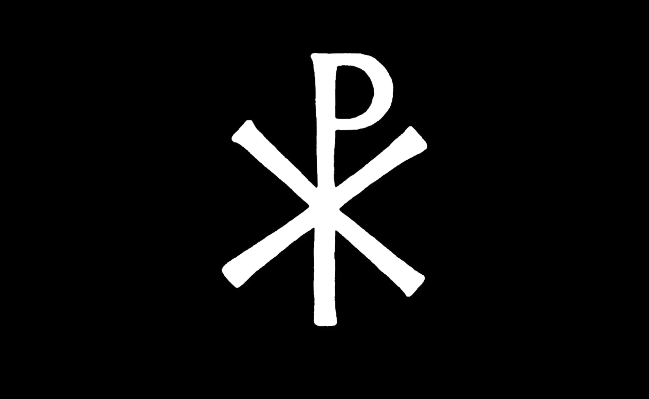
The chi-rho (☧) is a Christian symbol formed from the two Greek letters Χ (chi) and Ρ (rho), the former superimposed upon the latter. These are the first two letters of the word Χριστός (Christ). It is also sometimes interpreted as the monogram of Christ, and is often found accompanied by the letters α (Alpha) and ω (Omega). These letters, which mark the beginning and end of the Greek alphabet, symbolise wholeness: the beginning and the end. Furthermore, the Greek verb formed from them, ἄρχω, means ‘to lead, to go in front, to begin’ and refers to the dual role of Jesus Christ: founder and first leader of the nascent Christian Church.
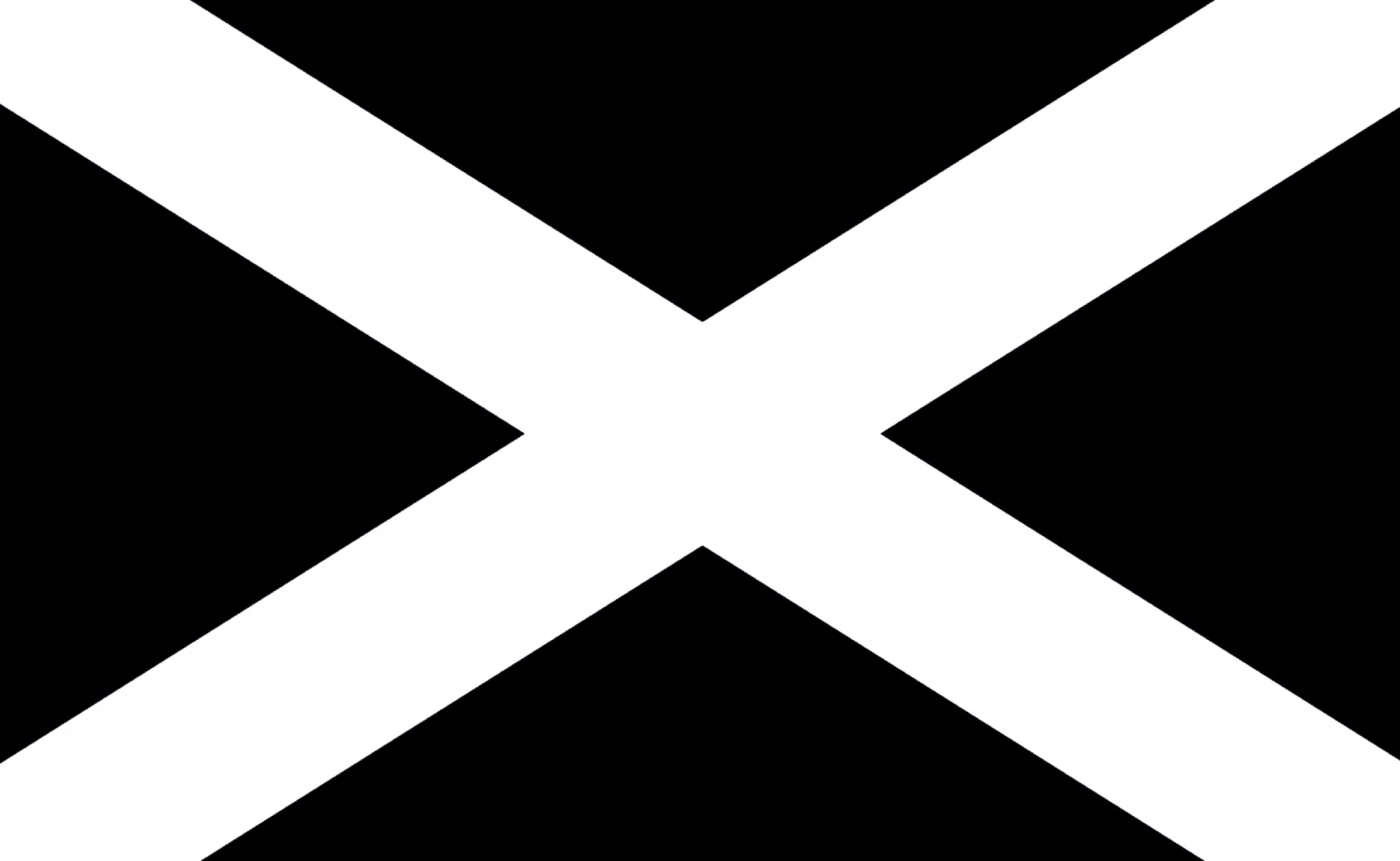
The ‘reversed’ cross (X) is generally known as the ‘Cross of Saint Andrew’. As the apostle Andrew was chosen as the patron saint by several European princes, the Cross of Saint Andrew became a symbol of the identity of many European monarchies, nations, regions, armies and political forces. It can still be seen today on the flag of Scotland, for example.
According to tradition, Saint Andrew felt unworthy of being crucified like his Lord, so he pleaded for his cross to be made differently. It is therefore a symbol of humility and suffering – and one might even say of non-conformity!
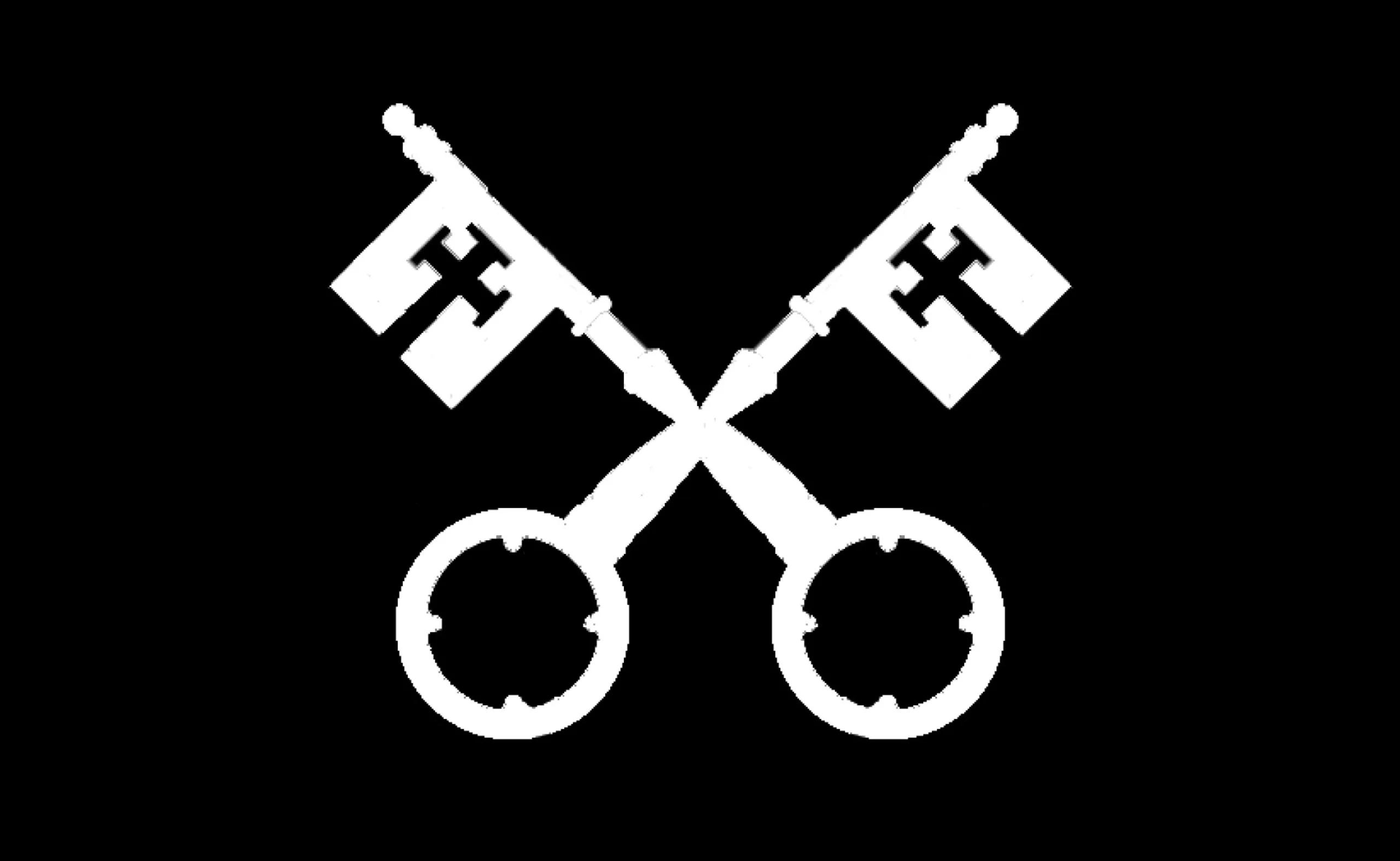
One example is the Keys of Saint Peter, which symbolise the authority delegated to the Church by Jesus Christ, and which feature in the Vatican’s coat of arms, for example.
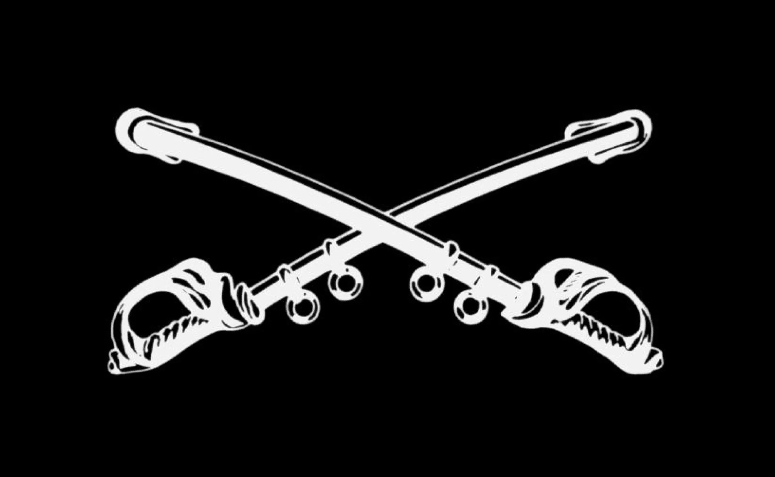
The history of the Christian cross would soon become intertwined with the history of war. For several centuries, the ‘Crusaders’ sought to liberate Jerusalem. The cross soon became the rallying symbol of Europe’s armies. It is hardly surprising that, etymologically speaking, ‘to cross swords’ literally means to fight with swords, but above all to oppose one another in conflict. From then on, the art of warfare would favour all manner of cross-shaped weapons…
In fact, don’t we refer to them as coats of arms? The ‘arms’ are the set of heraldic symbols that appear on the shield of a town, a family, and so on.
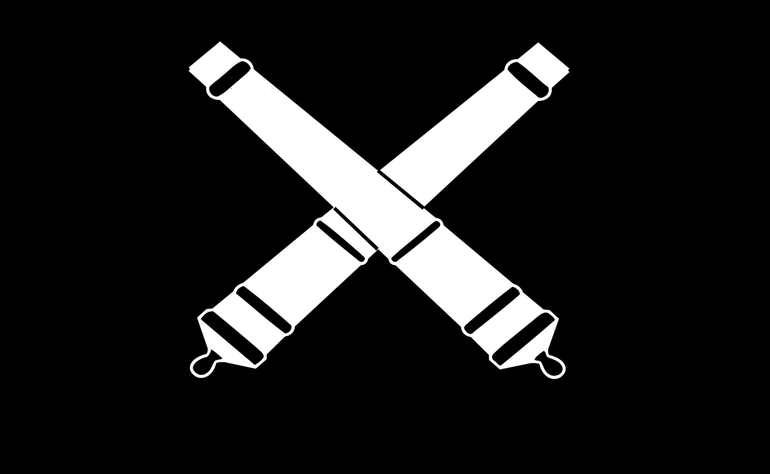
As time went on and weapons evolved, cannons would replace swords and sabres…
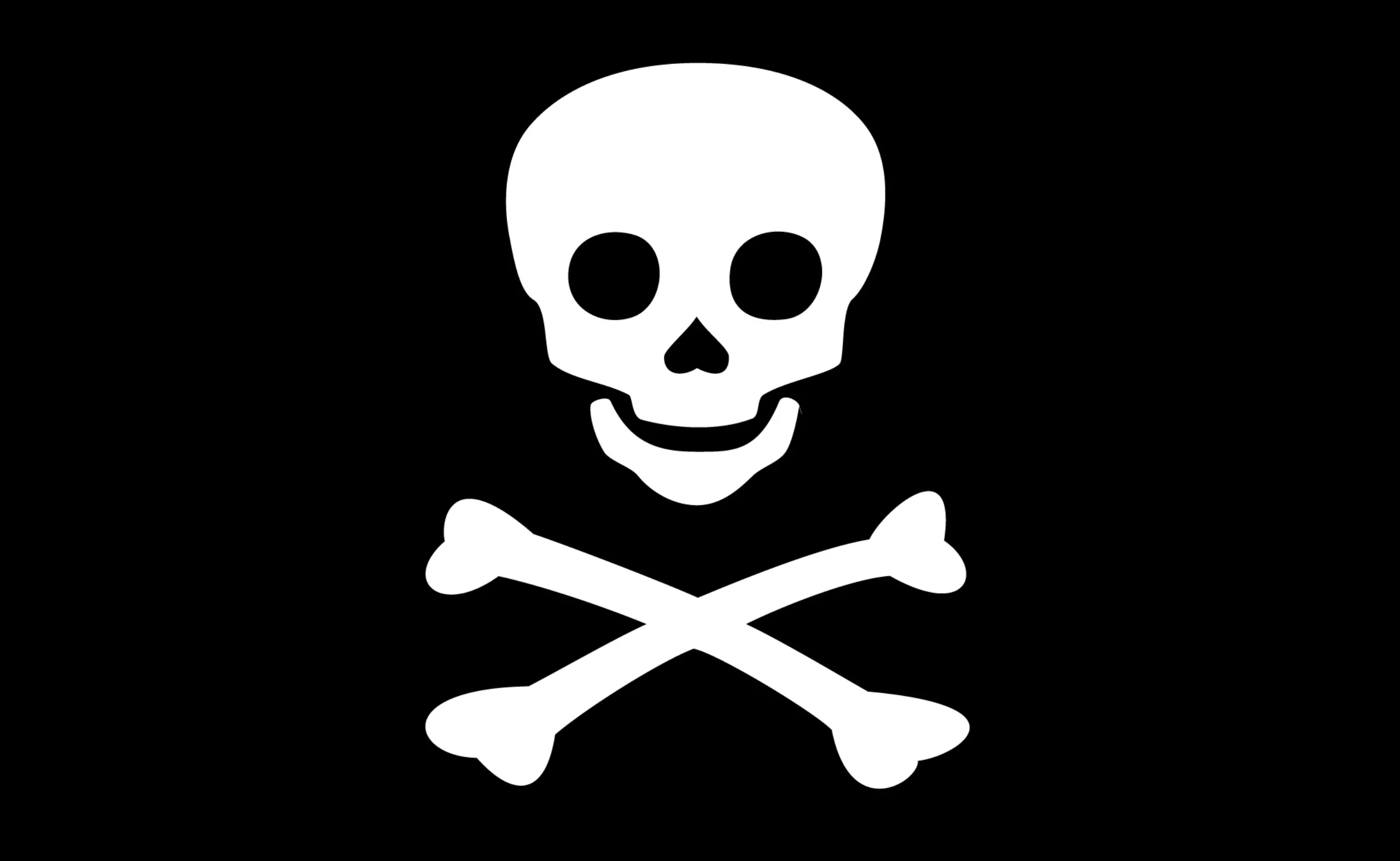
In keeping with this martial tradition, we might mention the ‘Jolly Roger’, the famous pirate flag!
This flag is said to feature symbols chosen by pirates and privateers to convey an unequivocal message.
At the time, buccaneers usually flew their nation’s flag and the red ‘no-quarter’ flag, the famous ‘joli rouge’, which probably gave rise to ‘Jolly Roger’ through a mispronunciation in English.
Pirates would initially hoist their black flag to urge their target to stop and surrender without a fight; as black is the colour of mourning and the underworld in the West, it had a certain psychological impact. If the target refused, the pirates would hoist the red flag, which signalled that they were attacking and that the fight would be ‘without quarter’.
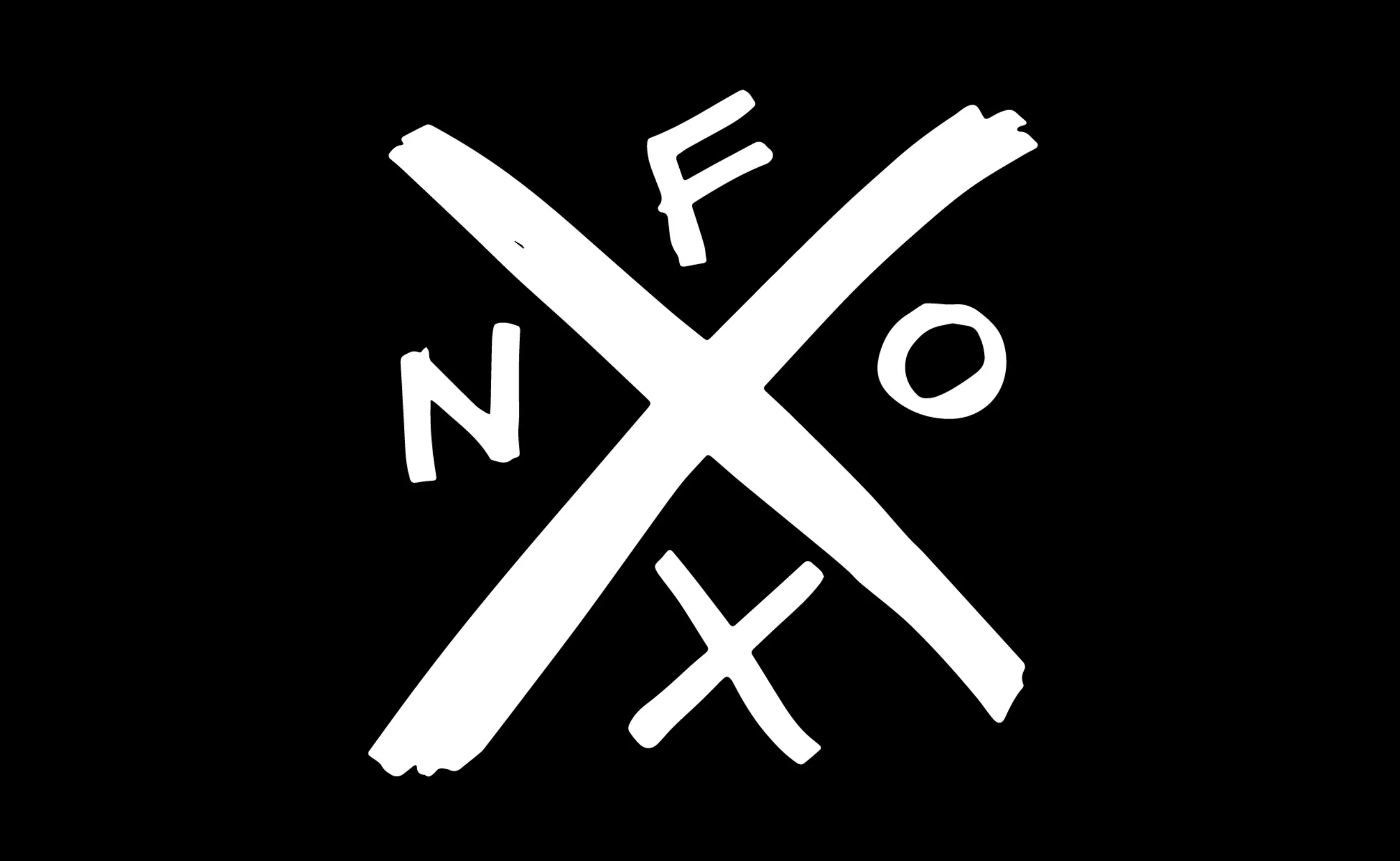
This pirate spirit can be seen in the ‘hardcore’ symbols of the punk movements of the 1980s and 1990s.
Drawing a cross was a very simple way to create an anti-establishment logo! A bit like this NOFX logo…
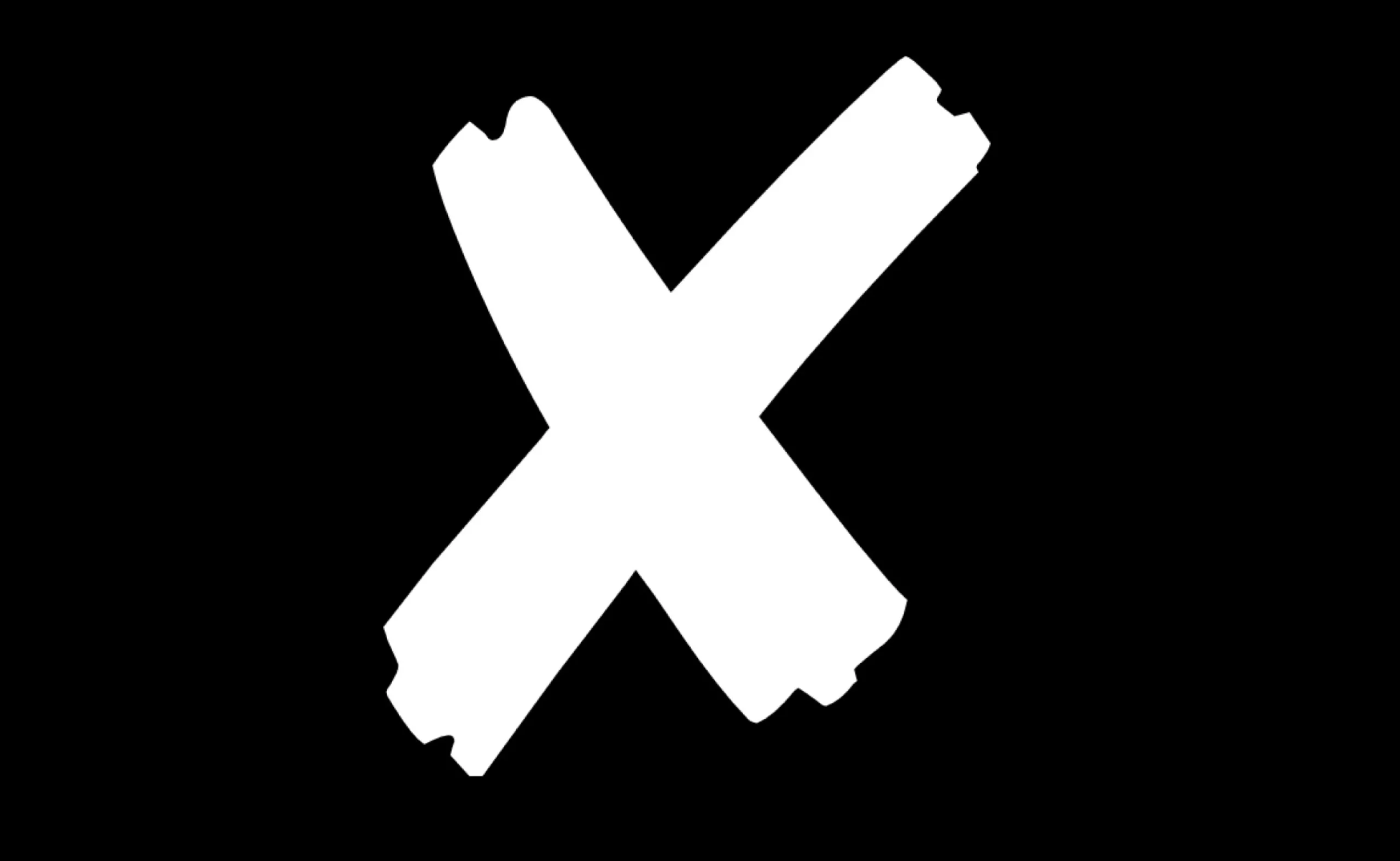
The horizontal line obviously has many meanings. Mathematicians use it as the multiplication sign, or as an unknown in an equation, whilst the Romans used it to represent the number 10. It is also used to sign, cross out or tick something. It is also the gesture one makes when shielding one’s face with one’s hands; it is a warning symbol on toxic products; and, more generally, a sign of negation – like a barrier blocking the way, or the little tick box used to close a window on a computer.
The symbol used by casual workers is, of course, primarily meant to convey ‘negation’. What’s more, it’s the simplest symbol to make – just two strips of white sticky tape on a black T-shirt and you’re done!
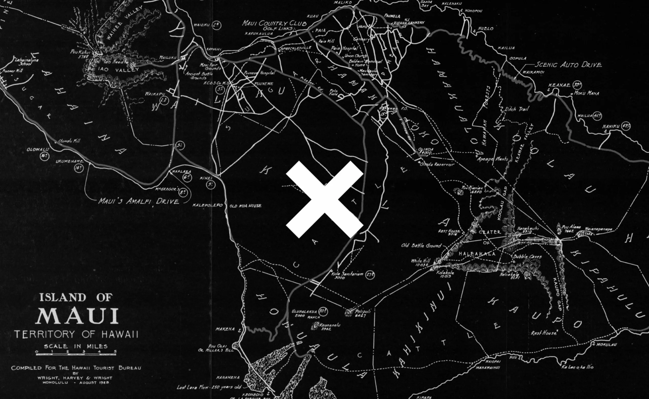
The cross is also a geographical landmark, enabling the precise coordinates of a single point to be identified!
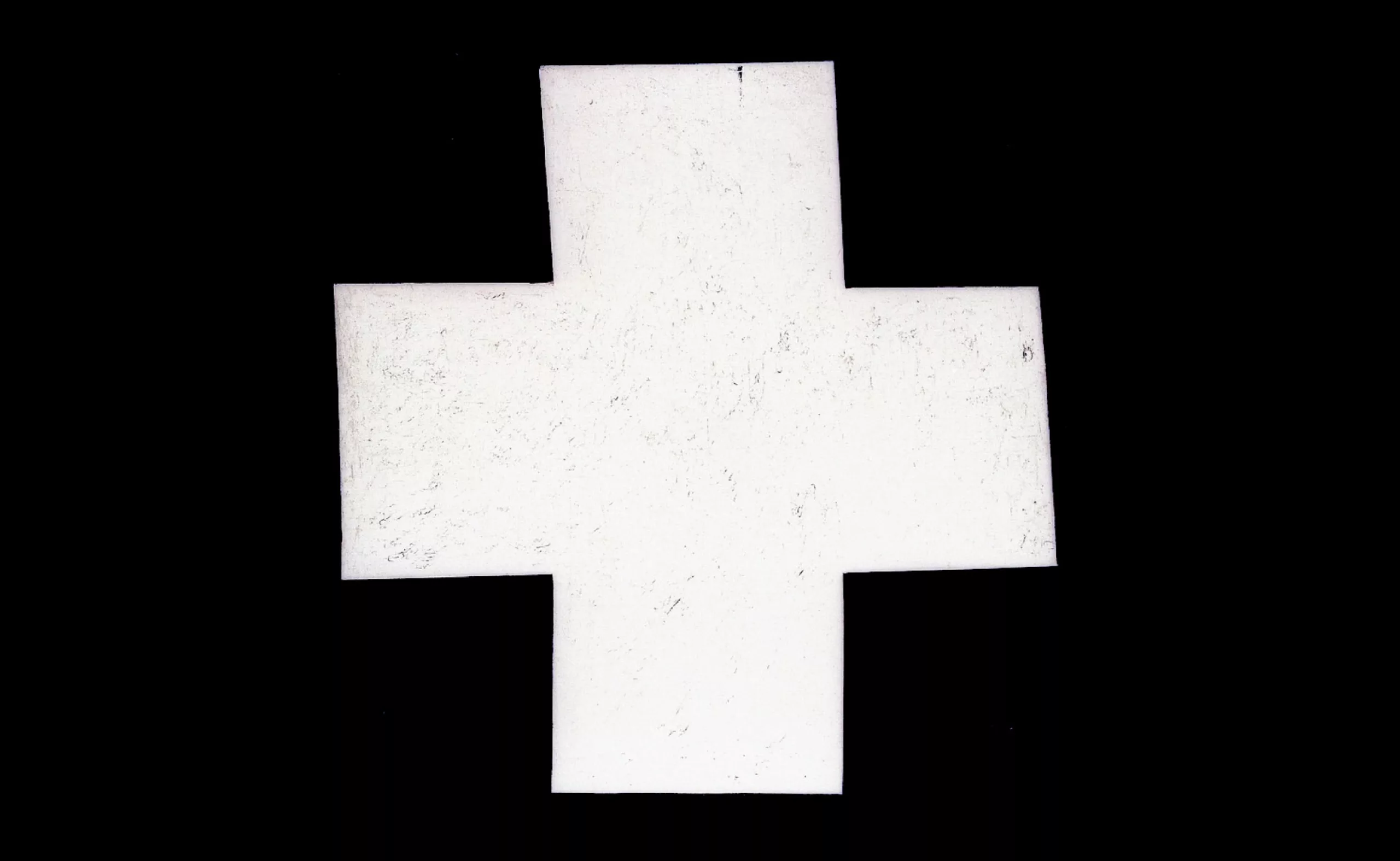
A brief detour into the history of 20th-century art: according to Malevich, the cross was formed from two rectangles; it is an open system.
The Black Cross is not used as the Christian symbol of Redemption, even though Malevich had previously taken an interest in Russian figurative tradition and Orthodox Church icons. The Black Cross is regarded first and foremost as a formal invention. The square, the circle and the cross are fundamental elements according to Malevich’s theory of Zero Form.
In recent years, it’s been impossible to miss ‘The XX’; the band’s name had been decided well before the release of their debut album. At first, they played together just for fun, and Romy MADLEY CROFT loved the letter ‘X’. The name just seemed the obvious choice. What’s more, when the band started touring, there were 20 people on the tour, and ‘XX’ means ‘20’ in Roman numerals. The band took this as a sign of destiny.
Naturally, one cannot help but think of the ‘X’ sex chromosome, also known as a heterochromosome. It is one of the X and Y chromosomes that determine sex. Women are ‘XX’ and men are ‘XY’…
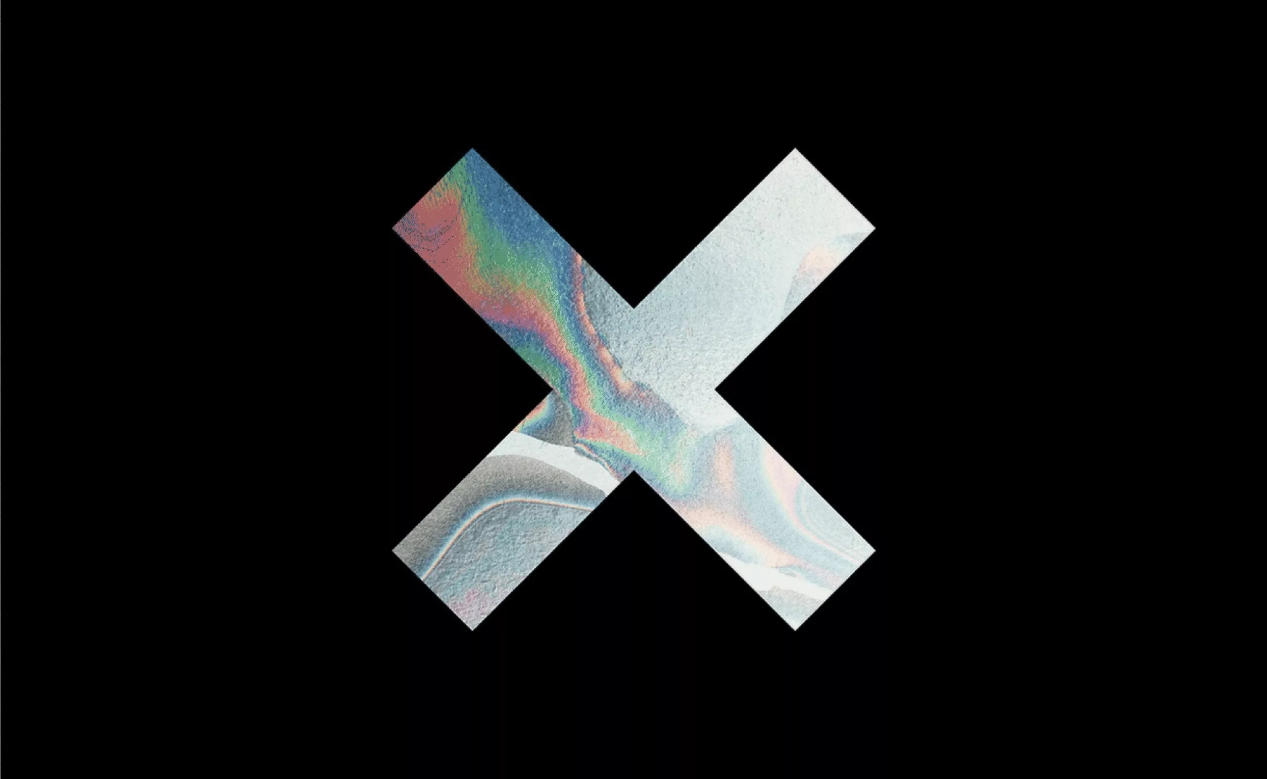
The cross used as a mark on a manufactured object can be regarded as the forerunner of the ‘brand’ as we know it today. I suggest you take a quick detour to our article on the origin of the word ‘branding’, where you’ll learn that the word shares the same origin as ‘branler’…
Let’s return to our ‘tâcherons’ – the name given to stonemasons who were paid by the job. The stonemason had to sign his stone in order to be paid. Alongside the stonemason’s marks, one sometimes finds a number indicating the stone’s position (more practical for ensuring a straight wall) and a cross indicating that the stone had been counted towards the stonemason’s wages.
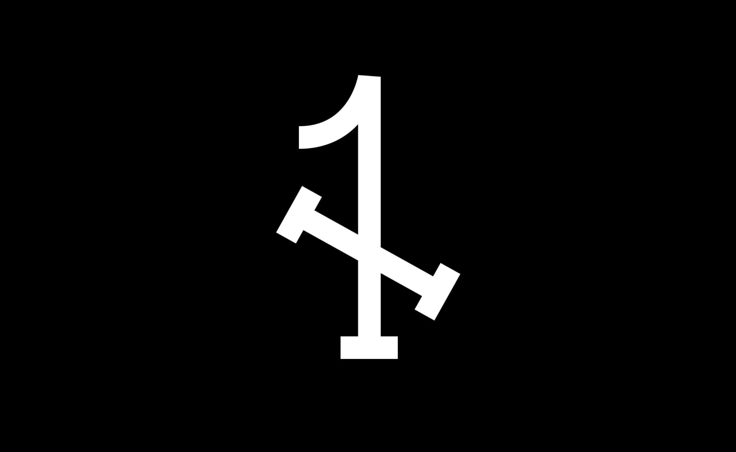
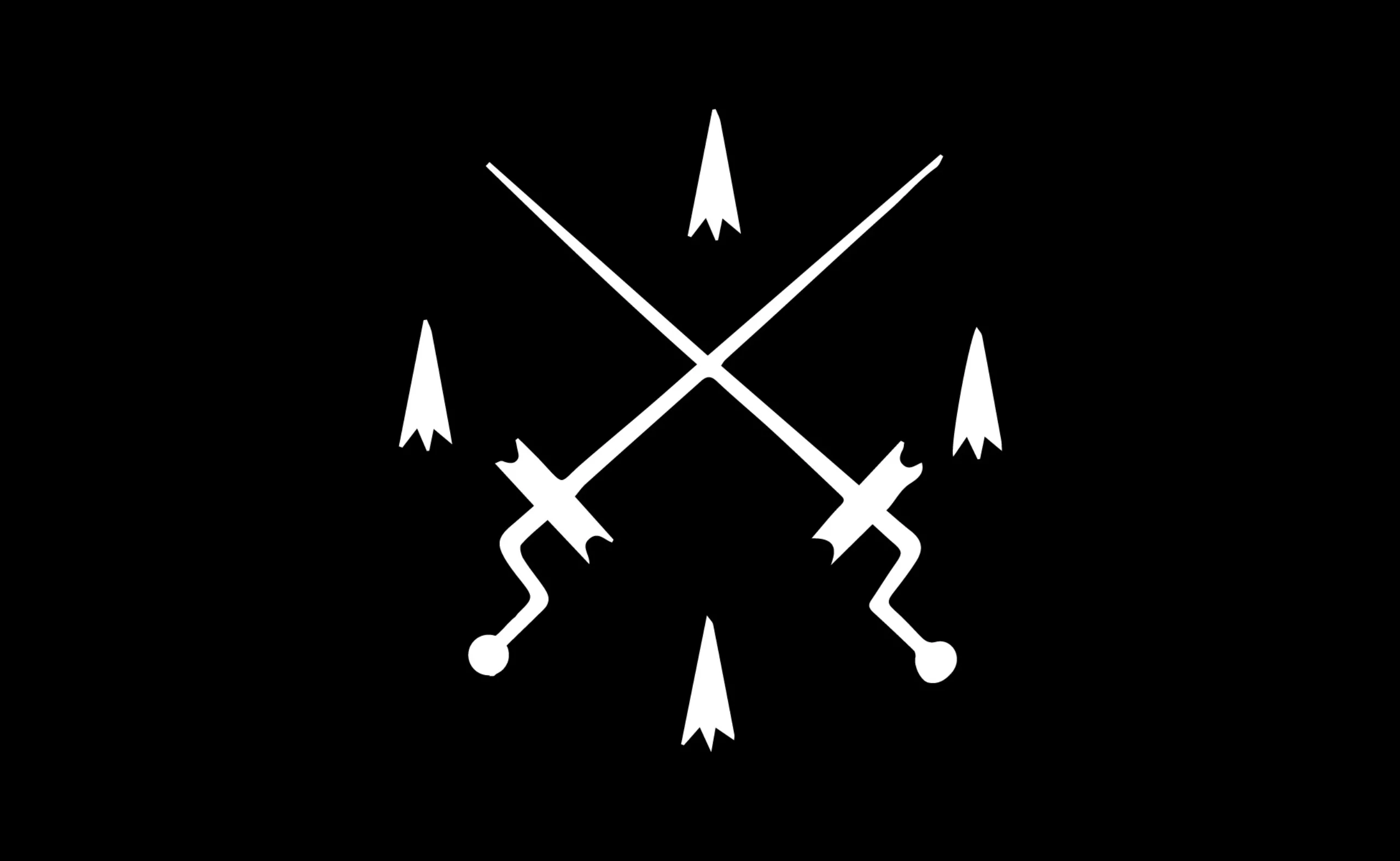
Crossed tools also feature in the coats of arms of trade guilds. This tradition is partly linked to Freemasonic symbolism and to the concept of labour. Consequently, this crossed set of tools has come to symbolise fine craftsmanship. Shown below is the symbol of the roasters’ guild (~1500).
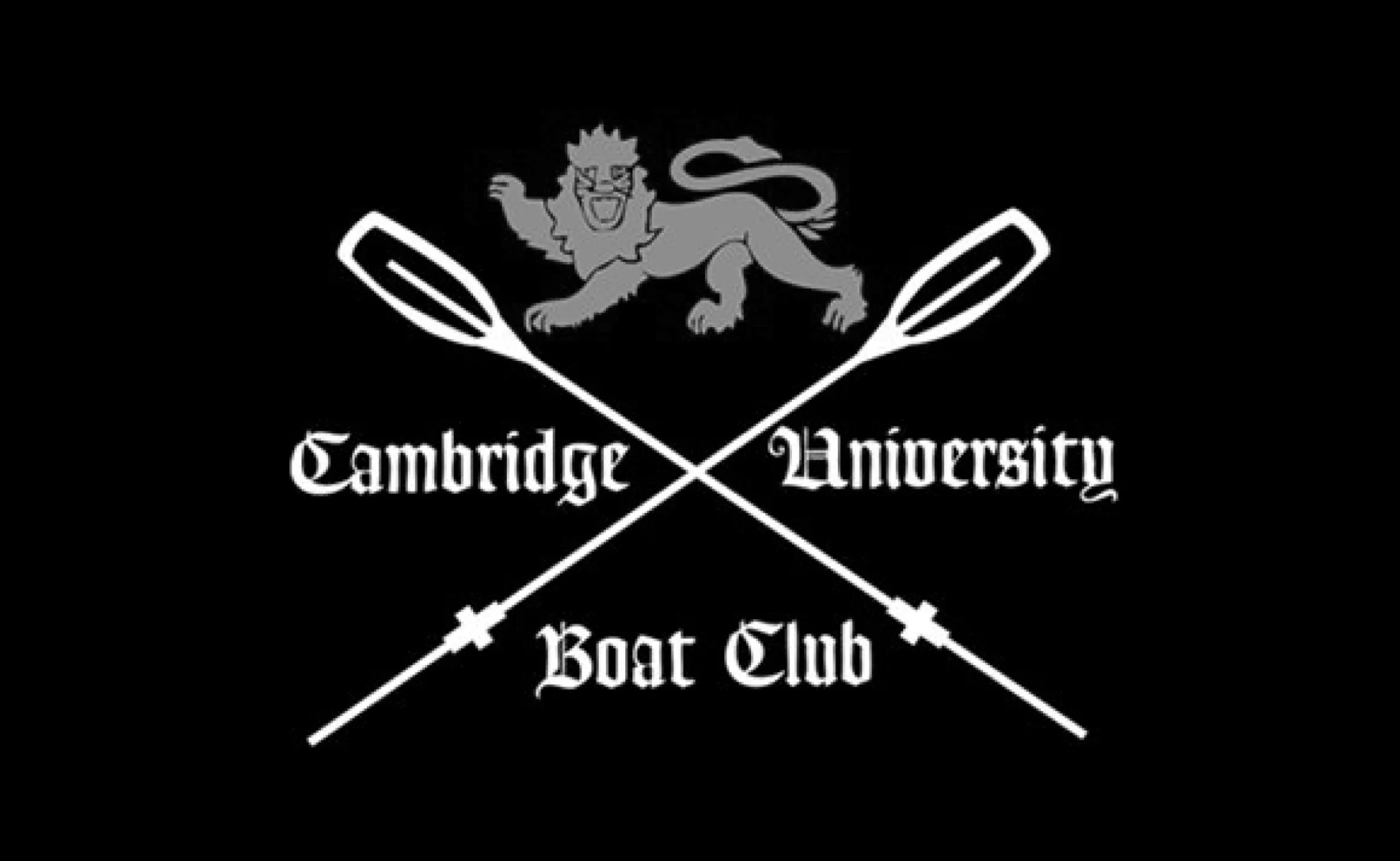
In the 19th century, sport came to play an important role in the major English universities. The heraldic tradition naturally found its way onto the coats of arms of the leading university clubs, such as that of the Cambridge University Boat Club shown below. In 2024, we analysed the Olympic Games ‘pictograms’, which had adopted this symmetrical, criss-crossed design to create their coats of arms.
Are freelance workers hipsters?
It’s a provocative question.
We’ve all seen these X-shaped logos popping up over 2015-2020. For those who might have missed this trend, here are a few links to refresh your memory: yourlogoisnothardcore
There’s even a Hipster logo generator for those who are a bit late to the party!
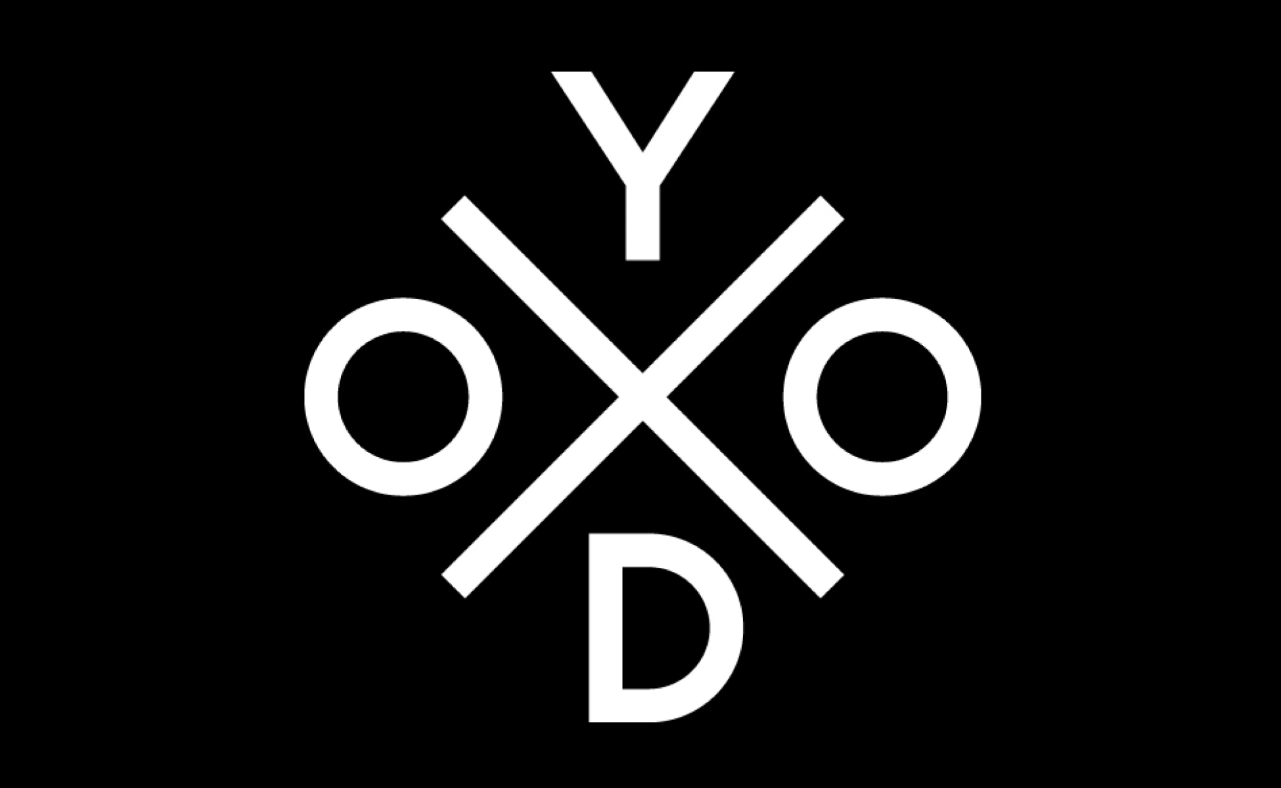
Whilst the hipster’s fascination with this cross is likely to stem from an appreciation of fine craftsmanship carried out to the highest standards, tinged with a touch of 19th-century Anglo-Saxon academic snobbery, the casual worker’s fascination with this white cross is more likely to be found in the punk ‘No pasarán’ spirit, the anarchist ‘Jolly Roger’ flag, and the mark of the ‘day labourer’ paid by the job…
In any case, well done to the freelance workers:
we’ve never seen a social movement so well marketed!
Credits: “Cabaret Frappé – Freelance performing artists” by Nykaule is licensed under CC BY-ND 2.0
Find out more
Working for these movements and collectives – as we have been doing for over 20 years as an agency specialising in institutional and cultural branding – requires a particular approach: moving beyond the conventions of traditional commercial branding without compromising on visual impact. It is from this tension that the most striking identities in the public and voluntary sectors emerge.
On the subject
-
The symbolism of cut hair in Iranian protest posters
In Iran, Mahsa Amini died for a lock of hair poorly concealed behind her headscarf, giving rise to a massive protest movement against the mullahs’ regime. The gesture of a severed lock of hair becoming the symbol of this struggle gives us the opportunity to look back at the many symbolic of hair.
-
The graphic codes of post-modernism in brand logos
We are entering the “time of the tribes”. Let’s discover the impact of this post-modernity for the logos and visual identities of brands and companies.
-
The hidden secret of CHANCE by CHANEL is Goude
Advertising sometimes offers us UFOs that seem to escape simple marketing specifications to project us towards an unexpected elsewhere. Here’s an analysis of the symbolic mystery of Chanel’s latest Chance perfume ad, directed by Jean-Paul Goude in 2016.