At Graphéine, we know that typography is far more than a matter of style; it is a powerful tool for asserting a brand’s identity and capturing the attention of its audiences. A coherent and carefully chosen typeface creates a direct connection between your messages and the visual experience you offer. In a world where every detail matters, typography becomes an essential asset. As Beatrice Warde wrote in The Crystal Goblet, “Typography is the craft of endowing human language with a durable visual form”; and behind this apparent restraint, the entire voice of a brand takes shape.
Typography design
Typography design:
The voice
of your brand


Discover our typography designs.
Creating typography for a startup, a company, a city, or a non-profit organization…
What is brand typography?
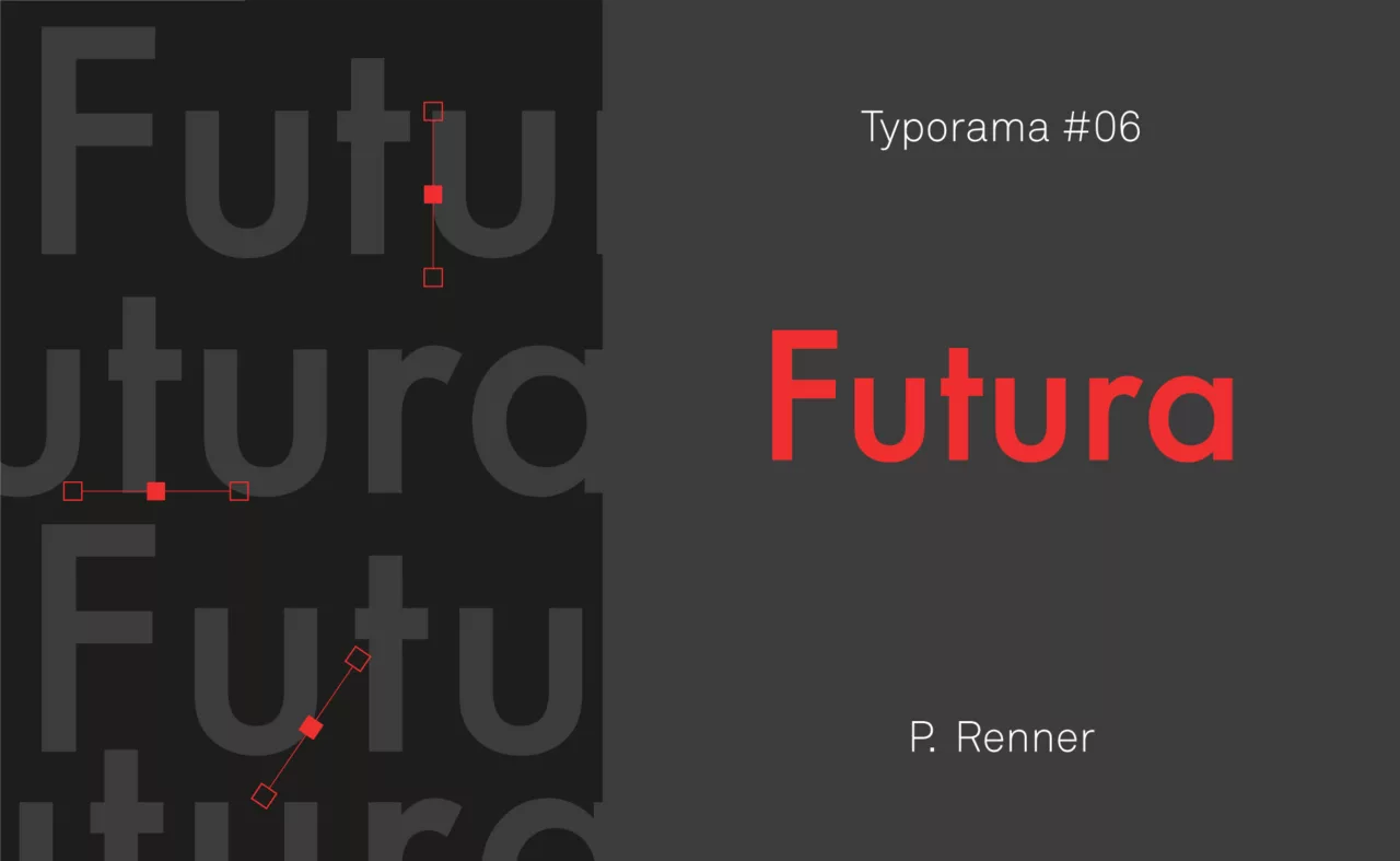
Brand typography refers to the use of typefaces to express a company’s identity. Every typeface carries its own style, and every style evokes distinct emotions, eras, and associative worlds. Helvetica breathes modernist rigor, Garamond evokes classical elegance, Futura establishes an almost scientific geometry; no typeface is neutral, each one speaks before the words themselves even begin.
Brand typography is not limited to choosing a font. It also encompasses the way characters are combined, structured, and arranged across different media. It is fully integrated into the company’s visual identity system and ensures the visual consistency of every expression of the brand; from business cards to websites, from packaging to signage.
Its role is twofold. First, to influence perception; a well-chosen typeface builds trust, creates emotional connection, and immediately signals a positioning; luxury, accessibility, seriousness, boldness. Second, to ensure readability and accessibility; in a world saturated with signs, a readable message is a message that has a chance of being read. The right typography serves meaning as much as aesthetics, and often shapes audience engagement just as much as conversion rates.
Our latest typefaces.
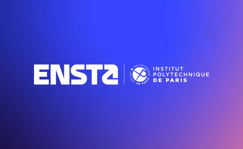
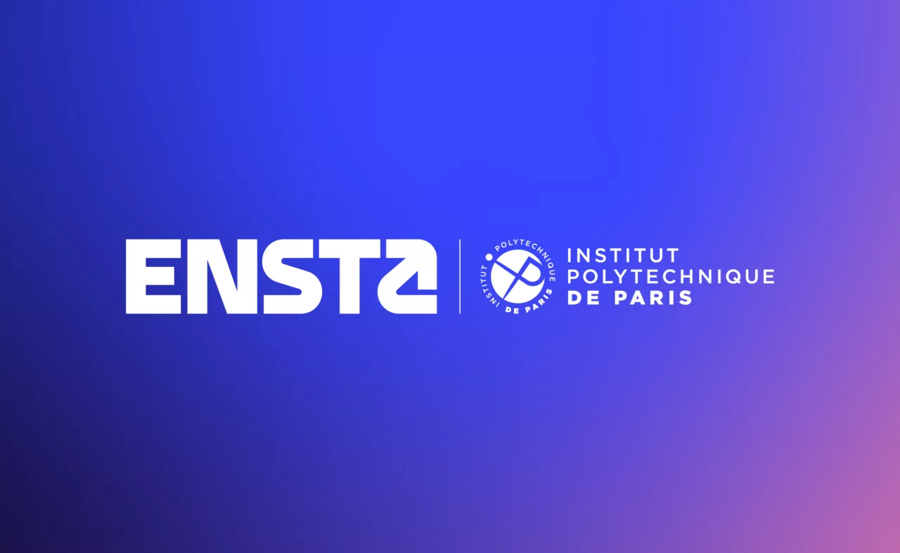
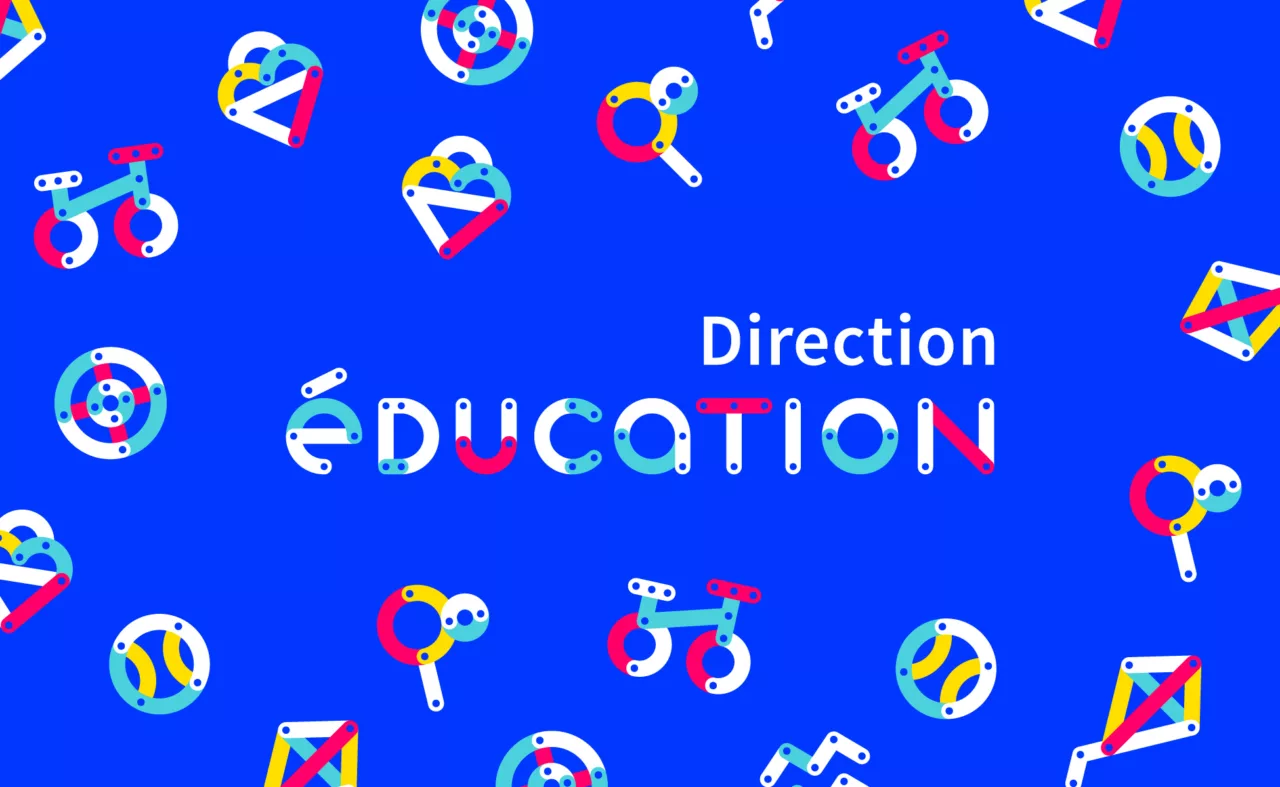
ENSTA, National School of Advanced Technologies
How do you reinvent the brand of one of France’s oldest engineering schools (1741)?
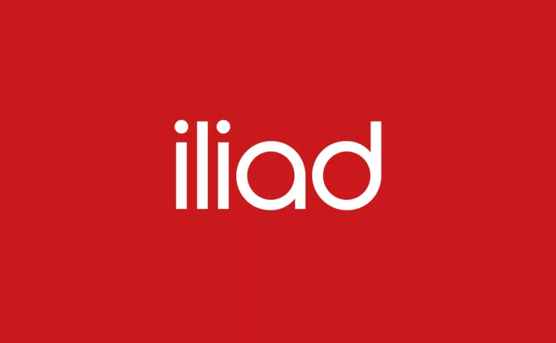
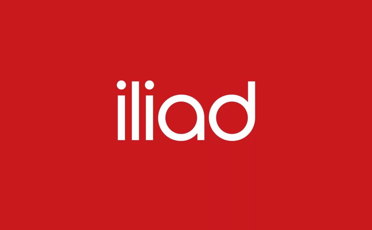
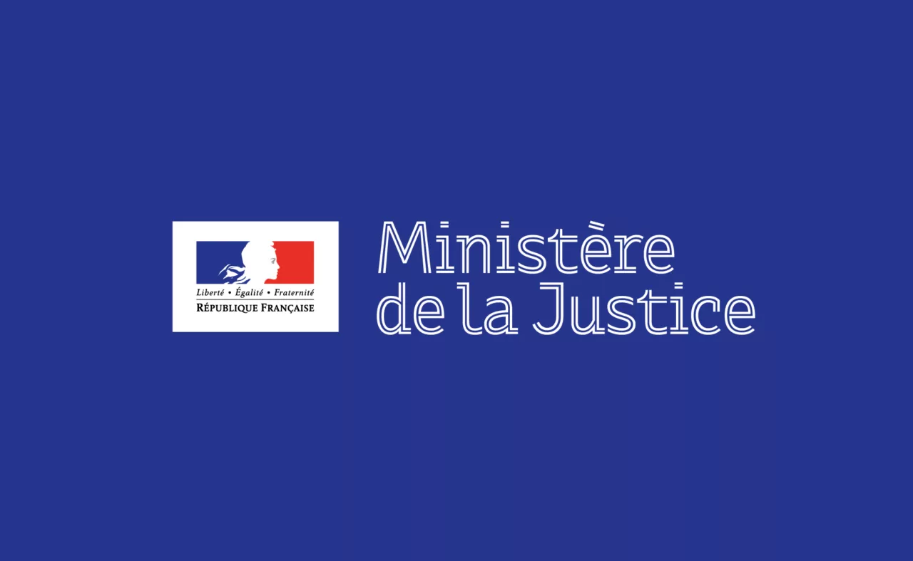
Groupe iliad – Free Telecom
Creation of the visual identity of the iliad Group, parent company of Free Telecom and major player in telecommunications. A corporate graphic charter inspired by the motto "Liberty, Truth, Simplicity".

How to choose the right typography for your brand.
Several criteria come into play:
- Align the typeface with the brand’s values and personality; a bold brand will not speak in the same typographic weight as a century-old institution.
- Define the target audiences; younger, digital-native readers do not expect the same visual language as cultivated print-oriented audiences.
- Clarify the intended uses; digital media such as websites and applications impose different constraints from printed materials.
- Prioritize readability; no elegance justifies an illegible typeface.
It is essential to test different fonts and sizes to ensure readability across all media, including for people with visual impairments. The combination of several typefaces must also be carefully considered; a clear typographic hierarchy is what guides the reader through the content. Using contrasting fonts between headings and body text improves readability and facilitates understanding of the message.
Some references
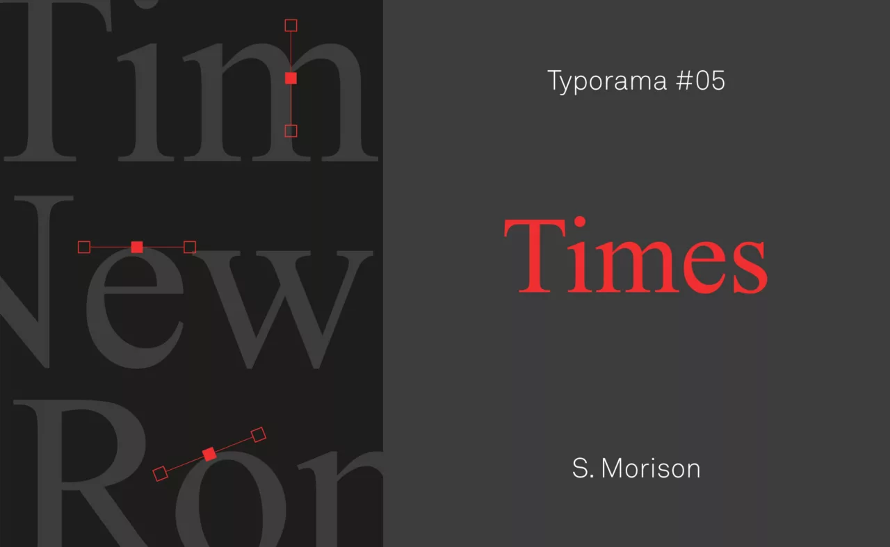
Typography
The major typographic families.
1. Serif typefaces: Recognizable by the small extensions, or serifs, at the ends of their strokes, serif typefaces carry within them the entire history of printing. Descended from Roman inscriptions and later from the humanist typefaces of the Renaissance, they are often perceived as traditional, serious, and authoritative. This is why they are commonly found in established brands, financial institutions, luxury sectors, and academia. They are also highly valued for printed text, as their serifs help guide the eye along lines and improve readability on paper.
2. Sans-serif typefaces: Emerging in the nineteenth century and popularized by the modernist movement; Bauhaus and Swiss design in particular; sans-serif typefaces freed themselves from serifs to offer a cleaner and more direct appearance. Their clarity on screens has made them essential in digital design. Brands such as Google and Facebook have made sans-serif typography a central part of their identity, aligned with a contemporary and accessible positioning. They are especially suited to startups and innovative companies seeking to project a dynamic and forward-thinking image.
3. Script typefaces: Imitating handwriting, script typefaces bring a singular personality and a sense of elegance or intimacy; depending on whether they evoke refined calligraphy or everyday cursive writing. They are often chosen by brands wishing to express a handcrafted, festive, or personal dimension. However, they must be handled carefully; the complexity of their forms can reduce readability, and they need to be combined thoughtfully with other fonts in order to preserve visual hierarchy.
4. Display typefaces: Designed for headlines and large-scale applications, display typefaces offer immense formal freedom. Bold, expressive, and sometimes extravagant, they turn every word into a sign in itself. Brands such as Coca-Cola and MTV have made them central elements of their visual identity. Yet their strength is also their limitation; when used without discernment, they can compromise the coherence and readability of an entire visual system.
5. Monospace typefaces: In a monospace typeface, every character occupies the same width; a legacy of typewriters and early computer terminals. This highly calibrated appearance is often associated with the worlds of technology, coding, and web development. When used effectively, these fonts can anchor a brand in a geek or cryptographic aesthetic; they are less suited, however, to brands seeking to express warmth or human proximity.
We talk about typography in the magazine.


How to create a typographic guidelines system.
A typographic guidelines system consists of defining a set of rules and principles governing the use of typography within a brand. It always begins with the selection of a few primary typefaces; generally one typeface for headlines, another for body text, and sometimes a third for highlighted elements such as signatures, quotations, or taglines.
The guidelines then define sizes, weights, line spacing, letter spacing, and specific uses according to context; web, print, signage, packaging. When well designed, they ensure that all brand communications remain consistent, reinforcing recognition and trust among audiences.
Some common pitfalls to avoid:
- Multiplying typefaces without logic; two or three carefully chosen fonts are better than a mosaic without hierarchy.
- Prioritizing aesthetics over readability; the beauty of a page begins with its readability.
- Failing to test typography across different media; a font may perform beautifully on screen and fail in print, or the reverse.
- Forgetting to gather user feedback; after all, they are the ones doing the reading.
Graphéine’s expertise
Brand Diagnosis
Brand audit
Competitive analysis
Benchmark
Reputation
Opportunities
Brand Strategy
Brand strategy
Communication strategy
Marketing strategy
Positioning
Brand platform
Naming
Brand Design
Logotype
Visual identity
Rebranding
Brand book
Style guide
Editorial guidelines
Typography
Brand activation
Print & Digital
Social media
Motion design
Signage
Events
In conclusion
At Graphéine, we believe that every detail matters in building a strong brand, and that typography is one of its most structuring pillars. Far from being a secondary choice, it shapes the visual voice of a brand; when thoughtfully designed, it creates recognition, engagement, and trust. Want to assert your voice with impact? It almost always begins with choosing the right typography.
Tell us about your project in a few lines and we will get back to you within 48 hours for an initial conversation. In Paris, Lyon, or remotely, whichever suits you best.