fr
fr

Pornichet, branding the destination

Slow living since 1900

Pornichet, a small village on the Loire-Atlantique coast that once thrived on fishing, salt production and agriculture, has gradually transformed into a true seaside resort, sought after by a discerning clientele in search of serenity and seaside leisure activities. Home to both the ocean and a thriving cultural calendar, Pornichet has forged an identity characterised by a gentle way of life.

Faced with fierce competition in the tourism sector, the town of Pornichet, situated between Saint-Nazaire and La Baule-Escoublac, needed to stand out and assert its unique qualities. We were therefore commissioned to rethink the destination’s identity, by highlighting Pornichet’s historical heritage and reviving an untapped sense of imagination.

Destination logo
From dawn to dusk

The name Pornichet means ‘nestled little port’. This name has long posed a problem due to its similarity to the neighbouring town’s name, ‘Pornic’. It is a long name that has never been perceived as ‘grand’ or ‘prestigious’ throughout its history.

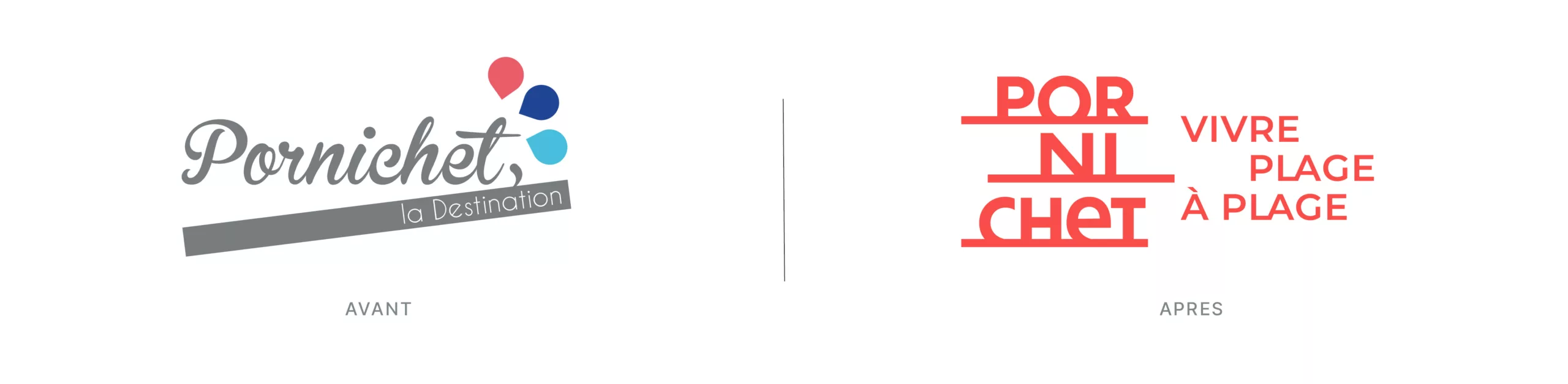
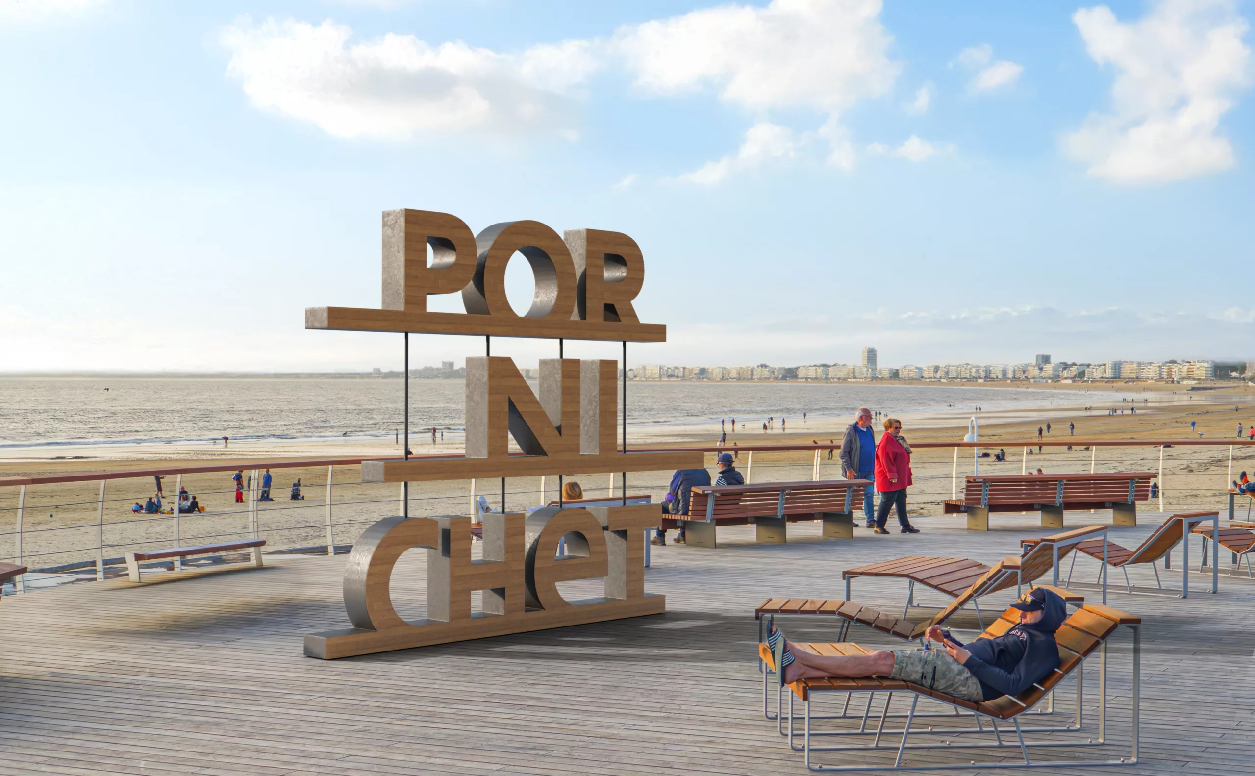
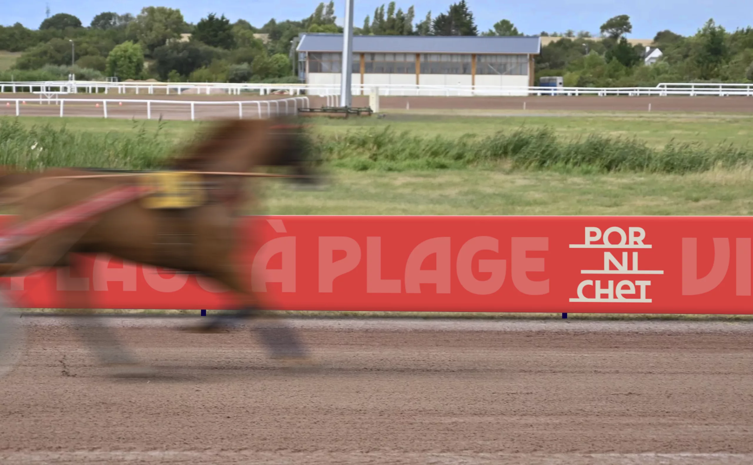
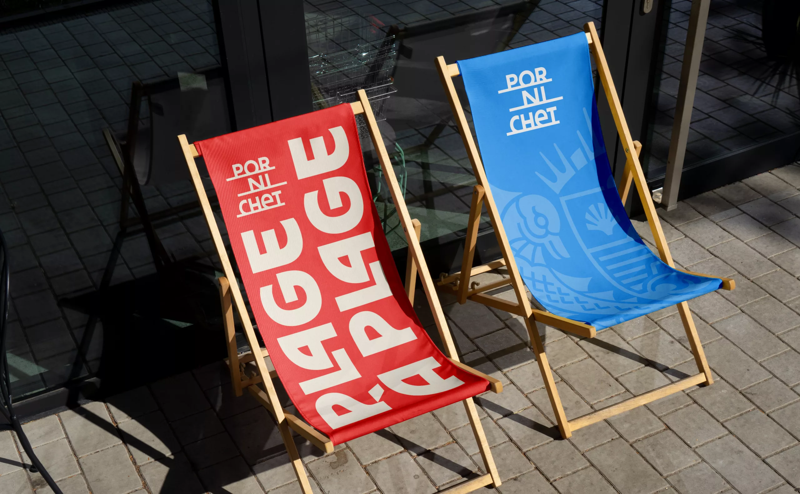
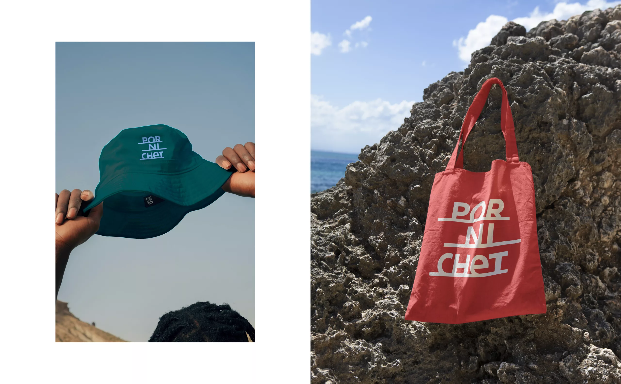
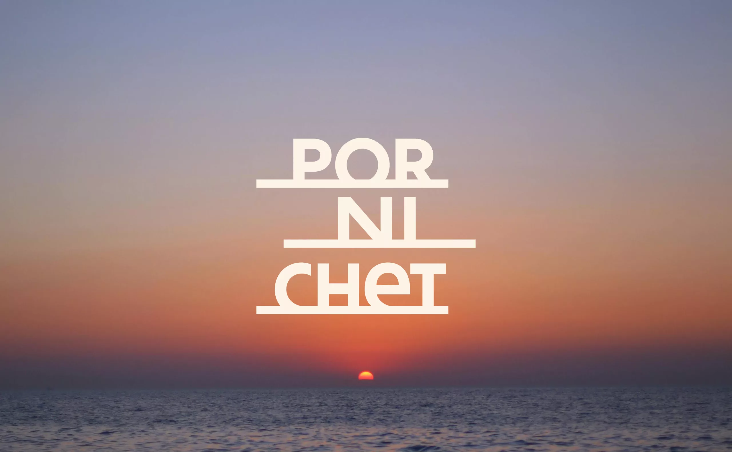
Custom-designed, the Pornichet logo breaks the name down into three distinct lines and three syllables, stacked and underlined by a single stroke. It also evokes the three times of day: dawn, midday and dusk, and directly embodies the destination’s ‘slow life’ ethos. This typographic composition is then used to depict the reality of the area through three abstract horizons that make up the backdrop of Pornichet.

“Por” evokes the sun setting over the bay with the central “O”, as well as the Pierre-Percée suggested by the shape of the “R”.
“Ni” refers to the marina facing the town, where the shape of the “N” forms a sail.
“Chet” illustrates the racecourse with its “H” shape, accompanied by the Belle Époque villas lining the coast.

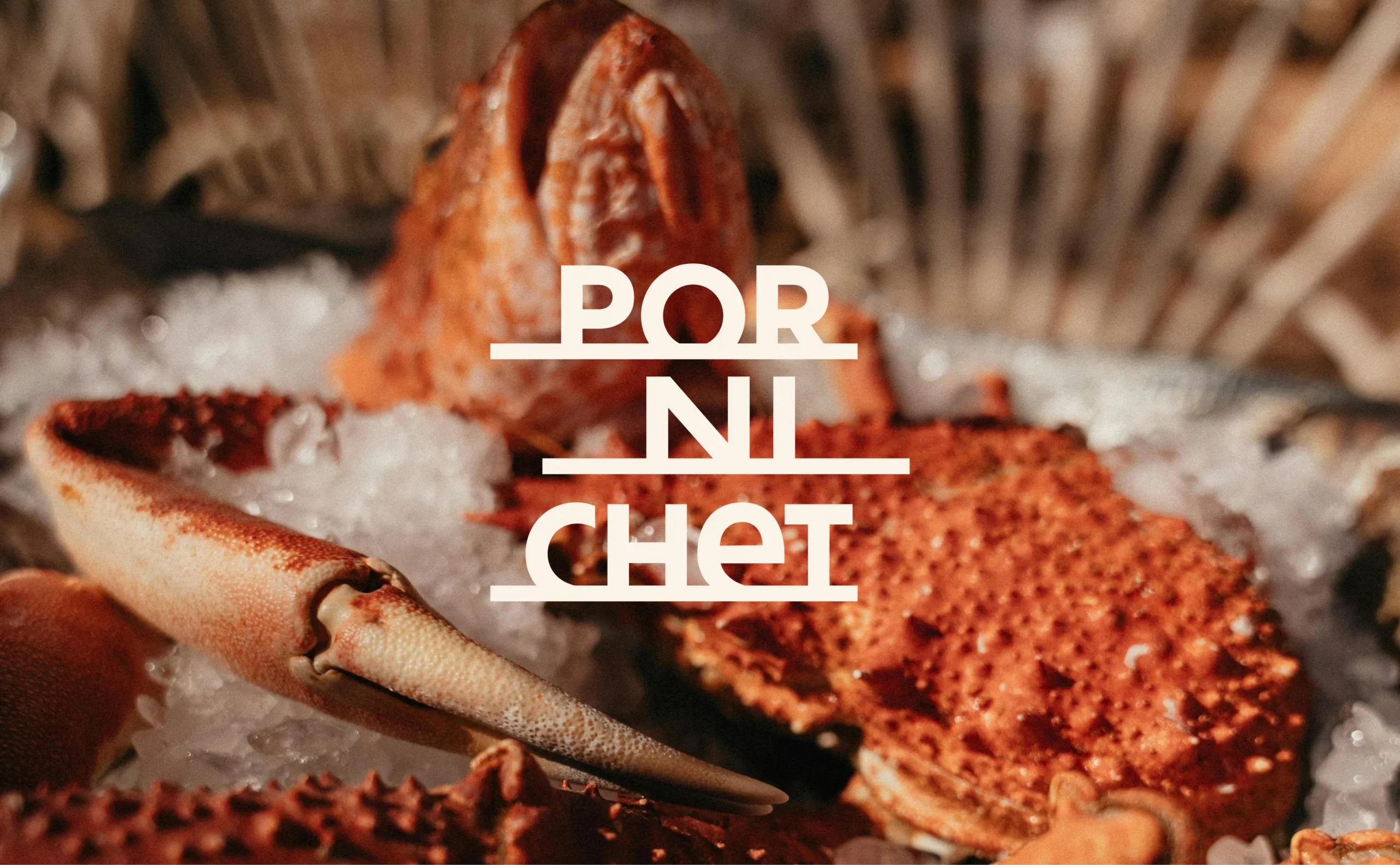
This landscape, revealed by the logo, is presented in a short film. The soundtrack of a peaceful seaside scene paints a mental picture of the destination.

Heraldic coat of arms
Symbols of pride

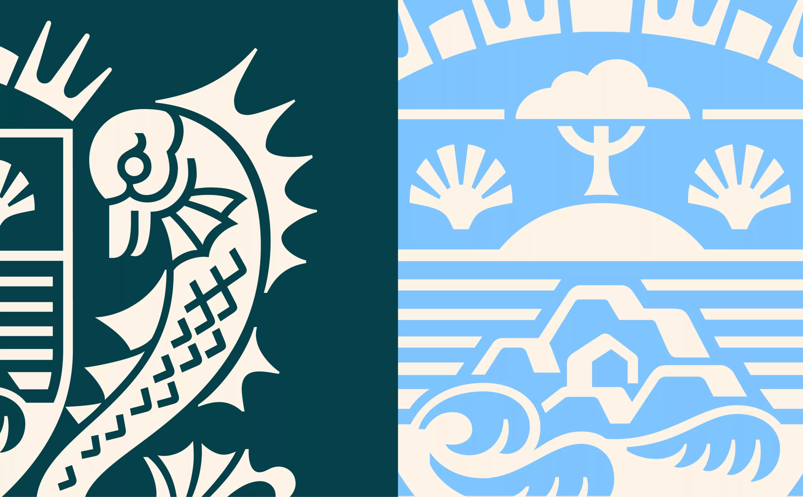
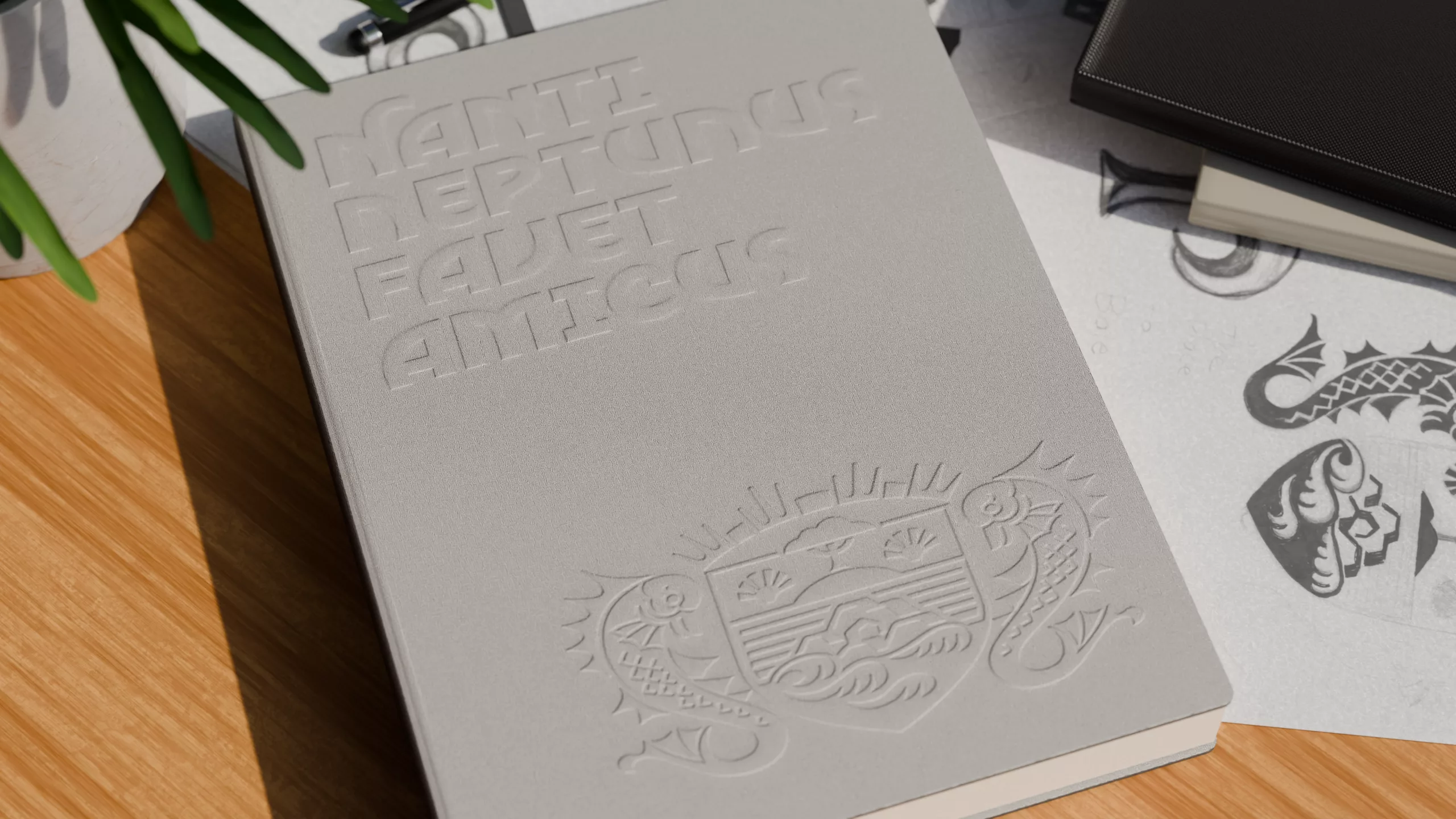
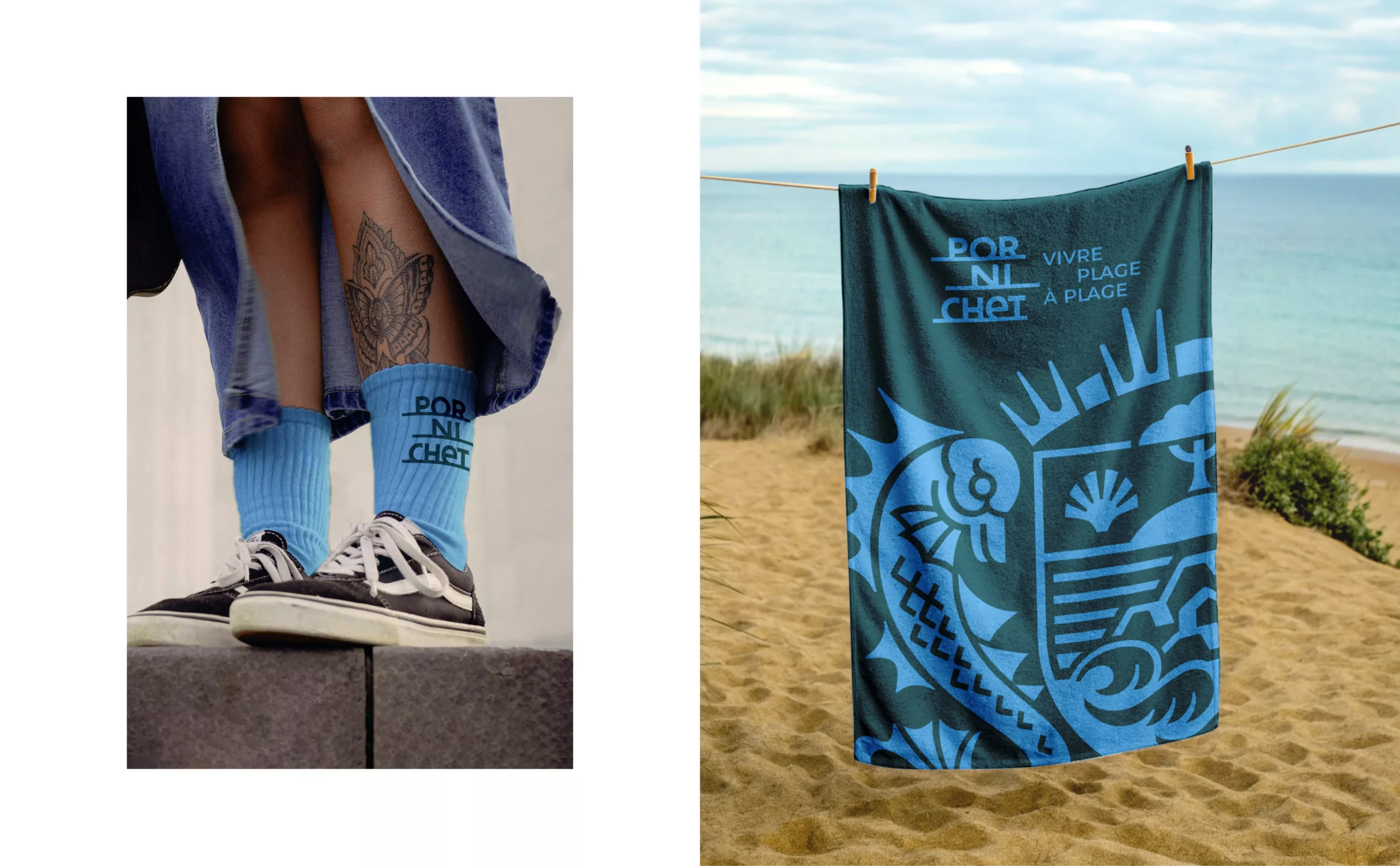
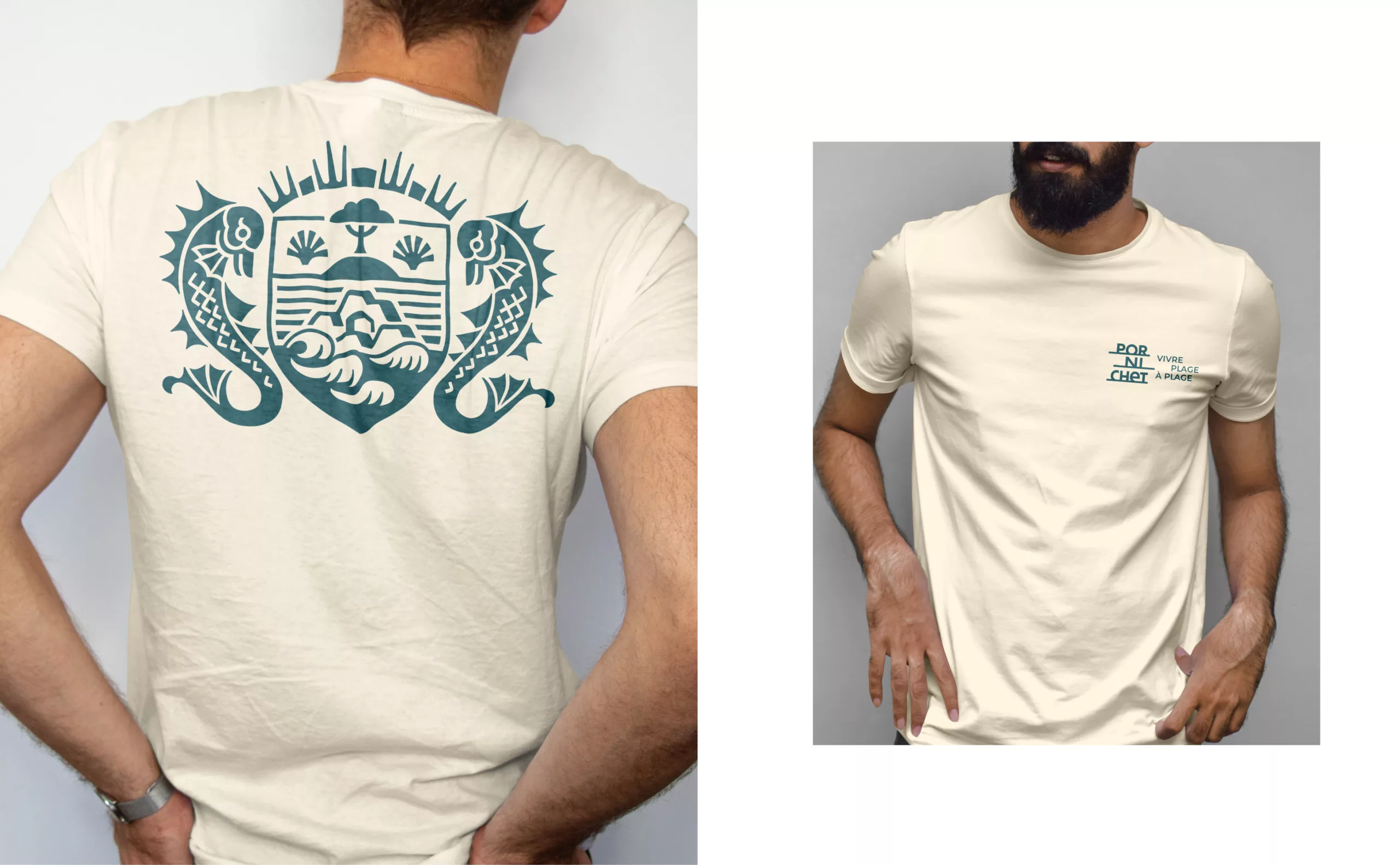
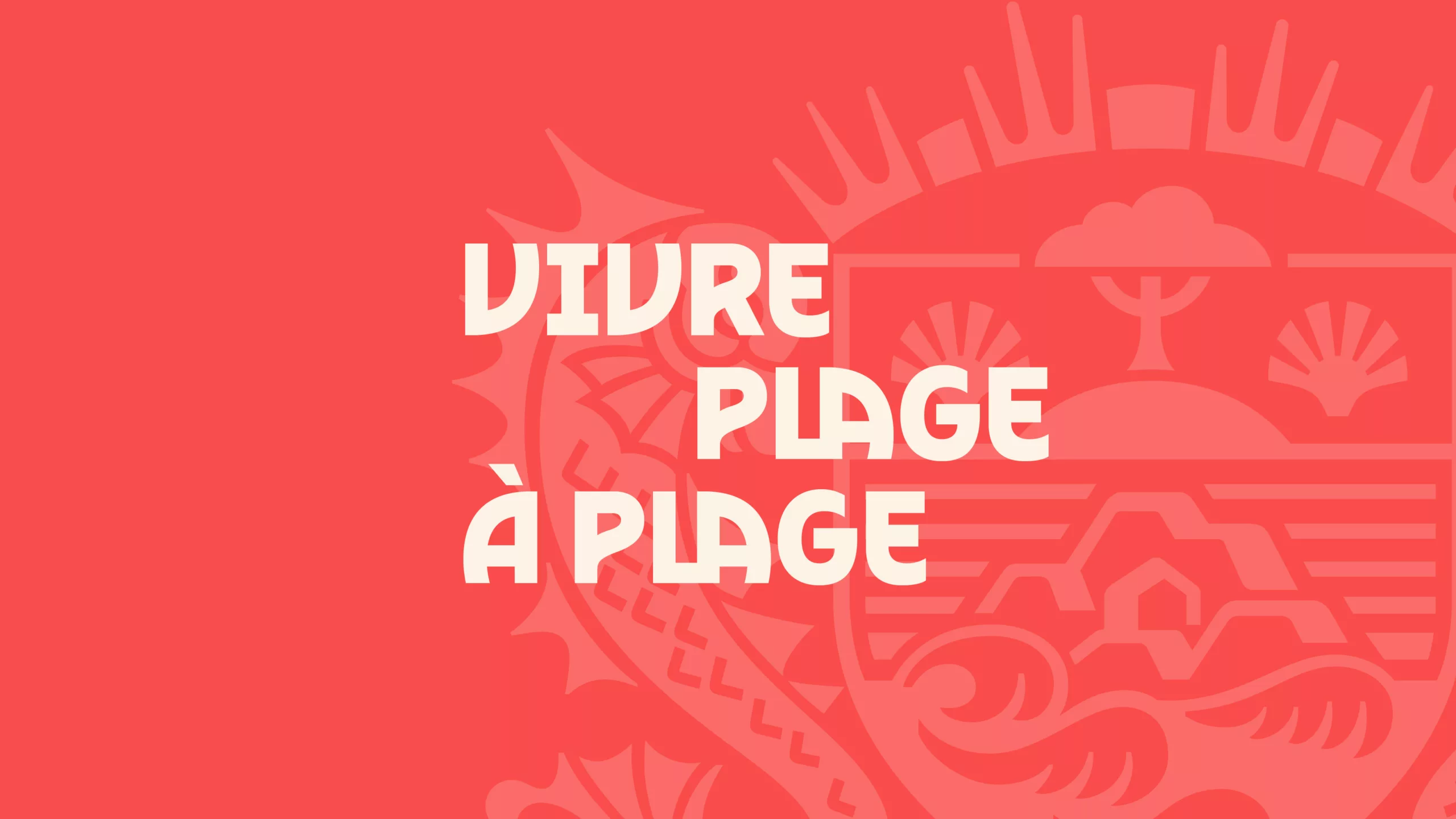
In 1912, Pornichet adopted a coat of arms designed to appeal to holidaymakers and to boost the town’s reputation and development. The modernised design incorporates the area’s iconic symbols: the dolphin, the Pierre-Percée rock, the maritime pine, and the weather vanes…

Its new design fully reveals the coat of arms’ symbolism and improves its legibility, making it a key visual element at the heart of the brand identity. It serves as an illustrative motif applied across everything from signage to merchandise.

Typographic design
The Pornichétine

Pornichet is a town built by people who shared a passion for writing and literature.

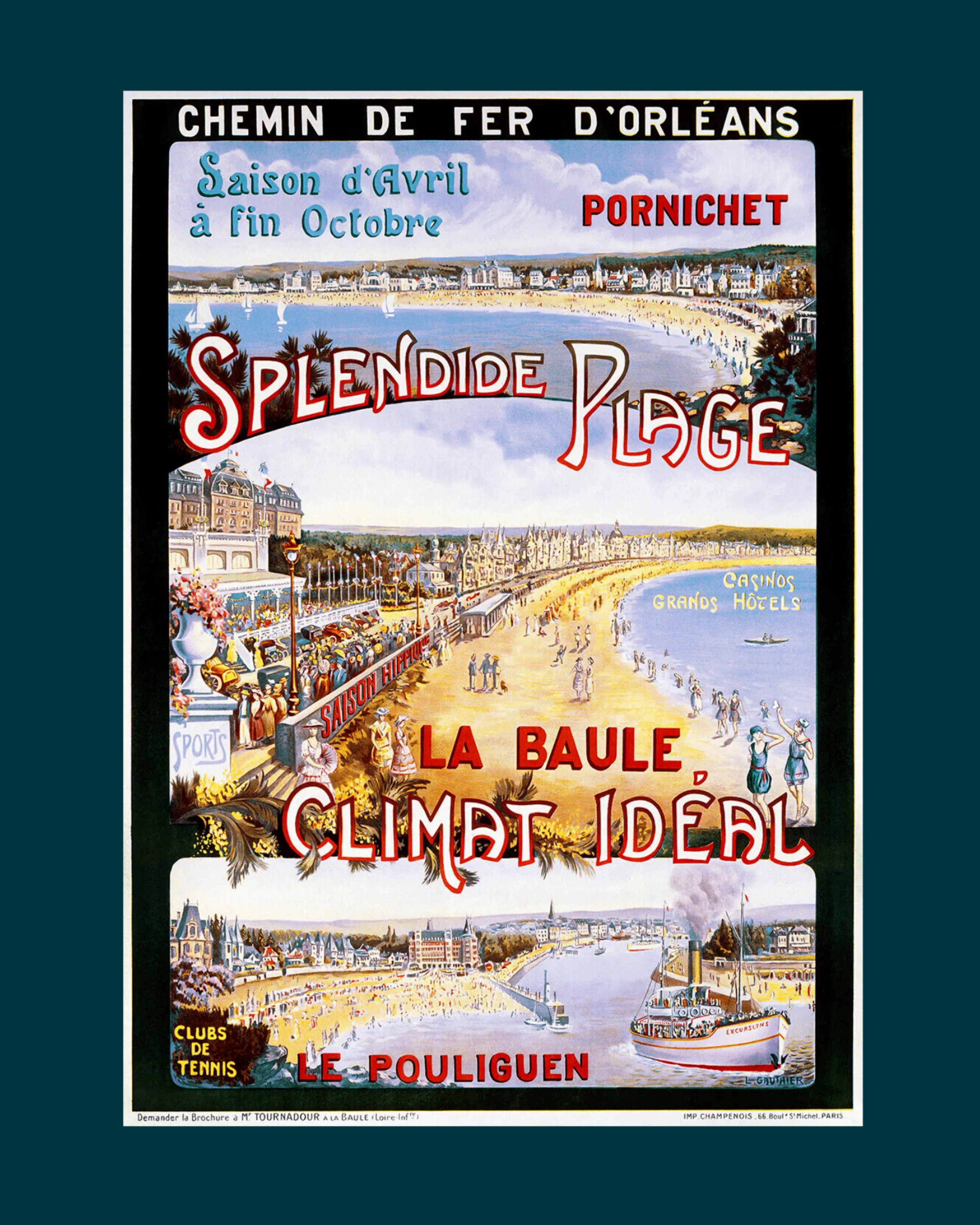
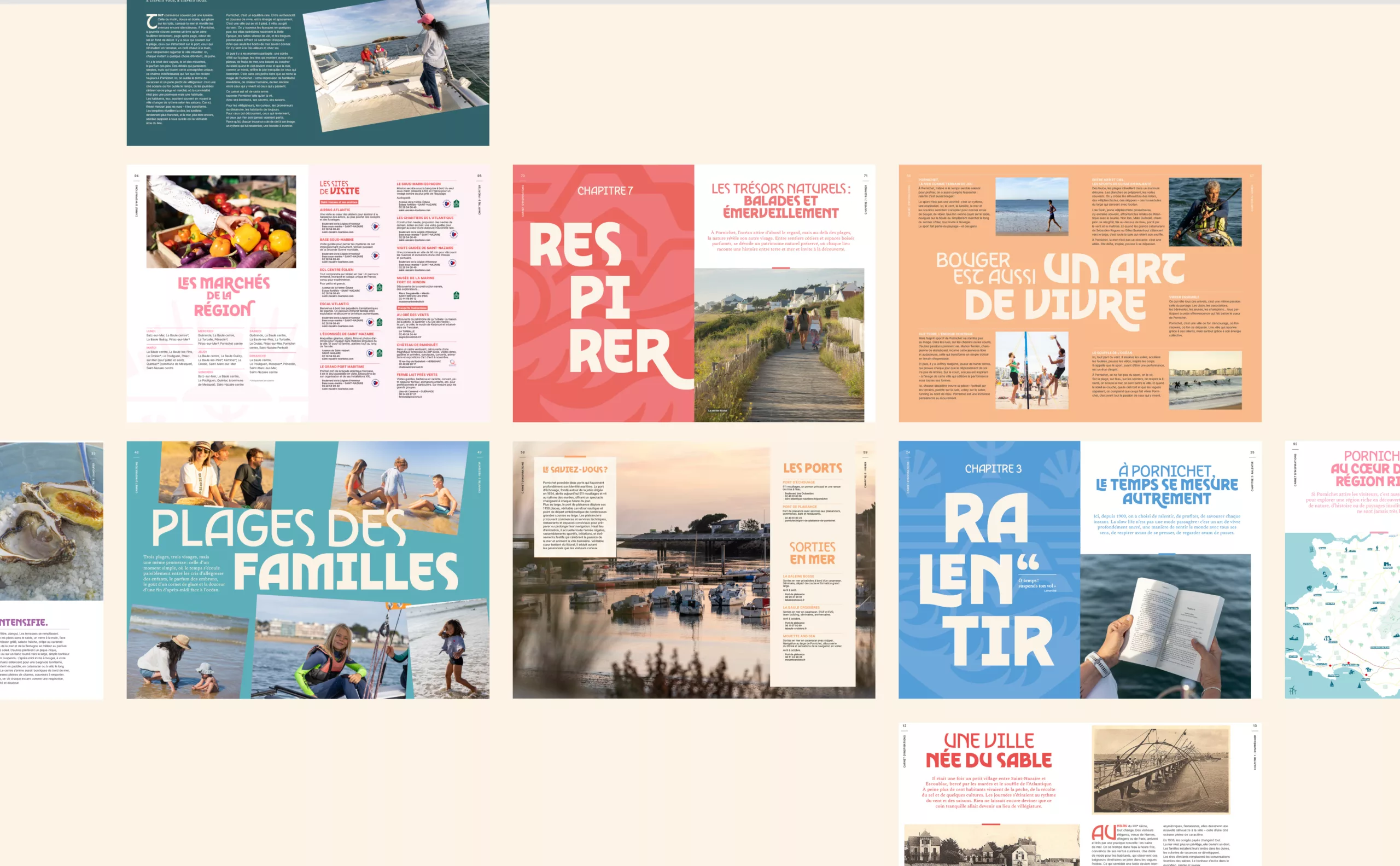
We are celebrating this literary heritage with the creation of a bespoke typeface that draws its inspiration from the Art Nouveau and Belle Époque styles found on vintage tourism posters and the façades of the town’s iconic buildings.

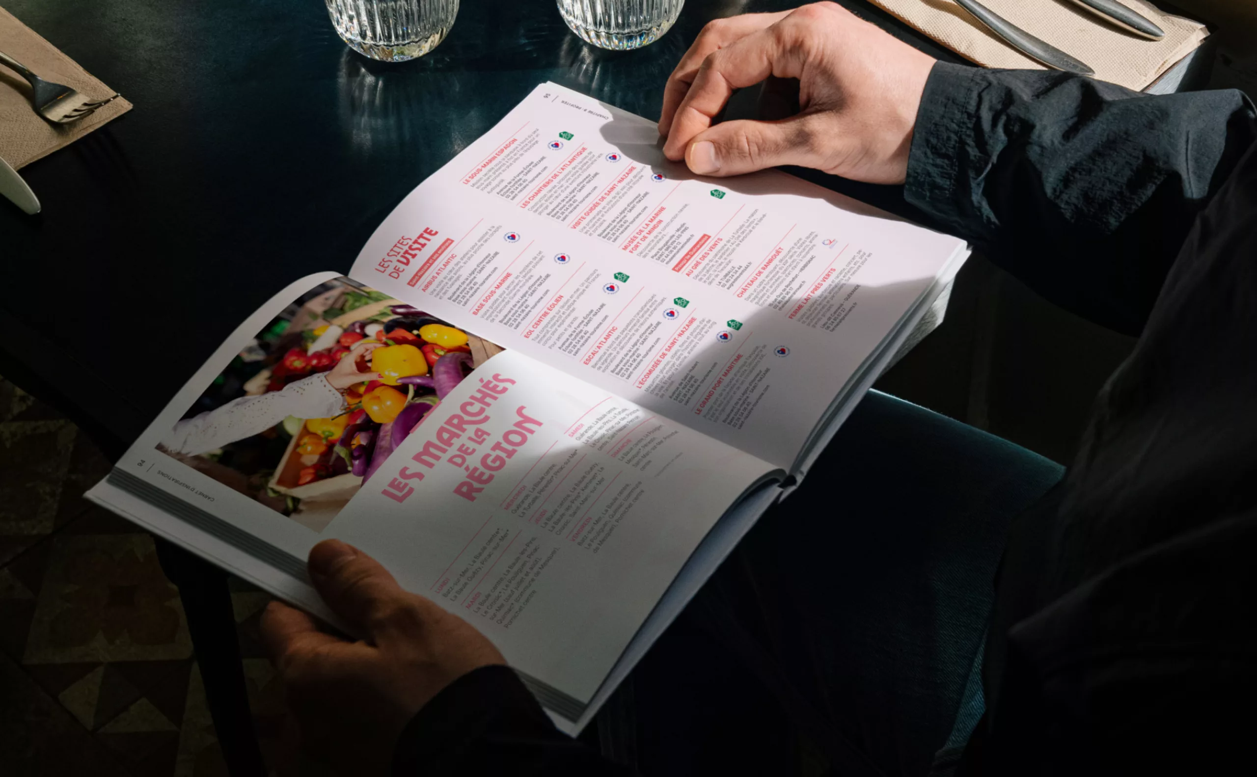
The ‘Pornichétine’ typeface features curved forms that evoke nature, the wind and the waves; the flight of seagulls and the sails in the marina. The lettering is intended to be expressive and exuberant. Theatrical in nature, it evokes the figure of Sarah Bernhardt and the Orientalist style of Mucha’s posters.

Storytelling & brand identity
Where life coasts along

The destination’s DNA revolves around the Slow Life ethos and the values of simplicity and conviviality. In Pornichet, people savour the moment, from sunrise to sunset. It is through this quality of life and the town’s literary heritage that Pornichet truly stands out.

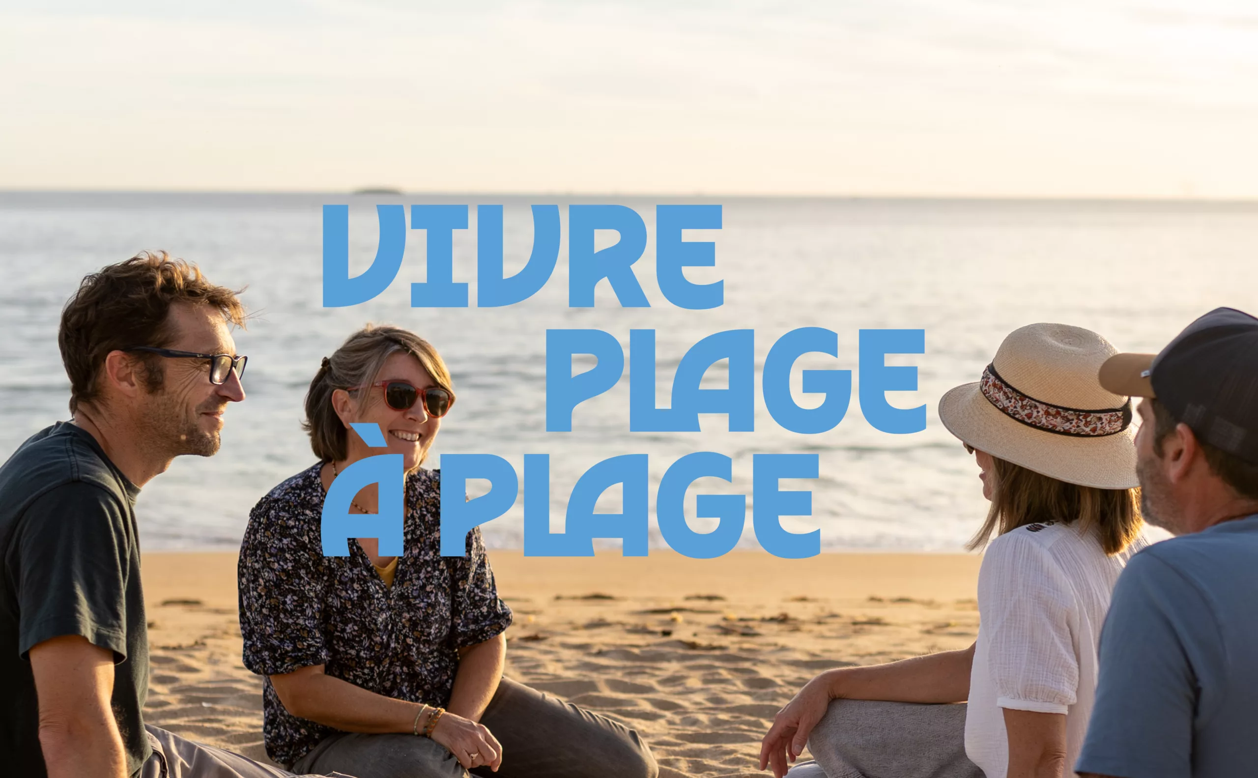
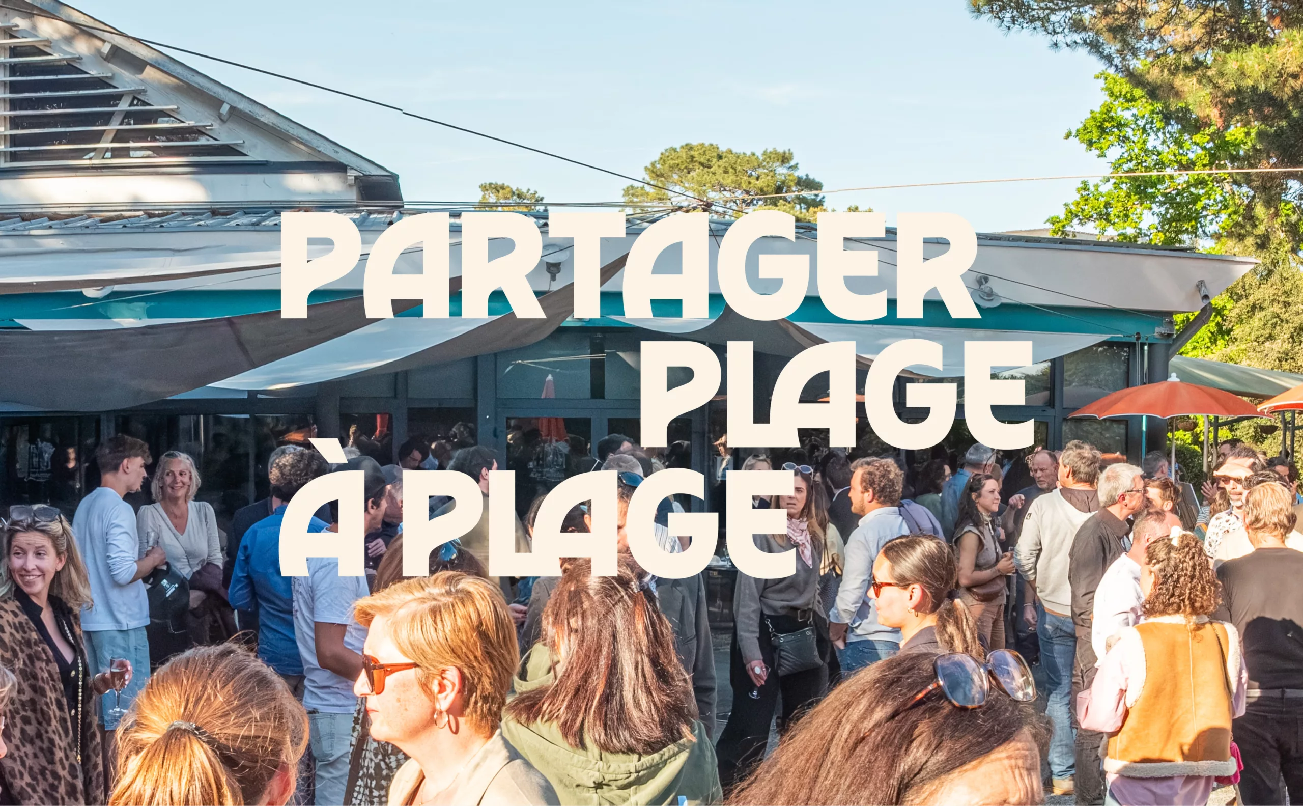
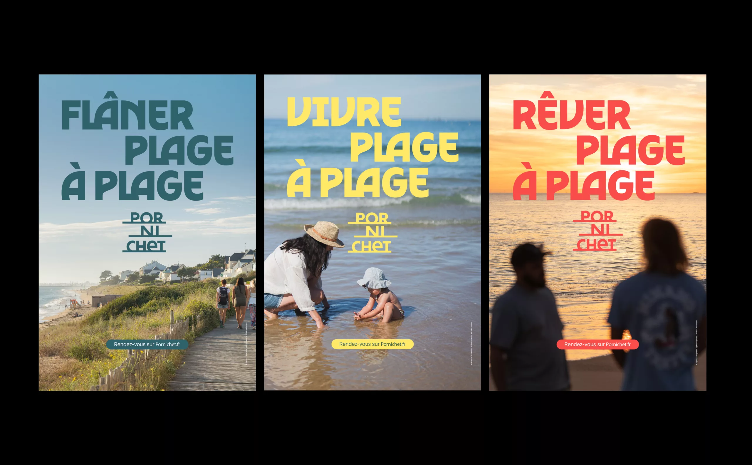
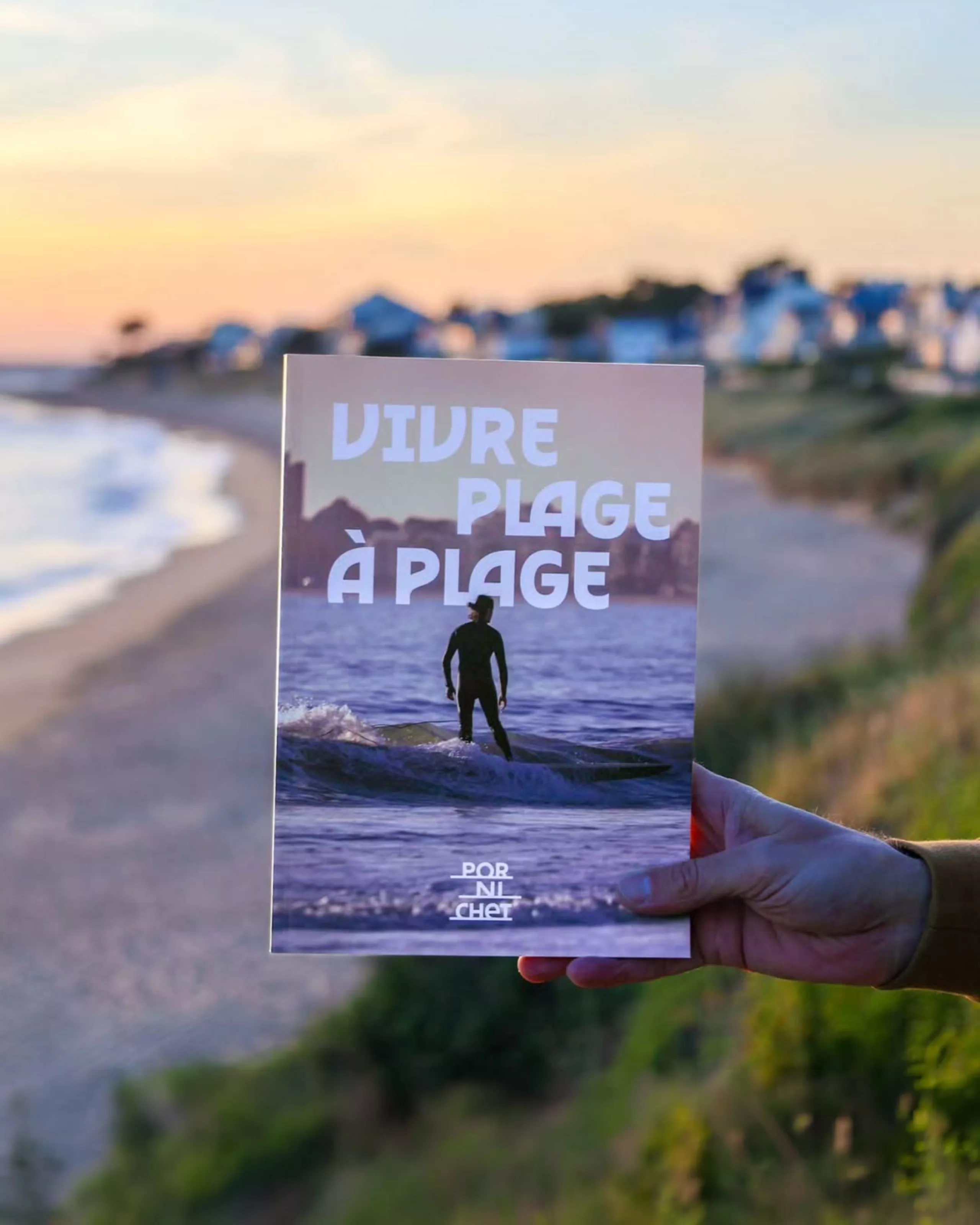
The destination’s brand signature, ‘Vivre plage à plage’, extends this mindset. Through clever wordplay, in french, the slogan simultaneously means ‘living from beach to beach’ while also sounding like the expression ‘living page by page’. This subtle pun connects Pornichet’s seaside living to its literary past; a nod to the historical link between Pornichet and the publishing house Flammarion. By combining these two, the slogan is an ode to taking one’s time.

We also translated the slogan into two languages – English and German, so as to convey the same wordplay between seaside life and slow living to the two major tourist groups visiting Pornichet every year. The English version being ‘Where life coasts along’ and the German version being ‘Meer Zeit zum Leben’.

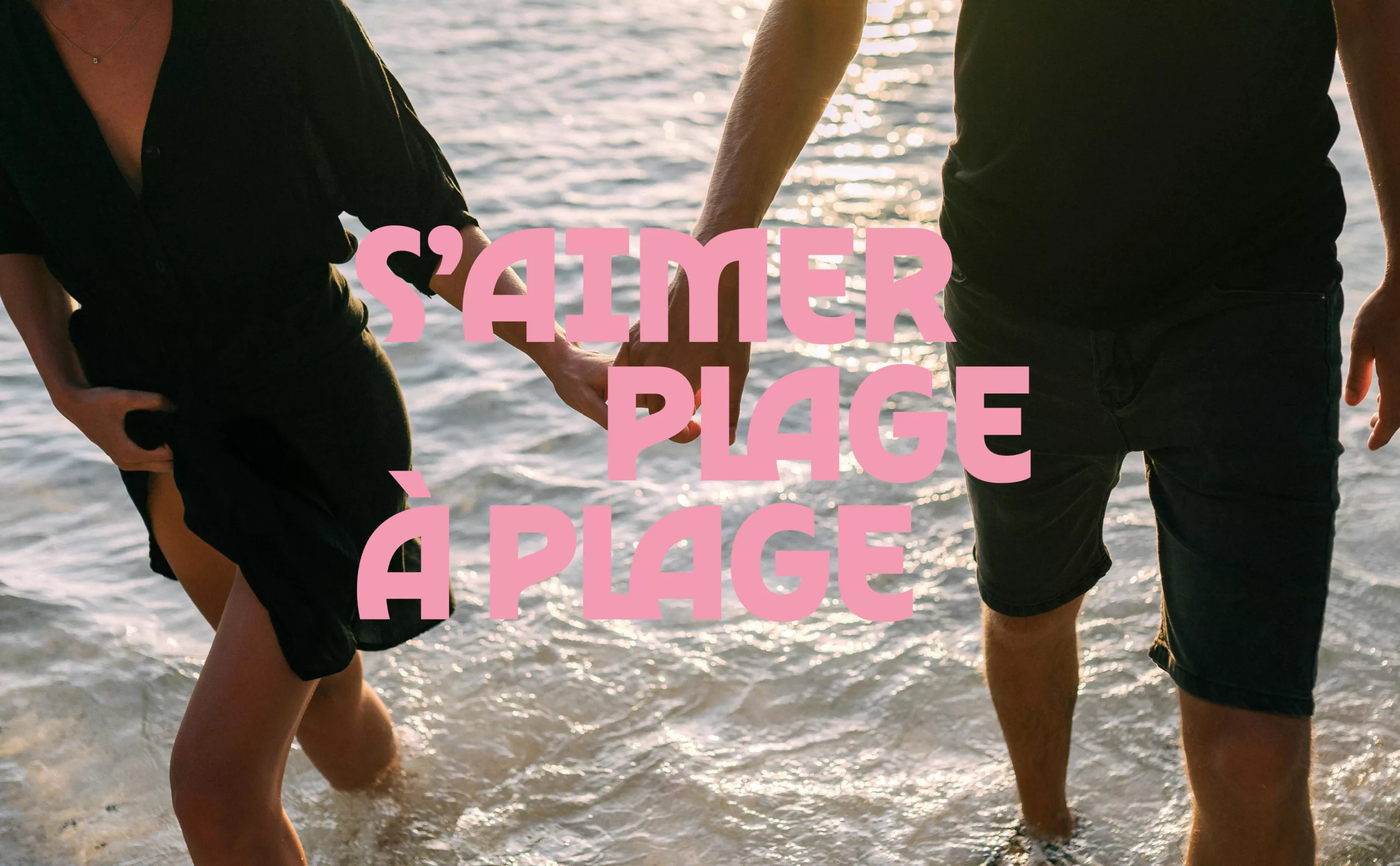
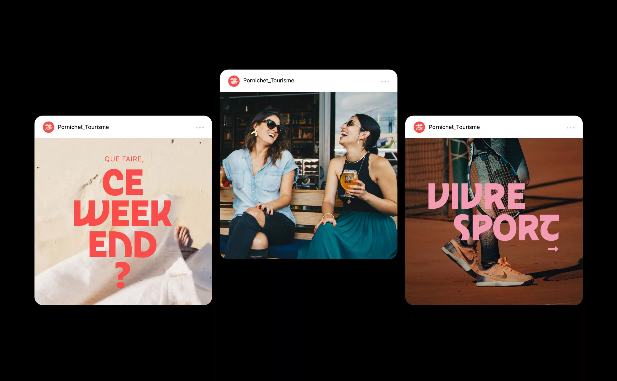
In the Brand Voice guidelines, this slogan can be readapted to convey all of Pornichet’s attractions: s’aimer plage à plage (loving beach by beach), se retrouver plage à plage (meeting beach by beach), voguer plage à plage (navigating beach by beach) etc. The verbal identity extends the destination’s DNA. The messaging highlights the quality of the environment, the lifestyle, and time passing peacefully.

Launch campaign
Pornichet: for locals and holidaymakers

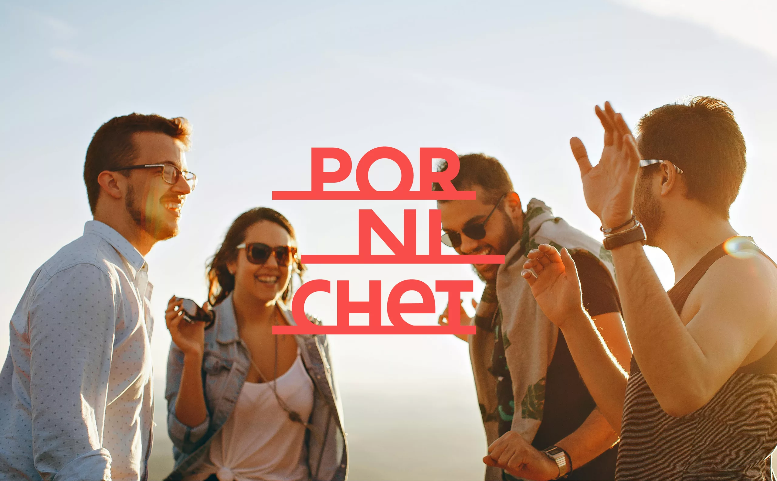
The launch campaign for this new destination brand celebrates the spirit of Slow Life and the highlights of a day in Pornichet.

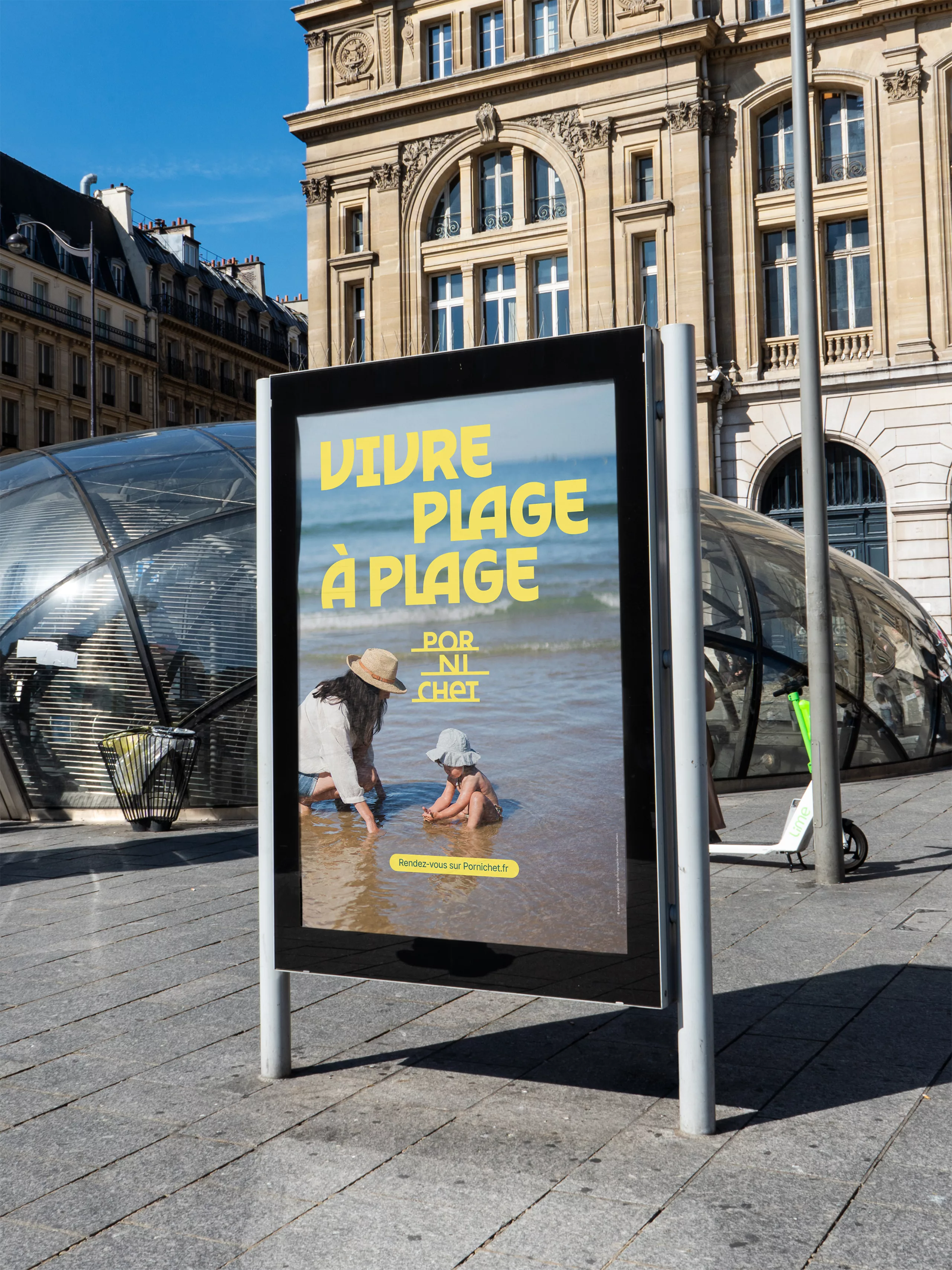
The campaign is brought to life in a video clip narrating the history of Pornichet, shown at Nantes station. It is complemented by a three-part poster campaign displayed in the cities of Nantes, Angers and Saint-Nazaire. The design draws on the key elements that define the area’s history and character, reflected in the new visual identity.

By adopting a new destination identity, Pornichet showcases its strengths. Its heritage finally has a voice, paying tribute to the founders of a region that is inhabited all year round with a ‘slow life’ mindset. Dedicated to its residents and holidaymakers, the town’s story unfolds through a landscape logo, a distinctive coat of arms and an expressive graphic identity.