fr
fr

ENSTA, National School of Advanced Technologies

The school of great advances

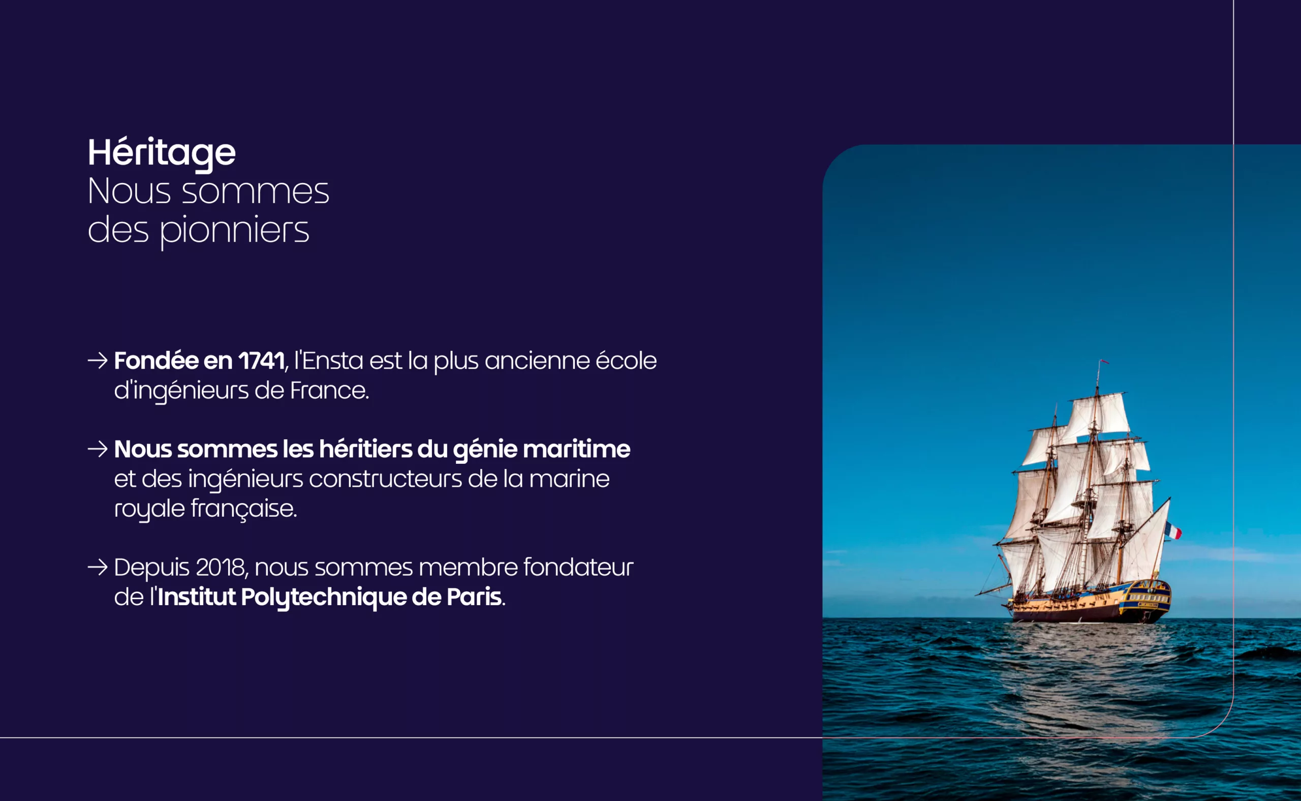
ENSTA, the École Nationale des Techniques Avancées, is the direct heir to France’s oldest engineering school: the Royal Naval Engineers School, founded in 1741 under Louis XV to provide the Royal Navy with a corps of engineers capable of designing its ships. Nearly three centuries later, this founding maritime genius still permeates the school’s identity.

In 2025, ENSTA Paris and ENSTA Bretagne merged to form a single engineering school: one ENSTA across two campuses, in Palaiseau and Brest. The school is a founding member of Institut Polytechnique de Paris. Graphéine was commissioned to lay the foundations of this new brand: brand platform, narrative, logotype, and expression territory.

Please accept cookies to watch this content.

ENSTA, The school of great advances

Everything began with the strategic phase. We conducted workshops and interviews in Paris and Palaiseau, bringing together the communities of both schools and examining their shared DNA: heritage, character, expertise, audiences, environment, and values. From these discussions emerged a new brand platform. Their mission is to educate future generations of generalist engineers capable of designing complex industrial systems while developing innovative and responsible solutions to address the major scientific and technological challenges of our time.

From this foundation came the brand signature: The school of great advances. A statement that embodies this promise of progress at the heart of a school focused on the industry of tomorrow and aligned with the major challenges of our era.

Brand identity

The visual system stems entirely from the idea of “great advances” The word ENSTA asserts itself boldly. The letter “A” becomes the symbol of progress and advancement. A play on symmetry emerges through the design of the “S,” creating a strong identity imbued with innovation.

The brand is accompanied by a bespoke typeface; modern and elegant, both geometric and sharp-edged. More than simple styling, it is the brand’s voice, its tone, its cadence.

Another visual idea is embedded directly within the text itself. A system of directional arrows integrated into the compositions (upward, forward, toward the unknown…) punctuates the sentences and gives form to momentum. “Since 1741, we have been training bold and creative men and women, ready to explore new possibilities.” Each arrow becomes a typographic embodiment of the brand promise.

Color extends this creative direction. ENSTA Blue, a vivid, electric blue, almost reminiscent of signal blue, deliberately breaks away from the sober navy blue traditionally expected from a military-affiliated institution. Combined with a deep Midnight Blue and energized by a warm Coral, it unfolds through blue-to-coral gradients that bring brightness, sensitivity, and modernity to the brand.

The visual territory is built upon a rigorous grammar, defined by its modular grid system and rounded angles. An identity that provides the school with an entire universe of possible applications: stationery, signage, social media, publications, brochures, and beyond.

We would like to thank Ms. Élisabeth Crépon, Director of ENSTA, Julien Naillet, Director of Communications, and Ingrid Le Toutouze, Deputy Director of Communications, for their trust throughout the project. We also extend our thanks to all the workshop participants, faculty members, researchers, and students who contributed to the process.

Photography credits: ENSTA