fr
fr

CapAtlantique

La Baule-Guérande Agglomération

CapAtlantique La Baule-Guérande Agglo is an inter-municipal conurbation which includes 15 municipalities stretching from Loire-Atlantique to Morbihan. Set amongst salt pans, the coastline and unspoilt natural areas, it enjoys an attractive living environment that contributes to its appeal and vitality.

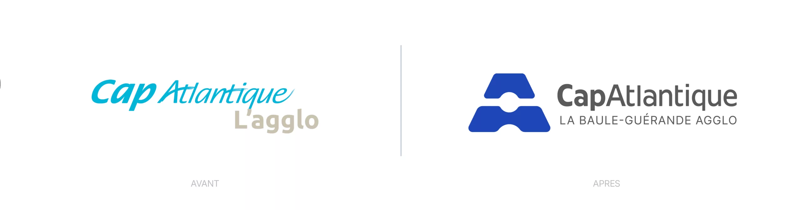
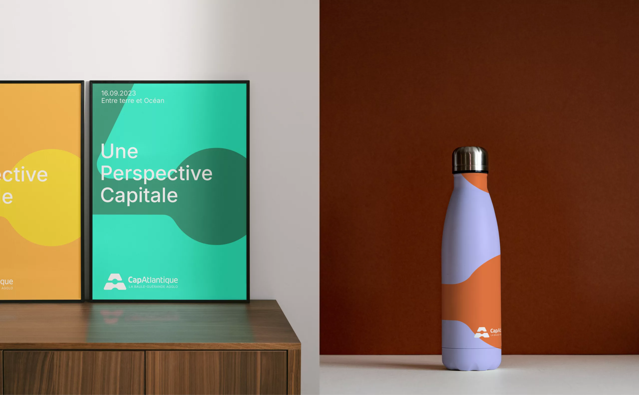
Graphéine supported CapAtlantique in modernising its visual identity and defining a new brand territory.

A symbol inspired by the salt pans

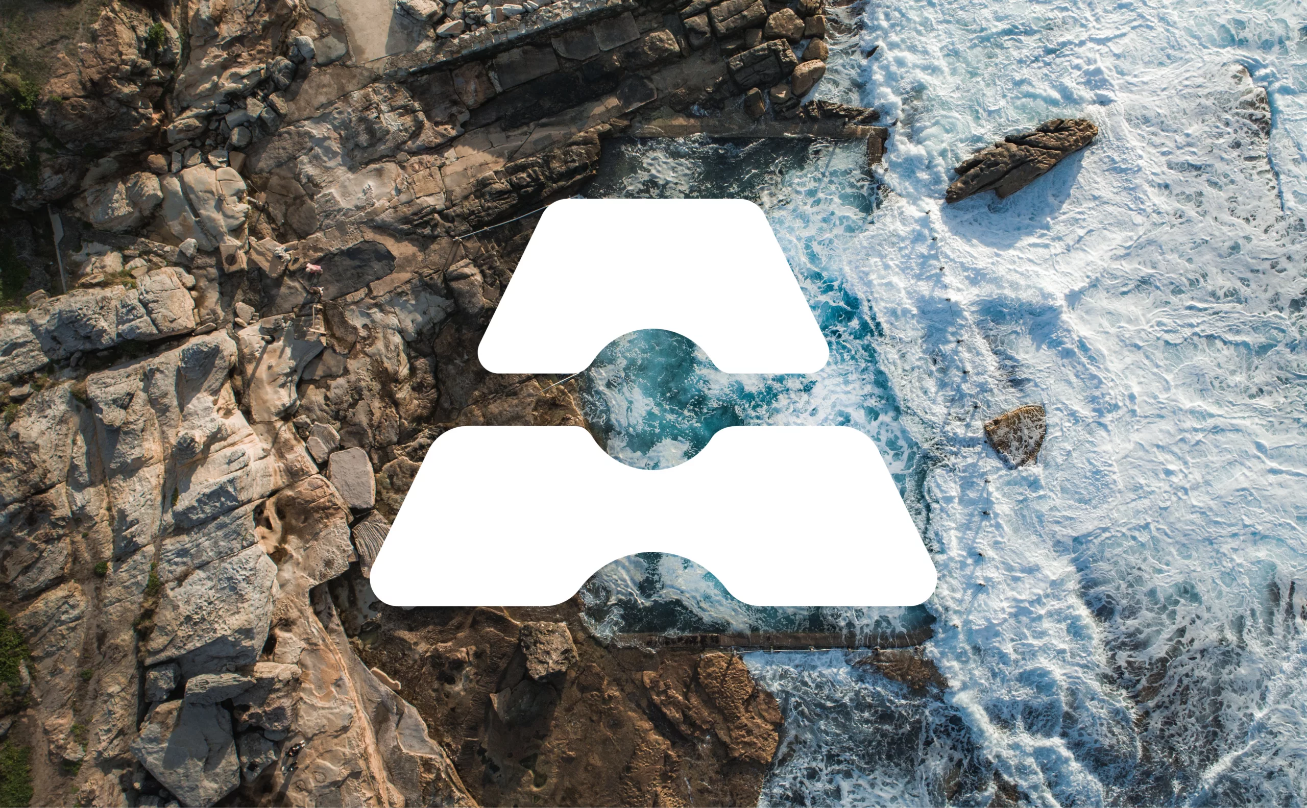
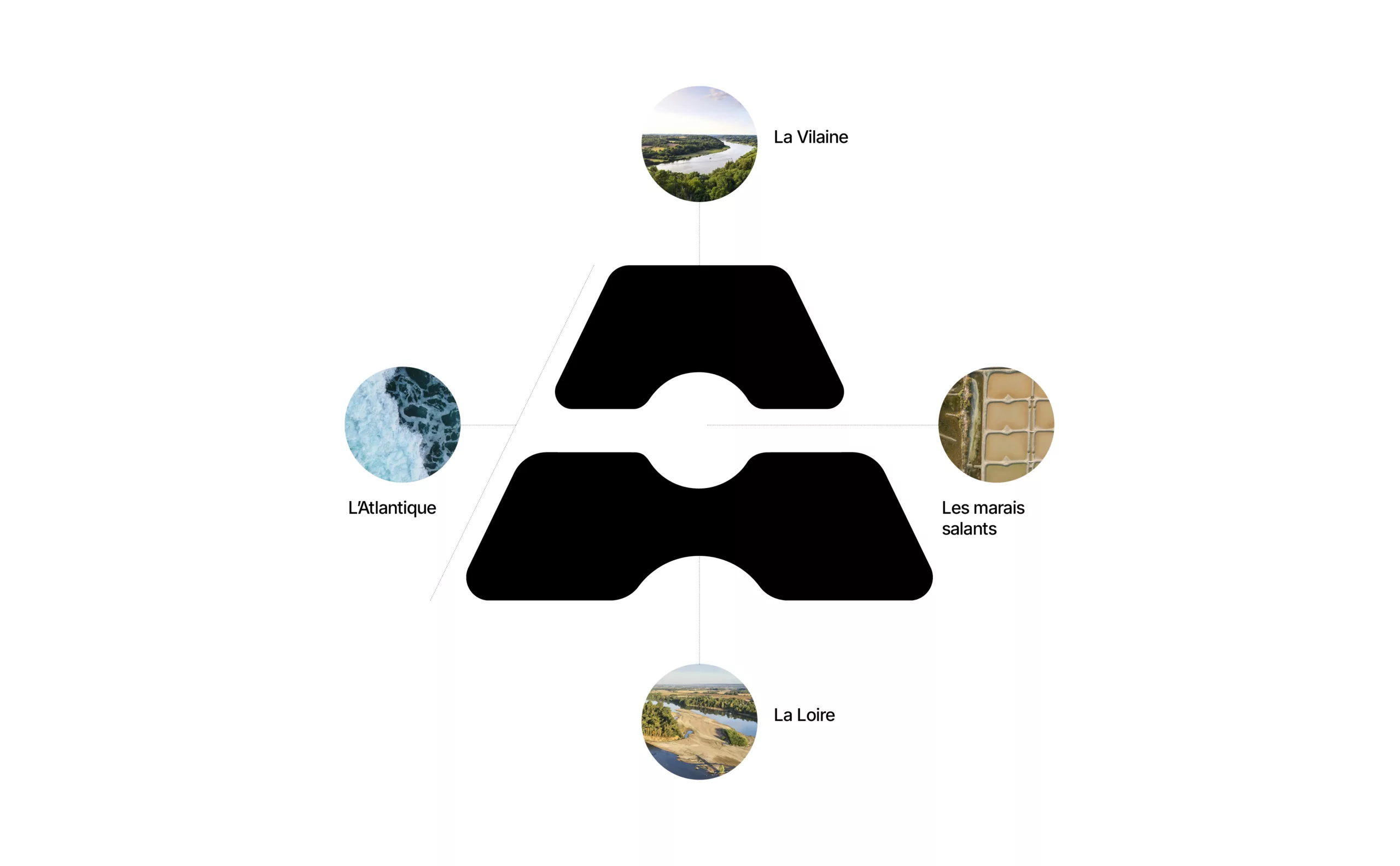
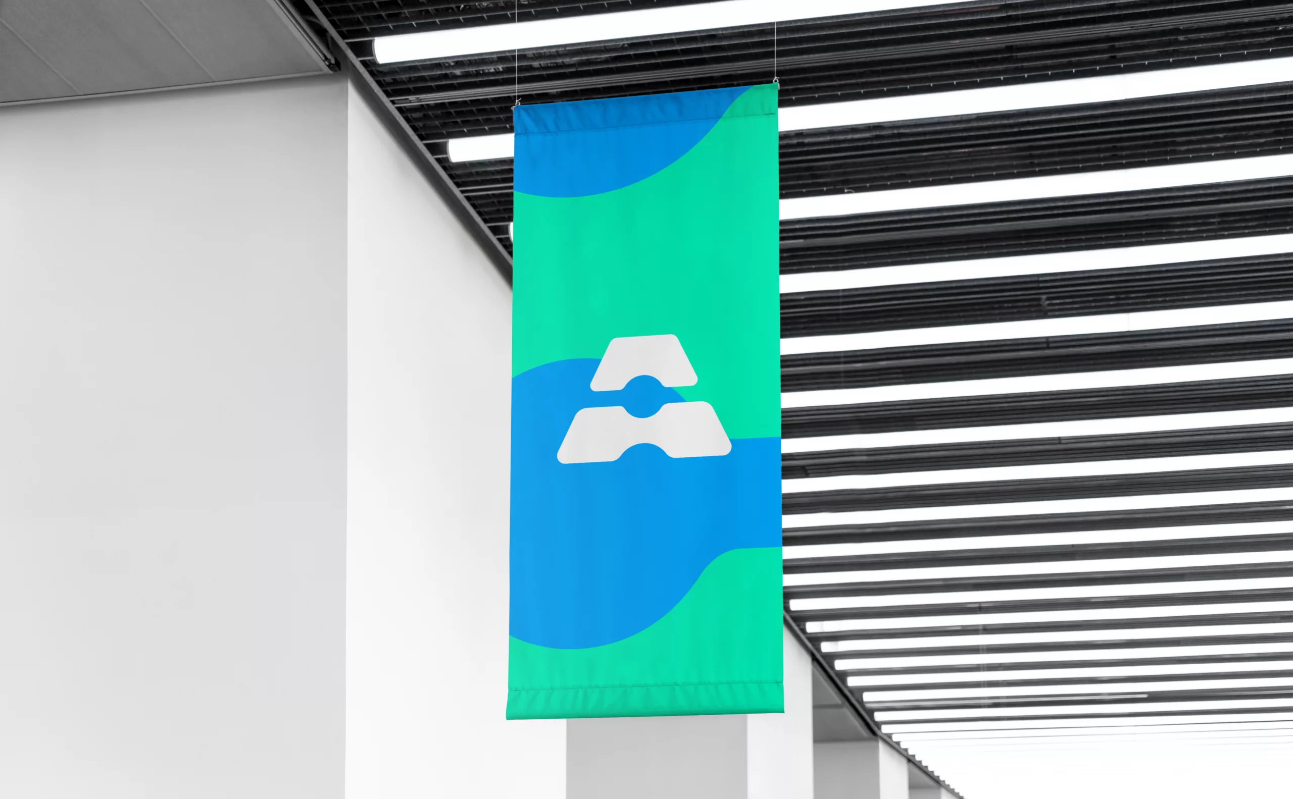
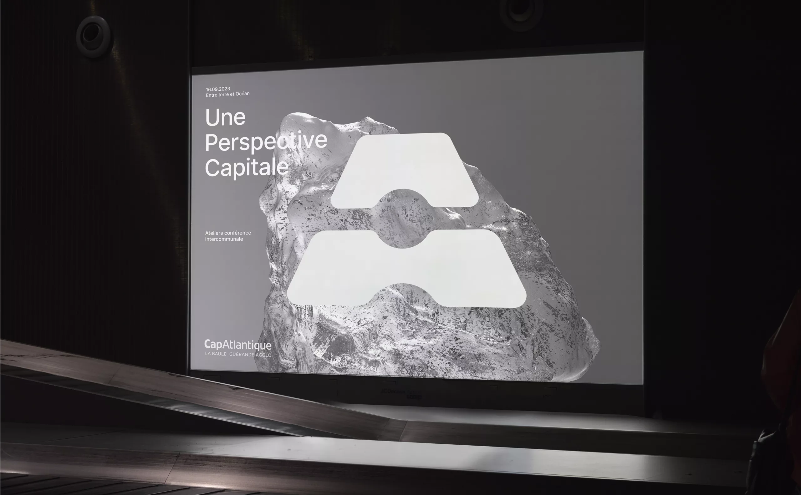
To embody the identity of CapAtlantique – La Baule-Guérande Agglo, we have designed a symbol directly inspired by the salt pans (salt pans, salt marshes and the Brière wetland), which are a common thread running through the region’s culture. The emblem depicts two salt pans set in perspective, with a pile of salt at the centre.

The symbol also forms the letter ‘A’, which carries a dual meaning: the initial of the Atlantic Ocean strongly connected to the region’s identity, but also of the Agglomeration, (a french administrative division) committed to its public service mission, working closely with its residents.

We have designed a bespoke typeface that blends harmoniously with the emblem, with condensed letterforms that optimise the length of the wordmark.

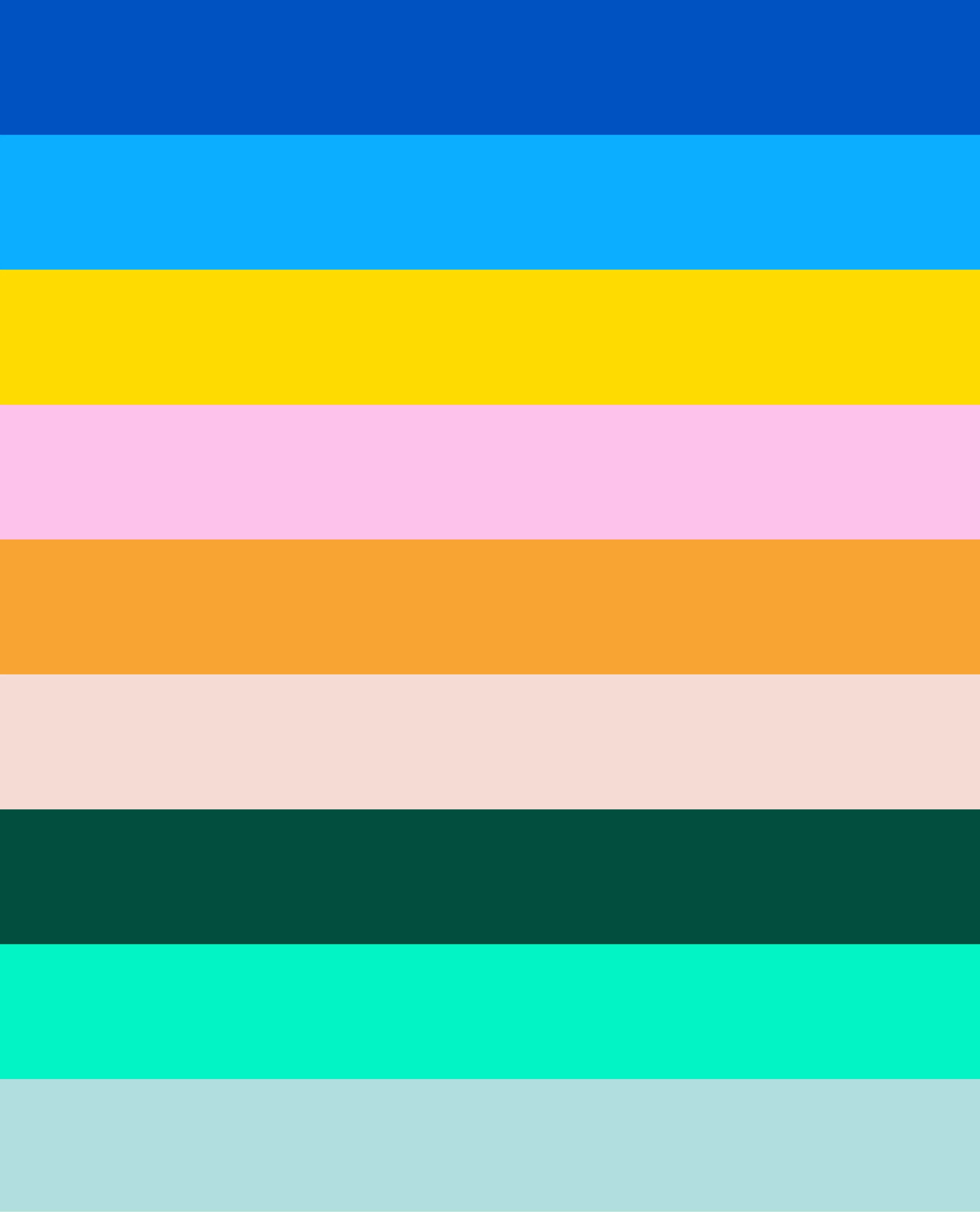
The colour scheme is directly inspired by the region. The dominant colour is dark blue, a reference to the Atlantic Ocean. This shade is complemented by a palette of modern, vibrant colours, making the overall identity expressive.

A dynamic and adaptable graphic system

The emblem is the central element of CapAtlantique’s visual identity. It can be adapted to highlight different aspects of the region, while conveying tranquility, well-being and freedom that are inherent to life in this conurbation.

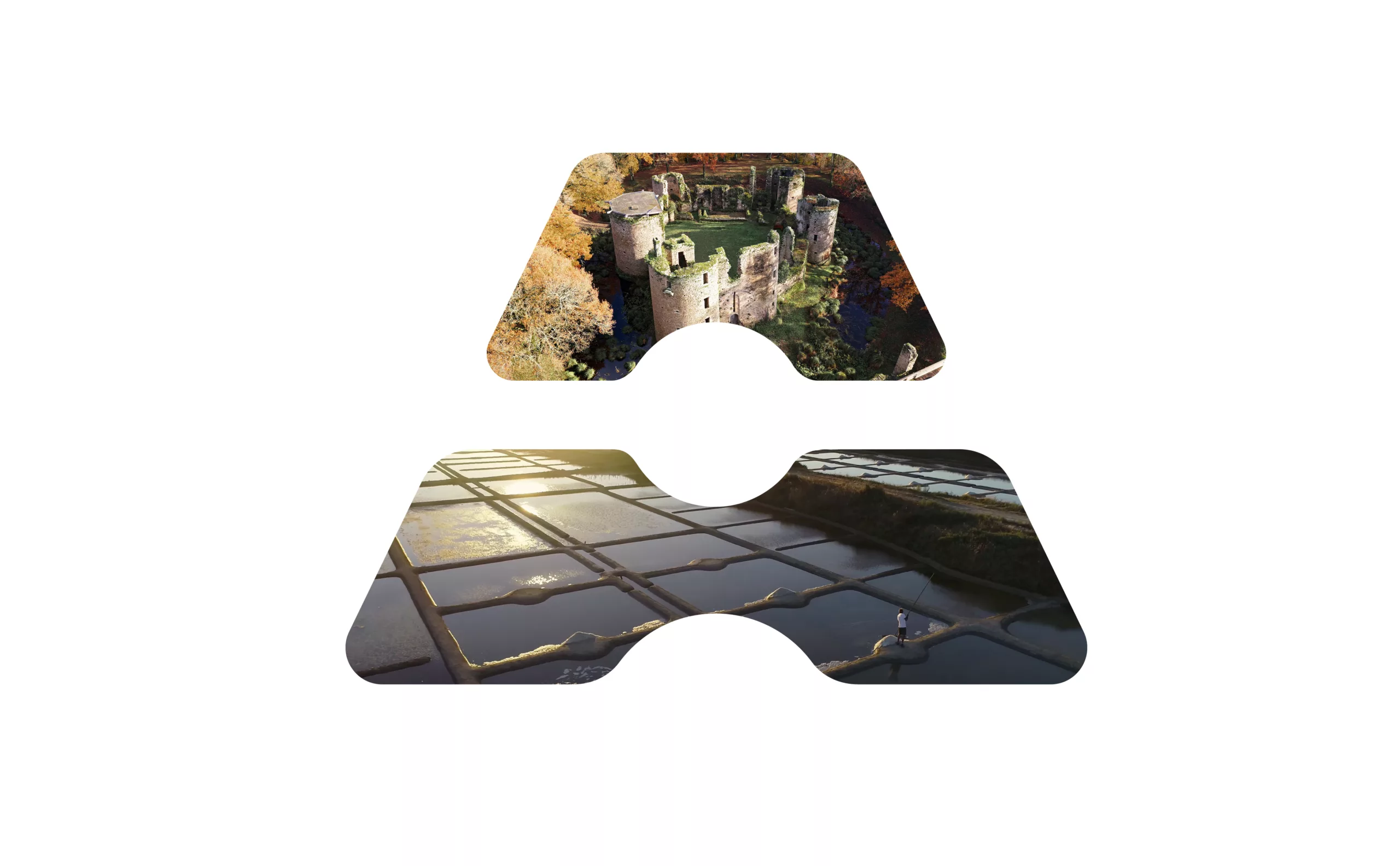
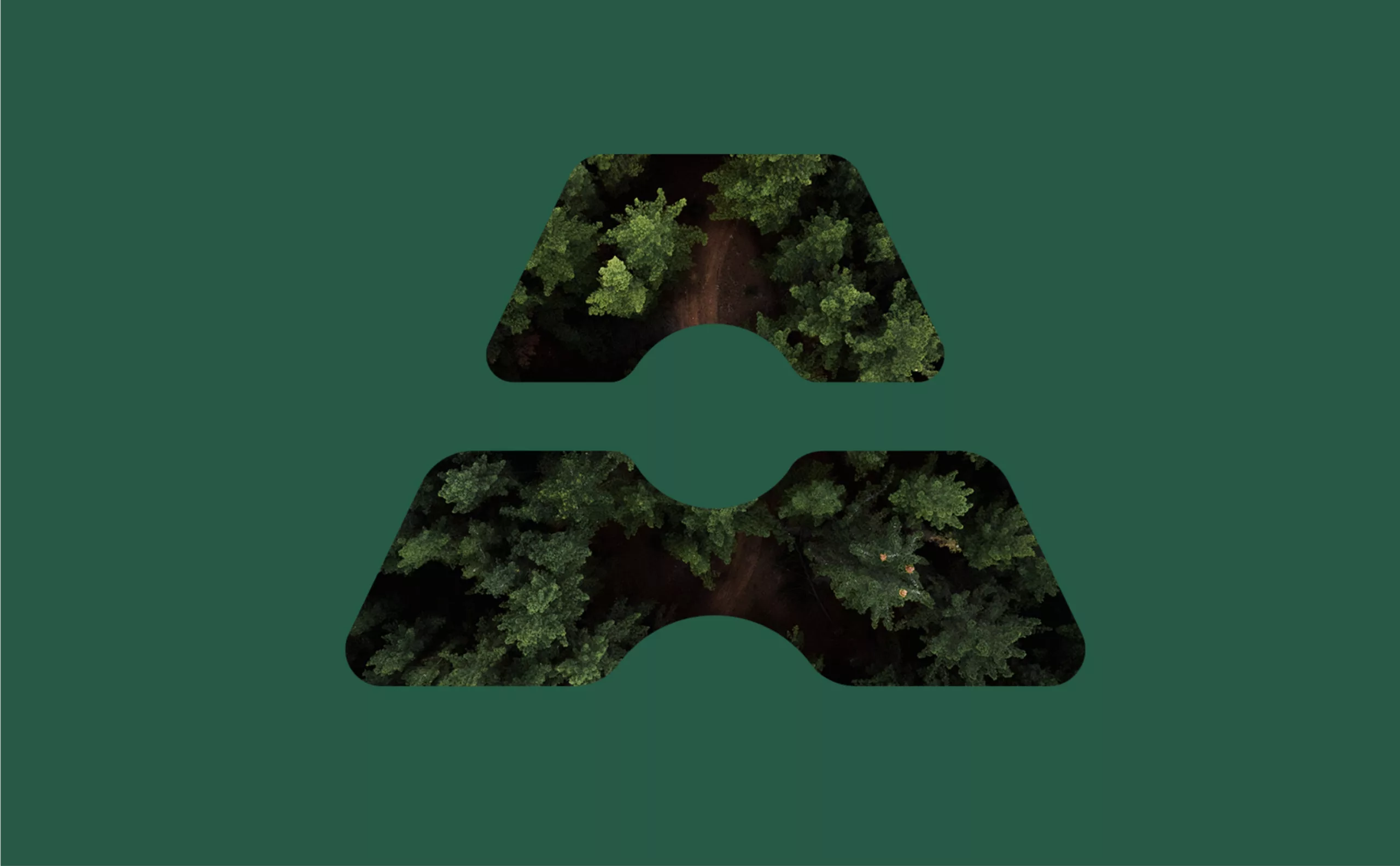
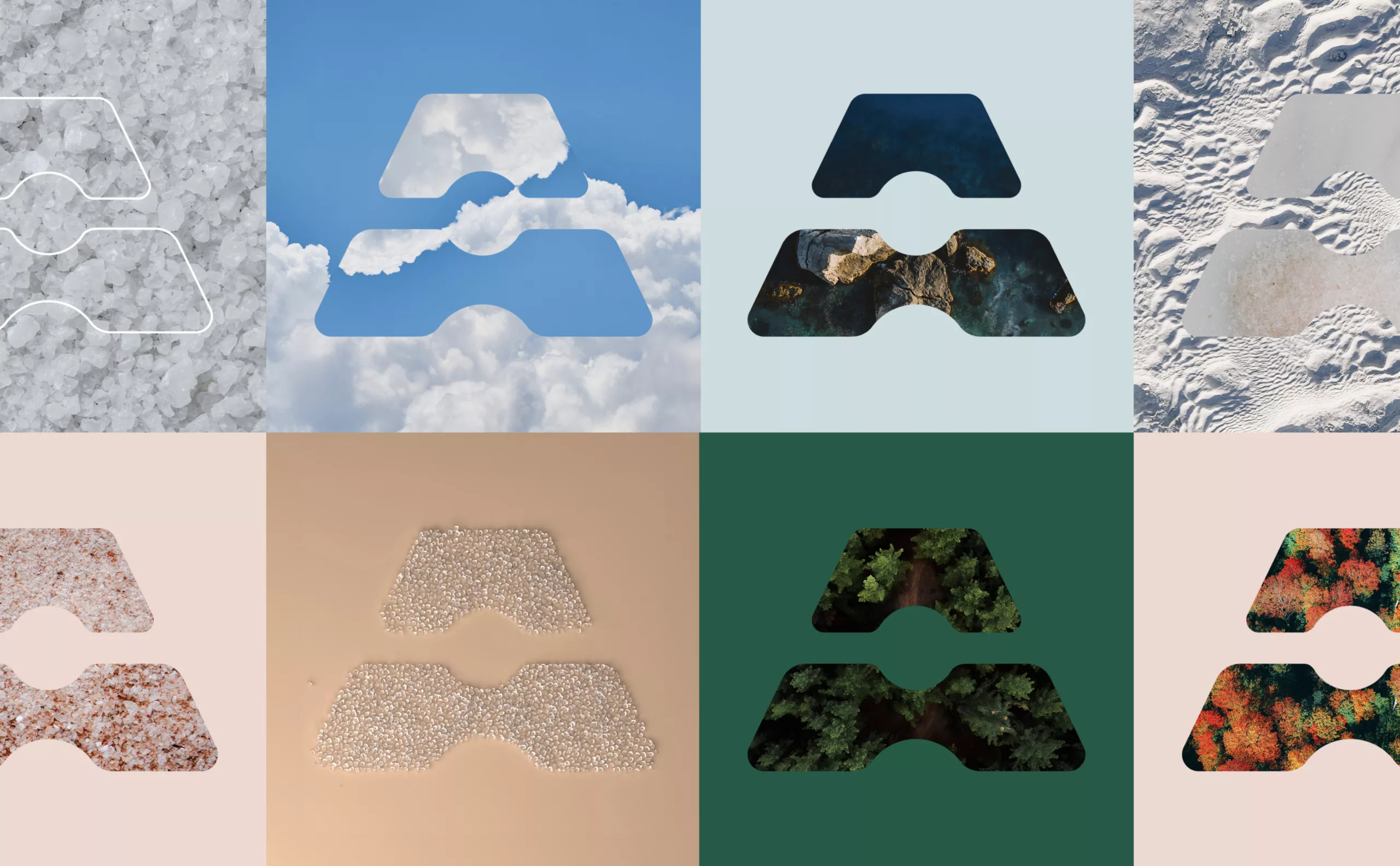
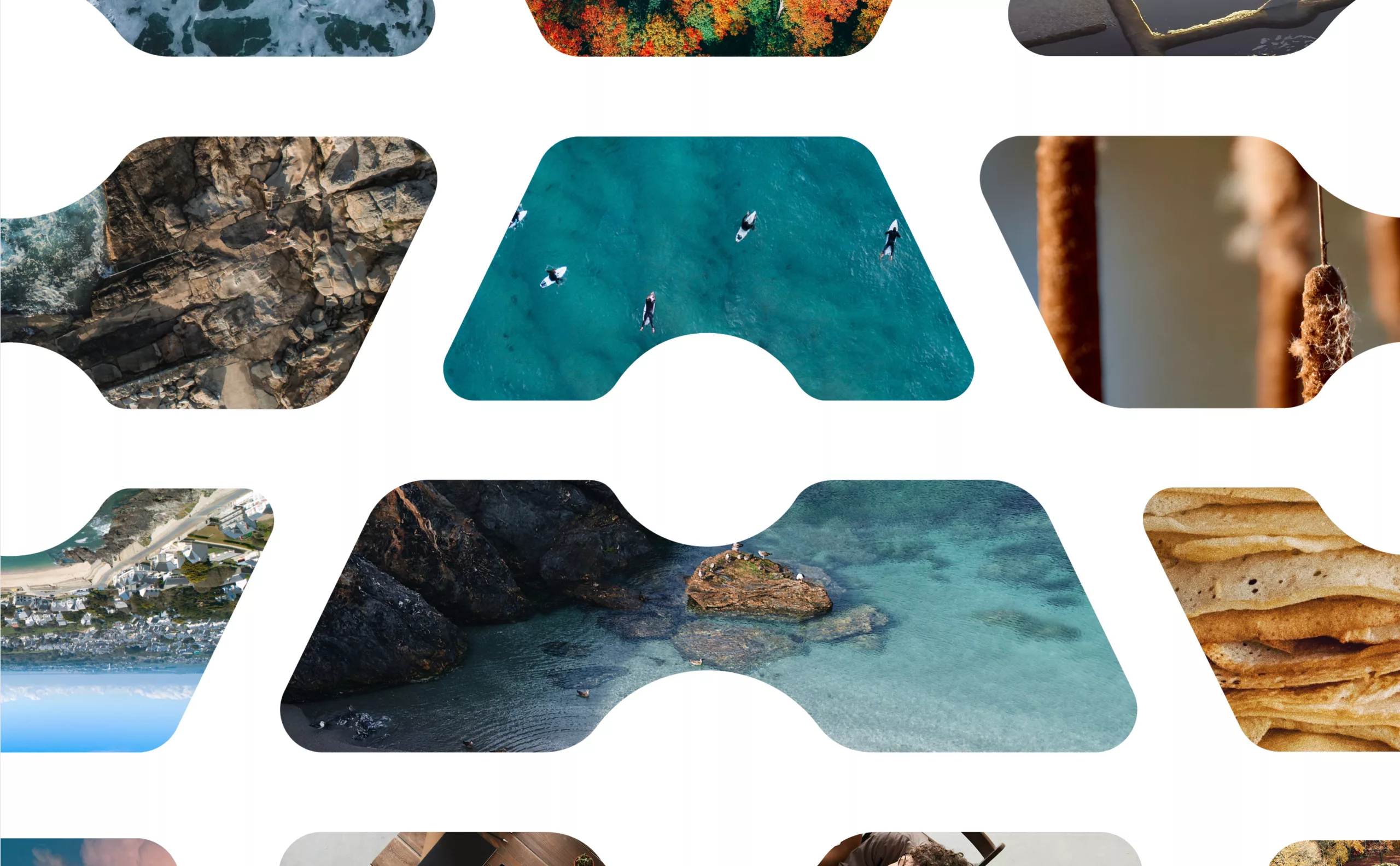
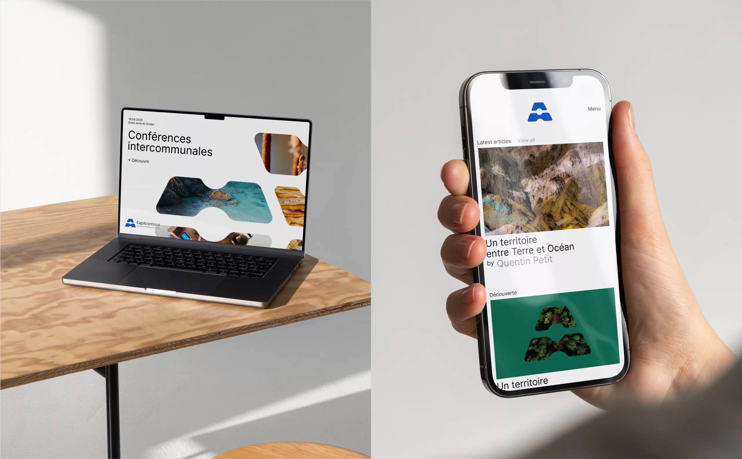
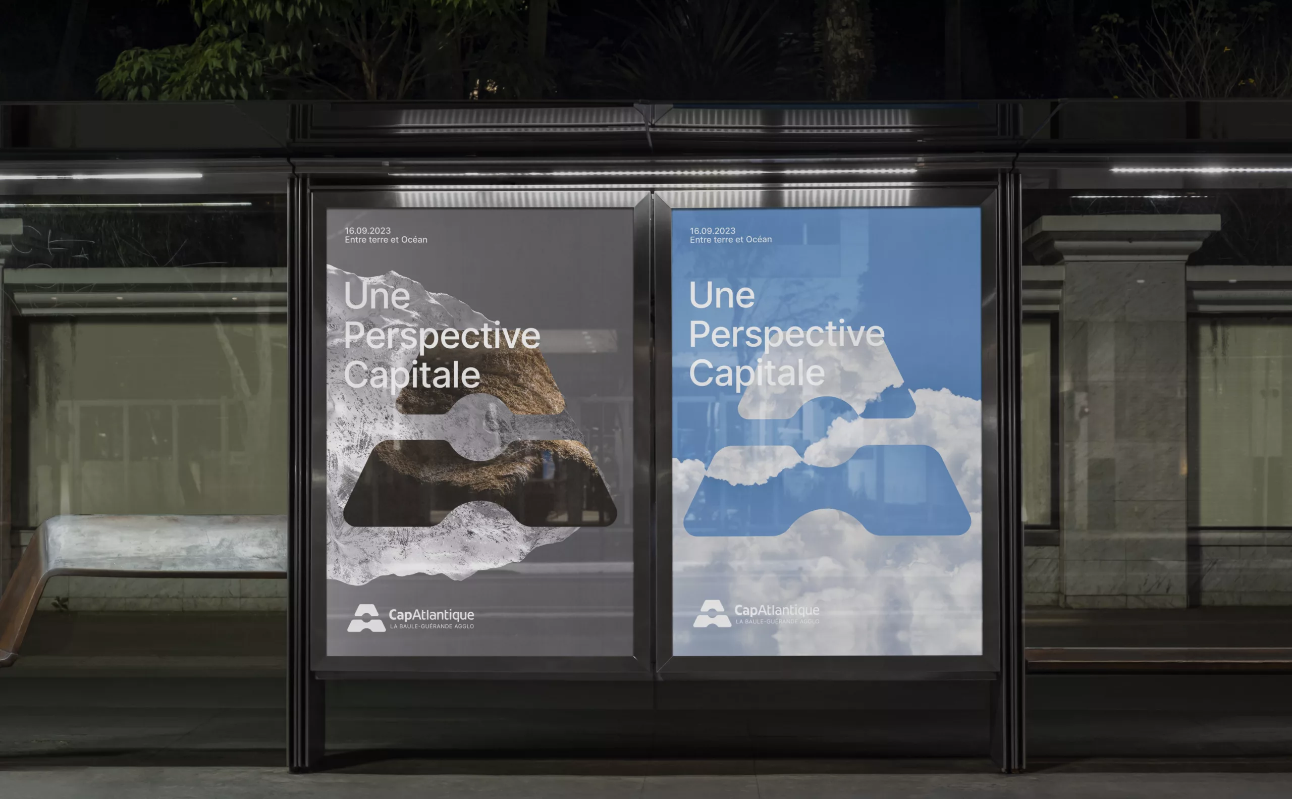
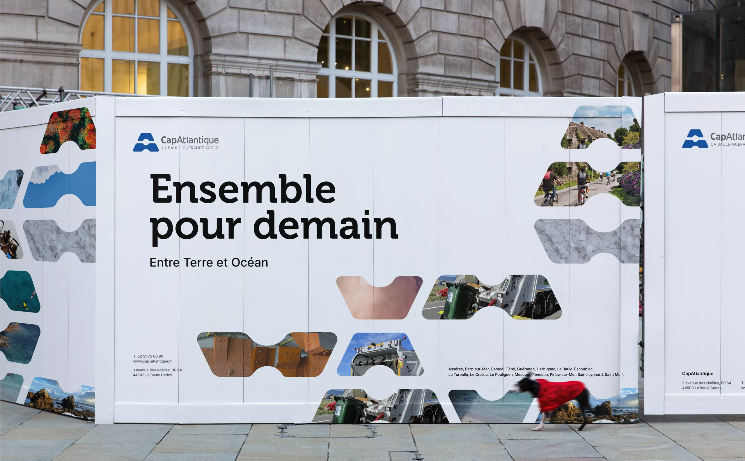
In communication materials, the emblem acts as a window onto the region. Through the use of single or double visuals, it uses photography to reveal the diversity of landscapes, textures and different atmospheres that the destination has to offer.

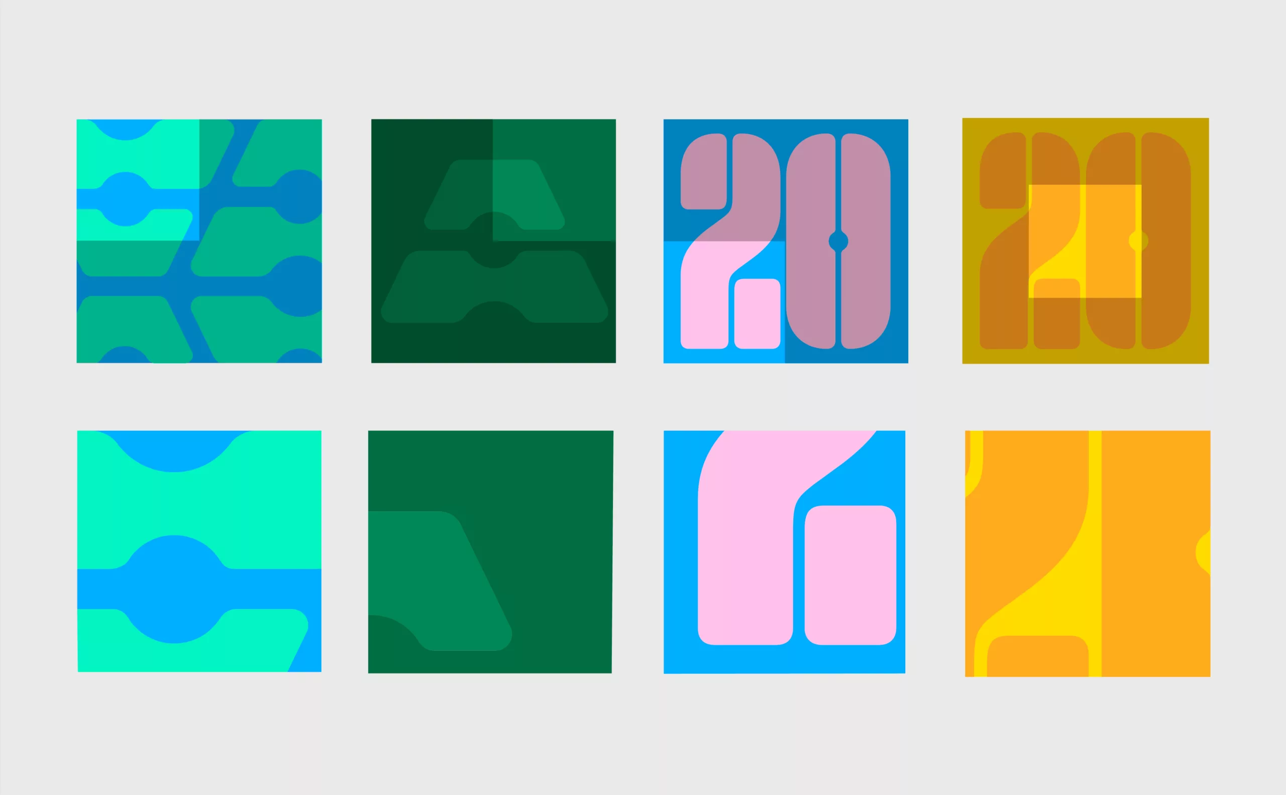
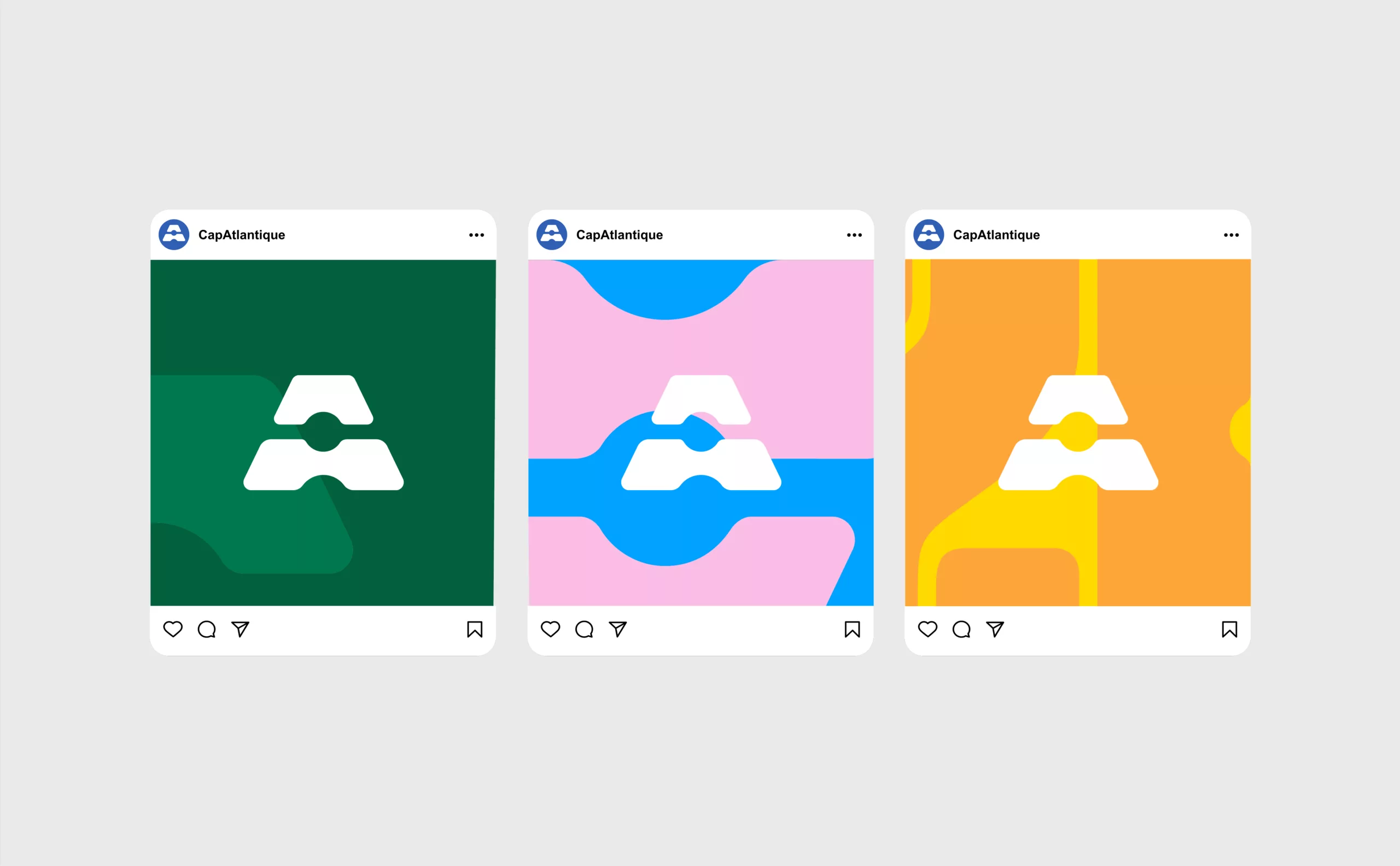
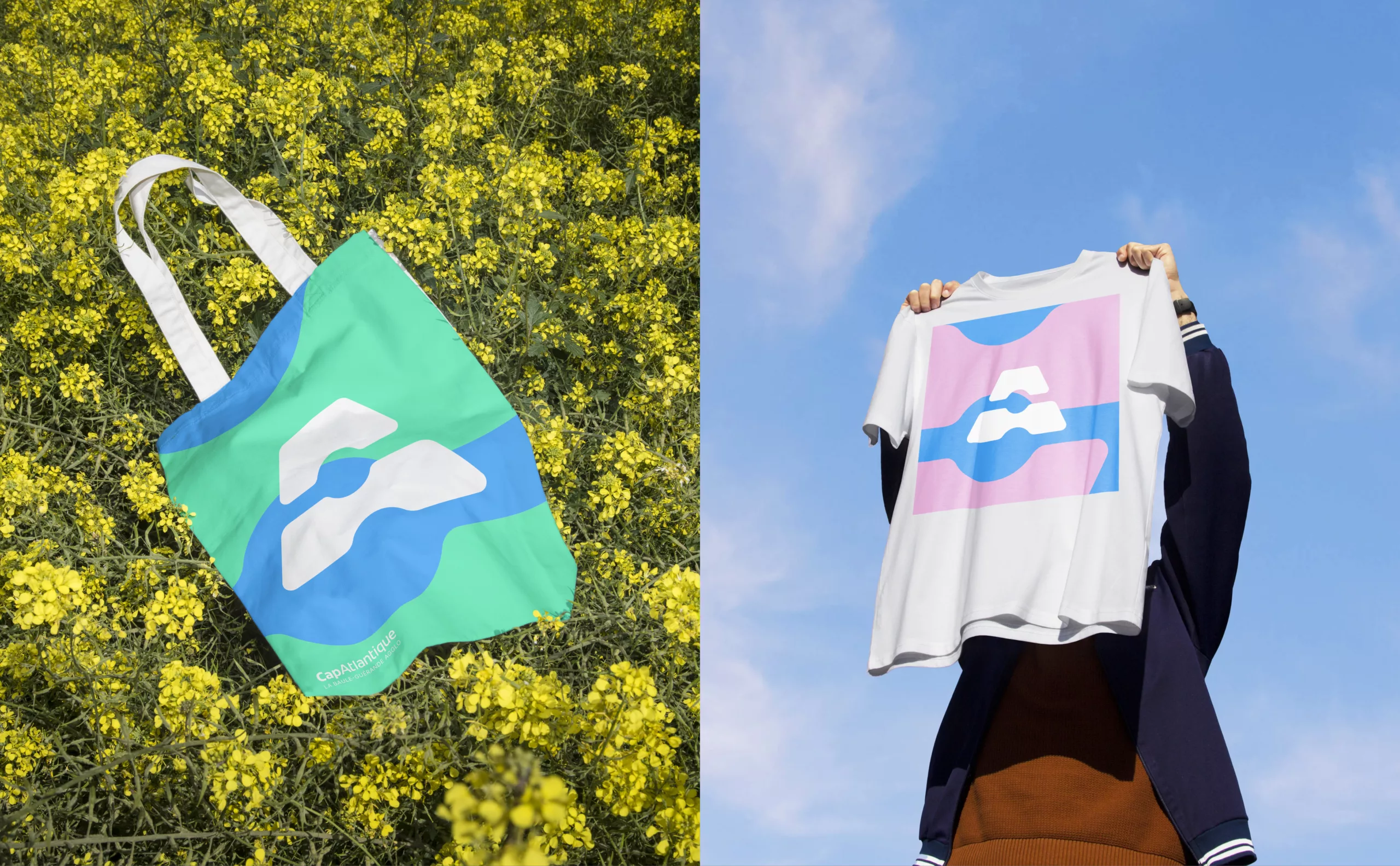
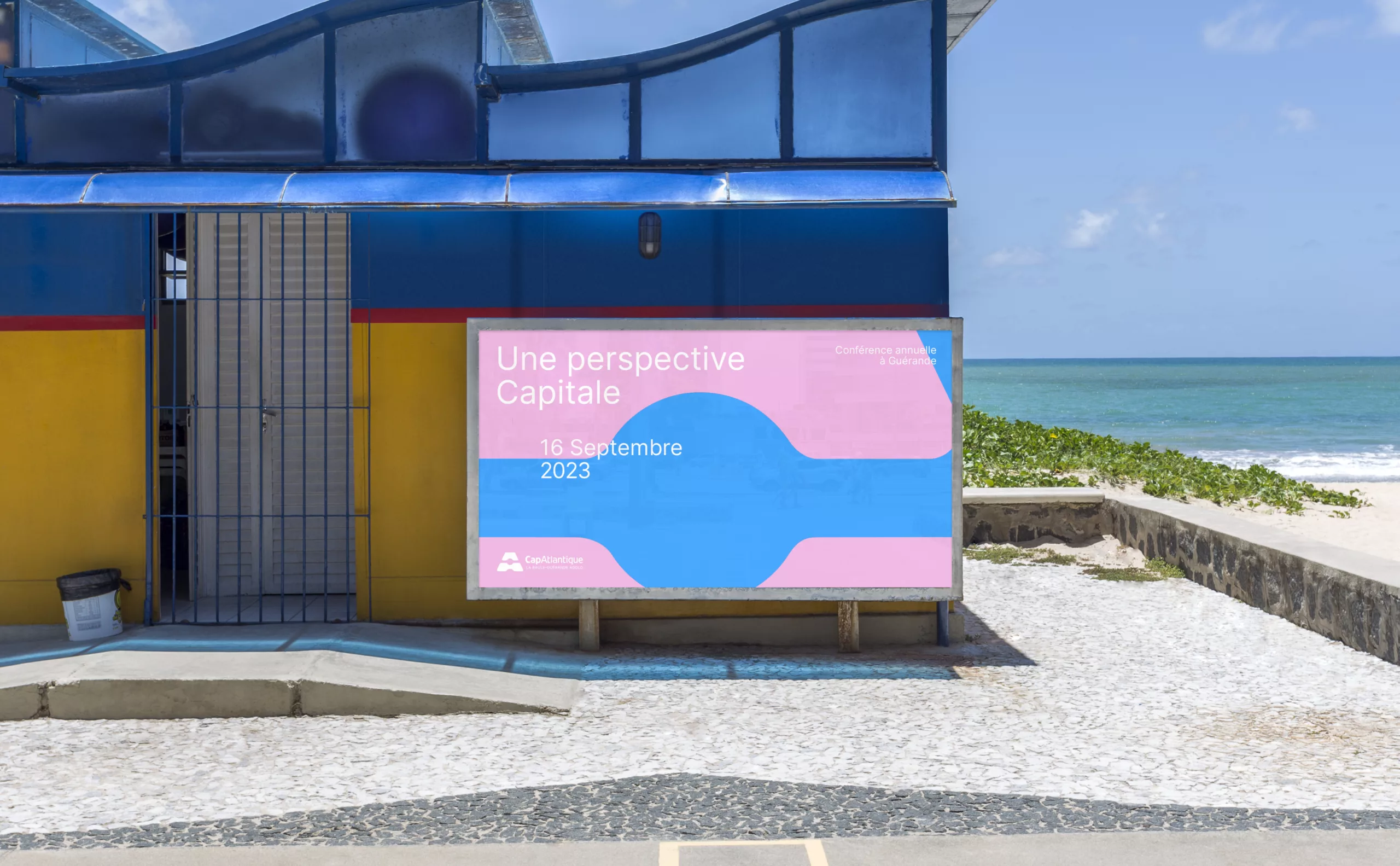
This emblem can also be used as a standalone graphic element; photographs or shapes can be incorporated into it to create dynamic and varied compositions. It can also be adapted into a pattern, repeated or deconstructed to suggest movement and enrich the visual identity across all communication touchpoints.

The emblem’s design lends itself very easily to a 3D rendering. We created this 3D version to complement the identity’s shape vocabulary.

By adopting a new visual identity, Cap Atlantique is asserting its status as the economic and tourist hub of the coastline. Thanks to its greater visibility and appeal, the conurbation is thus strengthening its influence and showcasing its impact across the region with clarity.