The cabinet of type punches, treasure of the Imprimerie Nationale

There exists in France a treasure that seems obsolete today, in the digital age, and which yet shaped the book and the influence of French literature for centuries. This treasure, carefully preserved at the Imprimerie Nationale, is known as the cabinet of typographic punches.
It is at once a unique site of creation and conservation of punches, a one-of-a-kind classified collection whose significance is technical, historical and heritage-related in equal measure.
The typographic character punch, first link in the printing chain
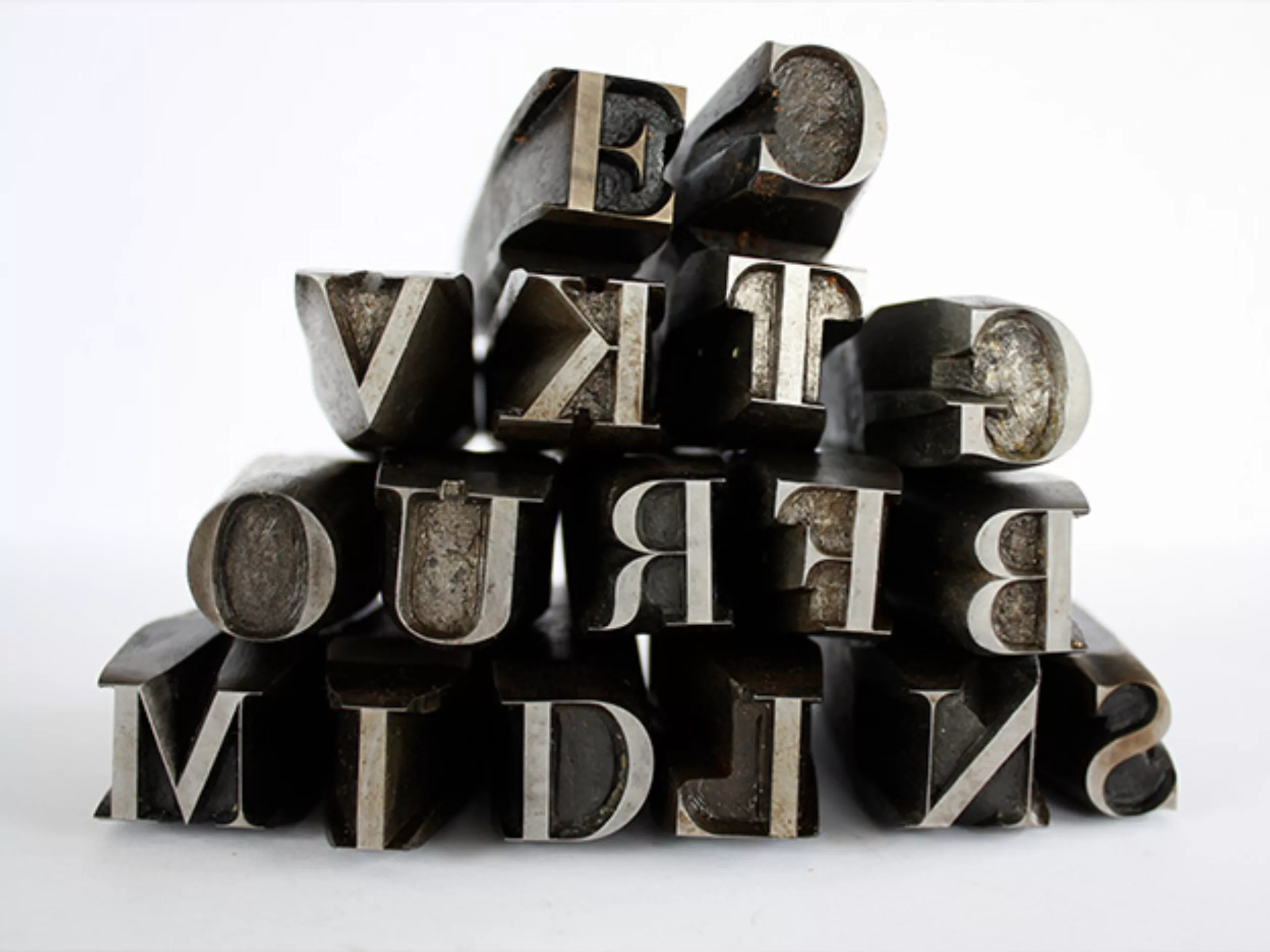
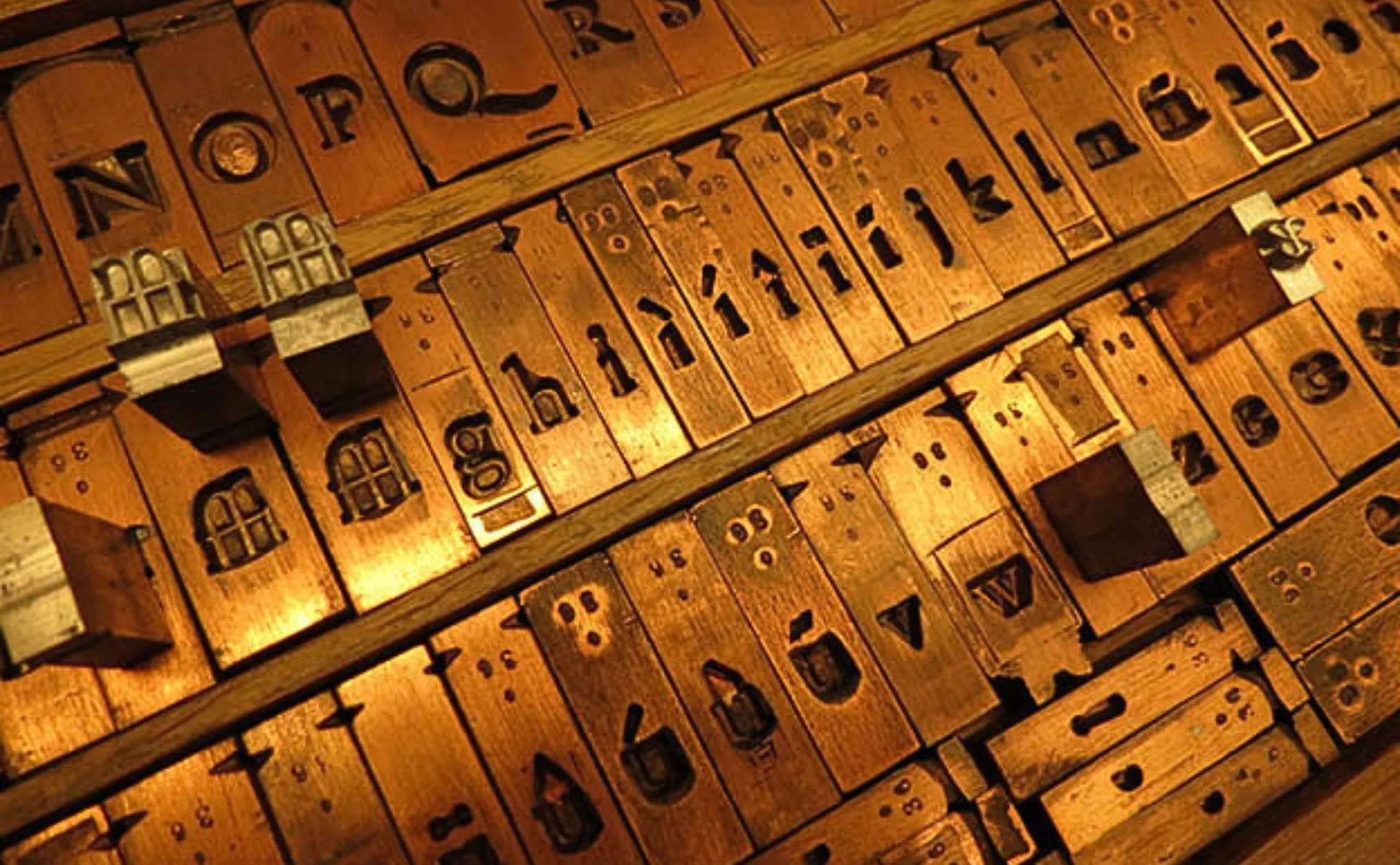
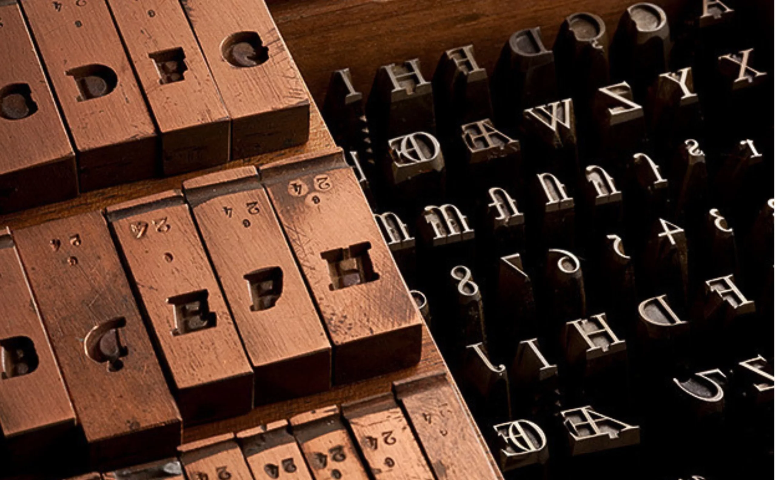
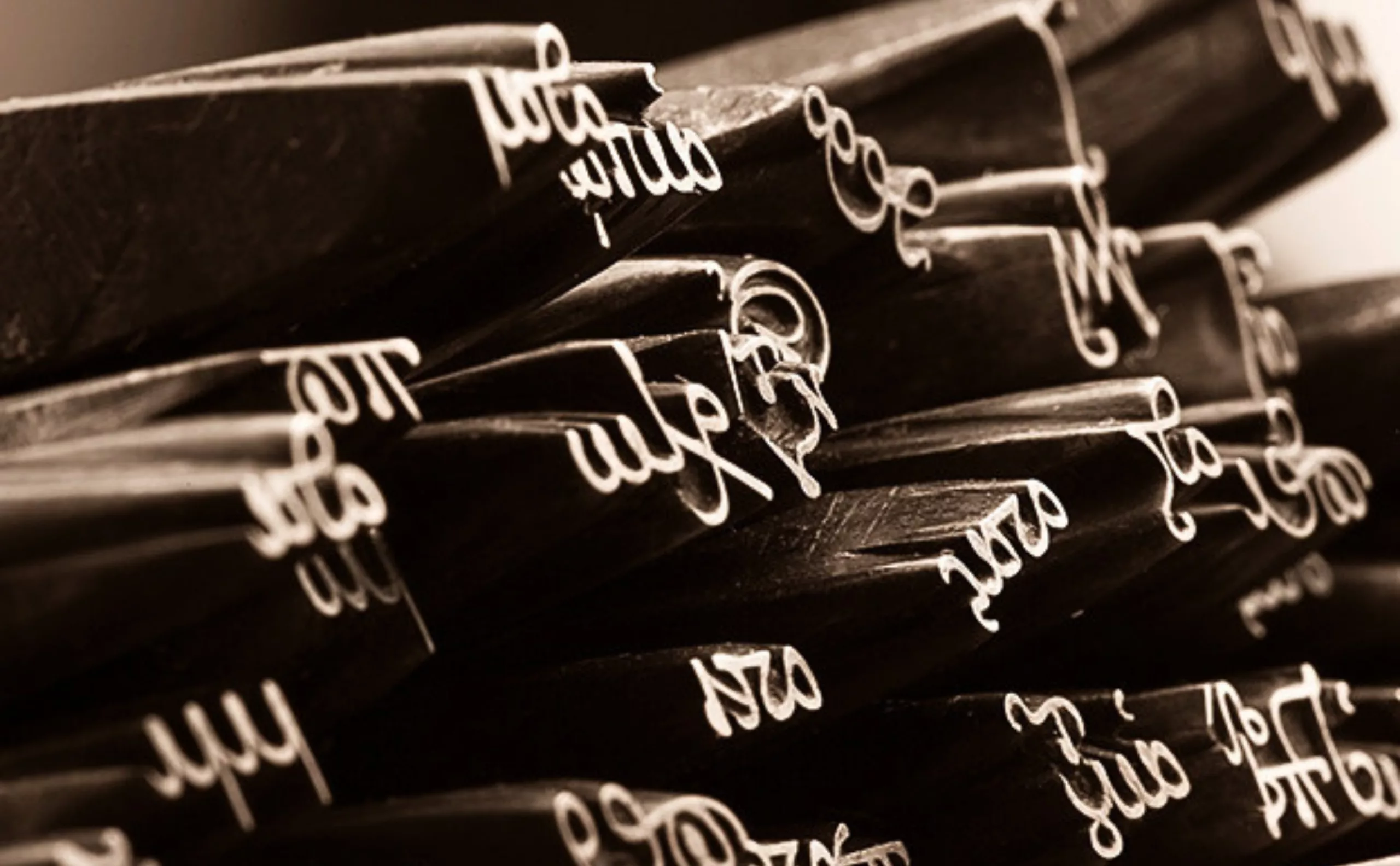
The punch is the first link in the typographic chain, the foundational work without which there is no letter. It is what enables the striking of the copper matrix, which then serves as a mould for casting the thousands of lead and antimony characters required for traditional printing. It also serves as a standard, an absolute reference point for the making of a letter.
These precious punches were thus coveted by Kings and Empresses, used by foundries and playwrights, and some were placed among the objects of the Crown at the Chambre des Comptes.
Let’s take this opportunity to set the record straight with a brief historical aside: Johannes Gutenberg is the father of modern printing in Europe, but in 1440 he did not invent the concept of printing, nor the hand press, nor even metal type (which had already existed in China 60 years earlier), nor even the mold for casting type, which already existed in Korea.
Gutenberg industrialized the printing process by combining all these steps and specialties: type design, metal casting, the hand press, and printing ink. He thus enabled mass production, beginning with the printing of Bibles in Gothic typefaces, which imitated the manuscripts of scribes.
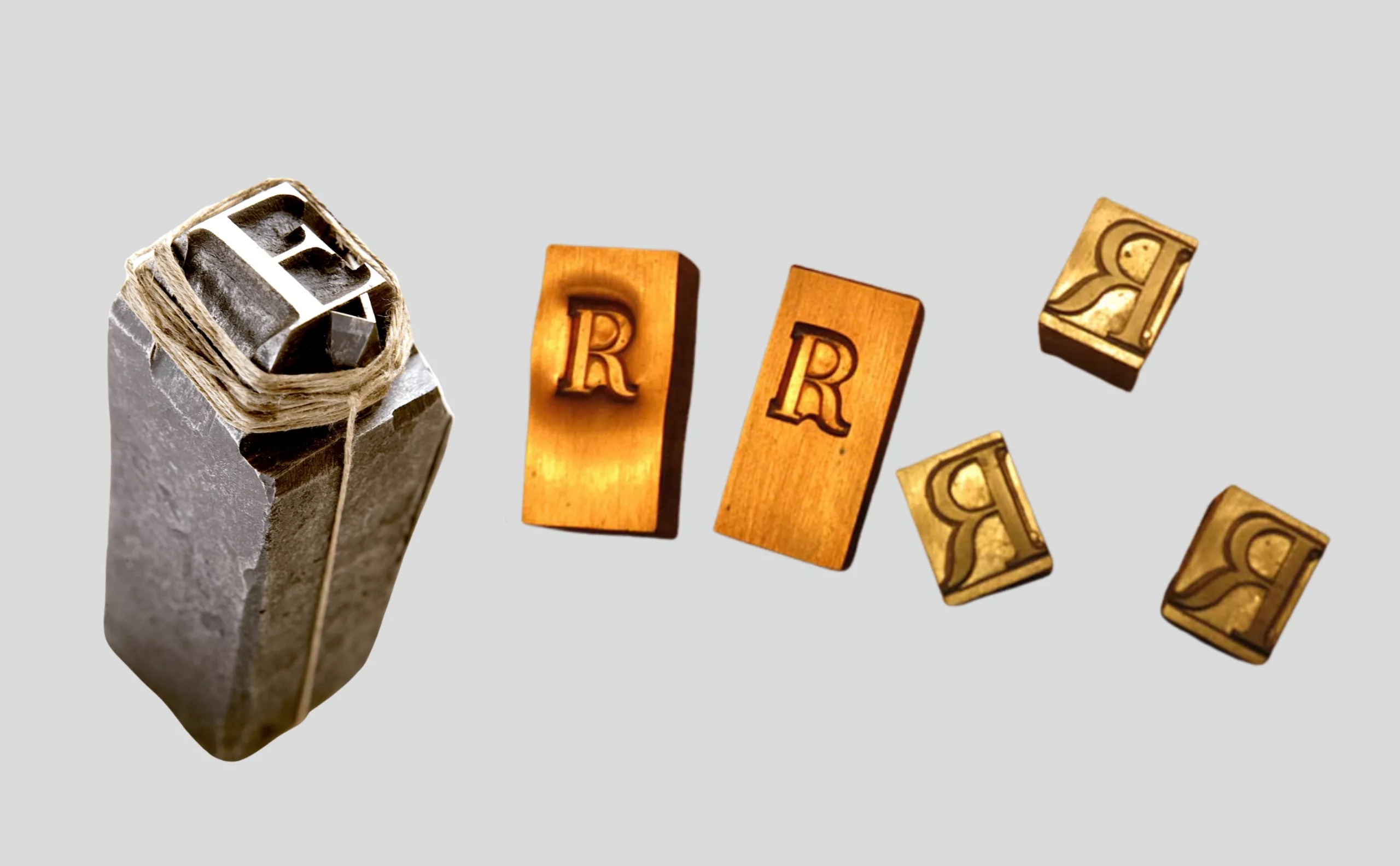

It takes three steps to print a book :
– The drawing and engraving of typographic character punches in a very hard metal, steel, which is used to strike softer copper matrices in which the letter is formed in hollow
– The casting of characters (in lead, tin and antimony), poured into the matrix fitted into a mould: this produces rods of equal height, at the tip of which the letter appears
– The alignment of these character rods by hand, line by line, followed by inking and printing onto paper using a press
The craftsmen who hold this knowledge and this treasure thus have the power to bring printed texts to life. One can better understand the value of these punches in the eyes of the King. By collecting them, he consolidates his prestige, extends his influence in the world of printing, and ensures a controlled circulation of rare and precious texts.
The Treasure of the Imprimerie Royale
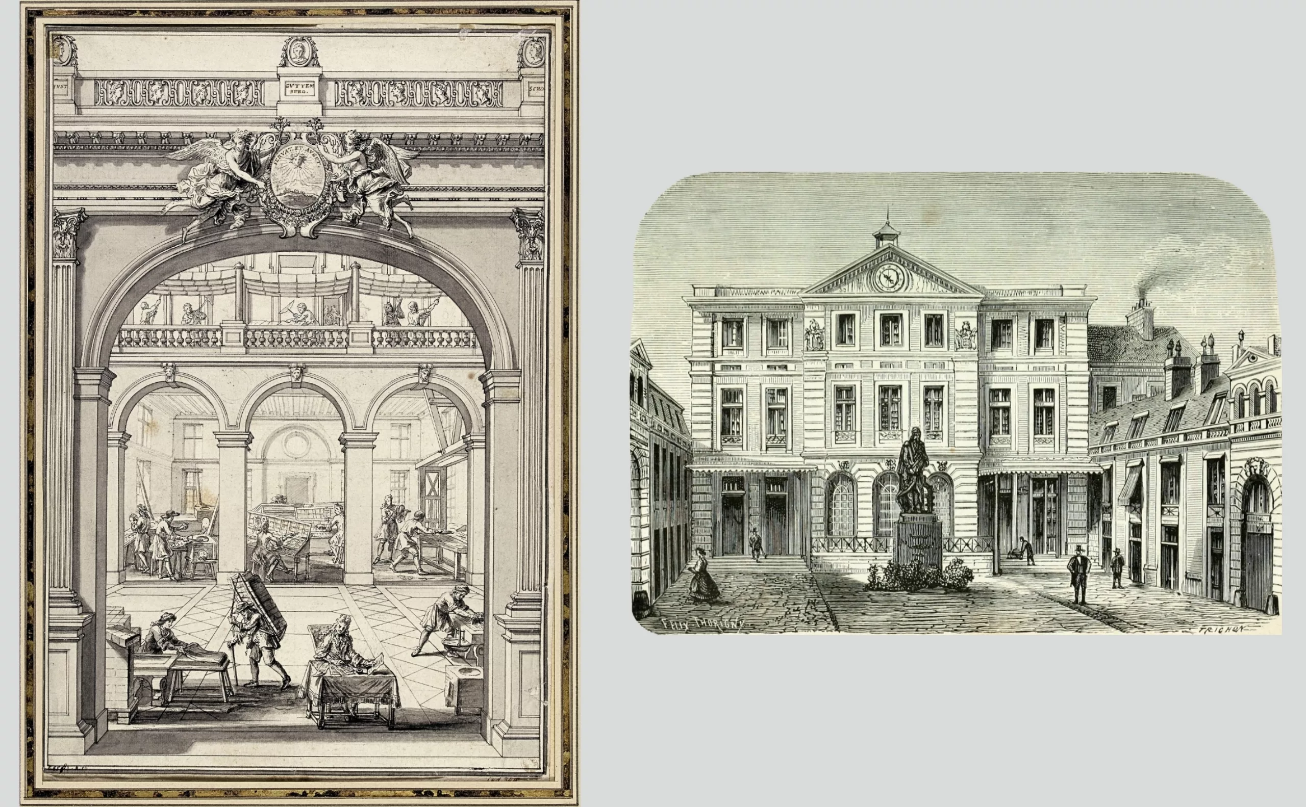
In 1540, François Ier granted privileges to a printer who became “Printer to the King for Greek, Latin and Hebrew”.
In 1640, Richelieu wished to print, in the finest manner possible, “publications useful to the glory of the King”, namely Ancient Greek texts, “source of all instruction”. The institution evolved to become the Imprimerie Royale and moved into the Louvre. Printing these texts in Greek meant both demonstrating erudition and holding a unique power of dissemination. The Imprimerie Royale was the exclusive place for the creation and printing of official State documents.
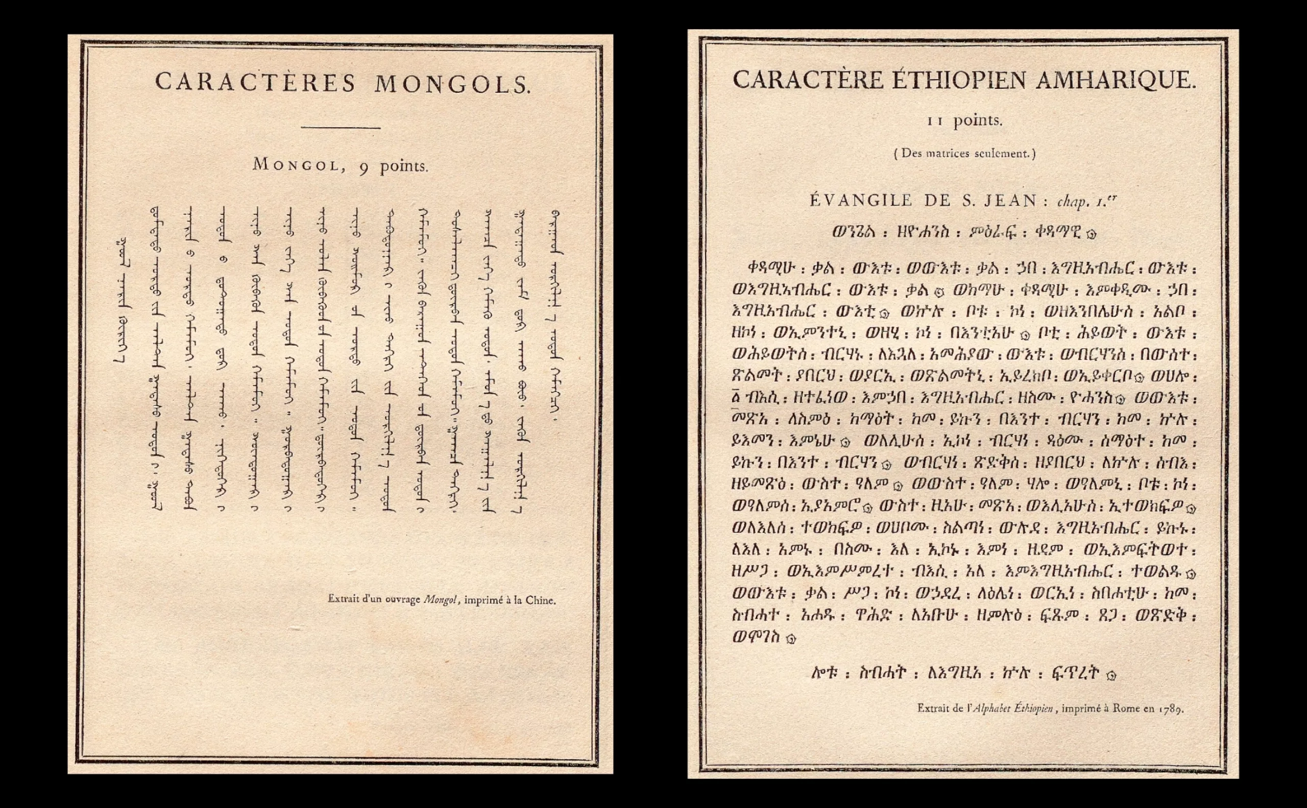
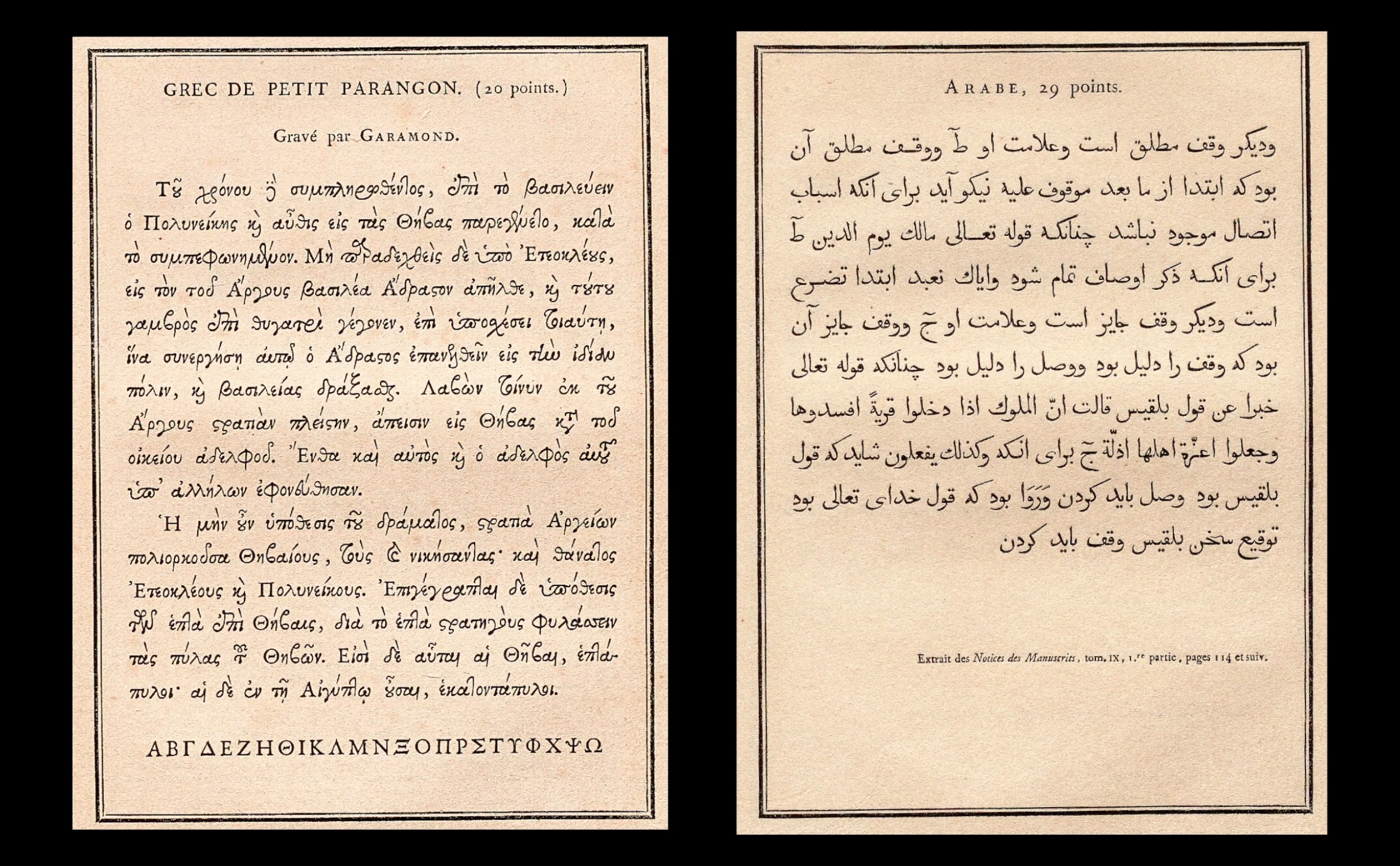
In 1813, Napoleon Bonaparte ordered the engraving of several dozen oriental typefaces to enable the printing of encyclopaedic works intended for international distribution, such as a Chinese-French-Latin dictionary.
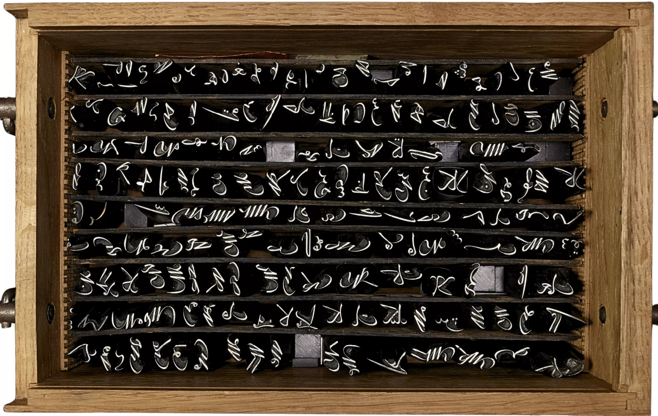
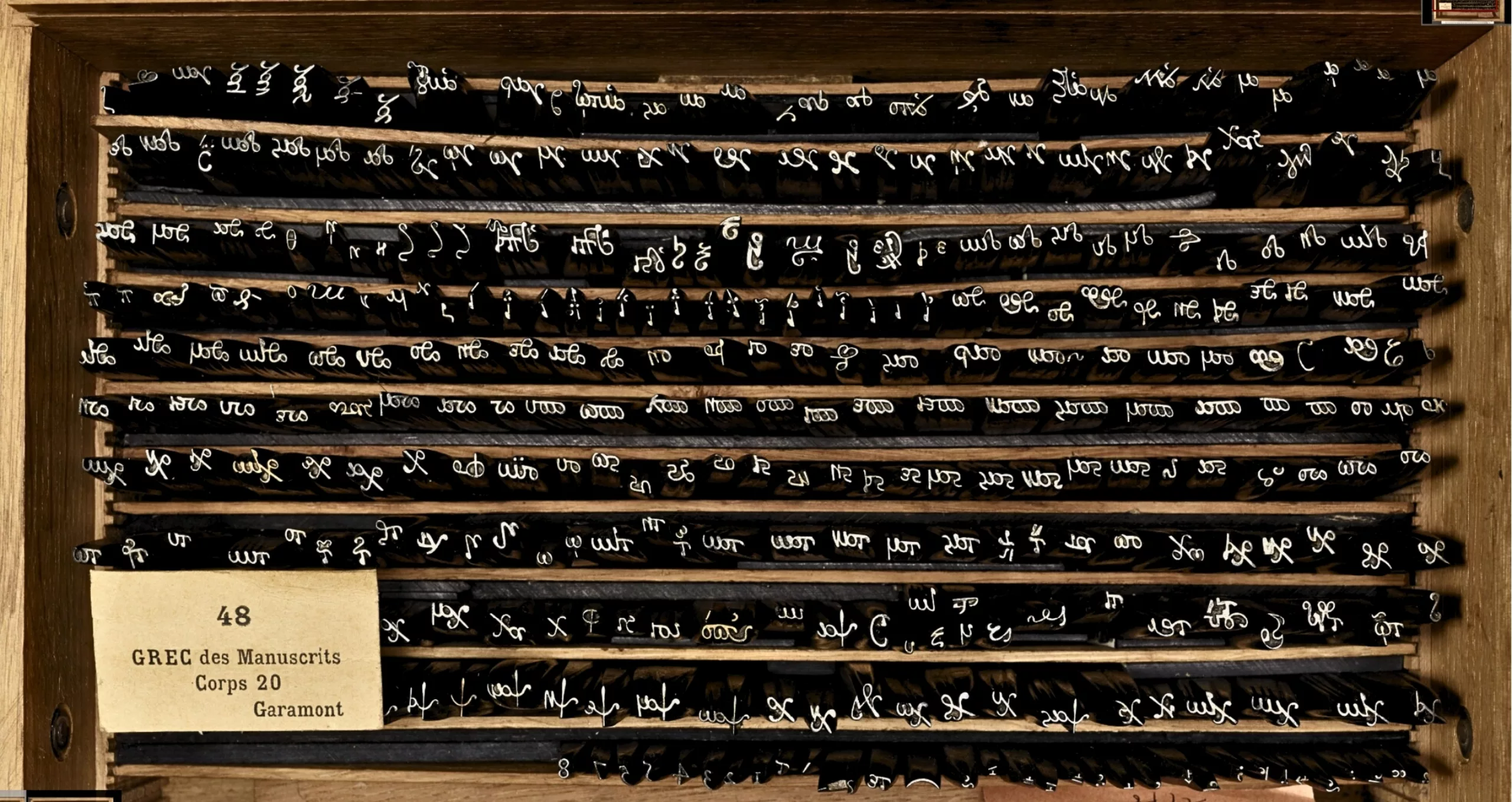
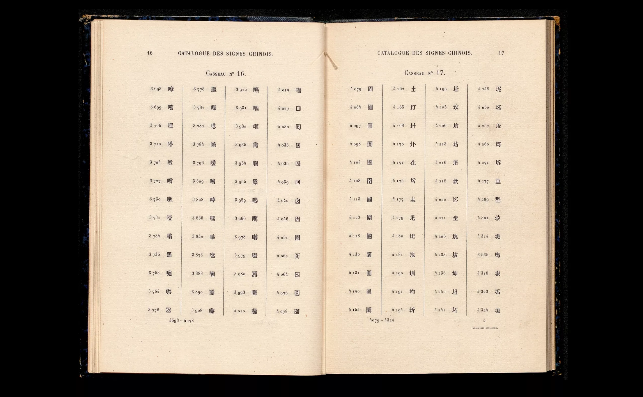
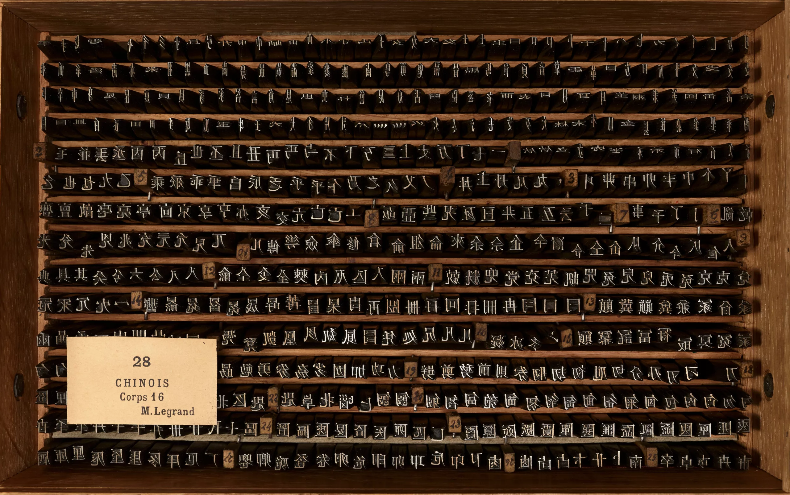
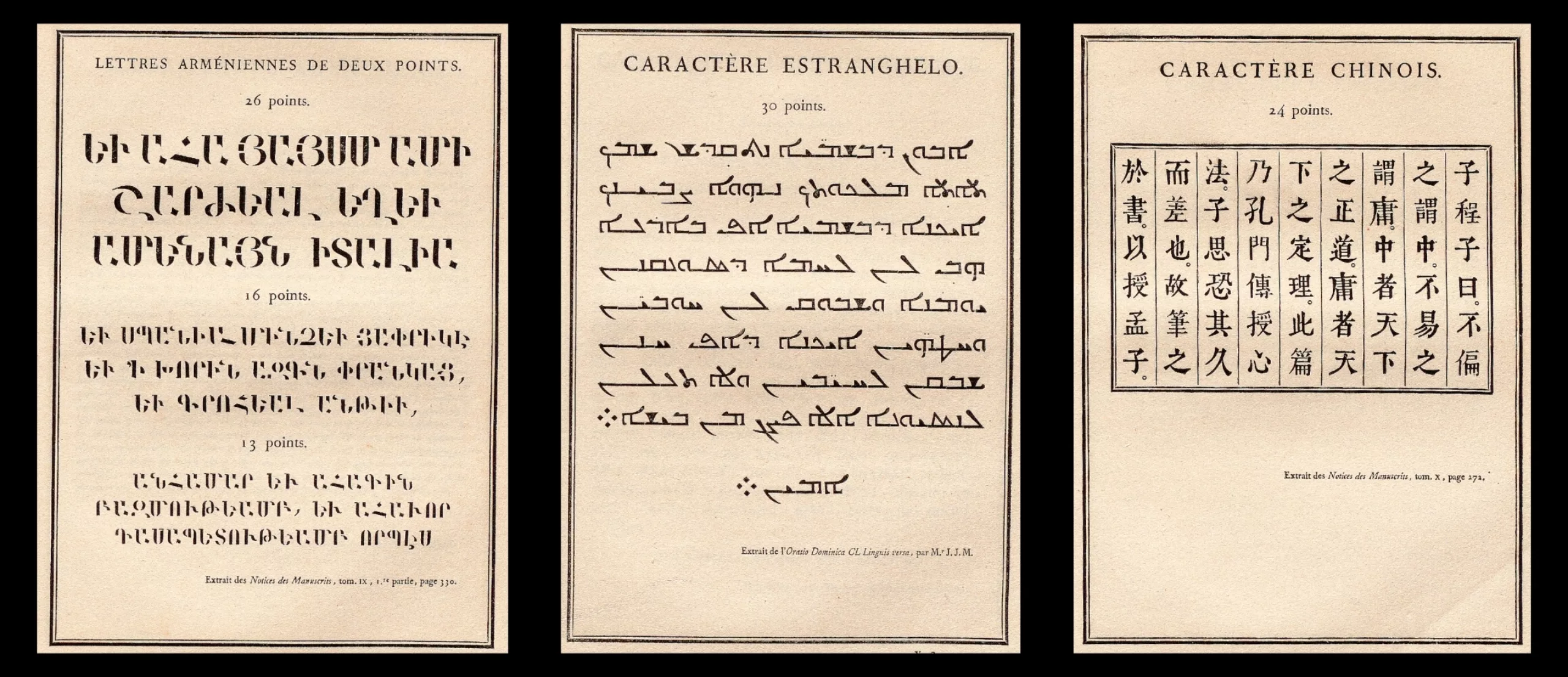
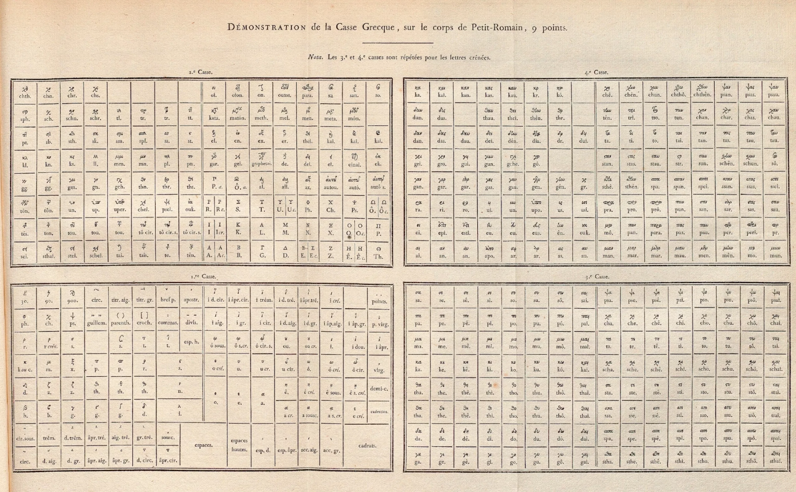
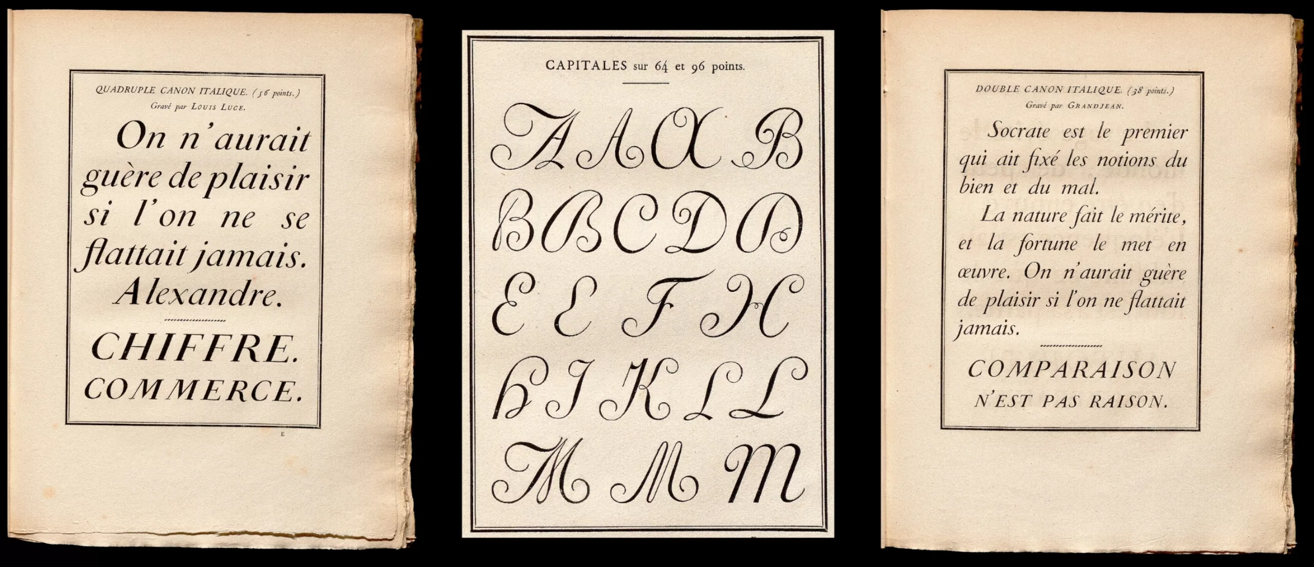
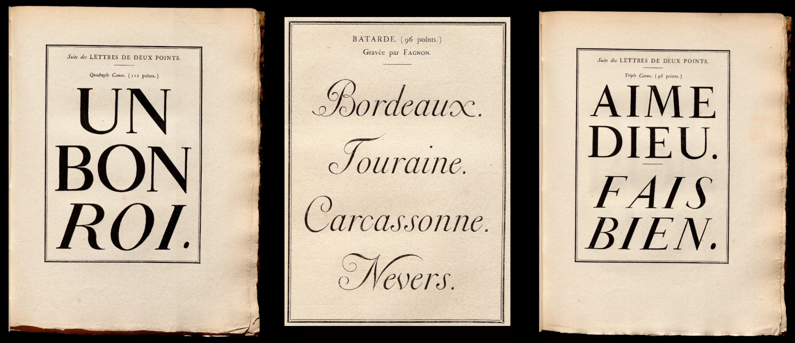
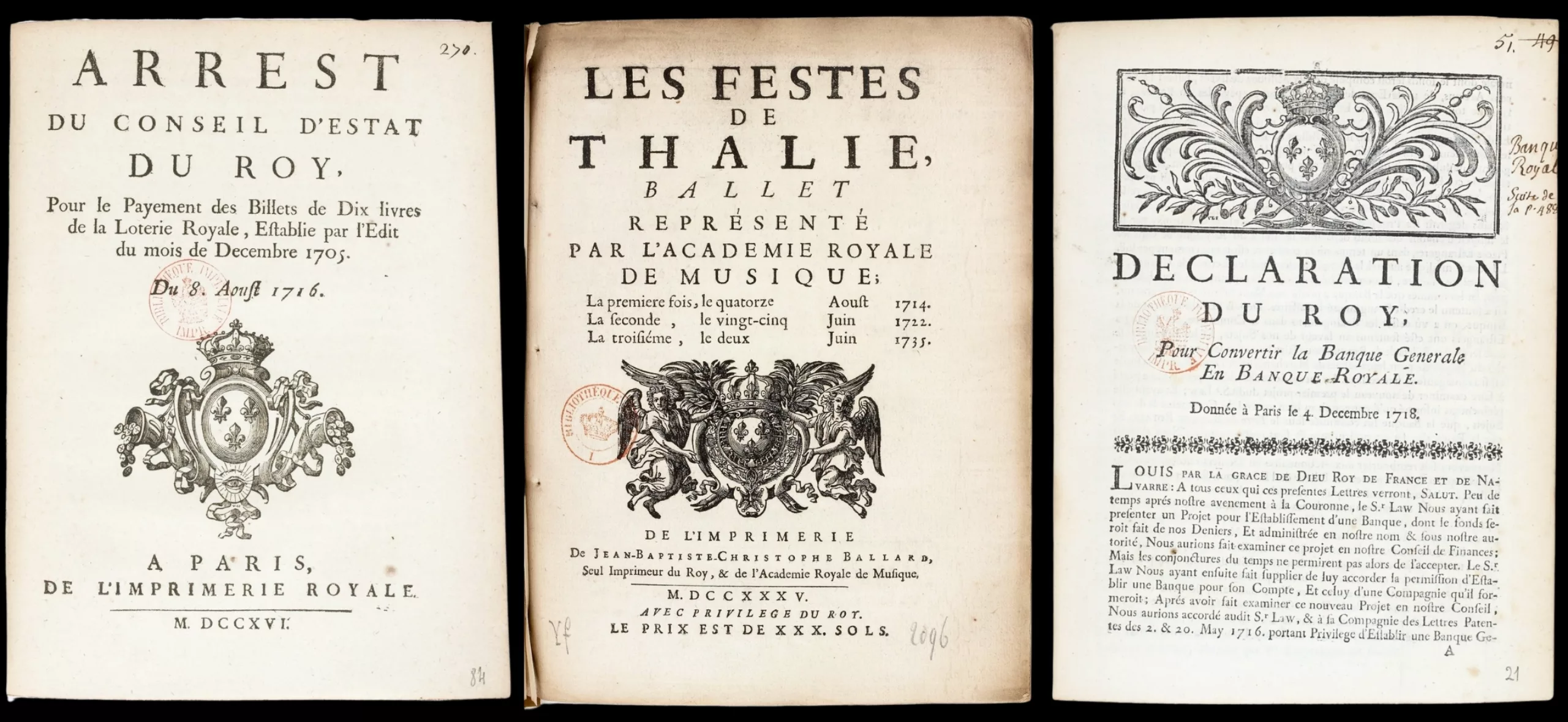
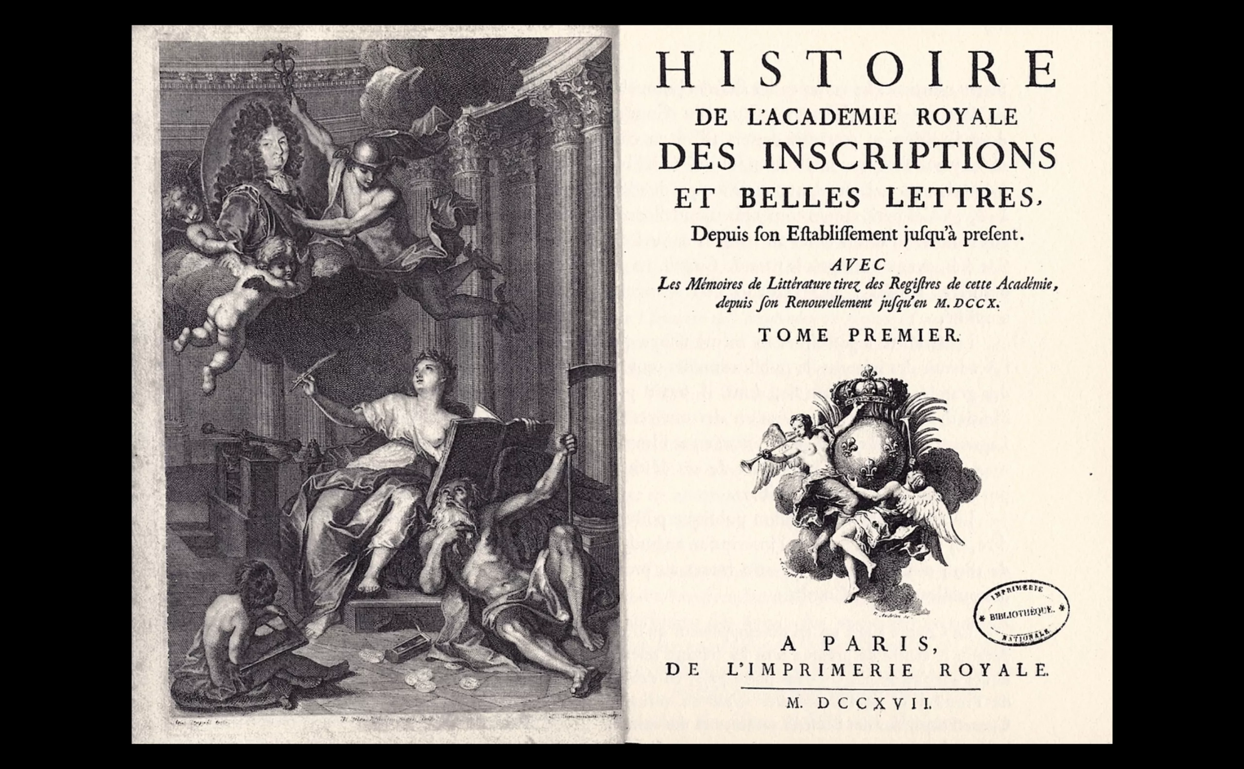
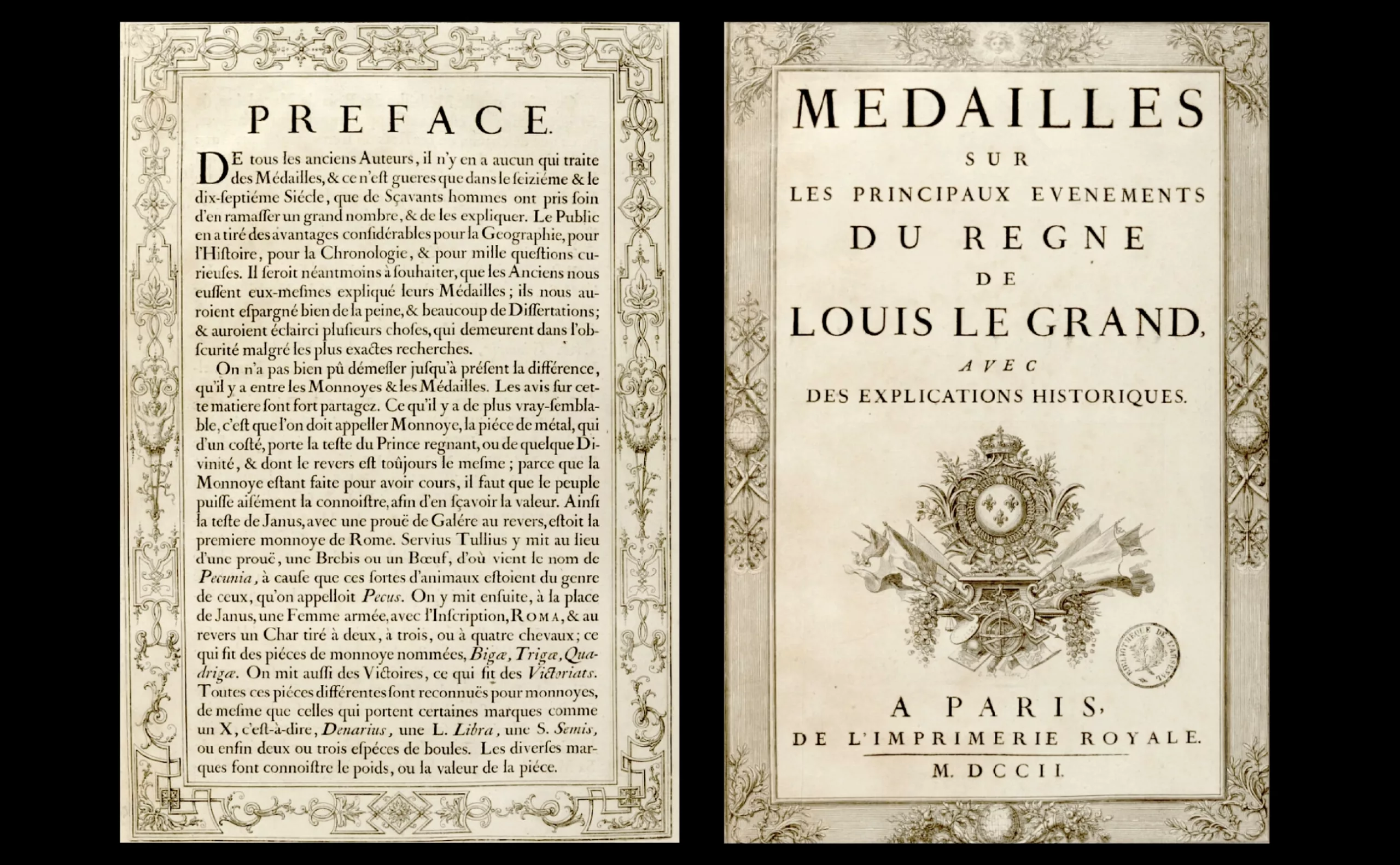
The book Spécimen des caractères, vignettes, armes, trophées et fleurons de l’Imprimerie royale (which can be consulted via the link), printed between 1815 and 1848, displays a large portion of the oriental and Roman characters used by the Imprimerie Royale.
The Imprimerie Royale also printed all laws and decrees issued by the King, in order to officialise the “placards” posted in the streets for citizens. It also made it possible to build a varied library, which today contains more than 35,000 volumes accumulated since François Ier.
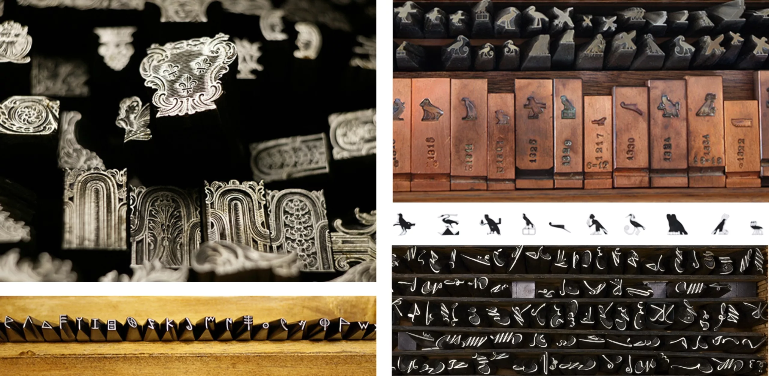
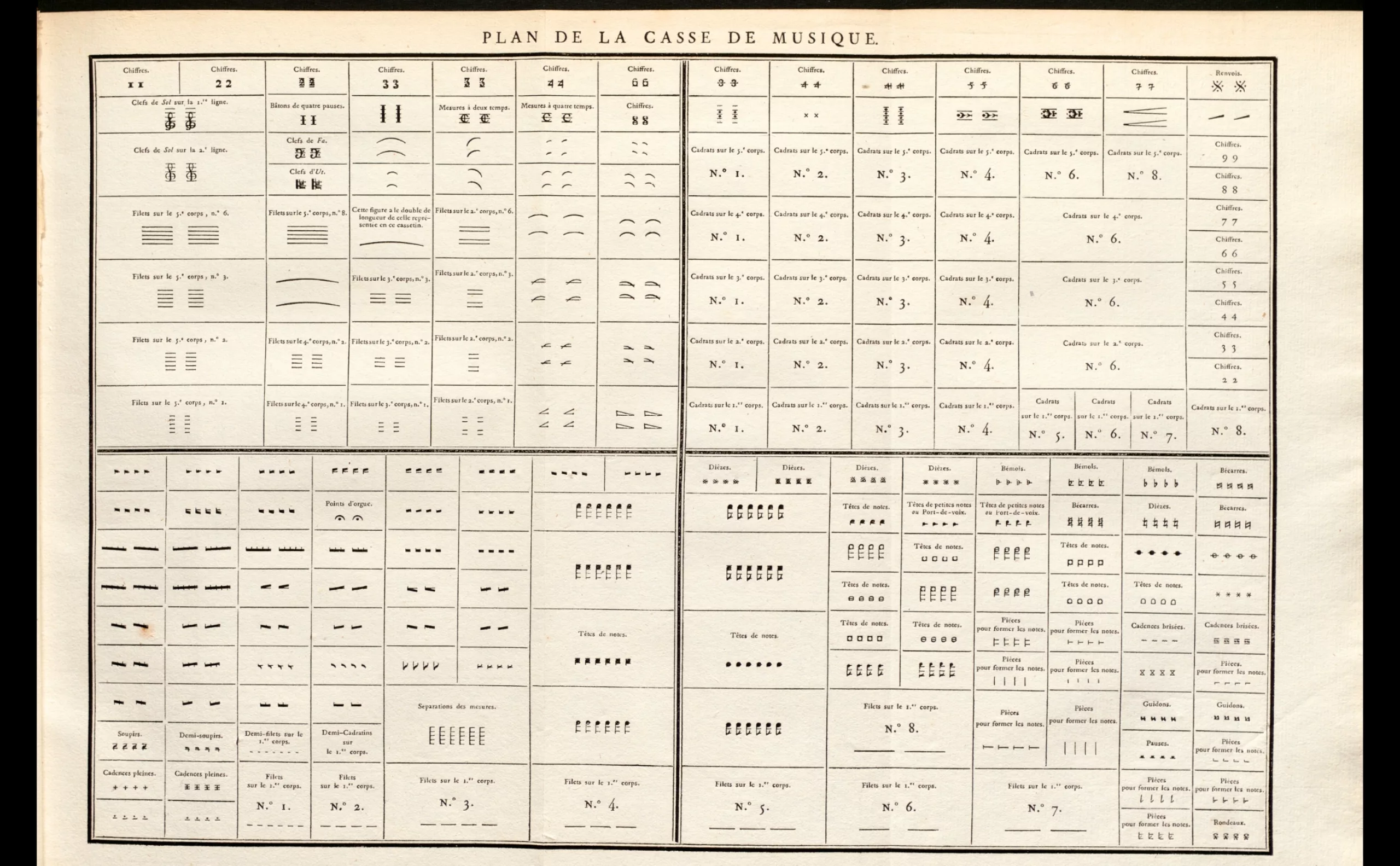
When the full collection of engraved pieces is taken into account, this treasure today exceeds 700,000 pieces, of which 500,000 are listed as Historic Monuments, preserved in a secure chamber as a national treasure of inestimable heritage value. The collection makes it possible to print more than 100 different writing forms and styles, including Ninevite cuneiform, Egyptian hieroglyphics, Aramaic, Hebrew, Arabic, Tifinagh, Samaritan, Syriac, Russian, Chinese, Siamese, Tamil, Tibetan, Laotian, Mayan and runic characters, as well as punches for musical notation.
This collection is the result of the merging of the royal “historic collection” with punches bequeathed by the Deberny & Peignot and Haas and Neufville foundries upon their closure.
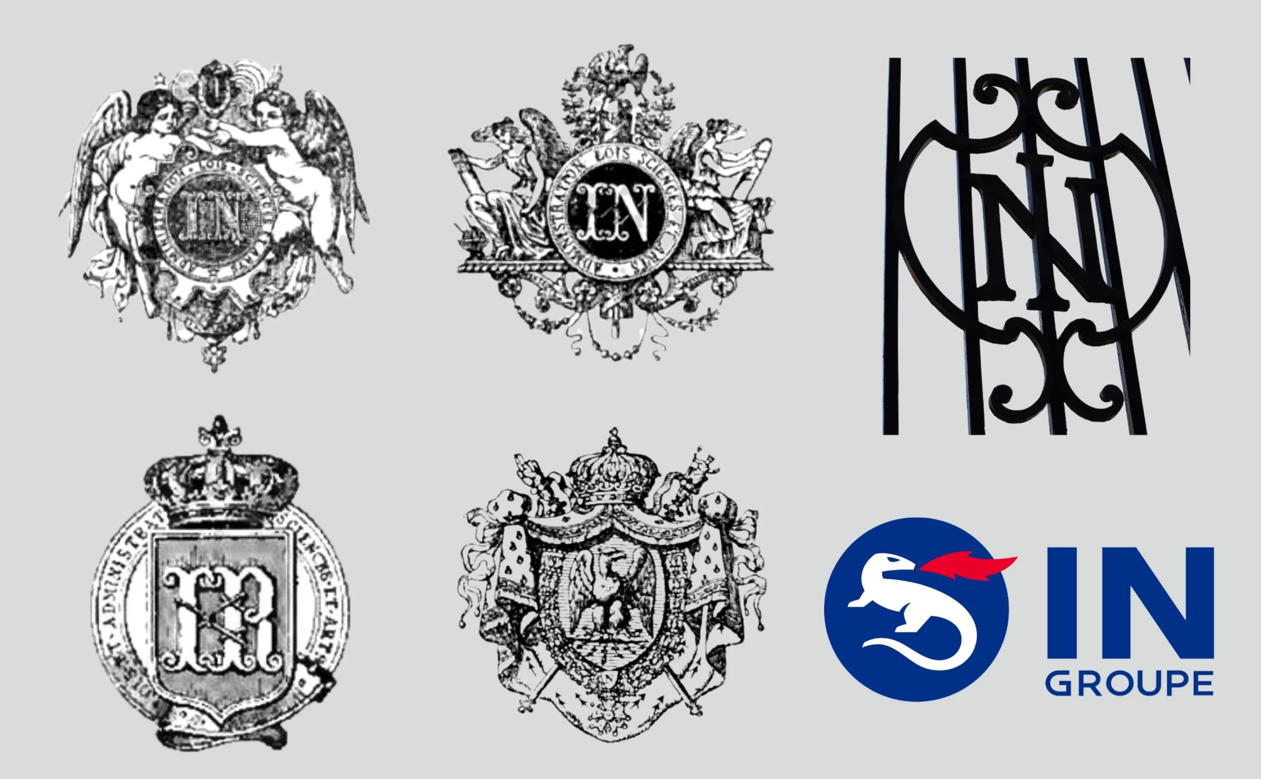
From the Imprimerie Nationale to IN Groupe
Over the years, the printing house changed its name with successive political regimes, becoming Imperial, then National, in 1870. It is today a place of collections, starting with oriental typeface punches through to the creation of the typographic punch cabinet (at the end of the Second World War), and the books of the historical library.
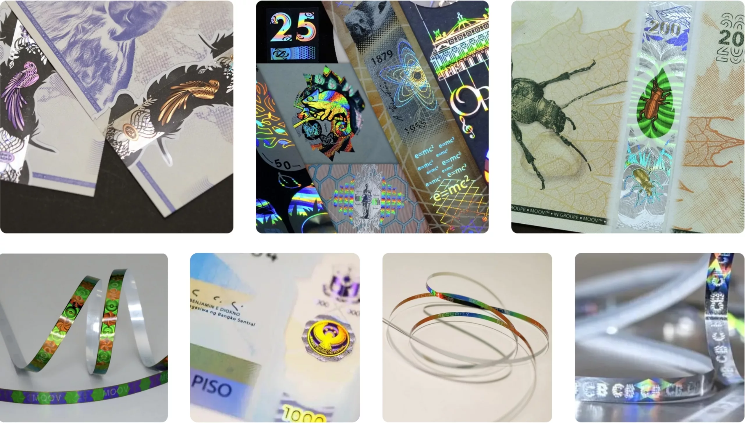
Having become a public limited company with the State as shareholder, it now guarantees the production of all official documents, from identity cards to biometric chips and passports for 130 countries, specific documents and secure digital services in the fields of health and public administration, as well as the creation of secure banknotes. IN Groupe today deploys its expertise in creating unforgeable documents, and is one of the world leaders in cryptography and digital and electronic security and “trust services“.
It printed the telephone directory until 2002, tax declarations, newspapers, catalogues, and more recently deployed the TousAntiCovid application.
The biometric chip, optical security ribbons, and secure inks of today are the modern forms of yesterday’s punches and matrices, still guaranteeing State certification.
The Romain du Roi
Since its creation in the 17th century, seven typeface families exclusive to the King have been produced at the Imprimerie Royale, shaping the reach of French literary culture and “branding” each reign according to its character(s): the Garamont (Romain de l’Université), the Romain du Roi (Grandjean) around 1693, the Luce (Types poétiques), the Didot millimétrique (Romain de l’Empereur) under Napoleon I, the Marcellin-Legrand, the Jaugeon and the Gauthier.
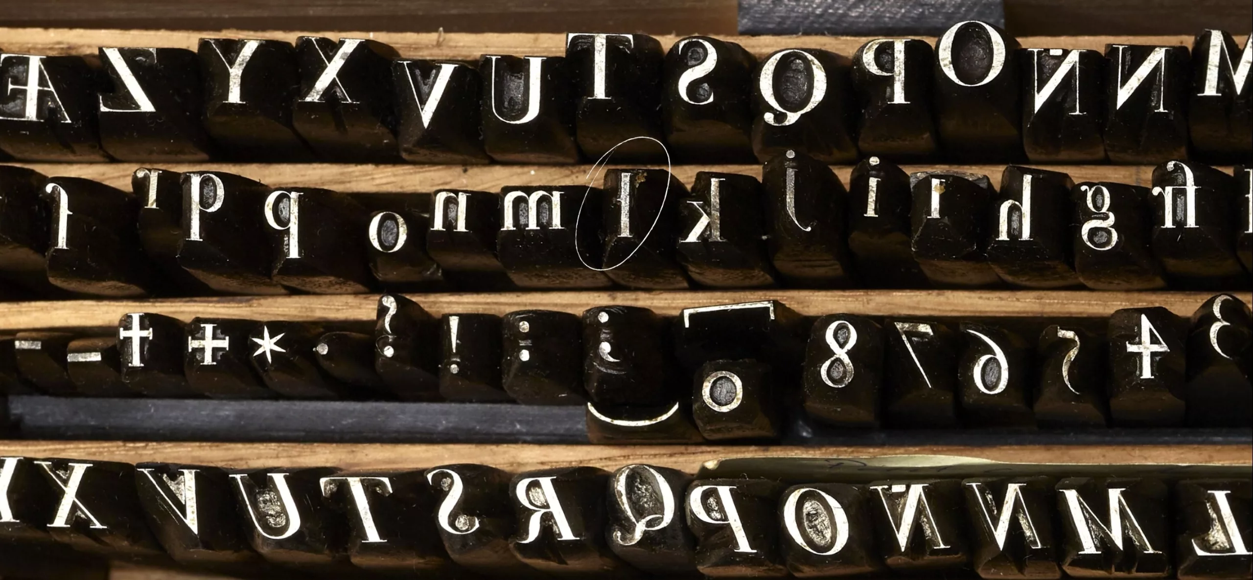
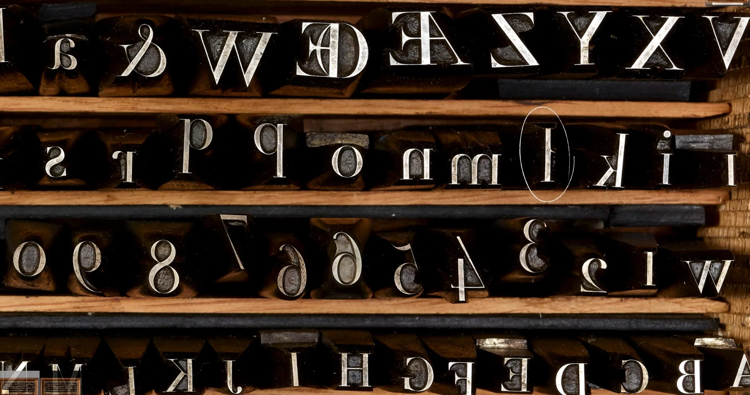
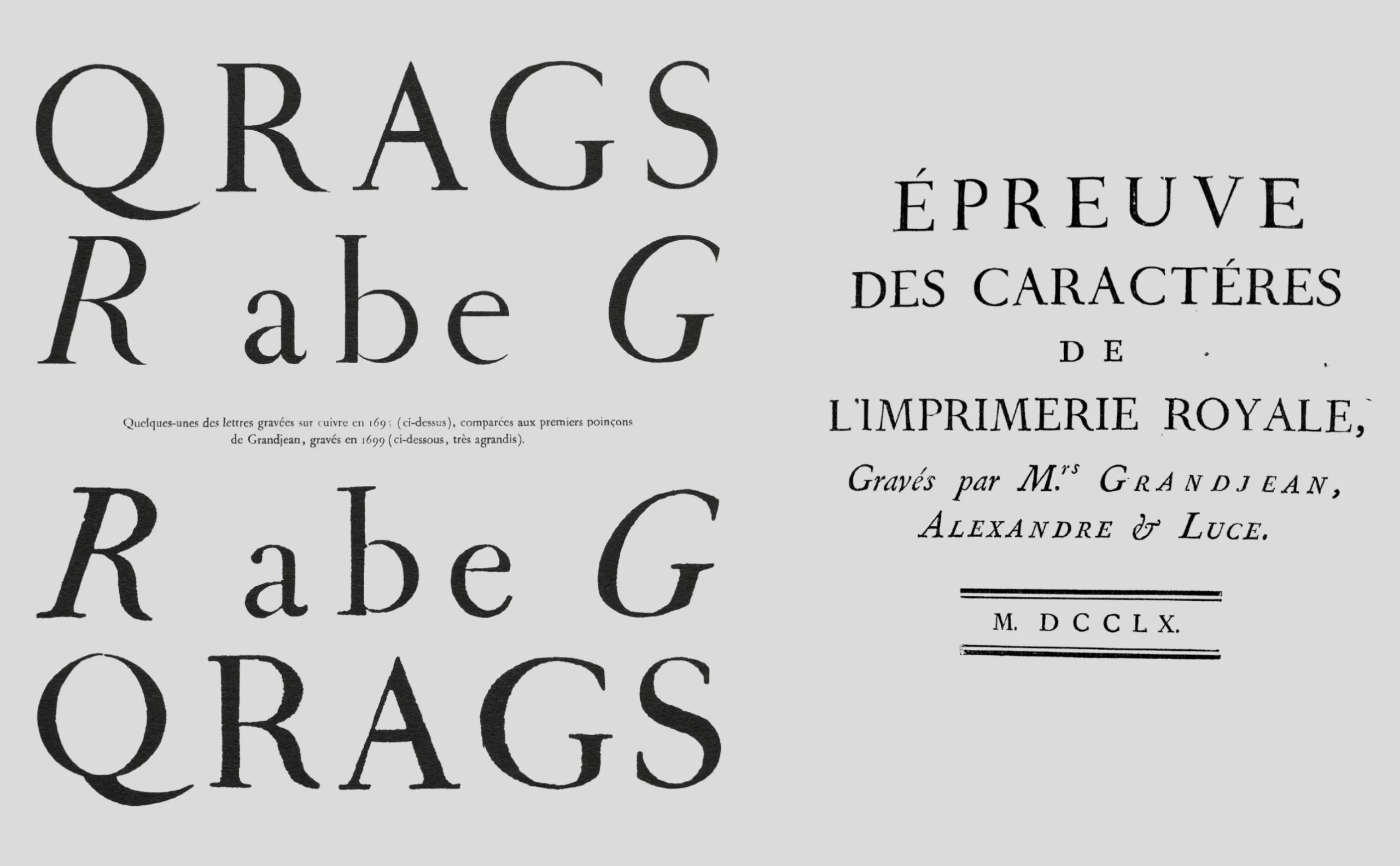
Today, official documents are set in Helvetica or Arial and aim to be as neutral as possible, whereas the Imprimerie Royale did exactly the opposite for its prestige productions: it asserted its singularity. Almost all its typeface families feature a crossbar at mid-height on the lowercase l (see visuals below), a distinctive mark of the Imprimerie Nationale that became its trademark, and several Kings created their own typefaces to “sign” their reign.
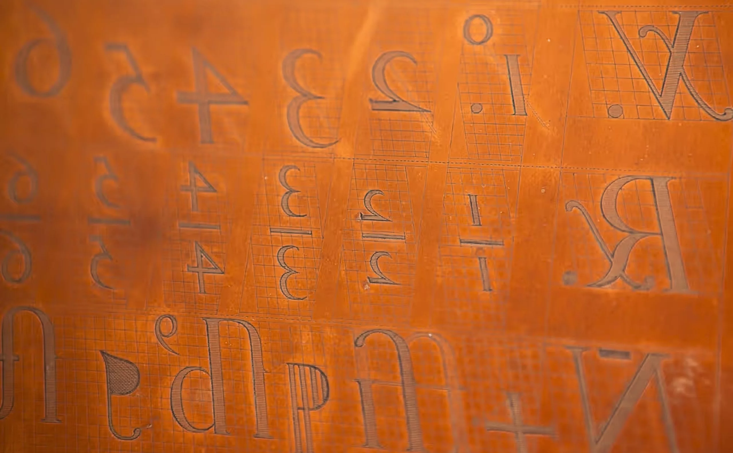
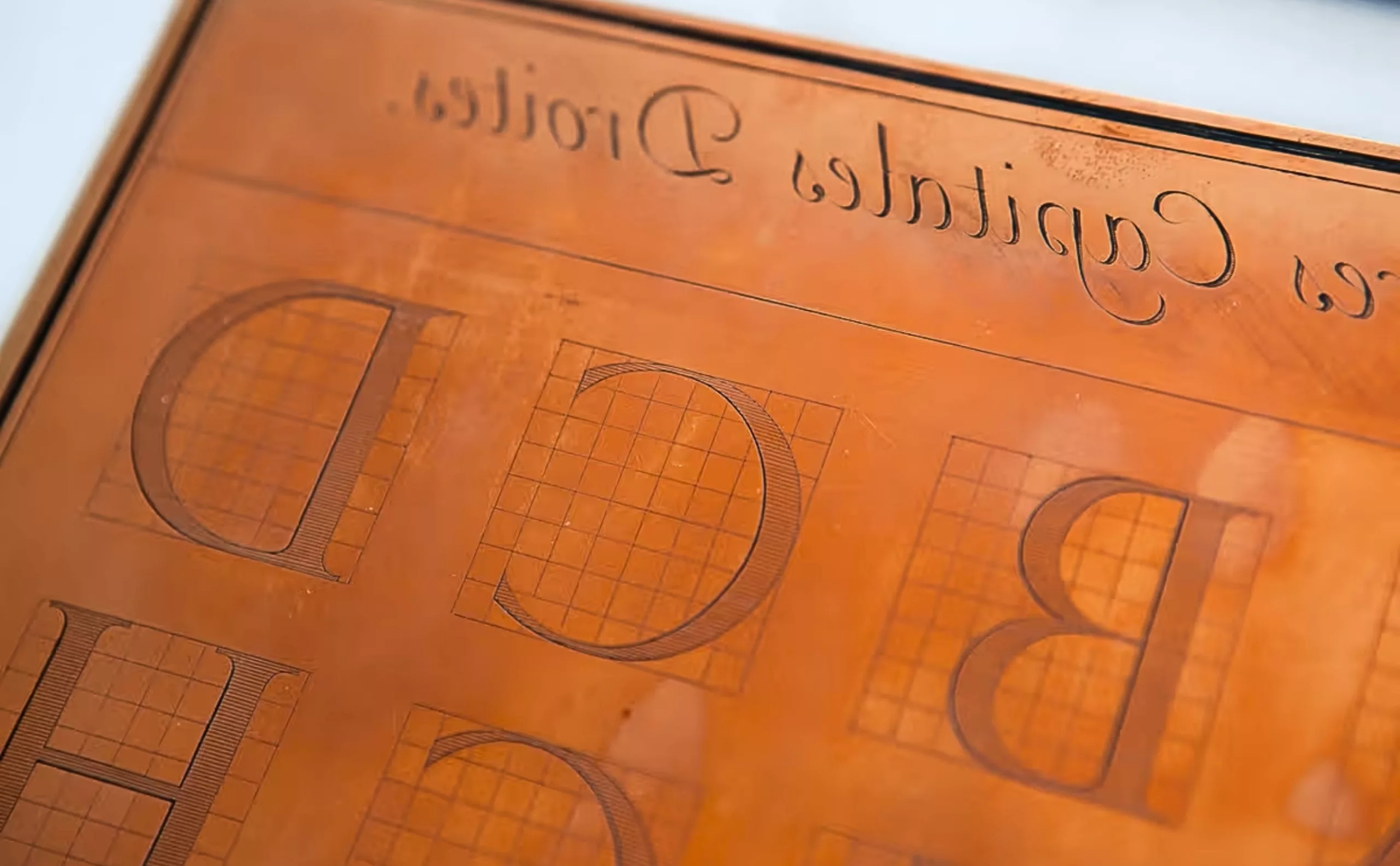
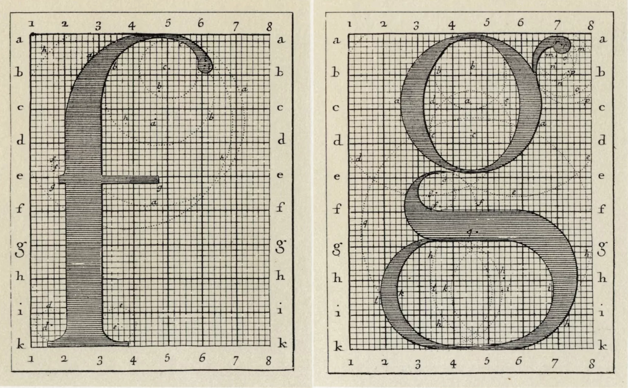
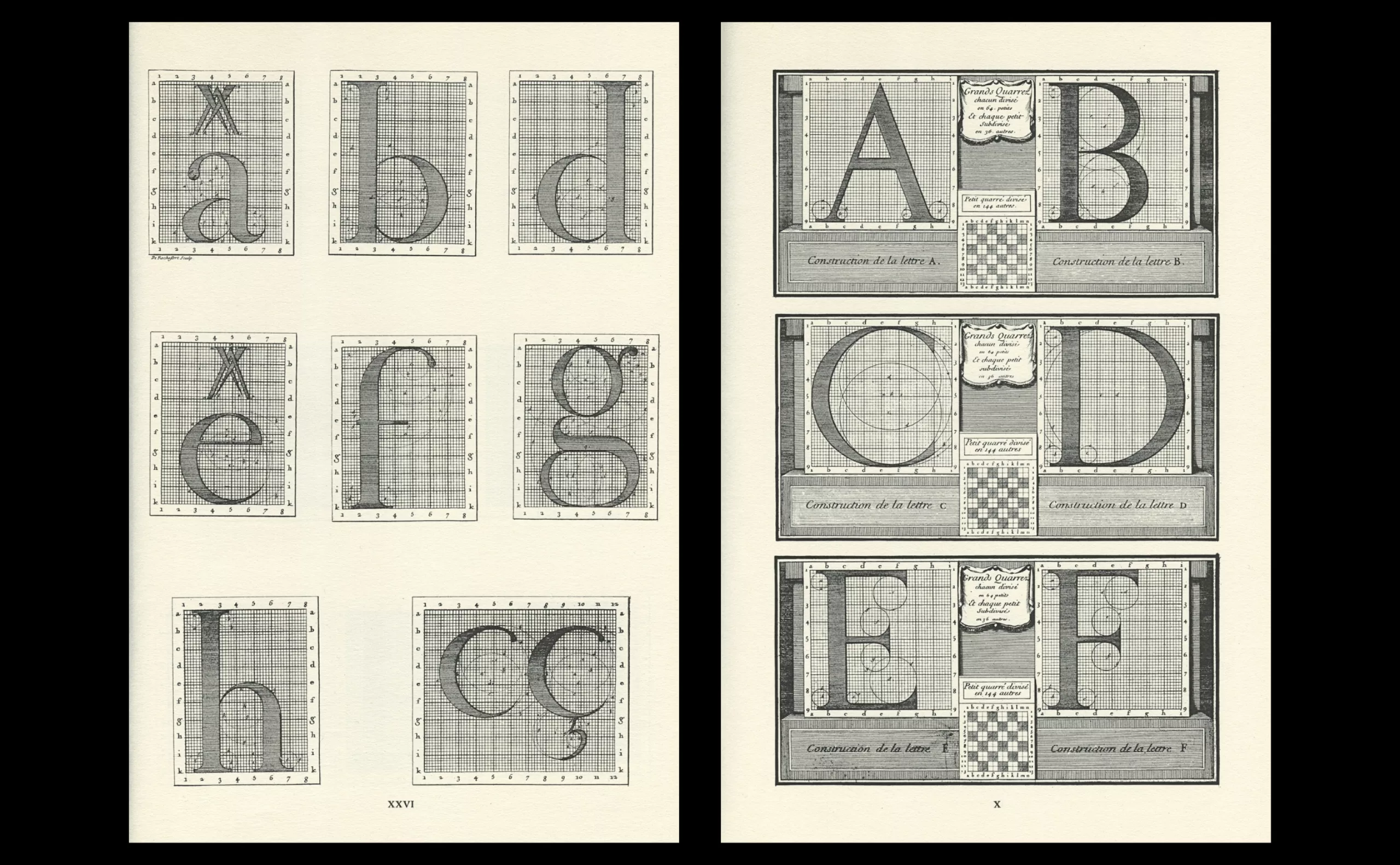
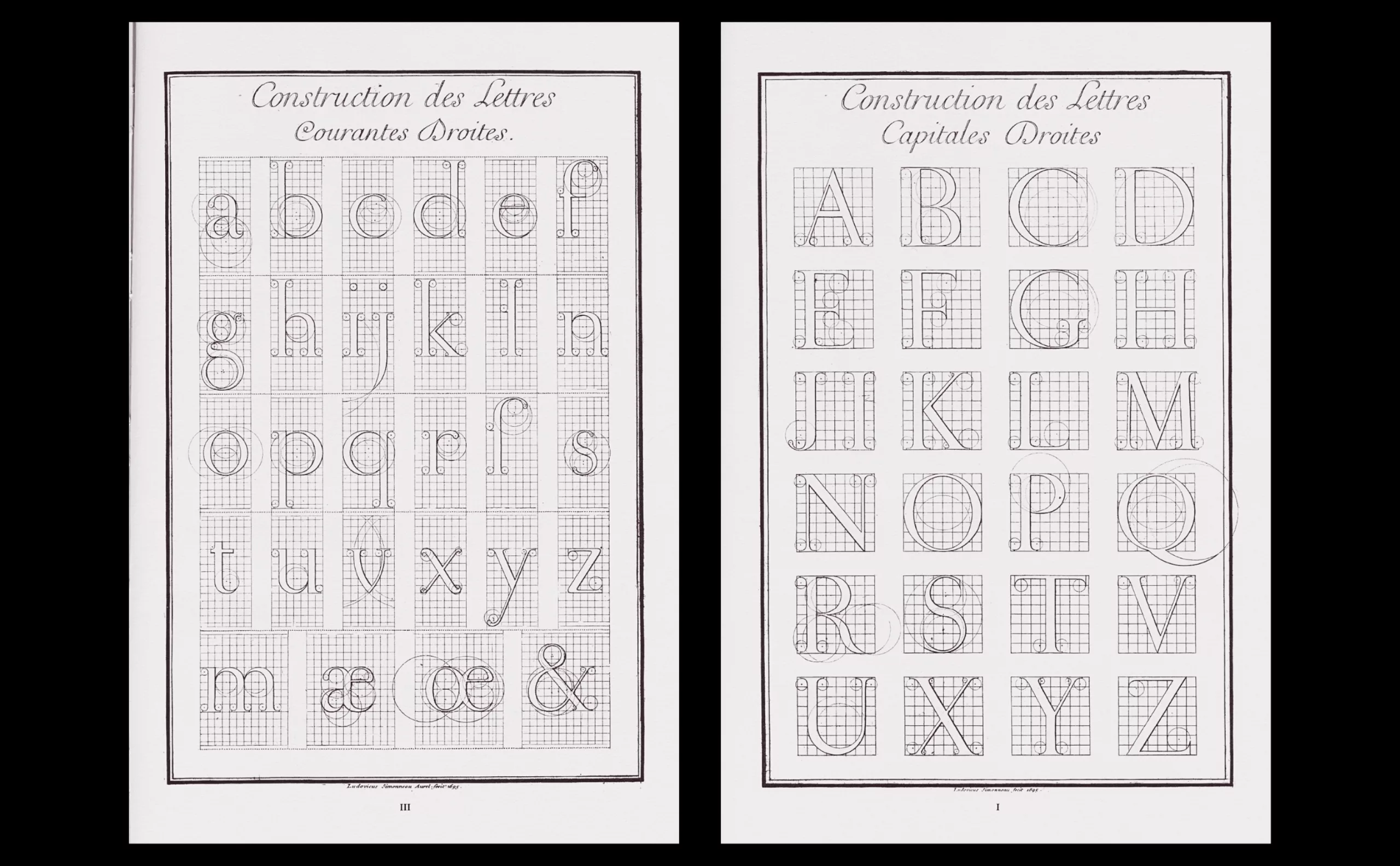
From 1693, over a period of more than thirty years, Philippe Grandjean, engraver and curator of the royal foundry, created the first modern typographic character of the Réales family, the most spectacular of them all. Under the impetus of the Académie Royale des Sciences and Jacques Jaugeon (rather than a simple foundry), and through the copperplate engravings of Louis Simmoneau, he and his pupils produced the punches of the “Romain du Roi” (known as Grandjean) in several cases and body sizes, both roman and italic. The first impression using these characters was produced in 1760, a full seventy years later.
His work drew inspiration from a study of the finest European letterforms of the time, proposing a rigorous style “scientifically” composed on a minutely gridded framework of 8×8 squares each themselves subdivided (2,304 squares in total), inspired by so-called “divine” proportional measurements, as with the Garamont before it. The Romain du Roi is distinguished by its uniformity and great harmony. It would also be used to engrave monuments and steles in honour of the King.
The punch cabinet of the Imprimerie Nationale no longer has anyone to practise and pass on the craft of creating typographic punches according to traditional methods. The sole heir to this unique and rare expertise is Annie Bocel.
Annie Bocel, heir to the treasure of the Imprimerie Nationale
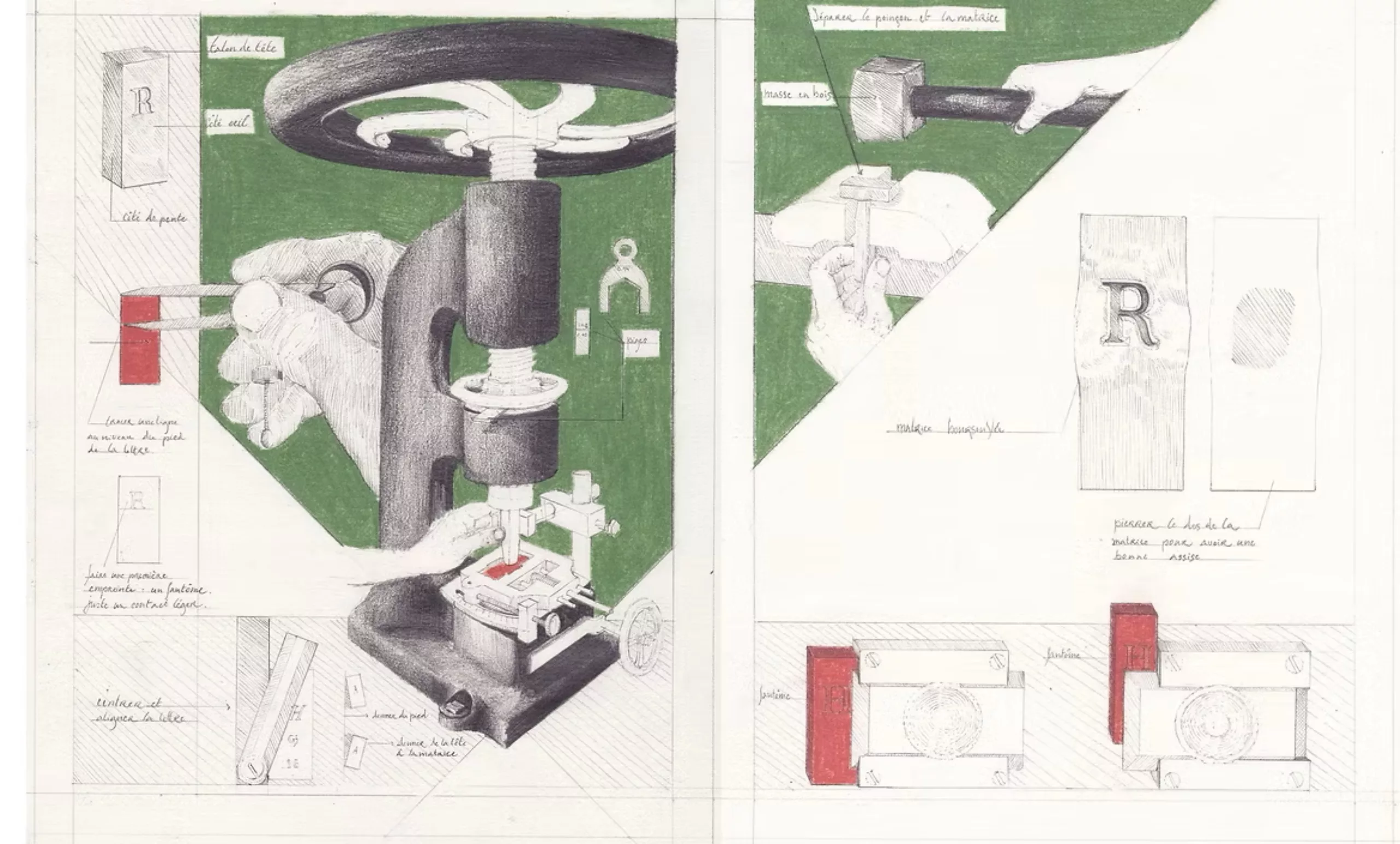
She was once the guardian of the treasure of the punch cabinet, and today works in a small studio in Brittany. Annie creates punches by hand and by eye using specific tools — squares, files, and extreme precision — in the pure tradition, while waiting to find someone to whom she can pass on this knowledge.
A former graduate of the École Estienne in engraving, she was trained by Nelly Gable in 2014 and for five years, within the Punch Cabinet of the Imprimerie Nationale, as part of the Maîtres d’art & Élèves programme established and managed by the Ministry of Culture & the INMA (Institut national des métiers d’art). Their practice is transmitted through a lineage descending from the Deberny & Peignot foundry (1850–1974), an illustrious French type foundry that bequeathed its precious collection of punches to the Imprimerie Nationale upon its closure.
From this apprenticeship with Nelly Gable was born a collaborative publication, written and illustrated to pass on the gestures of punch engravers: dessins de geste, gravure & poinçon typographique.
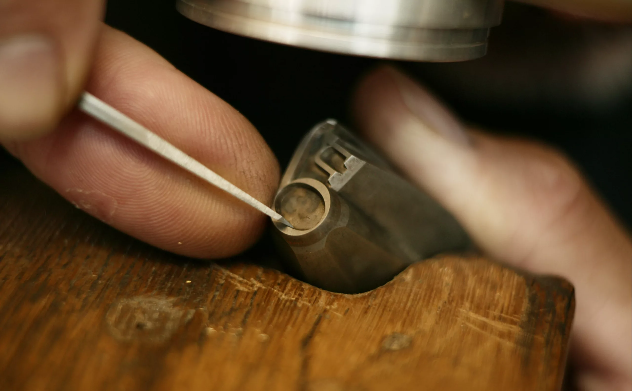
Annie Bocel lives and works in a tiny Breton village where she still holds out, unflinching, against the imprint of passing time. She engraves, not only punches. On her papers, Annie Bocel prints letters and images by playing with form, material and void. Each element shaped by her hands is revealed under the press, through contrasts. Black and colour enter into dialogue with white, shadows expose relief beneath a play of light, and gold sublimates and warms what was lifeless.
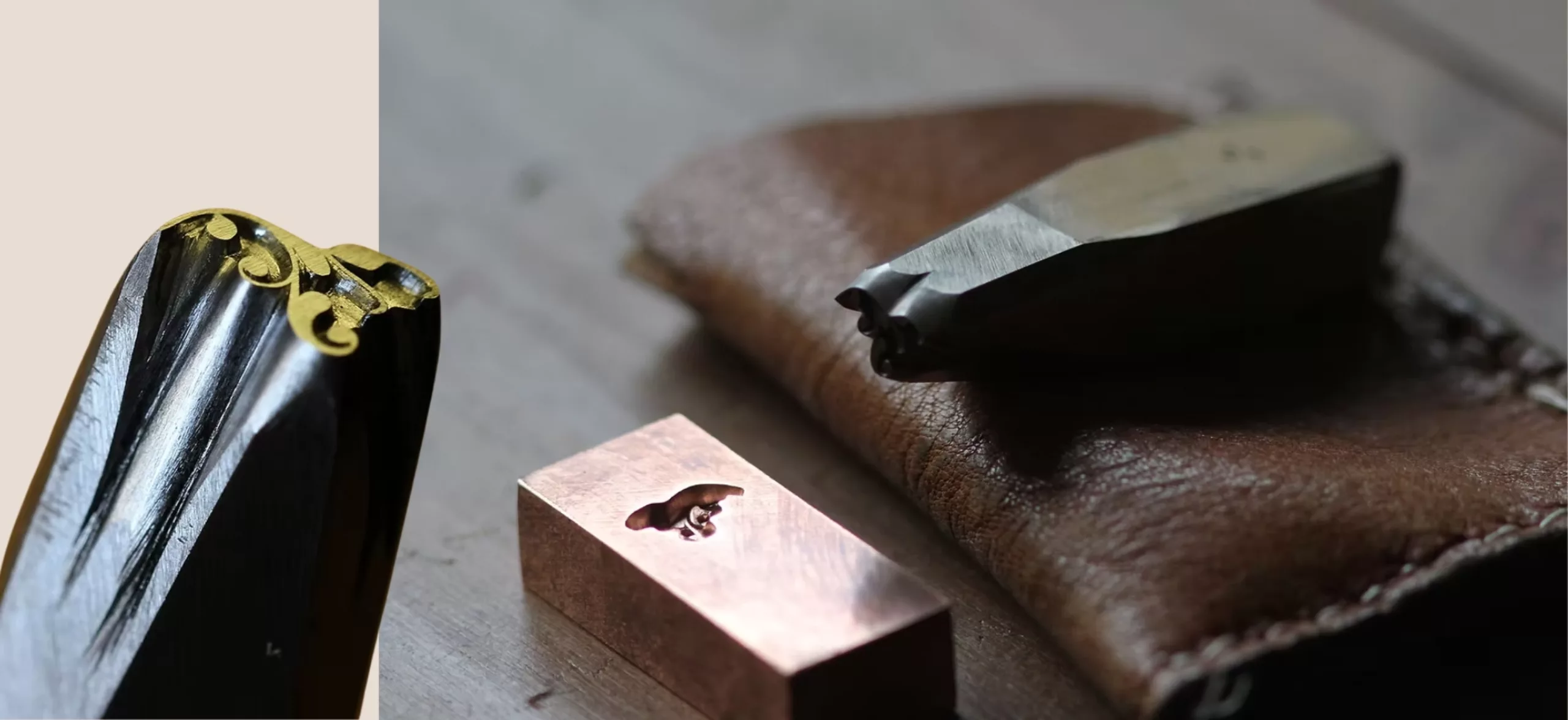
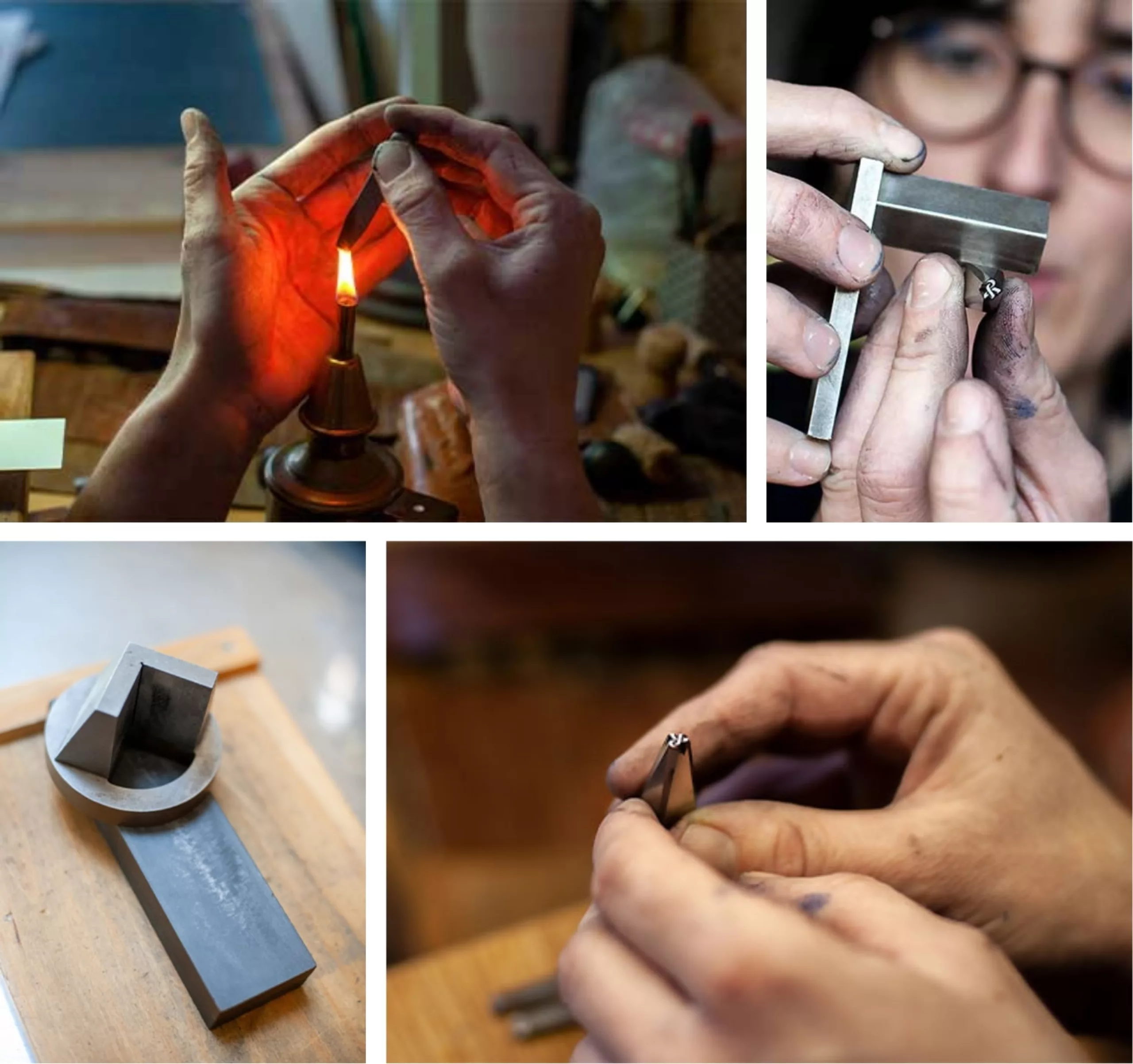
Annie engraves and embosses, breathing life into hollows and volumes to make the paper speak, through fragile and ephemeral prints that tell of forgotten time and unveil lands yet to be discovered. She works in mezzotint, in a clouded density that barely lets light through, creates botanical studies in etching with a transparent fragility, brings fossils back to life beneath gilded embossing.
From that rigid, heavy and cold tool that is metal, she draws forms that are organic, alive, light and deep at once. In perpetual search for meaning across her work, her research focuses on impermanence and trace, as a visual echo of the very essence of nature.
Annie is living proof that the typefaces of the past still have stories to tell.
On the subject
-

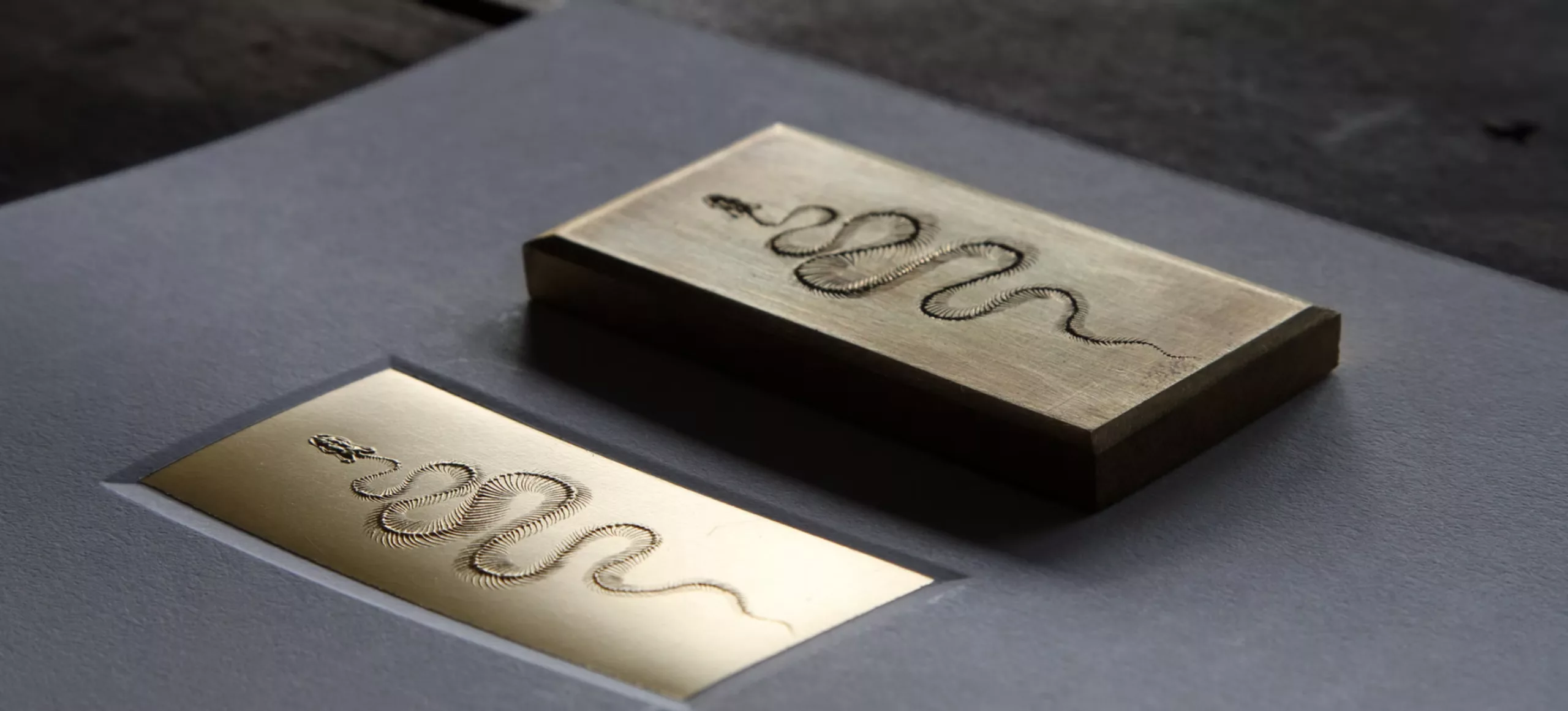
3 questions for Annie Bocel on typography and engraving
Graphéine met with Annie Bocel, who possesses the craft to create the first link in the typographic chain. From her workshop in Brittany, she answers our questions about type matrices, engraving and traditional techniques.
-
San Serriffe typographic Island
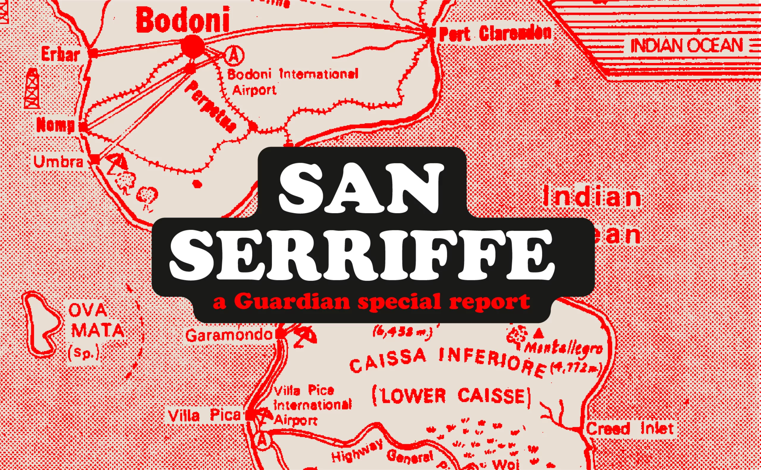
Discover how The Guardian tricked its readers into inventing the island of San Serriffe, a fictional republic born of a typographic April Fool’s joke that has become cult status. Between subtle satire and typographic wordplay, immerse yourself in one of the most brilliant journalistic hoaxes of the XXᵉ century.