The futuristic world of Brantonne

It was at a village flea market that we first came across a model kit for an Esso petrol station. There are no dates on it, but given the presence of a Peugeot 203, it’s highly likely that this children’s model kit was distributed in the mid-1950s, as the model was produced until 1960. It was a car that would leave its mark on its era. The first post-war motor shows had seen the emergence of a host of small cars: the Renault 4CV, the Citroën 2CV, the Panhard Dyna. The 203 was a larger car with an American-style look.
And then there’s the Esso logo: simple, effective, with that capital E shaped like an upside-down 3.
A typographical effect that was quite unusual. So we look into it, trying to find out where this logo comes from, and what lies behind the Esso brand name. From 1870 to 1911, the American company was called Standard Oil, then Eastern States Standard Oil. The name Esso is an acronym for Eastern States Standard Oil, but it is also the phonetic transcription of the two initials of the former Standard Oil… just like Hergé, R and G for Georges Rémi.
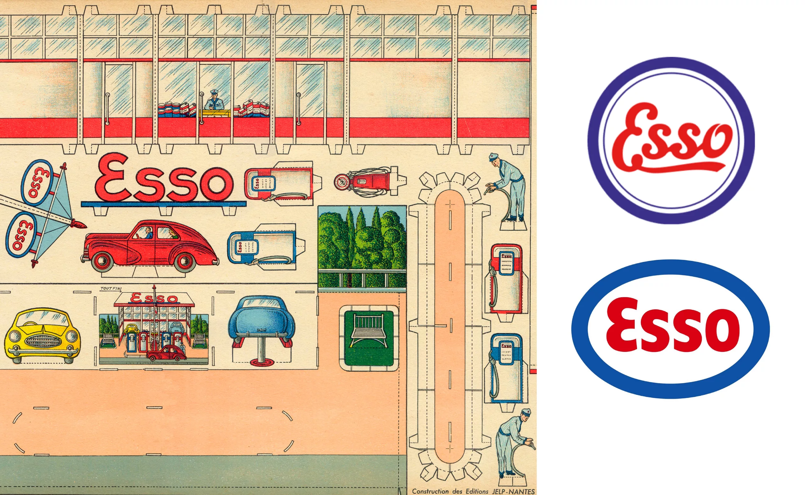
In the late 1920s, the blue and red Esso oval became the emblem of the group as we know it today.
And then, surprisingly, whilst reading an article about Raymond Loewy—to whom this logo is attributed—a name appears, one that is both legendary and unknown to the general public.
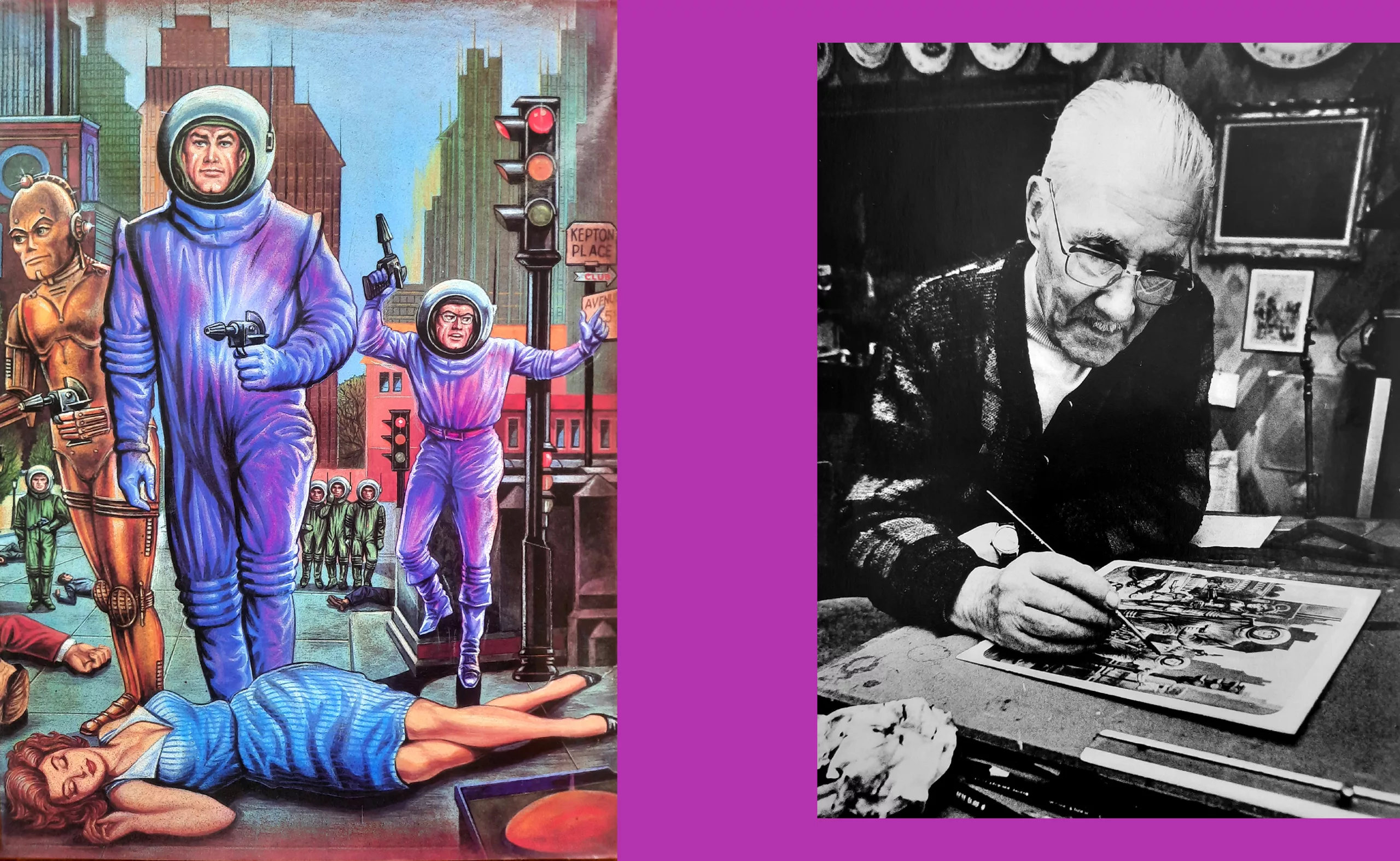
Brantonne, René Brantonne. THE Brantonne of Fleuve Noir, the man who created the most significant and fantastical post-war science fiction collection in France, “Anticipation”. Wild spaceships, bright colours… A whole universe.
A Marabout Bout de Ficelle story just the way we like them, starting with a flea market and a logo and leading us to a French illustrator who left his mark on an entire generation.
René Brantonne was born in 1903. He enrolled at the Beaux-Arts at the age of 18, but stayed for only two years, as his work did not meet the teachers’ expectations. Already, it was a case of colours being too bright at a time when artists painted with earth pigments.
He was called up for military service, then in 1925 he joined Paramount, which was setting up in France, as an illustrator. Advertising and his first posters. Other American film companies courted him: Fox, Columbia, Universal, MGM… He became indispensable for summarising films in a few illustrated vignettes.
In 1928/1929, René Brantonne was 25 years old when he set off for the United States.
What was his aim? What was on his mind? The story remains unclear, as throughout his life he perpetuated false legends and covered his tracks.
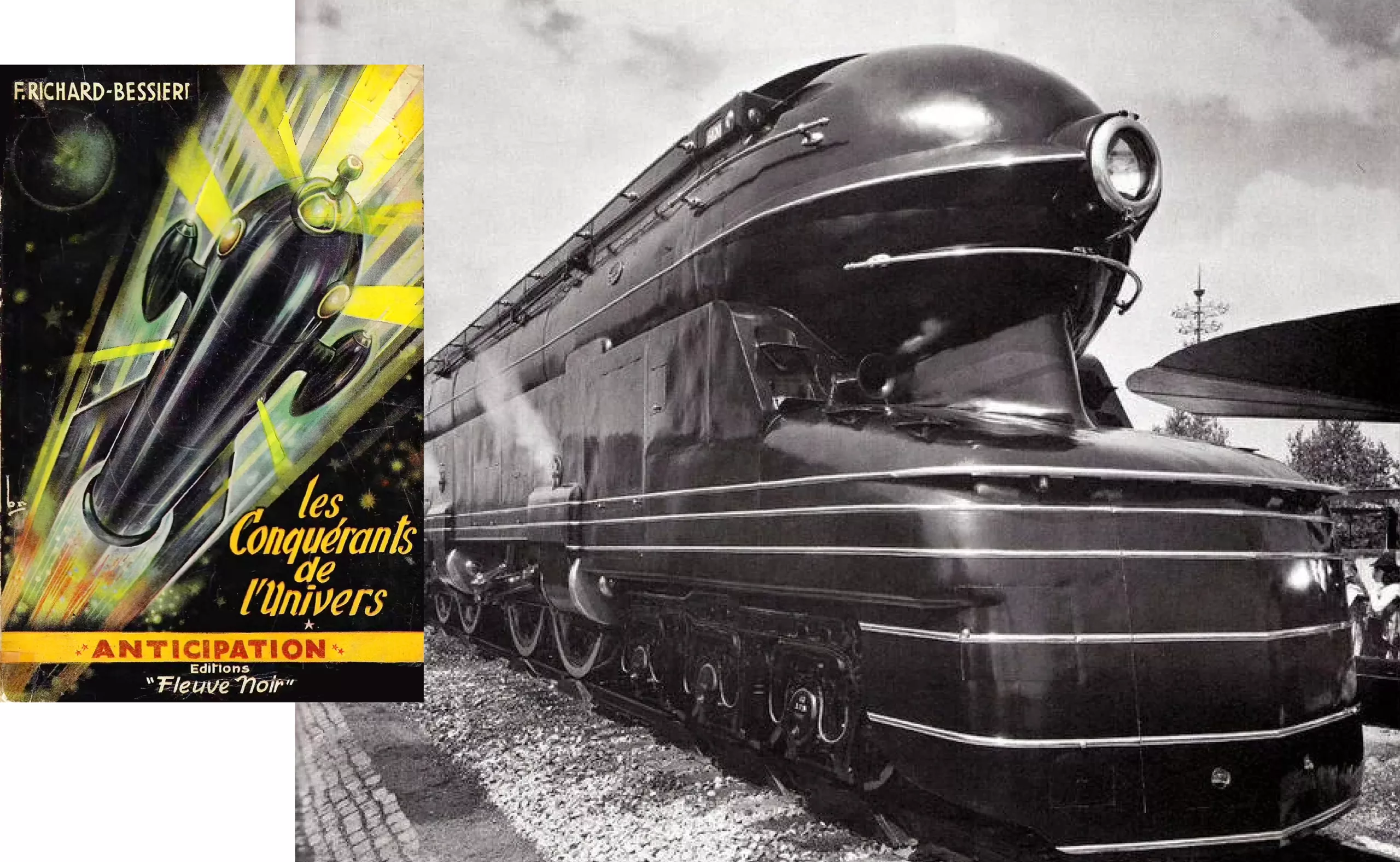
Be that as it may, he soon joined Raymond Loewy’s agency in New York, where he produced numerous advertising materials. In the field of visual identity, he worked on and finalised the Esso logo featuring the oval, the E shaped like an upside-down 3, and the blue and red colours.
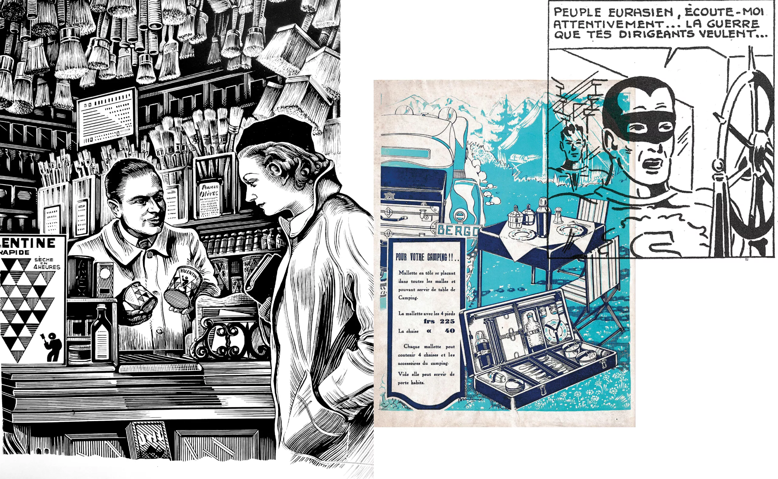
In the 1930s, he dabbled in everything. He ventured into cinema posters, illustration, photo retouching, advertising and comic strips.
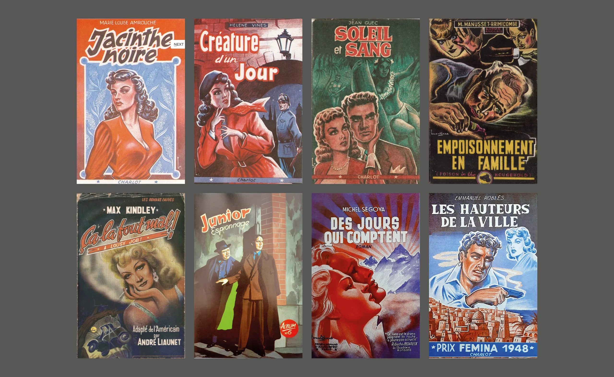
His book and booklet covers flooded the popular publishing market.
After returning to France following the war, Brantonne went on to become the king of Normandy Camembert labels. Labels that were like mini-adverts, like film posters. Eye-catching and visually striking.
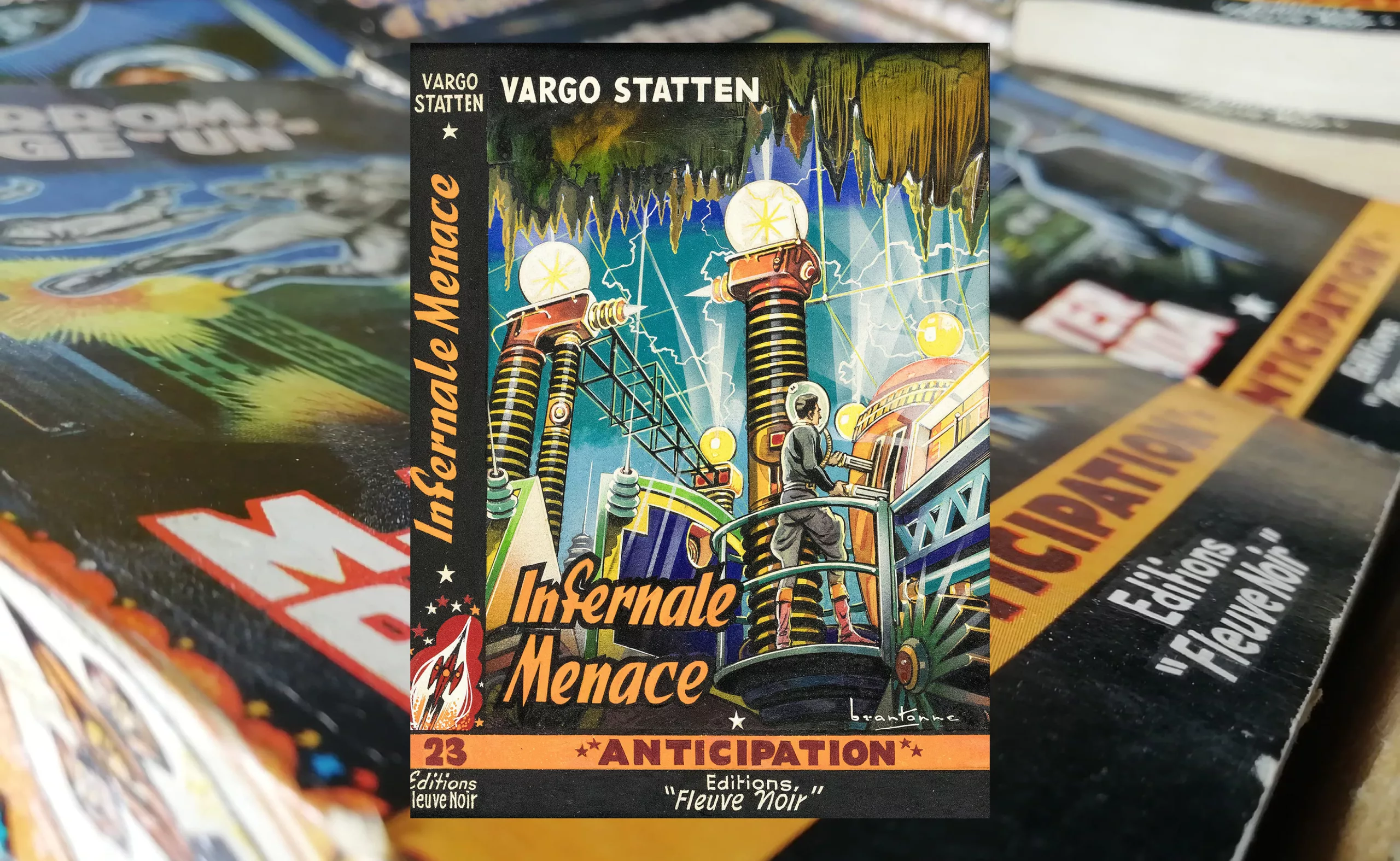
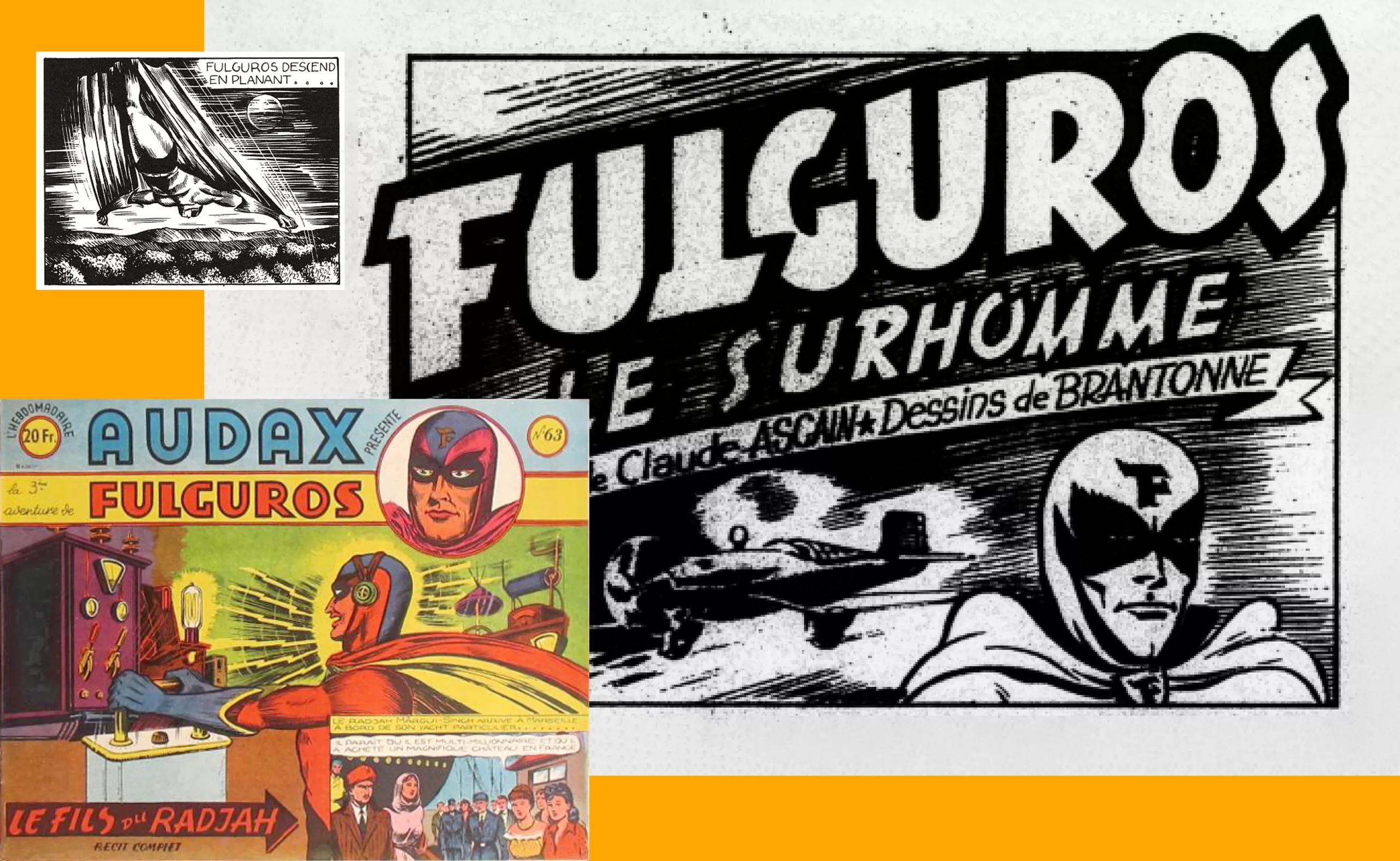
September 1951 marked the start of a collaboration with the publishing house Fleuve Noir that was to last more than 20 years (from 1951 to 1965), centring, amongst other things, on the legendary “Anticipation” (FNA) series, for which he created 273 original covers.
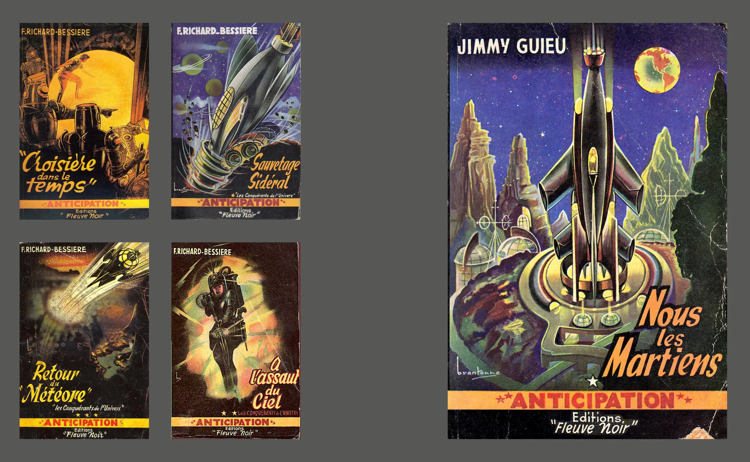
“Anticipation” was a science fiction series aimed at a general readership who dreamt of space travel. The books were inexpensive, with particular attention paid to the cover art.
In the 1950s and 1960s, more than half of science fiction titles fell into the “space opera” category, or what was known at the time as the “space serial”.
It was a subgenre characterised by epic or dramatic adventure stories set against a complex geopolitical backdrop. Already, large-scale space exploration and intergalactic wars were featured.
The genre enjoyed immense success from the 1960s and 1970s onwards with Star Trek and then Star Wars.
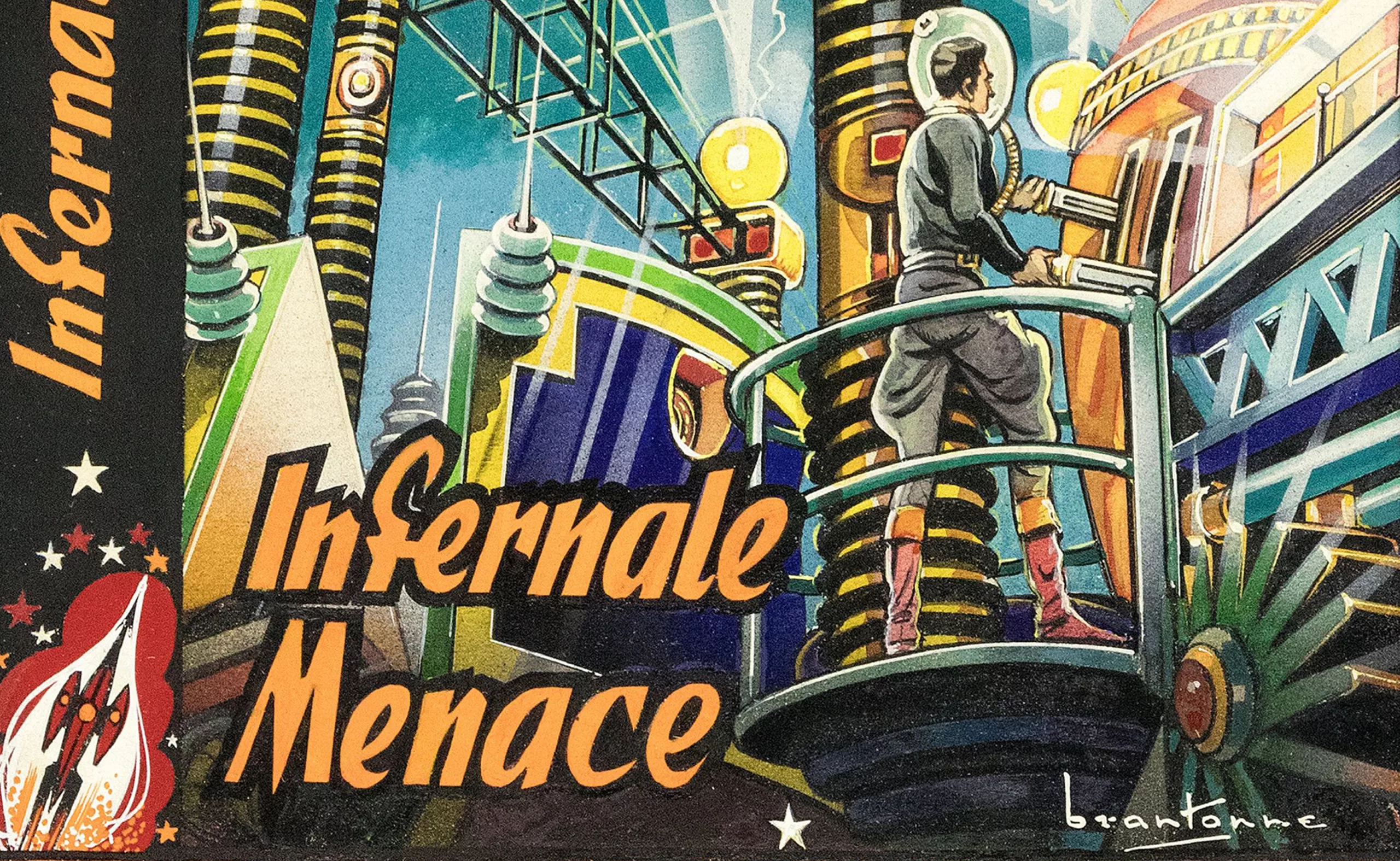
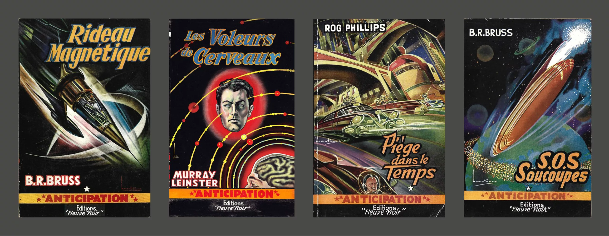
The Brantone style for “Anticipation” could be summed up as a palette of bright colours – too bright for the time.
As well as his use of airbrushing, a technique in which he pioneered, being arguably one of the first illustrators to use it in France.
But what is instantly recognisable is the design of the space setting.
Robots, aliens, space suits and suits. His rockets and intergalactic craft seem to draw their inspiration from Raymond Loewy and his approach to design. Fuselages with smooth curves. One need only compare the American designer’s locomotives with Brantonne’s rockets to find the same logic of simplicity.
Streamline, the ‘smoothing’ that lends an alluring form to the idea of aerodynamics.
At a time when science fiction was cold, metallic and technological, Brantonne brought a touch of humanity to it and made this imaginary world very accessible. Each cover thus becomes an invitation to travel.
Among his sources of inspiration, it is hard not to recognise the graphic style of a great British comic book and illustration artist, Ron Turner, who in the 1950s created some beautiful covers for science fiction series similar to Fleuve Noir.
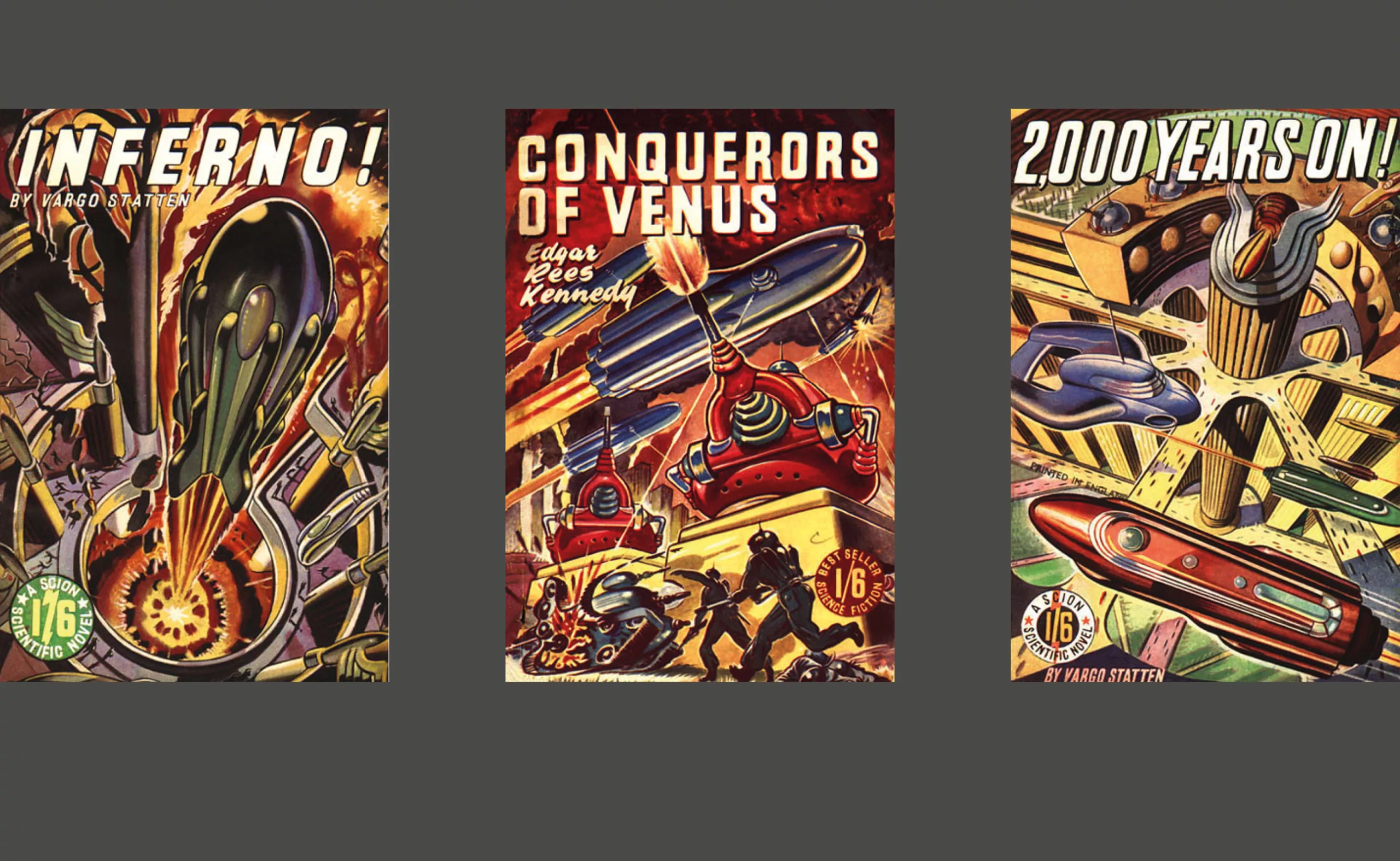
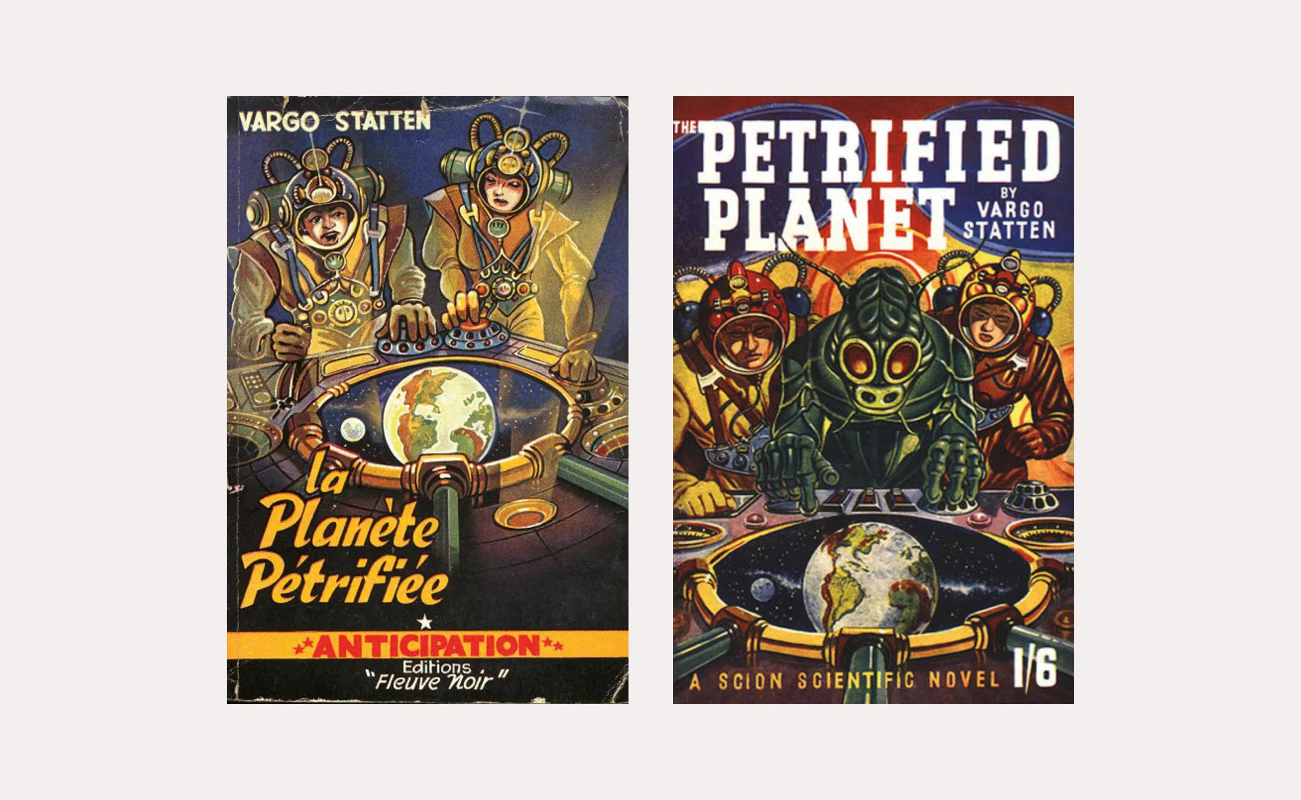
Some of Brantonne’s covers, such as *The Petrified Planet*, bear such a strong resemblance that the inspiration borders on plagiarism, even though Brantonne never references Ron Turner’s work.
Years would pass without Brantonne seeking to claim the status of an artist. No exhibitions or personal visibility. Then commissions would become scarcer.
Hard to pin down, he would obscure the truth about his political leanings (right-wing anarcho-syndicalism) (star illustrator for the French Communist Party after the Liberation), his affiliations (Croix de Feu before the Second World War) or his supposed links with Frédéric Dard (he allowed the rumour to circulate that he had inspired, in San-Antonio, the character of Bérurier (Béru) for his outspokenness).
In the 1970s, magazines such as Pilote, Futurs and Fiction commissioned him to produce a few rare covers.
After a career spanning 60 years, René Brantonne died in 1979.
As for his prolific output, almost nothing remains of it today.
The originals have vanished. Brantonne worked on commission without bothering to keep them. The Fleuve Noir covers, which have been so sought-after in recent years, were simply thrown in the bin. This is often the fate of popular media: consumed and discarded in the blink of an eye.
Text: François Chevret
Further reading:
— An illustrated book (out of print and not reprinted) traces the career of this author: “BRANTONNE au Fleuve Noir” by Yves Frémion, published by Kesselring, 1979.
— By the same author, “BRANTONNE illustrateur”, Le Denier Terrain Vague, 1983
On the subject
-

Peace & Love ☮ the activist icon
How did the most politically charged and well-known symbol on earth become a commonplace fashion accessory?
-
Tote bag, a new social totem?
The tote bag has become an essential part of our everyday urban lives.
What does it say about our society, our times, our habits and our behaviour? -
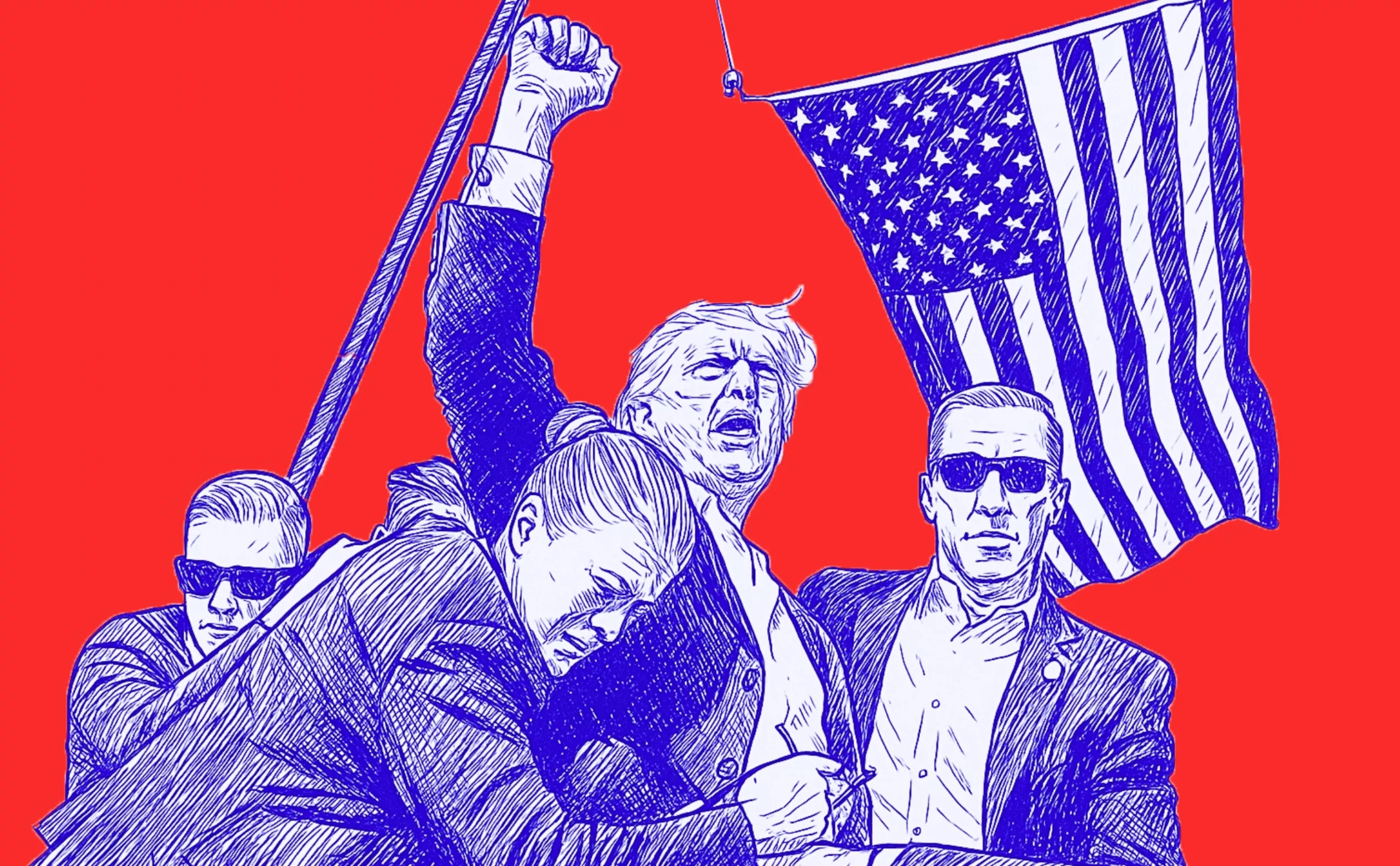
Donald Trump, the martyr who makes history
Donald Trump, his face bloodied, raises his fist and seems to proclaim “I’m alive, fight!”.
Let’s decipher an image that has gone down in history at the speed of a shotgun blast.