Lurs, Graphic Constellations
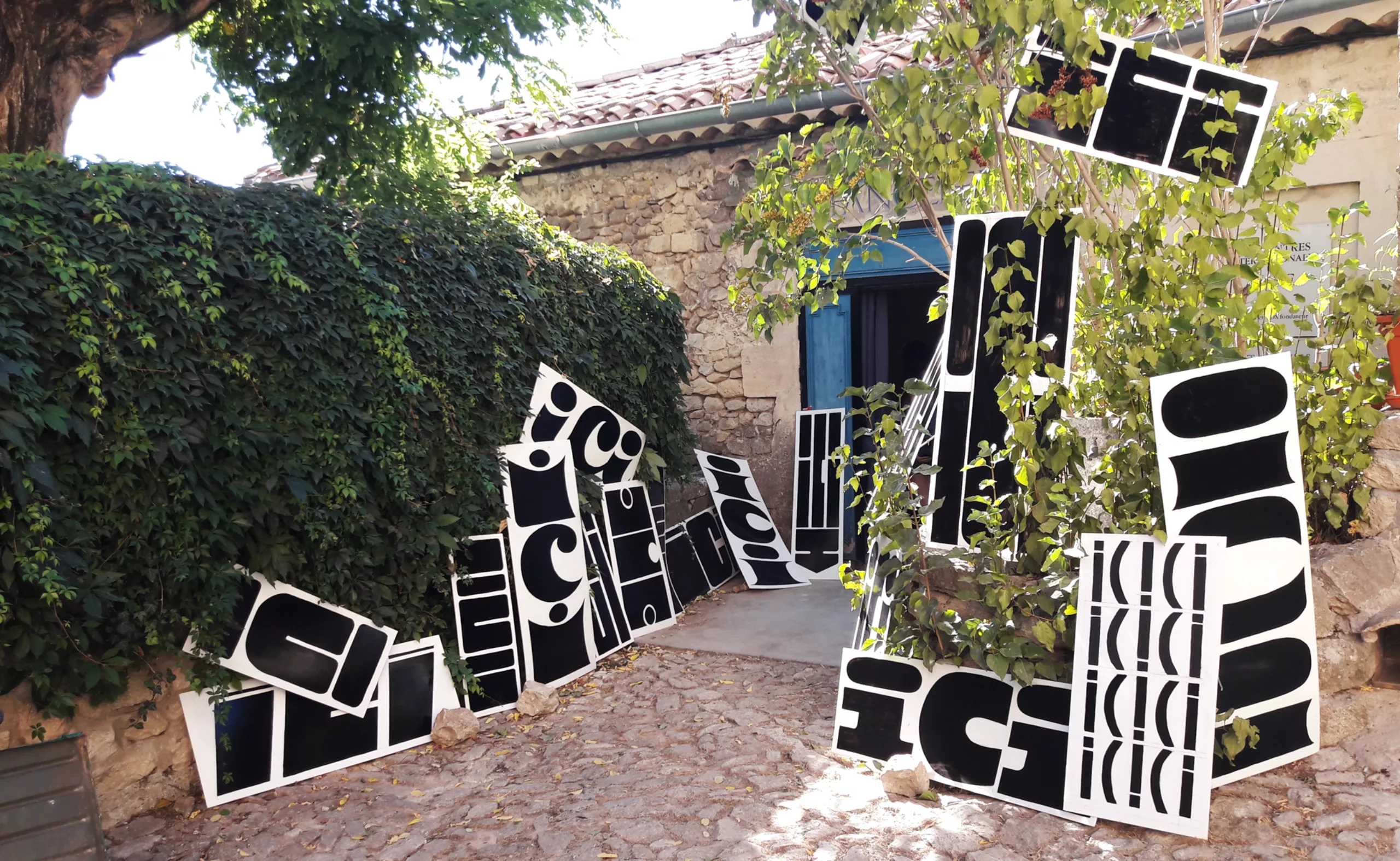
With our heads full of stars, a look back at our week at the International Typography Festival in Lurs in 2017, themed around constellations.
The first time
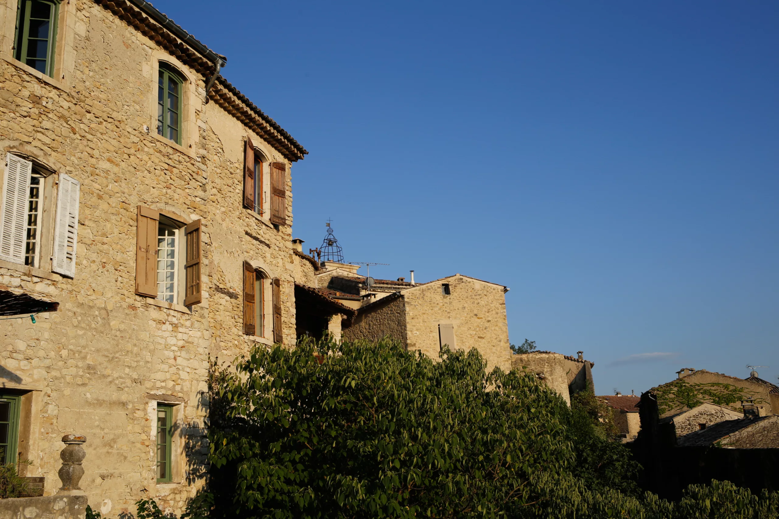
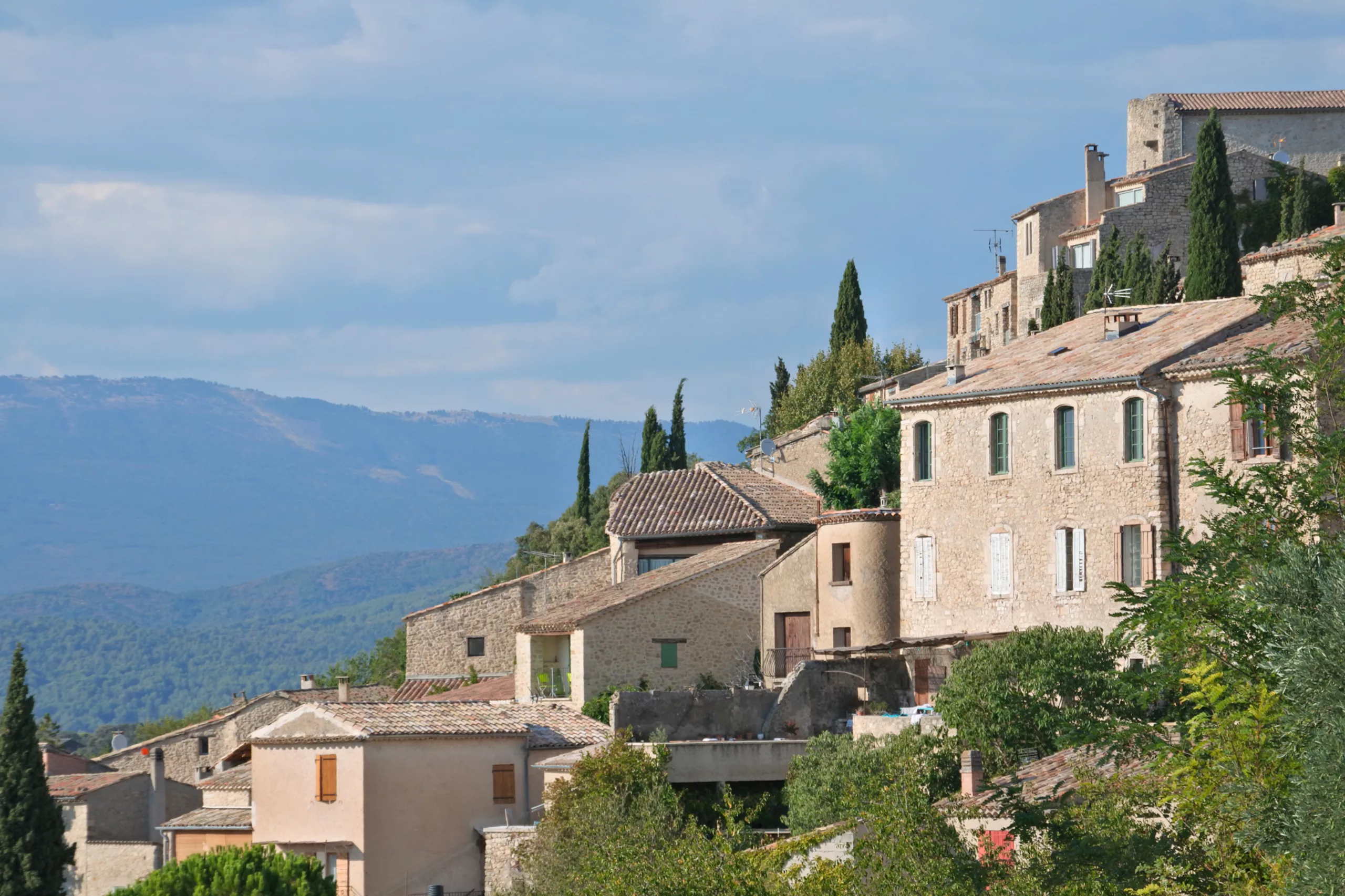
Your first encounter with Lurs takes place from a distance, overlooking fields of sunflowers and olive trees. Perched there like a small fortress standing firm under the scorching sun, the village welcomes its annual throng of pilgrims, without any fuss or neon lights. Whether passing through for international gatherings or on the Way of St James, their fervour is the same. Indeed, Vox recounts that in those days, “one entered the School of Lure as one enters a religious order; there was an oath renewed annually, passwords, incantations and mystical gestures…” Nothing has changed.
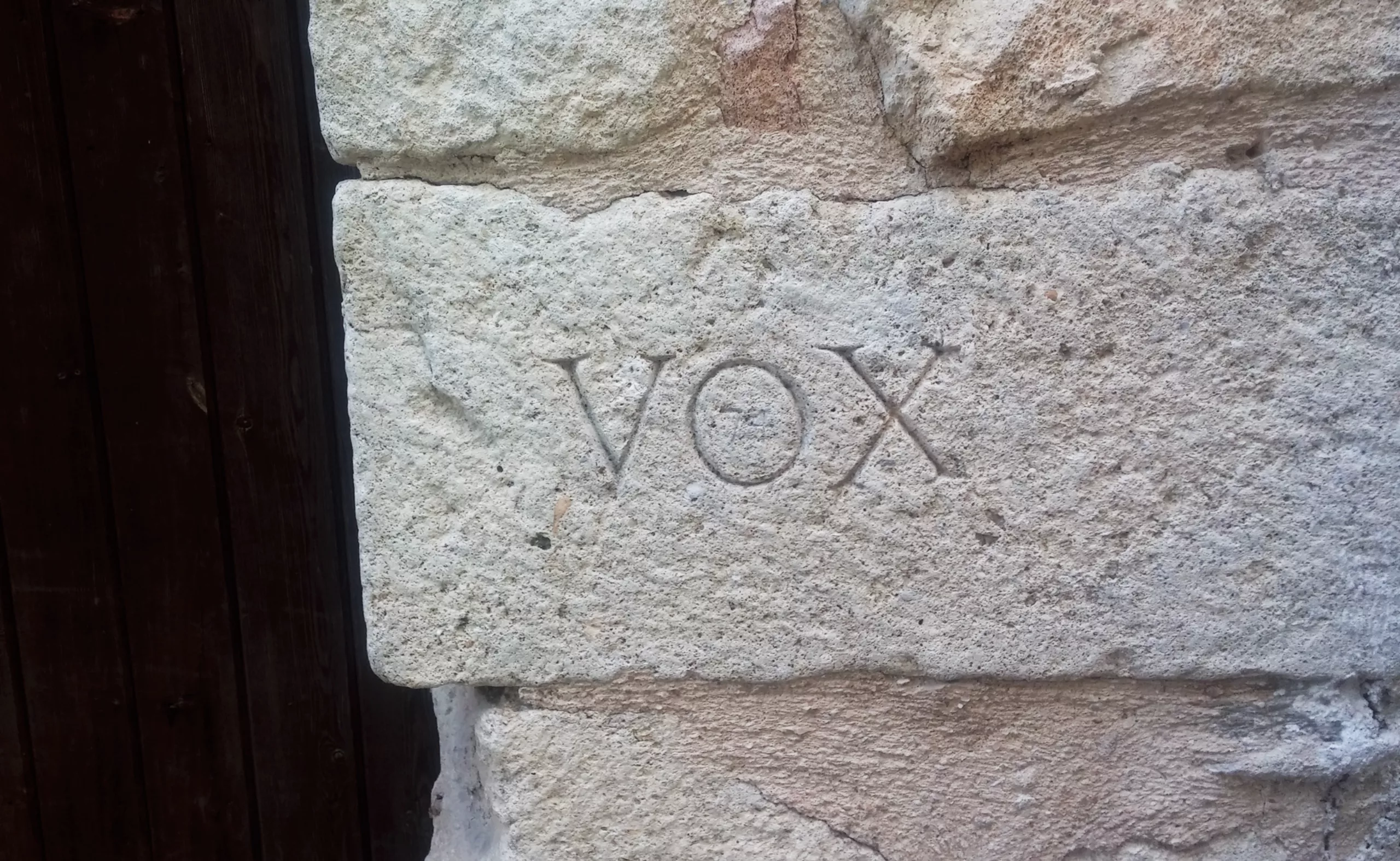
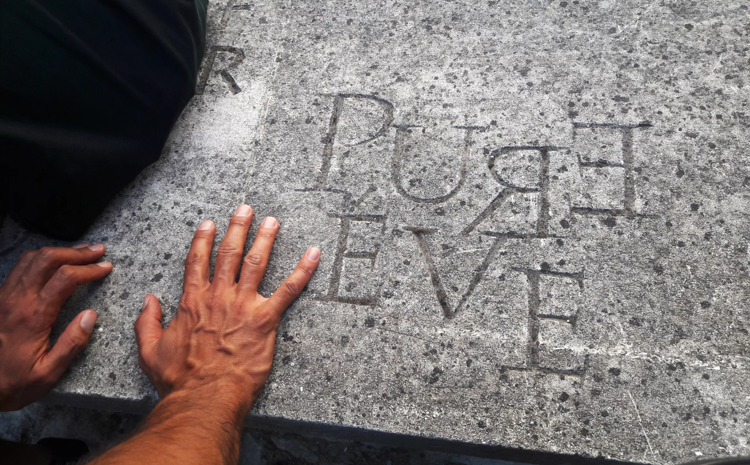
The walls of Lurs continue to speak to visitors through their stones, engraved by the great typographers who left their mark here – such as Vox, who founded the typography meetings.
On the ground, letters guide us through the village
• R E D • B L U E • G R E E N •
They set the tone and make their intentions clear: Lurs is a village full of character !
To find out all the secrets of the Rencontres, it’s best to start with this other article. In it, you’ll learn that Lurs was a deserted village infamous for a murder case, that Maximilien Vox doesn’t exist, you’ll understand the difference between Lure and Lurs, discover that to kick off the festivities at the first Rencontres, a chancellor drank methylene, and that a band of merry fellows vowed to meet there annually to “serve the spirit”.
To describe this first meeting, we could alternatively ask Maxime to pick up his guitar and come and sing ‘San Francisco’ with a Provençal twist. It would go something like this: It’s an ochre-coloured house nestled against the hillside. You walk there; you don’t knock – those who live there are already waiting for us. We meet up after a few hours’ drive and sit down to a meal; everyone’s there, at six o’clock in the evening, for the pistou soup…
Right under the stars
But the pistou soup will come later. For us, it all begins with a double moon story.
The first lecture plunges us, somewhat bewildered, into a detailed explanation of a lunar calendar dating from – 30,000 BC, engraved on a reindeer tooth half the size of my palm (incidentally, a little cosmic ‘did you know’: the crescent moon, curved downwards like an arch, only shines once every 19 years, on the eve of the spring equinox. See you in 2023 for the next one!).
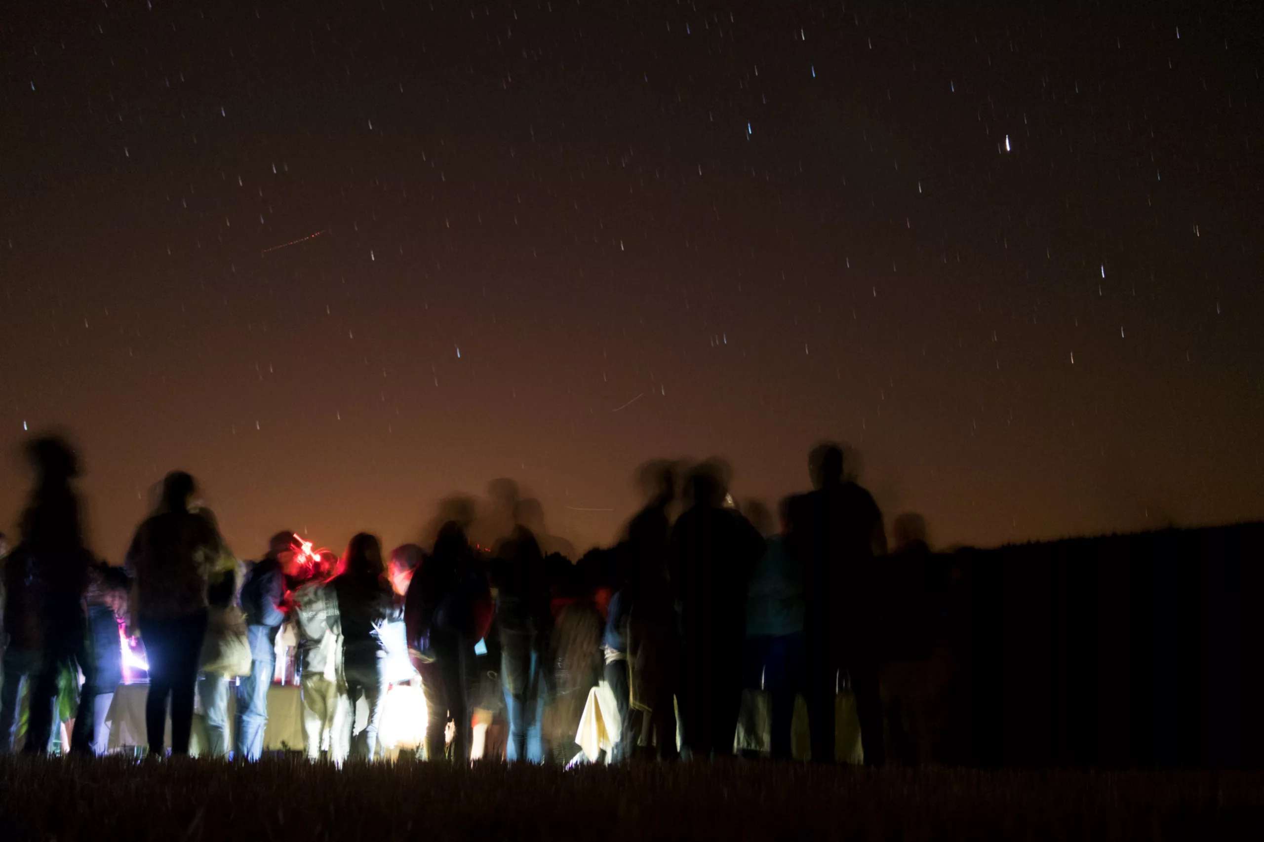
That very evening, we set off on a night-time walk to a deserted field to watch the moon rise and set against the stars, accompanied by a Jedi Master wielding a lightsaber with astonishing precision. Ten shooting stars later, we know all about Zeus’s love affairs, and how to find the North Star (thank you).
Propelled on this journey to the distant galaxy of Lurs, we are now ready to spend a week exploring the theme of constellations.
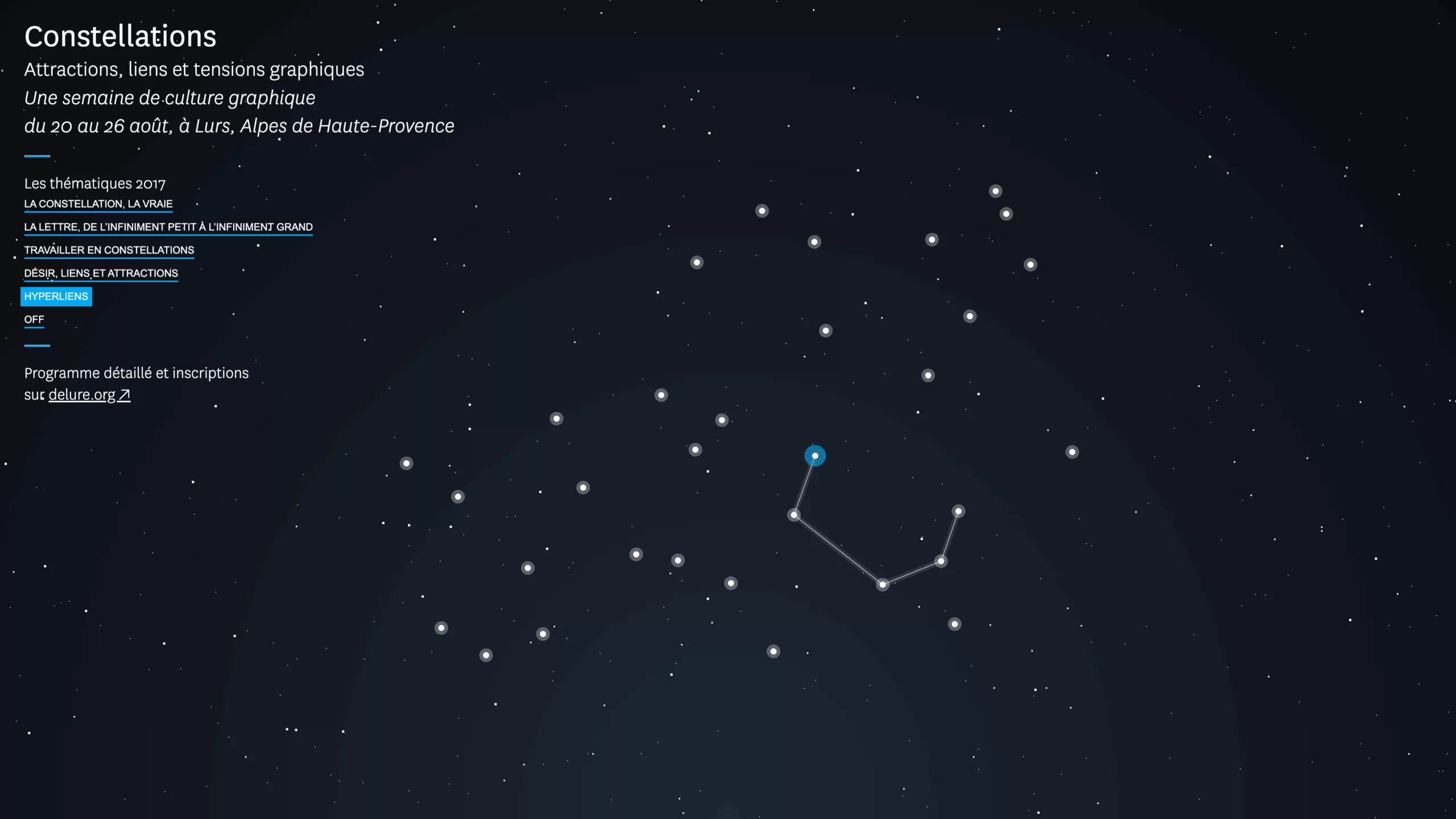
The official website of the 2017 Rencontres de Lure illustrates this rather splendidly:
Beings from another galaxy
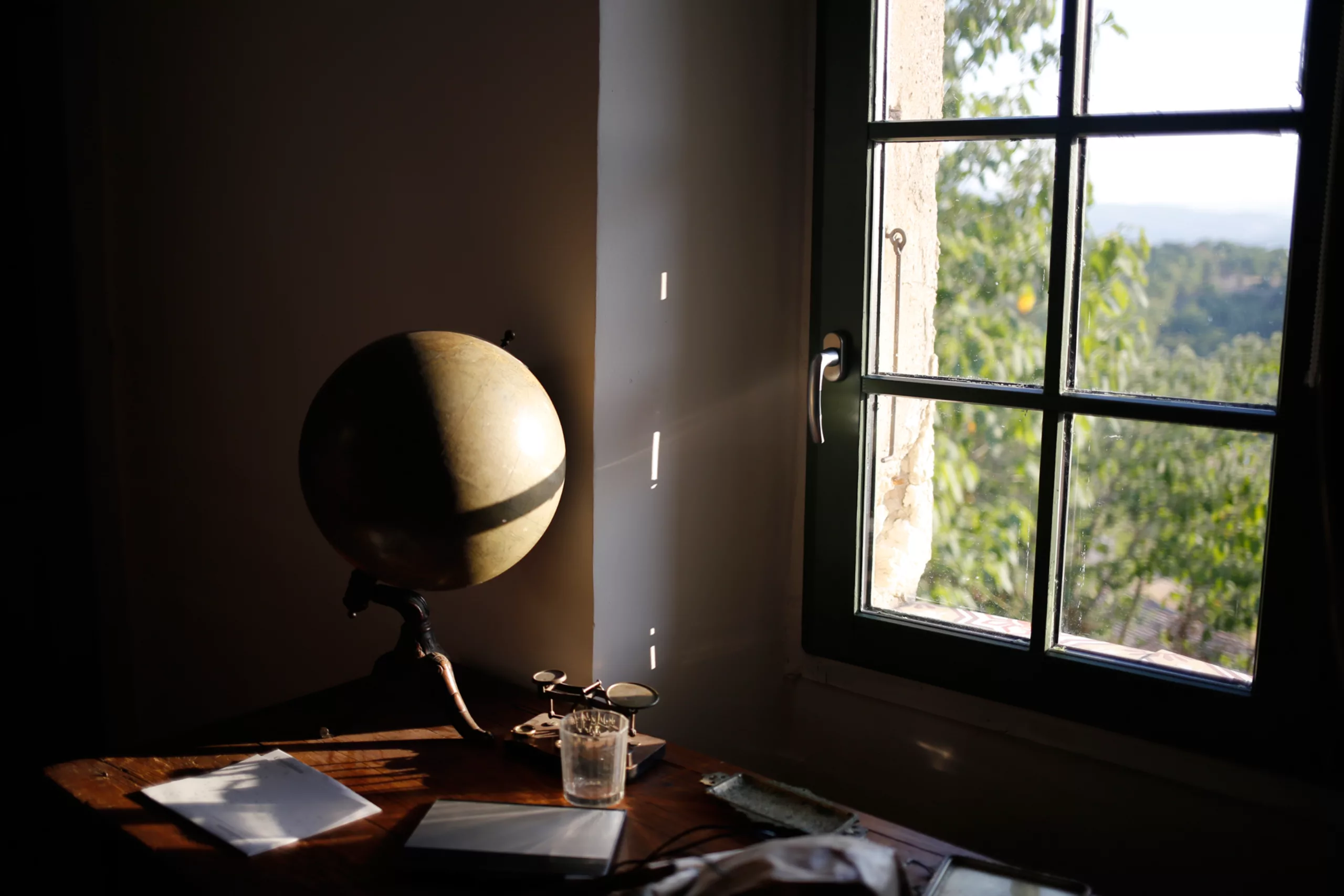
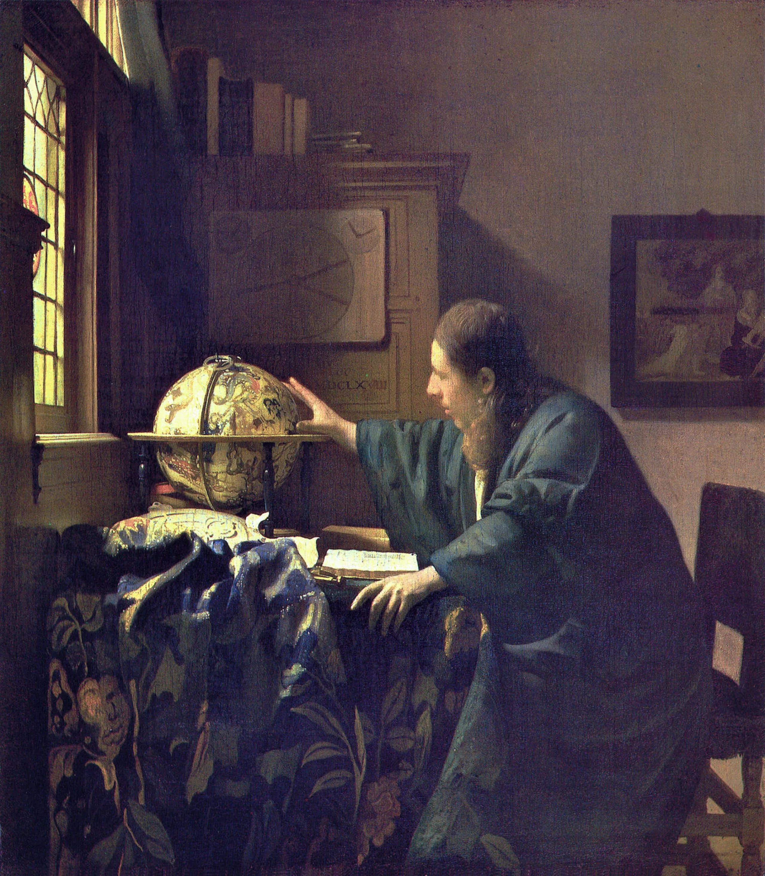
One evening, whilst visiting a local house, I found myself looking at this little corner of a window that reminded me of Vermeer’s The Astronomer. It was a first sign (astrological?).
And here’s another irrefutable piece of evidence, for that matter: the locals are indeed called the Lursians ! The parallel with the Martians is too striking to be ignored. The inhabitants of Lurs must therefore indeed come from another planet. QED.
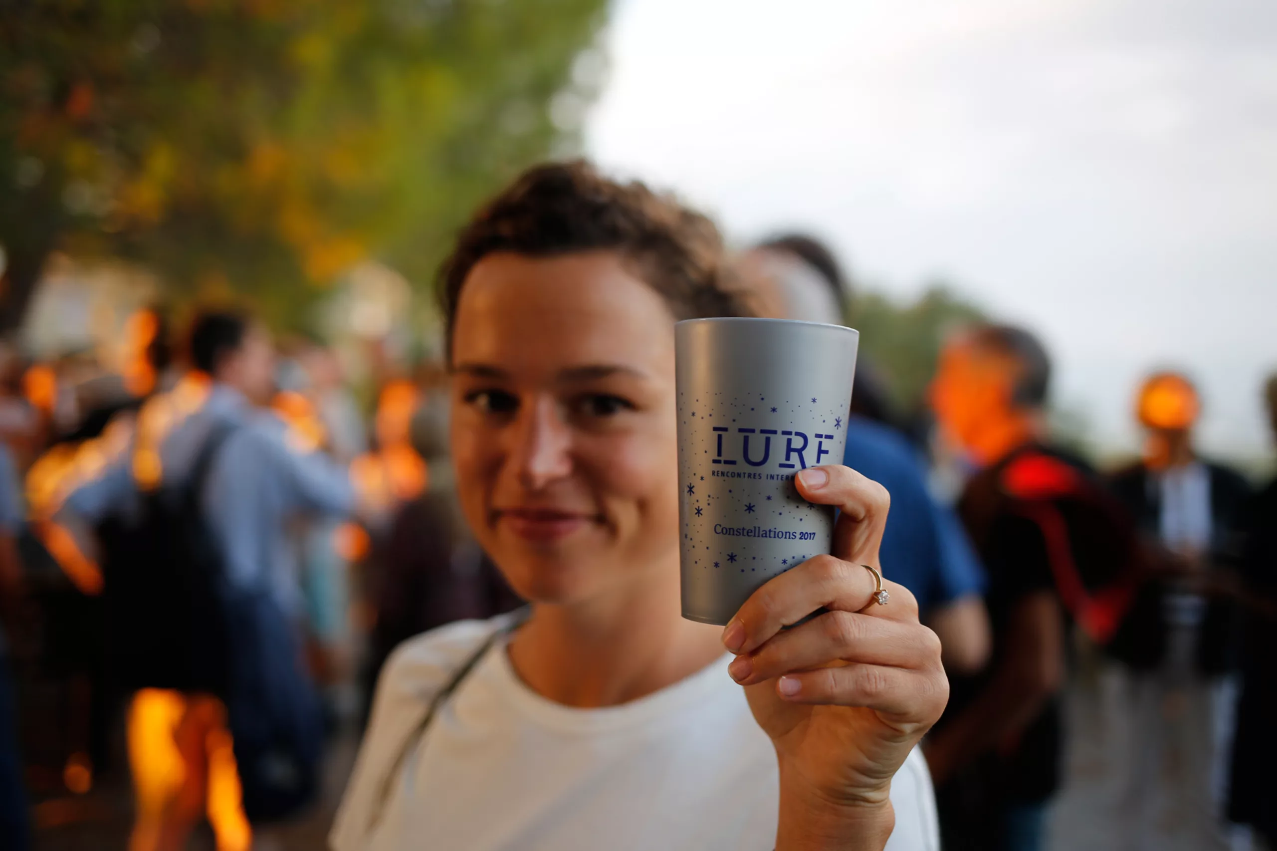
Sitting at the table with a few people from Lurs for the pistou soup banquet (we’ll come back to that!), I discover a small community of scholars who live on leftovers and poetry. Eighty of them in their stronghold, they share sunshine, tranquillity, reading and convivial moments with the other ‘beings from elsewhere’ that we are: the participants in the Rencontres.
It is pointed out to me that there aren’t many villages this small in France where you’ll find an art gallery and a bookshop… It would seem that, in addition to the beauty of the surroundings, art has its rightful place here. A double harmony that explains the legacy left by Vox and his troupe, those “pioneers who planted graphic design, like a bouquet, at the top of this town where everything had to be rebuilt.”
Moon rated X
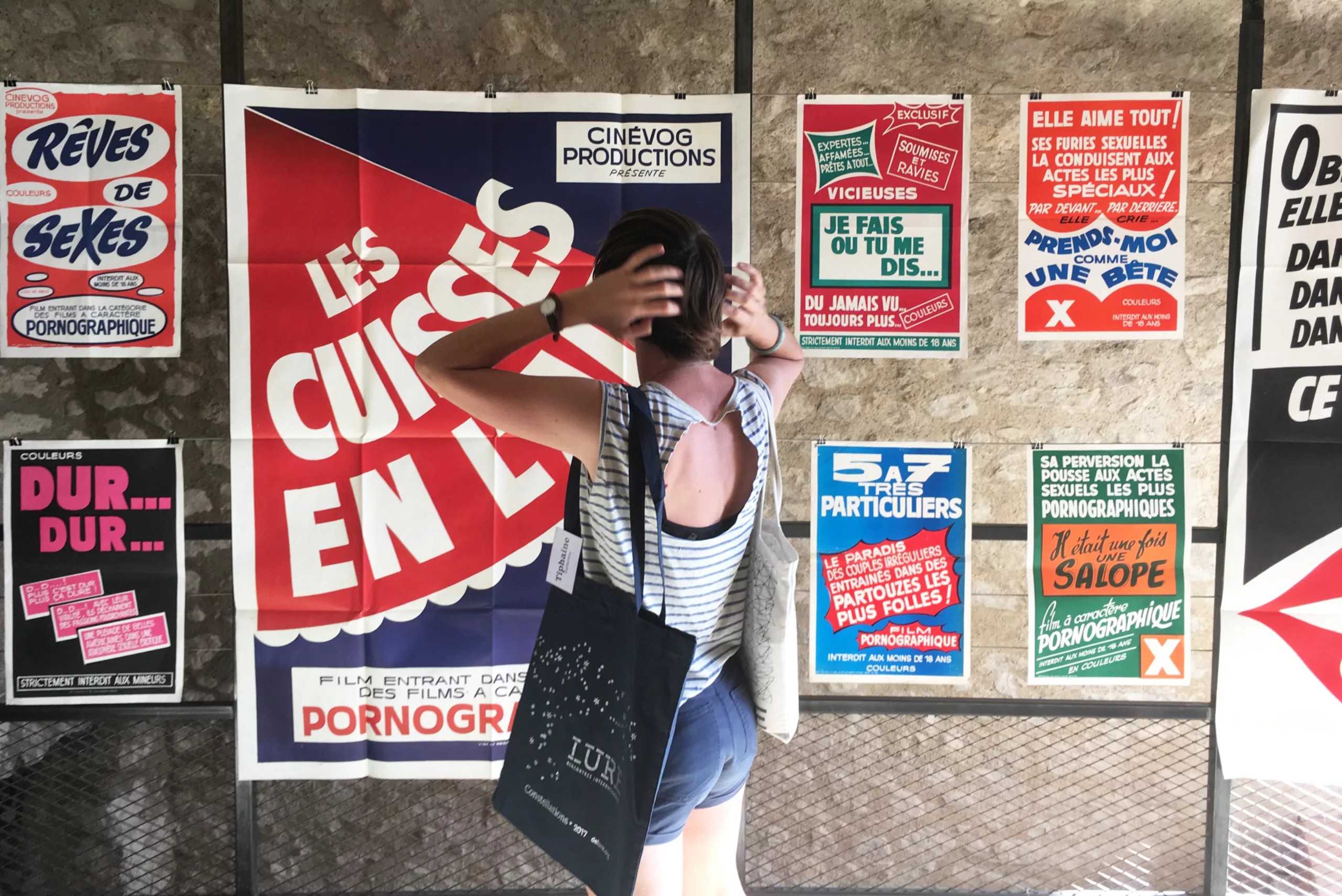
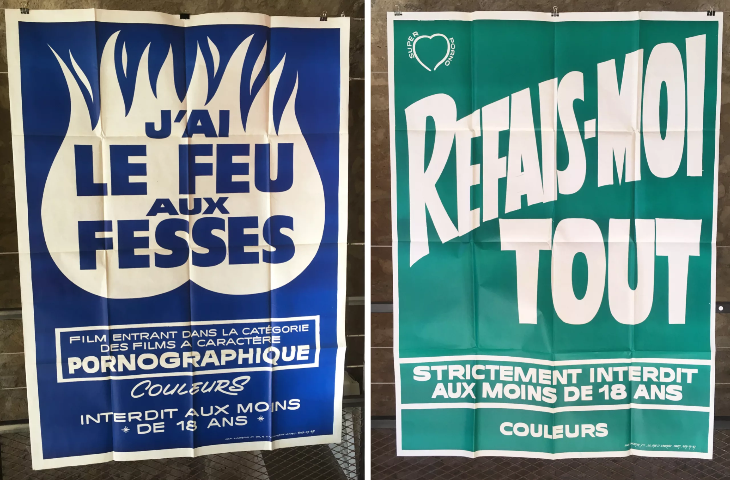
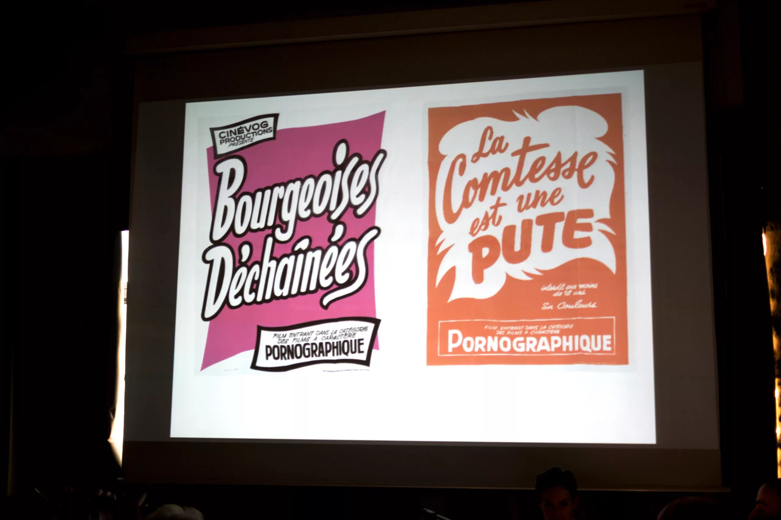
A few days later, still on the subject of the moon, Elsa and Aurélien from the studio La Direction will be joining us to show us their ‘backside’ posters (without any backsides) from pornography in 1975 cinema… (remember, we mentioned this in our fourth article on our history of book covers). The talk goes down rather well.
The duo tell us the story behind their project, from discovering the posters to printing the collection. Printing it required quite a bit of technical skill to reproduce those spot colours and create a new Pantone colour chart featuring retro-neon shades, complete with folds. We also learn that the countess is a whore – and a very elegant one at that.
The Universe
There’s a whole world to discover amongst these ‘stars’ of graphic design. Brahim and Maha are attempting to unravel the mystery of Tifinagh, the Tuareg script of the Amazigh people, which has been brought back into fashion since it was officially recognised as a language in Morocco. Usually drawn in the sand, the characters clash with the conventions of cursive writing, and it is this typographical challenge that these researchers are exploring.
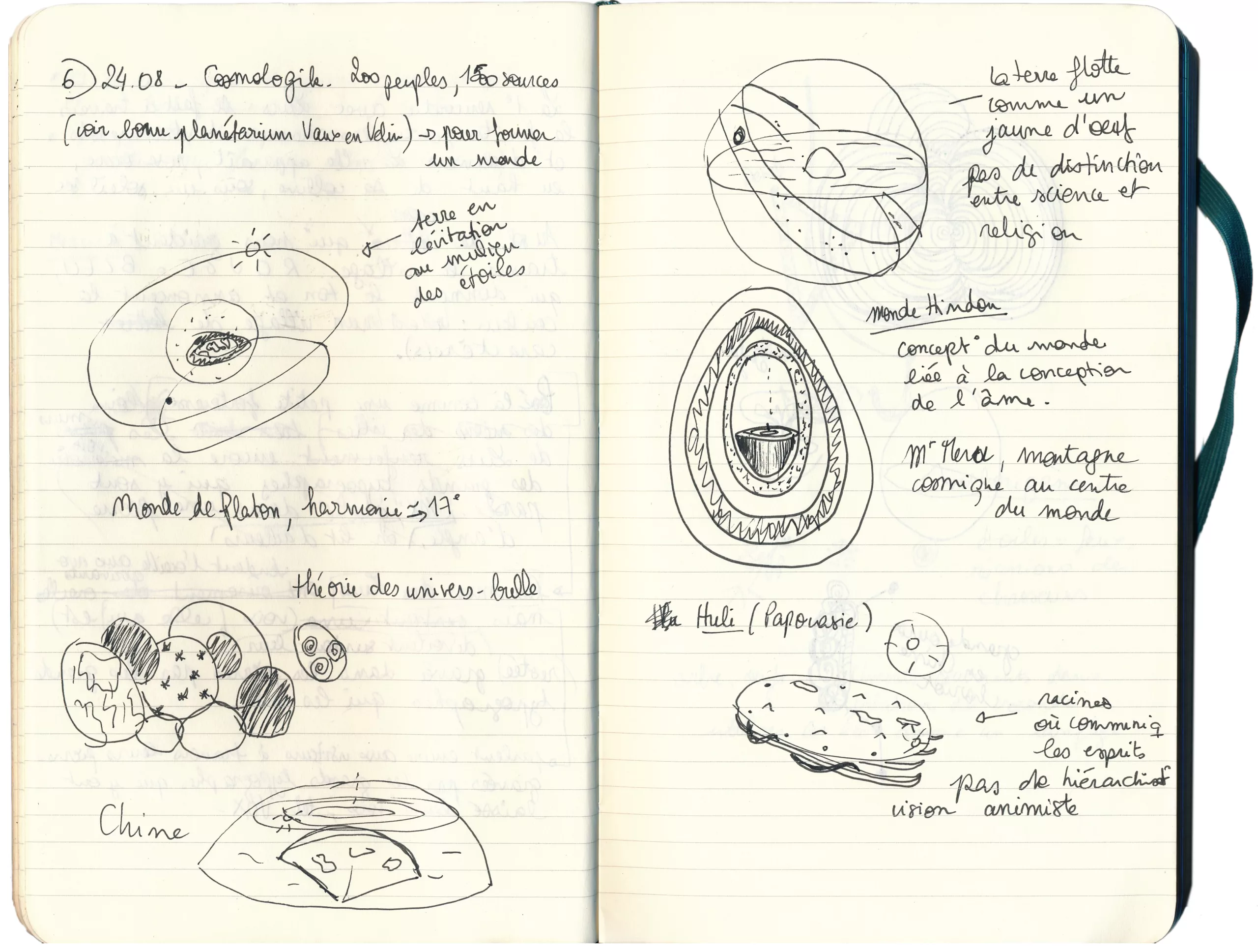
Guillaume Duprat, for his part, takes us into the realm of the worlds beyond, with his visual representations of the soul’s projections from myriad cultures. Heaven, hell and parallel worlds – whether flat, tiered or egg-shaped – coexist and fascinate us (see the hastily sketched drawings in my notebook below). Jeanne Moynot, for her part, will share with us the intimate sphere of her world as a visual artist.
Cosmic techniques
We’ll also be discussing technical matters with two ‘prehistoric’ graphic designers from the pre-DTP era, the work of Studio Pizzoti, advances in artificial intelligence, and the origins and creation of the PPC workshop (Paris Print Club). In fact, we’ll be spending the whole afternoon trying our hand at the techniques.
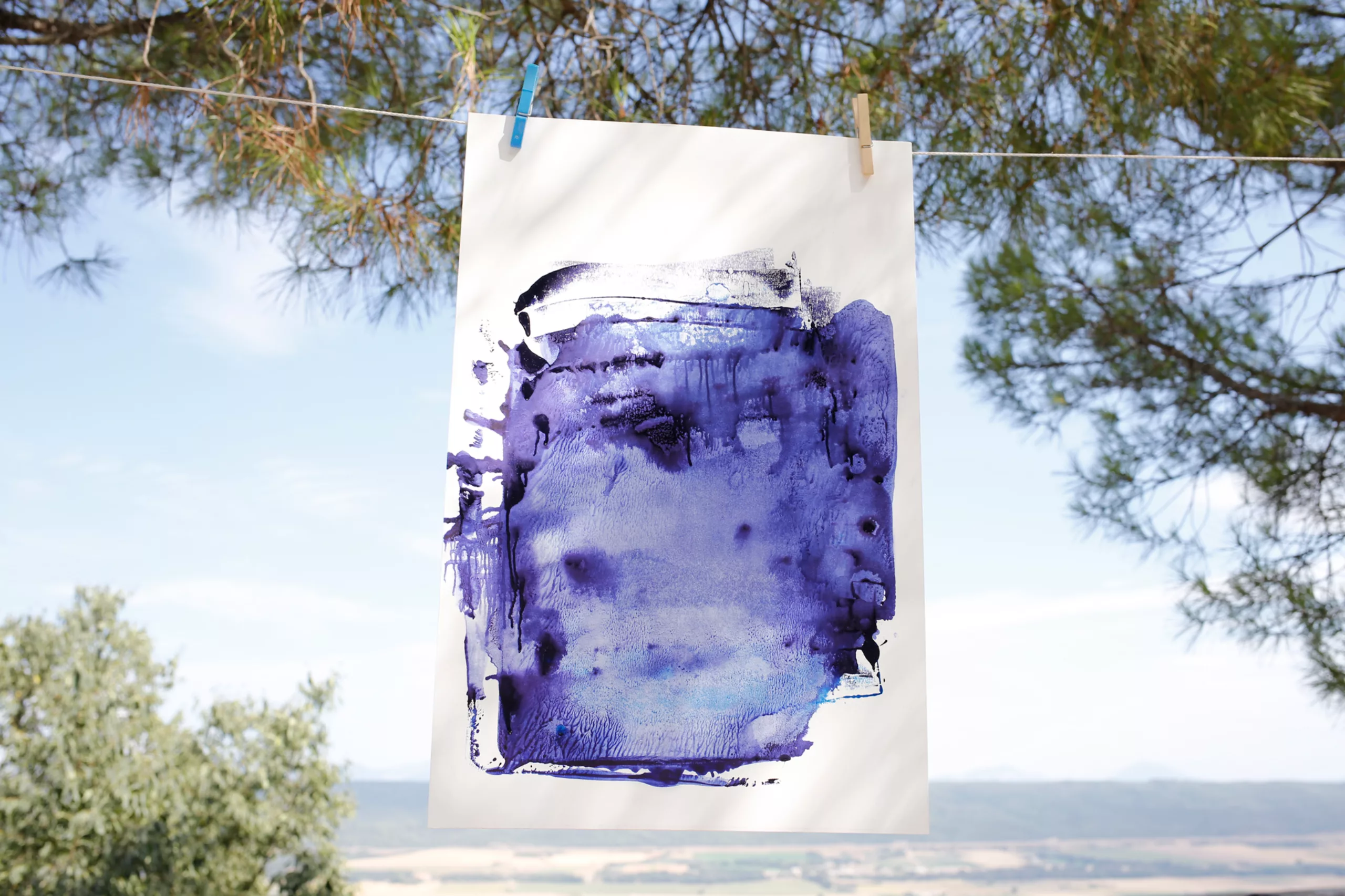
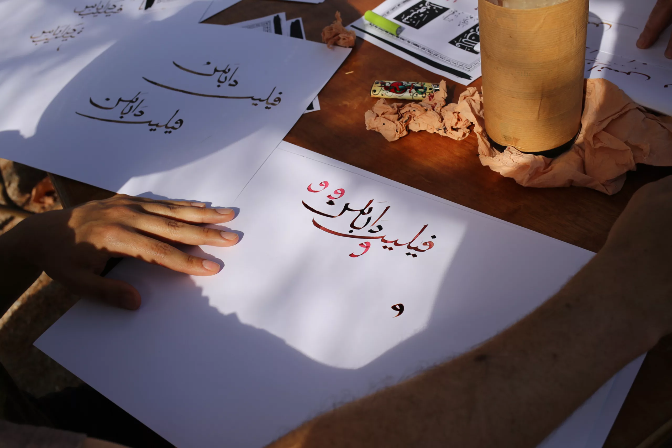
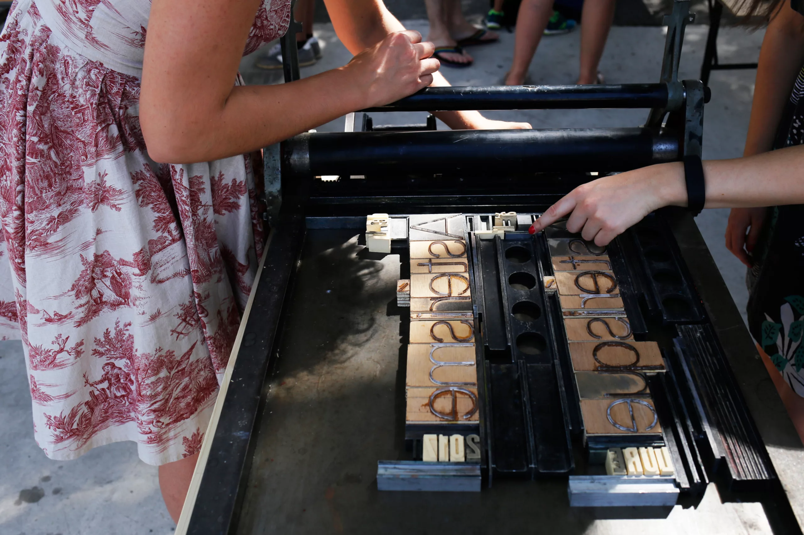
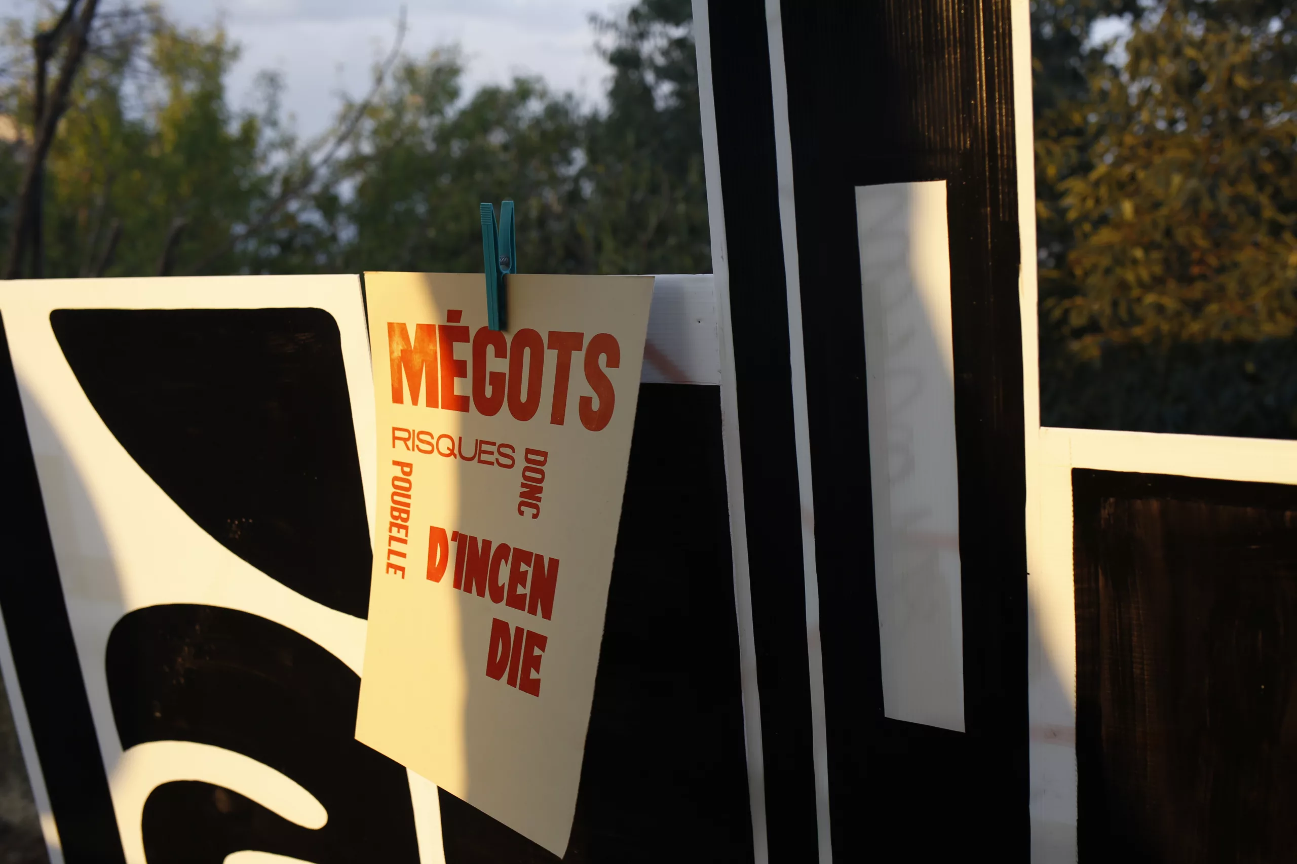
At the edge of the terrace, in the shade of the pine trees, a large table has been set up for an Arabic calligraphy workshop. Right next to it, Guillaume and Tristan from the PPC have made their letterpresses available to participants, and are guiding us in creating posters inspired by the venue.
Inside, Marc Bernot (who makes the morning soap operas) makes our heads spin with his mirrored glasses, which mess with our brains and our perception. It’s impossible to write anything without ending up with a mess of squiggles… He also has a marvellous laser cutting machine; science and technology do have their good points!
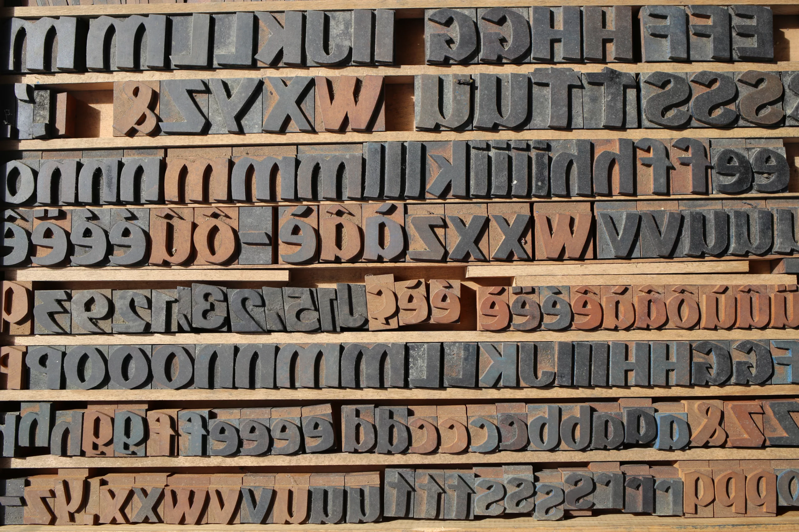
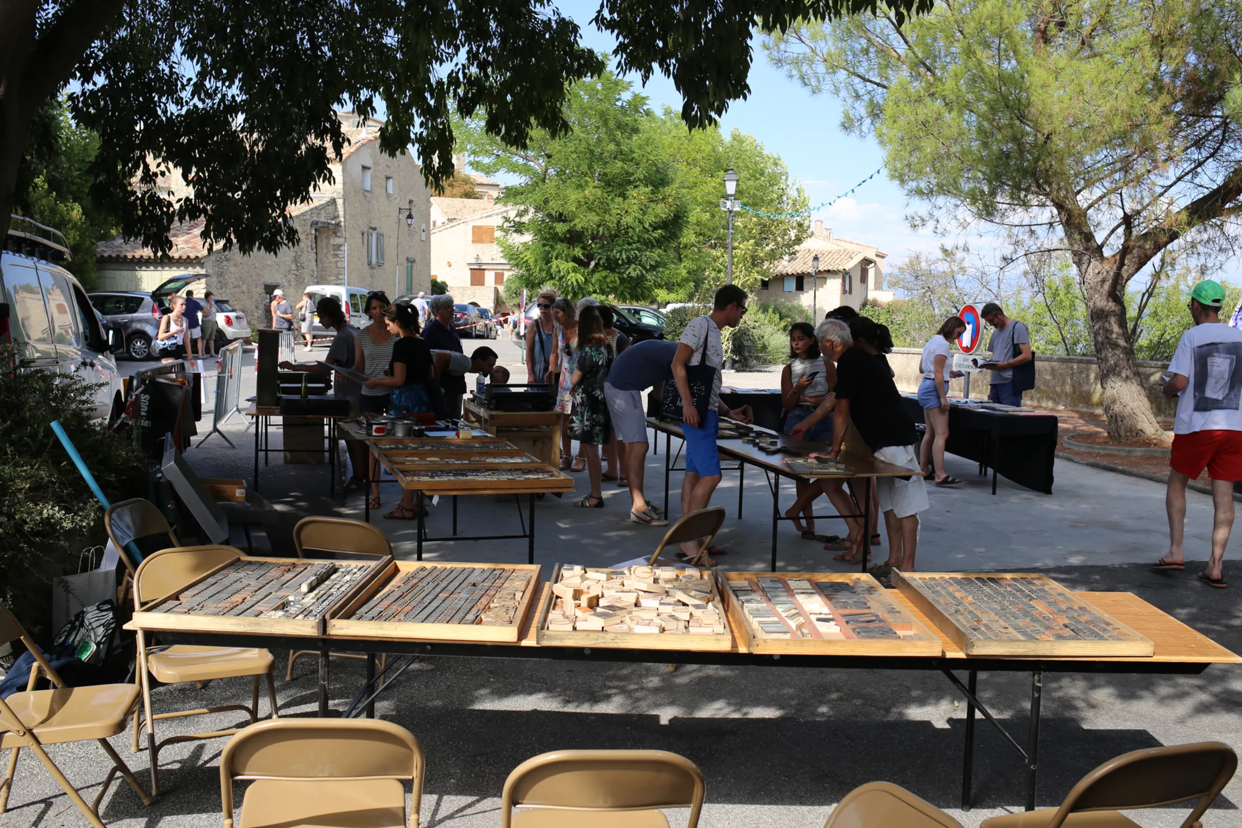
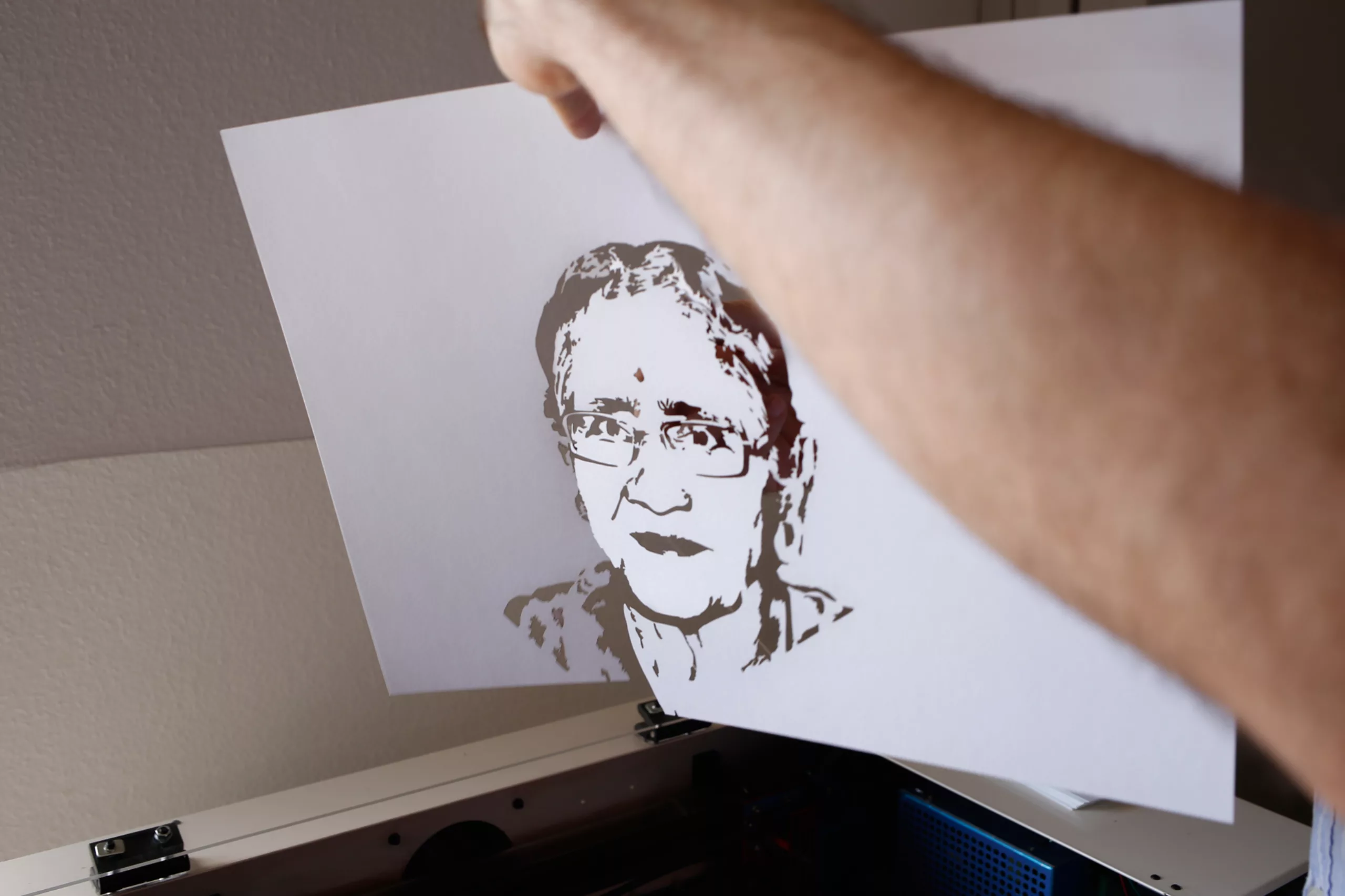
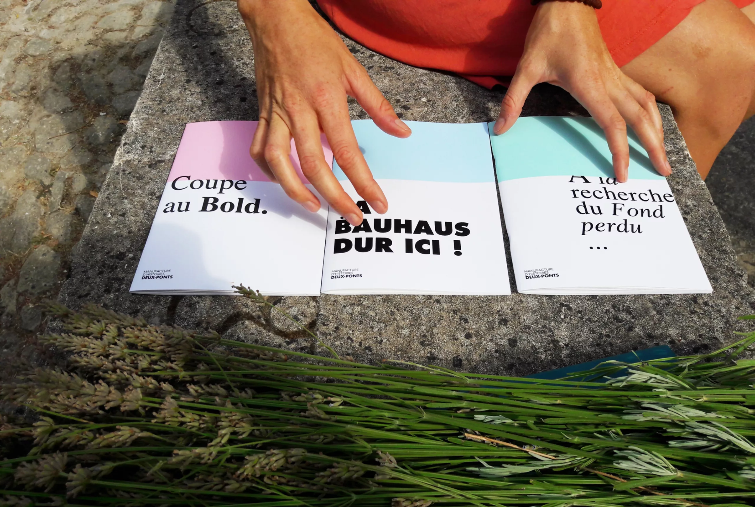
Typographic constellations ··.·••·..•
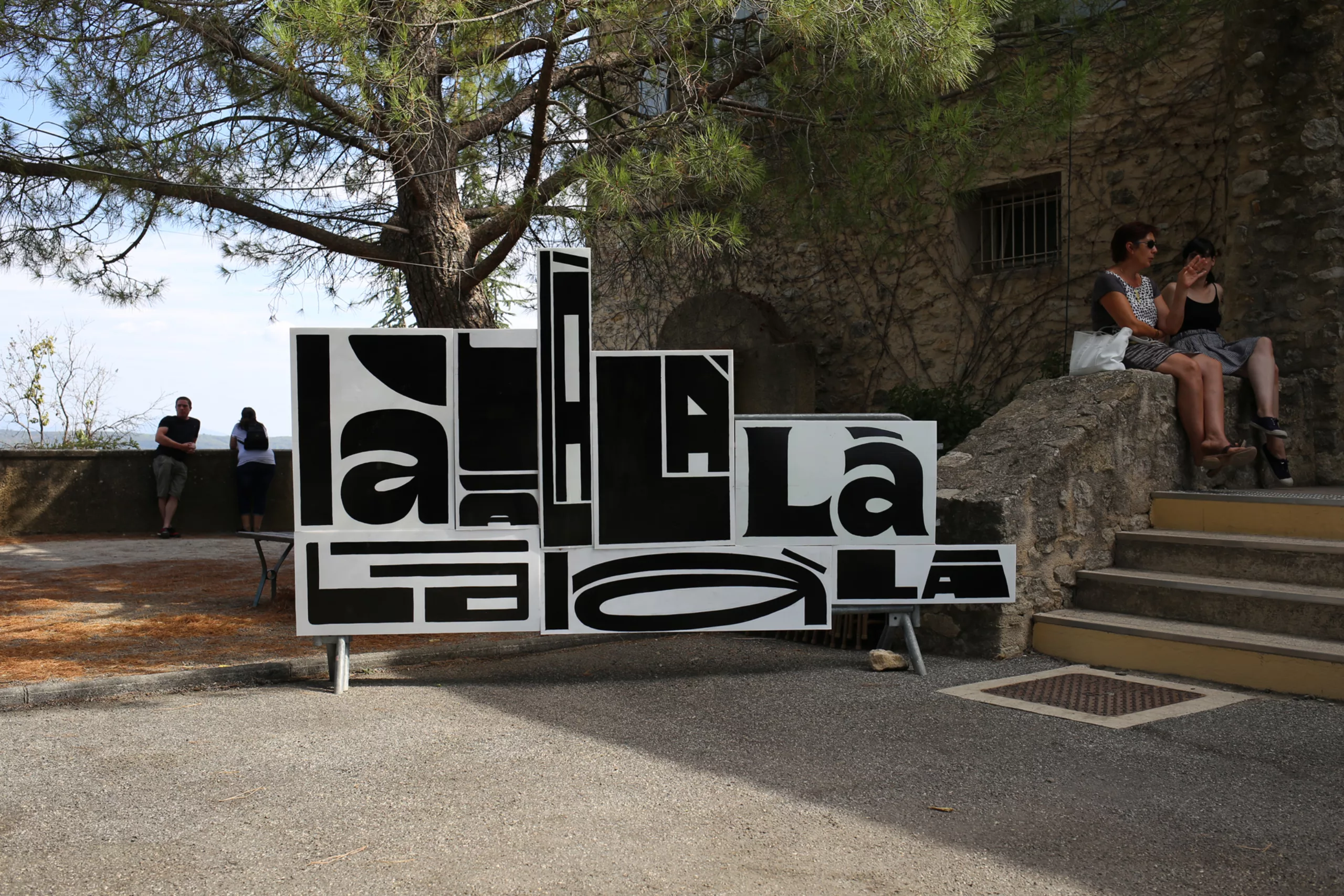
In Lurs, we also meet typography stars and star typefaces. In a way, that’s the whole point of these gatherings. The small hundred or so curious visitors, experts and enthusiasts who make up our group mingle on the terrace. There we meet – and the word is well chosen – speakers, students, regulars who are attending their 10th edition, foodies, and the very great… all in a relaxed atmosphere. Jokes from graphic designers fly thick and fast (thanks to the Deux-Ponts story workshop). Insights abound. It feels like being on a France Inter podcast, but in real life, and even more relaxed.
Together, we are creating, as Maximilien Vox put it, a “vibrant community of living beings”.
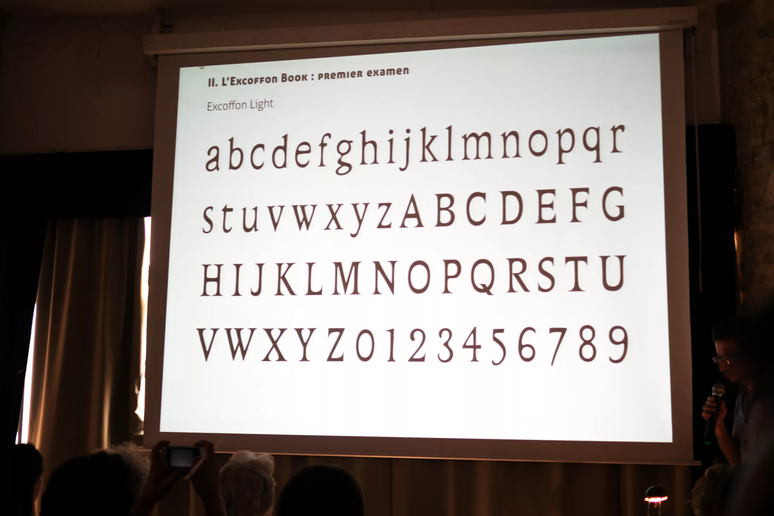
Bruno Bernard takes us on a journey through his discoveries and research into the ultimate form of Excoffon: the Excoffon Book. Initially, he ‘merely’ wanted to digitise this typeface, which never saw the light of day. As he worked on it, he realised that the characters were still clumsy, hesitant, irregular… unfinished? As if Roger had rushed to submit a proposal on time, but had never been able to finalise it.
This typeface was intended for Excoffon – the ultimate fulfilment of his dream as a typographer – and was meant to be “the culmination of everything (he had) accumulated throughout (his) career as a typographer”, but it would never see the light of day. Bruno is now wondering whether he should publish the typeface as it stands – an imperfect piece of work – or allow himself to make his own adjustments and face questions about the legitimacy of his work on the graphic legacy of a design legend. Why not discuss it with him: www.brunobernard.com ?
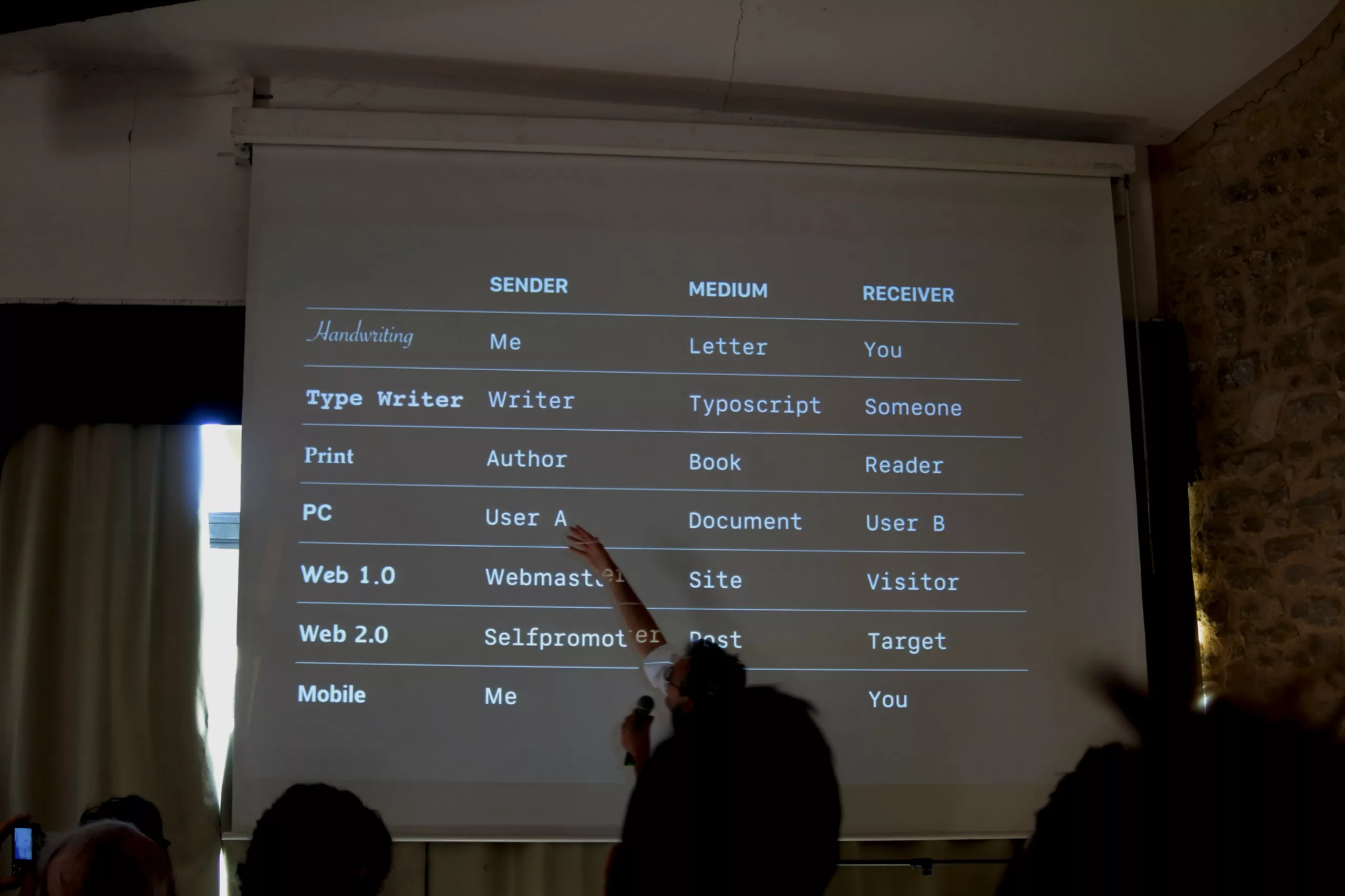
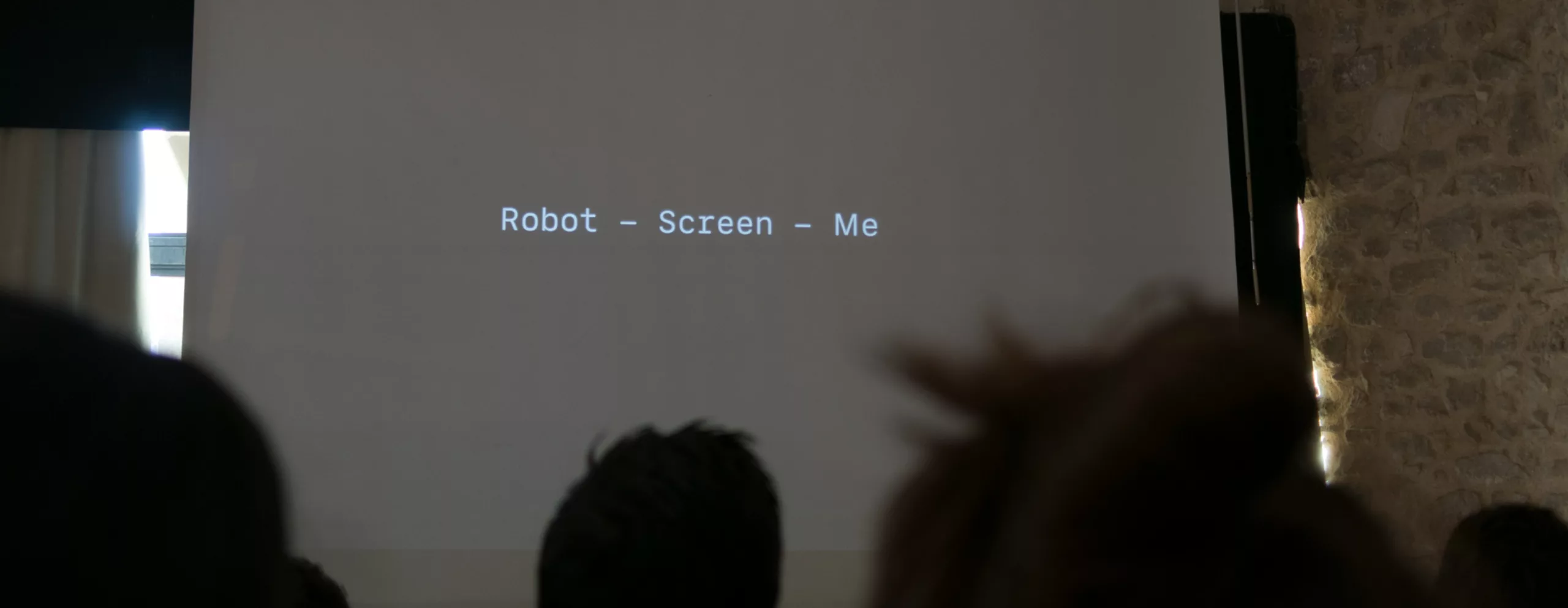
One of Olivier Reichenstein’s dreams, for his part, is to create a specific typeface to distinguish web bots – which hoard information – in order to expose the deception to the general public. It is a simple yet powerful way of re-establishing the direct link between reader and writer, which has been lost since the end of handwritten letters and the advent of the web.
In this table, we can see the influence of typography on the links between the person writing (sender), the medium used, and the person receiving it (receiver).
The icing on the cake to round off the week, Matthew Carter (the creator of Georgia and Verdana!) takes us on a journey through his past work, with his hand-vectorised typefaces, precise to the pixel, and his fascination with the ligatures found in the engraved lettering on monuments. His presentation makes us realise the sheer scope of a designer’s technical capabilities, and just how much engineers and graphic designers stand to gain from working hand in hand.
He adds, regarding the variations between upper-case and lower-case letters, that “to claim that lower-case letters have any connection with upper-case letters is an unsolvable problem. We must consider not one but two alphabets, which are inseparable”. Make a note of this for your future creations – the master has spoken!
Guided by the moon, beneath the constellations of humanity, amidst typographical techniques and worlds, Lurs has immersed us in a benevolent and luminous parallel world.
Finally, rest assured, we’re not robots here on the Graphéine blog.
There you go! We’ll be back (I hope!), like the good pupils we are. More photos to come on our Facebook page.
On the subject
-
Maison Nicolas, a new logo for a new strategy
Maison Nicolas has unveiled a new logo and identity, unfortunately without drawing on its rich graphic heritage.
-
Where does modernism come from? 2 – The two faces of modernism and the social ideologies surrounding ornamentation
L’usage ou l’absence d’ornementations symbolise pour l’homme “moderne” deux visions utopiques et différentes pour changer la société.