Where Does Modernism Come From? 3 – In Search of Neutrality and Universality
Welcome to the latest instalment in our series on Modernism! If you haven’t already done so, you can read the first article on modernity and the second on ornamentation and the debates it sparks, before getting started on this one. Enjoy the read!
The first decade of the 20th century brought with it a host of questions regarding the methods of the past, which were cast aside. The first works of abstract art began to emerge, simplifying and distorting reality or celebrating geometric forms, leading artists and graphic designers to break away from the rules of classical pictorial representation and to invent new ones.
This led to a genuine simplification of form (the result of complex thinking) which manifested itself through Art Deco, abstract art and, above all, the advent of the modernist movement launched by the avant-garde around 1920, following – amongst other things – the ideas of Adolf Loos (whom we discuss at the end of our article #2) . As a reminder, Loos wrote in 1909: “we have conquered ornament: we have learnt to do without it. ” The father of modernism proposed moving beyond our “natural” and “primitive” condition and abandoning ornamentation, “a sign of the degeneration of the past”, for economic and cultural reasons. He thus seeks to steer the 20th century towards purity and simplicity, a visual expression of the mastery of primitive impulses and the cultural and intellectual development of modern man… The resulting liberated new generation breathed new life into the past by reconciling art, craftsmanship and industry, giving rise to industrial design.
First of all, there is a deconstruction of established practices and our heritage – which we discuss in the first part – before we go on to devise new solutions aimed at achieving universality.
Towards non-representation and abstraction: the deconstruction of legacies
For several decades now, at least in France, art education in schools has been highly regimented: everything is precise and strictly regulated, right down to the children’s posture. The visual arts reflect rational thinking through a directed, disciplined, geometric and mathematical approach, designed to prepare future workers for the creation of industrial designs.
The impulse behind the first gesture: a quest for origins
Some artists shaped by this training seek, in adulthood, a new language, free from these rigid constraints. At the same time, Freud’s nascent psychoanalysis was exploring drives and the origins of movement, such as those freely and spontaneously traced by children. Quite naturally, art and psychology intertwined, prompting artists to seek a primordial universal language, a first gesture or the first language. This new creative path opened up previously unexplored and resolutely modern artistic explorations. An artistic deconstruction then began, breaking with the past; a naïve, deconstructed and idealised form of expression, which found expression in both writing and images, though it did not please everyone (one can well imagine Loos’s reaction).
Artists thus deconstructed their ingrained habits and established practices to explore a new pictorial language – one that was naïve and primal – by observing children’s drawings and the works of so-called ‘primitive’ indigenous peoples, which were the subject of extensive study at the turn of the century. This gave rise to the avant-garde movements (such as Fauvism and Expressionism), which explored sensations, and subsequently to abstract art, which broke away from reality. Critics dismissed these works as “childish” and “scribbles”. The artists, for their part, sought to recapture “the fixed, animalistically ecstatic gaze of children faced with the new, whatever it may be”: Picasso would spend his entire life attempting to “regress” by deconstructing his brushwork in order to rediscover his childlike gaze and impulse. It was around 1910 that Braque and Picasso invented Cubism, which deconstructs forms and breaks away from classical rules by abandoning perspective and volume, thereby breaking with a 500-year-old artistic tradition!
A breakthrough in layout, the emergence of a new visual language
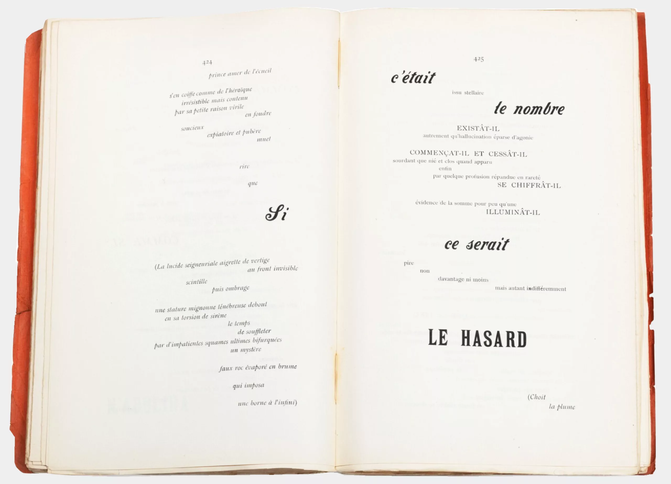
This departure from conventional rules is also evident in the text’s layout. In 1897, Mallarmé’s Un coup de dés jamais n’abolira le hasard marked a veritable typographical revolution by breaking away from the horizontal line and scattering the words across the blank page, where the space between the words appears, he said, ‘like a visual silence’.
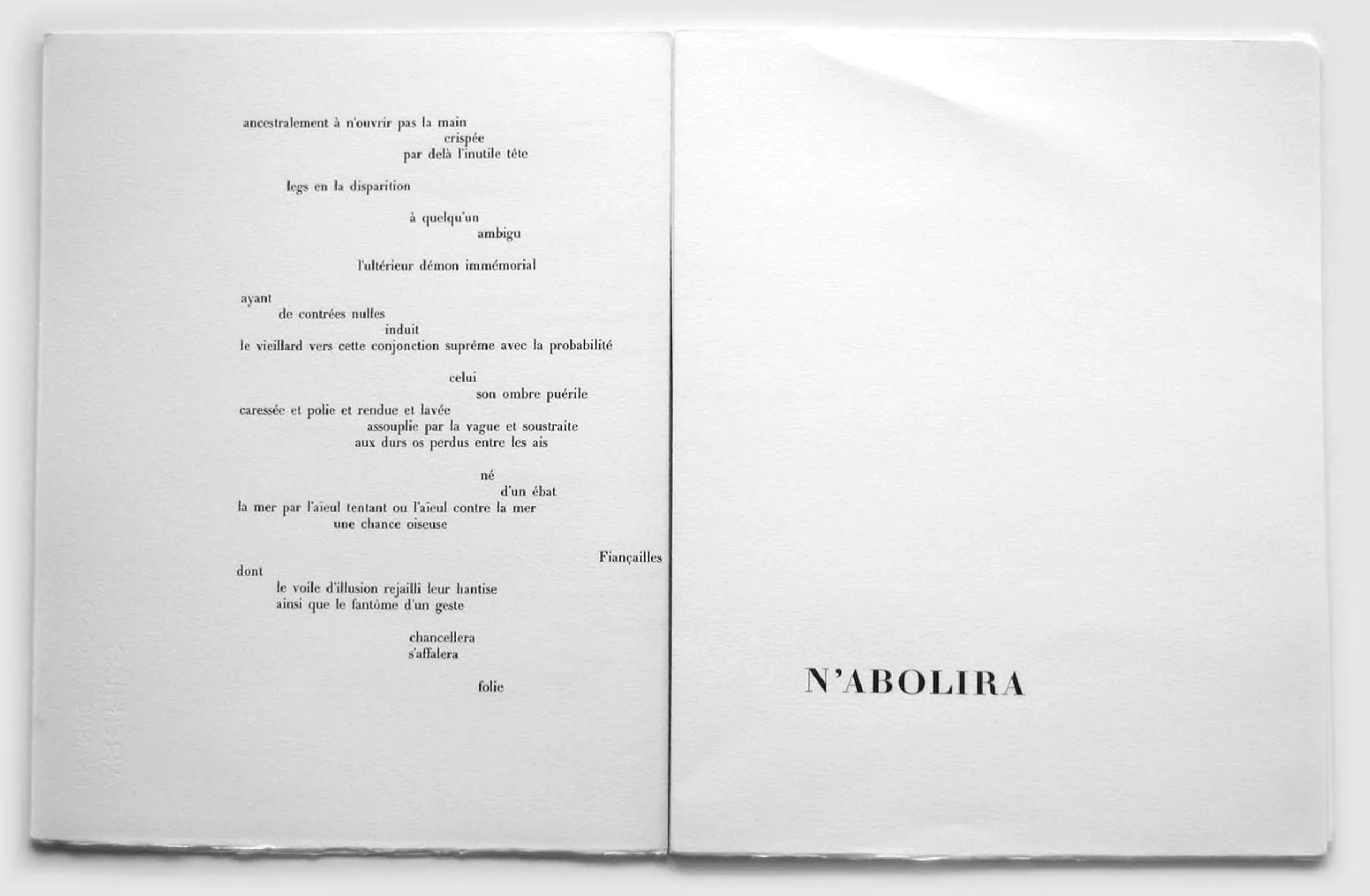
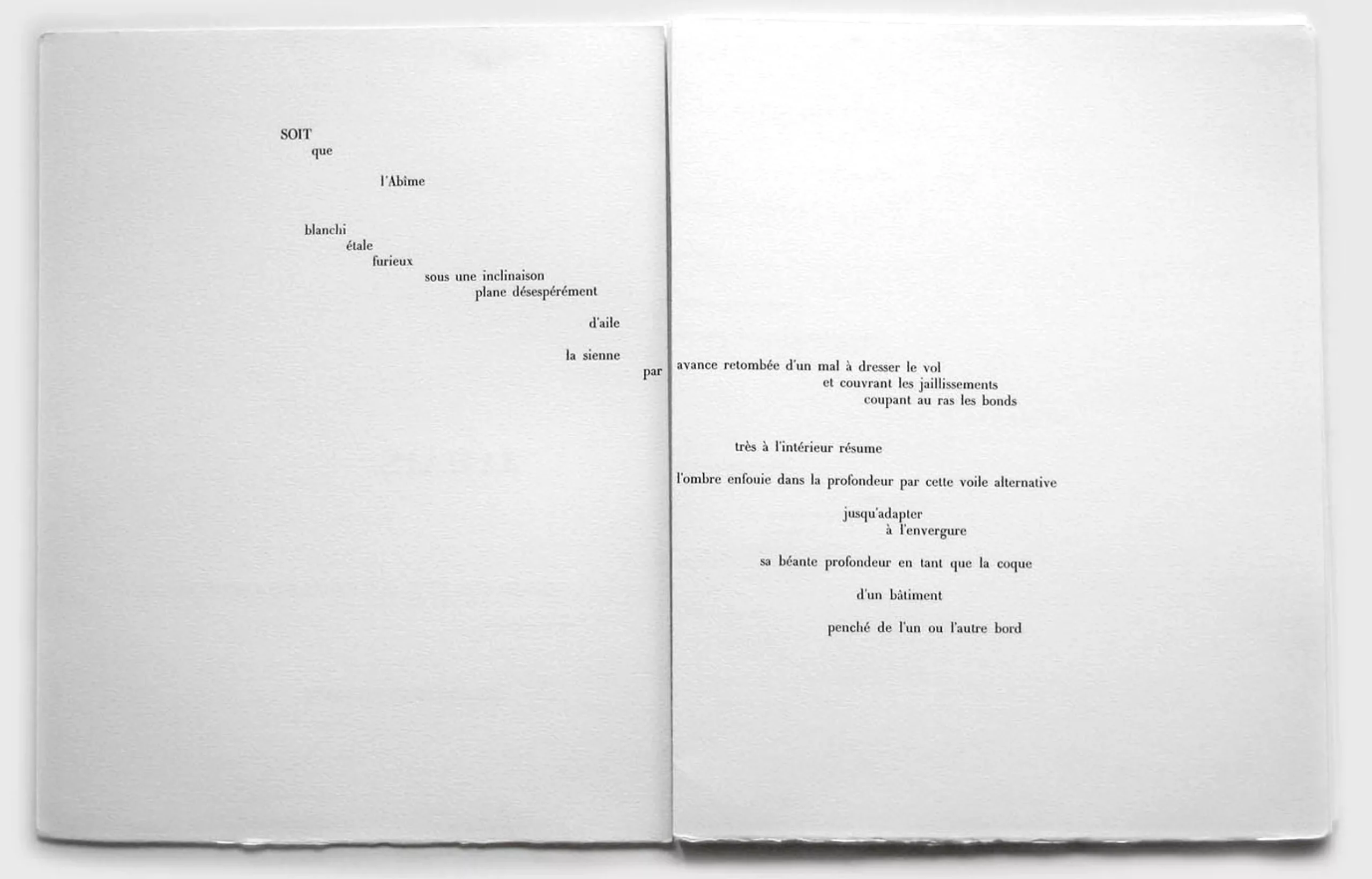
As Anne Fauré, a PhD student, explains, “For the modernists, reality still exists, but language no longer seems capable of expressing it, understanding it or assimilating it. Words no longer correspond to things. Language is in crisis because its relationship with the world is no longer direct and transparent, but ambiguous, uncertain and oblique.” We therefore seek to push the boundaries of words, letters and page layouts, because we are searching for a new language to express this modernity.
New technologies for new graphic experiments
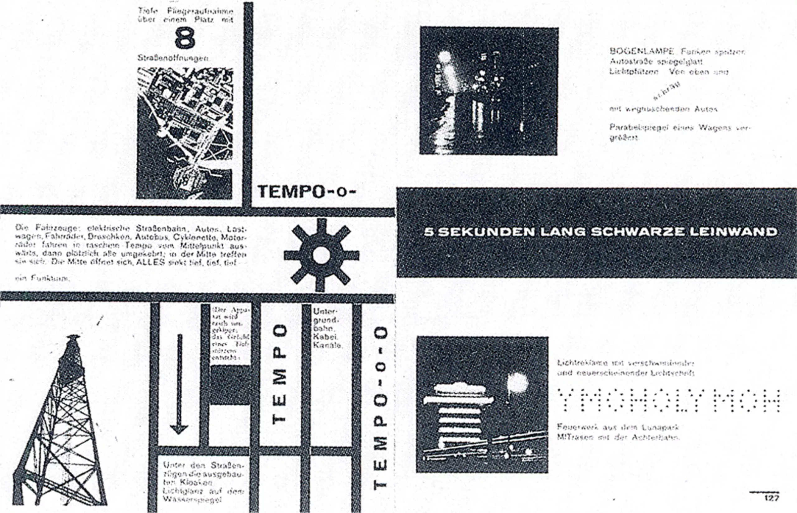
These artistic, psychological and textual explorations are accompanied by new technologies and techniques that enable the creation of this new, creative and innovative playground. Artists thus play with letters as if they were images, using lithography or photo-collages and collages that allow for an immediate and sometimes brutal, impulsive artistic act, reminiscent of that first childlike, innovative gesture. Artists also cut out letters from newspapers, which they use as templates to create wooden printing type. For the first time, text and letters are regarded as visual elements in their own right within the composition.
It is worth recalling that whilst today text is contrasted with image, the Greek word graphein means ‘to carve notches’ in order to engrave characters – thus involving both drawing and engraving – and thereby intimately intertwines text and image. It is this original meaning that the first decade of the new century sets out to explore: there is a focus on new oblique perspectives (and thus without perspective) with letters doubly liberated from the constraints of the horizontal/vertical grid and from their role as a medium for reading. These artistic and graphic experiments mark the birth of modernist typography, breaking down the barriers between letters and, consequently, the visual language.
Futurism, modern literature
This is what Filippo Tommaso Marinetti explored in Italy. This poet and artist wrote the Futurist Manifesto in 1909 (the same year that Loos’s Ornaments and Crime was published) in Paris, the capital of modern art, to break with the past, particularly that of Italy, which he described as a ‘flea market and a cemetery-museum’. Futurism celebrates the exhilarating novelties of the modern world – crowds, machines, war and speed – through the visual representation of movement. In the Futurist Manifesto, it declares that “the splendour of the world has been enriched by a new beauty: the beauty of speed.” Its aim is to create coherence between art and society’s technological and industrial revolutions, to change the social order and to free modern man from his traditions and heritage.
Whereas Mallarmé used the void as a silence within which letters danced, Futurism, for its part, uses what it calls ‘words in freedom’ to transcribe the sound and trajectory of modern war machines, or to create images. Letters and words are fragmented, unconnected visual elements, forming a free artistic form. Marinetti wrote that “the book must be the Futurist expression of our Futurist thought […]. My revolution is directed squarely at the so-called harmony of the page.”
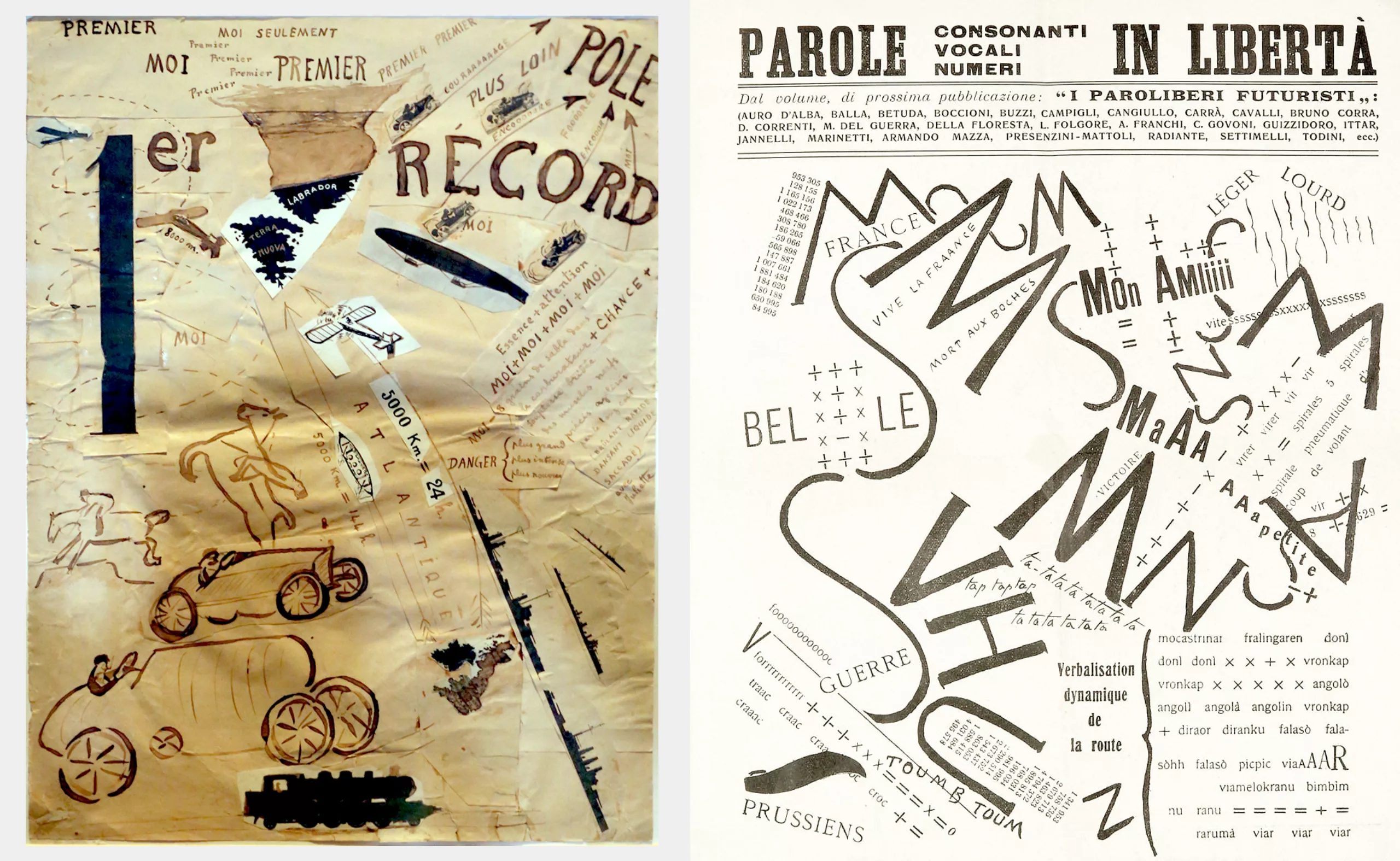
It should be noted that in France, the Peignot type foundry, for its part, rejected and opposed mechanical composition and continued to produce 18th-century-style typefaces, notably the Cochin typefaces (created in 1912), thus falling behind this growing trend towards modernity.
War and politically engaged art movements: Dada, Futurism, Constructivism…
The First World War brought this momentum to a halt, along with these experiments driven by an unshakeable faith in machinery. These horrors nevertheless gave rise to new forms of artistic expression, which pushed the upheaval in artistic and graphic conventions even further. They emerged almost simultaneously in Russia and across Europe.
The Dada movement: absurd modernist experiments
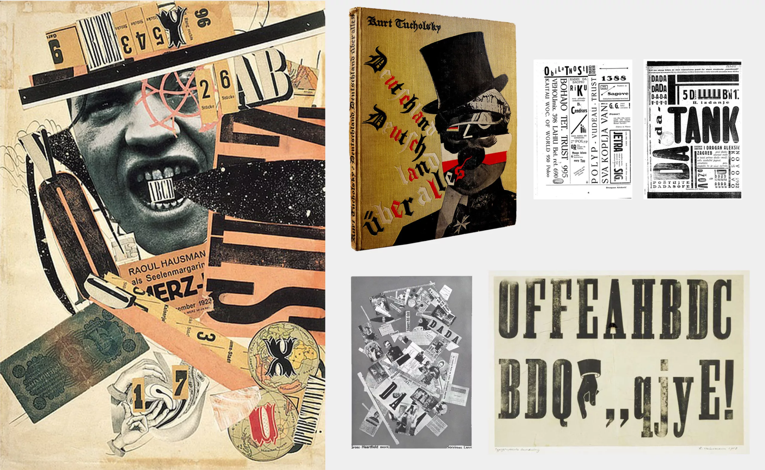
The Dada movement in German-speaking Switzerland was concerned about this first great war and modernity, and used their tools to denounce the absurdity of the world and also to break the rules in order to challenge bourgeois norms. This artistic and graphic movement drew on Futurism’s principle of ‘words in freedom’ and a ‘new conception of the typographically pictorial page’ to create all manner of images and texts, inventing a new language based on chance, often lacking in logic or even meaning, which captured the spirit of the age.
In 1917 in Germany, John Heartfield was one of the first to use the photomontage technique. He poured plaster around the blocks of type to hold them at an angle other than vertical or horizontal during printing. Raoul Hausmann, pictured below on the left, played with letters and images cut out from newspapers, which he assembled dynamically and without any logical order. “The ‘poster-poems’ loudly and clearly assert Hausmann’s desire to return to the fundamental elements of language, namely letters and punctuation marks (…) to liberate syntax, to return to the word and the sound – and to reinvent it, in order to restore its original power, its purity, and its magical and sacred dimension”, as explained by the Centre Pompidou. Artists are breaking down the barriers of graphic rules and pushing even further towards the absurd, as Iliazd and Hausmann would go on to do.
Futurism: visual synaesthesia in the service of war
In Italy, the words used by the Futurists evolved during and after the war to convey visual and auditory synaesthesia that reflected the modern world, and in particular the sounds of war machinery and bombing: “tummm, tuuumb, grang”.
Typographic characters become ideological mouthpieces—conveyed through abstraction or form—symbols of a utopian art aimed at changing the world. Here, Marinetti is fascinated by Mussolini’s fascism and sees change coming about through war (!). He wrote: “War is beautiful because it ushers in the long-dreamed-of metallisation of the human body”.
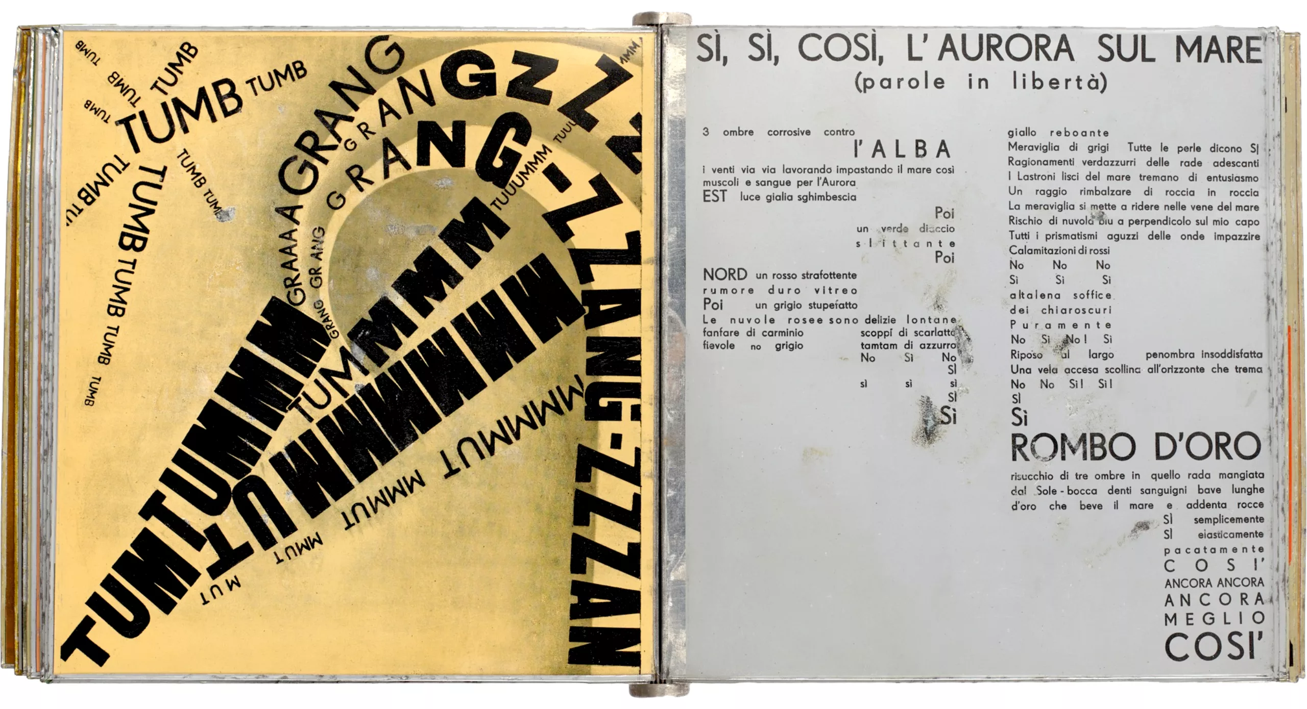
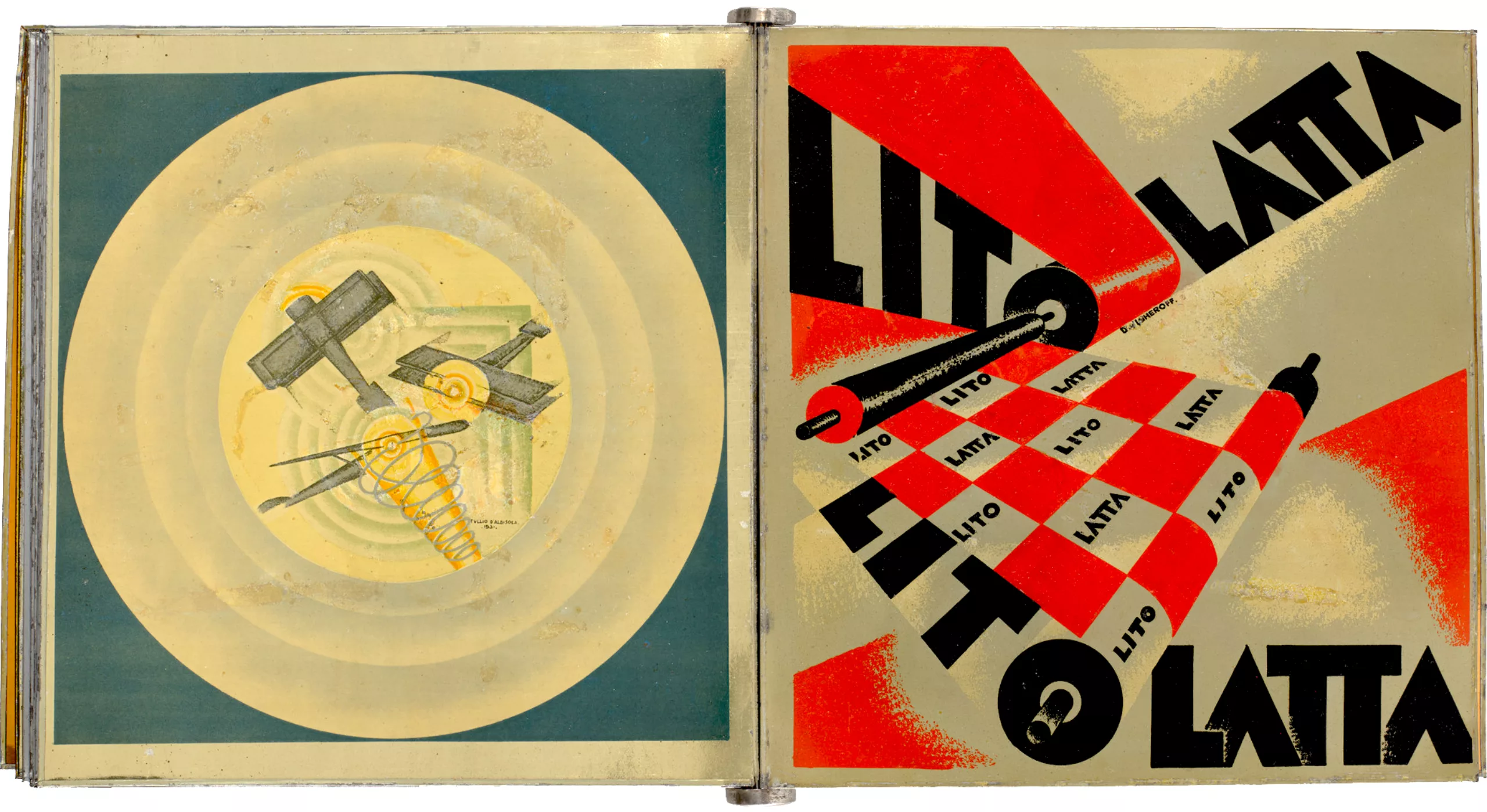
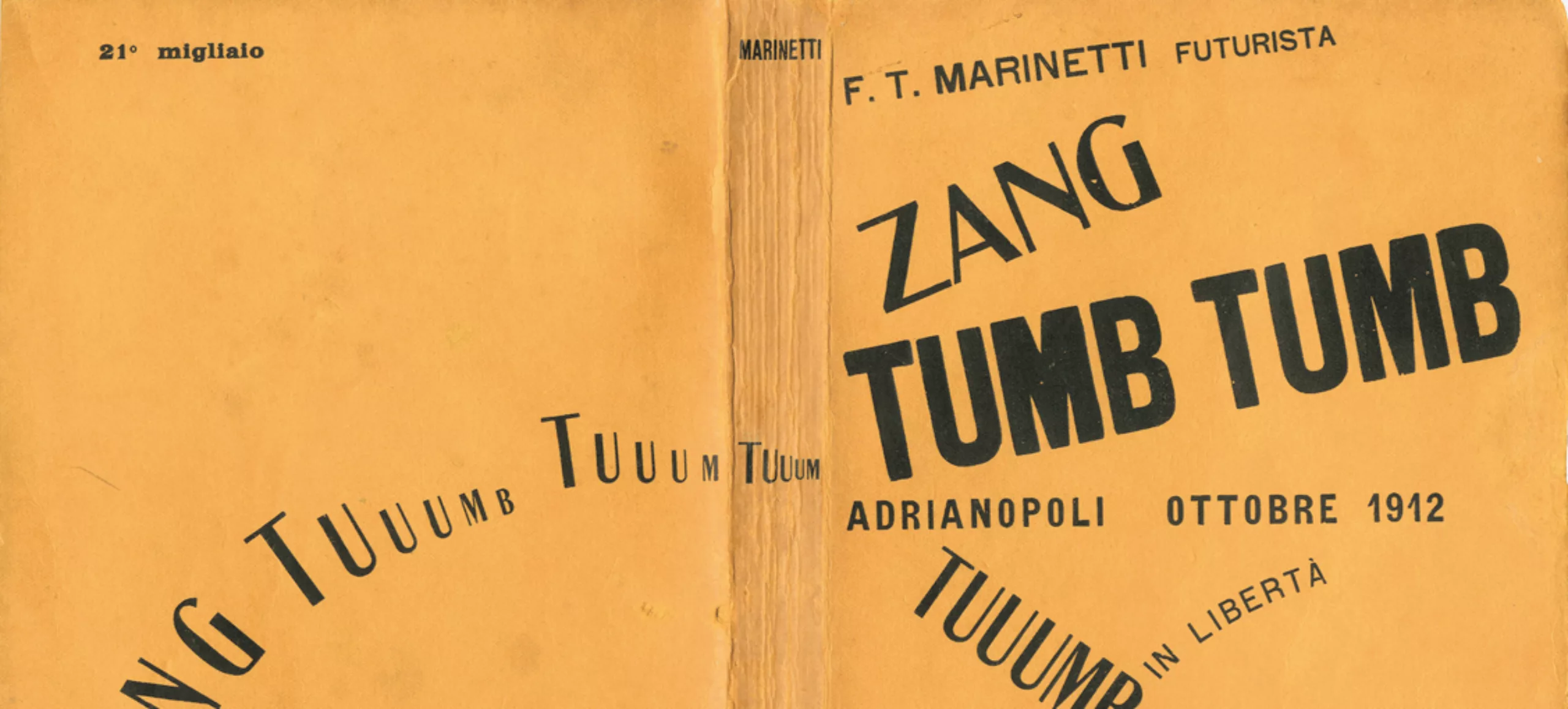
It is clear that Marinetti would, in fact, use sans-serif typefaces here (around 1930), because these letters have the advantage of being neutral and of bearing no trace of a hand-held tool (serifs are the legacy of the quill on manuscript paper or the chisel on stone): they are purely mechanical, and perfectly convey the symbolism of the machine.
Russian Constructivism, revolutionary graphic geometry
In Russia, around 1917, artists were also experimenting with text as image, not to denounce the conflict or glorify machinery, but to support the revolution. This was the case with El Lissitzky, a leading figure of Constructivism (the official art of the Bolshevik Russian Revolution), who helped to spread the ideas of the ‘Reds’ to overthrow the Tsarists, and with Rodchenko.
Propaganda spreads its slogans through posters printed in huge numbers. These are highly graphic, structured and visual in order to appeal to the widest possible audience, illustrated with revolutionary photomontages in both senses of the word, in basic colours (red, white, black), and featuring geometric shapes inspired by the Suprematist art of Kasimir Malevich, with whom El Lissitzky collaborated.
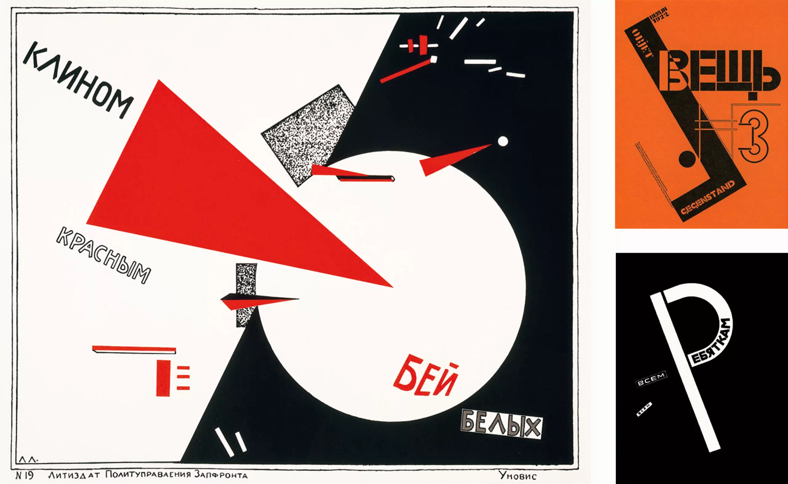

As a brief aside, Malevich’s Suprematism proposes a form of geometric abstraction that allows for a plastic deconstruction, creating a new form of non-representational painting, stripped of meaning, within an immaterial space. His famous Black Square on a White Background from 1915 and White Square on a White Background two years later would deconstruct painting, propelling it into a fourth dimension, floating in space and time. In other words, Malevich broke free from pictorial representation, the canvas and the rules, to create a form of painting that transcends the visible.
Constructivism, following in its footsteps, does not seek to be figurative, but rather to structure space through oblique lines and symmetry, which lend stability and movement, whilst not aiming to ensure that the words are easily legible. It is a form of art closely related to graphic design.

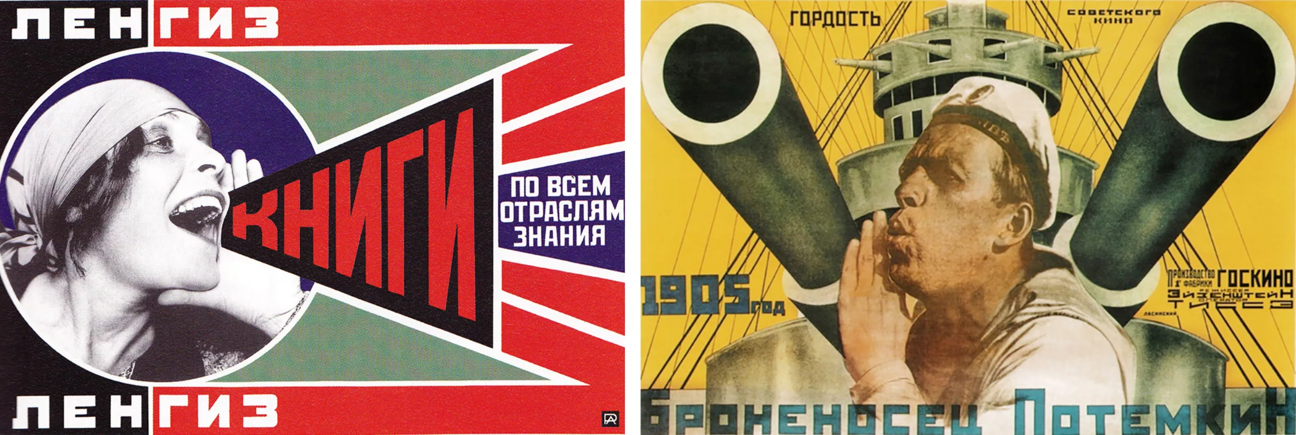
Of particular note are the highly innovative typographical experiments and the use of text as a visual element, in which typography takes on considerable importance and changes its status to become an image : “The Russian Constructivists approach typography as visual artists; it is clear that, for them, the fundamental issue of typography remains a matter of the visual arts” (Leclanche-Boulé, 1984: 49).
De Stijl and the Bauhaus: less, but better, in pursuit of universality
Constructivism would serve as the link between Russian abstraction in the East and the Bauhaus and the De Stijl movement in the West, through El Lissitzky, who joined the latter in 1923. The influence of the avant-garde artists is clearly evident in the paintings of the De Stijl movement, such as those by Mondrian in the Netherlands, or in the works of the Bauhaus in Germany. The use of geometry, grid-based composition, simplicity and minimalism, and the influence of architecture are recurring themes in these works.
The De Stijl movement, first founded in 1917 in the Netherlands by Theo Van Doesburg, developed abstraction and did away with perspective, using primary colours arranged between straight lines, based on a vertical grid system. De Stijl sought to establish a connection between painting and architecture, and aimed to create a universal and resolutely modern pictorial language, reflecting a mystical quest for pure emotion through the abstraction provided by the geometry of the grid and the use of the rectangle.
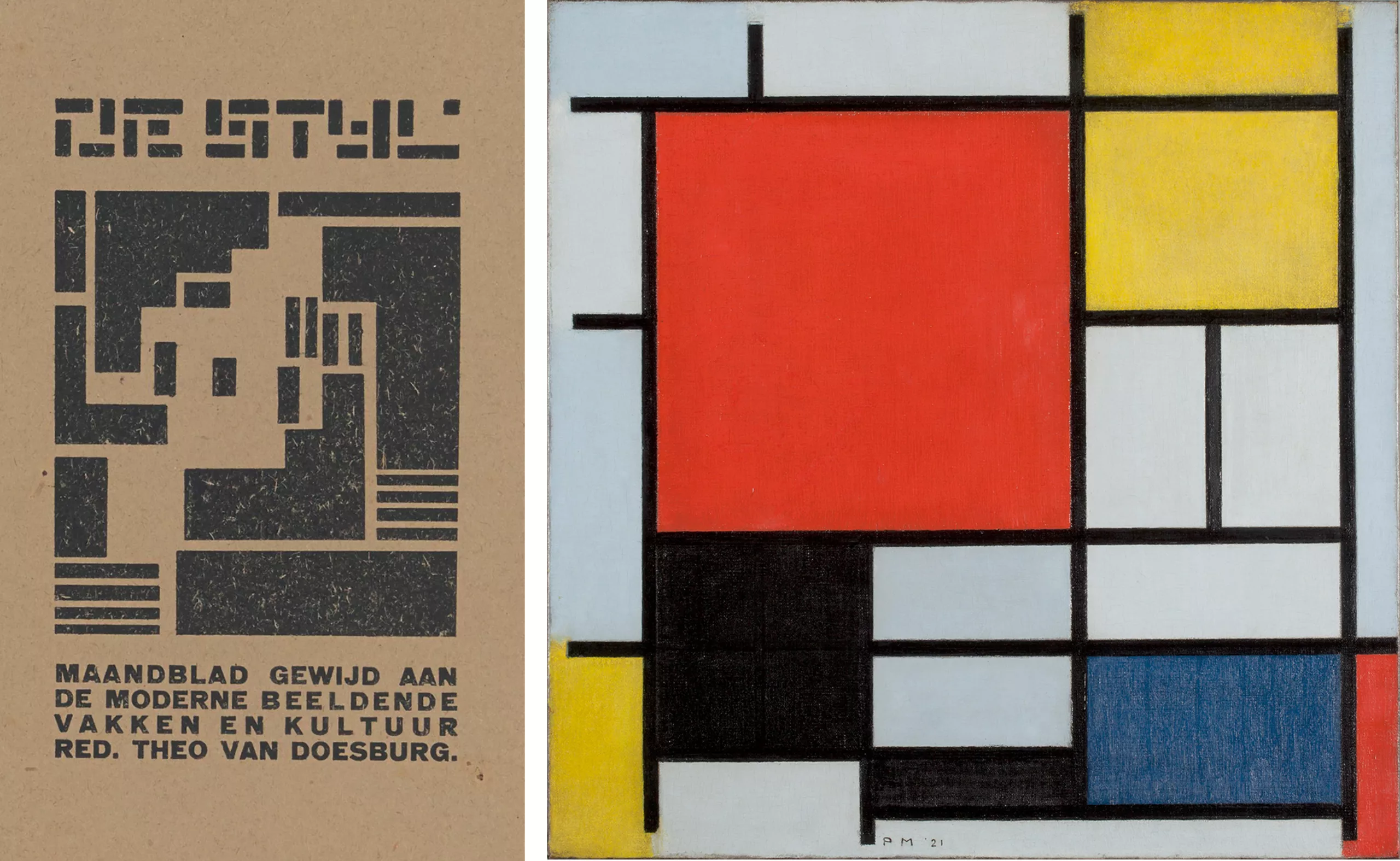
A year later, the Bauhaus school was founded, fully in keeping with this modernist movement and following on from these artistic influences, as shown in the images below (in the second row, El Lissitzky’s paintings from 1920–1922, which clearly influenced those by the Bauhaus artists produced in 1925–1923, shown above).
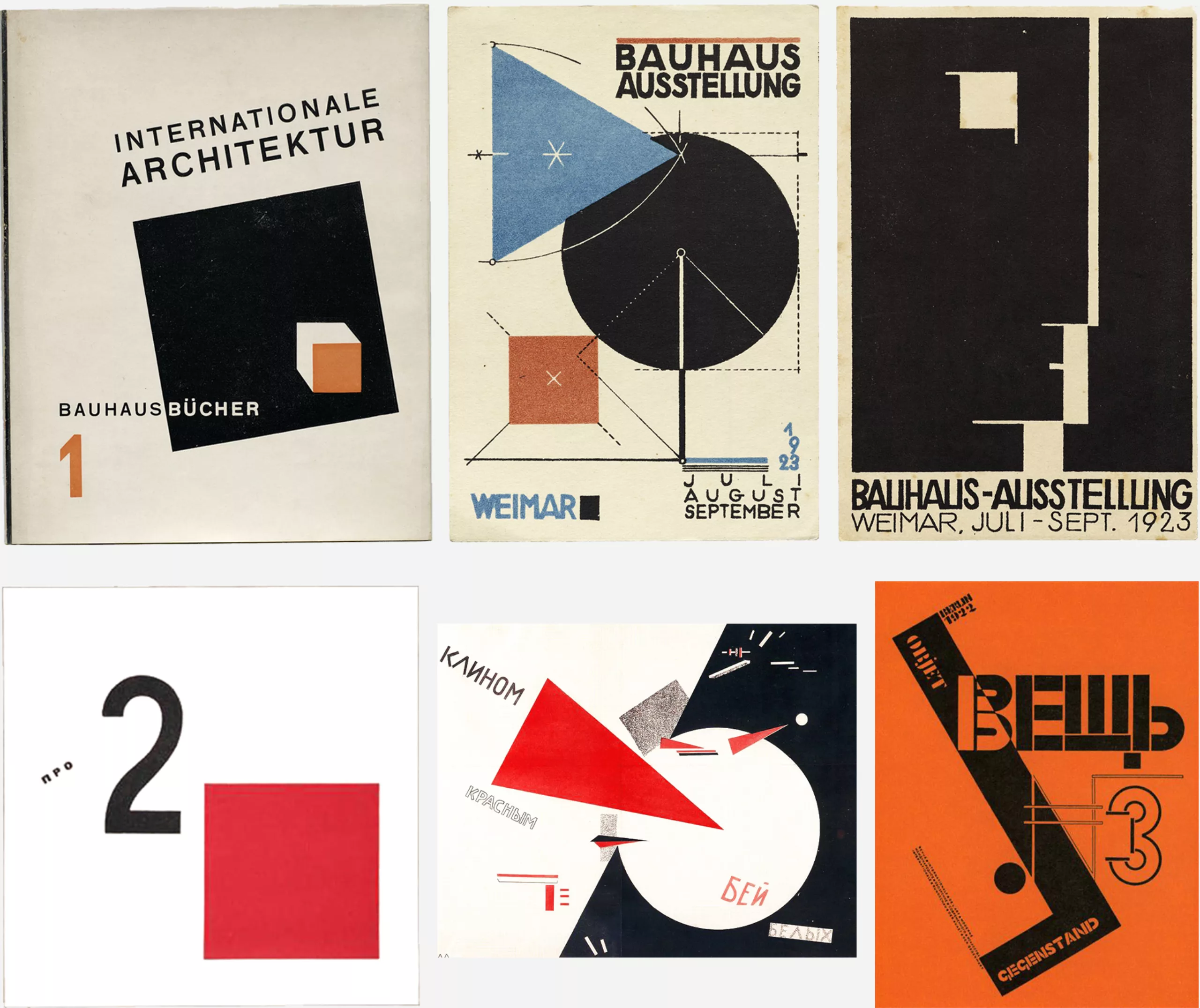
The humanist idea is to make industrial art simple, functional, beautiful and accessible, through clean lines, geometric shapes and new, high-quality materials, using objects produced either by hand or in series by machines. Bauhaus means ‘house of building’, in reference to the Bauhütte (a Gothic-style cooperative of craftsmen building cathedrals, which had also inspired William Morris), but here places the emphasis on artistic individuality. It was a veritable revolution that sought to “create together the new architecture of the future”, as Walter Gropius, its founder and first director, put it.
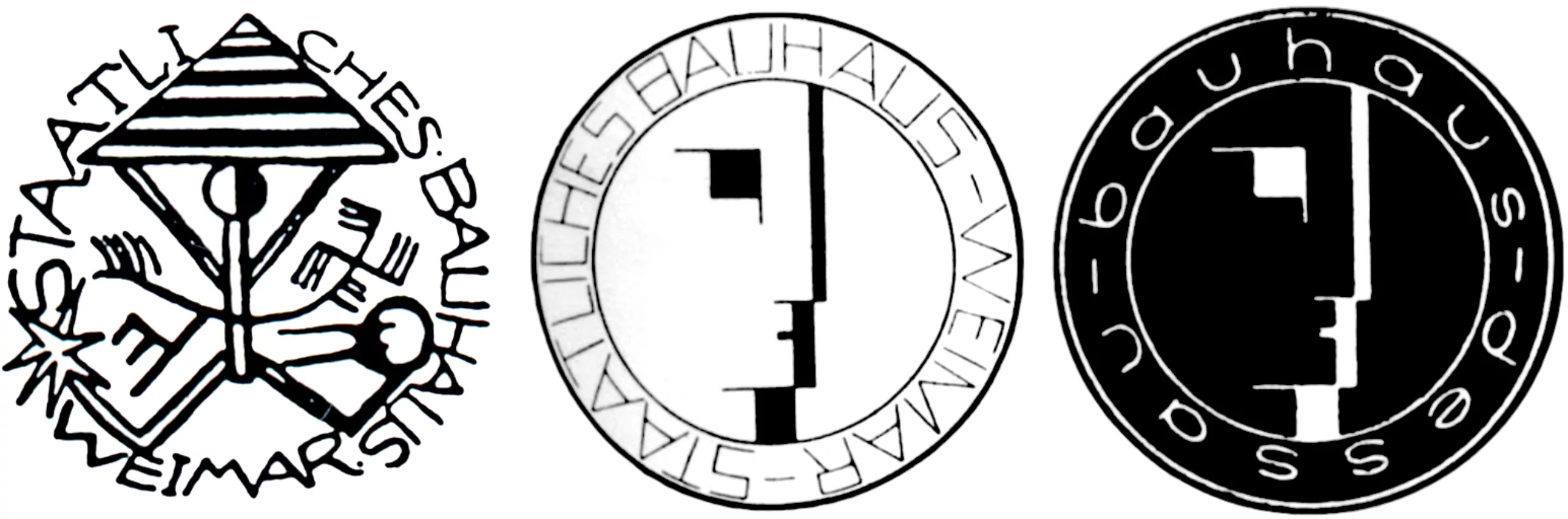
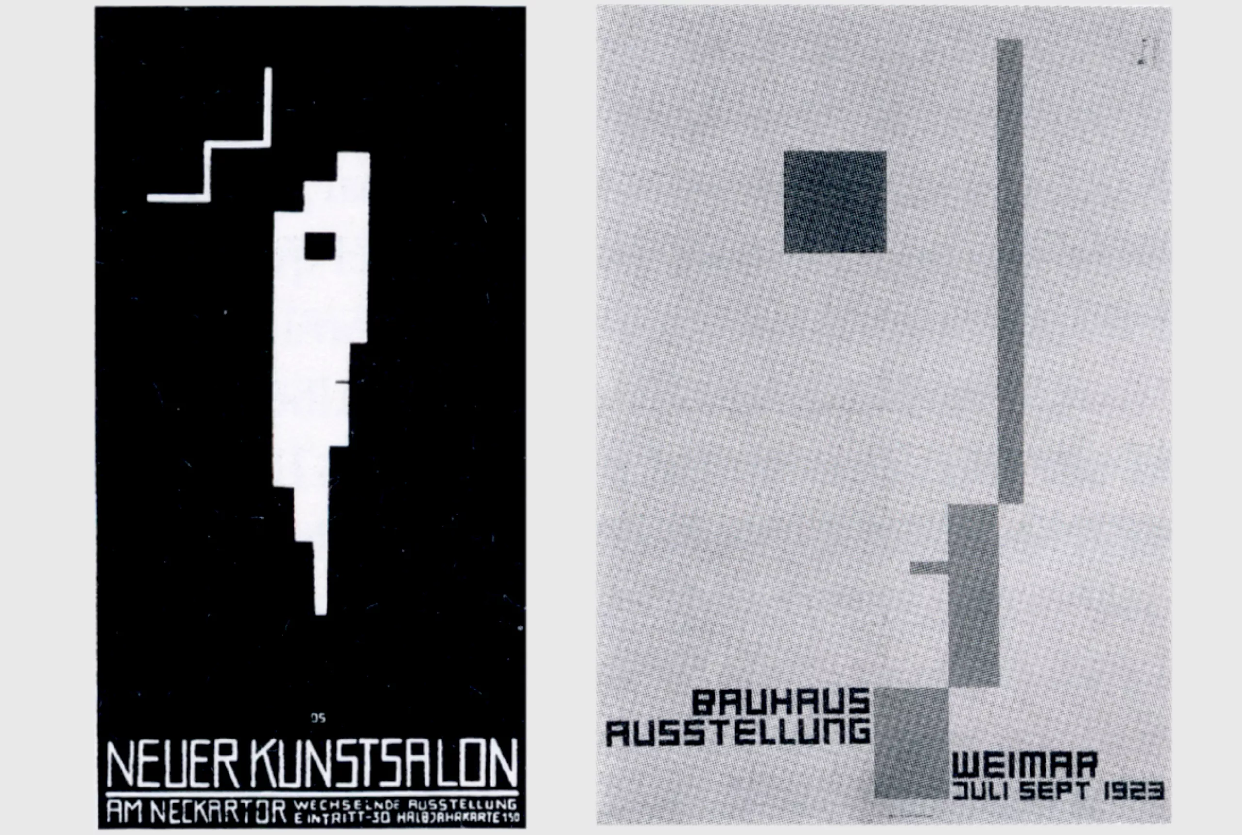
The Bauhaus sought first and foremost to reconcile democracy with a rejection of ornamentation, and then to create a new, modern human being through art and architecture. It is the phrase “less is more” by the architect Ludwig Mies van der Rohe, director of the school in the 1930s, that best characterises it. The school initially sought to liberate the craftsman, in a humanist spirit; then, in the 1930s, as politics shifted to the right, it focused on industry and functional design. As well as being part of an era in which people sought to move away from excessive ornamentation in favour of universality and functionality, the school was situated within a very specific German context.
Towards standardisation and universalism: reconstruction in Germany in the 1920s
In the 1920s, Germany was emerging from defeat following the First World War and was undergoing a severe economic crisis, during which it received financial support from the United States. This gave rise to a fascination with the culture and economic models established across the Atlantic, notably Taylorism, which enabled the rationalisation of labour and production ‘thanks to’ standardisation and organisation. The Weimar Republic then developed a need to standardise society, art and architecture through standardised models in order to make them more accessible and widely available to as many people as possible. There was also a desire to simplify the German written language so that it could be read by everyone.
In this context, Germany is nevertheless torn between two camps: tradition, which looks to the past, and modernity, which seeks to make a clean break from these influences. On the one hand, there are the defenders of tradition, who still make extensive use of Gothic typefaces (such as Fraktur, which was in use right up until 1944 under the Nazi regime), embodying rigour and geometric modularity but which are difficult to read (I would point out that the first movable type used by Gutenberg in printing was Gothic in style), and, on the other hand, those oriented towards modernity and universalism, who champion a new typography.
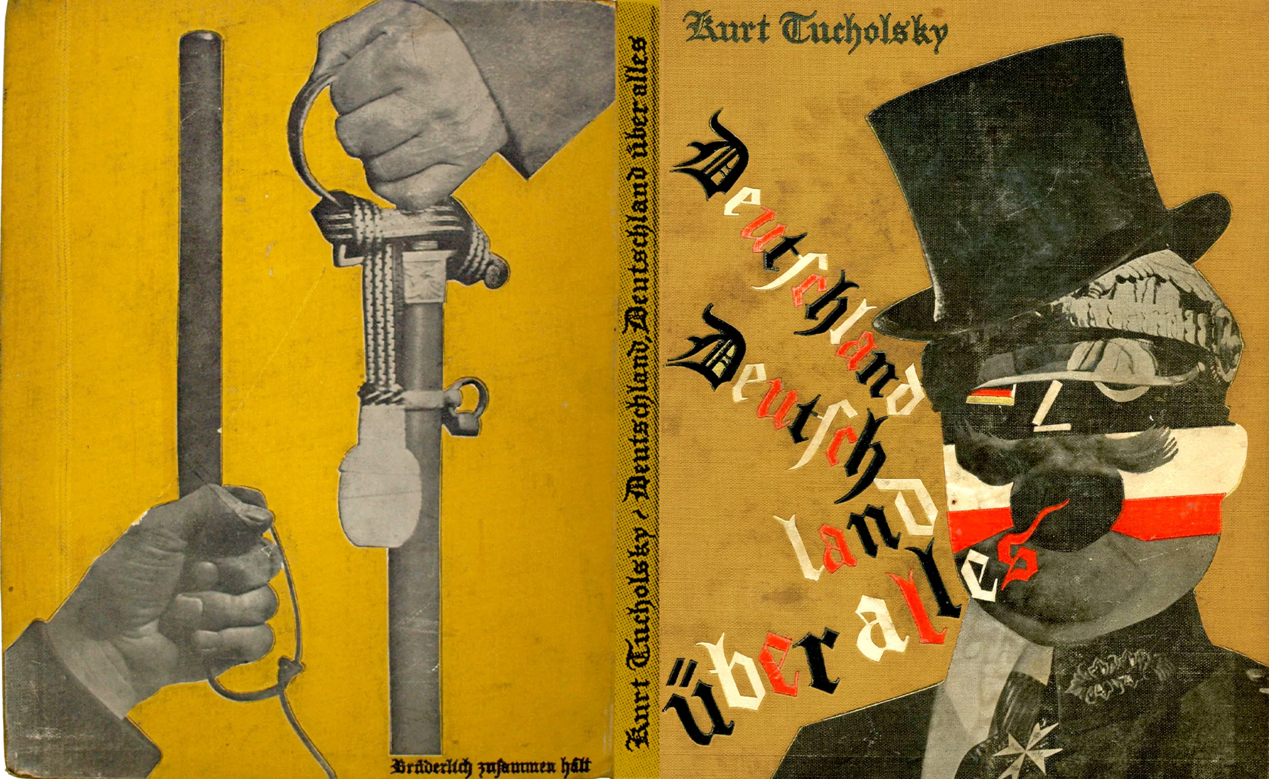
The new German typography, which ushered in international modernism, thus emerged as a reaction to this cultural and social context. It aimed to be timeless and neutral, centred not on handwriting or cultural heritage, but on reading, which it sought to make more fluid and straightforward through the use of industrial typefaces. In 1929, John Heartfield, a German artist and graphic designer and a proponent of photomontage, satirically denounced the atmosphere in Germany with the cover illustration below.
On the left, it depicts a police truncheon and the sword of military power, accompanied by the caption ‘together, in brotherhood’; on the right, a figure—part bourgeois, part military—proclaims, in Gothic script, ‘Germany, Germany above all’. Inside, there is a photograph of a backside with ears – a ‘Berlin idiom’ – whose meaning could not be clearer.
Mathematical rigour as a legacy for modern universalism
Artists, designers and architects of the 1910s and 1920s were therefore interested in mathematical language and geometry as a potential universal language. At the time, universality was a subject of great fascination. This was evident in the works of the De Stijl movement—Mondrian and Van Doesburg—the Suprematist Malevich, and the Dada movement: the search for a ‘pure’ form allows one to detach oneself from all symbolism and all meaning, in order to go beyond them. Either towards something spiritual or sacred, or towards a form of universalism. The line between the two is, ultimately, quite fine.
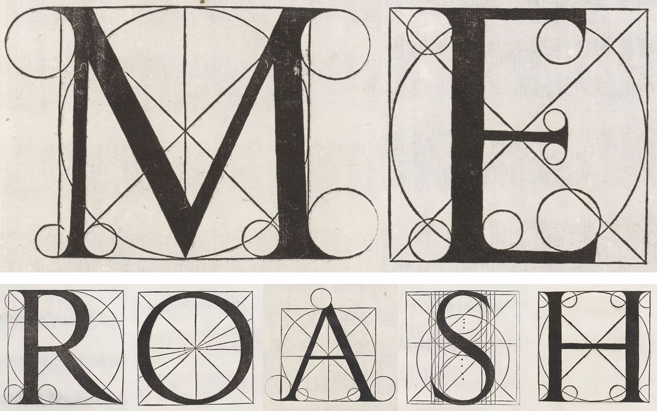
This interest in the application of mathematics to art stems from the 16th-century grid system: the ‘divine proportions’. These are proportional measurements based on a common unit as a ratio, inspired by the observation of Nature—which is regarded as the Divine Work—and embodying the idea of perfection. As far back as Roman times, with Vitruvius – the first known Roman architect (30–40 BC) whose writings have survived – God was conceived as the “great clockmaker of the world” (the expression would emerge in the 15th century) who expresses himself perfectly through Nature and whom man can comprehend through mathematics, via these famous proportions which are said to be its language and divine expression: geometry is the language of the universe.
During the Renaissance, following in his footsteps, attempts were made to apply these proportions to architecture and calligraphy (with Lucas Pacioli – below – or Thibaudeau, who studied Roman capitals, or Dürer, who took an interest in Gothic architecture, in the 16th century) or in art, by means of a system of grids and measurements known as the Classical canons, the very same principles that were shattered at the start of the 20th century, as we mentioned at the beginning of this article.
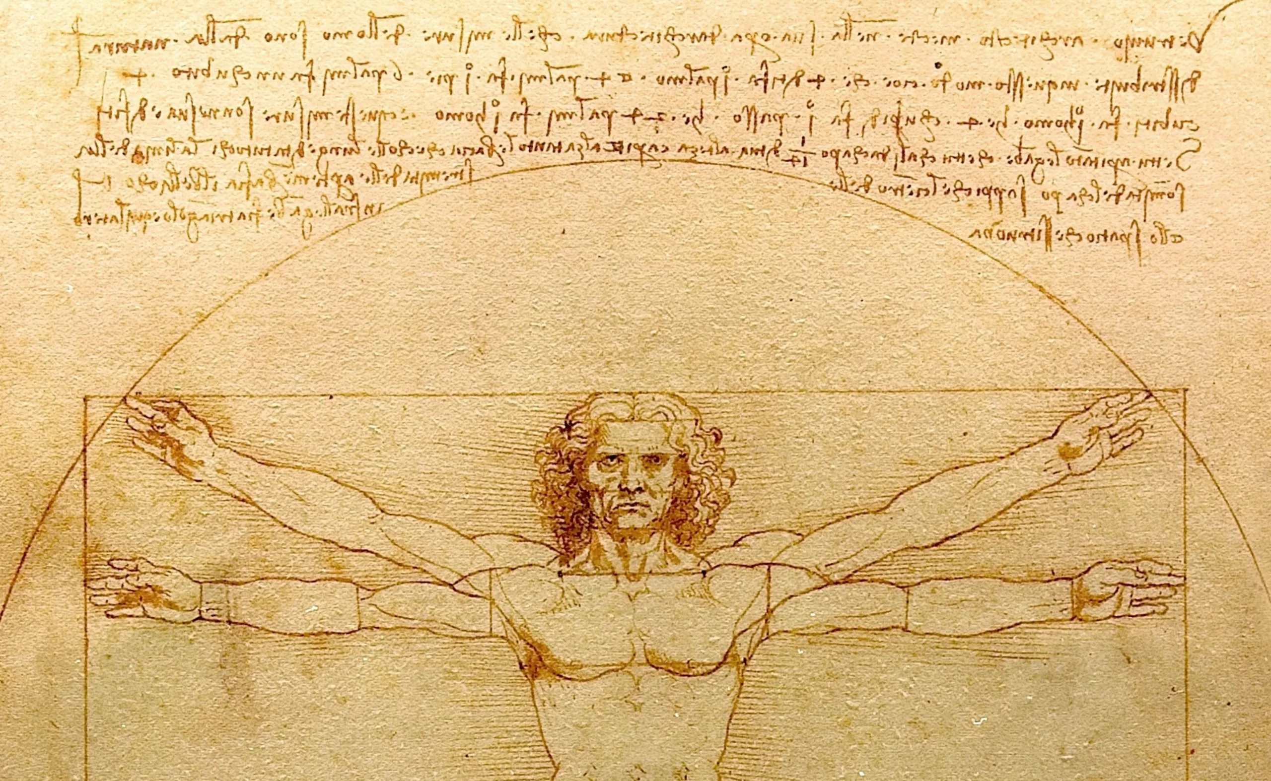
These proportions are illustrated by Leonardo da Vinci’s famous Vitruvian Man, with outstretched arms inscribed within a circle and a square: “Nature has distributed the measurements of the human body as follows: four fingers make a palm, and four palms make a foot; six palms make an elbow; four elbows make the height of a man. And four elbows make a double stride, and twenty-four palms make a man; and he used these measurements in his constructions.”
In search of the ‘character of our times’, a new universal language and the quintessential modernist style of writing
For modernists, it is indeed a question of looking to the future by inventing new forms (buildings, typefaces, page layouts…), of rejecting Renaissance script or the Gothic styles of the past, whilst not forgetting fundamental research into mathematical rules. The main difference being that the Renaissance sought, first and foremost, beauty in the application of these measurements and canons, whereas modernists prioritise function over aesthetics.
Modernists thus apply the principles of the grid system and use geometric forms in their designs in the pursuit of universalism and functionalism. This idea, later applied by the Bauhaus, originated with the architect Louis Sullivan, who wrote in 1896 in Aesthetic Considerations on the Height of Buildings, “the law of all organic and inorganic things, of all physical and metaphysical things, of all human and superhuman things, of all manifestations of the head, the heart and the soul, is that life should be recognisable in its expression, that form should always follow function.”
Modern research into new typefaces thus rejects the overly humanist and calligraphic influences of the past, drawing on the writings of Adolf Loos and the German values of the 1920s, namely rigour and discipline. This has led to the creation of standardised alphabets designed to be more accessible by removing and erasing the last traces of the manual gesture in writing: serifs. These conceptual alphabets do not seek to rediscover the origins of writing, but rather to create a neutrality and a universality—achieved through geometric forms—that everyone can agree on.
They are the descendants of the 1896 Akzidenz-Grotesk, the first typeface to gain widespread popularity amongst German sans-serif typefaces:
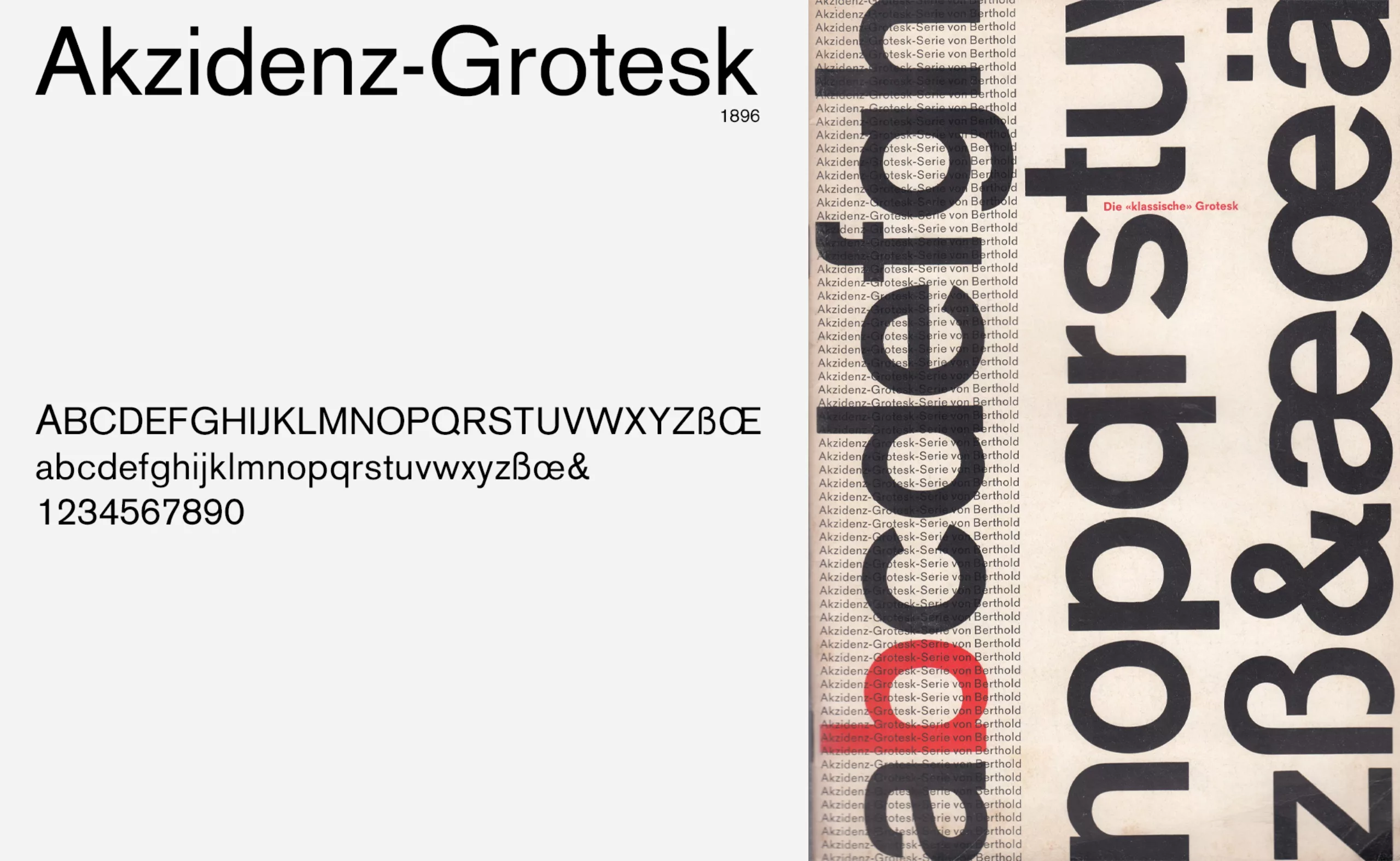
Sans-serif typefaces, known as Grotesk or Grotesques in the English-speaking world and Germany, have existed in England since the early 19th century, as we saw in our first article on modernism. However, they were redesigned in Germany to:
- to do away with the thick and thin strokes, that is to say, the marks left by the handwritten pen
- to be as neutral as possible that is to say, without any cultural or aesthetic features, without ornamentation, and without any references to the Renaissance or the Gothic style
- use neutral and abstract geometric shapes as a basis: squares, circles, triangles (inspired by the Universal Cut-out Plate), which are considered universal because they are rational and elementary
- to be seen as a legacy of the grid of ‘divine proportions’ or ‘divine measures’
It is interesting to draw up a brief (non-exhaustive) chronology of geometric typefaces and the steps towards standardisation taken in the 1920s. It is worth noting that these alphabets were rarely cast in lead for use in the printing trade – with the exception of Futura – and were more often concepts explored as the basis for a universal language that fascinated researchers at the time. One must also imagine this deep-seated need to break away completely from Gothic typefaces and from that past, and what the creation of a new and functional typeface must have meant in people’s minds!
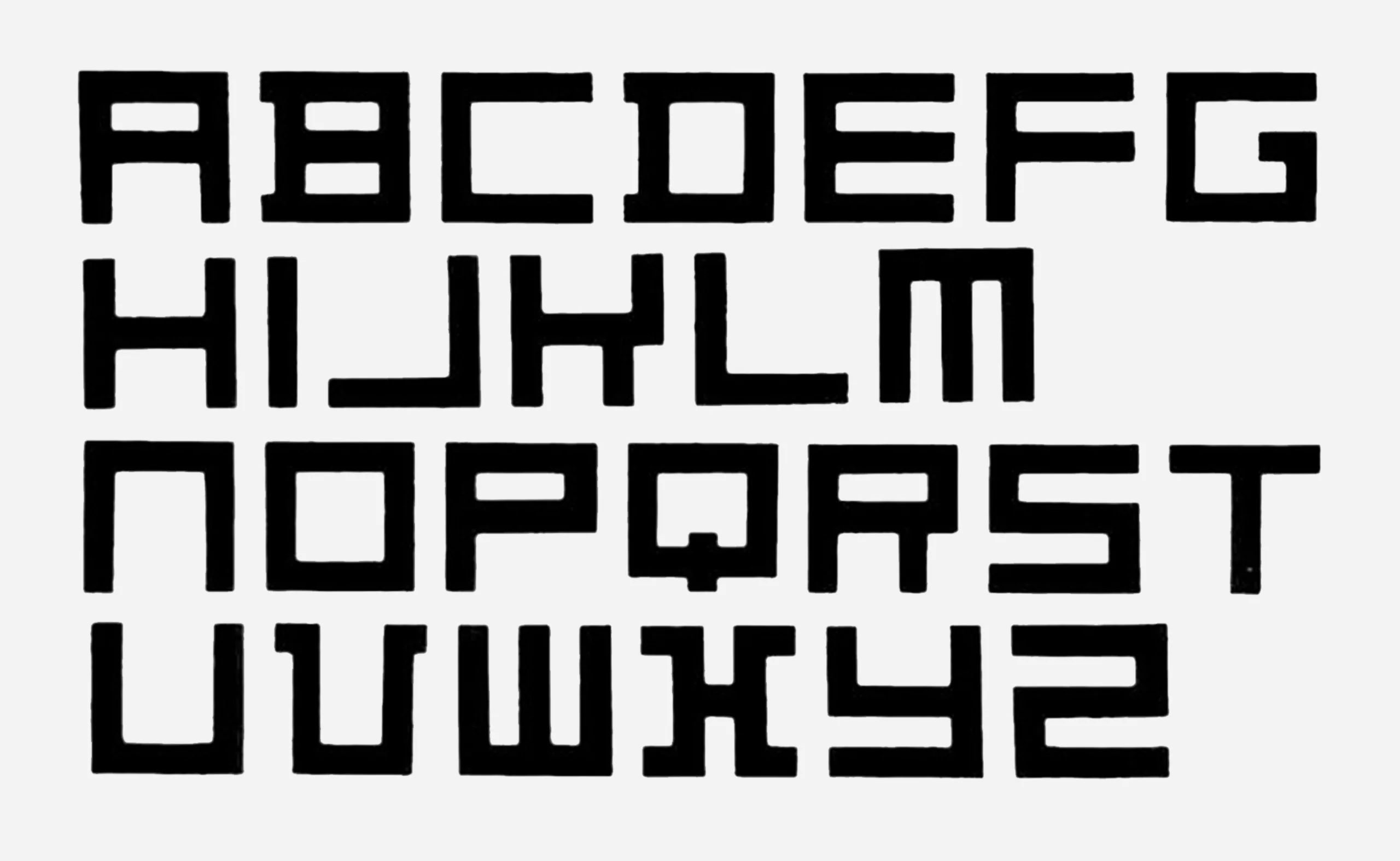
– In 1919, the Dutch artist Theo Van Doesburg (co-founder of the de Stijl movement) created an alphabet in which the letters were constructed from squares. His ideas on the formal simplification of writing through geometric shapes and straight lines influenced the Bauhaus school, where he gave numerous lectures. This spurred the creation of other linear, geometric typefaces, alphabets and typographic characters known as “universal”.
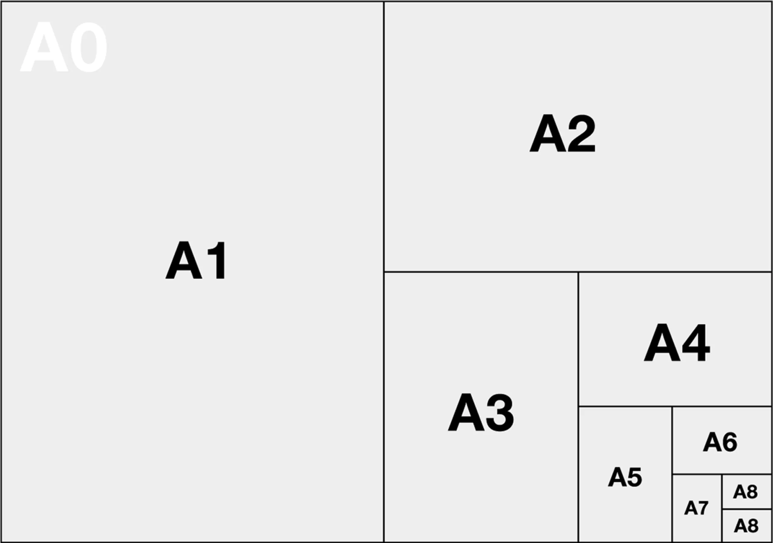
In 1922, the new DIN standardised paper sizes, from A0 to A8:
1924: the first designs for Futura, with their geometric forms, called for a clean slate, free of ornamentation, yet not without tradition. These typefaces are linked to the ‘Divine Proportions’. Originally, Futura was based on geometric shapes as a starting point for its design: we invite you to read our article on the creation of Futura.
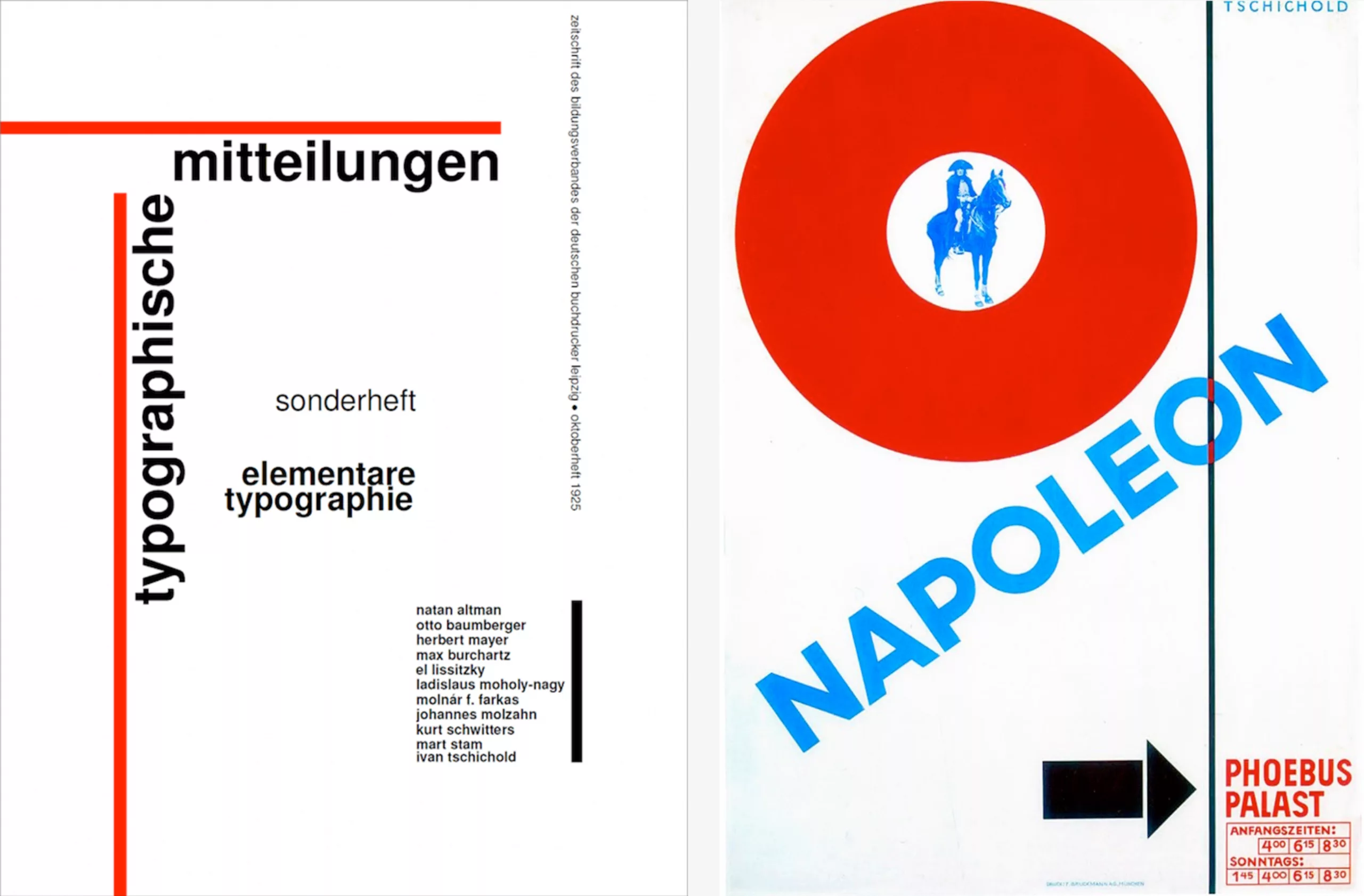
In 1925, the Bauhaus moved to Dessau and took a new direction towards a more industrial and less artisanal approach to production. A typography workshop was set up under the impetus of Moholy-Nagy, its new director, and the school became an incubator for the ideas of New Typography. Influenced by Theo Van Doesburg of the De Stijl movement and Jan Tschichold, the ‘handbook for designers of their time’ Die neue Typographie (New Typography) unveiled the first typefaces with geometric strokes to printers and brought together all this research before its publication in 1928.
New Typography proclaims the supremacy of geometric, constructed sans-serif typefaces, seeks a neutrality in the image of modern man, rejecting the trace of the hand, and is concerned above all with clarity in layout (before beauty) with “a functional use of colour” as Tschichold explains: “White, for example, reflects light; it radiates. Red comes forward; it always appears closer than any other colour, including white. Black, on the other hand, is the densest colour; it recedes the furthest”. Among his key principles is the notion that typography is “linked to functional requirements”, with the aim of communication, for which it serves as a “means of graphic expression”.
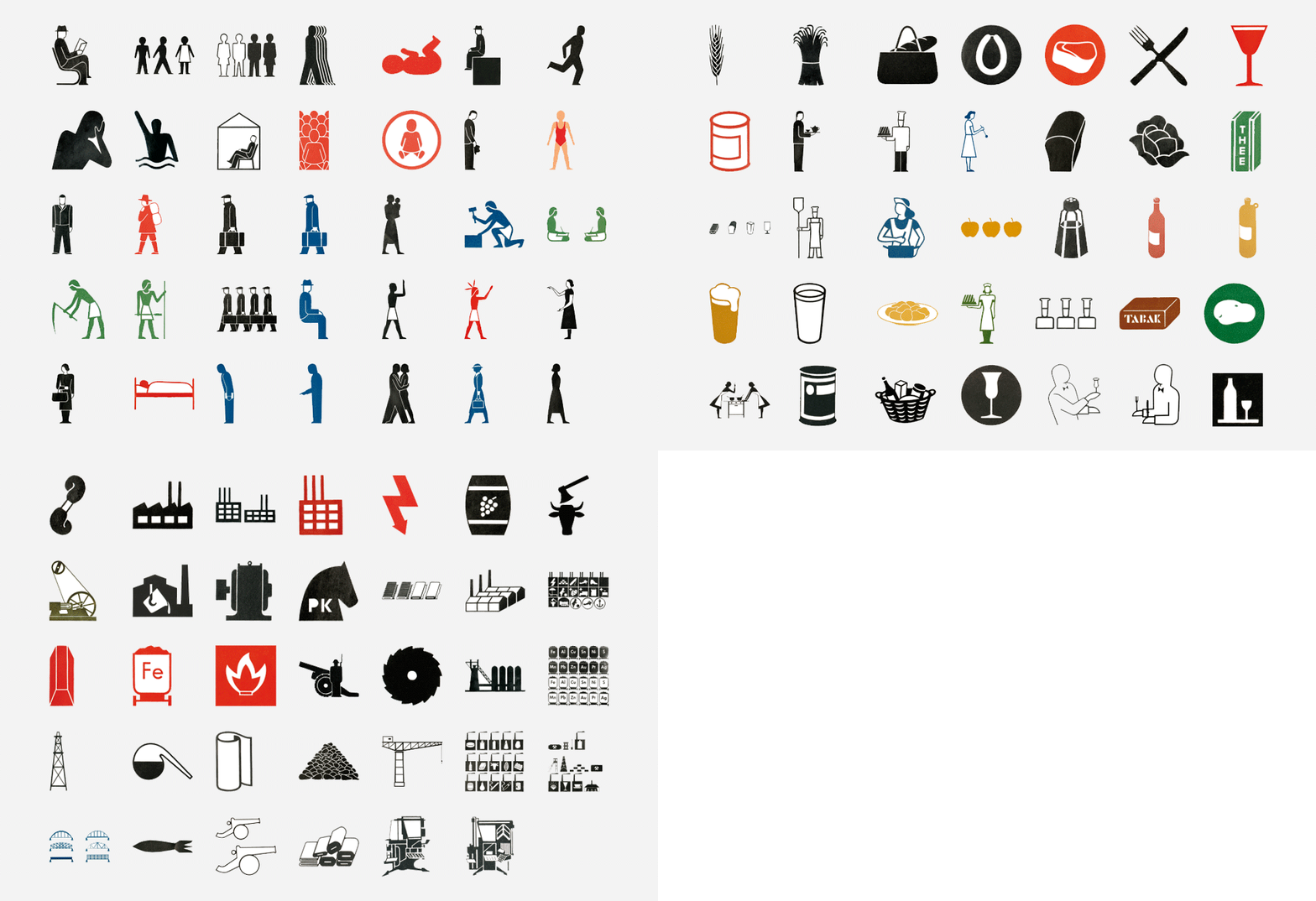
That same year saw the birth of ISOTYPE, the International System of Typographic Pictorial Education, in Austria. It is a visual infographics system, the forerunner of pictograms and emoticons, in which numerous elements are represented using symbols. It enables causes and phenomena to be explained and represented through repeated illustrations. Its use was introduced as part of an effort to democratise knowledge, with the aim of reaching less educated sections of the population, such as workers and children. It is a form of universal visual language, a form of pasigraphy.
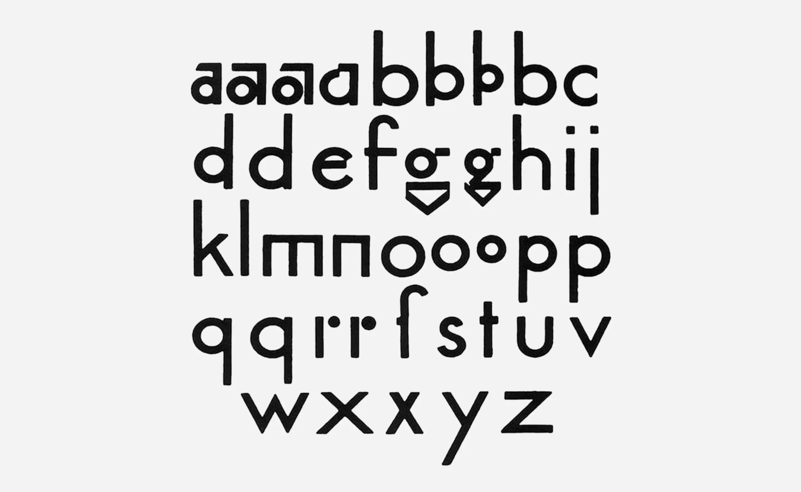
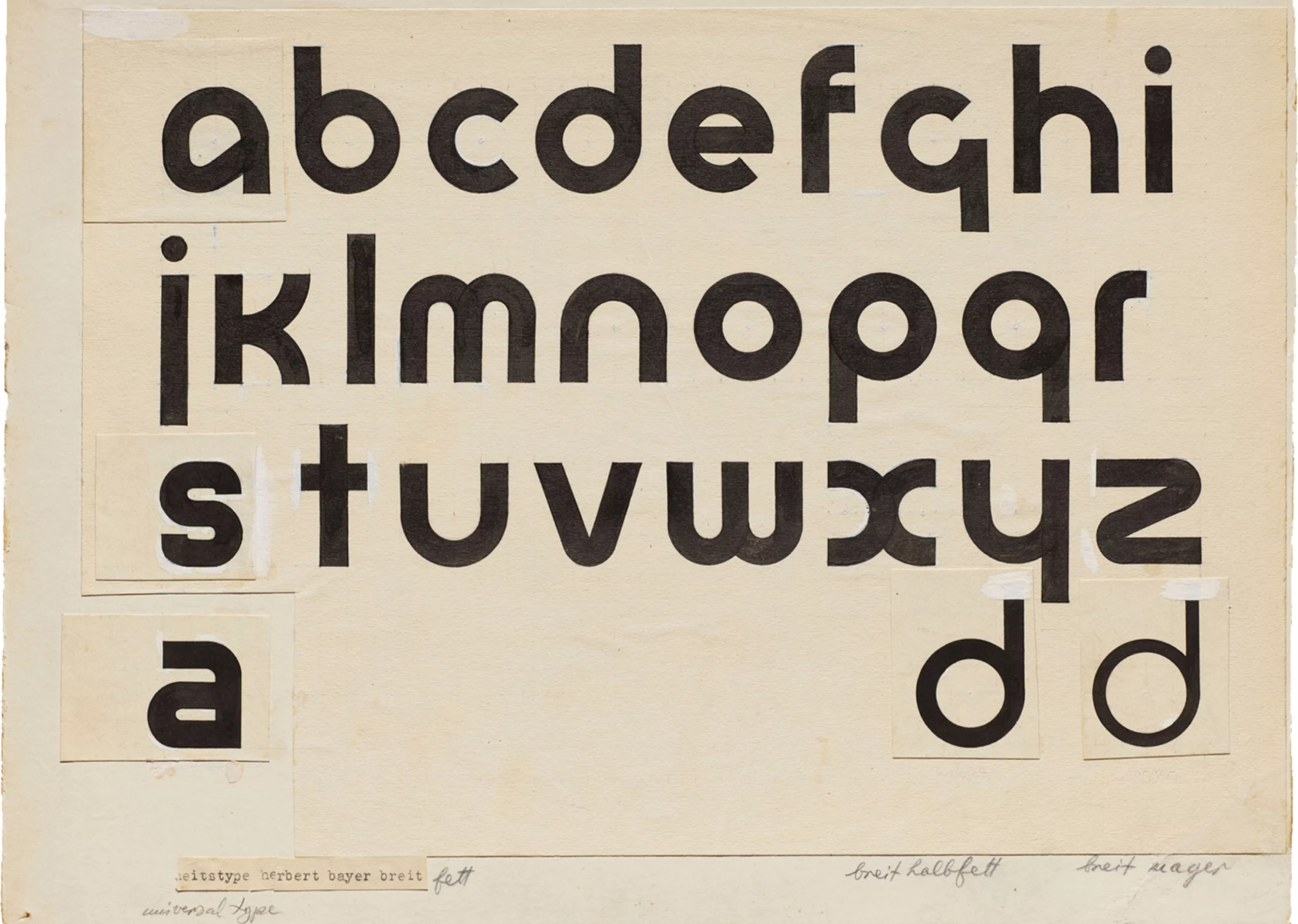
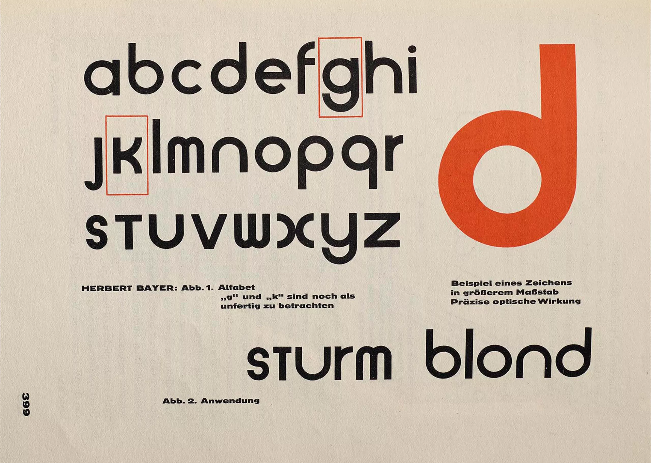
Herbert Bayer, a student at the Bauhaus and later head of the school’s printing and advertising department – for which he designed the letterhead and standardised the formats – pursued his research into the simplification of writing. He created a monocameral alphabet (without capital letters), which would become the preferred choice within the Bauhaus: the Universal. He geometrised the structure of the Latin alphabet by removing the thick and thin strokes inherited from the use of the quill: by removing the capital letters he simplified the typographic structure, which usually featured two forms from different eras for the same letter – a capital, of Roman origin, and a lower-case letter, inherited from the Carolingians.
It was subsequently decided, for the sake of simplicity and economy, to dispense with capital letters in Bauhaus publications. Herbert Bayer wrote in 1925 that by “making do with lower-case letters, our letters lose nothing and become easier to read, easier to remember, and considerably more economical”. Below is Bayer’s first version from 1925, followed by a variation adopted in 1926:
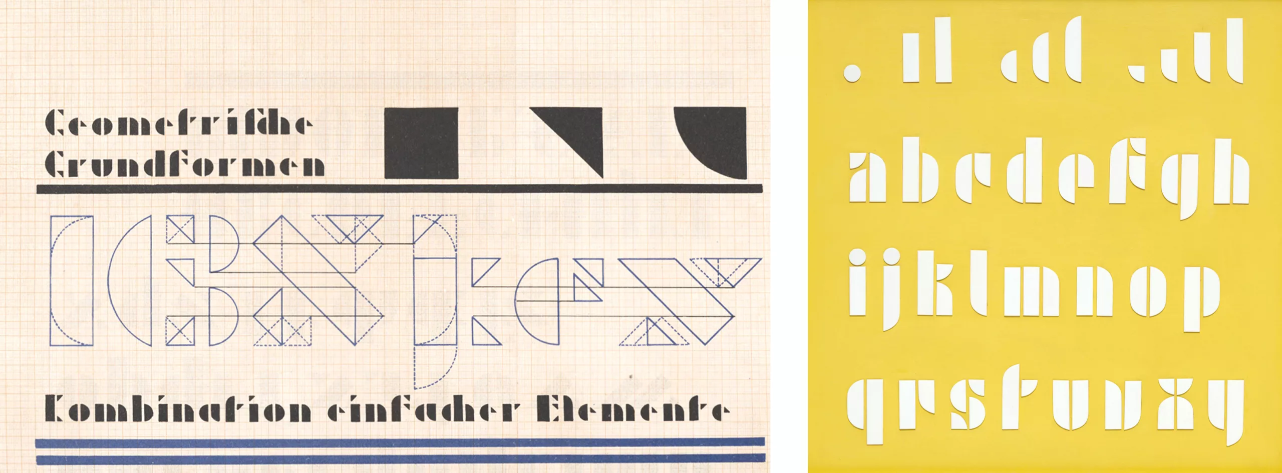
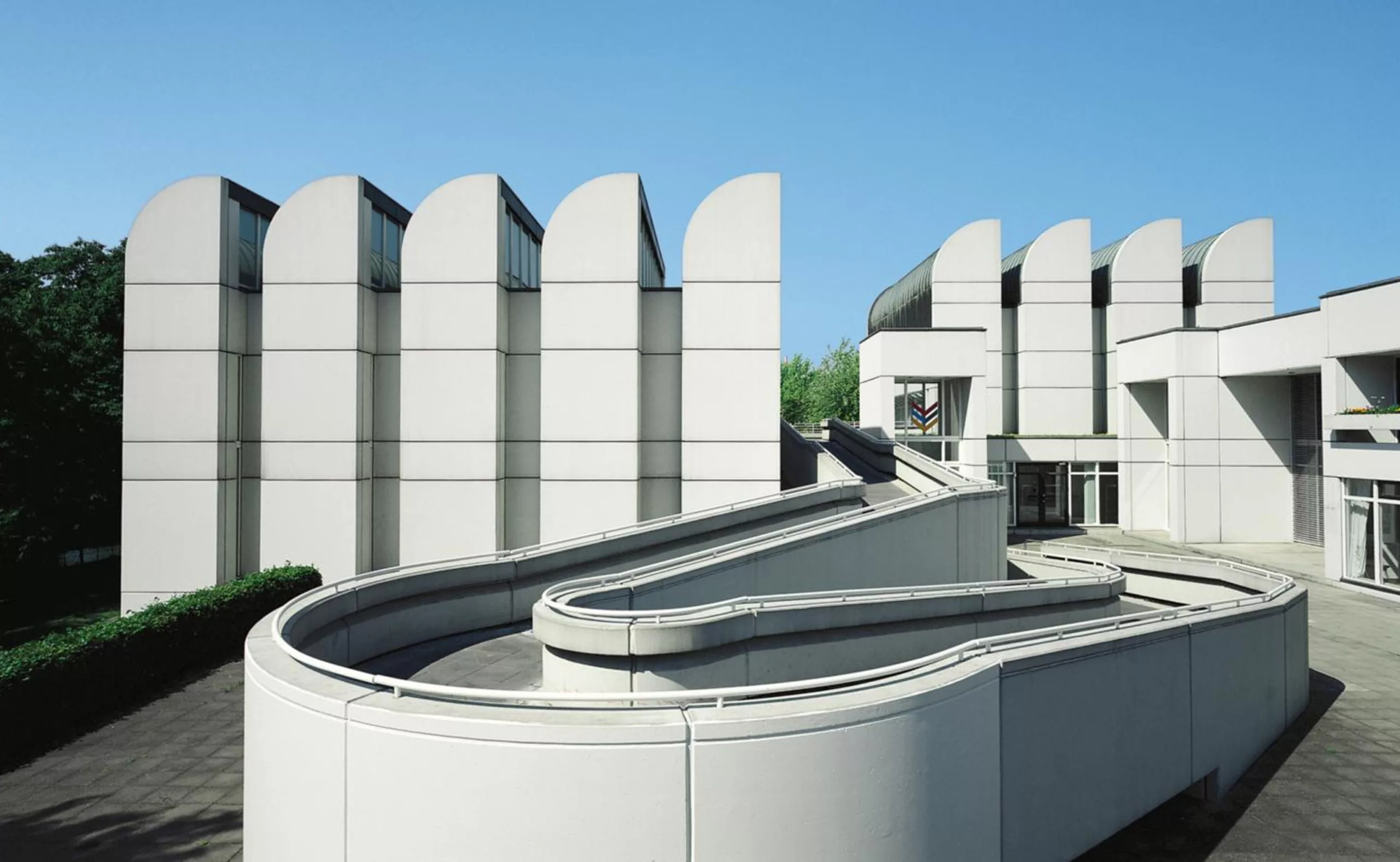
1926–1927: German type foundries sought to create the perfect typeface, striking a balance between geometry and legibility, and embarked on research into a universal typeface, such as Josef Albers’ Schablonenschrift (subconscious, in German) by Josef Albers, which combines simple geometric and architectural elements (squares, triangles, circles) and was created using stencils. It is interesting to note this desire to blend several disciplines in this quest for universality, by injecting geometry into the construction of the world, to make it accessible and understandable to all. Beneath the typographic image lies a parallel with the Bauhaus-Archiv building, designed by Walter Gropius to house the school’s archives following its closure by the Nazi regime.
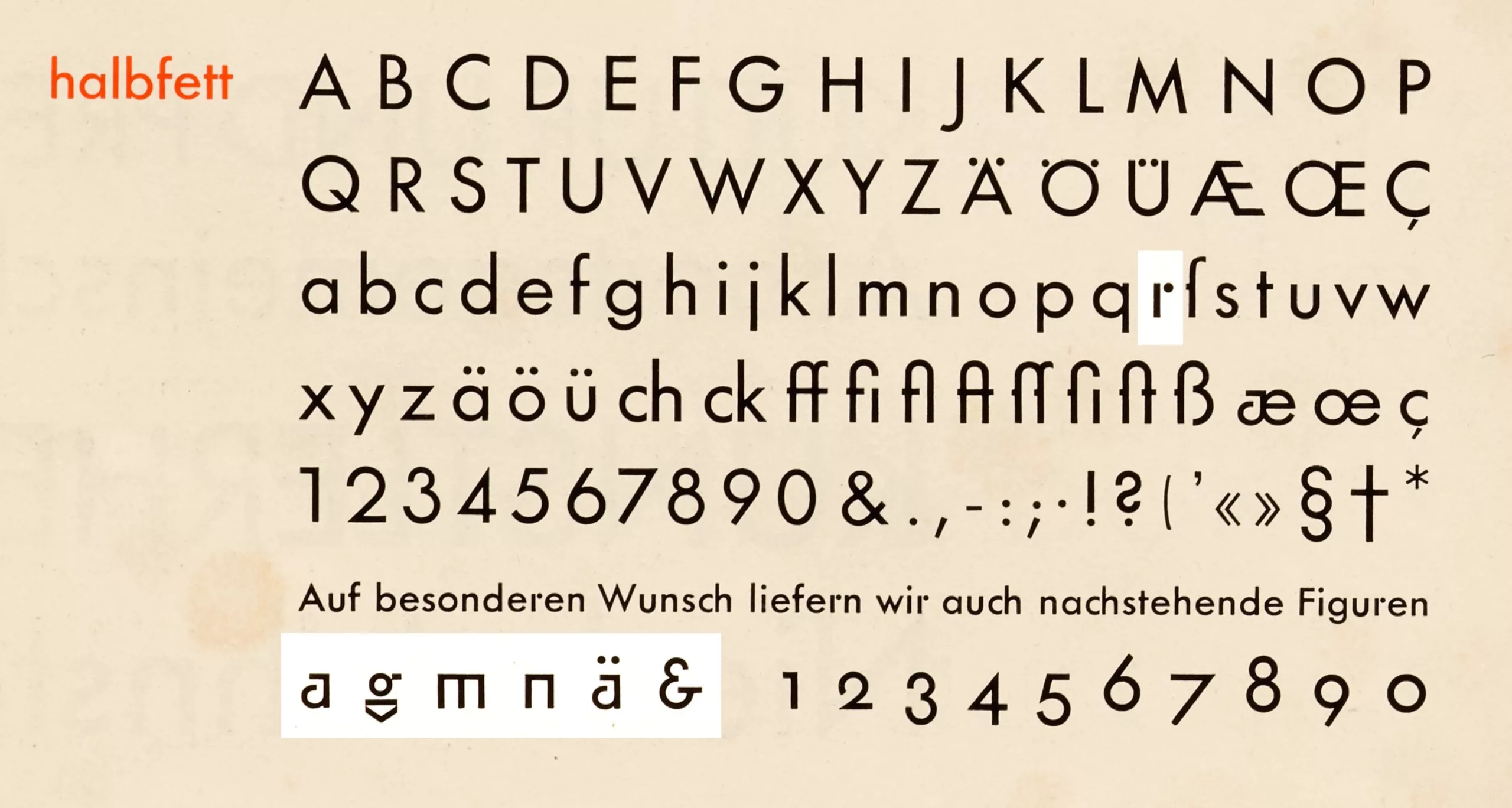
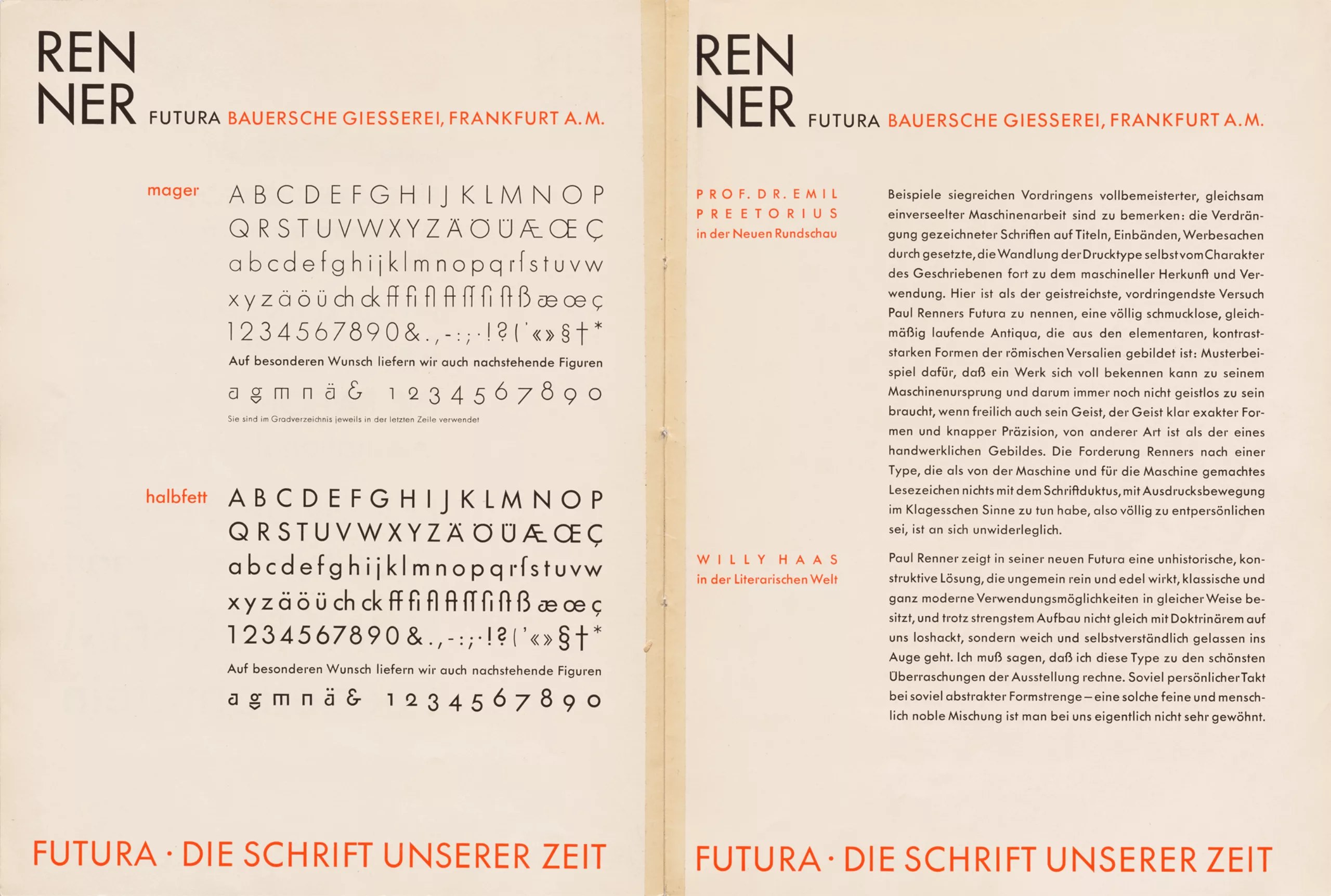
In 1926, the publication and immediate success of Futura, redesigned in a new version. This typeface was intended to become the new typographical standard, replacing standard text in as many media as possible. Renner, who was close to Tschichold, nevertheless opposed the radicalism of the new typography, stating: “The artistic quality of a typeface must be judged by the eye and not by mathematical concepts; thus, the creation of a geometric typeface cannot be achieved through elementary geometric construction alone.”
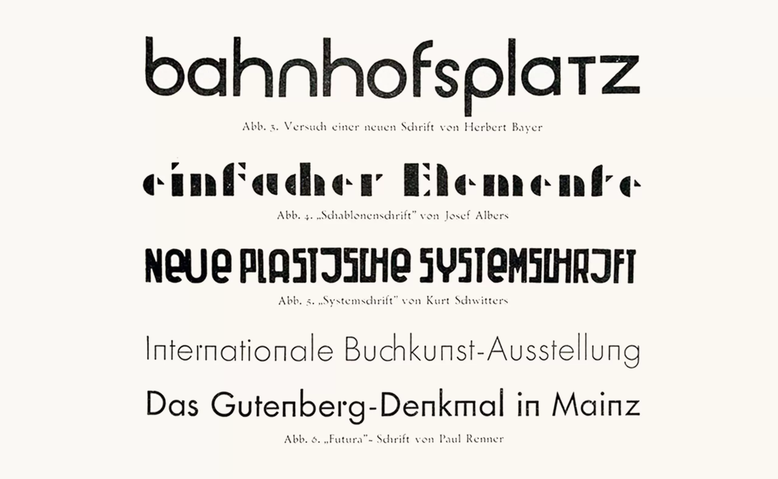
In 1928, Herbert Bayer compared his Universal typeface to Josef Albers’s Schablonenschrift, Kurt Schwitters’s Systemschrift and Paul Renner’s Futura:
But with the rise of Nazism and fascism in the 1930s and the approach of war, some influential graphic designers left Germany and went on to spread their teachings around the world. Some emigrated to the United States (such as László Moholy-Nagy and Herbert Bayer), to Israel, and others to Switzerland (such as Jan Tschichold). In Switzerland, the Basel School passionately revived the works of the Bauhaus, with figures such as Max Bill and Josef Müller-Brockmann, who in the 1950s advocated rigor in the journal Neues Grafik, which “rejected any form of compromise” while drawing on the values of concrete art. This Swiss style would become synonymous with the International Style.
Jan Tschichold (who is, after all, to graphic design what Adolf Loos was to architecture) would later reconsider his functionalist views and prescriptions, returning to a less standardized, more historical typography and to the “beautiful page” constructed in the spirit of William Morris’s principles. In 1946, writing in Schweizer Graphische Mitteilungen (Myth and Reality) No. 6, he remarked on modernism: “This intolerant stance is perfectly in line with the German penchant for the imperative; its quest for military order and its demand for absolutism coincide with those terrible aspects of the German character that Hitler’s rise to power and World War II reawakened.”
Questioning So-Called Universalism
One can question the meaning and validity of this quest for universalism in many ways. There is a sense that universalism leads to simplification and thus to the erasure of differences through the establishment of norms that result in a certain standardization, which shapes a model that purports to be universal but paradoxically causes exclusion… since true universality does not exist! It is imagined through cultural and social prisms that inevitably create variations across cultures, and it is a fantasized concept precisely because it is impossible to achieve. Nevertheless, Gropius said that the Bauhaus teaching of functionalism remained alive “as long as it did not focus on form, but sought, behind the changing form, the very flow of life.” It would seem that this was the case around the 1920s, but that in the 1930s—with the rise of Nazism and, more broadly, far-right values in Europe—and later, after the war, with the Swiss International Style, the principles of the modernists were transformed not into the noble pursuit of the “universal flow of life,” but into a rigid, standardized model that was, despite itself, applied as a standard to the entire “world,” with this form of standardization as the guiding principle and without any function preceding it.
On the question of standardization (versus differences), we can cite the dialogue between Claude Lévi-Strauss and Éribon in De près, de loin (1988):
Éribon: Cultures tend to oppose one another.
Claude Lévi-Strauss: At the end of Race and History, I highlighted a paradox. It is the difference between cultures that makes their encounter fruitful. Yet this shared interaction leads to their gradual homogenization: the benefits that cultures derive from these contacts stem largely from their qualitative differences; but in the course of these exchanges, these differences diminish until they are eliminated. […] What conclusion can we draw from all this, other than that it is desirable for cultures to remain diverse, or to renew themselves through diversity? However […] we must be willing to pay the price: namely, that cultures—each attached to a way of life and a system of values—must safeguard their distinctive characteristics, and that this inclination is healthy, not at all—as some would have us believe—pathological. Every culture develops through its exchanges with other cultures. But each must offer a certain degree of resistance; otherwise, very quickly, it would have nothing of its own left to exchange. Both a lack of communication and an excess of it carry their own dangers.
Today, there is no longer a quest for universalism in graphic design, and the tenets of 1920s modernism—a clean break with the past, the creation of the modern man, the quest for the universal, the use of geometric forms as a unifying language—are no longer relevant. All that remains is the need to bring simplicity and clarity to designs in a world that is visually overwhelming.
This search for a pure and essential primal form—whether it manifests through art, writing, or architecture—also remains an illusion originating in Germany-Austria, the Netherlands, or Switzerland, before their philosophy spread more widely across Europe and the United States to become a so-called “international” standard. While the pursuit of pure form allows for the breaking down of barriers and the elevation of the artistic pictorial language to a spiritual dimension, when applied to writing itself or to graphic design, this quest seems to achieve the exact opposite. Under the guise of “universal” rules and creations, the aim at the time was, in reality, to eliminate differences, cultural rough edges, and any trace of humanity—or even of life itself. But by distancing ourselves in this way from humanity and drawing closer to machines, mathematics, and inflexible rules, aren’t we instead creating a rigid and dehumanized mold?
Rather than a harmonization that would bring together all practices, the Swiss International Style—modernist par excellence, yet removed from its original context, which no longer exists—thus drifts toward standardization and the application of a norm that crushes cultural, social, and human diversity, which is never taken into account—and even today is very rarely considered.
Le Corbusier, moreover, drew on Adolf Loos’s principles to establish a new architecture through the “Ripolin Law.” This law, named after a brand of paint, consists of “replacing draperies, damask, wallpaper, and stencils with a pure coat of white Ripolin,” as the architect explains, in order to become “master of oneself”—that is, to rediscover truth through the abstraction of ornamentation. This method, closely aligned with the current minimalist movement actually conceals a desire for a major “purification” and “cleansing” that, at the time, echoed the far-right fascist ideologies admired by Le Corbusier. Whether it’s a coat of white paint or a blast from a Karcher pressure washer, the impulse is the same!
To conclude this series on modernism
The desire to do more with less and to find a simplified system for communicating with the widest possible audience has long been a source of fascination. The application of such principles has truly revolutionized the worlds of art, architecture, industrial design, and graphic design, right up to the present day. However, this desire to simplify, clarify, and better disseminate arises primarily from a complex context that provokes this reaction. As we have seen, in the late 19th and early 20th centuries, it was growing industrialization and an excess of ornamentation that led to the need to liberate the artisan by highlighting the value of his work (W. Morris) or by freeing them from superfluous labor (A. Loos); then, in the 1920s, it was the German context that sparked this need to break with the past and seek paths toward universal functionalism. At the same time, advertising and consumerist concerns took on an increasingly prominent role in Western societies, particularly during the postwar years, which provided an opportunity to rebuild modern cities according to these principles of growing and unrestricted consumption. As early as 1945, there was hope that “posters would be used more and more, not only for commercial purposes, but also as an educational propaganda tool by the government, in order to shape this new world we all dream of,” as mentioned in a pre-war book on graphic design. The 1950s came to embody this new dream, ushering in the era of art direction and the first logos for major corporations, combining simplicity and effectiveness.
It is up to us today to work together to invent the new rules of graphic design, in a noisy and ever-changing world, to overcome its constraints and define a new paradigm that is ever more inclusive and coherent.
On the subject
-
Minimalism: aesthetics of sobriety
Both a visual or life discipline, minimalism has become a questionable trend and consists in simplifying to keep only the essential.
-
Picture stones, fascinating natural wonders
The stones of the French Museum of Natural History design patterns and natural landscapes, fascinating mineral creations of millions of years.
-
Black and blue: registered and exclusive colors?
When artists are the users of an exclusive color, one may wonder if it is the color or its symbolism that unleashes the passions.