The History of Music Album Covers: Monochrome Vinyls, Cassettes, and Must-Haves from the ’80s
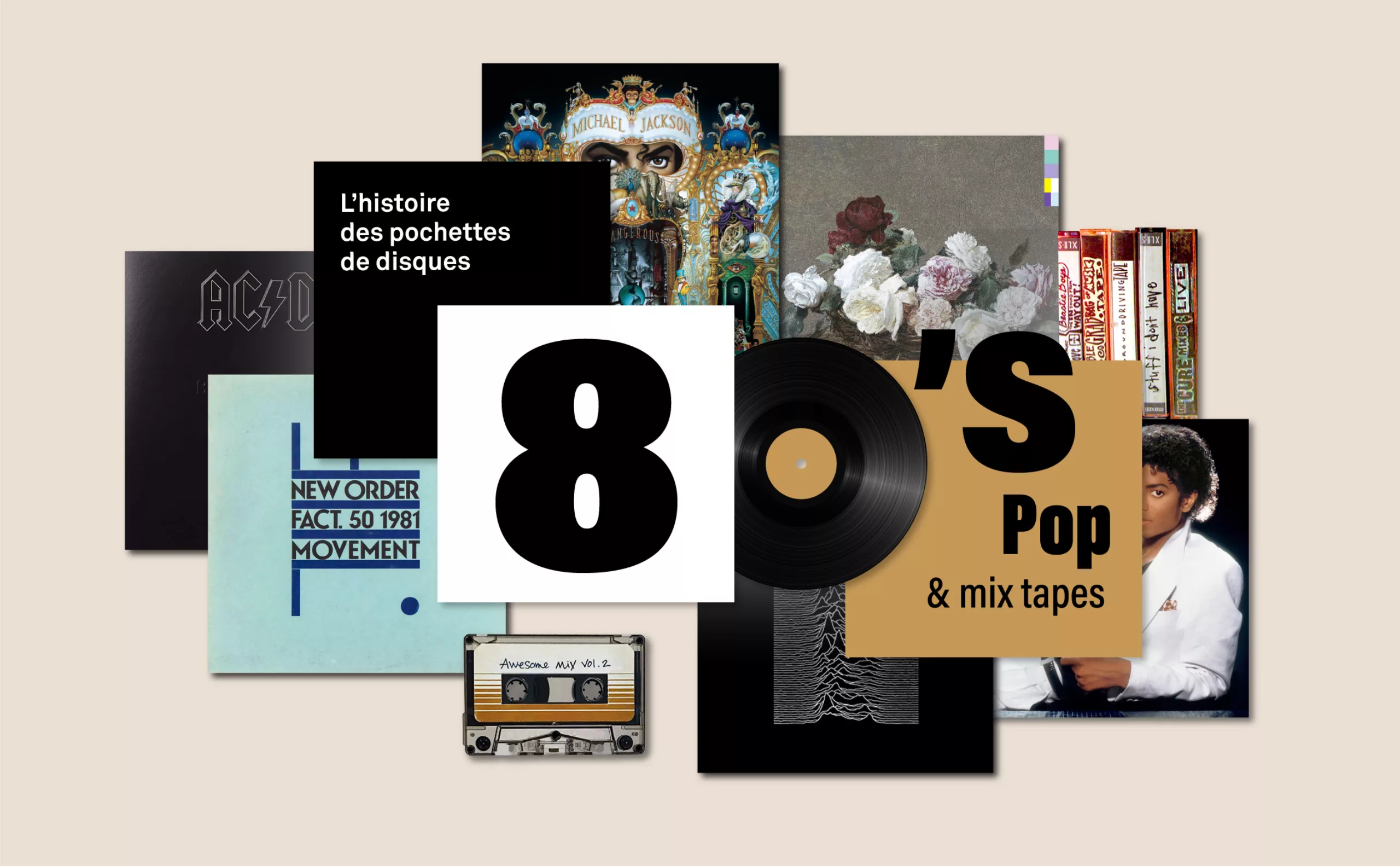
Here is the fourth article in our series on vinyl album covers. If you haven’t already, you can check out the others here: the first on 1950s jazz and the birth of vinyl album covers, the second on the rock, subversive, and psychedelic 1960s, and the third article on the futuristic and surrealist album covers of the 1970s. In this article dedicated to the 1980s, we discuss (among other things) monochrome albums, cassettes and hip-hop, Peter Saville’s work for Joy Division and Vaughan’s for the Pixies, and Michael Jackson’s most famous album cover (we’re saving the best for last).
Monochrome vinyl sleeves: simplicity that sets you apart
While record covers from the 1960s and 1970s were often outrageous or experimental, some artists also had “simpler” fun with covers featuring minimalist colors or vinyl records that were anything but black. Unlike Pink Floyd, who didn’t include a band name but simply featured an image of a cow for Atom Heart Mother, one might wonder if a single element (a logo or a simple visual) is enough to make a good album cover?
In both cases, this simplicity piques curiosity and prompts fans to want to know more—and thus to buy the album. On the other hand, a monochrome cover offers no visual clues about the album’s sound and is typically reserved for fans of bands that are generally well-known enough to get away with being minimalist. It’s hard to imagine a band that’s come out of nowhere releasing a green album, at the great risk of it flopping.
3 shades of gray for monochrome album covers: the white, the black, and the gray album
To the best of our knowledge, the first to create a monochrome vinyl record sleeve were the Beatles in 1968. It was the conceptual artist Richard Hamilton who proposed an entirely white cover for this album—which was actually untitled at the time but would come to be known as the “White Album“—as a reaction to the profusion of colors and shapes on the cover of Sgt. Pepper’s released a year earlier. The white cover was embossed only with “The Beatles” (this was McCartney’s idea; Hamilton wanted nothing but white).
Like a work of Pop Art, each album is numbered, turning this mass-market item into a unique, limited-edition piece—even though more than 2 million copies were printed… Inside, Hamilton includes a poster and intimate, previously unpublished portraits of the four Englishmen. In the reissues of the White Album, everything that made it unique (and therefore valuable) was removed: the embossed title was replaced with gray text, and the serial number disappeared.
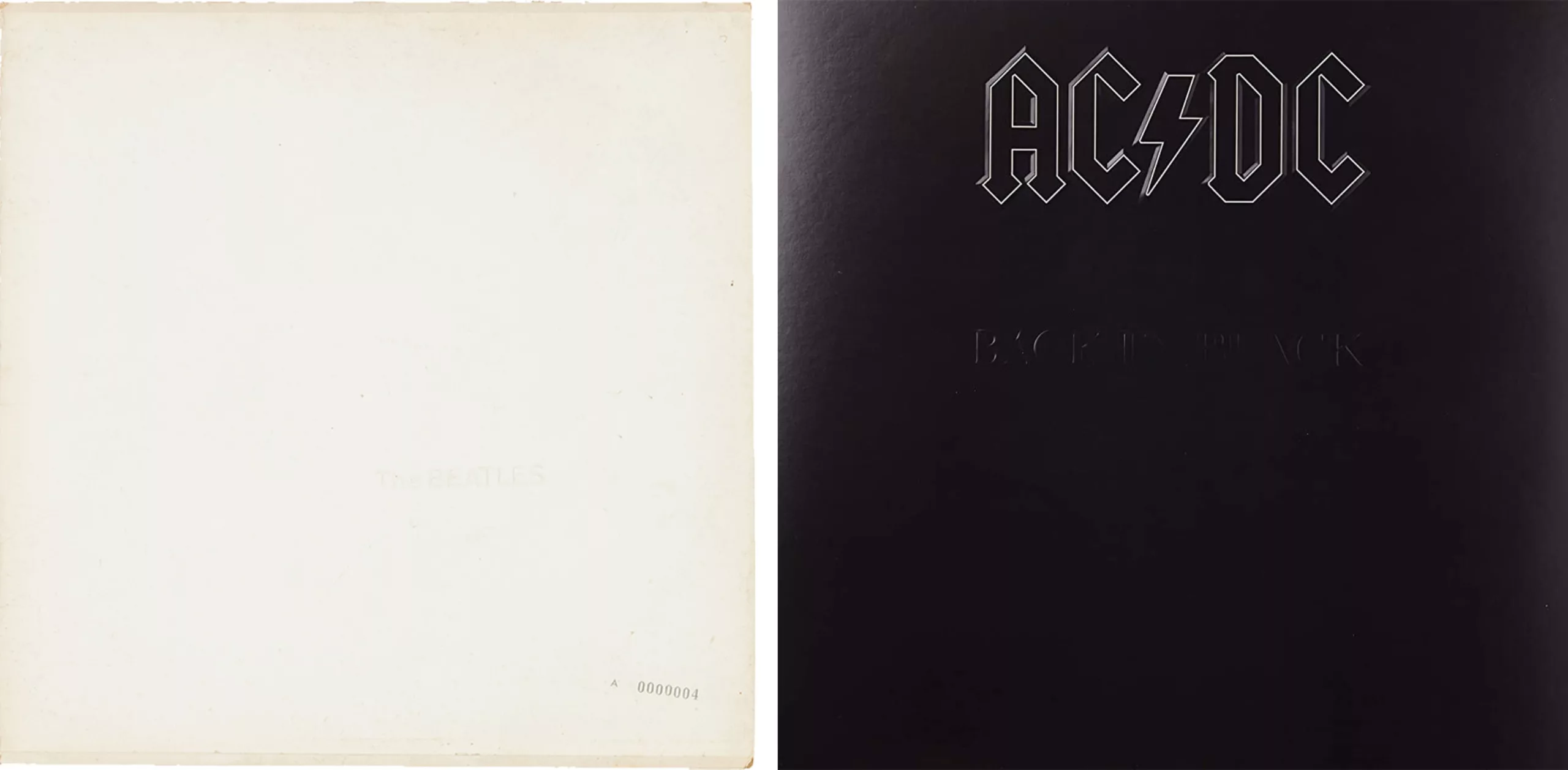
In 1980, AC/DC also released a monochrome album—but this time in black: Back in Black. In 1981, Metallica also opted for an all-black cover (featuring their logo and a snake taken from the Gadsden flag of the American Revolution) for an untitled album that would come to be known as The Black Album, as a response to the White by the Beatles. The cover is a nod to the fictional Smell the Glove album cover from the mockumentary This Is Spinal Tap about an equally fictional rock band of the same name. It’s worth noting, however, that the Beatles, during their spiritual phase, chose white—which symbolizes enlightenment—while AC/DC and Metallica, with their more “heavy” rock style, turned to the quintessential dark color (even that of death). Jay-Z would also add his own contribution to the trend with a “Black Album” bearing his likeness in 2003.
A notable anecdote: DJ Danger Mouse sparked a major controversy in 2004 with his Grey Album, a mashup (a mix of songs to create new ones) of the Beatles’ White album and Jay-Z’s Black album, which, however, have nothing in common except their monochrome titles.
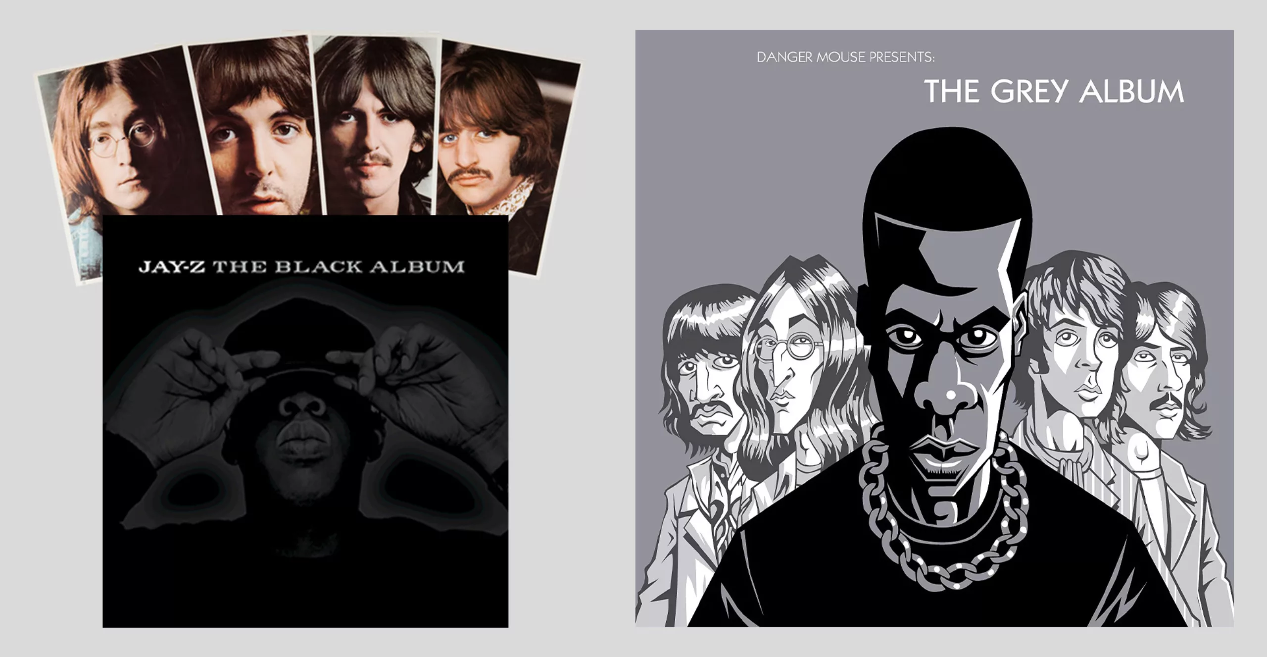
The album—a creative gem bridging the gap between the four boys and this U.S. rap star—was quickly banned from sale by EMI, which owns and enforces the Beatles’ rights. Aware that his tracks would run afoul of copyright laws, Danger Mouse shared his album illegally and presented it as a rallying cry for an internet where music is free and accessible to all. While the technique of the mashup is far from new (since it already existed in the 1960s with the hip-hop cassettes discussed below), the questions the album raises are new and shook up the nascent era of digital music sharing and rights.
The 2020 monochrome vinyl records in symbolic colors
More recently, in 2020 and for three consecutive years (a quick jump forward in time, if you don’t mind!), the British collective Sault released three all-black albums, the first of which—an untitled album also known as Black is—echoes the #BlackLivesMatter movement (we discuss this topic in our article “Racist Packaging Raises a Fist”). It features only a raised fist, the quintessential symbol of resistance. The second, Rise, depicts hands in prayer. The third, God, features no image at all. Only a mysterious, tiny white mark “signs” the albums in the lower right corner, where no artist names appear either.

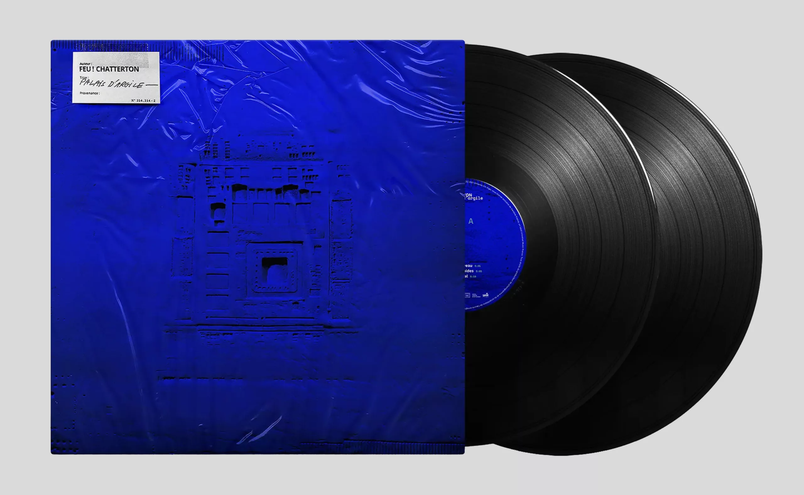
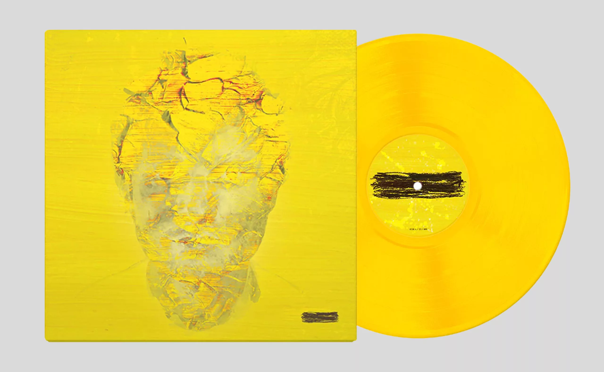
For their part, the bands Feu! Chatterton (Palais d’argile, 2021) and Ed Sheeran (–, 2023) have each released nearly monochromatic albums—blue for the former, and a limited-edition yellow version for the latter. Here, the visuals superimposed on the colored background tell a story, and thus offer a second layer of interpretation that was not present on the White or Black albums. Feu! Chatterton offers us a new nod to art with this Klein blue, following their previous album, which was illustrated with a pastel by Odilon Redon.
Sheeran probably chose yellow for its warm, enveloping, and comforting symbolism (though you’d have to listen to the album) that contrasts with the—struck-through title (substract, subtraction) and his portrait—depicted as an absent fingerprint on the cover—which (one imagines) foreshadow an erasure of the past or a more introspective and personal album. It’s an album that follows in the footsteps of his other albums, which are also named after mathematical symbols (+, ×, ÷, and =).
Just recently, Queens of the Stone Age released a limited-edition glow-in-the-dark vinyl for their latest album, In Times New Roman. Probably just because it’s really, really cool.

Whether they are black, white, or in color, monochrome albums always seem to signal a stance, a fresh start, a countercultural art form, or an aesthetic of simplicity that is self-sufficient; a return to the essentials signaled by this minimalist design. Even though it isn’t easily portable, vinyl still appeals to music lovers and collectors who are passionate about music: that’s probably why it has survived despite the arrival of its two (smaller) competitors—cassettes and CDs.
Take away music with cassettes and CDs!
In 1965, music underwent a major revolution: it became portable thanks to audio cassettes that could be played around 1970 on boom boxes (or ghetto blasters, “a radio as big as the Empire State Building and as loud as World War II”) that were all the rage in New York and Los Angeles, and especially starting in 1979 with the invention of the Walkman (“ the only cassette player as small as a cassette case“) by Sony.
This plastic invention “privatizes” and democratizes music by allowing everyone to listen to it anywhere, although the poor sound quality and packaging mean it’s nowhere near a match for vinyl. Purists and those who can afford to record their own music on vinyl look down on it. With the Walkman, however, the cassette was quickly adopted by the general public, across all social classes, because it was practical, inexpensive, and lightweight.
With the cassette, DIY music breaks free from the music industry
Above all, the cassette allowed anyone to create compilations—the famous mixtapes—to record themselves in their living rooms or in makeshift studios for much less than it cost to press a vinyl record, or even to slip a sweet or secret message into the middle of a song. During the Vietnam War, soldiers exchanged cassettes with their families—the precursor to our WhatsApp voice notes…& Music thus became customizable and was now shared from person to person, bypassing record labels: you chose your songs, created your own mixes, or recorded yourself; you gave them to whoever you wanted; and you designed the cover art according to your more or less questionable graphic design skills.
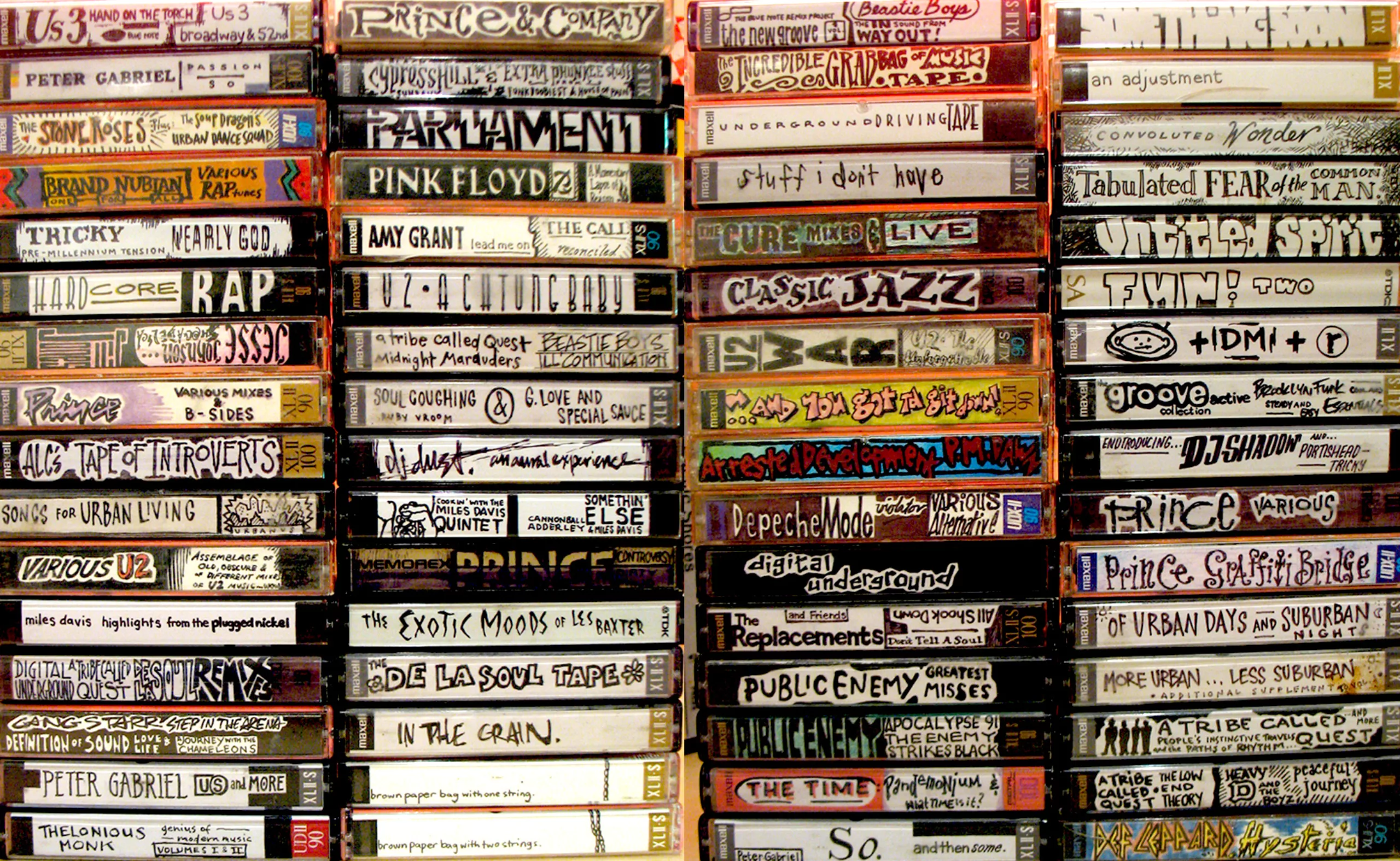
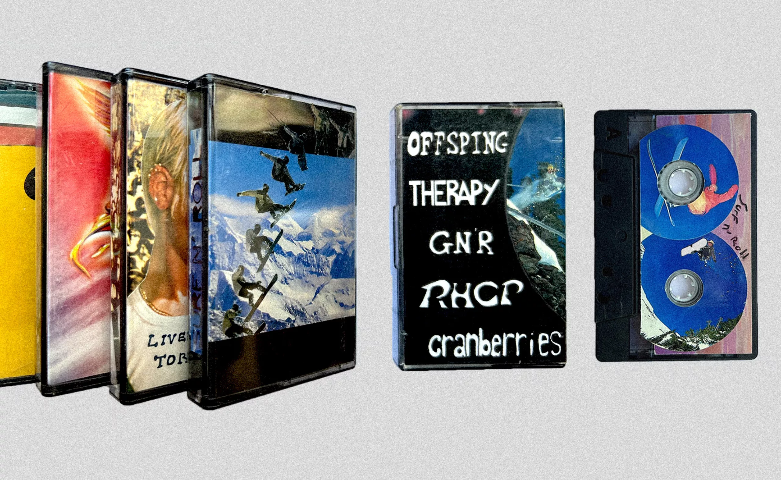
Hip-hop, for example, originated and spread throughout the Bronx in the 1970s thanks to live recordings on cassette tapes by artists who used these tapes to distribute their music independently, outside the traditional music industry channels. They created unique compilations, mixing samples taken from vinyl records and recorded onto cassette, freestyles, and exclusive collaborations, all while developing their own style and sound—the mashup mentioned earlier. The cassette is the medium of choice for punks and anti-establishment activists: it was through cassettes passed under the table that the Russian band Plastic People of The Universe spread anti-communist messages from within the Iron Curtain and beyond the borders of the Soviet bloc. This was the first time that the distribution of music had escaped the control of the music industry or government surveillance, and that the public created or shared it on its own terms.
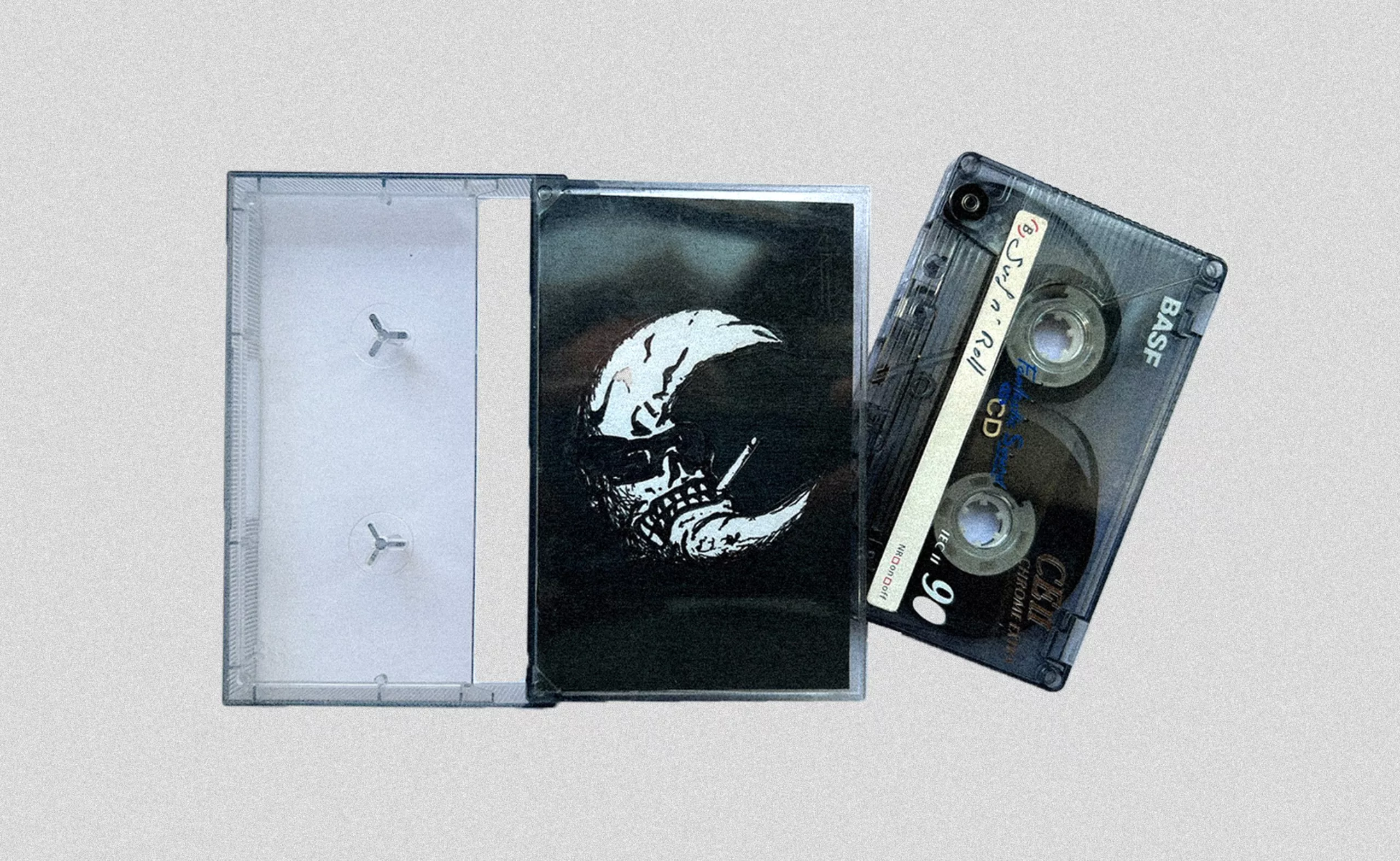
In contrast, CDs (compact discs), which hit the market in 1982, followed by portable music players in the 1990s, supplanted the two previous formats, soon leading to the complete disappearance of “cassettes” and a significant decline in vinyl sales.& nbsp;The CD revolutionized the music world: easily portable outside the home and now digital, it was more durable and could hold up to 80 minutes of audio. The industry regained control over the recording and distribution of music. But the CD case was of lower quality; the plastic (like that of cassette tapes) broke or scratched easily, and the booklet and any posters or visual materials no longer had as much space as they did on vinyl records… so less had to be created, and on a smaller scale.
Peter Saville’s Postmodernism for Joy Division
England is home to a graphic designer who was a key figure in the music scene of the 1980s: Peter Saville. He was one of the co-founders of the independent label Factory Records, founded in 1978. Drawing direct inspiration from the name and operations of Andy Warhol’s Factory (which we discussed in the second article—remember the album with the banana?), the label aimed to showcase Manchester’s local music scene as a counterbalance to the all-powerful London-based music industry. Saville had complete creative freedom and no budget or time constraints : he helped shape the postmodern musical identity of 1980s England, particularly for Joy Division (which would become New Order after the death of lead singer Ian Curtis). For New Order, he drew inspiration from the geometric typefaces of Herbert Bayer and Jan Tschichold, which stood in stark contrast, with their grid systems, to the anarchic punk graphic design of the era.
Making Something New Out of Something Old
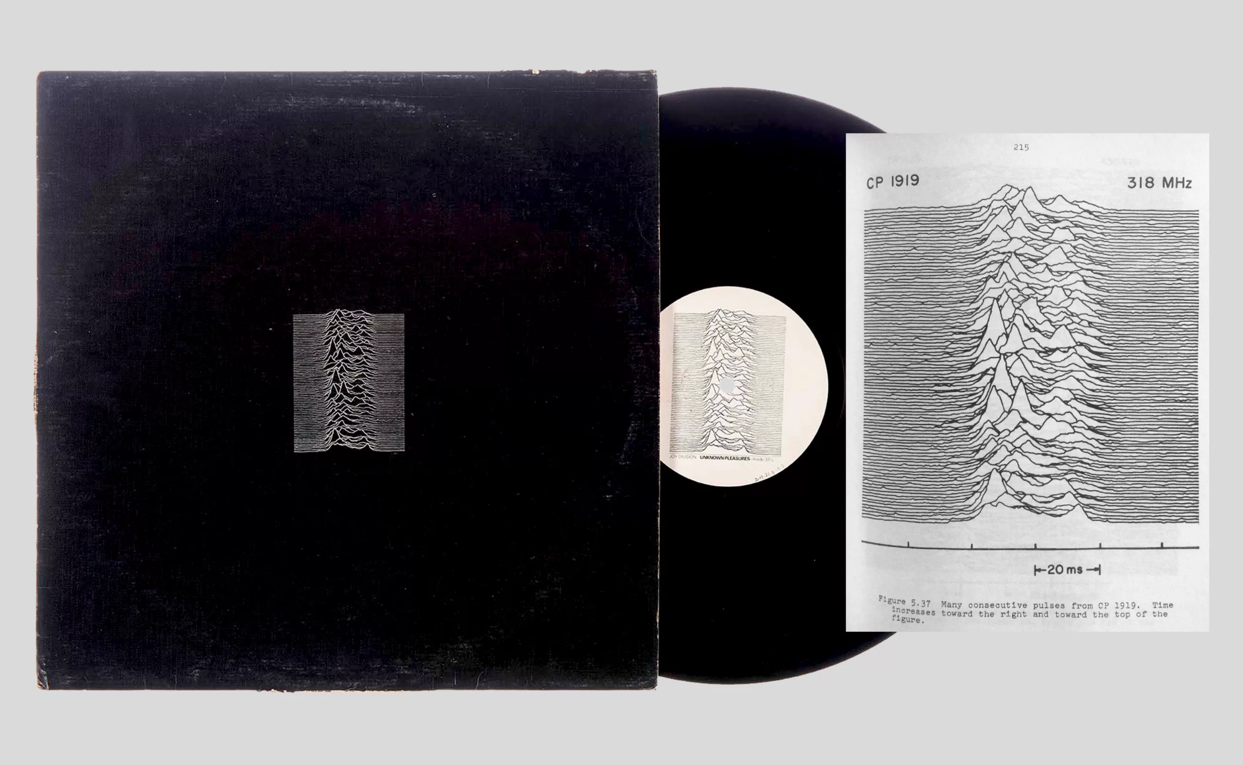
His album cover for Joy Division’s Unknown Pleasures, released in 1979, is one of the most iconic of that era. On it, he graphically depicts the frequency diagram of the first pulsar discovered in 1919 by a British astronomer and taken from the Cambridge Encyclopedia of Astronomy in 1977. Saville would say that the motif is “both technical and sensual, tight like Stephen Morris’s drumming and fluid: many people think it’s based on a heartbeat”.
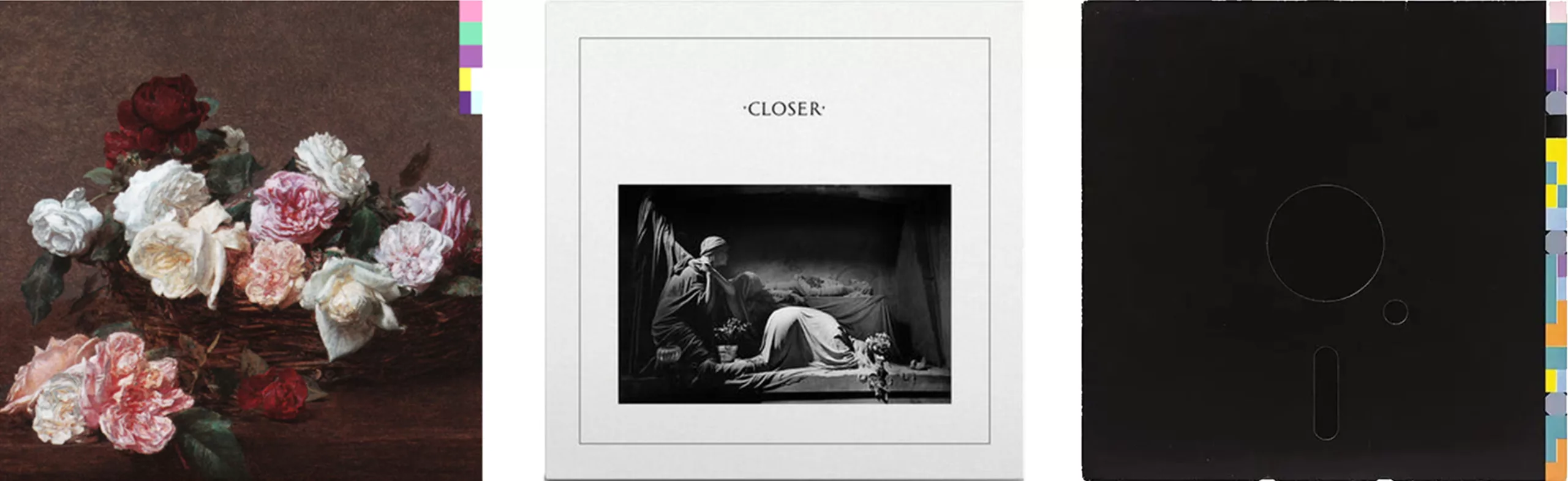
In fact, most of his designs are reinterpretations of pre-existing motifs that he reworks. He drew inspiration from classicism for the band’s second album in 1980, Closer, featuring a black-and-white photograph of an Italian funerary sculpture from 1910 and Roman typeface, creating “a postmodern juxtaposition of contemporary work within the ancient “, and later with a painting of a bouquet of flowers by Fantin-Latour taken from a postcard his girlfriend had bought at a museum, to illustrate—by contrast—the title of the album Power, Corruption & Lies (1983). Peter Saville also plays with modernity by incorporating the cutting-edge technology of the time into his artwork for New Order’s single Blue Monday by New Order in 1983, featuring a depiction of a floppy disk, recreating “the aesthetic defined by machines, their hieroglyphic visual language.”
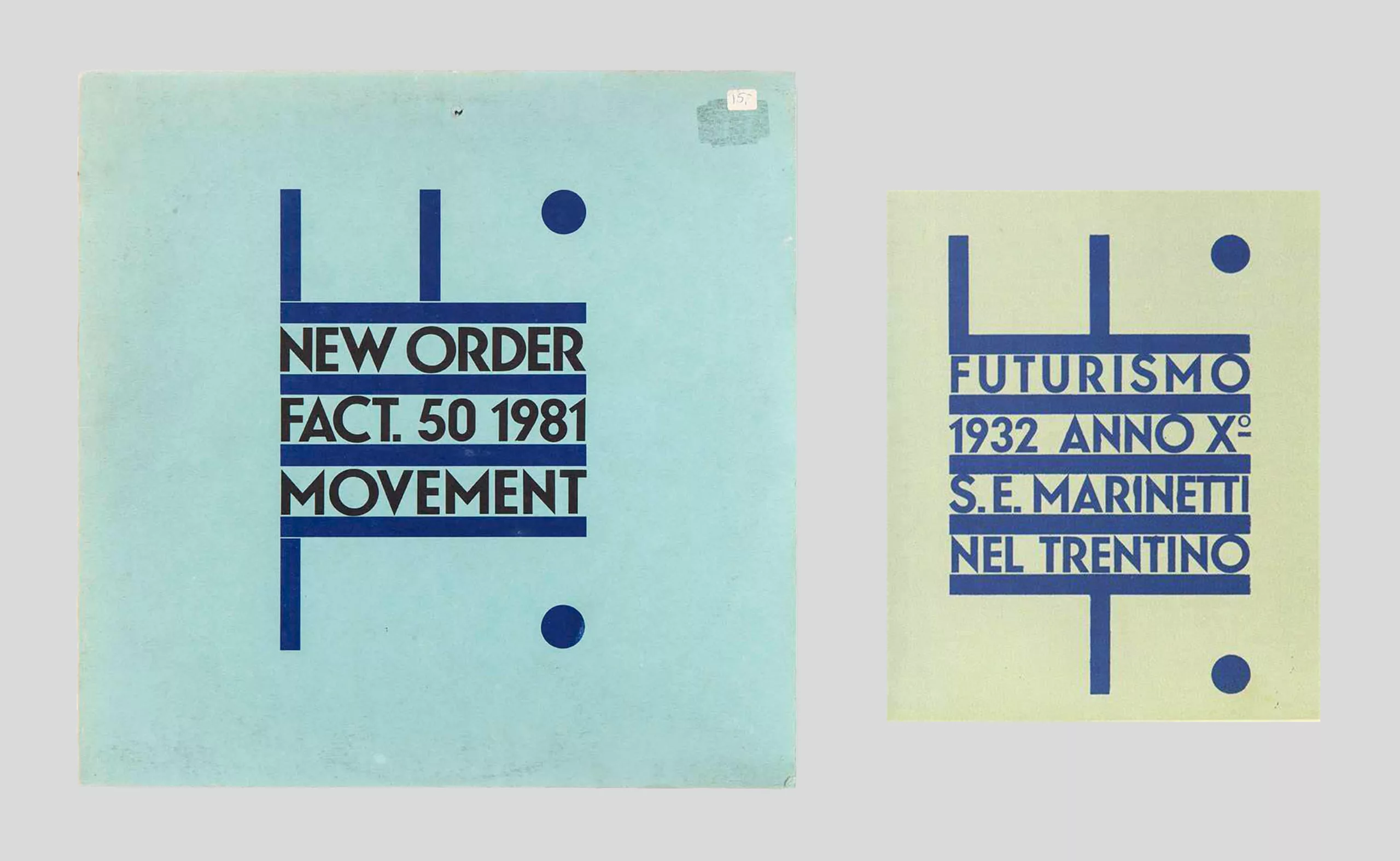
In 1981, for the album Movement, he made a direct reference to a 1932 cover of Depero’s magazine Futurismo, in which he altered the letters to add an F from Factory and an “L” for the album’s “Fact-50” reference.
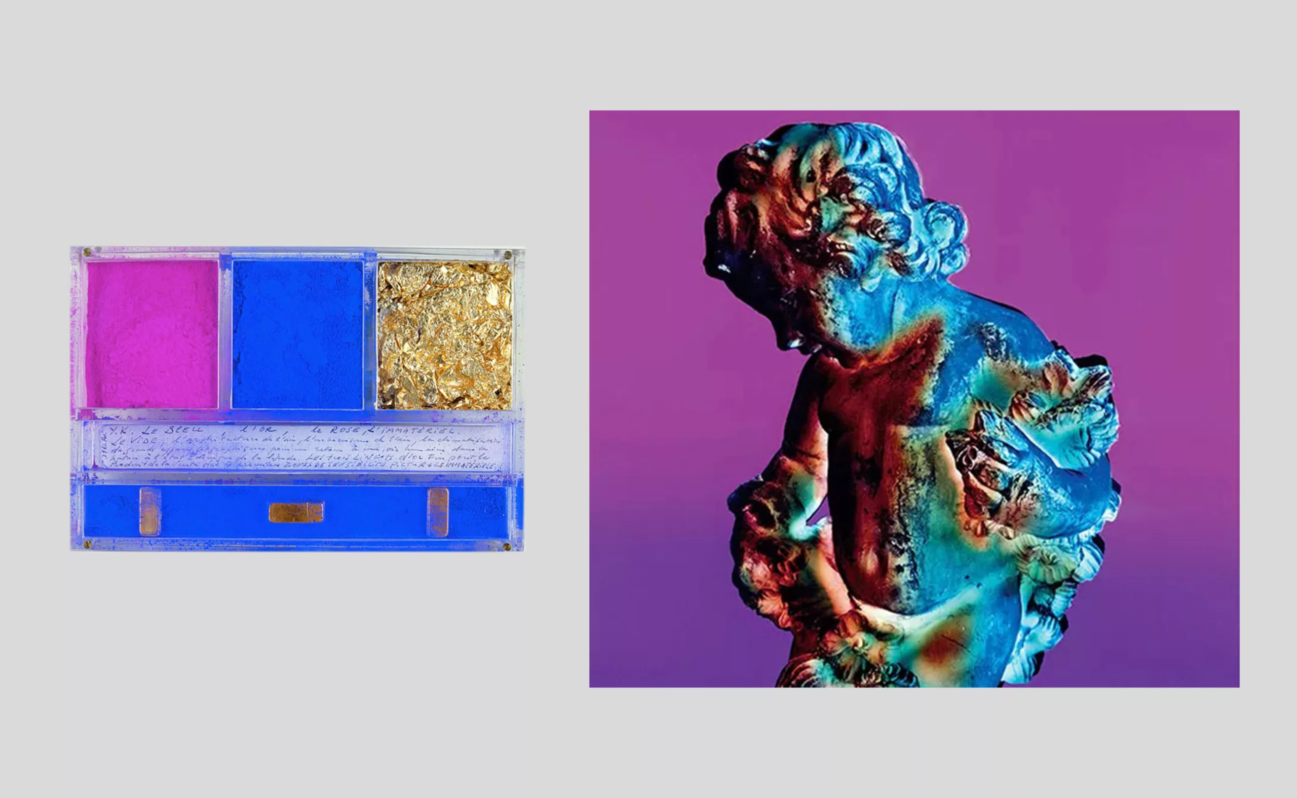
Saville is interested in Yves Klein’s work on color and emptiness. For New Order’s True Faith in 1987, he explored the notion of suspended fall with an image of a dead leaf floating in the sky, recreating the “stability of absolute movement in space” that Yves Klein experimented with in his Leap into the Void. In 1989, for New Order’s album Technique, Saville and photographer Trevor Key interpreted the conceptual artist’s colors in their own way using advanced photography and printing techniques, creating a trichromatic series in pink, blue, and gold, as if screen-printed onto a cherub. Saville would say that “all my previous album covers were somewhat idealistic and utopian; I had in mind that art and design could make the world a better place, a very neo-Warholian concept.”
Strangely enough, almost all of his designs for album covers have a connection to silence : from the waveform of a celestial object to a still life, a funeral photograph, a technological device, or a fallen leaf, the images invite contemplation and introspection.
In the 1990s, Saville worked with the Pentagram agency, but he was unhappy there, disillusioned by the visual overload of the era and the economic crisis. He no longer used original artwork but rather stock images, drawing inspiration from artists such as Barbara Kruger and Yohji Yamamoto. Saville is considered one of the pioneers of graphic design in the music industry and his visual legacy remains deeply rooted in the history of rock and pop.
Oliver Vaughan breaks the rules of album cover design
Still in Great Britain, we can highlight the creative work of Oliver Vaughan, who designed the look of the 4AD label (pronounced forward), just as Steinweiss had done before him for Columbia, Miles for Blue Note, and Saville for Factory. He is one of those designers who helped make graphic design an attractive, glamorous, and visible field. In contrast to Saville’s cerebral, modernist, and conceptual work, Vaughan offers a more spontaneous and liberated style that graphically embodies music to give it a physical dimension. Without having studied graphic design, and knowing little about the Bauhaus, Swiss Style, or the minimalism used by his contemporary peers, he naively forged his own creative path, playing with ancient typefaces and making a mockery of lines and grids. His work is fluid, featuring striking visuals and typography that is anything but linear.
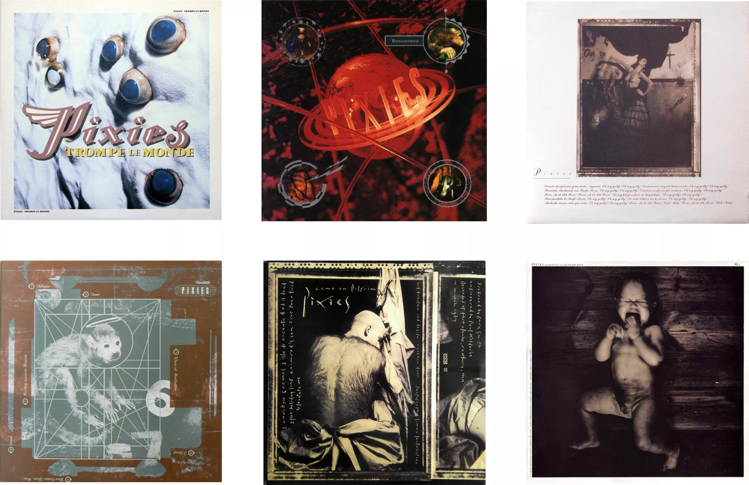
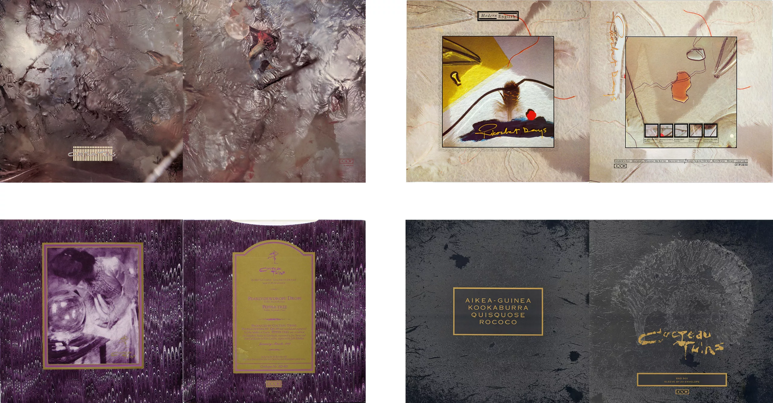
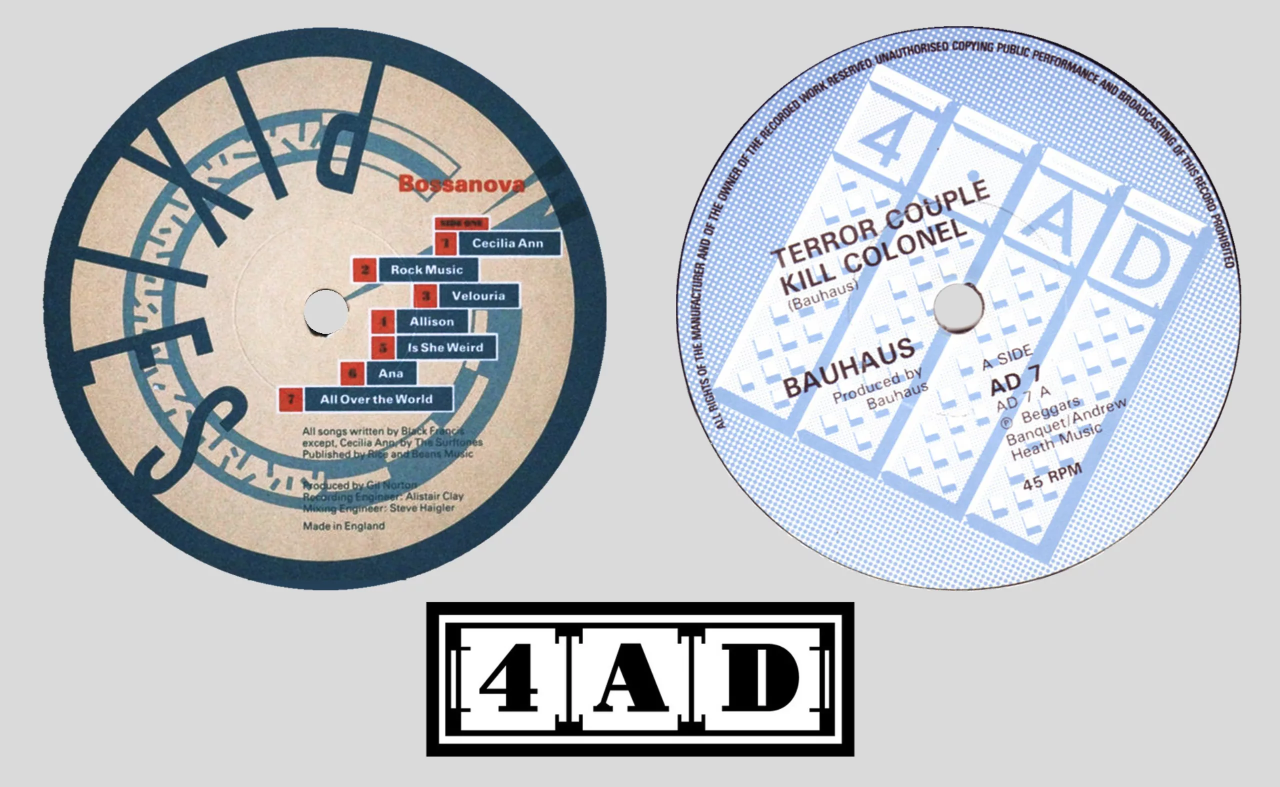
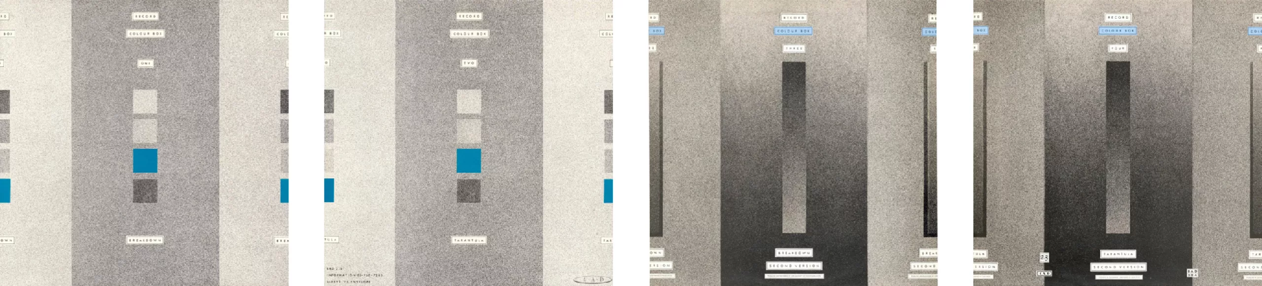
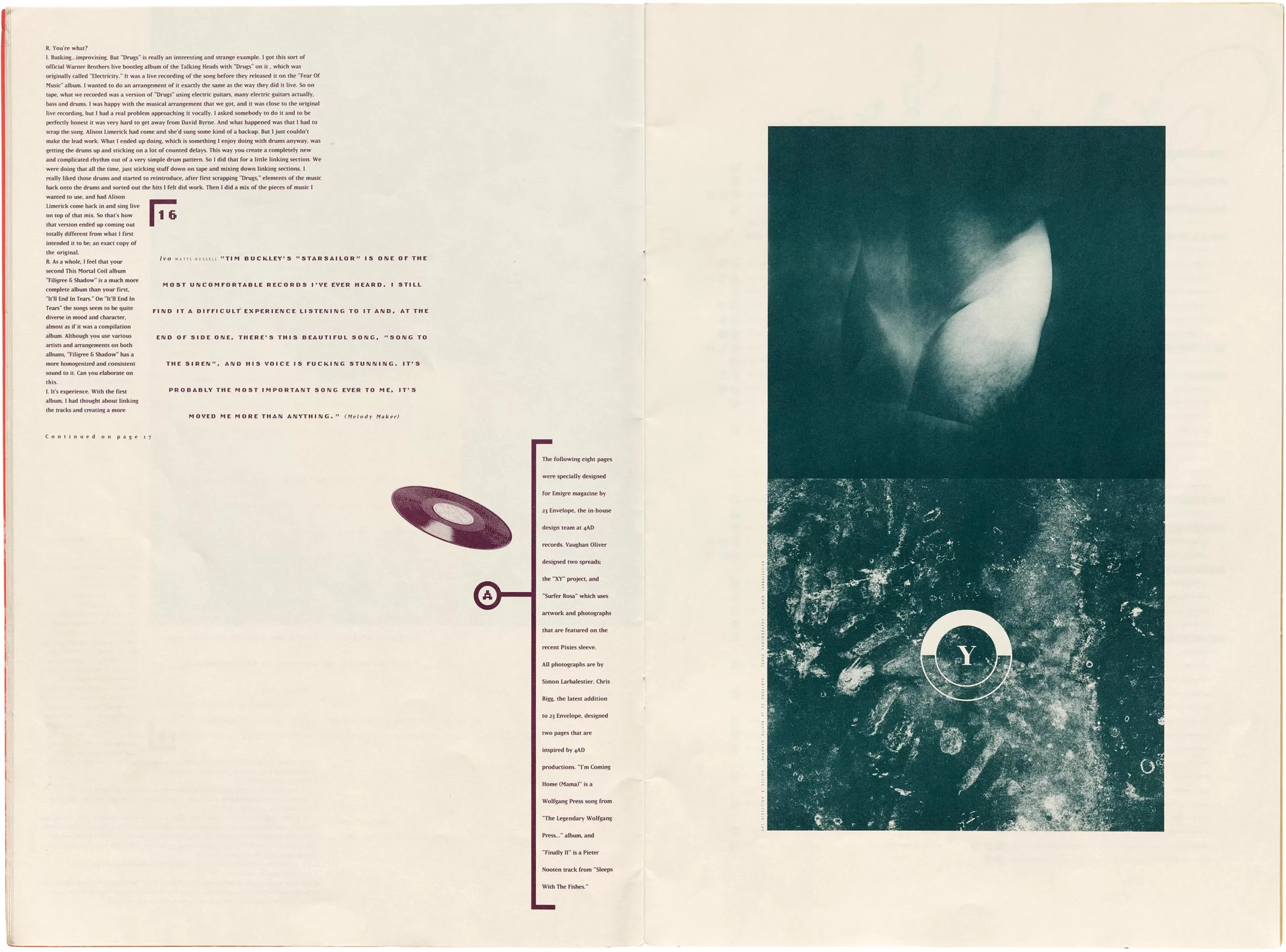
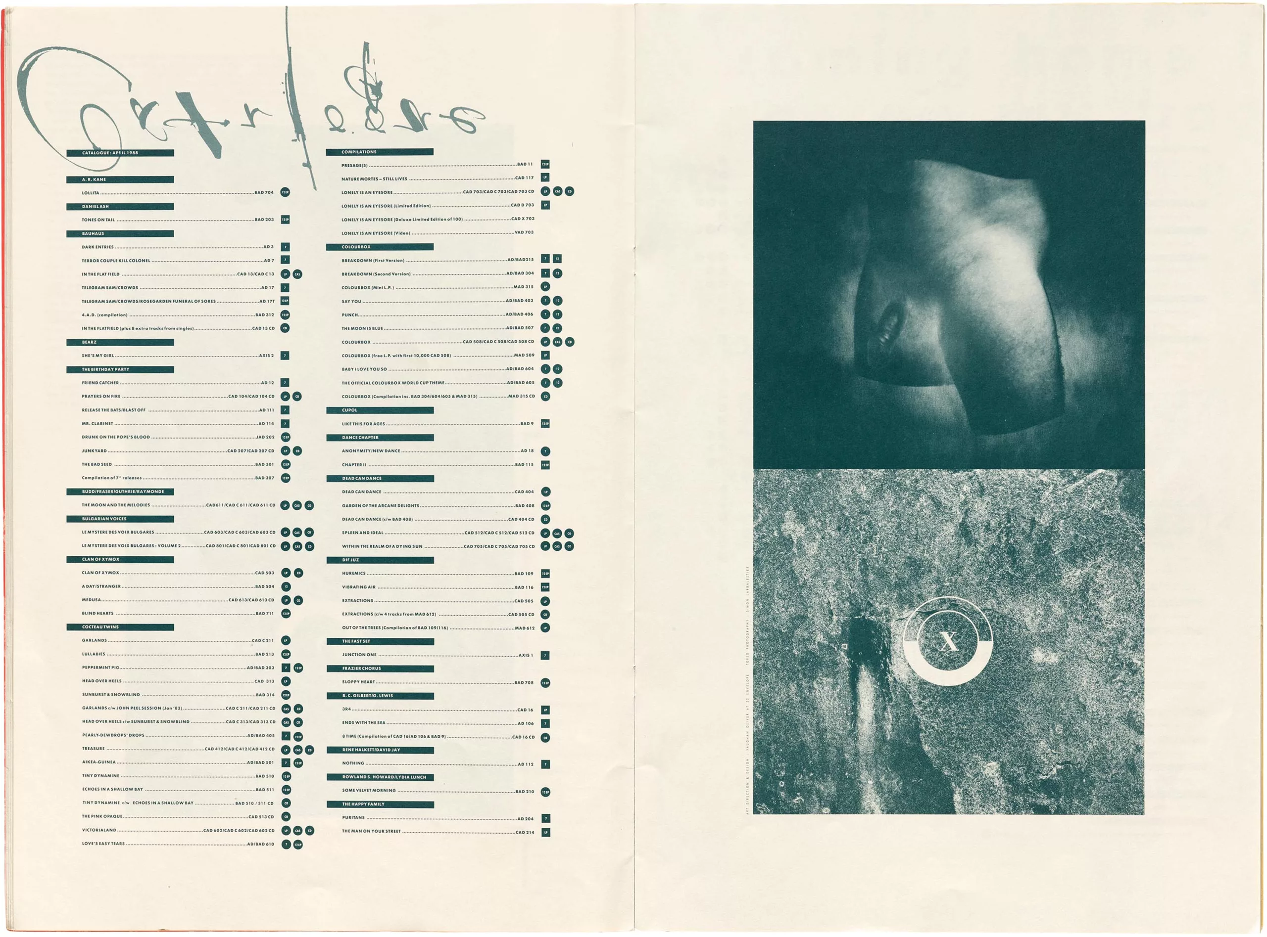
Vaughan works closely with the musicians (such as—ironically—Bauhaus, the Pixies, and the Cocteau Twins, pictured below) and has access to the album demos. He creates album covers reminiscent of a bygone era, somewhat mystical and surreal, often enhanced with frames and labels around the titles, which echo the 4.AD logo. He leaves it up to the audience to interpret the visuals he creates in their own way.
The cover of the Pixies’ album Doolittle, for example, draws inspiration from the song Monkey Gone to Heaven and a statement by a band member that served as a real turning point: “Music is really just a mathematical formula.” Vaughan then combines an image of a monkey with a halo with what he sees as the embodiment of mathematics and graphic design: numbers and grids inspired by the Renaissance “Divine Proportions” grids, the very ones that gave rise to the Vitruvian Man and the studies of the proportions of Roman capitals. These would also inspire Modernism, even though he would not venture any further into that realm.
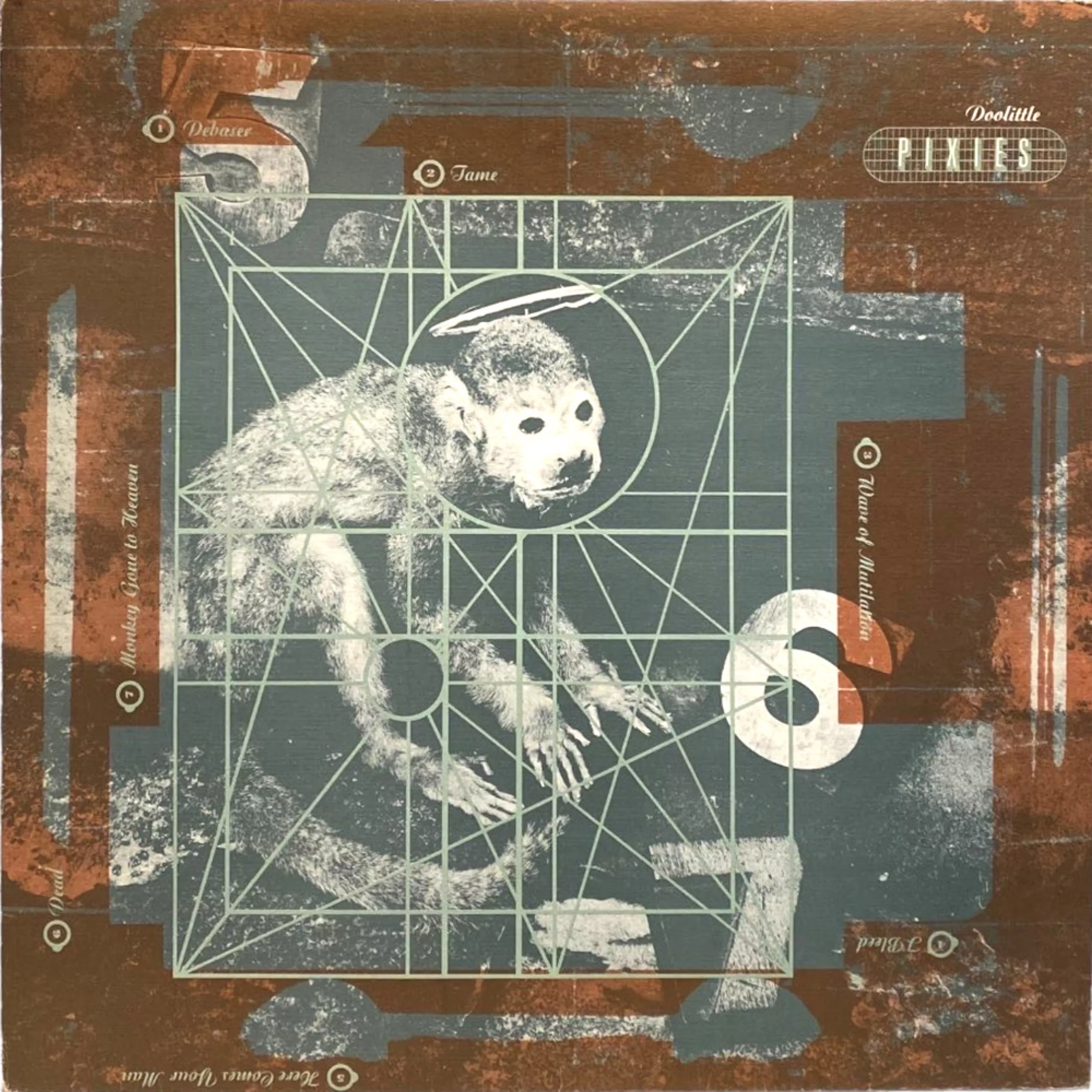
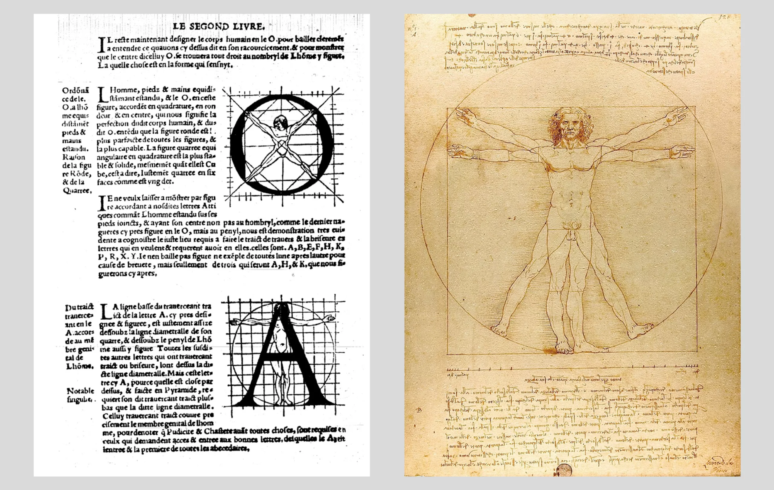
His graphic style is primarily rooted in an era marked by the emergence of DTP (desktop publishing), of which he was one of the earliest adopters. This new aesthetic owes virtually everything to Emigre magazine, which was also launched in 1984. The magazine collected and created typefaces specifically for computers while propelling the first generation of computer-aided graphic designers to prominence. Emigre created imperfect typefaces, “which better reflect the imperfect language of an imperfect world inhabited by imperfect beings.”

A sort of revival of Futurism or the Dada movement in typographic design—driven in the early 20th century by the modernity of machinery— graphic designers of the 1980s and 1990s also shattered established conventions and revolutionized layout thanks to this new technology. In fact, they were widely criticized by pro-modernists: Massimo Vignelli called these typefaces “trash, lacking depth, refinement, elegance, and a sense of history”!
The dangerous world of Michael Jackson
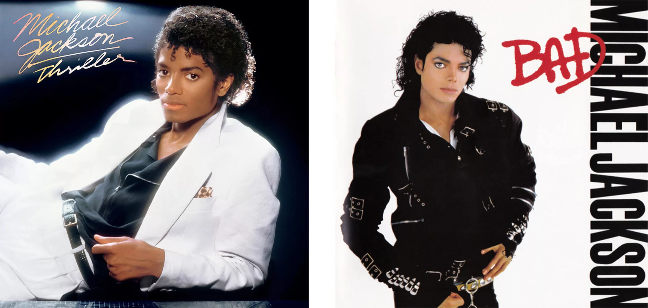
Finally, if you’re wondering why we still haven’t mentioned Michael Jackson as we’re nearing the end of this article, that’s perfectly normal. So far, his album covers haven’t had anything particularly noteworthy to offer. We’re talking classic portraits here—blurred with a romantic halo and featuring a baby tiger for Thriller (1982), and a bad-boy look with a leather jacket and graffiti for Bad (1982). Nothing to write home about, then—except that the album *Thriller* is the best-selling album of all time (across all formats) and that the halo-lit portrait by Dick Zimmerman is therefore one of the most famous in the music industry.
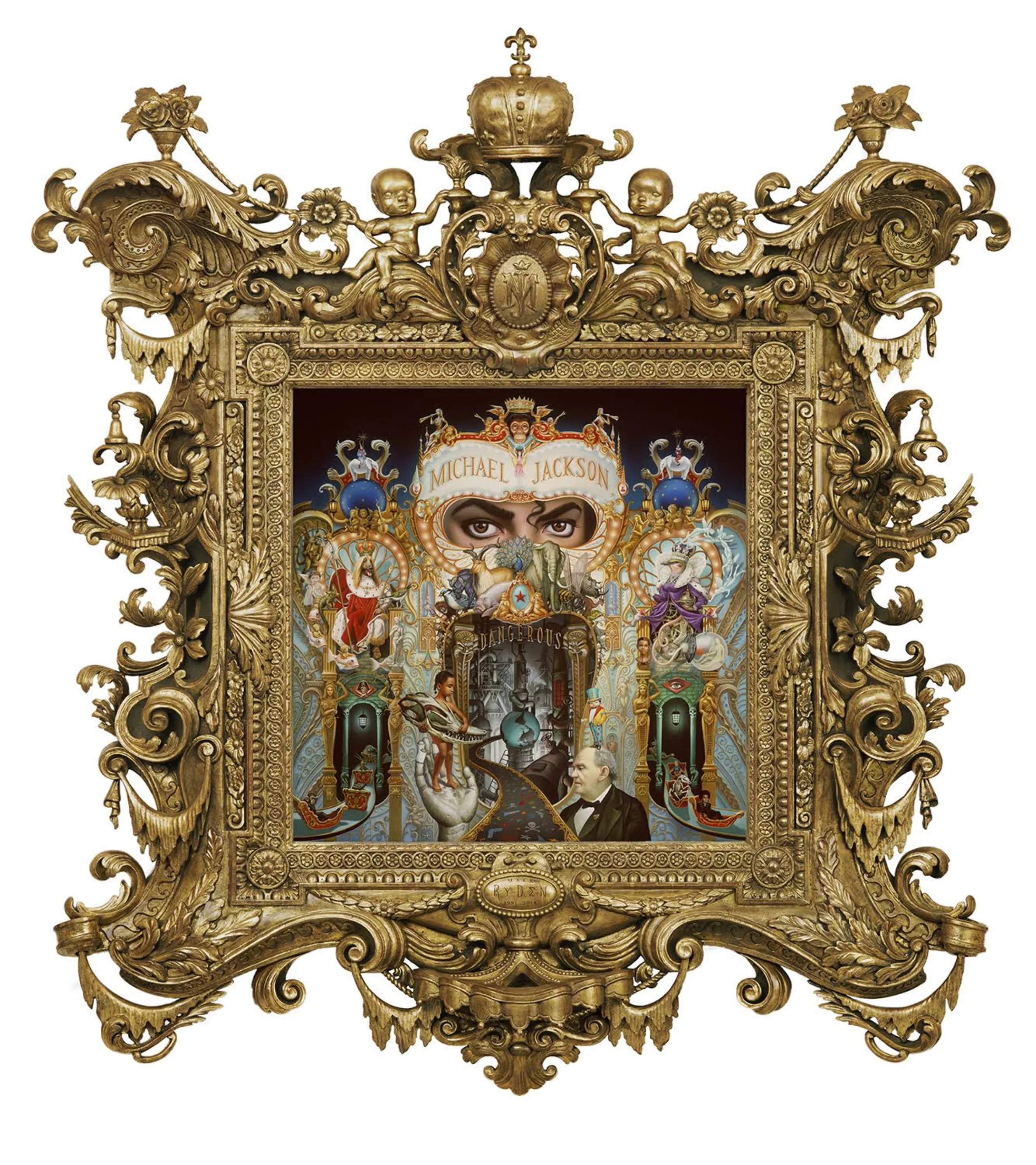
But in 1991, MJ shook up the music scene with Dangerous, an introspective album in which he laid bare his demons, his contradictions, and his desire to see society evolve. Dangerous was released four years after Bad, and pop music had evolved considerably since then. Jackson is now collaborating with Teddy Riley, who has replaced Quincy Jones—with whom he had produced his three previous albums, Off The Wall, Thriller and Bad. Riley incorporates more elements of new jack swing (a blend of R&B, hip-hop, funk, and soul) and rock, creating a more rhythmic, jerky, and contemporary vibe. The King of Pop illustrates this change with a colorful and highly detailed album cover, designed by Mark Ryden, the father of pop surrealism, which shows us the world as Michael Jackson sees it, protected by an idealized facade.
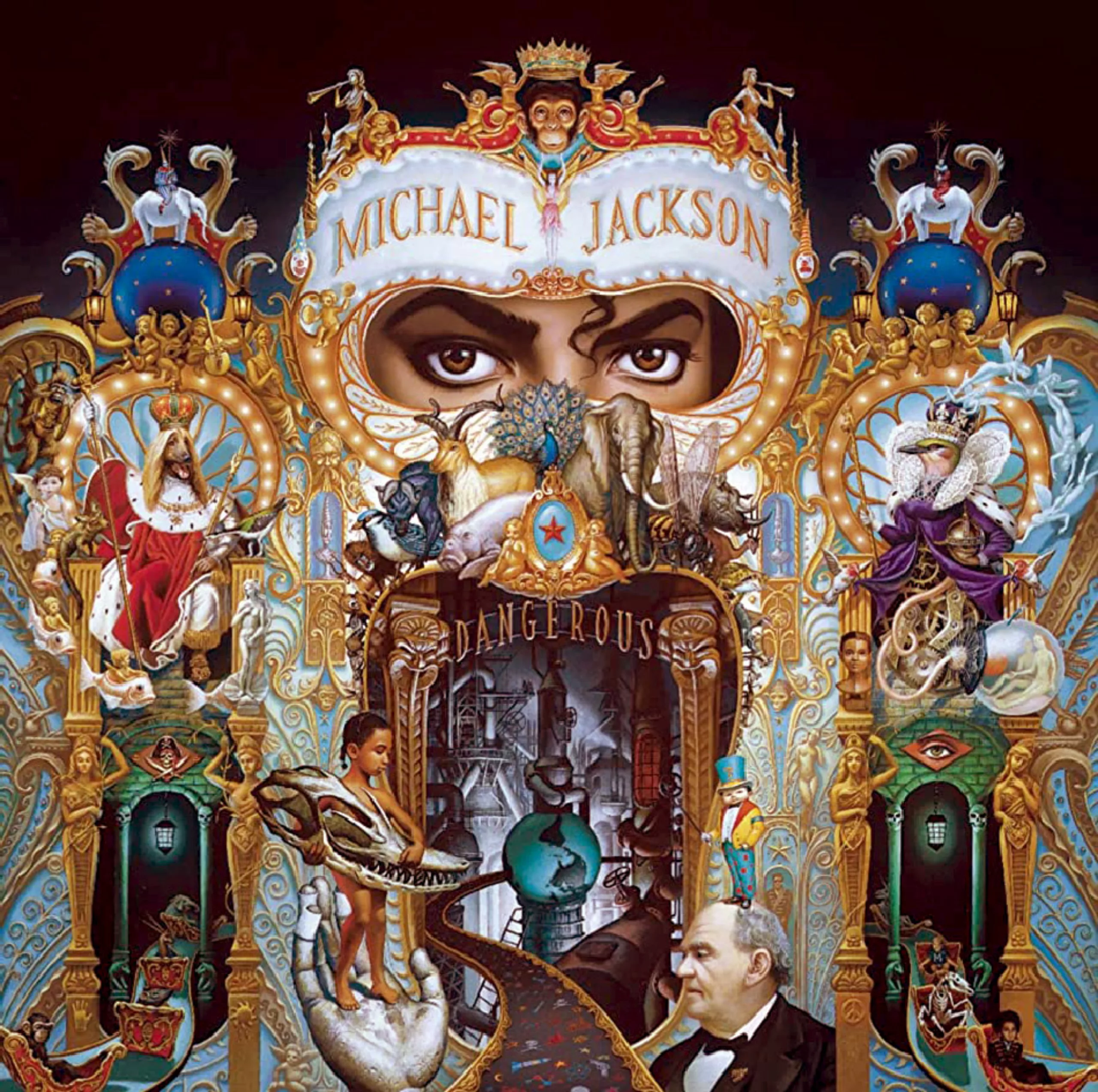
Ryden explains that he painted the album cover by hand (using acrylic paint) as if it were a portrait commission of a monarch, such as Louis XIV or Napoleon. At the time, the King of Pop was married to the daughter of the King of Rock ‘n’ Roll, Elvis Presley, and had already had his portrait painted while seated on a golden throne. His kingdom was populated by dozens of exotic animals, and his court was filled with lavish costumes and precious furniture. In his illustration, Mark Ryden blends real-life figures and characters from popular culture with fictional characters in a composition teeming with detail and hyperrealism.
He proposes 5 sketches in 5 days, based on the following brief: “Focus on Michael’s eyes, show the planet in peril, include animals and children (including the actor from “Home Alone,” Macaulay Culkin) in an illustration that is unsettling and funny, almost scary,” like a freak show. In the selected illustration, we can also see, in the lower right corner, Phineas Taylor Barnum, the inventor of the modern circus who made his fortune through freak shows around 1840 by exhibiting people with deformities or unusual physical traits (bearded women, two-headed women, dwarfs, giants…) who both fascinated and unsettled spectators. Ryden would share his incredible preparatory sketches on Instagram 30 years after the album’s release:
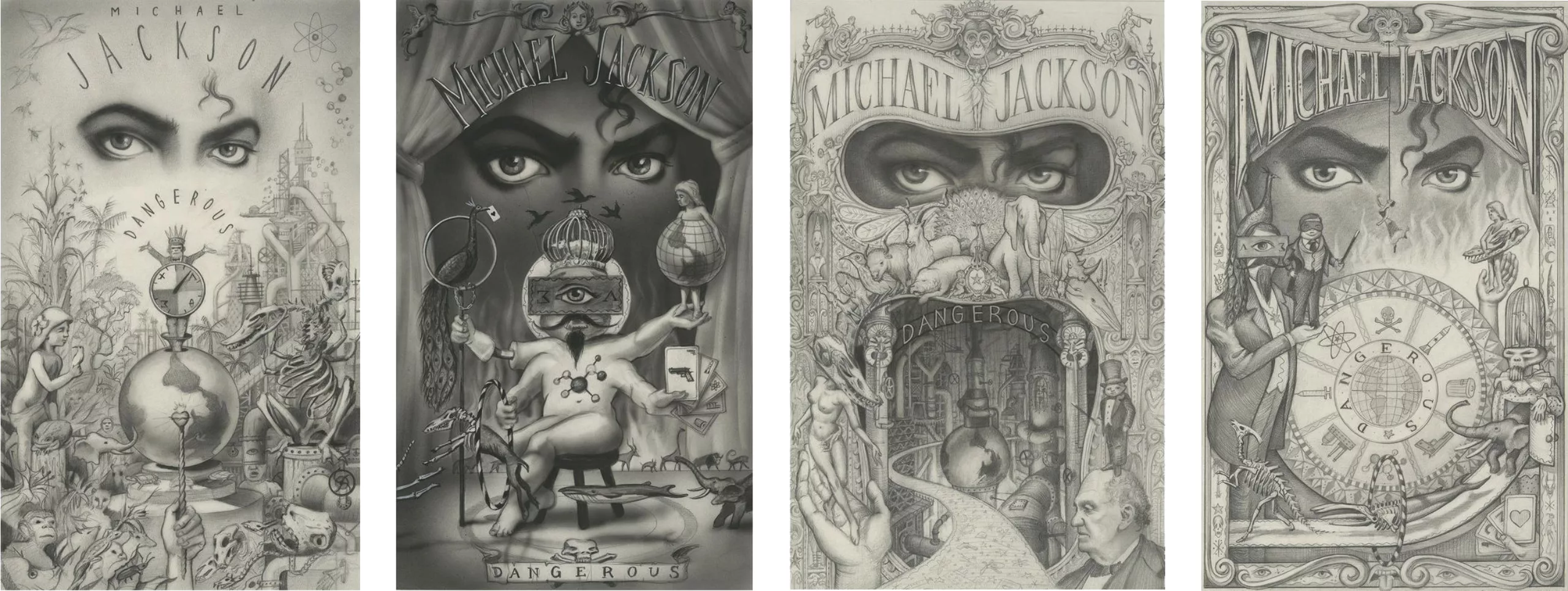
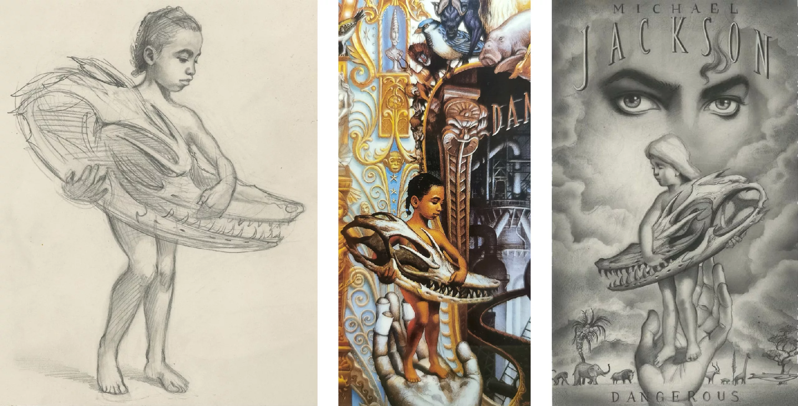
The vinyl cover Dangerous depicts a baroque haunted carousel teeming with a multitude of animals and strange characters that form a facade concealing the King of Pop. This idealized, enchanted, and naive bestiary—in which animals are placed on a pedestal—contrasts with the darkness of the dangerous world constructed and corrupted by adult men. Here, it is not King Michael who wears the crown, but a dog-Napoleon to his right and a mechanical bird-Elizabeth II to his left, while a chimpanzee (MJ had one at home, and it was likely a companion he was close to) is being crowned by two golden cherubs. On the left, the “train of death” drags animals into a “Dangerous” world—the album’s title—for an adventure into the ravaged bowels of the earth, a hellish machine spinning in reverse, fueled by war, violence, and industrial progress. On the right, under the divine eye of wisdom, the animals are nothing but bones, but we see Michael as a child emerging quite peacefully, closely followed by Macaulay, who seems to have enjoyed the adventure: two children who know how to survive and fend for themselves to face their fears in this adult world. Click on the illustrations to view them in full size.
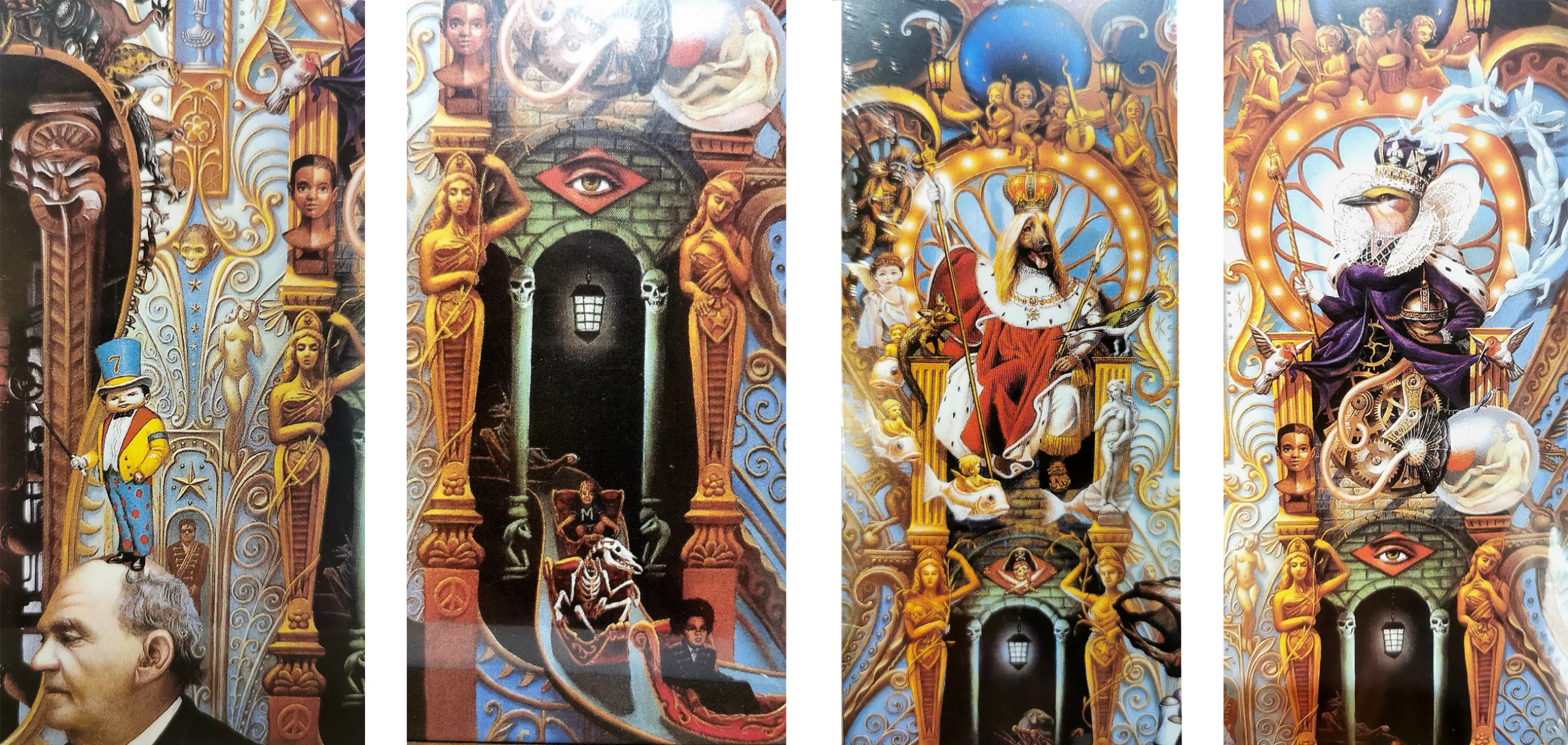

Much like Sgt. Pepper’s in the 1970s, you’ll want to hold this album cover close to decipher the illustration and uncover its unusual details. Michael Jackson had asked Mark Ryden to create a mysterious cover that fans could interpret freely. Those who understand the cultural references and symbols feel like they belong to an exclusive community. This marketing strategy—which was certainly not directly planned for this album—is called “tribal marketing” or “community marketing”: it has a huge impact on the community or fans because it creates an emotional bond that brings them closer together and connects them to their star. The album Dangerous sold over 20 million copies, surely in part due to its cover art, even if it doesn’t surpass the 66 million copies of Thriller. Later, Ryden, who still owns the rights to the artwork, decided to mount it in a huge gilded frame like a sculpture—a throne for this regal album cover!
The following decades marked the golden age of the CD and, above all, of digital music. These were times of major upheaval, which we’ll discuss in the next article. Stay tuned!
Sources:
- Sothebys, Hamilton et Le White Album
- About the Grey Album and the controversy surrounding it
- The Cassette Revolution
- On Peter Saville’s work, and an analysis of his album covers
- An analysis of the cover art for Michael Jackson’s Dangerous and the photo shoot for Thriller
Thank you to the Tiki Store for letting me take photos of the vinyl records.
On the subject
-
COLLECTION 1 — Graphic and Design Movements, Styles and Trends
From the ornamental whirlwind of the late 19th century to today’s flat logos, graphic styles tell the story of a century of aesthetic revolutions. Let’s embark on a chronological journey through the major movements that have shaped contemporary design, from modernist rigour to the psychedelic chaos of the counter-culture.
-

Minimalism: aesthetics of sobriety
Both a visual or life discipline, minimalism has become a questionable trend and consists in simplifying to keep only the essential.
-
Where Does Modernism Come From? 3 – In Search of Neutrality and Universality
The 1910s and 1920s marked a clean break with the past, laying the foundations for modernism, which drew on the German values of the time: rigor and discipline.