COLLECTION 1 — Graphic and Design Movements, Styles and Trends
From the late 19th century’s ornamental swirls to today’s flat logos, graphic styles tell the story of a century of aesthetic revolutions. Let’s embark on a chronological journey through the major movements that have shaped contemporary design, from modernist rigour to the psychedelic chaos of the counter-culture.
Modernism and Ornamentation: From Chéret to the Bauhaus
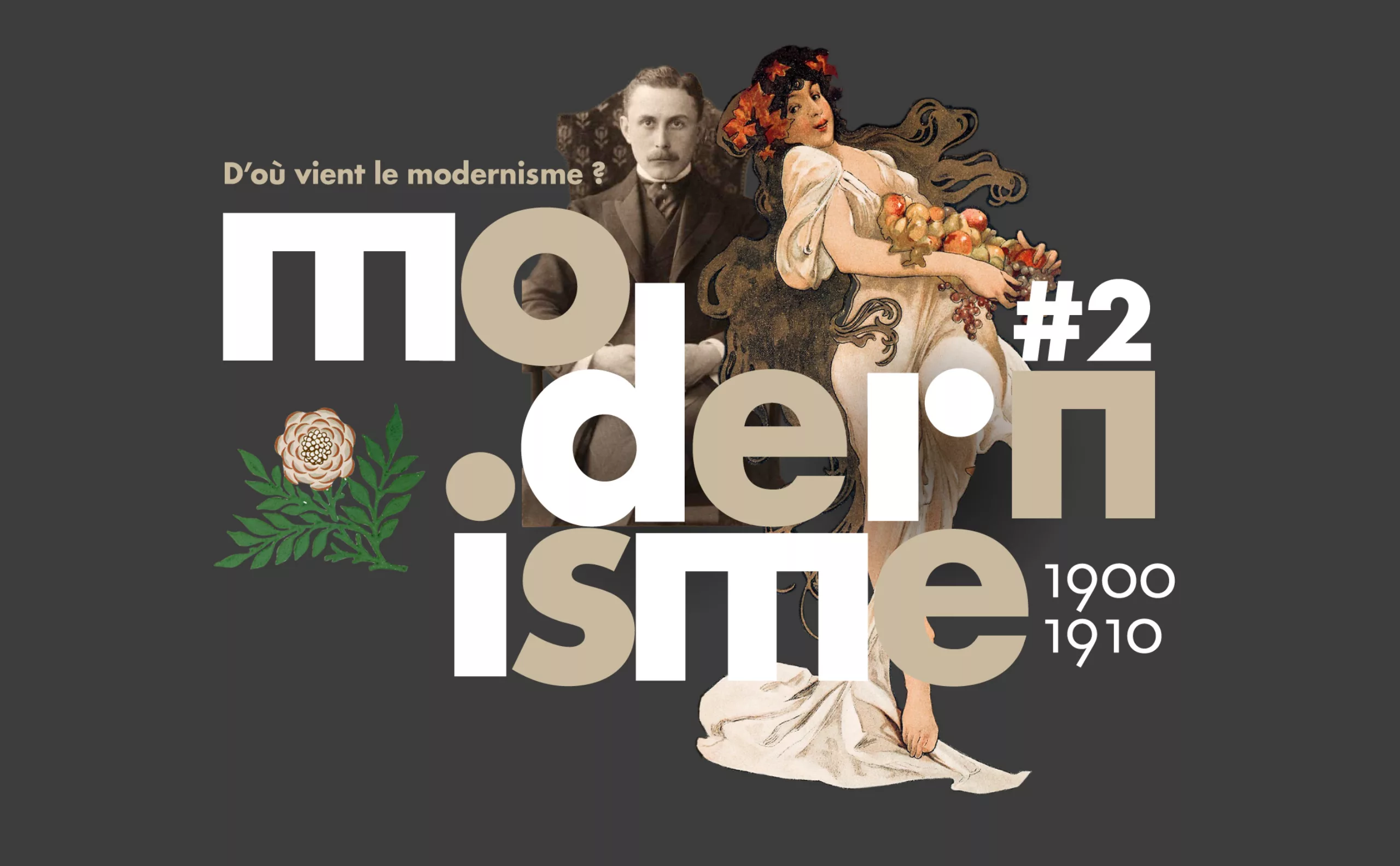
Modernism is first and foremost linked to the modernity of the new century. In Paris around 1880, the world capital of art saw the emergence of offset printing, which revolutionised modern advertising and led to a prolific production of colourful posters. Jules Chéret and his contemporaries transformed the city’s walls into illustrated ‘veritable museums’ that celebrated modernity. The first ‘grotesque’ typefaces appeared, and, without realising it, this effervescence and visual excess heralded the need for the graphic simplification that was to come.
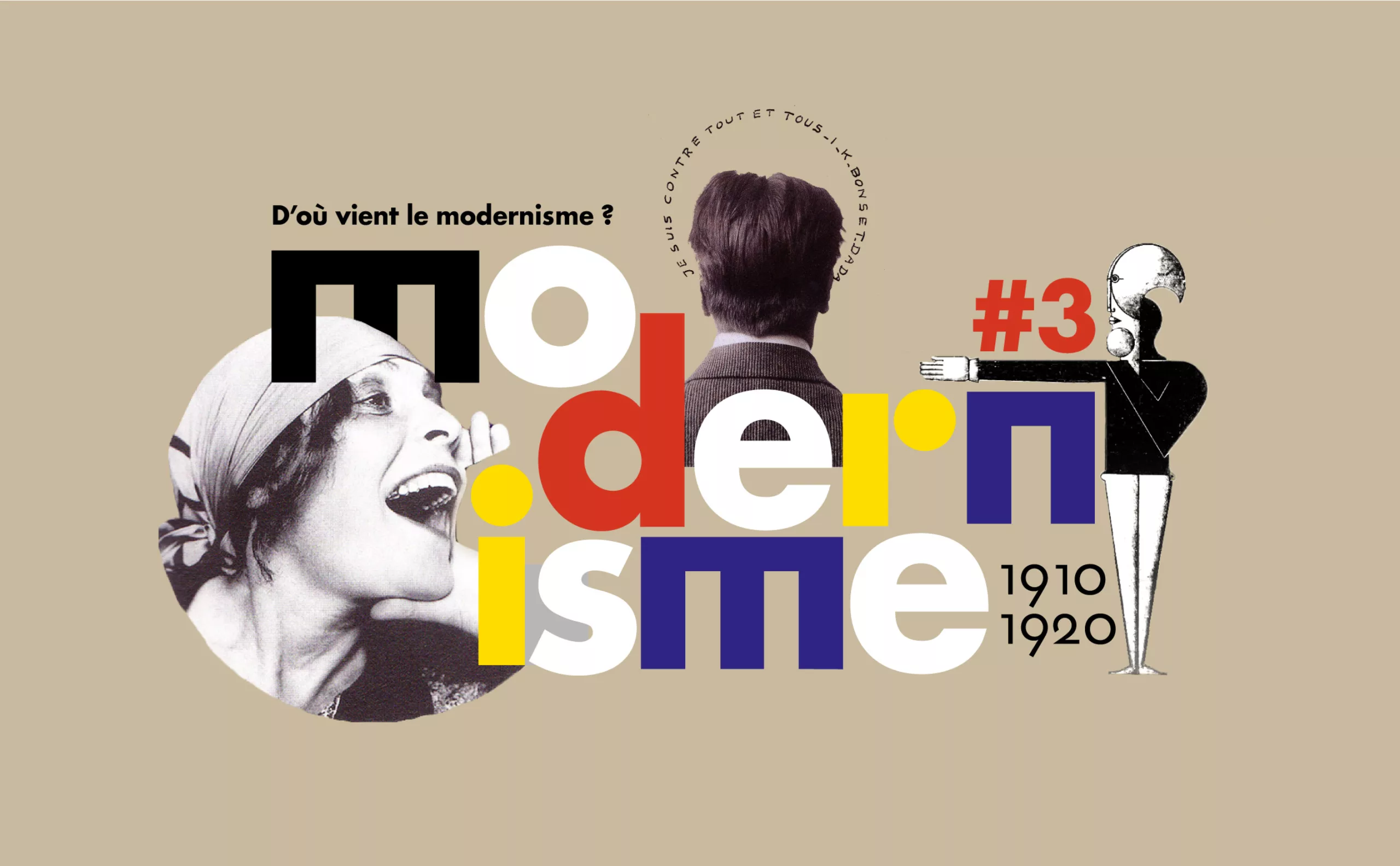
This is how two faces of modernism emerged. On the one hand, there was Art Nouveau, with William Morris, which celebrated ornamentation and craftsmanship, in order to extricate and liberate modern man from the cogs of machinery. On the other, Adolf Loos, who asserted that “ ornament is a sign of the degeneration of the past ” that modern and “ cultured ” people must absolutely bypass in order to progress. Loos ‘legitimately’ drew upon a hierarchy of races and genders specific to his era, which we must now question. His ideological purge, taken up by Le Corbusier, would lead to the Bauhaus and the quest for universality through new languages, such as geometry.
The 1920s thus established Modernism as a quest for ‘neutrality’ and universalism. Artistic deconstruction paved the way for new, avant-garde graphic forms, which the Bauhaus school was particularly fond of. This quest gave rise to universal typefaces such as Futura and Bayer’s Universal, based on pure geometric forms intended to transcend cultural boundaries, until Jan Tschichold himself renounced this “pursuit of military order”, which evoked the German context. Today, these principles of clarity are still applied in a world saturated with images.
Minimalism: the aesthetic of simplicity

Now a portmanteau, minimalism takes its name from an American art movement of the 1960s. Yet, its roots go back much further, embedded in Irish and Japanese religious traditions, celebrating imperfection and impermanence. Minimalism is not a trend; it is a philosophy that responds to a world saturated with images and distractions, taking various forms. By stripping away ornamentation and extolling the virtues of emptiness, it encourages us to see what is essential. But beware: simplicity is complex and does not mean neutrality!
Herb Leupin’s Playful Switzerland
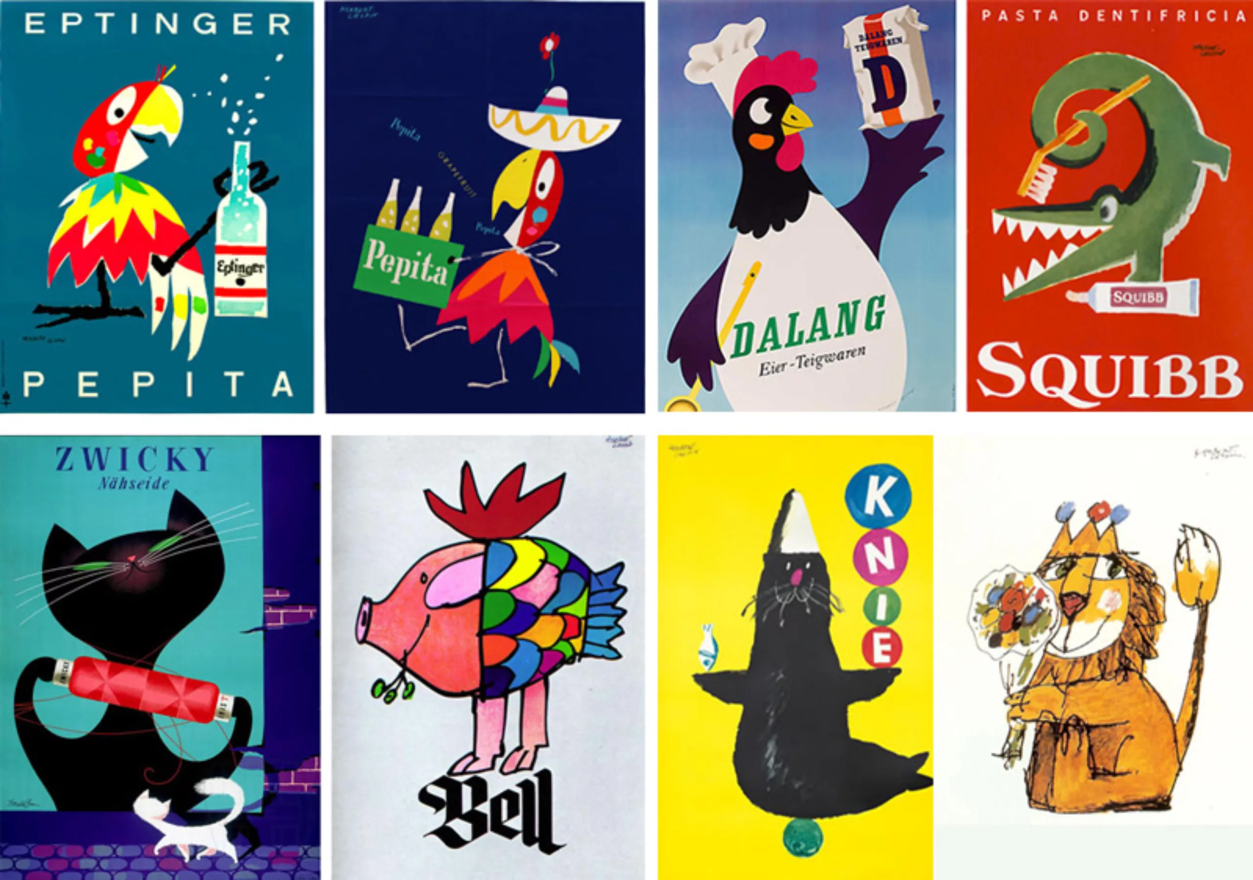
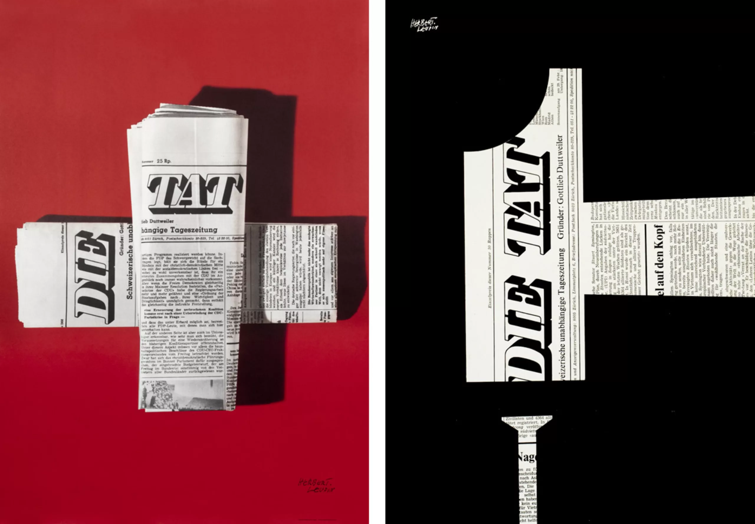
Swiss Style is not all about rigour and grids. The graphic designer Herb Leupin (1916–1999) proves the opposite with over 1,000 cheerful and colourful posters. From the hyperrealistic “Magical Realism” of his early days, he shifted towards a playful world populated by animals following the birth of his children. He invented the purple Milka cow and depicted a horse smoking a Rössli cigar (much to the dismay of animal rights activists). Proof that Switzerland also knows how to laugh at its own conventions.
The psychedelic art of vinyl record sleeves
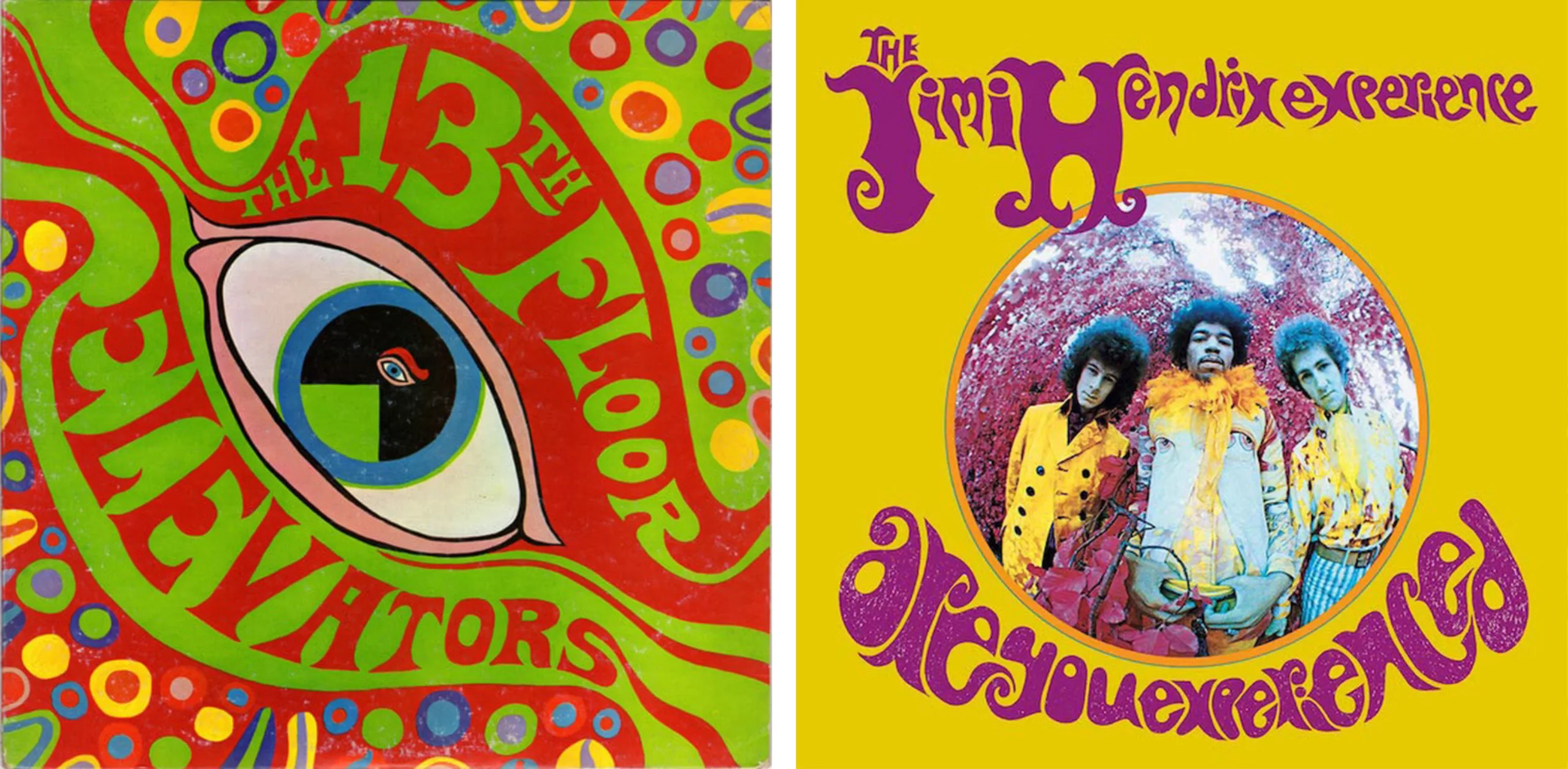
In stark contrast to minimalism, the psychedelic vinyl sleeves of the 1960s and 1970s fill every available space with their saturated colours and fluid shapes. Wes Wilson, a leading figure in American psychedelic rock, drew direct inspiration from Secessionist artists such as Mucha, Klimt and Roller, whose typography he liquefied. His lettering stood in stark contrast to the rigid, corporate commercial posters of the time. From Rubber Soul (1965) to the legendary Sgt Pepper’s (1967) and Andy Warhol’s banana, album covers became visual manifestos of the counter-culture, and music finally found a face as subversive as its sounds.
The post-modernism of tribes

We now stand in the ‘age of tribes’ (Maffesoli, 1988): post-modernist logos are abandoning their authoritarian capital letters in favour of humanising lower-case letters, their closed forms for open geometries, and their corporate colours for rainbow palettes. The geometric purity inherited from the Bauhaus appropriates all basic forms in a quest for immediate simplicity. Brands no longer impose; they accompany.
From austere modernism to fluid post-modern logos, via exuberant psychedelia, each graphic design movement has responded to the upheavals of its era. These movements of thought embody ideologies and world views. Understanding their origins means deciphering the symbols that surround us and grasping how design shapes our collective imaginations. What will we invent tomorrow, in a world where AI and digital overload are surely calling for a new aesthetic revolution?
On the subject
-
Minimalism: aesthetics of sobriety
Both a visual or life discipline, minimalism has become a questionable trend and consists in simplifying to keep only the essential.
-
Where Does Modernism Come From? 3 – In Search of Neutrality and Universality
The 1910s and 1920s marked a clean break with the past, laying the foundations for modernism, which drew on the German values of the time: rigor and discipline.
-

Uber’s new visual identity doesn’t transport anyone!
Uber has chosen to go for a logo that doesn’t make waves, is neutral and anything but singular. In short, a visual identity that transports no one!